Assignment: User Experience Analysis Of The ADM Building
For this assignment, I have decided to enter the freshmen’s point of view. Looking at how I would react if I were to enter the school for the first time.
 Upon alighting the bus, there is a sheltered walkway which acts as a guide that the entrance to the building should be at the end of this walkway. No major signages to direct me otherwise.

The first thought for this would be the key card access. Do I tap? Or is it already open? Also, these doors are automated on one side, where the warning is written on the door as “Caution Glass Doors Swings Outwards”. It is difficult to gauge if the door on the other side swings out or inwards (push or pull) for there are no guided text.

This entrance shows no signs of where to head next. Left? Right?

(Left Walkway) Leads to the library and there is a handicap lift. So I do know that the different levels are handicap friendly.
 (Right Walkway) Leads to the this huge area. Judging from the high ceiling that it is the main lobby. Not much signages till now. To the right, is the general office with a map that does not have much floor plan (of individual floors) and studio rooms.
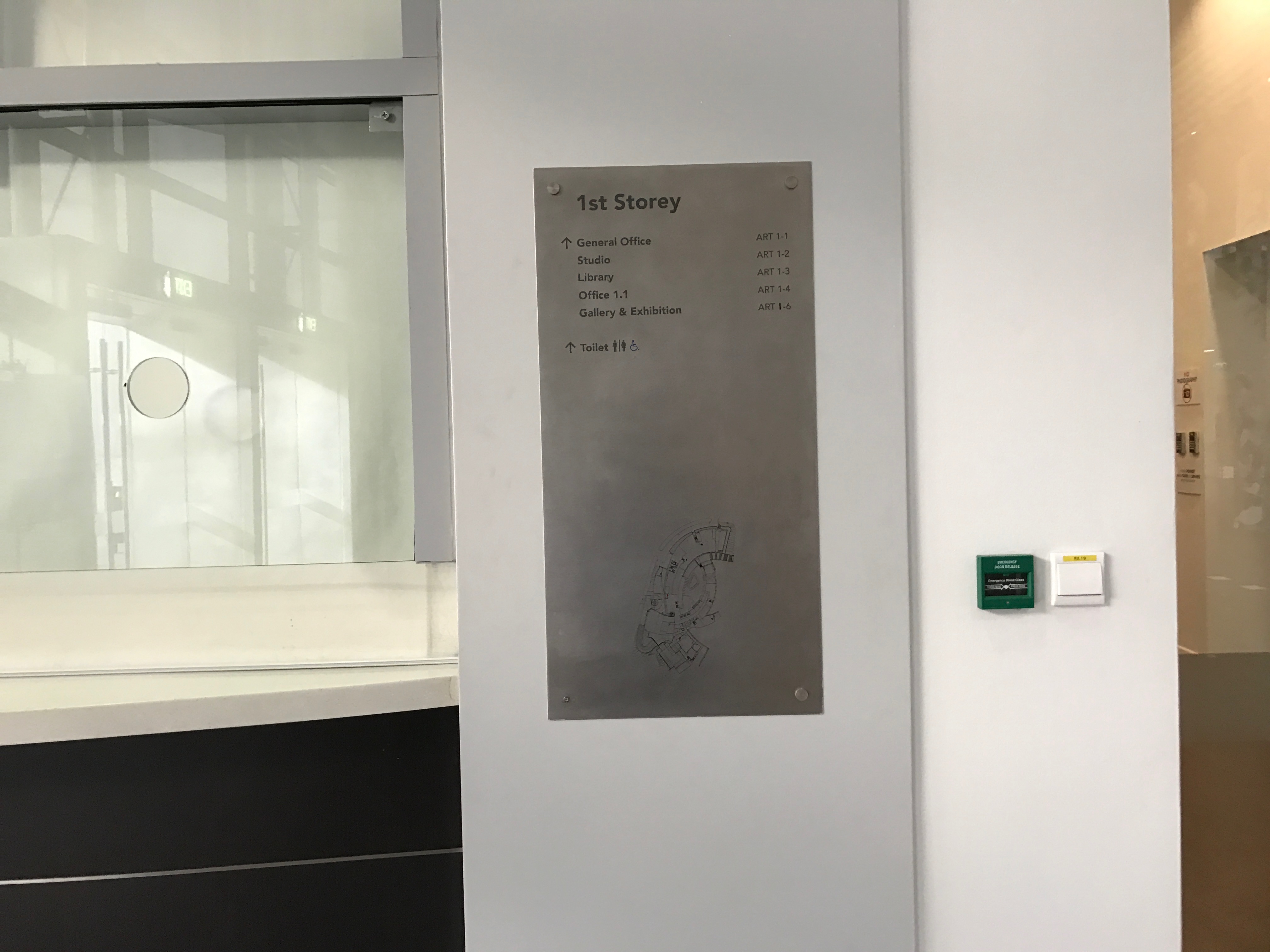
The map does not show where I am with the typical “you are here” tag. So it is difficult to judge which location am I headed towards on the map.


Lift does not show what is on the different levels and buttons are not labelled with the main categories of the floors (Eg. B1 Animation Studio/ Product Design Workshop).

This signage shows the general direction of the studio rooms. But….


Which walkway does it direct me to? The simple arrows were insufficient


Stairs heading up or down are generally good as it comes with handle bars for those who needs them. Also, the open concept makes it easy to look down and see if certain studio or workshops are what you were looking for.

Basement Level


No clear maps on B1 for. No toilet signages, only colour coded maps which are not easily understood for navigating.
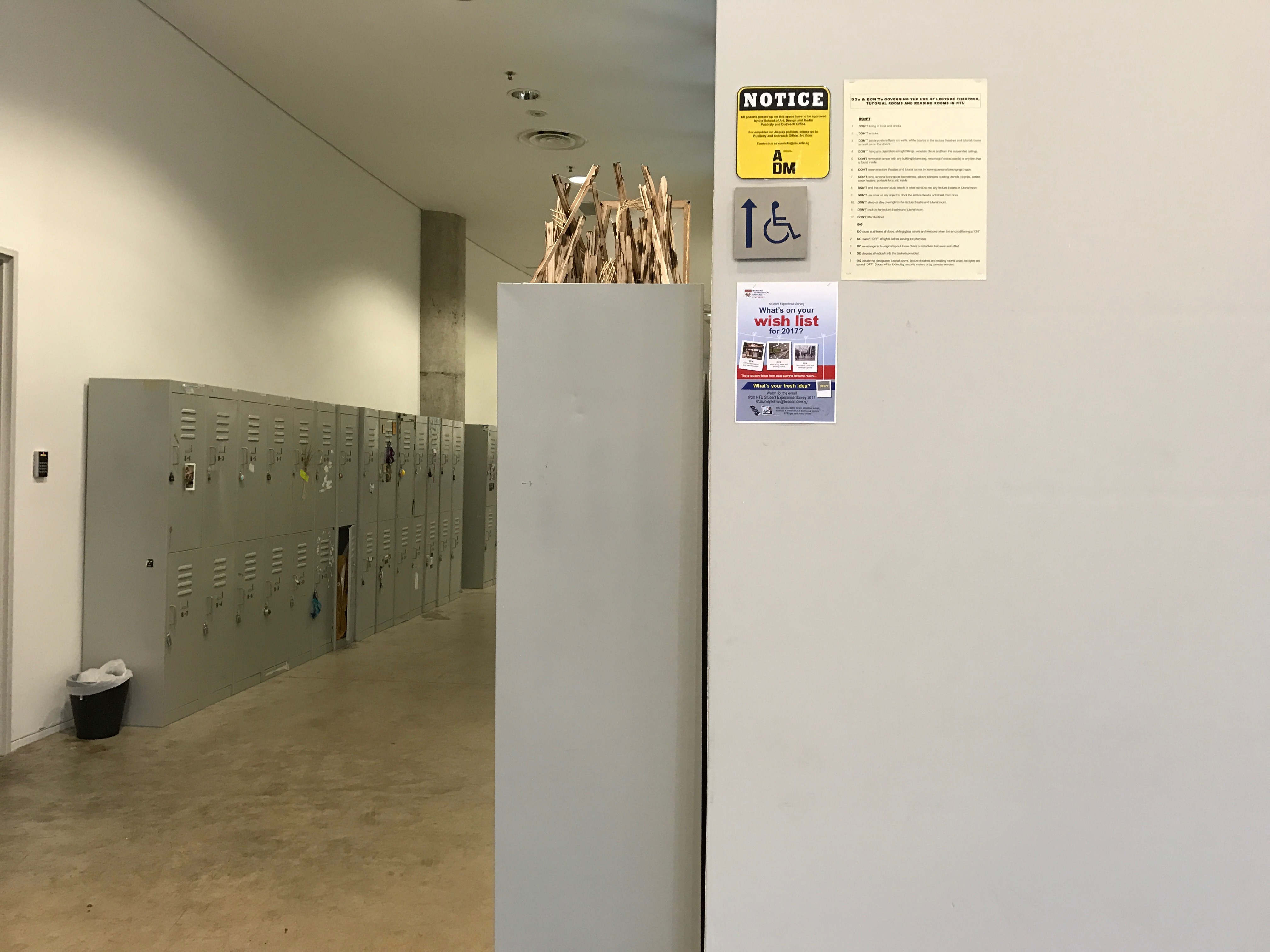
Fire extinguishers are generally hidden out of sight as there are rows of lockers, but for safety concerns the overhead signages are placed to indicate their placements whenever it is hidden.


Uncertain push pull doors as the handles are the same on both side and no guiding text are there.
Lecture in progress signages are switched on when lectures are being conducted in the room. 
Emergency evacuation labels are put around the school for people to read and evacuate accordingly when required. 

A map at the end of the hallway showing the animation studios.