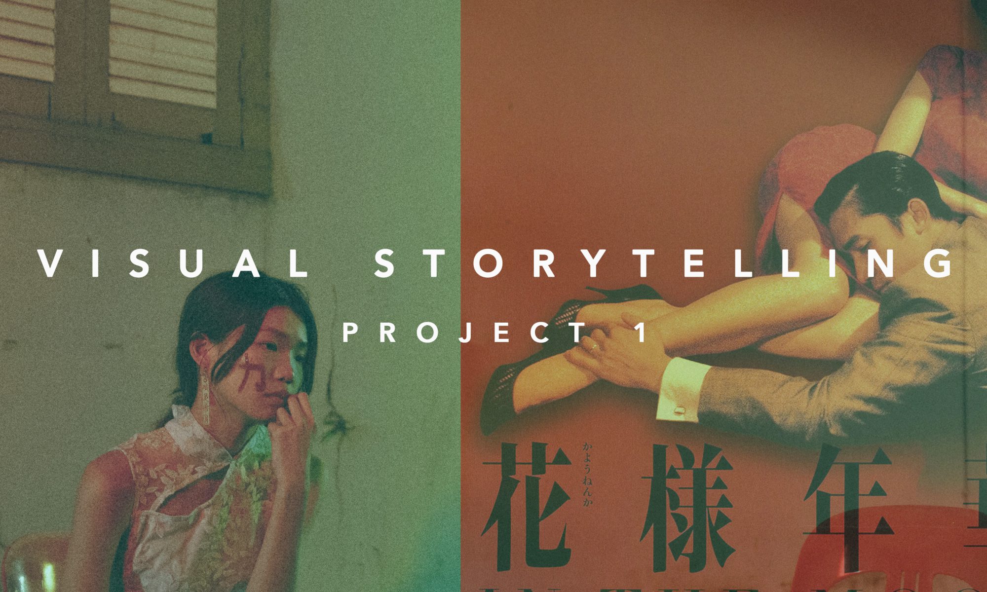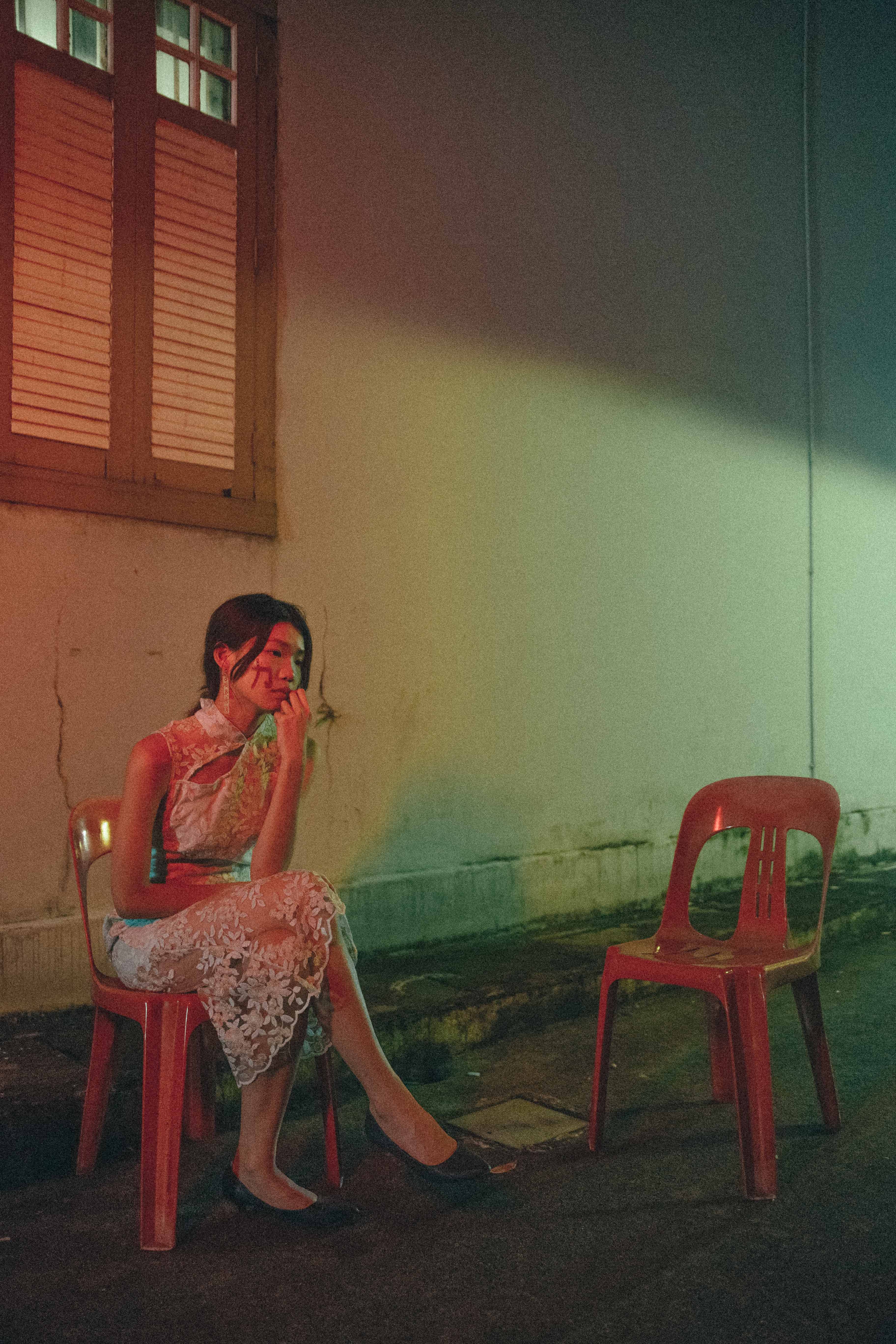

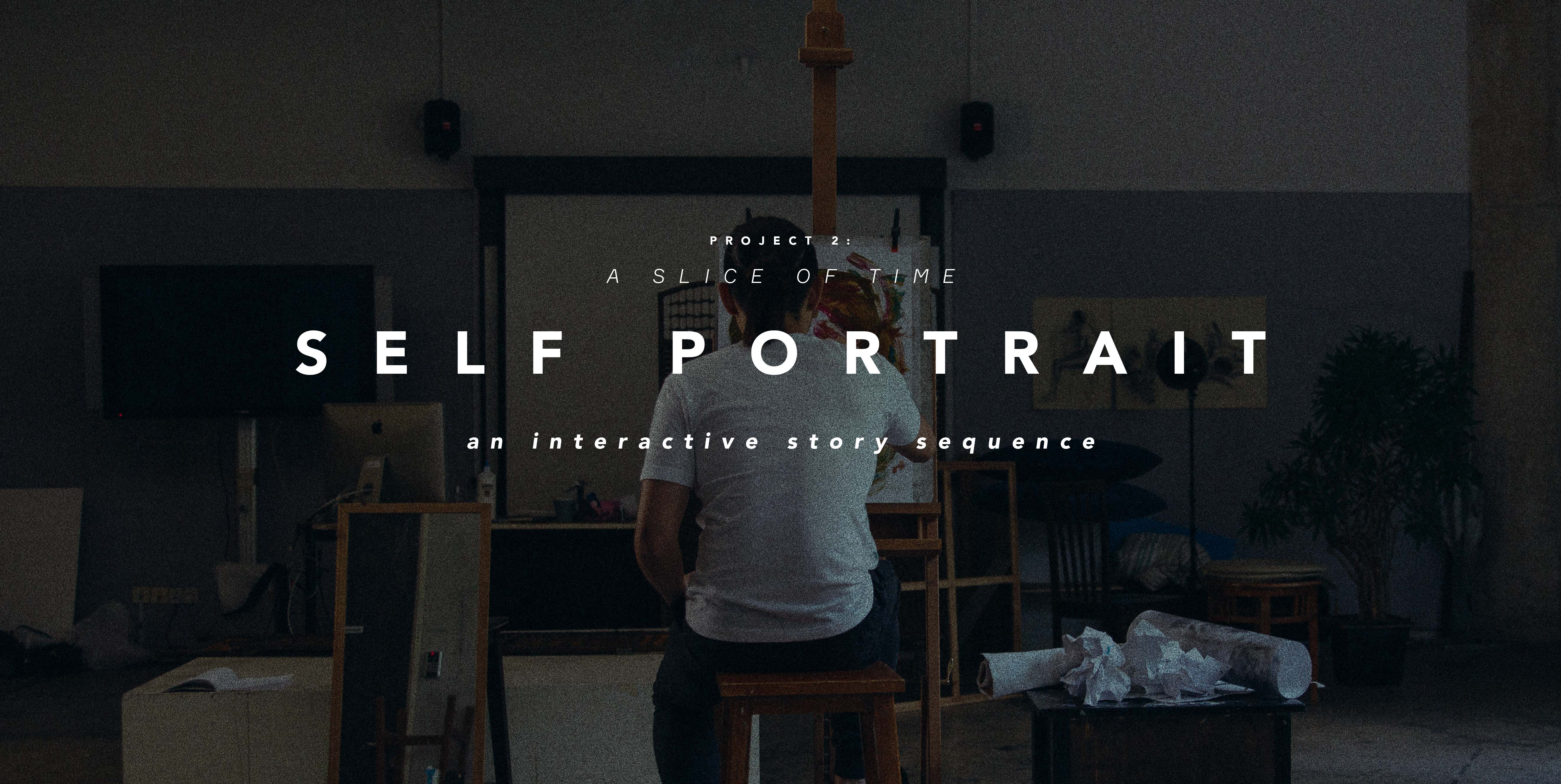
Project Title: Self Portrait
Please access this link to view the final work. (opens in new tab)
*Spoilers below* (Please read after trying the website)
I have made changes with regards to the layout and linking of the images following the in-class presentation.
This is a write-up regarding the thought process I had with the concept, image-making, layout and how I’ve linked the images together to tell this story.
When you first enter the site, you will be greeted with a home page welcoming you to begin the story.
Clicking on the begin button takes you to a rule page which explains how the website works and how to interact with it.
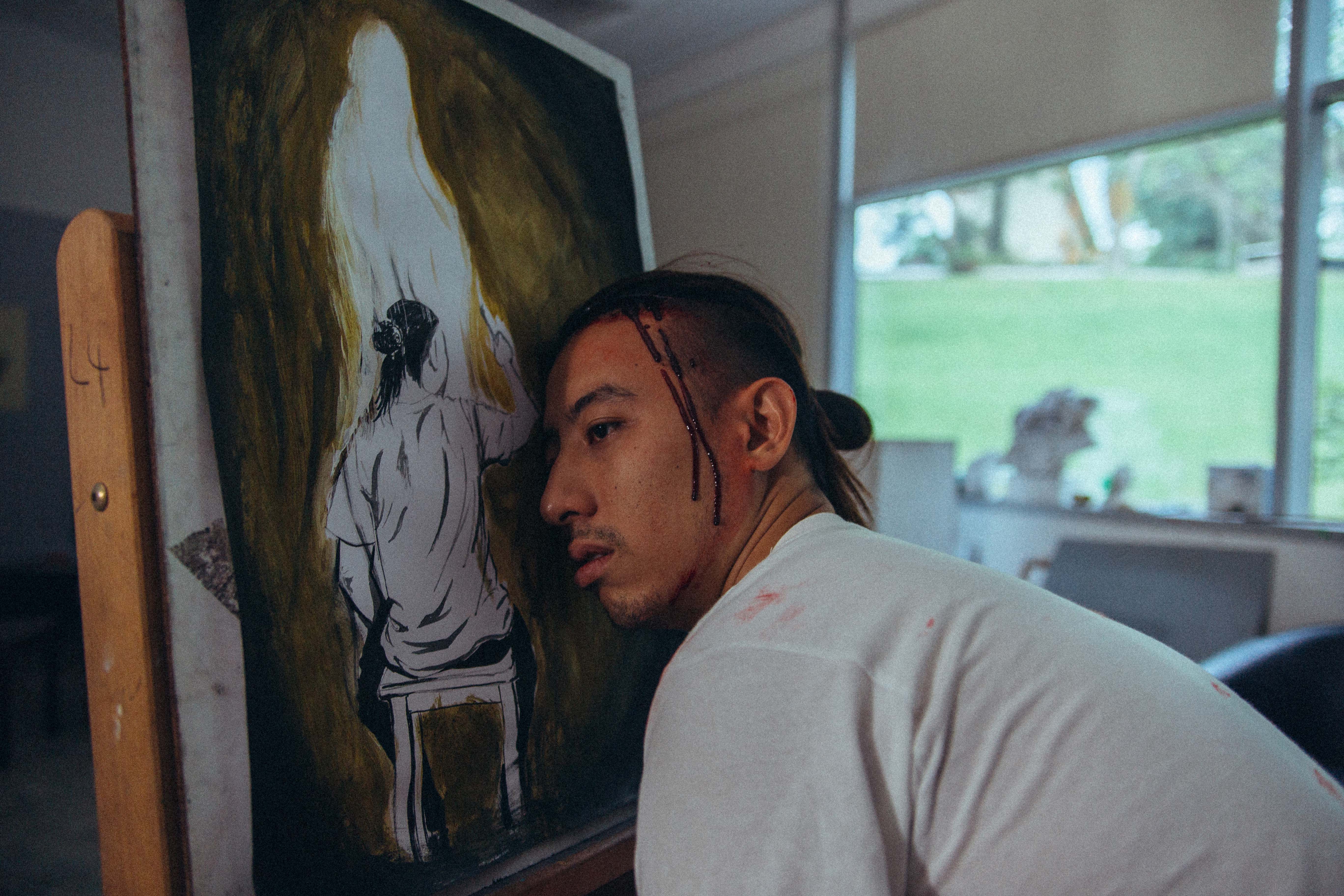
This is the first image where you begin the story. There are a total of 4 buttons on this image.
Image 1:

Button 1: The scraps of paper on the right
Button 2: The painting
Button 3: The artist’s back
Button 4: The mirror
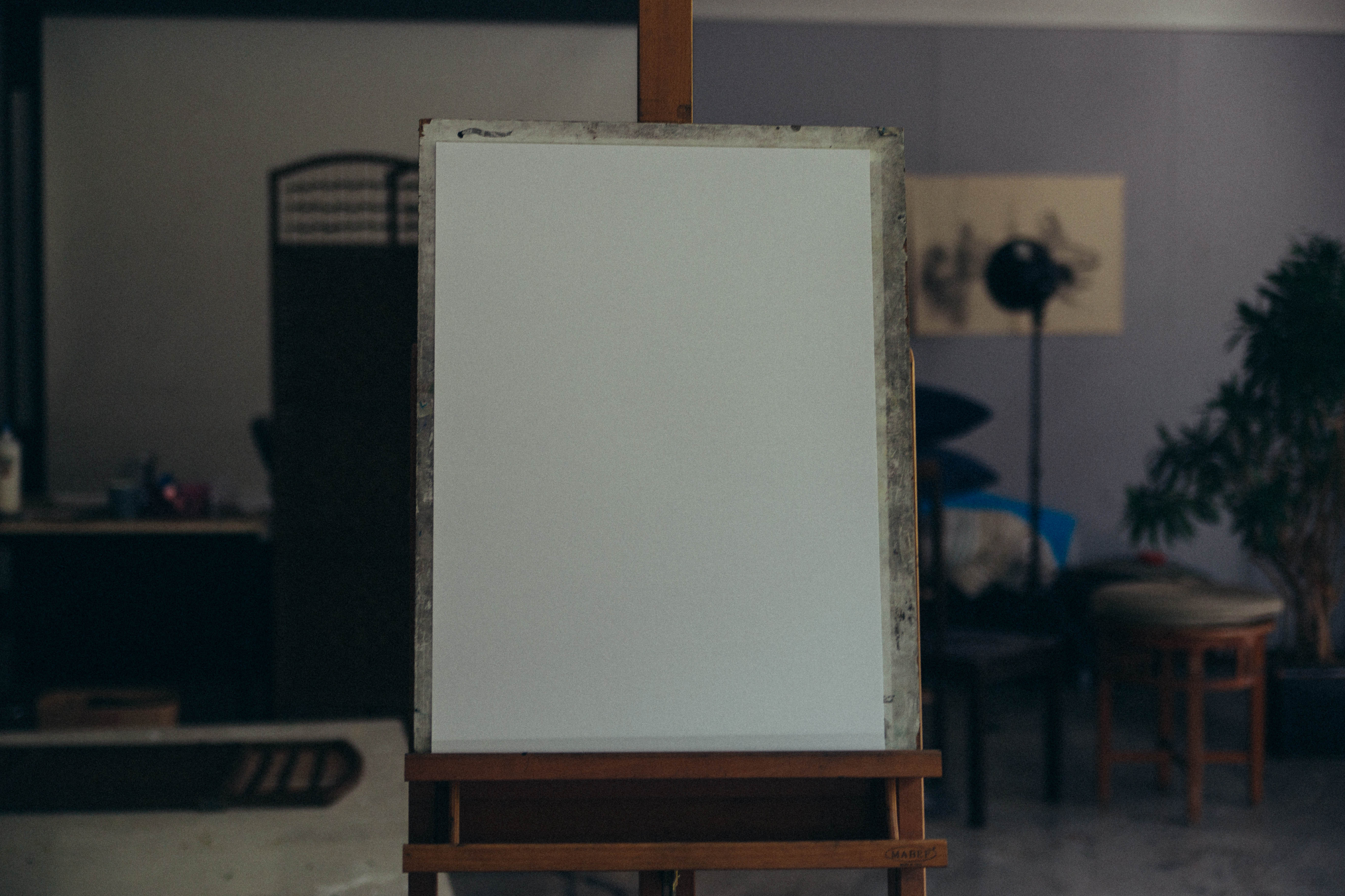
Clicking on button 1 takes you to the 2nd image in my sequence which is an empty canvas.
Button 1: The scraps of paper on the right
Image 2 & 3:

Clicking on the button in image 2 takes you to image 3.
The button in image 3 takes you back to image 1.
These 2 images are to first reveal what the scraps of paper are, they are paintings of the many attempts the artist has spent trying to create this perfect painting.
Button 2: The painting
Clicking on button 2 in the 1st image, we know that the artist is still painting, trying to work on this painting.
Button 3: The artist’s back
Images 4 & 5:
Button 3 takes you to image 4 of the artist’s t-shirt, filled with paint, he has already been at it for a long time.
Image 3 takes you to image 4 which is the artist’s hand filled with paint, showing the source of paint in image 3.
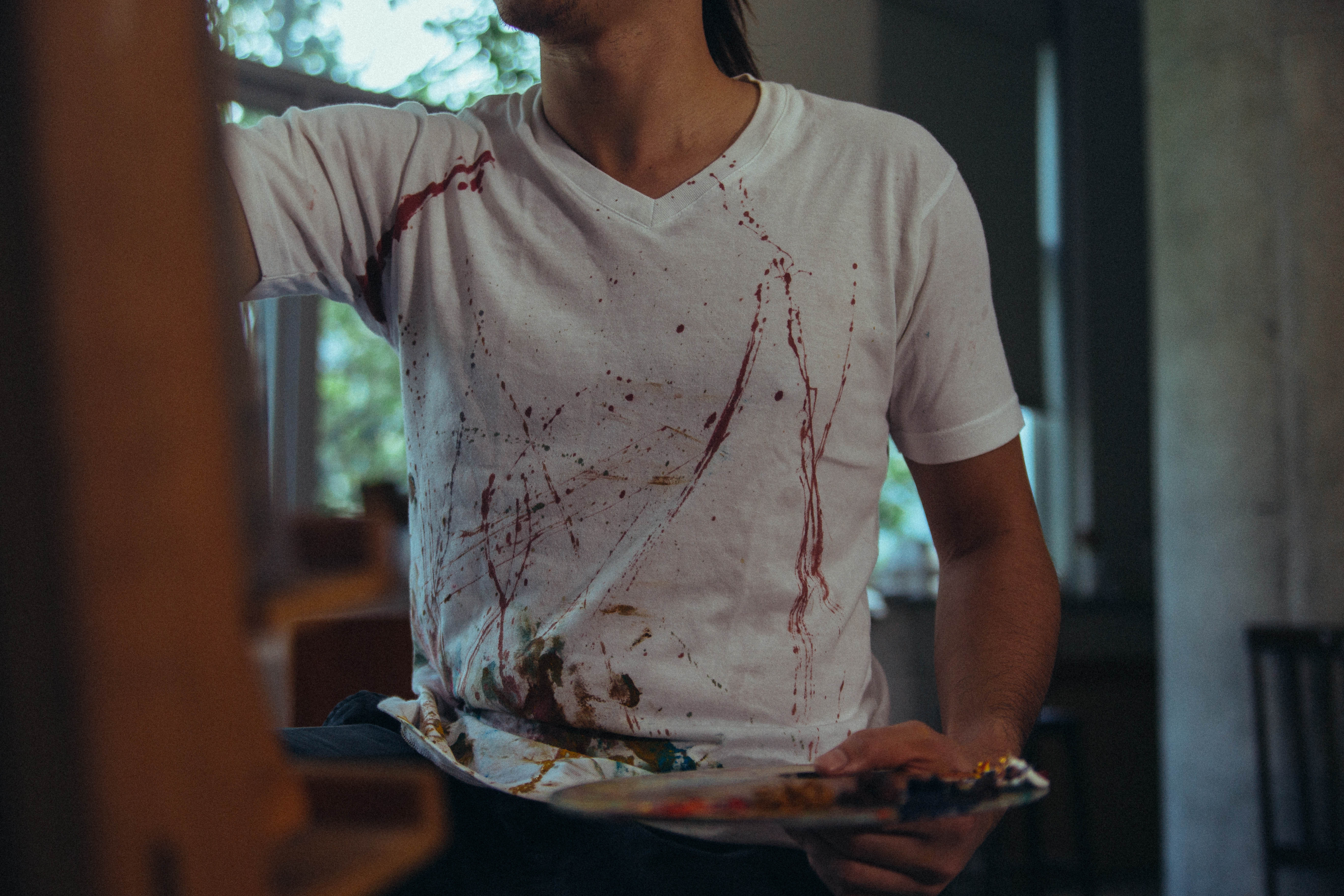

These 2 images further show the state of his hands & t-shirt now, filled with paint, this is to push the idea of the state of the artist is in this very moment, already filled with paint.
Image 5 has 2 buttons, one on the paint on his hand which is a back & forth between image 4 & 5 to show the source of paint.
The other button is on the brush, which takes you to image 3, revealing the painting. Establishing the connection and setting up the artist previous failed attempts at painting and showing his state now.
Button 4: The mirror
This button takes you to a close-up image of the mirror.
Image 6:

Clicking on the mirror takes you to image 7:
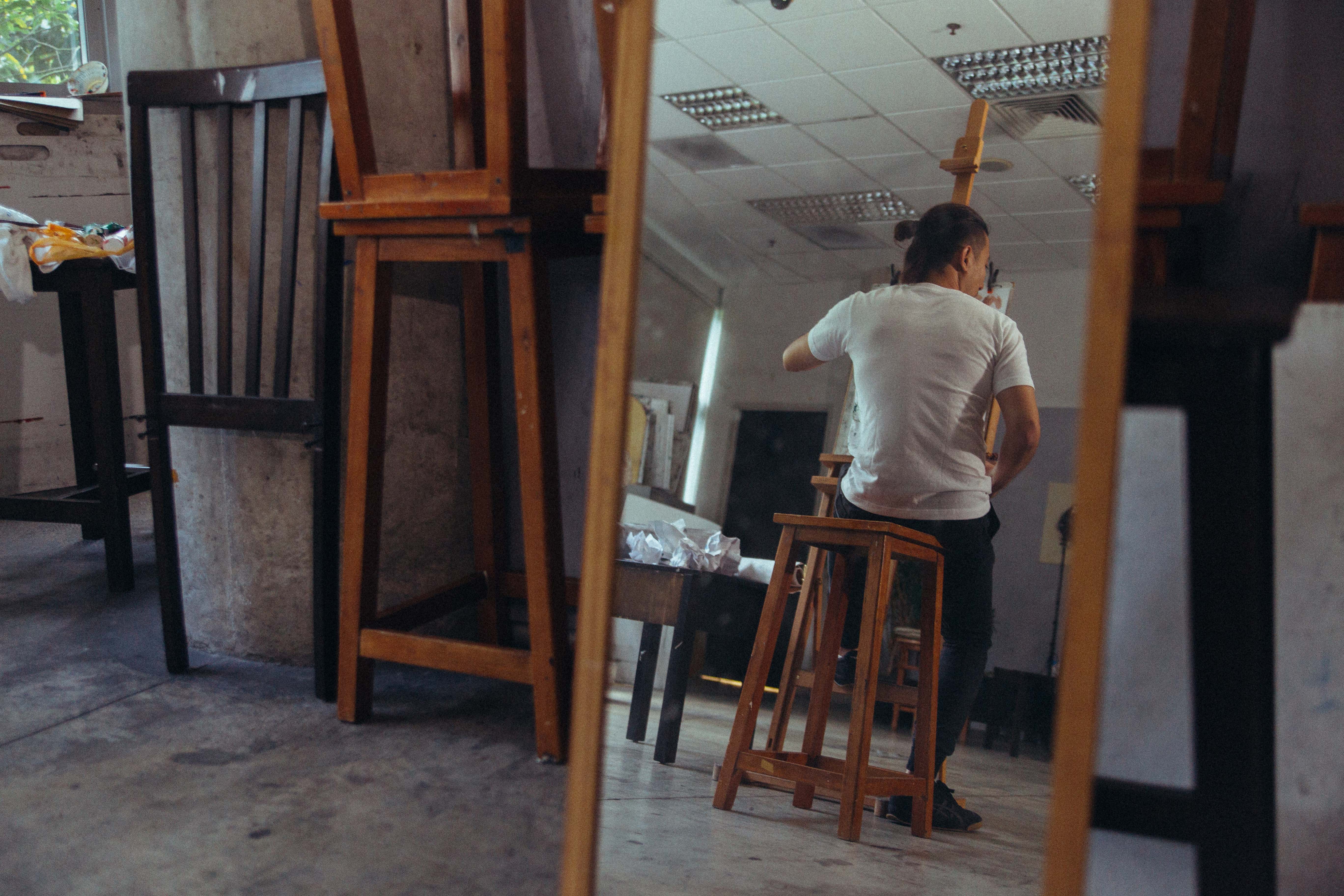
Image 7 shows you the back view of the artist, which he is using the other to reflect and see for himself. Clicking on the button brings us to image 8.
Image 8:

Image 8 establishes the fact that he is using the 2 mirrors to paint a back view of himself.
There are 4 buttons on this image.
Button 1: The artist’s face
Button 2: The artist’s brush
Button 3: The front mirror
Button 4: The back mirror
Button 3 & 4 brings you to the 2 respective mirrors so that the viewer can understand the significance of how the mirrors work for the artist.
Button 2 brings us back to image 5 which will link to image 4 to show us what the artist was painting.
Button 1:
Clicking on the artist’s face brings you to image 9, which is a close up of the artist looking at something.
Image 9:

Clicking on his eyes, we have a shocking revelation. The artist is bleeding, he is dying.
Image 10:
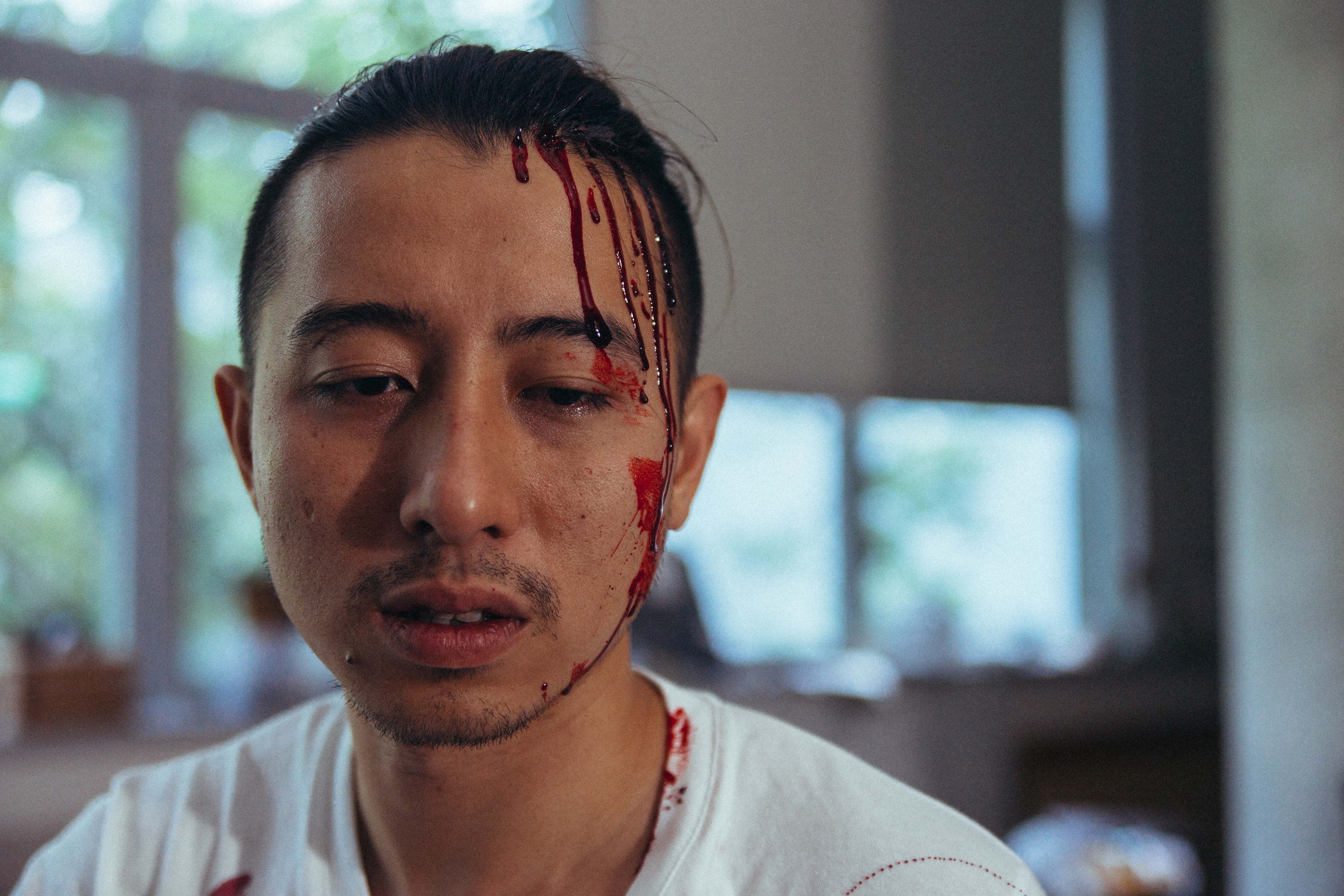
Clicking on the button which is on the blood. We go to image 11.
Image 11:
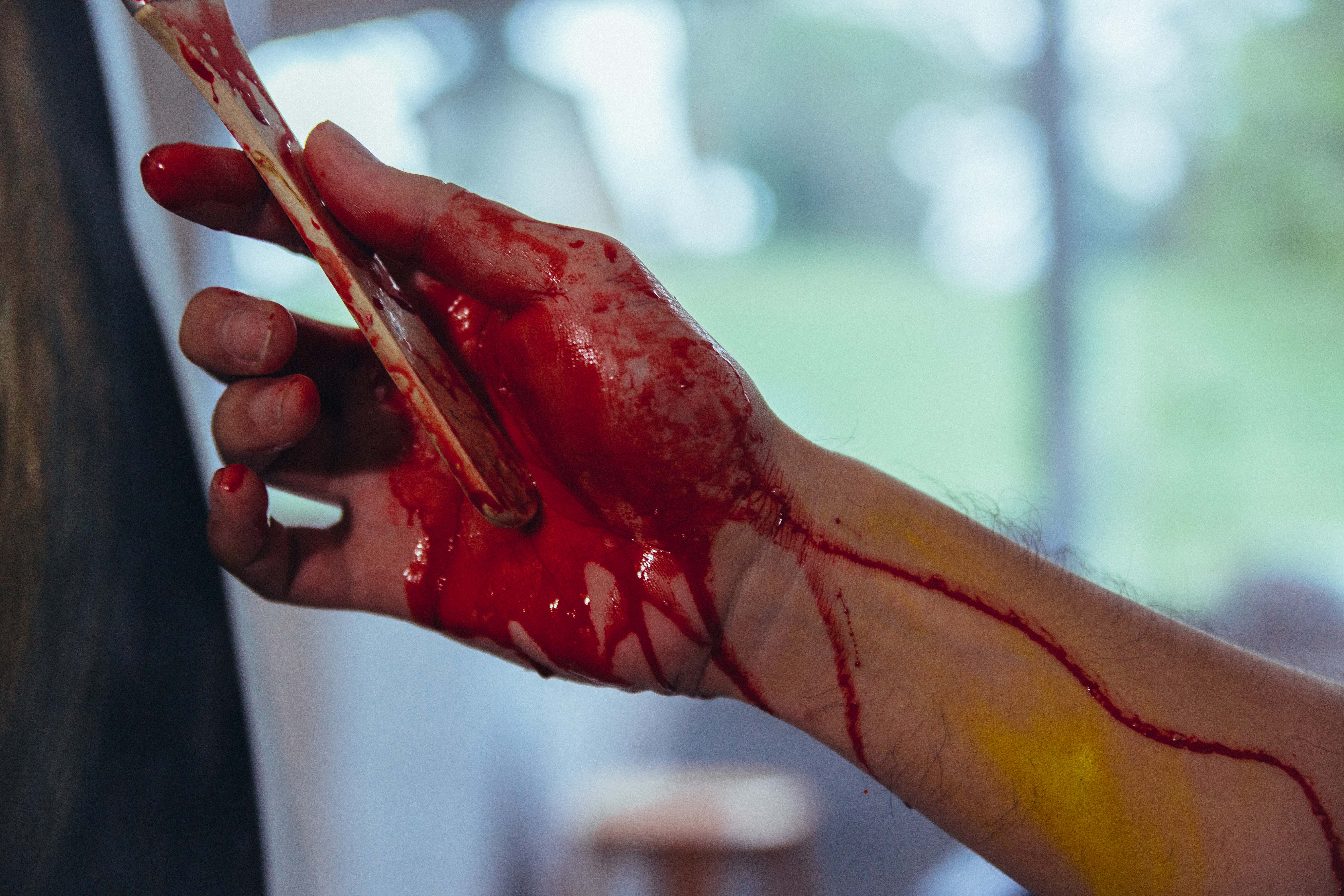
Image 11 reveals that the artist is bleeding everywhere, on his head and his hands. When you click on the blood on his hands, we go to image 12.
Image 12:
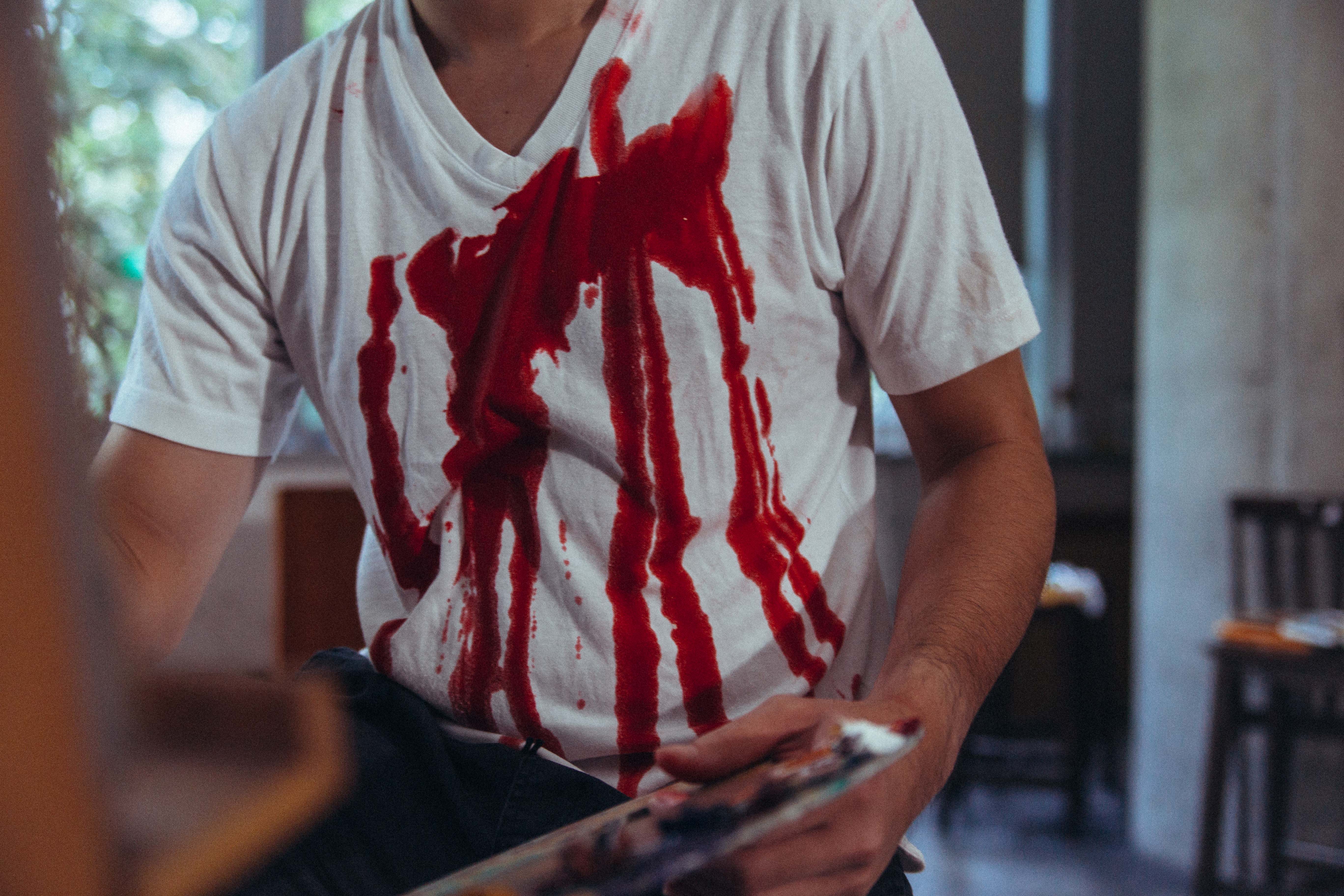
Image 12 also shows him dying, bleeding all over his body.
We click on the blood, we get another reveal, his final painting. This painting shows us the artist has been using the mirrors to paint a back view of himself.
But with a twist, his soul is leaving his body.
Image 13:
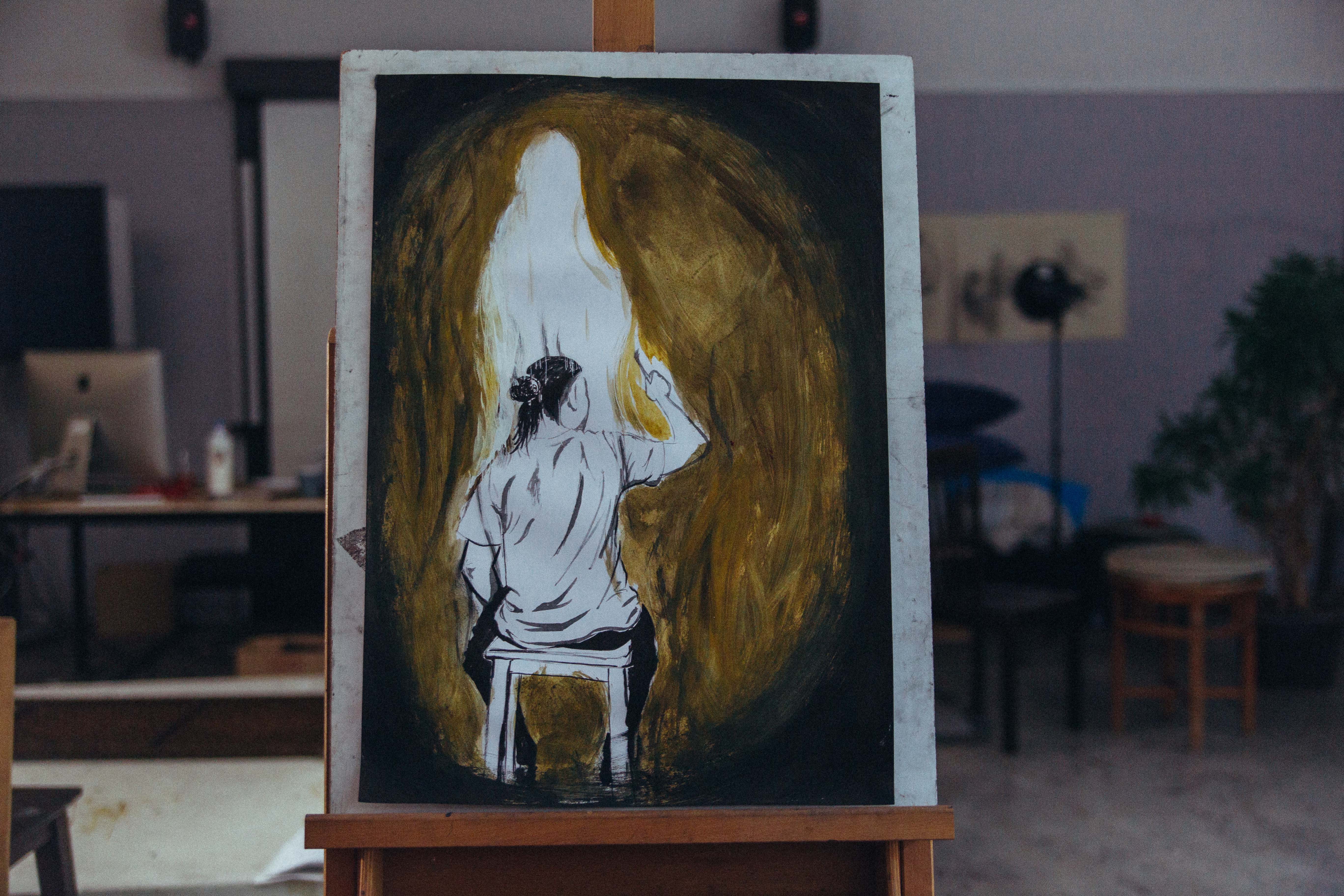
This image shows us the artist painting himself dying, which when you look back at image 3, it was an abstract version of this intended final painting. This connection shows us why the scraps are there and how the artist has already tried multiple times to perfect this painting.
There are 3 buttons on this image.
Button 1: His hand painting the image.
Button 2: The soul part of the painting
Button 3: The artist’s back.
Button 3 brings us back to image 7, which shows us how the back view he sees in the mirror is correlated to this painting he is trying to paint.
Button 1 brings us to image 14, which shows us the artist finishing the final stroke of his painting. The paint falling off his brush to show his final stroke.
Image 14:

Clicking on the paint brings us back to the painting. Relating the fact that the artist has finished the painting he is trying to accomplish.
Finally, button 2, reveals to us that the artist is in fact dead.
Image 15:
Button 1: The artist’s head
Button 2: His hand
Button 2 brings us back to image 14, once again relating his brush in the painting to his action in reality.
Button 1 brings us to the final image.
Image 16:

Image 16 reveals to us he is dead, clicking on his back, brings us back to image 1.
The concept:
This connection shows us that this whole series is capturing the moment in time where the artist finishes a painting of himself dying, completing a self-fulfilling prophecy of his own death through his own painting of himself dying.
Clicking on the “reveal” button on the menu on the left will confirm this story to the viewer once he/she has figured out.
Project afterthoughts:
Starting this project was a bit of a challenge for me as I struggled to find a story that could show a single slice of time but through multiple images. Which was kind of a conflicting thing, but it was definitely interesting exploring this as a medium of storytelling.
My initial arrangement of the website was more sequential, with 1 button per image, hoping that as the viewer plays through, they figure out the story, otherwise they can try again.
But after feedback & seeing someone else try the story during critique. I figured hiding different buttons within 1 image to allow the player to connect the dots to how these images link together through repetition and connection. This way of telling the story I wanted to tell works better and it gives the images new meaning as they are being discovered and clicked along the way.
I’ve arranged it such that as you click, you will see only 1 side of the story, such as revealing the artist’s death before seeing the painting. Or seeing the painting following the reveal of his death. This method of hiding 1 side of the story confuses the viewer and allows them to guess what is going on before the other side of the story is revealed to them.
It was definitely different from the typical way of how a story is approached and looked it, and I feel it being applicable to the way I tell stories in other mediums such as filmmaking, and this was definitely an interesting project!