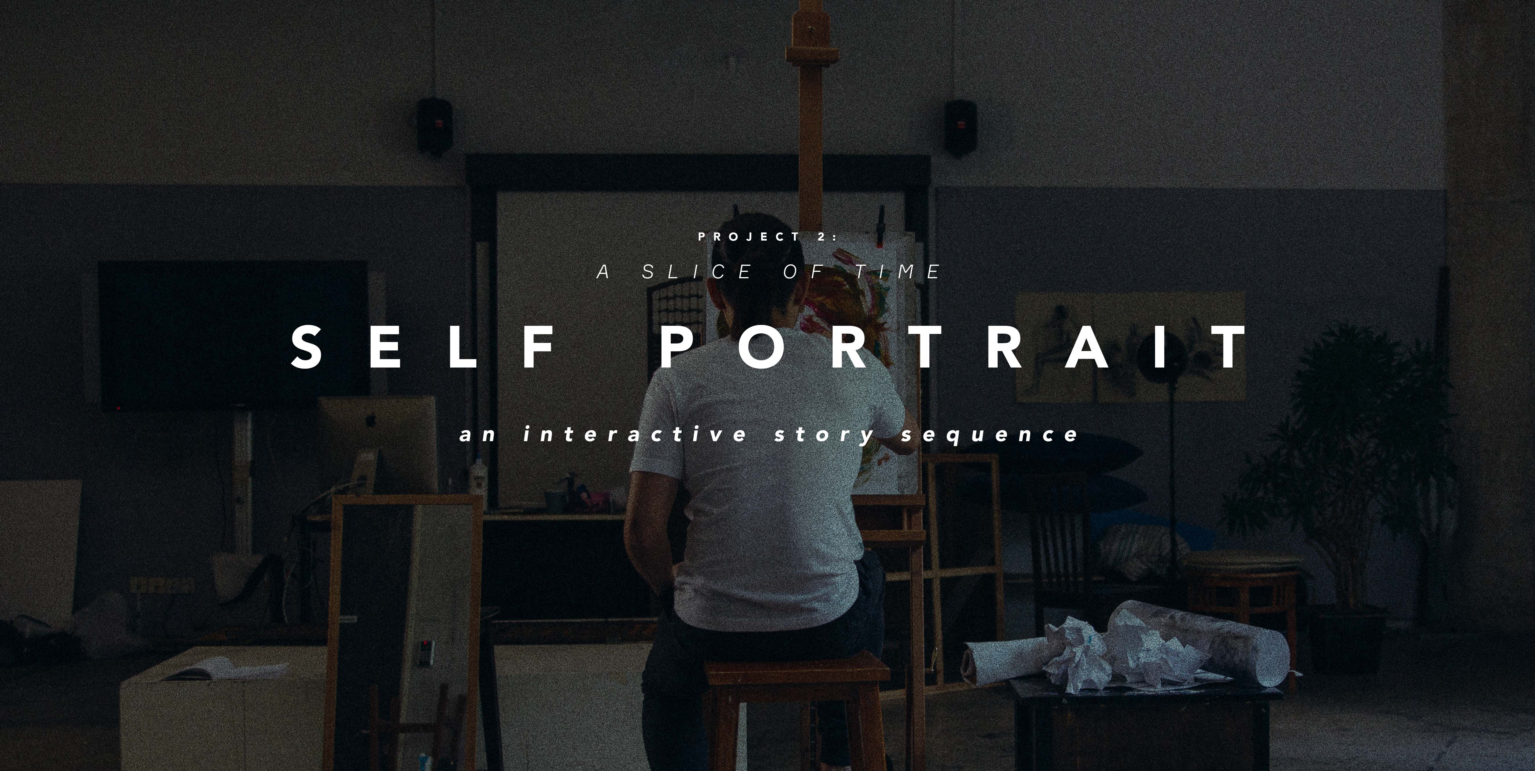
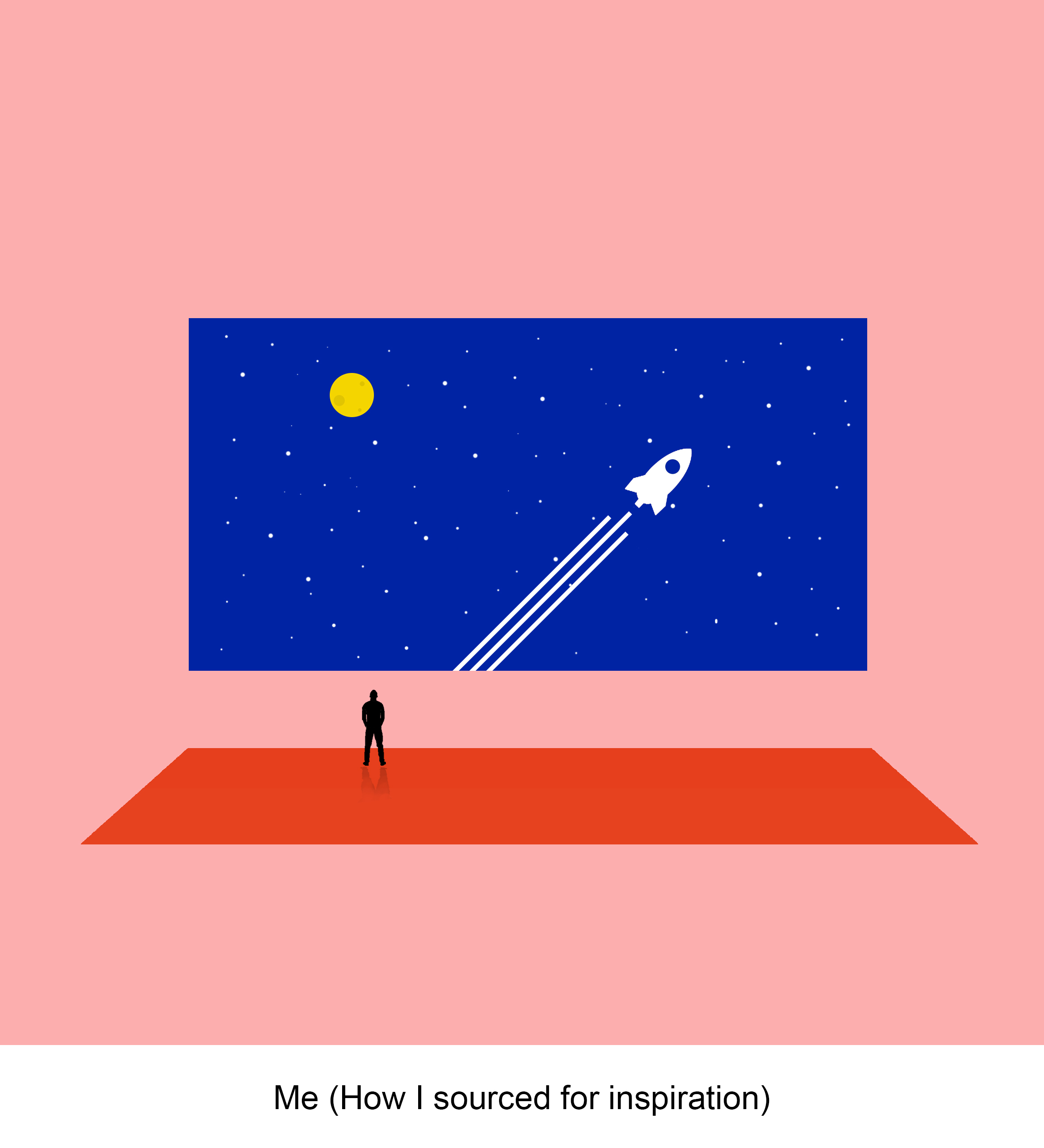
As a huge lover of movies, the idea of this project definitely excited me.
For the final 4 quotes (highlighted below in bold), I have chosen them from different films that have inspired me & also based on how I could visualise them & reinterpret them in different ways.
The final 4 quotes:
“After that breakup, I just want to be a ghost, completely anonymous.” – Before Sunrise (1995)
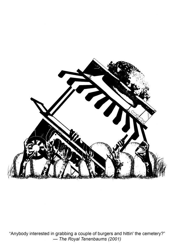
“Anybody interested in grabbing a couple of burgers and hittin’ the cemetery?” – The Royal Tenenbaums (2001)
“You don’t love me, you just love that I love you.” – mother! (2017)
“Every civilisation was built on the back of a disposable workforce, but I can only make so many.” – Blade Runner 2049 (2017)
The main challenge I faced for this project was to interpret these quotes without applying any context of the films into the designs.
Through various feedback from my friends & Joy during this whole process, this project definitely pushed my conceptualising skills further & taught me how to think beyond & not give surface level interpretations of the quotes.
Here are my final 4 compositions & how I developed them:
1. Before Sunrise (1995)
Before Sunrise is one of my favourite & most inspiring films to date, thus it was natural of me to source there first for inspiration.
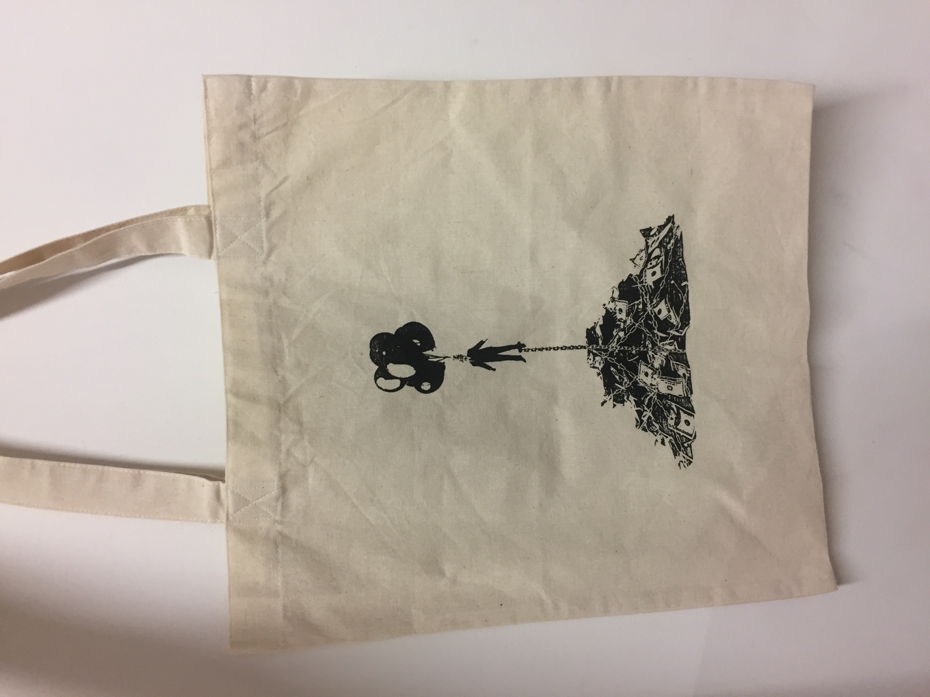
“After that breakup, I just want to be a ghost, completely anonymous.”
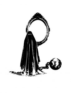
For my first draft, I started with using a prisoner’s ball chain as a visual representation of the breakup. Chaining a literal ghost down to the ball as he stands in front of a mirror to represent the part on being ‘completely anonymous’.
As mentioned before, when I started, I was approaching each quote very literally & just applied visual elements of the quote in to the designs. Through this feedback from Joy, I went back to rethink how I could give more meaning to this quote.
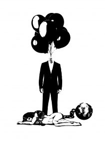
For the 2nd draft, from this quote the main takeaway was the part on being”completely anonymous”, so with that I removed the head of the man & replaced it with floating balloons. However, he is unable to escape as he is burdened both metaphorically by the ‘dead’ weight of the relationship as represented here by a woman as well as still being chained down by the ball.
Through consultations, I was asked to try exploring a different interpretation of the ‘breakup’ part of this quote. Instead of it being a literal breakup between a man & a woman, perhaps it could be a breakup between man & something else.
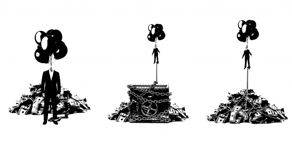
For the 3rd draft leading up to my final design, I decided to explore the relationship between man & greed. Using a pile of money to represent this physical manifestation of greed, I tried to arrange the elements differently to see which best fitted.
I tried to show a man who was trying to float up but instead was being weighed down by money. After the 4th draft, I decided that using the safe as a physical anchor created a lot of unnecessary distractions in the design.
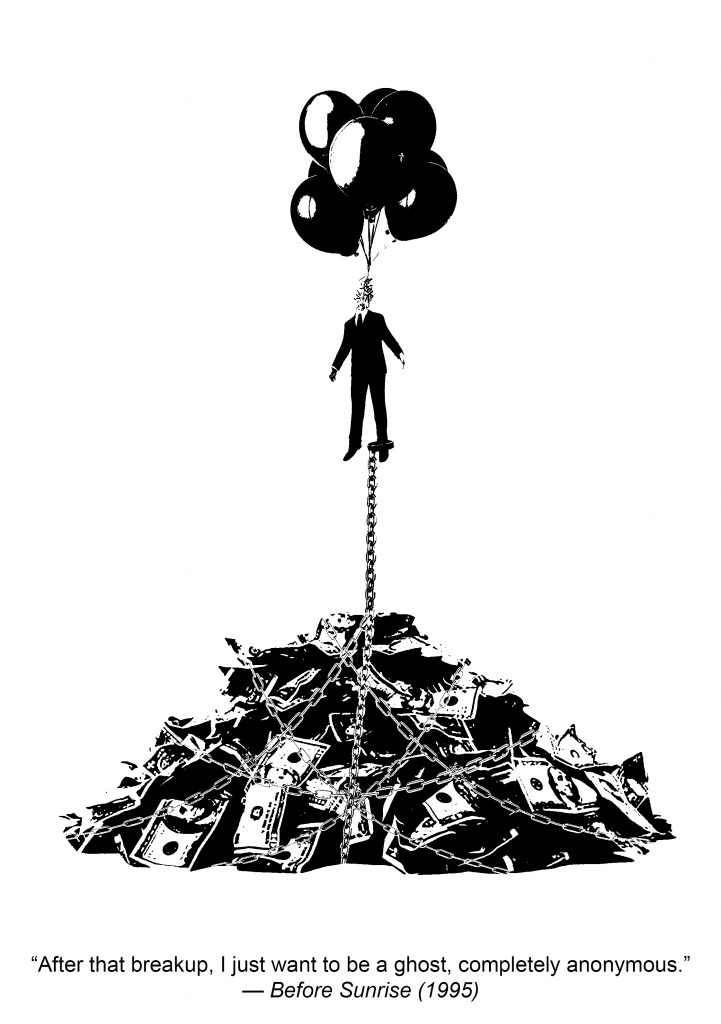
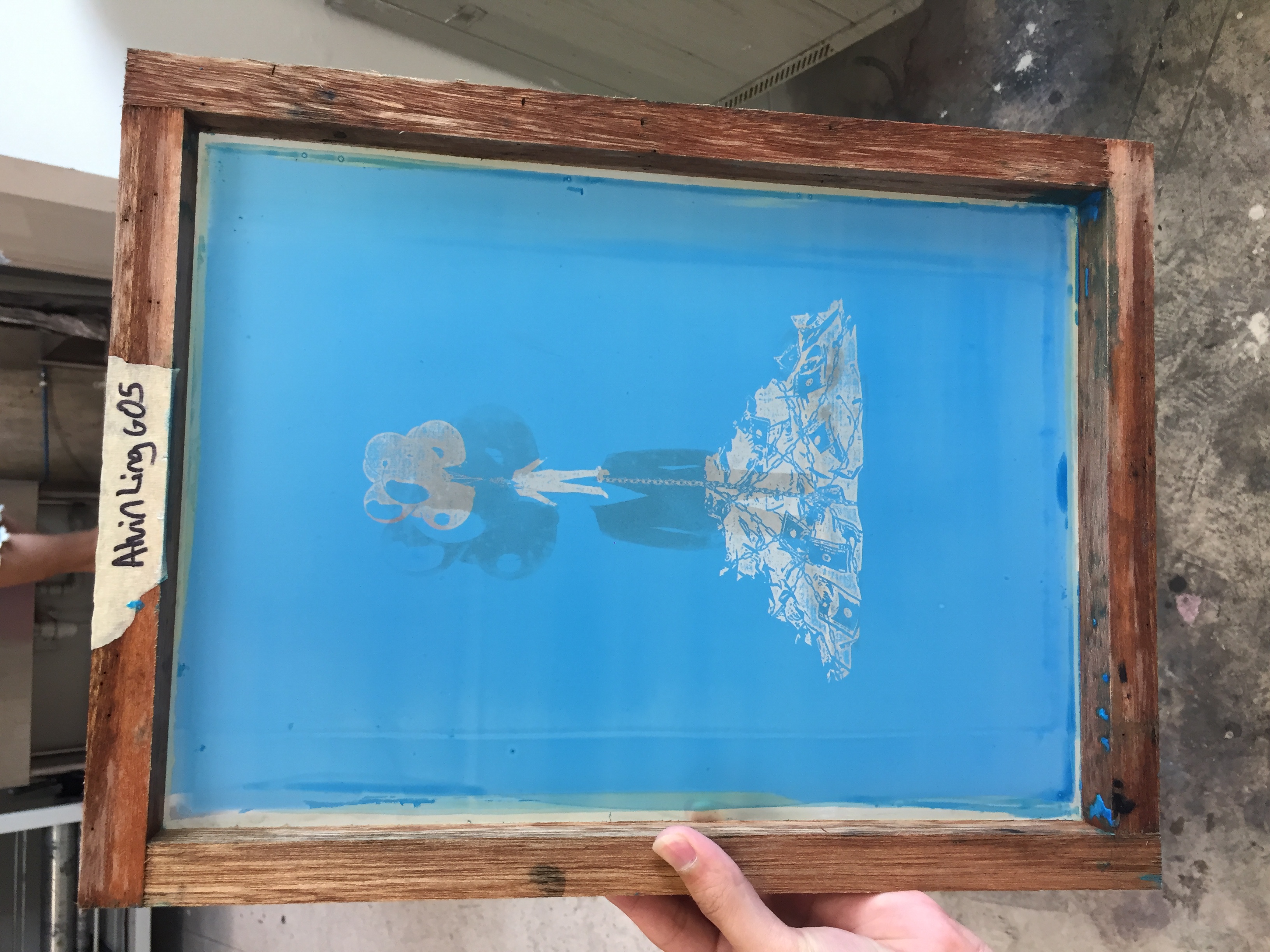
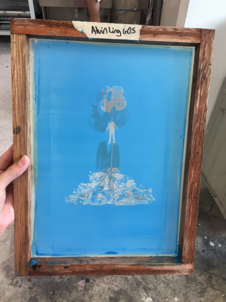
For the final design, the man being floated up by balloons, is weighed down by the pile of money engulfed in chains. This was to signify that man can only be free when he breaks lose of the chains of greed that hold him down.
Also playing with the scale & size of the man & the huge pile of money. I was using it to show the overwhelming impact of greed & how little we as humans can be.
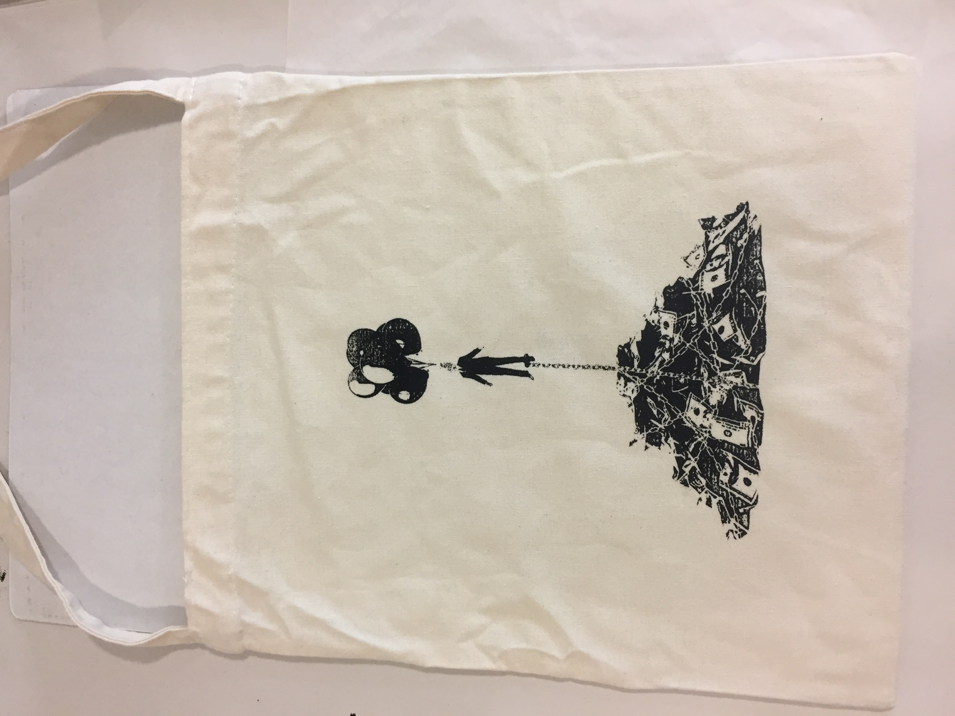
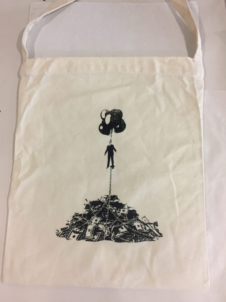
This was also the design that I chose to silkscreen on my tote bag. I felt that the minimalist design of this composition would fit better on a tote bag.
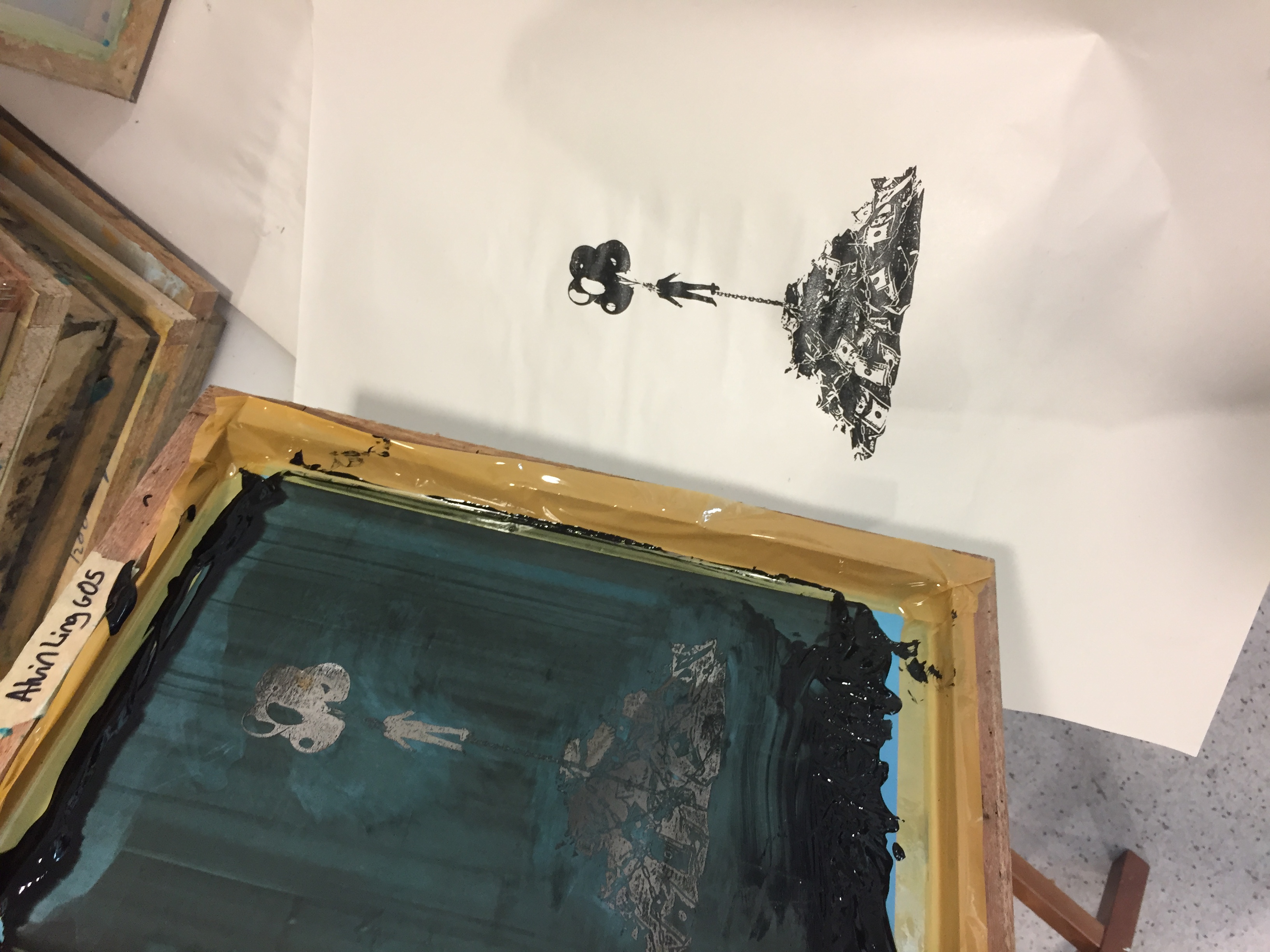
As I had previously exposed my screen with the first draft during the silkscreen workshop, I had to come back to redo the exposing process. The coating, exposing & washing was pretty straightforward despite it being a very time-consuming process.

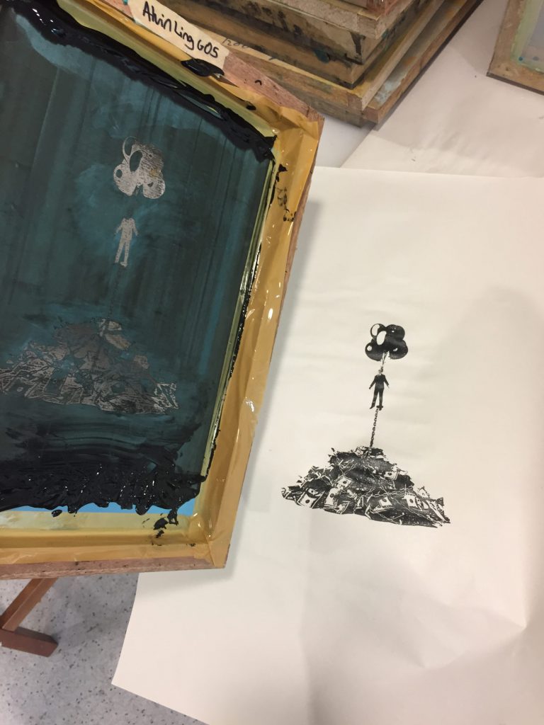
Afterwards, I did a couple of test prints on paper to check the results. It smudged quite a little & I lost some details in the chains on the money, but since the texture of the tote bag was different, I decided to go for it anyway to see how it would turn out.
I was quite satisfied with the result! I think I was also quite lucky as due to the minimalist nature of the design, the risk of smudging & losing details on the tote bag wasn’t as high & I managed to get the result I wanted on my 1st try.
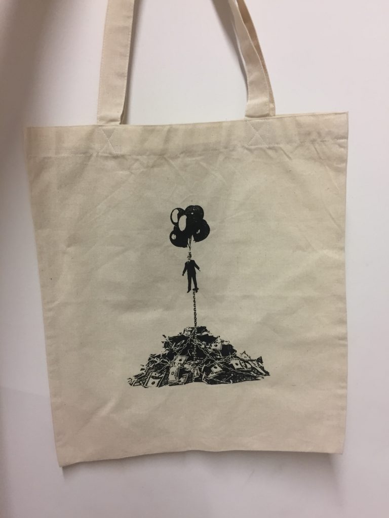
I went ahead to print my design on a 2nd tote bag which I have used as my final. The 2nd time turned out better then the 1st as I managed to get back some of the darker values in the balloons & as well as in the money. This also resulted in a better contrast between the money & the chains.
2. The Royal Tenenbaums (2001)
For the 2nd design, it was relatively easier as I had not seen the film before, thus I was able to approach this quote without thinking of the context of the film.
“Anybody interested in grabbing a couple of burgers and hittin’ the cemetery?”
After reading the quote, what I interpreted was a before and after scenario being played out. But, what I have done instead was to combine the visual elements into one design.
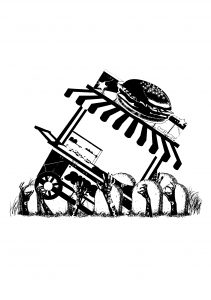
I did that by using zombie hands that are coming out of the grave & are literally grabbing & pulling a burger stand into the ground signifying how much they wanted the burgers.
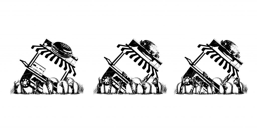
For the 2nd design, the interpretation wasn’t an issue, but rather, the execution.
For the 3rd draft (middle), I decided to rotate the burger stand at a steeper angle, helping it to create the sense of pull as the hands are dragging it into the ground. I replaced the burger of stand to a clearer photo of a burger to create focus in the composition.
For the final design, I shifted the graves around to create more contrast at the bottom & angled the hands such that it engulfed the burger stand, creating leading lines that start from the bottom, follow up the burger stand & lead the eye to the burger.
3. mother! (2017)
Taking this quote from a more recent film that I’ve seen, I liked the lack of visual elements in the quote, thus pushing me to conceptualise deeper for the design.
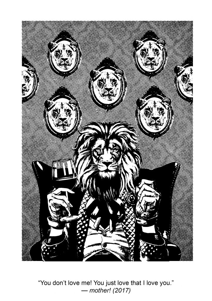
“You don’t love me, you just love that I love you.”
From reading the quote, my main takeaway was the idea of pride & ego. The part “you just love that I love you” to me plays with the idea of someone who is so in love with themselves, that even the thought of a lover loving him gratifies him more so then the love itself.
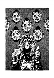
For this, I used the animal of a lion who from my research are known to be the proudest of animals to represent the idea of ego & pride. I replaced hunted animal trophy heads with lionesses heads framed up on the wall. The repetition of lioness heads are representative of how many lovers, or lionesses in this case, the main lion has as well as to show how insignificant they are to him. The scale of the main lion was also significantly larger then the rest to represent his big ego & to create focus.
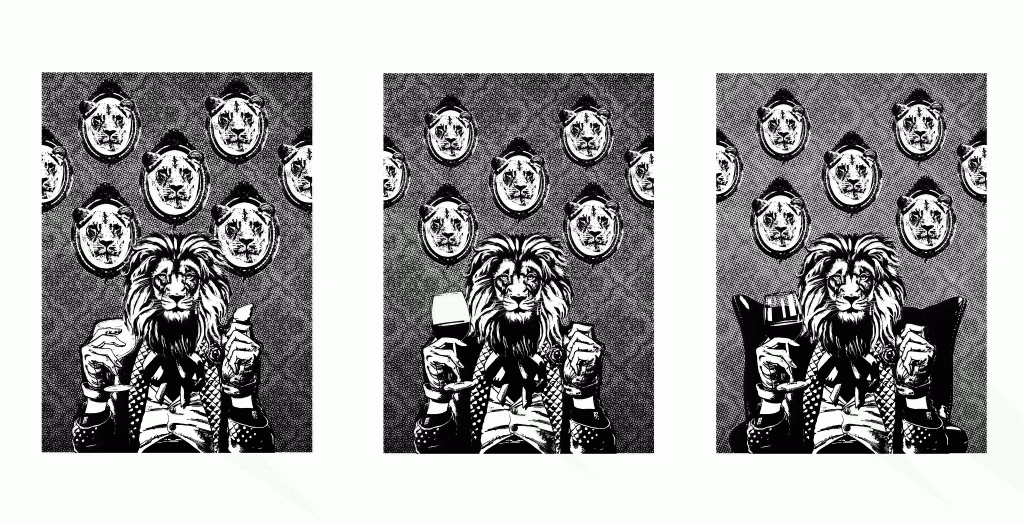
Through feedback from the 1st draft to the 2nd, it felt like the lionesses heads in the background were competing for focus with the main lion in the front. Also the wine glass was not as clearly shown. With that mind, I reduced the size of the lionesses heads as well as replacing the wine glass with a clearer photo of it.
To push this further, I reduced the half-tone intensity for the background such that it’s dark value doesn’t clash with the contrast of the lions as well as painting away some of the white values in the wine glass to create a reflection. I also added a darker arm chair for the lion to sit on, the dark value in the chair was also to draw focus to the main lion in the centre.
4. Blade Runner 2049 (2017)
Drawing inspiration also from another film that I’ve watched recently, the idea of applying a social context to this quote definitely excited me.
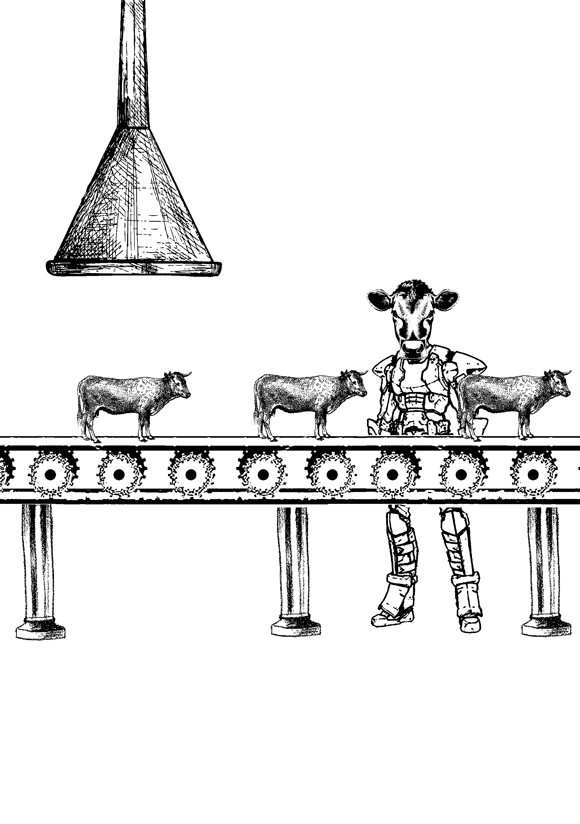
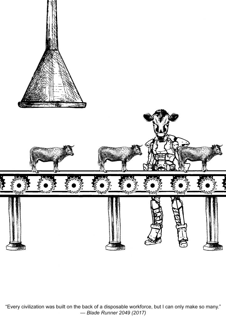
“Every civilisation was built on the back of a disposable workforce, but I can only make so many.”

The part of the quote “disposable workforce” made me think of what animal is usually represented as the ‘hardworking’ or known as the ‘worker’ animal, that was of course the ox.
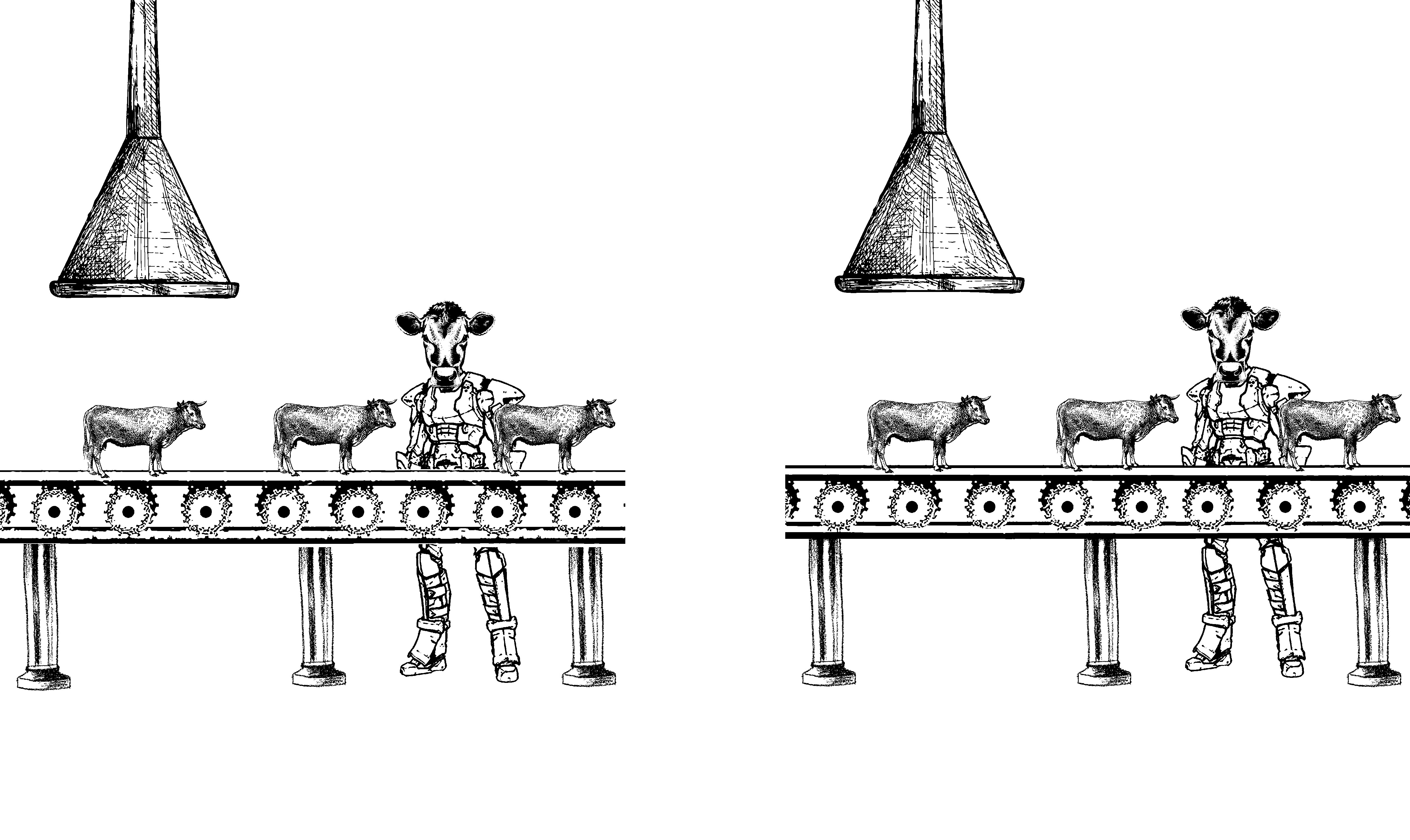
I placed oxen on a conveyor belt to represent how this ‘workforce’ was being constantly churned out at a consistent rate. I intended for this piece be quite meta as well, having the worker who is also an ox, in charge of the conveyor belt & having him literally watching more of himself get produced. Essentially making this whole process an entire loop.
The ox is on a robot body, to signify how this whole process is in fact quite monotonous & robotic as well. The supports that hold up the conveyor belt was actually Roman columns or pillars that I drew inspiration from my art history research paper. These columns are used as representative of a civilisation.
Playing with the alignment of the cows, I used this design element to represent the structure & monotony in the process depicted in the composition.

There weren’t as much changes from the 1st draft leading to the final apart from arranging the gears in the conveyor belt more clearly. I was asked to explore the inclusion of having more robotic parts on the 2nd & 3rd cow as it went down the production line, but I felt that would take out the message of consistency & monotony I was trying to convey with this composition.
Critique day:

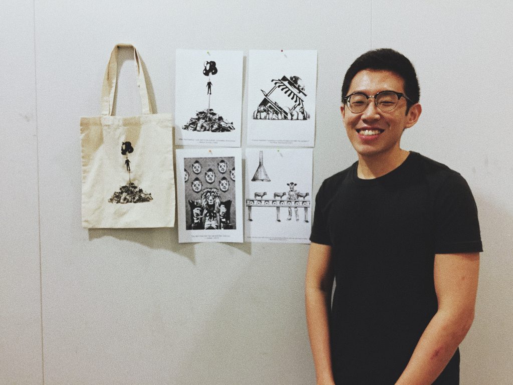
It’s a wrap!