The final 6 emotions I have worked on for project 1 are euphoria, lust, amazement, despair, uneasiness & irritation.
The use of irony was the overarching theme that embodied my work. However for each individual strip, the irony is explored differently.
For some, it is the irony in the work itself, for the rest, it is the irony in the process behind the work.
Euphoria:

The emotion of euphoria I have created is like a bursting, overwhelming amount of happiness almost in explosive way.
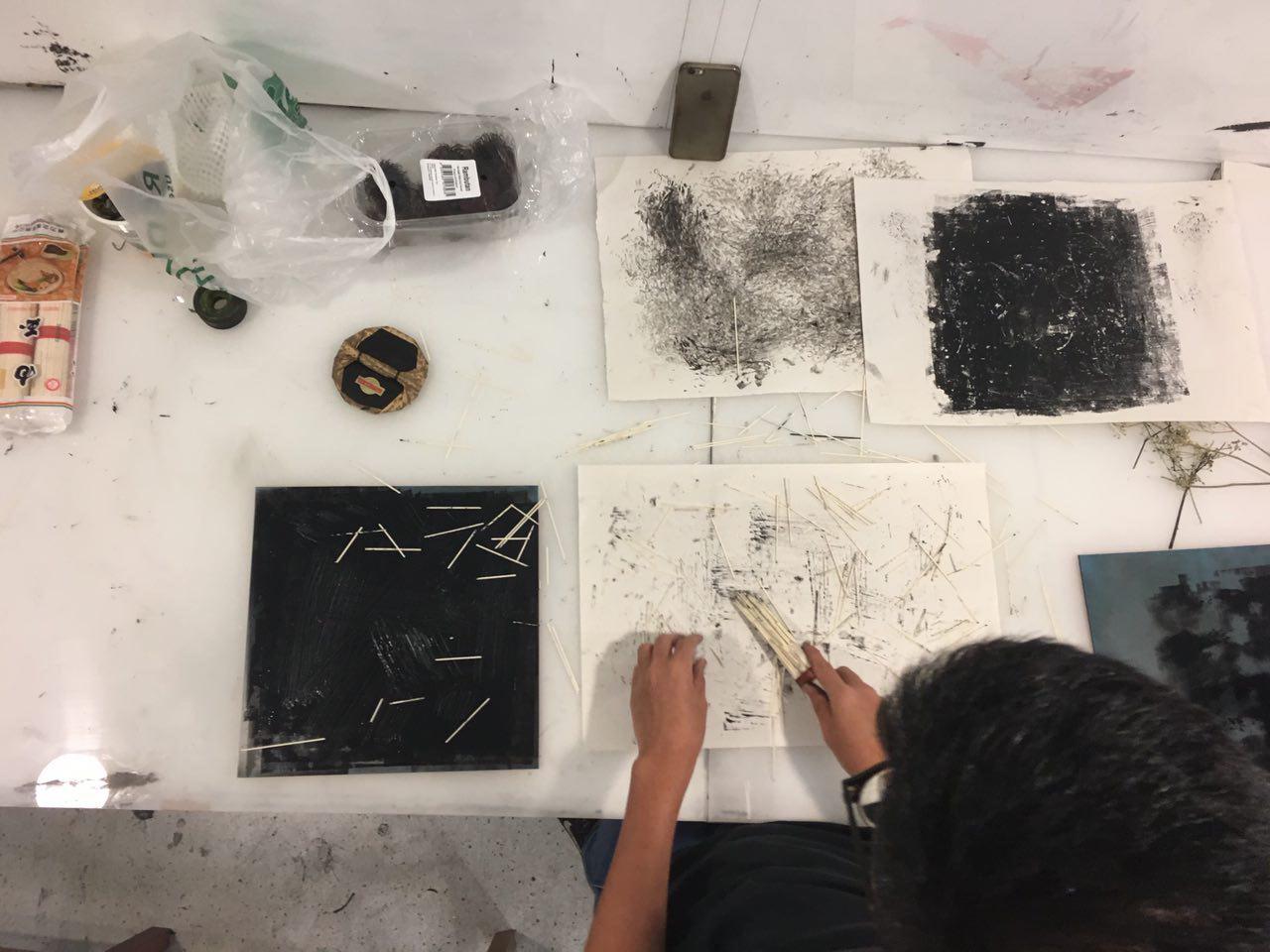
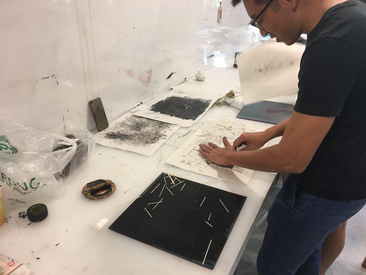
The irony in this emotion was the process behind it. I started off by painting the paper completely black, then I used a floor scrubbing brush dipped in white to ‘scrub’ the paper.
The scrubbing method I used was very aggressive & random, using a lot of body movements & pressure to create the result.
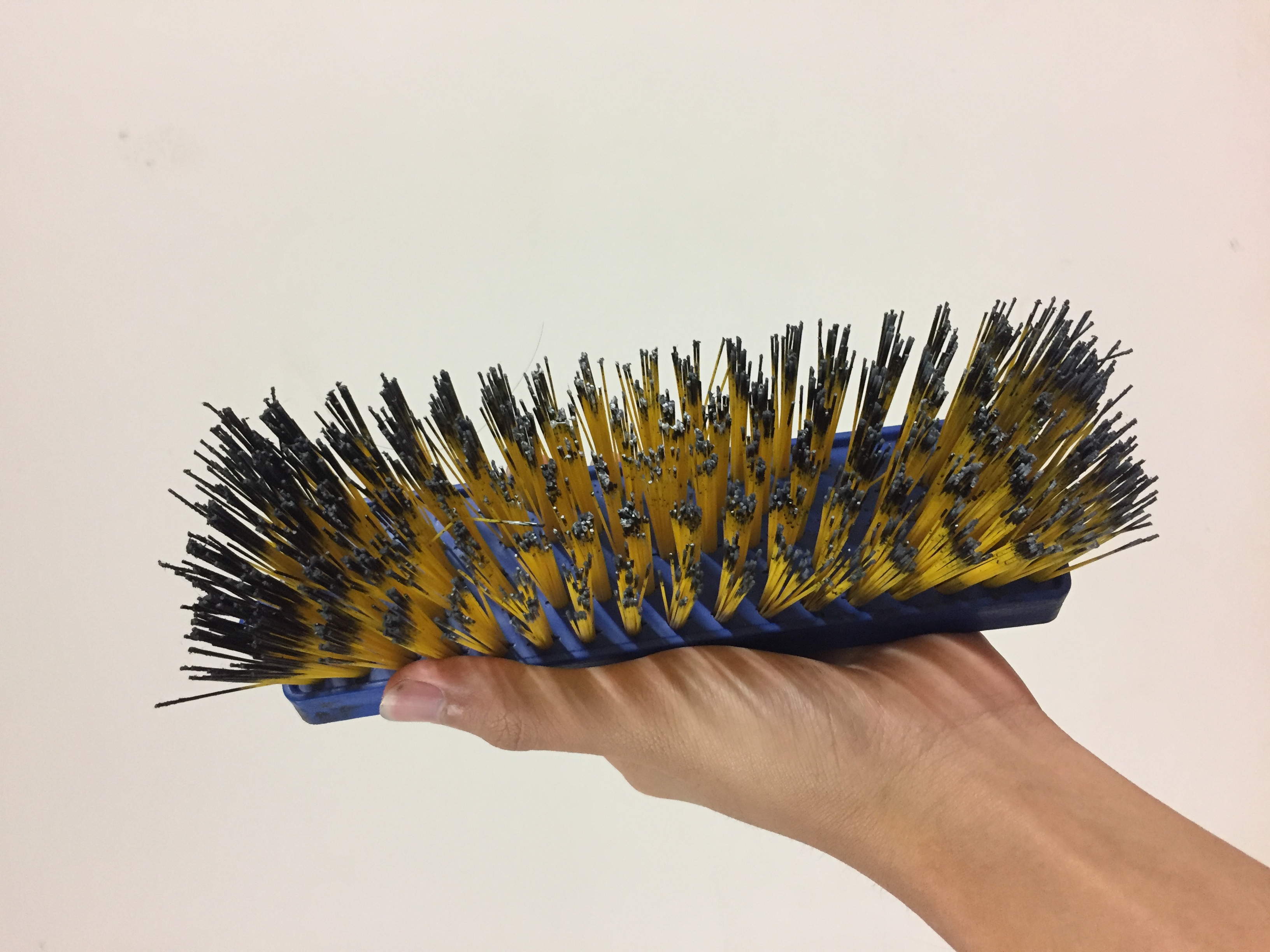
It was the complete opposite of happiness as I felt more aggression when creating it. However, this resulted in a sprinkle, almost flaky like effect which turned out to look more euphoric to me.
Also the use of positive spaces & the colour black dominating the strip would normally be perceived as something more negative. But for my work, I turned that into something that is viewed as a positive emotion instead.
Lust:
When I think of the word ‘lust’, I do not view it as a positive emotion. As opposed to the word love that is connected to the feelings of happiness or something that lasts. Lust to me was something fleeting & temporary.
The emotion of lust I was trying to create resembles that of waves of the ocean or wind blowing through a large & open grass field. The dots seen in the strip resembles the look of dandelion spreading across the field.
This flow & wavy effect symbolises the emotion of something that can be blown away easily, resembling the passing feeling I was trying to go for when I interpret the word lust.
The irony in this emotion was in the use of white, empty spaces to represent a negative feeling. Normally, empty spaces created a light & less aggressive look to the work & would be used to represent positive feelings.
To create this, I used a piece of foam dipped in ink & used my hands to draw wave-like shapes. I was careful to spread the ink across the paper to create a ghostly effect & not something that was dark & contrasted.
Amazement:
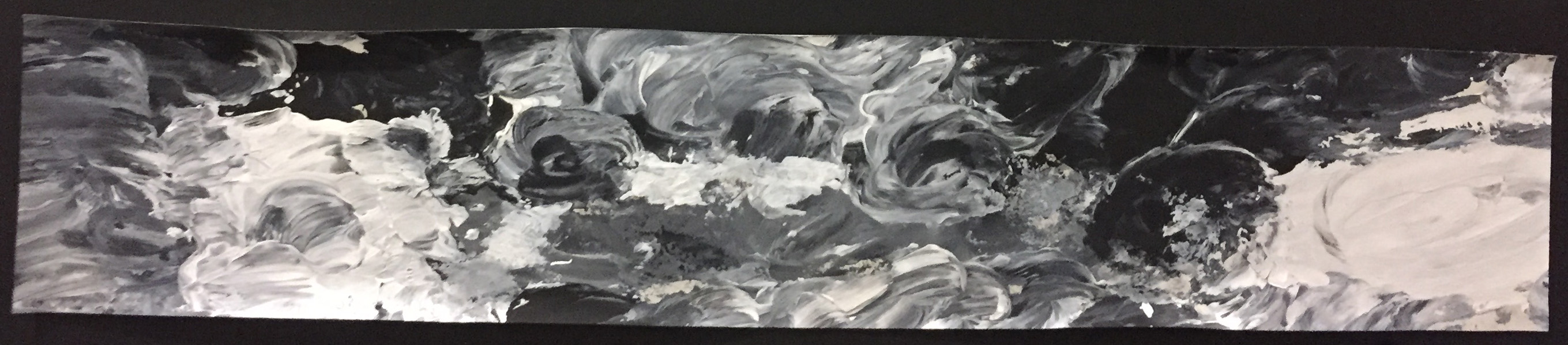
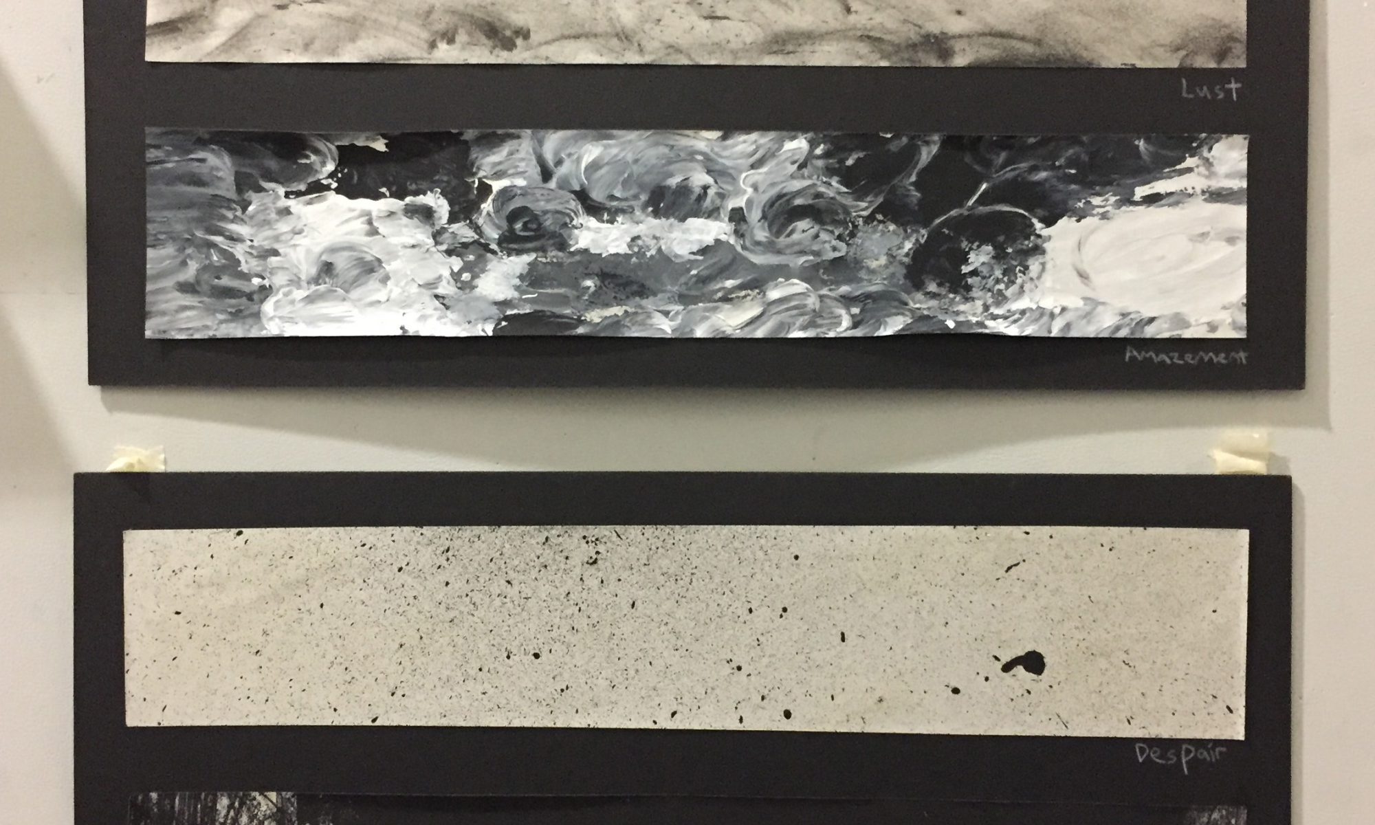
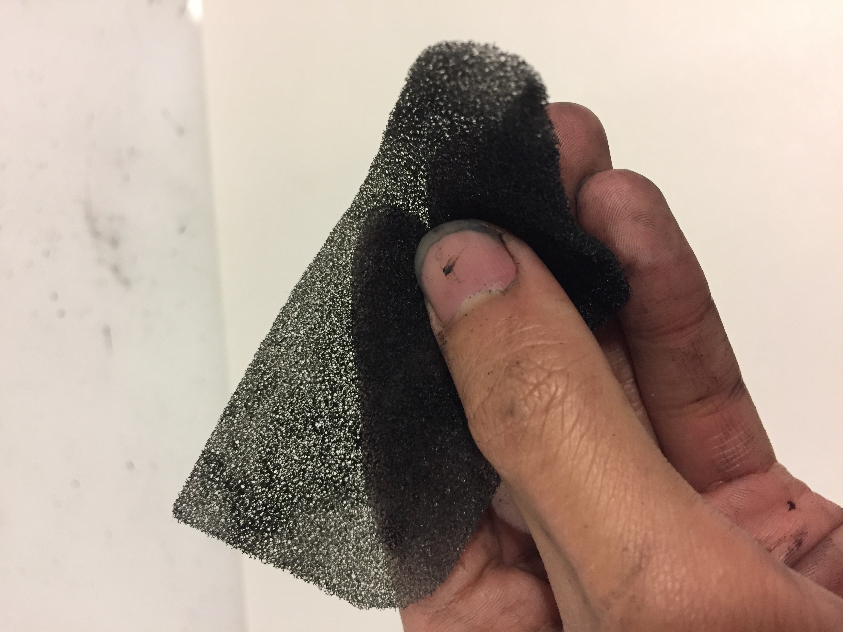
Most people captured the feeling of amazement through the shapes of circles on paper. But for me, I instead used stronger body movements to create circular shapes overlapping each other.
The mixing of white & black to create the colour grey is also only present for the emotion of amazement. As amazement falls under the broader category of surprise, I wanted this piece to be the piece that ‘surprises’ the rest & would be the only one that stands out by the use of inclusion of the colour grey.
Once again, the irony in this was the use of positive space & filling up the strip to represent positive feelings.
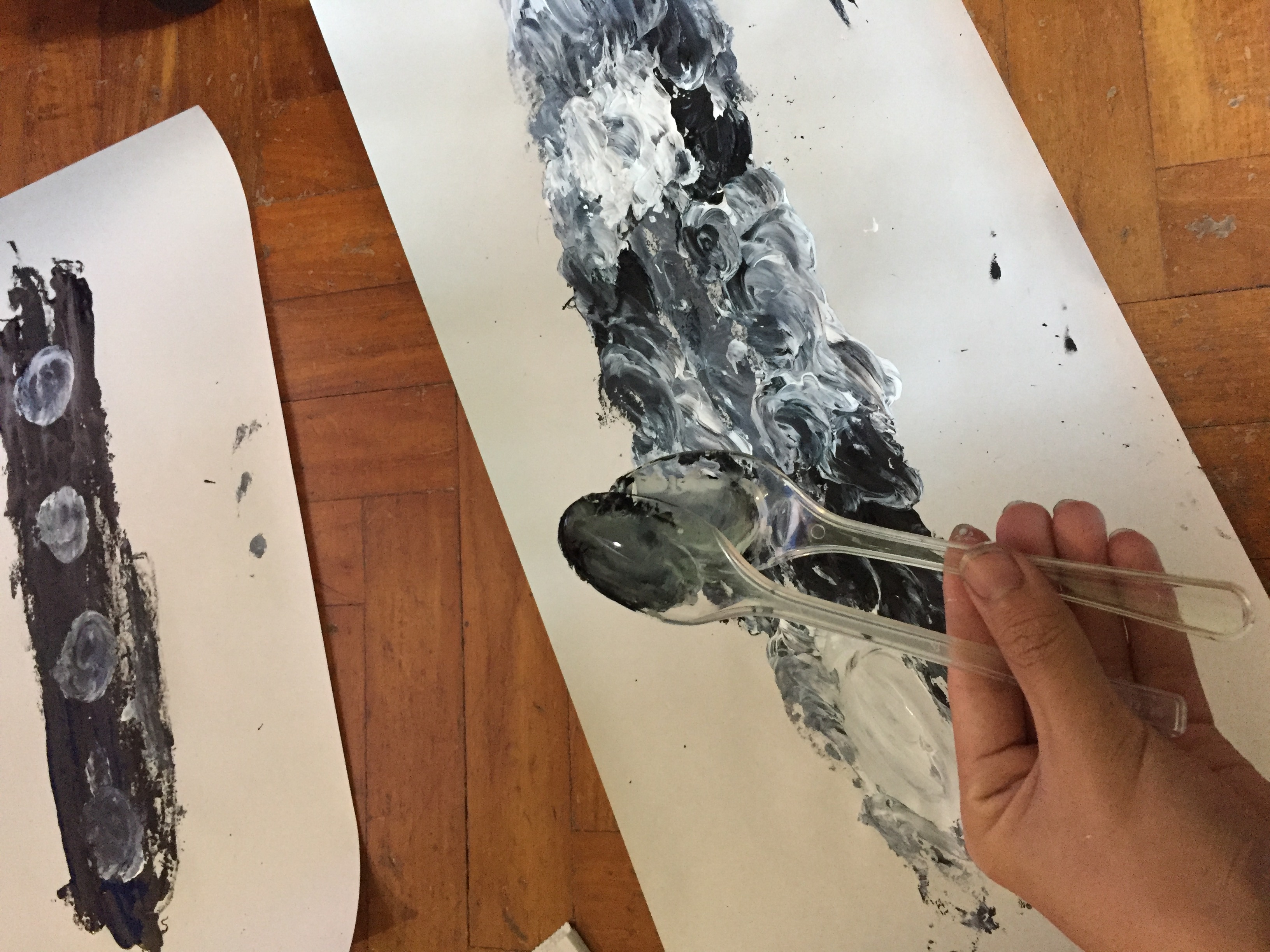
To create this, I used 2 spoons, one in my left hand & the other in my right. I dipped one in black & the other in grey & as I did the circular motion, eventually the colours met in the middle & overlapped each other to create the colour grey.
Despair:

Despair to me was this empty feeling inside as well as a sense of hopelessness. The spots of paint around an empty white piece of paper was to create this scattered look.
Initially, a lot of feedback I received regarding this strip was interpreted as happiness. But, to me, the irony was in the use of negative space to create the sense of emptiness throughout the strip.

The process was also a completely opposite to the feeling I was trying to capture. The use of a toothbrush dipped in paint followed by flicking it on to the paper was reminiscent of an innocent child playing & having fun with a toothbrush.
Uneasiness:
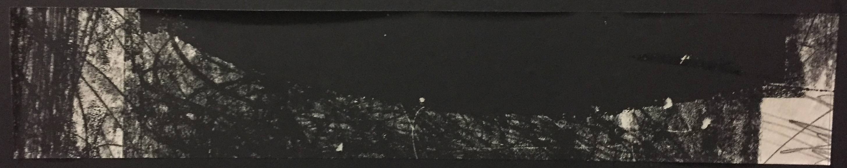
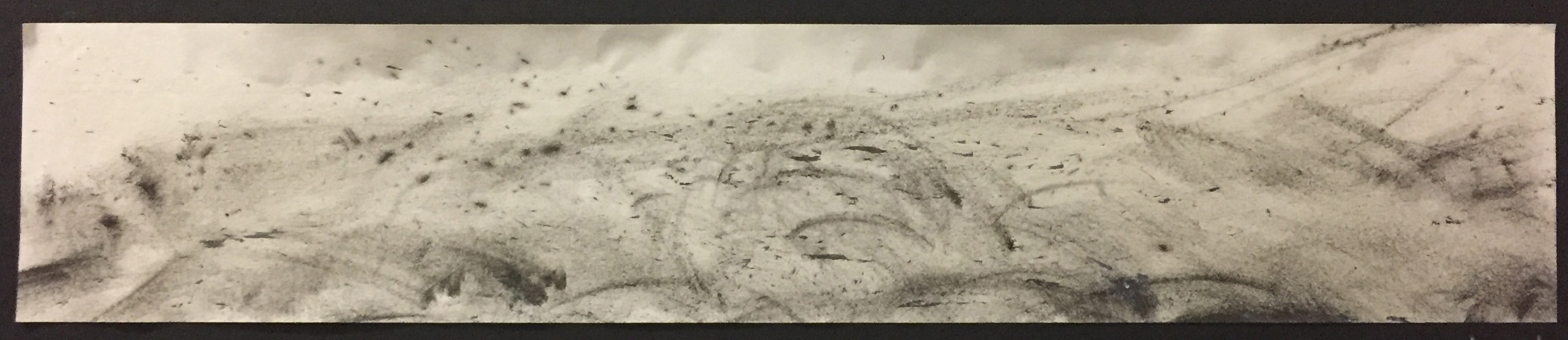
When we are afraid, the tendency to overthink & have irrational thoughts is amplified. Hence my emotion of uneasiness mixes the use of positive spaces, negative spaces as well as an overlap between the 2.
The harsh blacks gives this sense of overwhelm & the thoughts of our fears overtaking & consuming us. However, there are empty spaces as well to represent us questioning ourselves if we are overthinking our fears or if are they truly there.
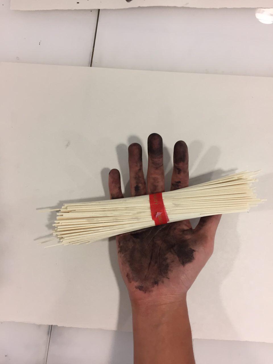
The scratches throughout the piece was also to connect to horror movies where scenes where the monsters or demons leave their claw marks on the walls.
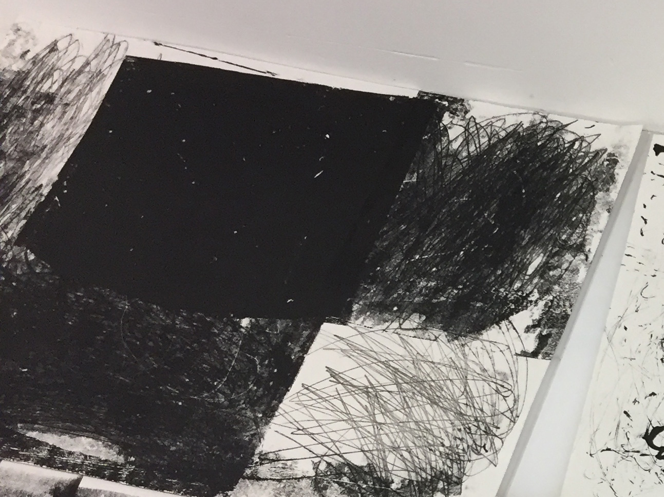
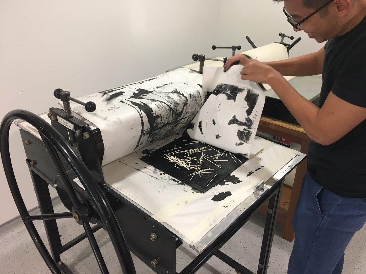
I created this piece by painting the lino board with black ink & placing the paper over it. I started with the full black square, then moved on to other spaces on the paper & began using my fingers to scratch over them.
As I moved it around, the ink gets progressively lesser & the scratches become more prominent. I then cropped out the area that best had the mix of all the results combined into one.
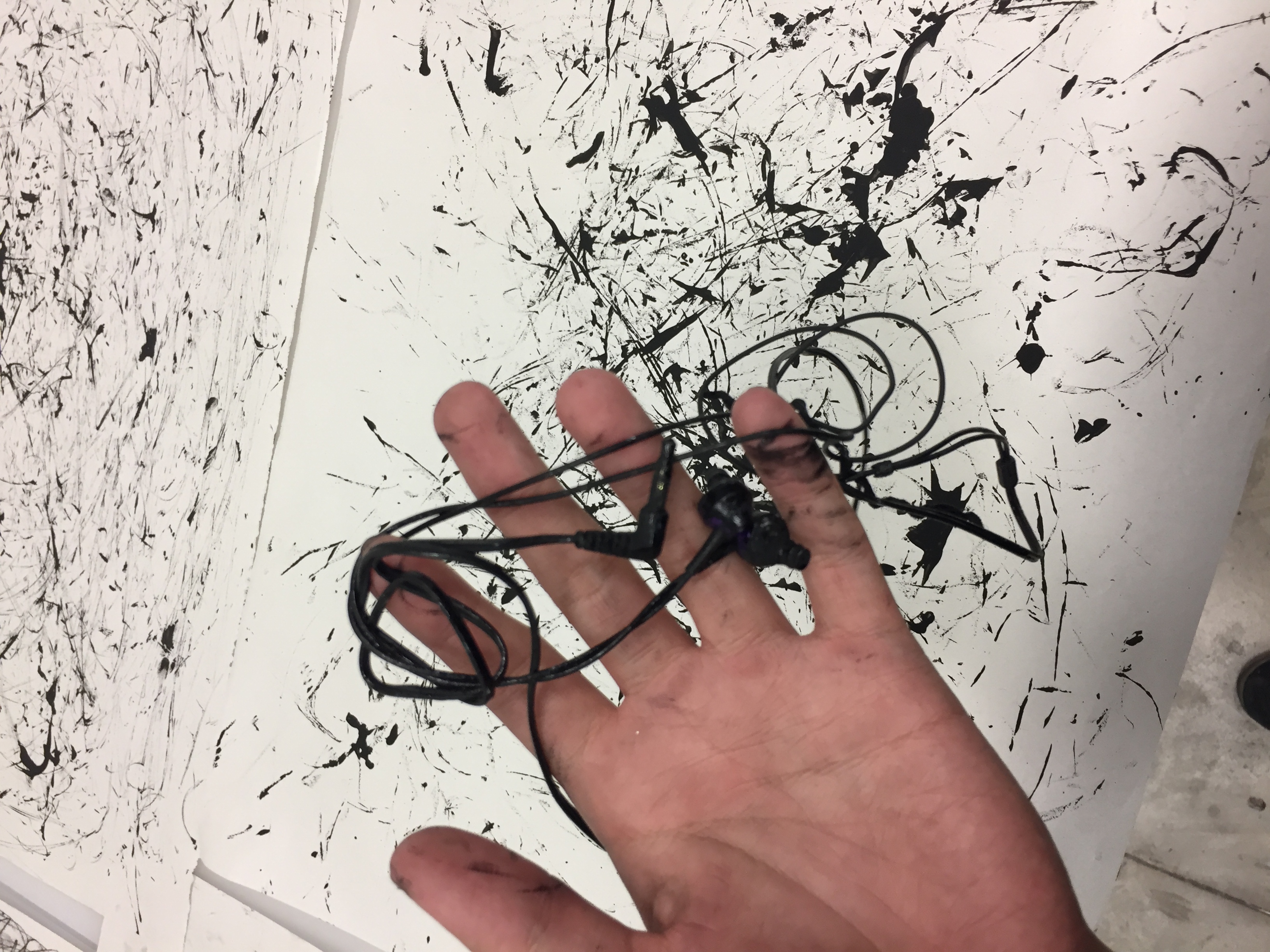
Irritation:
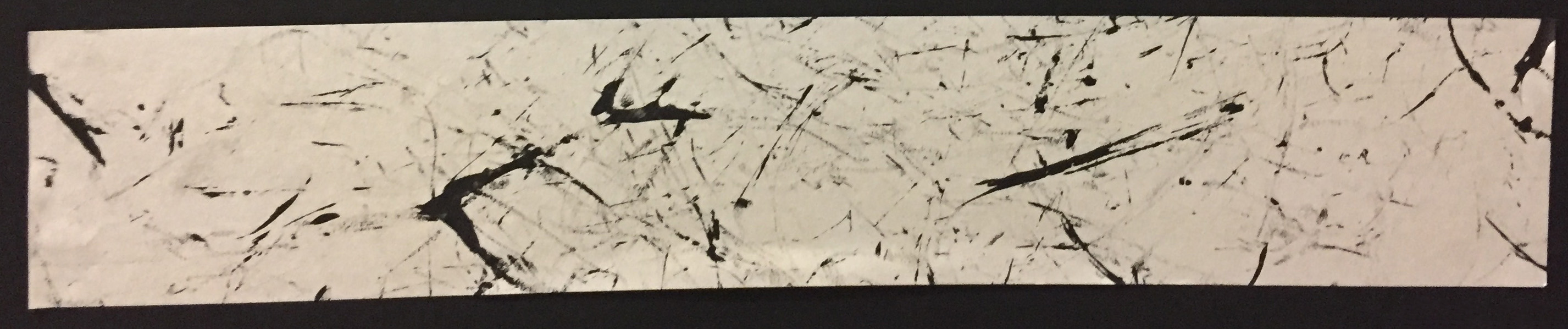
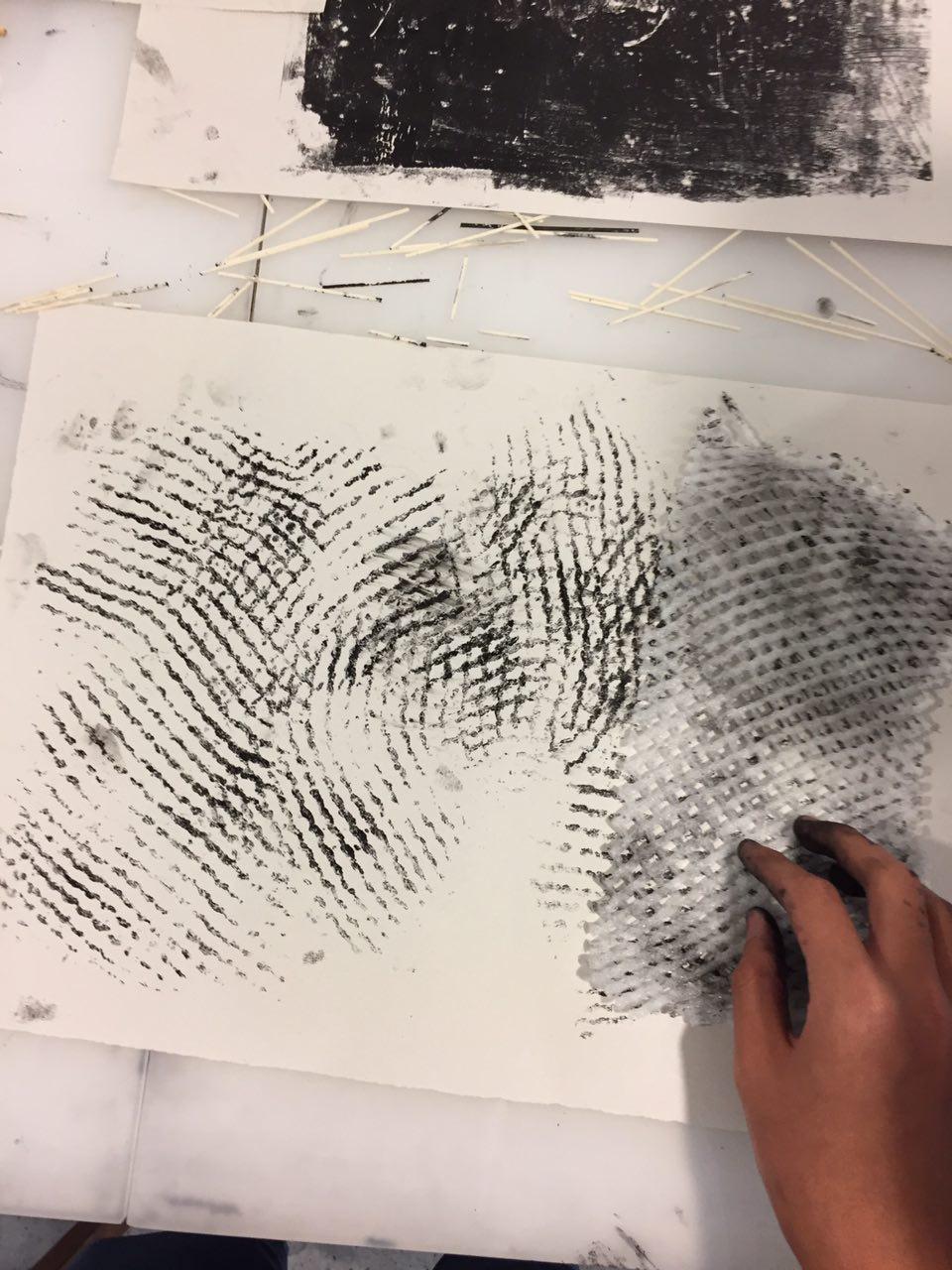
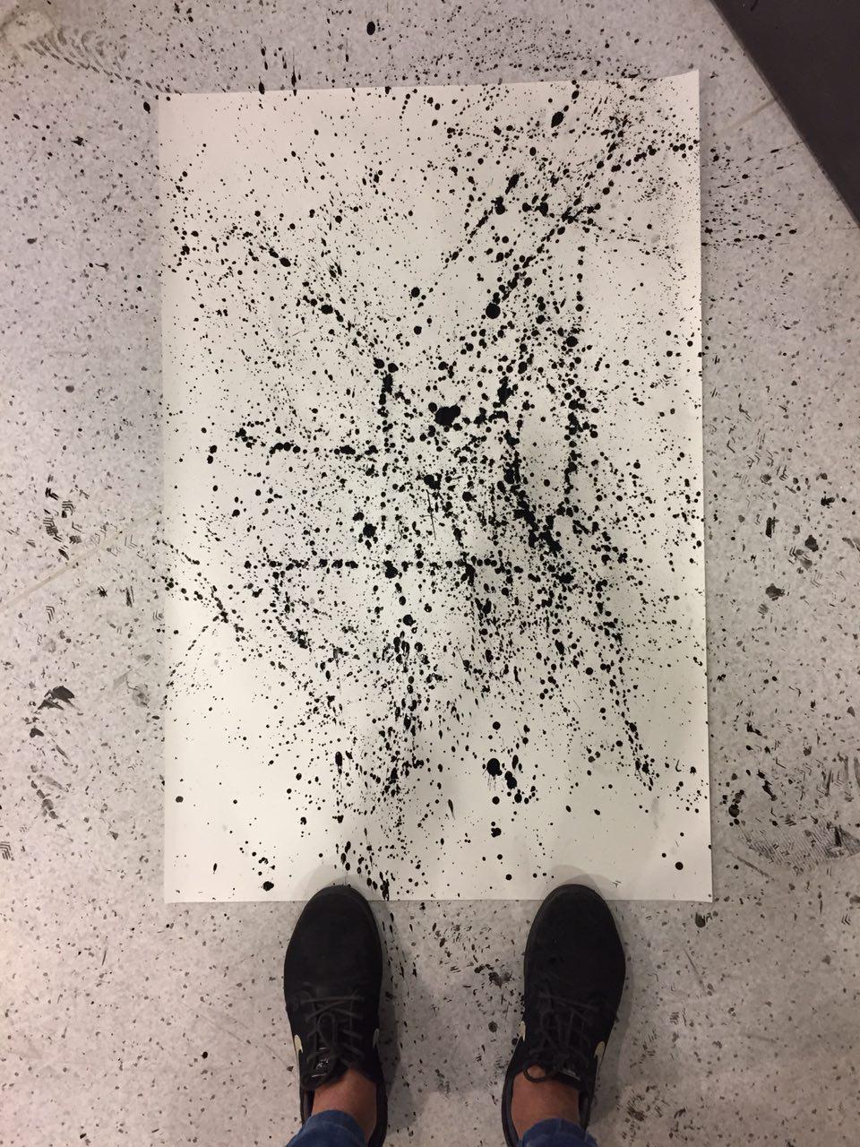
My representation of the emotion of irritation was to create the trail left behind of when flies circle around something. That was one of the most annoying feelings I could think of & felt it was apt to use that feeling to represent the feeling of being irritated.
The irony was in the work where the use of negative spaces was used to convey a negative feeling.

To create this, I dipped a pair of old earphones into ink & dangled them over the paper. I used the earphones to ‘draw’ & circle around the paper in random movements to create the effect.
Final work:
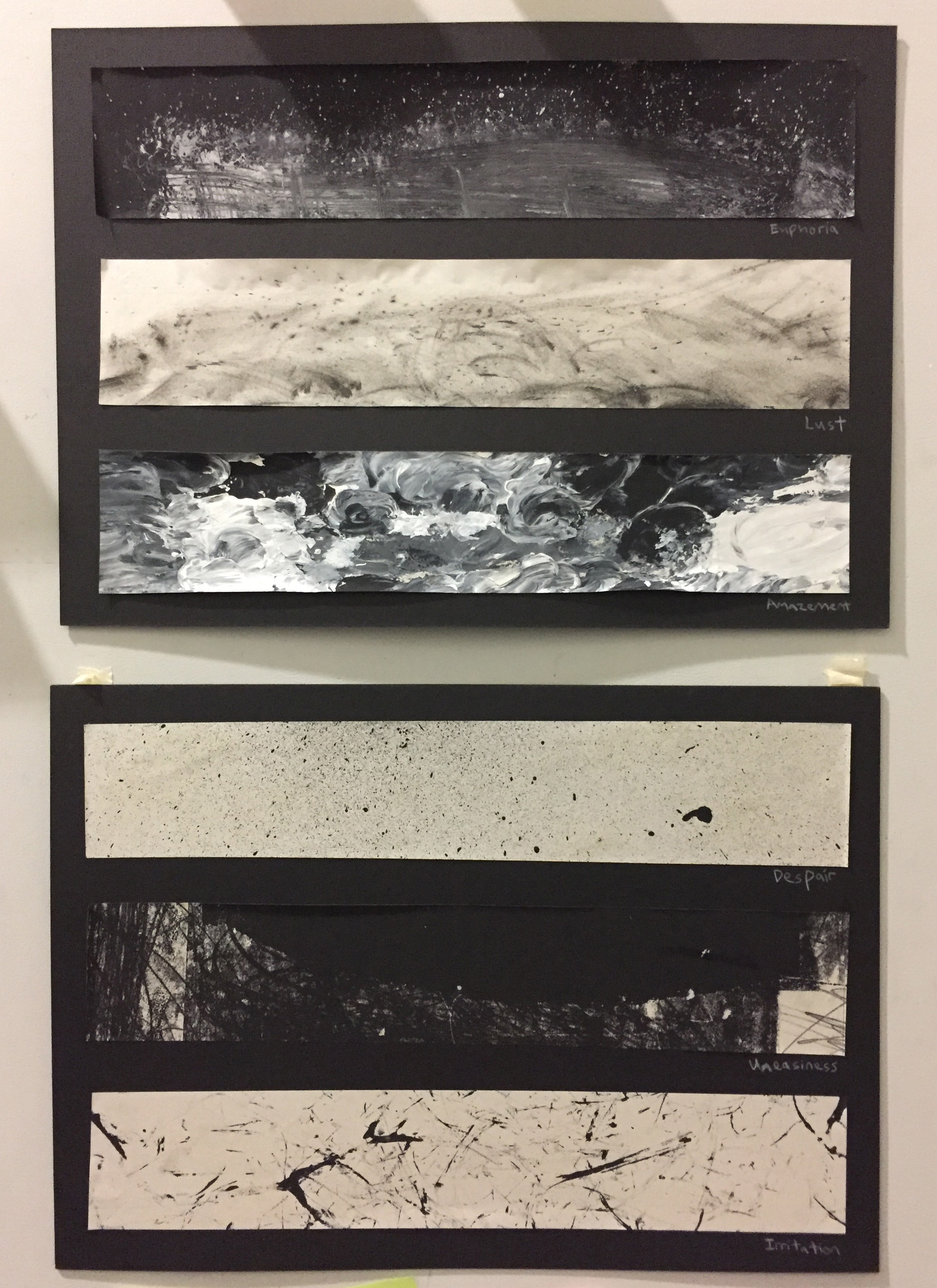
From top to bottom: euphoria, lust, amazement, despair, uneasiness & irritation.
Overall, I had fun with exploring various objects to create the marks. It was challenging to derive of an overall theme to connect the works, but it was through the process of doing that I discovered the theme.
Learning the importance of conceptualising & thinking through before beginning a project is definitely an important process to have & can be applied even for other aspects of design work.