I wasn’t expecting Project 2B to be as challenging at first but nevertheless, here’s my process on how I manage to come up with my layout.
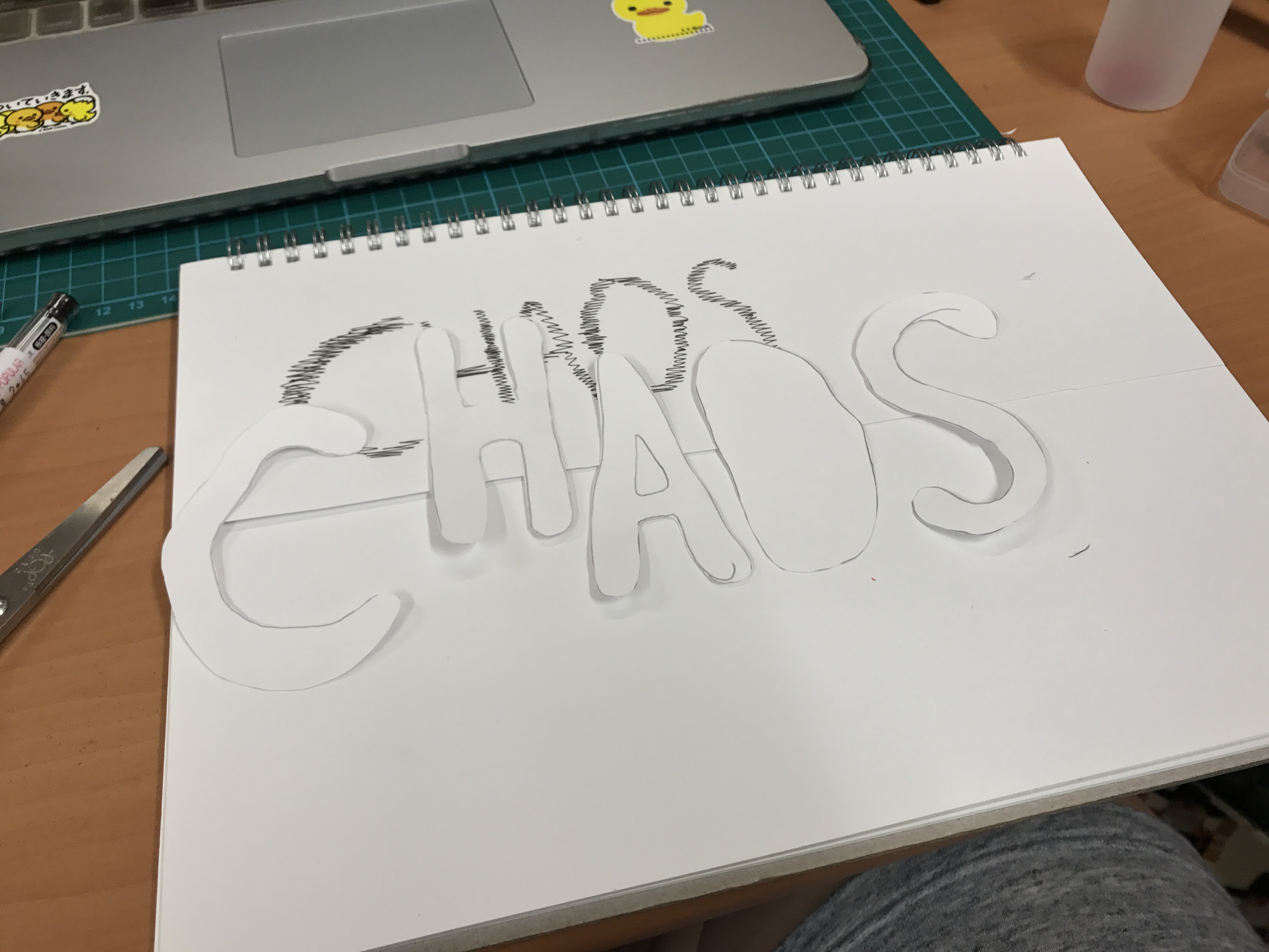
First up, I chose my quote “CHAOS MADE HIM BEAUTIFUL”, a quote that was a shortened and edited from the original “HER CHAOS MADE HER BEAUTIFUL”. To start off, I wanted a chaotic style of organic type for the first word in the quote. When I thought of chaos I thought of images like pain and fire was the first medium I tried using.
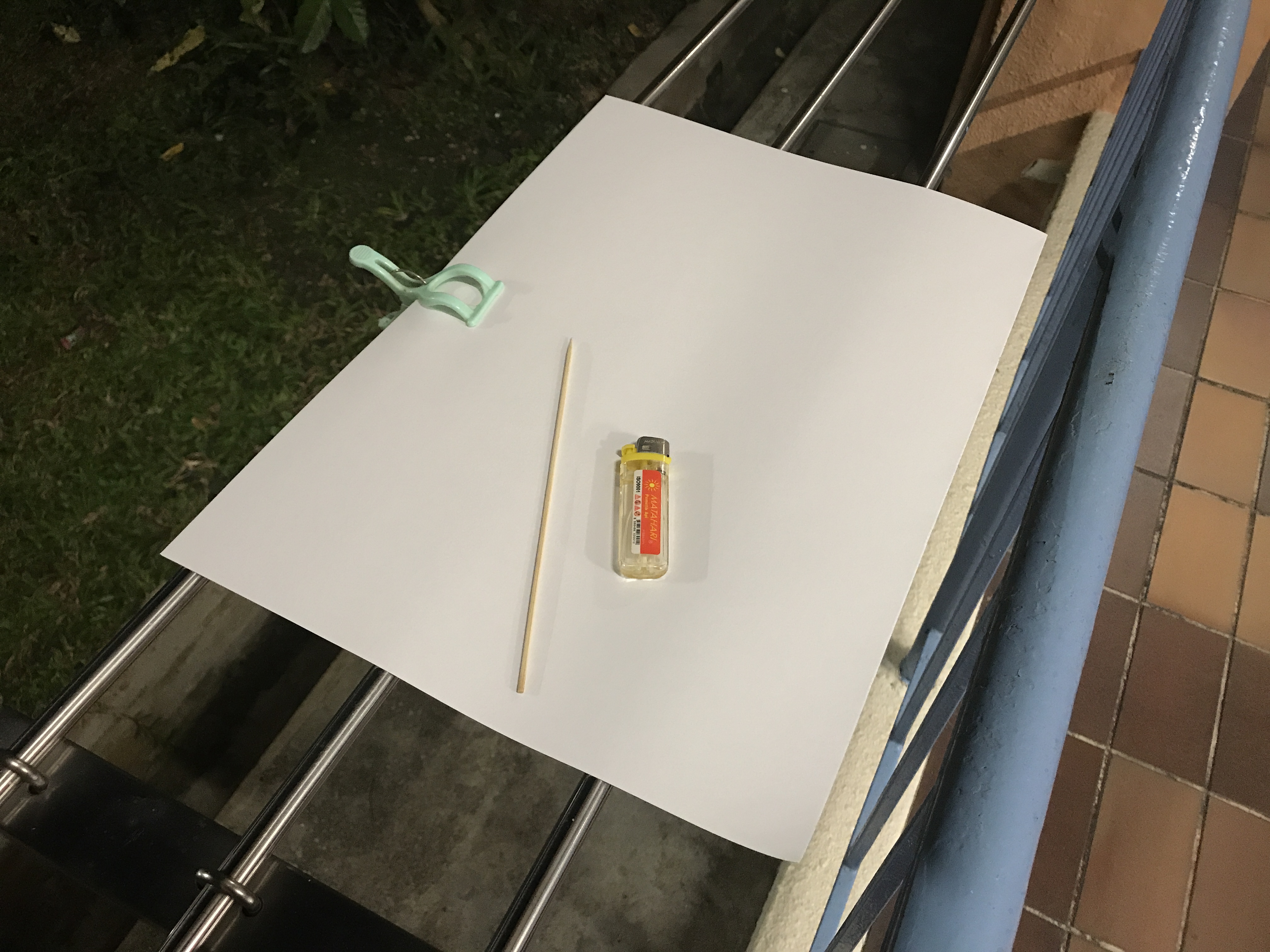
Risking the safety of my neighbours, I brought my set-up of a lighter and satay stick to try to burn letters into my paper.
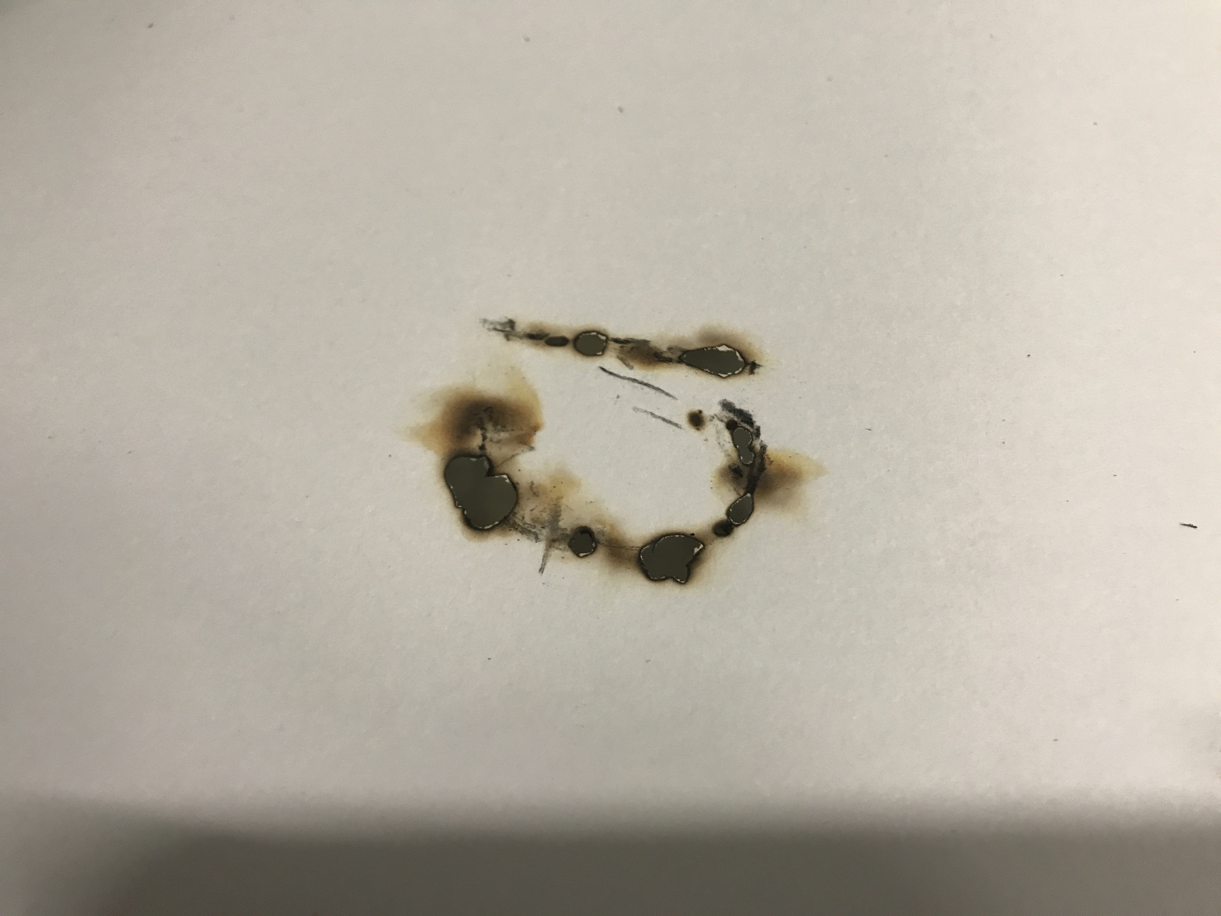
Controlling the burn marks were not easy as sometimes too much would catch fire. After about 2 hours this was the final result:
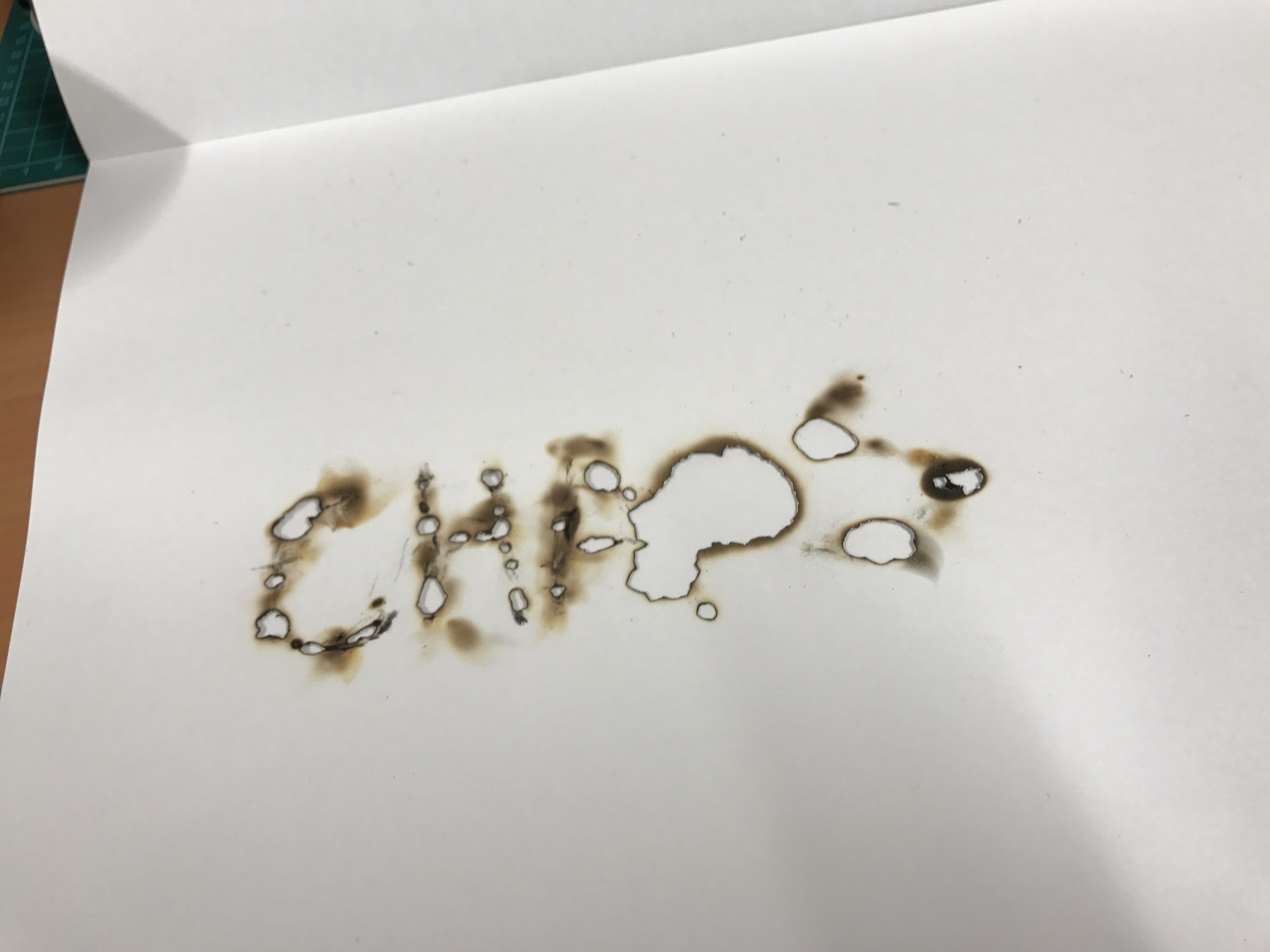
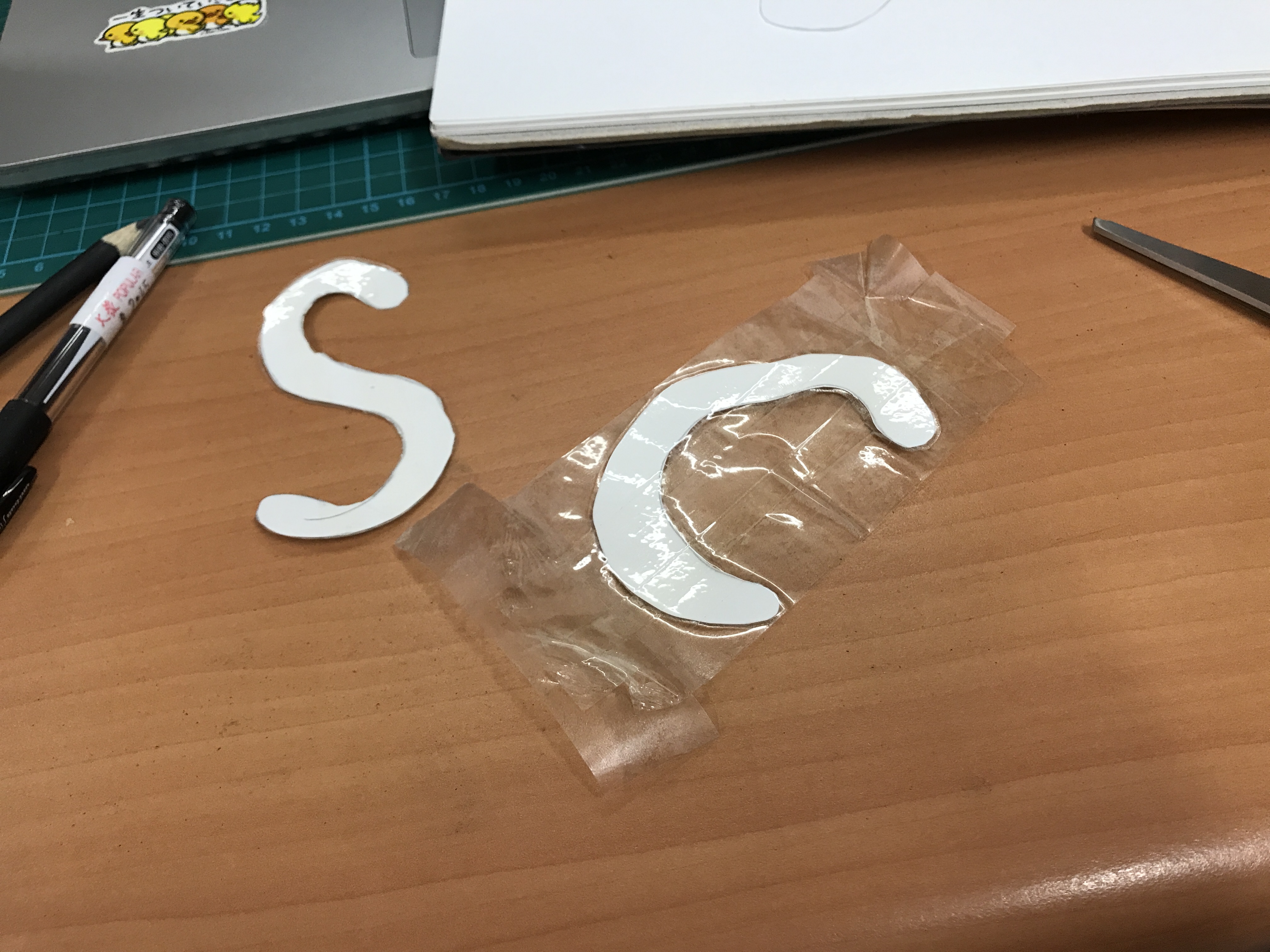
All in all, I like the effect but was not satisfied with the clarity of the letter. Legibility was of utmost importance to me. I then shifted gears towards sort of a stencil system. I cut out hand-written font and proceeded to seal them into sticky tape.
I wanted to create a laminate to protect my letters as I had ideas of exploring with paint and as such I did not want my paper letters to soak through or break.
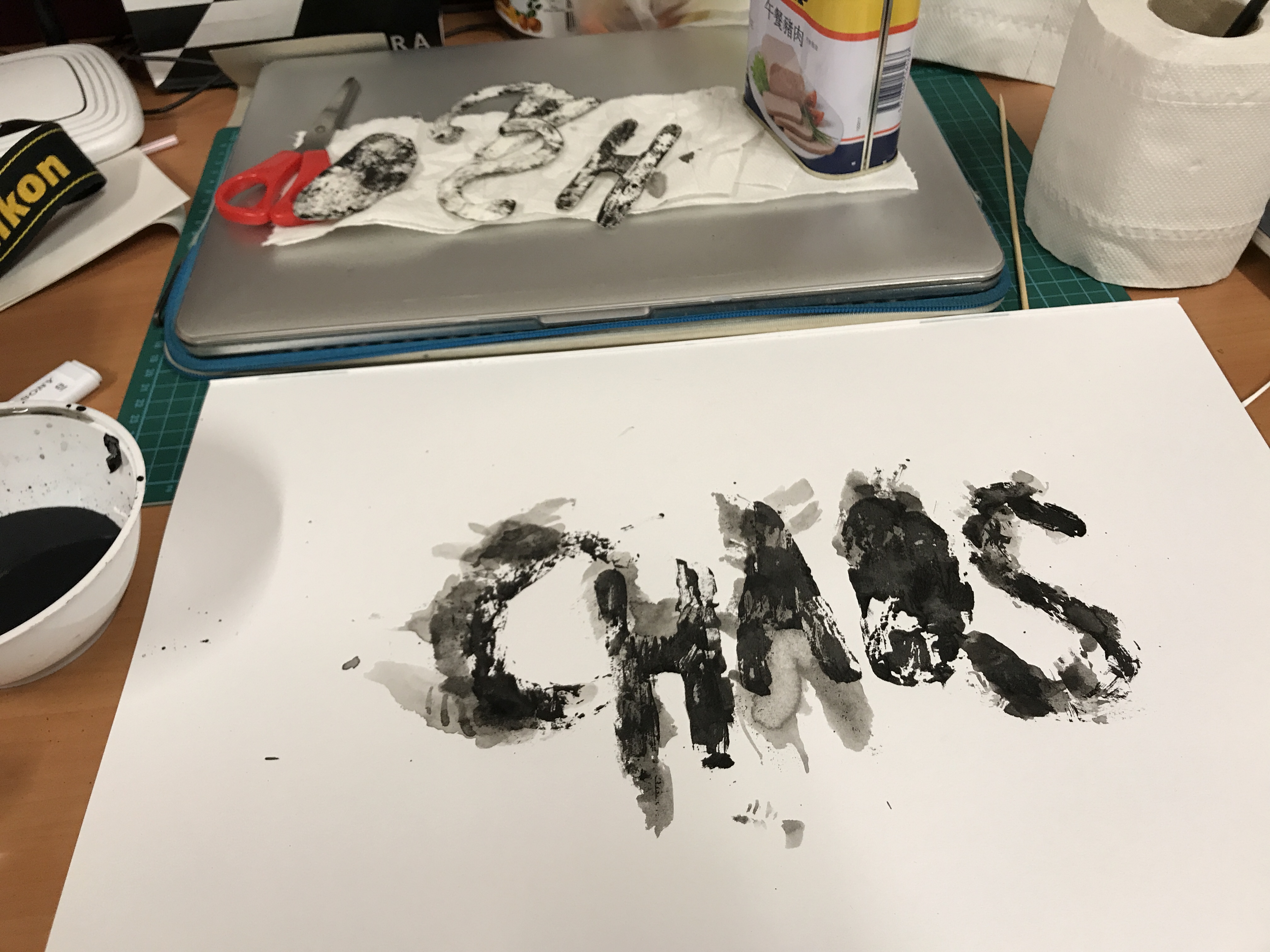
I mixed black acrylic paint with varying amounts of water and proceeded to add some of the mixture onto my letters. I then dragged the letters on my paper to create my typography. After creating the back strokes, I put a thicker layer of paint onto my letters and pressed to create just a bit more definition.
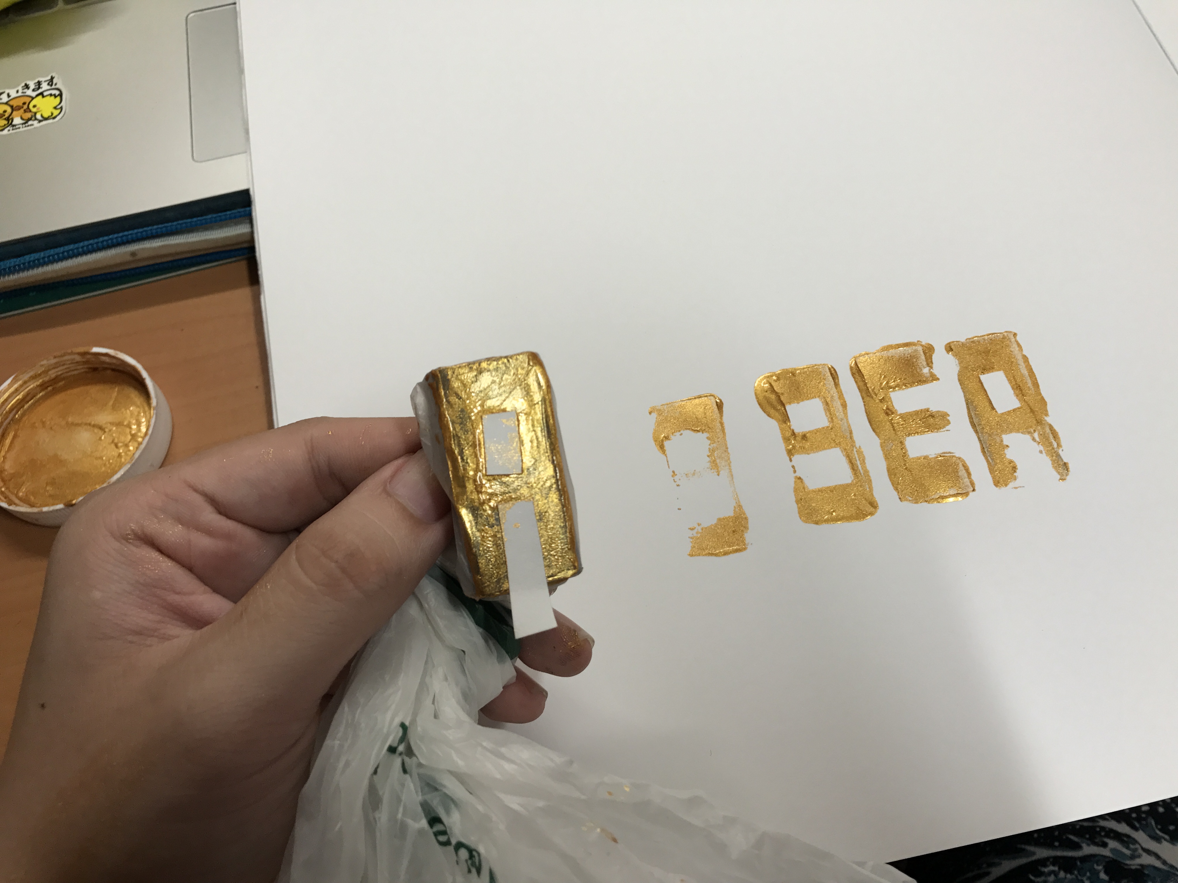
I was finally satisfied with my first font. Moving on to the next word, I wanted something simple but still organic. Looking around y desk, I found an eraser that later turned into my “letterpress”. Wrapping a plastic bag around it for protection, I proceeded to use strips of paper to block off parts I did not want to stamp and this was the result:
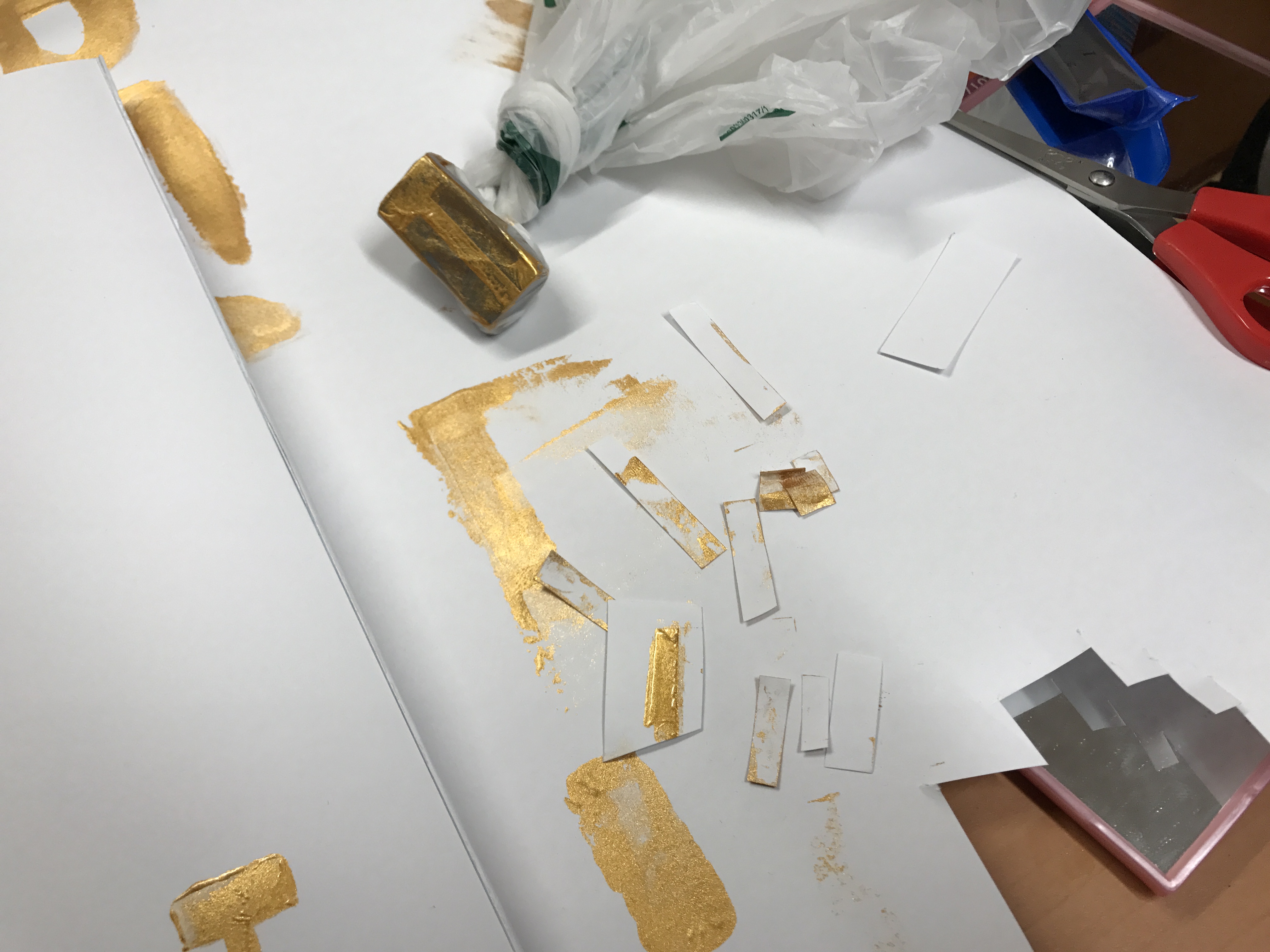
Here’s a closer look at the effect using gold paint:
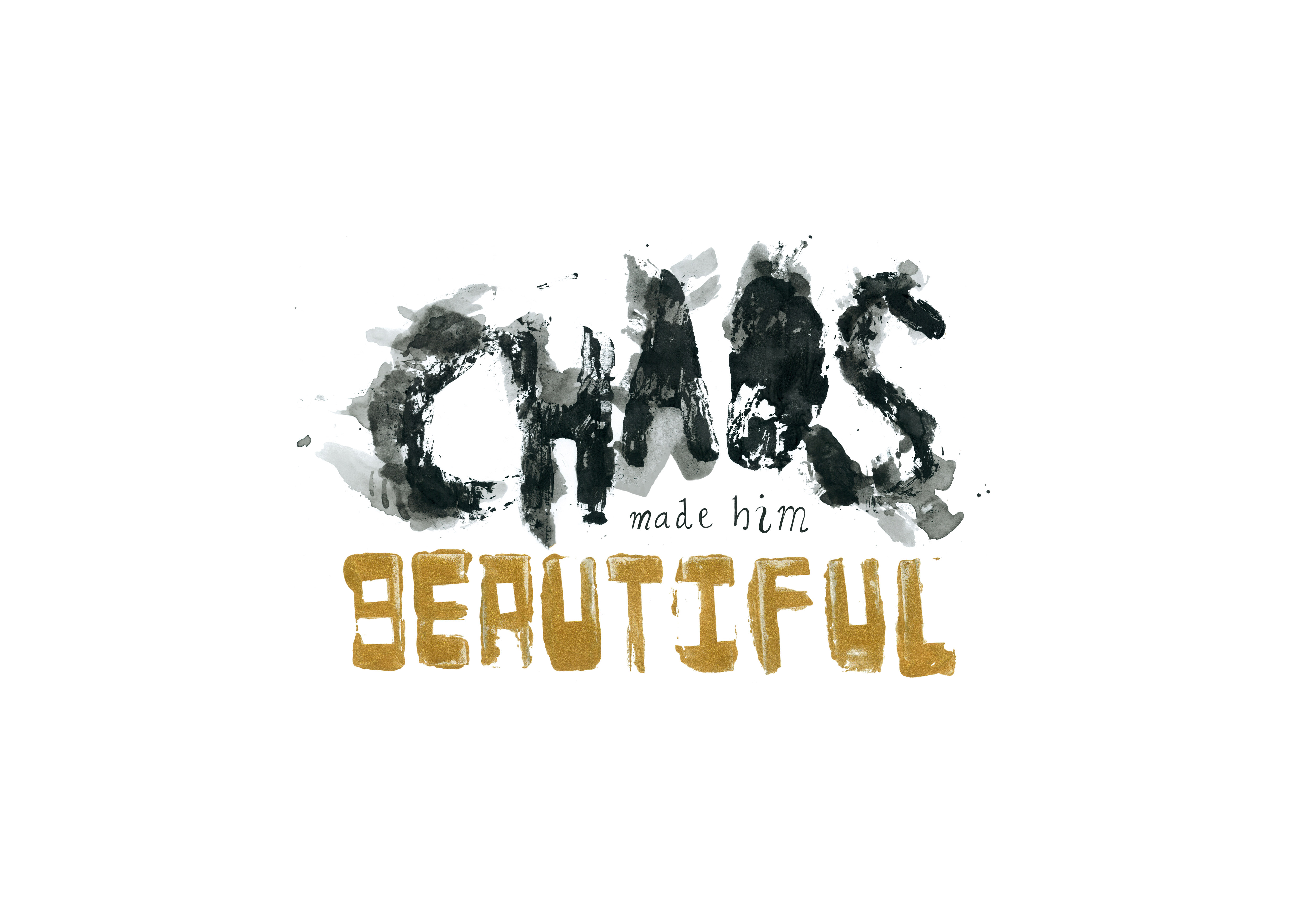
After adding one last handwritten font and scanning everything in, this is the layout I came up with:
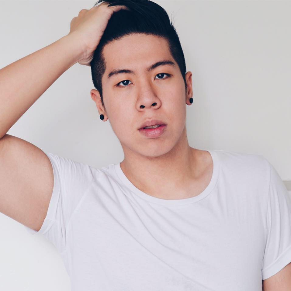
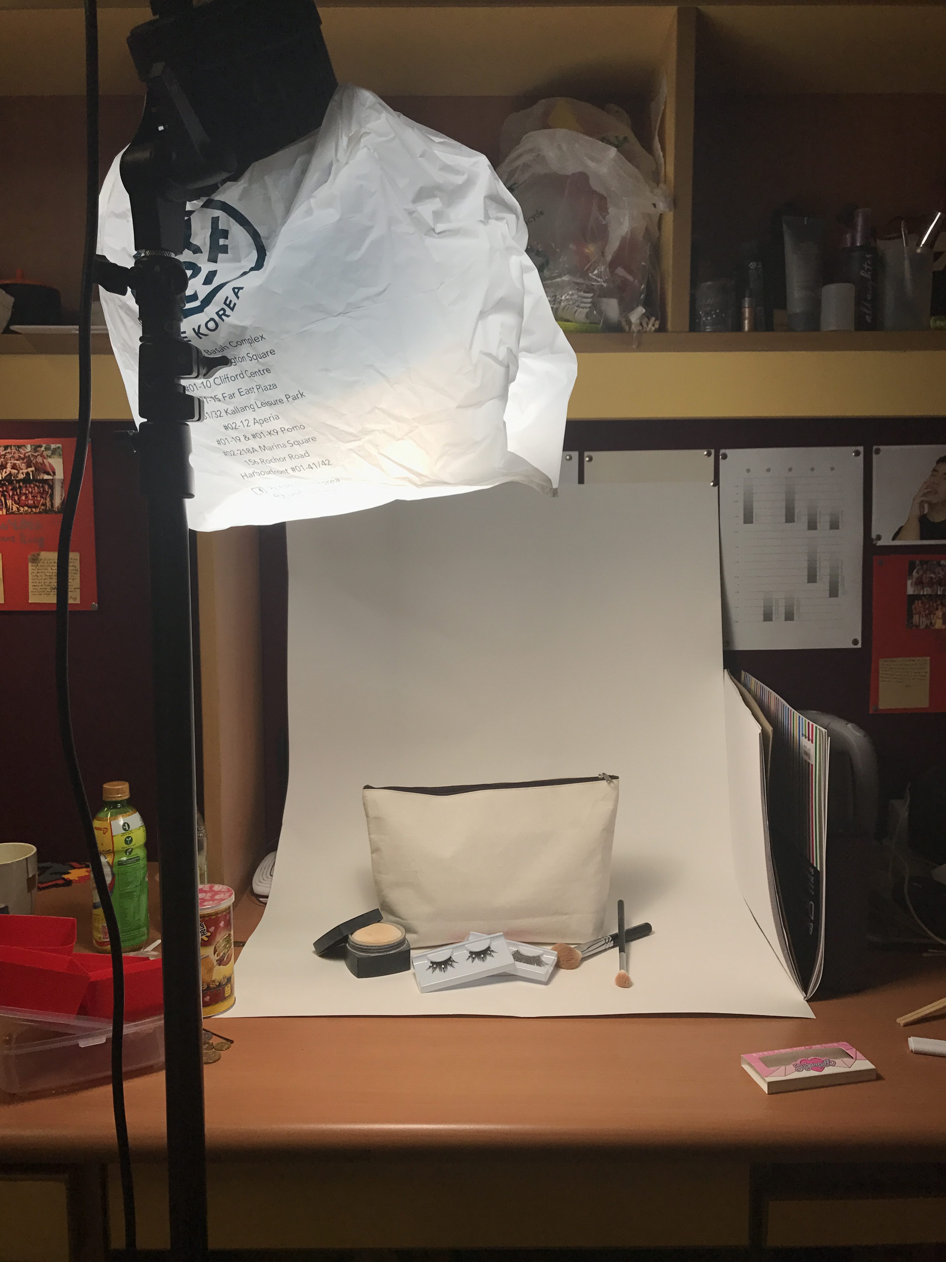
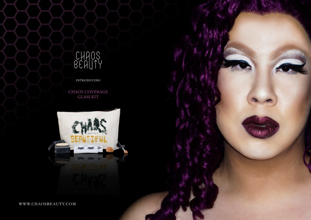
After consulting with Shirley, I decided to put this on a makeup bag/case for my application. Here’s some of the behind-the-scenes shots of my photography setup
With this image, I Photoshop-ed my organic type on
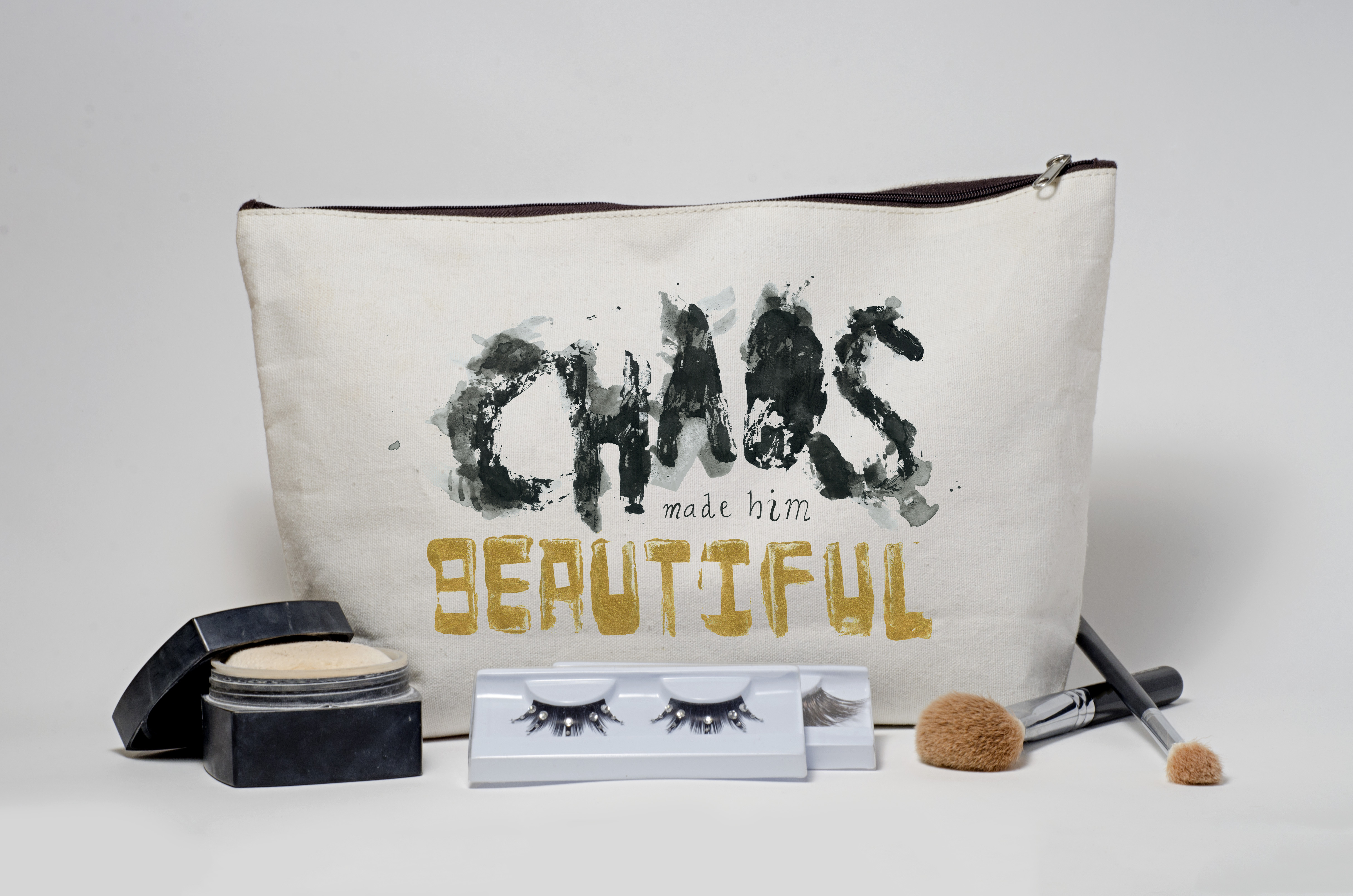
To fully put the whole concept together and answer why chaos made him beautiful. I decided to think of my product as a drag makeup kit targetted at men. I also went ahead to create a print ad for Chaos Beauty, a fictional makeup brand for drag queens.
All in all, I think this was an important project in reminding us of the beauty of hand-made fonts and not relying completely on digital programs and means for creating type. Indeed, each project was a unique expression and execution. Looking at the final applications just reinforced how hand-made font will never go out of style and still remains relevant.