Task: Create typographic portraits by using your name (or part of it) to describe imaginary professions and/or affirmations.
Before fleshing out any ideas, I came up with a list of personal traits, professions or objects I felt reflected my personality.
- I AM INDECISIVE
- I AM A DAYDREAMER
- I AM TIMID
- I AM IDEALISTIC
- I AM A CUP OF EARL GREY TEA
- I AM A COMFY OVERSIZED SWEATER
- I AM A PERFECTIONIST
- I AM A WRITER
- I AM A MEDIATOR
- I AM A SLOTH
- I AM AN ORGANISER
- I AM A PEACEMAKER
With my list, I started to think about the traits I would be able to portray or capture visually in an eye-catching way. I initially wanted to stick with a main theme so that all my pieces had a unifying factor. I was inspired by the works of Kyle Pierce, an American illustrator who layers photographs with hand lettering and illustrations, producing a raw and candid feel.
I wanted to implement his style into my pieces by placing transparency paper on top of a supporting image, and writing my name in different styles on the transparency sheets. Later on, Shirley pushed me to think further — just by looking at the font, how could someone guess what personality trait I was trying to portray? I needed to communicate my intended idea solely through the font. With this in mind, it was harder to come up with ideas, but also pushed me to go beyond the surface. Breaking down the meanings behind the personal affirmations I chose was helpful, and served as a guide that I could look back on at every point of the project.
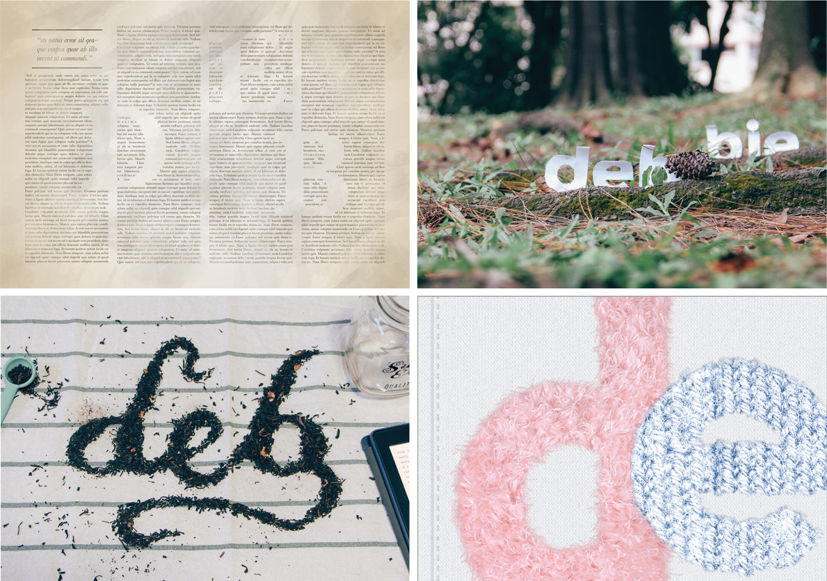
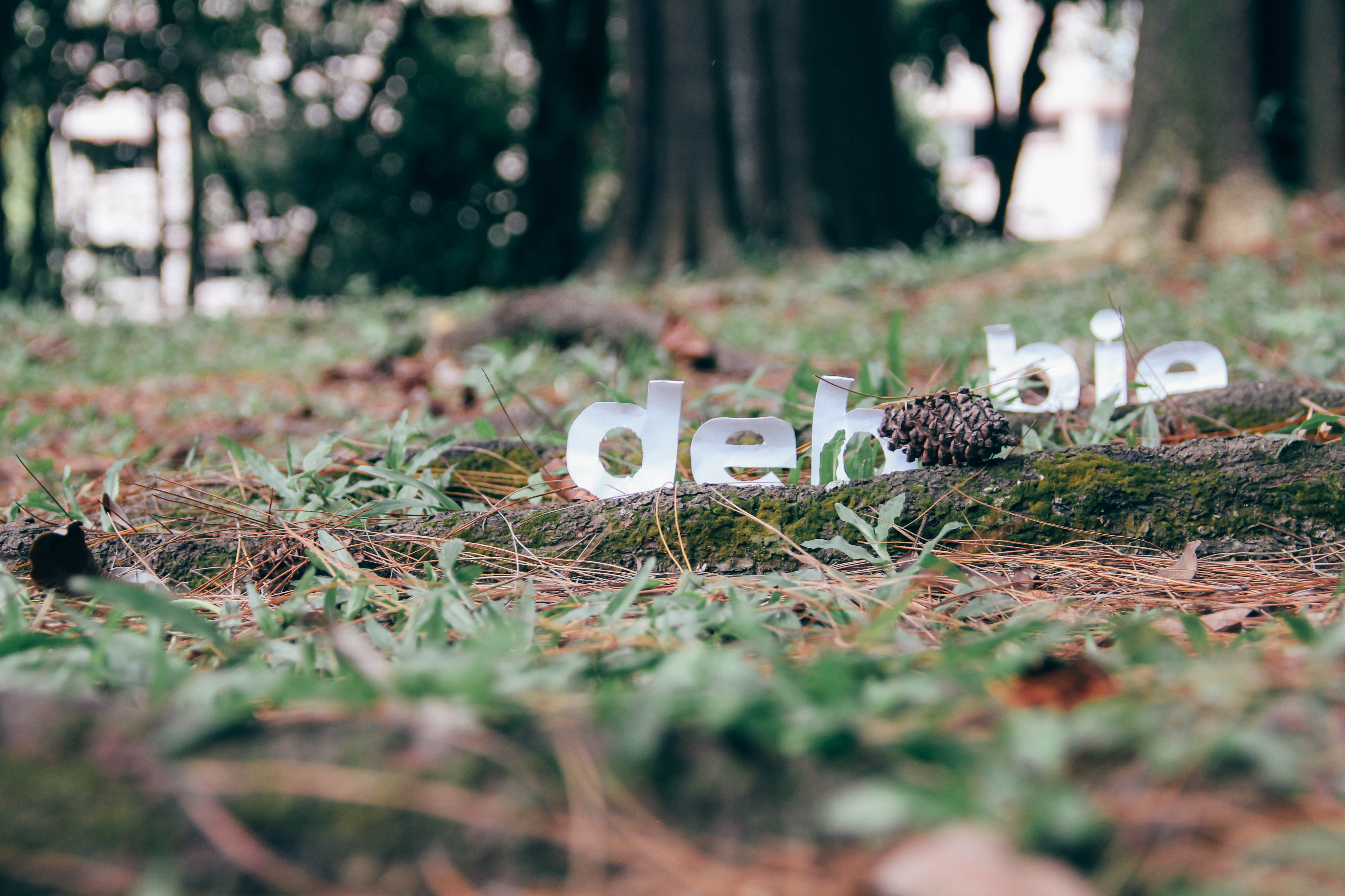
I AM A CUP OF EARL GREY TEA
Meaning: When I think of something that brings me peace and calm, I think of a cup of earl grey tea. I am quite serene and calm most of the time, though if you knew what was going on in my mind, you’d think otherwise. I often strive to keep a level head, and keep calm in all situations, so emulating the personality of earl grey tea has become my inner mantra.
IDEA #1:
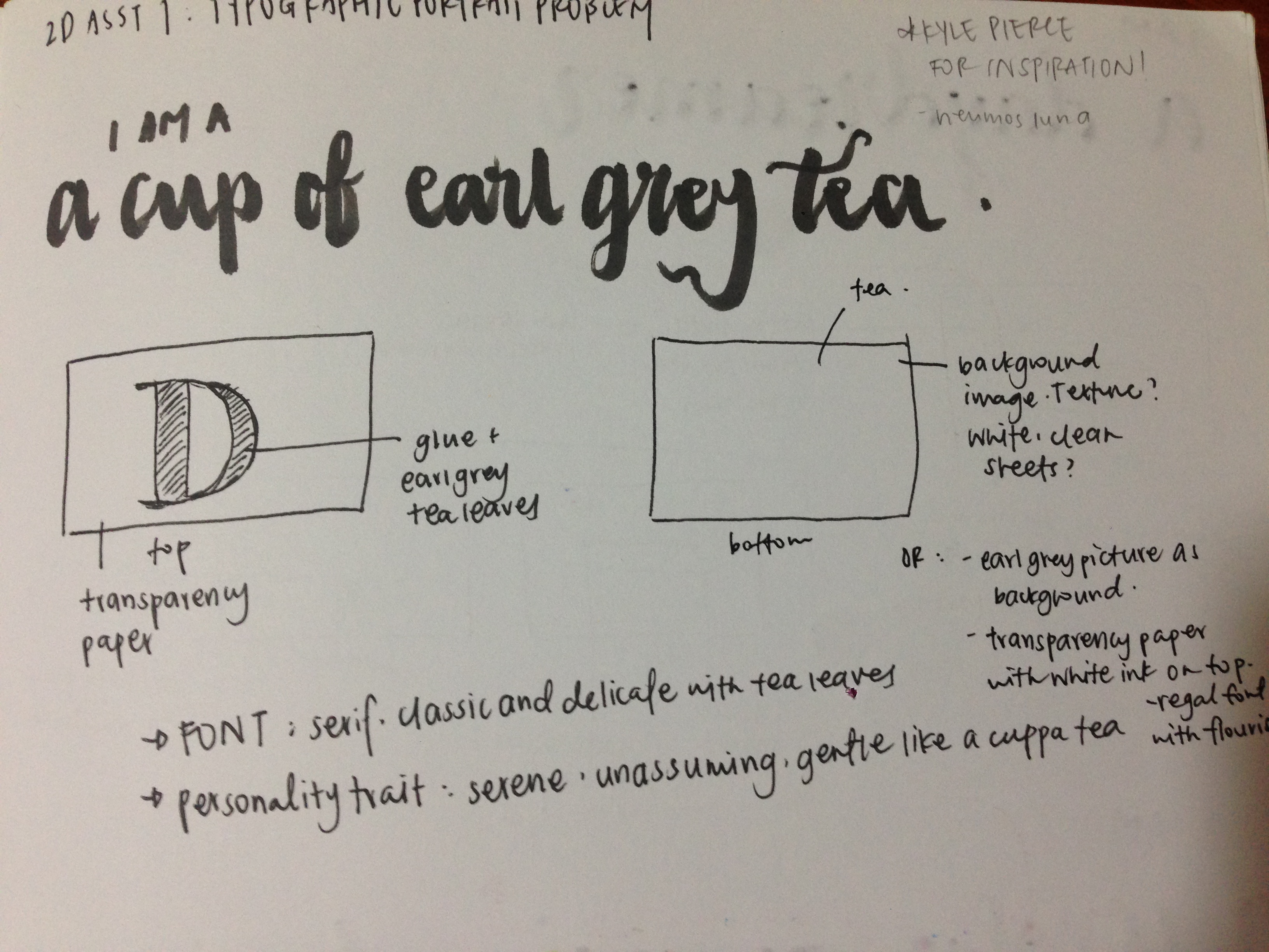
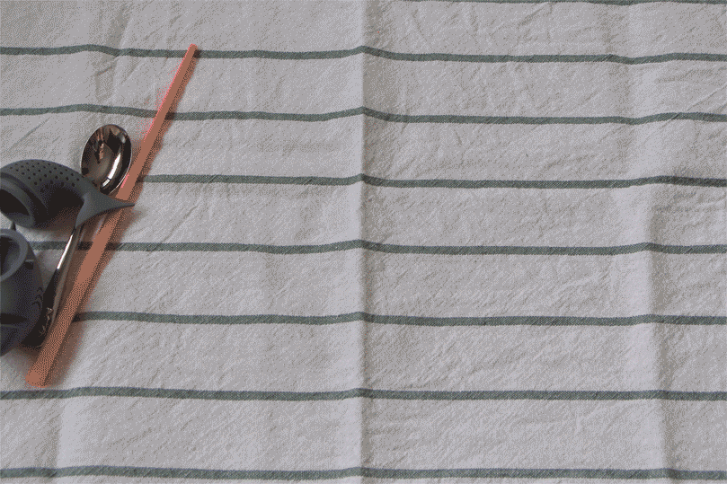
I decided to play with food typography for this composition. I’ve always loved what people can create out of everyday food items, and was inspired to try it out. Tea is often associated with elegance and class, so I was thinking of using a serif font. I wanted to make the first letter of my name out of loose earl grey tea leaves, resembling a monogram. The ‘D’ would be printed on transparency paper, and underneath, I was thinking of a plain texture, like white sheets, to keep the royal theme. I rejected this idea later on because I felt it wasn’t dynamic enough.
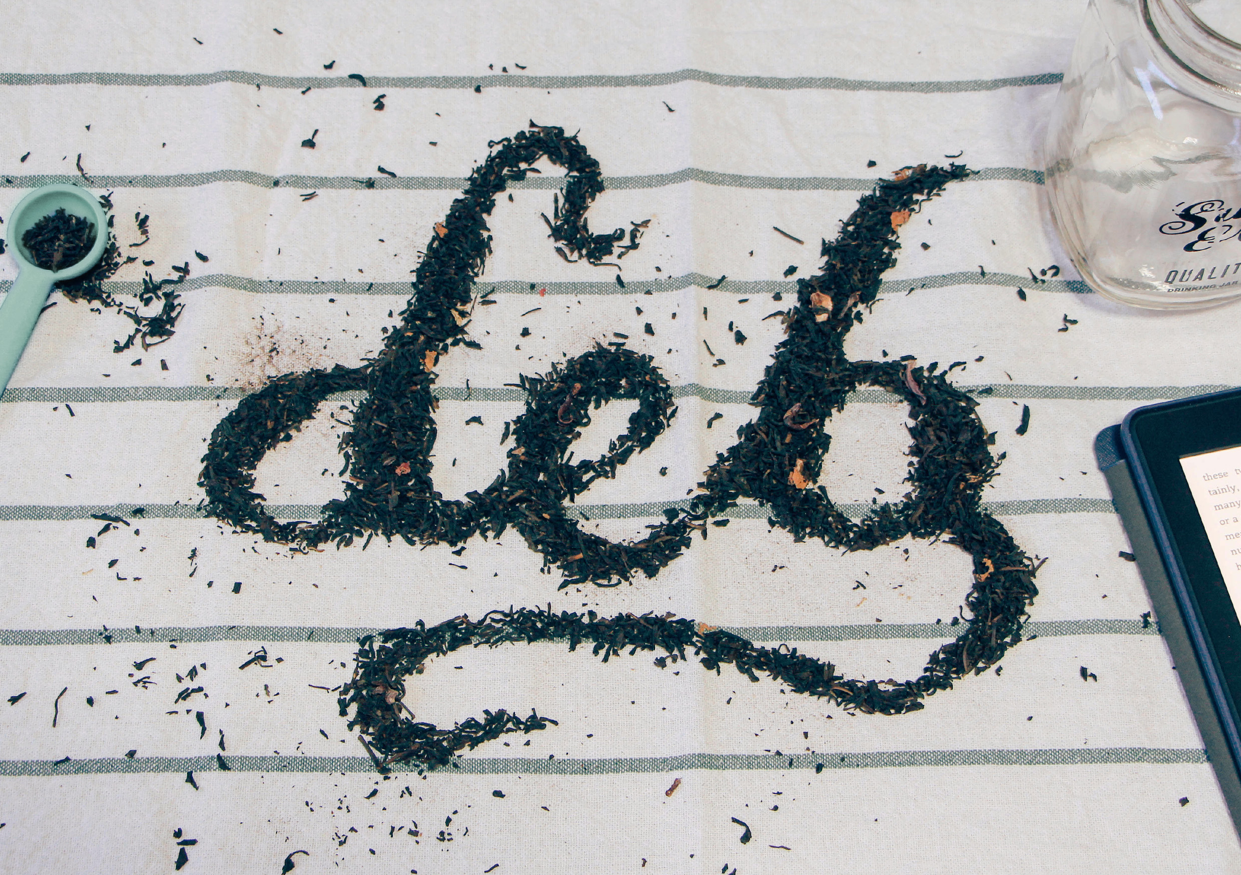
IDEA #2 (chosen):
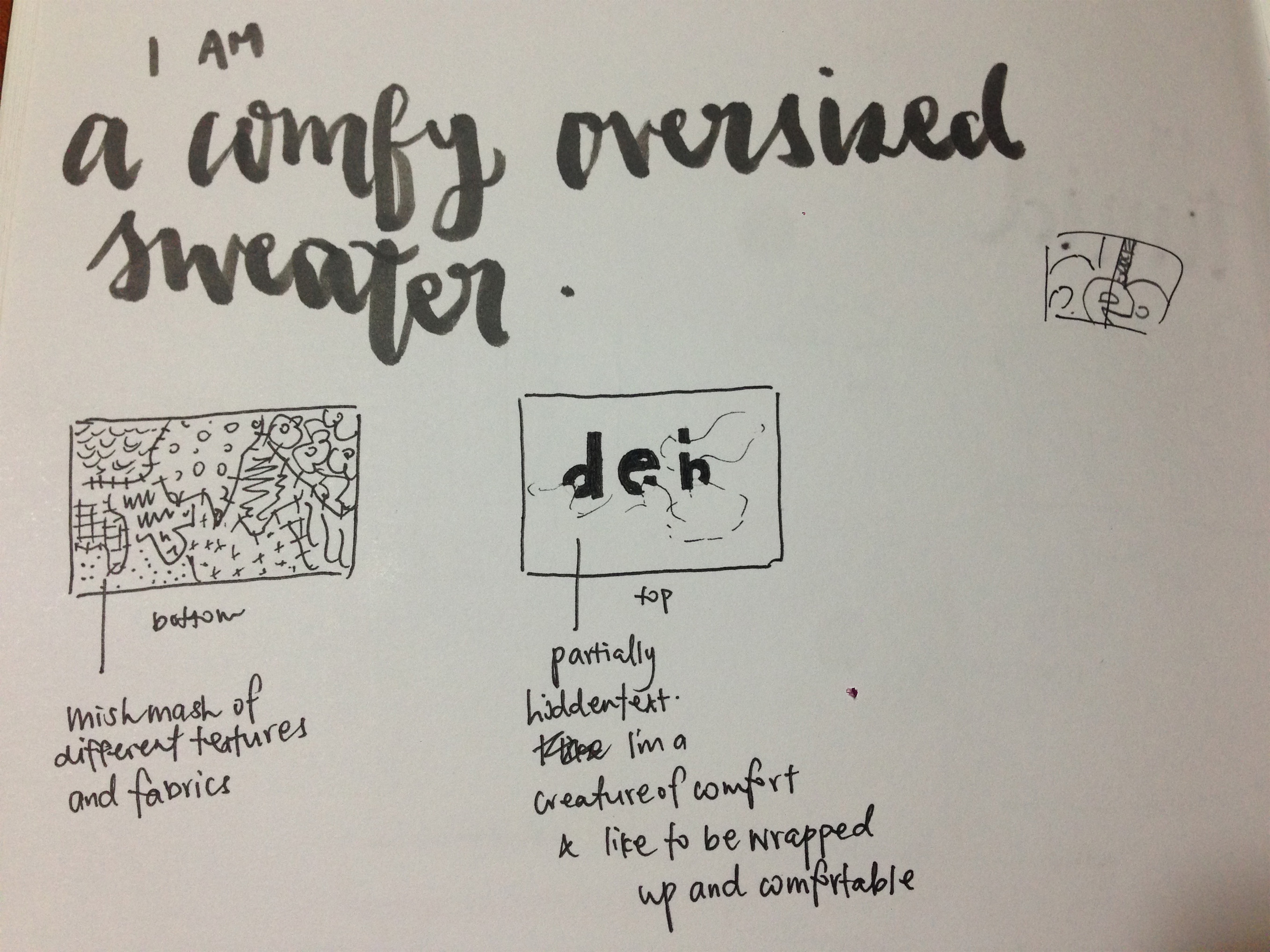
I decided to make a calligraphic font out of the tea leaves, as I felt that it would look less static than my initial plan to use a serif font. I tried to bring out a laidback and gentle vibe with stray tea leaves, a mason jar and my kindle.
Inspiration
Process
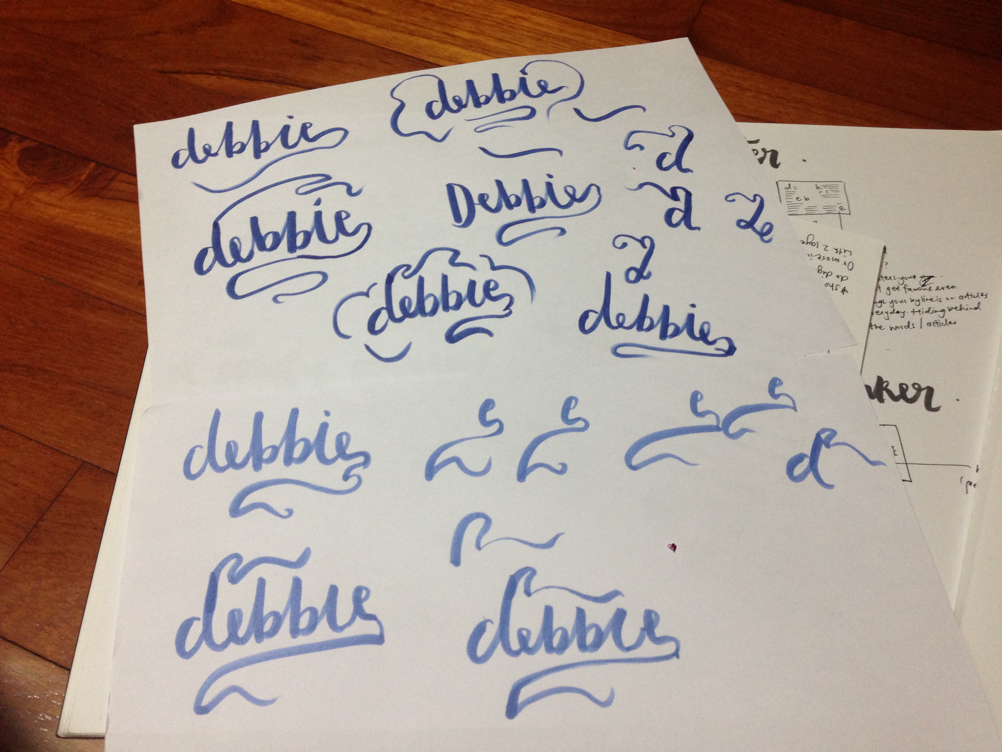
First, I wrote my name many times on a piece of paper, varying the flourishes to get my desired look. Then I arranged the tea leaves with the help of a spoon to clean up the edges. It took me a REALLY long time for me to get the font exactly how I wanted it, and I initially wanted to do my whole name, but realised my tea towel wasn’t big enough for it to fit. I was cool with leaving it as ‘Deb’.
Final
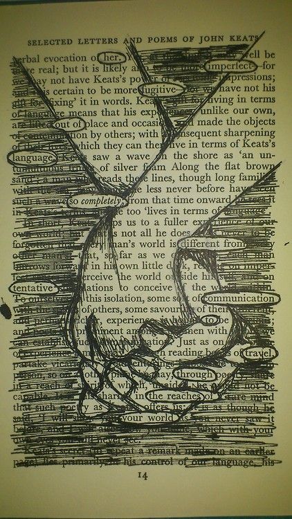
I AM TIMID
Meaning: I don’t like admitting that I’m quite a timid person. It’s probably because I often over-think things, and although I don’t suffer from anxiety, the worrying does get in the way sometimes. I tend to get myself out of situations or hide from things when I feel uncomfortable or afraid. On a separate note, I often find myself in awe of Mother Nature’s wonders, I’m also quite afraid of natural disasters and things than man can’t predict or control.
IDEA #1:
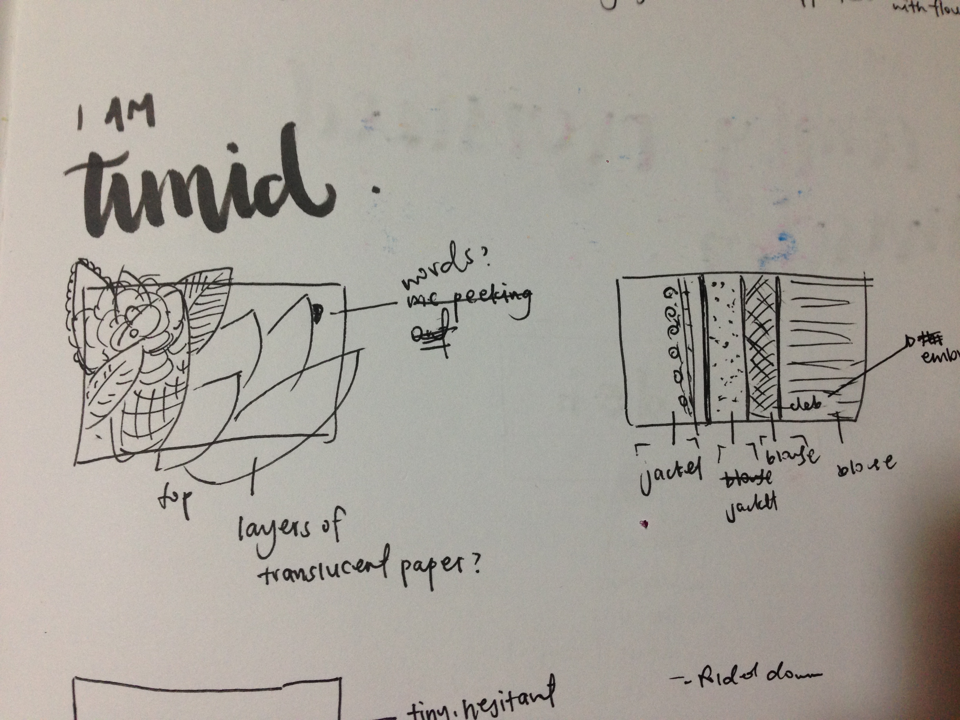
I initially wanted to emphasize the desire of hiding when I’m feeling timid, so I thought I could use layers of paper with leaves and flowers painted on them, and have part of my name peeking out in the corner. Another method was using layers of clothes to symbolise the desire of hiding under many layers. This idea didn’t work out in the end, because I was using visual aids to communicate the idea, and not utilizing the font to tell my story.
IDEA #2 (CHOSEN):
I wanted to play with the idea of feeling small and withdrawn when I’m scared, so I cut out a rounded font using paper that I crumpled and rolled slightly, and placed them behind roots and leaves, as if the font was hiding from the elements. I set it down on the floor to emphasise how small I feel. I also put it amidst to symbolise my fear of Mother Nature’s wrath.
Inspiration
Jon Gray
Pinterest
Process
(PHOTOS OF PAPER TEXT)
I printed out my name in the font Montserrat, a nice rounded typeface, then traced it on drawing block and cut the letters out. I attached the letters on satay sticks so they would stay up, then brought them down to the park to get some shots. It took me a few tries to get the position exactly right, because I wanted the text to be hidden at some points, but I didn’t want it to look too forced.
Final
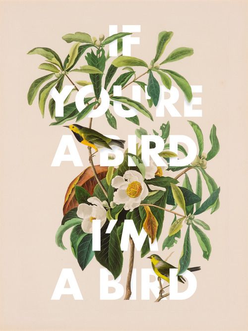
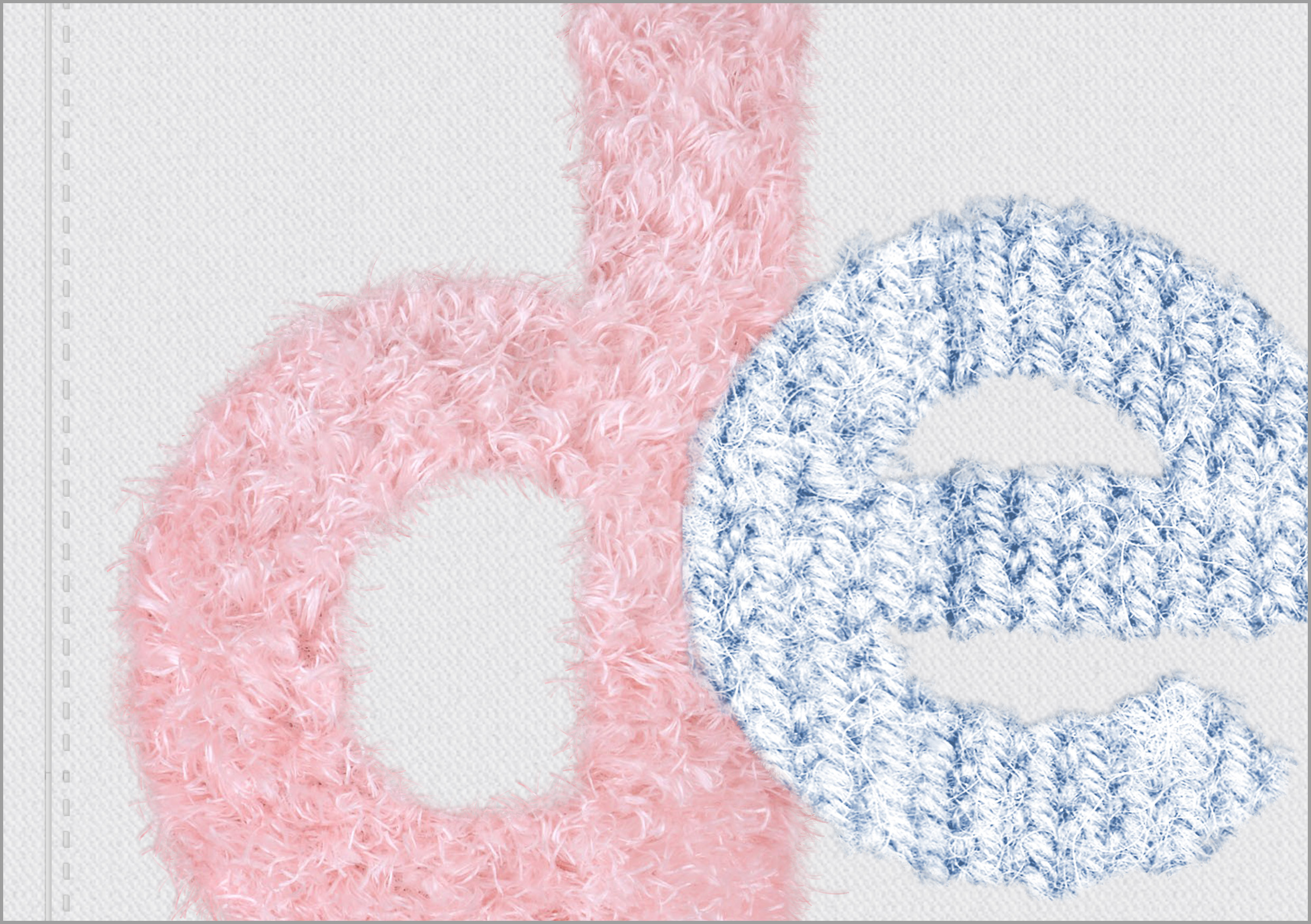
I AM A COMFY OVERSIZED SWEATER
Meaning: I am a fan of anything that keeps me comfy, and that means beanbags, cold weather, and above everything else, soft oversized sweaters. I also like giving people hugs.
IDEA #1:
I have quite a lot of old clothes lying around at home, and I was thinking of finding interesting fabrics, cutting them up and pasting them on an A5 base. On transparency paper, I would write my name, partially hidden by the fabric layers. I was trying to portray the idea of being a creature of comfort who likes being bundled up and comfortable. I rejected this idea because it was pretty similar to my ‘timid’ composition.
IDEA #2 (CHOSEN): To highlight the oversized-ness, I figured I could make the font look like it was so huge that it didn’t fit the frame. I would use pastel colours to accentuate the comfy aspect, and also because I love pastels.
Process
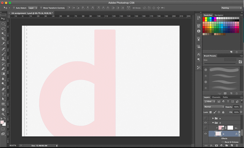
This composition was done digitally from scratch. I started with a clipping mask of the texture, then used the brush tool to add the fur along the sides, then blended more and more to achieve a more natural look.
Final
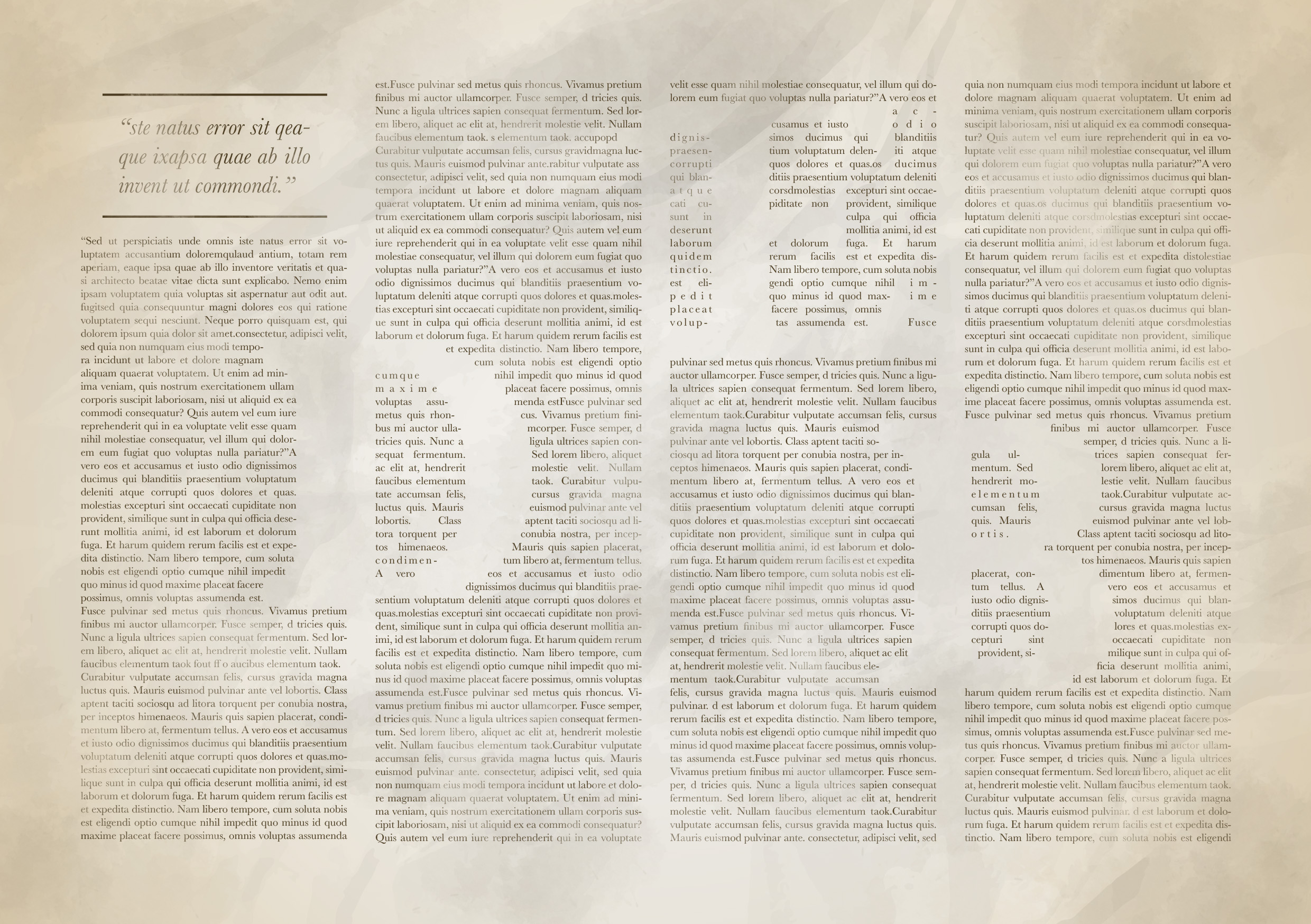
I AM A WRITER
Meaning: For a long time, I was pretty sure I was going to be a journalist once I graduated with my Mass Comm diploma. I worked as a beauty/lifestyle writer for almost 1 year and I loved what I did. It was intriguing to me that although my name must have been seen by many people, almost noone would know me personally, or even want to know more about me. The story always comes first, and a good writer doesn’t do it for the fame. As a writer, you’re sort of hidden behind the words you write, for better or for worse.
IDEA:
I decided to use negative space to communicate the idea of hiding/residing behind the words.
Inspiration
Process
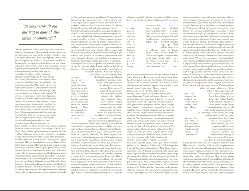
I first created the paragraphs with InDesign using lorem ipsum text, then used the text wrap effect so the words would “avoid” the huge D E B letters. Then I brought it over to Photoshop, adding a vignette effect, some brushes and a crumpled paper effect for interest.
Final
Reflection:
This assignment was really enjoyable for me, because I’ve always been fascinated by typography and its versatility in evoking different meanings and themes. I’m glad that Shirley pushed me to think harder about how to make the fonts convey exactly what I intended, and I hope the audience can relate to what I’ve created.