The Toaster Story: Products Comparison

“OMG. A Hello Kitty Toaster? In Harvey Norman? Are you kidding me?”

Please forgive my drama, but that was exactly my first inner reaction when I saw this Hello Kitty toaster being placed at the same rack as Kenwood, a well-known brand for their electronics. It is not that I hate Hello Kitty, but it triggered my mind to think “why Hello Kitty? would it sell better than the Kenwood toaster?” (Yes I really wanna buy that Kenwood toaster but I have no house in Singapore so that goes to my must-have list)

Continue reading The Toaster Story: Products Comparison

The Hawker Experience: Tourist vs Local

The Hawker Experience: Tourist vs. Locals

Singapore is known for her hawker centre – similar to a food court but much more down-to-earth and an open space without aircon. The food stalls are run by individual owners, unlike foodcourt’s which can be managed by a bigger company. The food in hawker centre have a really wide variety: chinese, malay, indonesian, indian, western, korean, japanese and many more. The largest and most famous hawker centre would be Lau Pa Sat, located at the heart of the Raffles Place CBD. When I was still a tourist in Singapore, I used to visit Lau Pa Sat and did not really consider to eat at other local hawker centres. However, after a few years living in Singapore, I realized that the experience that Lau Pa Sat offers to the customers are so different from many other hawker centres, even the famous ones too.

Photos of Lau Pa Sat

Photos of Clementi Hawker Centre

Observations: Comparing Lau Pa Sat and Clementi Hawker Centre

Table Comparison Table Comparison 2

So

What I can conclude from the observations is that Lau Pa Sat is a ‘special breed’ of hawker centre. It is much more ‘advanced’ that it is similar to a food court rather than hakwer centre. Clementi hawker centre is really similar to other hawker centres such as Newton Circus, Holland Village Market, and many more. If Clementi and Lau Pa Sat were persons, Clementi would be someone who lives not to impress anyone, and while Lau Pa Sat would be a person who is very well well-groomed in order to please new guests. In fact, Lau Pa Sat is really famous among tourists and I think it is designed and managed so well – more variety of food, cleaner, less noise, arranged, decorated – in order to give a good impression about Singapore to people who have a leisure travel here.

PS: And, after I did further research on the internet, Lau Pa Sat has undergone a lot of renovation and no wonder it looks like a super pretty hawker centre! here is the original Lau Pa Sat before the decoration. Even the chairs and everything are changed, the metal engraving at the ceiling are painted, and the color of the place is changed to be made more coordinated. I cant see Lau Pa Sat as a true representation of hawker centre anymore.

telok_ayer_market_6_jan_06

But to be honest, I did enjoy Lau Pa Sat more than Clementi to be a place for me to have meal on a Friday. Thanks to its good interior, ambience, hygiene and excitement – I tried the Costarican food, not bad really (food photo in the gallery)

From this comparison, the concept of a hawker centre is an eating place for public in an open space (not indoor, no aircon). And indeed this is very Singapore. 

Improvements for Lau Pa Sat

As a designer, I thought of improvements while was doing some research. I realize there is no main entrance in Lau Pa Sat, and all ends are exits to different roads. It would be great if there is ‘directory’ or signage showing which one is to which road. This would ease the flow of visitors.

But again, I really think this Lau Pa Sat’s shape and floorplan are originally like this since the 19th century. Well, even though it has undergone renovation, I think the government still want to retain the authentic aspect of this place.

Improvements for Clementi

It is a classic example of hawker centre in Singapore. I don’t feel like suggesting any improvements because this is one of true identities of the society. Probably to make it better, the local governor or leader could start a campaign of ‘putting back your own tray’ because there were really a lot of trays and plates left on the table with no one cleaning them up. Probably, there is short of manpower or the cleaners are on breaks, but it would be great if the costumers could do such an easy task to improve the experience of eating in a local and classic hawker centre.

You want to go to the places? here are the address:

  • Lau Pa Sat: 18 Raffles Quay, Singapore 048582
  • Clementi Central Market and Food Centre: 448 Clementi Ave 3, Singapore 120448

Typographic Portrait

About

In this project, we are assigned to create postcards with a typography of our name. Just like its title, the typography should be a ‘portrait’ of myself: a representation of who I am and/or my aspiration.


Research

The first artist I have researched is Hannah Hoch. Her collages speak their messages strongly, and some even have multiple interpretation. Her pieces intrigue me to try ‘less clean’ photomontage.

1 2 3


The second research is Dada Movement. Here, more typography is involved in this style even though it is similar to Hannah Hoch’s.

4 5 6


The third one is Russian Evolution art. This one is more poster-like and bold.

7 8 9


The fourth is DIY typeface. This is experimental basis and surely will bring a much more distinguishable look than digital image.

10


Process

First thing first, I did a mindmap about myself: my facts, my aspiration, and “If I were…”s.

Some of the ideas that I picked are:

  • Messy perfectionist
  • Nerdy bimbo
  • Dreamy fashion designer
  • Mischievous artist
  • Coquettish tai-tai
  • Emo musician
  • Mischievous Christian

Then, I started sketching drafts. At first, I was influenced heavily by Hannah Hoch and Dada art, making me to plan a too image-drive postcards. I forgot to emphasize much on typography and to infuse my characteristic into the text, not the image. The first set of draft sketches/planning is wrong.

For the 2nd set, I did both traditional pencil sketches and digital sketches. Some of the digital sketches I have done:

Dreamy Fashion Designer draft
That is a flying needle, and the ‘i’ is a mannequin silhouette
Naughty artist draft
The naughtiness is portrayed through the evil horns, tail and trisula. The artist is portrayed through the brush as the ‘i’.
Sleep-deprived art student
The idea is ‘having panda yes’, and replaced the panda eyes with artist palette, and the ‘panda’ is wearing an artist beret.


However, I think that these drafts are still lacking ‘thoughts’. The first one can be developed further but the 2nd and 3rd…they are not really satisfying.

As the deadline was getting near, I chose 4 points out of all the points I mentioned earlier about myself and worked on these 4 ideas.

The final inspiration I gained:

  • emo musician: inspired from music sheet’s 5 lines and written notes. The blood, the last idea I got to improve this typographic portrait, is to portray extreme depressed action of ‘self-cutting’.

Emo Musician 3 Emo Musician 4 Emo Musician 7

Emo Musician 9
If I were a musician, whenever I felt depressed, music would be a platform for me to transfer my pain into. I won’t let myself bleeding because of self-harm, but I will let the music the bleed the pain out.
  • nerdy bimbo: I want ‘bimbo’ to be portrayed through makeup kits, and the ‘nerdy’ idea through various chemistry class’ equipment.

Nerdy Bimbo 1 Nerdy Bimbo 3 Nerdy Bimbo 4

Nerdy Bimbo Final
F.N. can be Feliciana Natali, or F for fashion, N for nerd. It’s purely coincidental but that is one of the reasons why I made the ‘f’ for bimbo character and ‘n’ for nerdy character.


  • dreamy fashion designer: the idea of using mannequin as the ‘i’ is derived from the digital sketch I have made earlier. Then, for this postcard, I use the ‘opposite’/mirror concept. ‘Dreamy’ means I love to think of fantasies, fairy tale, impossible things to happen.

Dreamy Fashion Designer 2 Dreamy Fashion Designer 4 Dreamy Fashion Designer 6

Dreamy Fashion Designer Final
The idea of ‘fashion’ is depicted through the use of mannequin as one of the ‘i’, and (subtle intention) the use of font type Didot, which is used by a high-end fashion brand of Valentino. The ‘dreamy’ is portrayed as ‘fading reflection’ of my name to show that my dreamy characteristic may not be obvious, I look like a practical and realistic person (well that’s true) but deep inside I am quite dreamy and imagining many fantasies. ‘The two sides of me’…


  • mischievous artist: initially, I didn’t think of monkey to be the symbol of mischief. I thought I would use something like messy brush strokes and splashes on a wall, which is not very communicating the message…

Mischievous Artist 5Mischievous Artist 2  Mischievous Artist Revised 2

Mischievous Artist final
So, the ‘monkey me’ wrote ‘atali’ with its tail messily. The grin is to show it’s playful and potentially mischievous. The broken halo is to show that it is actually benevolent and not mischievous in a harmful, evil way – it just wants to have fun. The ‘artist’ is highlighted by the red palette and brush.


Exploration of Style/Reflection

It is natural for me to create a ‘clean-style’ image. However, the usage of only three colors: black, white and red is unintentional. The first two images (Emo Musician and Nerdy Bimbo) are both consist of these 3 colors only. Hence, I just continued making the last two images to be in the same colors.

Initially, I really wanted to try photomontage. However, the idea of photomontage drove me to think of image not typography. I am very new to typography and hence I decided to just focus on typography, and let all the messages I want to deliver stored in the typography only.

The simple/clean style also allows me to create design aesthetically through the meanings, not through visual elements such as colors and shape. First, I focused solely on how to convey the messages effectively, then I altered here and there to get the desired aesthetic of the design as a whole.

Overall, this project exposed me to the door of typographic art/typography’s world. I am amazed by how simple typography can be but the simplicity carries out a lot of mood, message, purposes. This project makes me want to learn more about typography.


the-end

Research Critique: Costume and Textile


The performance is called “The Space Between Us”, choreographed by Utam Moses and composed by Eric Lindsay. This performance was held in April 2010 in the United States. This performance shows dance choreography with costumes that can generate and control sound with the help of pressure and flex sensors. Designed by Amy Burell and Jay Garst, this costume allows the dancer to be able to control the strength of the audio according to the strength of his/her movements, hence making the dancer not a slave of the pre-composed music. It is not stated whether this project use open source technology or not but I think it did use OSS because this project would not happen without the networking between talents from different fields (choreographer, musician, costume designer and engineer), which would be much easier to achieve with the help of OSS. Moreover, the complexity of the technical aspects would require a convenient shared storage system, which could be done using OSS.

In my own opinion, this project is jaw-dropping and one-of-a-kind. Most of the time, people would like to create costume technology which something to do with lights (or other visual matters) instead of sound. A lot of sensors would have been used all over the body to make this marvel happen. I think this would need more than just creative minds but also the scientific ones.

EGO – Final Assignment

:: EGO ::

Final ALL done

:: RESEARCH&INSPIRATION ::

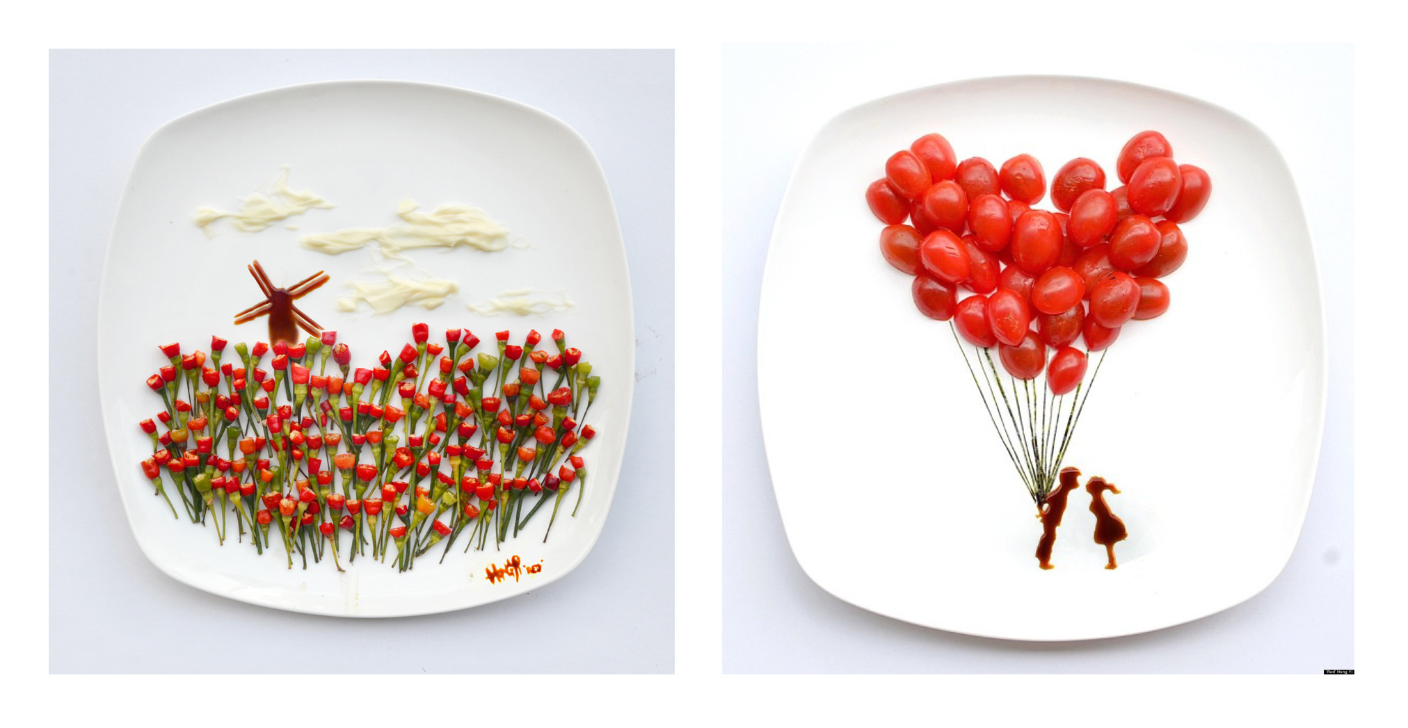
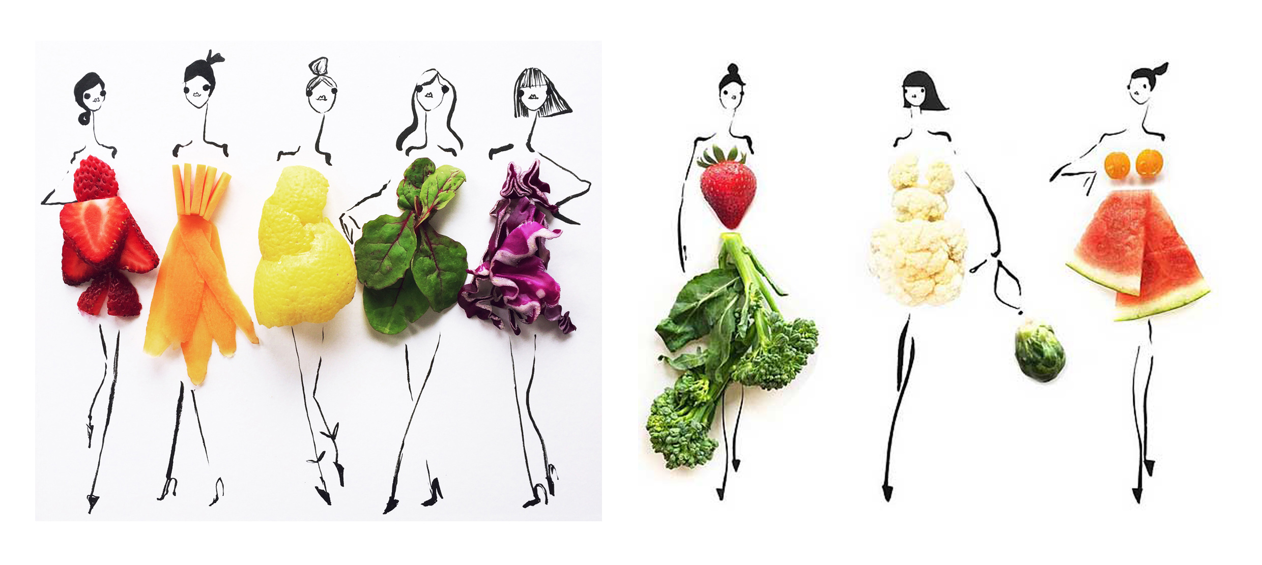
1. Red Hongyi || 2. Groerhs || 3. @ibird_art

Red Hong Yi

Groehrs

ibird

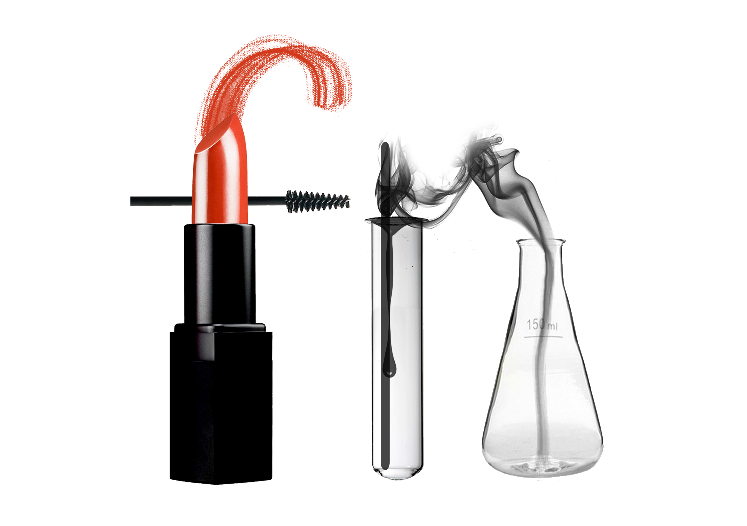
The concept/style that I pursued for this assignment is illustration+digital collaging, slightly different from the inspiration I have searched. I prefer digital collaging rather than traditional arranging because it allows more flexible process and permutation of final results. Traditional arranging requires a lot of different materials and the color would be more ‘inflexible’.

I chose to use quite a number of my hand drawn pictures to make the whole panels uniquely me. Most of the times, hand drawn lines are individualistic.

:: PROCESS&INSIGHT ::

Fantasee

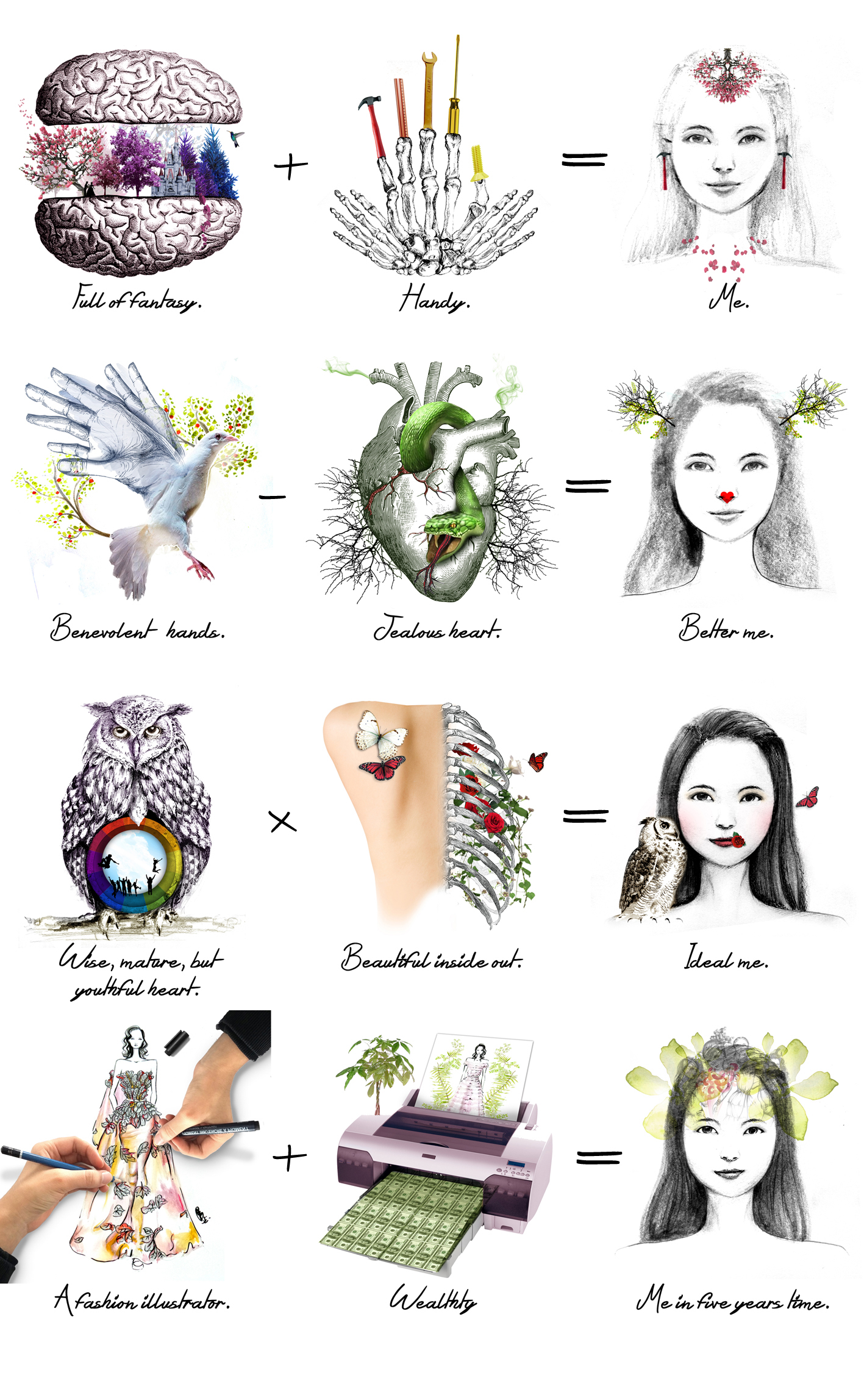
I am a dreamer, a fantasizer. The idea is about opening my brain, and you see what is in side. The first image is a trial to see whether this illustration of brain good enough to be in the collage or not. I use analogous colors from pink/red to blue/purple, with the intention to give clearer depiction of fantasy.

Handy

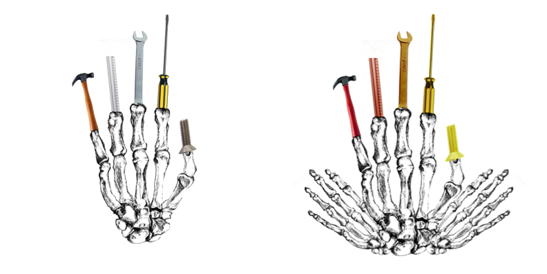
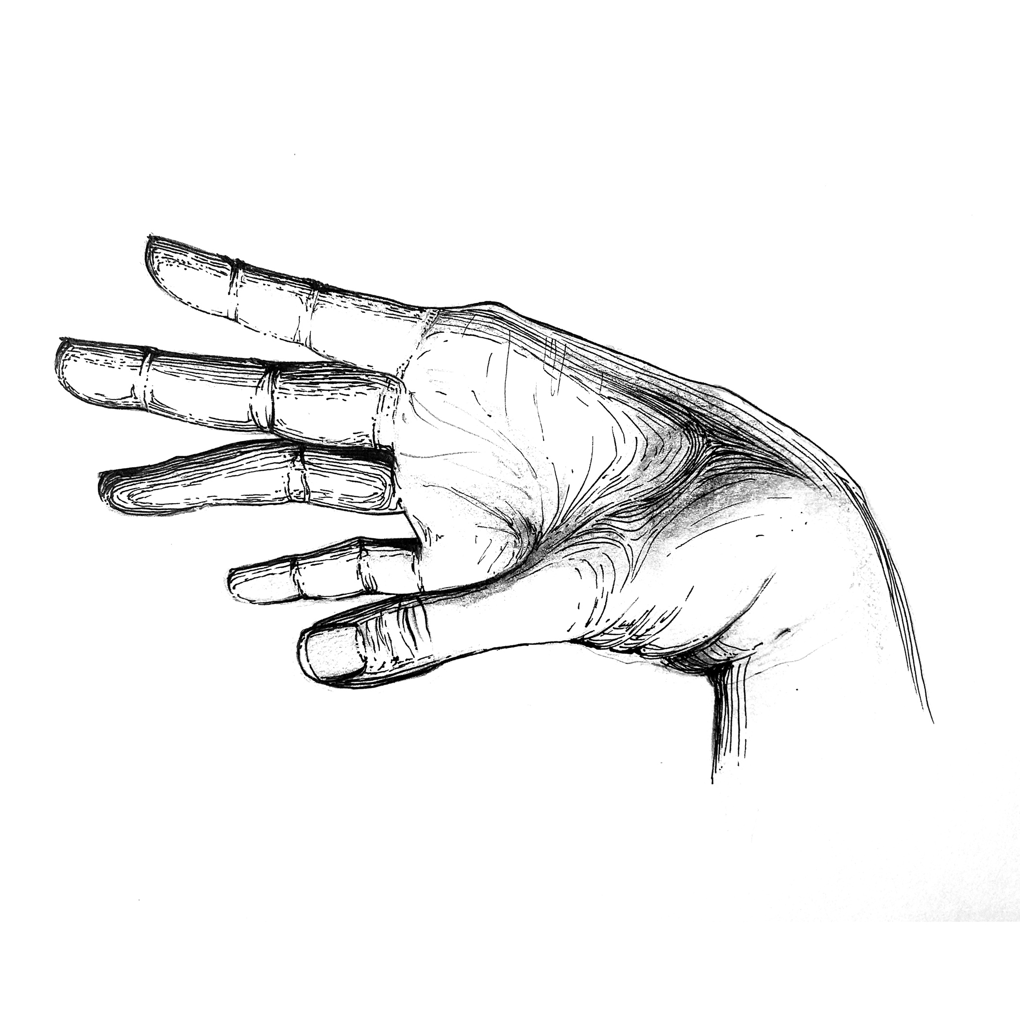
I am pretty handy. The idea is having a hand that can act like mechanical tools, hence my hands are quite versatile in making things, repairing things. I got the inspiration from a doctor who suddenly ‘foretold’ me that “there is something about your hand. Don’t work for others. Work for your own.” And some friends do tell me that I have magic hands. The analogous colors of red to yellow are chosen as they gave the impression of working. When you are tired your face turns red,  I guess?

 Dove

I am willing to help. I want to be a blessing for others. My hands are meant for benevolent things. Hence what i can think of to symbolize ‘blessing’ is dove. And to apply design synectics, I replace the wings with my hands. It gives the impression that with my hands, I fly to others, helping them and sprinkling blessings. At first i found difficulty how to make the composition smooth. The 2nd picture looks patchy, hence I try unhide certain layers and the color of the wings help a smooth transition from illustration to photo. I used split complementary colors of light purple, blue and yellow for the bird – aesthetic purpose. I add the tree as a ‘background’ because when I tried, it looks just nice, reducing the ‘rawness’ of the image. For the tree background, it is complementary colors of green and red. I use the original color of tree and its fruit to give more natural look to the image.

snake

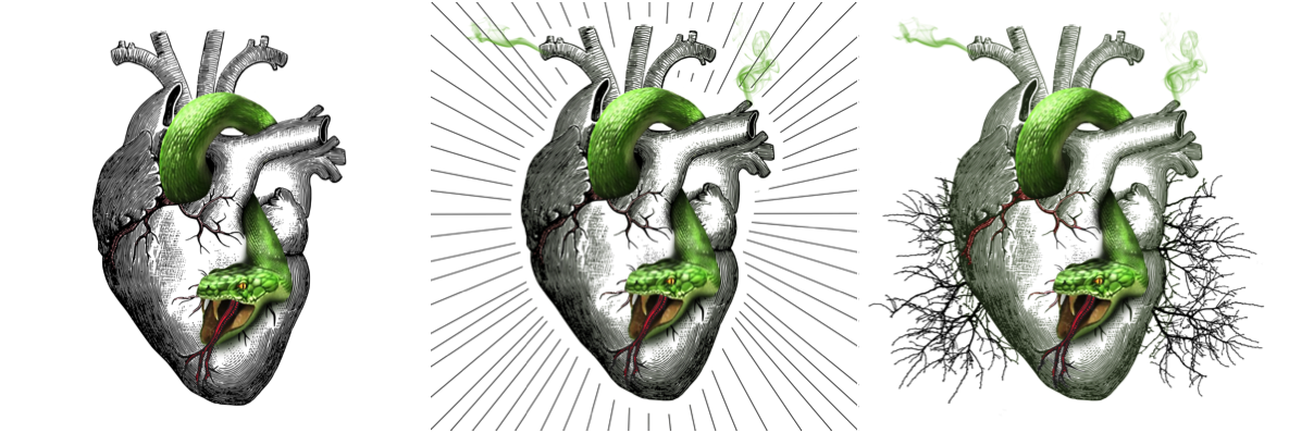
But my heart is often consumed by jealousy. This deadly sin fades little by little as I grow older, but it still lingers there, poisoning me. Green is the color of jealousy, and a snake is chosen with the intention to depict ‘evilness’ and ‘toxicity’ of the the green jealousy. A heart is chosen to depict the kindness, humanity – which will be gone if jealousy consumes them. The line background is suggested by a friend and no, it’s not my style. Then together with the previous Benevolent hands image, I add the tree background. The difference is, the trees here are dead – because of jealousy. And for real, jealousy kills the humanity in us. The benevolent hands will not act the way they should be if the snake is still in our heart. Complementary colors of red and green is chosen – the red is ‘spices’ to the image; sub-ordinate role.

owl

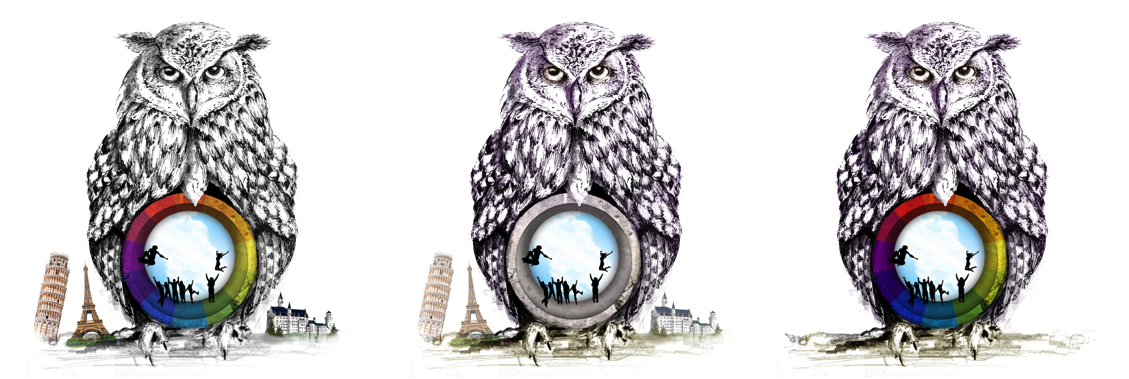
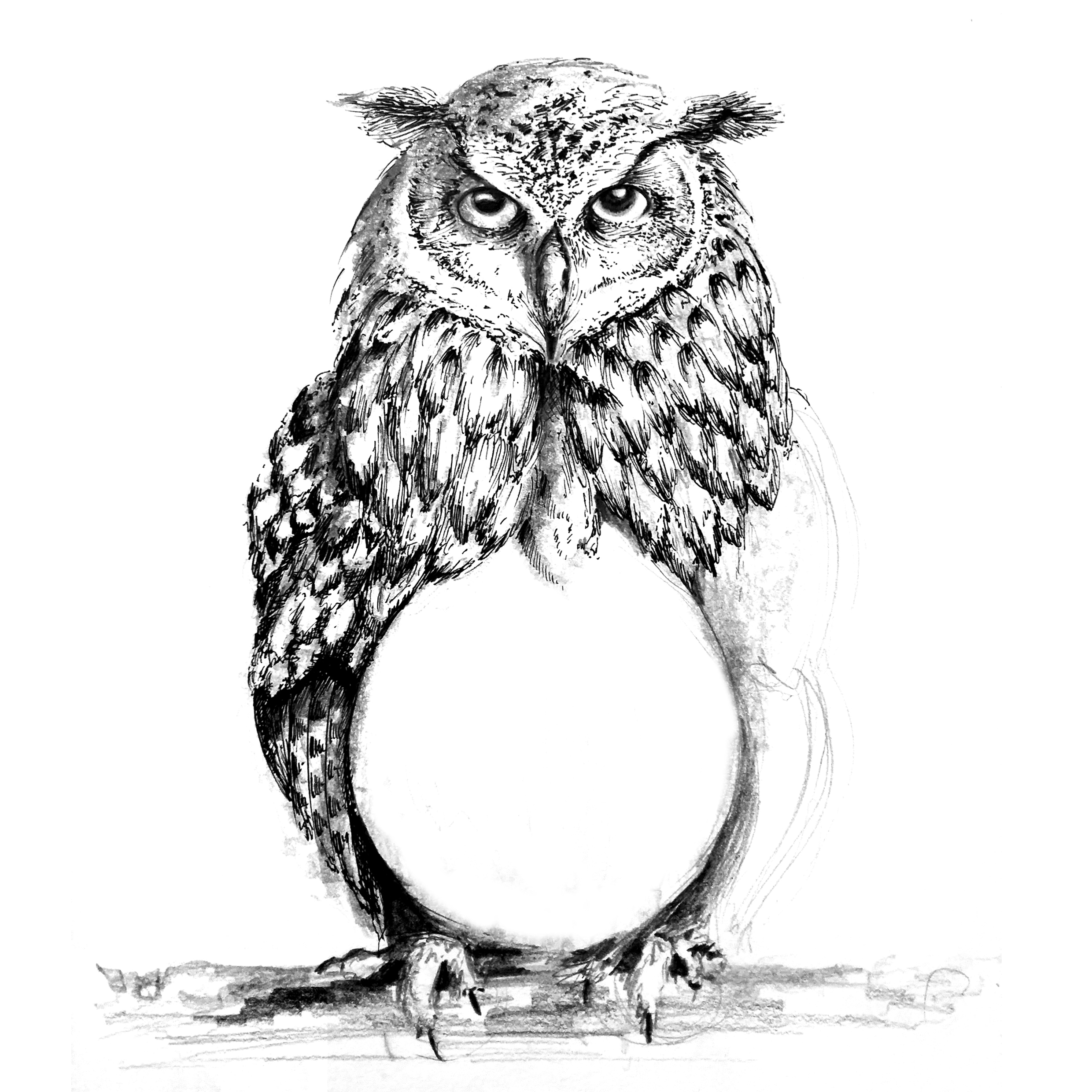
To me, important virtues that I want and have to have are not just maturity and wisdom, but also youthfulness no matter what age I am at. Going to stay young at heart. I am inspired by my mom and some other parents who are still able to connect with modern teenagers and youngsters, but at the same time mature gracefully. To symbolize the wisdom and maturity, I purposefully chose owl and purple (color of wisdom). The youthfulness is depicted using rainbow and the happy silhouette. I delete the random tourist places at the feet of the owl because it looks redundant with the title. I wanted to depict youthfulness with the trait of being adventurous and exploring, however I think the silhouettes are enough to depict that.

beauty

I can’t deny that sick personality would make the most beautiful angel ugly, but in today’s world, looks are important too. Hence, if I can have both inner and outer beauty, why not? the flawless back skin is to depict outer beauty, and the garden inside the ribcage is for inner beauty. I chose roses because it’s the universal symbol for beauty and at the same time expression of love and other positive feelings. Red is for love and compassion. White is purity. the butterflies are to add aesthetics.

fashion illustrator

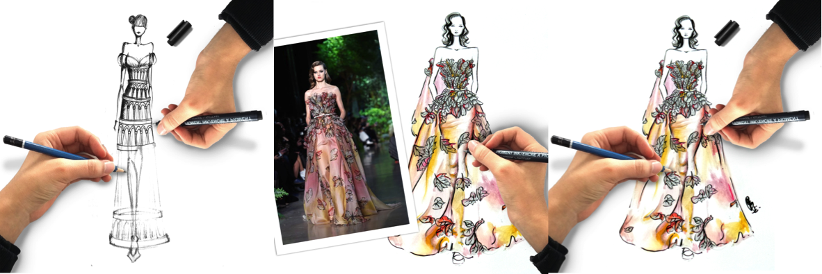
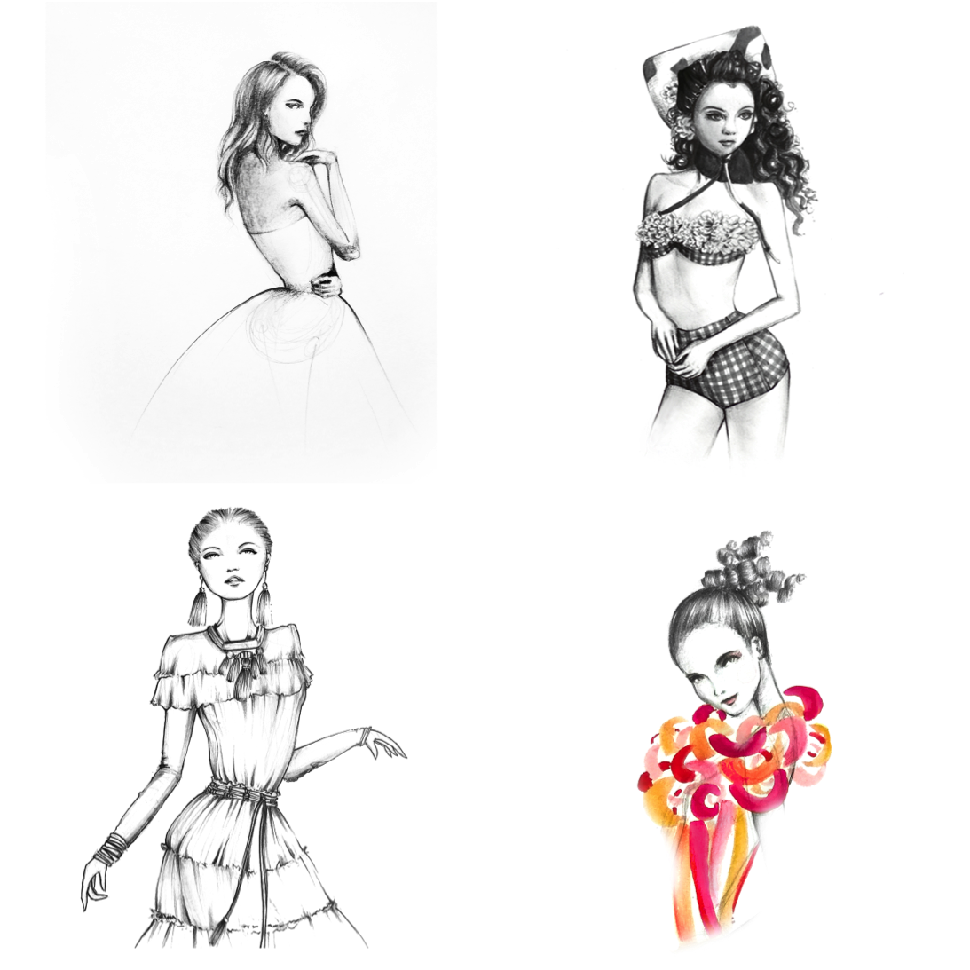
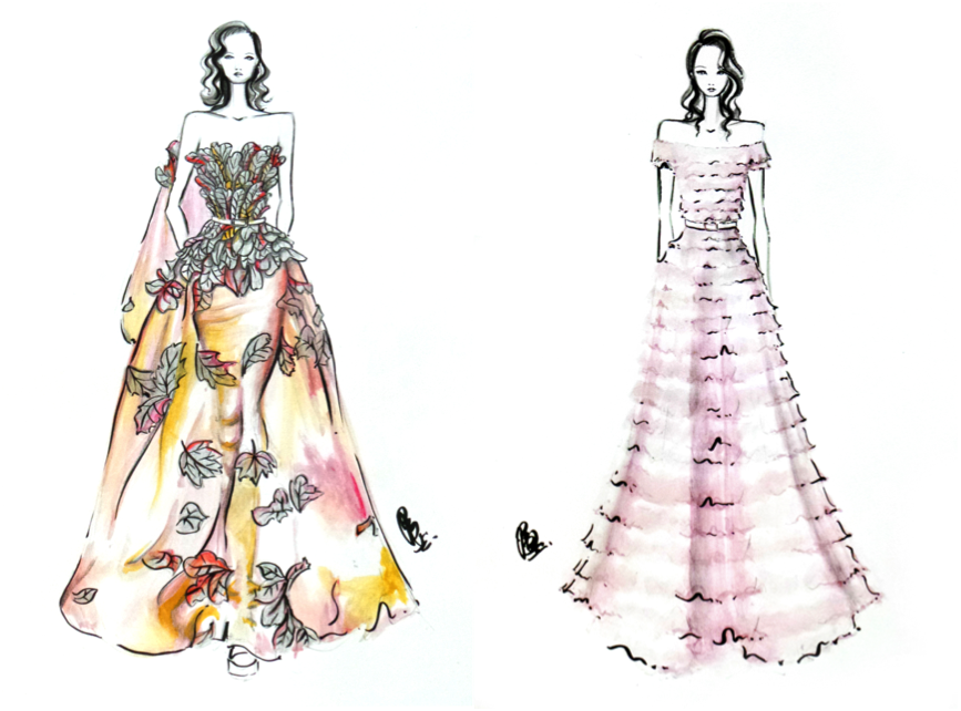
I want to be a pro fashion illustrator. Hopefully, as I graduate from ADM, I will already obtain the skill and the fame as a fashion illustrator, not just locally but internationally. Illustration: Elie Saab Haute Couture SS2015.

print

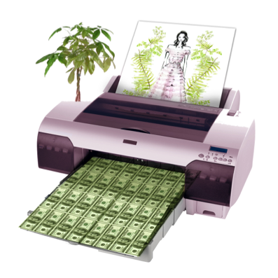
And hopefully, being a fashion illustrator is lucrative, making me rich. Nothing’s impossible, right?  Yeap, hopefully in 5 years time I ‘print’ money by ‘inserting’ my illustrations ;).

Memememe

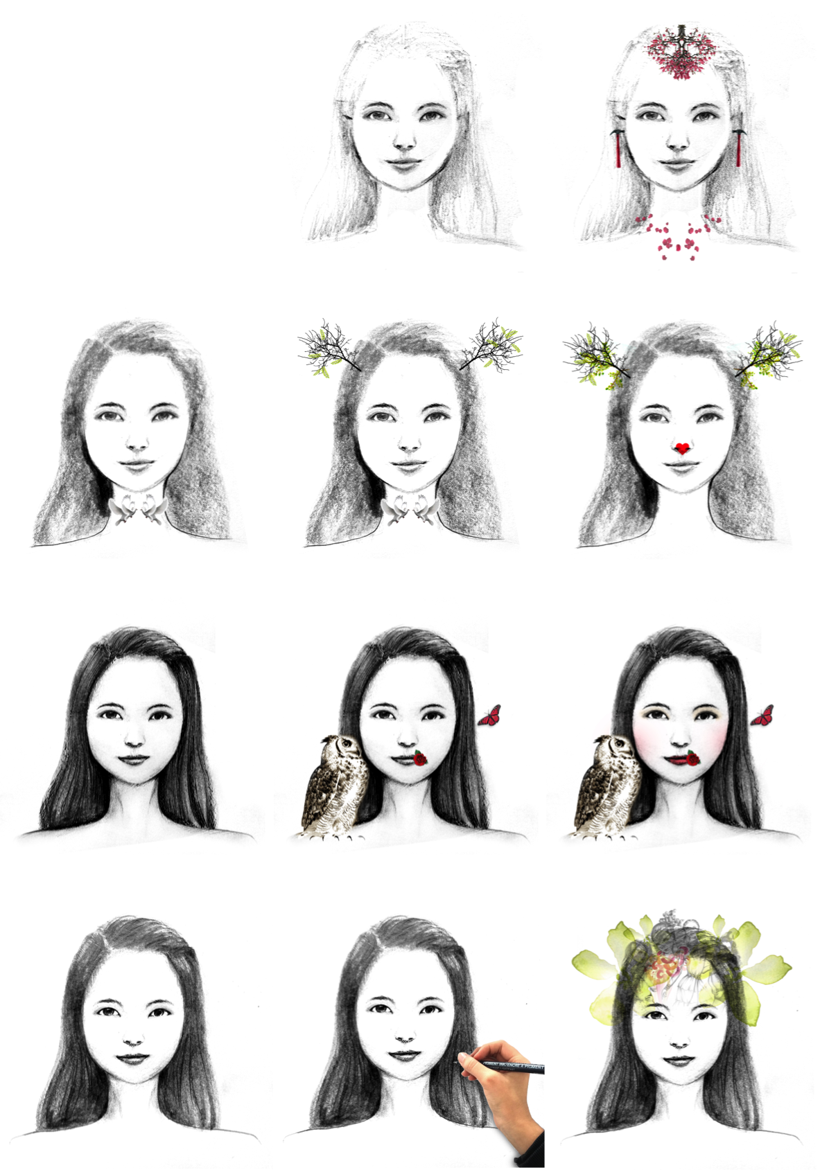
The pictures in the third column of the final work have multiple and intertwined meanings. To summarize:

:: The whole thing shows a progress of drawing an illustrative portrait – my portrait. I draw parallel to self-development/improvement = as more lines/shadings are added to my life, I will be better.

:: So, the final result of the portrait is intentionally made to be the Ideal me because me in 5 years time may not be ideal yet. I may take more than 5 years to be ideal, right?

:: me = looks like a goddess. I am fantasizing myself as some fictional character.

:: better me = me is like a deer, animal that symbolizes kindness, maturity.

:: ideal me = other than using the finished picture of my portrait, I add make up to ‘her’. I don’t wear makeup now, so I think in the future I would be more ideal with makeup. The rose at the side lips to show that I speak beautiful, kind words. And i have wise friends like the owl!

:: me in 5 years time = me as fashion illustrator, will think a lot of illustrations.

:: ORIGINALS ::

Some of the images used are made by myself.

Hand raw owl raw

ref2

ref3

ref1

And my portrait and its processes.

:: REFLECTION ::

I am happy doing it. Even though I admit it is a bit last minute for the execution, I am satisfied that I can use the style that I like. More importantly, I feel that after this assignment, I can draw illustrations faster and better. Applying as many design synectics as possible is challenging actually, I spent more time planning then executing the final works, but it is really worth-doing. I want to make more ‘smart images’ that can talk to the viewers without words.

And thank you, Mimi for your guidance 🙂 I am exposed to many new skills thanks to your teaching in class and also the assignments <3.

The best is yet to be.