Banner Progress (After Recess)

So, I decided to not just re-resolution-ize each element that I have drawn as motifs, but also to change the composition of my banner. Because I feel that the last banner I have shown to Ina and the class has no feeling.

Ina also said that there was a lack of tiny details or texture in the micro level in order to entertain the viewer’s eyes when they look at the banner closely. So I was thinking, what should I do? if the banner is done in illustrator and in vector form, the texture might be needed to be in vector form as well. The flatness of digitalized image is not my cup of tea. I always like the touch of something hand-drawn and traditional.

So I decided to almost ‘re-do’ the banner by creating high-resolution hand-drawn images so I can retain the sketchy element. To add something more but subtle, I photoshopped the important elements such as the head, skeletons, and crown to have ‘dots’ in the shaded area. I hope it looks okay when being printed in original size.

I play with only two colors because…I don’t know what else to add in order to maintain the seriousness of it. I don’t want it to be as cheerful as my previous banner because in this new composition, there is an eye that is very sharp and full of emotion.

The process that I took is very traditional, almost like a photomanipulation + digital painting. Each element is manipulated and composed one by one. Then in order for my laptop not to crash, I flatten them after I’m satisfied the black-and-white composition. Coloring is the last step, and each element and corner of the banner is colored differently. It’s almost like a painting. I don’t know, I think this is my cup of tea even though it’s a lot of work.

Below is the progress. I hope it’s fine…

Week 5: Banner Progress

In week 5, I made progress in the banner composition and color choices and I came out with these.

Ina has approved of the second draft and hence I’m working on the final high-quality version for the final print. It is approved because it’s more interesting and detail-full compared to the first one. Well, I learn the importance of a good “macro view” and “micro view” from this process.

Motif Development Week 4

Feedback on Week 3

Based on the feedback on Week 3, I ‘narrowed down’ the story or topic before developing anything. Ina said the element of crops and plants sprung out of the goddess’ dead body is interesting, and I think so too. In addition, I thought it would be nice to have some elements that can give the vibe of ‘royalty’ or something that relates to the kingdom of gods, instead of purely vegetation and body. Based on these thoughts, I created individual ‘elements’ using pencil and pen.

Elements/Motif

The elements consist of various fruits and crops (not just padi) which grow in Indonesia, a Javanese crown, and a female half-face half-skull. I’m inspired to draw half-skull because I imagined the ‘supernatural logic’ behind the growing crops from the dead body. I thought maybe, the life of Nyi Pohaci was kinda ‘transferred’ to the crops, so the half-skull illustration to depict the ‘process of life transfer’, where her beauty was drained out, left with only her skull.

Below is some of the ‘cleaned-up version’ of the sketches. And I did some random watercolor splashes too for experimentation later.

Experimenting to create more motifs

I felt the singularity of those elements are lonely and less intricate. I could not imagine the South East Asian feeling if using the elements as it is to the pattern. So I tried playing around with the elements to create motifs. I did multiple mirroring, and I pretty like it.

Today in class, I tried combining different elements to make a not-symmetrical motif.

Developing patterns

From the modified motifs, I created regular patterns and somehow, I could feel something South East Asian/Indonesian from them. I want to try something that looks less regular, but I don’t really know how to do it…

More patterns are done in class. I prefer something more ‘geometric’ if it is a full repetitive pattern. I think I should draw more interesting elements?…

So far, this is my progress :).

Class Trip to Future World – Response

I cannot be more than grateful to be able to visit Future World exhibition as a class trip and being explained by the TeamLab member himself, Takasu. Overall, it was an eye-opening experience about how close we are to the ‘future’, where everything is third generation computing, and able to turn non-technological things into a piece of technology in an instance – in the exhibition, projections of animation on tables, walls and things react to our presence and actions. I feel like I was in the future, fully immersed that I almost forgot most of the world out there is unlike Future World right now.

My favourite installation for me is the Story of the Time where Gods were Everywhere, at the Park Session. This is the installation where the rain of ancient caligraphy could turn into ‘real objects’ when we touch it. For example, if we tap unto the caligraphy with double circle, it would become a sun in that ‘world’. Then, if we tap the animal symbols before there is food such as grass, they would die. Wrongly tap a fire symbol would burn the whole forest. It reminds me a lot about the creation of the world in the Bible, where everything is in its right order so that no creature suffers. It is so impressive to me too because different audience are able to create different world, and one could change the other’s world. We can become ‘gods’ in this installation, like literally.

The Story of the Time where Gods were Everywhere Photos

img_6916-min img_6934-min

However, the most unforgettable piece is the last installation, Crystal Universe. Visually, it is really breathtaking that I thought they were all diamonds or stars. Such strong visual is forever embedded in my mind it create a very high standard for the aesthetic of installation art. Sadly, there were no enough time to really feel the entire 4D experience by supposedly ‘swiping stars and planets’ in the mobile app. But this is really the most gorgeous installation I’ve ever seen.

Crystal Universe Photos

img_6947-min img_6944-min img_6939-min

At the end of the tour, there was a lecture that was short but sweetly revealed the art concept behind the whole Future World: the Japanese or eastern perception of beauty. Never I expect that would be the inspiration, because the installations are so futuristic – who gonna think it was inspired closely to the eastern traditional perception of beauty? The western beauty theorem ‘direct us’ while the eastern ‘surround us’. I must admit the beauty, feeling and experience of the exhibition are multi-directional that it feels like another world. This is one great lesson for me as an artist and product designer.

NATURE Section – Interactive installation where the ‘flowers’ we step on will die and more will grow in the place we do not stand on; animation of the sea. Both are inspired from Japanese traditional screen.

TOWN Section – Immediate urban planning; move the block and you move the whole infrastructure on the screen; draw your buildings and vehicles and you might see them on the screen; building blocks that change colors; interactive table

PARK Section – A place for you to play with other visitors; hopscotch!; create your own fish; become a god and create your world.

SPACE Section – Immerse yourself in the celestial space and cosmos.

img_6957-min

Team Shingaporu: FINAL PROJECT

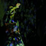
Hi Everyone! We are team Shingaporu and for this project, we are working on a landscape digital painting as part of the celebration for Singapore and Japan to commemorate the 50th anniversary which is happening right here right now.

sj50 logo STB_Joint-Tourism-Logo

Claim

Commemorating the 50th anniversary of Japan-Singapore diplomatic relationship. That is the reason why we combine Japanese traditional aspect (folded screen) with modern landscape of Singapore. We feel that not many people know about this ongoing special celebration, hence this visual response might serve more than just a display but an informative artwork.


Artist Statement:

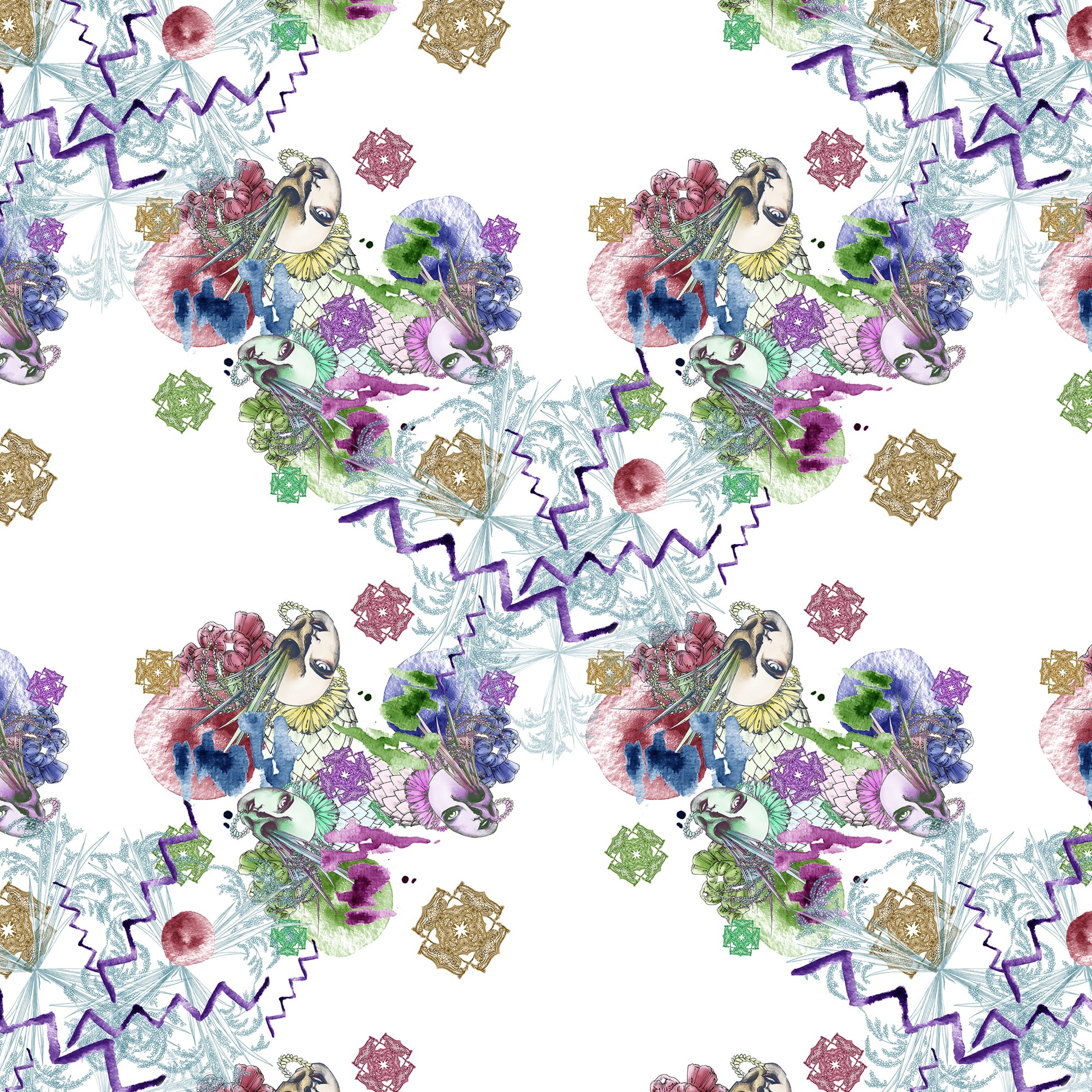
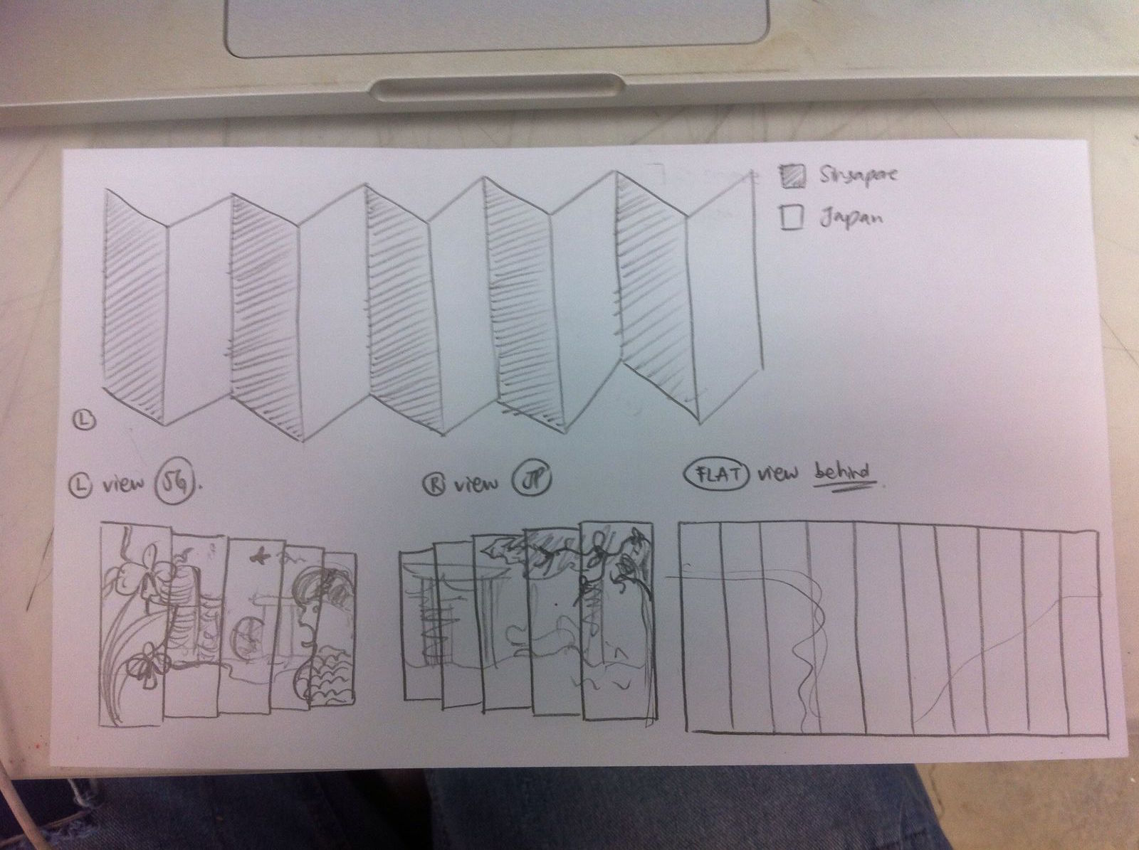
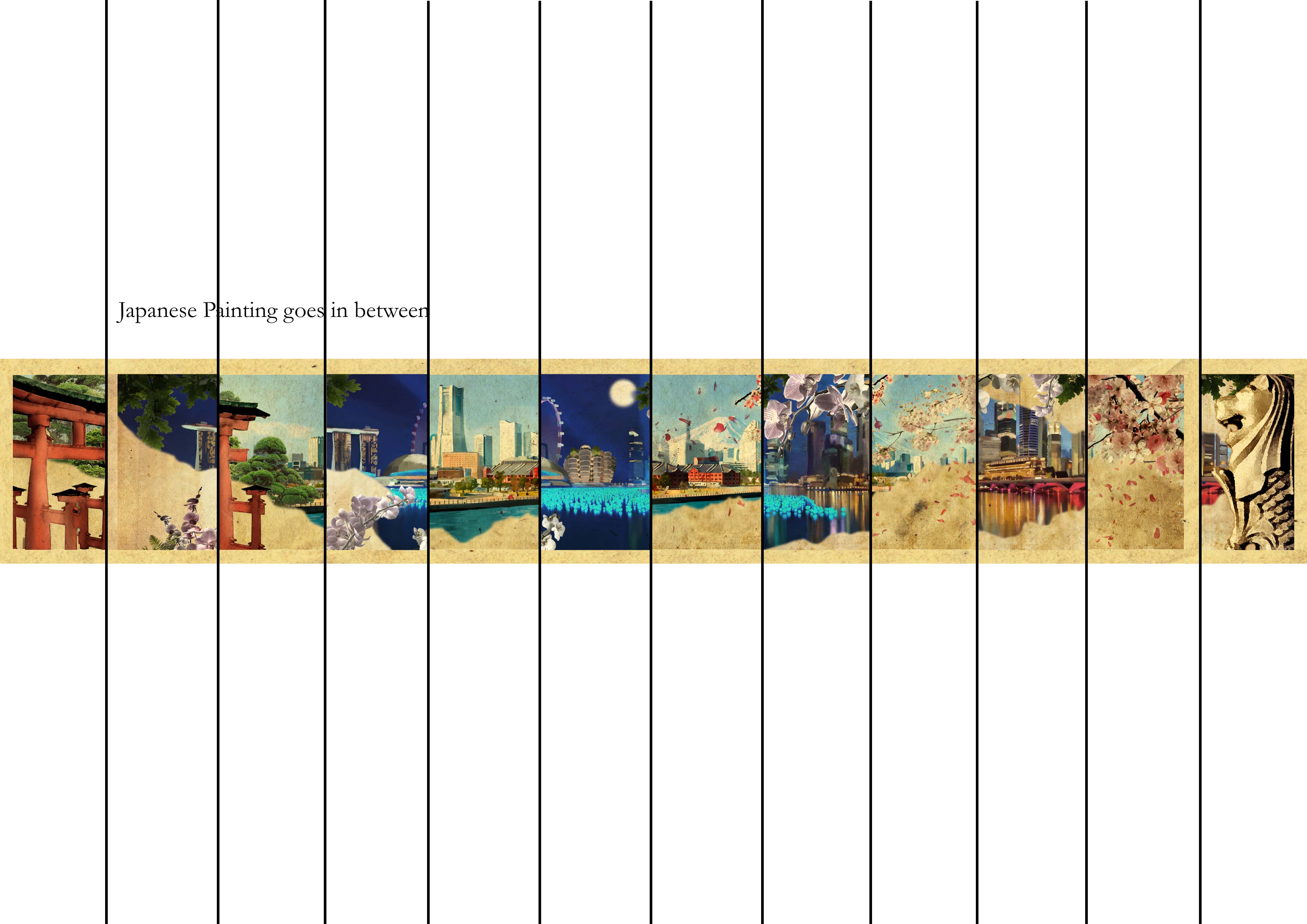
Shingaporu is made in a way that when the viewers moves in a direction that is parallel to the artwork, they would be able to experience a change in the landscape: from Japan to Singapore, and vice versa. There would also be a moment where two landscapes intersect and exist on the same plane side by side, which symbolizes the close relationship between the two countries.

In fact, our visual response is actually an art to celebrate and increase the appreciation for the ongoing celebration of the 50th Anniversary of Singapore-Japan diplomatic relationship.

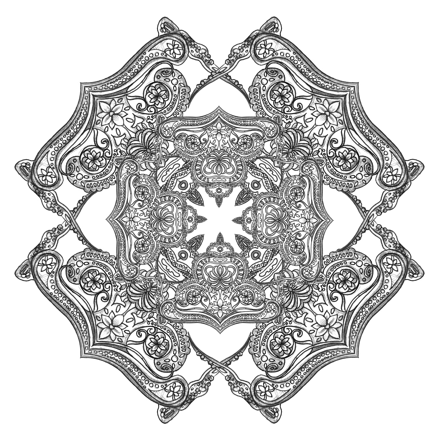
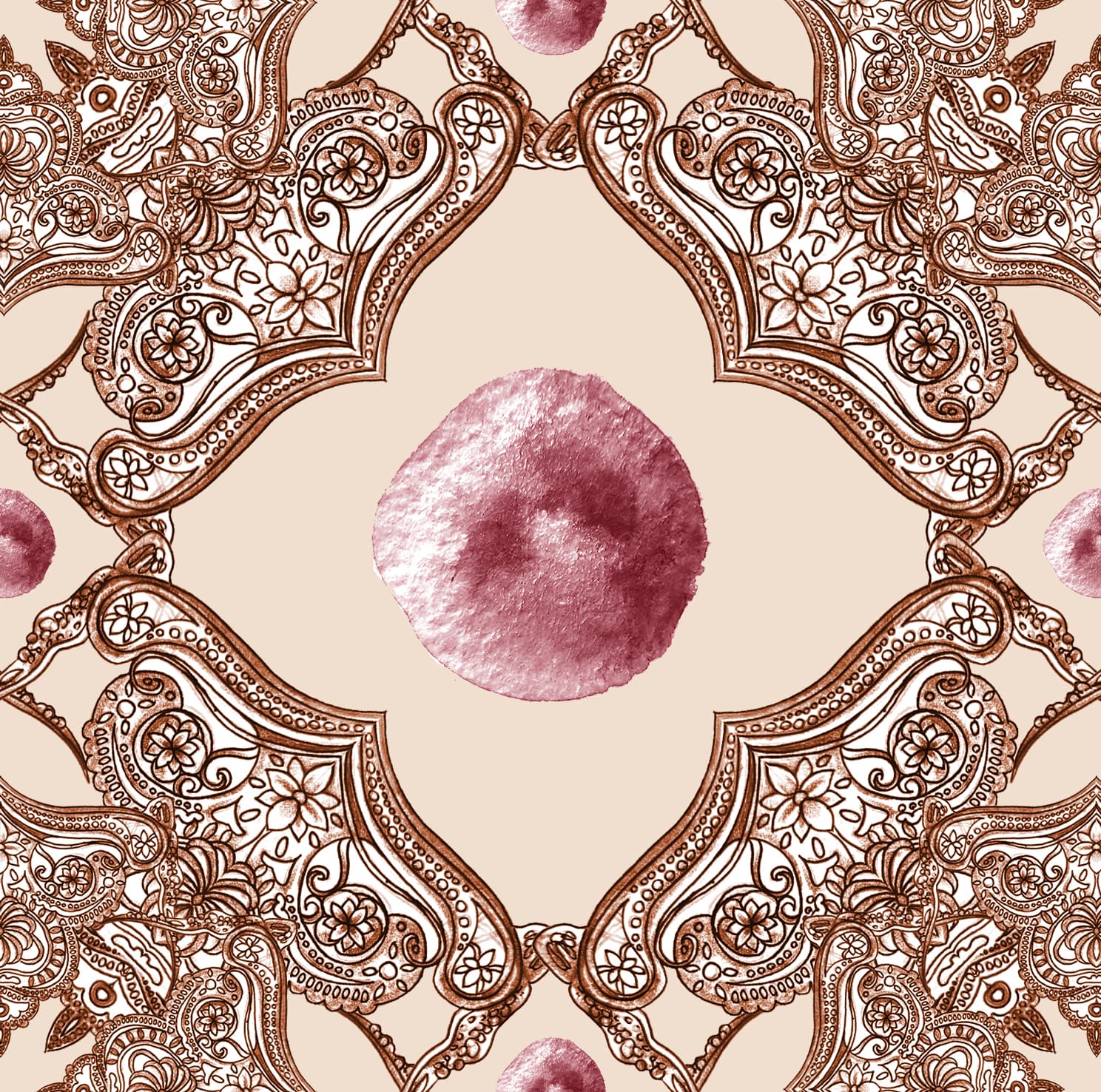
Since our visual response is based on the topic Japanese Screen Painting, we played along with the idea of Japanese screen paintings that usually come in pairs. The difference from the original historical art is our art exists as one single screen with two separate different paintings.

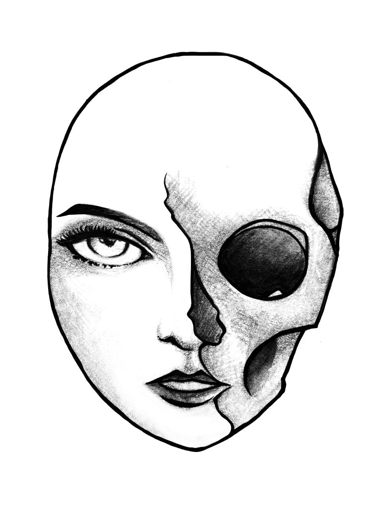
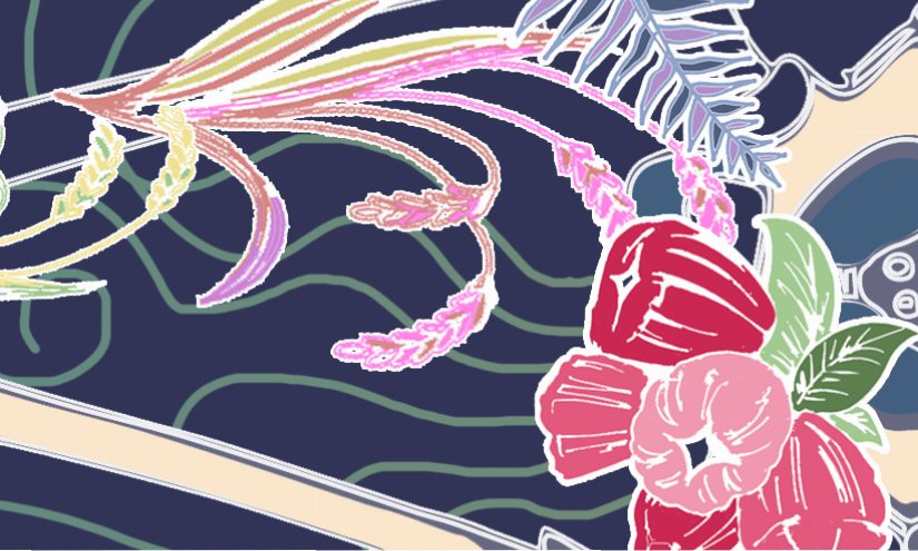
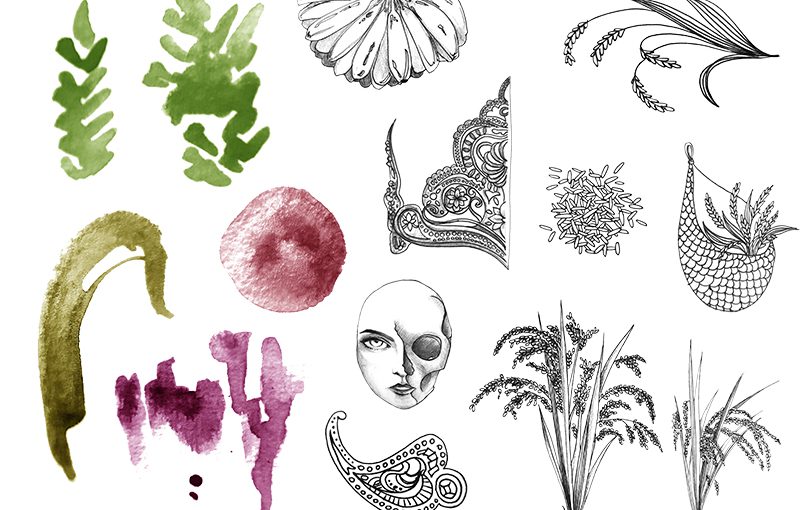
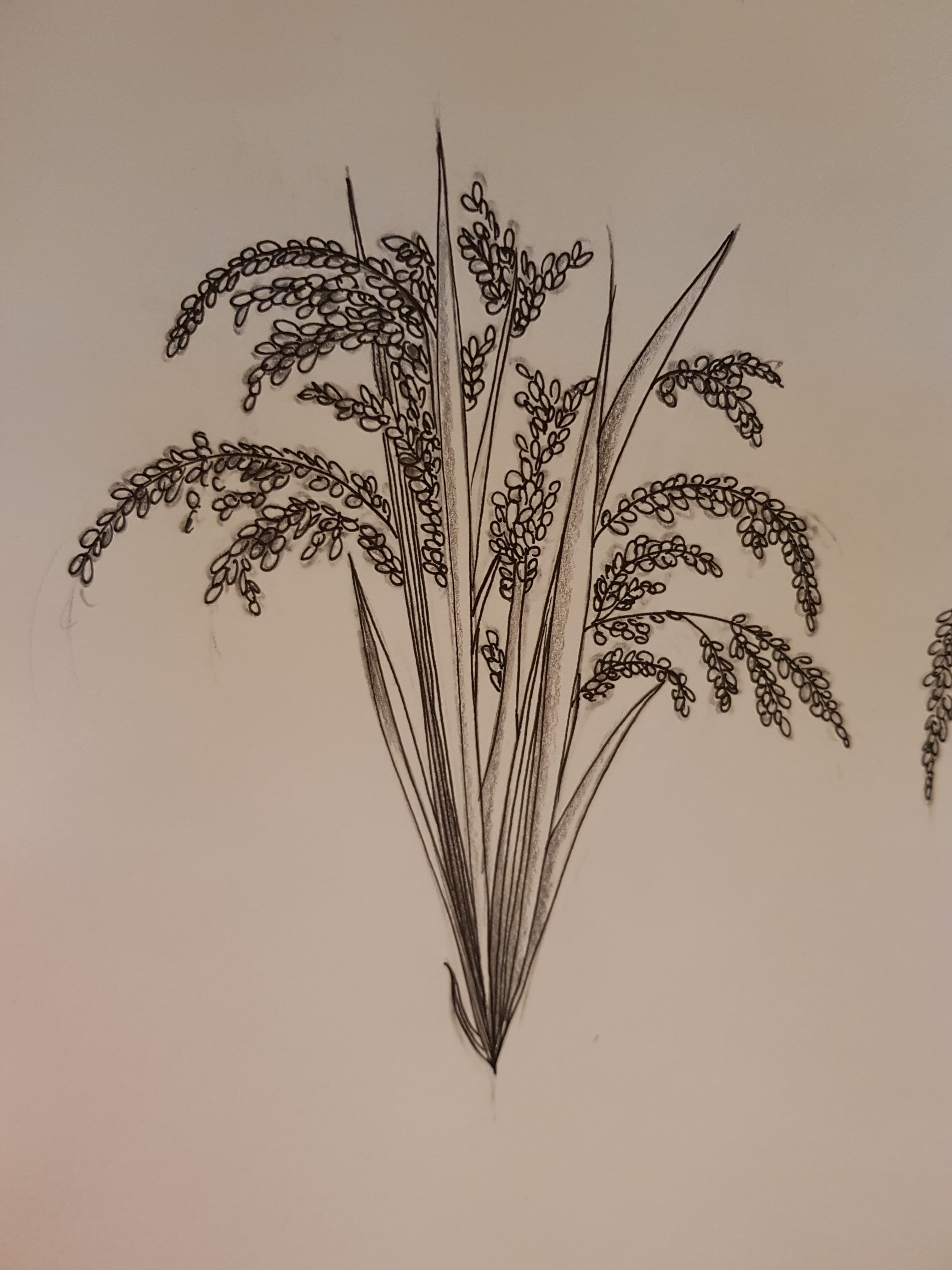
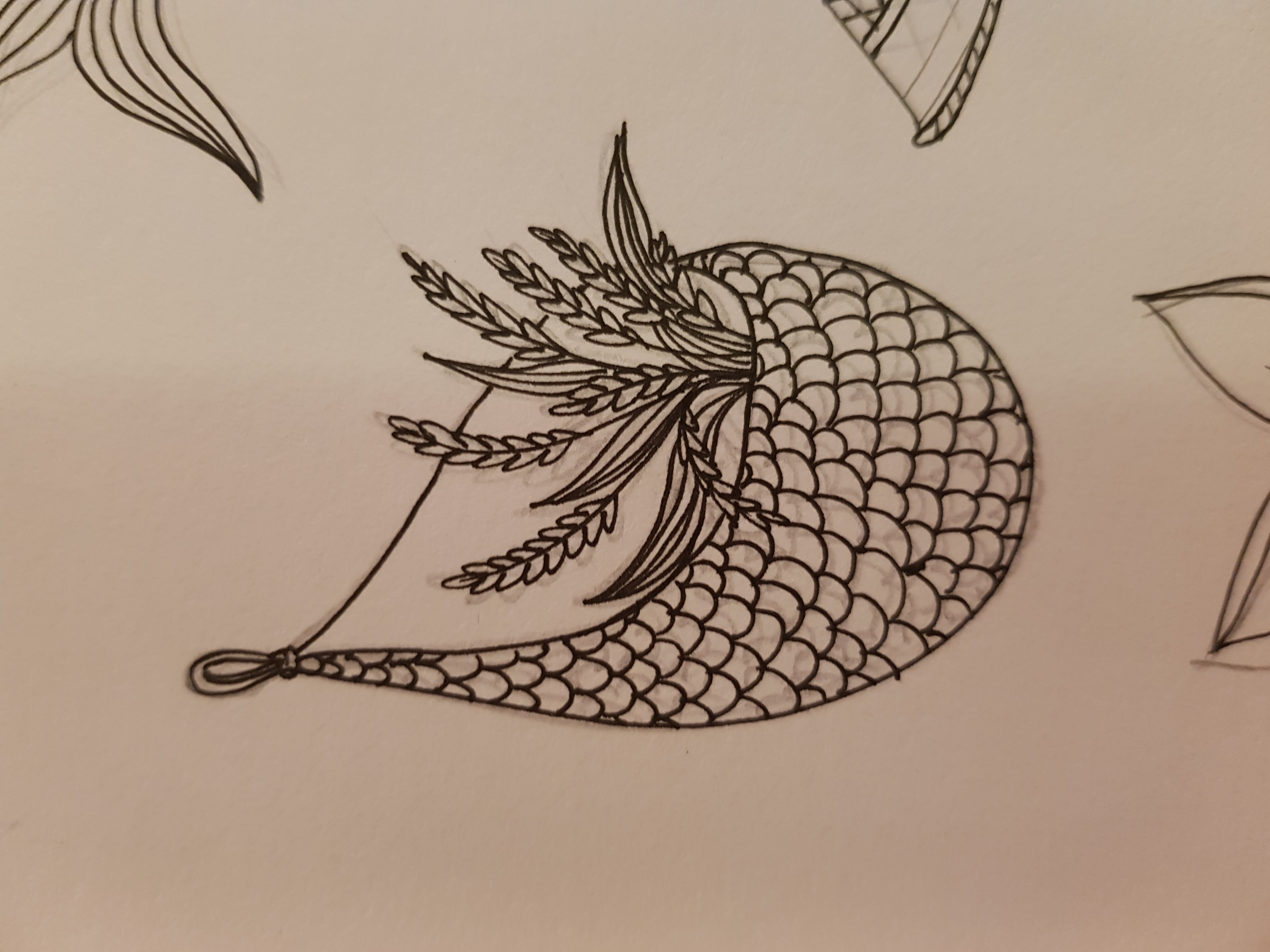
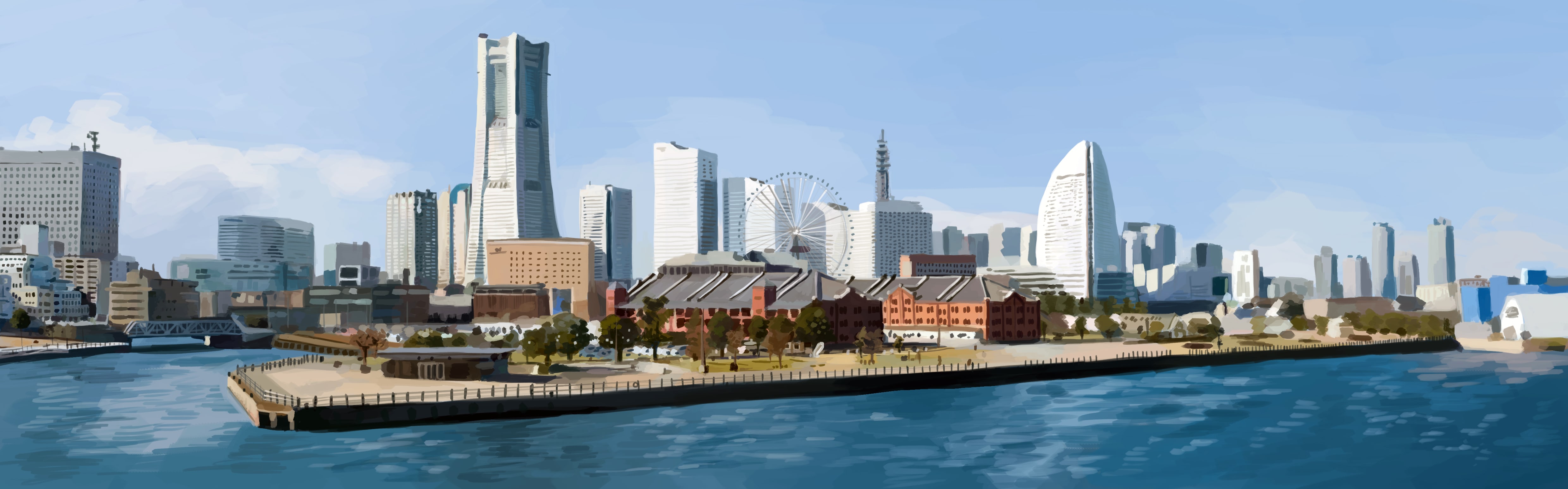
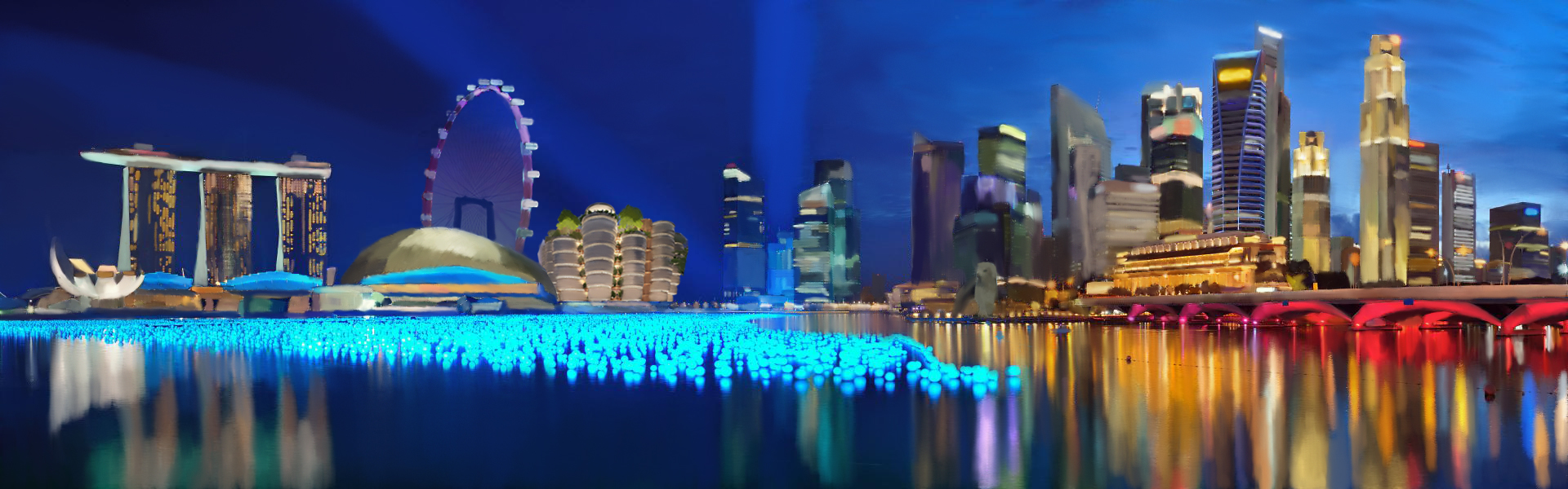
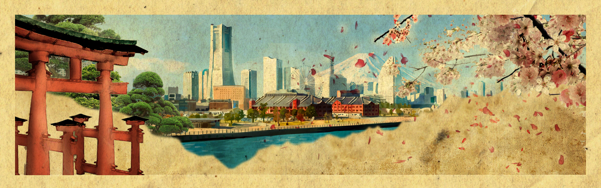
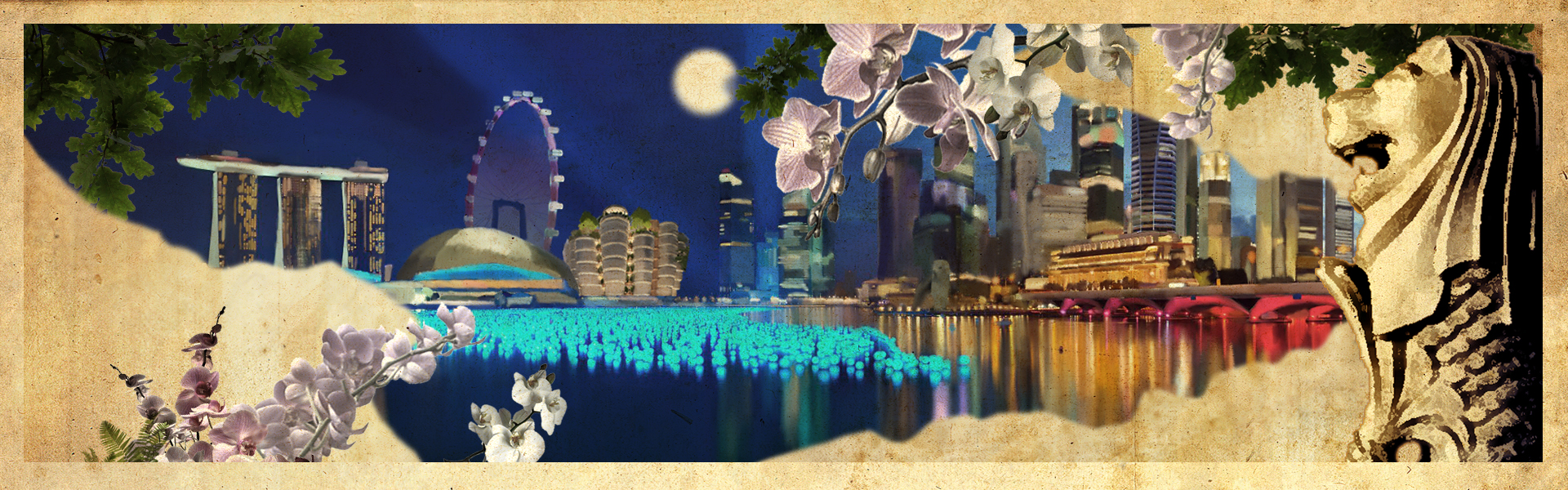
Then, in relation to our selected artefact: Four Seasons with Sun and Moon, we decided to paint a landscape of the world we live in now. Unlike in the past, we are more surrounded by skyscrapers and man-made buildings rather than nature. The seasons in the artefact represents a cycle and the passing of time. However, we do not use the different seasons to represent this. Instead, we make use of the foregrounds of each landscape to represent the past, and the backgrounds to represent the present. The “foreground of the past” consists of torn old paper texture, each country’s iconic flower and one of the oldest iconic place. Then, as we look far into the present and the future, we see the background of today’s cityscape. This way, we are able to keep traditional taste of Japanese screen painting despite using modern medium.

Lastly, viewers might noticed that the landscape of singapore is during the night and the landscape of japan is during the day. This corresponds to the yin and yang concept evident in our selected artefact.


Group Members: Darren Ho Jian Hunt, Feliciana, Sarah and Isabella Tong

Title of artwork: Shingaporu

Size: 6 A4 and folded to make an anamorphic art style

Medium: Digital Painting plus filter to make it look like a Screen Painting

Job Allocations:

  • Darren Ho Jian Hunt – Digital Artist for Singapore Landscape painting
  • Feliciana: Concept Artist plus Final Touchup
  • Isabella Tong: Digital Artist for Japan Landscape painting
  • Sarah: Researcher, Writer and Planner


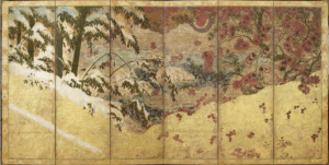
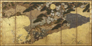
Research and Reference: Four Seasons With Sun and Moon in National Museum Of Singapore

Screen Shot 2016-04-14 at 2.14.04 AM Screen Shot 2016-04-14 at 2.14.16 AM

Visual Analysis

  • Both screens have subject matters of nature and landscape: trees in different seasons, hills and valleys ‘framing’ the trees, grass, flowers.
  • Golden frame.
  • Each screen is divided into 2 ‘scenery’. First image: winter (L) with its white snow on the leaves, autumn (R) with red falling leaves, and both are during the day because the tone is bright. Second image: Summer (L) with barren land and withered plant, spring (R) with baby plants, blooming flowers and grass, and both are during the night because there is circular moon at the top side of the painting

Visual Response Idea

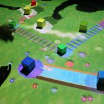
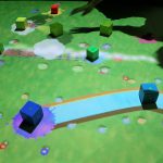
  • The digital painting of Singapore modern landscape.
  • Might include famous landmarks, buildings and places such as Merlion, Marina Bay Sands, Singapore Flyer, Buddha Tooth Relic Temple, Esplanade Theatre and many more.
  • Nature’s element presented in the painting: rain forest trees, orchids, or other plants which are present in Singapore.
  • The painting can be folded, just like Japanese screen


What else is being done for the celebrations

http://www.sg.emb-japan.go.jp/events_SJ50PA_Schedule.htm

  • There are several events being held in Singapore throughout the entire year to celebrate this joyous event. Events that include food, Artwork, Travel Fair etc. Follow the link to get more details on the different events.


Are all the celebrations about let’s forget the past and focus on the present and the future

http://www.cnbc.com/2015/12/30/sg30-sequel-singapore-japan-to-launch-sj50-to-celebrate-bilateral-ties.html

  • From the article, we read that,

“During World War II, when Japan occupied Singapore, thousands of Singaporeans were killed for being “anti-Japanese” or for being “Chinese sympathizers.” 

But there has been a sea change in relations since the 1945 end of the occupation. The countries launched diplomatic relations in 1966 – a year after Singapore gained its independence – and in the 1970s Japan became Singapore’s largest foreign investor and trading partner. The Lion City was also the first country to sign a free-trade agreement with Japan in 2002.”

To conclude, we can tell that the relationship between Singapore and Japan is ever growing and are going stronger as years goes by.


Why is the painting folded into anamorphic style and its function

  • Our artwork is such that when the viewer moves in a direction that is parallel to the artwork, they would be able to experience a change in the landscape (from singapore to japan, and vice versa). While moving, there would also be a moment where the two landscapes intersect and exist on the same plane. This symbolises the relationship between the two countries. Furthermore, the artwork when viewed from the front can be seen as a combined landscape of singapore and japan.
  • Since japanese screen paintings usually come in pairs, we played along with that idea. Our artwork can be seen as two separate screens but they exists as one single screen.


Why this medium and how we see the co-relation

  • In relation to our selected artifact, we decided to paint a landscape of the world we live in now. While people used to be surrounded by nature in the past, we now live in a world where we are surrounded by skyscrapers. We intended to show how our landscapes have changed from past in this artwork. The seasons represents a cycle and the passing of time. The seasons has been used to portray the idea of time in our chosen artifact. In our artwork, we plan to do so with our choice of medium while keeping some elements of the original artefact (such as the gold borders, trees and flowers), since the digital medium had not existed in the past.
  • Viewers might noticed that the landscape of Singapore is during the night and the landscape of japan is during the day. This corresponds to the yin and yang concept evident in our selected artifact.


What is it’s size and purpose of the painting

  • The artwork will be printed in 6 A4 styles and pasted plus folded in a way to make it into a larger size printing to bring out the sort of impact to the audience. The printing can either be a banner to mark the Anniversary or can be used as a brochure for people to realize the existence of the relationship.
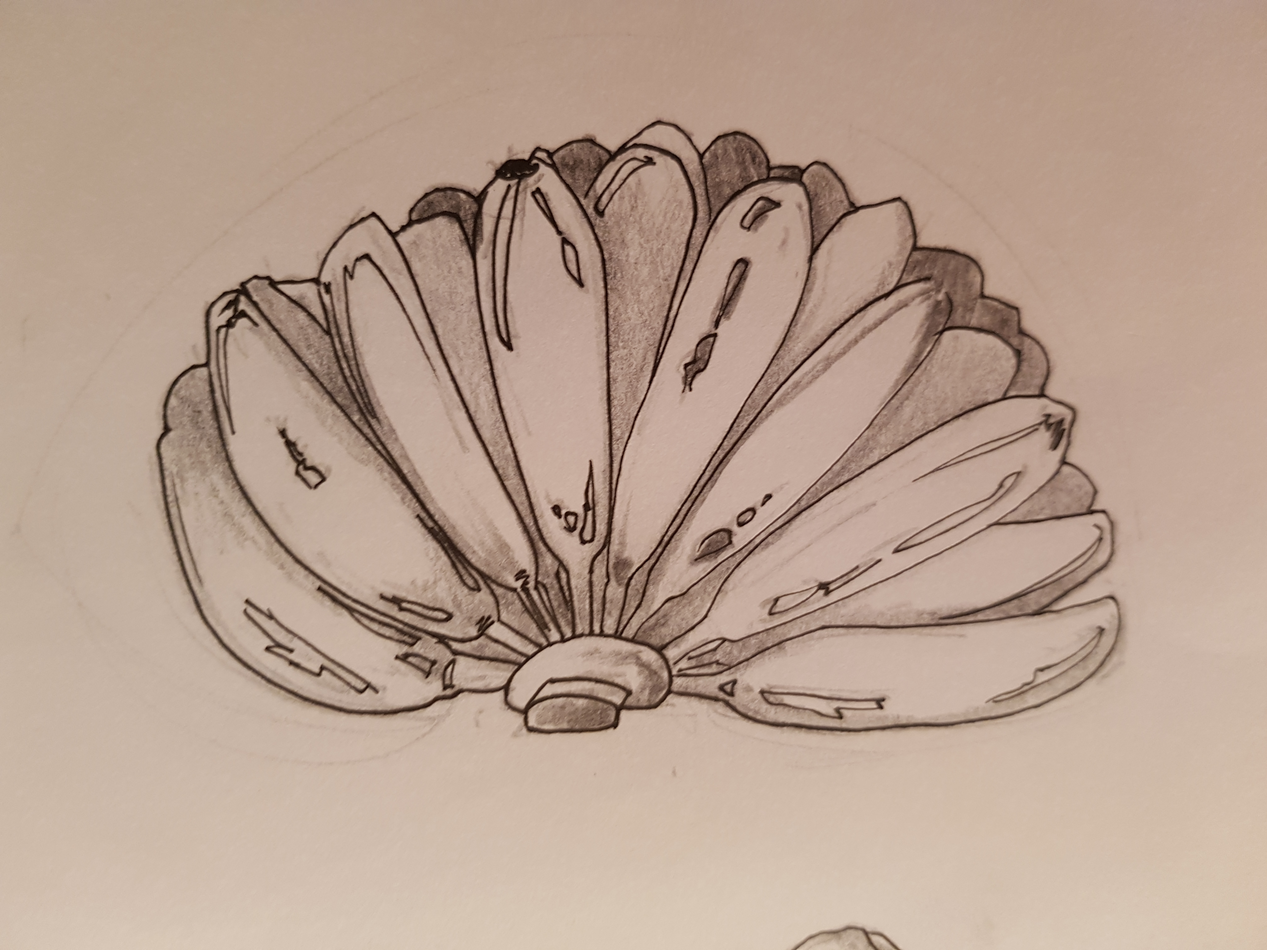
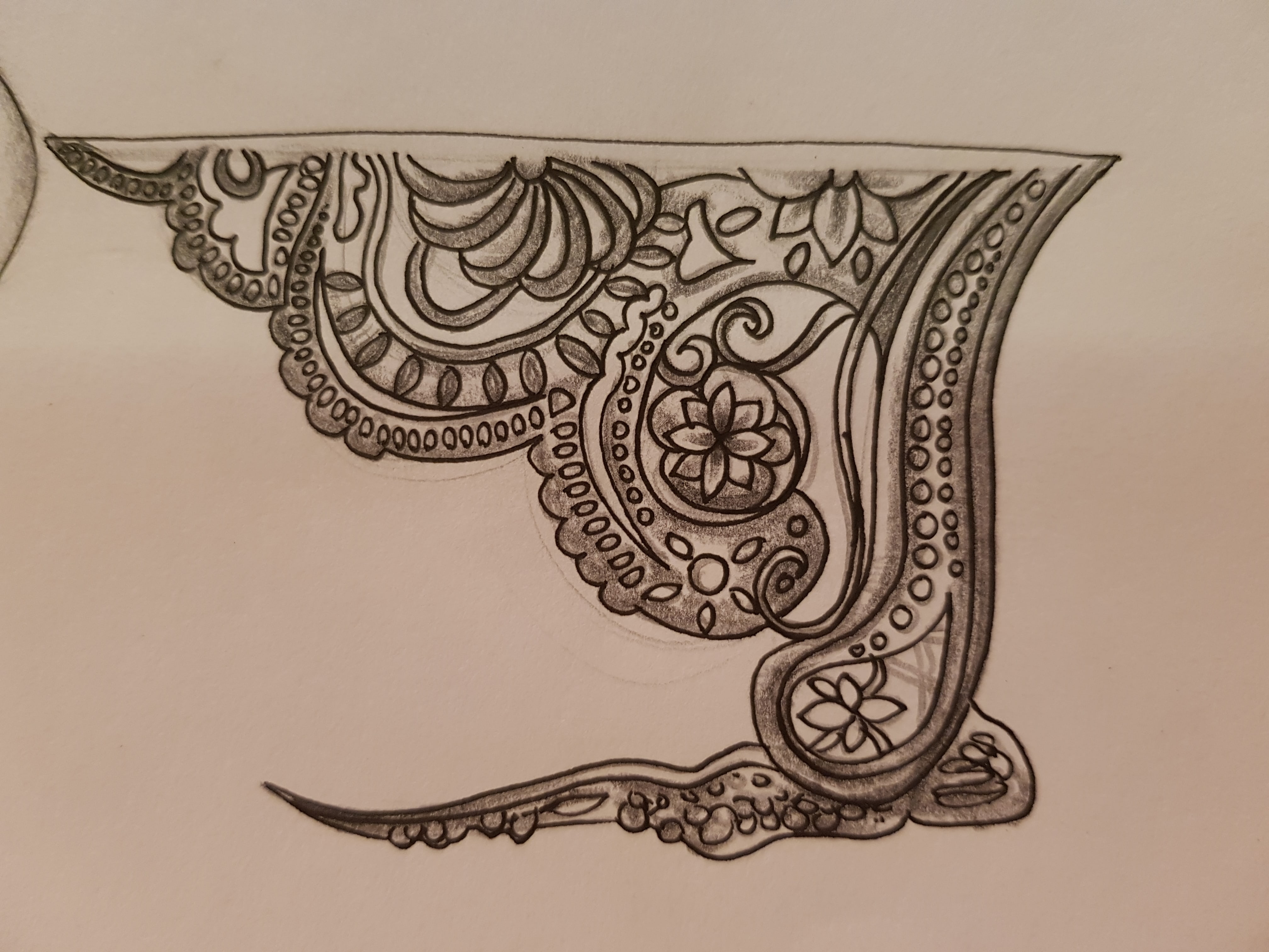
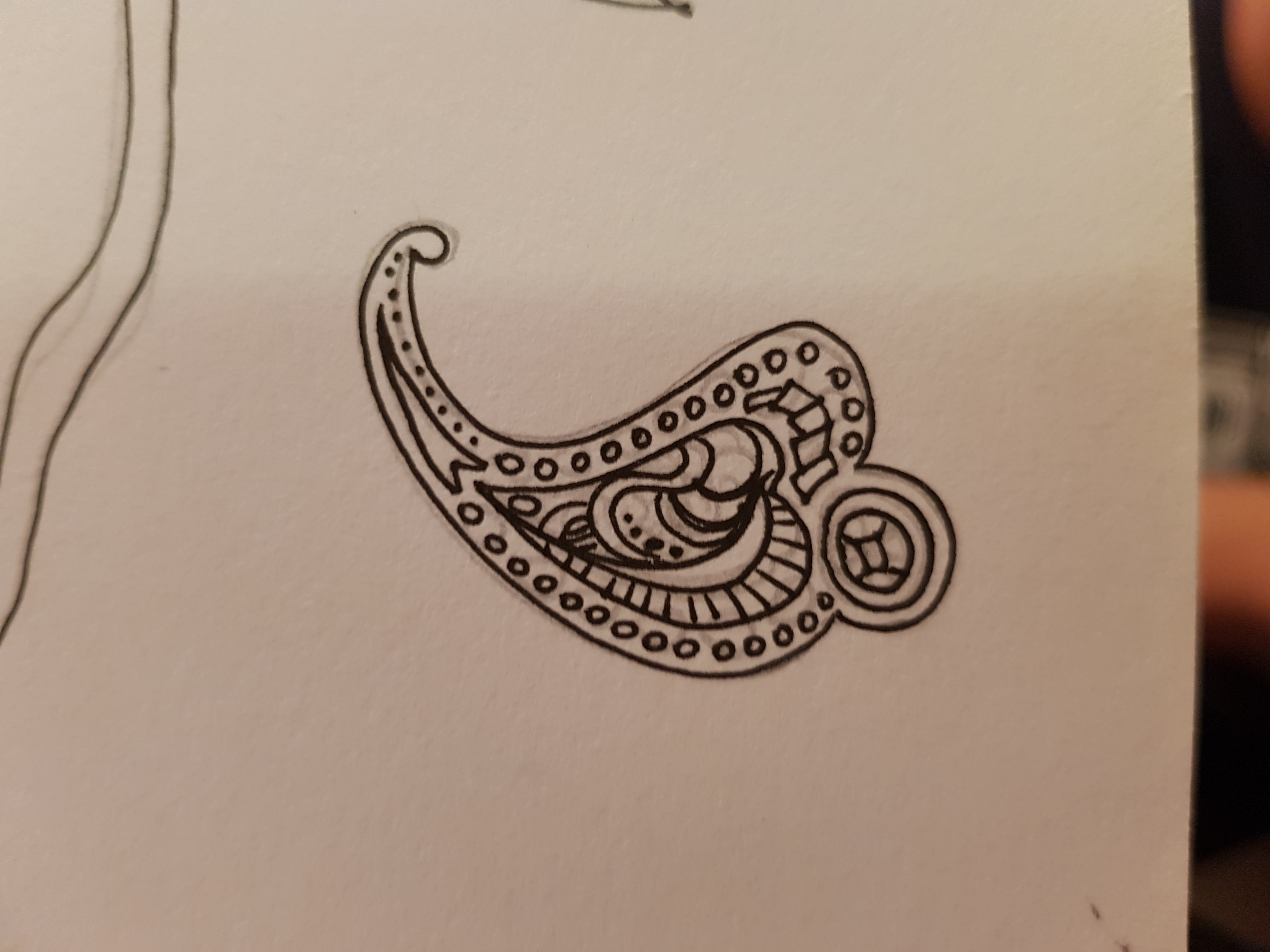
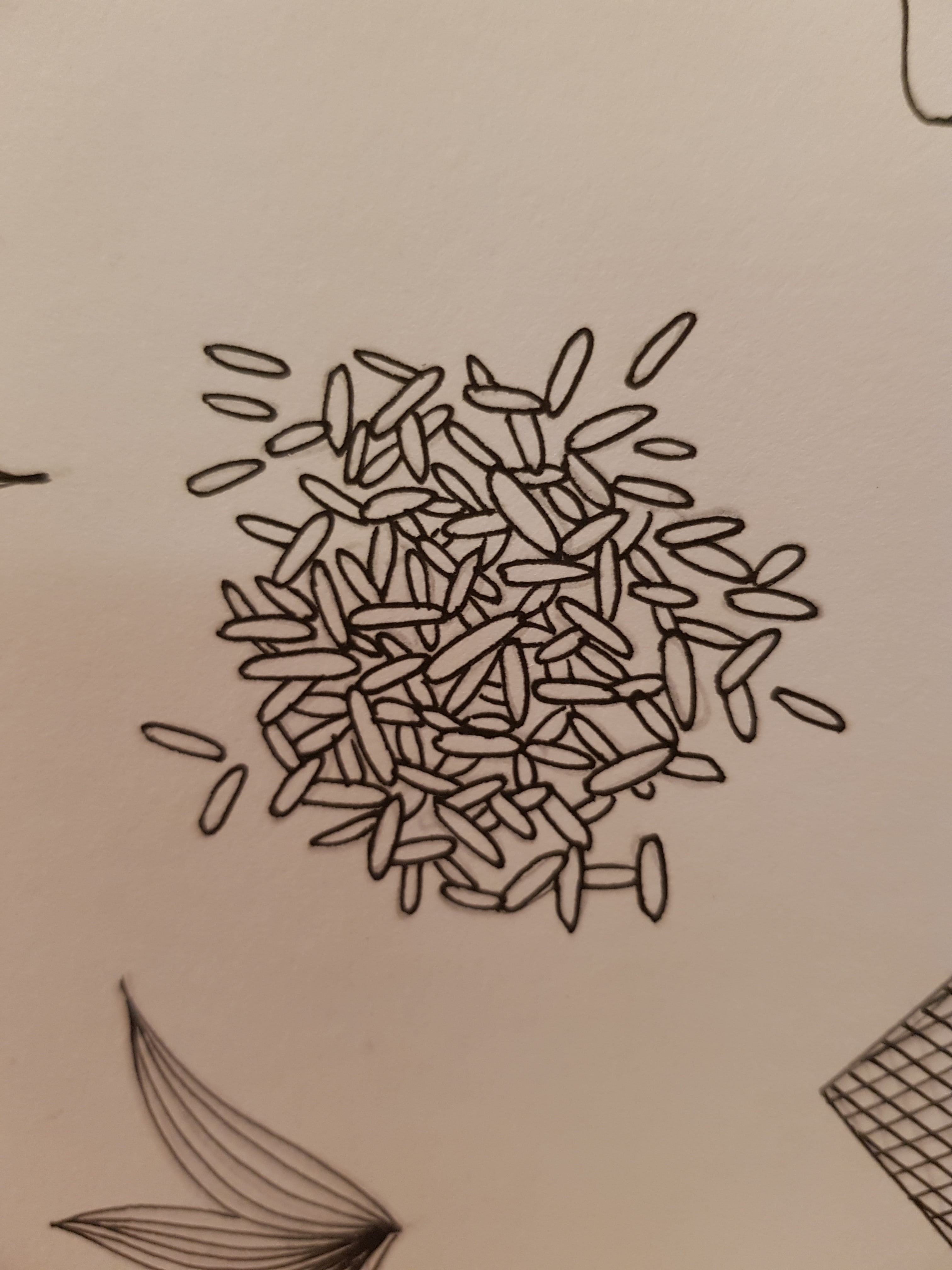
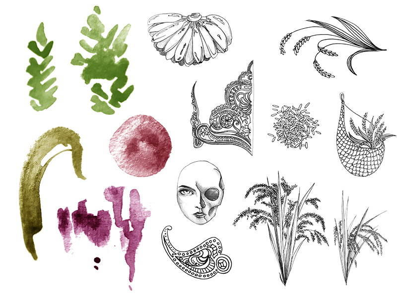
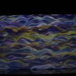
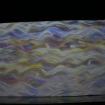
Process Images

Concept & Idea:

20160413124334Base Paintings:

japanyokohama-min MarinaBayp

Final Touch-ups:

JapanYokohamaa MarinaBayp 2

Printing & Folding Format:

Process-min

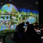
Presentation & Proposal

AH Last Assignment.pptx.compressed

Reflection

First of all, I would like to express my gratitude for being given the opportunity to do this project. It is my first time of planning and creating an artwork (visual response) by referring very closely to an ancient or historical artifact. From this one project, I feel that I have learned more ideation/conceptualization skills which surely can be used for future projects.

At first, our team found it difficult to create a visual response to an artifact with a general positive intention and no controversy. Personally as an artist, I do not really like to make an artwork with contentious issue: a point of view about particular religion, culture, gender, and many other sensitive topics. It is because my rooted art principle is to create a happy art, which somehow I successfully convinced the rest of the team to have the same vision for this project.

However, non-controversial art might be equal to mediocre and boring art, something that we do not want neither. So, we decided to create something that most of the potential viewers (ADM students and faculties) able to relate to. That is why we choose Singapore as a big part of theme.

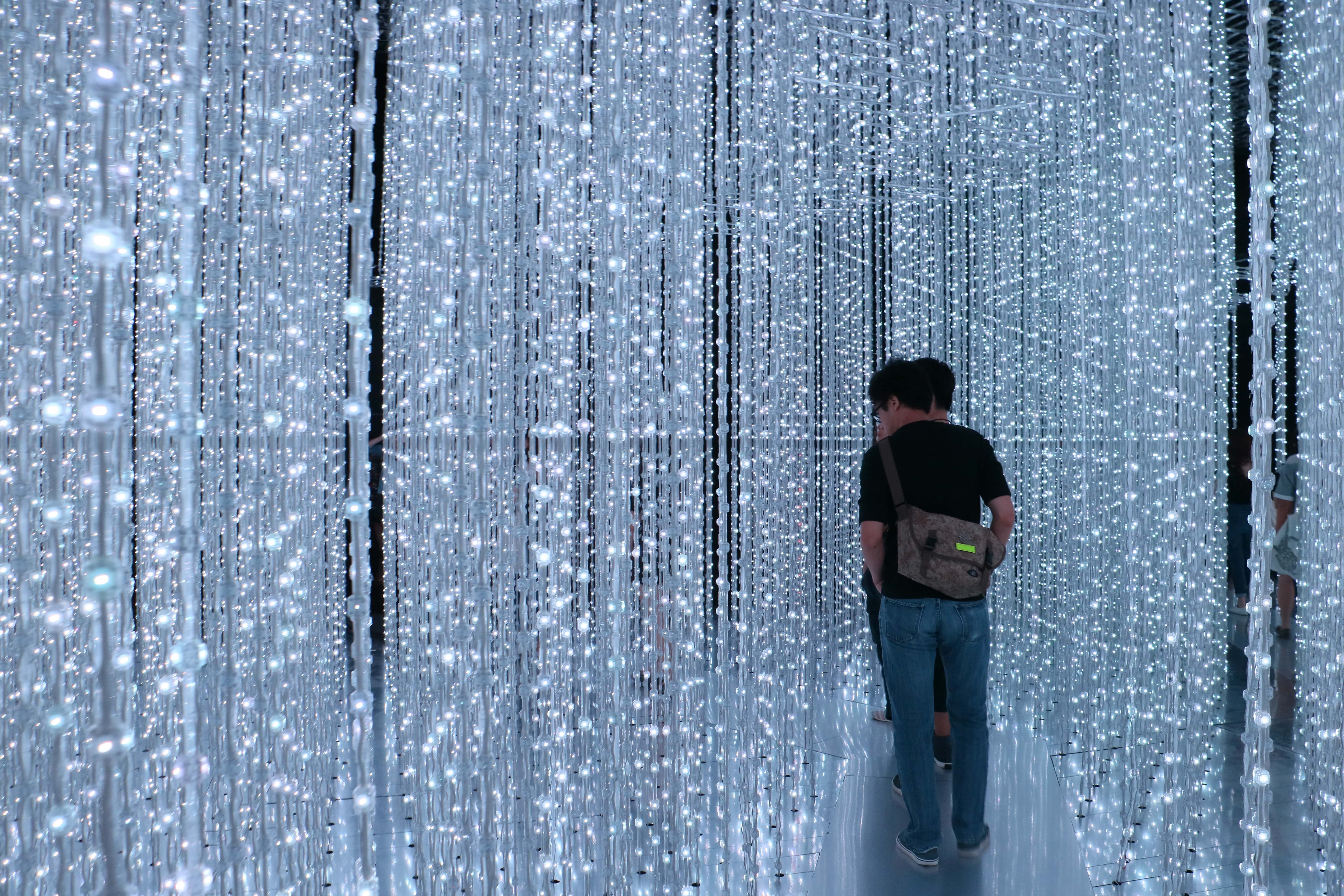
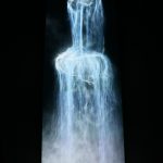
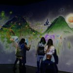
Still, something was really empty the first time we came out with the idea of drawing Singapore landscape in Japanese screen painting format. To fill that gap, we infused current general knowledge into our planning: the 50th anniversary of Singapore-Japan relationship. I was the one who came out with this ‘news’, simply because I watched one of the commemorative performance and saw an installation related to this at Changi Airport.

Since then, my eyes are opened. A simple general knowledge about what is going on around us can be a source of inspiration; even better, purpose. Knowing this, I regret of not having the habit to read local news daily. I did not know and have never experienced that an artist may be benefited directly from being resourceful about current issues.

Hence, in the end of this reflection, I would like to encourage as many friends and junior as possible to…read newspaper, or e-news.


EGO – Final Assignment

:: EGO ::

Final ALL done

:: RESEARCH&INSPIRATION ::

1. Red Hongyi || 2. Groerhs || 3. @ibird_art

Red Hong Yi

Groehrs

ibird

The concept/style that I pursued for this assignment is illustration+digital collaging, slightly different from the inspiration I have searched. I prefer digital collaging rather than traditional arranging because it allows more flexible process and permutation of final results. Traditional arranging requires a lot of different materials and the color would be more ‘inflexible’.

I chose to use quite a number of my hand drawn pictures to make the whole panels uniquely me. Most of the times, hand drawn lines are individualistic.

:: PROCESS&INSIGHT ::

Fantasee

I am a dreamer, a fantasizer. The idea is about opening my brain, and you see what is in side. The first image is a trial to see whether this illustration of brain good enough to be in the collage or not. I use analogous colors from pink/red to blue/purple, with the intention to give clearer depiction of fantasy.

Handy

I am pretty handy. The idea is having a hand that can act like mechanical tools, hence my hands are quite versatile in making things, repairing things. I got the inspiration from a doctor who suddenly ‘foretold’ me that “there is something about your hand. Don’t work for others. Work for your own.” And some friends do tell me that I have magic hands. The analogous colors of red to yellow are chosen as they gave the impression of working. When you are tired your face turns red,  I guess?

 Dove

I am willing to help. I want to be a blessing for others. My hands are meant for benevolent things. Hence what i can think of to symbolize ‘blessing’ is dove. And to apply design synectics, I replace the wings with my hands. It gives the impression that with my hands, I fly to others, helping them and sprinkling blessings. At first i found difficulty how to make the composition smooth. The 2nd picture looks patchy, hence I try unhide certain layers and the color of the wings help a smooth transition from illustration to photo. I used split complementary colors of light purple, blue and yellow for the bird – aesthetic purpose. I add the tree as a ‘background’ because when I tried, it looks just nice, reducing the ‘rawness’ of the image. For the tree background, it is complementary colors of green and red. I use the original color of tree and its fruit to give more natural look to the image.

snake

But my heart is often consumed by jealousy. This deadly sin fades little by little as I grow older, but it still lingers there, poisoning me. Green is the color of jealousy, and a snake is chosen with the intention to depict ‘evilness’ and ‘toxicity’ of the the green jealousy. A heart is chosen to depict the kindness, humanity – which will be gone if jealousy consumes them. The line background is suggested by a friend and no, it’s not my style. Then together with the previous Benevolent hands image, I add the tree background. The difference is, the trees here are dead – because of jealousy. And for real, jealousy kills the humanity in us. The benevolent hands will not act the way they should be if the snake is still in our heart. Complementary colors of red and green is chosen – the red is ‘spices’ to the image; sub-ordinate role.

owl

To me, important virtues that I want and have to have are not just maturity and wisdom, but also youthfulness no matter what age I am at. Going to stay young at heart. I am inspired by my mom and some other parents who are still able to connect with modern teenagers and youngsters, but at the same time mature gracefully. To symbolize the wisdom and maturity, I purposefully chose owl and purple (color of wisdom). The youthfulness is depicted using rainbow and the happy silhouette. I delete the random tourist places at the feet of the owl because it looks redundant with the title. I wanted to depict youthfulness with the trait of being adventurous and exploring, however I think the silhouettes are enough to depict that.

beauty

I can’t deny that sick personality would make the most beautiful angel ugly, but in today’s world, looks are important too. Hence, if I can have both inner and outer beauty, why not? the flawless back skin is to depict outer beauty, and the garden inside the ribcage is for inner beauty. I chose roses because it’s the universal symbol for beauty and at the same time expression of love and other positive feelings. Red is for love and compassion. White is purity. the butterflies are to add aesthetics.

fashion illustrator

I want to be a pro fashion illustrator. Hopefully, as I graduate from ADM, I will already obtain the skill and the fame as a fashion illustrator, not just locally but internationally. Illustration: Elie Saab Haute Couture SS2015.

print

And hopefully, being a fashion illustrator is lucrative, making me rich. Nothing’s impossible, right?  Yeap, hopefully in 5 years time I ‘print’ money by ‘inserting’ my illustrations ;).

Memememe

The pictures in the third column of the final work have multiple and intertwined meanings. To summarize:

:: The whole thing shows a progress of drawing an illustrative portrait – my portrait. I draw parallel to self-development/improvement = as more lines/shadings are added to my life, I will be better.

:: So, the final result of the portrait is intentionally made to be the Ideal me because me in 5 years time may not be ideal yet. I may take more than 5 years to be ideal, right?

:: me = looks like a goddess. I am fantasizing myself as some fictional character.

:: better me = me is like a deer, animal that symbolizes kindness, maturity.

:: ideal me = other than using the finished picture of my portrait, I add make up to ‘her’. I don’t wear makeup now, so I think in the future I would be more ideal with makeup. The rose at the side lips to show that I speak beautiful, kind words. And i have wise friends like the owl!

:: me in 5 years time = me as fashion illustrator, will think a lot of illustrations.

:: ORIGINALS ::

Some of the images used are made by myself.

Hand raw owl raw

ref2

ref3

ref1

And my portrait and its processes.

:: REFLECTION ::

I am happy doing it. Even though I admit it is a bit last minute for the execution, I am satisfied that I can use the style that I like. More importantly, I feel that after this assignment, I can draw illustrations faster and better. Applying as many design synectics as possible is challenging actually, I spent more time planning then executing the final works, but it is really worth-doing. I want to make more ‘smart images’ that can talk to the viewers without words.

And thank you, Mimi for your guidance 🙂 I am exposed to many new skills thanks to your teaching in class and also the assignments <3.

The best is yet to be.