Tuesdays tend to be the days when I feel like my mind and body are worked to its limits. Perhaps because I’ve got three full lessons (two of which are core modules, 3 hours each) crammed into a day. And also because Mondays tend to be content heavy. And Wednesdays too. So Tuesday is the day of romping through the thickest part of the jungle, brambles and all, with insufficient rest.
But it is also the day when Astrid introduces us to the depths of history, not solely constrained to graphic design, because design is never separate from society or the time it was set in. In fact, it has proven, so far, to be a reaction to something. Take William Morris and the Arts and Crafts movement, for example. Morris was reacting to the ugliness of mass produced goods. Similary, Art Nouveau was also a reaction against academic art. And today, as Futurism and Dadaism was introduced to us, we learn that the former was rejection of the past, paired with a love for the technological advances they saw and foresaw. Likewise, the latter, Dadaim, does not stand detached from everything and anything, contrary as it is, but is set during the world wars –a time of great chaos and turbulence– which is arguably reflected in the style. The International Typographic Style (ITS) as well, developed as a means to solve the mess leftover from war in an neutral and objective manner, exemplified by its highly mathematical and logical approach to design.
Before I ramble on though, I have a Mind and Meaning quiz tomorrow. Which is why my brain right now feels a little bit like potluck, with part of me fresh from a graphic design lecture, and another part of me trying to recall information from Mind and Meaning.
One of the more recent lectures discussed basic psycholinguistics: the brain, left/right hemisphere dominance, how the brain processes language, and which hemisphere seems to be more involved with logic/math while the other more concerned with creativity/expression. Lateralization (or dominance). Not complete control. The hemispheres don’t solely do one or the other. (I’m troubled when people say “the left hemisphere is for logic, the right for art”. I’d prefer if they are aware of the nuance that should come with it. When I was much younger, I read a book on the brain -which I positively loved-. It told me the same things: left hemisphere for logic/science/math, right hemisphere for creativity/music/the arts. No disagreements then. But somewhere between then and now, articles and stuff everything all beg to differ. The hemispheres aren’t independent entities, otherwise, like the lecturer says, it’ll be like “having two brains instead”. Okay end of rant.) Back to the original topic, we also learnt that the convention (i.e. for most people) is that the left hemisphere is where language processing takes place. Regardless of the form of communication -written, spoken or signed-, they are processed in similar areas. The form of input is different, but the meaning conveyed is the same. Hence, to understand language requires some rather complex mind acrobatics of logic that happen to (for most people) sit in the left hemisphere. Now here comes the crux of this post: what if the input is form?
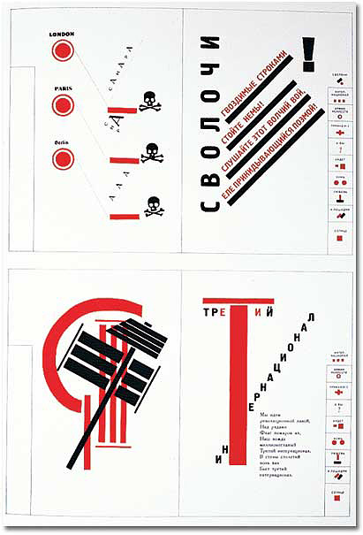
During one of our lectures today (typography or graphic design), we talked about El Lissitzky who uses shapes, numbers and a limited palette to develop “a language to form instead of letters” (quoted from lecturer) because of the wide audience he was reaching out to (i.e. both literate and illiterate populations). Here are a couple examples of his work:
Here, you see type as image, type taking form not as letters and alphabets, but becoming a system where meaning can be graphically communicated. Just like written language, one has to read it, but in this case the image is mostly iconic to what it conveys, much like sign language. In a sense it is like emojis as well! Though emojis are much more emotive (and they recall the days past of pictographs).
So here is the crux of the whole post: since the saying is that this is a “language of form”, does this mean that it is also being processed in the left hemisphere?
As a “language of form”, it is more iconic than arbitrary. Yet, it must be processed to be understood. (This is on the assumption that the graphics are meant to communicate and are not for a purely aesthetic purpose, in which case, it’ll be like listening to a conversation in a language one doesn’t understand, and meaning gets thrown out the window and prosody is processed much like music.) Extrapolating this, would this “language of form”, which is art, be processed similarly to how one interprets a mathematical graph or scientific diagram? (and another question: do we process these graphs and diagrams with the left
Here, the lines between “art” and “science” are being blurred. Certainly, the hemispheres do not function separately, they can communicate via the corpus callosum (yes, I’m taking the chance to revise for tomorrow’s quiz right now, thanks for putting up with it), identifying what is seen, what is could mean, and finally what the meaning should be. Then again is there a false dichotomy between the arts and the sciences? Or are they two sides of the same coin, both vital to our interpreting, understanding and discovering the world? Language itself can be considered both an art and a science, anyway. And both are equally interesting, no?
Well. I might not have made much sense (yet again). Maybe I should go and check the terms I’ve used hahahahahaha but if you’re like me and functioning on less than optimal sleeping hours…
Yes, you do understand, don’t you! 🙂
Then again, a round of applause for you! Most people aren’t particularly interested in this topic, so reading ’til the end is a feat? And my writing is probably more of an obstacle than anything else. Apologies. *bows* pray I’ll be more organised/structured while writing next time!
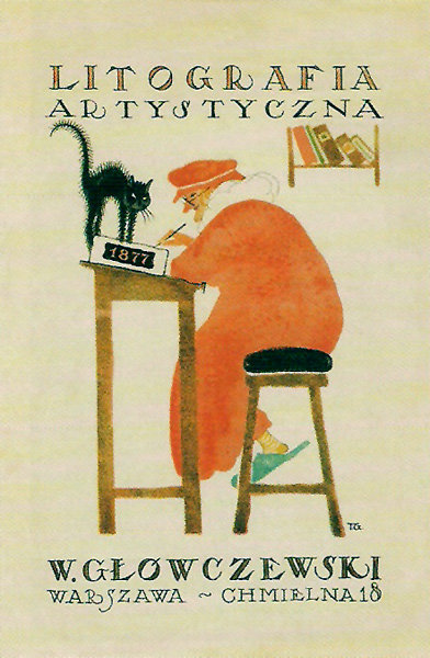
While researching about the “Conceptual Image” for a presentation for History of Graphic Design, one will come across the Polish Poster.
At first, they were befuddling. Then, intriguing. The poster beckoned with layers of mystery, asking to be pondered over and understood. It was sometimes rowdy and rambunctious, yet at other times, quiet and contemplative. Certainly, the former caught my eye most easily, but the latter held it.
Here is one of my favourites so far:
Artistic Lithography (1920) by Tadeusz Gronowski, known as the Father of the Polish Poster
This piece was just before the era of the Conceptual Image, but Gronowski is not called the Father of the Polish Poster for no reason. He is “one of the first artists to consciously integrate the typography with the illustration”, choosing to offer “a different look into the subject, often displaying a penchant for the light and the humorous which endeared him to the viewers.” (The Legacy of Polish Poster Design, Smashing Magazine)
In Artistic Lithography (1920), the quiet, stable composition is very comfortable. The largest shape is the man, clad in a snuggly red robe, which further accentuates the warmth of the piece. Visual and narrative interest comes in the form of the the black cat, who is on its haunches, apparently bristling for some unknown reason. Adding to the mystery of the narrative is the tiny lift of the corner of the man’s lips.
I love the soft edges made by the airbrush that the artist chose to use. It adds a softness that makes the piece really approachable and welcoming!
It depicts the journey of a girl and a whale, and the tenderness between them. It is a very simple visual that spans the whole walkway, easily understood, yet recalling the simplicity of childhood, or times less burdened, more exploratory and whimsical.
The walkway is dyed a comforting blue as the viewer travels with both whale and girl, temporarily transported into a different world of the viewer’s imagination, providing a moment’s reprieve from the stressful environment of the hospital;
a moment’s worth of recharging energy to continue their all important work;
or a refuge in emotional turbulence.
I hope the natural, human-ness of the hand-drawn lines, and the ebb and flow of watercolour on paper prove to be a device through which the narrative touches the audience more easily. Thus, this piece was made by first drawing out every object, tracing them out separately, then scanning them into the computer to digitize them. Colour and texture were all done by hand, painted then scanned, and finally compiled in Illustrator. A more detailed account of the whole process can be found here.
“If you want a golden rule that will fit everything, this is it: Have nothing in your houses that you do not know to be useful or believe to be beautiful.”
–William Morris
the leader of the Arts and Crafts movement
with a dream
made reality?
Perhaps not.
William Morris was man disillusioned by mass produced goods. He was obsessed with beauty. Not just any kind ofbeauty, mind you, but one that harks back to the past — a romanticized sort that finds its roots in the poetry he so loved; and in the woman he fell in love with (and later married).
She was his ideal lady and he won her hand in marriage! How wonderful! In other words: he dreamt and obtained.
But did he, really?
History records that the fair maiden never did love him. She married him because Morris “made an offer she couldn’t refuse”. He was wealthy, you see, and she wasn’t, and in those days, it was probably difficult for women to move out of their social class outside of marriage. If she never loved him, can we say that he truly “obtained” the relationship he desired? Or was he satisfied with a superficial relationship with someone beautiful?
In a similar vein, then, is the question: Was Morris able to spread things of worth and beauty to people? Were the people able to easily access and have things of beauty? Or was he simply satisfied with, as with the fair maiden, a superficial relationship of creating things of beauty?
Morris believed that everyone should own something beautiful – something handcrafted, warm and human; not the calculating cold of mass produced goods. And so he set out to do just that. Advocating the craftsmen’s ownership for the work, and guilds for them to help one another, Morris had structured a system of great potential for creativity and artistic expression.
But what of the cost of
labour,
materials,
amount of care,
and time that each craftsman has dedicated?
Immense.
Now let’s consider the background of England at that time. The Industrial Revolution has taken hold of the nation, and people are moving out of agriculture to work in factories which pay more. Even so, many aren’t living off a surplus of wealth, and some are just scraping by. Are these people able to afford Morris’ exquisitely made items? Of books have been painstakingly made, including the paper?
Certainly not.
Moreover, according to Maslow’s Hierarchy of Needs, one would first seek to fulfill physiological needs – food, hydration and such. Extrapolating this to the large working class of Morris’ time, people would therefore aim to fill stomachs first, or meet tangible needs, rather than fulfill the intangible pleasure of owning something beautiful.
Morris was able to organise a structure that could make things of beauty, but these things of beauty, though made, could not make it to the masses. They never could, unless the craftspeople were willing to sell at much lower prices which discounts the effort put into one product. And even if they did, there would be the issue of demand and supply: would they be able to make enough in a reasonable timeframe for so many people? Hence, just like the relationship between Morris and his lady love; so also did his dream set off for the masses, but were not able to reach them. (Thankfully those who saw his work liked it though! That’s probably better than being tolerated by the woman you love..?)
Ironically, a couple centuries later, we’re here studying him and his artworks on mass produced goods (books and computers alike). And it is through these mass produced items that his works finally reach a much larger audience, digitally! How odd! Perhaps his dream did succeed, though not in a manner he envisioned.
P.s. Just a fun tidbit here: but something peculiar is that in the 1900s, another William Morris set out to become one of the greatest industrialists of his time, founding what is now known as the Morris Motor Company. Well now. Fascinating!
It’s the weekday, and the offices that were quieter during the weekends surge with the hustle and bustle of life once more. Or so would be, if the workplace were in the CBD. But not the hospital. Regardless of the time, there is always someone working, someone tending to the patients, someone waiting anxiously for news.
=Therapeutic Graphics=
Project goal: To create a welcoming and soothing environment through design that can potentially promote healing in the hospital.
Below is the space which will house the work:
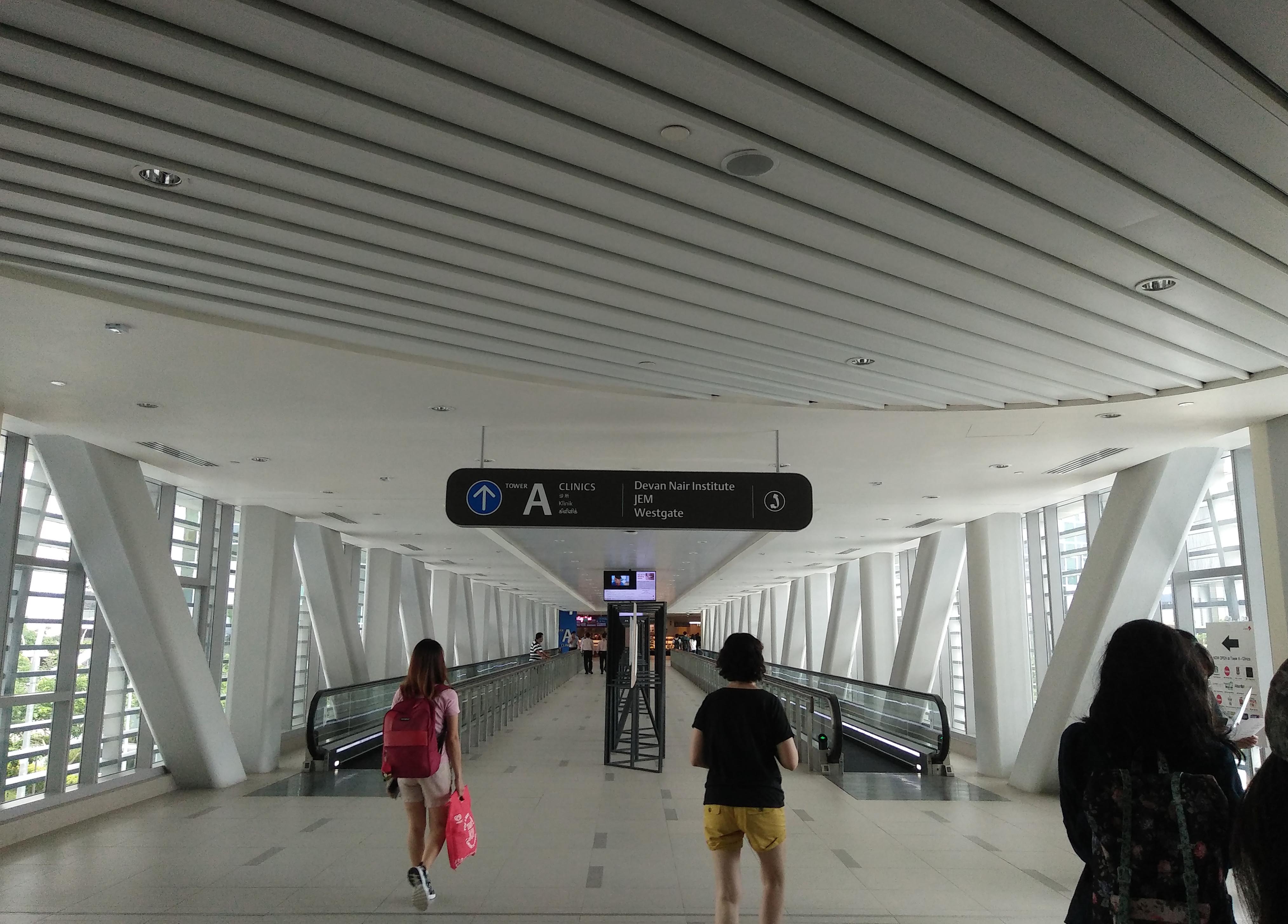
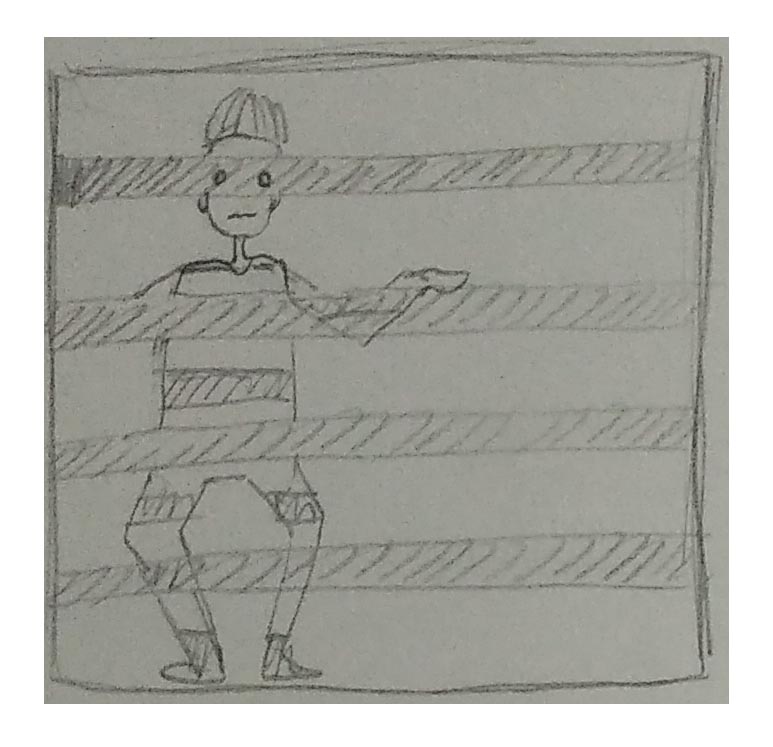
The J-Walk
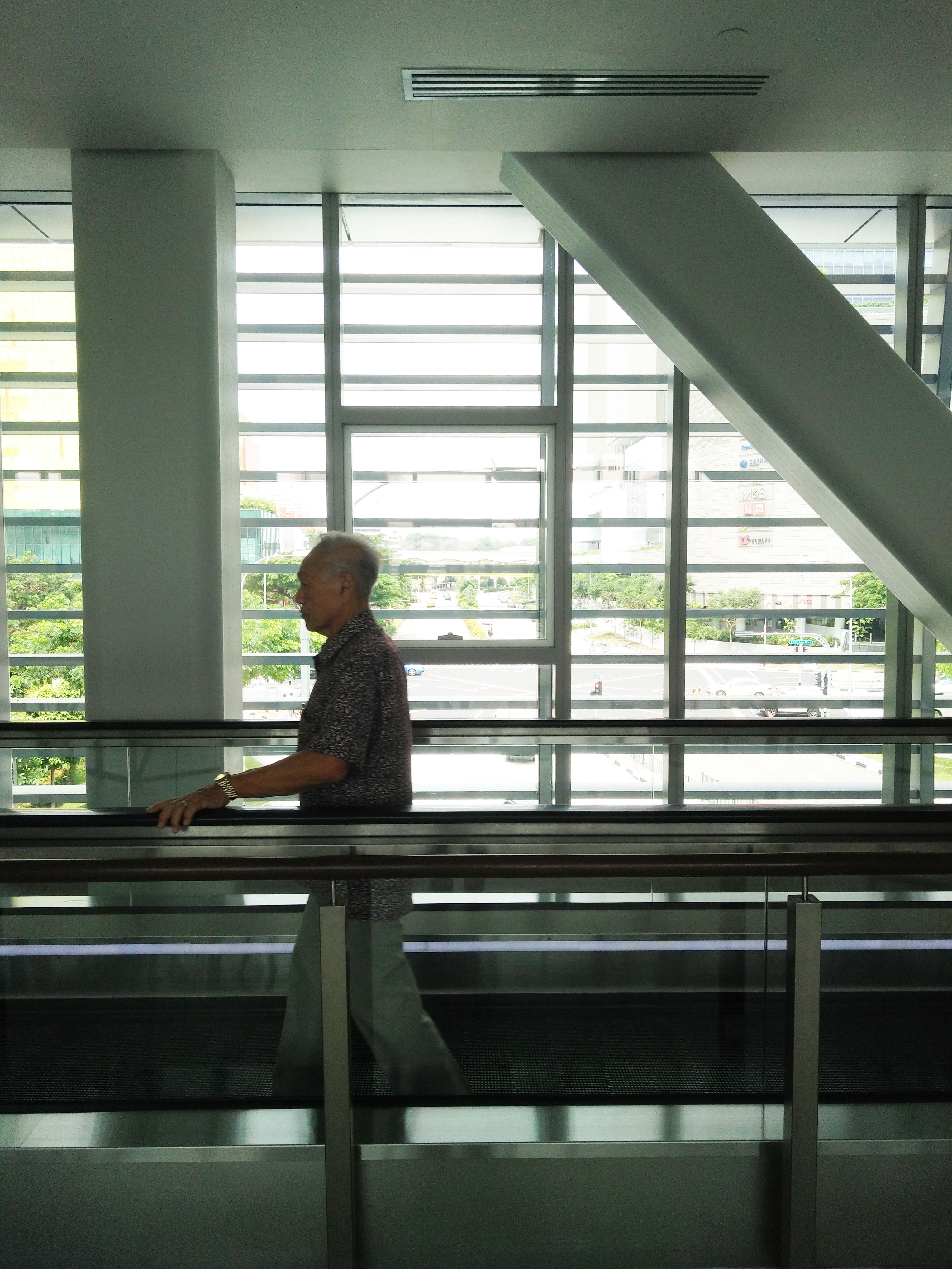
More specifically, the square window this elderly gentleman is moving past:
=Notes on the space=
Ceiling to floor glass windows that allow light to stream into the walkway,
which is a wide, mostly empty space (especially in the middle),
with travellators on the sides.
The overall design/feel of the space is industrial. Gray tones of metal and tiles and blocky pillars add to this feel.
Directly outside the windows are bars that run horizontally along the walkway.
Beyond which is a street view that includes quite a bit of greenery and glimpses of nearby malls.
=Talking to the auntie=
Marianne and I approached an middle-aged auntie in uniform. She is one of the cleaning aunties, to whom the clean and presentable environment we saw can be credited to.
When asked what she thought of the place, her reply (in Mandarin) was that it “resembles a prison”.
I was surprised. The open space and soft sunlight were plenty positive things to me. I could breathe more easily along the walkway compared to the confined space of the mall or hospital corridors. “Prison” was not what I was expecting.
It took a second look at the space for understanding to dawn upon me, and is an issue that a number of my classmates pointed out most concisely: the individual’s emotional/mental state that influenced their perception of the space.
I entered the space as a student, fresh out of a long summer holiday (or not, but it was a break nonetheless), anticipating a new project in a new module. Sunlight and space are nice.
On the other hand, many of the people who use this walkway enter it differently. Many probably have not had a holiday in a while, some just completed shifts, yet others miles from their home country. Without a doubt, the hospital environment can be a high-stress environment regardless of the identity or role of the person who enters. Surgeons rushing to the operating theatres, nurses hurrying to assist patients, office staff up to the neck with paperwork, cleaning staff upholding the enormous task of keeping the space suitable, and even visitors worried about family or friends. In this situation, the grey of the space might stand out. Harsh and unforgiving. Bars seem to follow you as you move through the walkway, but they stretch out farther before you, as if moving quicker, more efficiently; mocking all the effort you’ve put into everything. Then again, these same bars recall the bars of a prison cell, acting as an obstacle to the comparative peace of the outside world, trapped.
=Ideation=
Likening the walkway to a prison generally connotes something negative. It implies a sense of dreariness, monotony, imprisonment, stress.
Contrasting words to this would be fun, playful, vibrant, full of life, exuberant, bright, active and engaging.
The goal of these designs is to provide respite mental/emotional from the toil of work, a period of relaxation as they hurry between different locations. Ideally, due to the large target group (from children to elderly, shoppers to doctors, and everyone in between), the graphics still resonates positively with them.
Hence, I’ve explored two main types of ideas. The first is modifying the perception of the bars. That is, to somehow integrate the bars into the design, thereby altering the understanding of “bars = prison”. The second collection of ideas finds its roots in the contrasting words and the exploration of lighthearted humour in the first group of sketches.
=Horizontal bars, or not?=
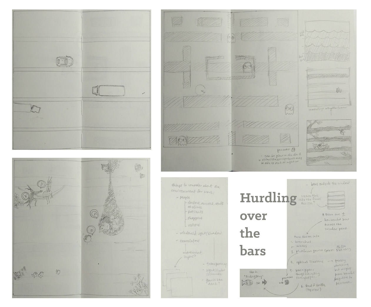
Anyway, I don’t usually work well with mind maps(referring to the typical mind map). My equivalent of a mind map happens to look like chunks of notes instead. In this case, notes on the side of the sketch. They are mostly ideas that suddenly pop up, or grow from a related idea. Yes, in essence it’s the same as a mind map. It just doesn’t look like one… somehow…
Sketches: street, pac-man, ecosystem on the bars, and a bunch of note-making
The sketch that tickled my sides was this one:
the (not-so-)great escape
Up until this sketch, I had mostly been thinking of just visually appealing images. Images that were relaxing and comfortable to look at. But this reminded me that therapeutic graphics goes beyond just looking good. It should have something that resonates with the viewer. I had tried to do that with “Pac-man”, but it isn’t a universally appreciated game. This sneaky person, on the other hand, has a quirk of humour, something that reaches out to the audience.
(I personally did quite like this idea hahahaha.) But Michael mentioned that this design could more likely accentuate the bars instead of distracting the viewer from their prison-ness. Classmates also voiced concern about how it can be executed. And I agree. So yup, it’s a no-go.
=Idea Number Two=
Then, what else can speak to the people traipsing along these hallways? What can lift their spirits?
Nature is definitely a recurring theme for many of us. I can’t think of anything particularly universally funny either.
And by this time, I’ve already a particular feel/vibe that I’d like my work to have. It has to be something relaxing, free, colourful, and light at the same time. Searching from inspiration everywhere, I remembered a text my friend wrote a couple years ago for a school publication, Non-Sequitur. Exactly what I needed.
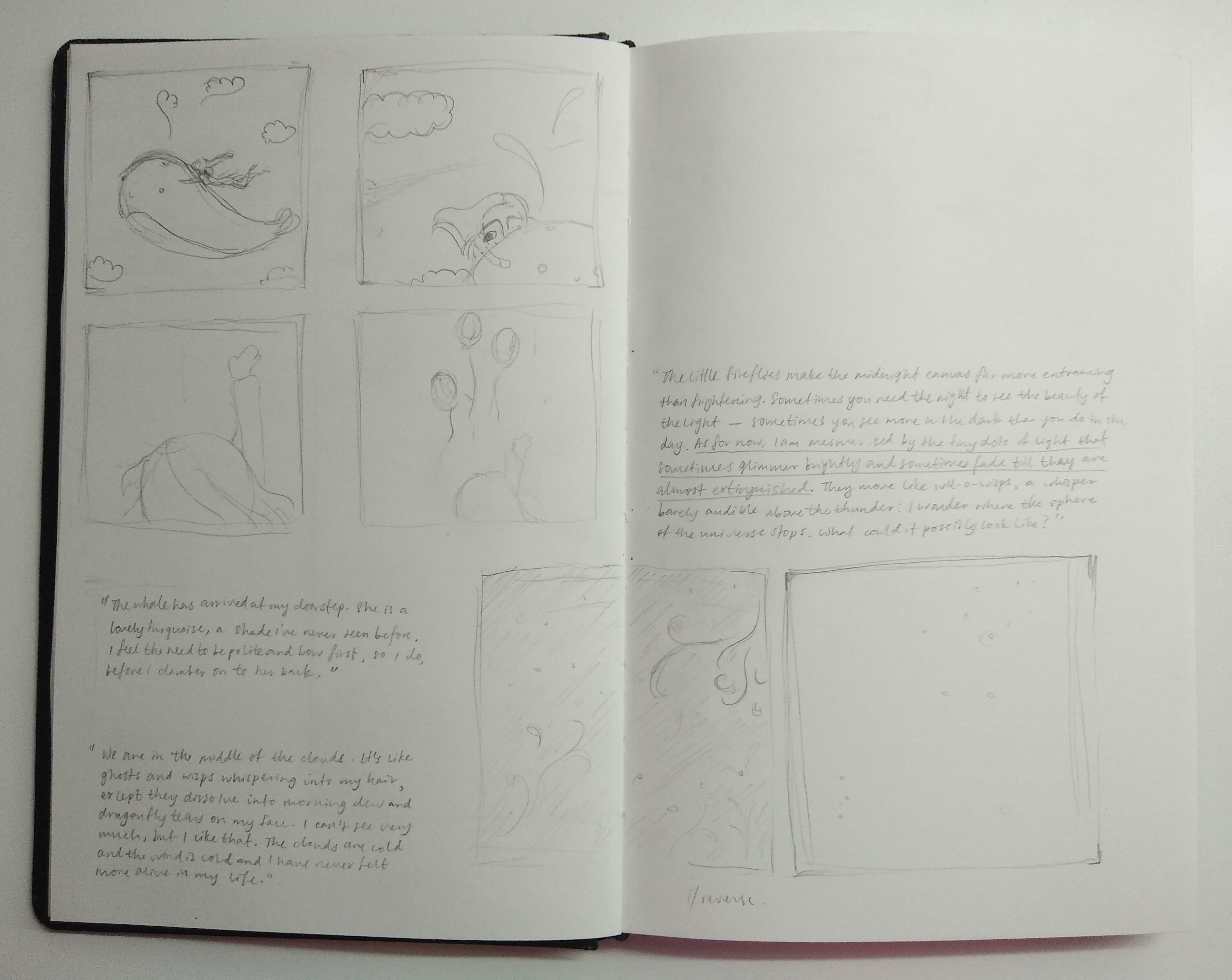
The following is the first third of Wanderlust
Written by Winnie Fok
The whale has arrived at my doorstep. She is a lovely turquoise, a shade I’ve never seen before. I feel the need to be polite and bow first, so I do, before I clamber on to her back. So smooth it feels like silk. Makes me want to slide down her side and fall off into the abyss. I wonder where the ground is. I wonder what hitting the ground feels like. But before I can make that a reality funny I should use that word she takes off. There is a soft intake of air, like someone breathing in quickly. I look up to see the balloons moving up, like they are being pulled by something. It takes me a while to realise that she is moving with the balloons. Up, up into the clouds. We are going. Where are we going? I don’t know where, but we are headed there, and I like that.
We are in the middle of the clouds. It’s like ghosts and wisps whispering into my hair, except they dissolve into morning dew and dragonfly tears on my face. I can’t see very much, but I like that. The clouds are cold and the wind is cold and I have never felt more alive in my life.
I am full of
wanderlust.
∞
It’s everything I was looking for and more.
Whimsical, lighthearted, with a singsong quality that just emanates from the writing. I love it. <3
What’s even better is that it already contains distinctly graphic elements that most people would associate with comfort. Despite their large size, the gentleness of whales is well-known. And the beautiful blue (or in this case, turquoise) has already been on my mind as a staple for the colour palette of “therapeutic”. Perhaps it’s the cultural thing about cute huggable whales that’s eliciting the “awws” as well! Moreover, there is a human character whom people can relate to.
I’m hoping that it can become some sort of a series. A lighthearted, whimsical narrative through which people can adventure with the main character as they move by from location to location.
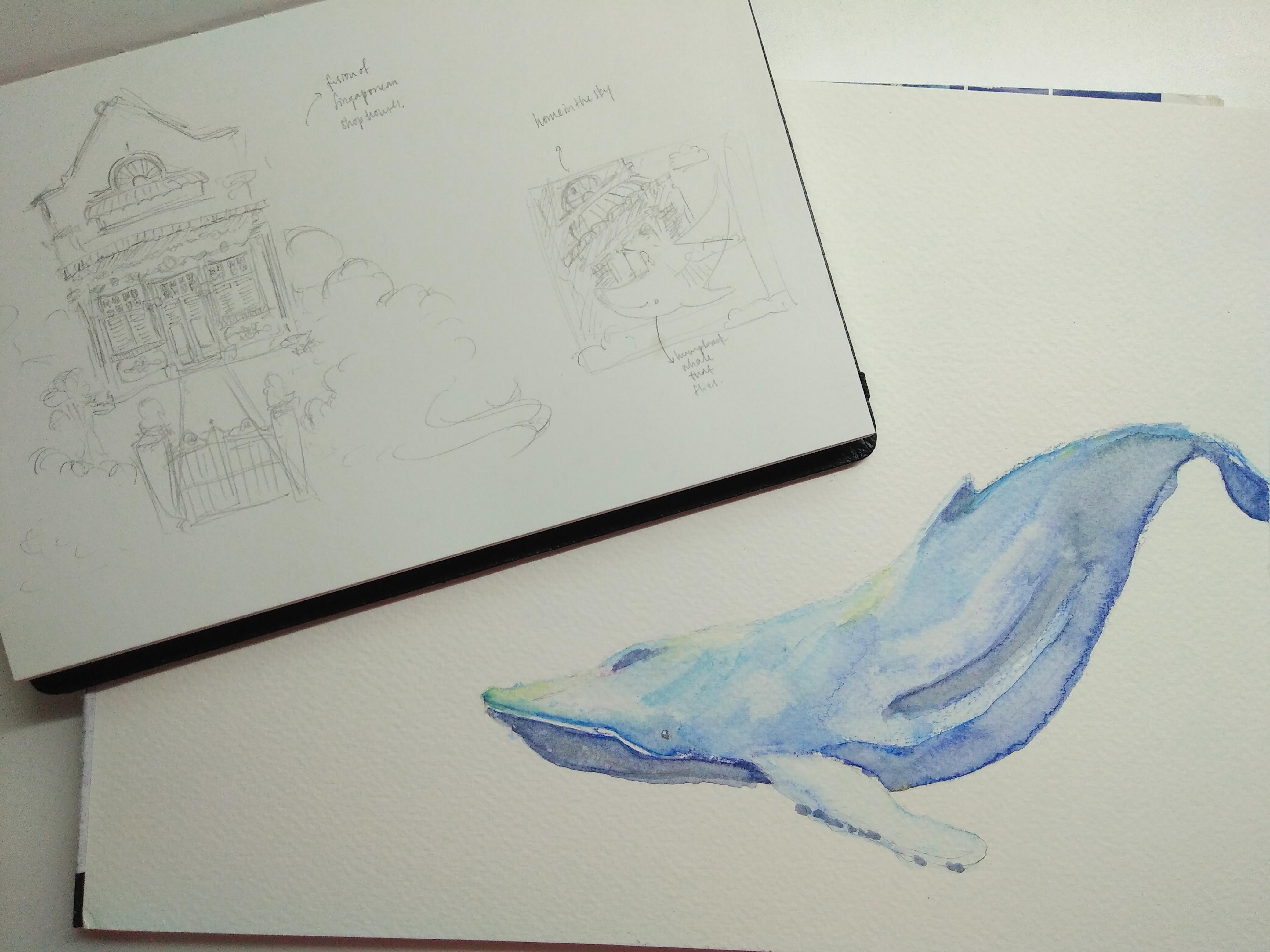
Preliminary sketches
I also considered cutouts that could allow light to pass as little glimmers of fireflies and wisps, even adding some glow-in-the-dark so that it can be viewed after the sun has set (since there are people working in hospitals even at night). This is an idea that I might included into the final illustrations.
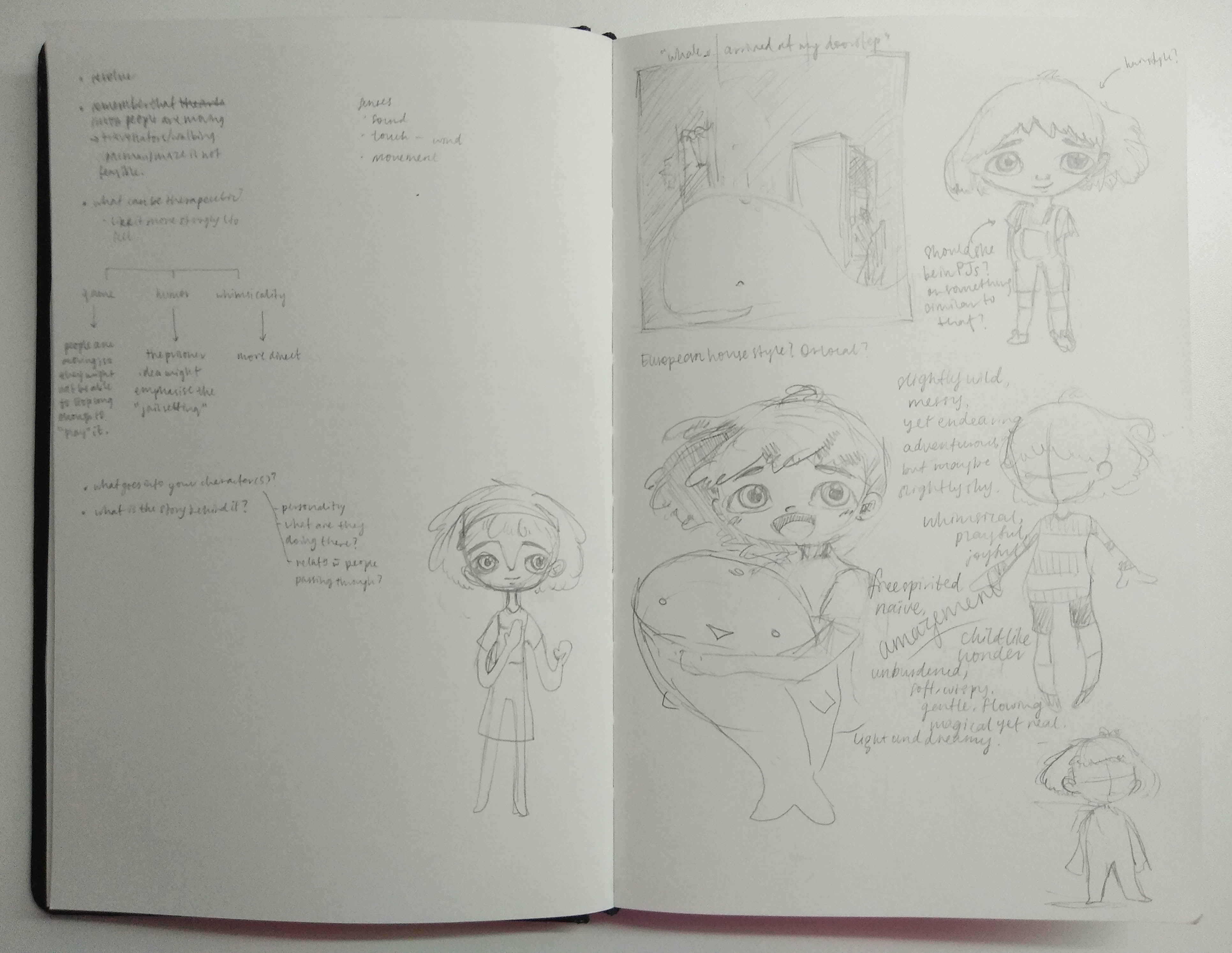
=Designing the characters=
Officially starting on Idea Number Two!
More sketches
Working out the main character’s personality and features. I’m inclined to make the girl a little bit like the writer, slightly shy, yet adventurous and more than willing to try new things. She’s got this child-like wonder, and is amazed by what she sees when flying on the whale’s back.
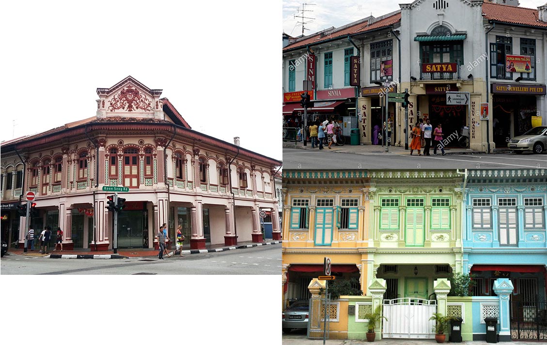
House/doorstep design. Compositional sketch for the doorstep scene.
The first “house” that came to mind was very English looking. But this is Singapore, not the U.K., and thus, I tried to design a house that was a little bit ore similar to the shophouses that lined (and still line some) streets in Singapore. Due to the wide range of audience, I want something that can reach out to the different age groups. In this case, the older generation will relate better to the visual of a shophouse. Inspiration was taken from the following images:
Next is the whale!
I chose to use the humpback whale because it’s potentially the most expressive whale. Why? Because it’s mouth can be drawn to quirk into a very endearing smile:)
Whale colour sketch
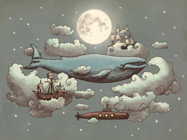
And I’m hoping to make a whale and sky piece, something like this:
Whale in the sky
I really love the whimsicality in this piece. The mix of ships and submarines and a whale all flying together in the night sky is somehow very dreamy.
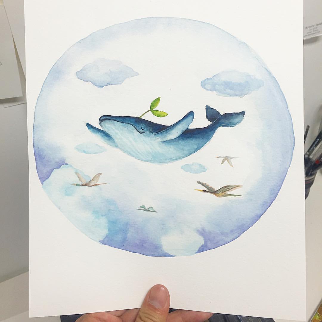
Or this:
Happy whale in the sky
With a little bit more loose-ness in the execution like this:
Slightly looser appearance so that it gives the viewers a sense of space, that the characters are not confined by lines (or bars), thus brings out the lightness I’d like the final illustration to have!
mood board
Blue seems to be the most effective colour to achieve a calm yet endearing atmosphere.
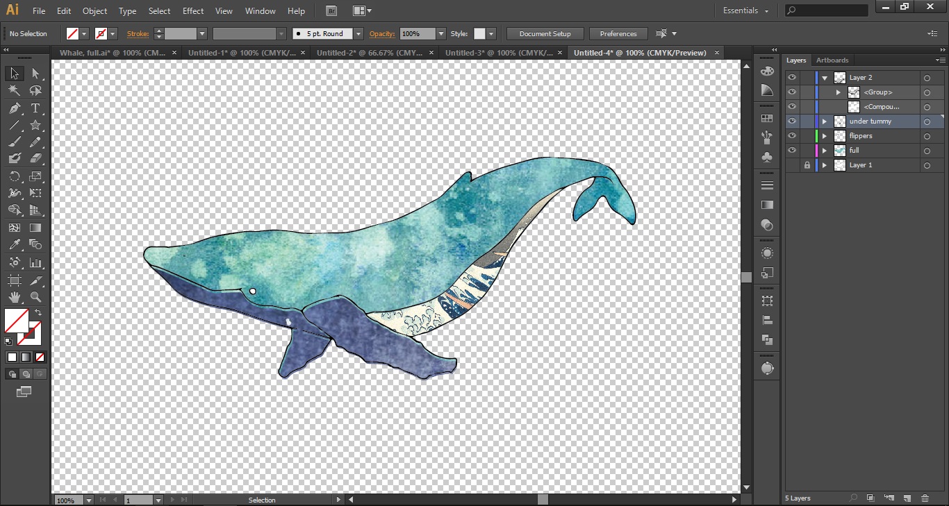
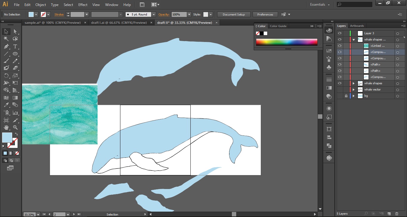
Well. It took a while to realise that the final should be digitised and printed 😡 but I still really wanted the watercolour look. The looseness of it gives a sense of space and freedom, some rather therapeutic elements! Being pretty green to digital work, I’m clueless as to how to have a watercolour effect on the computer though, so I decided to scan in the whale first. However, the blending of paint wasn’t retained after making it into a vector (a limit on 16 colours, I think?), and thus line work and textures had to be scanned in separately, then put together digitally.
So then, here goes the recounting of great pain:
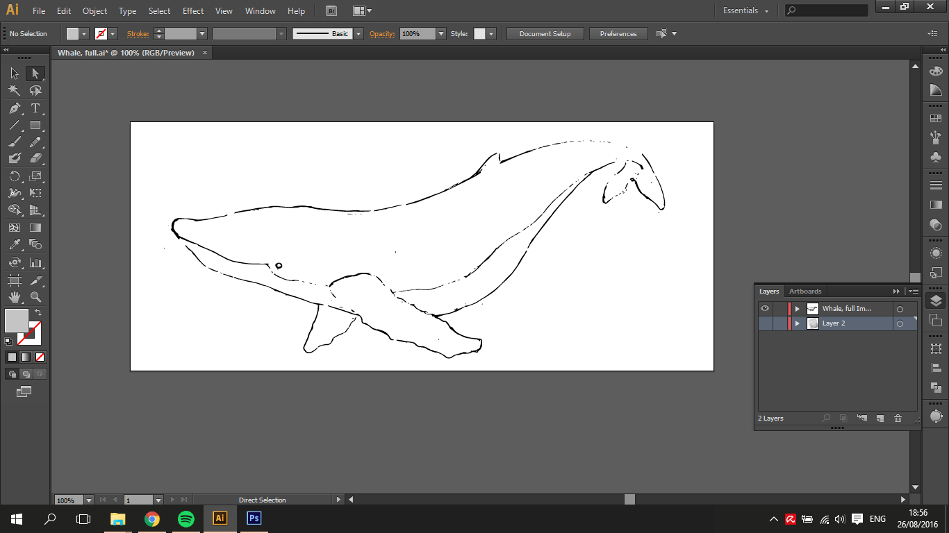
whale #2: just an outlineattempting a clipping mask of some sort. but it was “too complex”.so the clipping mask attempt failed miserably. whale #2 kept disappearing!eventually figured out a way to break down the whale into simpler shapes. this allowed for playing around with different colours/textures! However, I wasn’t satisfied with the quality or colour of images online, and endeavoured to experiment with my own
tried different combinations to find a combination that could be comforting to look at
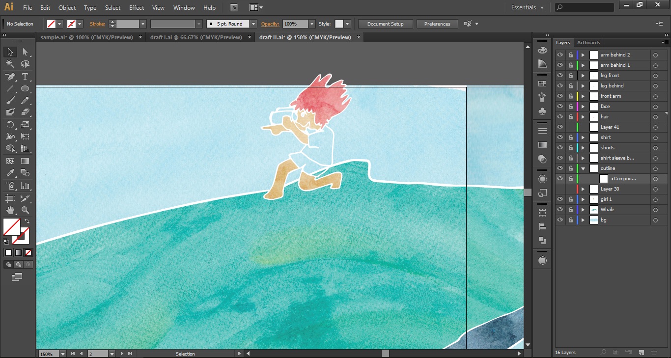
While working with whale #2, the shapes proved far too complex to work with, and it seemed difficult to weave in the little girl character who was to interact with the whale.
And thus, the final composition started to take more concrete form:
Changes made are 1) simpler shapes, 2) solid outlines
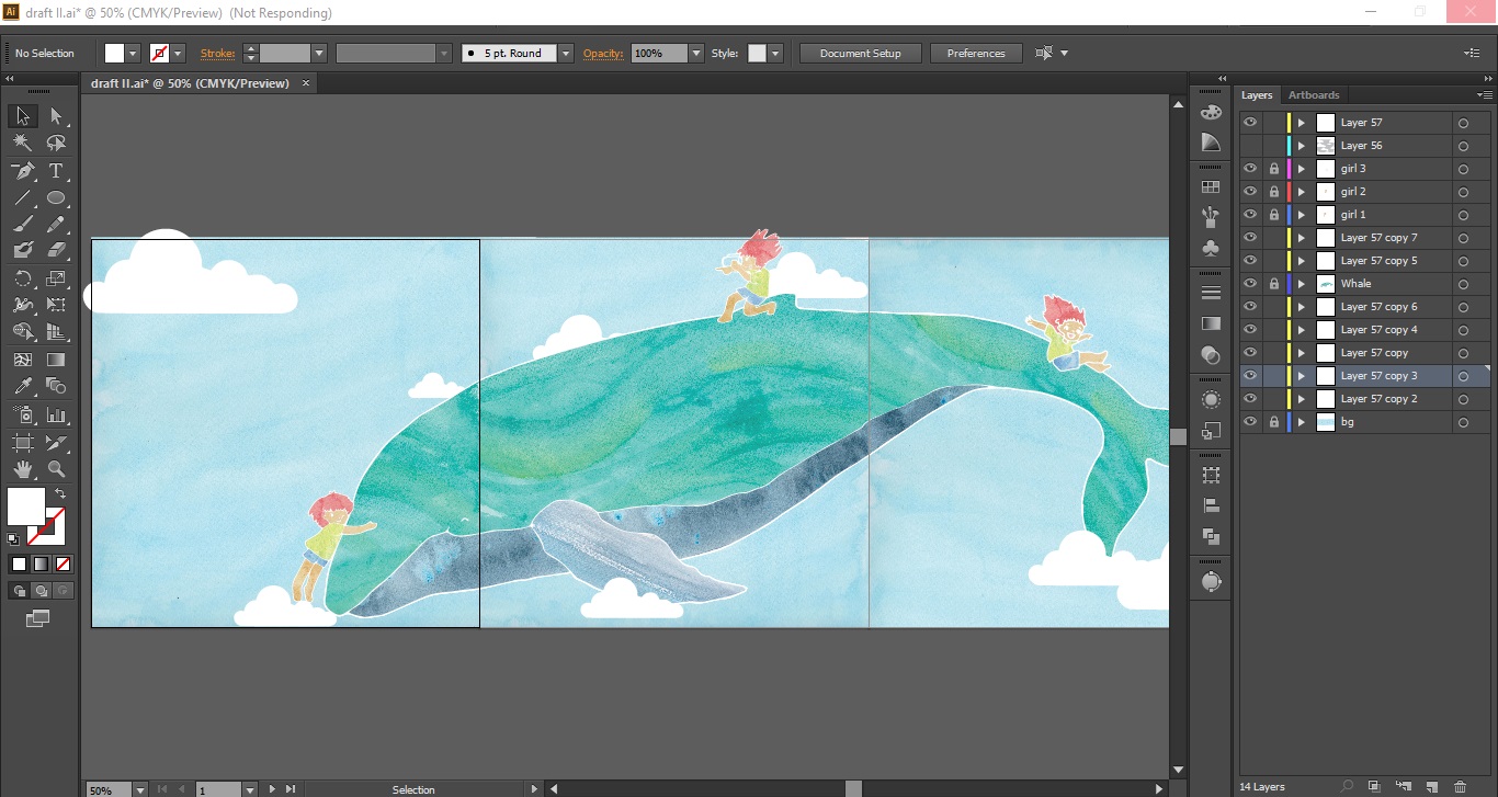
Joy and Amy had both commented that it might be nice to have a whole whale swimming alongside the people as they travelled through — and I really liked the idea! It’s as if they would be temporarily transported into someplace else, an aquarium/underwater world, for example! Plus, the large form of the whale would unify the thin horizontal bars, making the space look less long and intimidating.
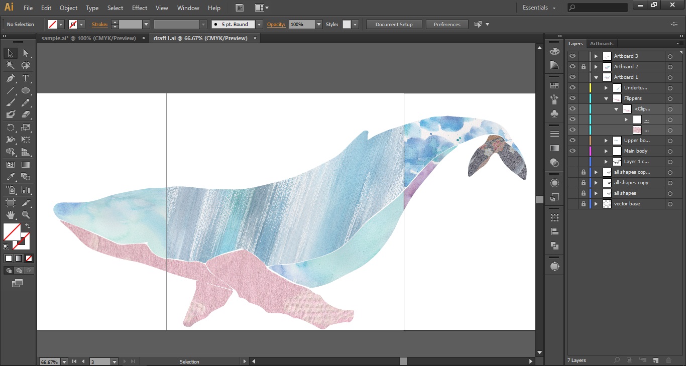
outlines for whale #3 and girl. yes, the whale had to be scanned in separately~breaking up the whale into shapes so that the clipping mask can workclose up of the girl on whaley’s backfinal composition with a few fluffy clouds
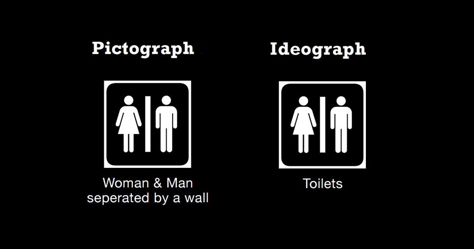
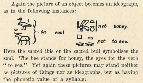
That said, as I try to reconcile the information from the classes yesterday, I’m reminded of how amazing people are. Consider how mankind has managed to transmit knowledge learnt from generation to generation. It’s why we have cars today, because our ancestors made tools that have been handed down and developed over time! During History of Graphic Design (DV2003) taught by Astrid Kensinger (who is also teaching Typography I), she spoke of the start of graphic design in pictographs and ideographs, both symbols to represent objects/things and ideas/concepts respectively. Evidently, this was a huuuge leap in thought for mankind.
In the beginning, people carved past events, their hunting expeditions, tales of epic hunts on walls. It was a narrative of sorts, of someone and something. One can understand from the art on the wall that a “gigantic bear attacks hunters”.
Then, it became more stylised. We might start getting symbols for hand, paw, teeth. So the action can be conveyed in writing as “gigantic bear attacked hunter with paw and teeth”. More specificity can be expressed through these simpler symbols. Ideographs, symbols that convey concepts and ideas further enrich the written language. So we can express “gigantic bear attacked hunters unexpectedly”. Intangible things like emotions can also be expressed, such as “hunters were surprised, raised spears and fought”. Chronology, past, present and future ideas might also be expressed! Symbols might even be put together to form a new meaning! Like 木, 林, and 森; wood/tree to forest.
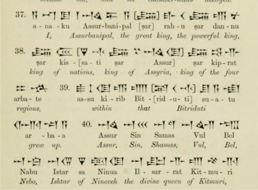
Please note that I am not expert in the development of these things, okay! The above is how I understand petroglyphs, pictographs and ideographs. In fact, the written word could be far more complex and elaborate, like the Cuneiform below:
cuneiform and it’s translation
Astrid mentioned that people who could read and write such as scribes, were the elite, and considered magicians of some sort. Being literate was power. Well, given how complicated their writing system is, it’s understandable.
Oh! Here’s a really helpful presentation online that distinguishes pictographs from ideographs. (It’s where the featured image is from)
I think this really ties into HG1001 Mind and Meaning, because how do we look at words, read them, and actually understand what it means? The word is merely the vehicle through which we understand an idea, which is why “happy” can be expressed as 开心, 楽しい, onnellinen, ευτυχισμένος, سعيد. (Google translate was used for quite a number of the above translations: Chinese, Japanese, Finnish, Greek and Arabic), which (I assume) means about the same thing, just in different languages. Fascinating!
Yes. The nice OSS ladies have persuaded me to believe that OSS will be a good platform to keep my progress/research. And well, considering how scatterbrained I get sometimes, OSS might just be the solution;) Thus, this post is here. It’ll be more of a thought diarrhoea though. So it’s not really a “work” per se. Just random thoughts.
Confession: LMS (NTU) rejected my application and appeal, which was what landed me in ADM. I fretted over not getting into the course, and worried over how I’d fit into ADM. Looking back, I’m very grateful for the initial rejection. Especially because the lecturer of HG1001 Mind and Meaning has very, very generously granted a couple of us entry into the foundation LMS course, meaning then that I can pursue both art/design and linguistics. My current goal is to somehow marry these two diverse and fascinating studies together!
I attempted it last semester for 4DII, but I feel that it was a work that didn’t do sufficient justice to either. You could even call it a rather unromantic arranged marriage. Sighs. I’m very sure that it can be a super meaningful and satisfying one though! (a post/reflection might come up when there’s time, but this semester will be ridiculously busy so it’s not in the foreseeable future…yet) So, imagine my euphoria upon being accepted into HG1001 to study linguistics alongside current/future linguists!
On to what spurred this post. Lecture 2’s topic is on Animal Communication. This caught my eye:
a lexigram
This is a lexigram. It is one of the medium through which researchers have been teaching primates to communicate with humans. These symbols are on buttons which the apes press to input them. What’s surprising about this artificial language, called Yerkish, is that the buttons have to be pressed in a specific order, much like how humans speak. The reason why this is so fascinating is because such structure in speech is not natural for apes (it might be debatable if this is natural to humans too). In fact, when taught American Sign Language (which had limited success so far), the chimp signing “Bob tickle Ali” and “Ali tickle Bob” could mean that either Bob tickled Ali (Ali being the victim), or Ali tickled Bob (meaning that Bob was victim to Ali’s amusements). So the fact that chronology can be imparted and expressed is quite interesting.
It helps also that the symbols are highly visual and very abstract. It is one thing for the chimp to learn the symbolic vocabulary for objects, but expressing their own emotional state is another matter altogether, because it first requires reflecting on oneself, understanding that emotion, and connecting that intangible, invisible emotion to the appropriate symbol for others to see. Which is actually some pretty big leaps that we often take for granted simply because it comes so naturally.
Anyway, I haven’t completely processed most of the information. It’s too late in the night to do that after a full day of school. Nerdy me is looking forward to lecture tomorrow though haha!
And now to continue where the previous post left off:
The Elements of Design
Woo. The pressure is palatable, but I’ll be trying my best to dissect and explain what I’ve done in the zine.
So, starting with… the cover page!
This cover page was not from previous collages. It was made specifically for this zine, and meant to incorporate all the important points I had learnt in my collage journey thus far: flexibility of ideas, use of overlaps, paper tearing techniques (texture), and manipulation of the image.
As always, a sketch is supremely helpful in laying out initial ideas. In the case of a collage, especially when you’re using only found papers, what is important is not the image itself, but the essence of the collage. What is its purpose? Is it going to be fun, quirky or serious?
This is one of the secondary sketches. The initial sketch was actually of a fox wrapped in ribbons. Girly, yes, but hey, imagination!;)
Because I intend for the front and back covers to be a spread, the whole composition has to work. However, they are also separate, so each cover should be able to carry their weight too.
So, scattered throughout the covers are 3 main elements: the crafty (scheming) man, a flying fox and a volcano pencil holder. They are seen as the main elements from their sheer size, each occupying about a third of a page. What is worth noticing is that each main element is actually made up of two or more separate elements:
These are seen as “one” unit each because they are joined/ are in close proximity to one another.
Moving on to the smaller elements, starting with the fish on the right corner, the same proximity principle applies. They overlap, becoming one visual unit, and filling the otherwise empty corner of the front cover.
The second small element are the people climbing up the volcano. They are somewhat close to one another; but what combines them into one visual unit is similarity. Both are people donning some very unique robot outfits, and both appear to be scaling the side of the volcano. Thus, the similarity in appearance and action unifies them.
The flying fox leaps from the back cover to the front cover. This effectively bridges the covers into a single spread.
The change in visual texture distinguishes the fox from the rest of the elements. He is surrounded by a box of white body copy, while all the others are framed with torn dark paper.
The front cover is asymmetrical. The title leaning heavily on the left, brought out by its stark contrast with the white background. Its darkness is balanced out by the black segment on the right.
Hierarchy of text is created through size: “CRAFTY” is colossal. “Making collages” is much tinier.
**However, as Shirley pointed out, “making collages” will be more readable if it were to be typed normally, then rotated to align to “CRAFTY” instead:
Moving on to the next spread,
Large, blocked white text on a black background = size, high contrast. This immediately draws the attention, functioning as the “header”. These headers distinguish the three groups of text in the spreads. Since most people read from left to right, the flow of reading goes as such: preamble >> step i >> step ii.
The composition of the spread is of three smaller circles vs one large circle. The difference in size creates a flow for the reader to read. Although the larger circle is noticed first, one knows (based on the size and overlaps) the chronological order and the order of importance.
The background is faded out a little to bring more focus to the foreground text.
Third spread:
This spread is cleanly divided into 3 sections. The division is by an invisible line from the difference in background.
Beginning with, step iii: text is placed in the negative space of the background. This is because this section is about “composition”, the example being the background itself. Thus, it is best that the text does not hinder the image, which is there to aid the reader’s understanding.
In step iv, the hierarchy of text plays in important role in emphasising the point. One sees the blocked header first, then exceptionally large body text which is different from what we’ve seen in the zine so far. It even repeats. Repeats. Repeats. *echoes* The background is the culmination of that repetition. Layers of paper torn and stuck over one another again and again.
The next page is an elaboration of “step iv: cut tear stick”, and is one of my greatest takeaways regarding the making of a collage. Which is the reason why a whole page was dedicated to it. Hehe :>
The paper strips in the background are at about the third mark, almost splitting the page into three. The centre is held together by an image in a circle, and the circle is emphasised with text that conforms to its arc.
Because we read line by line, and the text here is split into so many small lines, the pace of reading slows down. Which is the effect I was going for so that the reader also slows down as well to consider the content of the text.
And finally to the last spread, and arguably the easiest to read:
Making use of layering and the multiply effect, I tried to bring out the chaos of a revolution in the header “TO YOUR ADVANTAGE”. Using one of my previous collages, a scene of battle is immediately understood. Aligning “ADVANTAGE” to the soldier’s stance, the concept of strategy and efficiency is conveyed visually, relating to the paragraphs on the left. Thus in this spread, the image and header (both much larger, with more saturated colours and greater action) are seen and understood first, giving context to the text that will be read afterwards.
The final page is the back cover. And the viewer makes eye contact with the man in a checkered suit. He seems to be planning something, possibly something at our expense. Oh dear. “CRAFTY”, indeed.
That said, that’s also why there is a fox. ‘cos, as crafty as a fox, yes?
I chose this font because it has “guidelines”, which really matches the zine’s hands-on/handmade feel. And it also has the blocked out letters which really help to make the headers stand out:)
So that’s about it for this post. As always, thanks for reading!
Which is in reference to the cut-stick-and-stamp process I’ve been experimenting with this semester, seen in Projects 1 & 2. More specifically, this zine contains some processes I found helpful and techniques I learnt while making my collages in Project 2.
So without further ado, here is the FA~
I really do hope you found the zine worth viewing; both in content and aesthetics:)
You’re more than welcome to view “Zine: Process” for a more detailed discussion of the elements of design that have been woven into the zine.