
Protected: Shoes, glorious shoes.
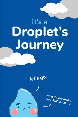
VCIII: Water Project – Droplet’s Journey

.: Research :.
Our group started out studying bottled water: how it is marketed, packaged and its impact on the environment. Following that, the irony between copy and reality, which hides aspects of our interaction with water began to interest me. Thus, subsequent research pursued this direction. As the project moved forward, the idea gradually evolved and distilled into this: how we treat water.
Man’s relationship with water is one where we are greatly dependent on water. It is one-sided relationship, really. But it’s weird that we don’t treat water that well… We prize clean water because it is essential for life. It is so important that history has recorded mankind fighting over ‘rights’ to this resource time and again. But we also misuse it, take it for granted, and pollute it. Deliberately.
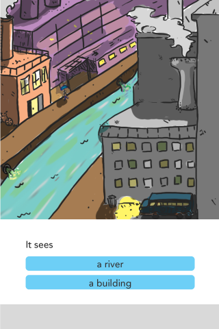
Thus, this project tries to articulate the many relationships mankind has with water, via the perspective of water’s journey through different countries. It is presented in the form of a ‘choose-your-own-adventure-esque’ application. There are happy endings, sad endings, and a few with lingering uncertainties, to prompt us to critically evaluate our relationship with water.
.: The Project :.
The first section of this post will discuss the final deliverables. The process will be included at the end. If you aren’t a huge fan of words, browse the gallery 🙂
Application
The main deliverable is a ‘choose-your-own-adventure’ application. The attractiveness of choose-your-own-adventure style stories/games is that the reader makes choices that decide the progression of the narrative. The ending achieved is dependent on the nature of the reader’s choices.
For the purpose of provoking critical thought of our present relationship with water, all story-lines are based on real-world issues. With Professor Nanci’s knowledge and guidance, we narrowed it down to 6 main areas: Malaysia, Singapore, China, UK, America and Africa (not a country, but many nations on this continent face very similar issues regarding water). However, within the project time frame, I could only do 3 (and code only 2) ;-;
The final 3 (China, Africa and America) were selected based on the breadth/type of water stories they had, which appears to be closely connected to the level of development as well. As of now, all illustrations are completed, but only the first 2 have been coded into the application.
If you’d like to try the application, please visit: https://tinyurl.com/dropletsjourney

Advertisment & Plushie
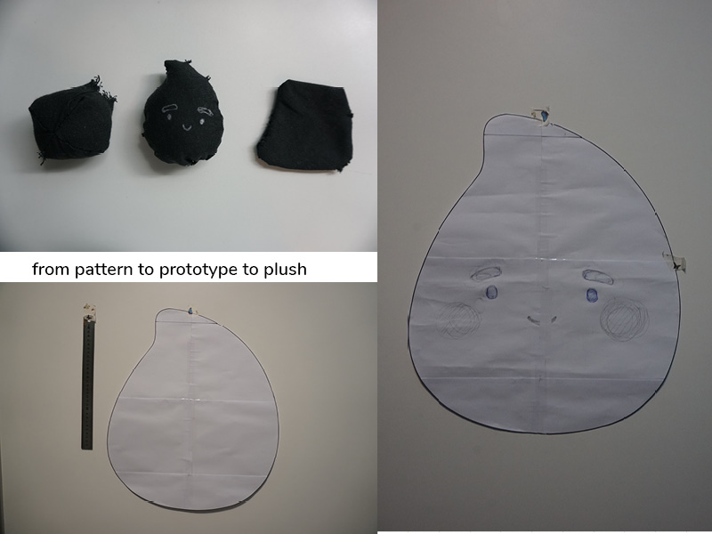
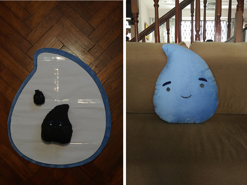
As supplements to the main application, the advertisement, well, advertises the application. It is square format and runs for about 15s. The plushie is in Droplet’s image, measuring 46x50cm. The plushie is made to be cuddled and loved. Treat it with care 🙂

On another note,
The rain falls outside my window as I type this. How fitting.
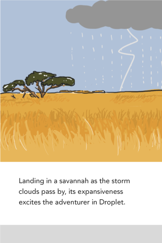
I wonder where Droplet has landed now. What sort of adventure will it encounter?
.: Process :.
Application: Process
Ingredients:
81 illustrations,
A flair for the dramatic,
Beginner coding abilities,
And a few pairs of eyebags to tide the day(s) by
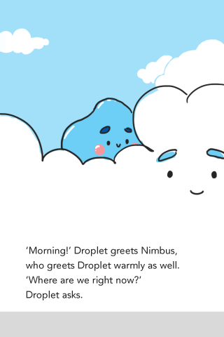
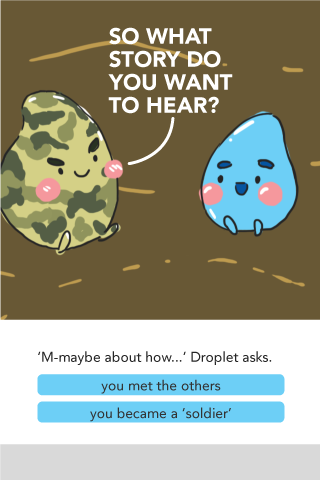
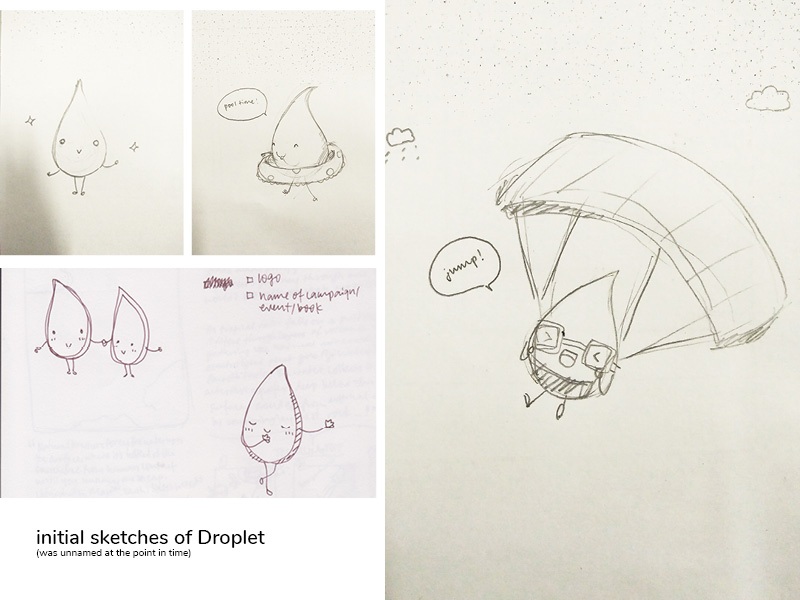
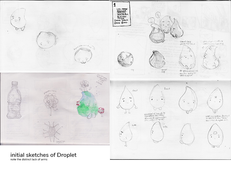
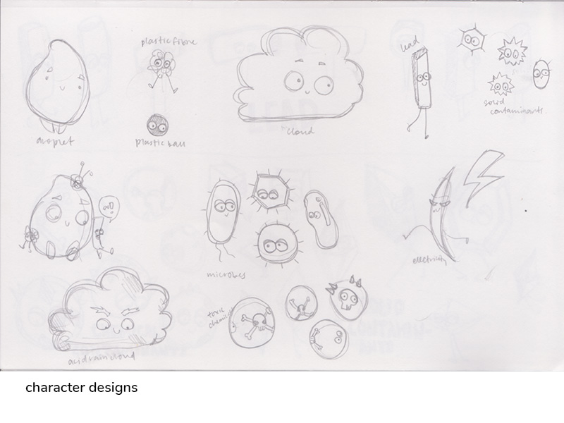
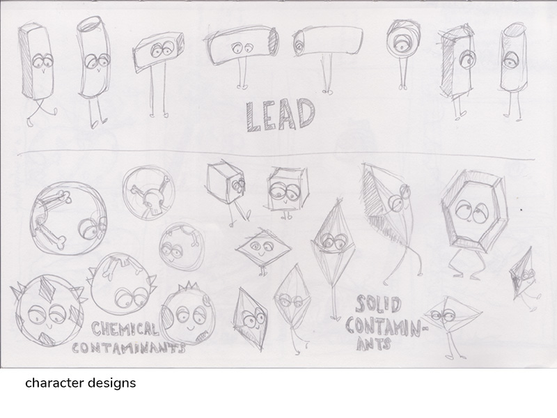
In terms of character design, Droplet was designed to appeal to people’s protective instincts 😉 it appears to be working…? Also, the other characters are also not created to ‘bad’, they have no knowledge of (or agency over) their effect on others. It should be observed that this is the premise which the stories are built upon: man is often the one who has agency, and is also the one to benefit, or suffer, from the state of water, which is affected by our choices and actions. This is why Droplet has no hands; no agency. Also, Droplet is naive and innocent, which is why it is so helpless against the perils of the world (and why the player has to make the right choices to help it!)
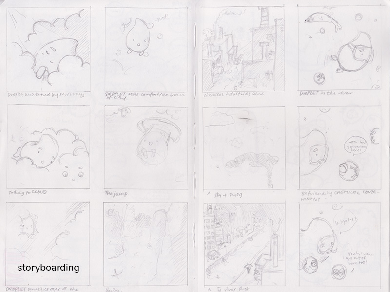
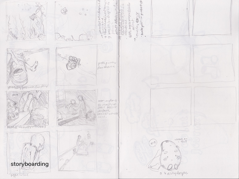
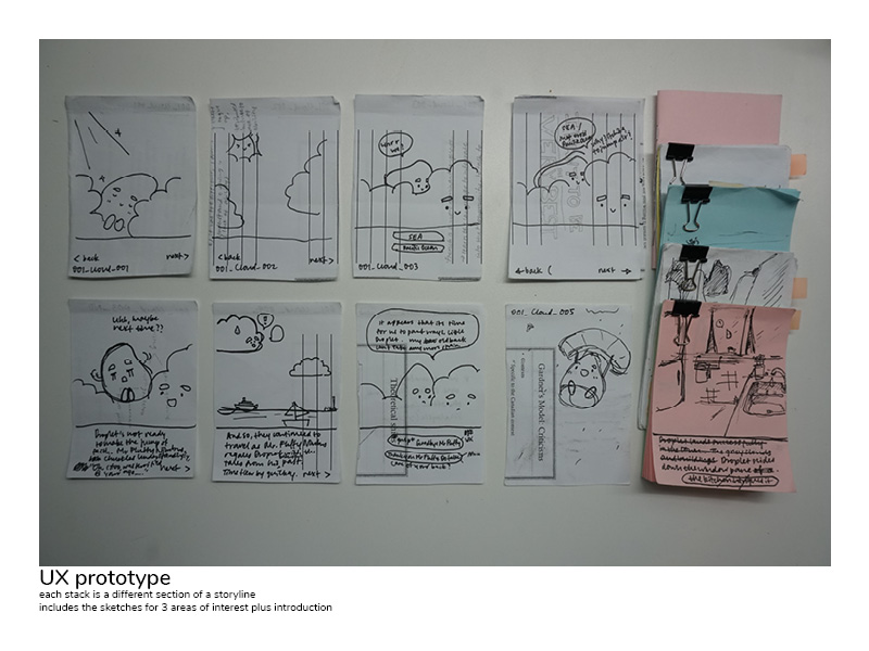
Before getting to the meat of things, Prof Nanci had me do a user experience prototype, so as to gauge the duration and detail for the story lines. This was a really helpful process!! I got to storyboard (kinda) and try it out on people (hurhur) without having to code.
But since one of my recent goals is to learn to code, I tried my hand at it for this project! I’m super delighted that the code actually works! Okay, honestly, it’s quite a simple code (though tedious), but to beginner me, I get very confused with all the lines and stuff. Really thankful for the ‘block’ system Code.org had that made things easier to understand. The loops/skips in some parts of the story, make me feel even more confuzzled… learnt somethings though, so that’s good.

Ad: Process
Ingredients:
Clouds,
Dreams,
Blinking Droplet,
And a do-or-die attitude :p
It was my first time using Adobe AfterEffects. An interesting experience, and could still be improved on. But my primary focus was on the application, so the ad didn’t receive as much attention. The purpose was simply to advertise the application, and give users some idea about what the application is about.
Plushie: Process
Ingredients:
1/2 metre of soft blue cloth,
Ruined fabric pencil,
Helpful neighbour who has sewing machine,
And a set of numb fingers
Another reason why the ad was less loved is because of the plushie 😉 I made prototypes of varying sizes, and it more than doubled in size each time. So the final plushie is the size it is (46x50cm). It should sit pretty comfortably in your lap and still be nice to hug. Went shopping for materials with Christy (see her post here!) hehe it was great fun! We had to conduct #facetest to evaluate the suitability of cloth for our plushies.
In conclusion,
This was a very demanding project. I was far too ambitious at the start ;-; it’s a real pity the application isn’t complete yet. However, I did learn a lot from this. Knowing my limits for one, dabbling in a few new skills (coding and aftereffects) as well as an increased awareness of our impact on the environment ;-; sometimes, ignorance is bliss, other times, not so much.
Project 3: process {a thousand well wishes!}

It was great fun exploring the paper as a 3D object for this project, though my final piece doesn’t really show much, uhm, interesting three dimensional shapes or cuts *cough cough* #budget.
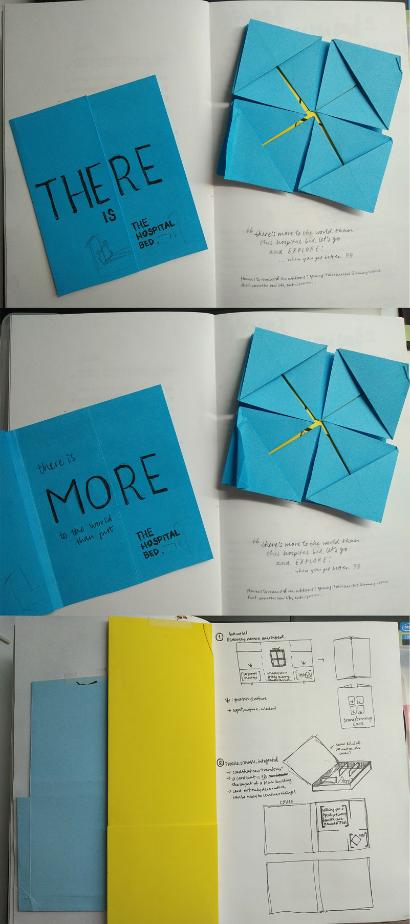
Above is the first round of ideas, where I was really focused on creating an interesting form. However, after asking some friends, one who recently underwent an operation, about what kind of card they would like to receive, it was quite surprising when a couple of them said they would like a simple card. Why? Because hospital bills are expensive enough as is. Additional cost for a card when I’ve just spent a substantial amount on surgery, no thank you. Thus, I added a new parameter to the design: #budget. What they would like to see was something simple yet pretty/cute.
So, the next design emerged:

Eep, what I didn’t realise was that EACH fold costs MOLLA$. Oh dear me. So the origami crane card was not workable. Michael suggested that the crane be scanned/photographed, then printed, to give the illusion of the origami crane. I tried it out, but it proved very difficult because 1) the scans were not very clear due to the raised surface of folds; 2) the quality of the photographs were meh as well; 3) manipulating them digitally wasn’t producing the visual effect of movement and lightness (speediness) I’d envisioned, probably because the original flattened origami was already quite stiff. So I played around with illustrating the cranes at various angles, but it didn’t work out very well either.
As such, I went back to re-evaluate the concept, re-analysing why the crane had to be there. My original intention was simply because the form was clean and elegant and it could be folded into a card. Fortunately, Charmaine had said shared about the Japanese myth, where folding 1000 origami cranes will grant a wish. The hospital, too, is wishing for the speedy recovery of their patient. Thus, I found it quite apt to convey that wish: packing in symbols of well wishing (elephant, crane, tortoise, wishing well (pun wasn’t deliberate…at first)). Also, because their discharge is a joyous occasion, the card should be lively and energetic as well. Finally, due to financial restraint, the cuts/folds should be kept to a minimum.
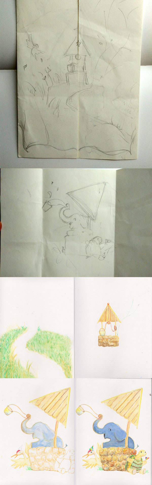
And thus, the celebratory animal welcome started! After drawing and colouring it, the image was scanned and edged out individually, then compiled in Photoshop as an image. Text and image was put together in InDesign. Looking back, I should have just compiled them all in InDesign, it would have been so much less laggy, and adjusting things would have been much easier. But I got so caught up with editing in Photoshop it slipped my mind. It would have been so much more efficient (and less laggy) though. Oh well. #learnsomethingneweveryday :>
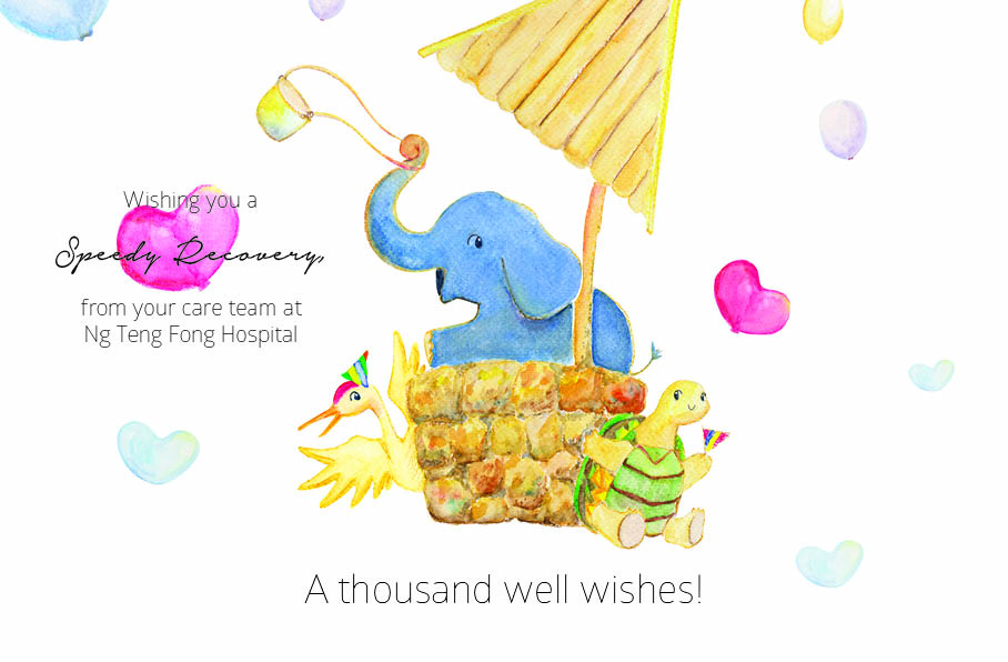
That said, the final printed version is here! Teehee:)
Project 3: Get Well Card {a thousand well wishes!}

What would someone being released from the hospital like to see? Apparently, something that isn’t extravagant, because they’ve got a hospital bill to pay. So the goal of this project is budget-consciousness! Even so, it’s important that the card conveys the hospital’s wishes for the patient’s recovery. I’d also like for the card to be packed full of well wishes and energy and celebration over their imminent recovery.
For the element of surprise, the least animated symbol i.e. the wishing well (pun intended?) was placed outside the card. With rainbow stairs leading up to it. The gatefold was chosen because it is simple (and cheaper #budget) and ties it well with the graphics inside. Once opened, the animals spring forth a surprise for the person who opens the card. And yes, all the animals (and the wishing well) are symbols of well wishes in various cultures. They welcome and celebrate the patient’s recovery, and the balloons help to add to a festive mood. I hope that the card, with its colours and characters bursting with energy will invigorate and refresh the reader, as well as convey the hospital’s care for them. And so, the space on the sides of the card are for staff to write their personal messages for the patient.
So well, here’s the final:
front
back
the print actually came out a lot brighter than I thought (the colours on my screen are not as strong). As such, it was a good choice to choose the slightly yellow paper :> the texture was really nice too, because it adds to the more personal and “made-by-hand” vibe.
printed


view the process here~
Project 2: Zika Final
You can prevent it
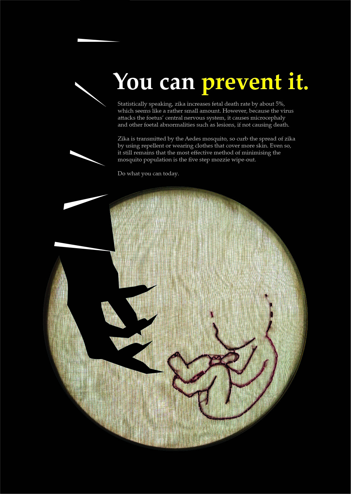
Purpose: To remind the viewer of the power they hold in curbing the spread of Zika.
The poster depicts an embroidery hoop with a developing foetus. A sinister arm extends silently out of the black background into the embroidery hoop. The intent of the graphics is to, firstly, point to the potential consequences of Zika: microcephaly and among other foetal abnormalities shown by the not fully developed foetus; the second intent is to emphasise the culprit: the female Aedes mosquito, depicted as the menacing striped arm; and finally, to place the viewer in the point in time before/after the virus reaches the baby. If read as “before”, the viewer is faced with the question of “what will you do now?”; if read as “after”, we can only wait and twiddle our thumbs, watching to see if the child will pull through safely.
While embroidering the foetus, the medium chosen because of the strong feminine and motherly connotation that it has, I realised that the act of piercing the cloth to thread was too similar to the mosquito’s biting mechanism it was quite uncomfortable. If we were to liken the bite to the piercing of the needle, and that the formation of the baby parallels the embroidered image, then if at any stage of pregnancy that needle was to transmit the virus to the child and inhibit its development, then what I saw on the embroidery hoop would be reflective of the entirety of the foetus’ development – incomplete. And if the major systems of the foetus were not sufficiently developed, he would not be able to survive.
However, let us not forget that not ALL Zika-infected pregnancies result in such abnormalities. Zika-infected pregnancies simply have a much higher probability of resulting in stillbirths and abnormalities. In fact, the Straits Times reported just a few days ago that the two births (so far) have progressed smoothly and the babies have -drumroll- no sign of microcephaly. Worth celebrating, yes? Even so, let us not become complacent in keeping those Aedes mosquitos at bay. They are carriers of both dengue and Zika. Dangerous mites they are.
—Final reflections—
Learning points: making posters are very much harder than expected. And making one that is supposed to relay serious information and motivate/encourage/remind/warn people while being engaging/interesting and clear at the same time really is a juggling act. There were also a number to design do’s and don’ts that I’ve learnt through this project. The first being margins, margins, margins. Very, very important (paraphrasing Michael). The second is hierarchy, and the third is composition. I think I still need to work on both hierarchy and composition much more, because I’m still not very satisfied with the layout of the current poster. Though it is better than the first few ones… #practicemakespurrfect, hopefully someday soon.
If you happen to be interested in the process, or would like to have a few more laughs at horrible compositions/designs/etc feel free to check it out here.
The case of Helvetica

After learning more about the circumstances and inception of Helvetica, I feel very sorry for its state right now. It was made to be neutral, clear, and its ideal, in some sense, was to be the solution for the world. And it was. Major corporations everywhere used it, and signages used it, and posters used it, and practically everything used it.
And that, is the essence of le problemo Helvetica faces today. Its awe-inspiring quest to be the solution, ironically, became the problem. Its neutrality, which stood at the core of its birth, was useful to practically everything: advertisements, clarity, impact etc, but the extensiveness of its use started to twist and paint and dye (or die?) the neutrality that was ever so important to the typeface. In fact, if I recall correctly, one of the ladies in the movie commented on how she had interpreted Helvetica as the font that supported/fueled the Vietnam war. And she isn’t alone in the awry misinterpretation of the typeface. So jaded has the public become to the onslaught of Helvetica in all its weights and uses that more often than not, it just…is.
On a side note, I confess to never having like Arial in sizes above 10pt. I don’t really know why. I’ve avoided it since wayyy back unless absolutely necessary: e.g. when the teacher specifically requests that it be in Arial, 12pt, no less. (cringes inwardly) So I’m not sure where I stand on the Helvetica love-hate continuum, because I’m not (consciously) familiar with Helvetica… yet.
On the other hand, the movie also presented the opposite view. The view of the Modernists, upon whom Helvetica elicits the oohs and aahs, the flutter-me-bys of gazing upon perfection. And I think, if used correctly, Helvetica can still do that. I’m not too familiar with the beautiful counterform they talk about (Painterface will teach me soon, I believe… #apprehensive). But I hope I’d understand what they mean by just how “solidly it sits in its counterform”, and how “the counterform makes the letters, not the other way around” means as well! Then again, due to the love of using grids then, I suppose I can understand that intellectual and mathematical delight of things falling in exactly the right place. Mmhmm~
Just to sate the curiosity of the similarities and differences between Arial and Helvetica, this site by Mark Simonson might be of help! I’m currently just staring at this example of Rates (Helvetica) vs Rates (Arial), and am slowly understanding, a wee bit, what Helvetica’s “solid counterform” might mean.
And as a side-dish to Arial v Helvetica, one might be interested in this too: “The Scourge of Arial”. Quite the dramatic title.
Well then, until next time!
Art Nouveau: a way of life
Perhaps one of the reasons why Art Nouveau is so interesting is because of its philosophy, that art should be “a way of life”. Truly living out their philosophy, the reach of the movement did not stop at what was traditionally known as “art”, but extended also into architecture (cue Victor Horta), posters (cue Jules Cheret), and even…fashion? Okay, I’m not too sure about what art nouveau fashion entails, but Google has directed me to Jean Philippe Worth, who designed the dress below:
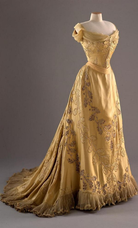
(Click here to find out more about art nouveau and art deco fashion) The dress is quite in line with what we learnt! It exhibits beautiful, flowing lines in its cut, from shoulder to waist to hip and all the way to the little train at the back, which is also seen in the floral designs that wrap elegantly around the dress, hugging the figure yet flowing almost effortlessly into a gorgeous swooshy-ness! (is this the dress version of a whiplash?)
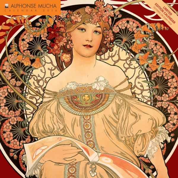
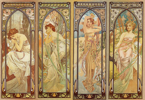
And certainly, one can never discuss Art Nouveau without mentioning Alphonse Mucha. Such fantastique. By the way, I couldn’t help noticing some of the similarities in the flowing dress design of Mucha’s work and Worth’s designs. They’re so pretty~ Mucha’s work pretty much epitomizes the whiplash (and the ideal feminine beauty?), and influences of Japonism is quite evident in the rather flat plains of colours and black outlines of figures. His work still retains the Western academic realism of the figure’s form though!
And to end of, just sharing a little cute poster of his:
It made me rethink my impression of Nestle.
![Alfons Maria Mucha's Art Nouveau decorative paintings, advertisements and illustrations [dvdbash]](https://oss.adm.ntu.edu.sg/jcheung001/wp-content/uploads/sites/182/2016/10/mucha-advertising-nestle-food-for-infants-1897-dvdbash.jpg)
Project 2: Zika development
What is Zika?
The chief concern over Zika is its impact on fetuses in the form of microcephaly, transferred from mother to child during pregnancy. Microcephaly is a condition where the a baby’s brain does not develop properly or does not continue developing after birth, and therefore has repercussions on motor and mental development. Second, is its relation to the increase in GBS. There is no cure or vaccine for any of the three conditions.
Here are a couple sources about Zika in Singapore, its effects, GBS and microcephaly.
Target audience: Young adults to adults, people who are at the reproductive stage in life and may be considering raising a family now or sometime in the foreseeable future. It is of great importance for them (especially the ladies) to be aware of the risks, as well as know of preventive measures that lower the chances of getting infected.
===== Potential slogans =====
- “Psst! Zika.”
- Psst! is often used to get someone’s attention, and it has a similar sound to ‘z’ (the difference between unvoiced [s] and voiced [z]), which thus gives unity to the sound of the slogan, a
- Bar Zika /(to be said with vehemence)
- Zero Zika
- Based on the Brazilian slogan. Alliteration.
- Zika the Zealot
- Inspired by alliteration. Seems to be able to translate into a narrative, but may be more for children instead. However, the target audience best suited to combating Zika are the adults, who are in positions where they can act, be it to lessen potential spawning areas or supporting/encouraging other adults to take preventive measures, or instructing children to do the same.
- Zika Wipeout
- An extension of the “Mozzie Wipeout” slogan/campaign
===== Concept for posters =====
Juxtaposition; of what we do know, and what we do not yet know

This concept was inspired by the above images, where Lego pieces were used to re-create highly iconic art pieces. The point here is that even though the square pieces created a blurred effect, we are still able to identify it. Similarly, although we don’t know everything about Zika yet, we know its form, we know its impact. It’s not a clear image, but we know enough: enough to know that it cannot be taken lightly.
The most literal adaptation of this would be a similarly blurred image of a mozzie, which is the complete opposite of the super high definition image of Aedes mosquitoes we currently see. Actually I get really uncomfortable with these hyper close-ups of insects in general… so maybe I haven’t been looking at those posters in great detail…? But the follow up for these campaigns were good though! So I didn’t miss out on anything. (I think. Shh.)
===
Narrative; Zika the Zealot
-in the form of a collage/scrapbook/illustration
A series of compositions that follow a mozzie’s quest for blood. Even with an illustrative approach, depending on the style chosen, it can serve as a method of pointing out what preventive measure people may take to reduce the risk of getting bitten. As it has a narrative sort of flow, situations that locals may find themselves in can be simply depicted, and handy suggestions can be conveyed through the posters.
The colour palatte will probably be limited so as to allow the content of the poster to separate itself from that of comics, as well as easily highlighting the areas of focus for the composition.
===
The Shock Factor
Many anti-smoking campaigns in the world depict the consequences of smoking on our bodies.

 They shock, instill fear, in the hopes of spurring one to act.
Could this also be used in regards to Zika?
I feel that what is most terrifying about Zika that we know about right now is its effect on babies. Microcephaly can range from mild to severe. In the worst cases, the child may die as a result of those congenital defects and/or infections.
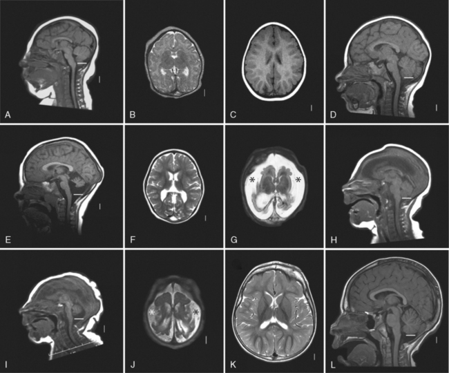
I’m not very sure about where this one will go though. (it has a high chance of being inappropriate) This MRI scan compares the brain development of different congenital defects, microcephaly included.
Yupp that’s about it for now!
===
Heya! Came back with another idea which I’m thinking about developing. Just this afternoon, a friend mentioned that Zika doesn’t seem to be that significant, and some people who do catch it are just given a few days worth of MC and drugs for their symptoms. This is an understandable path of thought, though, because the effects of Zika on a developed person is not evident. There are several studies which indicate that there are perhaps some effects, but these are inconclusive at the present time.
However, as someone who knows a number of couples who are planning to have children, some of whom are already pregnant, and one who worked in a Zika-zone until recently, their concern for the unborn child is definitely warranted. Even so, it isn’t completely up to them to ‘protect’ the child. They may be doing everything in their power, but the greatest ‘shield’, their greatest defense comes in the form of everyone putting in effort to stamp out the spread of Zika, even if it doesn’t affect us directly.
Hence, the slogan inspired by this goes as such:
ZiKA: BEYOND YOURSELF
the point being that it is more than just ourselves, but that in regards to Zika, we are motivated by concern for others. For the mothers-and-fathers-to-be, family and friends, even people completely unrelated to said people, the motivation is the safety of the unborn child: a person apart and distinct from ourselves, still in the womb yet facing the threat that is Zika.
Here’s a preliminary sketch!
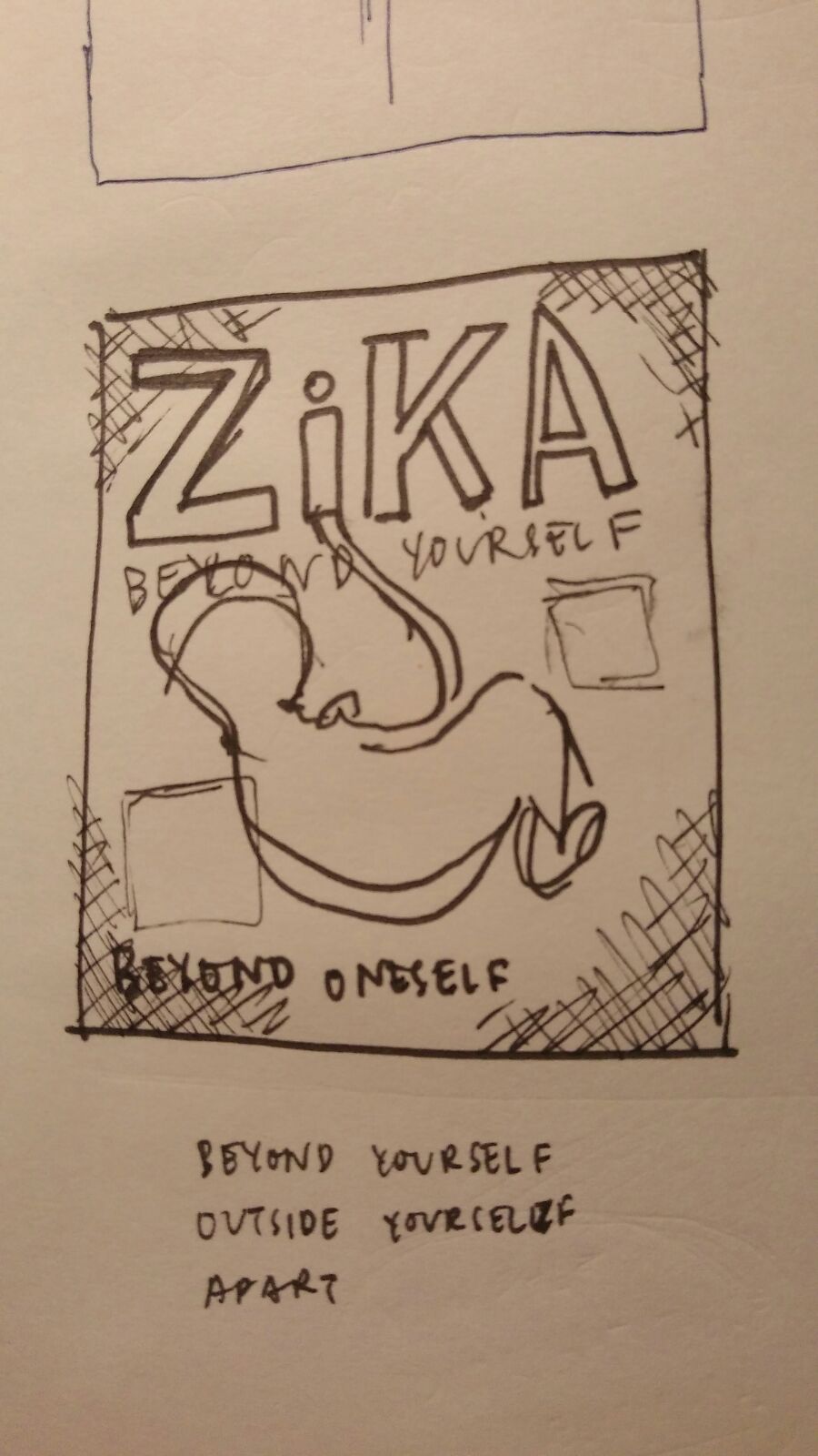
Anyways, I’ve just bounced the idea off Marianne, and she’s told me to work on the composition. Seems like the work’s been cut out for me hmm~
===
Now that the direction has been set for discussing the effects of Zika on an unborn child, I proceeded to become more familiar with the specifics. Most horrifyingly, there are sources which link Zika not only to microcephaly, but to other birth defects as well as stillbirths as well. According to Everyday Health, “The abnormalities seen in the ultrasounds of pregnant women with Zika included microcephaly, hardened calcium deposits in the brain, a breakdown in brain tissue, brain swelling, and poor growth of the fetuses.”
“It looks like Zika is inhibiting development of the brain, not just [associated with] small head size, and it’s associated with stillbirths… That’s why I called it the virus from hell, because it really is something terribly evil happening that’s blocking the brain of the unborn baby.”
— Peter Jay Hotez, MD, PhD
Regardless of which trimester the mother is in, the virus seems to have developed a way to attack the foetus’ central nervous system, and also seems to affect the placenta during the third trimester as well.
Perhaps the only silver lining we do have in this situation is the fact that 71% of pregnancies proceed normally! Though that does mean that for pregnant women infected with Zika, 3 in 10 pregnancies do meet some kind of complication…
===
more progress to come /soon/
Visual Research: Posters

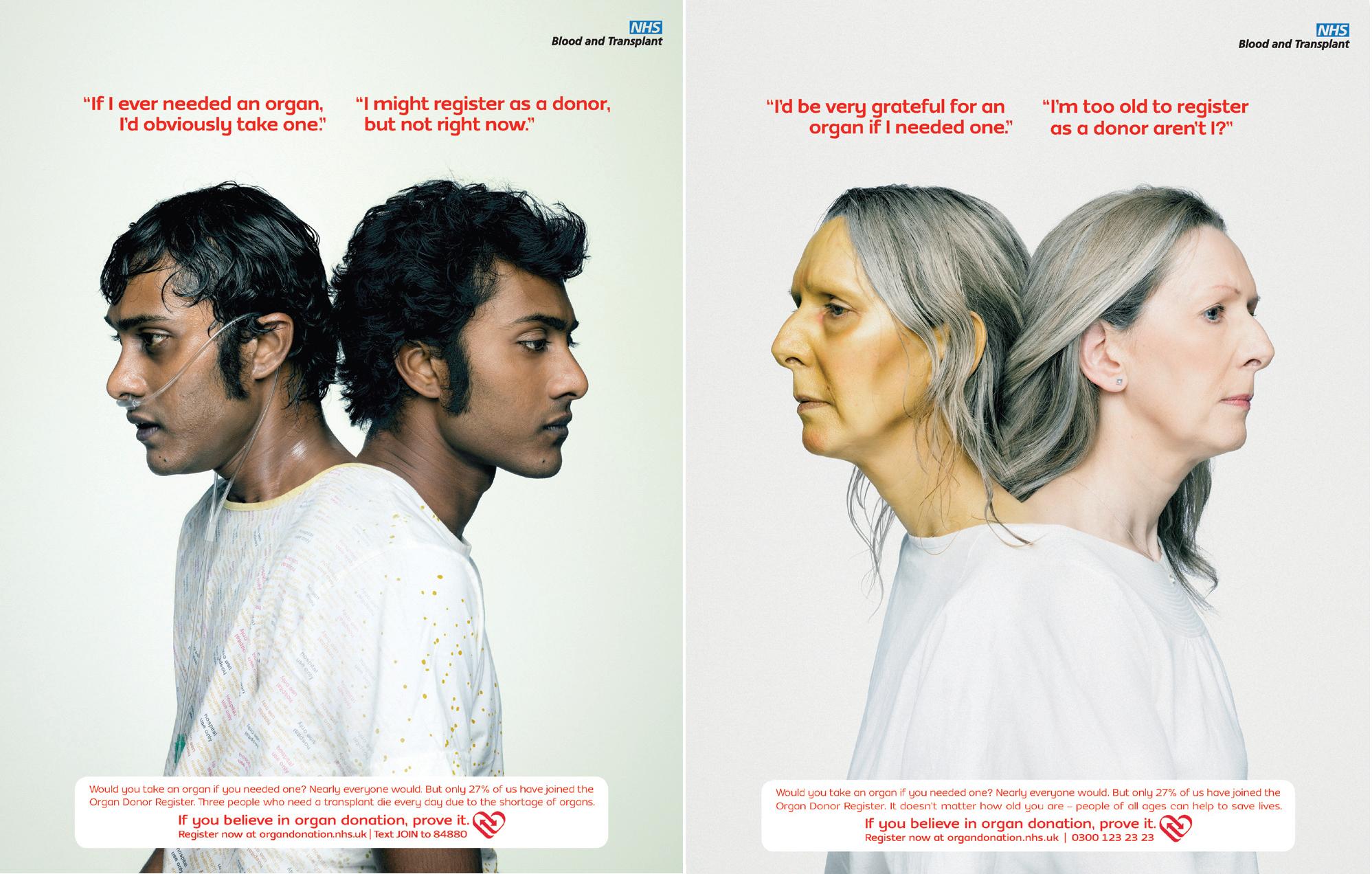
This is a series of posters by NHS to encourage people to register as organ donors.
What is most eye-catching about these posters is the “conjoined” appearance of two people, who appeared different. It was only on closer inspection that I realised that it is actually the same person, but in different “states” — ill and healthy. I suppose the purpose of the poster is to 1) get people to sign up be organ donors; and 2) to convey the urgency/need for organ donors; and finally 3) placing the viewer in the position of the person who is in need of an organ, evoking empathy so that they understand 2) and will do 1) and sign up themselves as well.
What works for this poster is the plain background. It allows the “conjoined” persons, which is the dominant shape, to stand out. Also, the juxtaposition of “one who is in need” against “one who is apathetic/ignorant” works, and may serve as a push to get people to donate. The text aids in addressing different views people may have regarding organ donation.
However, I feel that the placement and colour of the text is far too eye-catching, and competes with the figure(s) for attention. The red works too well in grabbing attention despite its smaller size. Perhaps it would have worked just as well to allow the image to grab attention, and let the text aid understanding after. Although, perhaps, the text could be less direct. At least that’s what Ben taught us in writing. It is always less effective to “tell” the reader directly what the characters are thinking, and more effective to leave some space for the viewer.
Even so, the fact that they made a series of posters with people with visibly different symptoms is intriguing. It piques my curiosity about exactly what organ they need. Which works to the posters’ favour, as quite a number of organs and tissues can be transplanted with current technology, and therefore drives the point that there is a host of patients out there, waiting, all with different needs, which can only, for now, be alleviated should people step up to the table.
Here are a couple other posters that were really interesting too~

This one was interesting because of the discomfort from seeing the spikes in a shoe, which, ideally, is comfortable.
Below is a series that uses the hand to convey part of the message.


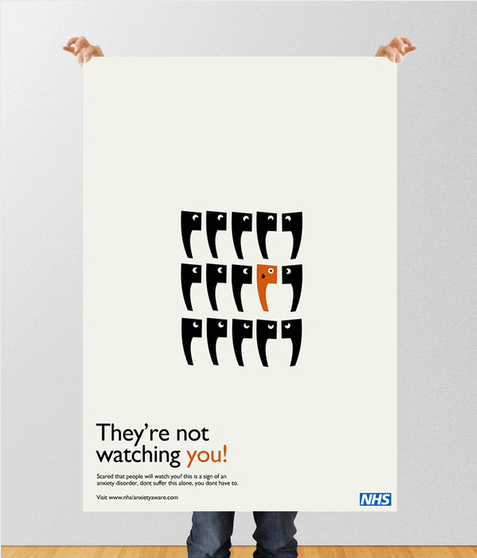
I really like the simplicity in these two! But they’re more “text as image” instead of “image-driven” which is a criteria for this project.
Ah, and the one below is rather jarring yet interesting combination of photography and cigarettes.

