
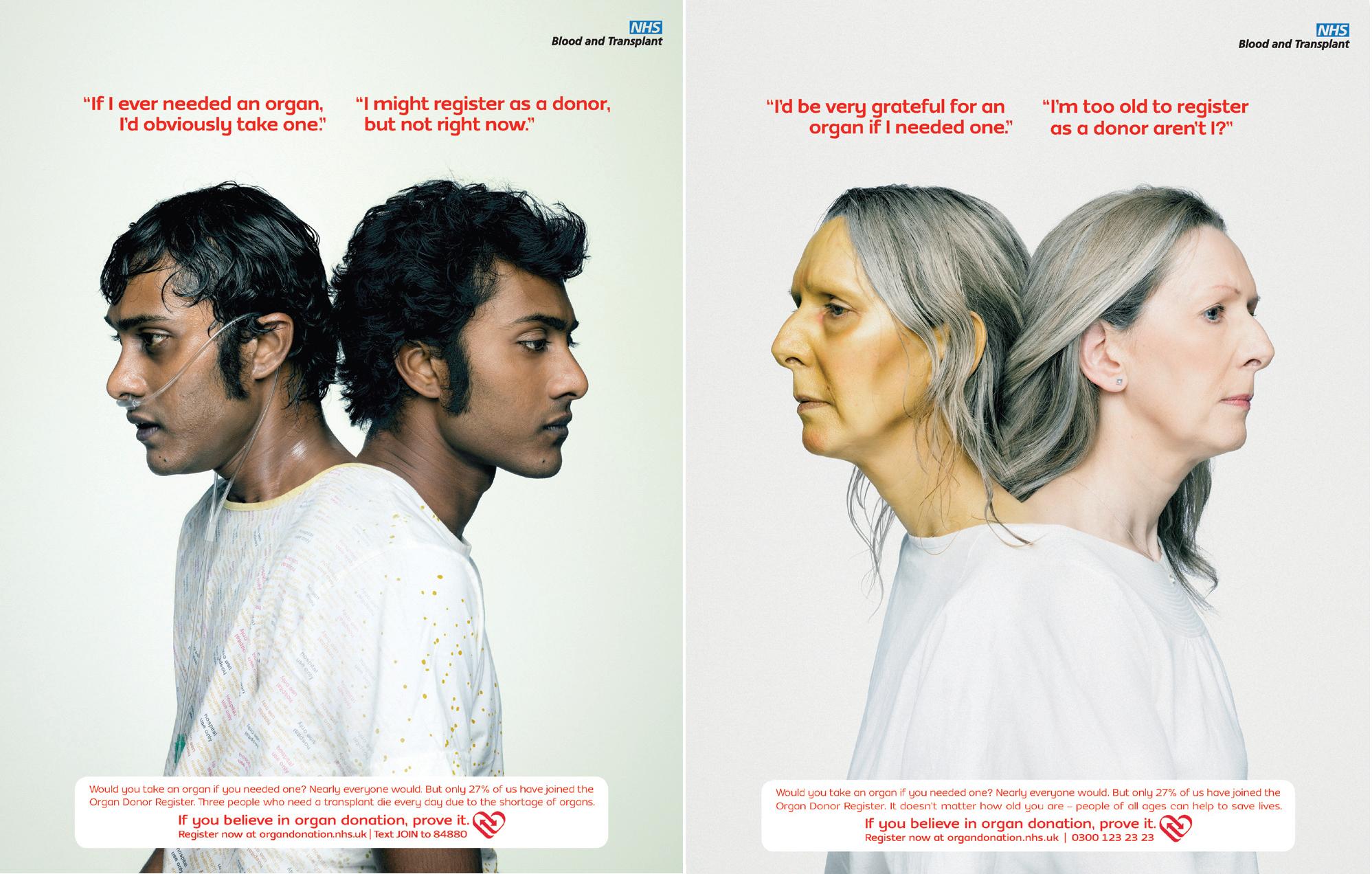
This is a series of posters by NHS to encourage people to register as organ donors.
What is most eye-catching about these posters is the “conjoined” appearance of two people, who appeared different. It was only on closer inspection that I realised that it is actually the same person, but in different “states” — ill and healthy. I suppose the purpose of the poster is to 1) get people to sign up be organ donors; and 2) to convey the urgency/need for organ donors; and finally 3) placing the viewer in the position of the person who is in need of an organ, evoking empathy so that they understand 2) and will do 1) and sign up themselves as well.
What works for this poster is the plain background. It allows the “conjoined” persons, which is the dominant shape, to stand out. Also, the juxtaposition of “one who is in need” against “one who is apathetic/ignorant” works, and may serve as a push to get people to donate. The text aids in addressing different views people may have regarding organ donation.
However, I feel that the placement and colour of the text is far too eye-catching, and competes with the figure(s) for attention. The red works too well in grabbing attention despite its smaller size. Perhaps it would have worked just as well to allow the image to grab attention, and let the text aid understanding after. Although, perhaps, the text could be less direct. At least that’s what Ben taught us in writing. It is always less effective to “tell” the reader directly what the characters are thinking, and more effective to leave some space for the viewer.
Even so, the fact that they made a series of posters with people with visibly different symptoms is intriguing. It piques my curiosity about exactly what organ they need. Which works to the posters’ favour, as quite a number of organs and tissues can be transplanted with current technology, and therefore drives the point that there is a host of patients out there, waiting, all with different needs, which can only, for now, be alleviated should people step up to the table.
Here are a couple other posters that were really interesting too~

This one was interesting because of the discomfort from seeing the spikes in a shoe, which, ideally, is comfortable.
Below is a series that uses the hand to convey part of the message.


I really like the simplicity in these two! But they’re more “text as image” instead of “image-driven” which is a criteria for this project.
Ah, and the one below is rather jarring yet interesting combination of photography and cigarettes.

