It’s the weekday, and the offices that were quieter during the weekends surge with the hustle and bustle of life once more. Or so would be, if the workplace were in the CBD. But not the hospital. Regardless of the time, there is always someone working, someone tending to the patients, someone waiting anxiously for news.
=Therapeutic Graphics=
Project goal: To create a welcoming and soothing environment through design that can potentially promote healing in the hospital.
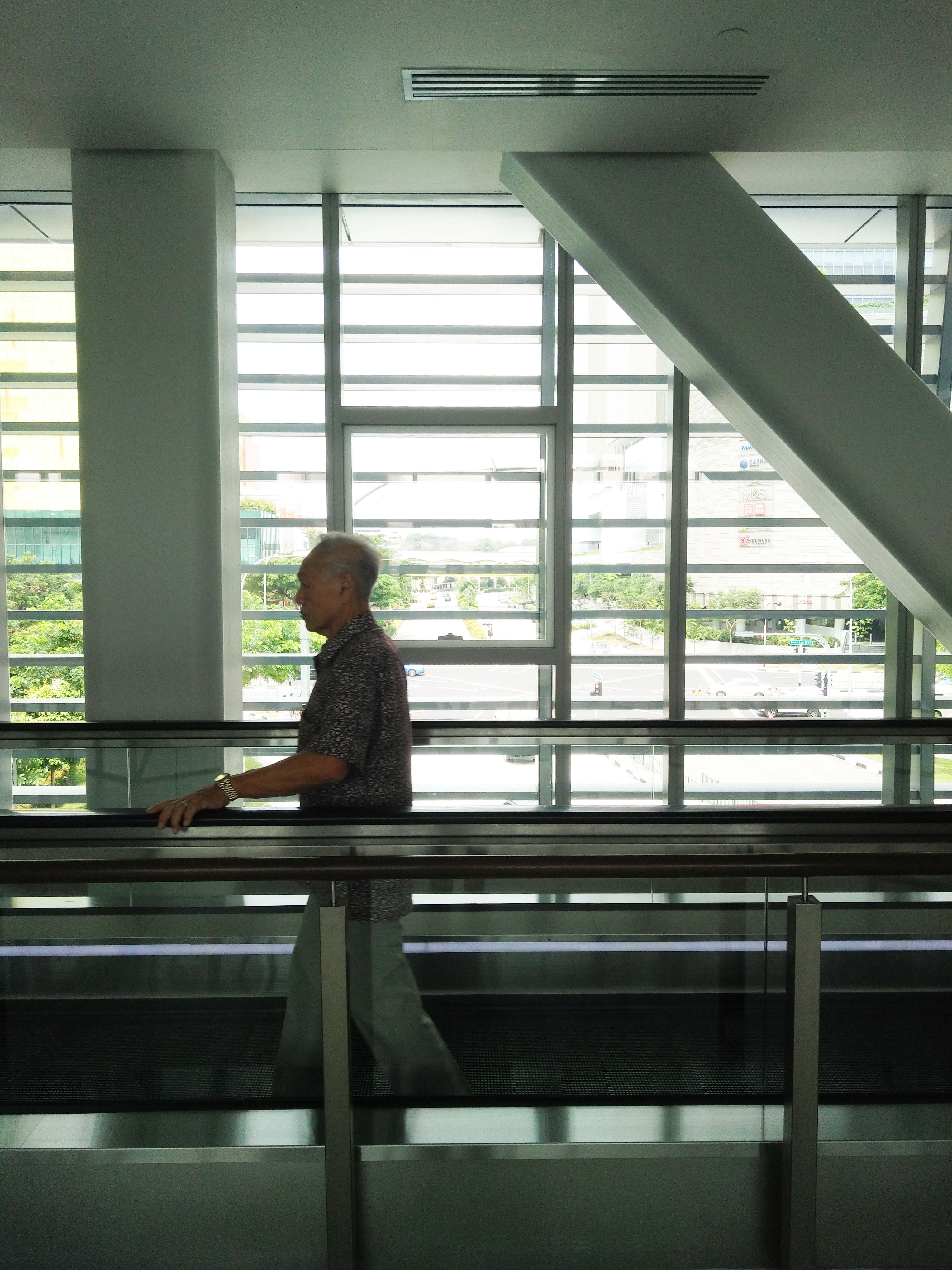
Below is the space which will house the work:
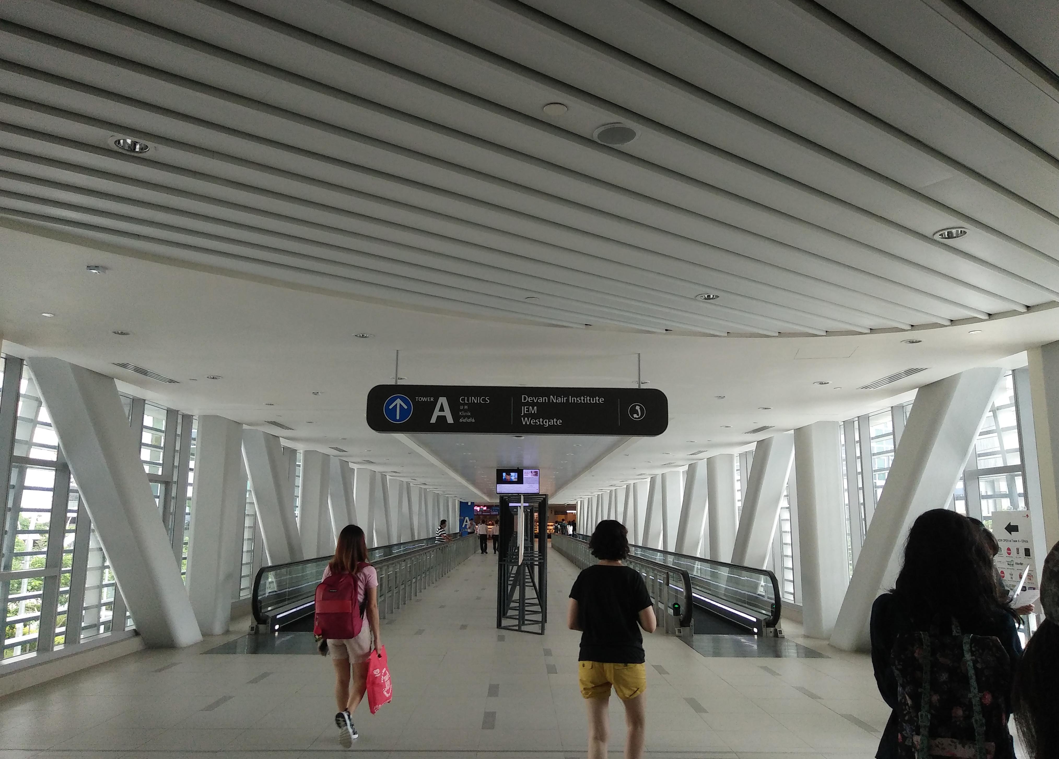
More specifically, the square window this elderly gentleman is moving past:
=Notes on the space=
- Ceiling to floor glass windows that allow light to stream into the walkway,
- which is a wide, mostly empty space (especially in the middle),
- with travellators on the sides.
- The overall design/feel of the space is industrial. Gray tones of metal and tiles and blocky pillars add to this feel.
- Directly outside the windows are bars that run horizontally along the walkway.
- Beyond which is a street view that includes quite a bit of greenery and glimpses of nearby malls.
=Talking to the auntie=
Marianne and I approached an middle-aged auntie in uniform. She is one of the cleaning aunties, to whom the clean and presentable environment we saw can be credited to.
When asked what she thought of the place, her reply (in Mandarin) was that it “resembles a prison”.
I was surprised. The open space and soft sunlight were plenty positive things to me. I could breathe more easily along the walkway compared to the confined space of the mall or hospital corridors. “Prison” was not what I was expecting.
It took a second look at the space for understanding to dawn upon me, and is an issue that a number of my classmates pointed out most concisely: the individual’s emotional/mental state that influenced their perception of the space.
I entered the space as a student, fresh out of a long summer holiday (or not, but it was a break nonetheless), anticipating a new project in a new module. Sunlight and space are nice.
On the other hand, many of the people who use this walkway enter it differently. Many probably have not had a holiday in a while, some just completed shifts, yet others miles from their home country. Without a doubt, the hospital environment can be a high-stress environment regardless of the identity or role of the person who enters. Surgeons rushing to the operating theatres, nurses hurrying to assist patients, office staff up to the neck with paperwork, cleaning staff upholding the enormous task of keeping the space suitable, and even visitors worried about family or friends. In this situation, the grey of the space might stand out. Harsh and unforgiving. Bars seem to follow you as you move through the walkway, but they stretch out farther before you, as if moving quicker, more efficiently; mocking all the effort you’ve put into everything. Then again, these same bars recall the bars of a prison cell, acting as an obstacle to the comparative peace of the outside world, trapped.
=Ideation=
Likening the walkway to a prison generally connotes something negative. It implies a sense of dreariness, monotony, imprisonment, stress.
Contrasting words to this would be fun, playful, vibrant, full of life, exuberant, bright, active and engaging.
The goal of these designs is to provide respite mental/emotional from the toil of work, a period of relaxation as they hurry between different locations. Ideally, due to the large target group (from children to elderly, shoppers to doctors, and everyone in between), the graphics still resonates positively with them.
Hence, I’ve explored two main types of ideas. The first is modifying the perception of the bars. That is, to somehow integrate the bars into the design, thereby altering the understanding of “bars = prison”. The second collection of ideas finds its roots in the contrasting words and the exploration of lighthearted humour in the first group of sketches.
=Horizontal bars, or not?=
Anyway, I don’t usually work well with mind maps(referring to the typical mind map). My equivalent of a mind map happens to look like chunks of notes instead. In this case, notes on the side of the sketch. They are mostly ideas that suddenly pop up, or grow from a related idea. Yes, in essence it’s the same as a mind map. It just doesn’t look like one… somehow…
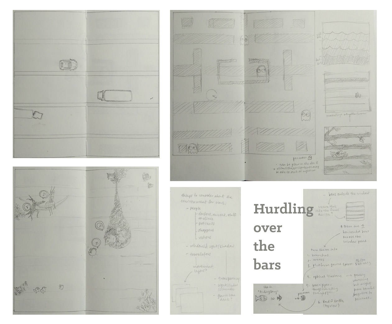
The sketch that tickled my sides was this one:
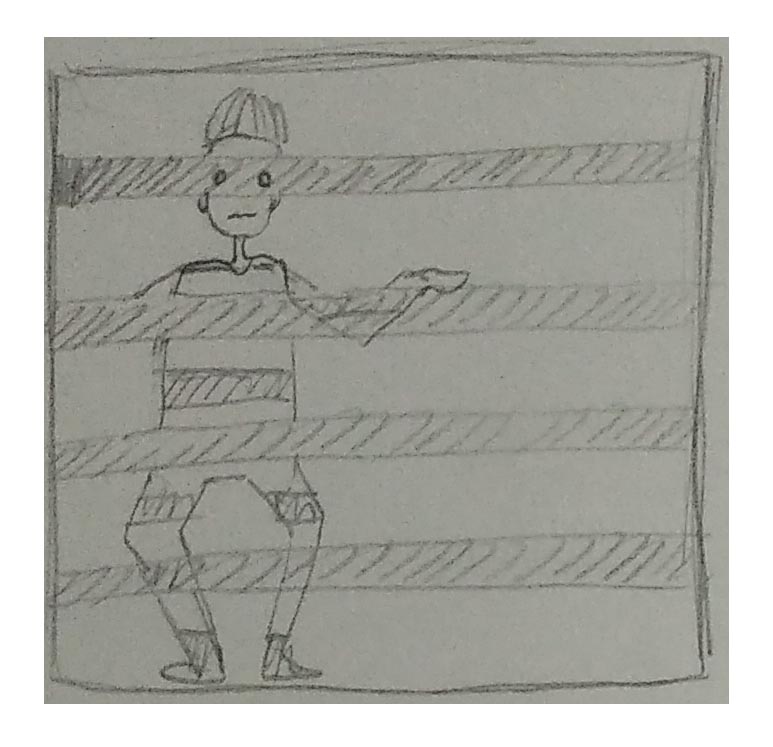
Up until this sketch, I had mostly been thinking of just visually appealing images. Images that were relaxing and comfortable to look at. But this reminded me that therapeutic graphics goes beyond just looking good. It should have something that resonates with the viewer. I had tried to do that with “Pac-man”, but it isn’t a universally appreciated game. This sneaky person, on the other hand, has a quirk of humour, something that reaches out to the audience.
(I personally did quite like this idea hahahaha.) But Michael mentioned that this design could more likely accentuate the bars instead of distracting the viewer from their prison-ness. Classmates also voiced concern about how it can be executed. And I agree. So yup, it’s a no-go.
=Idea Number Two=
Then, what else can speak to the people traipsing along these hallways? What can lift their spirits?
Nature is definitely a recurring theme for many of us. I can’t think of anything particularly universally funny either.
And by this time, I’ve already a particular feel/vibe that I’d like my work to have. It has to be something relaxing, free, colourful, and light at the same time. Searching from inspiration everywhere, I remembered a text my friend wrote a couple years ago for a school publication, Non-Sequitur. Exactly what I needed.
The following is the first third of Wanderlust
Written by Winnie Fok
The whale has arrived at my doorstep. She is a lovely turquoise, a shade I’ve never seen before. I feel the need to be polite and bow first, so I do, before I clamber on to her back. So smooth it feels like silk. Makes me want to slide down her side and fall off into the abyss. I wonder where the ground is. I wonder what hitting the ground feels like. But before I can make that a reality funny I should use that word she takes off. There is a soft intake of air, like someone breathing in quickly. I look up to see the balloons moving up, like they are being pulled by something. It takes me a while to realise that she is moving with the balloons. Up, up into the clouds. We are going. Where are we going? I don’t know where, but we are headed there, and I like that.
We are in the middle of the clouds. It’s like ghosts and wisps whispering into my hair, except they dissolve into morning dew and dragonfly tears on my face. I can’t see very much, but I like that. The clouds are cold and the wind is cold and I have never felt more alive in my life.
I am full of
wanderlust.
∞
It’s everything I was looking for and more.
Whimsical, lighthearted, with a singsong quality that just emanates from the writing. I love it. <3
What’s even better is that it already contains distinctly graphic elements that most people would associate with comfort. Despite their large size, the gentleness of whales is well-known. And the beautiful blue (or in this case, turquoise) has already been on my mind as a staple for the colour palette of “therapeutic”. Perhaps it’s the cultural thing about cute huggable whales that’s eliciting the “awws” as well! Moreover, there is a human character whom people can relate to.
I’m hoping that it can become some sort of a series. A lighthearted, whimsical narrative through which people can adventure with the main character as they move by from location to location.
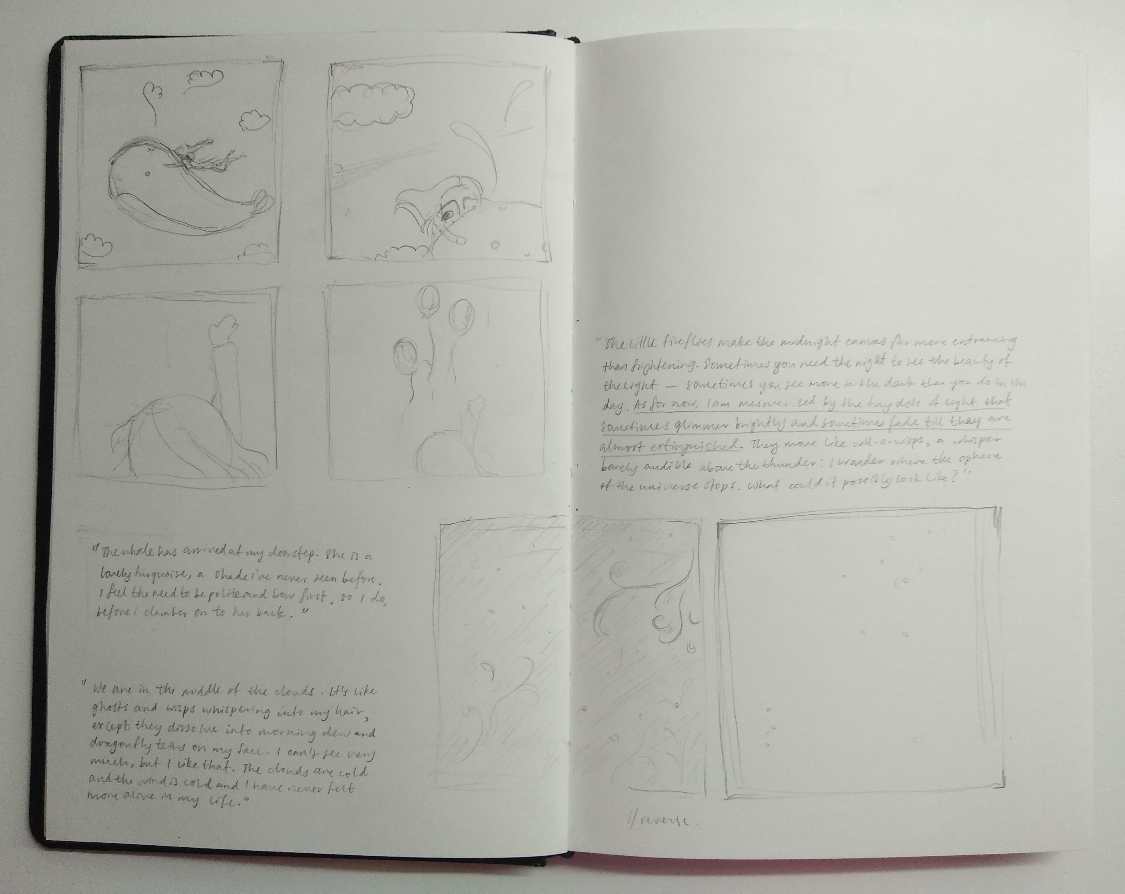
I also considered cutouts that could allow light to pass as little glimmers of fireflies and wisps, even adding some glow-in-the-dark so that it can be viewed after the sun has set (since there are people working in hospitals even at night). This is an idea that I might included into the final illustrations.
=Designing the characters=
Officially starting on Idea Number Two!
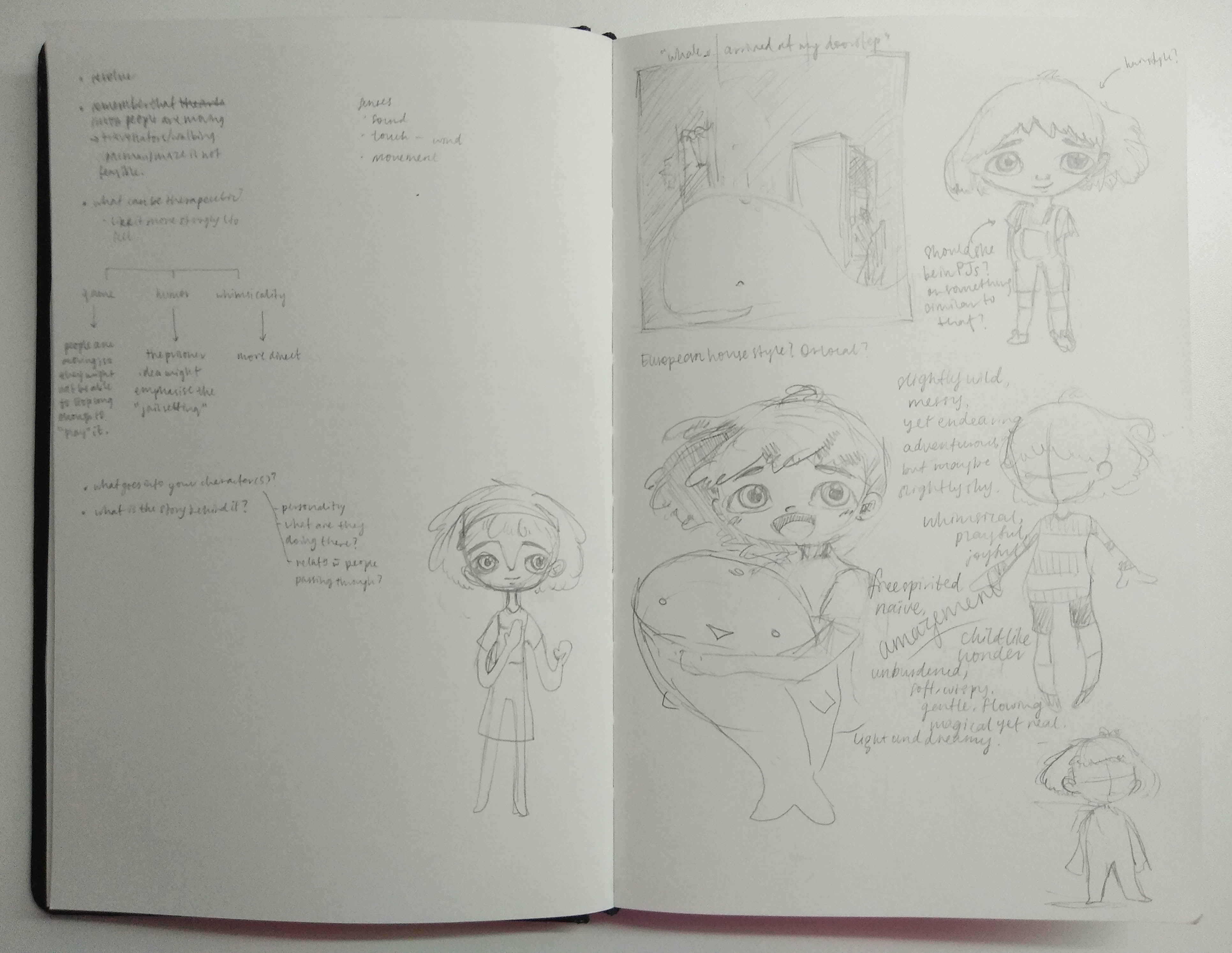
Working out the main character’s personality and features. I’m inclined to make the girl a little bit like the writer, slightly shy, yet adventurous and more than willing to try new things. She’s got this child-like wonder, and is amazed by what she sees when flying on the whale’s back.

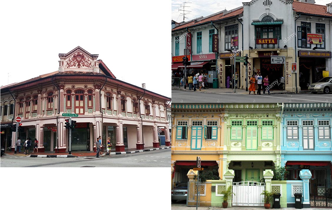
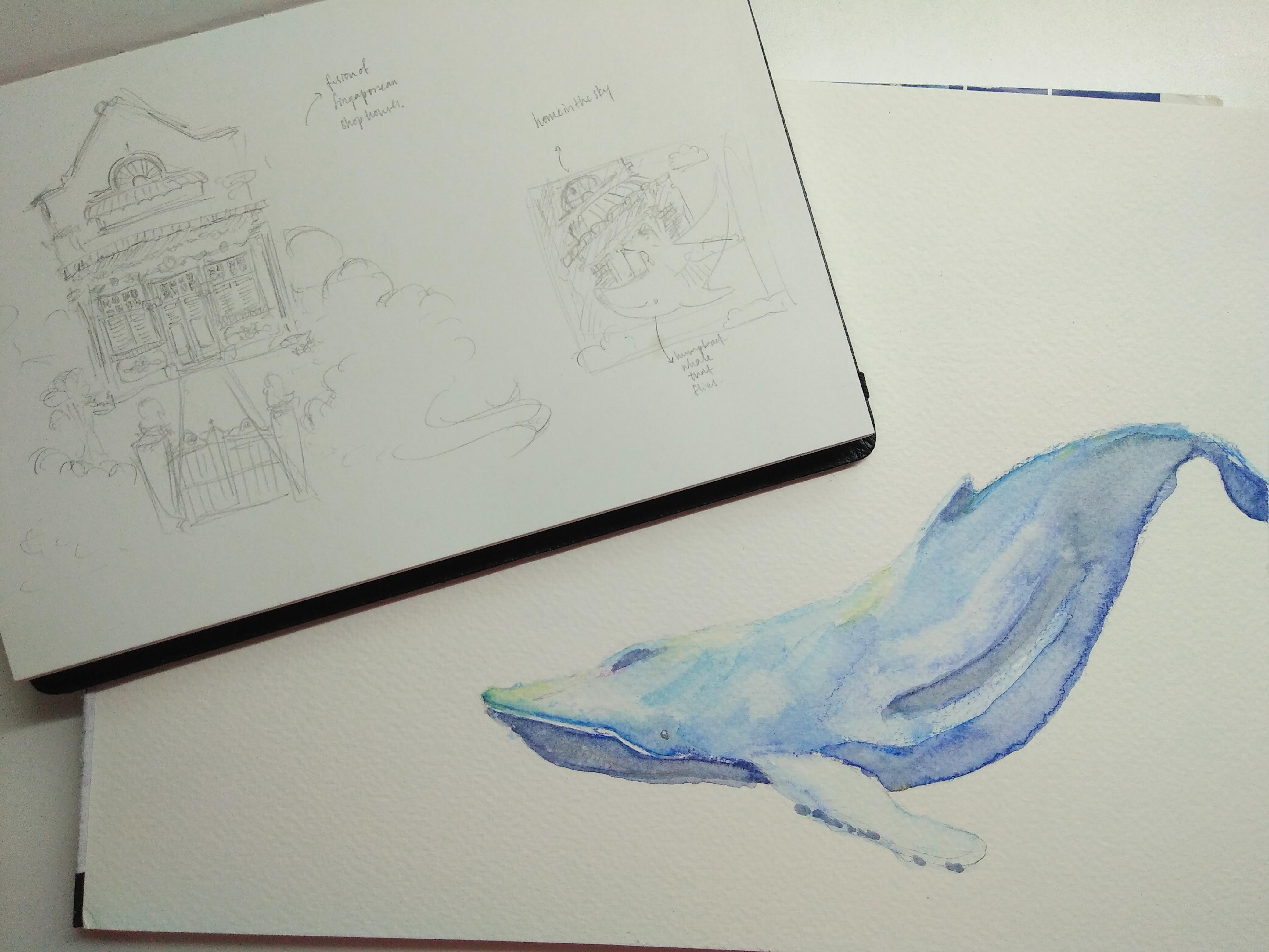
The first “house” that came to mind was very English looking. But this is Singapore, not the U.K., and thus, I tried to design a house that was a little bit ore similar to the shophouses that lined (and still line some) streets in Singapore. Due to the wide range of audience, I want something that can reach out to the different age groups. In this case, the older generation will relate better to the visual of a shophouse. Inspiration was taken from the following images:
Next is the whale!
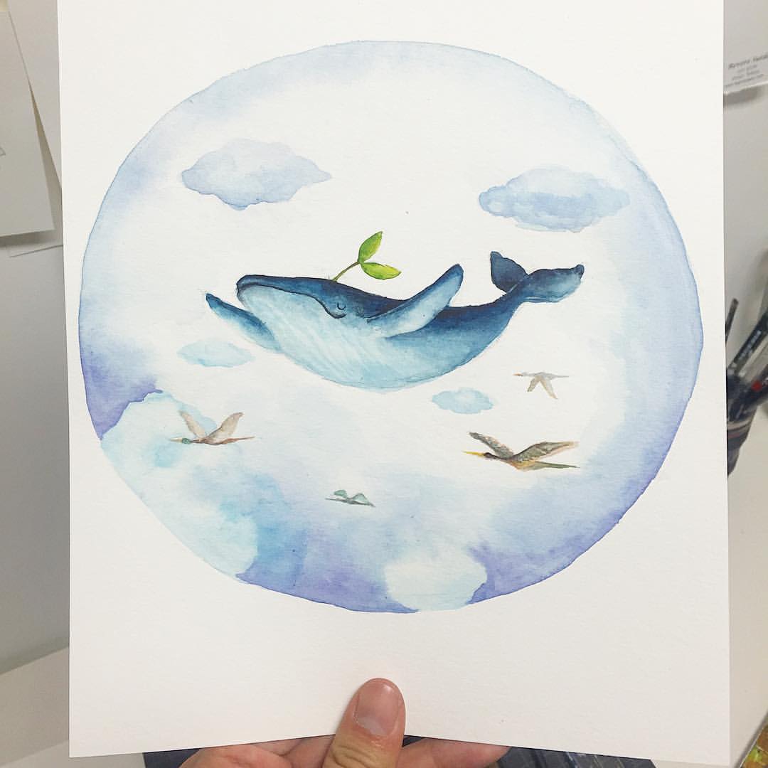
I chose to use the humpback whale because it’s potentially the most expressive whale. Why? Because it’s mouth can be drawn to quirk into a very endearing smile:)
And I’m hoping to make a whale and sky piece, something like this:
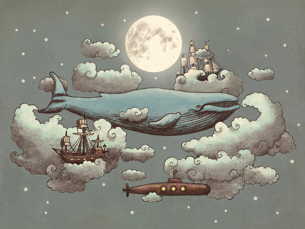
I really love the whimsicality in this piece. The mix of ships and submarines and a whale all flying together in the night sky is somehow very dreamy.
Or this:
With a little bit more loose-ness in the execution like this:
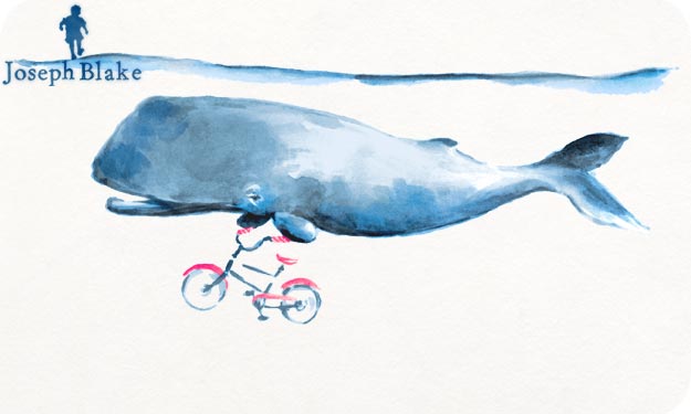 Slightly looser appearance so that it gives the viewers a sense of space, that the characters are not confined by lines (or bars), thus brings out the lightness I’d like the final illustration to have!
Blue seems to be the most effective colour to achieve a calm yet endearing atmosphere.
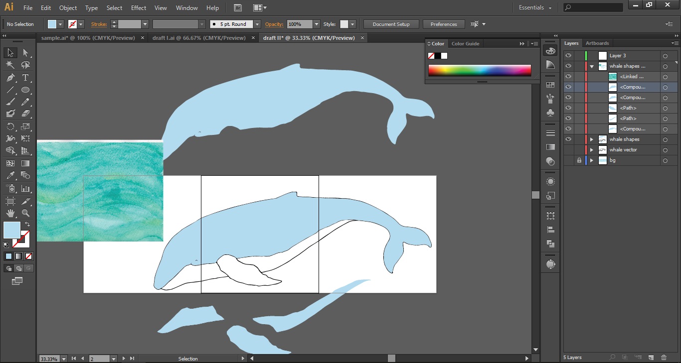
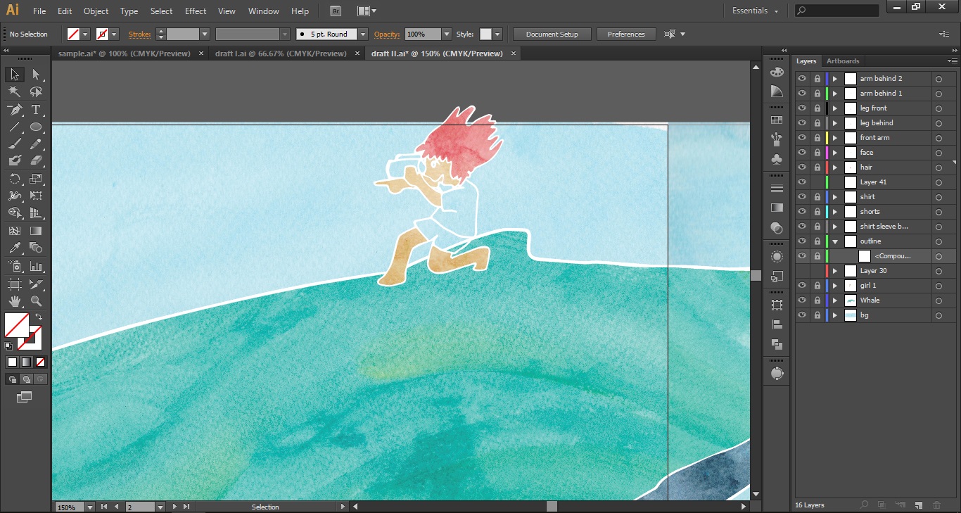
Well. It took a while to realise that the final should be digitised and printed 😡 but I still really wanted the watercolour look. The looseness of it gives a sense of space and freedom, some rather therapeutic elements! Being pretty green to digital work, I’m clueless as to how to have a watercolour effect on the computer though, so I decided to scan in the whale first. However, the blending of paint wasn’t retained after making it into a vector (a limit on 16 colours, I think?), and thus line work and textures had to be scanned in separately, then put together digitally.
So then, here goes the recounting of great pain:
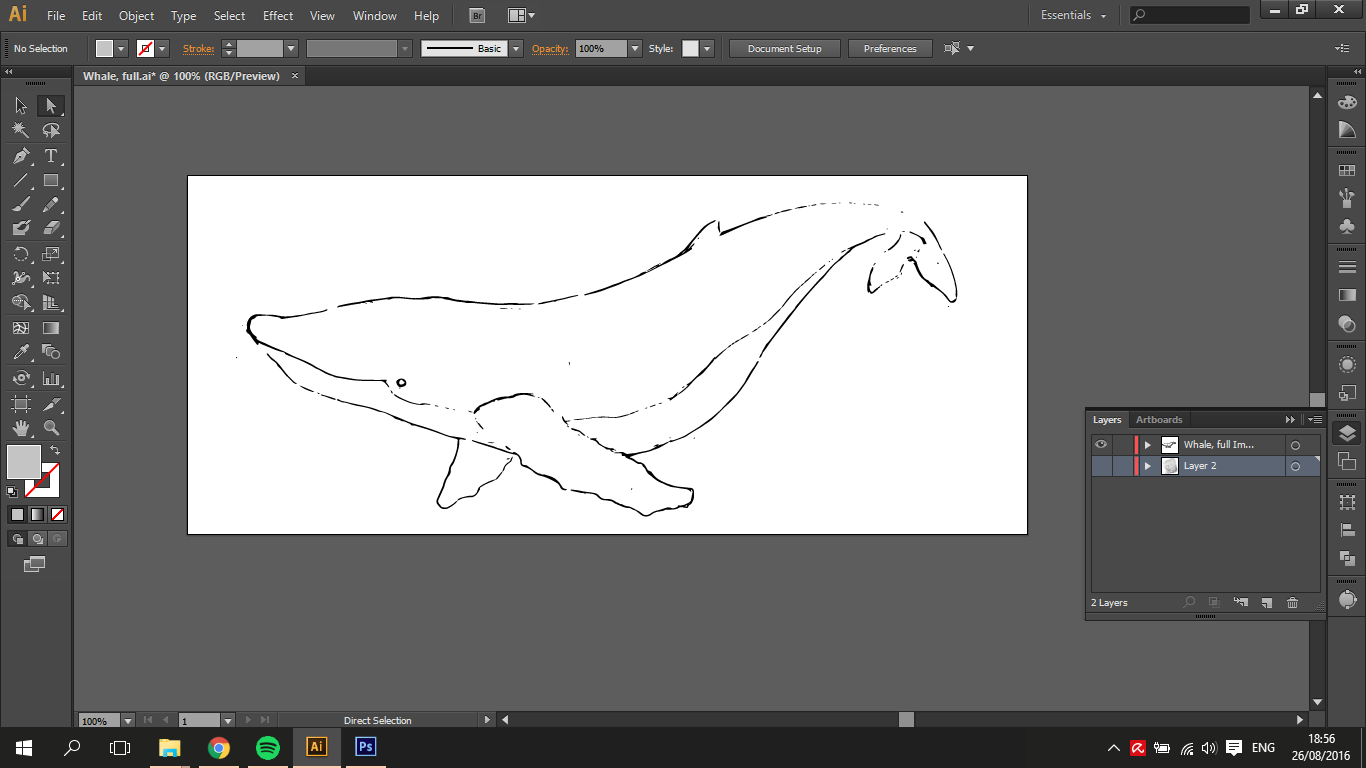

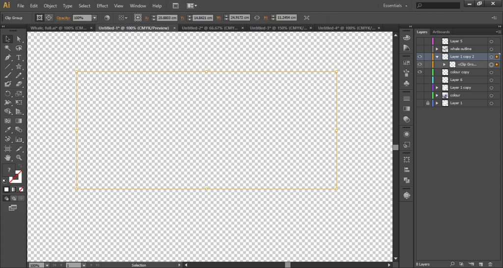
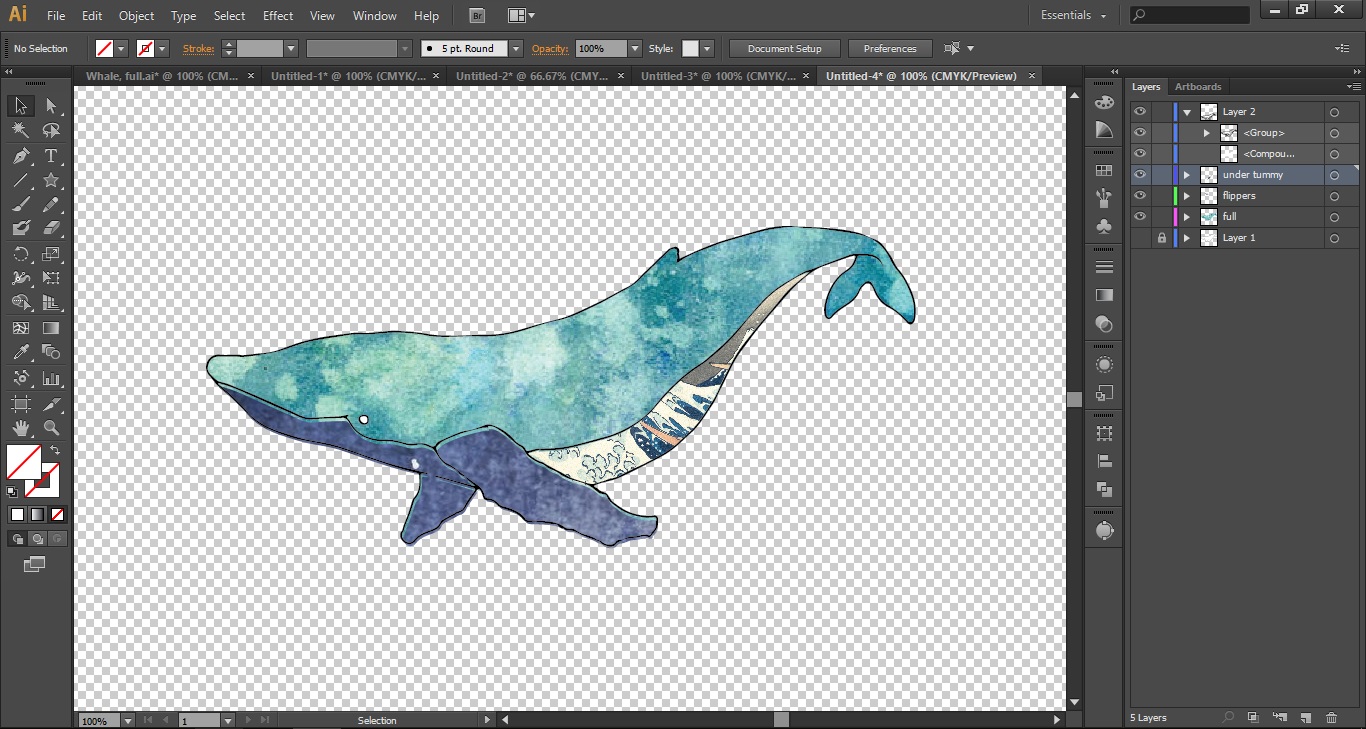

While working with whale #2, the shapes proved far too complex to work with, and it seemed difficult to weave in the little girl character who was to interact with the whale.
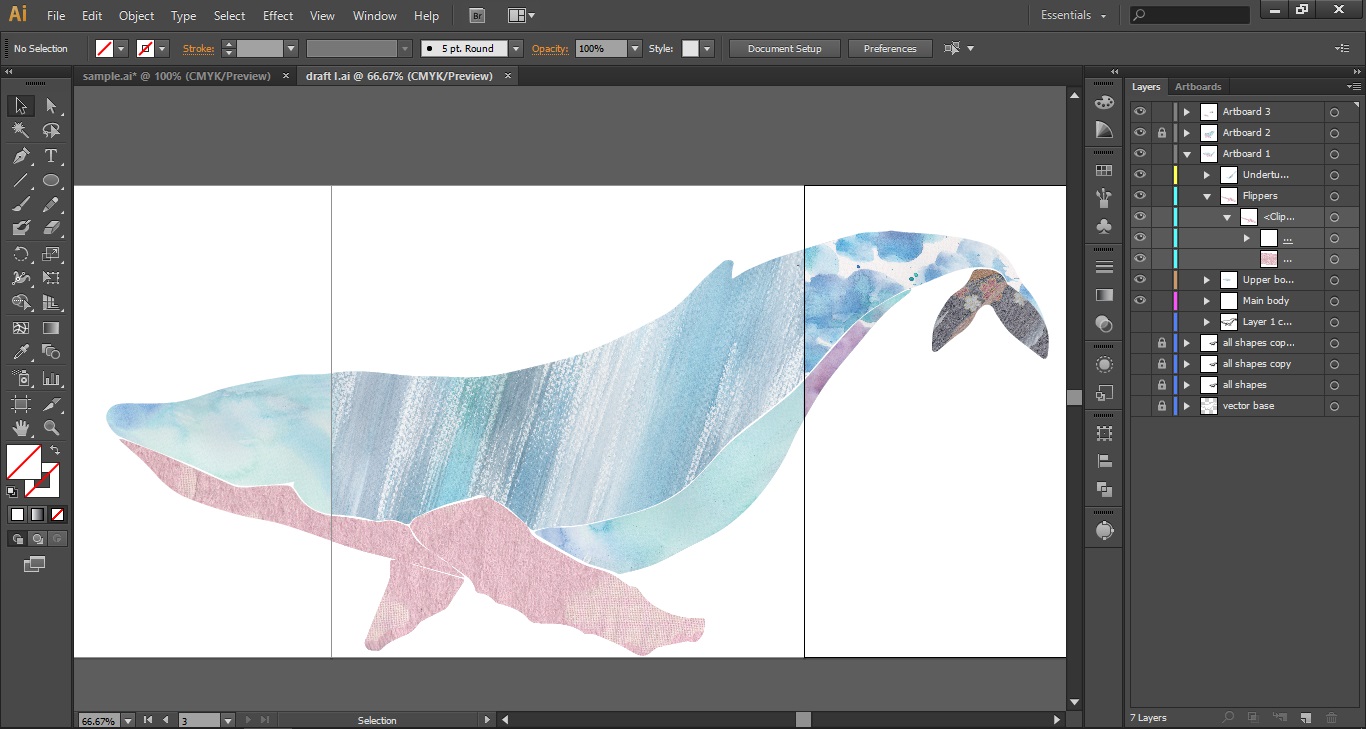
And thus, the final composition started to take more concrete form:
Changes made are 1) simpler shapes, 2) solid outlines
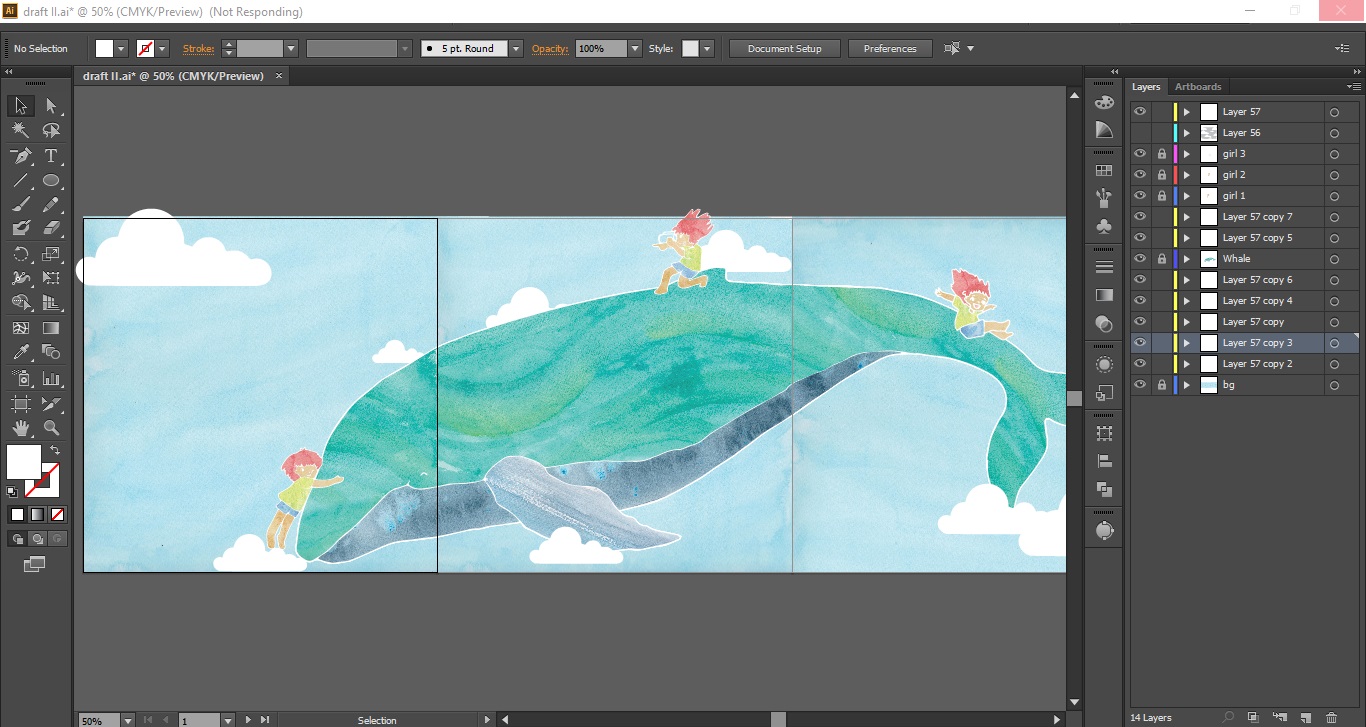
Joy and Amy had both commented that it might be nice to have a whole whale swimming alongside the people as they travelled through — and I really liked the idea! It’s as if they would be temporarily transported into someplace else, an aquarium/underwater world, for example! Plus, the large form of the whale would unify the thin horizontal bars, making the space look less long and intimidating.