Click here to view my research.
Click here to view my process.
Portfolio
When I first heard about this project, I felt really apprehensive because I was really worried about my digital skills. I tried using photoshop before in the previous semester but it was like simple cut and paste work that I just attempted but I have never tried doing proper illustrations on the software at all. Furthermore, this time we had to use indesign which is yet another software that I was not familiar with at all. Hence, I was naturally very worried if I could produce a work even by the end of the semester.
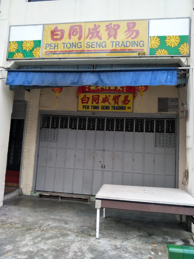
Worries aside, we started out by first selecting a location that was unfamiliar to us. Initially I thought I could do on the east side since it’s more like my comfort zone but we had to explore somewhere totally opposite of that. In the excel sheet, I initially decided on two rough locations-serangoon and Little India. However, eventually I went to beauty world because it was somewhere I was always curious about ever since I heard about the affordable yet yummy burgers in beauty world centre. I went ahead and travelled to beauty world along with my classmate, Esther, to explore the surroundings.
Initially, I really expected a pretty hip looking area since I heard about the burgers. I expected to see a mall with plenty of new starting businesses selling those hipster food you would see on the internet nowadays. However, to my surprise, the area had a few malls no doubt, but the malls looked like they were there for an eternity. The malls looked like they have been there for a pretty long while and the amount of people in the malls were also quite little. Although there were a few malls in the same area, the interior looked relatively similar. The same scenario could be seen in those malls where only very few stores were opened for business and there was no crowd either and the malls were generally quite quiet. I took a few shots and I do admit I kind of like the peacefulness I get from the malls, brings me back to the old Singapore a little and I liked how it felt.
The only thoughts I could gather was, how I wish all these stores could stay there permanently and there never has to come a day where they have to move out the area for some new residential plannings. The way how things in the mall looked like they came from awhile back makes me feel like time has temporary stopped the moment I enter, and I really liked the feeling. In particular, I always like to see the old-school barber’s pole, especially the ones that lights up, brings back some really nostalgic feelings. From there, I wondered what I could express in my zine regarding my exploration at beauty world. Since what I saw when I went to beauty world differed from what I expected, I thought I could express in my zine a contrast between the old and new. Something along the lines of how they can both coexist and stand out in their own ways for my zine. However, when I went to consult Shirley for this, she questioned how this was related to my personal experience because it felt like I was simply documenting the area rather than showing an interpretation of it. At that moment, I felt like it was hard to go anywhere with beauty world so I decided at that moment to change my location.
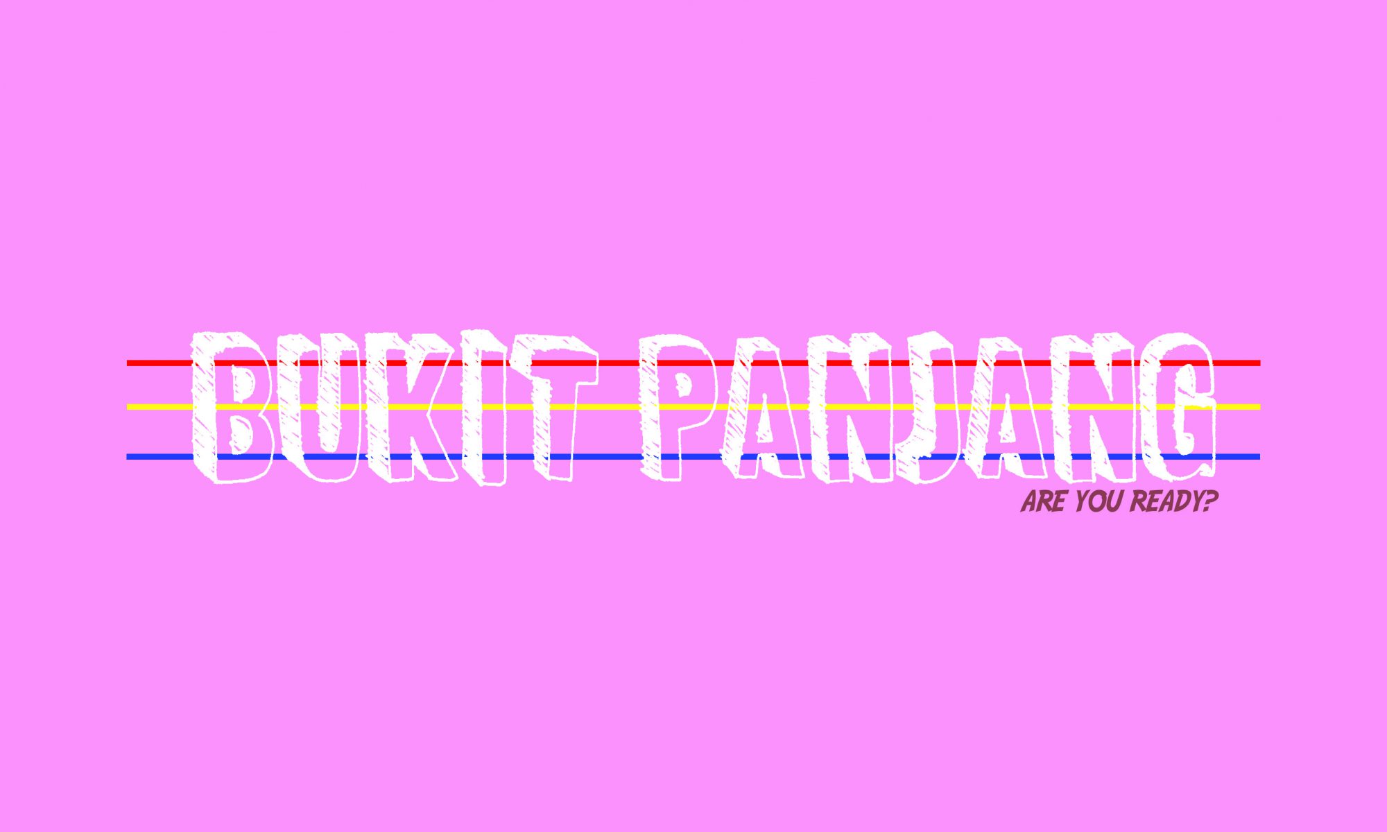
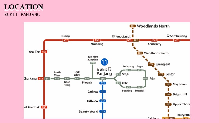
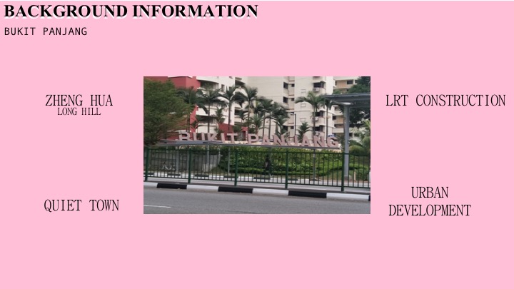
I did not have a clear idea about where was suitable because I rarely travel and the places I am more familiar nowadays would be the extreme east and west. I was talking to a friend and she brought up Bukit Panjang as a ‘rising star’ since many changes were taking place. Obviously, I did not know where it was until I looked it up on the MRT map. It was at such a central area, leaning slightly towards the west. The only way to get to Bukit Panjang MRT was only through the downtown line, either that or you have to take MRT to Choa Chu Kang and then change to LRT to reach Bukit Panjang. Honestly, despite the downtown line, the Bukit Panjang MRT still felt very inaccessible for me, it was literally like in the middle of nowhere. Thankfully, my friend recommended a bus which I could take to reach Bukit Panjang from Boon Lay bus interchange to save the hassle of changing MRT lines, but it was still a really long journey ahead. However, since I have never been to Bukit Panjang before, I thought I would go ahead and explore to see what ideas I could get from a new area.
On the same day, I briefly explored Bukit Panjang and the surrounding areas, and I also went to different places such as Cashew and Chinese Garden. I took the weekends to also explore Paya Lebar and MacPherson, just to expose myself to different areas to gather more ideas for the zine.

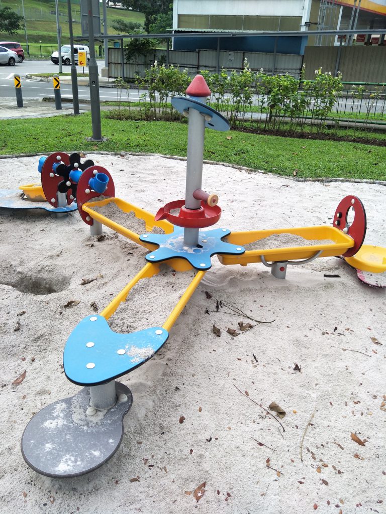
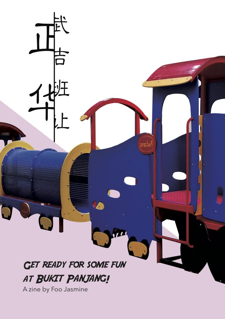
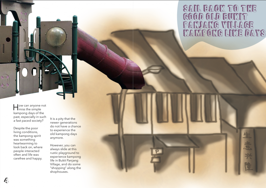
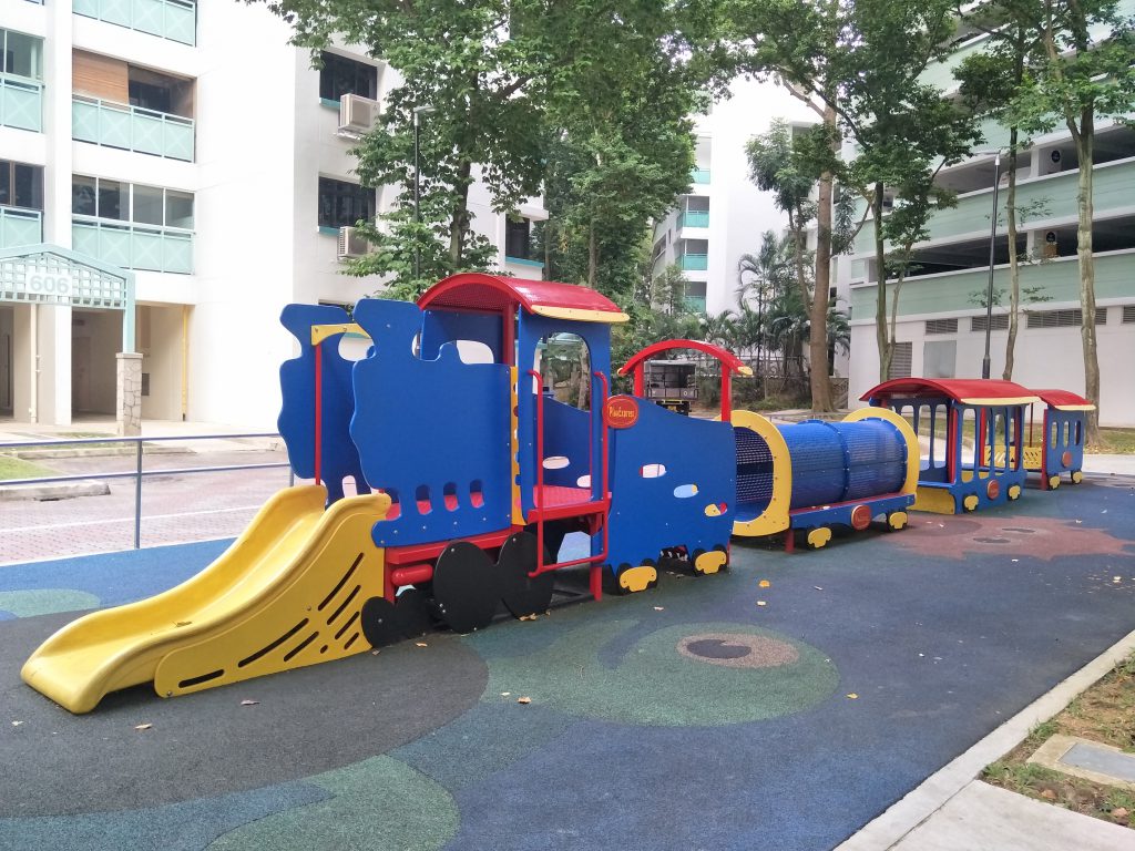
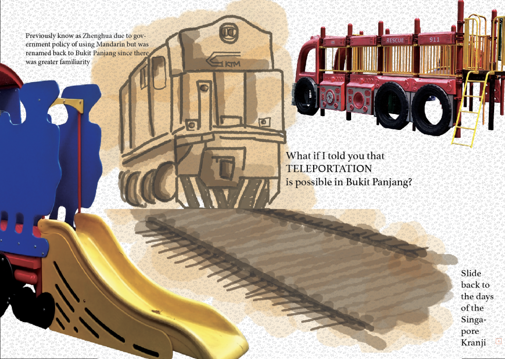
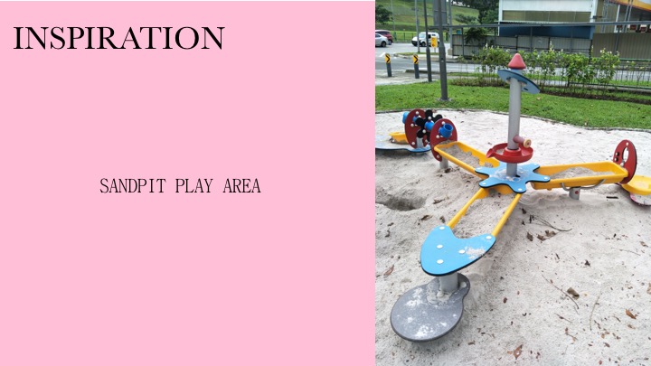
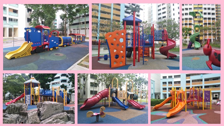
I brought my discoveries to show Shirley, however it felt like I had too many ideas ongoing all at once. Since I was not sure what I wanted to do for my zine and I explored so many places, it was delaying my time from actually focusing on what I should do. Hence, at that moment, Shirley knew I had to decide on a location at that point of time and just go for it rather than still considering a whole lot of places. I eventually decided on Bukit Panjang’s playgrounds to work on after I got the inspiration from the sandpit playground near Cashew and I moved on from there to gather images of playgrounds in Bukit Panjang.
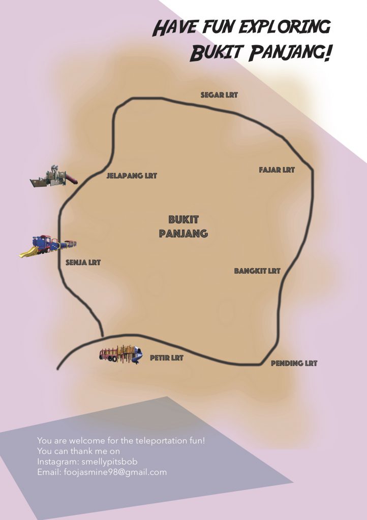
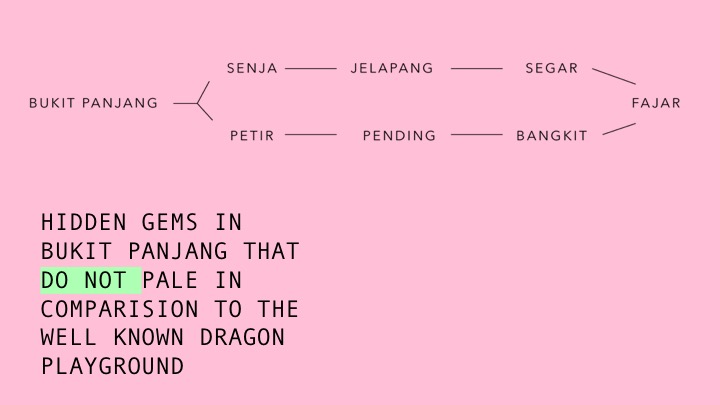
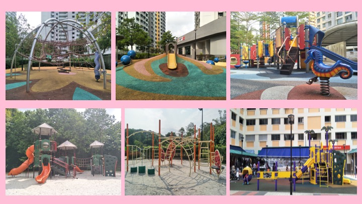
This time, I felt more reassured because I was working along a direction rather than moving aimlessly. My goal at that point of time was clear, which was to gather images of interesting looking playgrounds in Bukit Panjang that were uniquely Bukit Panjang. Hence, I made a second trip back to Bukit Panjang and this time I decided to move along the LRT line since it was all in the Bukit Panjang vicinity. On the MRT map, I actually moved along the right side of the LRT line, which starts from Senja LRT to Petir LRT. I decided to walk, following the LRT tracks and photograph any playgrounds I come across. This whole process was really exhausting to be honest, I spent around five hours trying to finish the whole journey and finding certain playgrounds that I researched to finally get a collection of the photos of the playgrounds.
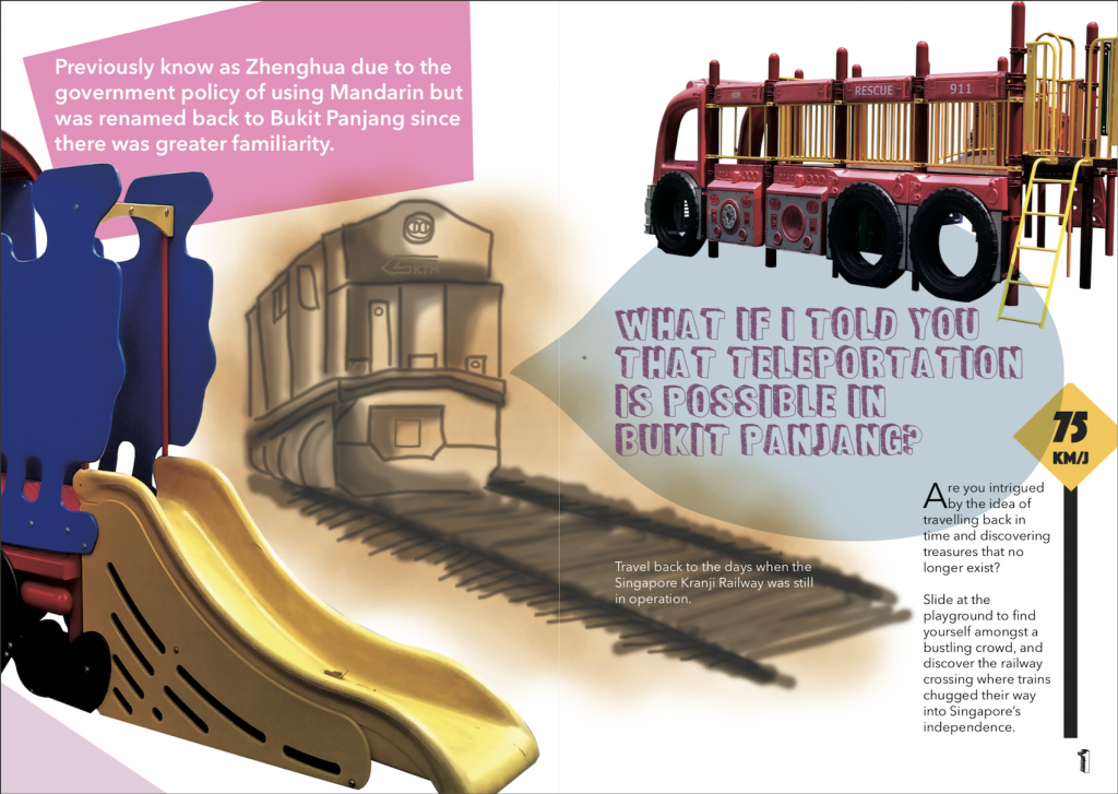
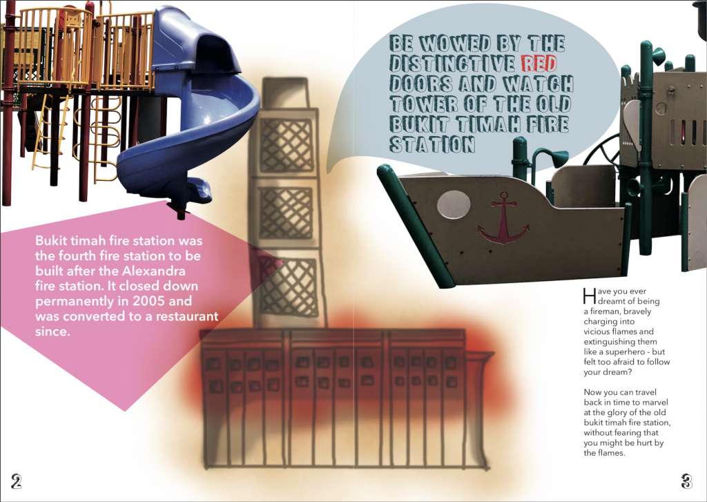
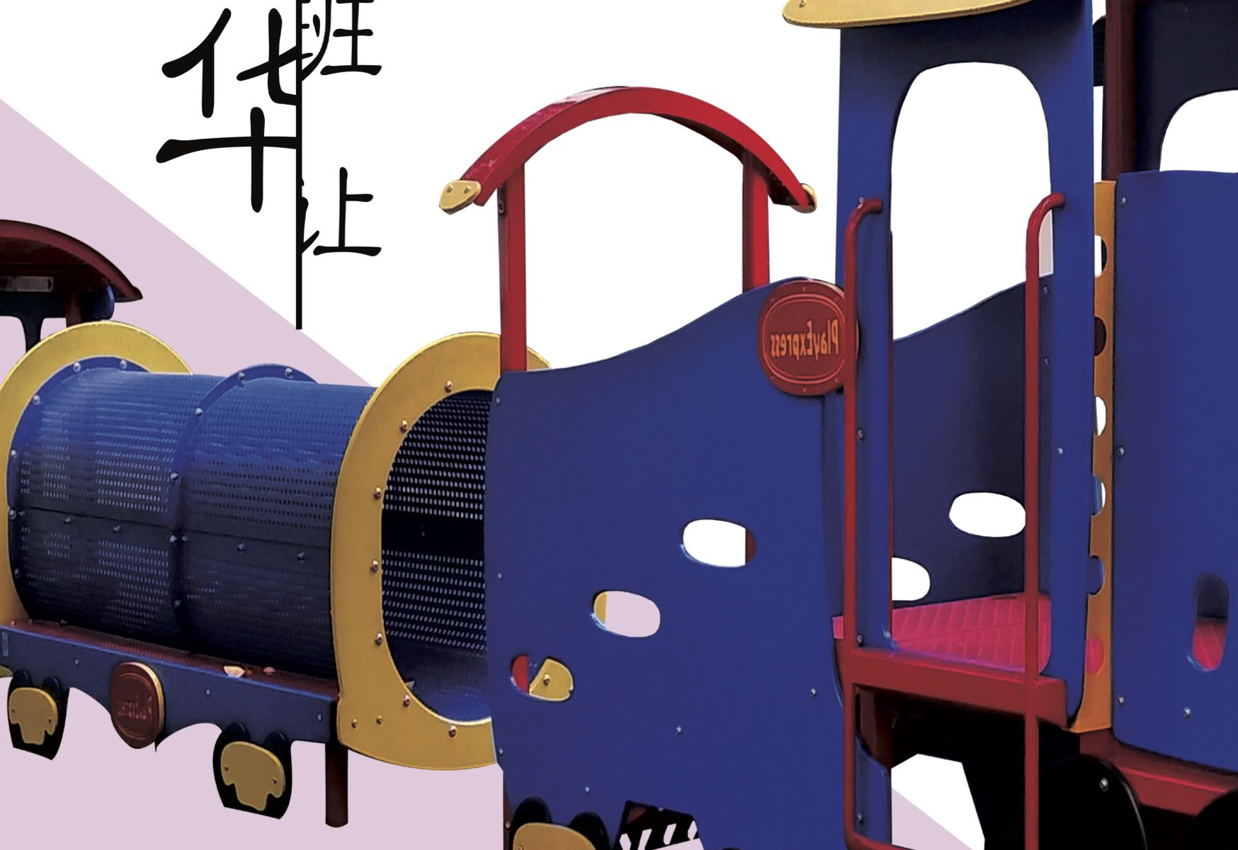
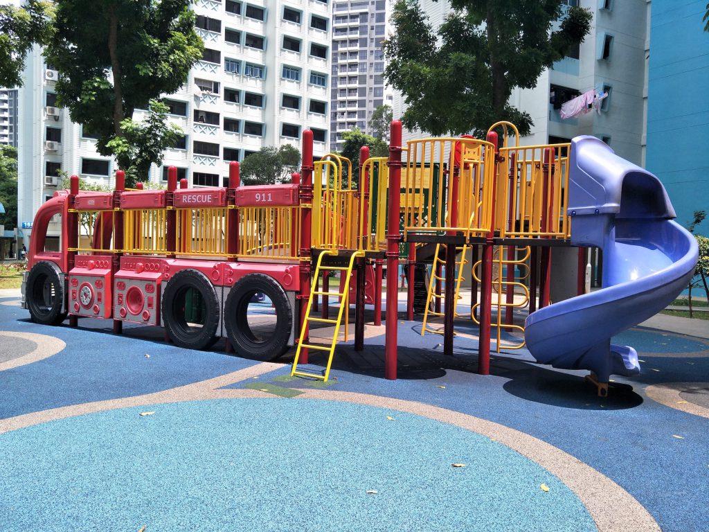
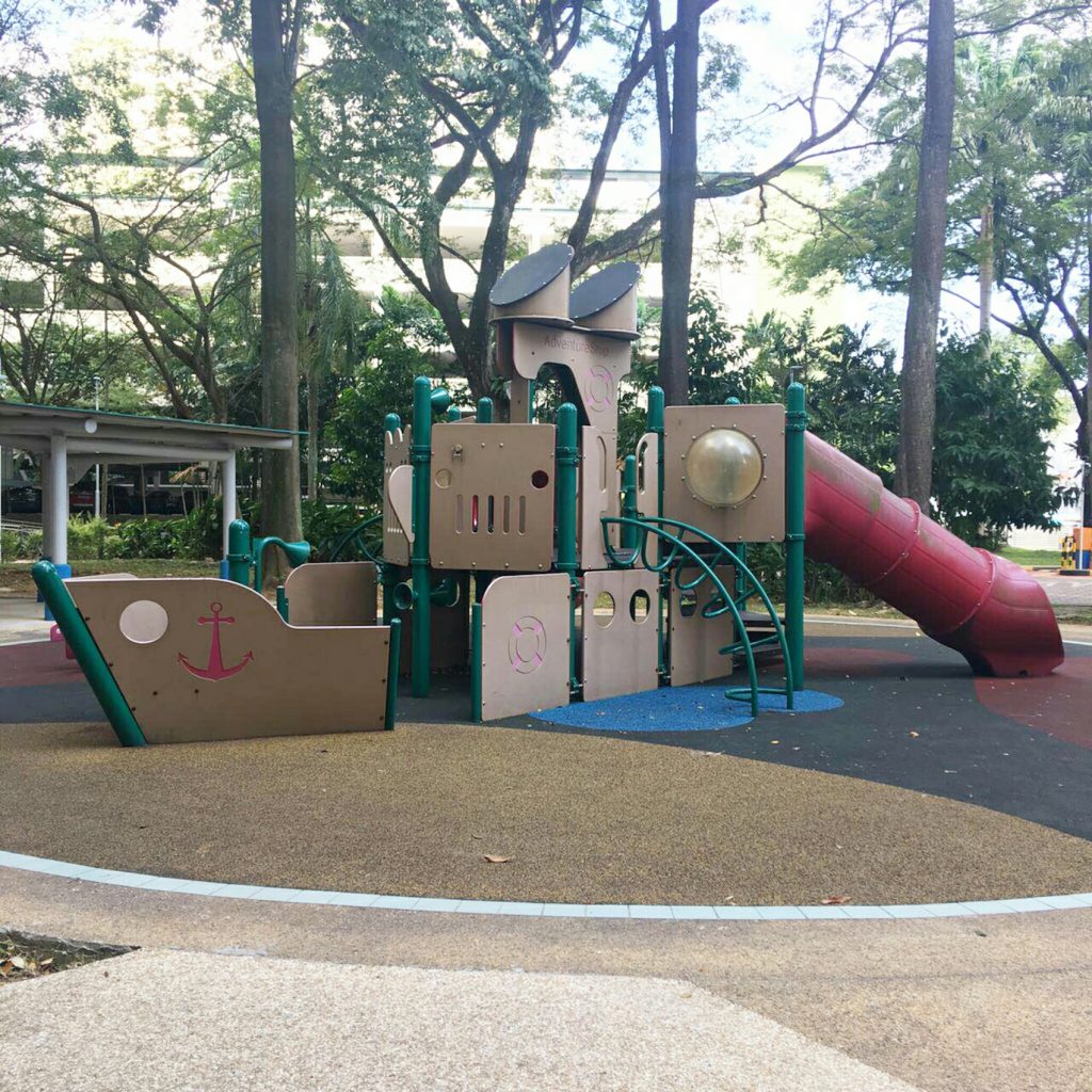
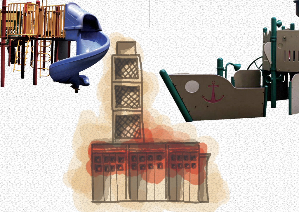
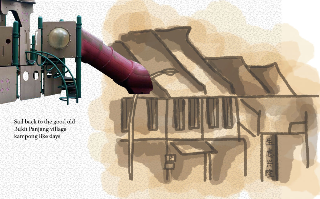
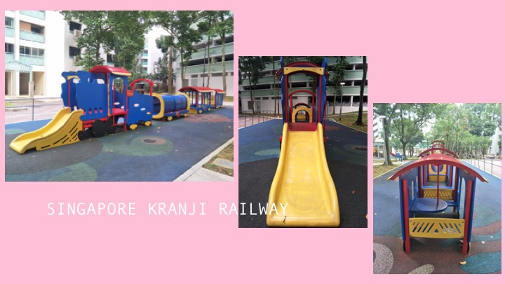
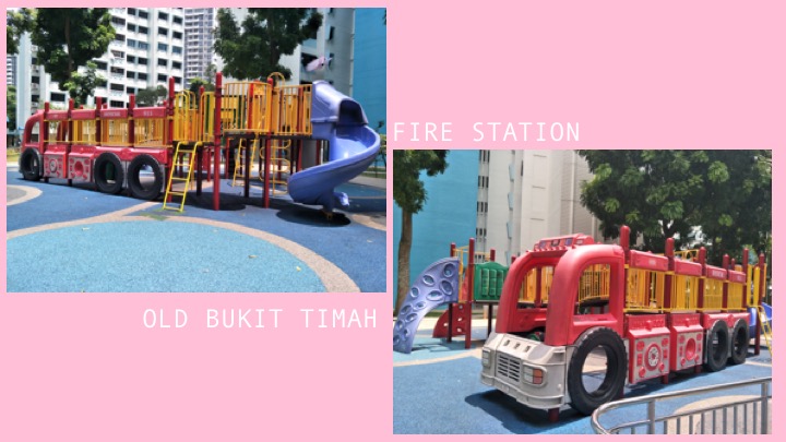
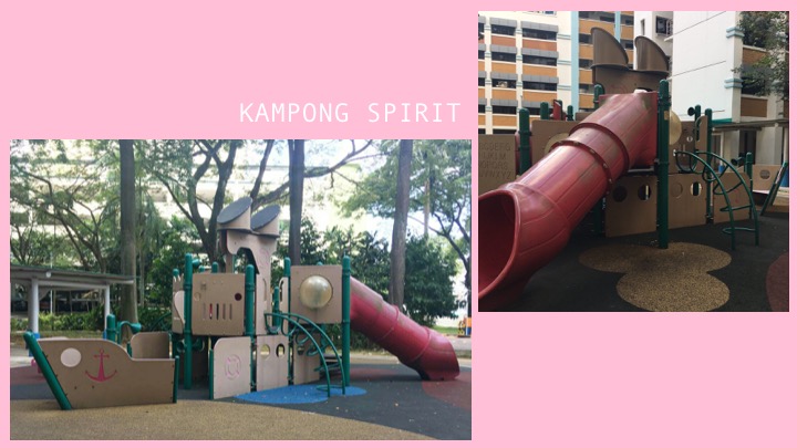
From there, I was trying to come up with an idea for my zine and while I was working, an idea came across my mind to make a teleportation theme. I thought it would be quite interesting since Bukit Panjang indeed changed a lot from the past from what I researched, hence I thought about how the playground could be a channel where teleportation takes place. From my observation of the playgrounds I took photos of, I also realised that three of them were more outstanding in a sense that they looked more unique to Bukit Panjang in my opinion because it is a design I have never seen elsewhere. The three playgrounds were transportation themed, with one being a fire truck, one being a train and one that was a ship. With this, I decided I could play with the playgrounds and connect it to the past of Bukit Panjang with my teleportation theme. I read up online and there are a few who actually shared blogposts about how much Bukit Panjang has changed and they are reminiscing certain memories from the old Bukit Panjang. People also replied to the posts and commented about how they shared certain sentiments as well in relation, hence this all the more proved to me that making a zine to allow teleportation seemed like a logical and fun idea which could be relatable.
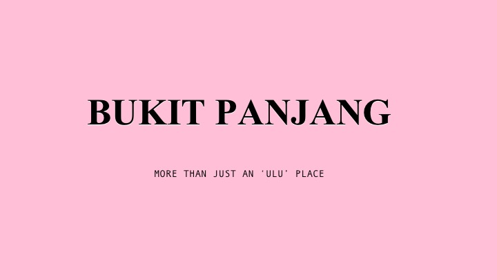
My zine will hence be like a fun guide book to introduce people about the three playgrounds and how each of them can allow teleportation back to a time period to experience how life was in Bukit Panjang in the past.
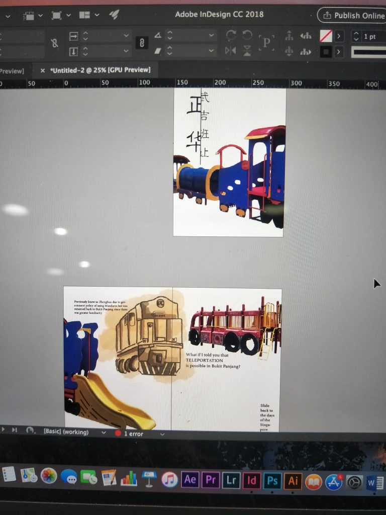
I started with the idea of each playground occupying a page, so that the playground is halved at every page and continues to the next to give an explanation about it along with some illustrations. I cropped the images of the playgrounds out to fix the composition in place first. I also tried to do some illustrations on photoshop which are supposed to be the ‘memories’ part of the zine. The zine becomes a narrative where readers can follow one playground and be brought back to a point in time to old Bukit Panjang and experience- be it the Singapore Kranji Railway days, the old Bukit Timah fire station or the kampong days in Bukit Panjang.
I then added the illustrations and tried to experiment with the colours.
![]()
This was how the composition looked initially, I really liked how the illustrations turned out but it was an issue bc the background white was not removed so I had to redo the illustrations. I redid the illustrations for so many times I can’t even keep track haha. Shirley also commented that it looked quite boring and plain so she helped to add some shapes for more interesting composition and colours.
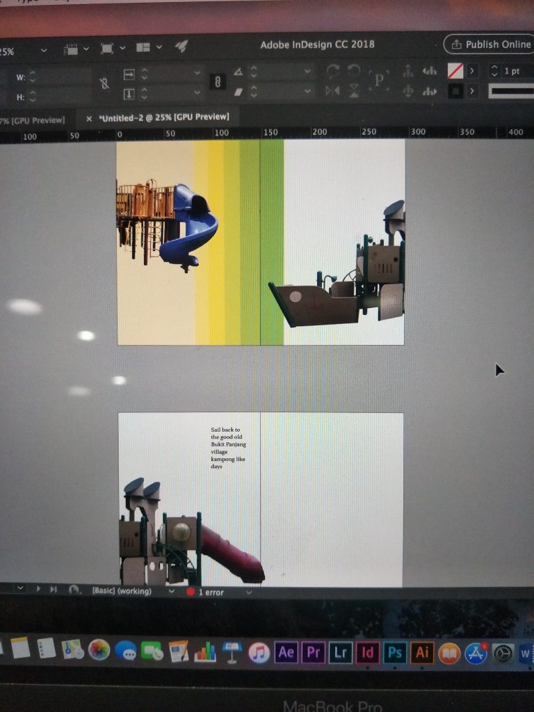
From there, I edited more and came up with the final composition that you can see over here.
The final composition has a plain white background because I felt that the colours of the playground which were primary colours were too overpowering for me to add more colours in. There was initially a texture layer on the background however I eventually removed it for the final because it came out looking weird in patches on the pdf so I knew it would not work out despite the fact that I already arranged it to the back of the work. I wanted each playground to bring out a certain type of experience for the reader to travel back to the past and I wanted it to be a fun zine to look at. The colours on the final work is very loud and eye-catching and I thought it worked well with the concept of playgrounds to convey the idea of fun. I also added a map at the back so that people can locate the playgrounds if they want to experience the time travel themselves.
FEEDBACK:
Thank you to the classmates for all the constructive criticism!! If I were to make amendments to my zine, I would probably redo my illustrations and make them neater. I would also reconsider the font types and sizes and probably choose a colour scheme to follow throughout the zine to make the zine look more colourful without that many empty white spaces.
Here’s the end of my locale zine process, hope you had fun reading!


and I’m a space chef
_______________________________________________________________
My name is
and I’m a bedtime storyteller
_______________________________________________________________
My name is
and I’m a pressed plant collector
_______________________________________________________________
My name is
and I’m a sanitary pad tester
Click to see my research!
https://oss.adm.ntu.edu.sg/jfoo018/project-1-image-…gh-type-research/
Click to see my process!
https://oss.adm.ntu.edu.sg/jfoo018/project-1-image-making-through-type-process/
When I first got the project brief I had a headache really. Shirley wanted us to think of jobs that did not exist in order to make the composition more interesting. But because I had to think of jobs that did not exist, it was really really tough to be honest. My brain was so fixated on jobs that are already on the market and it was just so difficult to tell myself to look apart from those and think of something else. I spent the following week thinking about jobs everyday and I finally managed to come up with a few. I started by thinking about what I am interested in, hopefully to follow that path and think of jobs that do not currently exist yet.
Things I like to do? Things I like??
-painting,drawing,crafting
-biology
-dancing
-makeup
-eating
-sleeping (haha)
-vegetables
-touching soft plushies
-something magical
However I soon realised that this would be of little help for me to think of new jobs because as much as it helps me to focus on a certain aspect, it also limits the boundaries of the job I want to create. I then continued to think about the jobs and came up with these below.
JOBS THAT DO NOT EXIST??!?!!? (or just jobs that I can think of in general that seems less common T_T)
-rollercoaster tester
-shoelace tie-er
-cute cartoon destroyer
-nostalgist
-bedtime storyteller
-paw palmist
-sanitary pad tester
-professional skater
-space chef
-dead flower dissector
-pressed plant collector
-robotic surgeon
-firecracker lighter
-unicorn rider
Initially from this list, I had chosen the four I wanted to do because they were my initial ideas. They were namely the bedtime storyteller, pressed plant collector, shoelace tie-er and paw palmist. From here, I started to do sketches to show Shirley how they would look like, trying to incorporate the elements of that specific job.
1. Dog paw palmist
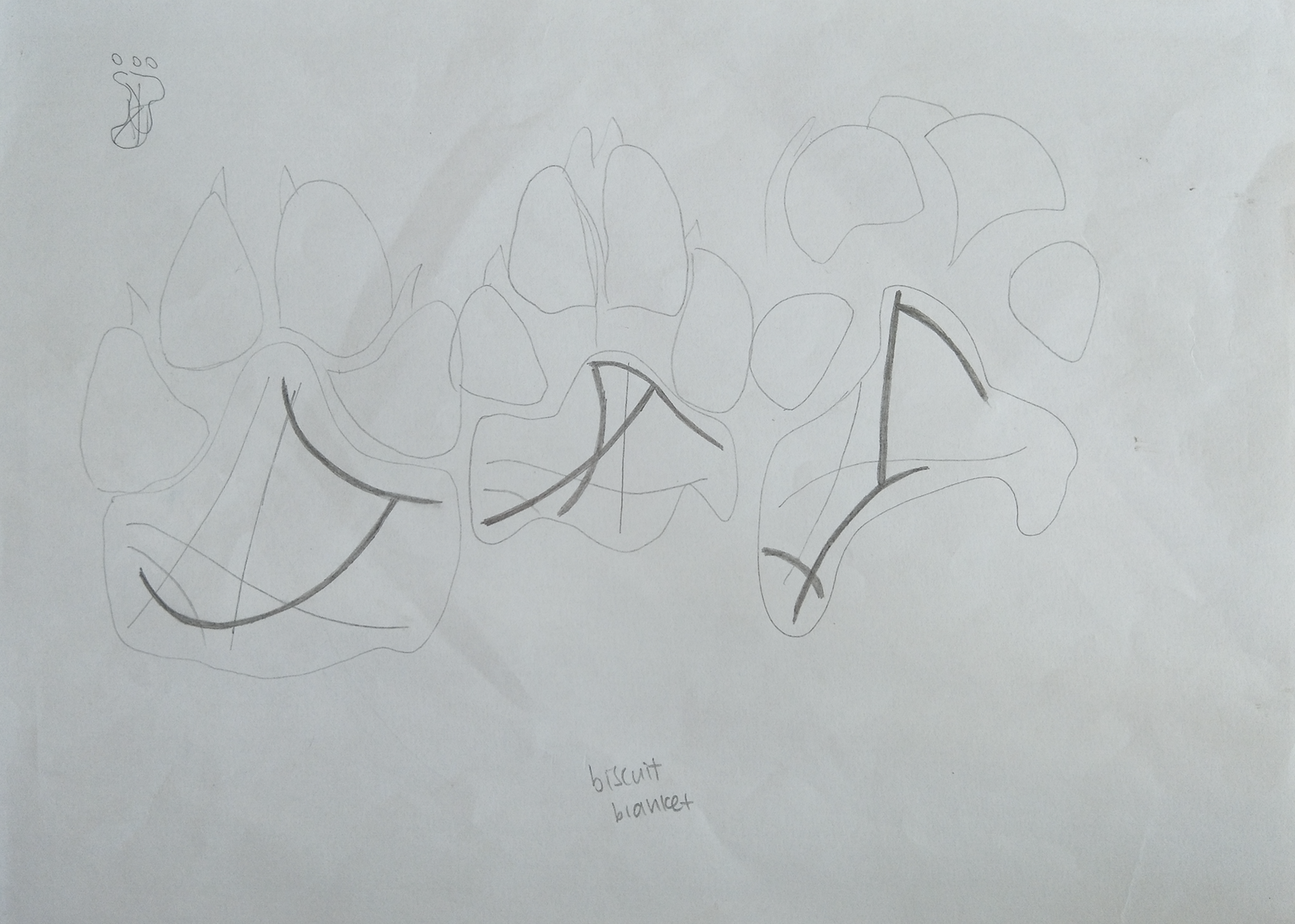
I thought that the idea of palmistry was really interesting so I was thinking about how it would be like if we were able to read the paws of dogs to tell their future. However, upon researching, I realised that palmistry follows a certain way of reading the palms according to the different line paths on our hands and this would mean that there is a standard line to read even for different hands. This also meant that if I wanted to portray palmistry on the paws and make my name visible and easy to read, it would be quite difficult since the line should technically be located at the same place. On top of that, I was not sure if it was possible to actually read the dog’s paw so I eventually gave the idea up although I really liked it and felt like there was a possibility to develop the idea.
2. Shoelace tie-er

This was like first ever idea and I was just thinking of jobs that seemed redundant and useless which obviously does not exist. So I thought of a shoelace tie-er, a person who works to attend to people when their shoelace comes loose. For my sketch, I decided to use shoelace to form my name and even included the formation of the imagery of a shoe to add in the element of ‘tying’. However, I realised that there were a lot of typography made using shoelaces already and they all gave off that cursive looking font which I wanted for this work. Eventually I just felt that this was not going to work because there was little for exploration, although Shirley suggested that I could improvise and add on additional elements such as the shoelace holes, but I tried it and it just did not look like how I wanted it to. So eventually I gave this idea up anyway 🙁

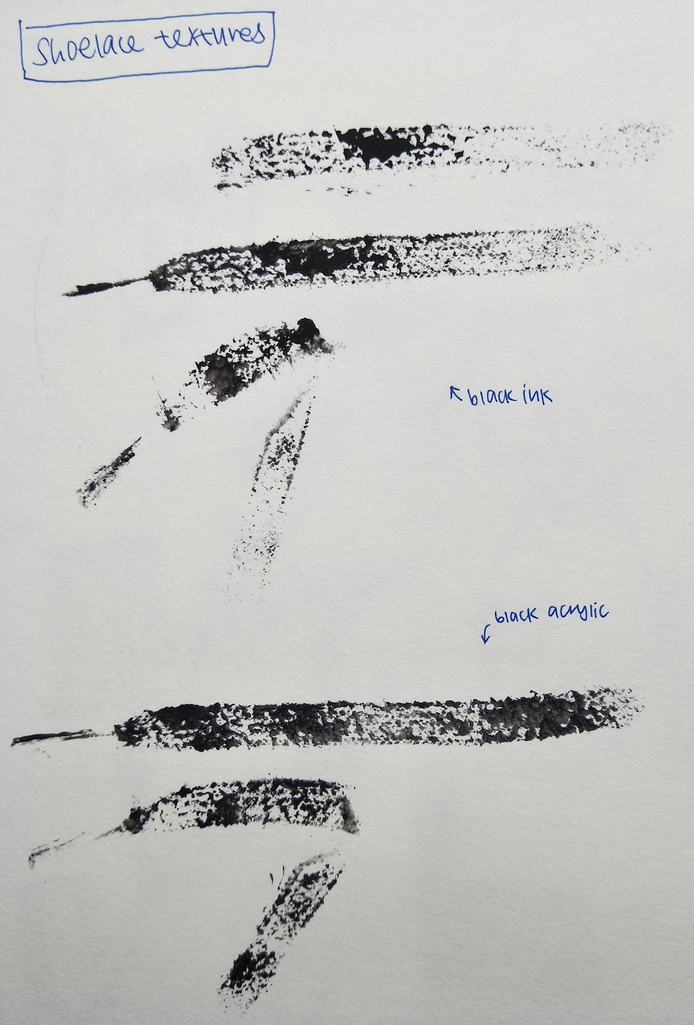
I even tried using black inks to try and imprint the textures of an actual shoelace for this piece, the prints came out pretty well, but I just thought it would not be any different from the other shoelace typography I saw eventually so I just gave up the idea in the end.
3. Bedtime storyteller
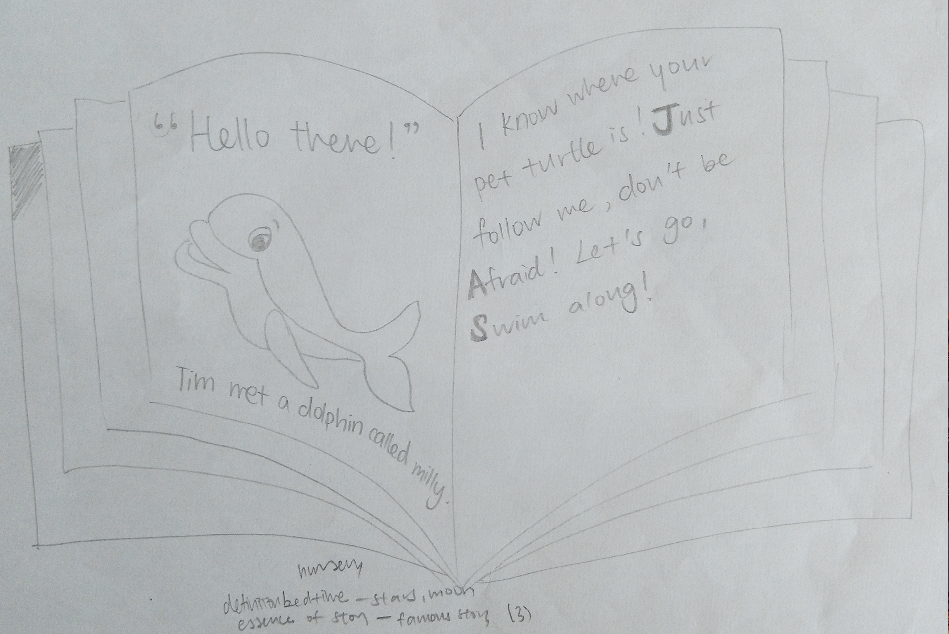
My idea of a bedtime storyteller was a role to help busy parents help coax their child to sleep. I thought about how I could possibly portray it in terms of a storybook concept, highlighting the alphabets that formed my name within the chunk of words. I later thought of using the method of collage, inspired by dadaism, to create the different alphabets to give it a comical yet possibly childlike look (with the help of the content of the text as well).
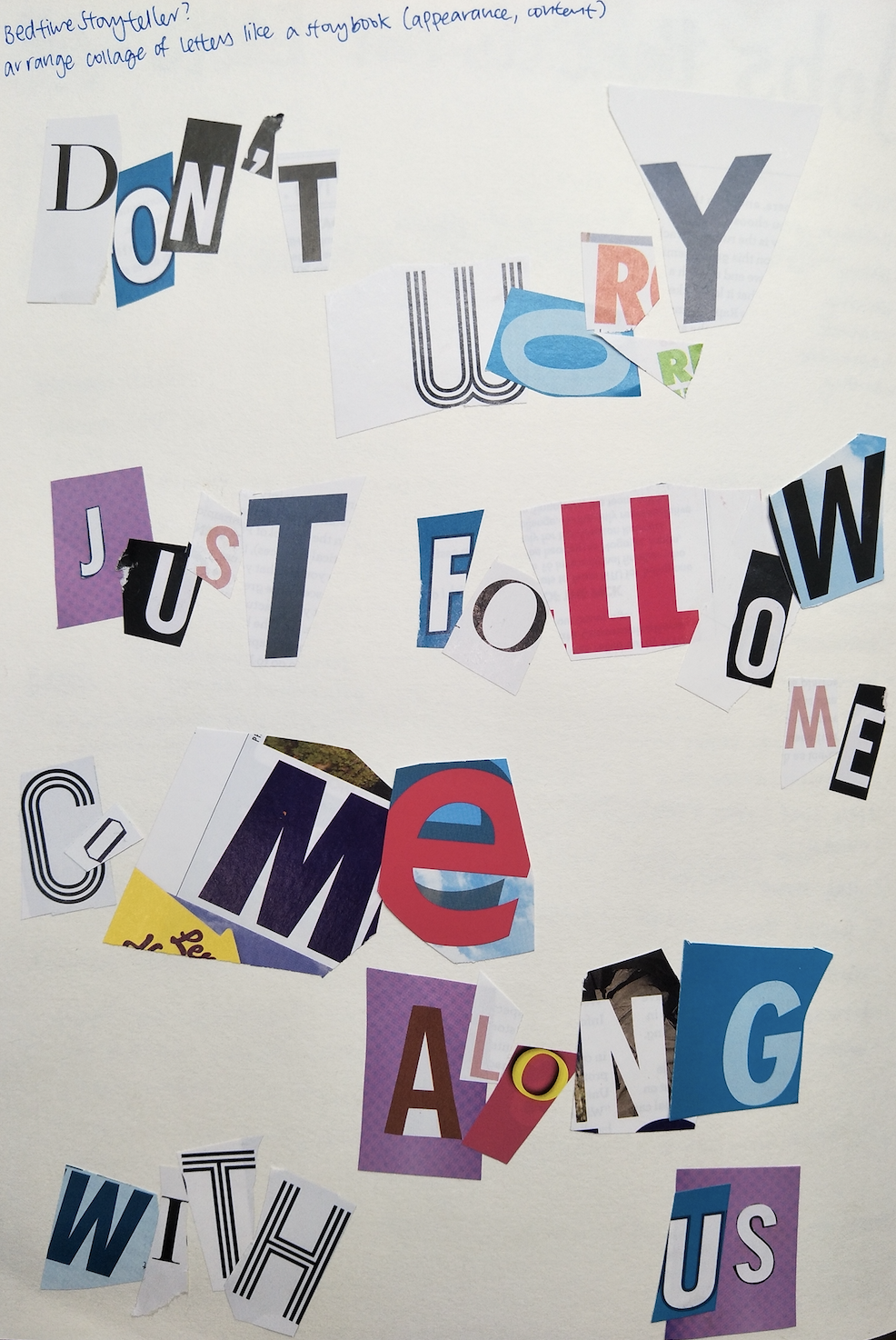
However, I later realised that I was probably doing it wrongly because there would not be a certain font for my name specifically and we were supposed to incorporate elements of the job INTO our names itself rather than just putting the imagery. After consulting Shirley about this idea, I thought that the job was still feasible to work out and so this idea stayed YAY.
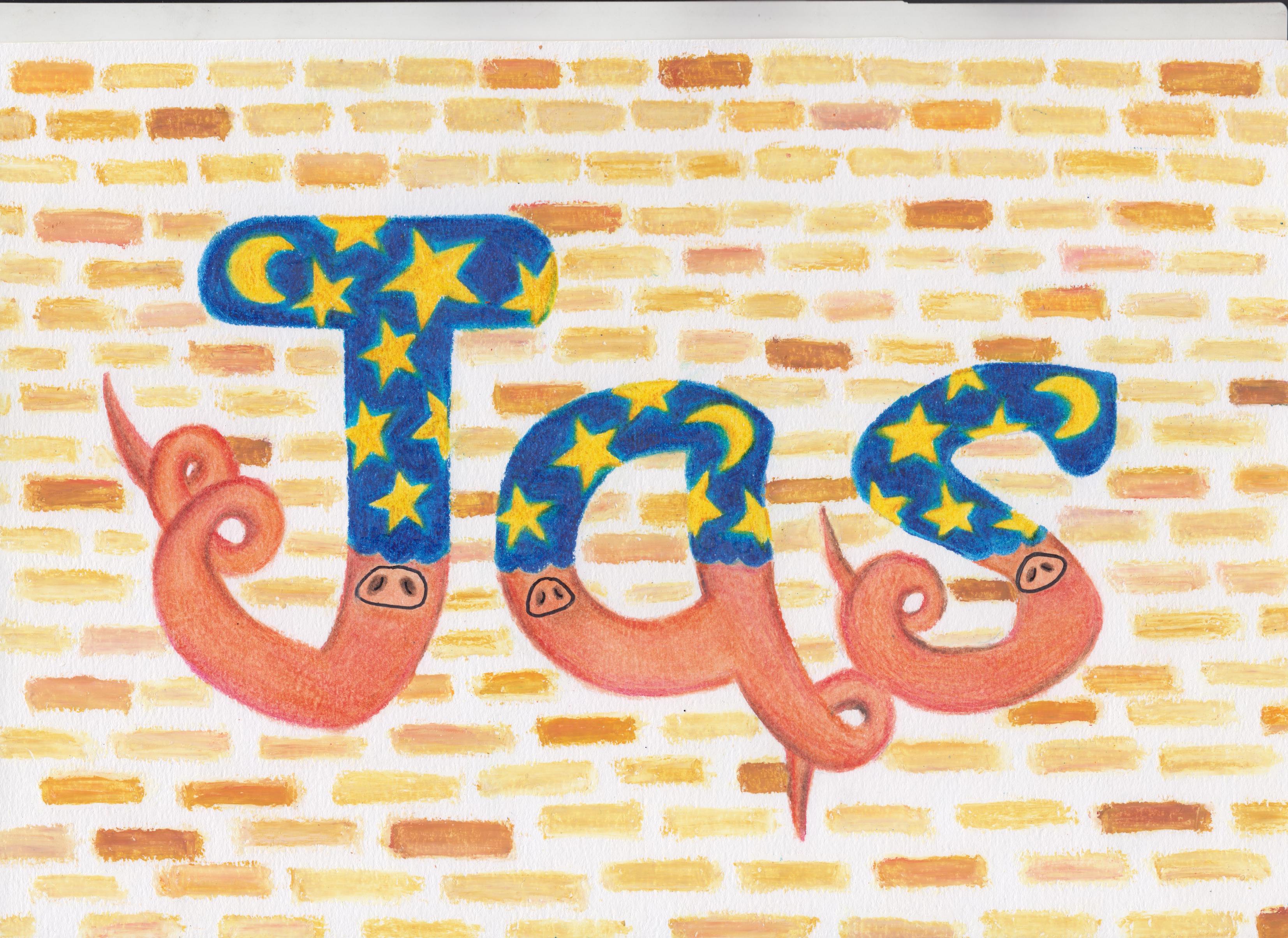
4. Pressed plant collector (Initially pressed flower collector but I thought that would be a very narrow scope so I decided to include ALL plants after)
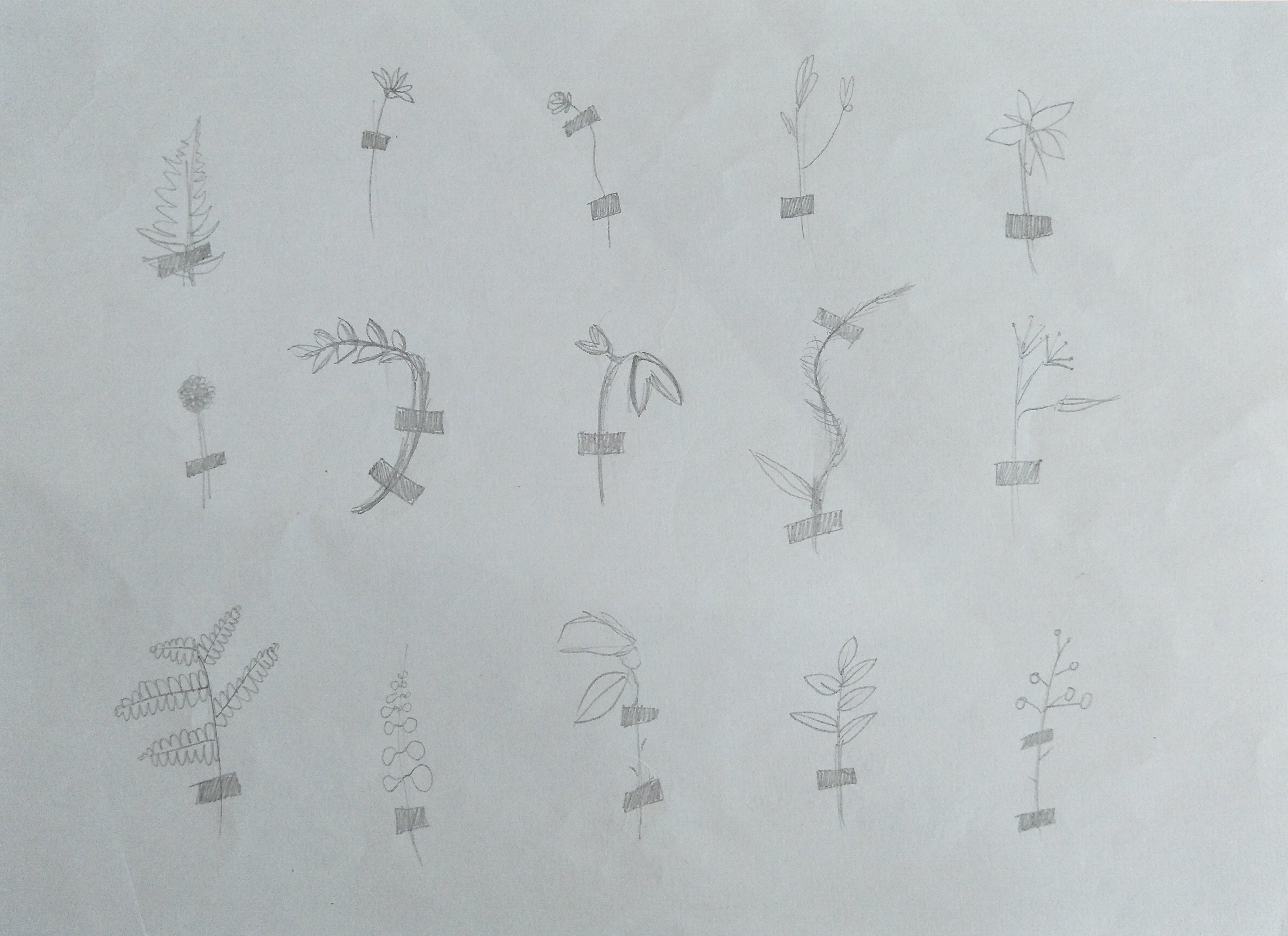
I really like the look of dried pressed flowers so I thought it would be interesting to try this idea out. It is also a relatively simple concept, where I just paste the plants into alphabets too signify my name. The tape should not be of an outstanding colour as well so as to not steal the attention of my name in the middle.
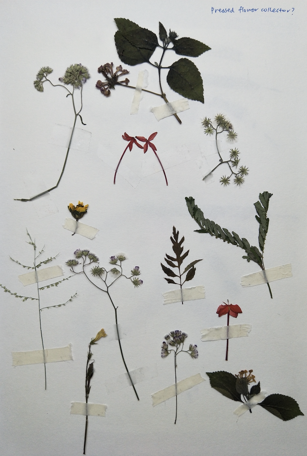
Shirley mentioned that this idea was feasible and interesting due to the minimal elements but yet was able to convey the nature of the job easily so I decided to keep this idea but go more in-depth to develop this concept later on.
So till this point I only had TWO out of FOUR jobs confirmed, which was the bedtime storyteller and the pressed plant collector. Throughout the next week, I did more sketches and tried to come up with more ideas to see if they were better. I did some sketches about rollercoaster tester, bedtime storyteller, space chef, sanitary pad tester, animal manicurist and dog’s optometrist.
Rollercoaster tester:

I liked the idea of the rollercoaster tracks but I felt like it would be quite plain and if I were to add additional elements like the safety belts, it would probably be too messy. I wanted to try and use the pattern brush in adobe illustrator to recreate the tracks, but sadly it did not work out so eventually I had to give this idea up as well.
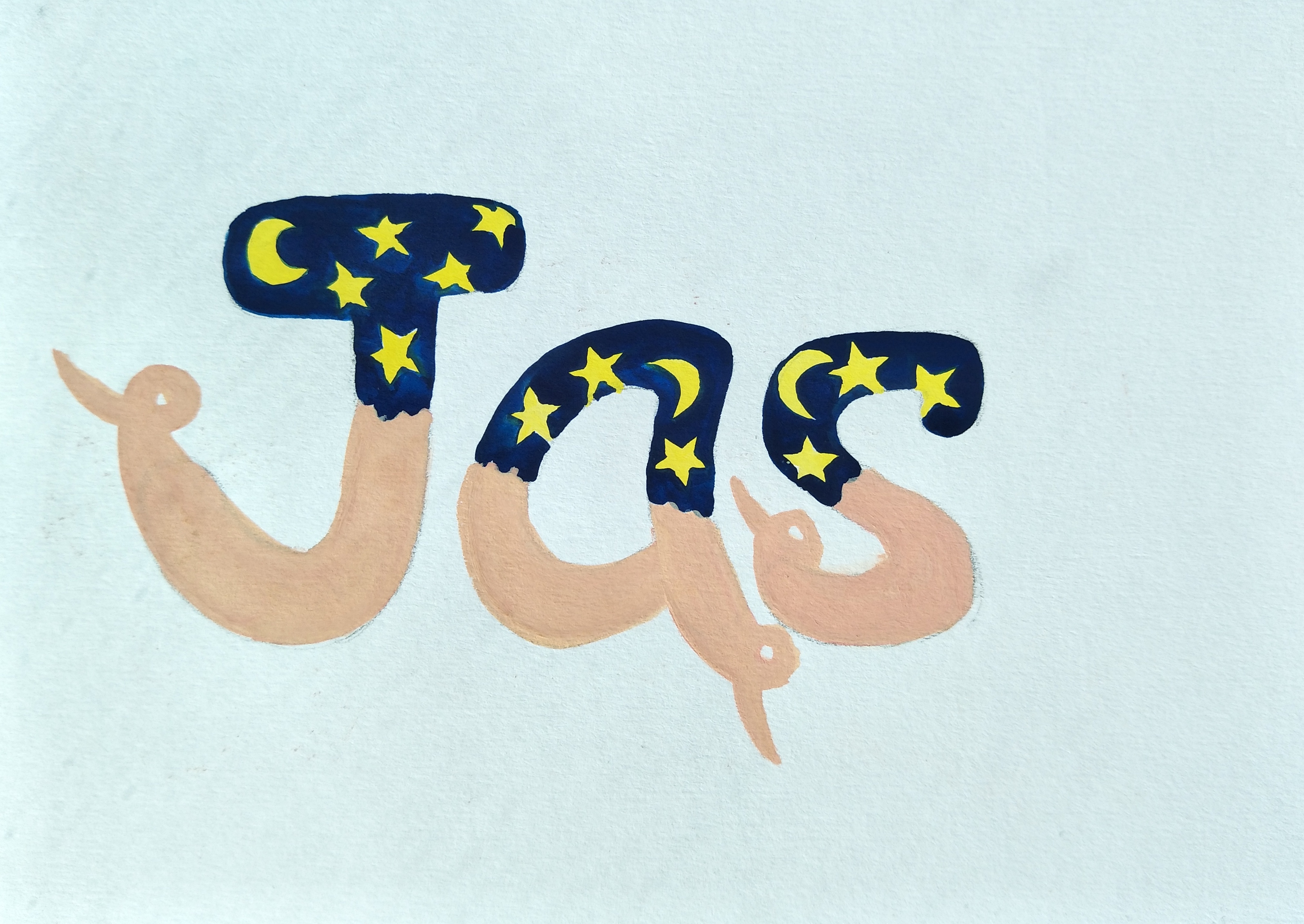
Bedtime storyteller:
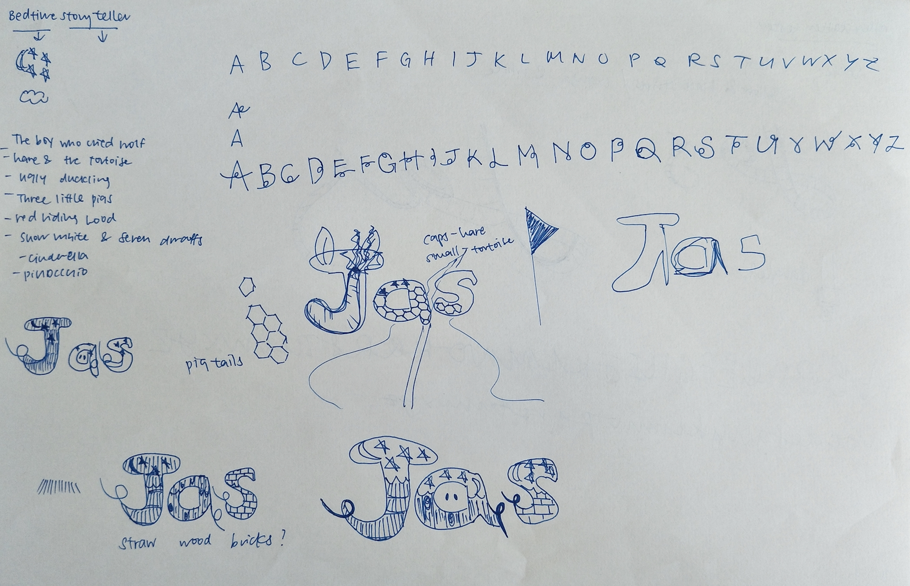
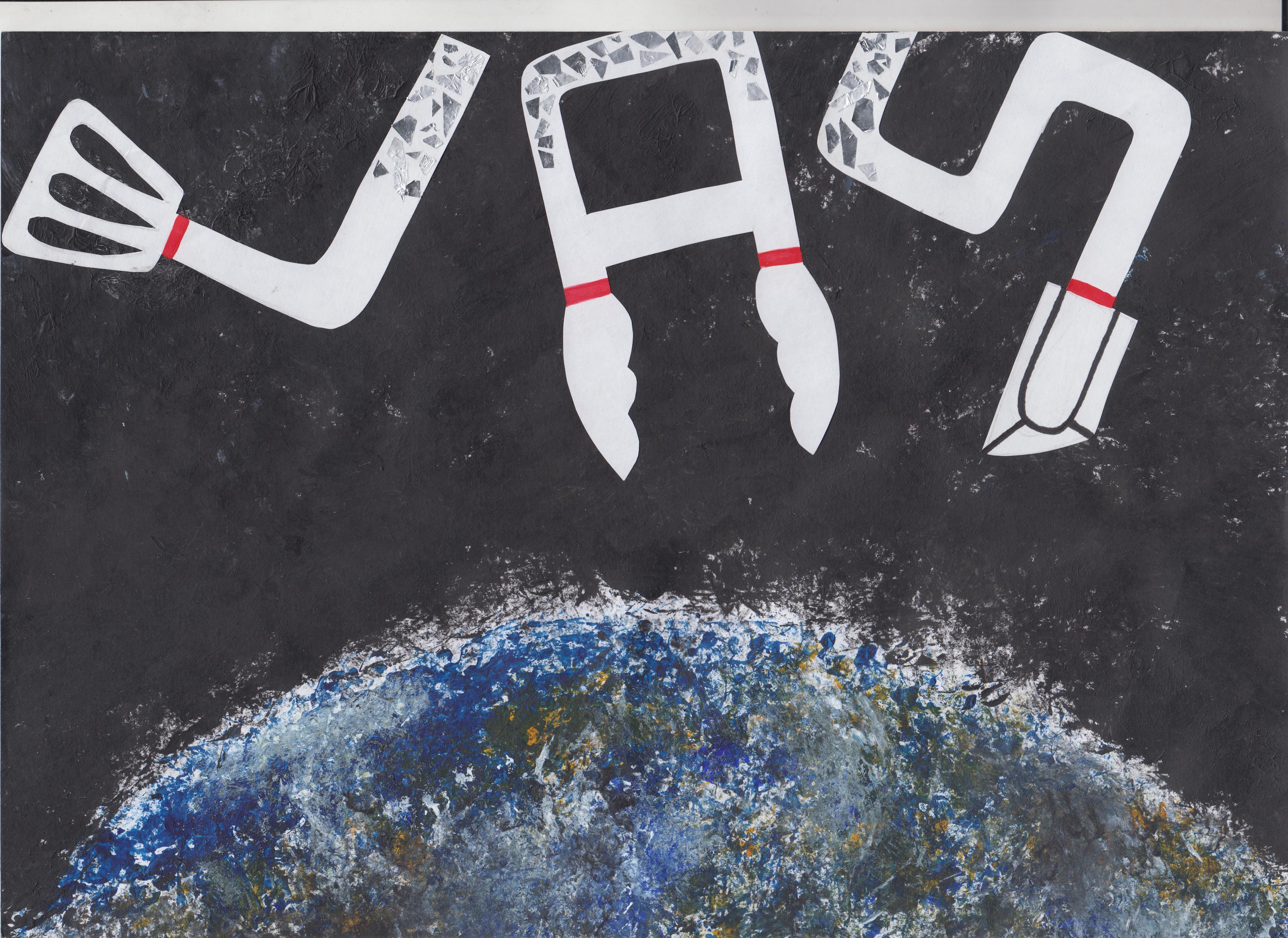
This idea was confirmed but I just had to brainstorm how I wanted to incorporate the idea of ‘bedtime’ and ‘storyteller’ into my fonts. I decided to go with the comic sans font because it gave off a more child-like vibe due to its bubbly appearance. In order to portray bedtime, I decided to add elements such as moon and stars with a dark blue backdrop to depict the effect of night time for half of my letters. I was thinking of what story I wanted to incorporate into my work so that it can bring out the nature of the job yet not complicate things. Eventually I settled on the story of the ‘Three Little Pigs’ and added the elements of the pig’s nose and tail into each alphabet. I wanted to use the three materials which the pigs used to build their house-straw, sticks and bricks as the background. After consultation with Shirley, she thought that it would be good if the background would be just a single material to not over complicate the work. So I decided to go in with a brick background ultimately. I will elaborate more on this as I share my final completed work.
Space Chef/Sanitary pad tester/Robotic surgeon:
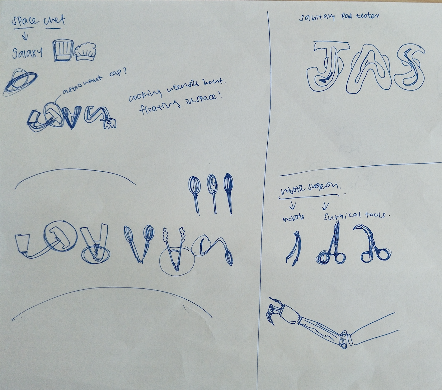
Space chef: I gained interest in this job because I felt like it would be a job whereby the elements can be quite easily identified and it also sounds like a really interesting job to have. I was thinking about the different utensils used in the kitchen and how they could be bent to form the letters. However, we were supposed to include the elements into the letters itself so from here I actually made adjustments which will be explained later on.
Sanitary pad tester: This idea dawned on me one day and I thought about how nice it would be to do this, something that I can do to help other women, to test out the durability and holding power of the sanitary pads.
Robotic surgeon: With the advancements in technology, I was thinking about having a job that is similar to plastic surgery for humans, but in this case for robots. As u can see, I tried to form my name using the surgical tools. However, later I felt that it was quite difficult to execute because of the difficulty to identify and show the essence of the job in my name.
Animal manicurist:

The idea of manicurist came across my mind so I just thought I will jot it down to see if the concept was able to develop. I tried using the nails to form my name as you can see in the sketch above. However, I eventually scrapped the idea because it would be weird if the composition was made up with painted nail clippings of animals and I just did not see that working.
Dog optometrist:
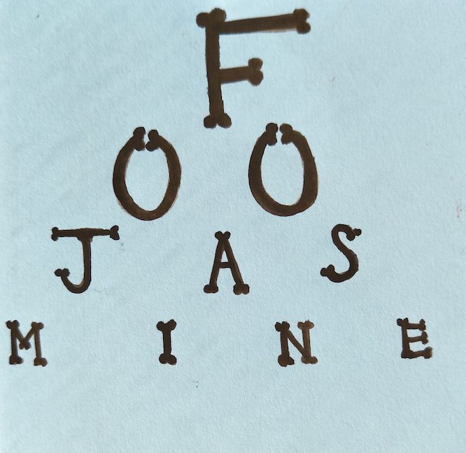
I made use of the shape of the dog’s bone to form into my name to look like the board that is used to test our eyesights. I thought it was kind of cute but it was also kind of too plain for my liking so I scrapped this idea off as well.
At this point, I had to make a decision to choose the four jobs I want by now and I eventually settled for space chef and sanitary pad tester as the other two jobs, other than the confirmed bedtime storyteller and pressed plant collector. I had in mind a way to execute them and I thought that they were pretty interesting and unusual jobs.
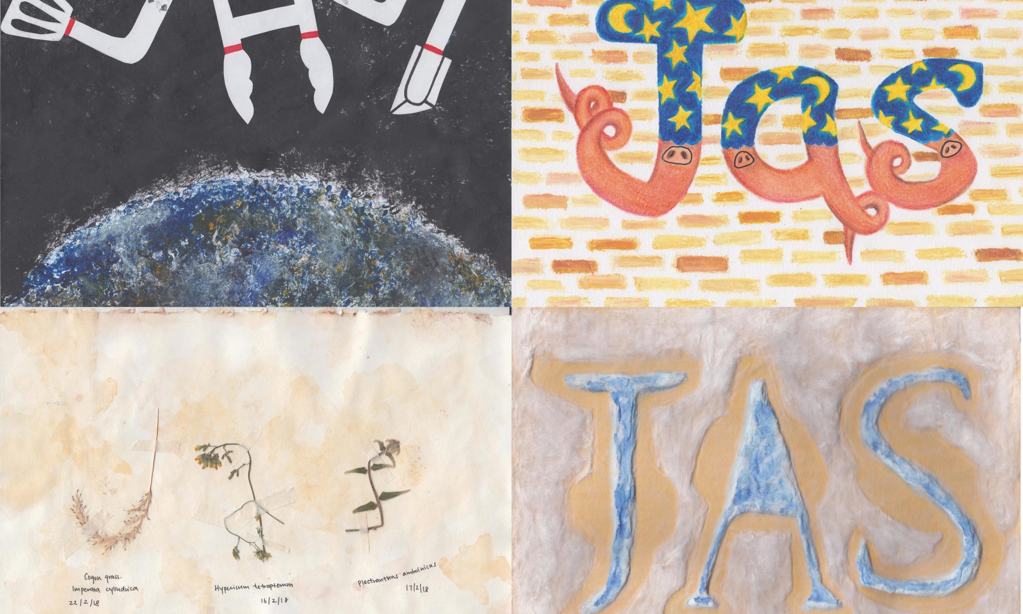
Space chef:
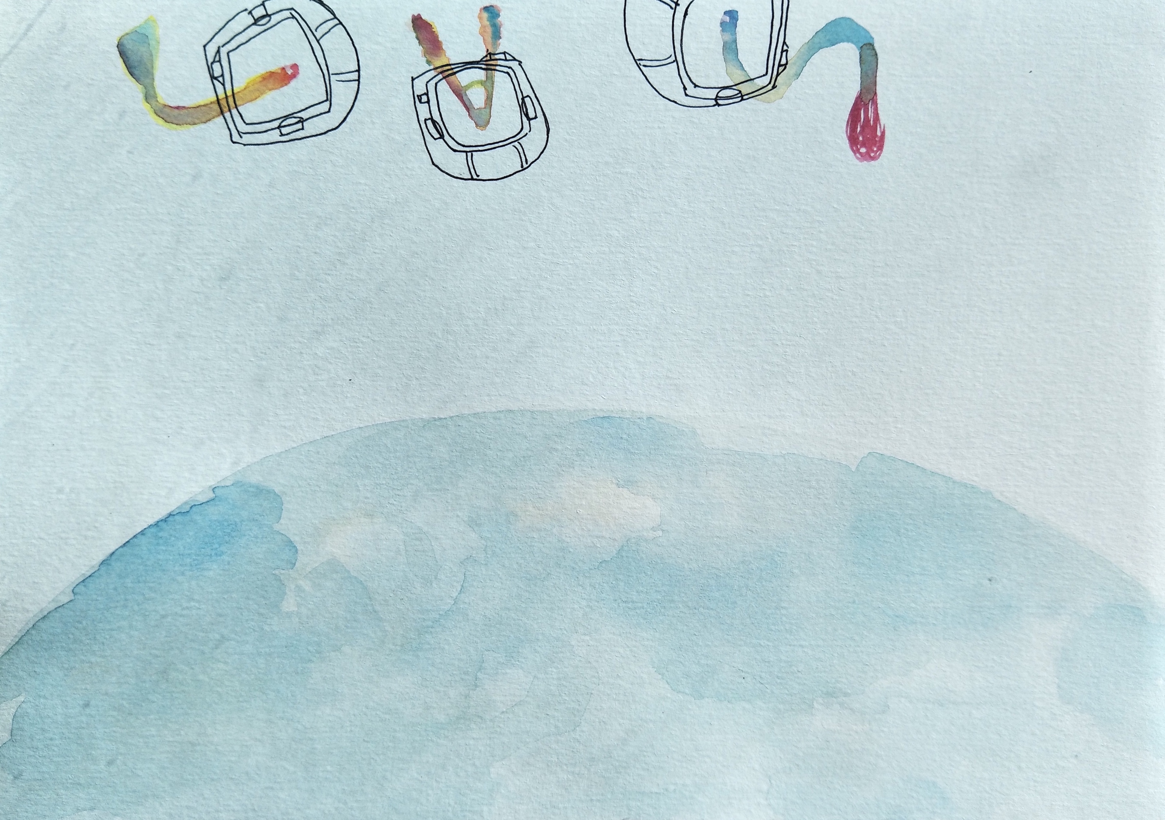
I used poster colour to do up this painting, with the Earth at the bottom of the work to show that this scenario is in space itself. The alphabets are floating and I wanted to make the them galaxy coloured but it did not work out well, the details of the kitchen utensils could not be seen as well. I then added the helmet of the astronauts to each alphabets to show that they are floating in space. However, this needed more improvements such as choosing a specific font to work on and to try incorporate the essence of an astronaut into the letters.
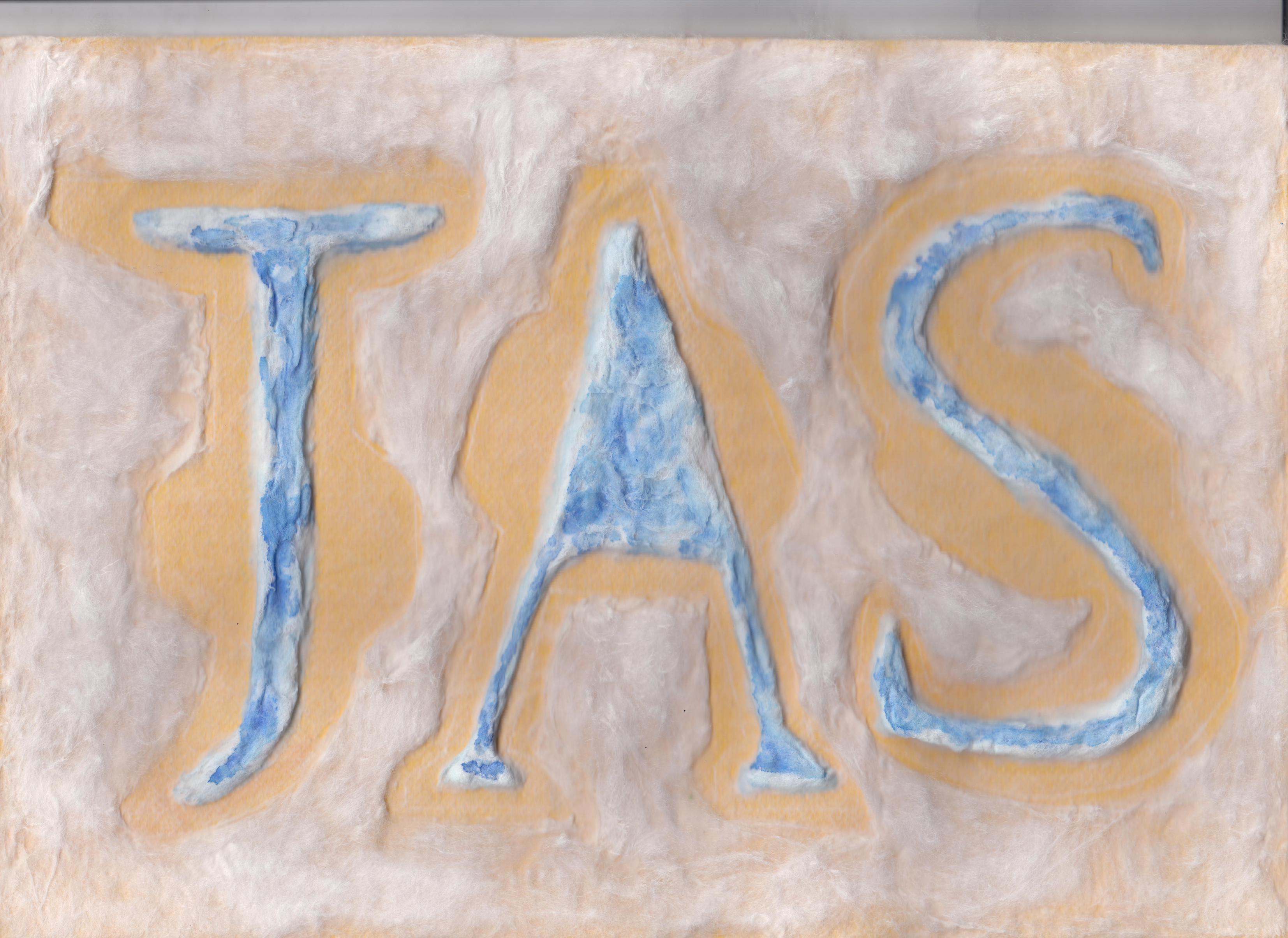
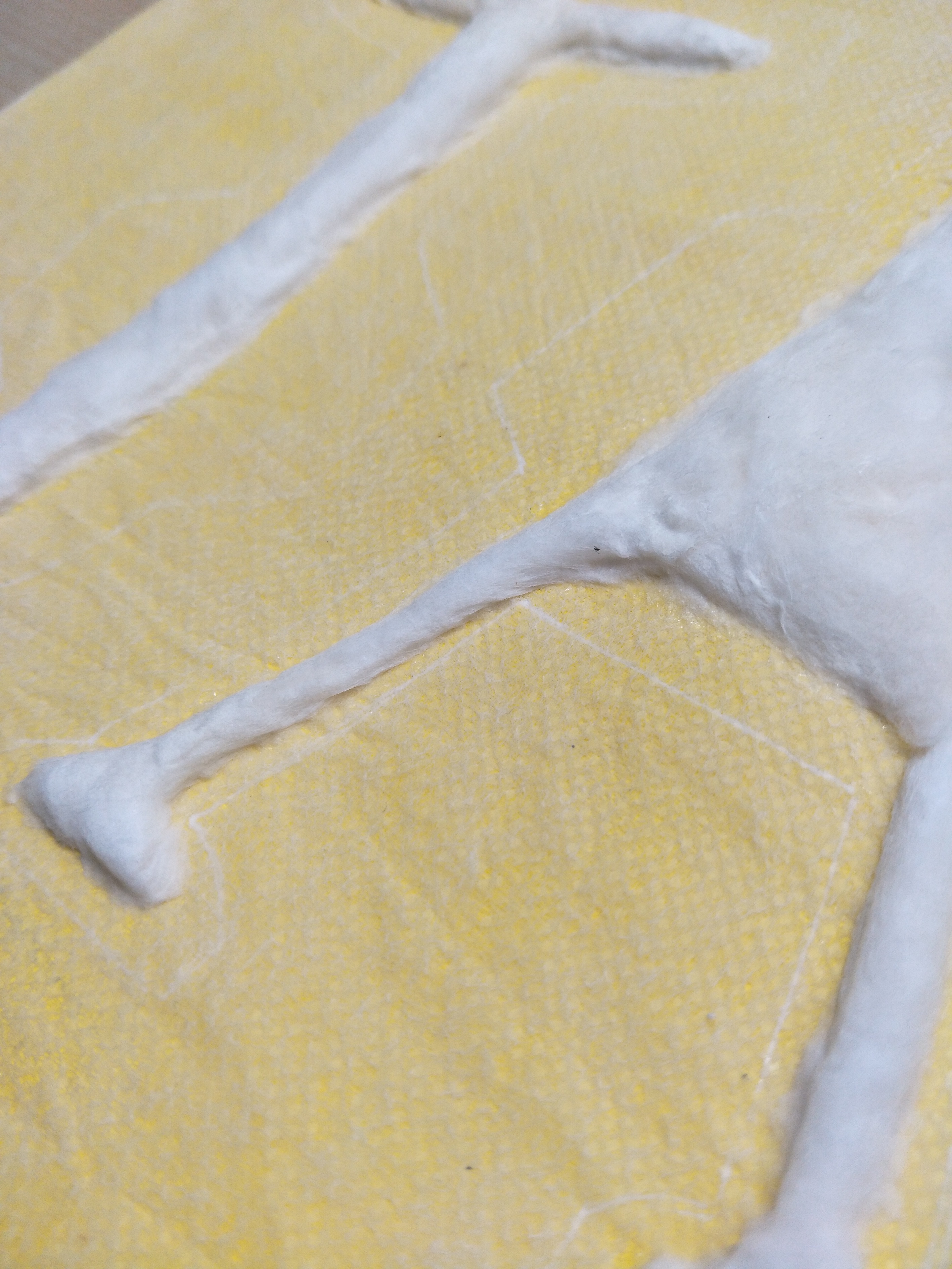
Sanitary pad tester:

Initially when I thought of sanitary pad tester, I thought of blood and I came up with this. But Shirley said that it looks like a murderer instead so I opted for another way of representing it.
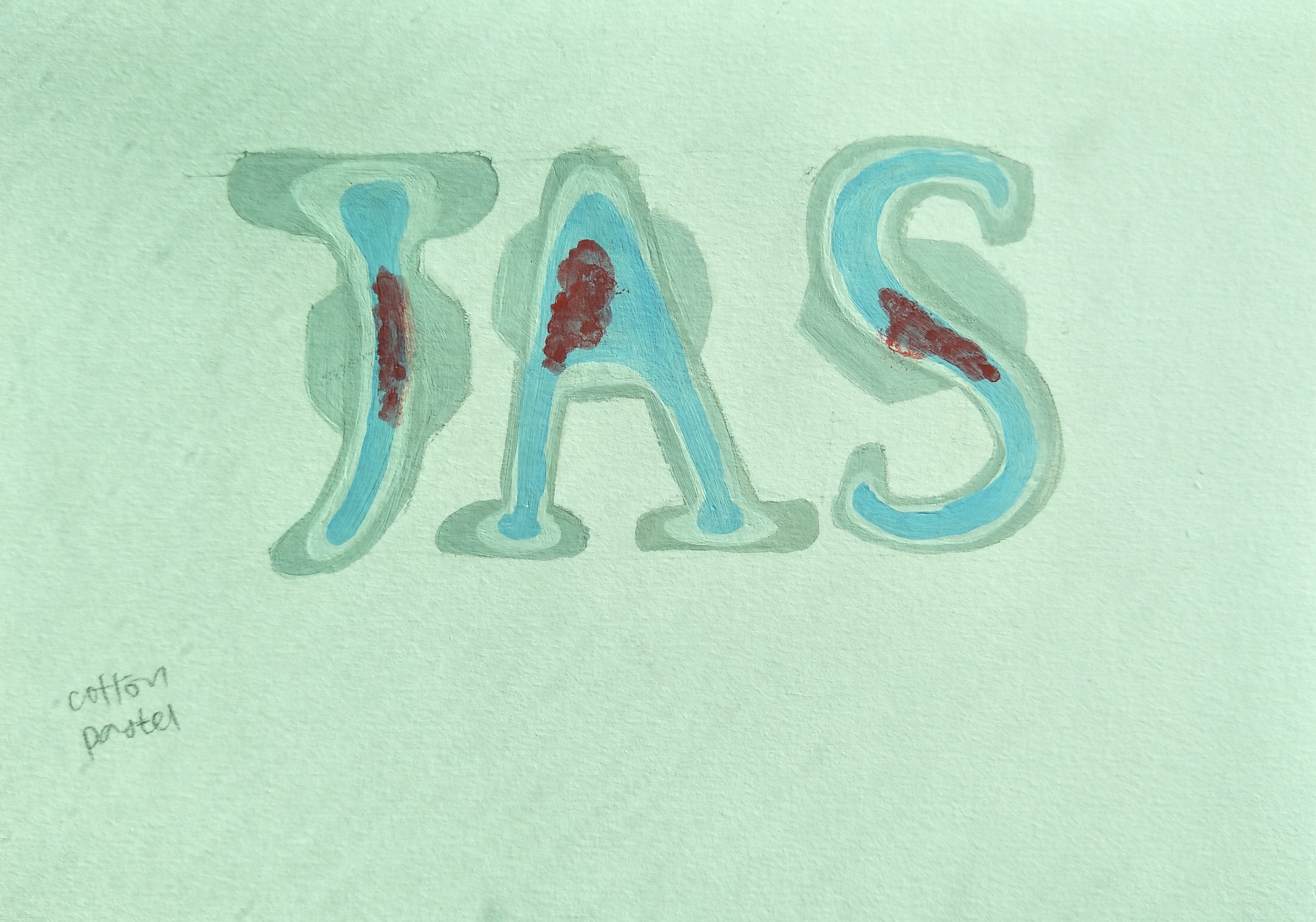
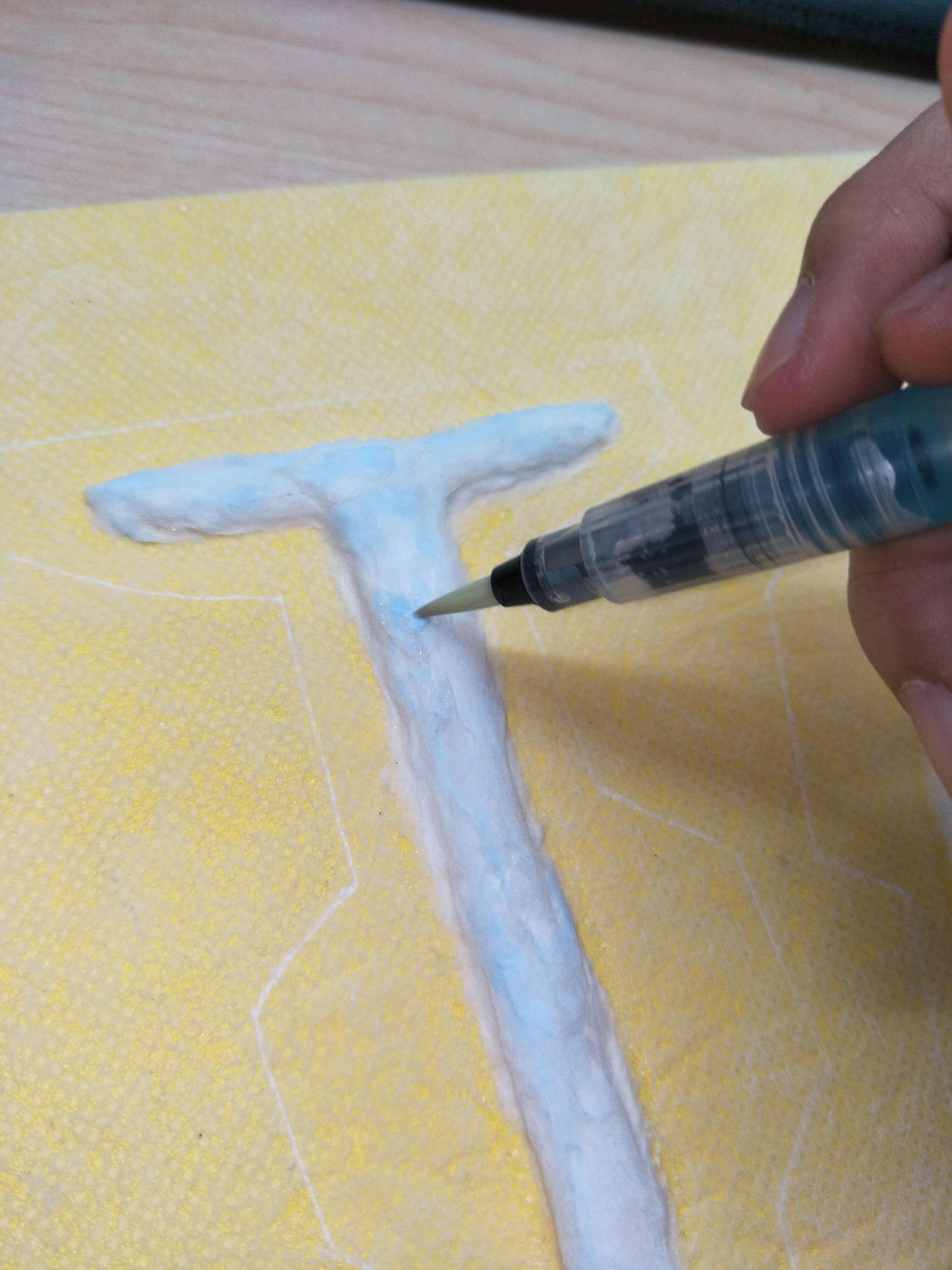
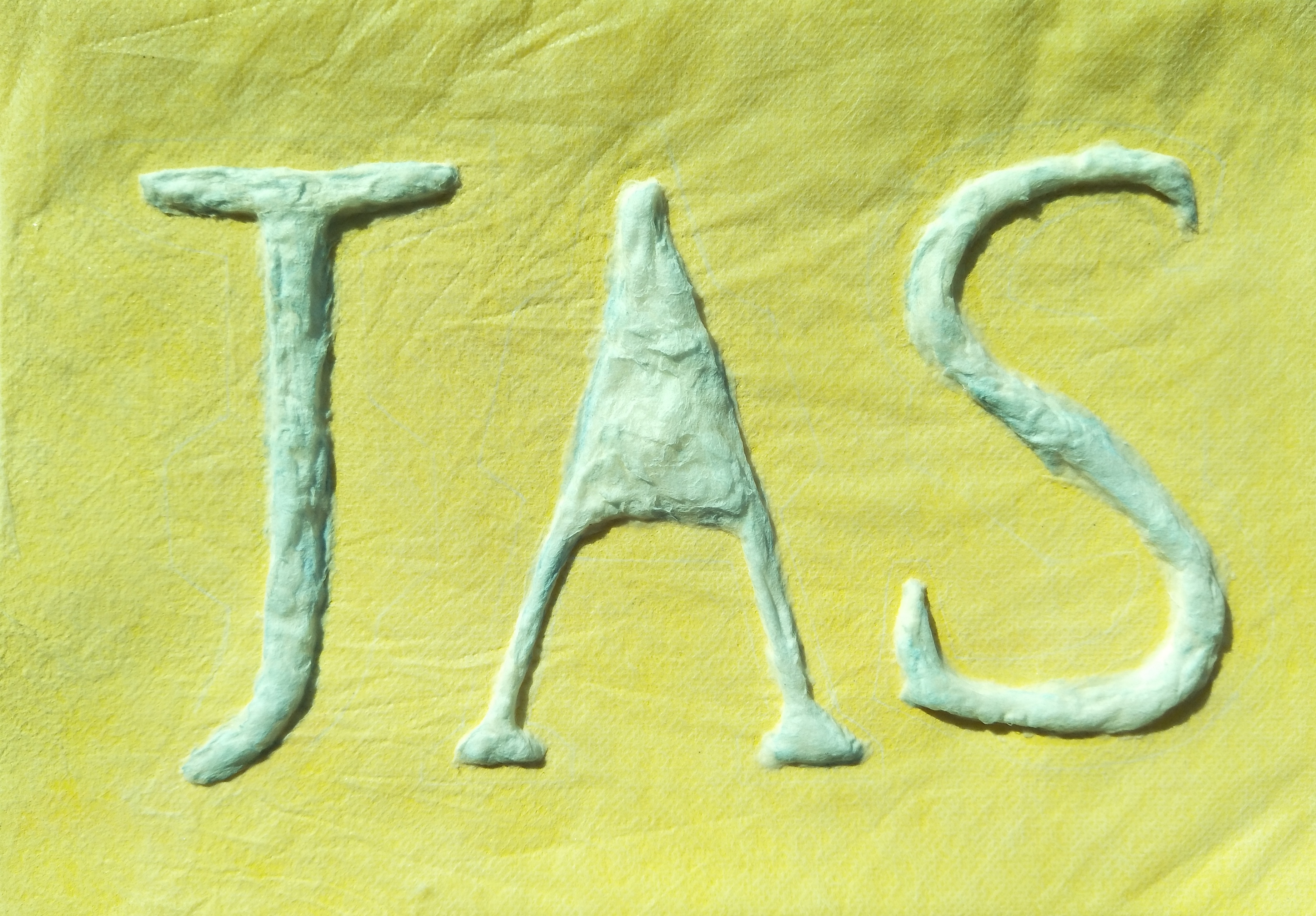
Shirley suggested that I used the serif font in our previous consultation so I went ahead and made the letters each look like a sanitary pad themselves with wings. The look of the ‘blood’ was a little weird so Shirley said to get rid of it and to just use blue liquid as the testing liquid instead. Shirley also mentioned to get a background which could be cotton to represent the lining of undergarments.
Bedtime storyteller:
I combined the look of night time with the pig’s tail in the alphabets for consultation and see what parts I can improve on.
_______________________________________________________________
From here onwards, it was about making adjustments till I get the final piece of work.
1. Space chef
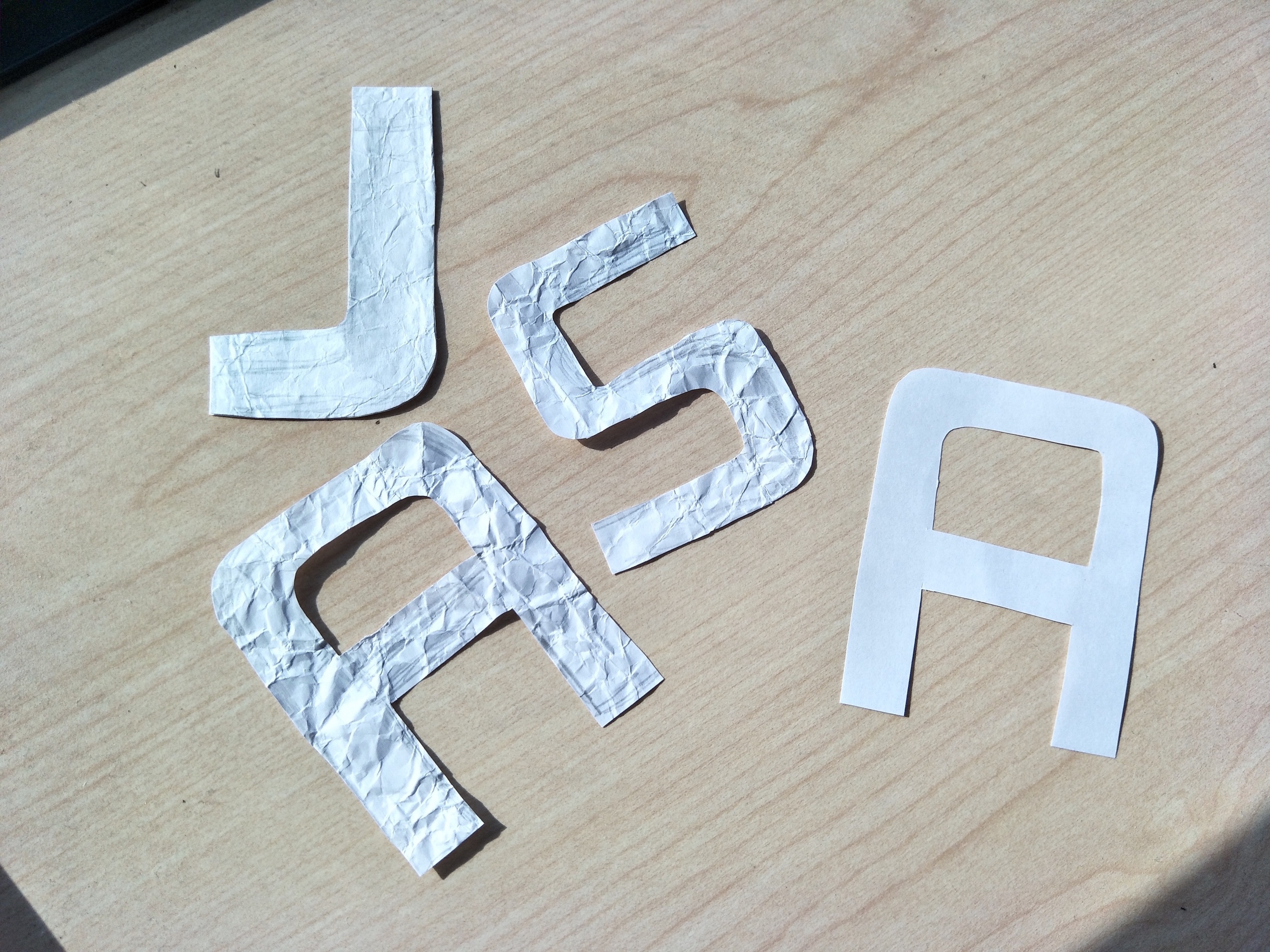
I chose the copperplate font for my space chef job because it gave off this outer space look with the slightly fat characters which almost has a squarish structure to it. Initially I wanted to do cutouts of the letters, then crumble them for texture and add white paint and ‘chop’ the alphabets onto the space background I did. However, the effect did not turn out as opaque as I wanted it to and the texture felt pointless to me so I decided to re-cut the alphabets and just paste them as how they are.
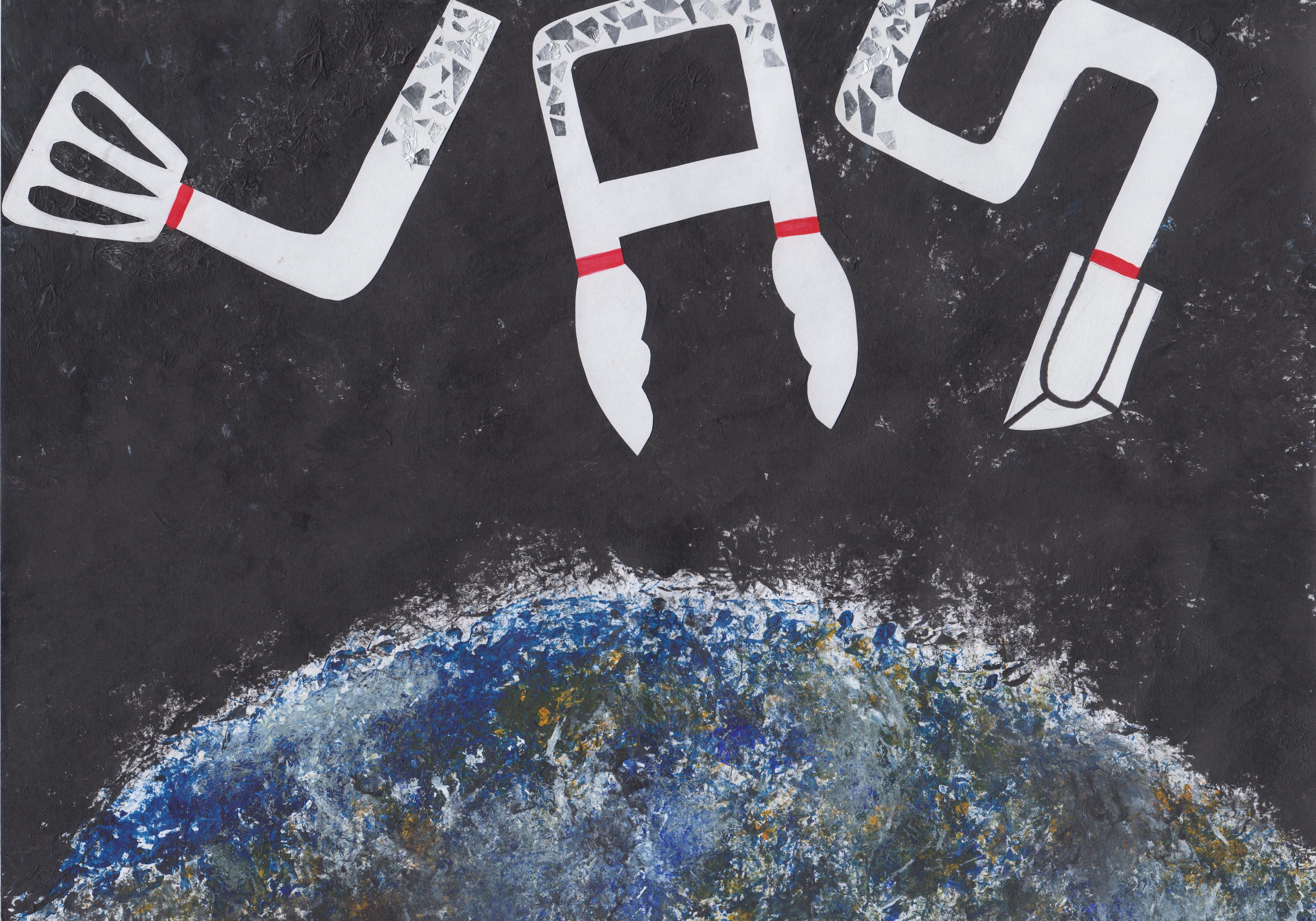
I do not have a lot of photos recording the process of making this but basically I just stamped black paint for the background using newspaper to give that almost like galaxy looking sky with empty spaces looking like specks of stars in the sky. I also used the same method to stamp the Earth at the bottom and I thought that the technique gave the look of the Earth a more interesting take because of the textures created. I then cut out paper for the alphabets, with the essence of kitchen utensils in each letter and pasted it on the black background. When I look up astronauts outfit, they all seem to be wearing this puffy white suit with a helmet so I thought that the white alphabets would make sense in this case. I wanted to make the alphabets look bit puffed up too but I was worried that the font would not be as visible so I decided to not include that. Instead, I added the red lines that was commonly found on the space suits and I also added aluminium foil to the top of each alphabet to signify the shiny part of the helmet. The alphabets was also arranged in a manner to look like they are floating in space so the orientation is in a more playful formation with the ‘S’ going out of the frame itself.
2. Bedtime storyteller
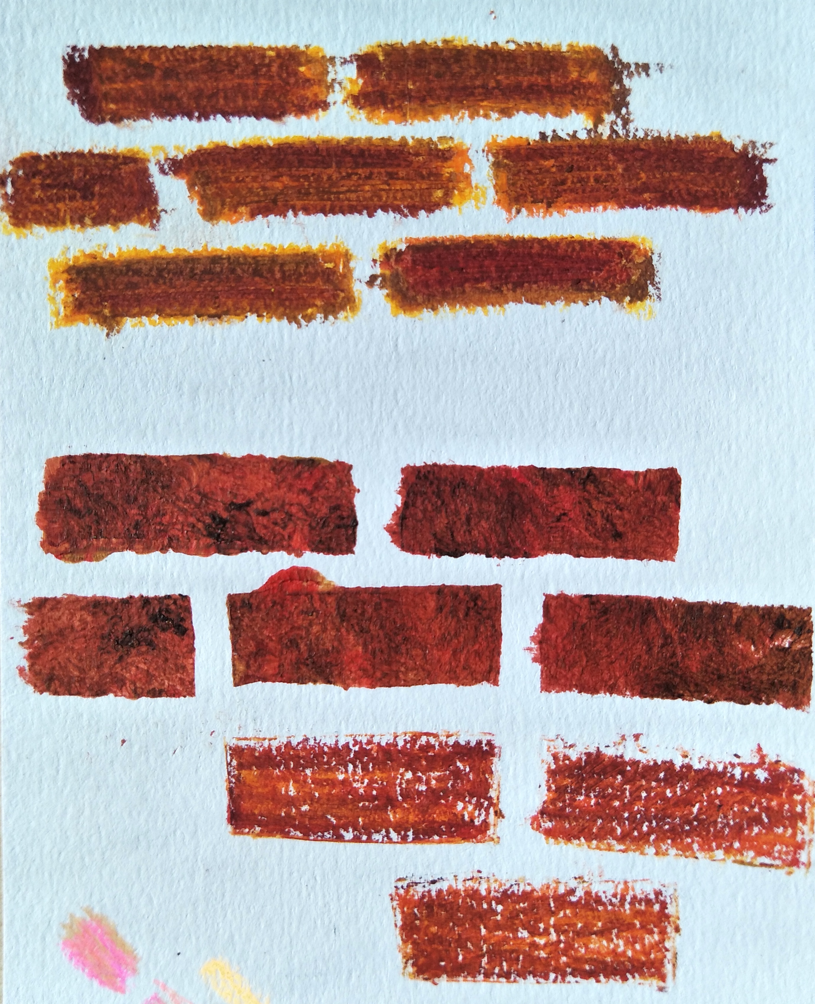
I tried to make a stencil for the bricks and experimented with acrylic and crayons. In the end I decided to use crayons for the bricks because it gave a more realistic looking texture. I then decided at this point to use only colour pencils and crayons for this piece of work since it was on bedtime storyteller and it would mean its very child-like so using materials such as colour pencils and crayons also hold this feeling of a child to me.
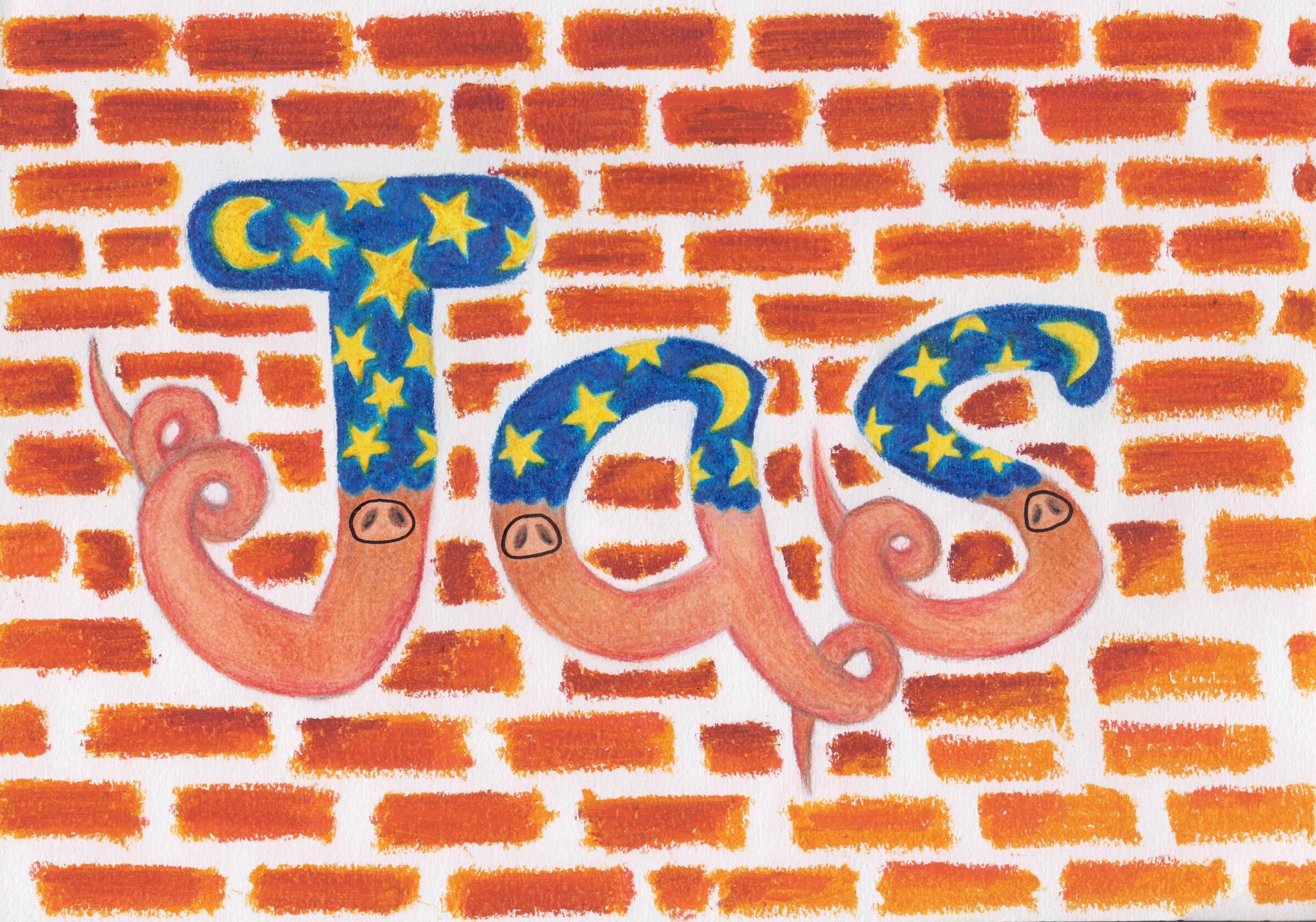
I also added the pig’s nose on each alphabet to make it more obvious that its pigs. The look was very outstanding but the background colour was quite similar to the bottom of my letters, the colour of the bricks was also too saturated that it stole the attention from the letter itself so Shirley suggested I change up the background digitally to make the colour at the back more muted.
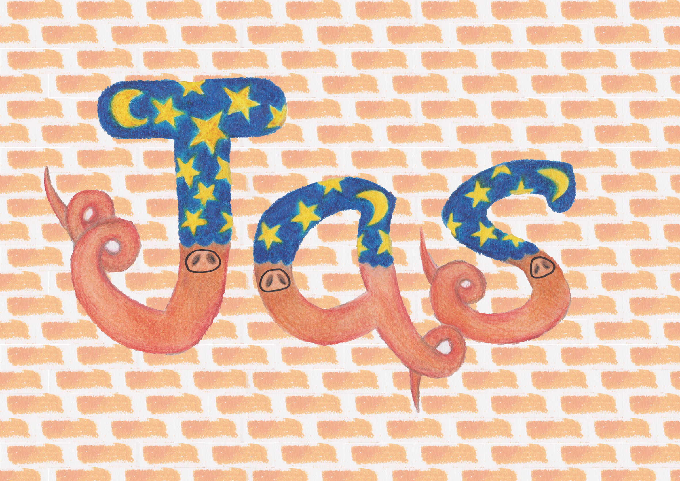
I took out the letters and cropped out one brick and duplicate it for the entire background. I then tone down the opacity of the background to give this more muted orangey shade. However, I was not fully happy with how this looks because I used one brick and duplicate it many times, it gave a very structured look to the background. The brick was also slightly slanted and I just felt like it could be better. I also tried using photoshop to create the letters as shown below but I just felt like it was taking a really long time and there was no textures as a result of it.
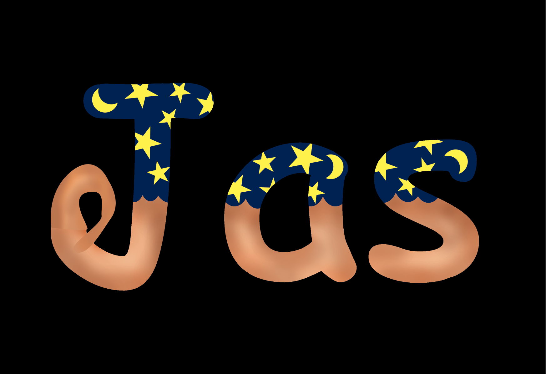
So I decided to just redo everything by hand, making sure to tone down the bricks in the background. So TA-DA!!

This was the final look and I played around with the shades to give the bricks more definition. The letters were able to ‘pop’ because of the contrasting tones with the background as well, so I was quite happy with this one and how it turned out eventually.
3. Pressed plant collector
From the start when I did the composition to show Shirley, I stuck a lot of other plants and flowers around my name itself. However, it felt like the colour of the plants and the thickness overpowered the main focus in my work. So she told me to remove them and just focus on forming my name ion the middle of the work.

This was how it looks like after I removed the surrounding unnecessary plants but I had to paint the paper so that it will look like paper that has been kept for awhile and turned yellow. I went to search on how antique paper looks like and I tried to recreate the effect with two shades of poster colour namely yellow ochre and vandyke brown. I also tore the paper out from a sketchbook so that it will look like it came from a collection and was torn out from the book.
This was how it looks like eventually! It took a really long time to do the background because the effect of old paper is not so jarring, there needs to be the build up of brownish tones to eventually create patches on the paper that would look more realistic. The paint also dries lighter than when first applied so there was a need for reapplication many times to get the look I wanted, which looked good enough like old paper but to not steal the attention away from the pressed plants. I also darkened up the edges where it looks like it was pulled out from a notebook to signify the rusty staple bullets that were used to bind them together. I then googled for the names of the plants one by one and recorded it in a manner with the scientific name and the date I collected them. I intentionally made the last line bit slanted so that the composition would not be so straight and it would also feel more like a real torn out page from a book of pressed plant collection.
4. Sanitary pad tester
I thought that it would be quite literal if I directly formed the shape of the pads so I decided to play with the use of negative space, forming a border around the alphabets to give it that sanitary pad shape. Shirley suggested a cotton background in pastel colours so I got some cloth and tried to paste it up, however, after consultation it felt like if this was how its going to look in the end with each section of the cloth coloured ink a different colour, it might take away the attention of the name itself. Hence Shirley suggested that I use the same technique of what I did for the middle of the alphabets but to form the entire border around the paper so that the background would be less focused on. Thus I then redid the work and started with painting the base paper yellow to give it a more happy vibe. Then I layered this cloth that was from a high heel bag on it because the cloth had a texture that was similar to the ones from real sanitary pads.
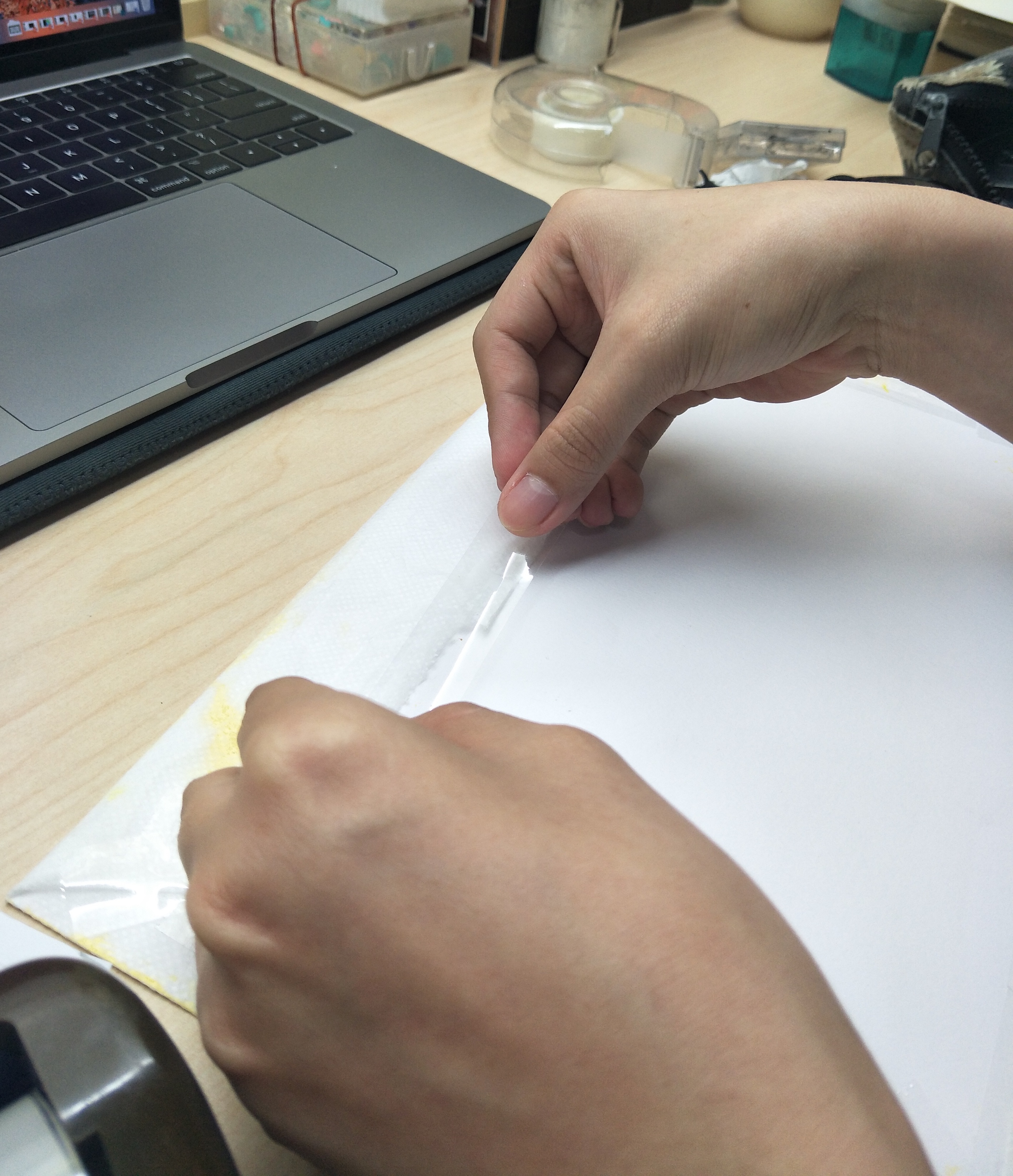

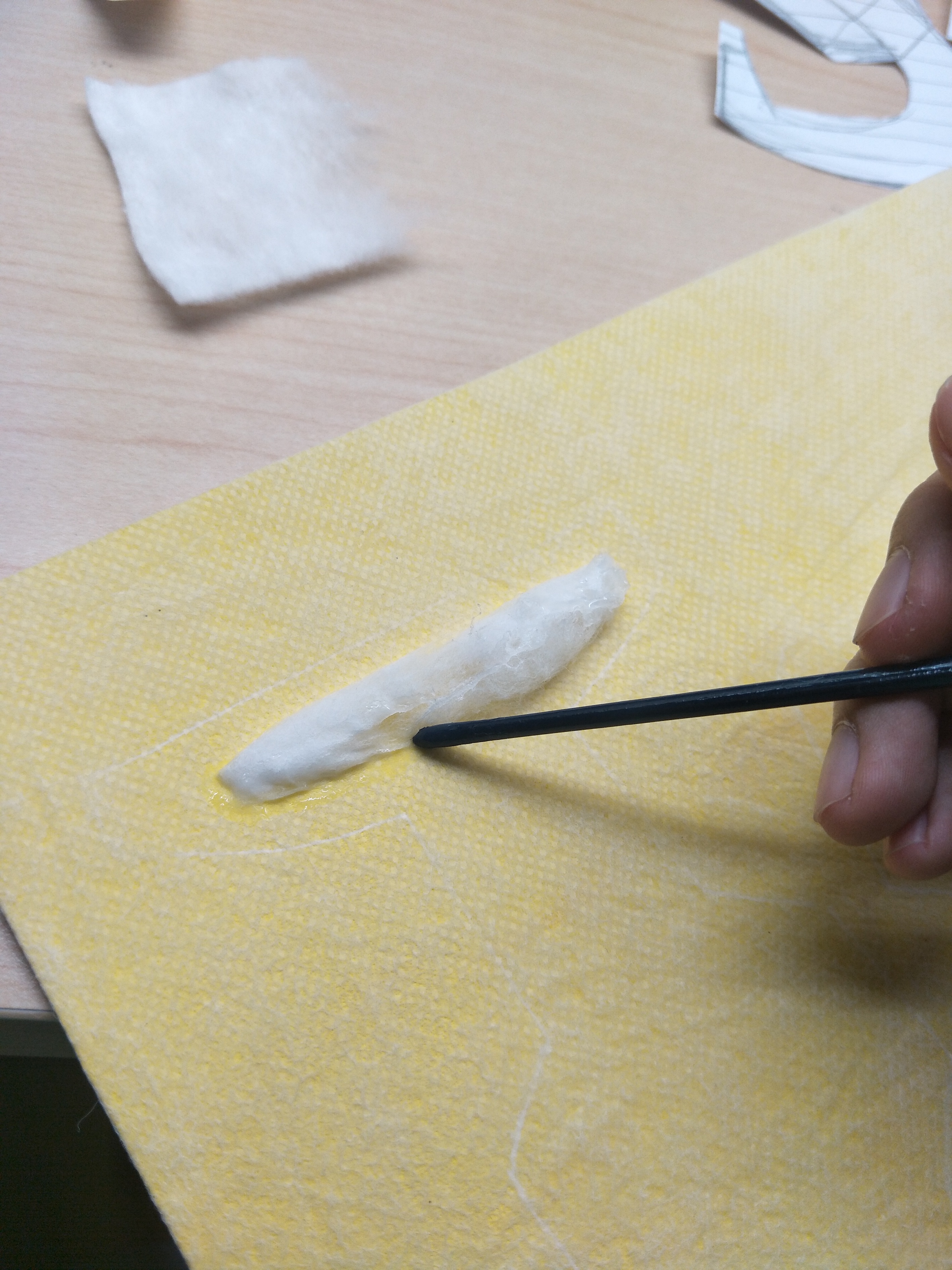
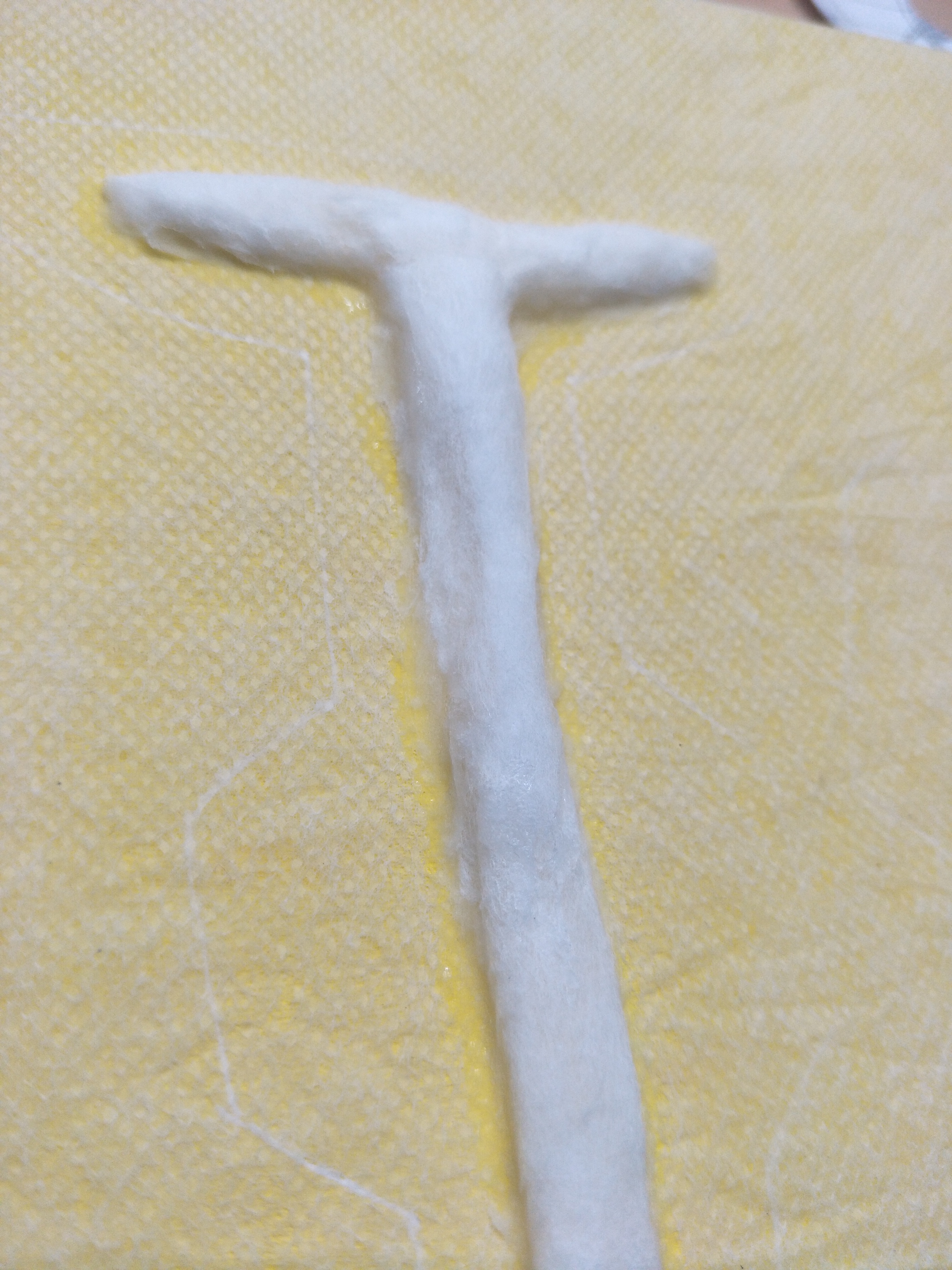
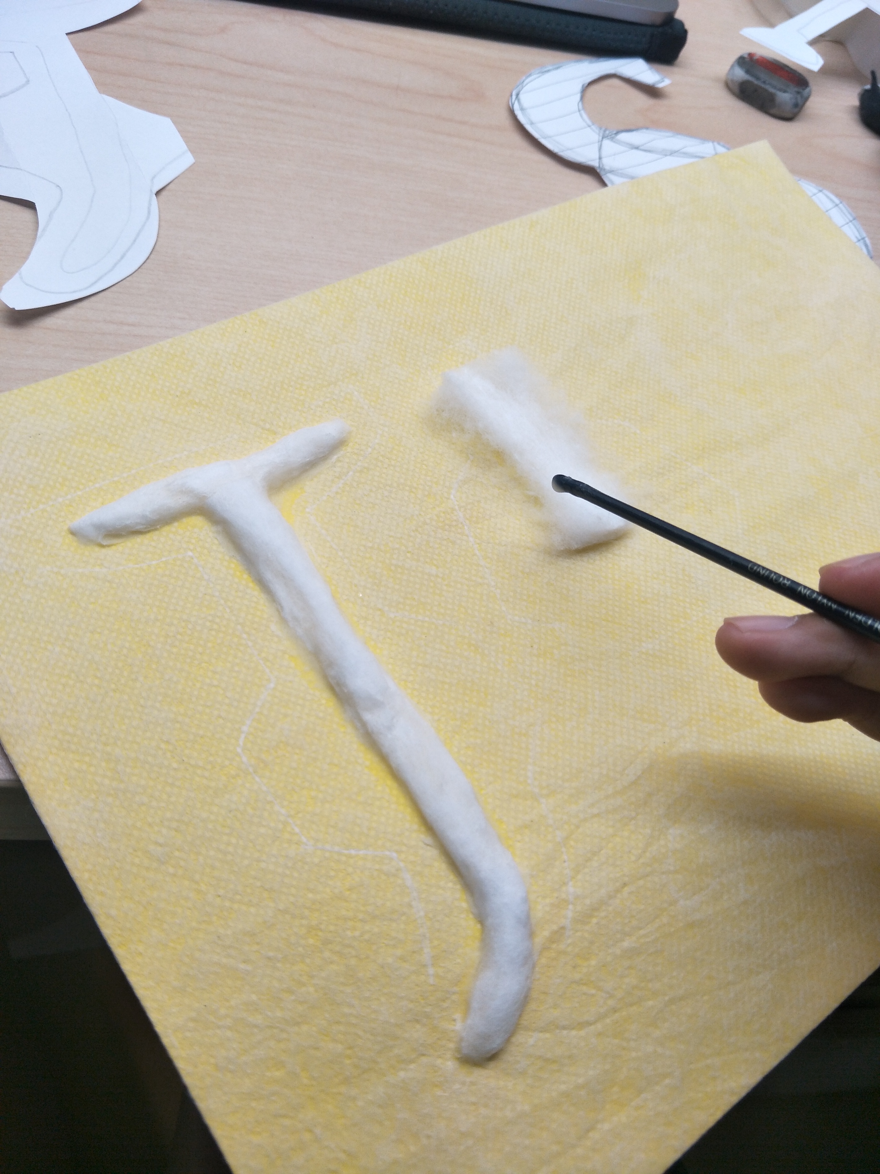


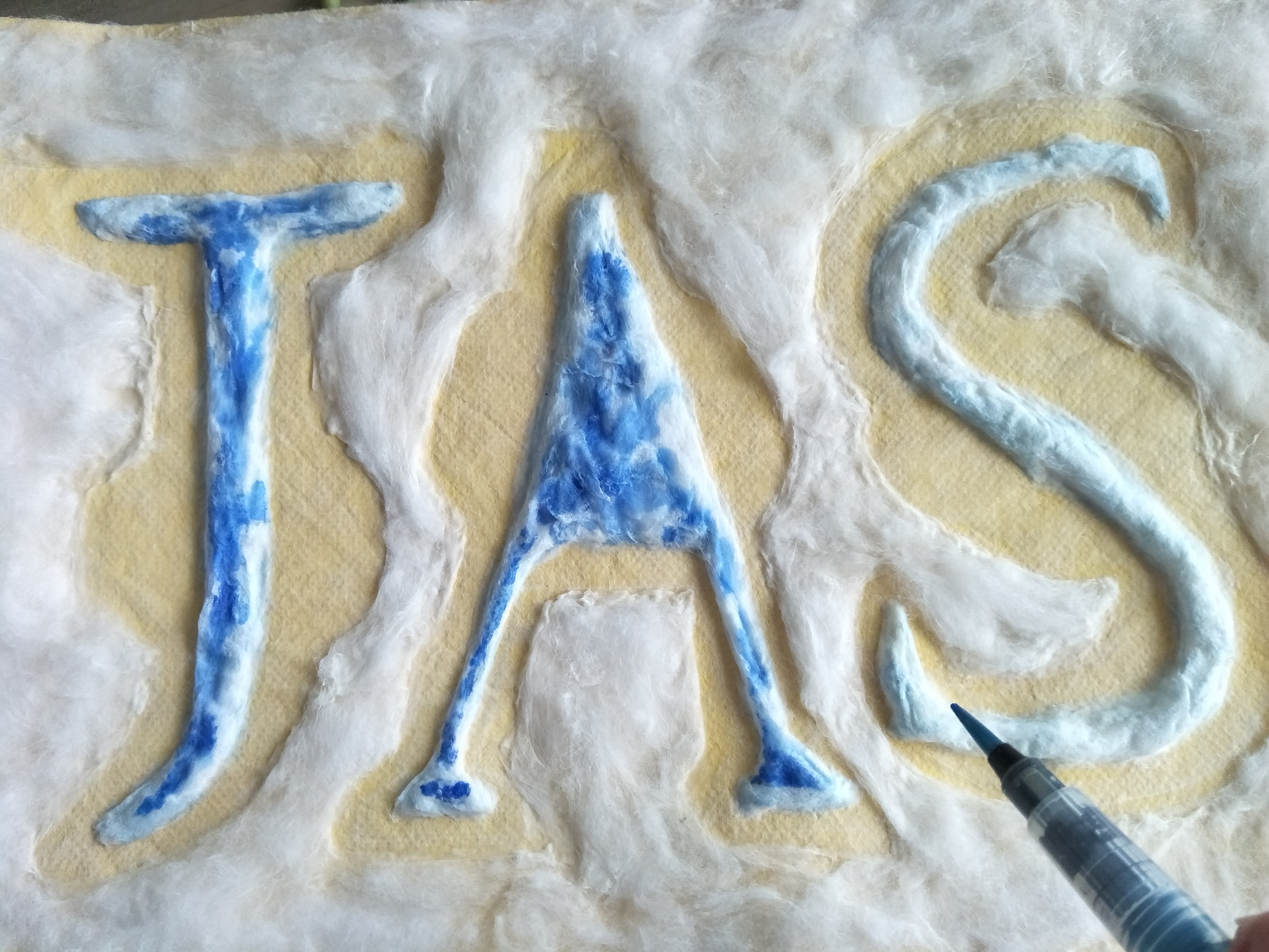
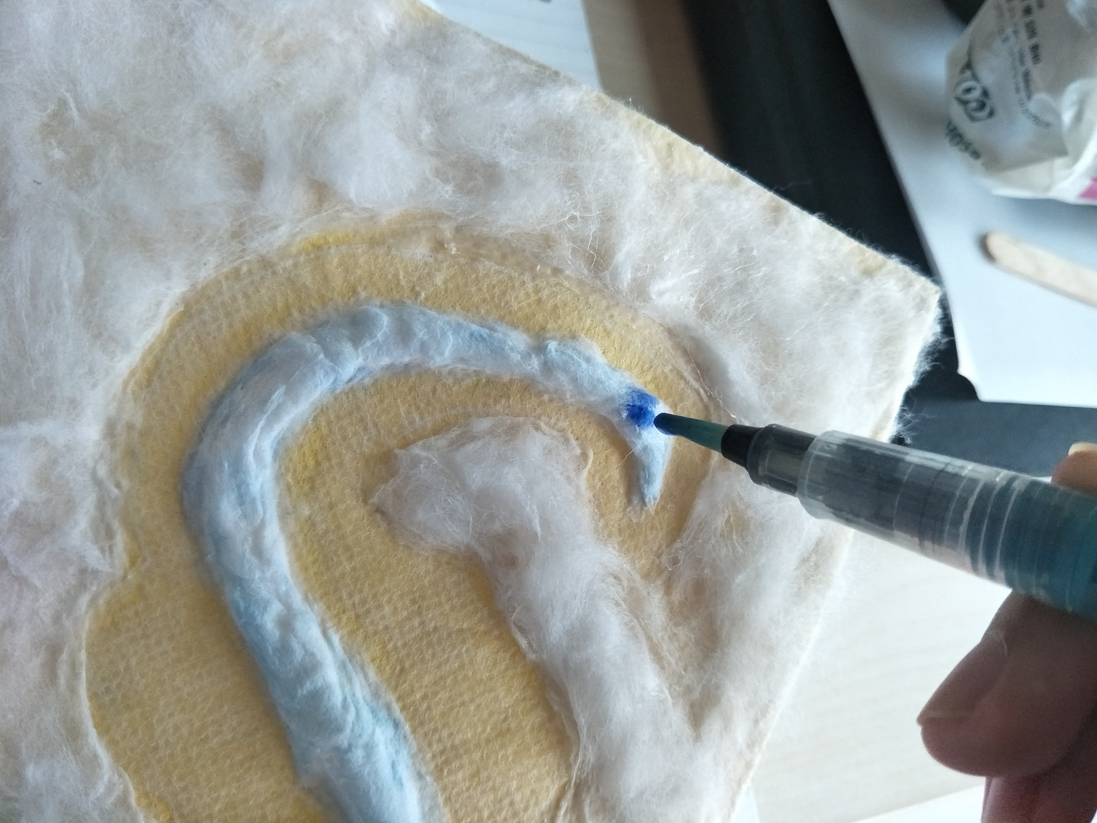
I made up the shape of the sanitary pad using the negative space and this was how it turned out. I was a little disappointed at how the blue tester liquid spread out on the cotton itself and how it made the pale blue of the insides less visible. However, because of that, it also showed the characteristic of a sanitary pad of how it absorbs and spread out. This was particularly tedious to do because I had to put glue before sticking on the cotton wool and the cotton just keeps sticking everywhere which made the process a lot harder. There was once where I started to do the background and the cotton just keeps clumping together and it looked really bad so I had to scrap that off and redo again to get a more even coating.
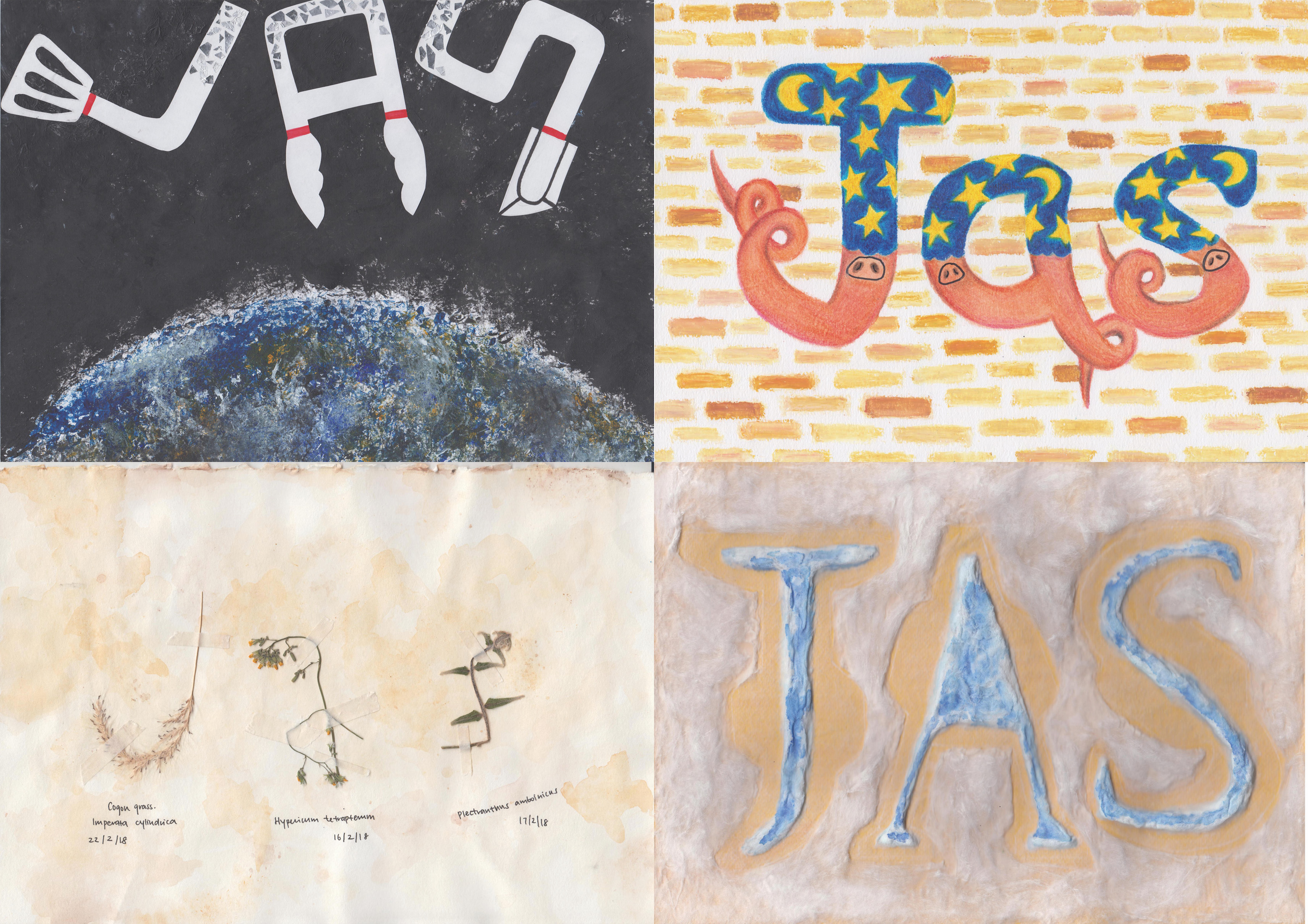
This was how it looked like in the end, I am quite happy with the results considering that the process of ideation and actually doing it took a really long time. There was a lot a lot of experimentation involved which took up a lot of time because then you have to judge and see if it looks good and suits the job you wanted to portray. Although all my works are done by hand, I would really like to explore and learn how to use illustrator and photoshop properly so that I can do more digital works instead. However, I do also appreciate the actual texture of the material when its done by hand. Overall, I would say that this project seems simple initially but it is really not how I would imagine it to be. It requires a lot of thinking and trying to pick out the essence that would make more sense to portray the jobs chosen. However, I guess the challenge is necessary in order to grow and I will definitely be putting in effort to learn the various digital softwares for my works.
Prior to the start of project one, I did some research on two artistic movements, namely Dadaism and Russian Constructivism.
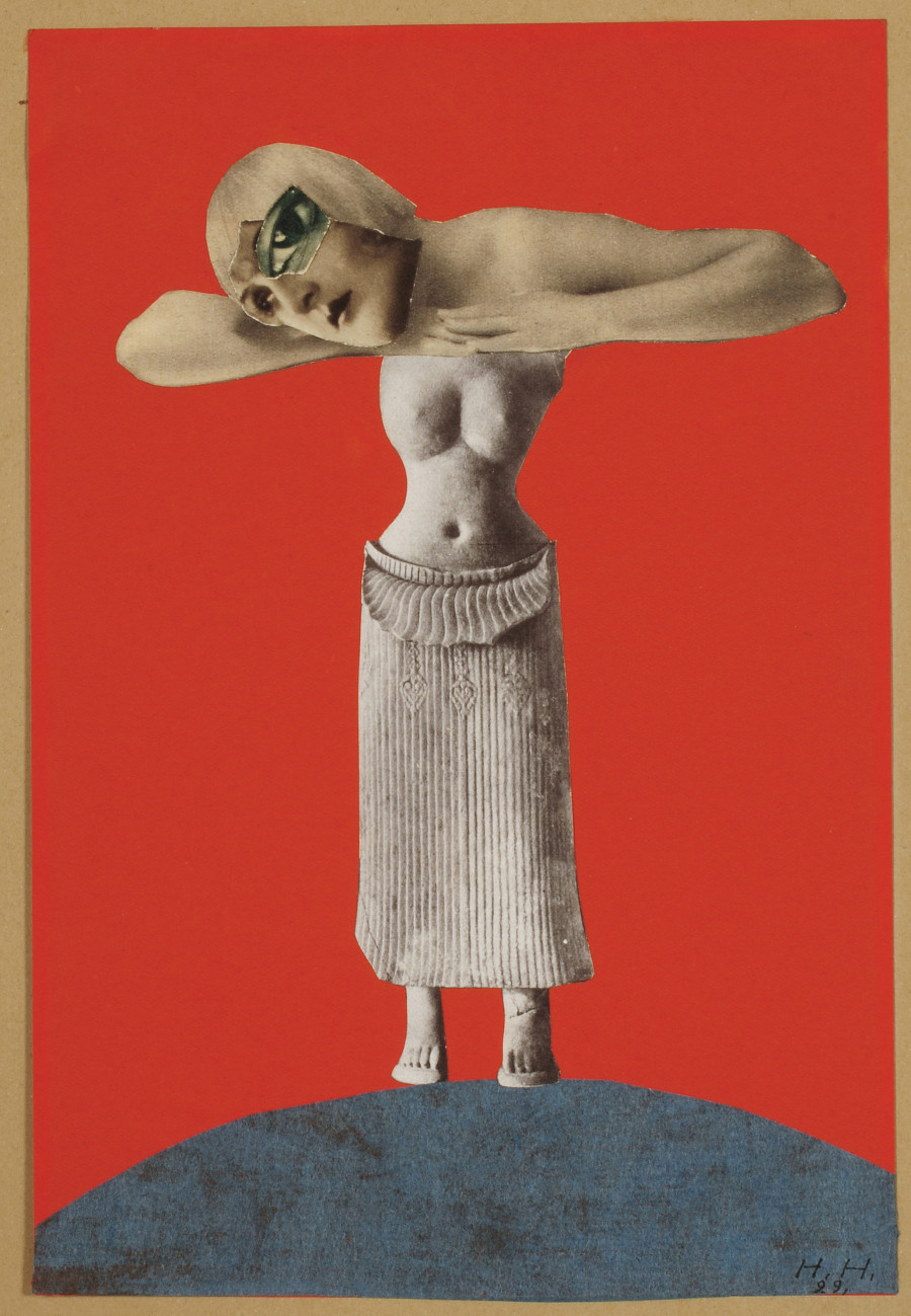
For Dadaism, it is an art movement in the early 20th century which was a reaction to World War I. It is considered a nonsensical kind of art style which was meant to question the purpose of art, the role of art and the role of the artist. Dadaism also shows mockery to the materialistic and nationalistic attitudes by creation of works to question about artistic creativity. There were works created using ready made objects and this was relatively easy to understand and achieve the goal of dada artists, which was to really question the purpose of art in society like what is considered art. If the art piece which is the readymade object is already made by someone else, then would exhibiting the object itself be considered art? Even if it is considered art, what value would it serve and what message does it bring across? With little to no manipulation of the object by the artist, what then is the role of the artist in regards to the ‘art piece’ itself?
When we talk about dada, we definitely have to look into artist Hannah Hoch regarding her art styles. I was trying to research about her techniques to see if I could apply any of it into my work. Hannah Hoch is a famous German DADA artist and she was one of the starters of photomontage. For her works, she mainly talks about the issue of gender and figure of woman through her photomontages, allowing her to gain popularity in the art scene. She was able to cleverly use unrelated images of cut-outs from magazine or newspapers to combine them into an art piece to create meaningful works. One of her more famous works would be ‘Cut with the Kitchen Knife Dada Through the Last Weimar Beer Belly Cultural Epoch in Germany’ in 1919 which opens a discussion about gender issues in the post war Weimar Germany.


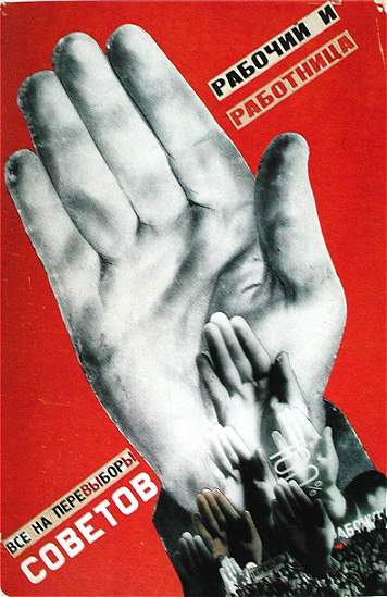
Moving on to Russian Constructivism, it is actually an artistic and architectural philosophy. It was the last and most influential modern art movement to actually flourish in Russia in 20th century. The main focus of Russian Constructivism is to replace composition with construction. There were hence creation of works to carry out fundamental analysis of materials and forms of art, leading to design of fundamental objects. The point of the art was to demonstrate how the materials would actually behave to form an artwork according to the type of the material.