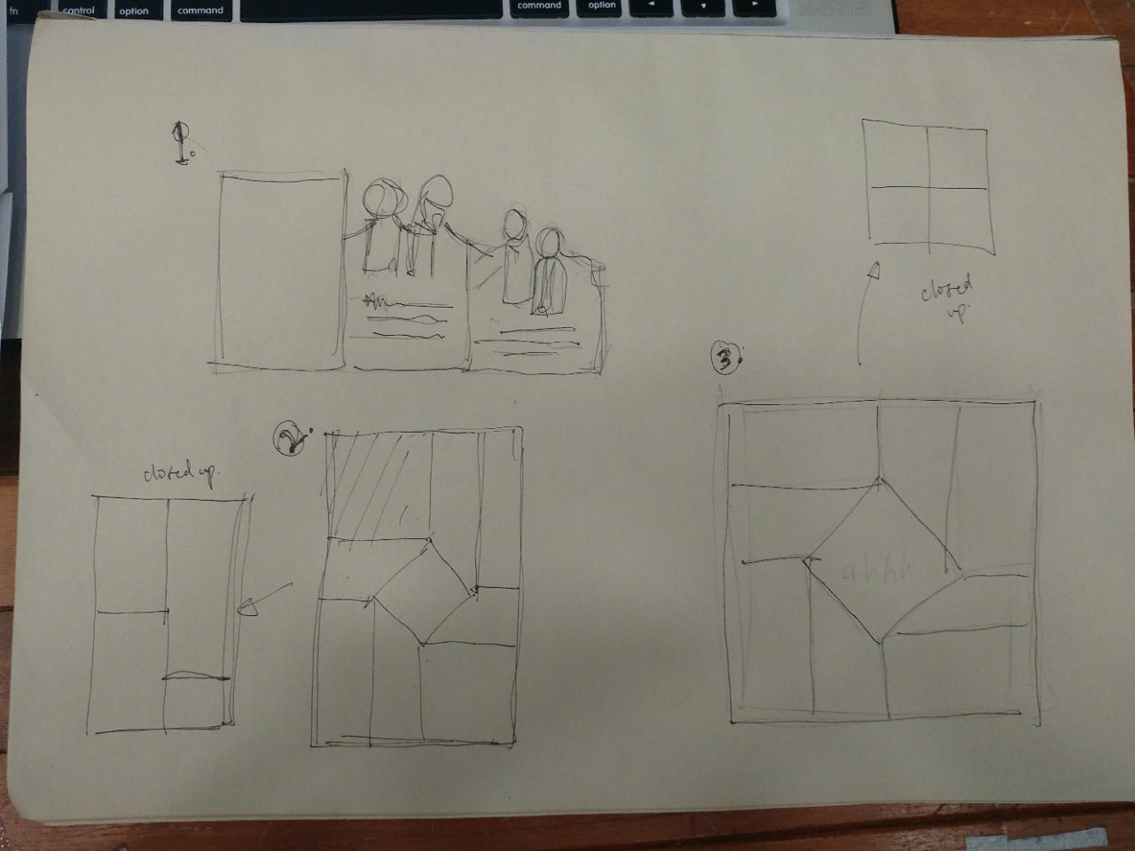
Task 1. Existing brochure designs x3
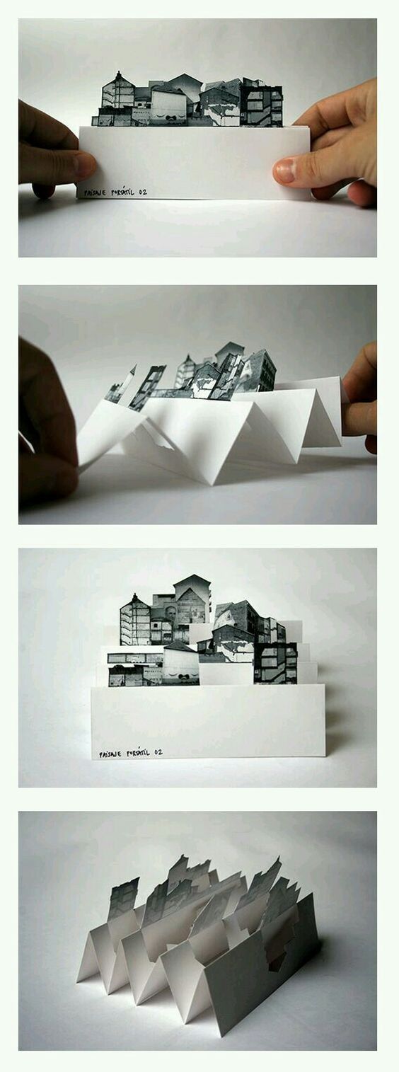
These 3 folds and card cut outs are what caught my attention.

The above 2 are the ones that had a certain focal point that i quite liked.
Especially the top left (square cut out). I liked that when it opened up, it had a focal point that allowed the eyes to flow with the content.
The cuts and folds of the 2nd one (the right one) was also very interesting because it had the pop up 3d look. However, this one may not be as suitable for the theme of my assignment.
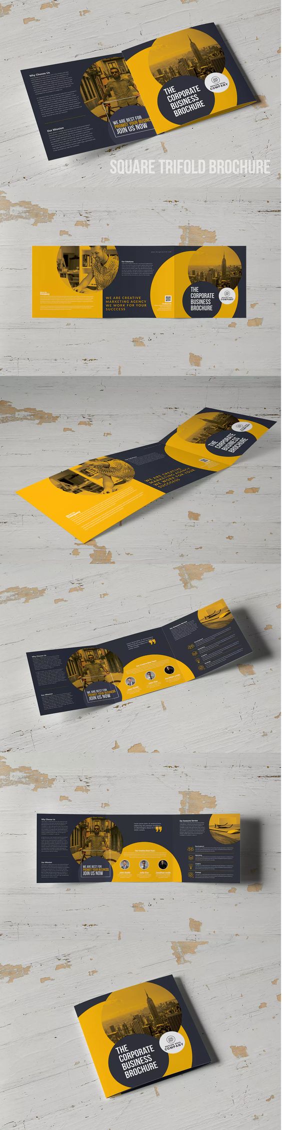 This above one is also square in nature, but it plays around with the colour and the background as well as the colour of the images.
The content also creates a flow and focal point of the entire brochure. The circles also help to give rise to a sense of flow and hierarchy, along with the choice of font colour. From afar, you know what to focus on and the leading lines from the left to the right.
2. Playing with folds
So based on my research on the different folds and cut outs above, i came up with 3 possible folds that i thought would be quite interesting for my brochure and might fit the theme of it.
1. The first one was more of a die cut that would fold out. I wasn’t so keen on it, as i thought it’d be quite a normal fold. Not that normal and simple is bad, but i really wanted to challenge myself a bit.
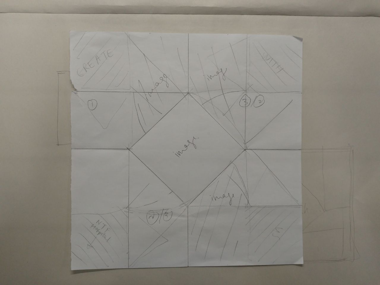
2. This fold is based on the japanese style of Origata — paper folds. I thought it was quite interesting.
3. The third one was something i thought would be very interesting. Though relatively common, its not as common as the 3 fold brochures that you might always see.
After some thought i scrapped the 1st idea and tried the 2nd concept of the origata fold.
So below is my attempt at the fold itself to see if it might work.

I decided to still use my poster concept and apply it to my brochure, to arrange it differently.
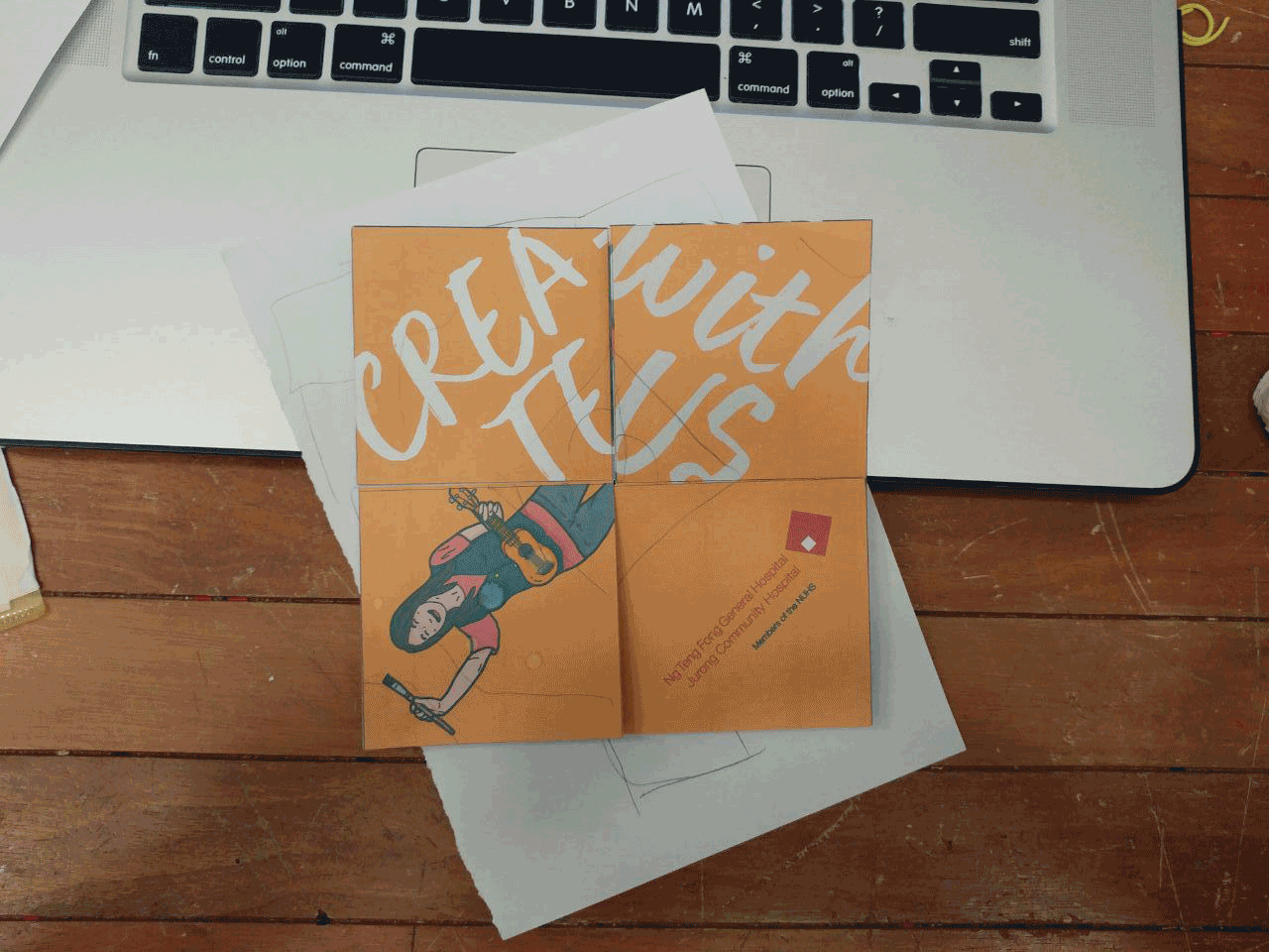
For this origata fold, i tried experimenting with this layout and i really really liked the initial cover page.
BUT after consulting with Michael, i realised that it wouldn’t work out well due to the fact that when i opened up the brochure, a lot of things would get cut out. Hence i decided to scrap this idea of the fold, as much as i thought it was really interesting.
MOVING ON to the 2nd idea!
The above is a quick mock up i did for consultation with Michael. A few things he pointed out:
1. add different “layers” or “levels” to show people where to focus on.
2. add triangles or lines that might help lead the eye
3. Play with geometric shapes as an add on to guide the eye.
4. Have a back to the brochure.
So i went back to my drawing board to try and think of ways to give my brochure a little more focus.
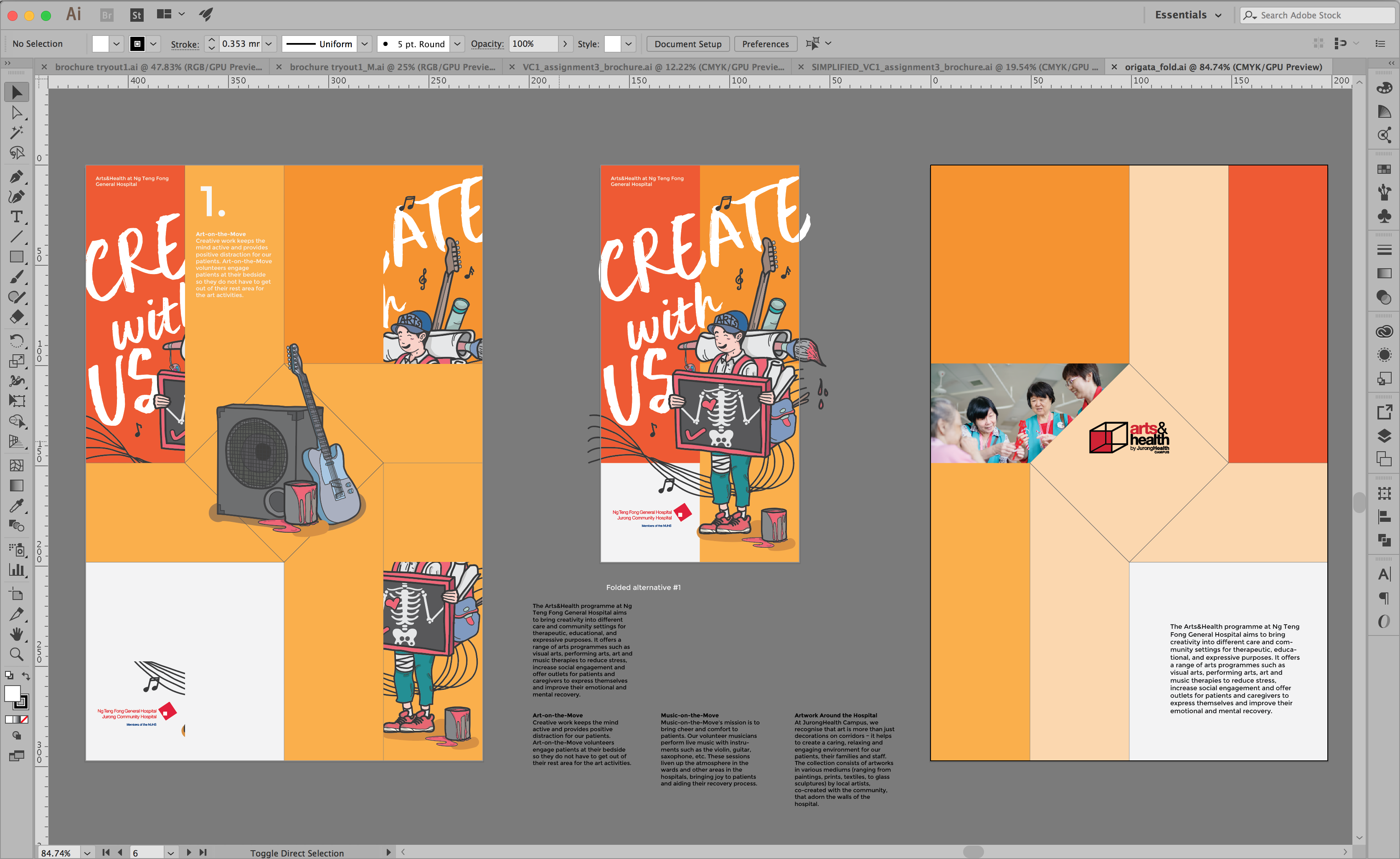
3. Preliminary Designs
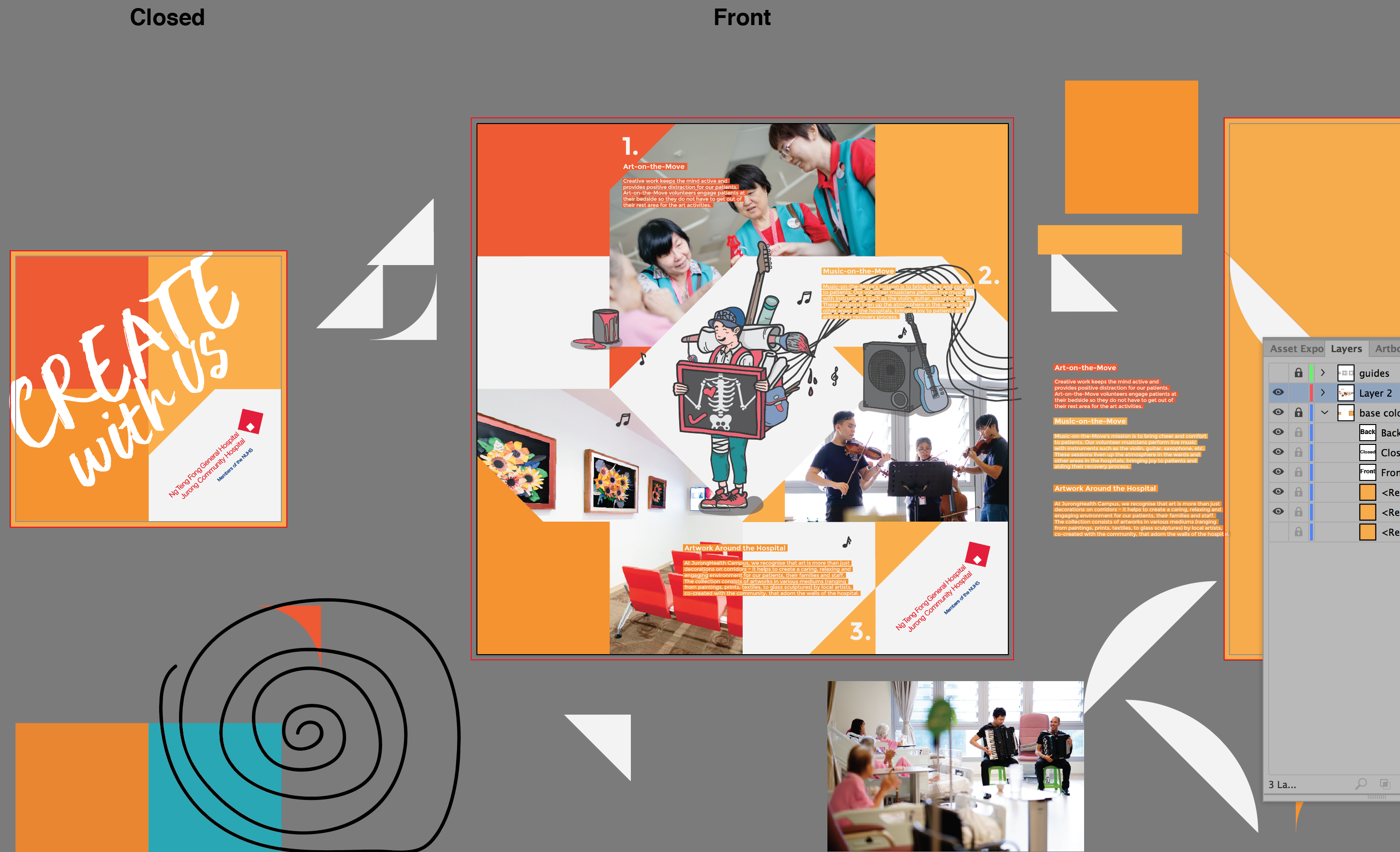
So after trying out the initial idea and getting some feedback from Michael and the whole class, i changed my layout and design a little more to add the leading lines and flow. I played with geometric shapes, curves and what not to try amplify the flow of the entire layout.
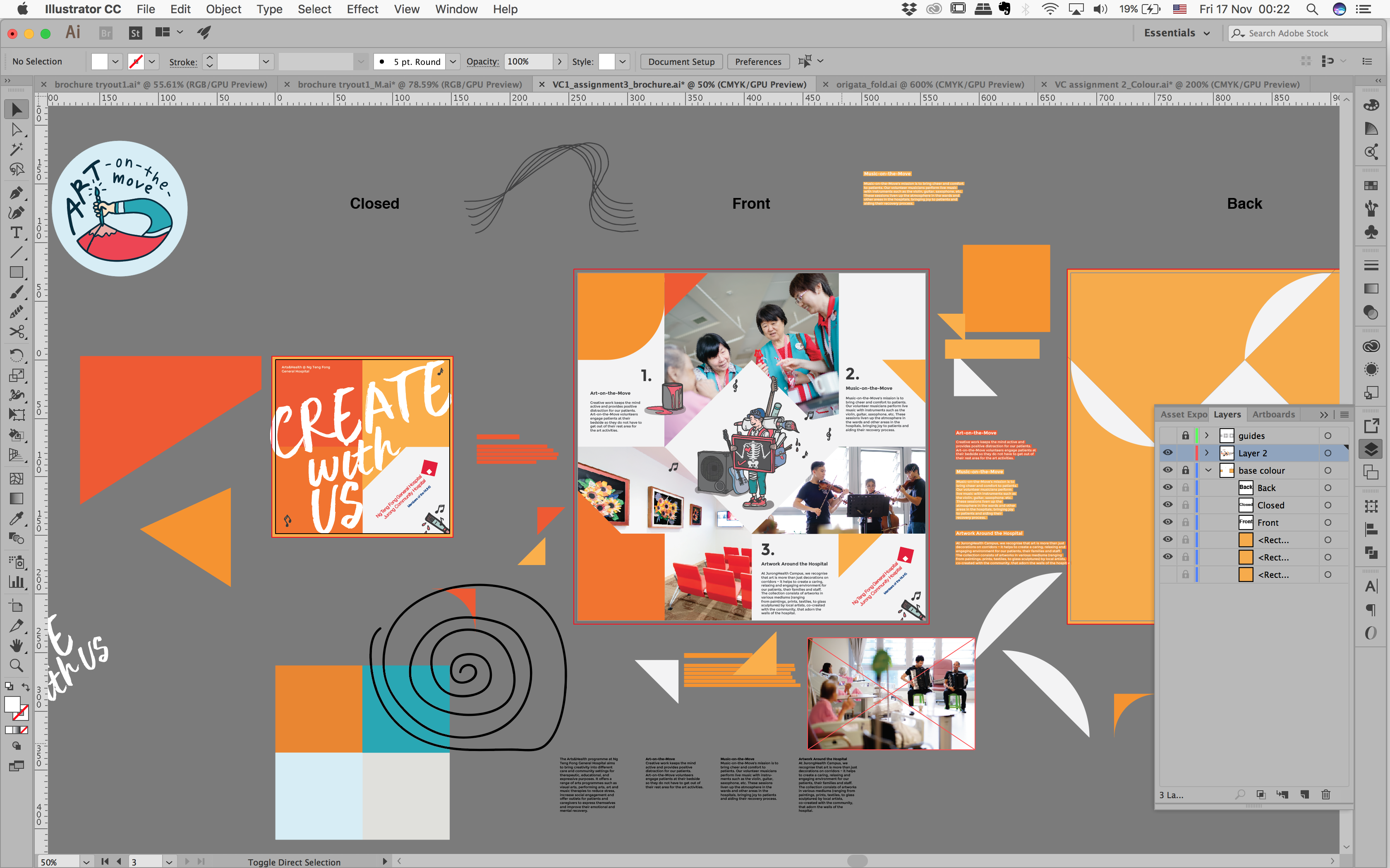
After a few tries, i decided to go with a PINWHEEL CONCEPT, using triangles to add a geometric shape, especially since the way
the brochure opens up acts like a pin wheel.
This concept ties in with my illustrations and gives the eye catching pop.
Since my illustrations have a “cartoon-y” concept, it plays well with the entire theme.
3 different shades of orange (monochromatic) to play with the consistency (ties back to poster design as well).
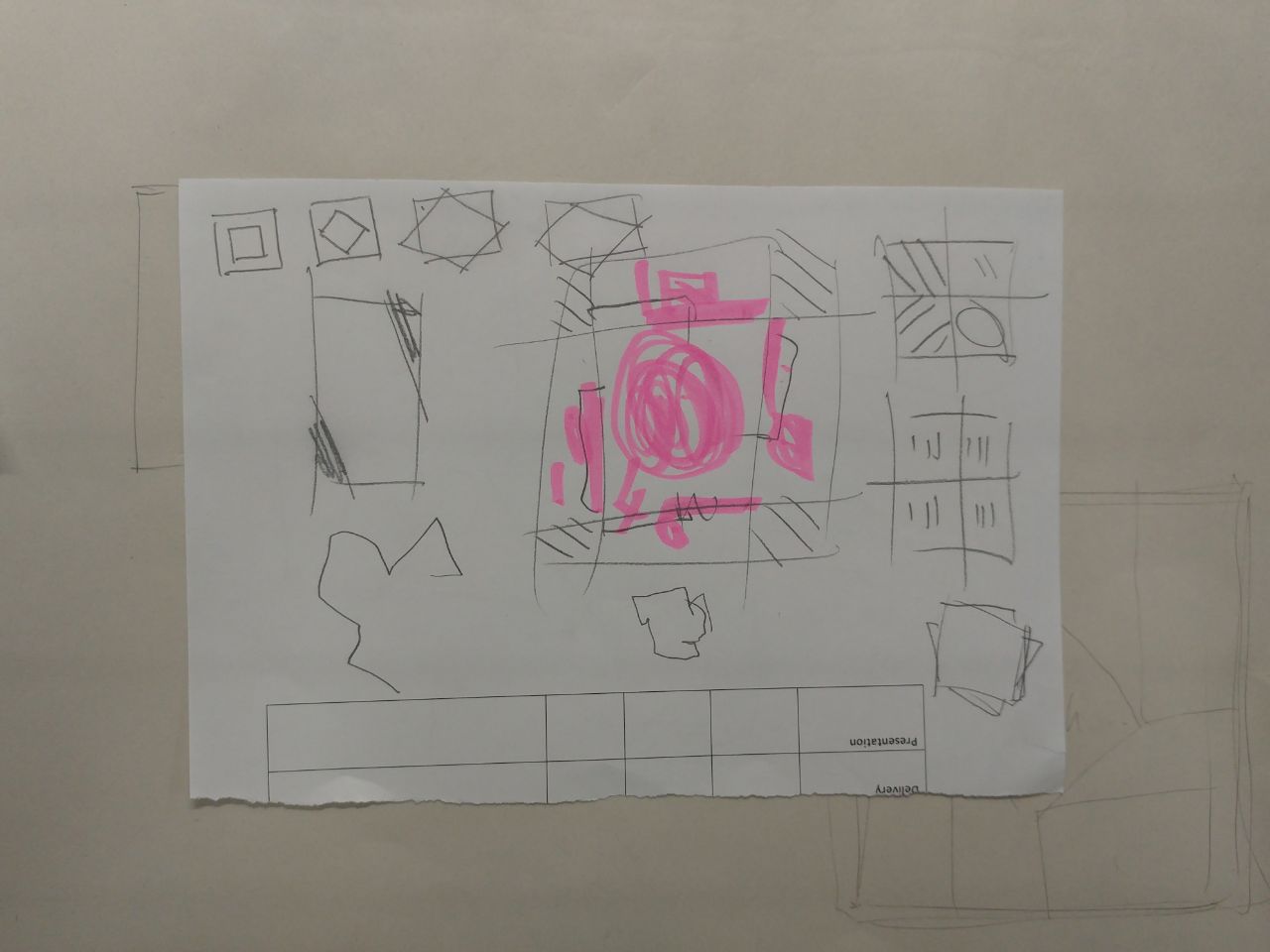
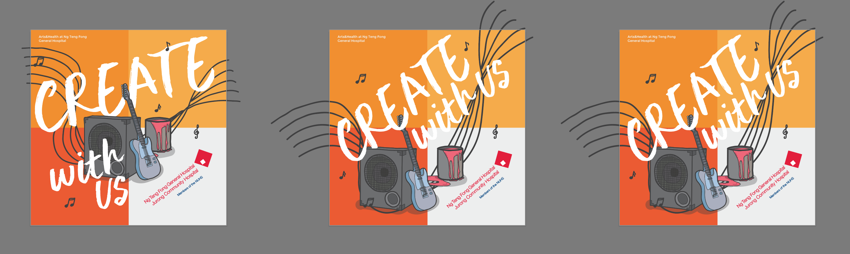
After settling the centre layout, i had to figure out how it’ll look like when the brochure was closed. This was the BIGGEST HEADACHE OF MY LIFE!
I just couldnt find a suitable cover that, when opened, wouldnt make the entire design look messy.
Below are a few try outs for the cover. I was going a bit crazy, when i realised that i should just bring it down a notch,
making it simpler and not over think it.
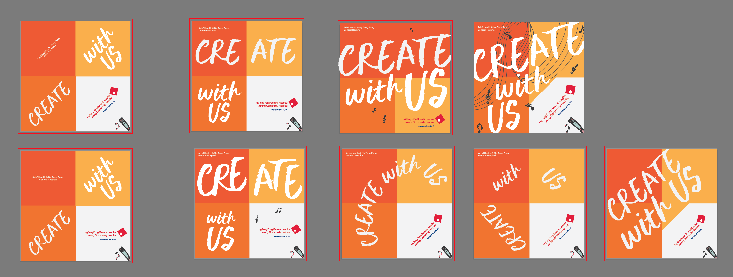
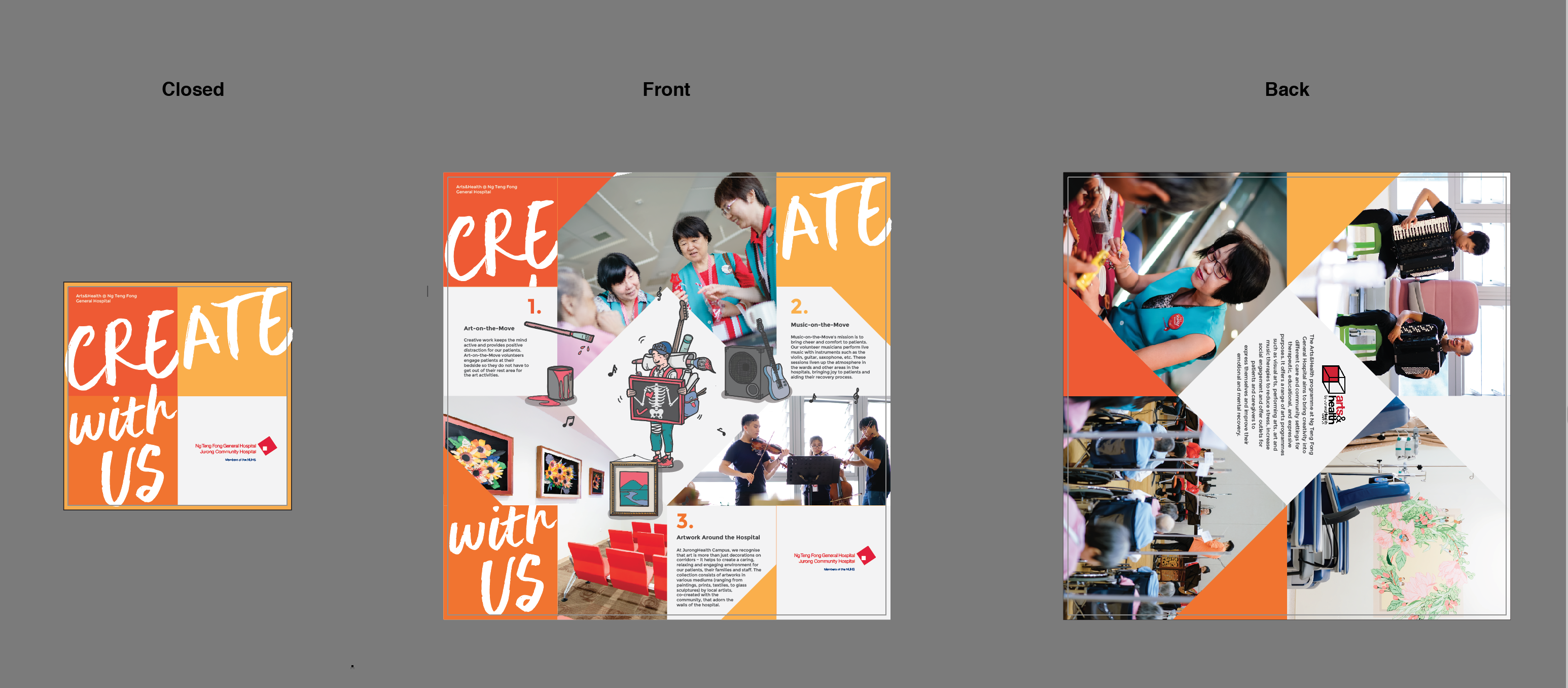
I finally chose 2 particular designs to go with the centre and added it. (image below)
Also! I did up the back of the brochure, making it a photo gallery with the hospital’s images.
My biggest concern here was that the 1st design complicated things when the brochure was opened, where as the 2nd design was a bit more clean, albeit a bit boring and rigid. Took 2 days to keep trying out different layouts and tryouts for the entire
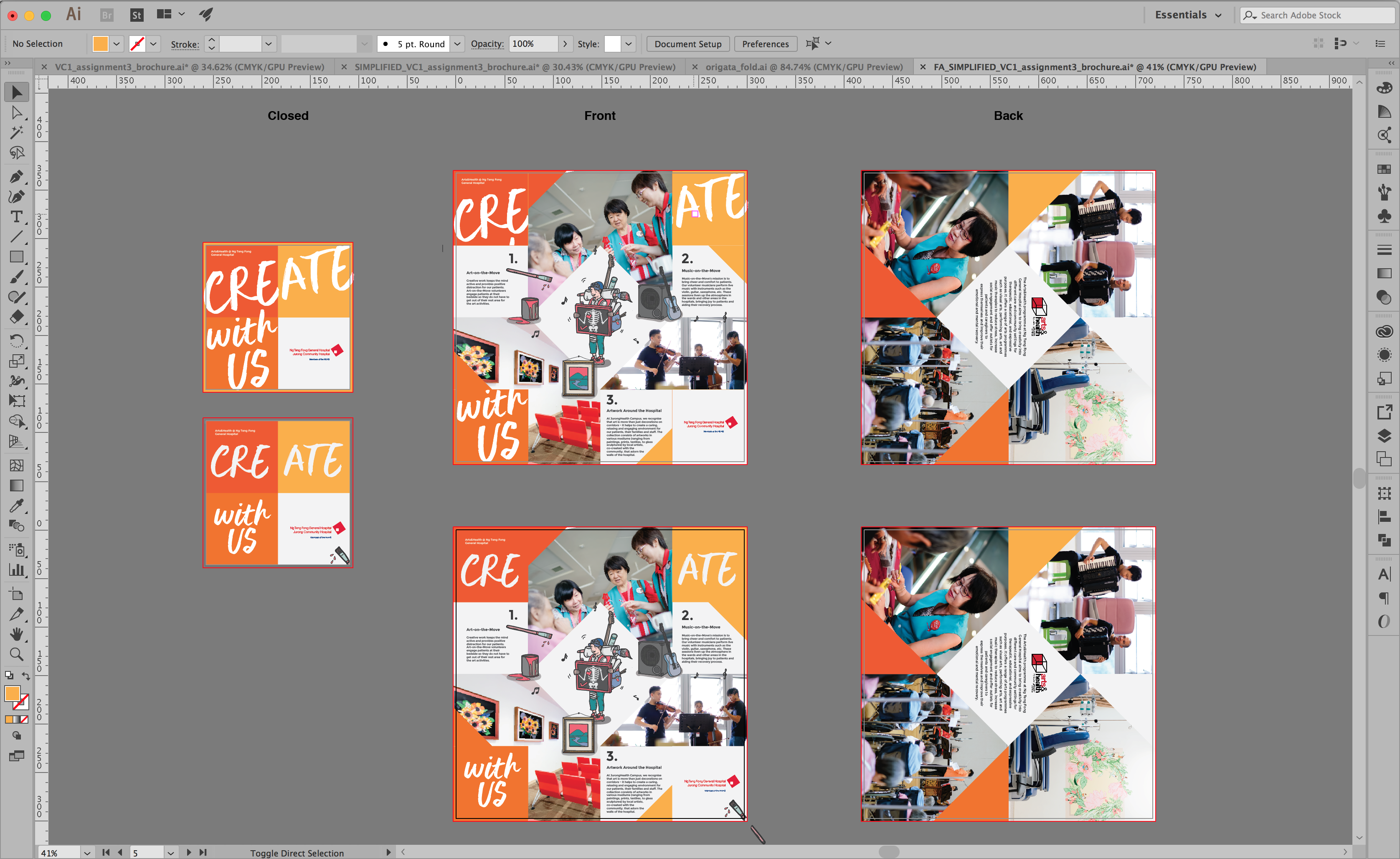
BUT! After getting feedback, i decided to go with the first design (BELOWWW). This is because there was more movement and excitement in the design.
It was explained that it did not matter that when opened, the 4 corners did not match. I am quite happy with the final outcome of this brochure, it has the kind of “feels” that i was going for. Though there’s still a lot to improve, but still learning slowly.