Designing for the Digital Age by Kim Goodwin provides a framework for designers embarking on their projects, to achieve optimum efficiency and effectiveness, from a functional, industrial standpoint. Goodwin believes that the essence of design is to visualize concrete solutions through conceptualizing for stakeholders to see and understand, and eventually build. As mentioned in the second paragraph, the ability to serve human needs and goals is what sets a design artifact apart from art.
Goal-directed design is a method developed at Cooper (founded by software inventor Alan Cooper) for approaching the design of products and services. With user goals in mind, goal-directed design aims to aid skilled designers in their job of generating great solutions, instead of acting as a set of rules or restrictions. This method consists of four main components – Principles, patterns, process and practices, that make up some of the techniques that one can implement while designing projects in the real world.
In my opinion, this framework would be very helpful in the planning, conceptualising and the production of a design artefact, but should be used as a general guide, and not in a way where it dictates the direction of the ongoing project. While adapting this framework, certain components and processes may also change depending on the nature of the project and its participants, and exceptions should be made for unique cases. For example, the processes, structure and practices behind the makings of a computer game would be very different from the one behind the production of a household product. What do we change then?
Apart from that, some other questions also come to mind: Does this framework still come into play with several key stakeholders in collaboration? What if there is a conflict in interests and goals?
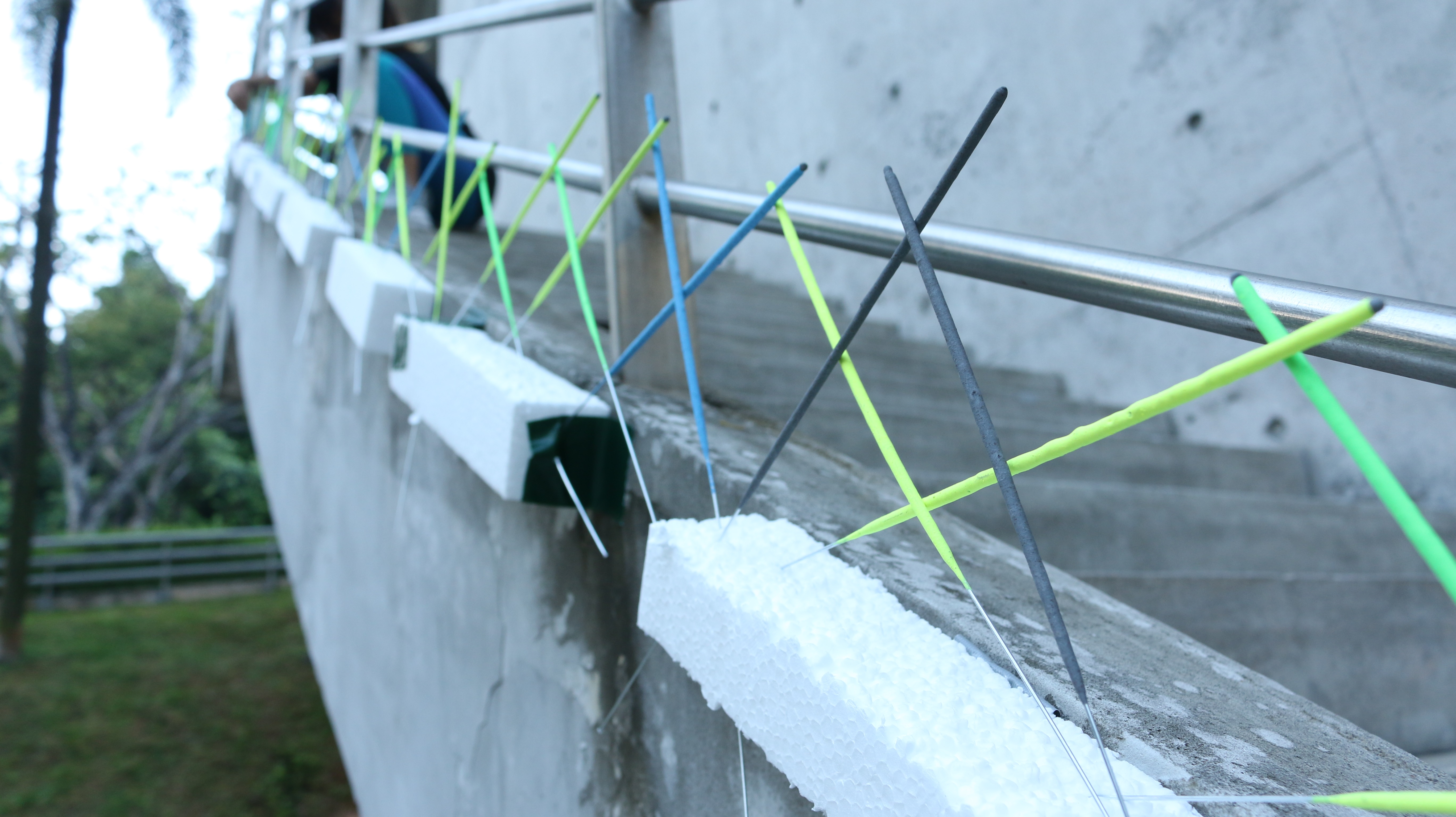
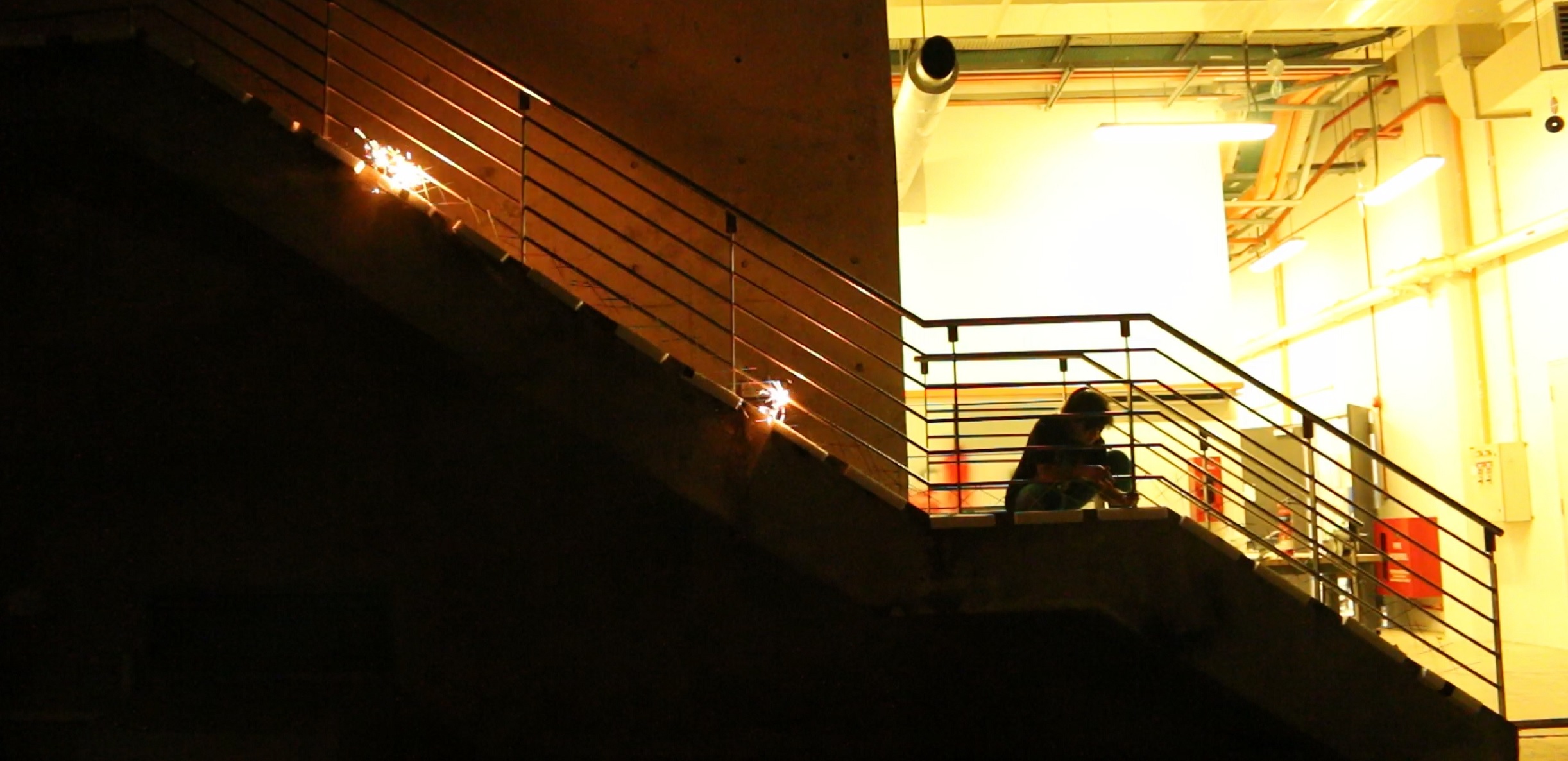
A Hundred Lit is a site-specific installation featuring 130 sparklers lined up along the edges of a flight of stairs. Arranged in a crisscrossed fashion, the flame from one sparkler is transferred to the next, allowing the spark to travel from one end to the other.
By Joan & Tiffany
Initial Ideas
1. Googly eyes
Pasting googly eyes of different sizes onto different objects within a room, to give life to inanimate objects and suggest relationships between nearby objects.
2. Teabags
100 teabags hung onto a rack, where users can pull them down individually and place into their cups. Or, to diffuse 100 teabags into a large tank of hot water to observe the diffusion process.
3. Sparklers
a) A bundle of 100 sparklers wrapped up as a gift, then light it in an open space and see what happens!
b) Line up a relay of 100 sparklers along the outline of the platforms in the sunken plaza. Film the burning process at night from the window at level 2 to see the moving outline drawing the shape of the platforms.
Problem: it was too windy at the Sunken Plaza, it was very difficult to light up the sparklers and there was a high chance of them being blown out by the wind.
Process
From our first testing of sparklers, we found that as long as there was a point of contact between two sparklers, one would light the other (they have chemistry) and sparks would fly… resulting in 2-6 mini sparks burning in different directions.
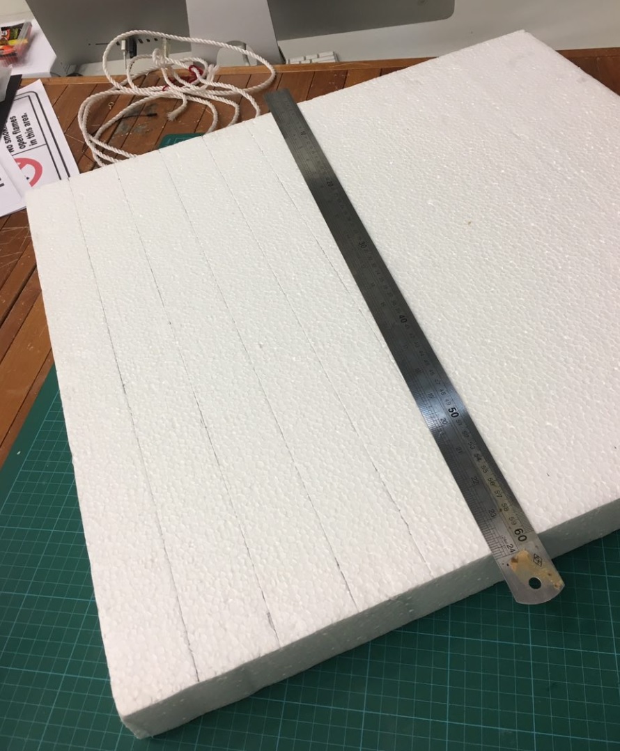
Since we needed bases to support our sparklers, we decided to use styrofoam pieces of 5x5cm rectangular bases.
Location choice: Instead of seting up our sparklers at the Sunken Plaza, we chose the stairway behind the ADM carpark instead as we found the added height would make a more interesting composition.
One challenge we faced was ensuring that each sparkler had the right amount of tension and were firmly connected with one another.
SLOW BURN
The burning process took a very long time, and the relay of sparks got cut off several times when the spark failed to transfer.
Overall, it was very fulfilling experience as we managed to burn all 130 sparklers, although the whole process took about 2.5 hours.
This reading discusses about what constitutes a good design and the thought processes that should go through every designer’s head. While there are many different definitions of what a good design is and what design theory means, this chapter gives readers a general idea of core design concepts, and the scope of what should be considered when embarking on a thoughtful interaction design.
The design process encompasses the designer, the resources and the situation at hand, and by considering these elements, newly created designs should aim and participate in problem solving. Unlike logical problem solving, this sort of problem solving is an ongoing process that influences people’s work, leisure and everyday life. On top of that, this chapter generally emphasised on the importance of having a good balance between aesthetic design and its functionality, which in turn constitutes a thoughtful design.
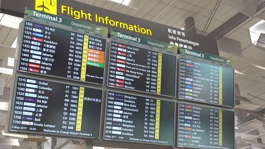
One example of a relevant design with very practical consequences – Changi airport flight information boards, commonly found in the large areas near the entrance of the terminal:
6 LED flight info displays at Terminal 3Split-flap display at Terminal 1
The efficiency of information transfer between the user and the boards lies in its design. Ideally, the user should be able to refer to the displayed information comfortably, find and effectively remember the details of their flight within a short amount of time. Personally, I prefer the design of the split-flap display for both its aesthetics and functionality.
Visual clarity
Unlike the downward layout of split-flap displays, LED displays lack direction and clarity when all six pages of information are displayed at once. With their attention already divided, one can easily lose track of their search if the information on the screen changes with no warning, resulting in a slower transfer of information to its users.
Tangible vs digital
Despite living in an increasingly digitised world, the process of learning is often more effective and enforced through tangible experiences. Physical tools often have a stronger impact than digital mediums. Similarly, the physical qualities of the split-flap display catch the attention of the viewers and draws them to the neat, structural layout of the electromechanical flaps. The metallic flapping sounds of the display alerts the viewers when the information is being updated, giving users a better understanding and a cognitive map of the information that is being presented to them.
Context
Considering the bright interiors of Changi airport terminals, with floods of both artificial and natural lighting in the day, high amounts of light may reflect off the screens, affecting the visibility range of large reflective displays. Split-flap displays, on the other hand, are non-reflective, allowing wider viewing angles, convenience and viewing experience for the general public.
However, when the budget and spatial limitations are taken into account, LED displays are in fact more feasible in some locations. On other levels of the airport with lower ceilings and less sunlight, these displays are laid out on a straight row instead of the 3×2 arrangement.
This also proves Löwgren and Stolterman’s point where:
“The good of a particular digital artefact also has to be judged in relation to the intentions and expectations present in the specific situation. This means that the artefact users’ competence and skills in judging quality has a great impact on how the artefact is assessed.”
Overall, this was an enriching read that presented many interesting ideas and applicable concepts to us, as interactive design students. It highlighted many key points that should be considered when embarking on any design projects, and provided insights about the processes relevant to the design industry.