THE NOVENA DREAM ZINE

THE NOVENA DREAM

Novena Church, or Church of St. Alphonsus, the highlight of my zine. The Church, filled with history and culture, was destroyed recently for renovation purposes. The project, costing 55 million dollars, was planned for years but when executed also meant that the followers that called the Church their second home would be essentially, homeless.

I want to explore the feeling of knowing and feeling the destruction of your own home that people have grown up and gotten used it. Are the years of suffering worth it in the end? So, what is a home?

i. Self +/ Exploration

When I drew out Novena I was sorely disappointed as I really wanted to do my own home town, Yishun. I had many crazy ideas for Yishun but was glad Daryl was the one who got it. 

So Novena, the only impression I had about it was that it was very much a sporty and medical town. It was quite an identity for them after some interview with friends. But they also suggested me to check out Novena Church as many couples from all walks of life would gather to get married in their great Cathedral. 

Being a wedding photographer and videographer myself, I was naturally curious as I’ve mostly been shooting hotel weddings. After research, I found out that they’ve been undergoing renovations for awhile and would be reopening this year. 

Excited, I emailed and facebook messaged Novena Church but did not receive any response for over a week. I tried to do my own research and explore different angles of how I want to portray Novena Church whilst messaging the Redemptorist Singapore group which was incharge of Novena Church. They were not the most responsive group but they provided much information about what I needed to know.

ii. Communication & Research

I was referred to the head of Novena Church’s library and communication department but they were not very responsive and I had to engage in my own angle and take of the Church without too much consultation.

I explored various ways to portray the Church such as: Renovation and Reopening, The Old Novena Church, The Cathedral of Novena Church, Redevelopment Prayers, The People of Novena Church, Death & Rebirth.

The current theme of the Zine was a mixture of a few of the above themes and I tried to give a narrative to it as well. It would be a simple 3 act structure, establish obstacle resolution

iii. Proposal

http://novdream.businesscatalyst.com/index.html

iv. Narrative

After deciding on the theme, I went to write the narrative of the entire zine. ¹I wanted to start the story with what it is now, a desolate wasteland from the renovation. ²From there I wanted to show that beyond the destruction, there are the people who were affected, the followers and their state after the lost of their homes. ³But beyond that, I wanted to show that there is a silver lining behind everything.

v. Art

For the proposal, i drew a logo and I thought it would be branding material for the actual zine but that logo never came to be used in the end.

Usually people would plan out their layouts before engaging in drawing anything. I kinda lacked the inspiration to start because of the responsiveness so I just went to do some doodles and sketch ups of what I think would be a cool 2 page spread. That doodle kind of became a 1 page spread and kinda evolved into the cover page you see now.

from pencil, ink, photoshop clean up, primary color scheme before final one you see on coverpage.

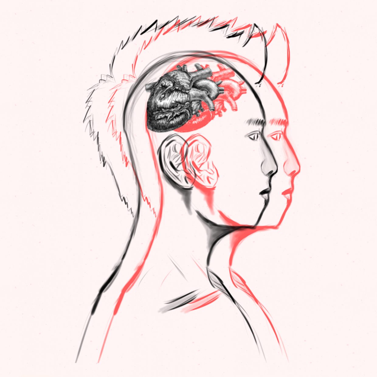
It was supposed to represent Novena Church’s most prominent aspect, the Grand Cathedral. I worked with several low resolution pictures on the internet to map out what exactly is where and how a “renovation” might look like in a more dramatic context.

I also penciled and inked some cool people to be our lost christians

I wanted an abstract tone to this page to break the formality of the zine. Kinda wanted it to stand out and give a confused feeling to the reader, which is exactly what the people of Novena Church are feeling.

vi. Layout

Now with the materials I kind of had with me, I could decide properly the layout I wanted. Instead of just typing everything out it’ll be better if you just see the amounts of revisions I had for each version and how they slowly changed and evolved.

There were certain spreads that I was going quite experimental and pushing boundaries with what I could do. A lot of my ideas involved cutting and printing on transparent paper to achieve a stained glass look.

vii. Reflections & Finale

Technical feedback wise, I’ve learnt that book fonts can go up to size 8 and it would still be legible. Previously I thought it was 11.

For paper choice, I think I made the right decision to go to RJ Paper at Kovan to slowly pick and choose the appropriate paper I wanted to bring out my zine. A classy cotton paper of A2 size was cut down by the staff to aid my printing needs.

And for printing wise, I had to print a few times because it turned out too dark. I upped the overall exposure on Photoshop after exporting it from Illustrator to get the exact colors I wanted. In the future, I’ll be taking the advice from Daryl and will be printing with RGB setting as it makes the colors much more vibrant and less dark.

Received a bunch of feedback regarding my middle spread page and how it could’ve been clearer. I now understand that abstraction in art should be left in Fine Arts(or at least not in a zine) as the primary goal of a zine is to inform the readers of its contents and not let them think through visual references.

Overall, I felt I pushed myself a lot in this semester as compared to the previous one as I really wanted to do graphic design (seriously) one last time before streaming into my major.

It was a blast learning and being taught by the famous Mimi and thank you, most importantly, for inspiring me to think out of the box!

/2d end

EGO: HERO (OUTCOME + RESEARCH)


Processed with VSCO with hb1 preset

The Hero’s Journey

I have always been a digital cartoonist, rarely drawing anything on paper ever since my polytechnic days after I got my wacom tablet so I wanted to challenge myself and push myself to do more and to go back to my roots.

Have always been a big fan of comic book drawing styles, especially the vintage ones drawn traditionally with pencil and ink. Most of my work today are inspired by fellow Singaporean artists that joined Marvel; Benjamin Ang and Sonny Liew.


ARTIST REFERENCE | DEVELOPMENT | FINAL


ARTIST REFERENCE

Sonny Liew

Quirky, light ink inspired some of pieces and gave a lighter tone in some of my pieces.
The soft color board also influenced my choice of color to tell a story. A newer age of comics but still brings a subtle vintage tone to it.

Jack Kirby

And of course the legend himself, Jack Kirby, the really nice uncle that everyone likes of comics, next to Stan Lee of course. His style single handedly changed the way people viewed visual novels everywhere. Thick black strokes coupled with vibrant colors and the use of pen techniques like hatching to bring out shades was truly a MARVEL of the era.

Benjamin Ang

Benjamin is a new aged artists and this brings a whole new dynamic to the style of comics he draws. It was important for me to study how digitally drawn art differed from modern style to the more traditional vintage style.


DEVELOPMENT

Initial stages were very tough as I had too many ideas and was trying too hard to utilize different mediums to stand out from the rest.

I finalized on a single narrative about the coming of age of a super hero that would reflect my life.

ACT I: A fat boy decides to slim down. Becomes more confident and gains leadership and charisma. Learns skills from a mentor(the internet).

ACT II: Defeats foes on the internet and calls it his own.

ACT III: Gets destoryed by the one thing he calls his home. He realizes maybe this is not the Hero’s Journey he expected afterall.

For a compiling narrative, I needed compiling and complicated visuals.

Had wanted to do pancake art but after trying out, I realized I wasn’t much of a pancake contemporary artist.

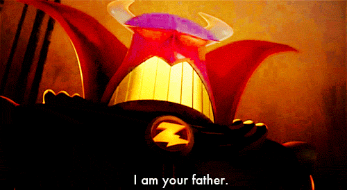
(pardon the stock image)

I also explored mediums of color gels, lights, shadows and an installation style but was told it would sway from 2D to become a 3D project.

Upon browsing through shadow images, I thought of something I’ve seen before on pinterest and wanted to execute the concept.


(again, pardon the stock image)

The concept seemed cool and it went along well with my narrative, most of which started with (Me) at a certain age in my life and the reflections would lead their way to the 3rd box of each series.

But as I googled for more images, it seems someone has already used the concept. I was devastated. 🙁 I even did a mock up of a low poly of my face to test out the artistic style if it was suitable.

I had to change my idea completely. The images below would be all the versions thus far I’ve changed in AI and a journey into my thought process.

screen-shot-2016-11-21-at-10-26-58-am
(v1-ish: Tried poly and my style of cartooning)
screen-shot-2016-11-21-at-10-27-12-am
(v2: tried to digitally recreate traditional art works only to realize the reason why comic book artists spend hours on paper, pencil and ink)

drawn

Hand drawn and inked.

animated

screen-shot-2016-11-21-at-10-27-34-am
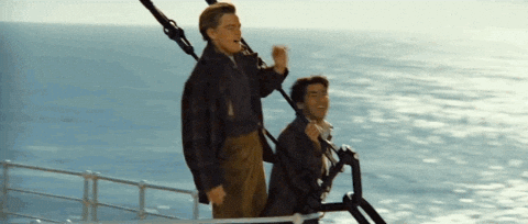
(v3: before the final touch ups and the last panel)


FINAL

screen-shot-2016-11-21-at-10-27-39-am(v3.5 aka final: fully colored and ready for print)

Triadic colors of the primary colors were chosen as they not only represent the metaphor of the hero, but also the state of mind I was in during at age.

Blue: Young & Innocent
Red: Hot & Passionate
 Yellow: Powerful & Dominant
White: Lost & Empty

screen-shot-2016-11-21-at-11-03-22-amMe(Young) + Hero’s Training = Strong & Bold

Always had a strong desire to protect and to be brave. When I was young, I was quite fat and as a result, was bullied very often. I decided to never become like one of those bullies. I’ve read comics my entire life and decided I wanted to a super hero. When I was 16, I was determined to lose as much weight and to be the person I always wanted to be; a strong, bold and courageous person.

screen-shot-2016-11-21-at-11-03-29-amMe(Teens) + Too Much Time On The Web = Develops Skills

During my teens, I was the odd kid in class because I was deeply in love with the internet and photoshop and photography and film. The internet came out of no where, took me by surprise and I made it my own. I learnt many things and developed skills that no 14 year old would know.

screen-shot-2016-11-21-at-11-03-35-am

Me(Not So Young) + Meets Technology = Finds True Calling

In polytechnic, I was truly exposed to technology. Thousands upon thousands of dollars of equipment was mine and thus it enhanced my skills and turned me into something that I never would have imagined. I have found happiness, bliss in technology.

screen-shot-2016-11-21-at-11-03-45-am Me(Now) + Life = Not So Much Of A Hero

I am now in university. The passion, overused from work and assignments, not doing what I truly love but what others deem to be necessary. I feel restricted. Unable to run. Is this what I truly wanted to be?

RHYMES: The King, The Knight, The Jokers, The Father

photo-28-10-16-1-43-42-pm

The King, The Knight, The Jokers, The Father

With a specific theme in mind, I found quotes that were iconic and conveyed what I wanted to say. The visuals had to match the scene of the quote. It would be more impactful that way. I wanted to show depth and layers of the movie, easter eggs, visual metaphors.


The Knight

tan_junkang-terminator

I wanted to show the Terminator in its purest form, a strong mercenary with a compassionate heart, like a Knight. A gentleman was used to show his character.

No doubt the most touching sequence in the Terminator was whence he sacrificed himself for the greater good. The iconic scene of him waving and turning into a (Y) sign particularly struck me when it came to doing this quote. The negative clouds on the bottom of my visuals were also used to represent the lava that took his life but also to show the consistent theme of fire through his resurrection and birth from flames when he time traveled over to the present.

A skull was used as well to show the consistent themes the movie had with it. I had altered the skull’s eye sockets to look like a pair of sunglasses as the original Terminator would wear it quite often. I have also added in an eye ball to pay homage to his death scene in another Terminator movie. The U-Turn sign was used as a symbol of going back.

This line has inspired many sequels and breathed new life to the protagonists of the Terminator franchise. A quote that sets the past, present and future of its franchise.


The Jokers

tan_junkang-findingnemo

This is an ironic one. In the actual sequence, 3 different types of sharks were declaring veganism as they felt consumption of other fishes was as good as cannibalism. I wanted to show a level of sophistication that these animals have, thus, gentlemen.

The goal was to make an ironic mesh-mash of conflicting styles to show the delusion and incongruous nature of the quote. I purposefully pulled reference from 80s children’s storybooks, 2000s cartoons and vintage and realistic visuals.

I drew much reference from Spongebob Squarepants, a cartoon from the 2000s that showed the friendship between a sea sponge and a star fish. I incorporated much of its light hearted visuals into the design to emulate that friendship.

I watched this movie when I was 8 and it left a big impact on me. Big enough for me to swear to never eat fish because they are friends. I also have many pet fishes as they are also my friends. It’s also ironic cause I keep them in the kitchen, where they can see my family eating and cooking fishes.


The Father

tan_junkang-starwars

Perhaps the most iconic quote in cinema history. How could I not do this one? Star Wars is a franchise close to my heart and it took me multiple attempts to get this one out. Lions were used because contrary to popular belief, lions are terrible dads.(cough, darth vader was a terrible dad too, cough) They leave their young(cough, vader, cough) and won’t acknowledge them until they are old enough to join hunts.(cough, vader fights luke, cough)

Star Wars was basically a movie about family drama if you think about it. Angry dad, son and daughter fighting for redemption, dad punishes insubordinate son, son kills dad and restores peace to the entire universe. You know, typical family drama. So I made it look like a family portrait by giving it a vintage frame and added a pinch of asian family drama. “THIS IS WHAT HAPPENS WHEN YOU DON’T GET AN A! OR WHEN YOU DEFY THE OVERLORD OF THE DARK SIDE!” They get the cane. Or in this case, a lightsaber to the paw.

I think I was able to find a balance of wit, humour and the actual seriousness of the scene in this graphic. Hits quite closely to home as I was punished very often at home and was glad I was able to convey those feelings.


The King

tan_junkang-titanic

I’m the king of the world! A common phrase I told myself during polytechnic days, I was the best at what I did, I answered to nobody, and had the time of my life. However, all that ended when the reality of 2 years in service. What I wanted to show was more than just a mere quote, I wanted to show the consequences of a declaration like that, and what is to come.(something like what happened to titanic)

The closer you look, the more things you’ll find. A consistent theme in all my designs, but this one in particular. We’ll start from the top; The King Of The World, a king of DIAMONDS with a globe face. The top portion already explains the entire quote. But let’s go alittle bit lower. We can see the mast of the ship that Jack proclaimed kingship of the world. We can also see the titanic and a sunken titanic in the quilts of the King’s innerwear.

The HEART shaped DIAMOND that Rose wore was an integral to the story. If you look closely, the King’s hand is in a open palm position relative to the diamond, as if he was dropping it.(which was what happened in the movie)

Let’s look at the bottom(pun intended) now. It’s the Jack of HEARTS. With a Rose face. Perfectly aligning the J ❤ Rose. Showing that Jack loves Rose. The Jack is also wearing a diamond necklace to show that the necklace has sunk into the ocean with him. There is also the iceberg that caused the sinking in it.

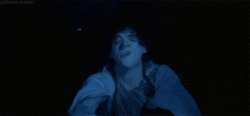
I chose this as my final outcome as it shows greater depth in not only the quote, but the entire movie as well. At a glance, people are able to pinpoint the quote, but people who have watched the movie would have caught many interesting easter eggs from this. Not only that, the consistent theme of the visuals also give a coherent and appealing look to the entire design.


The Making Of

screen-shot-2016-10-31-at-1-23-36-pm

Rejected/Prototypes

Most of the rejects were just brainstorming visuals like Avengers Assemble!With Great Power Comes Great Responsibility and Why So Serious?

In the end, the visuals were just not compelling enough to be used for final submission. They lacked attitude, style and just didn’t fit my general theme.

PRE SILK

screen-shot-2016-10-06-at-10-20-38-am

“I’M THE KING OF THE WORLD.”
Jack Dawson, Titanic 1997

screen-shot-2016-10-06-at-10-20-48-am

“WHY SO SERIOUS?”
Joker, The Dark Knight 2008

screen-shot-2016-10-06-at-10-20-58-am

“FISH ARE FRIENDS, NOT FOOD.”
Bruce The Shark, Finding Nemo 2003

screen-shot-2016-10-06-at-11-08-05-am

“I’LL BE BACK.”
The Terminator, Terminator 1984

screen-shot-2016-10-06-at-11-08-59-am

“I AM YOUR FATHER”
Darth Vader, Star Wars: The Empire Strikes Back 1980

Emo Life: The Making Of

Processed with VSCO with hb1 preset

Mark Making Elements

Processed with VSCO with hb1 preset

Mark Making Mk I and Mk II

Processed with VSCO with hb1 preset

Mark Making Mk III

Processed with VSCO with hb1 preset

Artist References

Processed with VSCO with hb1 preset

Trying out different mediums of Mark Making

Processed with VSCO with hb1 preset

Processed with VSCO with hb1 preset

Contentment V Lust

Processed with VSCO with hb1 preset

Amusement V Greed

Processed with VSCO with hb1 preset

Courage V Fear

Processed with VSCO with hb1 preset

Calmness V Gluttony

Processed with VSCO with hb1 preset

Triumph V Pride

Processed with VSCO with hb1 preset

Enthrallment V Envy

Processed with VSCO with hb1 preset

Patience V Wrath

Processed with VSCO with hb1 preset

Happiness V Sadness

Processed with VSCO with hb1 preset

Love V Hate

Processed with VSCO with hb1 preset

Final Reflection