After doing my research on my location and deciding on the focus of my zine (ICE CREAM), I decided to get started since I already had plenty of photos of ice cream on the streets. BUT I had no ideas on how my zine should look like.
So I referenced the slides my own group did about zines ( ) THANKS JEROME AND SHU YI
From there, I knew I wanted to do something related to photography zines as I felt the style fit the concept of my zine which was to compare the color tone of cheap ice cream with buildings and shops on Orchard Road. I also felt like I could best present the photos I had painstakingly taken by eating 5 ice creams in one and a half hours.
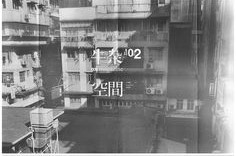
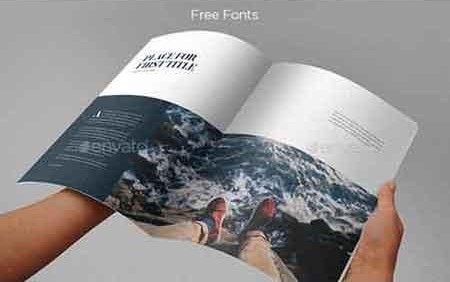
So off to Pinterest I went, in search of zines that I could take reference from. At first, I found this zine which had an interesting spread design that I liked.
But eventually I decided that I wanted to avoid anything that covered the pictures.
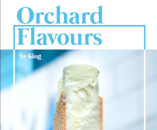
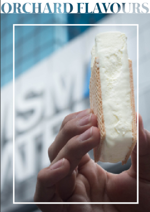
For my cover, I chose the vanilla ice cream and tried to make something nice and ended up with this.
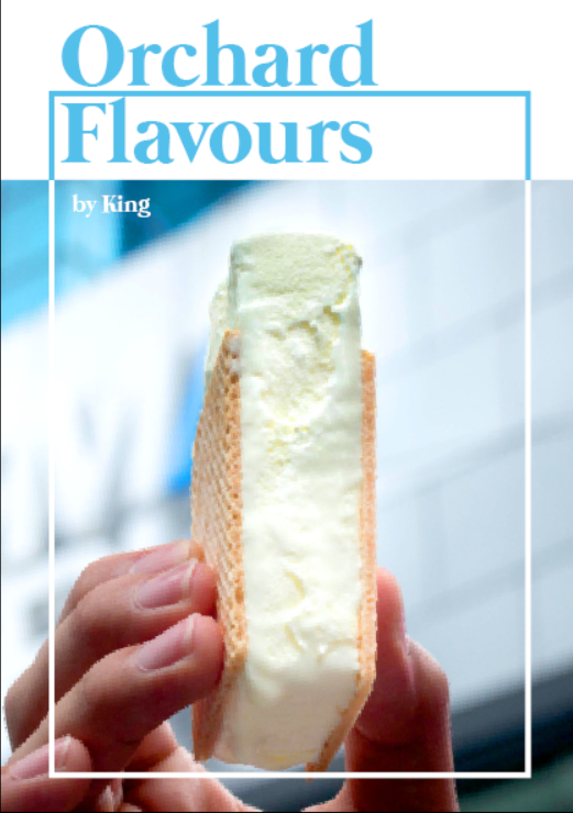
Which was admittedly not very nice. After consulting Ms Shirely, she helped me to refine it a bit more. She also reminded me to think about visual hierarchy and textual hierarchy. So with her help (some playing around with photoshop, levels, saturation and masks + using the rectangle more in the design) my cover became much nicer.
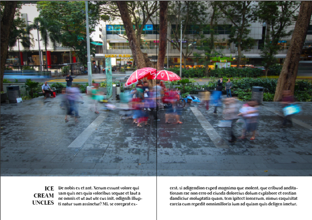
Ms Shirely also did my inside front cover, which was originally this large spread.
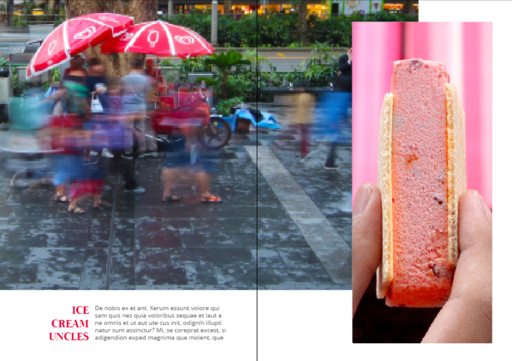
Shirely pointed out that the focus was not really on the ice cream uncle and cropped the image accordingly, as well as using an ice cream that had a similar color to the bright red umbrella
Although I didn’t really like the rightmost image and changed it into another angle of the ice cream uncle.
After my consultation, I would edit all the photos accordingly. After some more searching on pinterest, I found some minimalist photography zines that seemed to work for me.
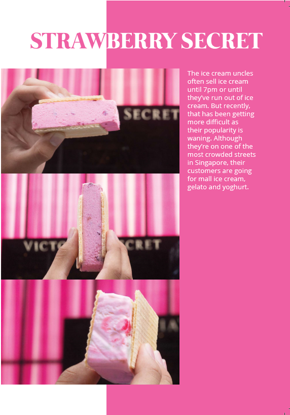
I liked that the overall color tone of the photos was supported by a bar of color at the top. It fits with my original idea of using ice cream as the color palette. So I tried it for one of my pages which was the Strawberry Secret page.
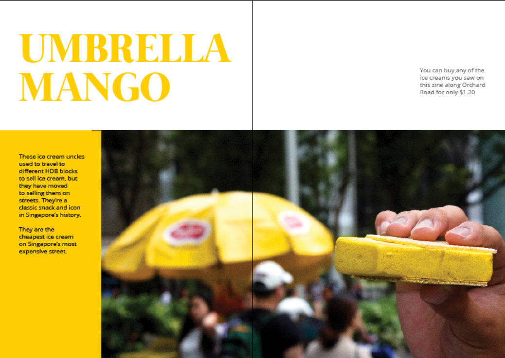
I also got the main idea for my Umbrella Mango spread from the zine on Pinterest. I adapted the color scheme to match the ice cream color.
Lastly for the back page, I mirrored the style of the front cover but changed the color scheme to fit the melting drop of ice cream to represent the fall in popularity for these cheap ice creams. I liked the idea of having very bright colors but the text is in contrast to this and is quite sad.
I enjoyed making this zine because I got to eat a lot of ice cream, as well as learn more about Photoshop and InDesign. I also got to use what I learned/forgot/remembered about design which is definitely a useful skill.
