The data

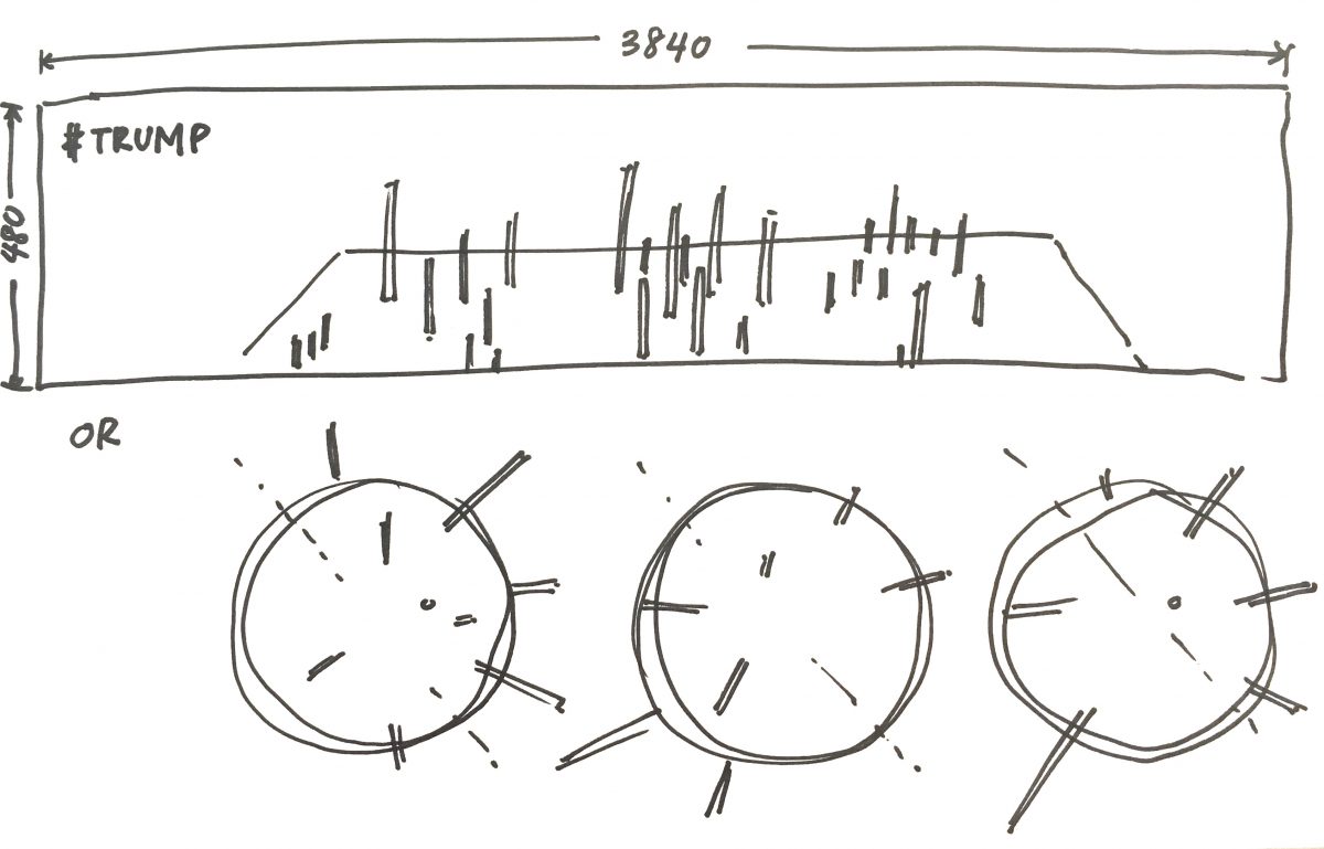
Here is the part where I’m getting stuck so, I’m just going to document what I have been doing for the past few weeks… which hasn’t really been productive in translating into visual results, but I have learned quite some.

From here I think I have grasped the file format with which to write and read my data—JSON (Java Script Notation Object). Through Node js (which is a separate platform from Processing), I can use NPM packages such as this convenient Twit package to get data from twitter.

Shiffman’s Twitter bot tutorial roughly covers that knowledge in a brief way, so it was a good introduction. But he was more focused in post functions in twitter, while I am more interested in the get so I can attain the metadata from twitter. From this at least I learned that I will have to write my own JSON package file that picks up only the metadata that I want.

So with that, I have to figure what JSON actually is. Currently I’m still digesting the knowledge in these lessons:

The main goal here is to figure out from these other projects that Shiffman has done, how to get specific categories of metadata from Twitter, and record it in a JSON file with Node.js . So yes, that’s currently the challenge.

Visuals of the Data Viz

This is a sketch of what I am trying to do… either working on a plane that is rotated (like such) for view, with the protruding data (like Herwig Scherabon); or rotating globes with the data mapped on the 3dimensional sphere. I’m more inclined towards working on a plane, just because it makes more sense, more readable.

A reference that I have been using to learn up: Daniel Shiffman’s 3D Terrain Generation. A lot of what I will be referencing comes from Shiffman’s Youtube channel The Coding Train, I’m trying to understand and use parts of each of his projects to build my own.

I played around with the code which he made available here on Github, but really all I did was to see how I can change colours and sizes and constraints.

My main takeaway from this is learning how to draw a grid with flexible x,y coordinates in relation to the screen size within Processing. This is so hopefully I can attach the long and lat coordinates of countries to a grid and manipulate shapes on each coord point with the extra dimension of height.

Another useful reference: 3D Earthquake Data Visualisation also by Shiffman (because Shiffman is king of teaching coding). Actually, this may be the most useful with what I’m trying to do in terms of planting the data by location, but I will have to map on a flat plane instead of a 3D sphere.

Shiffman’s code for this project available here on Github.

The Idea: News Accessibility Around The World

The idea is compare international news accessibility all over the world, by visualising the consumption of a global trending topic in all the nations of the world.

First I will need: data (live, constantly updated)

  1. Trending news topic—this topic has to be global, predetermined already by a news source. Potential sources could be trends.google.com or @trendingtopics on Twitter.
  2. Metadata—collection of “mentions” about the trending topic in various forums/platforms. I will need the information, the metadata, of the “mention”, namely the quantity, location and time. Potential sources I intend to look from include Twitter and online news networks (preferably, the national paper of the country).

Second I will need: visual

  • Processing sketch, likely utilising P3D (for 3-dimensional visuals)
  • The data (quantity) will have to be geographically by nation.

My main visual reference will be Income Inequality by Herwig Scherabon

Challenges I expect to face:

Really, I’m most worried about collecting the data, especially working with live feeds. Previously I had worked with static data that was already recorded and formatted. I intend to first figure out how to import data from Twitter (which is live and constantly updating, so it could be more dynamic), which will be my main challenge.