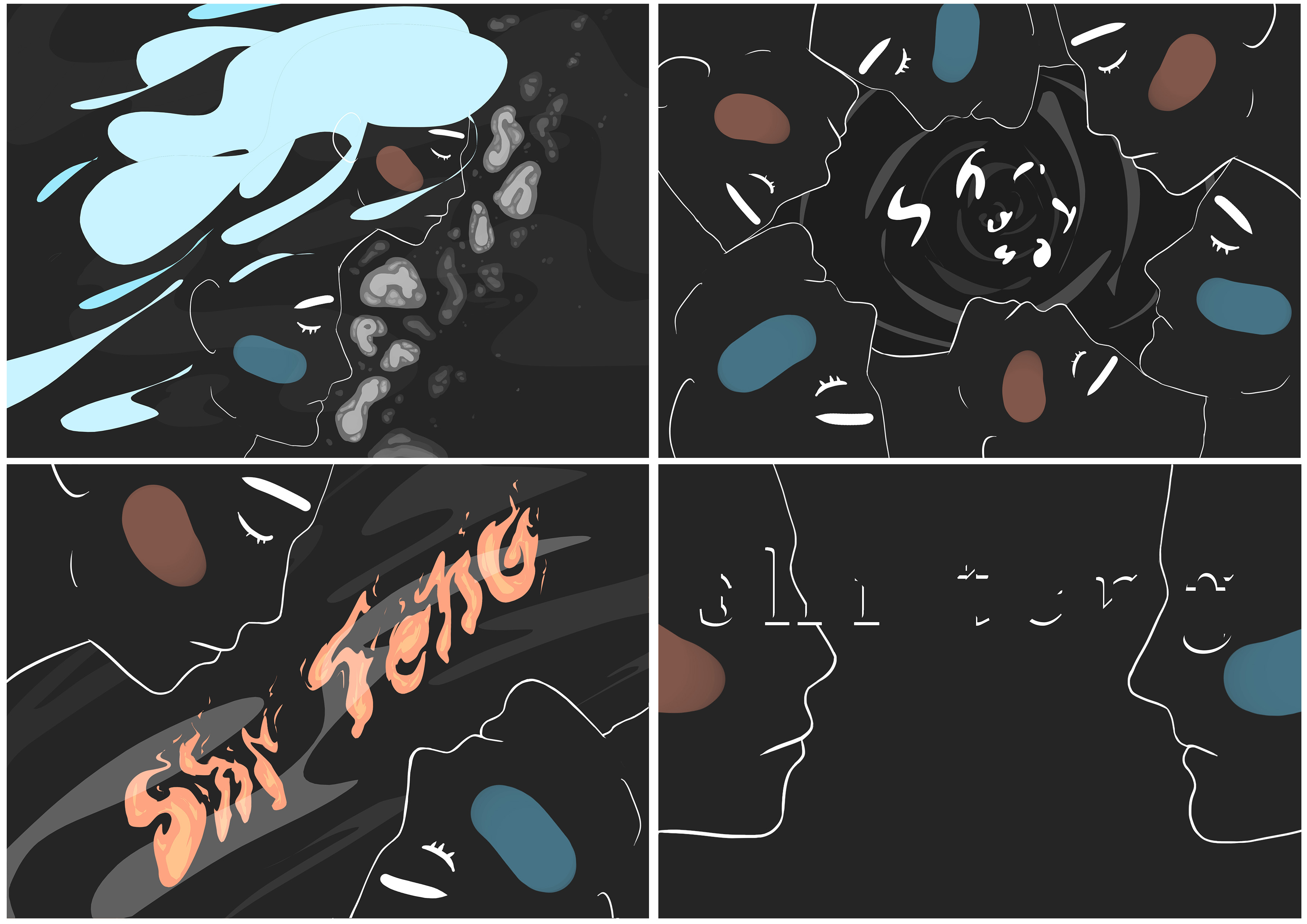
My four jobs:
Coursing River, Great Typhoon, Raging Fire, Mysterious Moon
Since the last consultation, it has been concluded that I needed to tie my visuals more to the message I was trying to convey.
I started off with re-looking at my message, “Women can be these things too” and rephrased it to become “It doesn’t matter man or women” which I found resonated with my neutral stand better as I wouldn’t consider myself a passionate feminist, and gender roles is such a grey area to me.
From here, it was coming up with new designs that would convey the message.
With my previous female-centric stand, I found it tricky to not fall into the confines of gender bias as I thought usage of colours or body forms stereotyped to genders would become a oxymoron with my message.
I preferred the neutral stand as the usage of colours would simply be a representation of the genders instead of a stereotype. Typing “feminist” into the search bar and seeing a variety of designs being pink also helped realign my thinking.
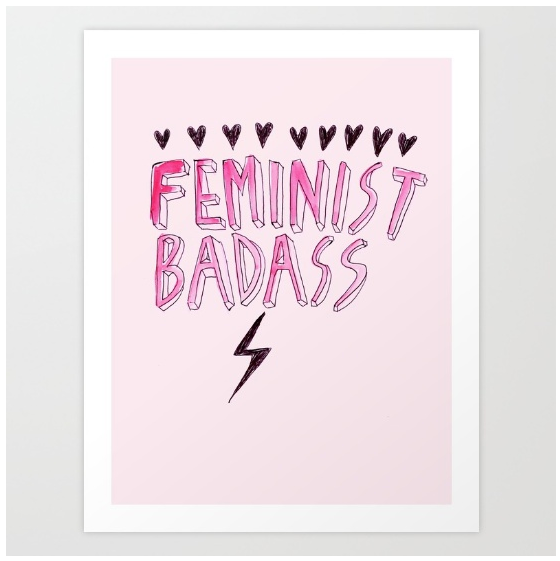
In the above designs, pink was used as colour to help convey the message better and I found that designs with the pink help the feminist message stand out better as compared to the designs in other colours.
Instead of a ‘stereotype’, colours can be used as a signifier, a semiotic mechanic to drive the message as blue and pink could be considered indexes that connects the message – pink commonly represents females and blue commonly represent males.
Secondary Research
(Brainstorming has been documented in sketchbook)
Let’s get down to business ?
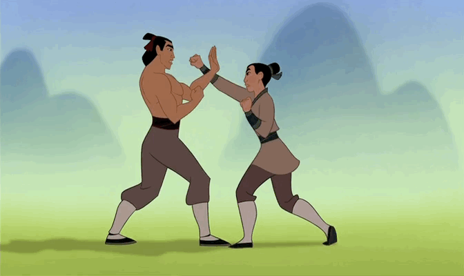
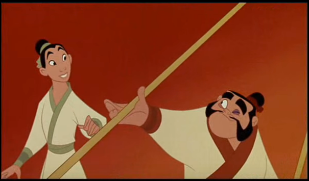
Relooked at the Mulan video for some inspiration!
Like most animations, Mulan’s face is rather minimal and I think that influenced my style.
Also, I really like artist, Henn Kimm’s minimal lines and colours.
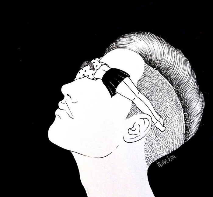

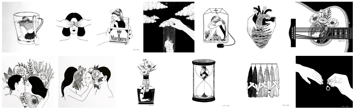
I love how despite the restricted (but strong and contrasting) flat, solid colours and clean lines, she could deliver her illustrations minimalistic-cally. I also like how clean and solid the backgrounds look with no textures, just one flat color.
Redesigning:
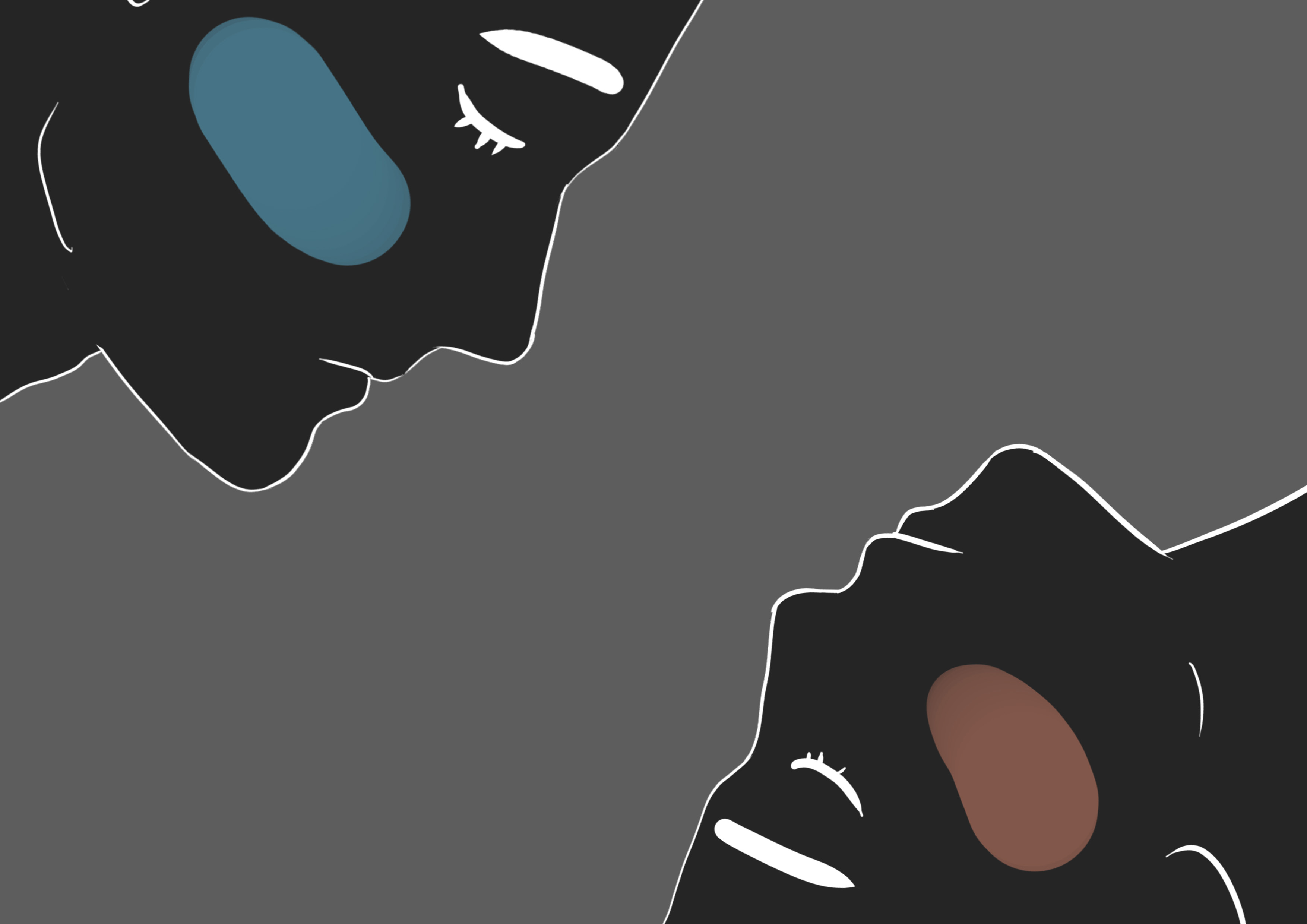
After brainstorming, I came to using faces of a man and a woman. They provide a focal point, and are straightforward, effective and obvious enough to carry my message, rather than using hands or the whole body which could end up in things being unnecessarily complex.
I started off with sketching some composition ideas, and then coming up with the faces, the new main attraction of this series, tracing the carefully deliberated and handpicked side views of a male and female faces.
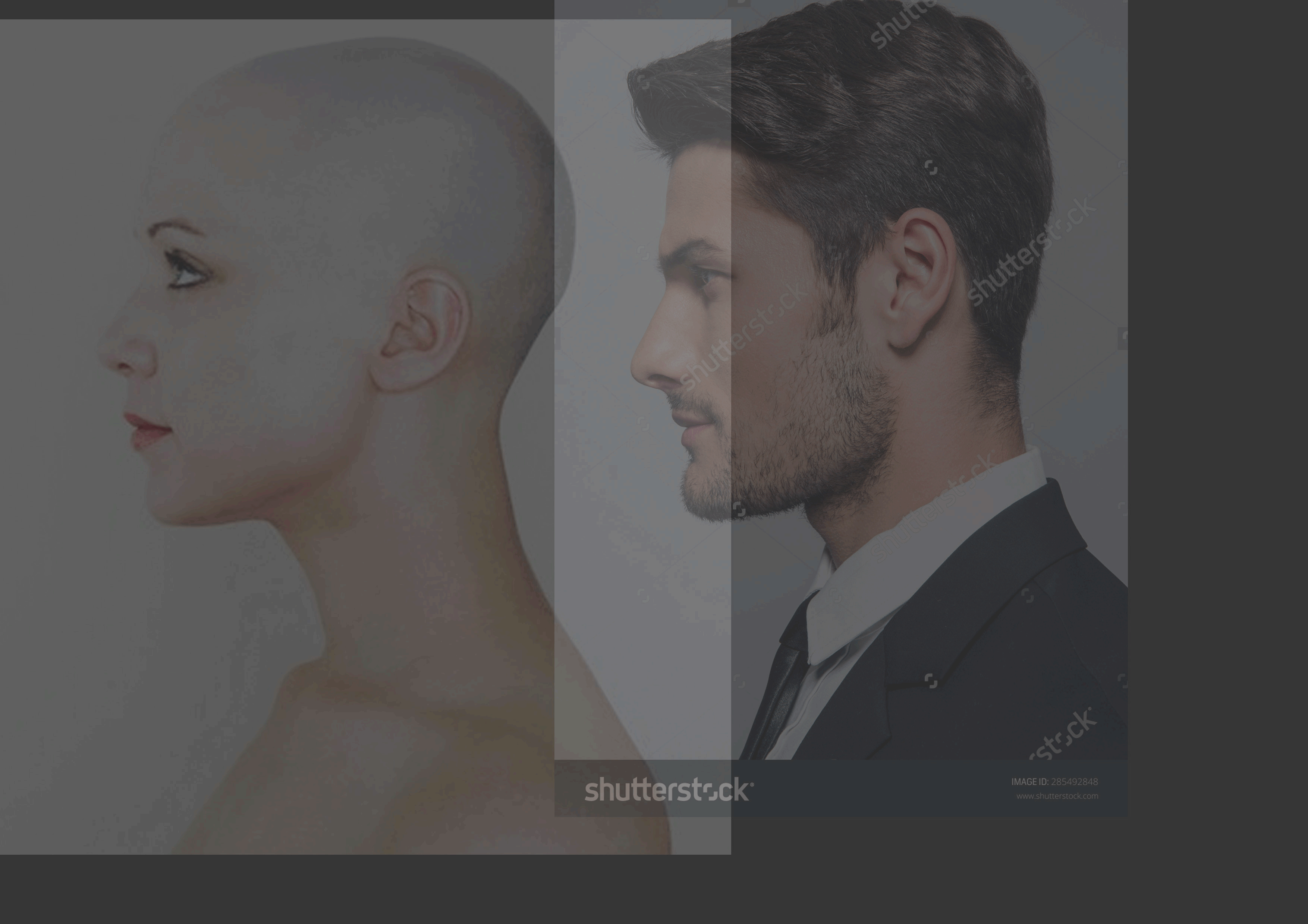
I traced the images instead of drawing them from scratch because I felt like the forms and contours matter. Despite the fact that there are some very pretty Korean boys, men generally have different facial features and structures as compared to women.
I snuck in the differences using minute variations in angles in the brows, lips and blusher.
I thought thick and straight eyebrows would be cute and would stand out, instead of basic and legit eyebrows, since they’re stylised drawings anyway. I feel like they complementing the equally outstanding blushers and help make the design more stylised. Plus, Mulan has thick eyebrows too. (And as everybody already know, thick eyebrows are in trend)

I love including blushers in my works. They’re cute. Especially as seen in local artist Lyyeow’s works:
From here, I guess it is pretty obvious that the overall style for these pieces would be more graphical and stylised – fitting to my major in animation, as well as the origins of the concept, an animation feature.
And with my previous design as a base, I fit in the faces
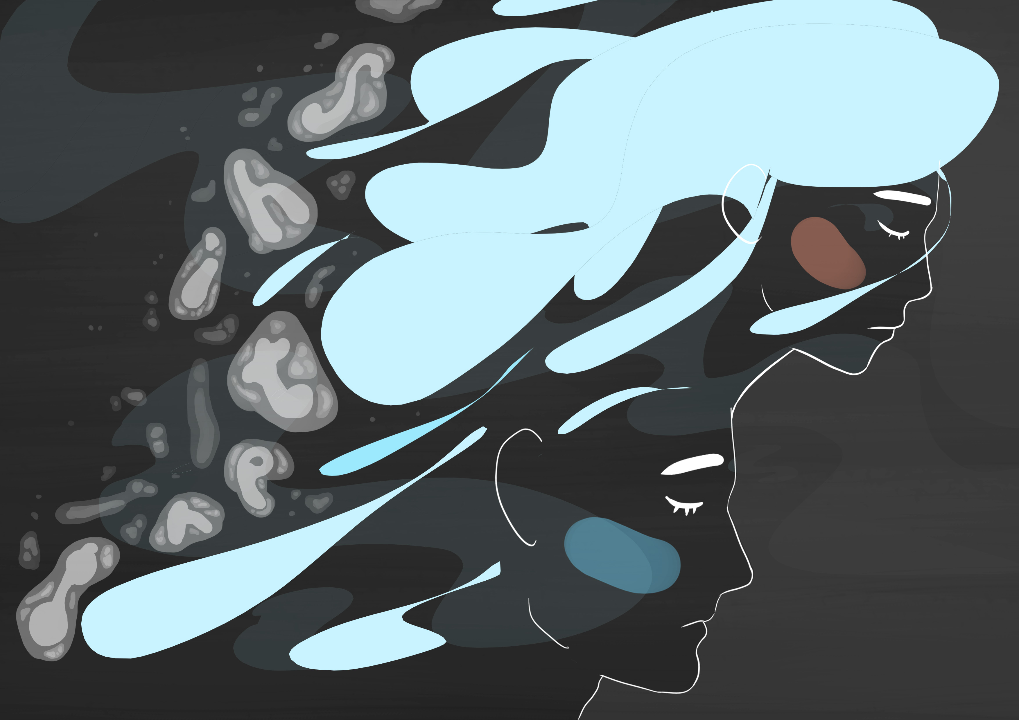
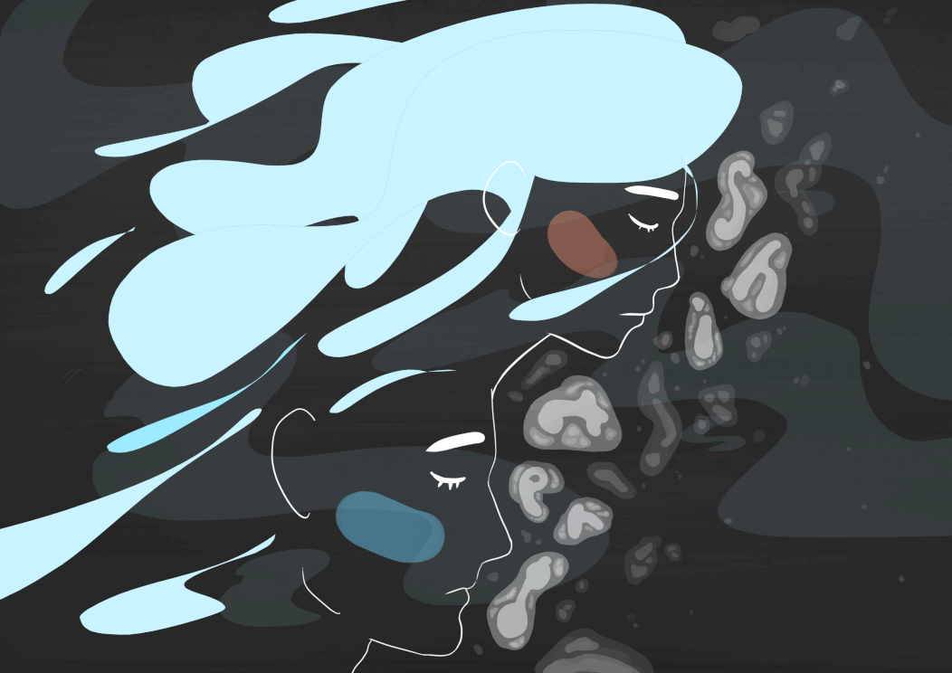
Drew blobs of water for hair because the imagery of ‘swift as a coursing river’ reminds me of hair gloriously flowing in the water.
(It always does, just like in this piece from my Ego project:)
But I used blobby hair this time to match the flat, vector look, and also…
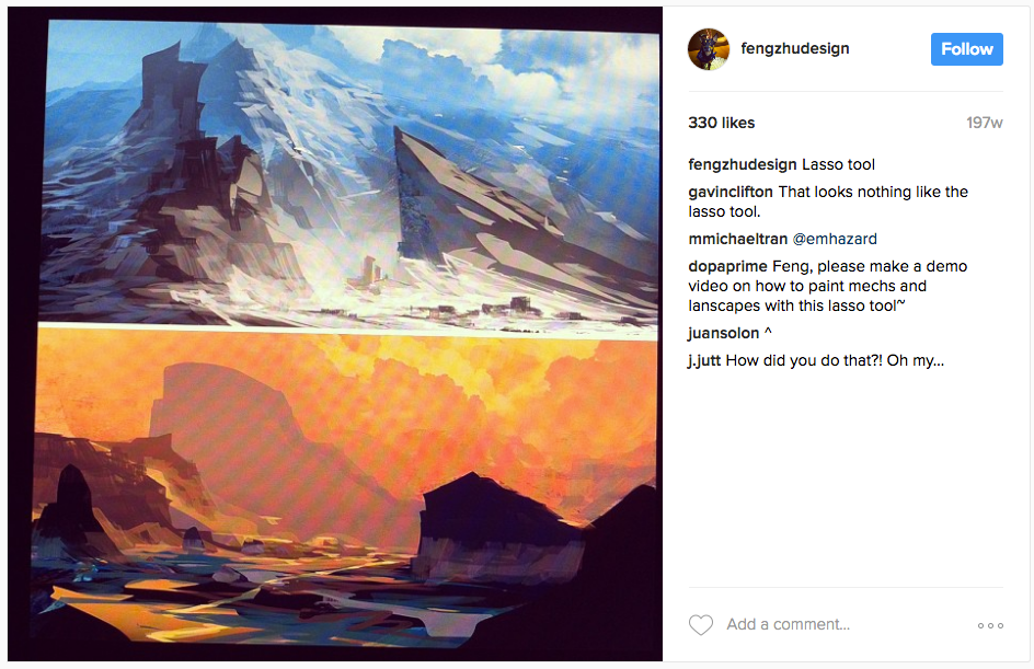
Since the last update, I have decided that the lasso tool is my go-to for this series. It is a secretly powerful tool that if often overlooked as I try very hard to digitally draw smooth flowing shapes. I first came across it while I was watching one of Feng Zhu’s (a concept artist) digital painting videos. Look at what it can achieve!!! It is a secret weapon and I was going to try and make use of it more.
In the compositions above, the type wasn’t working out yet, and the background was still messy – I received some suggestions to try using the bubbles to spell out my name.

Also considered using different kind of foam / bubbles but nope, just nope.
Though there is rather rhythmic movements in the above composition (it was intended for the bubbles to look like it was flowing down the hair to suggest action), I thought the negative space on the right side seemed awkward so I tried to switch it around.
Adjusted the layout, then tried to remove some elements of the original designs (Brush strokes in the background and testing out different colour schemes and opacity).
Eventually the brush strokes were removed to achieve a flatter and cleaner look, taking into consideration that brush strokes /textures might not fit in the other designs as the they were placed initially to help mimic the gradience of water.
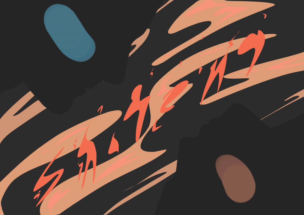
So there, swift as a coursing river, the swiftness is demonstrated in the flowing hair, bubbles and blobs of water in the background.
Originally, I wasn’t going to use dark grey for my all the background, but figured that it was fitting as it helped make the faces stand out as I was working on the Typhoon design:

In the first draft, I used Green and Blues because that’s how a typhoon is seen from outer space (as researched last post). I also thought that the contours formed by the faces made the middle section look like a continent.

But the colours didn’t work out and black worked much better, especially in promoting a style and unity between the four pieces and breaking the predictability of the colours used for my four jobs.
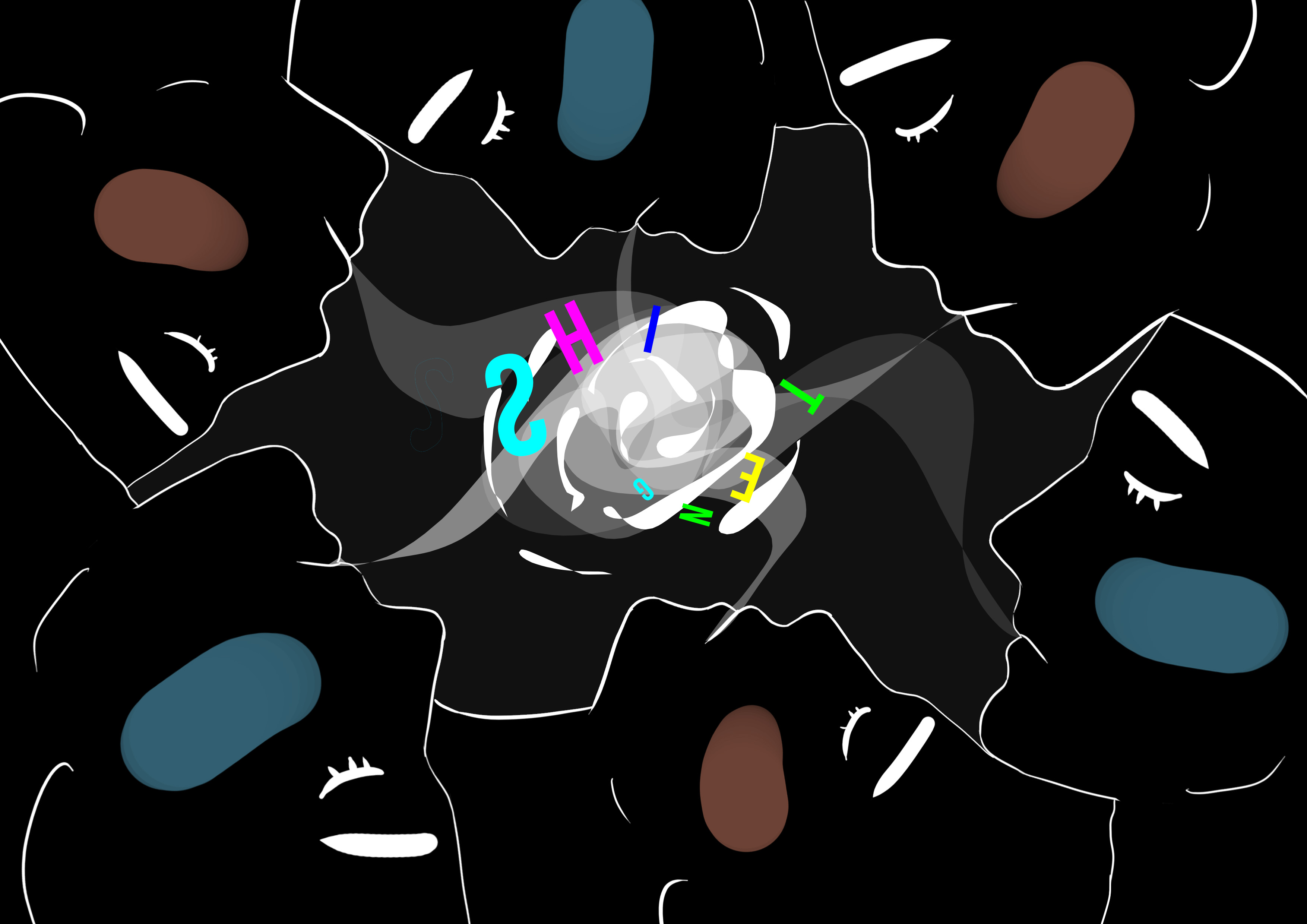
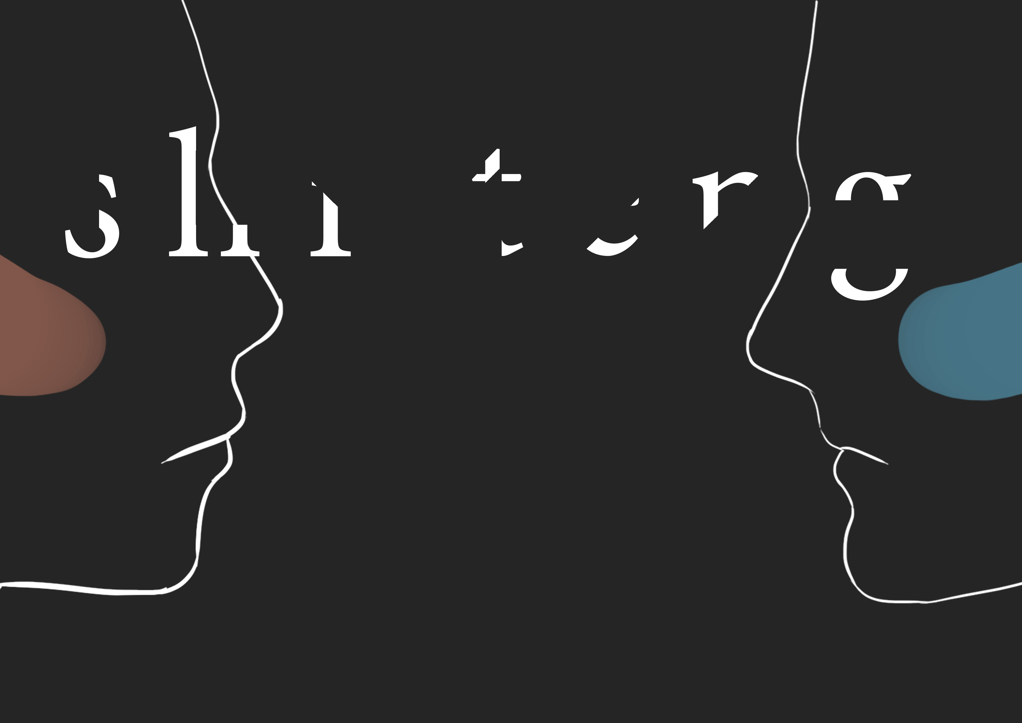
Tried to use the concept of random neon colours (from the previous designs) again but it didn’t seem to work out. Then, I drew my name instead of using a commercial font and attempted for it to look like it was being sucked into the middle.
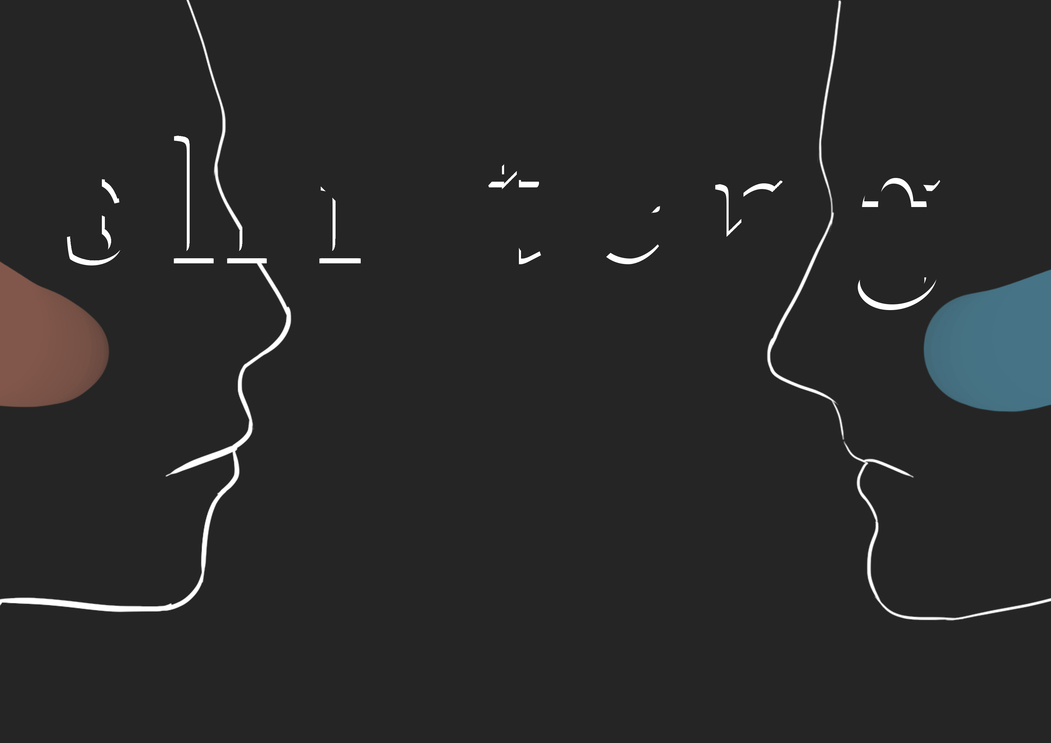
Played around with different ways to signify the typhoon as I thought the first one really looked quite like people smoking.
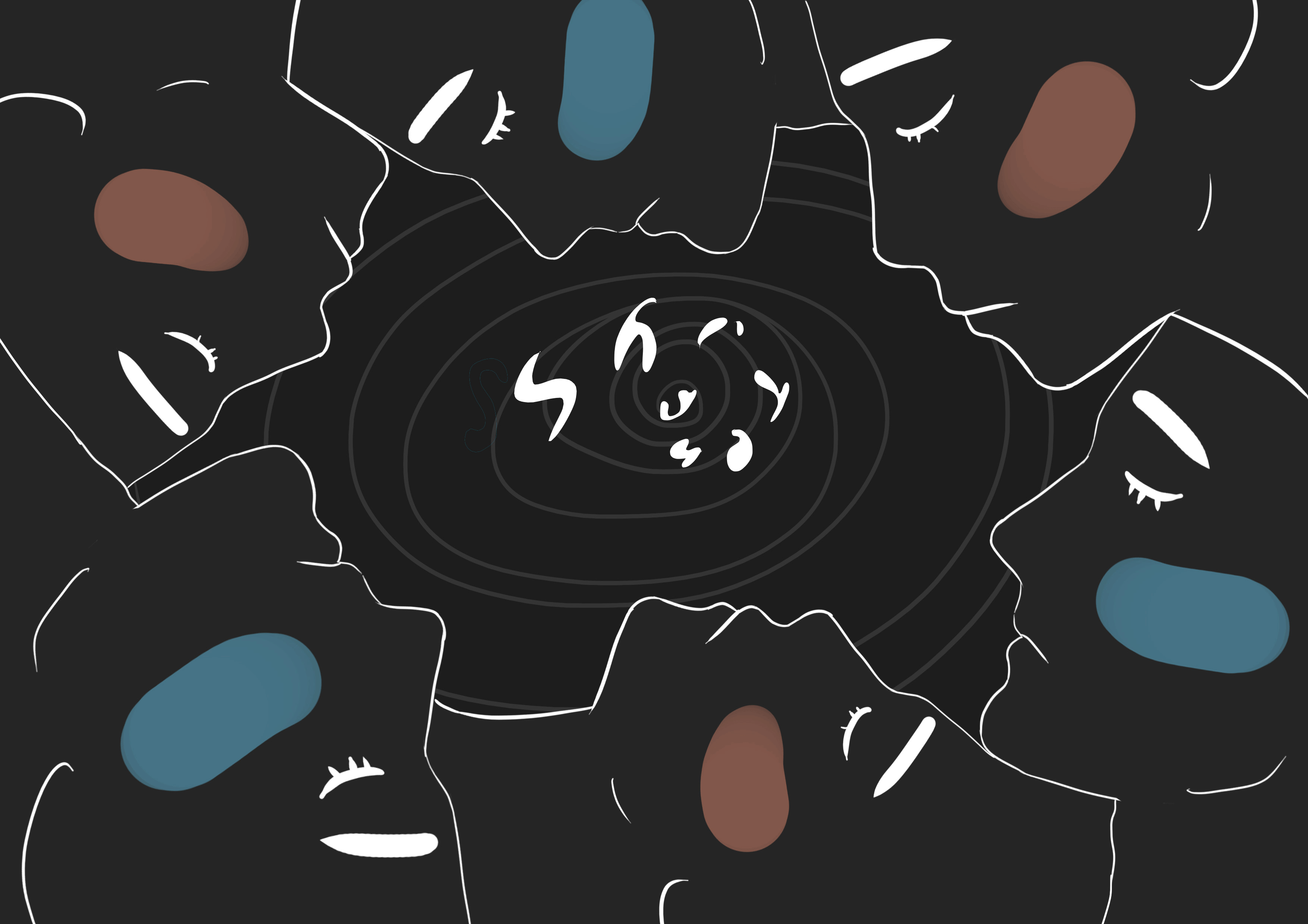
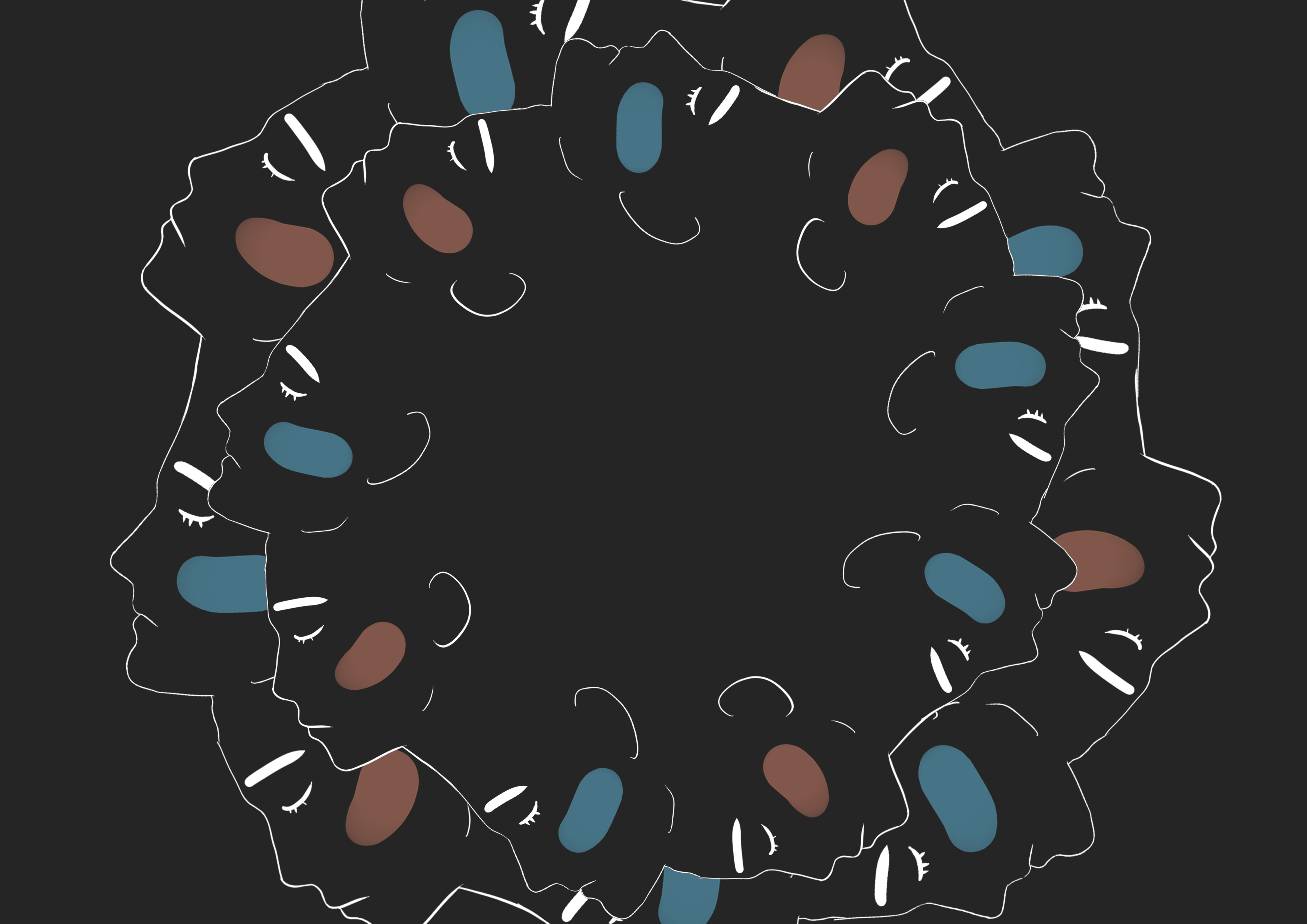
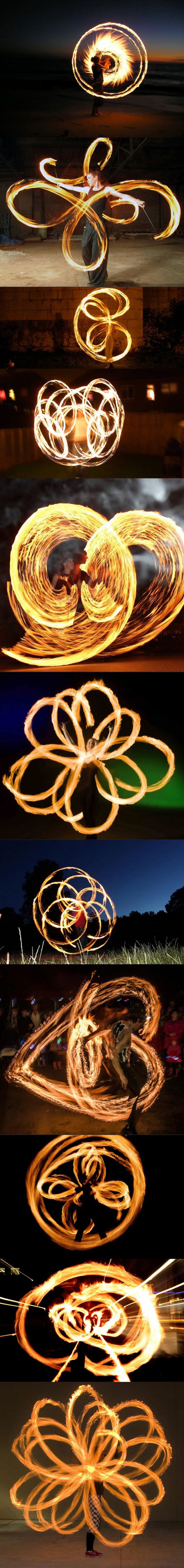
Force of a great typhoon, straightforwardly signified by the circle of people around, as typhoons are just rotating and rotating and rotating and rotating….
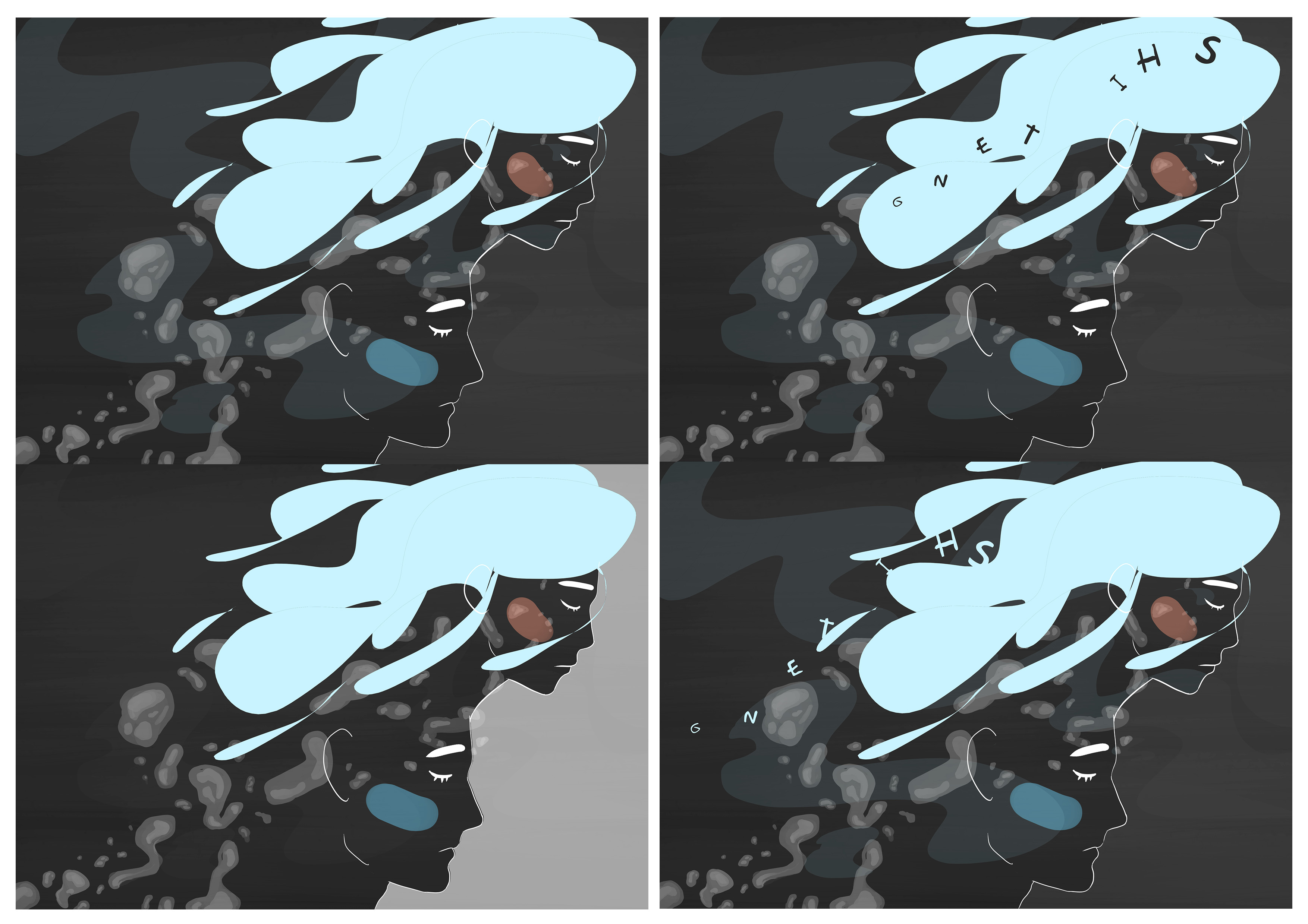
Using the idea of covered fonts form my previous designs, here’s mysterious moon.
I didn’t mention in the previous post, but how the name was hidden (in this version) was inspired by the moon phases.
? ? ? ? ? ? ?
I didn’t realise, but feedback said that it looks like solar eclipses!
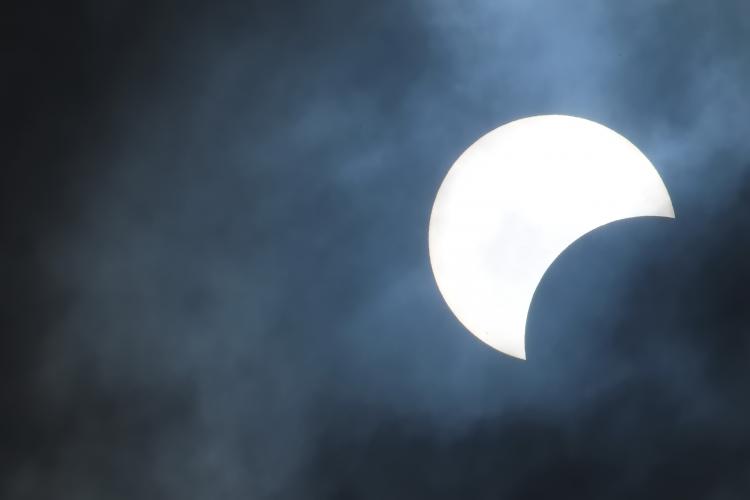
The side profiles were fitting to dark side of the moon. Even more so because the colour scheme is near black and the type being backed by shadows. Researching mysterious men/women, I came across these pieces which stood out to me:
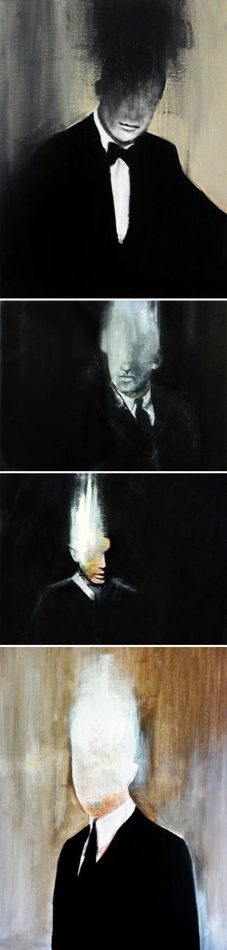
Wellllll I couldn’t smudge a minimalistic illustration like this and it wouldn’t fit into the look and feel of the series, so the eyes were removed to help exude mysteriousness.
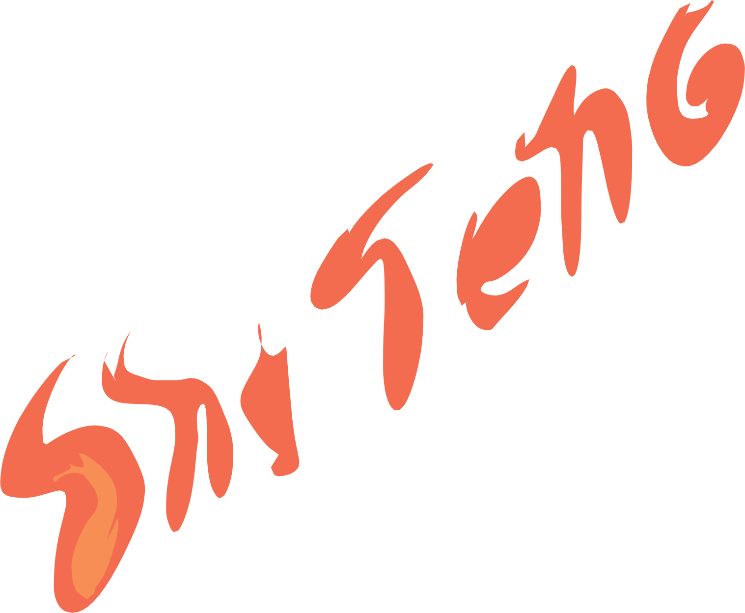
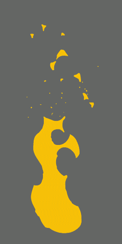
Lastly, raging fire was really quite challenging.
My attempts at taking elements from my previous designs like the other pieces were no good as it didn’t fit in with the other three visuals and they had too much red in them:
How to represent fire with faces????
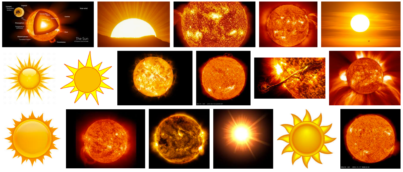
I remembered that the sun is a ball of raging fire
So why not give it a shot:
Which didn’t work out. There are waaay to many faces and it doesn’t show any signs of a fire.
I looked at the three other visuals as a whole and came up with a composition for the faces that is different from the other pieces.
I also thought of using smoke and silhouettes to help signify fire. A raging fire would mean lots and lots of smoke.
Initially I collected this as a reference to write out my name:
But I wanted a flatter layout to resonate with the other designs.
Since there are some colours in the coursing river piece as compared to the other designs, I thought of similarly including colours in this piece to help balance the pieces out as a whole.
Tried different colour combinations and eventually decided to include the lines for the faces to help read them clearer and also harmonise more with the other pieces.
Still rather unhappy with the design, I explored with drawing my name differently, this time making use of Photoshop’s liquify tool.
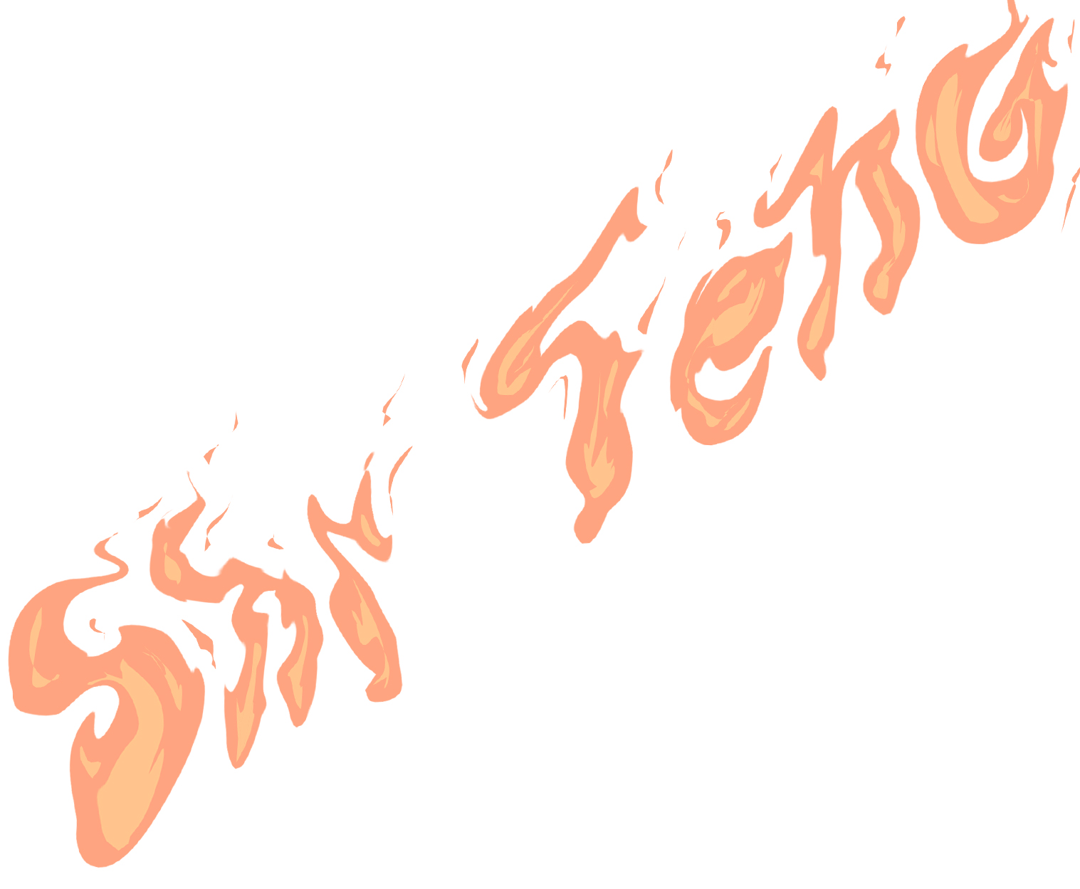 After Liquify and color changes / additions
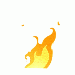
How the name was drawn was inspired / referring to animation of flames that I have encountered before (while doing research on another project):

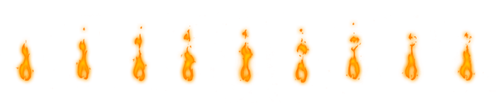
Also ended up using orange because it made that fact that this piece is about fire, obvious. Tried out other colours in the process and they just didn’t work out.
The GIF below also shows the process of trying to integrate the type more into the design. Within the composition, I also tried placing the name in different places but they didn’t work well. Eventually, I found that varying the opacity of the smoke in the background helped a lot. It also gave a better impression of a raging fire, or an impression of smoke in varying distances.
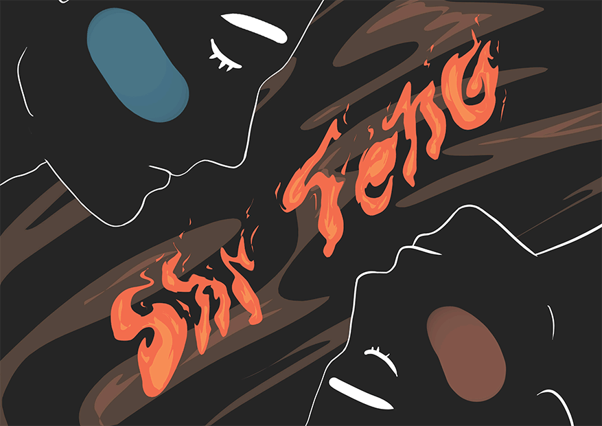
I also switched the male and female faces around so that in the combined presentation, the gender of the faces will mostly be alternated.
Reflection
Initially, I really found it a struggle to have to include a message within my visuals. It was tough for me and really something I thought I was quite bad at. In hindsight, I think it was a good struggle to have to have meaning in my design. After all, I came up with a message I thought was quite special, and I think the end product speaks.
I also found that in my end products, there was a sub message that really resonated with me. With both the faces of men and women, other than genders not playing a part, it could be seen as men and women working together, just like eventually in the video of the sound track. After all, they were all coming together to defeat the Huns, so why would genders matter as long as they are willing?
Because I am so neutral (or some say indecisive) person, more often than not I find myself not being able to pick a side, I often fall back onto the solution of people working together. I love it when people work well together. Half way through designing I realised this sub message in my designs and felt like it really worked out. Despite my works usually not being personal and being more general, I like how the end product was still mine in the end because of it’s neutral tonality and sub message about working together.
In last semester, I mostly tried to use traditional mediums and methods which were mostly very time consuming. Using a digital medium was in contrast much more effective. Butttt, I thought I should be more particular at the beginning especially if I was going to use the same illustration for all four pieces. Because I was not so particular then (I thought I was just testing compositions), I duplicated the illustrations into other designs though the strokes were uneven and not clean. I had to go back to each design and touch up afterwards.
Also, with the digital medium, it was convenient to explore minor tweaks but I think I might have fell into the trap of easily settling on a composition. My usual work process was – find something to start with (in this case the faces and my previous design), lay them around, find something good, and work on it. I thought I could really have explored more compositions by sketching first before diving in digitally. When I explore digitally, the compositions would usually differ much less.
Tying in with exploring more compositions, I would also like to build up a better habit of doing more research, especially according to specific artists instead of related words. When I get too excited, I tend to come up with my own ideas and work from there. I find that this results in limitations in my designs, especially since the visual library in my head can in no way compare to the multitude of resources and references, I can find out there. I could probably have pushed my research more, and earlier, instead of being too anxious and diving into test designs – which I ended up settling on (too) quickly. This was evident when I was stuck on my raging fire composition. By then, I was already more or less done with the other three designs and searching related words (like fire, fire typography) wasn’t able to help much. If I had researched more and explored more compositions in the beginning, maybe I could have come up with something better.
Additional research according to the style I was going for could have been more beneficial, though the research in the beginning did help as I was so inspired by David Carson. I really enjoyed his style and tried to use some of his methods, though eventually I veered away because of the change in design concept. Despite that, David Carson’s interview inspired me to be more personal about my designs, which I felt at least this pulled through because this series was something related to animation, and the concept and design were still things that were in my style. It feels/seems like something I would do, and I am happy with that, especially since I almost just gave up with my stand when people suggested that a female-centric message would be easier to convey.
So there, in this assignment, I overcame the great barrier of marrying the message with the visuals. I think the compositions could have been better, but I am happy with how the end product speaks, is united, and the main colour scheme.