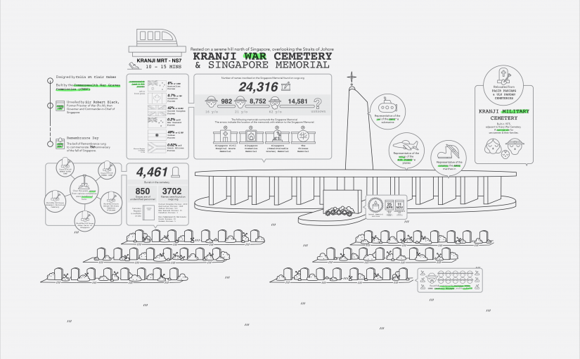
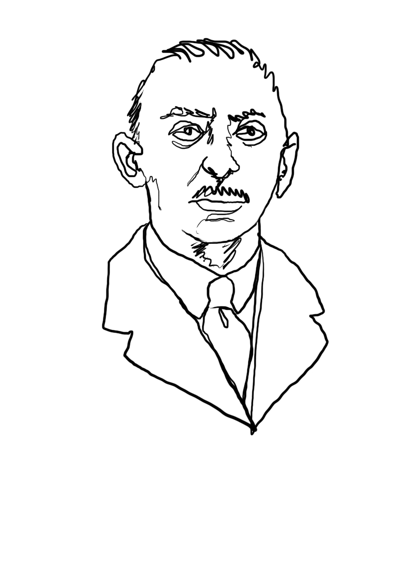
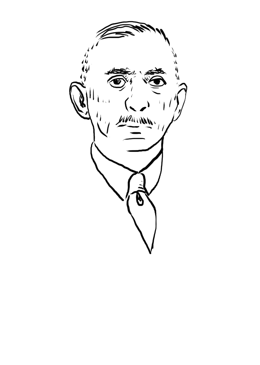
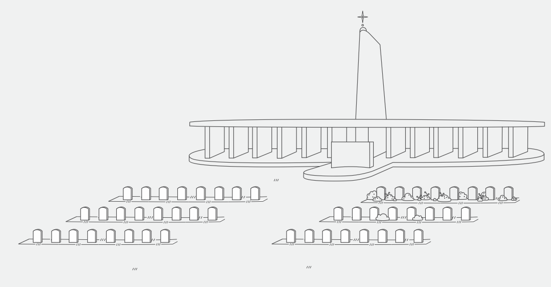
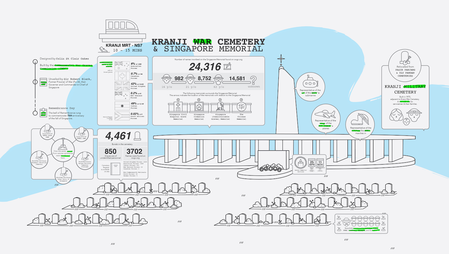
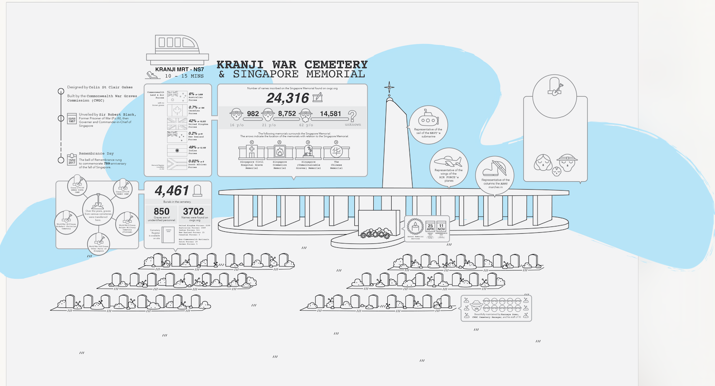
Tone: Solemn but not sad Target Audience: Millennials Message: Information on the Kranji War Cemetery Concept: Reminiscent to the neon highlighter, war is something that we’ve mostly learnt in secondary school, but something that we never really remember. With this infographic, I bring information as reminders of the war, reminders of the lesser known war memorial and soldiers who fought for us.
Other than the information found online, I wanted to include my on site thoughts and observations as well. Being:
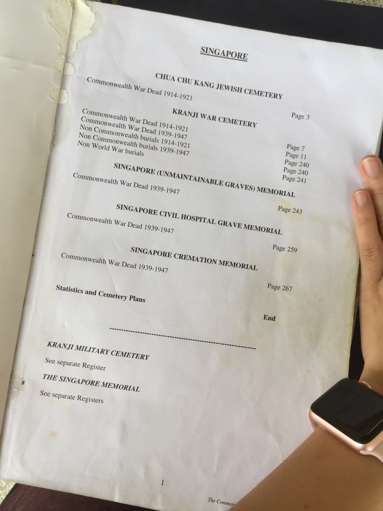
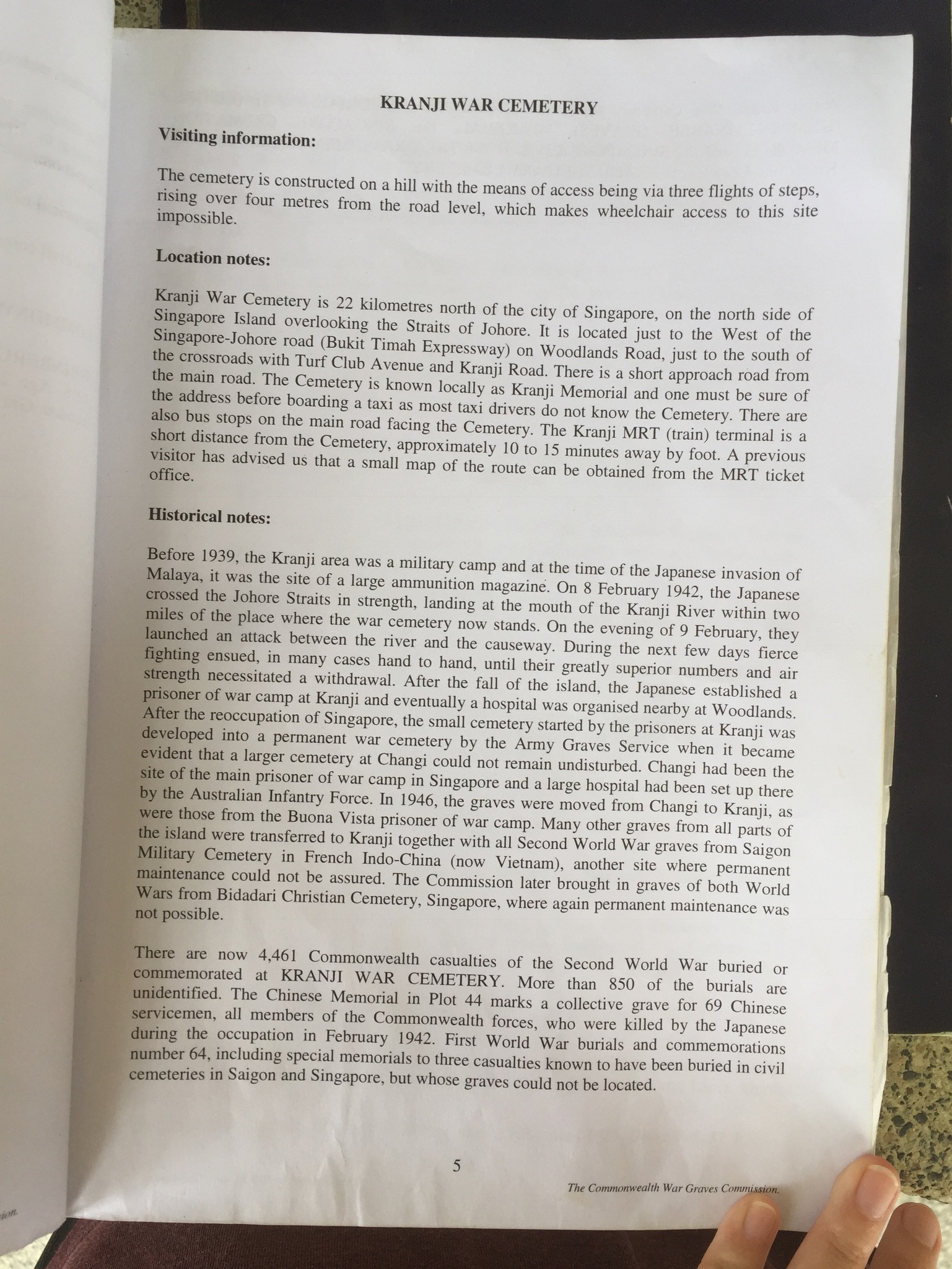
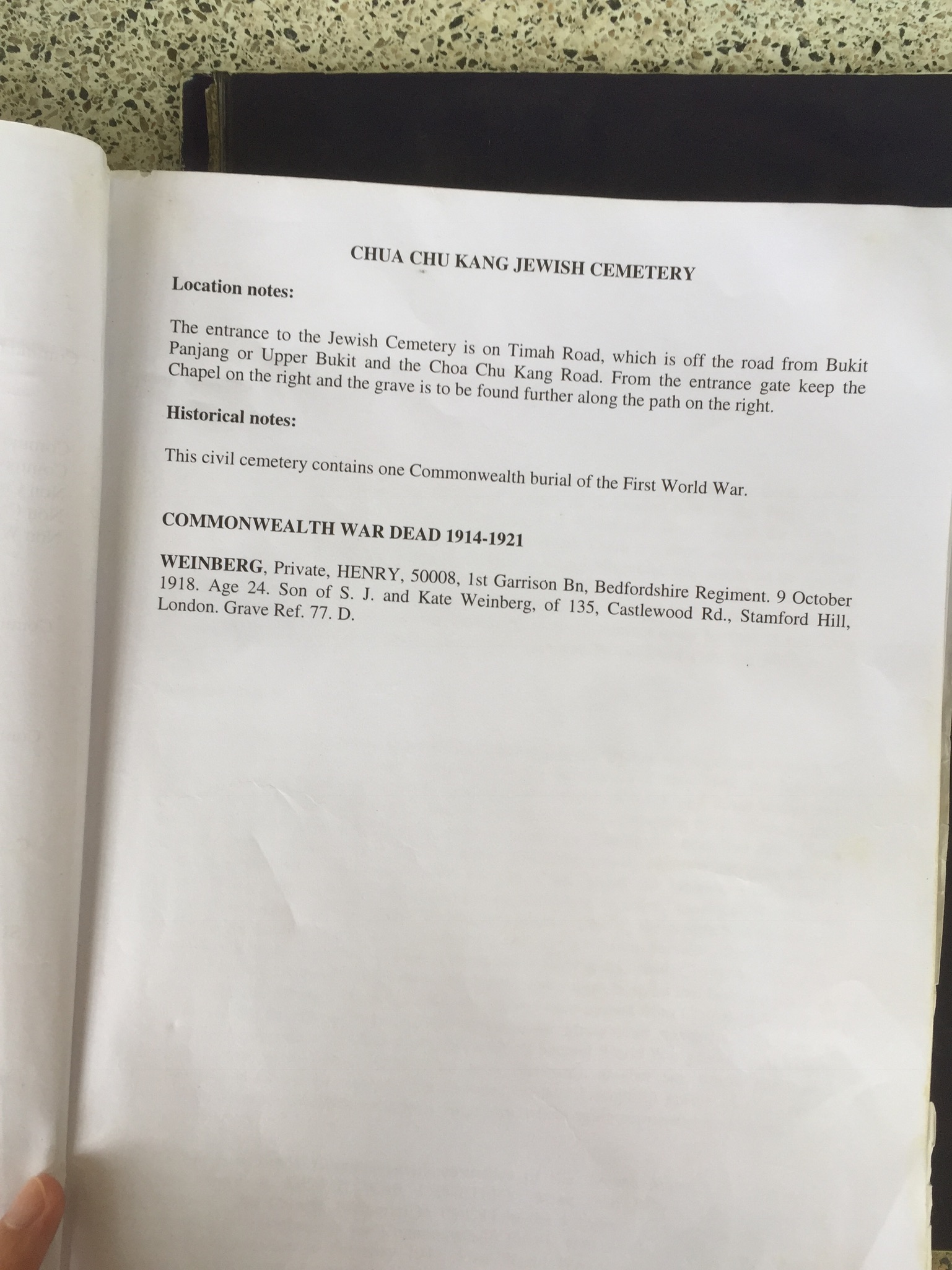
The difference between the War Cemetery, Military Cemetery and Memorial was something that I only found out after a more in-depth research
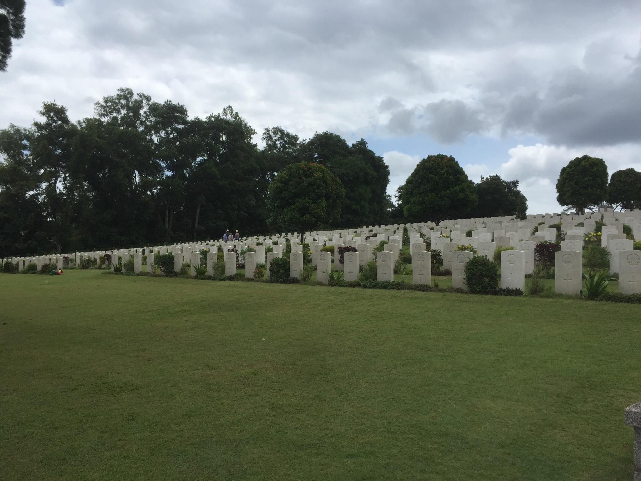
The serenity of the hill these graves lie on, how beautifully maintained the entire cemetery is
Who maintains the cemetery
The fresh flowers that were placed
I realised i didn’t know much about the war, and had no idea why they were names of mostly foreigners
This also led me to think how war was only a subject we learnt in secondary school and never remembered as I did my research
The cemetery register that was printed and available on site (rarely anywhere else you would see something shared like this laid out in the open for visitors?)
The other war memorials apart from the Singapore memorial – which commemorated other significant deaths.
It really felt like the organisation behind the war memorial tried to commemorate the soldiers individually as specifically as possible
Researching, I also realised how there were numbers everywhere and not all in one place – hence the inclusion of some statistics
Hopefully, the information I presented was good enough and conveyed well enough.
Reflection on this project is found on the Process post. (:
It’s been an interesting journey from site visit to jumping back into illustrator and creating my first infographic, something I never thought I’d do. On top of that, it’s slightly stats based and numbers are just never my thing.
Firstly, it was about sieving out the subject that I wanted to present, and eventually I settled on the war memorial which I had the most feels and observations from the trip there. I think in my end presentation, I was able to present my thoughts and feels gathered from the trip and I’m happy with that!
But, I also feel like my work is kinda basic. I mean I like it, I am happy with it, but just basic in the sense that it just looks like a common infographic. As mentioned in my research post, it seemed to me like infographics all look kinda the same, so it was difficult to do something outstanding. The most special part of my infographic was probably the highlighter, which I thought was slightly genius (concept wise) but unfortunately could be executed better hahaha.
Initially, I was going to opt for a more sketchy look by drawing out the whole infographic. Going for the whole Megan Nicole Dong feel + the sketchy infographic look as written in my research post. However, as I set out to experiment on how I was going to do it, I felt that it wouldn’t work out because of the various structures and different aspects of the cemeteries, and it just wasn’t the look I envisioned.
Some miserable attempts that I almost forgot about:
Totally miserable
So, I settled for Illustrator. The moment I decided this, I knew it was going to look some sort of basic. But good thing is, I also knew the kind of look I was going for.
Much of my infographic was created in references to these:
your-travelling-collections.blogspot.com
behance.net
mkshft.org
The simple, thin, clean lines on a subtle greyish background. In reference to the first and second image, I had also planned to do a splash of colour in my infographic which didn’t turn out that well (shown later).
I set off to drawing out the memorial in illustrator, with the use of some reference images such as
(found on Google)
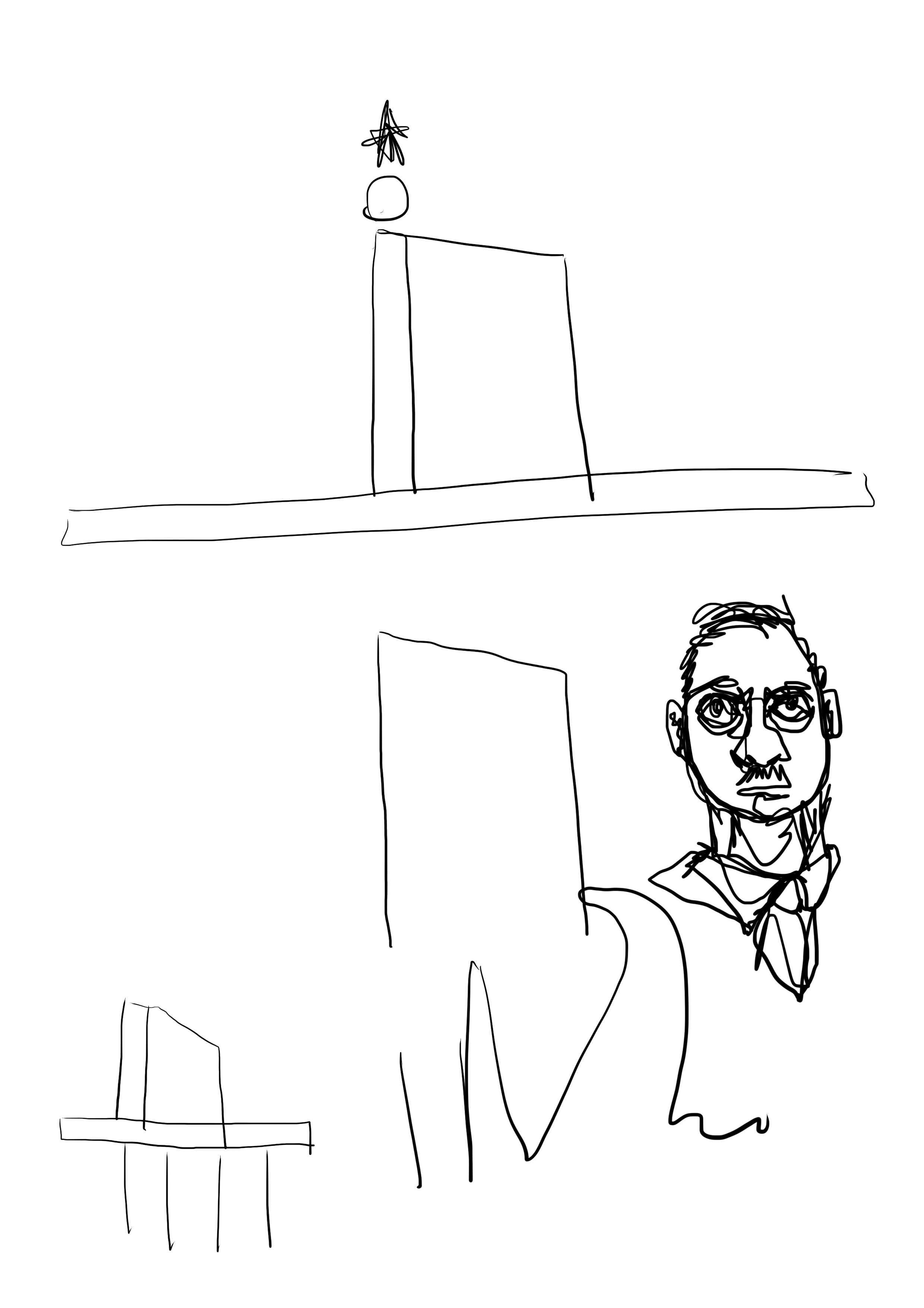
Really not sure what I was doing with life with the indecision on perspective. My 4D teacher coincidentally saw this and commented on it and I came to epiphany that everything should be in isometric perspective and it all made sense.
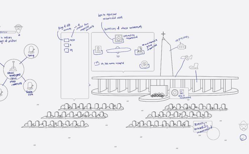
Slowly started populating the graphic, which made it look way better. I’m glad I trusted myself as I told myself that it’s going to look okay when it’s finished despite how plain it looked at the beginning.
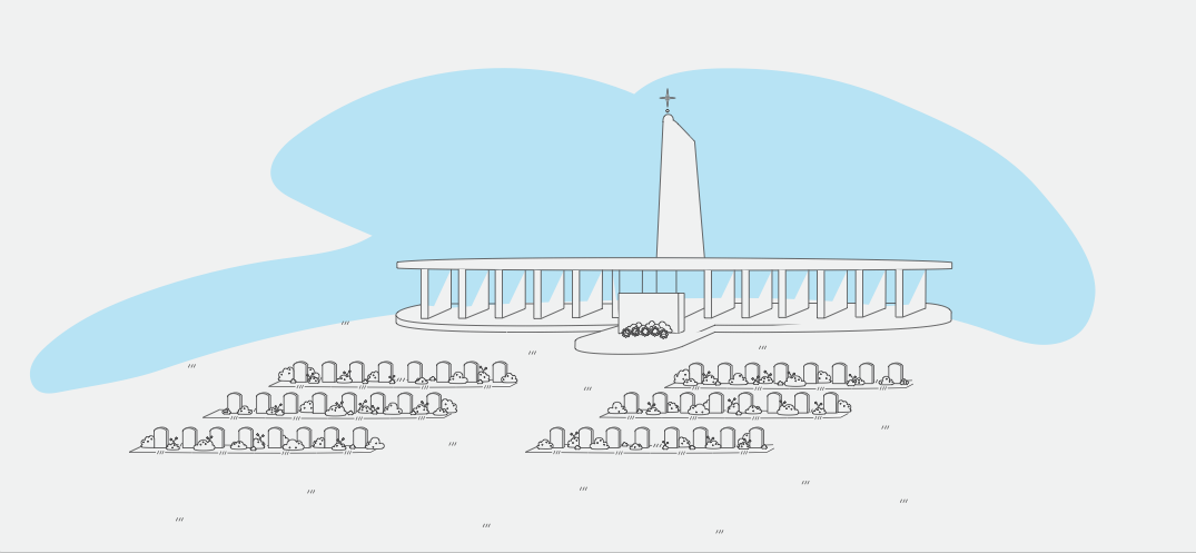
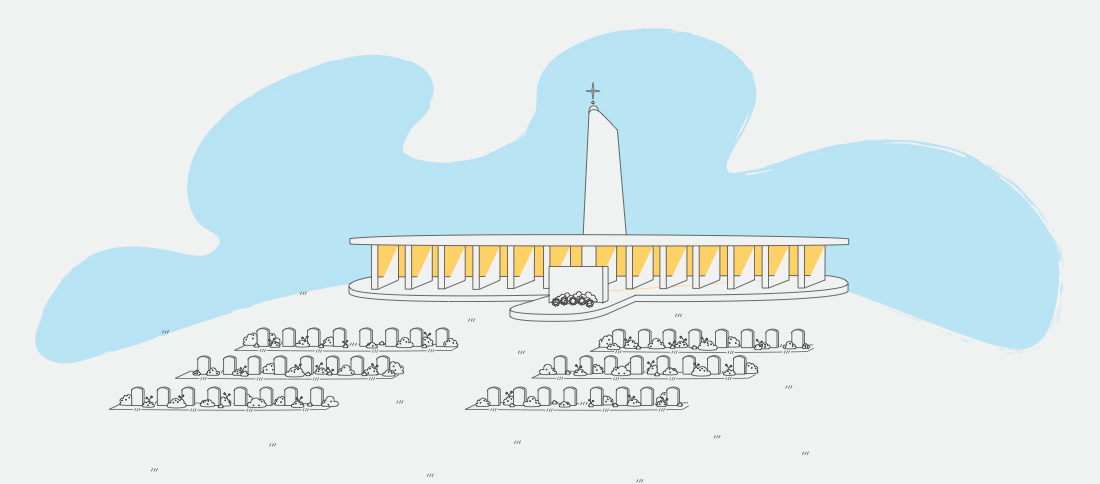
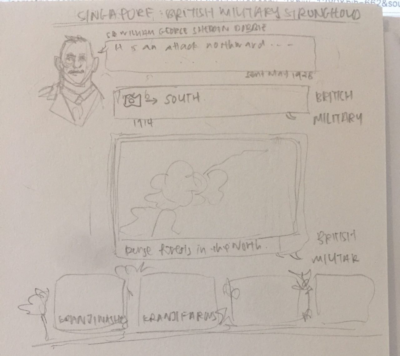
Tried adding the splashes of color I wanted to do initially. I wanted the cemetery to remain colorless, with a splash of the blue sky to bring across the ‘solemn but not sad’ feel I was going for. A beautiful blue sky with some birds was gonna do the job, I thought. But apparently not. I also wanted to try like a more saturated, cyan kind of color in reference to the river map image posted above, but it was too bright in this context. Because of the way I drew it, there were gaps across all the memorial columns… But hey that kinda looks like shadow / sun thing let’s try if it would work if I added some orange. After all, I was quite for the blue/orange/pink color scheme (as posted in research post) even if they looked quite common. So I tried it out and, “No,” I thought, after rearranging some of the lines and colors and stuff. It also didn’t feel right because I felt like in between the columns should show the blue sky for clarity in visuals instead of the whole block being yellow. It was also getting too bright and happy. Initially, the idea was to include some background knowledge of how the Japanese came from the North instead the South in a whatsapp / text format.
Something like this ^ And at the same time introducing some other elements of Kranji.
But eventually I decided to scrape it and focus on the graves and memorials. On hindsight, I felt it is quite helpful.
Even after deciding on the war cemetery, I had to sieve out what exactly of the war cemetery as there was quite a bit of information. I wanted to present a little about the war as background/context, the other aspects of Kranji that I had visited, or focus the whole thing on the cemetery manager (which I decided not to as it wasn’t data I collected from my site visit) – and maybe that was just too much.
Anyway, I continued with what I had and eventually also stuck to one type of labelling that would stick better with icons which would make majority of the infographic work, as advised by Joy, “to ensure that the text and imagery are integrated well such that the imagery provides information as well. [T]he last thing we want is information in text and just a “background” image of the memorial – making it look like a PowerPoint presentation slide. A good tip would be to imagine if one didn’t understand the language of your text (in this case, English) would he/she be able to tell some, if not most, of the information you are conveying?” rather than just point and put words. The advise was super helpful.
A big part of this project was the information that I wanted to convey. I ended up with stats eventually and was grateful that I found easier ways to calculate them and that there were sufficient information available online (albeit the discrepancies). Data and numbers are dry information and I hope in my end product, I was able to convey them more visually.
Some progress images:
Oh yes, I also stuck with three of my go-to fonts, Courier, Helvetica, and Avenir light. With a wee bit of reference to
mariahalthoff.com
All in all, I think the eventual outcome was not bad, I’m happy with it, but maybe I could experiment with colors more. Quoting, it is
“Good but not sexy” – Clara Lim, 2017
More importantly, I think I have somewhat achieved the goals I set for myself from the last project – to sketch more / come up with more compositions / layouts – as seen in my visual journal. (Yay small improvement steps).
So from this project to the next, I aim to push the boundaries, explore with colors more, let loose, and get sexy.
Hellooooo so I went and visit the Kranji farms today!
It was a nice and nostalgic visit as I’ve always went to the farms when I was a kid.
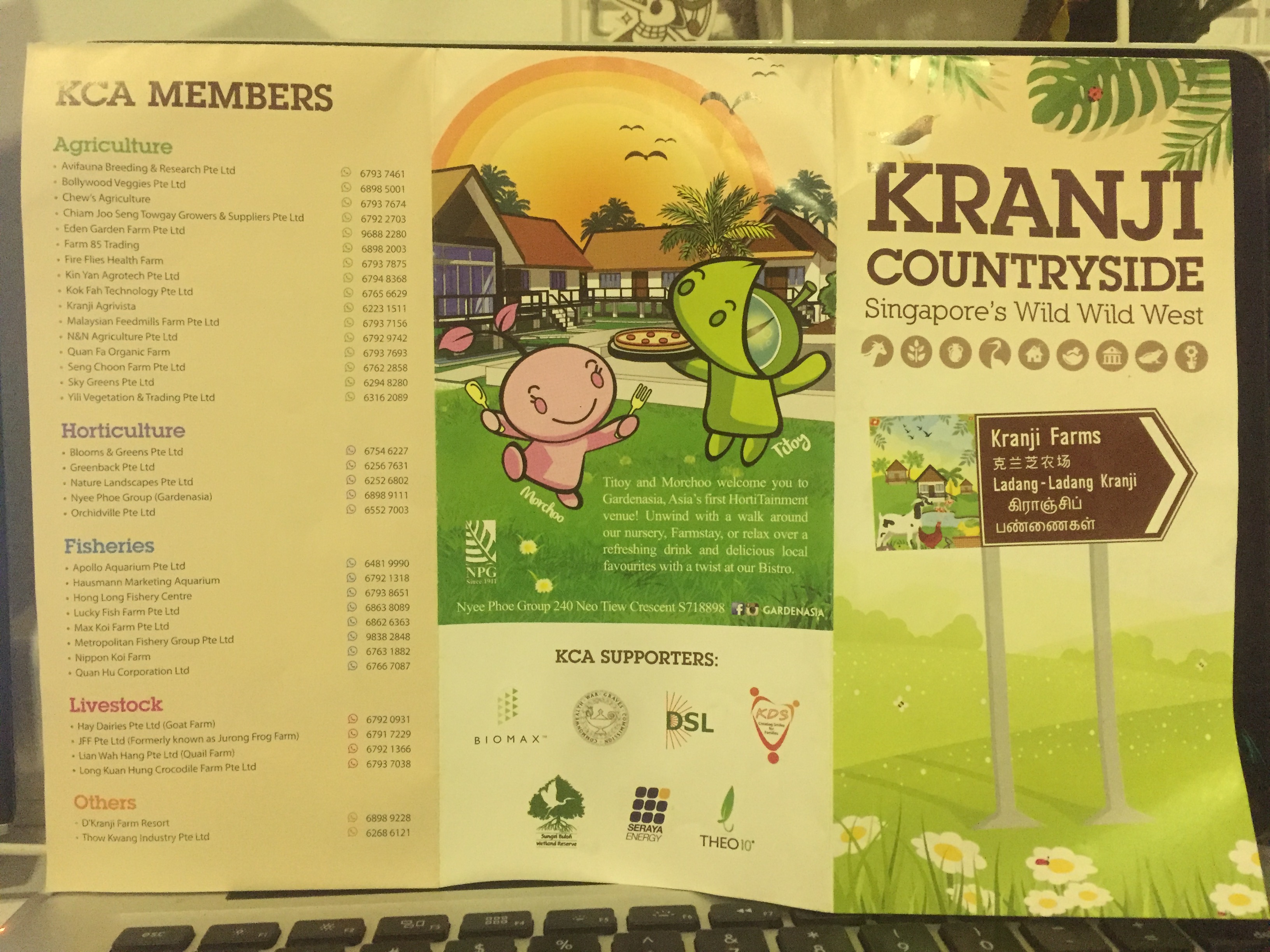
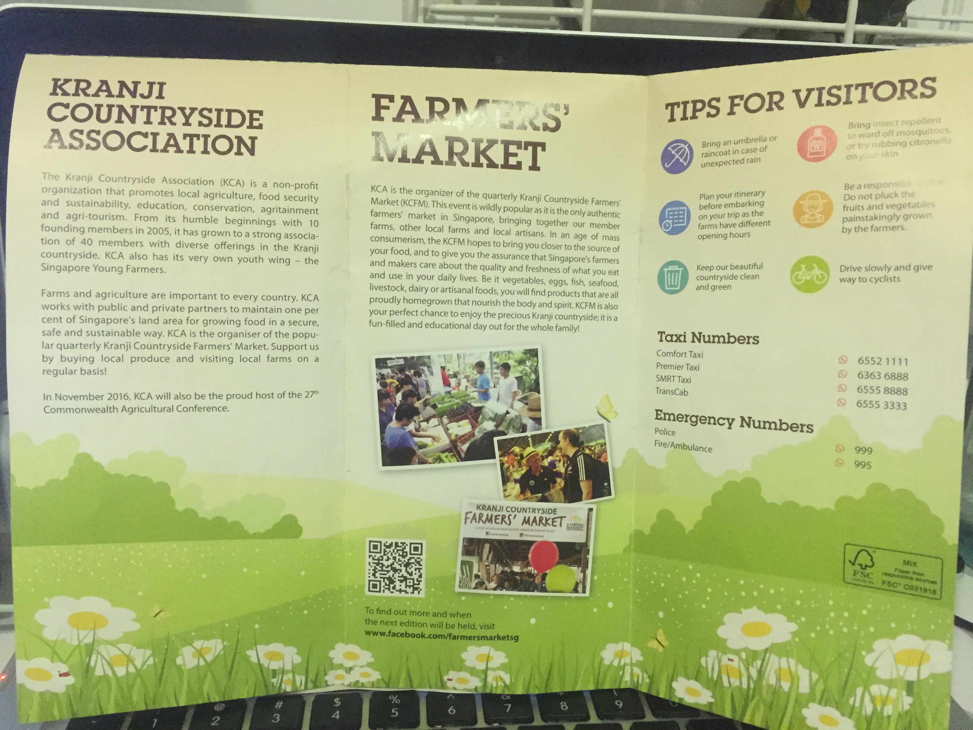
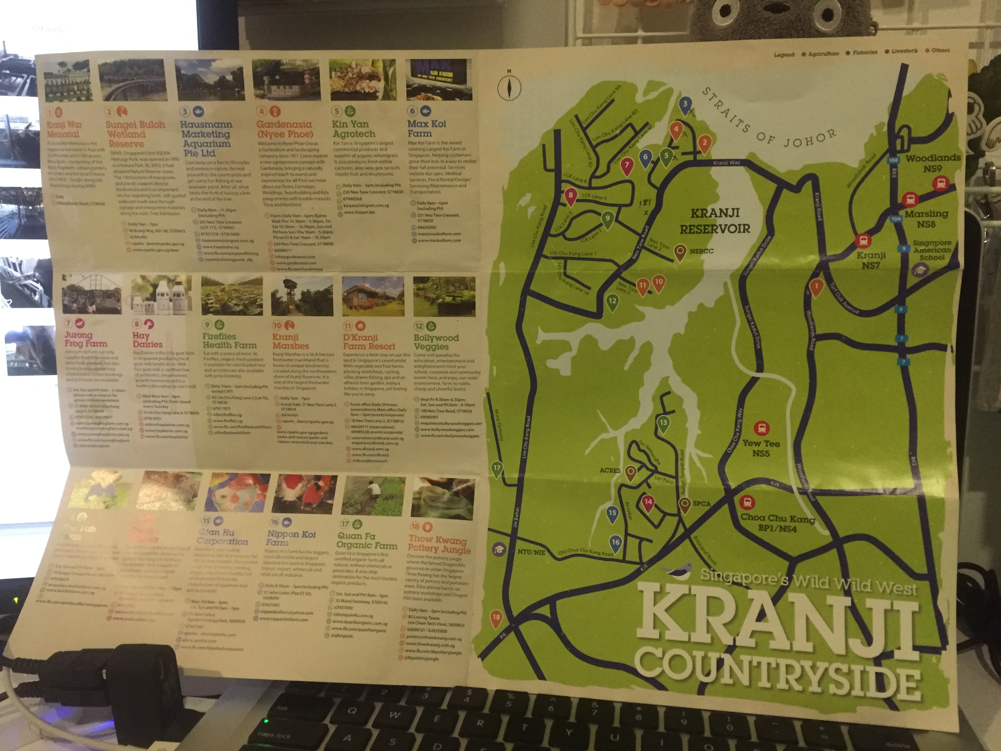
I have a lot of pictures, but more importantly… I picked up a very informative pamphlet when I was there.
And maybe because it was a weekday, I wasn’t on any tours, and I’ve been to the farms quite a bit, the farm trip wasn’t as exciting as I thought it would be. Most of the farms were opened, but empty, it was a lot of just alighting, talking a walk and then on to the next stop. It was quite repetitive, especially since the produce of some farms were the same.
seconds before shit got real
To summarise this visit anyway:
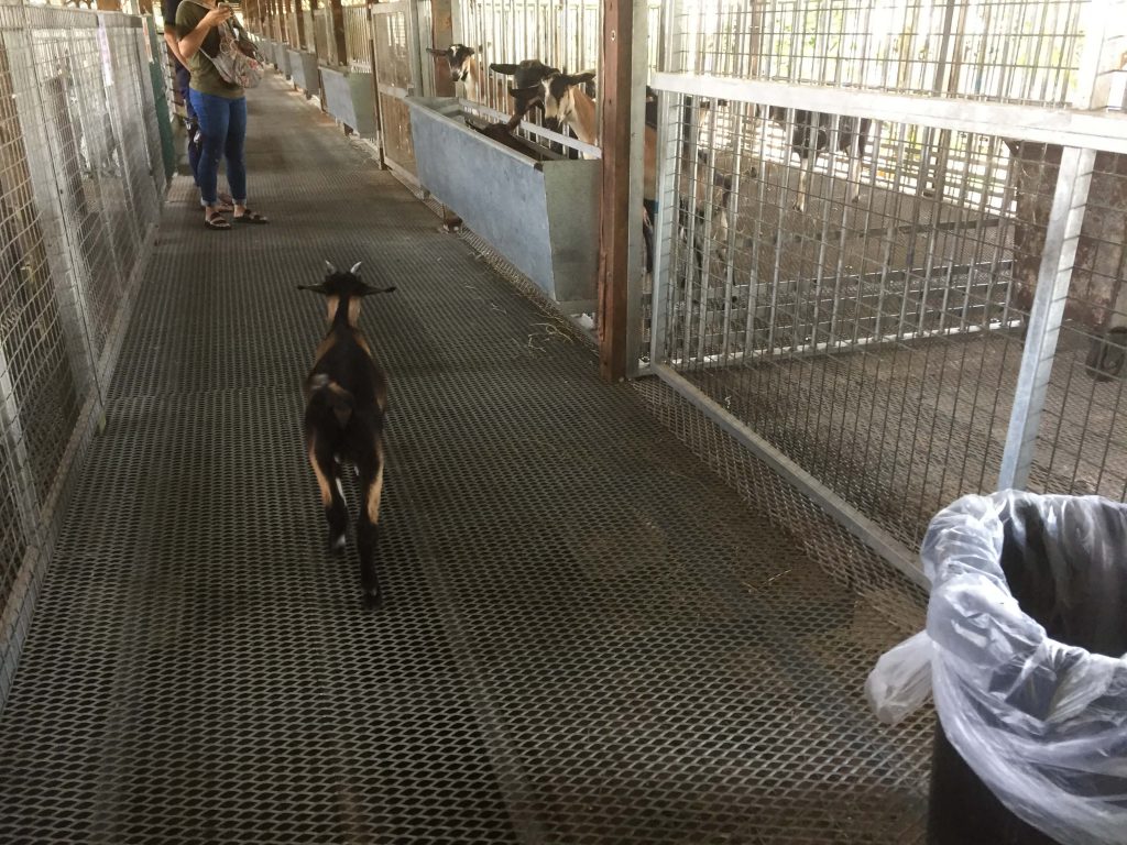
There was a young goat’in that escaped it’s cages and was so happily prancing around. A girl was crying so hard in her boyfriend’s arms when the goat jumped on her. Apparently this goat figured out how to escape and always does it.
seconds before shit got real
It was really nothing much but a cute experience! The owner of Hay dairies was really friendly too and even suggested a route for us to visit the farms!
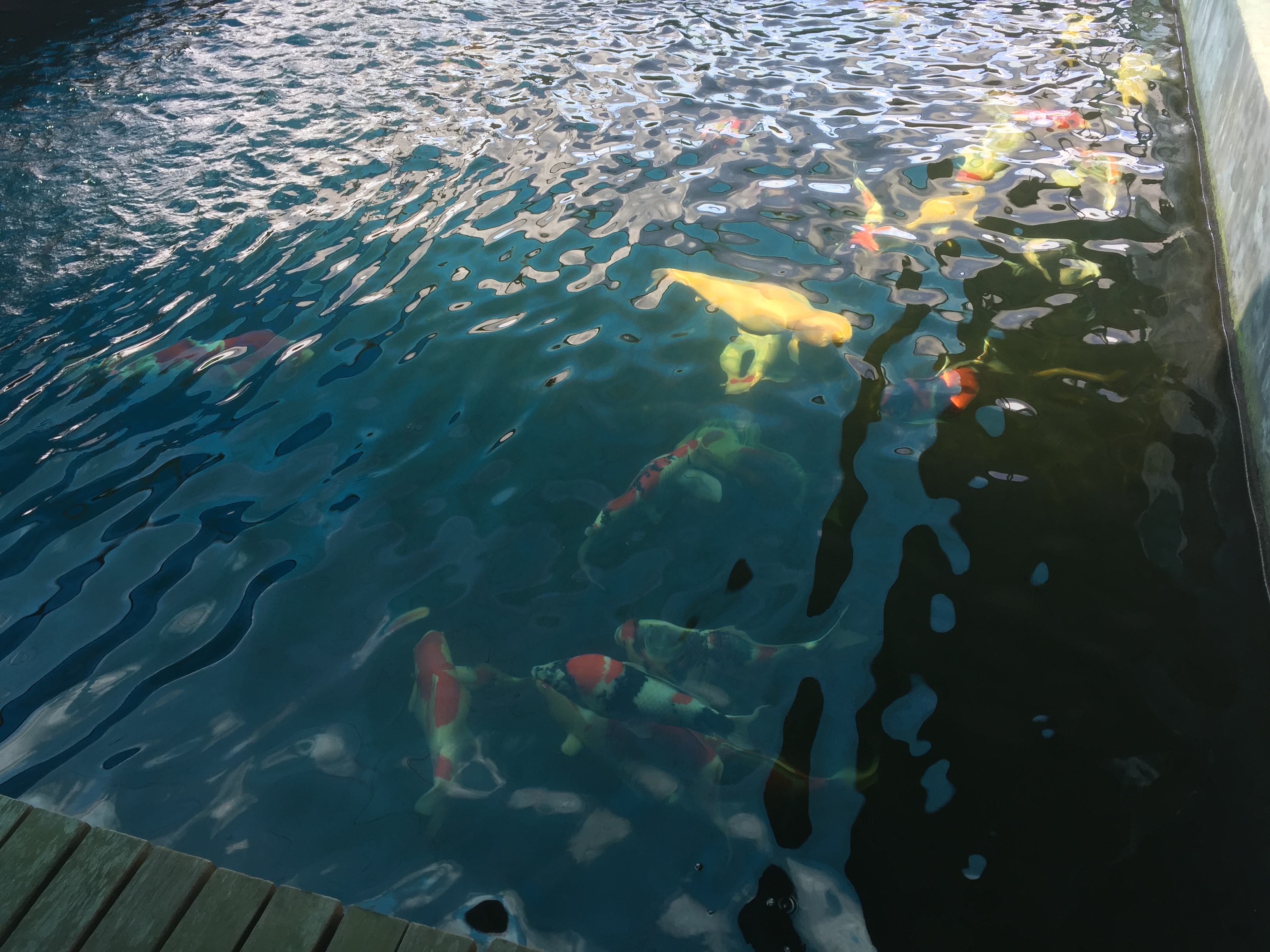
Not sure issit my eyes blur or, part of the Arapaima’s bodies are pink?! Color combi on point even though it looks dull at first glance.
Also never really saw koi fishes this big and fat. They legit are big.
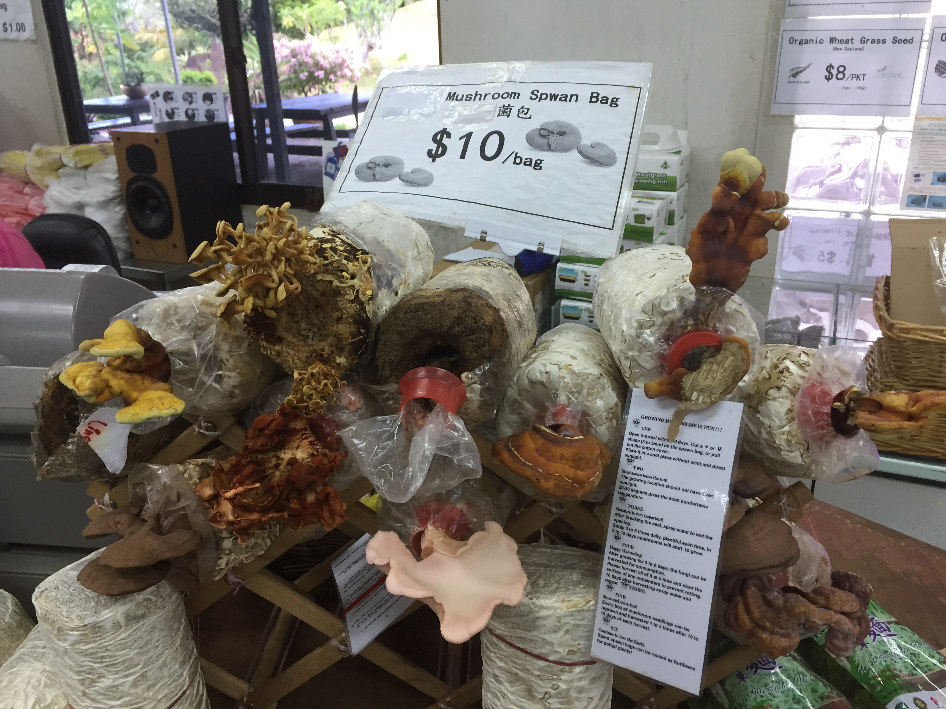
Grow-your-own-‘shrooms. They sell this. It’s cool. Also, the uncle at this Kin Yan Agrotech is hiring full time promoters so hit him up if there’s anybody interested.
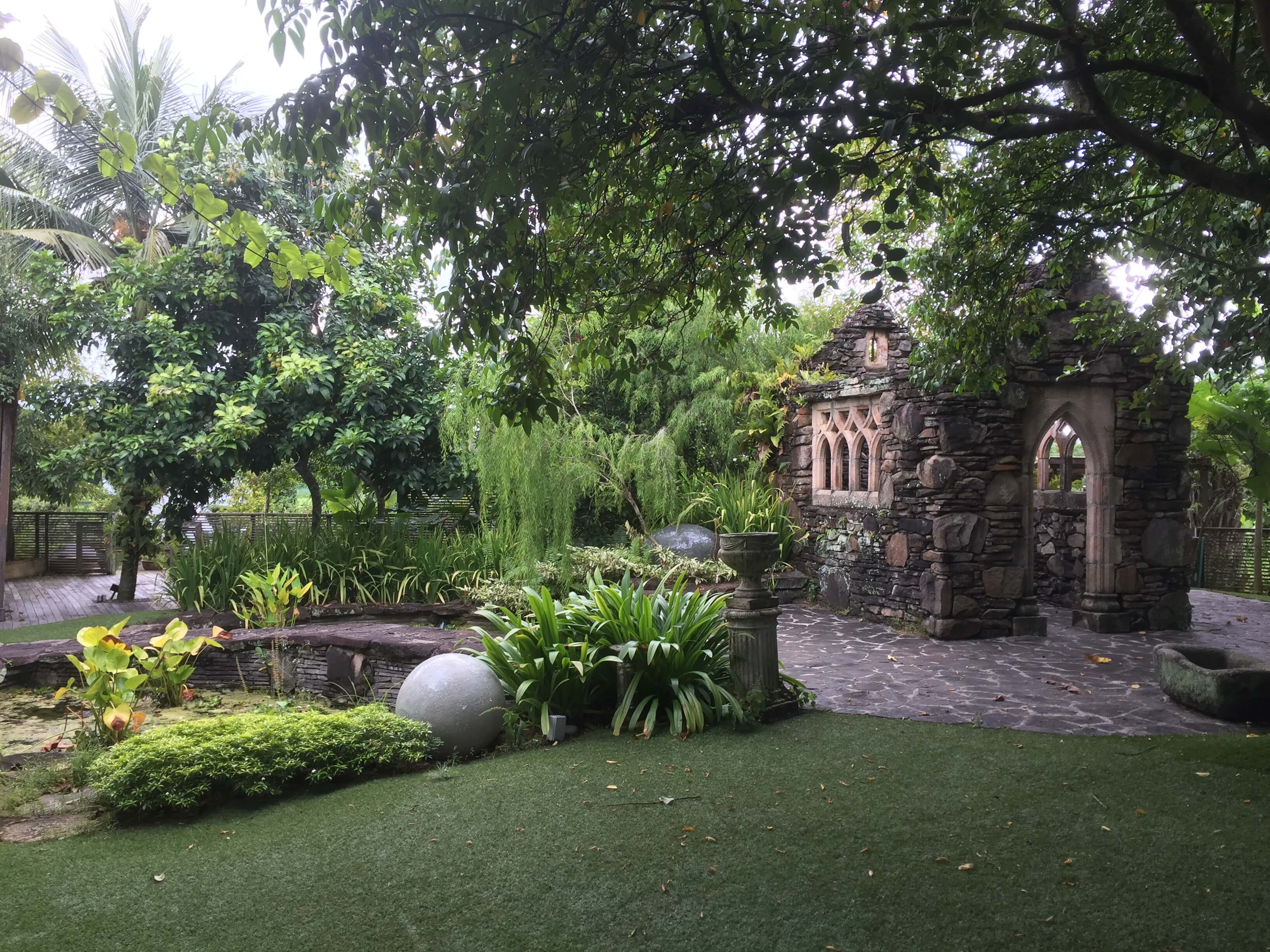
This Nyee Phoe Gardenasia place actually very nice!
Went to a total of seven farms today and it took lesser time than i expected!
So..
Since there’s already such an informative pamphlet and websites and from a short survey with friends, I thought I would work on the War Series instead, focusing on the War Memorial and sthuff.
I feel like I have a better takeaway from the war memorial visit and it’s quite a shame that I didn’t get to visit the abandoned army barracks and Neo Tiew estates to complete my war series.
Since i’m doing it on war, it is probably less probable that I will be embarking on the sketchy comic style as mentioned in the last post.
Perhaps, I will be taking reference to this old design that I have done before:
Will start with compiling the information that I want to present and start drafting some compositions for the infographic!
Here’s my ongoing Pinterest board for infographic styles / helpful guides: https://www.pinterest.com/awkwardst/2d2-project-2/
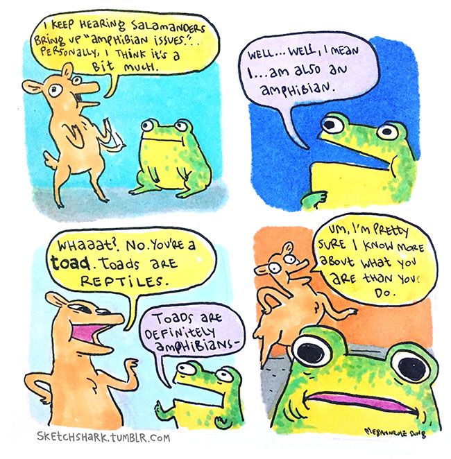
I am also thinking about the possibility to do a sketchy styled infographic, as inspired by Megan Nicole Dong‘s comical sketches:
Also came across this on one of my Pinterest boards and I kinda liked it. It is also a possibility to refer to the color scheme.
styleshack.com
shantisparrow.com
theendearingdesigner.com
Or maybe include some vintage logo designs to lure the hipsters and convey the spirit of Singapore’s heritage?
This is just a preliminary research, will do more as I venture into doing some draft compositions after my farm visit!
But as I scroll through these countless infographics with my tired mind, I found that though most of them were visually attractive, it’s hard for me to focus / find something I was interested in to click and read. Perhaps it was because I was tired, or perhaps it’s because of the information overload. Because it’s such an in thing now, there’s so many of them and everything somehow looks the similar (flat graphics, similar fonts?). Maybe it’s like David Carson said, since resources are so readily available on the net, a lot of designs look similar. Then again, things just seem to go with the trend nowadays.
Currently, I’m think it’s an idea to do accompanying short derpy comics to tell a story of the information I want to convey, in hopes that it will be more memorable and stand out from all the data and infographic that are being presented.
This infographic below might be a good guide for a more comic-layout
Also, love the look on this one:
Overall, I think I quite enjoy the Blue / Orange / Pink color scheme. As well as the Japanese earthquake infographic’s Yellow and dark blue color scheme.
With the sun shining, clouds suitably fluffy and temperature at a lovely 27 degrees celsius, Shi Teng does a sit up, got off bed, and sets off on a lone adventure to a less explored neighbourhood named Kranji.
Now, I wasn’t really sure if the temperature was 27 degrees celsius but the weather did seem pretty fine when I finally got outside.
Pre-exploration, I did two rounds of research.
The first round being a really basic one and this is what Wikipedia taught me:
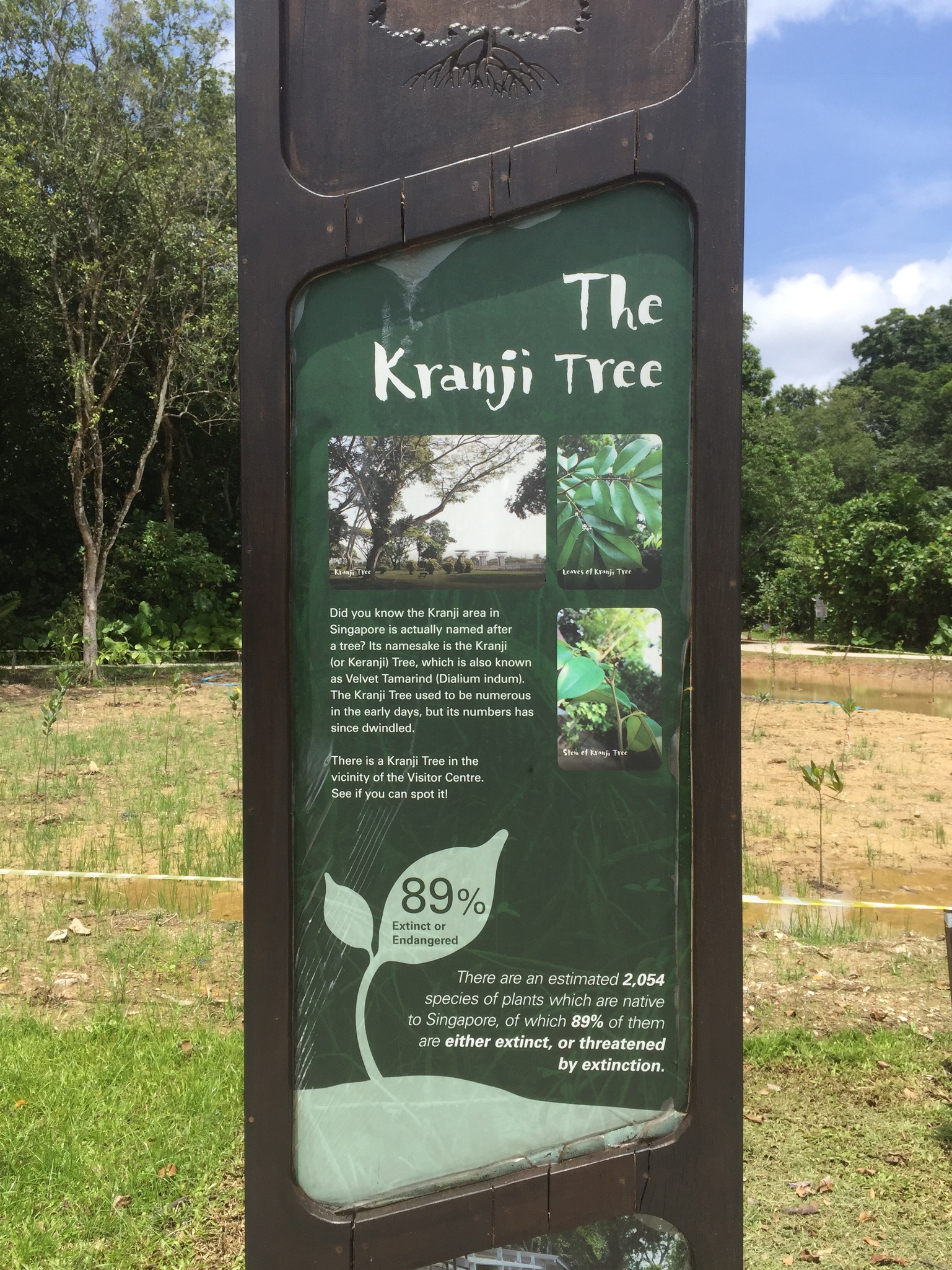
Kranji was named after a tree (which is now close to extinction)
It is in the Northwest of Singapore
It’s an industrial area with lots of standalone properties
Some history
It used to have the railway
And a military camp
Now it has a war memorial
Some Highlights
Kranji Racecourse
Kranji Resevoir
Kranji Marshes
Bollywood Veggies
Kranji Countryside association
I guess Kranji has quite a lot to offer! Definitely more than what I knew.
Through a secondary round of more in-depth research, I classified Kranji into a few main areas, namely:
Kranji Turfclub
Kranji Countryside (Farms)
Kranji War Memorial (Military Barracks, WWII Landing Sites)
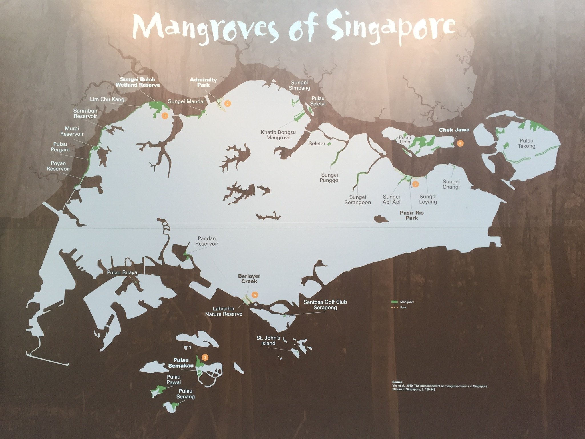
Kranji Resevoir & Sungei Buloh Wetland Reserve and after exploring, why not add in…
Kranji Industrial area and heavy vehicles because that’s really one of the things Kranji has to offer.
1. Kranji Turfclub
This was reasonably interesting. I thought this was an activity that was something different to do in Singapore. The tickets were cheap and the Grandstand seemed to have quite a bit to offer, like four different venues to watch the race.
I was so ready to go down and catch a live race myself (and maybe even place a few bets), after all it’s something that I’ve never done and probably never will, until this project! Buttttt… First unfortunately, races are only held on selected Fridays, Sundays and public holidays (It was a Thursday when I explored Kranji). Second unfortunately, I found a Trip Advisor page, which had quite a fair bit of reviews, including a few bad ones that discouraged me from visiting the site alone.
(I mean… it makes it even more exciting and interesting to visit right but Joy said not to engage ourselves in dubious activities so I shalt not.)
One day, one day, I will catch some horse races.
Other related websites:
https://www.stc-ridingcentre.com/
2. Kranji Countryside
I was really quite intrigued by all the information online about the farms. There was a whole website called Kranji Countryside and a few Straits Times articles, one of which that mentioned Kranji Farms getting recognised as a tourist spot. I thought that was really cool, it was something special, something that was about the heritage of Singapore that was not about the bustling city life or trips to the museum. There was also an article that mentioned the uncertainty of Kranji farmland’s future as many of the farmland leases are ending soon.
I was really looking forward to attend some tours that would bring me around the Kranji farms. Unfortunately, tours are mostly catered to groups and visits would require an advanced booking.
Or maybe I haven’t looked hard enough, because I came across this character called Uncle William, the official tour guide to Kranji Farms and was quite bent on attending one of his tours. It wasn’t difficult to look harder as there were several mentions of him, eventually I came across the Farmart website which included a detailed PDF of his farm tour program, and unfortunately he only hosted group tours.
I emailed him yesterday and only got an invite to the upcoming Farmers’ Market where he was giving a talk about Chickens and Eggs. He’s probably the man who has the answer to the question, “Did the chicken or egg come first?”
I’ve heard about the Farmers’ Market pre-project 2 but unfortunately, according to their Facebook page, the next one will be held on 11th March, which is a week after our research due date.
And apparently, there is a sgfarming wordpress (which I haven’t explored much) which has an article about the 2014 Farmers’ Market.
On the Kranji Countryside webpage, I also read about the Kranji Heritage Trail and decided that maybe I could base my exploration mainly on this trail. I thought about doing the entire trail, but was worried that I probably won’t have enough time or balls to do it alone.
My initial plan was to take the Kranji Express Bus and see how much I could explore, and possibly document the time and journey. But not all plans work out… Reading a few other blogs, they did suggest that personal transport would be better. Also, there wouldn’t be enough time for me to fully explore along the catered bus by the time I left for Kranji.
3. Kranji War Series I read some blogs that told me more about these areas of Kranji. In this particular blog, there were a lot of pictures about the Kranji barracks. They looked creepy and not like a place I was going to visit alone. I am also unsure if access to the public was allowed.
(I also read somewhere that the en-bloc-ed Neo Tiew estate became a training area for SAF but lost the link. On a second search, the pictures on http://joyloh.com/blog/?p=3342 ; https://remembersingapore.org/neo-tiew-estate/ makes it seem like an interesting place to visit, with friends!)
But I knew I was going to the Kranji War Memorial. A friend also told me pre-visit that SAF once brought him on a field trip there.
Disclaimer: Being the uncultured 22 year old girl that I am, I don’t remember much or have much knowledge about the war.
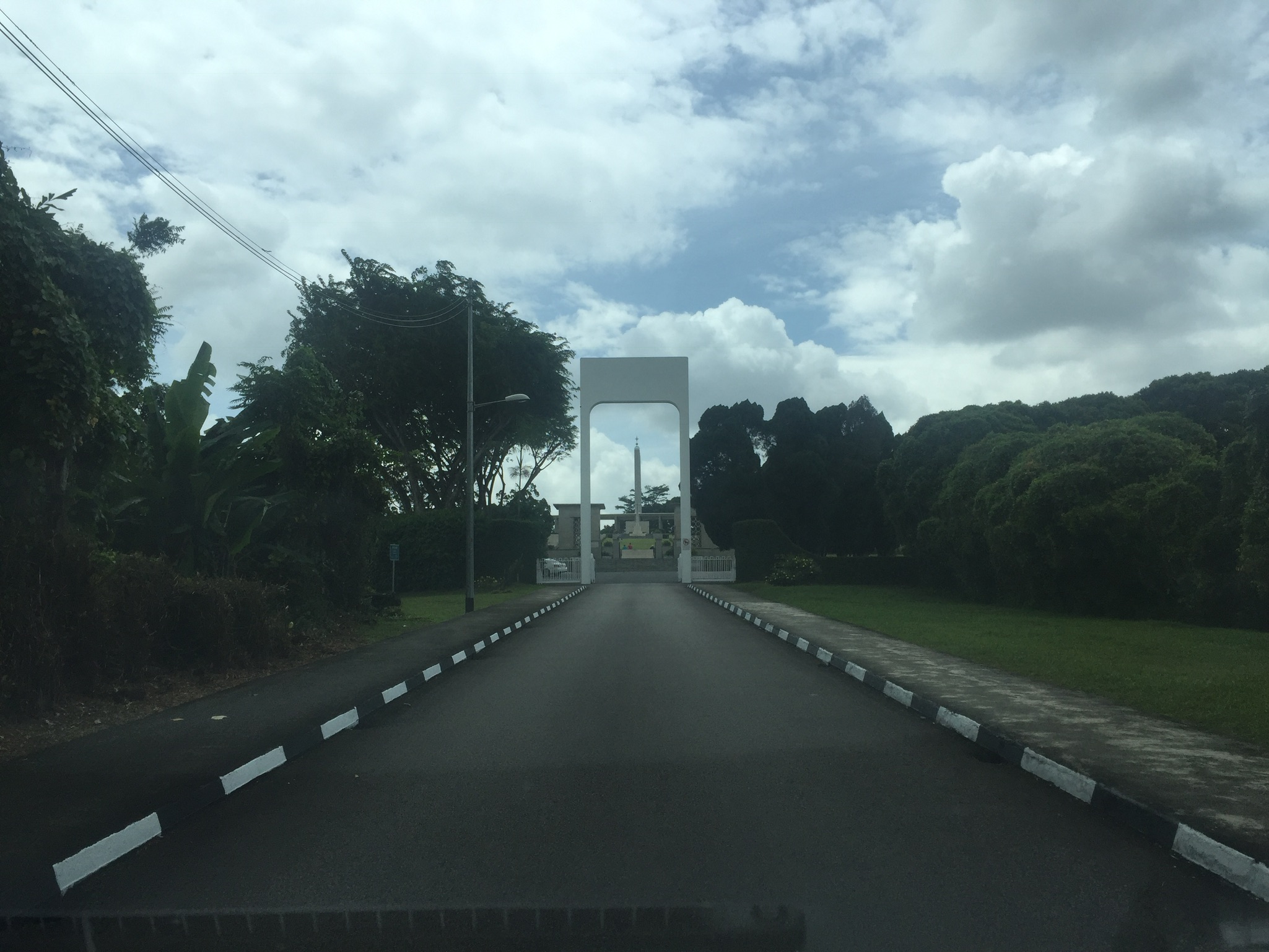
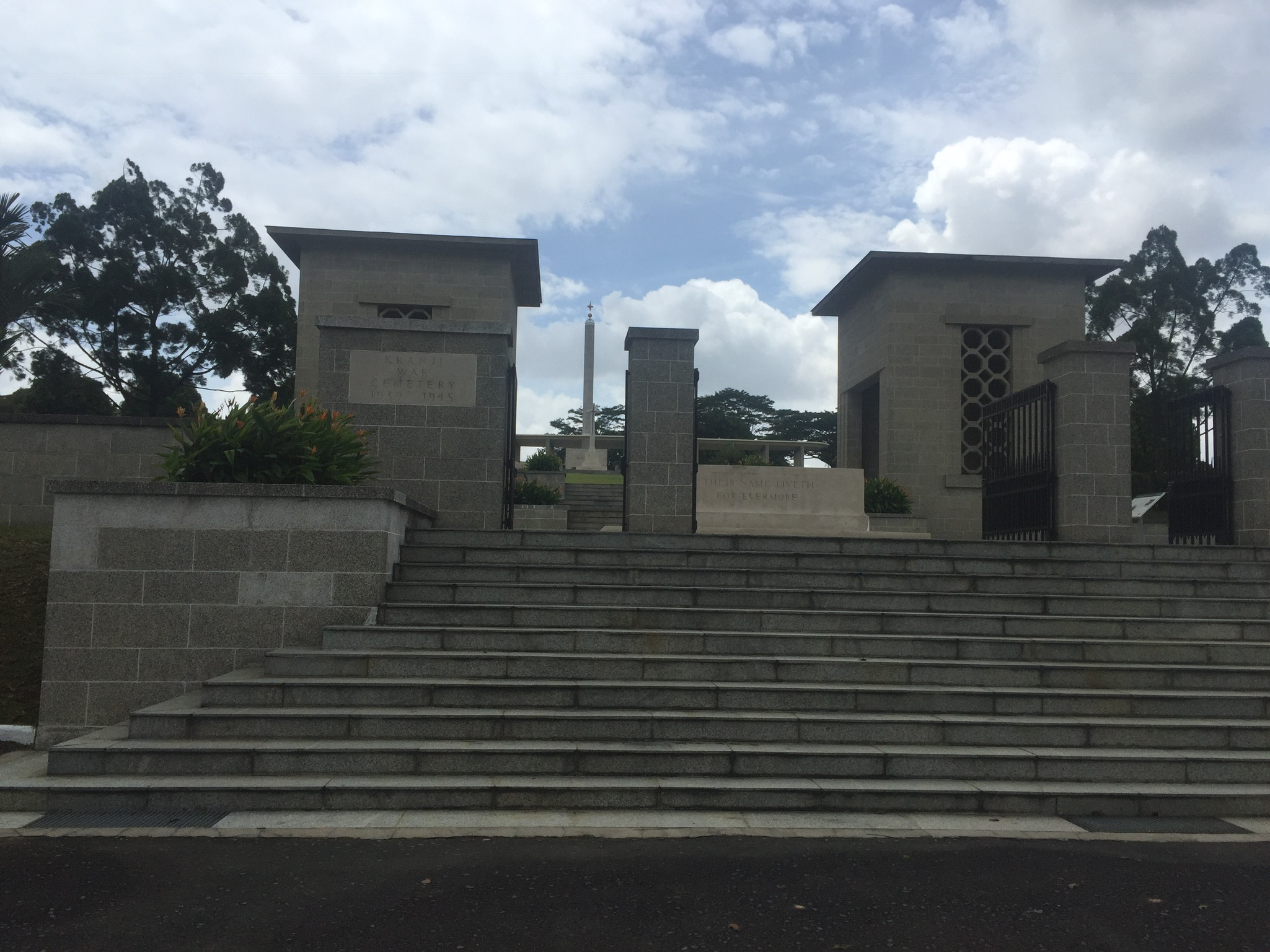
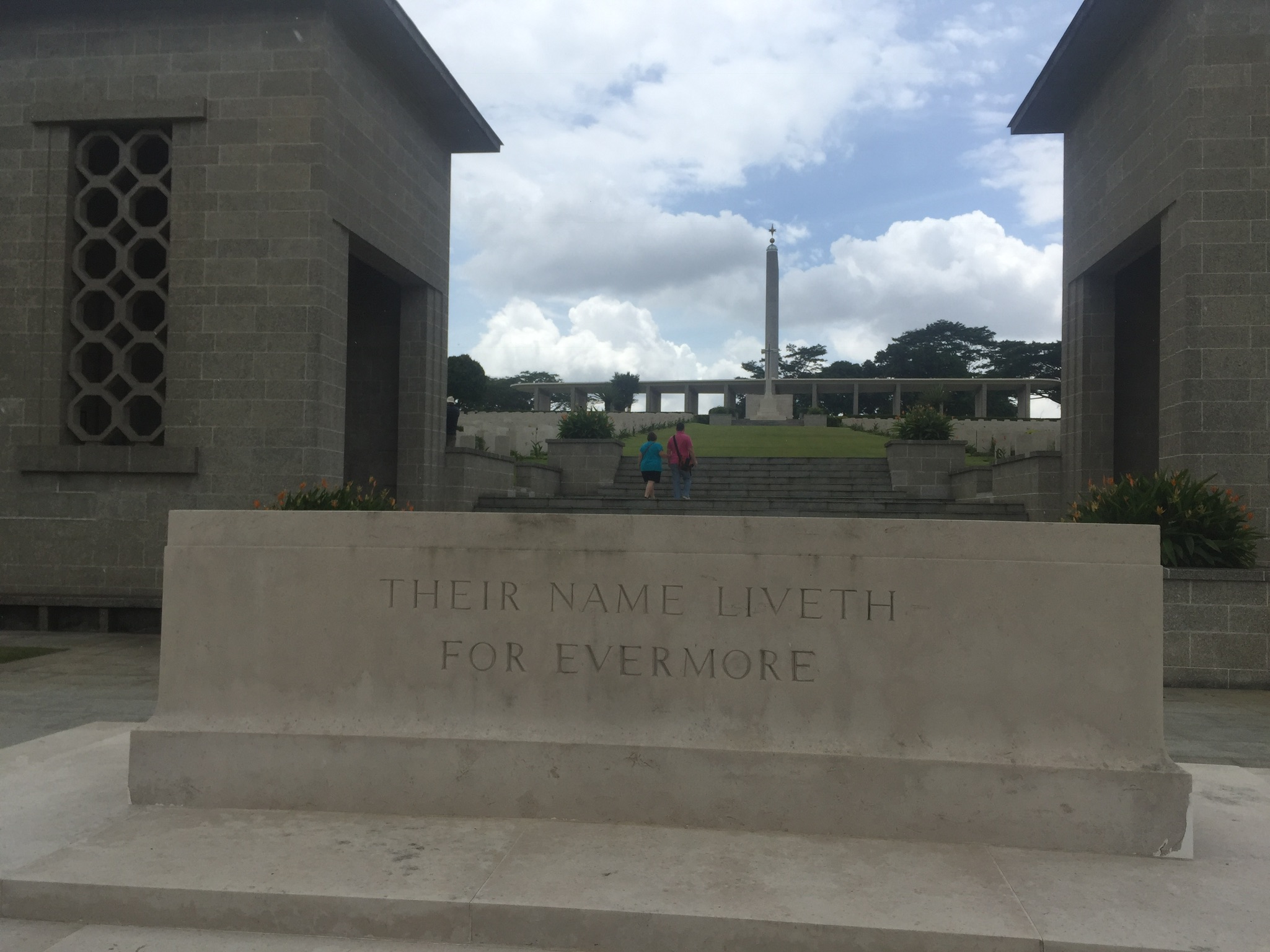
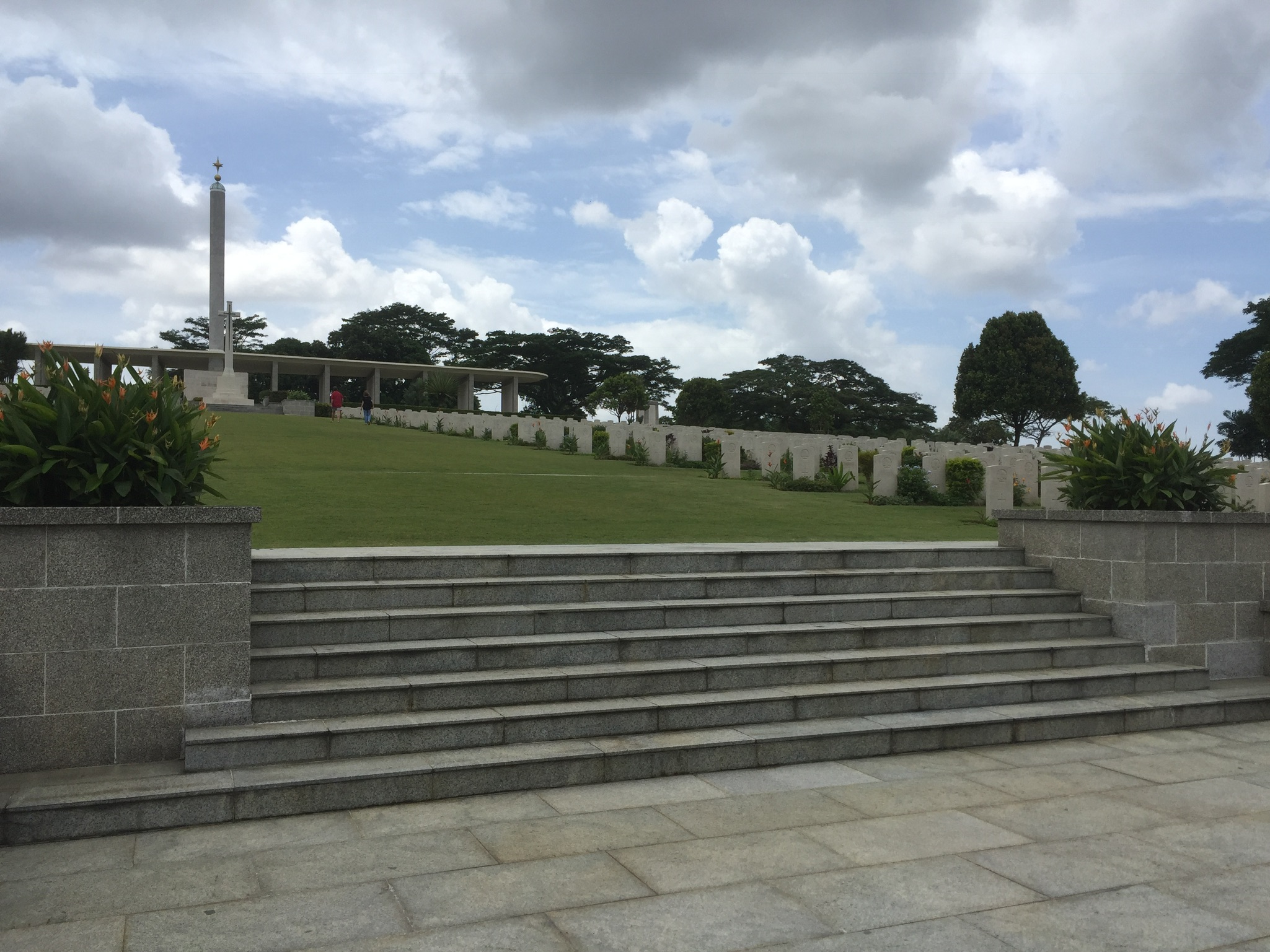
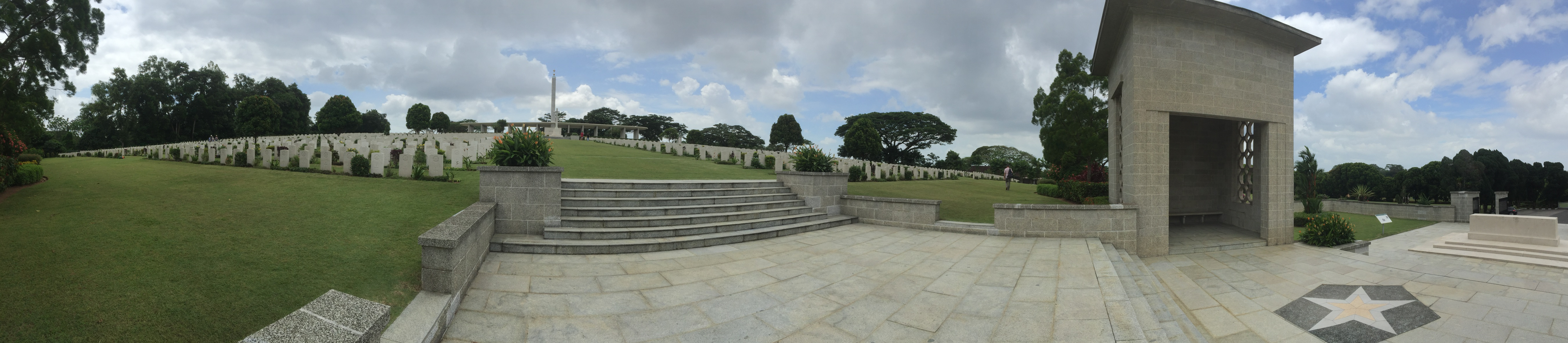
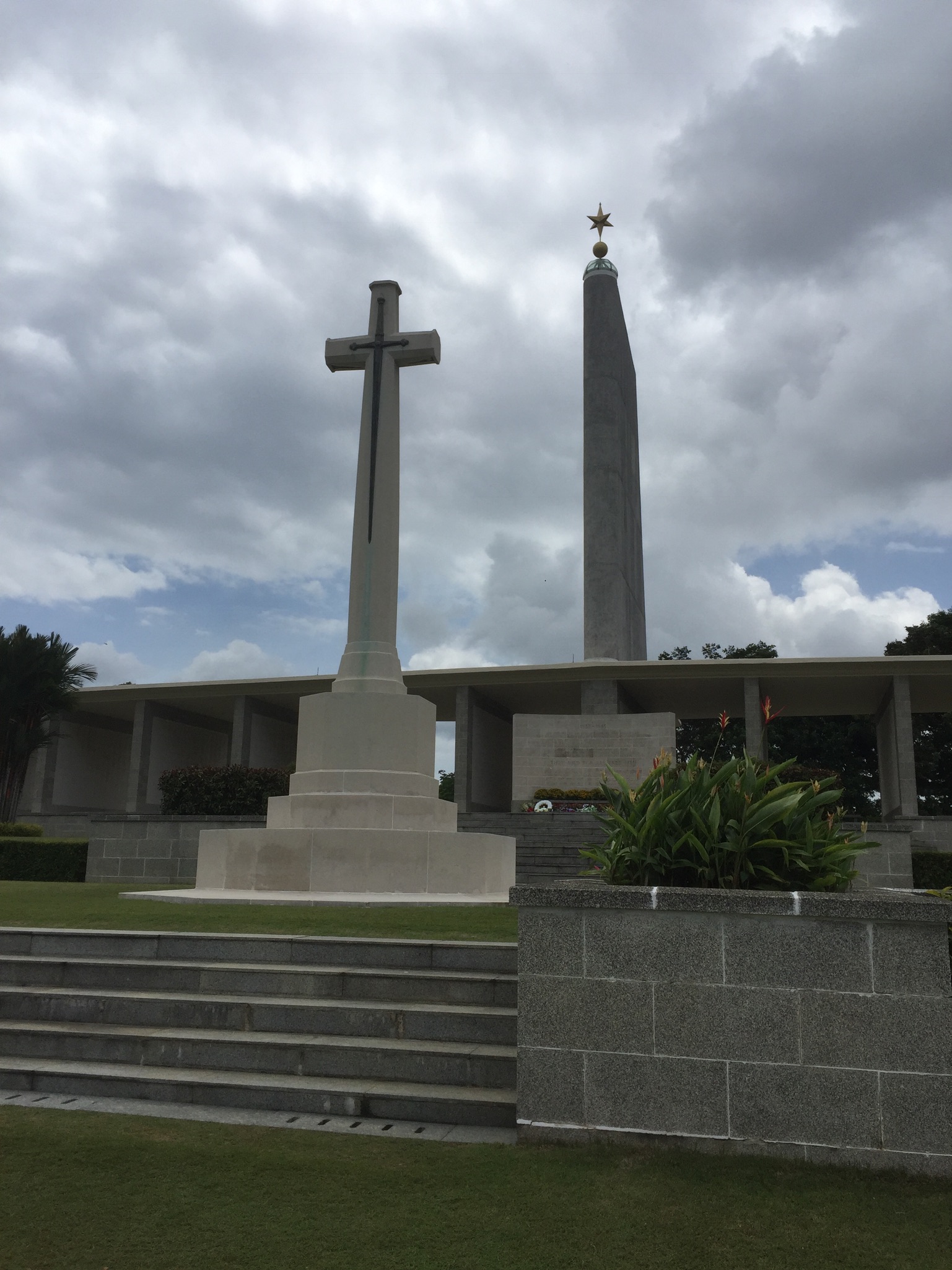
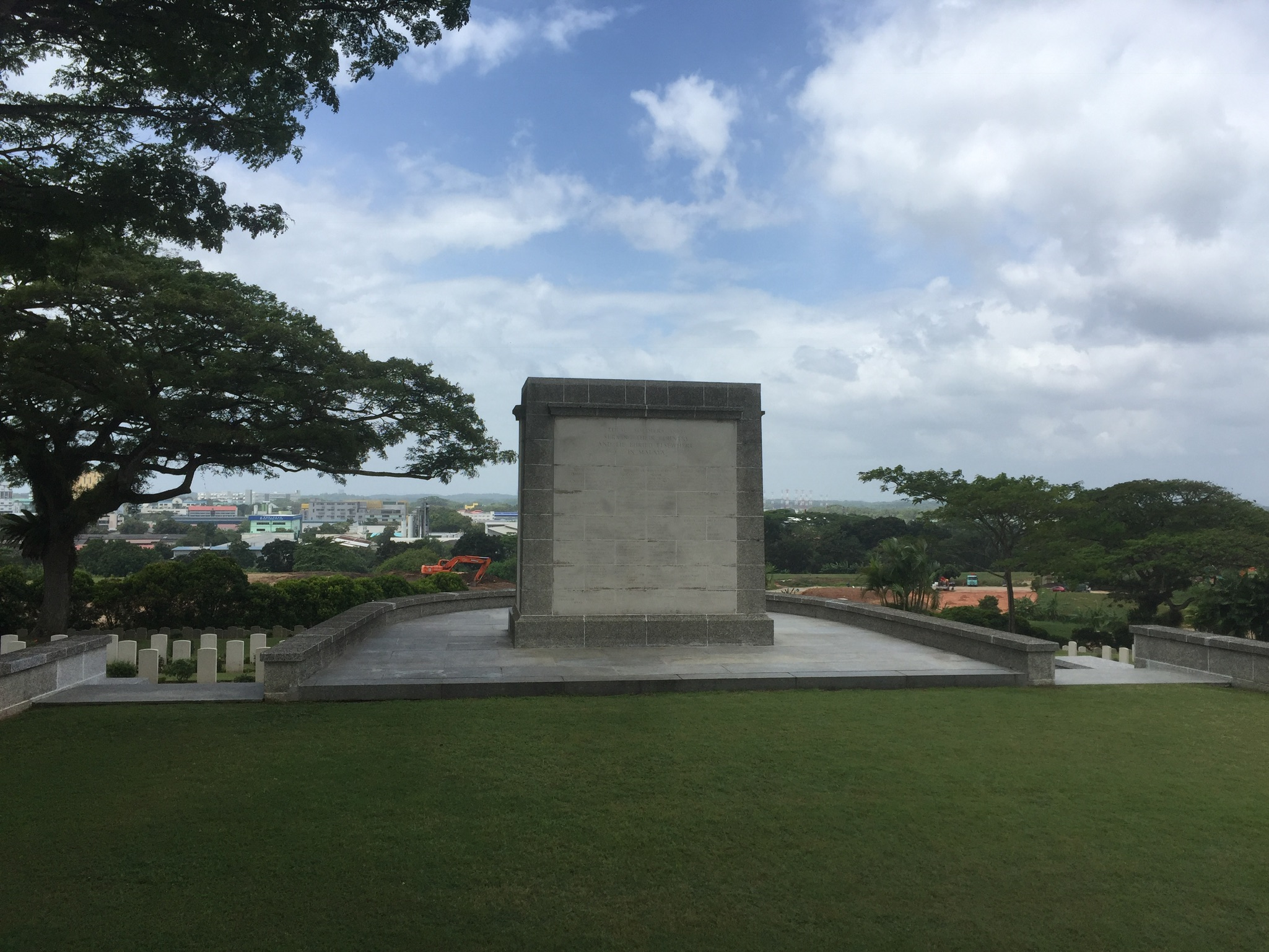
I arrived and had to stop to take a picture because it already looked so beautiful!
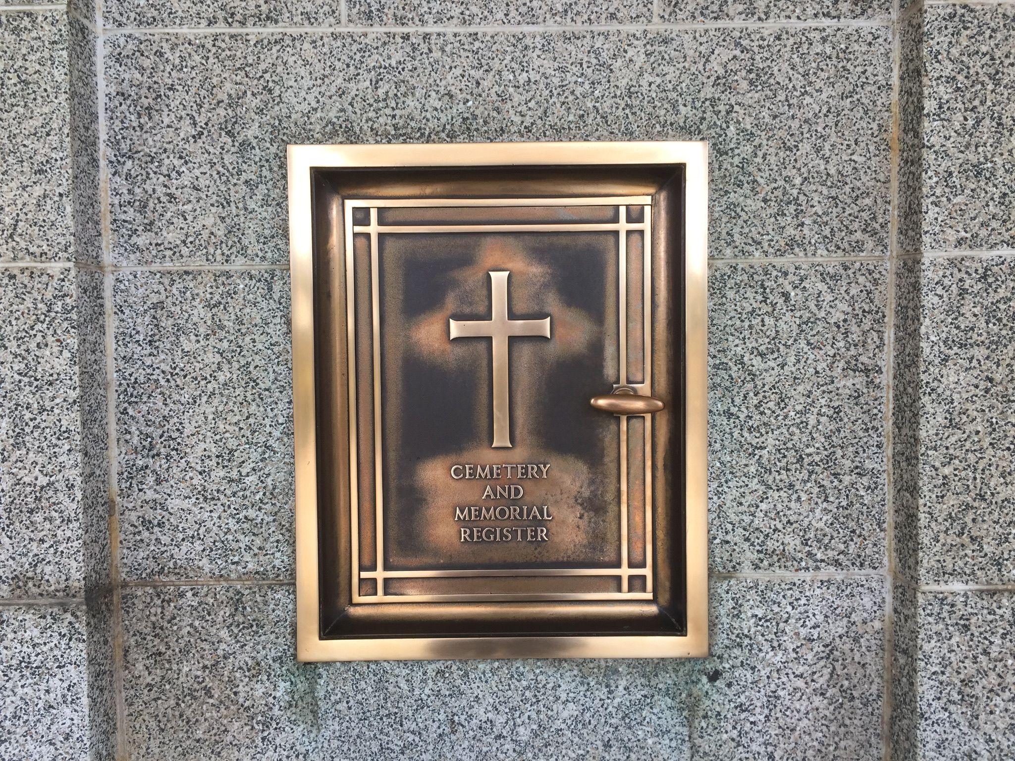
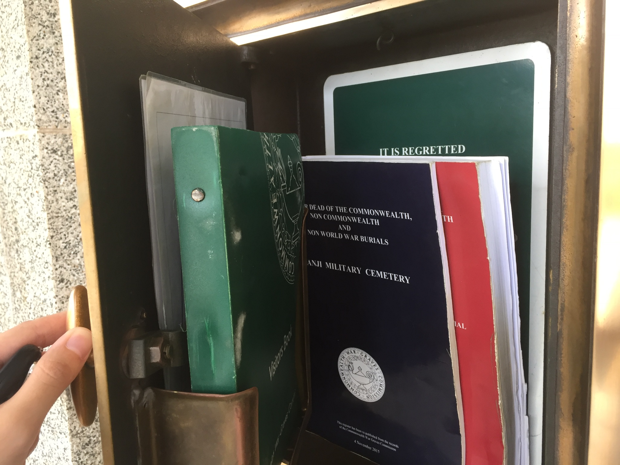
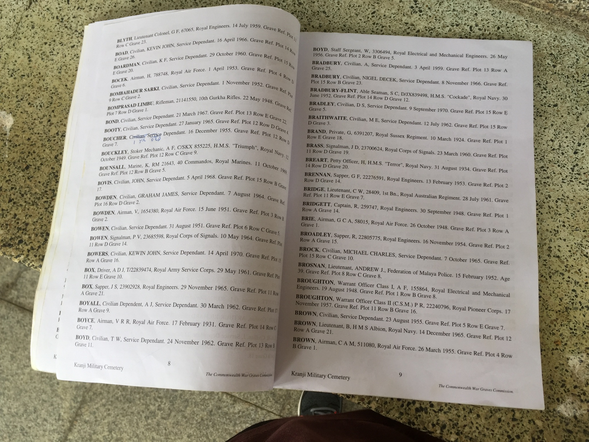
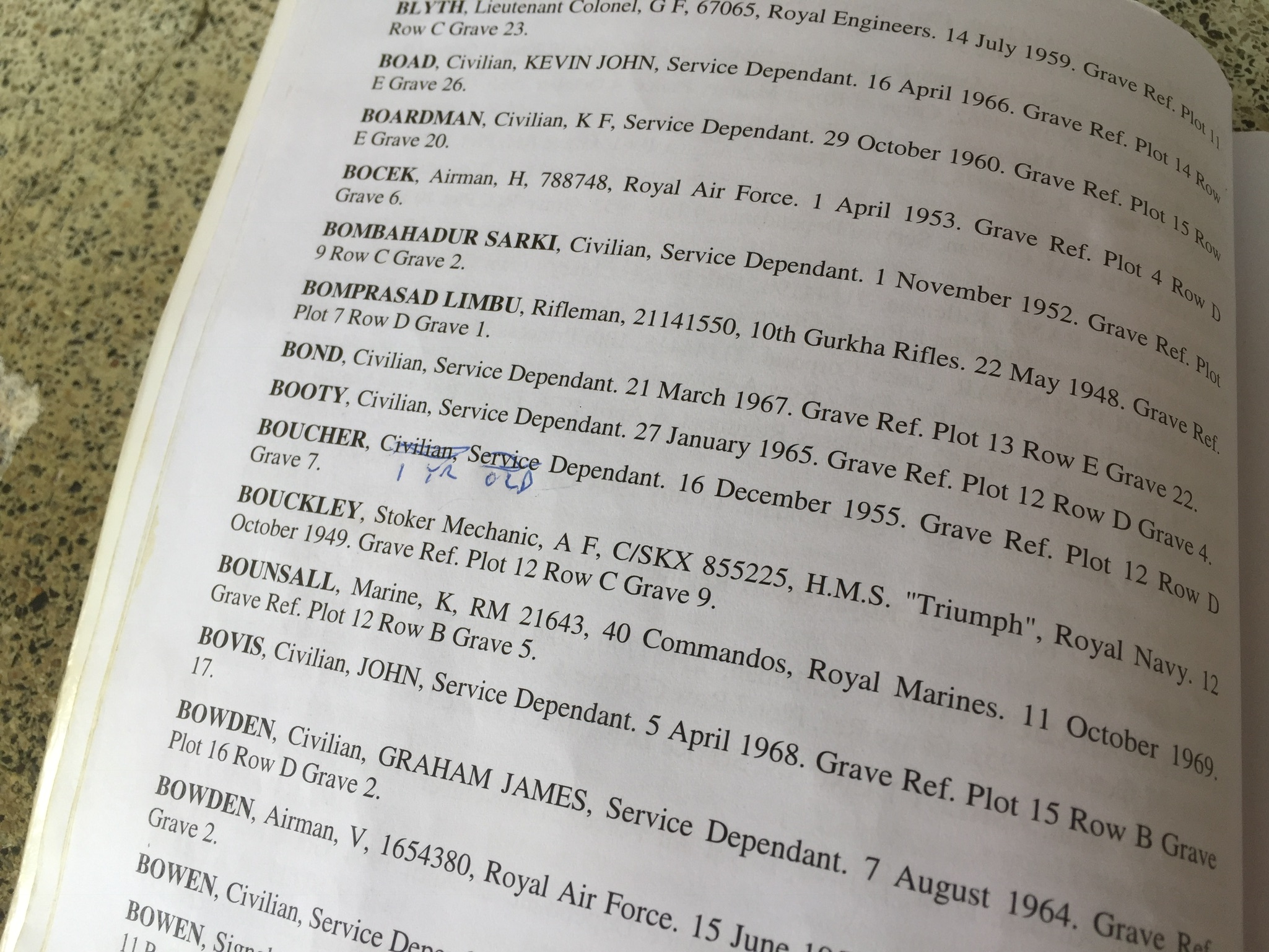
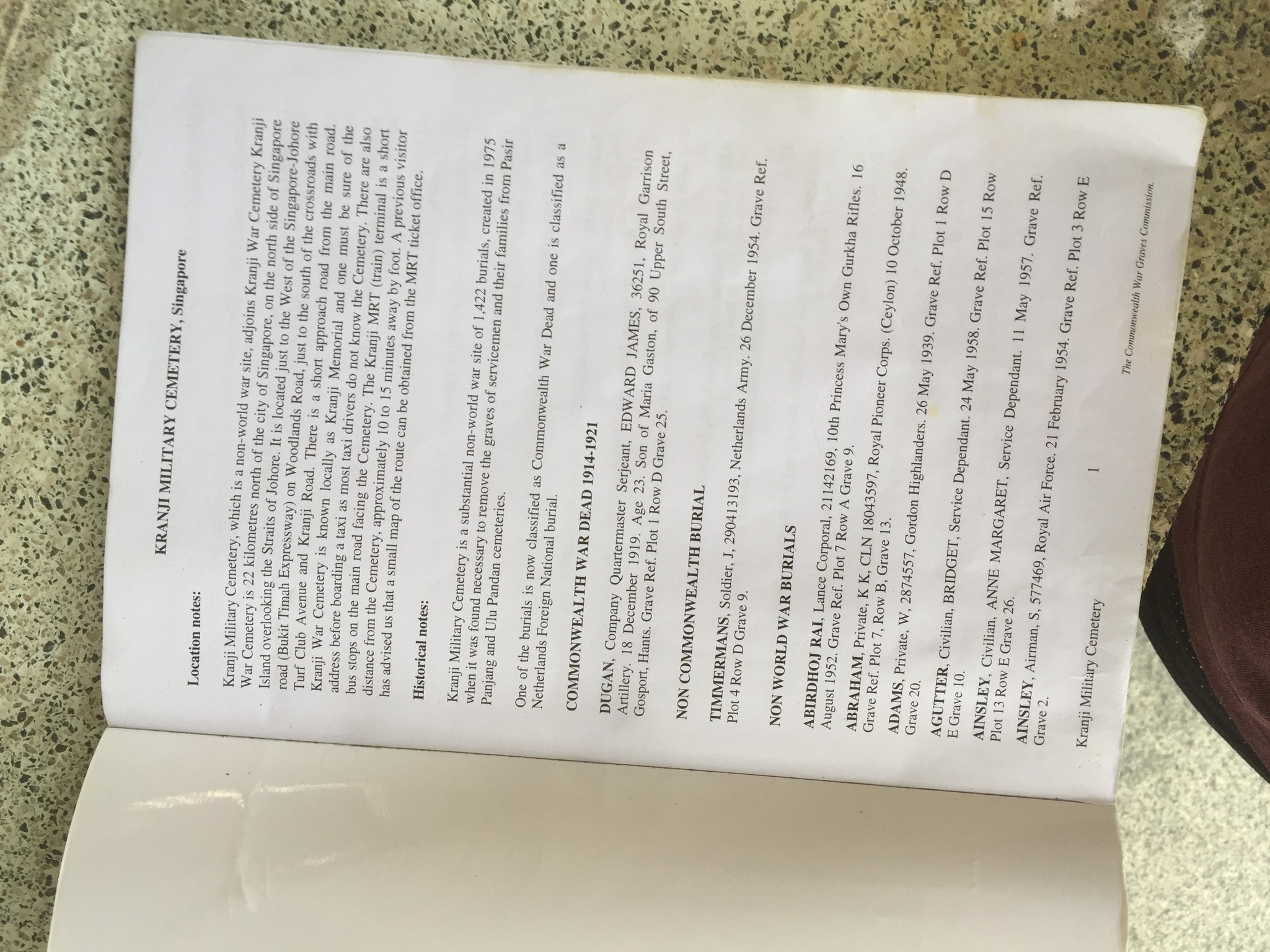
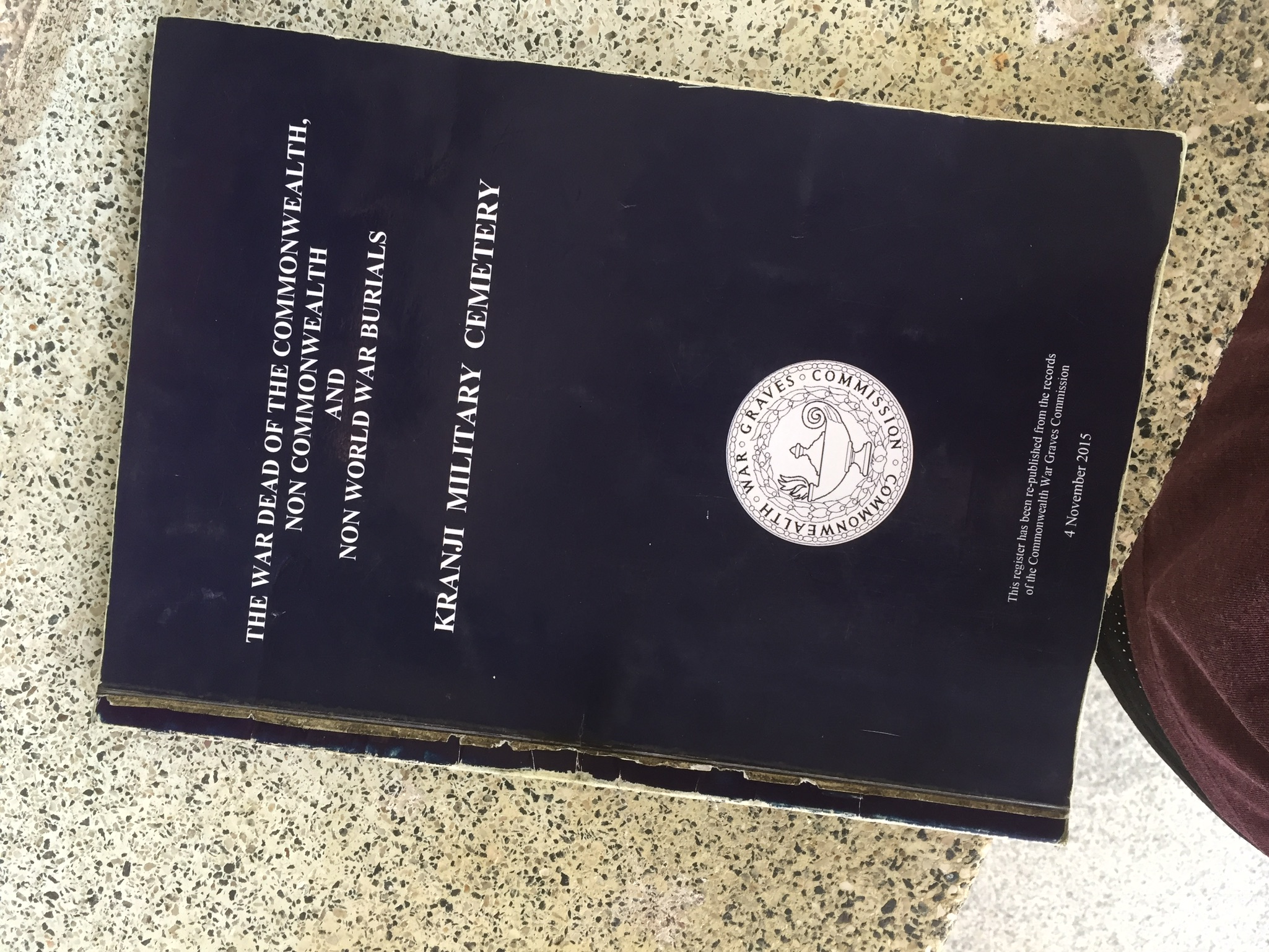
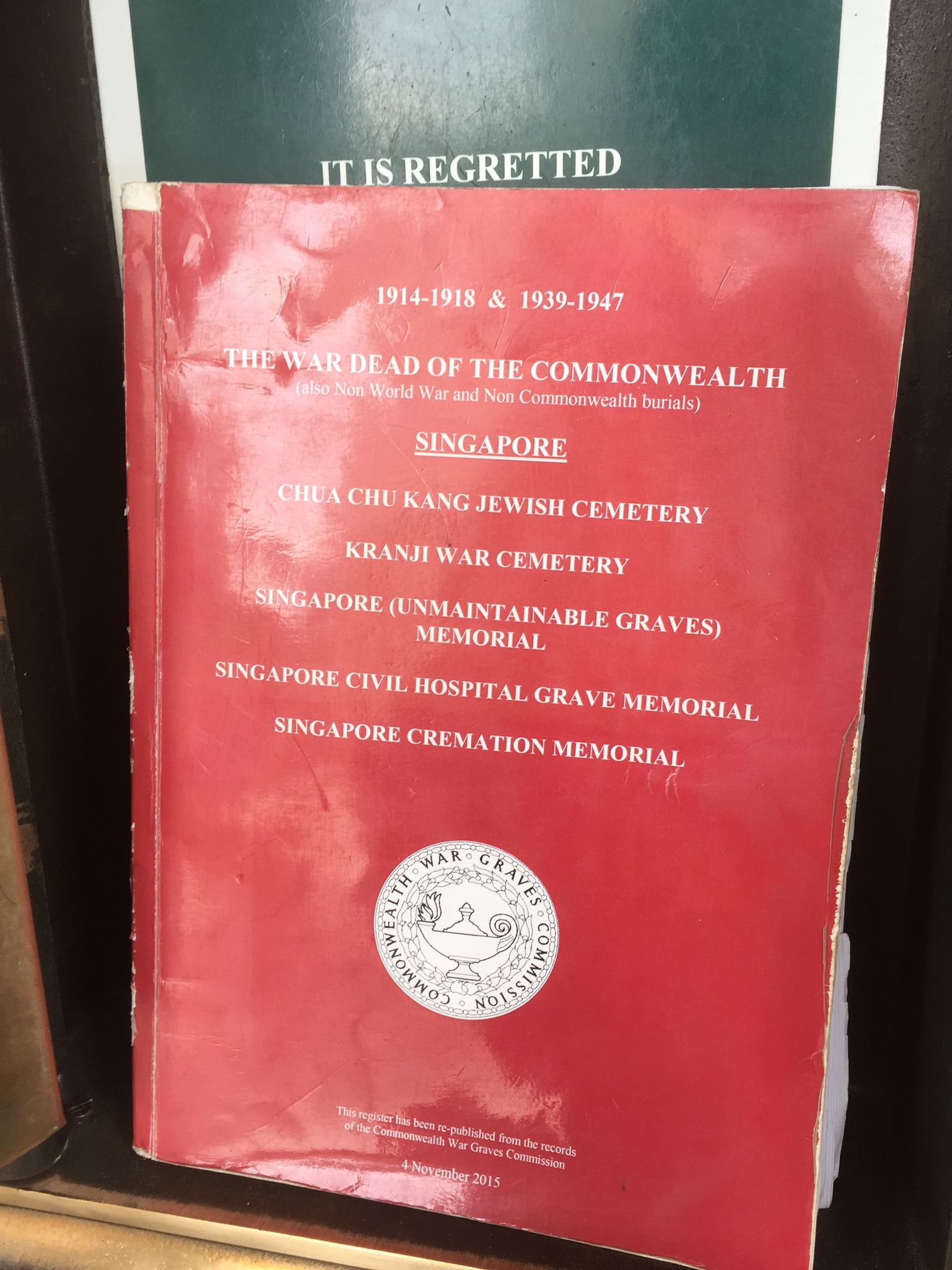
Was quite surprised that this was an actual thing you could open and there were actual books inside for visitors, but eventually realised that it made sense.
Some vandalism, or maybe a correction. Not sure if it was a typo, or was if Mr Boucher was really a baby then.
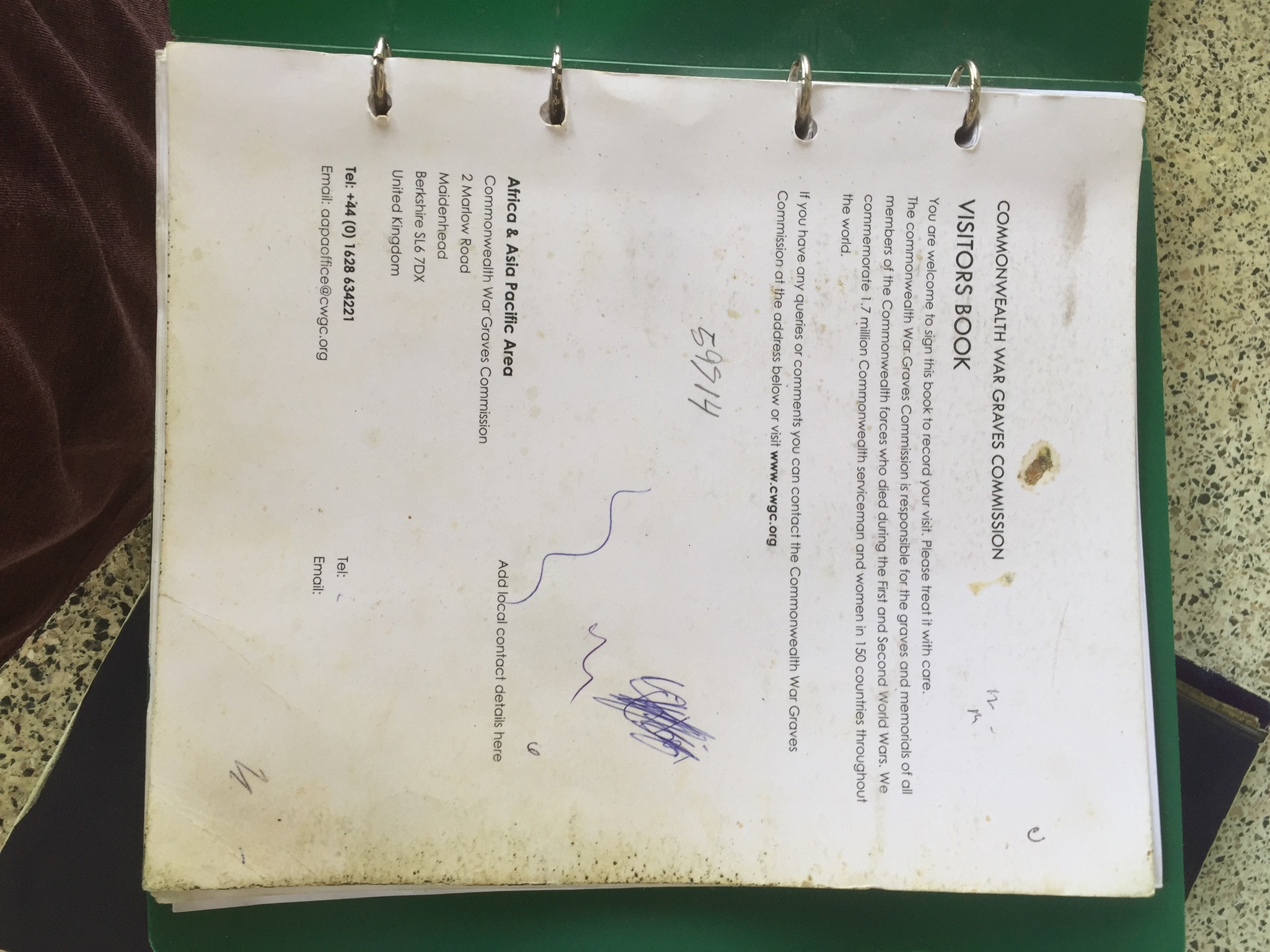
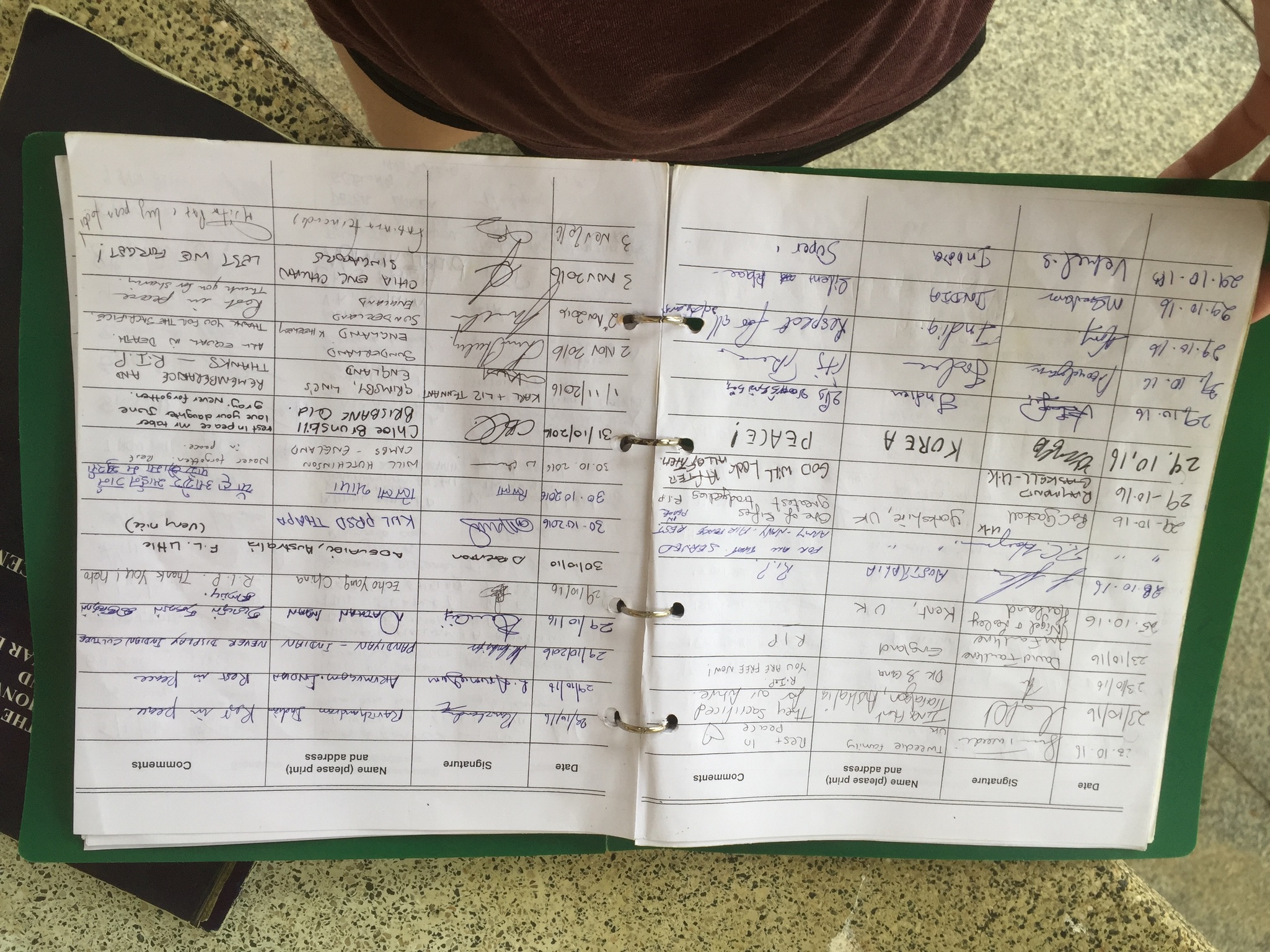
There was also a visitor’s book where visitors from all over the world signed and left messages.
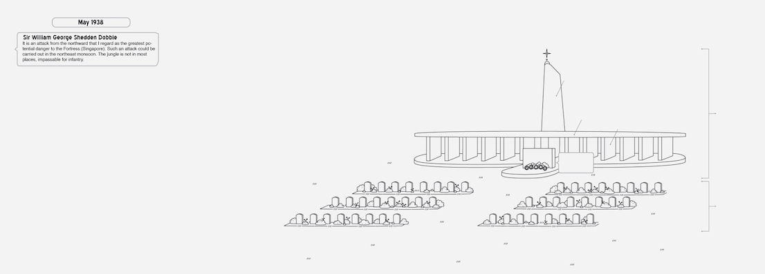
^ Information that could be helpful if I was going to do my infographic on the war.
Okay, from this point onwards, I wasn’t sure if it was disrespectful to blatantly take pictures, especially because there were a lot of ang mohs around and I didn’t want to be an uncultured Singaporean brat. So I refrained from taking pictures, but took some anyway!
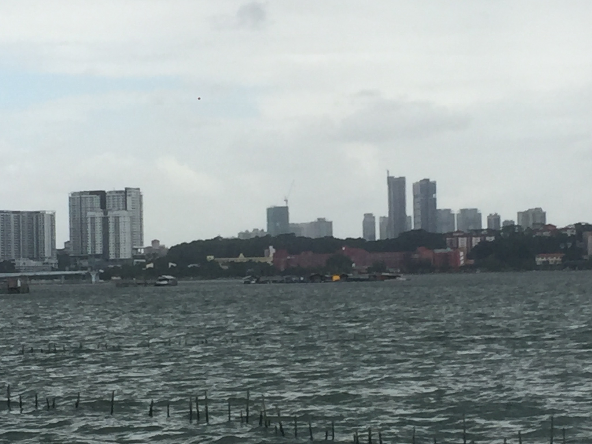
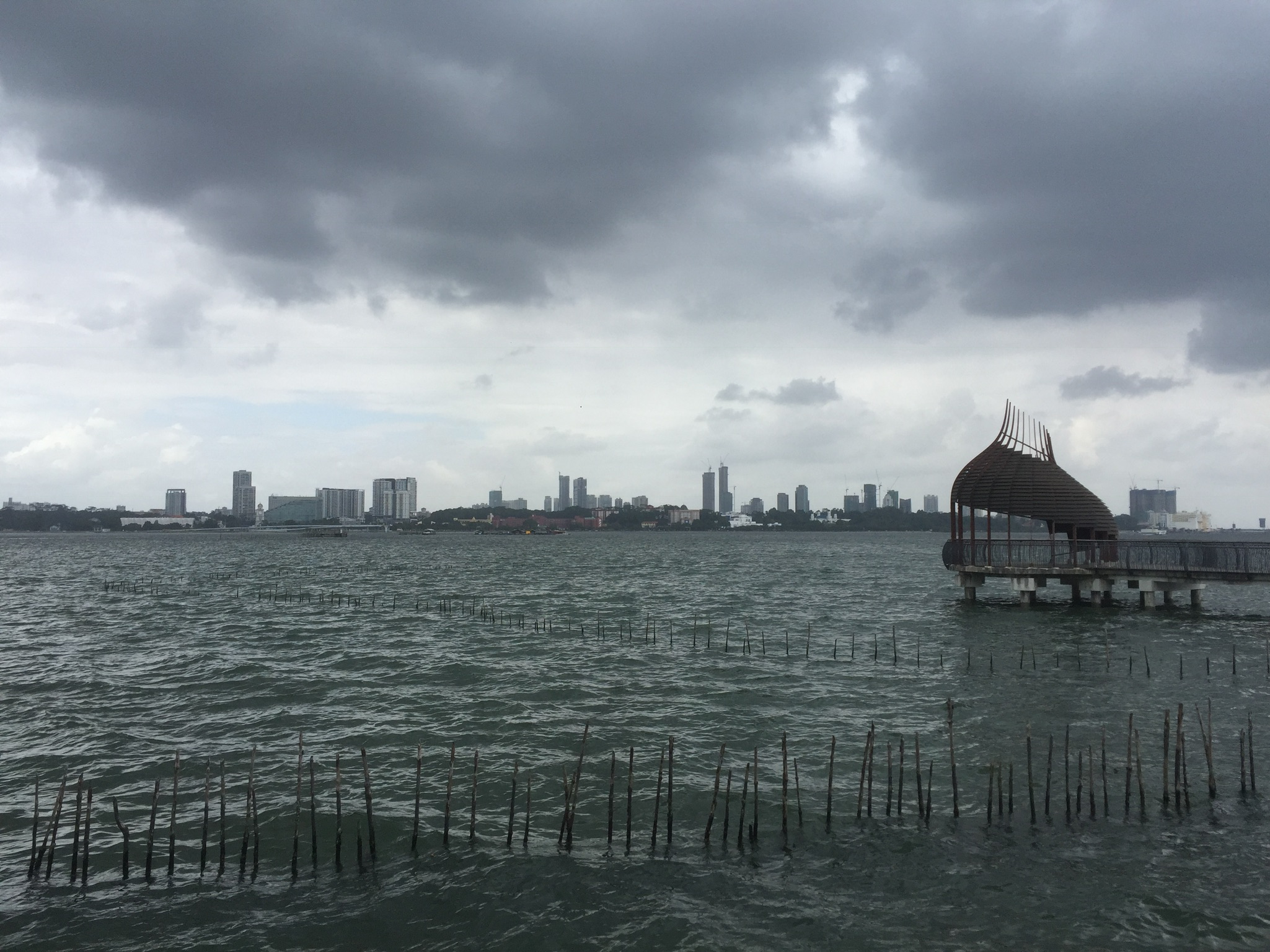
A faraway juxtaposition of the serene graves vs bustling city life.
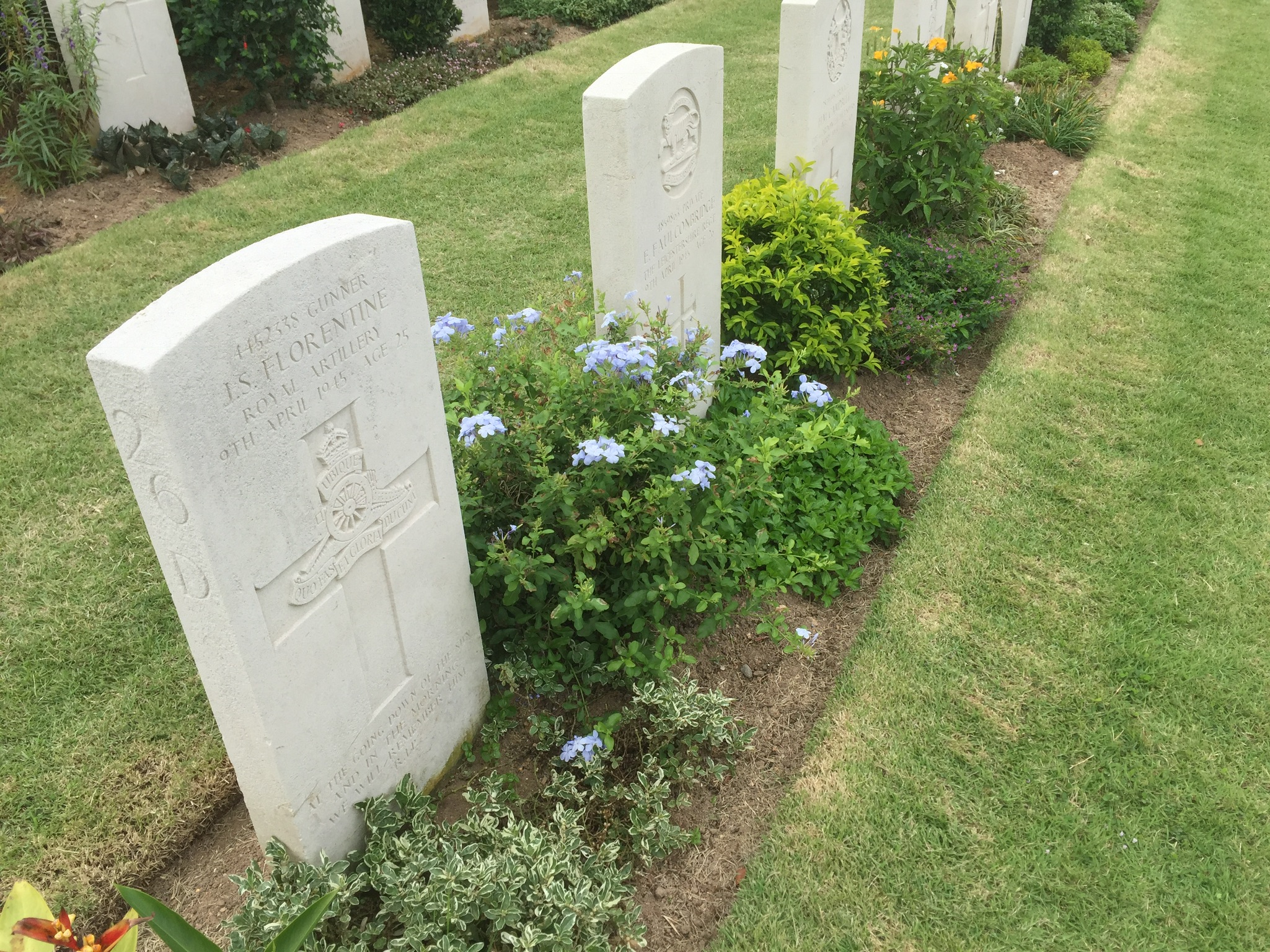
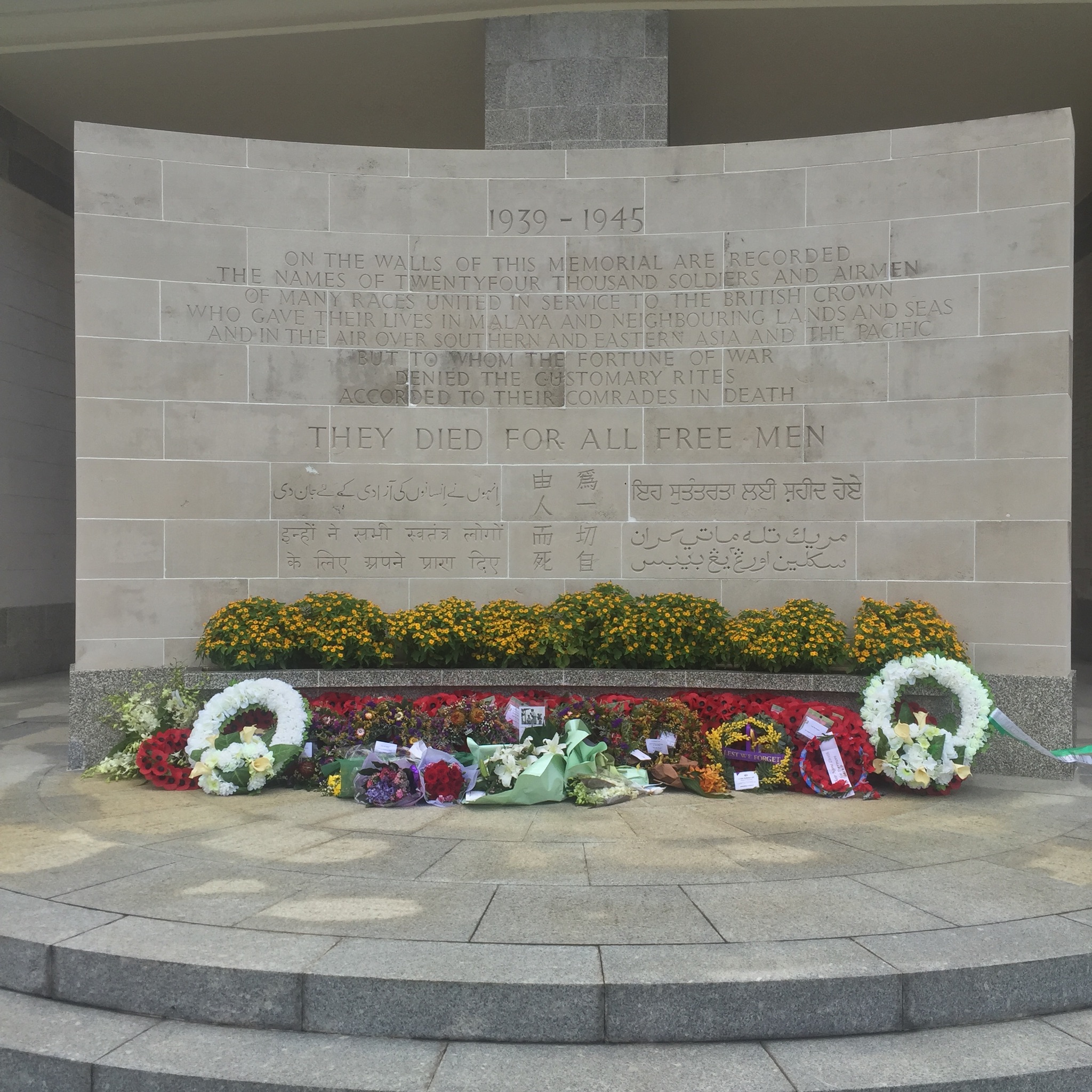
The graves were indeed really very well maintained and nicely engraved and there were so many pretty flowers along them.
Fresh flowers I later found out was because of Total Defence day, it all made sense.
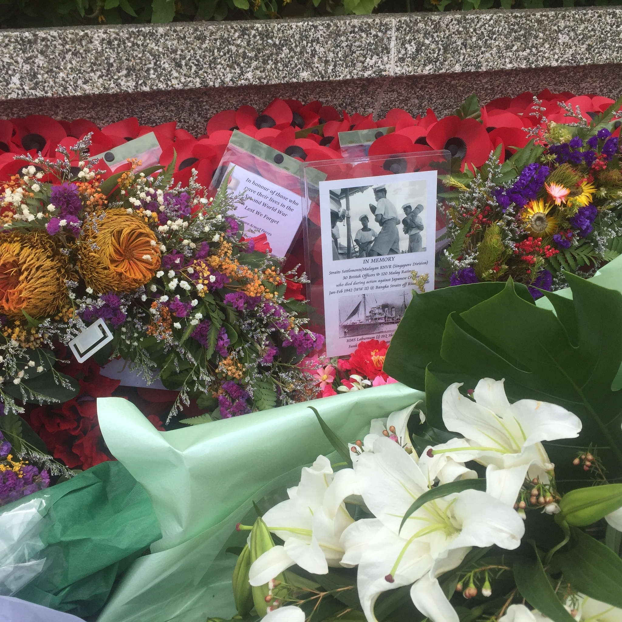
The flowers came from everywhere, from visitors, SAF, and some overseas government. I’ve noticed flowers placed on specific graves too.
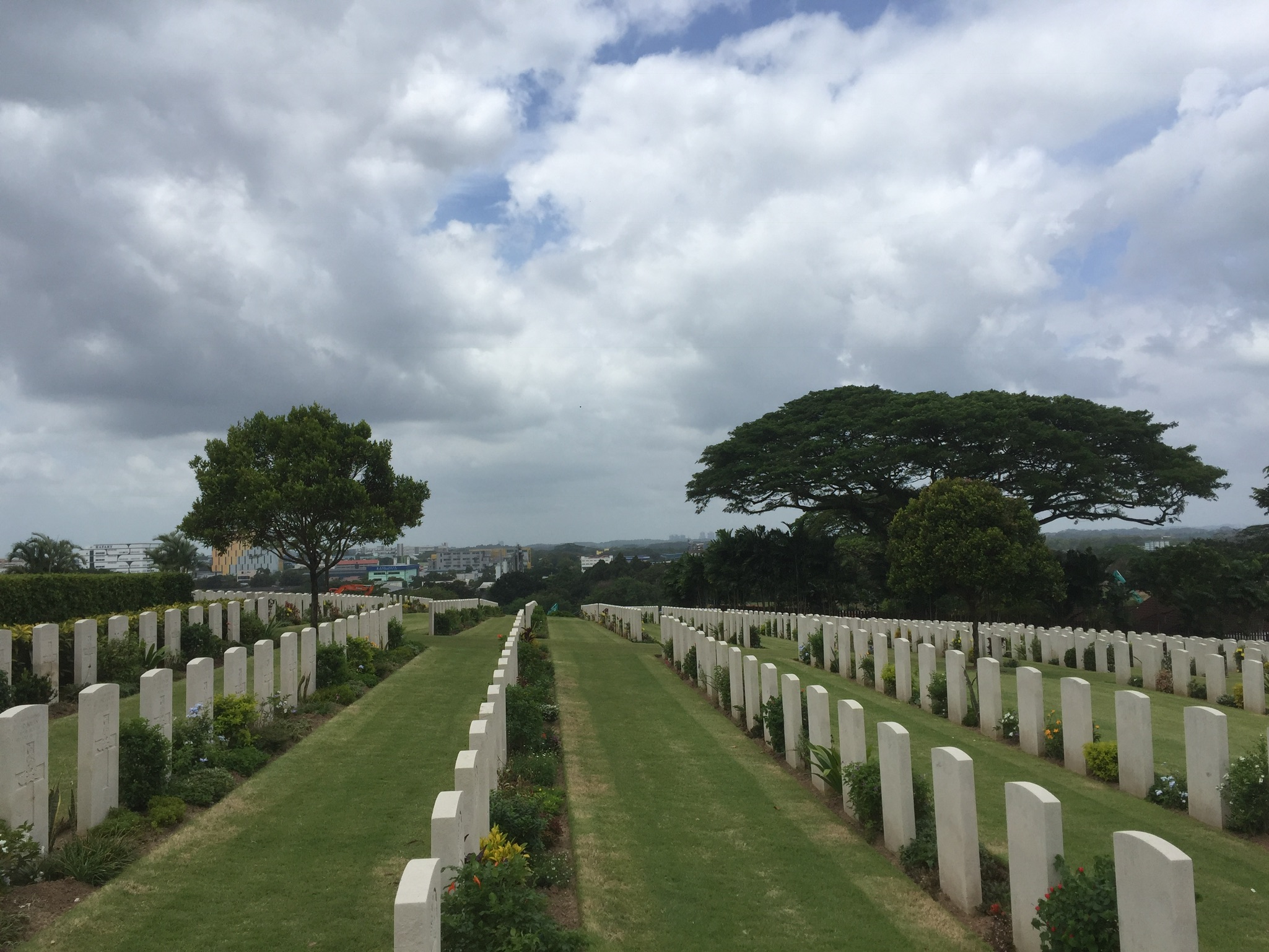
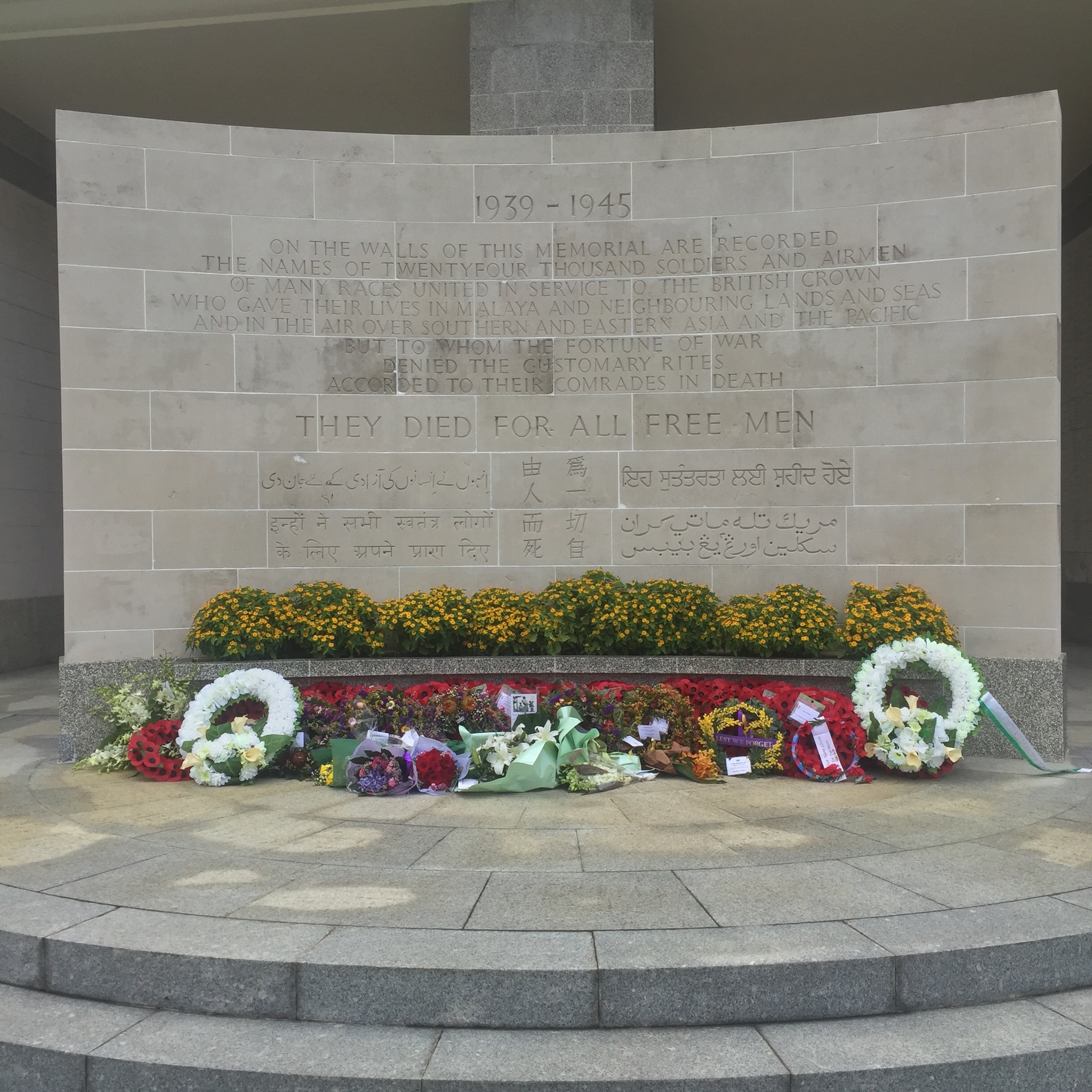
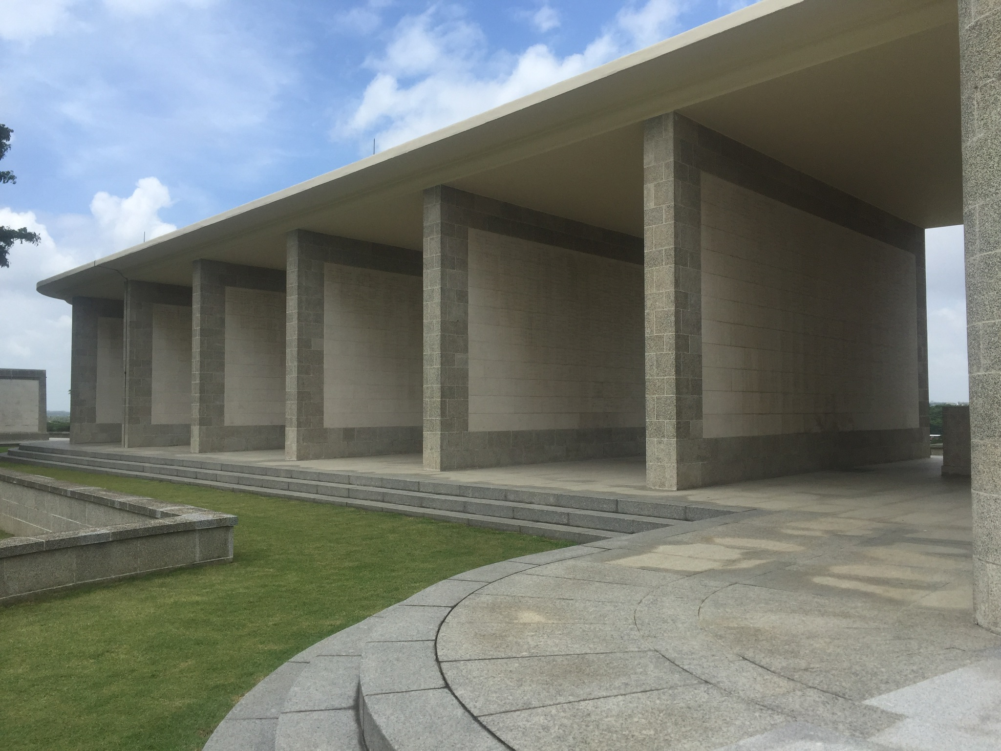
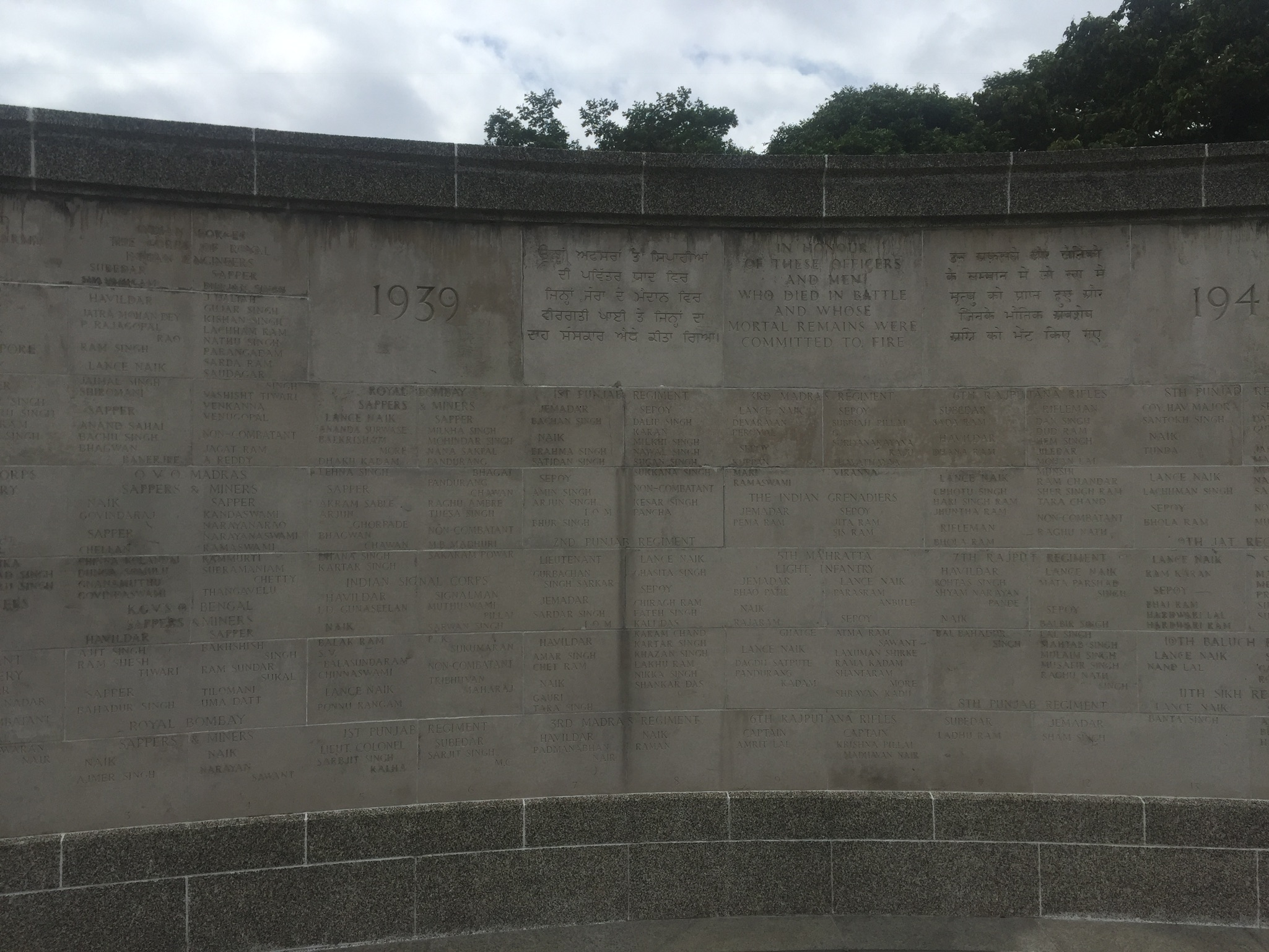
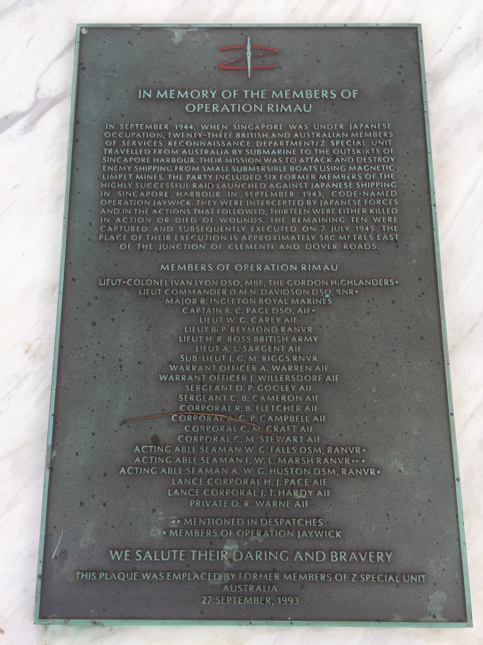
Walls of engraved names.
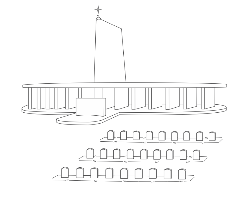
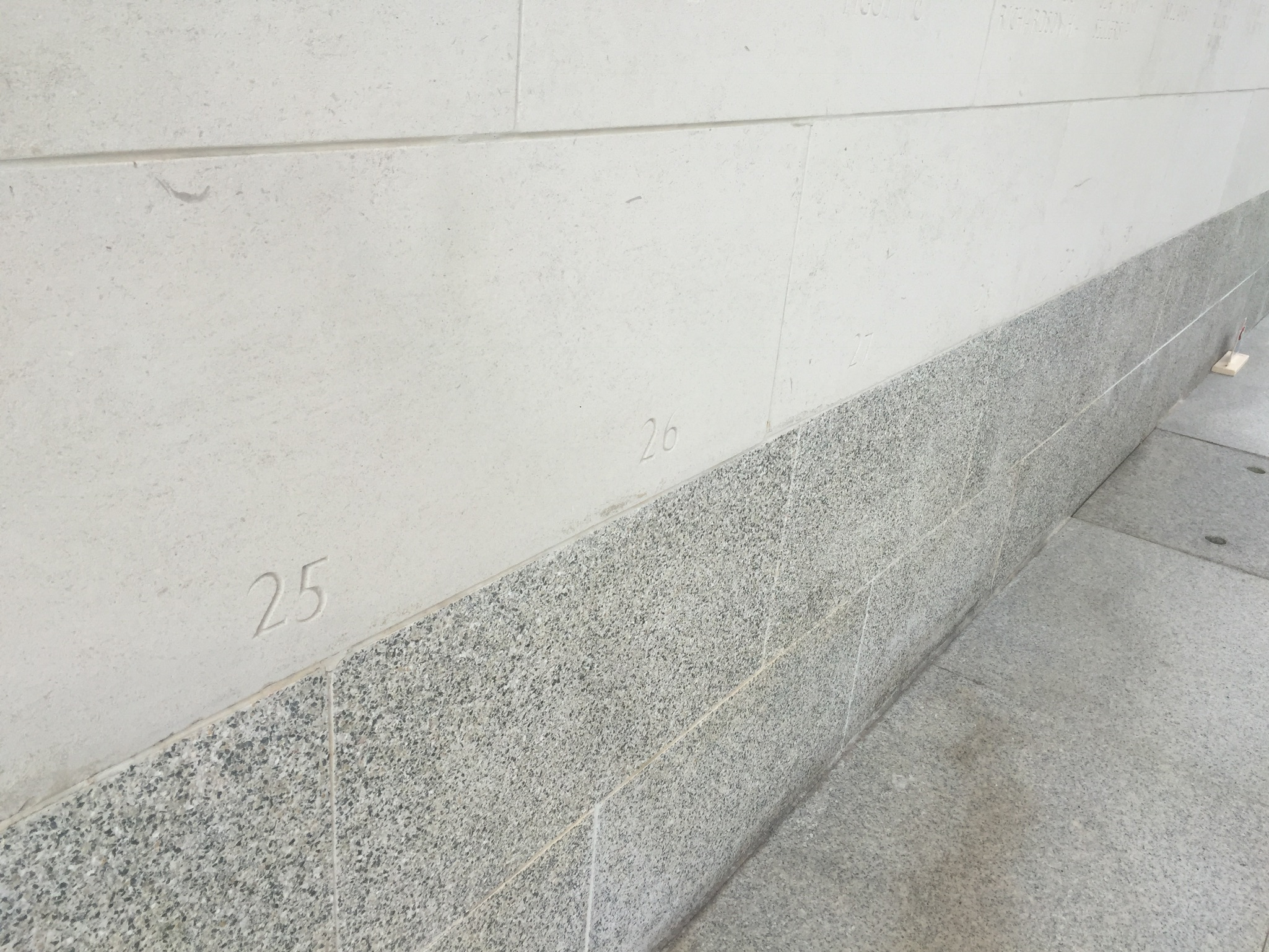
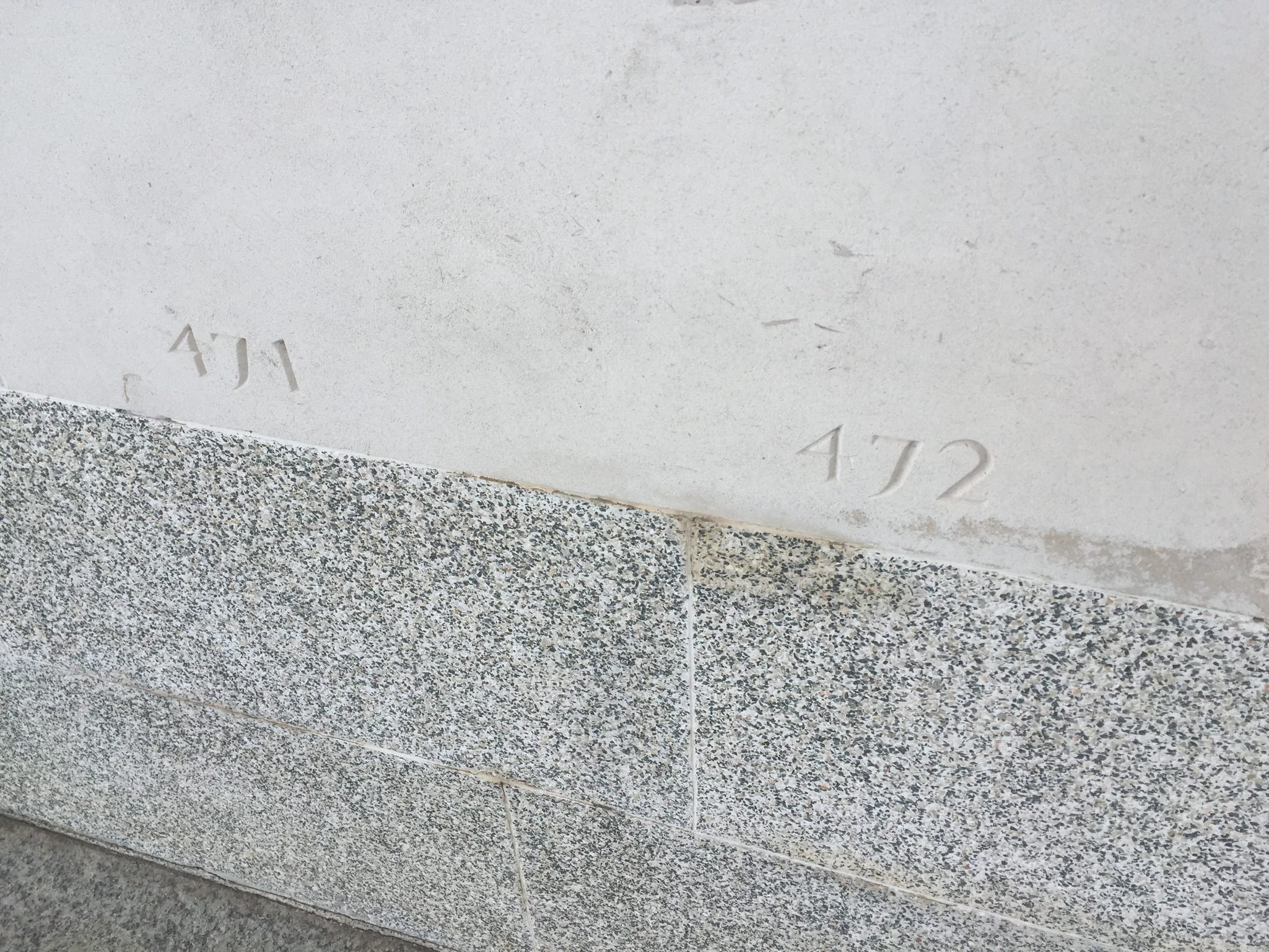
I found these numbers below and realised they were counting columns.
In total, there were 472 columns.
Another juxtapositions. There were several walls like these which had words that described the soldier’s death, such as in captivity or in fire, or if they were transferred graves. It made sense that they were doing their best to really honour and name each and every soldier.
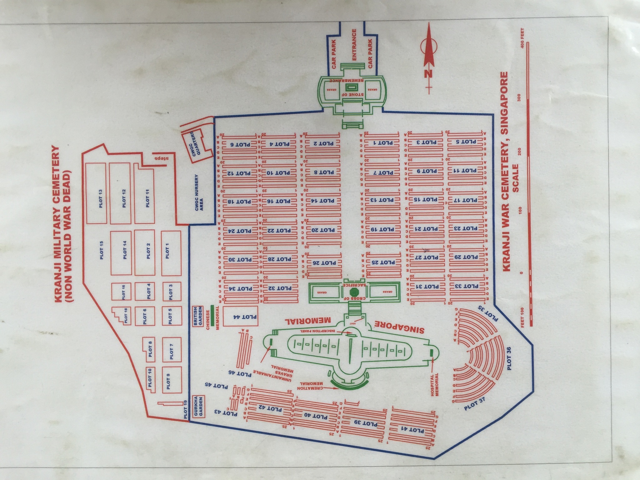
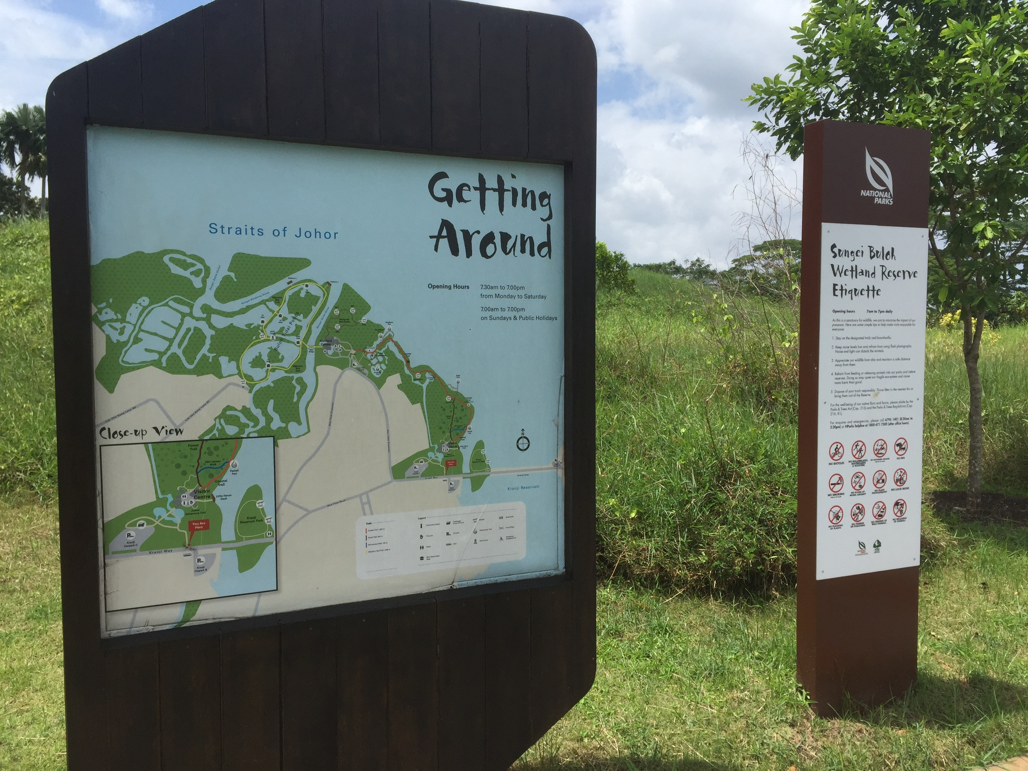
The site is part of the Kranji Heritage trail.
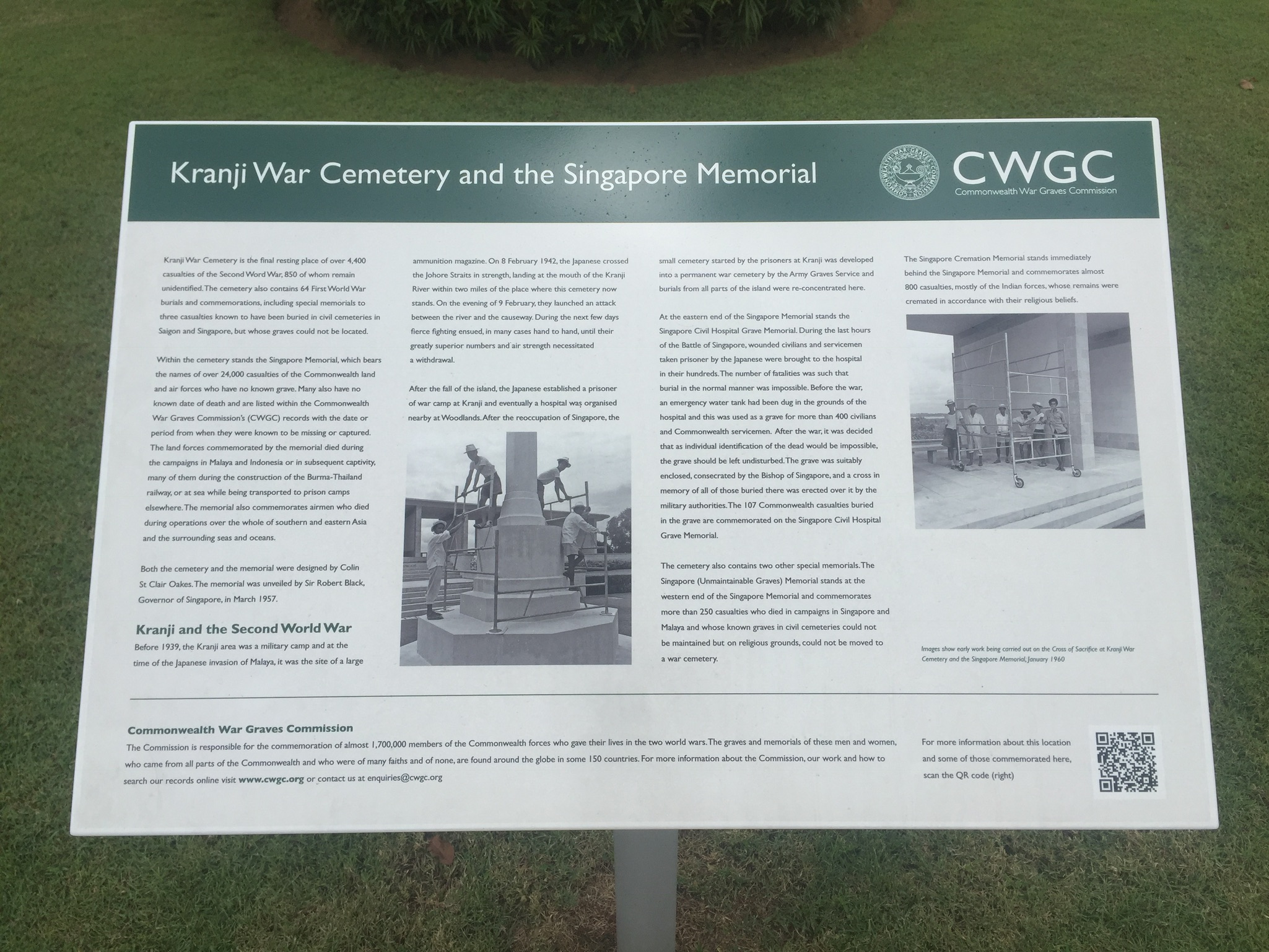
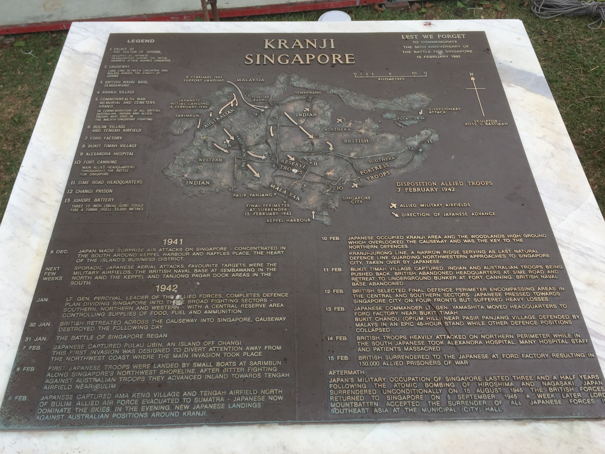
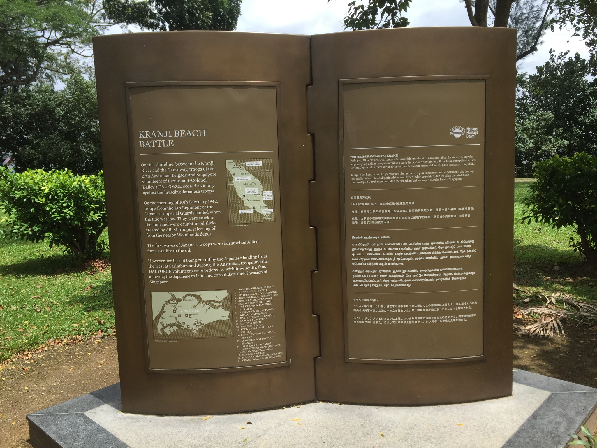
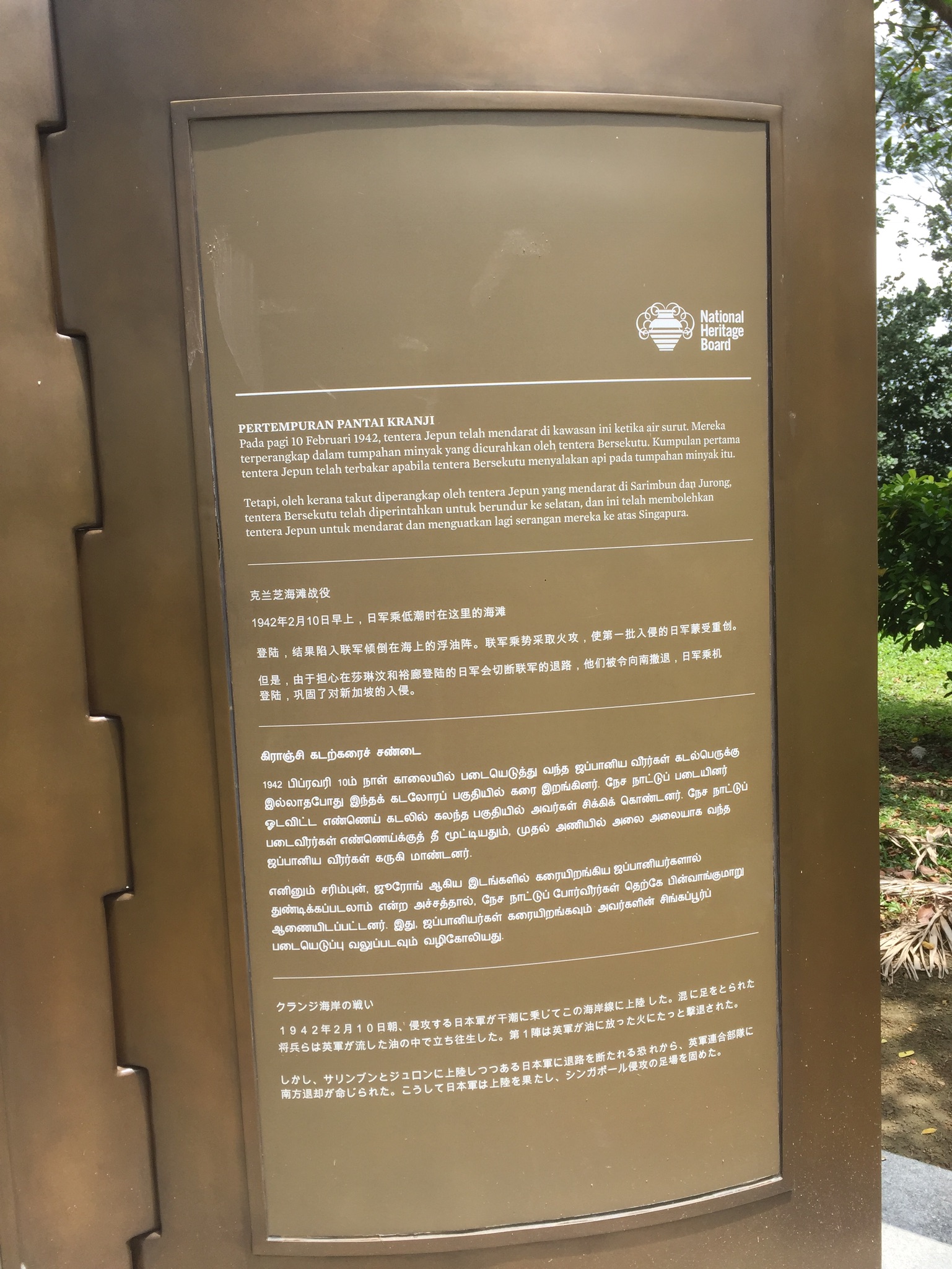
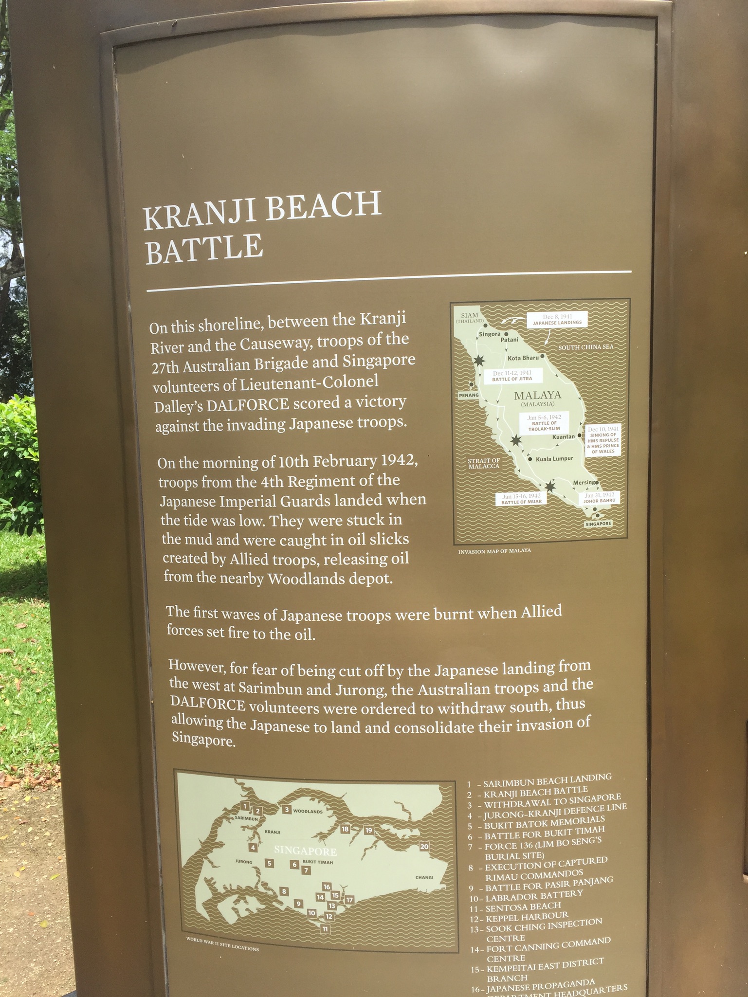
I was about to leave when I spotted these two information plagues around the carpark.
^ Some information to read.
When I went to take these pictures, I also happened to see an isolated grave on the opposite side of the carpark. It turned out to be the grave of former Singapore president (1971 – 1981), Benjamin Henry Sheares.
It was really quite an experience for me to visit this site alone. I had the time to breath in the peace, and was able to take my time to walk around and hear the birds chirp. It was a really beautiful and serene hill tucked away in the city, an aptly landscaped ground to honour the brave souls and their families.
I’ve read somewhere before my visit that the memorial was maintained by 5 foreign workers. Upon my visit, I saw some sheds and a gardening area with pots of plants. Also, around the area seemed to be some landed housing estates – but I am not really sure what they are.
It was quite emotional to think about the scale of the war and how much it affected the lives of the people then, and the people now. I was quite surprised that there were so many countries, nationalities and religions involved. Some of them I noticed were names of Singhs, there were also notably soldiers from Hong Kong, New Zealand etc.
The war also notably affected the lives of the people around the soldiers, there were assigned areas for the graves of the families. These graves were more customised. I’ve also realised a set of different graves and from the inscriptions, found out that they belonged to the Gurkhas. The graves were of a darker tint and were more rugged looking.
When I was there, most of the visitors were westerners, maybe it was because most of the names on the graves belonged to westerners too? A pair of old couple particularly caught my attention as they stayed on the same spot for a really long time. They were there before I reached and when I left, they were still there. Perhaps they were looking for a name? I didn’t speak to them at all (because I am a shy wuss) and I didn’t want to disturb their peace. Despite knowing how nice foreigners can be about small talk, it just didn’t seem like a place nor occasion to talk to them.
I also wondered if it was right for me to know so little about the war.
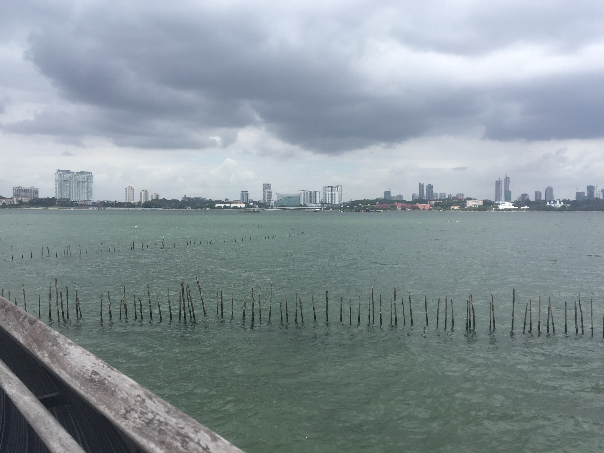
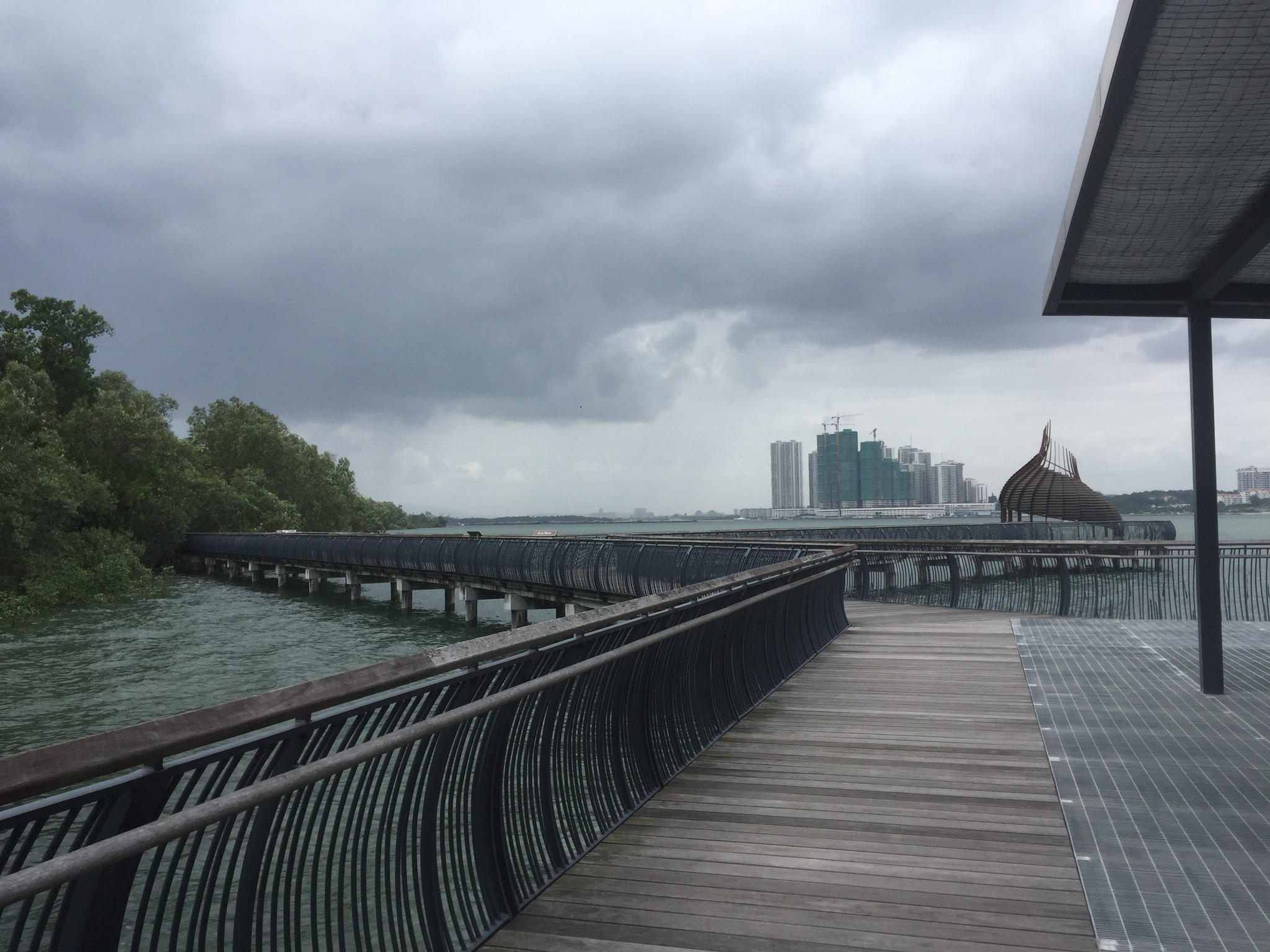
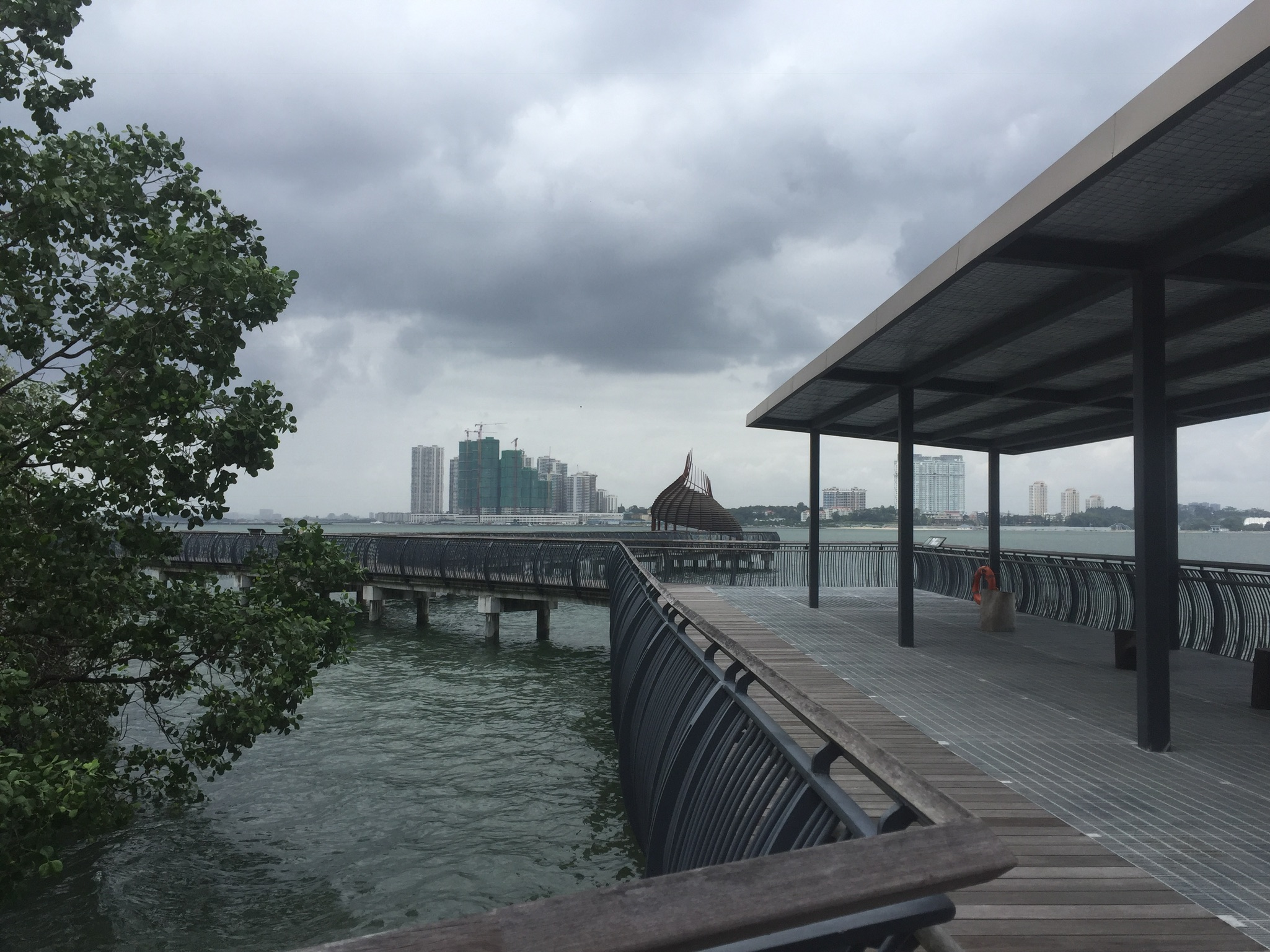
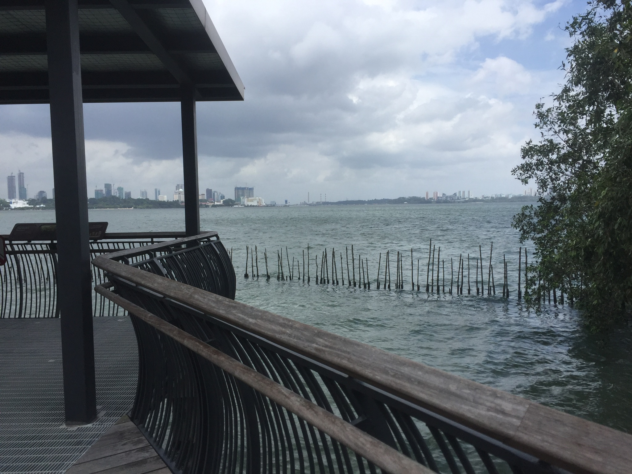
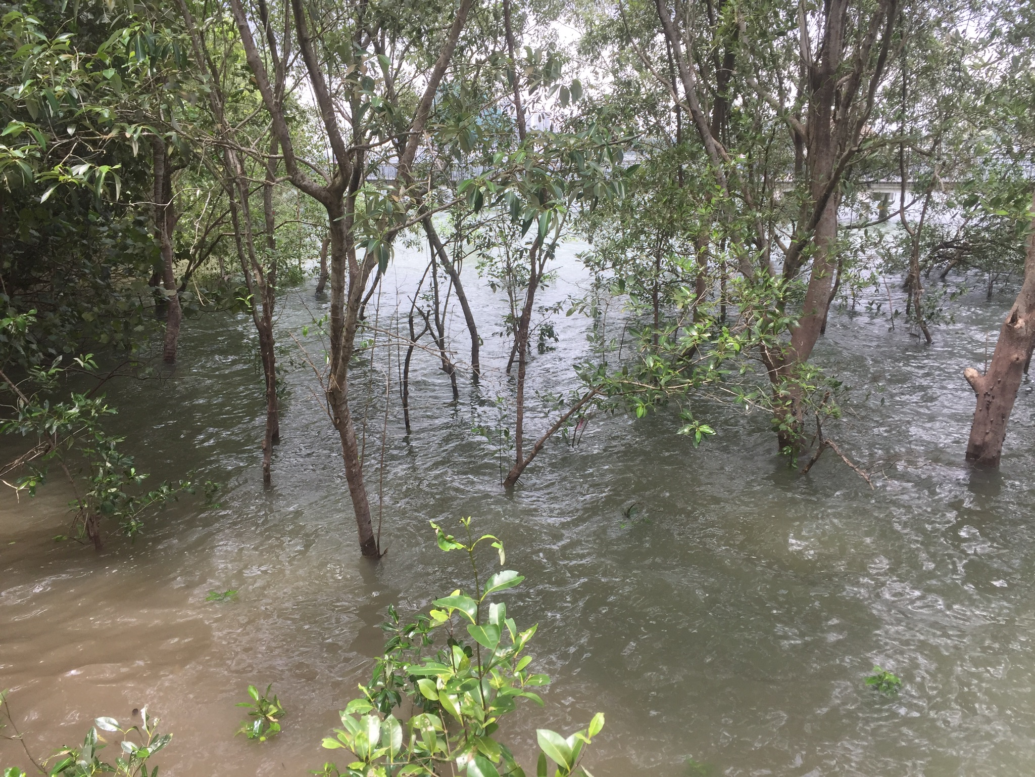
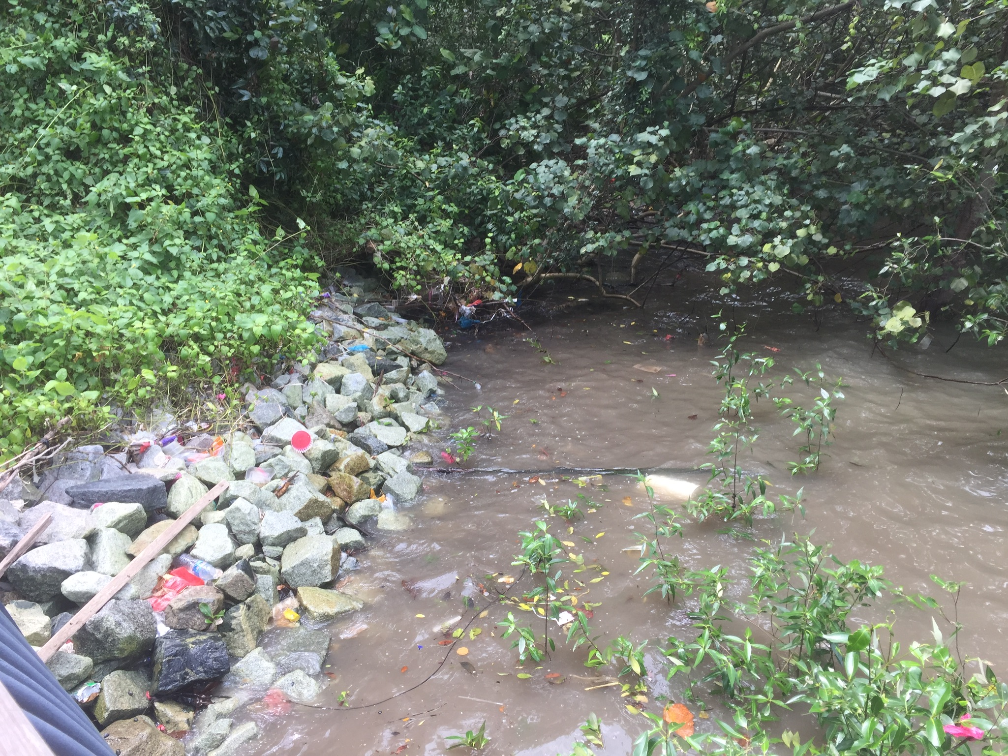
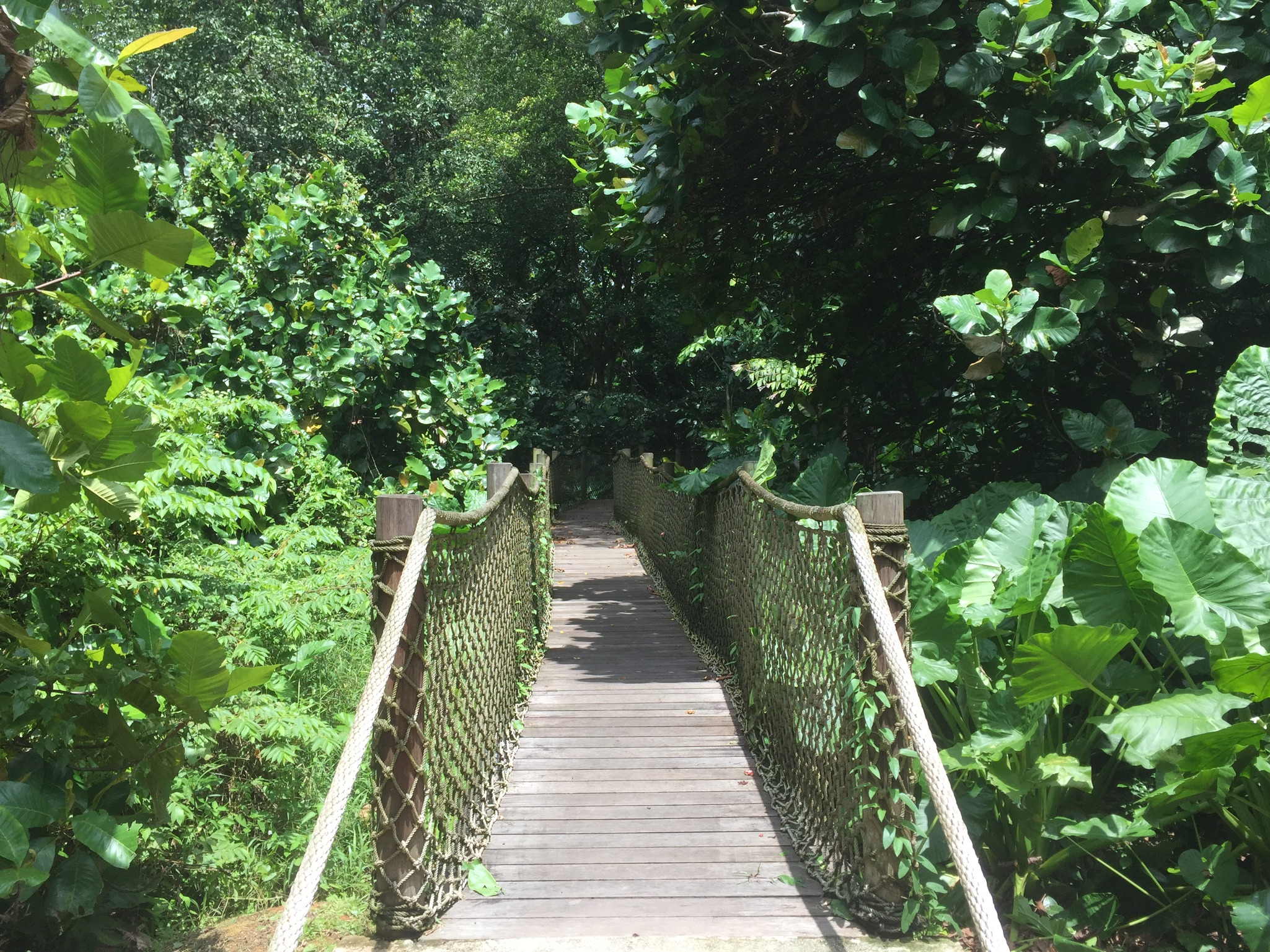
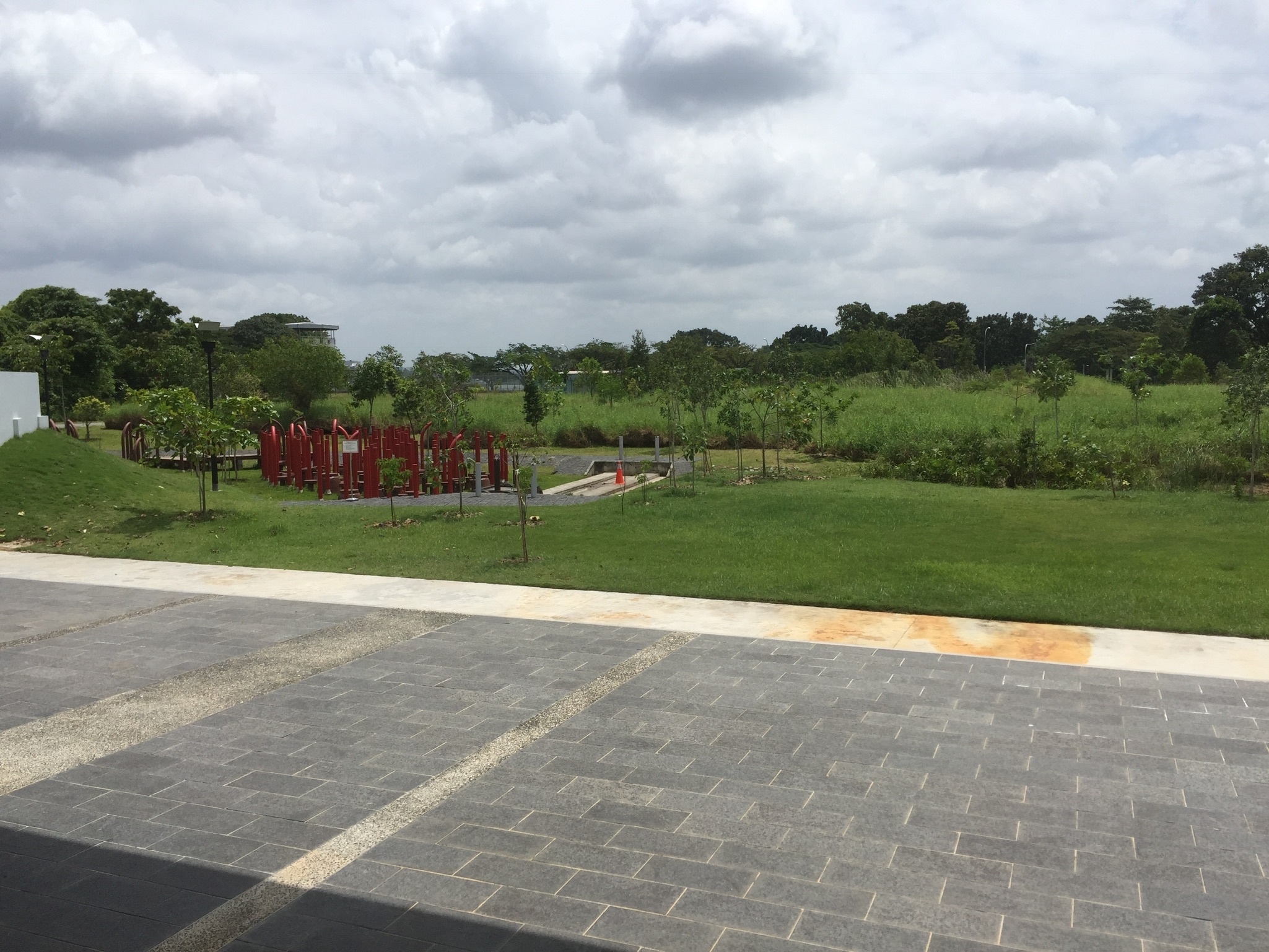
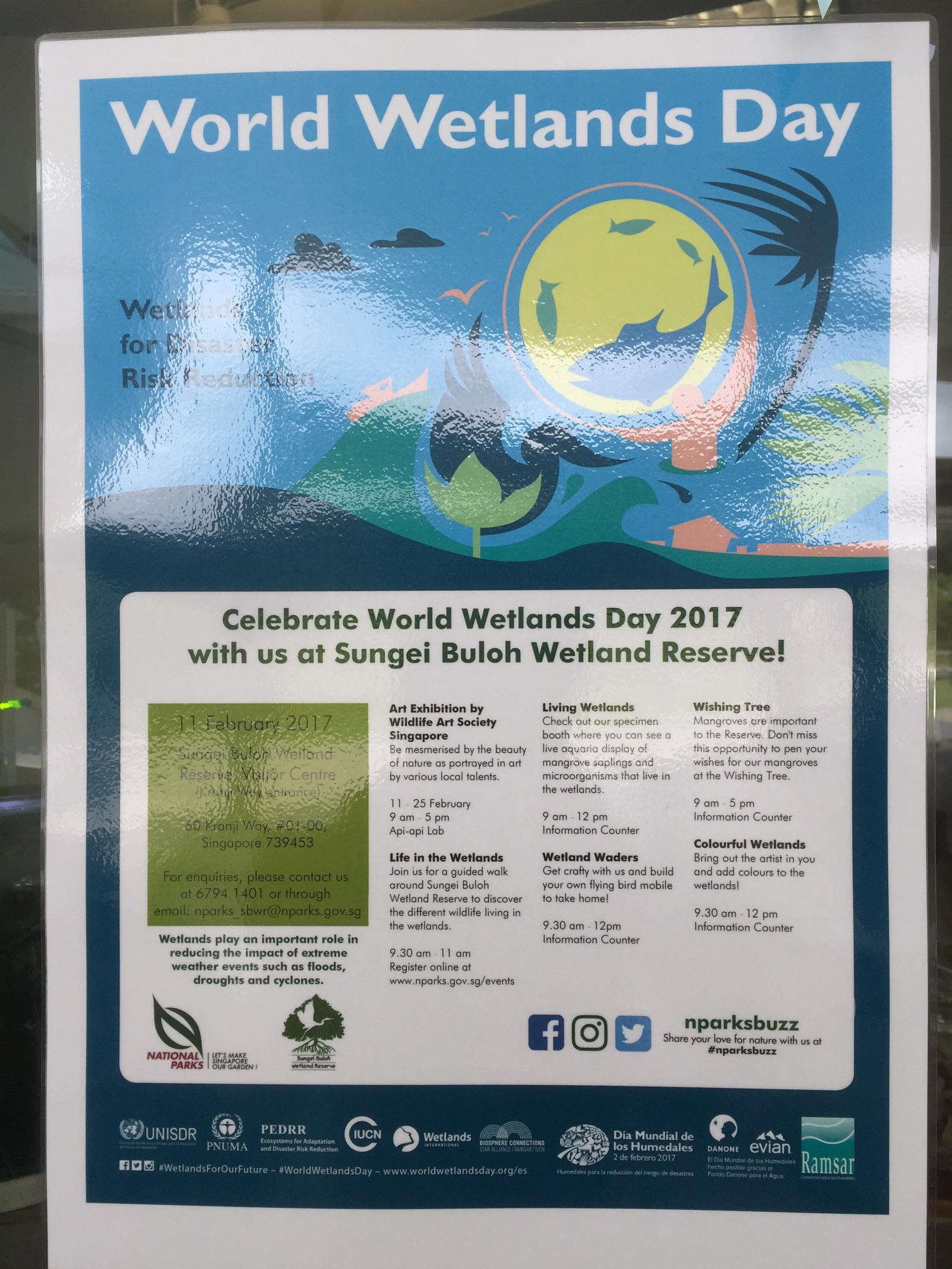
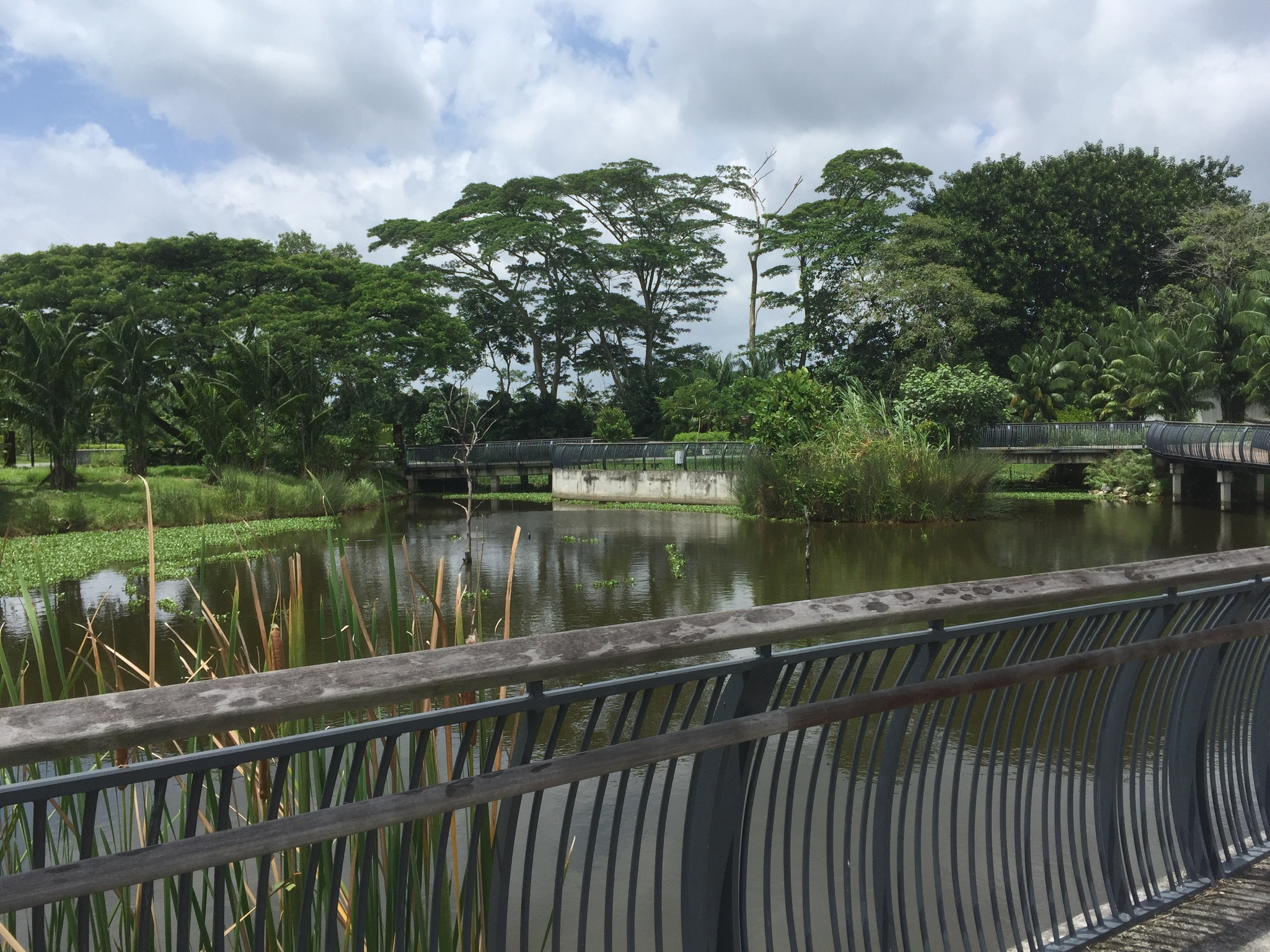
4. Kranji Reservoir and Sugei Buloh Wetland Reserve Next, I headed to Kranji Reservoir. I got lost for a bit because I probably entered the wrong address the first time, but through my detour I noticed the amount of industrial areas around and thought that it was a possibility to do an infographic about all of them, (if it wasn’t boring).
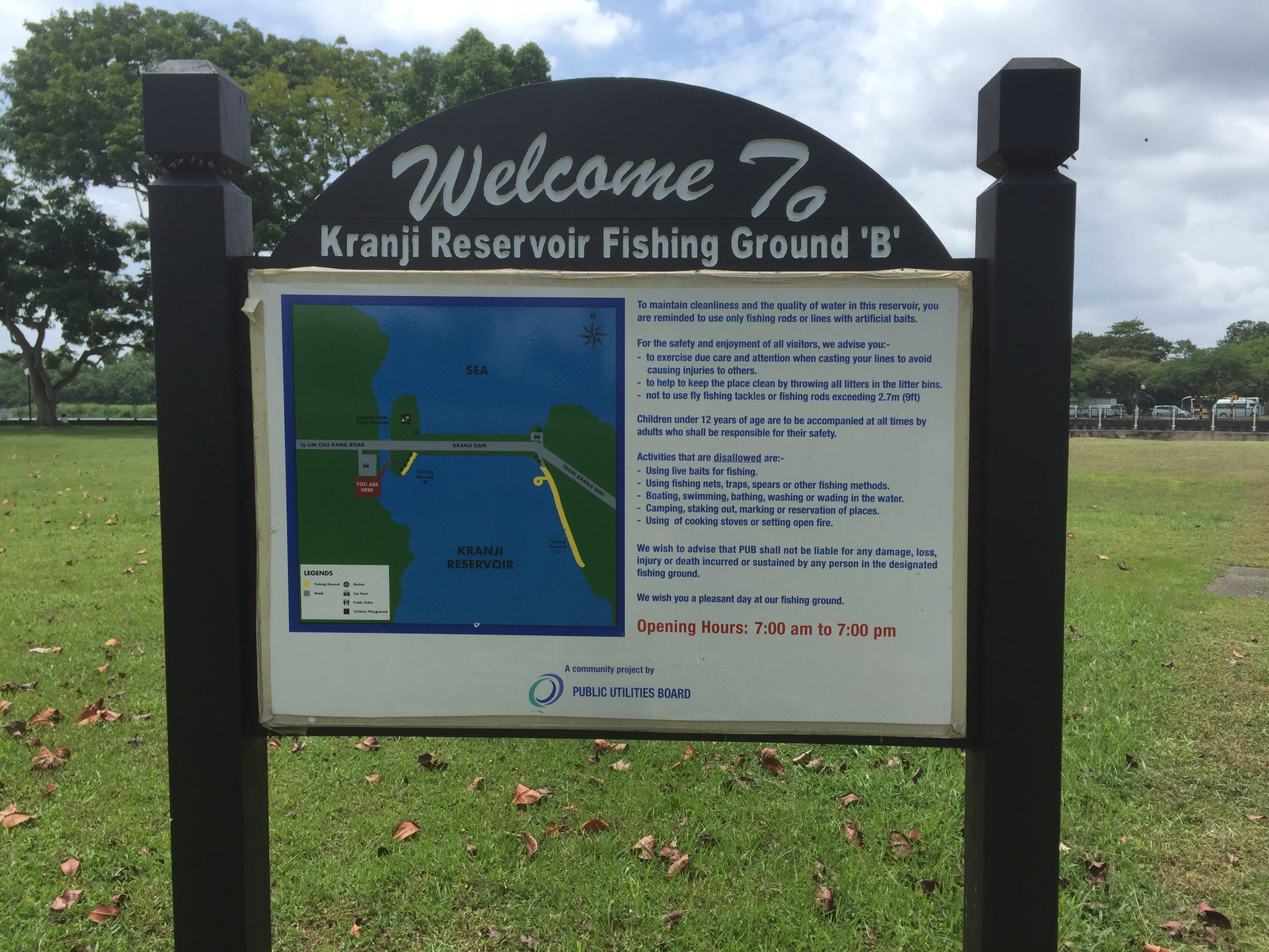
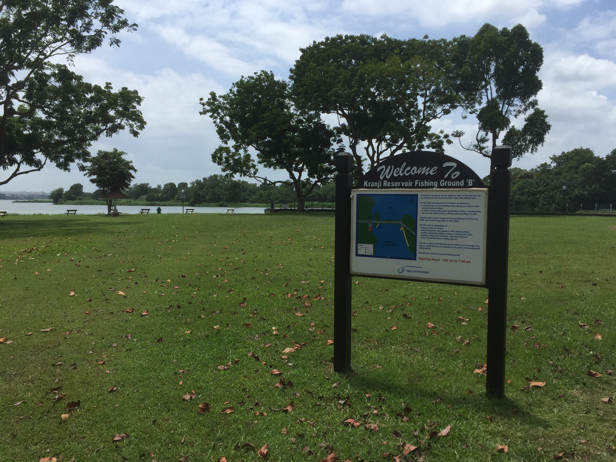
Never knew there were “Fishing Grounds” in Singapore in an area not along the beach. All I’ve encountered were “no fishing” signs.
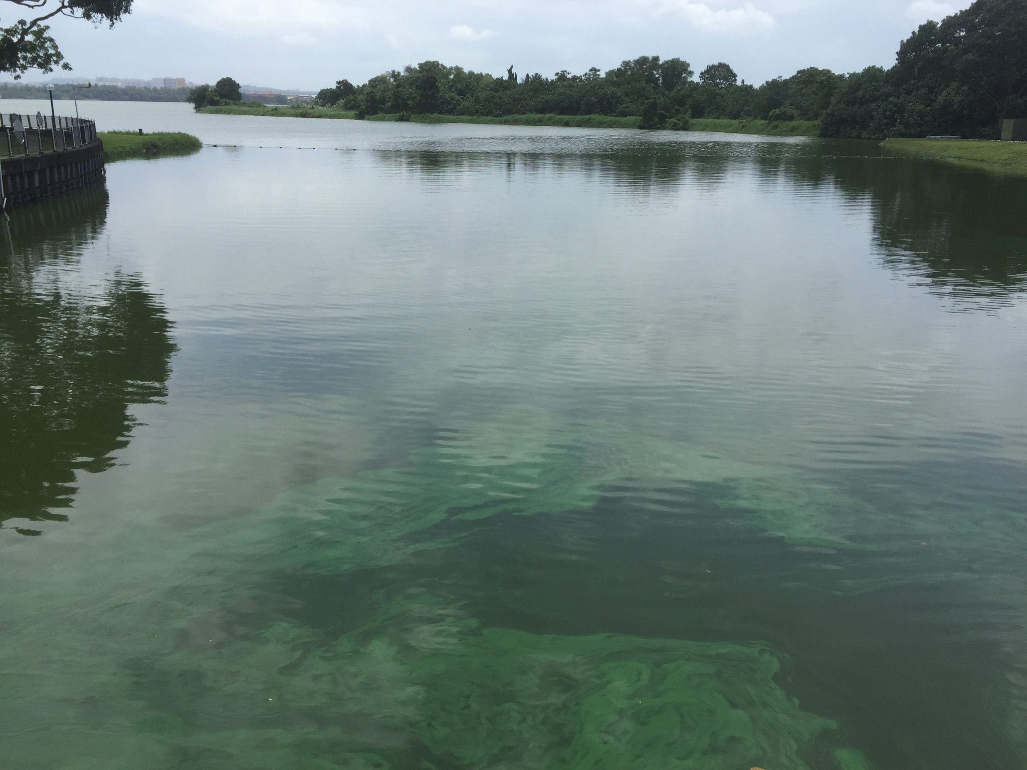
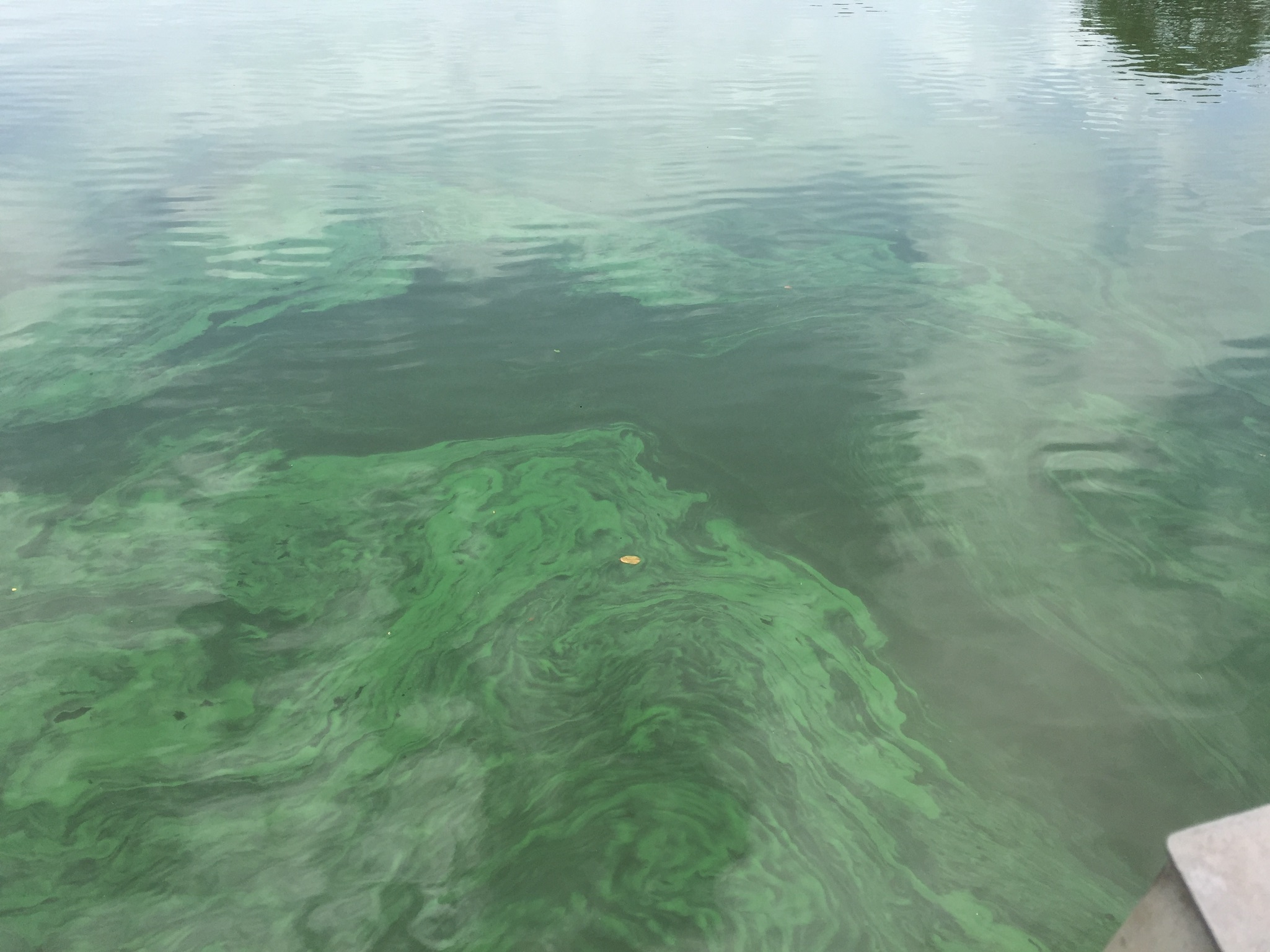
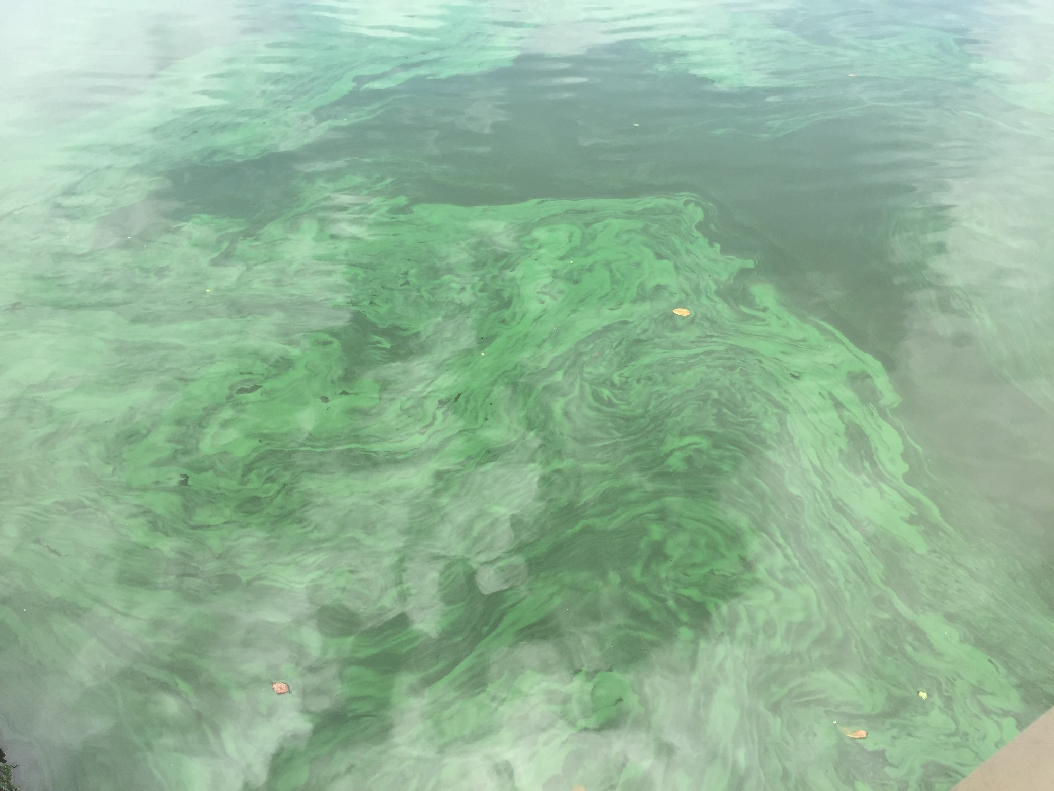
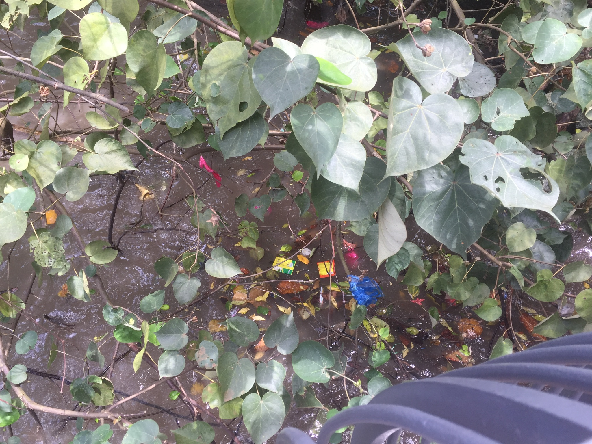
Not sure why the water looked like this….
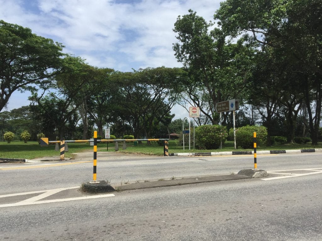
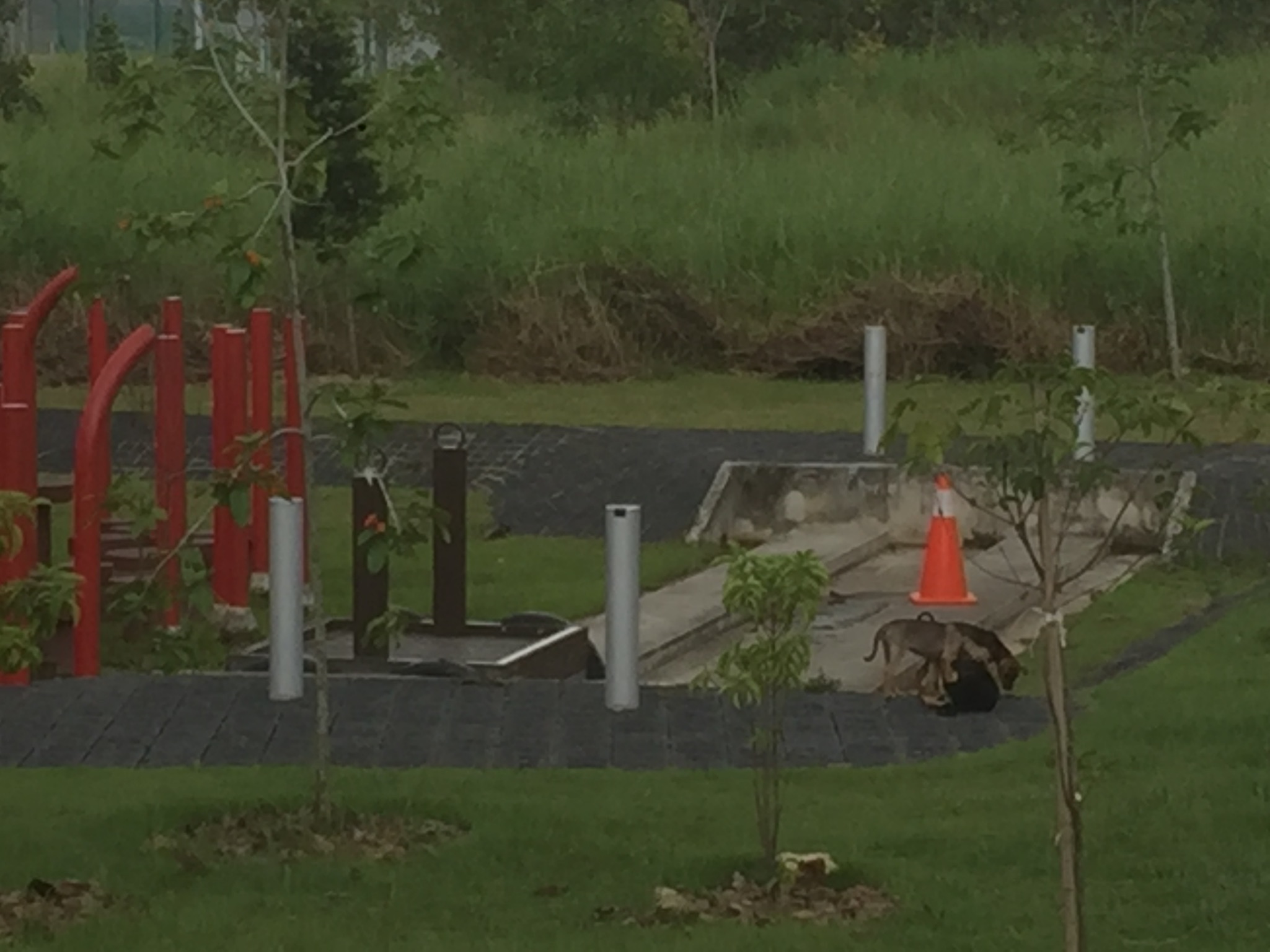
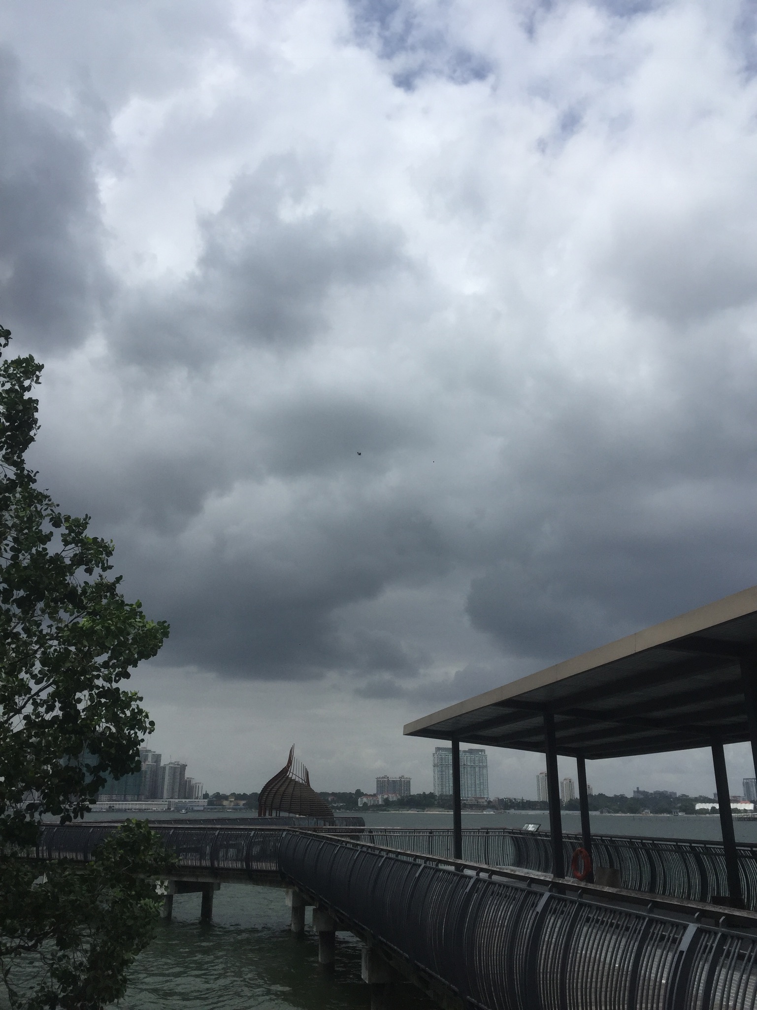
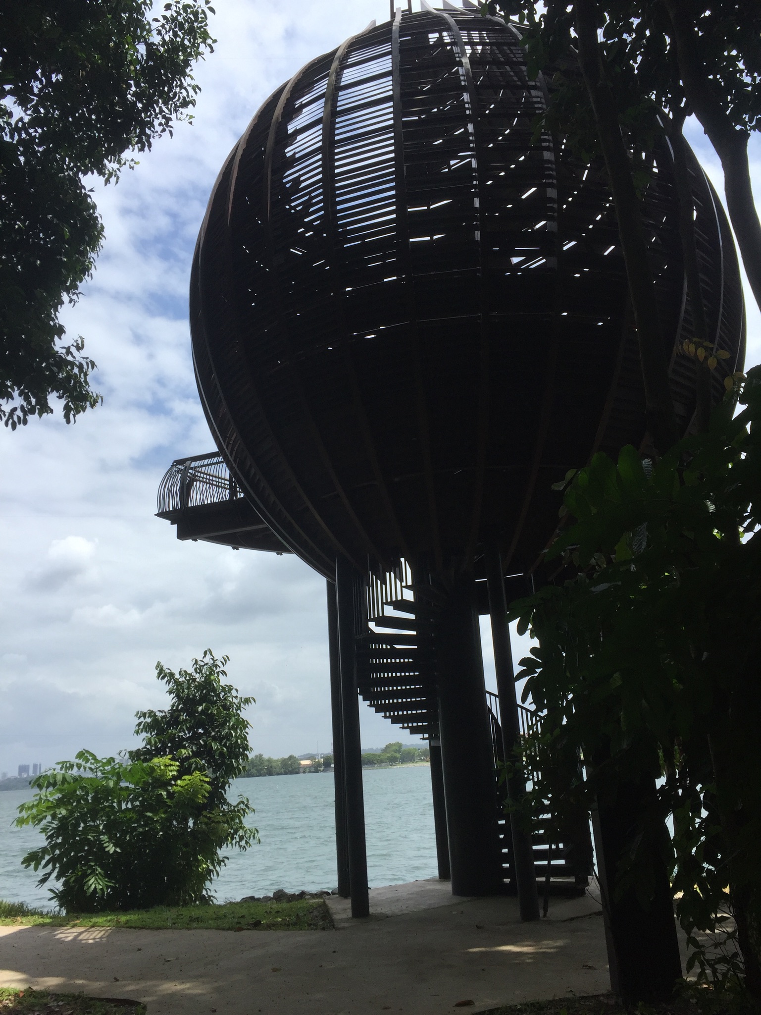
Why did Shi Teng cross the road? To get to the Kranji Battle site! It was just like a really small, unkempt park.
But wait, what?! FORREALLLL???? But no worries, thanks to this signboard, I ain’t fear no crocodile encounters! Unfortunately I didn’t get to encounter during my short stay that came to feel a bit eerie. There was also a random uncle sleeping by the crocodile sign board so I left after the pictures as there seemed to be nothing much anyway.
(Also came to my mind that I could do infographics on the strange animal spottings in Singapore. Like crocodiles)
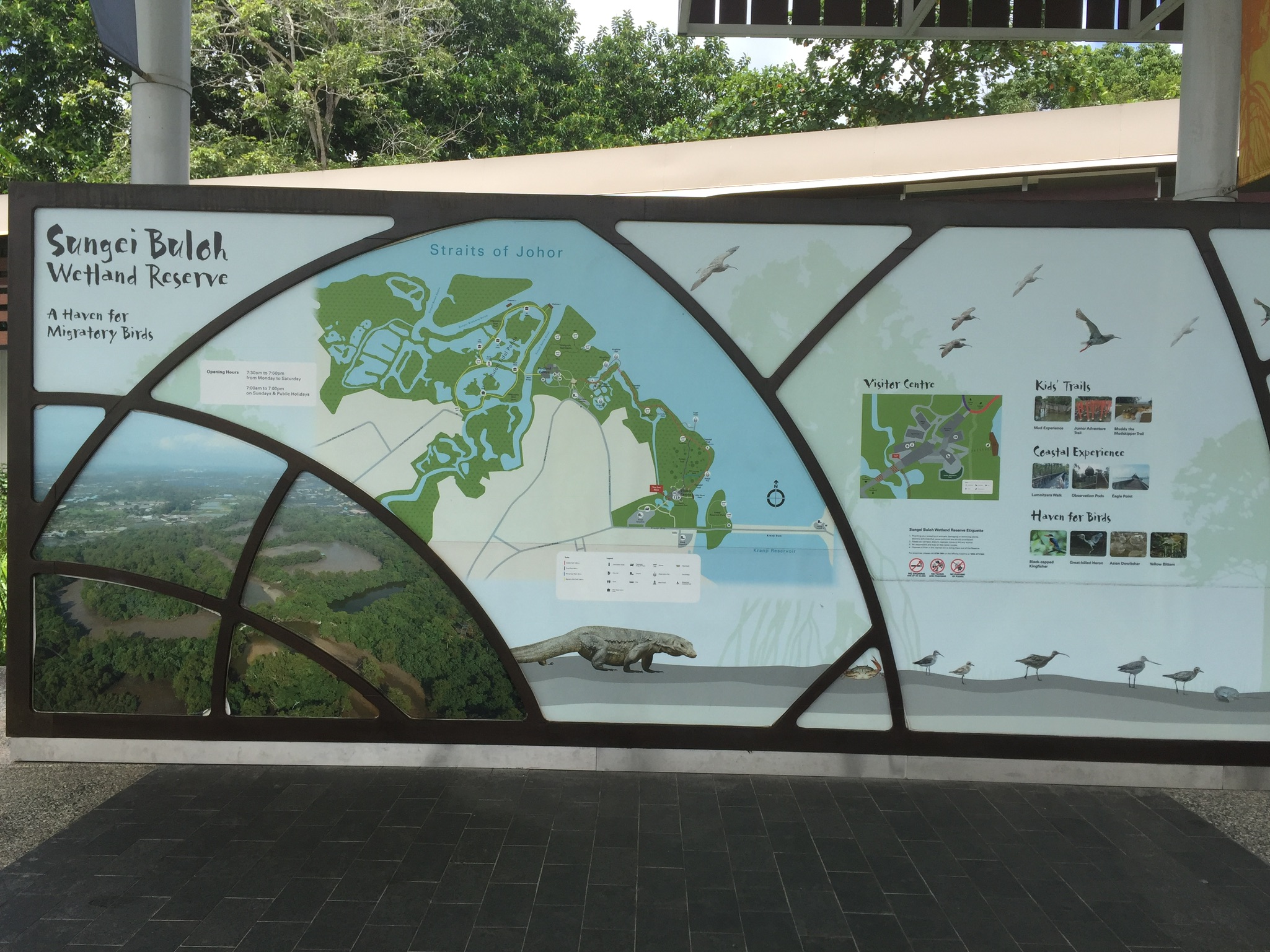
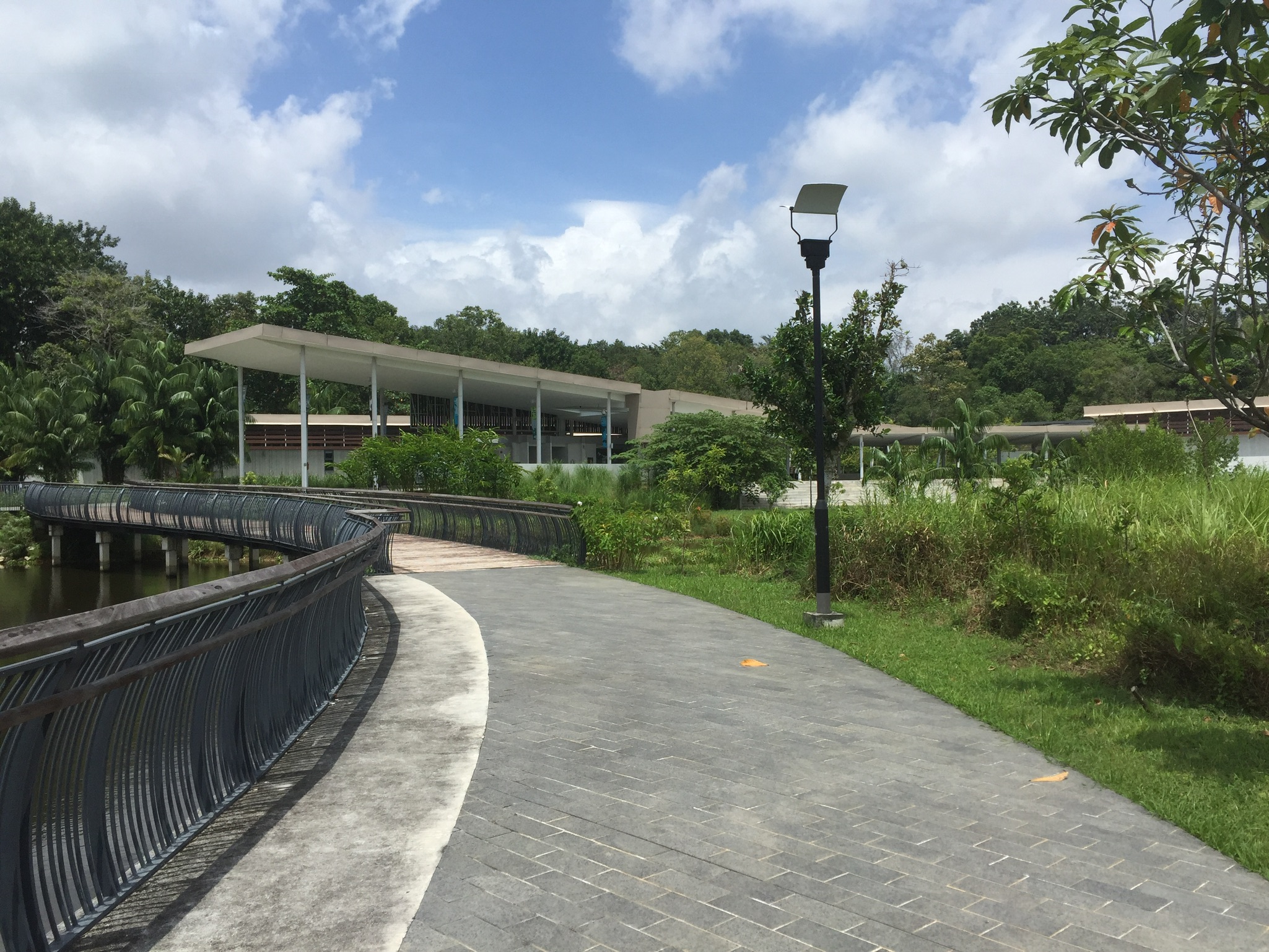
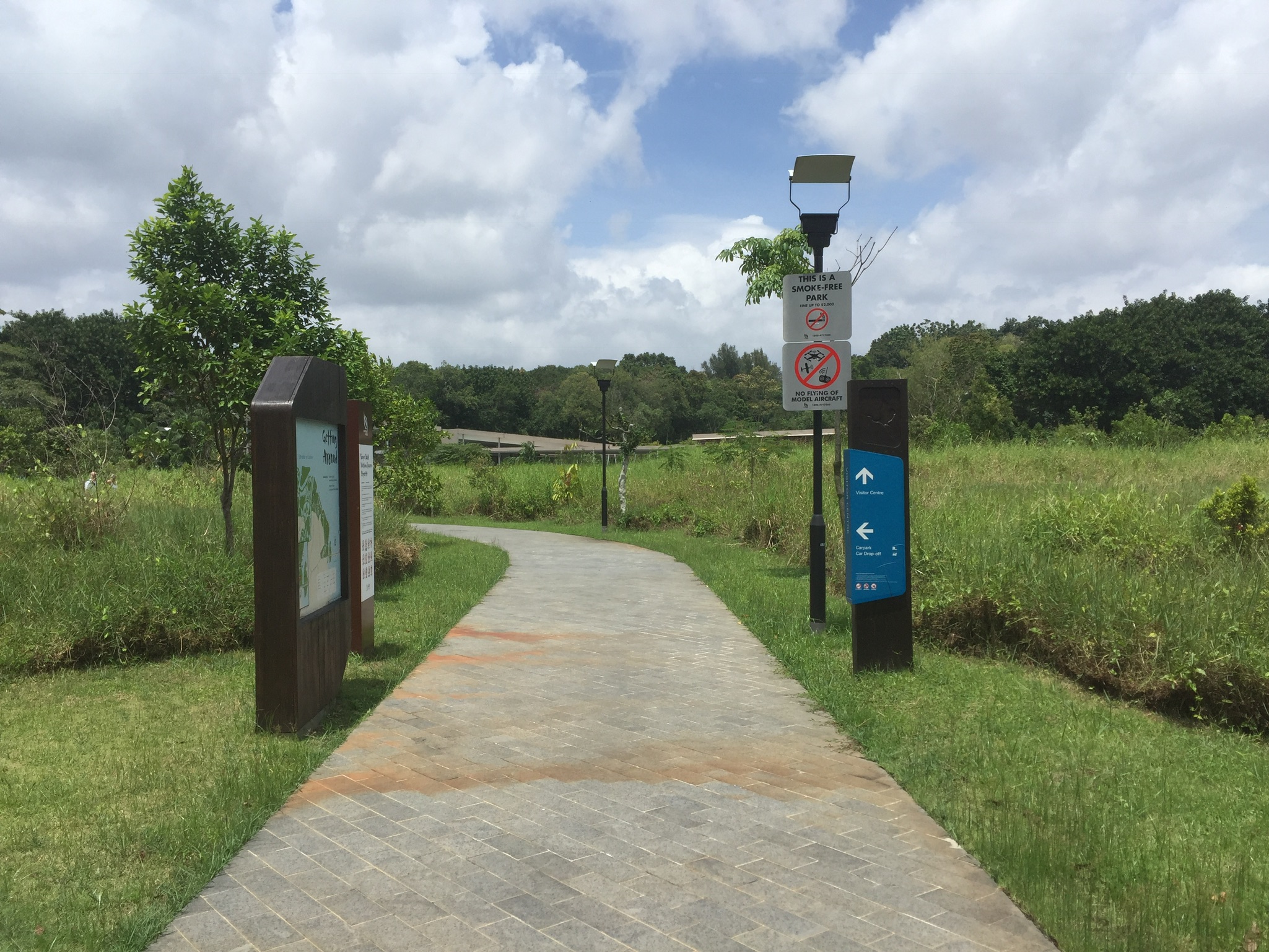
I was about to leave, again, when I saw this really strange out-of-nowhere bus stop in the carpark. And there were quite a bit of ‘normal’ citizens there. They weren’t random uncles, truck drivers, or construction workers. They were people who wouldn’t be (or weren’t dressed to be) in an industrial area like this. I was wondering where they came from until I found out that the Sungei Buloh visitor centre was a 2 minutes walk away from the carpark I was at.
Mystery solved. I guess it was also like an interchange for bus 925?
I proceeded to cross the road, this time to get to the Wetland Reserve’s visitor centre! Idk why but OSS uploaded my pictures in reverse chronological order.
So we start off with some photos of wild puppers and gloomy skies. And as we can see, when I entered, it was sunny and slightly hot.
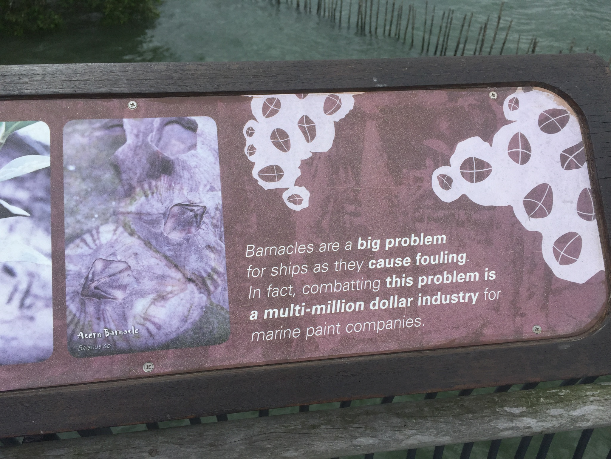
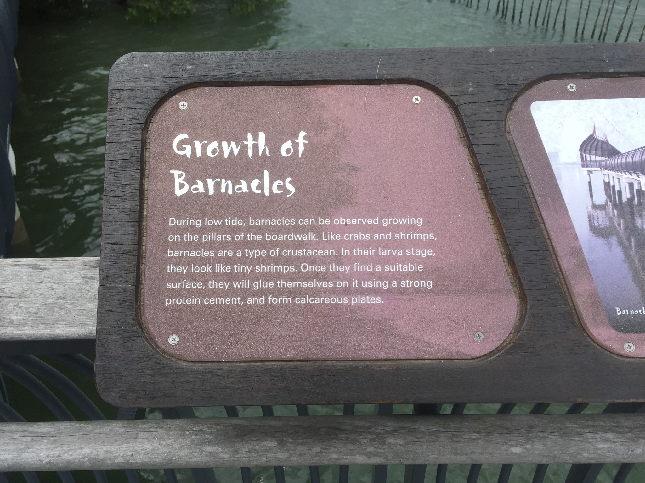
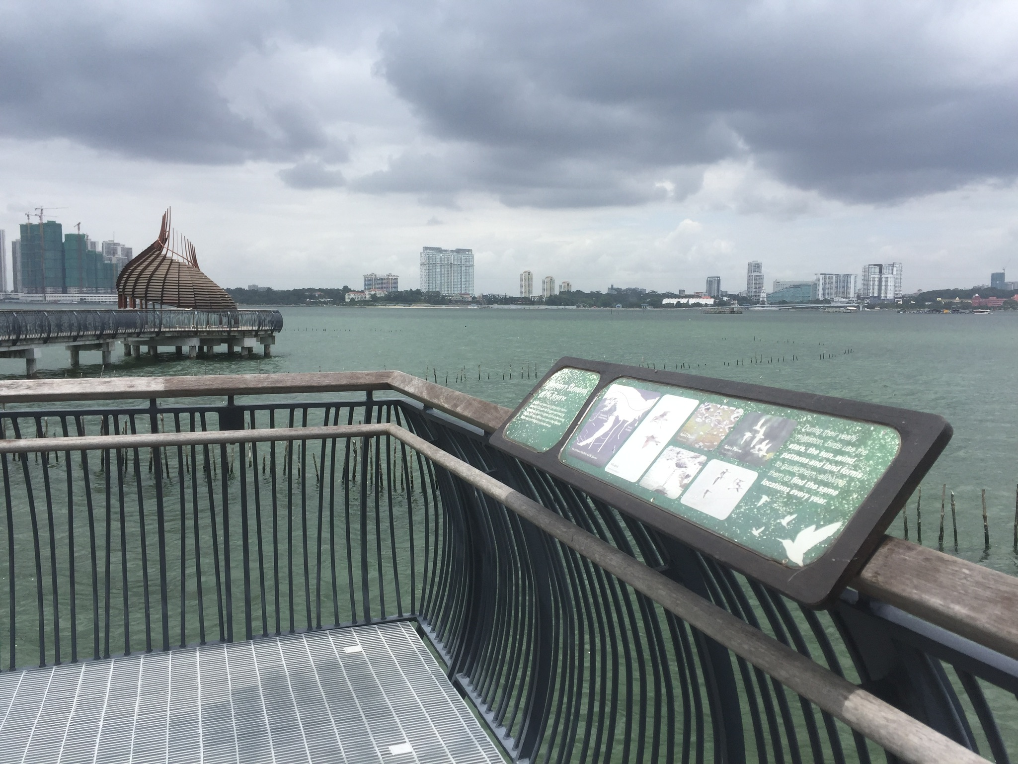
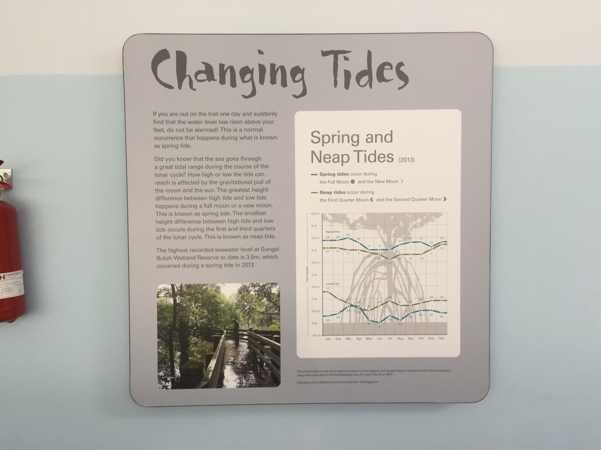
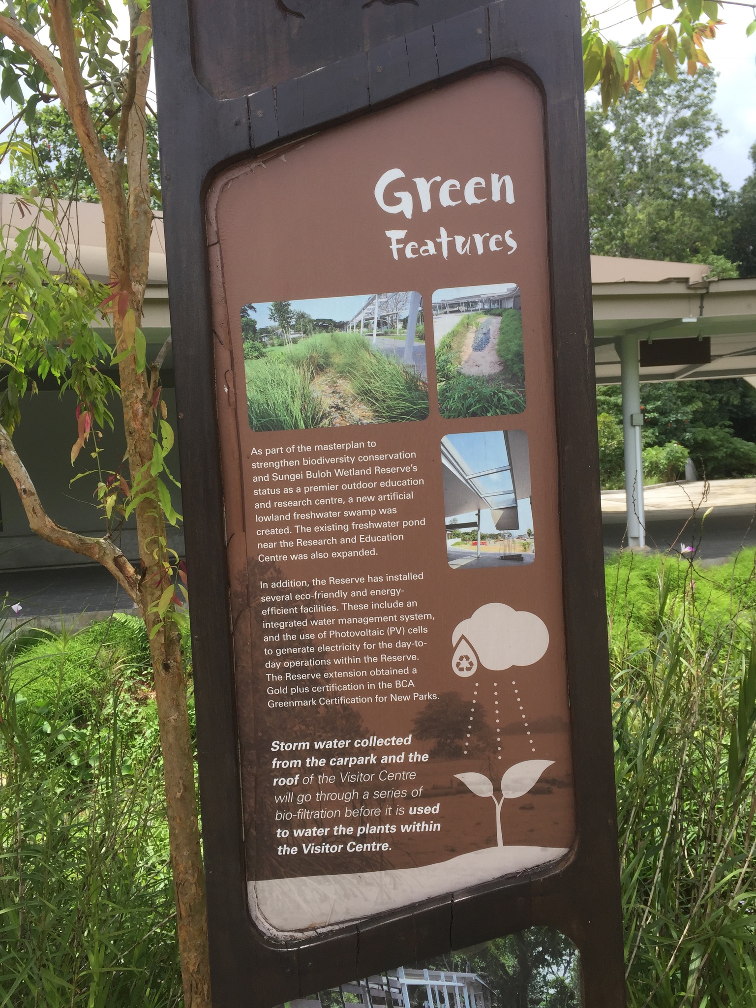
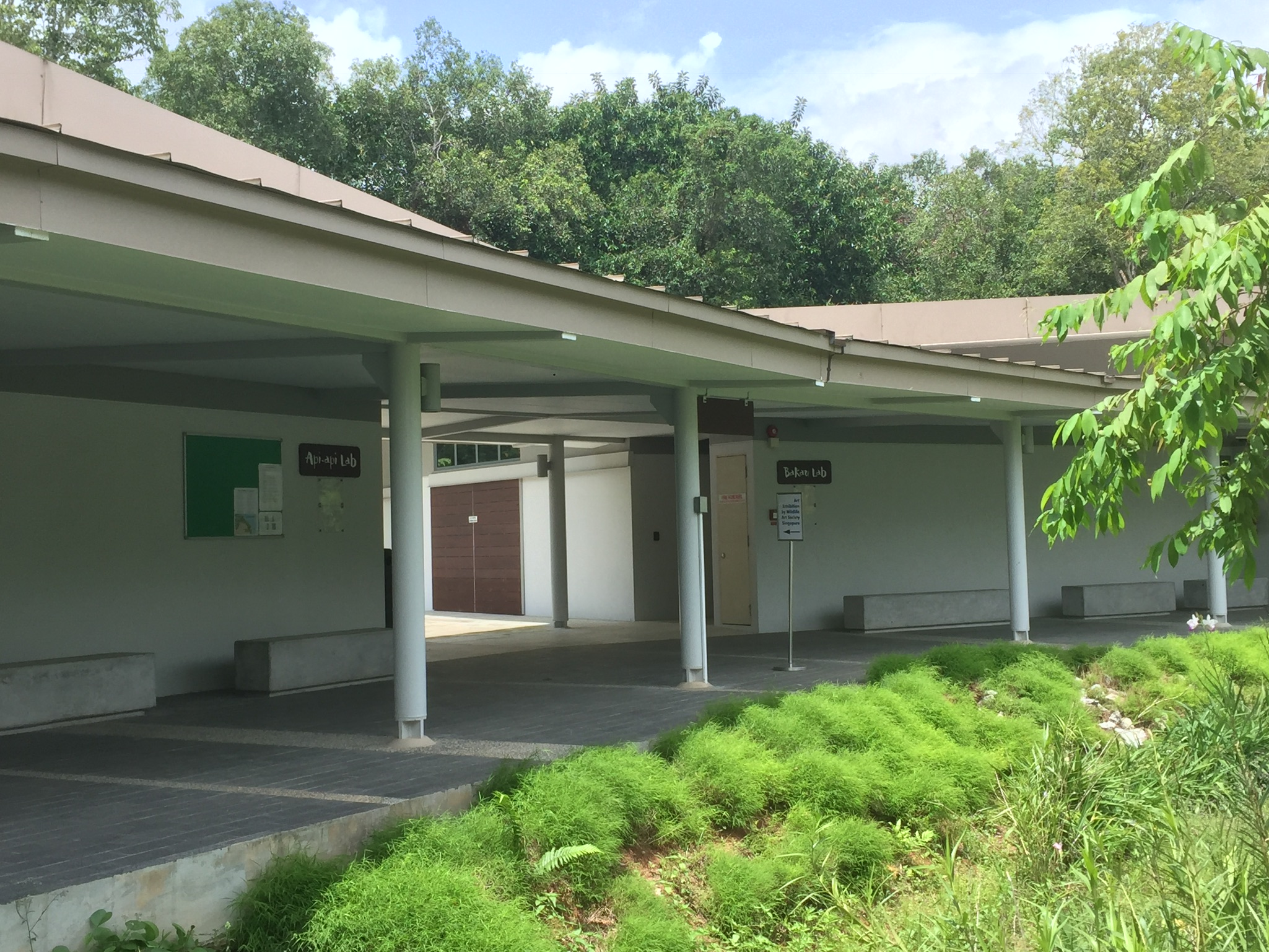
And yes, when the cicadas kept quiet, it was slightly late. I guess I learnt that they kept quiet only right before it rained. Or maybe the rain clouds came too fast. At the visitor center, were a few labs that I guessed were for things like student visits. There was also some galleries around. There were a bunch of information trials and basically, the whole reserve was information overload.
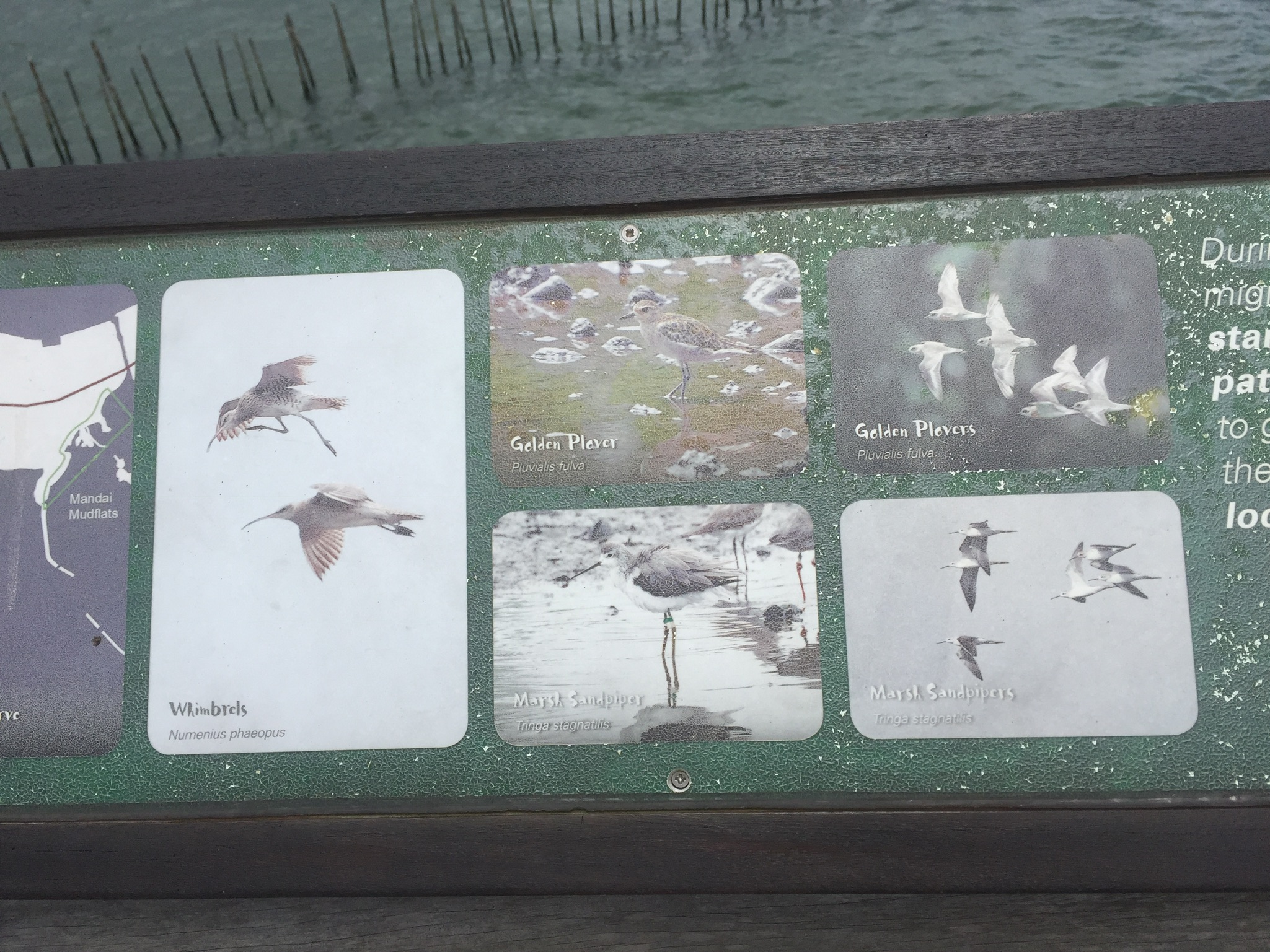
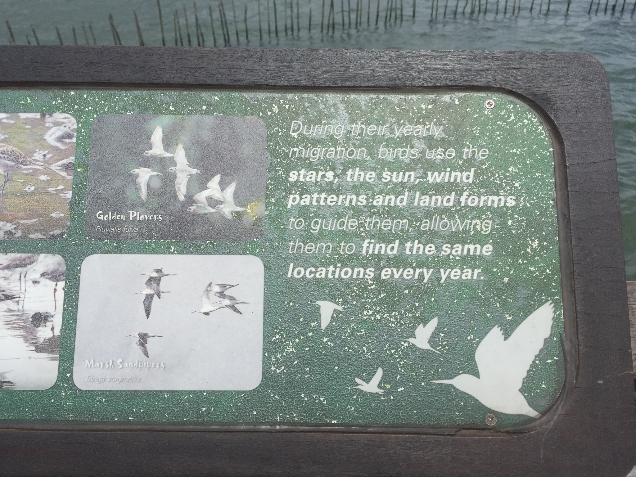
There were some information I considered I could do, like about barnacles (which i only knew as a curse word used in Spongebob), or about the migration of birds and how the stars guided them. With a shiny title like “May the stars guide you home”.
But then again, these information were so readily available in the marshes and it would be so much cooler for people to visit it themselves.
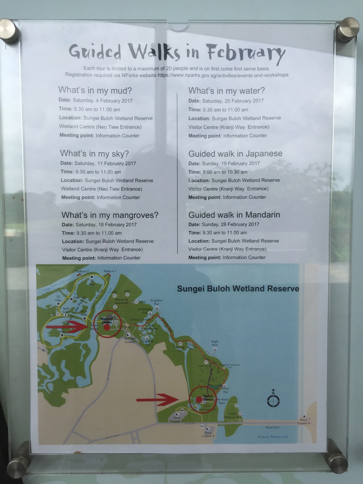
There’s also a rather informative NPark website about the marshes. Once again, I unfortunately would miss all the guided tours. #nofate
Concluding this post, I have decided to do my infographic on either the Kranji War series or Kranji Countryside.
Am currently leaning towards the countryside but it’s unfortunate that I haven’t visited the area! Similarly, I haven’t visited the military barracks / WWII landing site for the war series.
Hopefully I will get to visit the farms sometime soon!


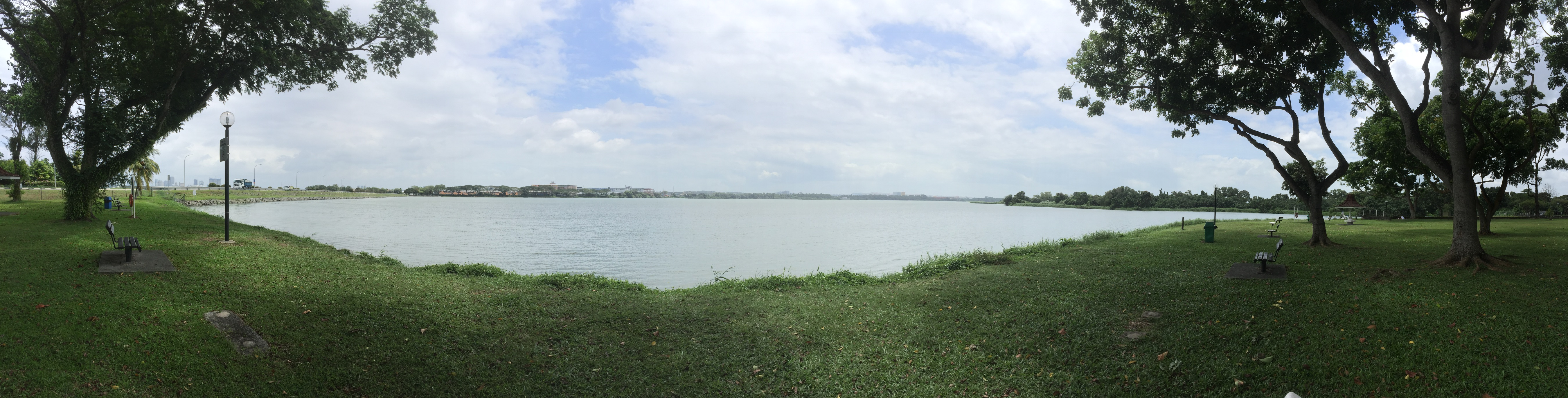

 It was just like a really small, unkempt park.
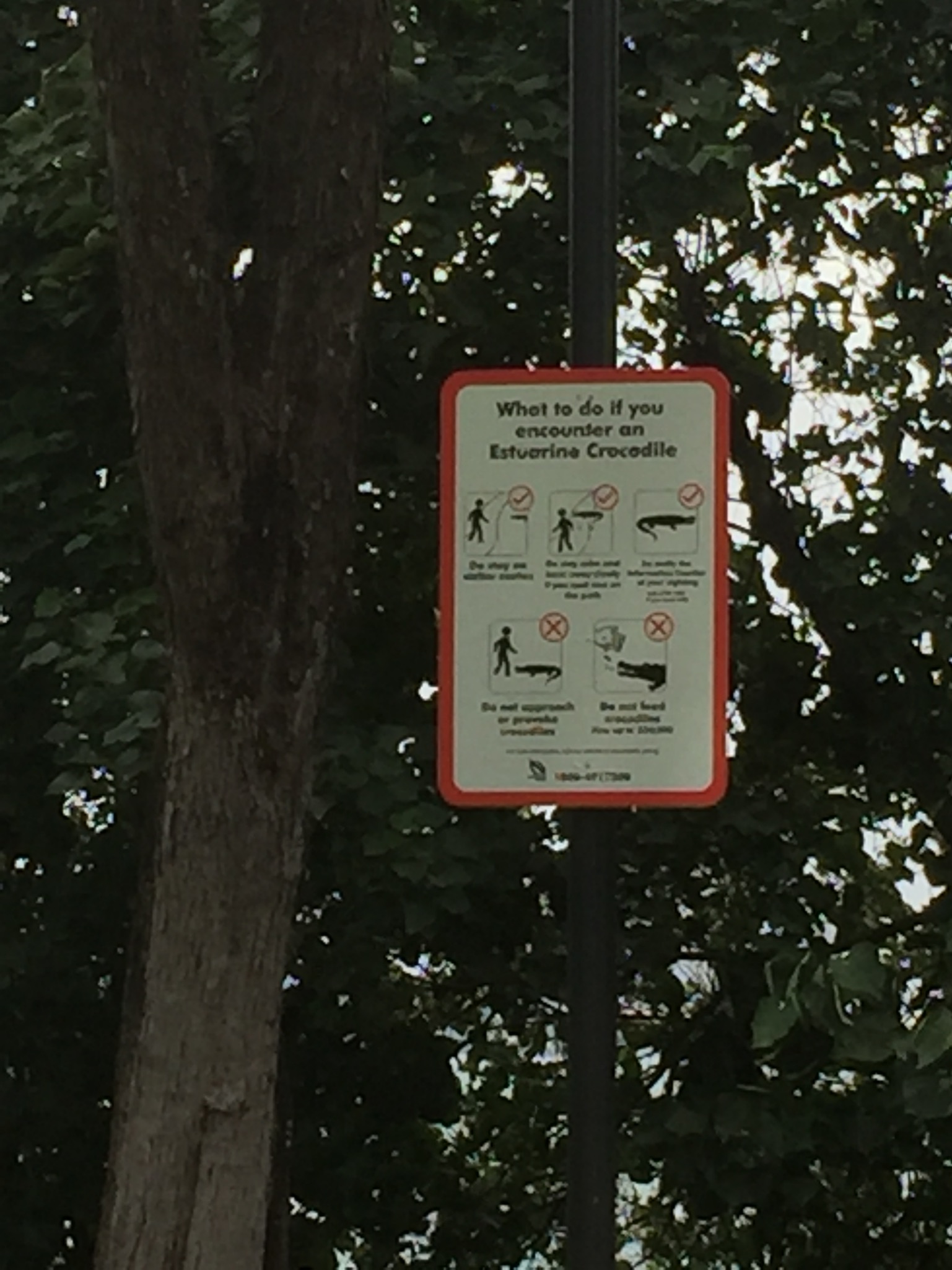