Here’s my ongoing Pinterest board for infographic styles / helpful guides: https://www.pinterest.com/awkwardst/2d2-project-2/
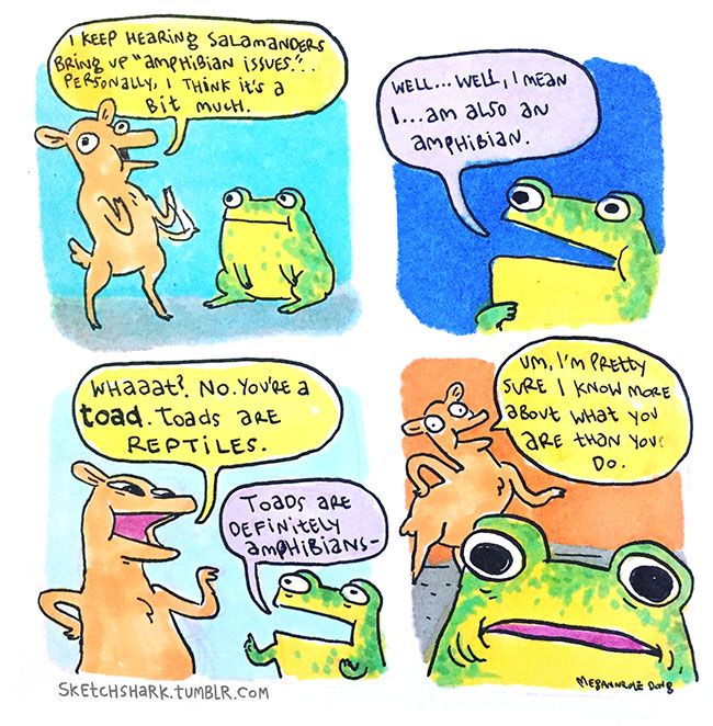
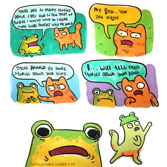
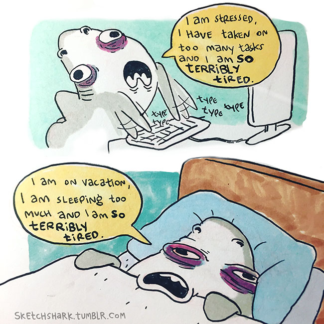
I am also thinking about the possibility to do a sketchy styled infographic, as inspired by Megan Nicole Dong‘s comical sketches:
Also came across this on one of my Pinterest boards and I kinda liked it. It is also a possibility to refer to the color scheme.
styleshack.com


This is just a preliminary research, will do more as I venture into doing some draft compositions after my farm visit!
But as I scroll through these countless infographics with my tired mind, I found that though most of them were visually attractive, it’s hard for me to focus / find something I was interested in to click and read. Perhaps it was because I was tired, or perhaps it’s because of the information overload. Because it’s such an in thing now, there’s so many of them and everything somehow looks the similar (flat graphics, similar fonts?). Maybe it’s like David Carson said, since resources are so readily available on the net, a lot of designs look similar. Then again, things just seem to go with the trend nowadays.
Currently, I’m think it’s an idea to do accompanying short derpy comics to tell a story of the information I want to convey, in hopes that it will be more memorable and stand out from all the data and infographic that are being presented.
This infographic below might be a good guide for a more comic-layout
Also, love the look on this one:

Overall, I think I quite enjoy the Blue / Orange / Pink color scheme. As well as the Japanese earthquake infographic’s Yellow and dark blue color scheme.