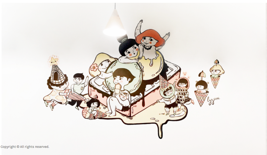
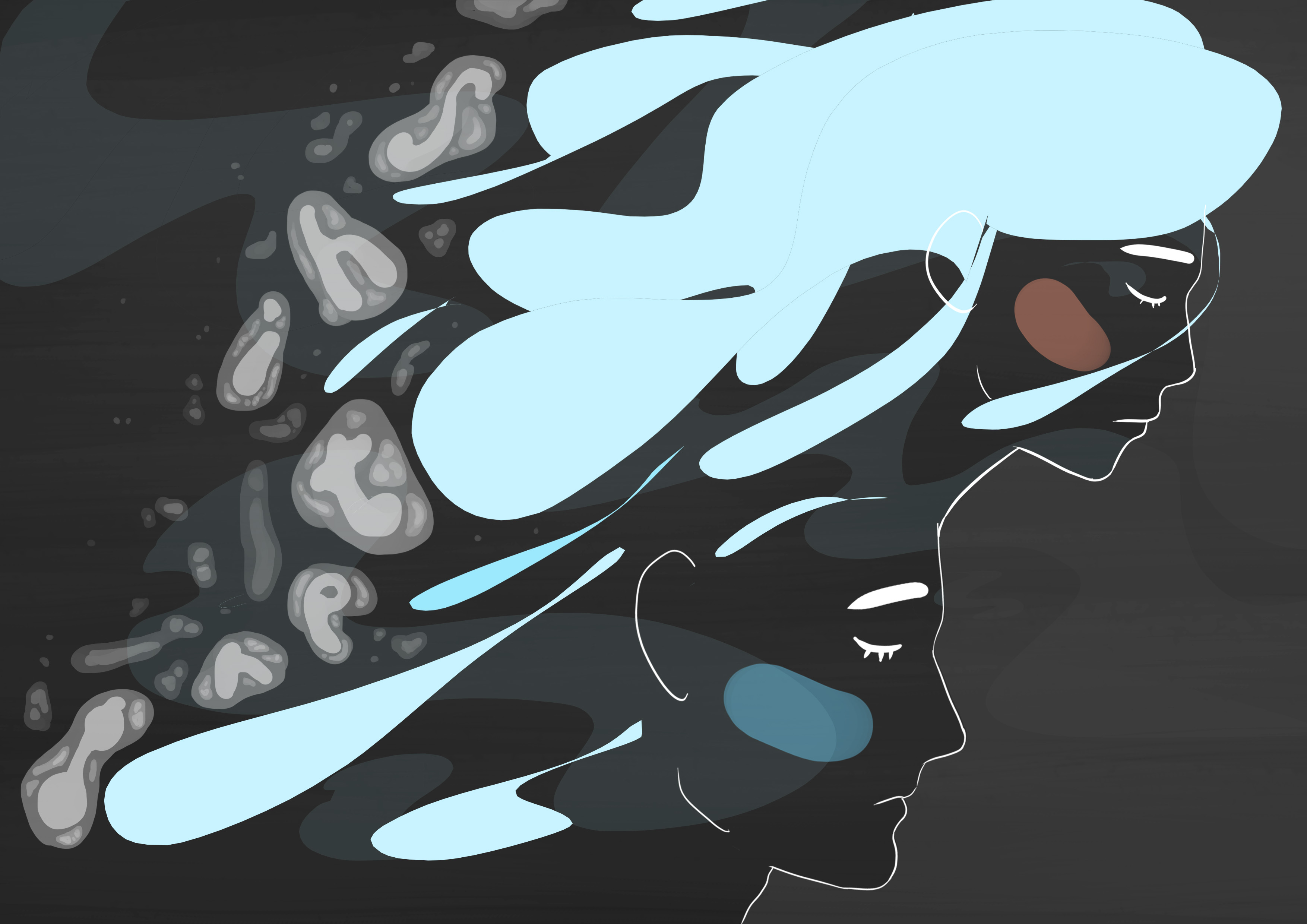
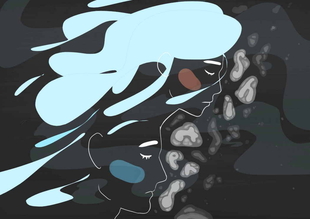
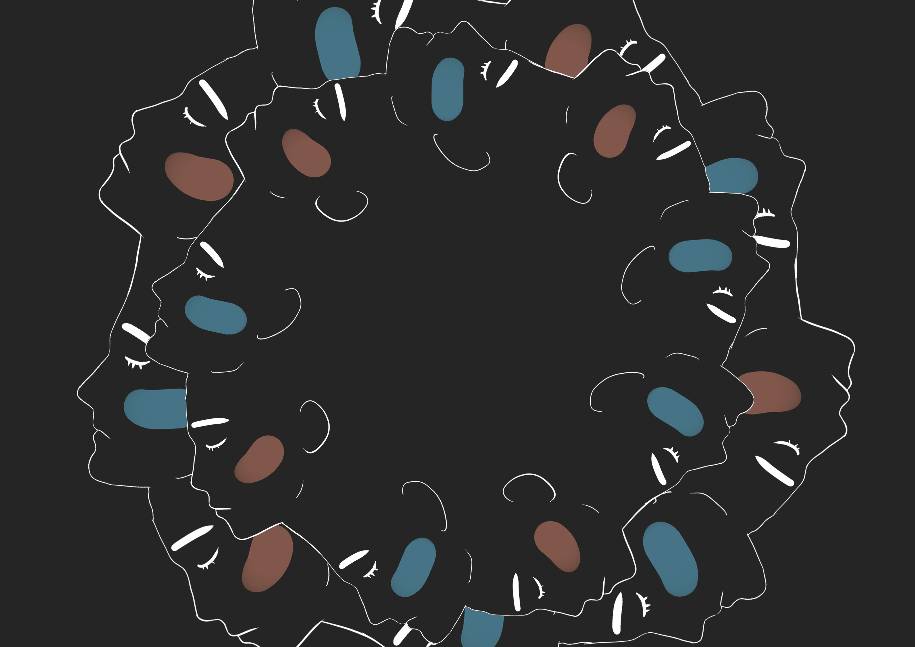
From the last post, i think it was really quite beneficial to have the art direction quite set from the start. So i full out went for the sketchy look and referred quite a bit to Megan Nicole Dong.
Sketches, hardcopies and test prints are all in the Visual Journal.
Methodology wise, I started off with a few options, the ones on sketchbook being: draw traditionally > scan in. But I thought that that wouldn’t work out very well because of the troubles I foresee when it comes to cropping and trying various layouts and arrangements.
So I made the decision to draw and colour on the iPad, then export them onto Photoshop to try various arrangements. Later on, after coming up with a suitable arrangement, I save the file as jpeg and then export them it into procreate to make additional drawings.
The above are various variations i tried for the digital method. The last two i tried with scans of handmade papers but they didn’t really work out probably because of the clash in colors and it doesn’t look clean either.
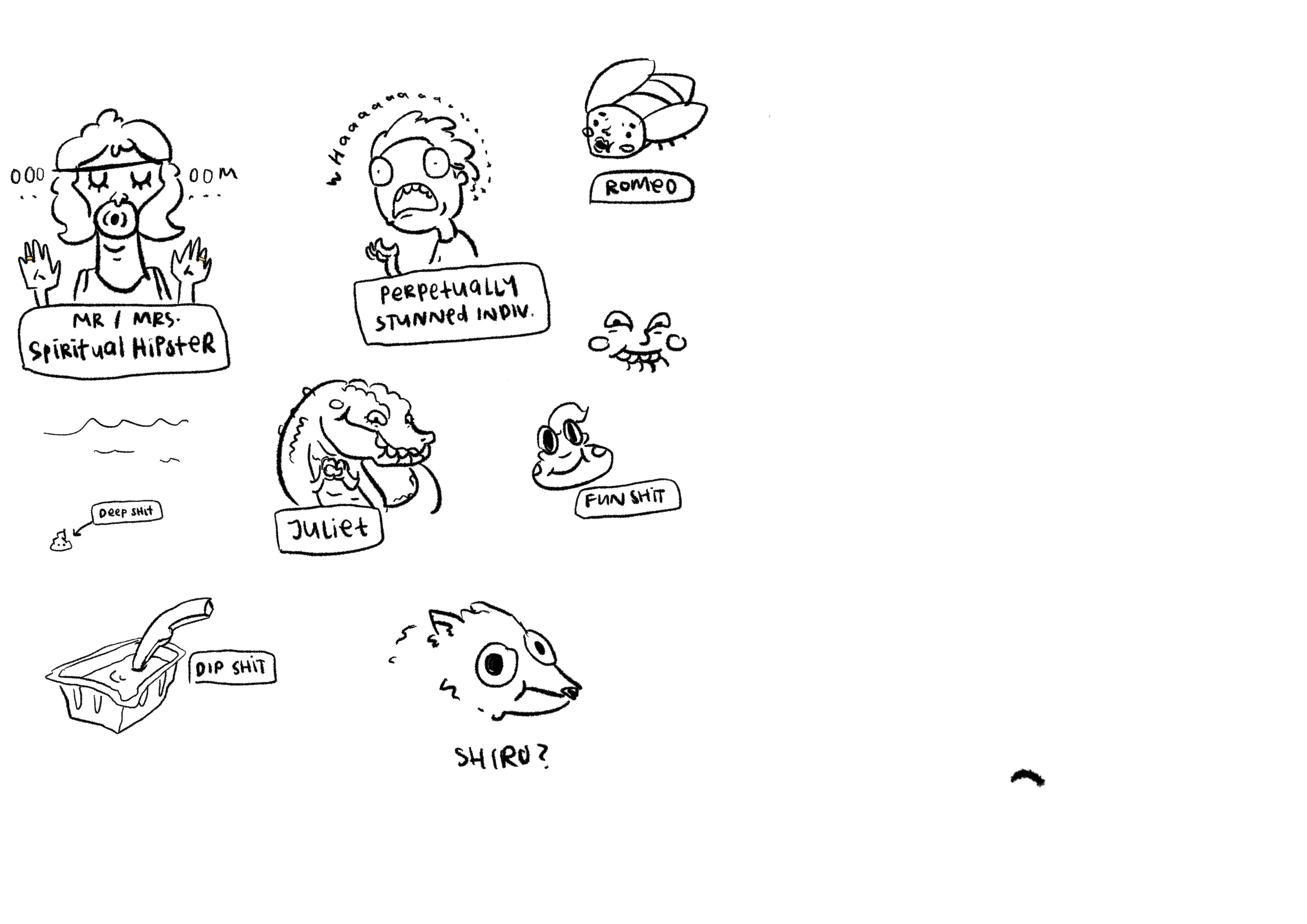
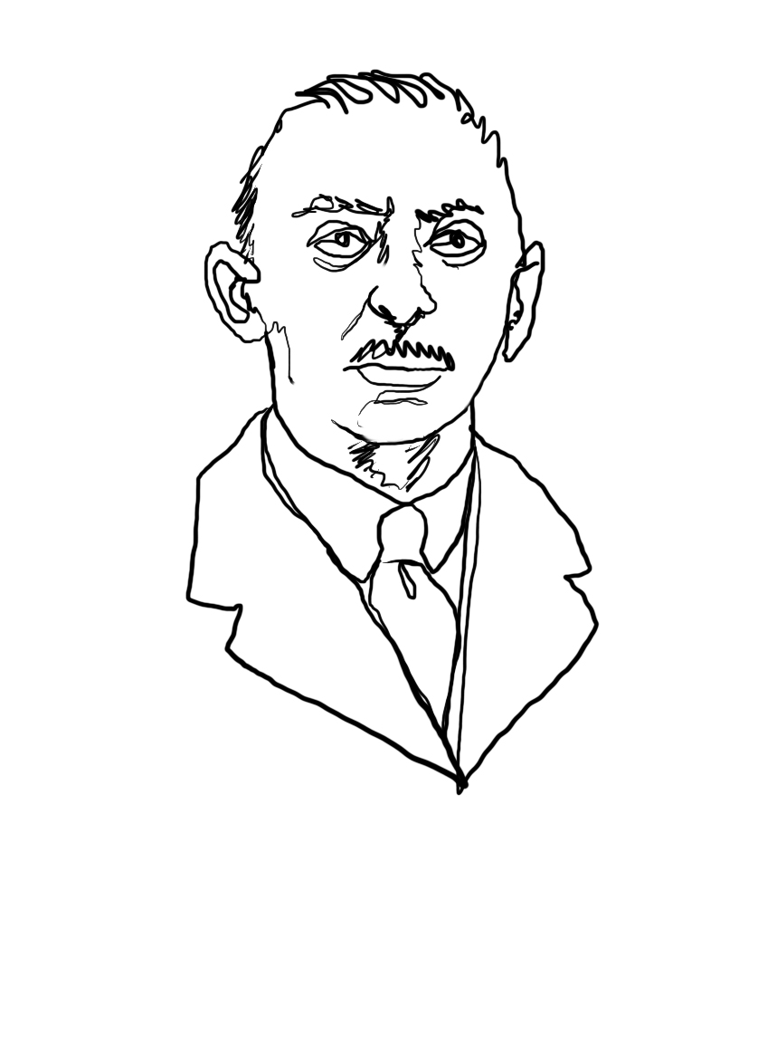
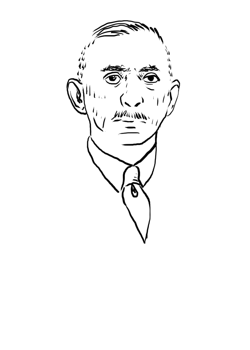
I started off with drawing elements for each of the pages. I also drew some characters separately but unfortunately, i didn’t get to include most of them in the zine because of the limited space ):
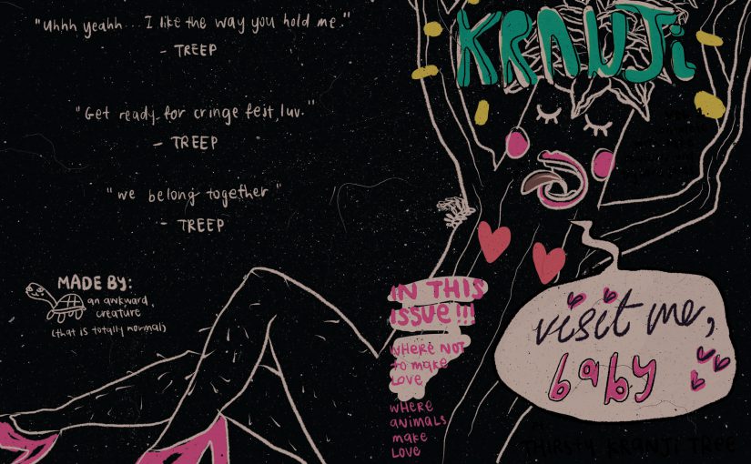
I was quite excited to do this spread hahaha
I started off with finding sexy legs and did some preliminary sketches to fit the anatomy of the tree.
I gave the scanned paper another shot. But nahaaaaaah. The colors don’t play well together and they don’t stand out against the toned background color. It also dilutes the overall theme and feel.
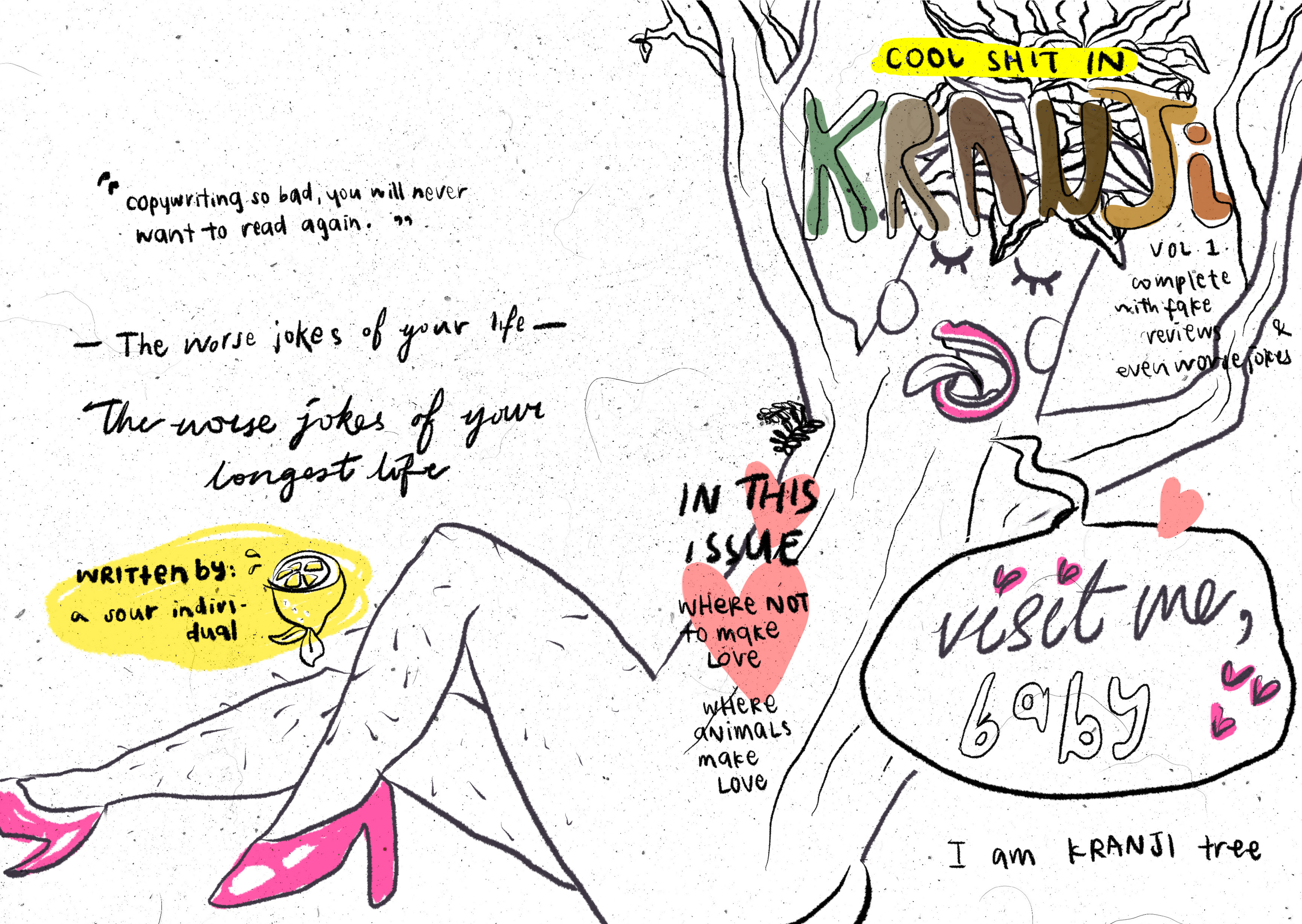
Also tried some background colors but I think the full white one was the simplest and conveys the look and feel best. Having the page white also helped the other colors stand out – also a reason why the entire tree was not colored. 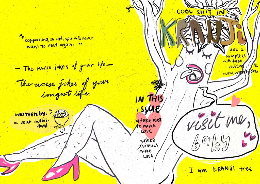 An accident happened but i thought it looked quite interesting. But it probably doesn’t go that well with the light hearted concept of my book. It looks more spacey while Kranji is more… Grounded.
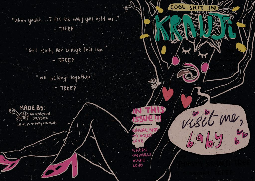
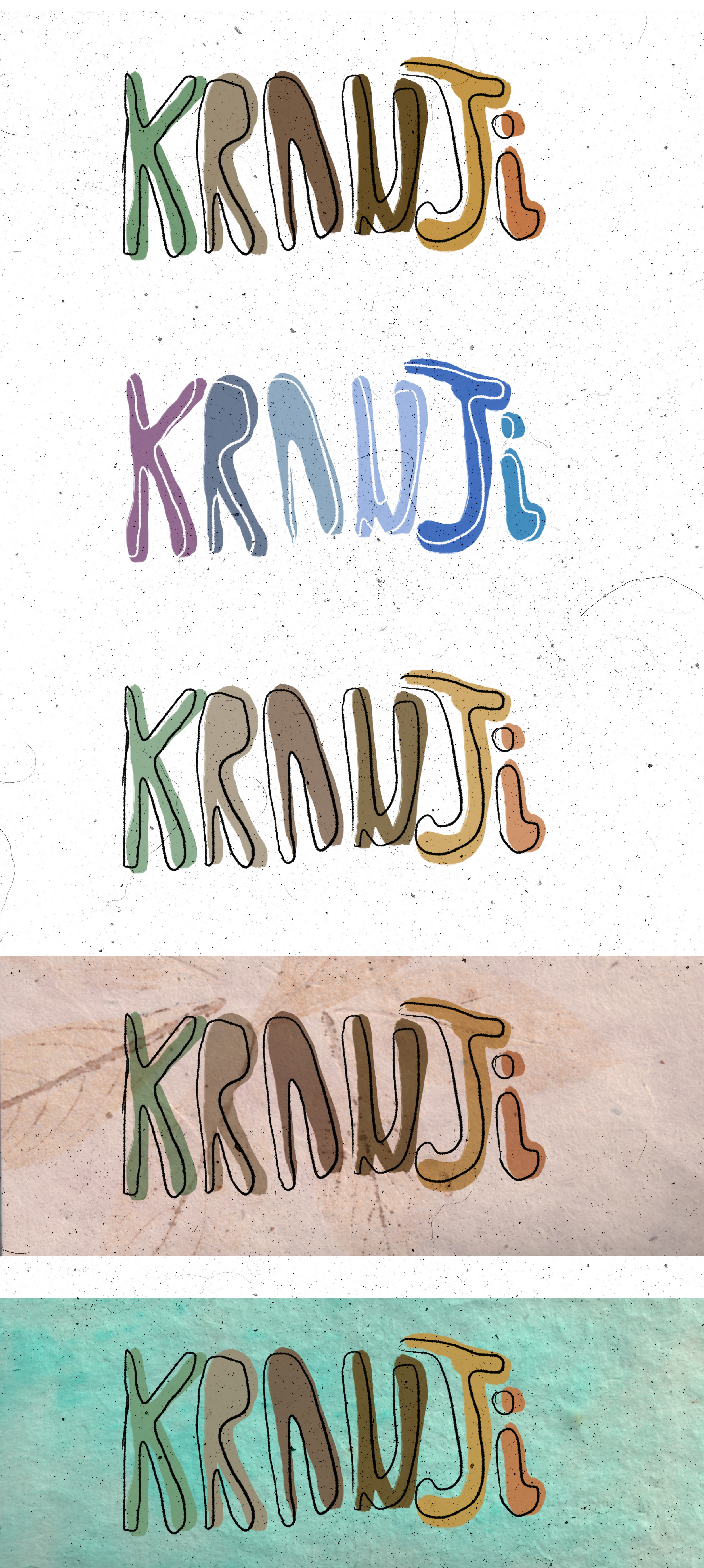
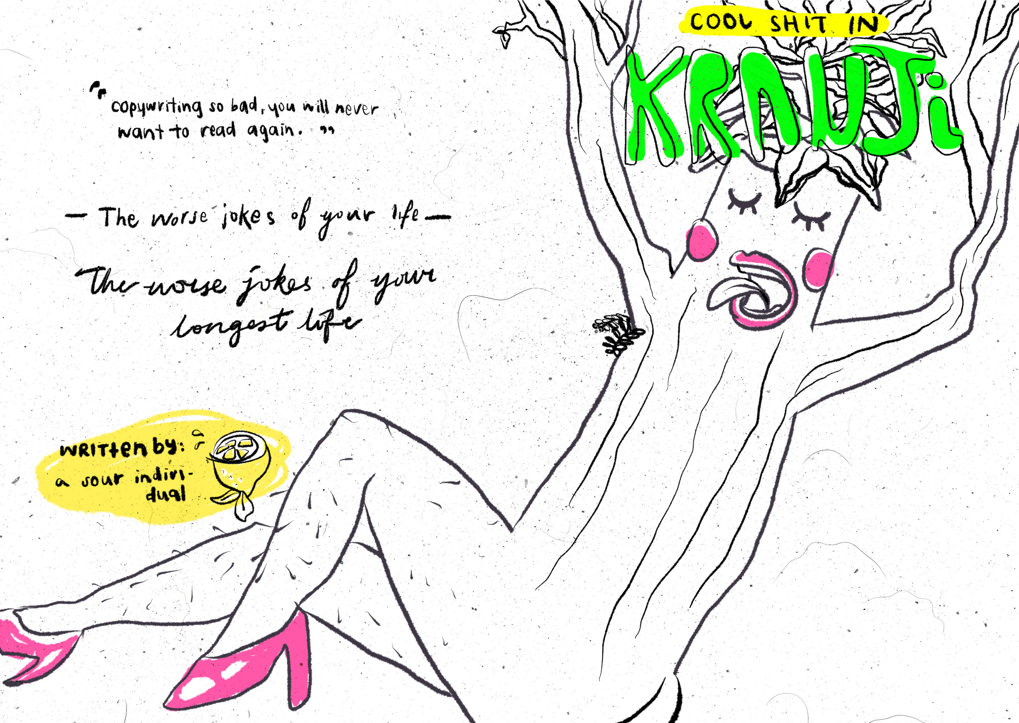
Also tried different placement for Kranji because the title didn’t stand out very well as a title. Decided to go against the placement below anyway because I wanted it to be more like a parody of magazines and all magazines seem to have their titles on the top of the page. Though readers may not notice, but I’m sure subconsciously the placement of the title is a convention that can trigger a certain sort of familiarity to interest readers. I also noticed that their variations of the titles are mostly using colors so that’s what i tried next.
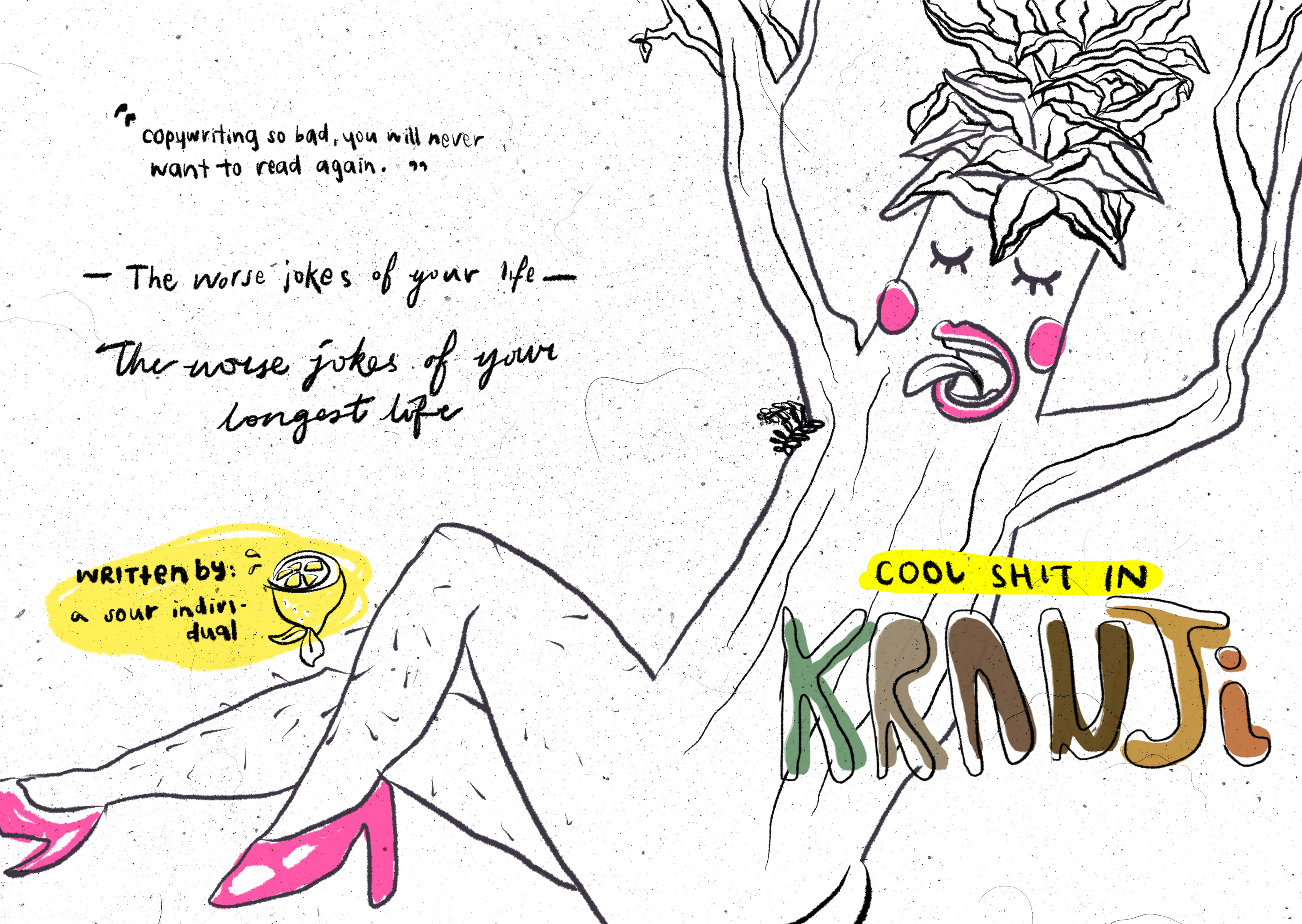 What would stand out better than neon colors? Neon colors! As inspired by the highlighter part of my Part 1 infographic. CMYK is not able to print neon but still, the title would stand out better as one single color that is different from the other colors from the page – after seeing it in CMYK mode instead of RGB mode. As seen in the visual journal, I also thought of printing blank pages and highlighting them but unfortunately this is a digital project.
CMYK ^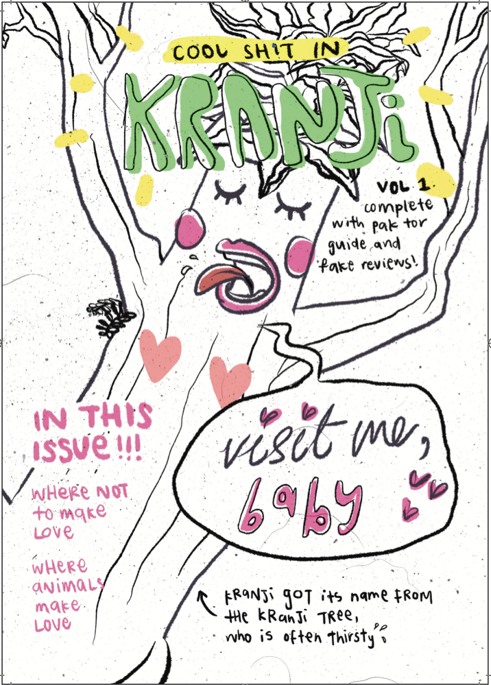 RGB^
RGB^
Also attempted increasing the saturation for the colors to make them brighter but the colors didn’t fit very well.
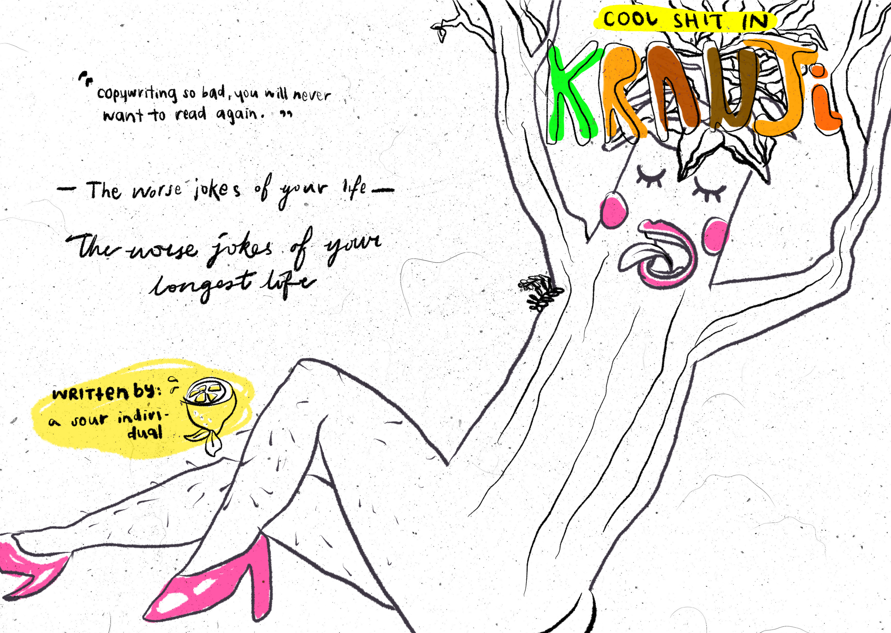 Yellow highlighter anyone? Not me. Though yellow is really a bright color, green stood out more and using green is also in relation to Kranji’s grassy grounds and jungles. Green fit better both looks and concept wise.
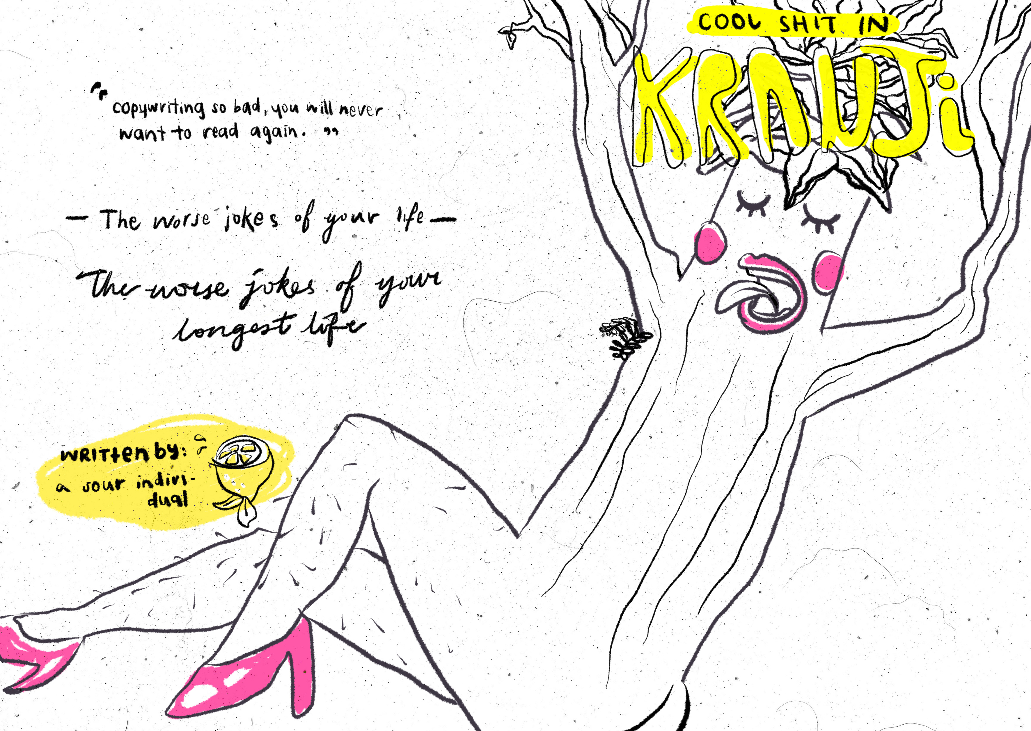
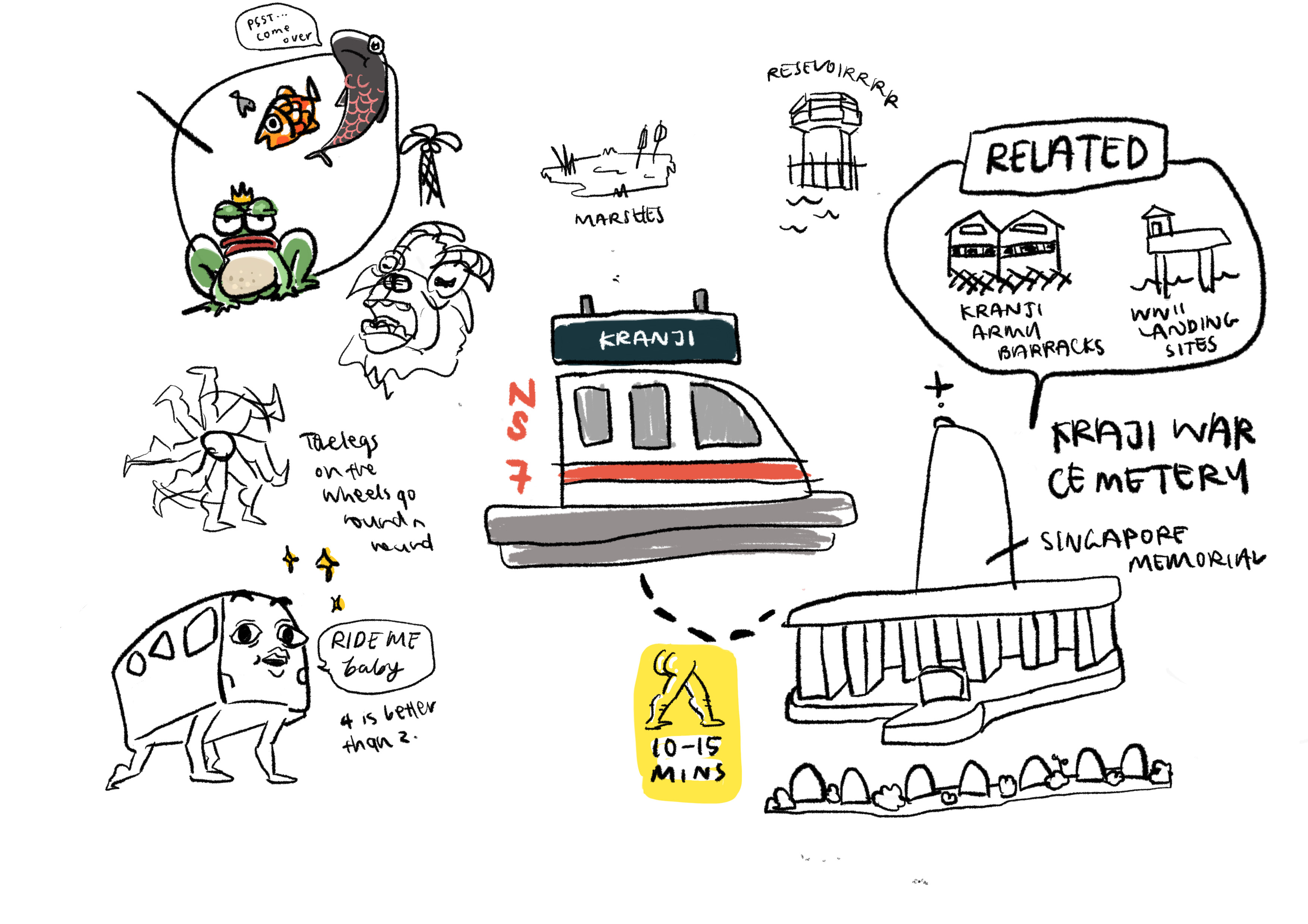
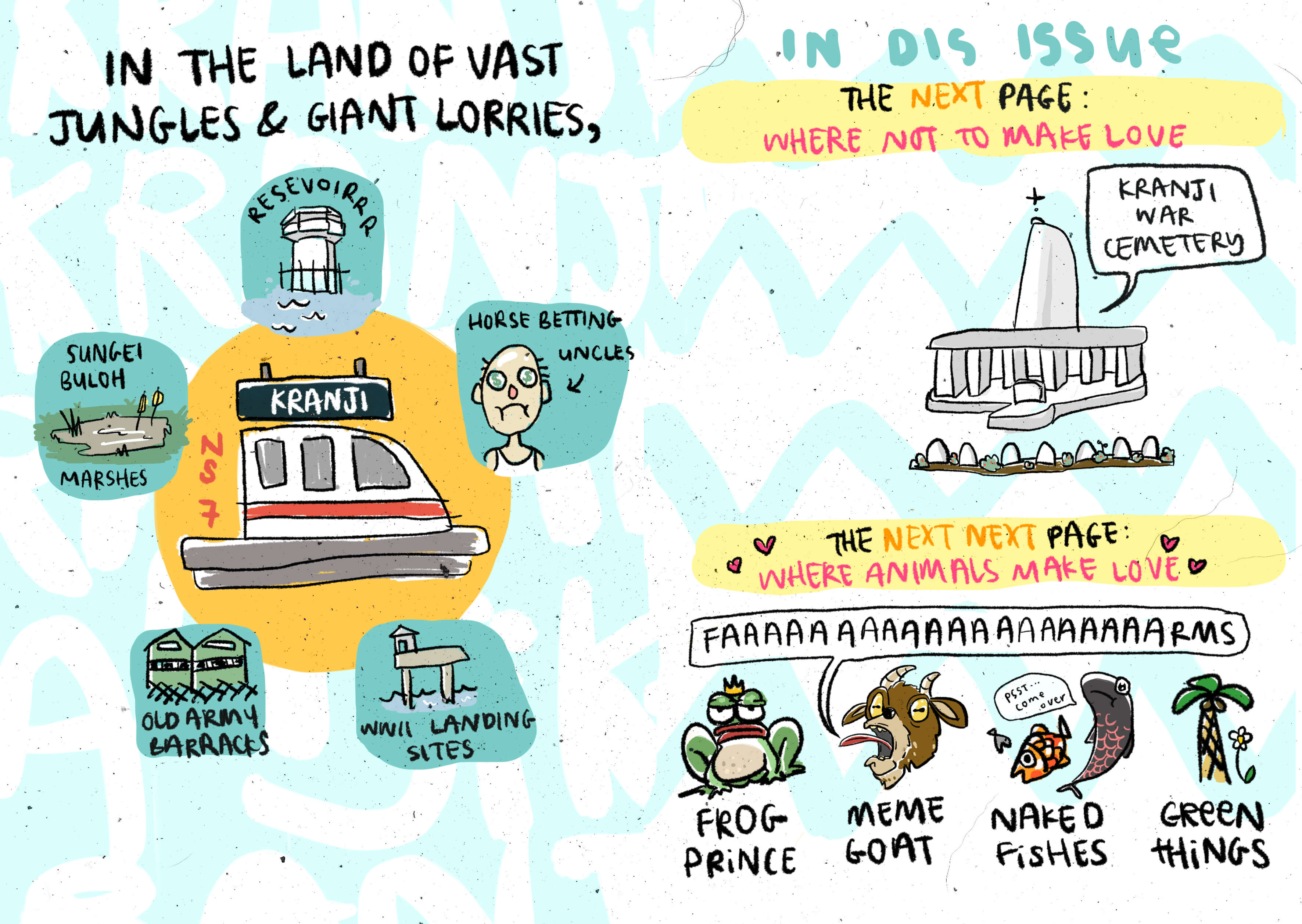
Started off my content page like this, wanted it to look more like a map that has the elements of Kranji in a more circular manner. But eventually I was struggling really hard with this layout 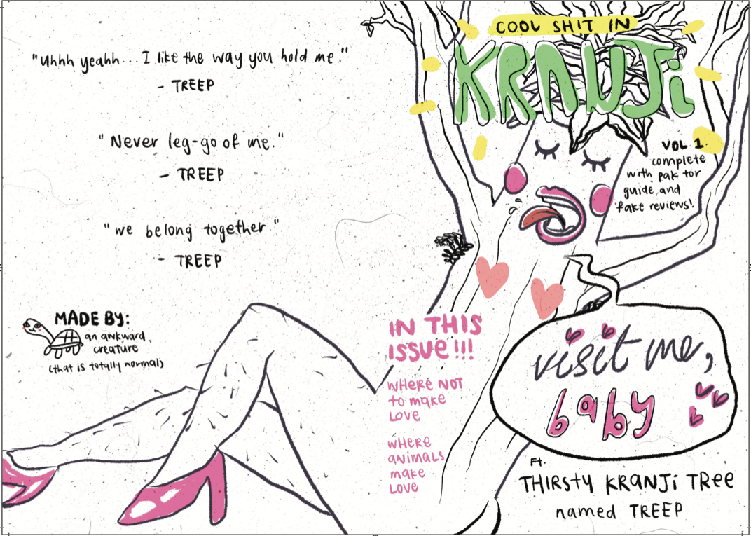 ^Test print, which was pretty much fine, but I adjusted the size of certain elements and also changed the text “Thirsty Kranji Tree” to something that is easier to understand.
  ^Final print
 So I came up with something else. Instead of being stuck with a spread, I thought of experimenting layouts in pages and breaking the elements up. This can help with readability and hierarchy and it will overall also look neater. The next few pictures shows the process of how i tried different layouts:
Experimenting with different placements: 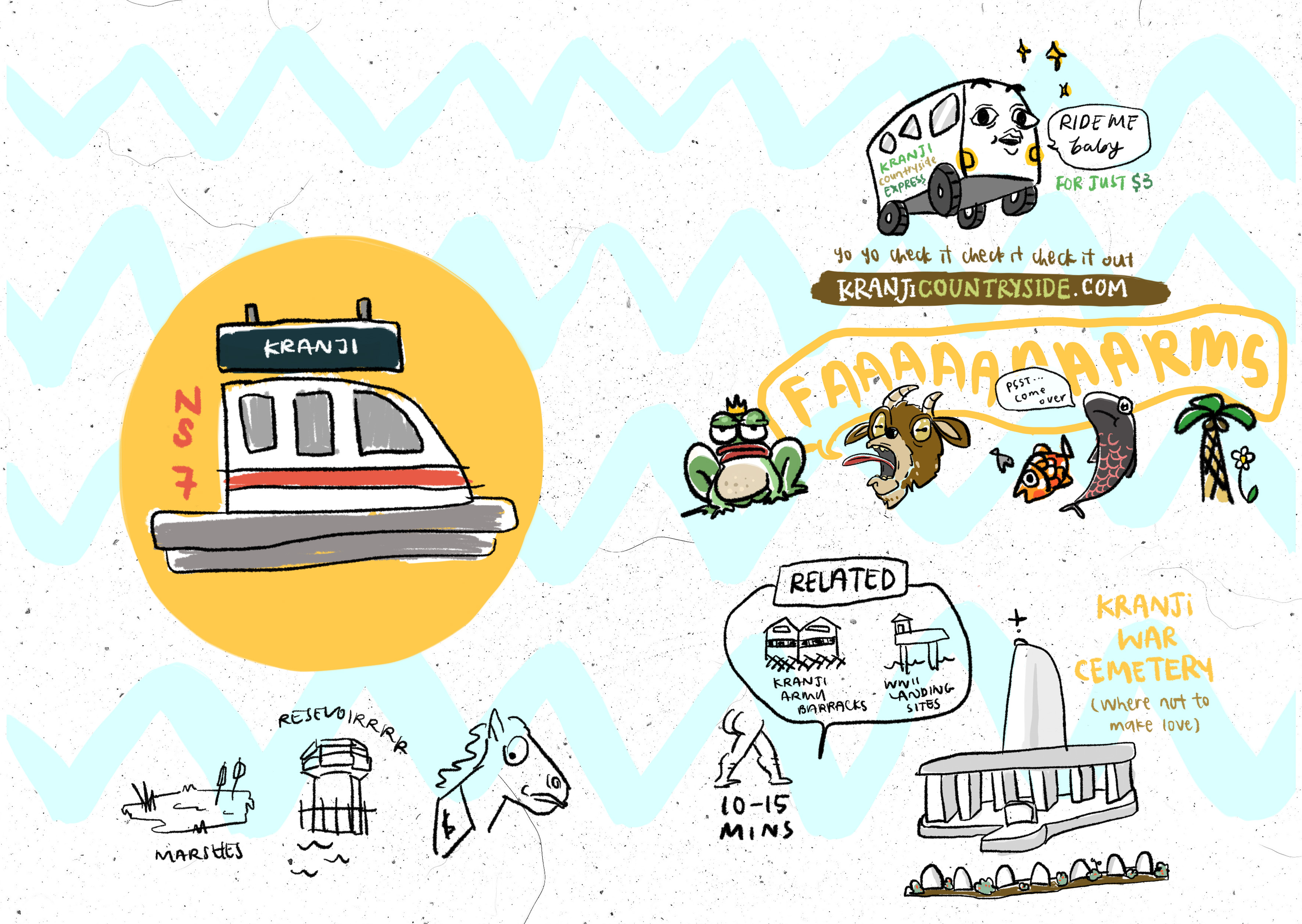
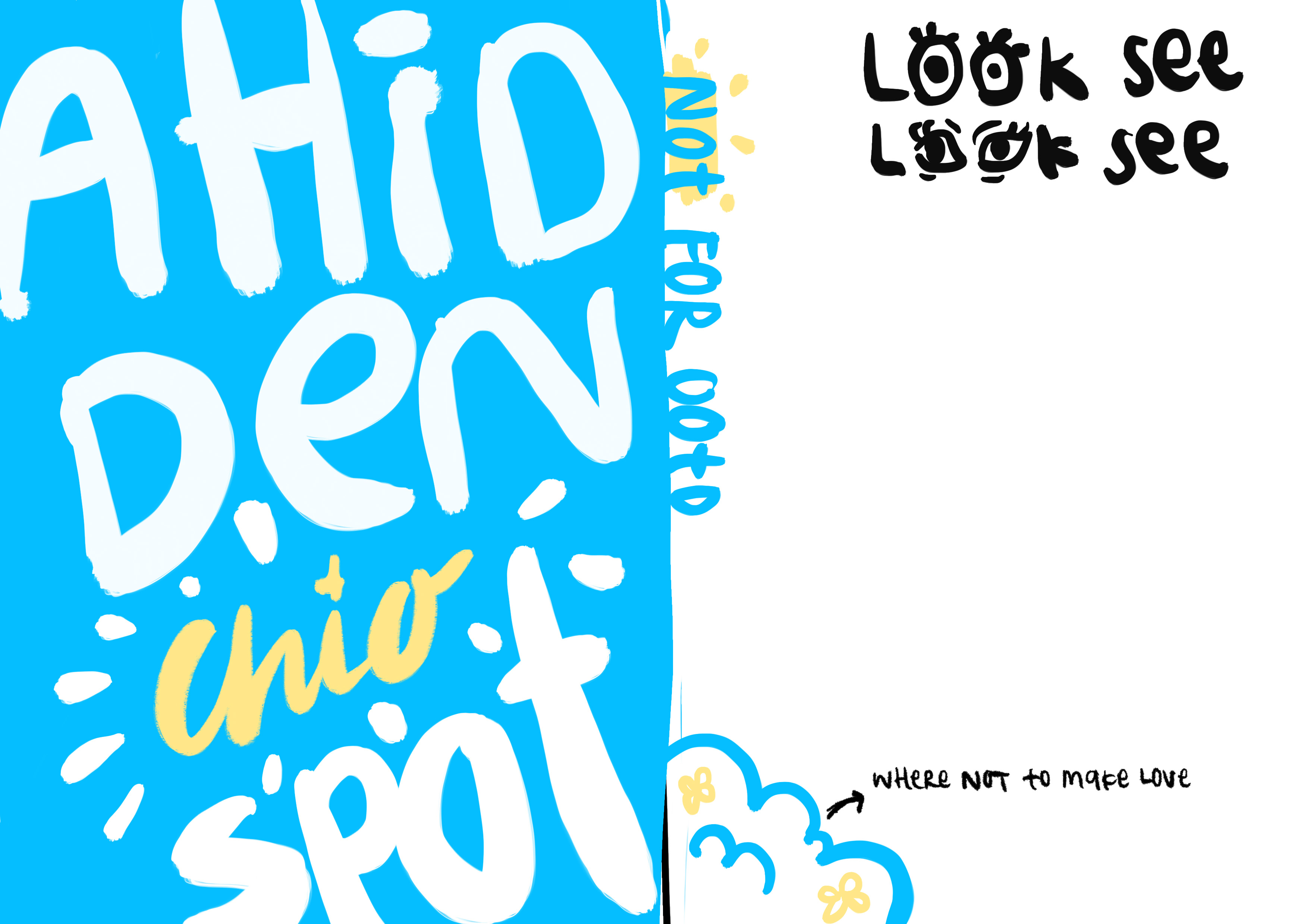
 I varied the background for each of the page to separate them more so they won’t look like they’re coming out together all at once. The left page is basically writing a repetition of the word ‘KRANJI’.
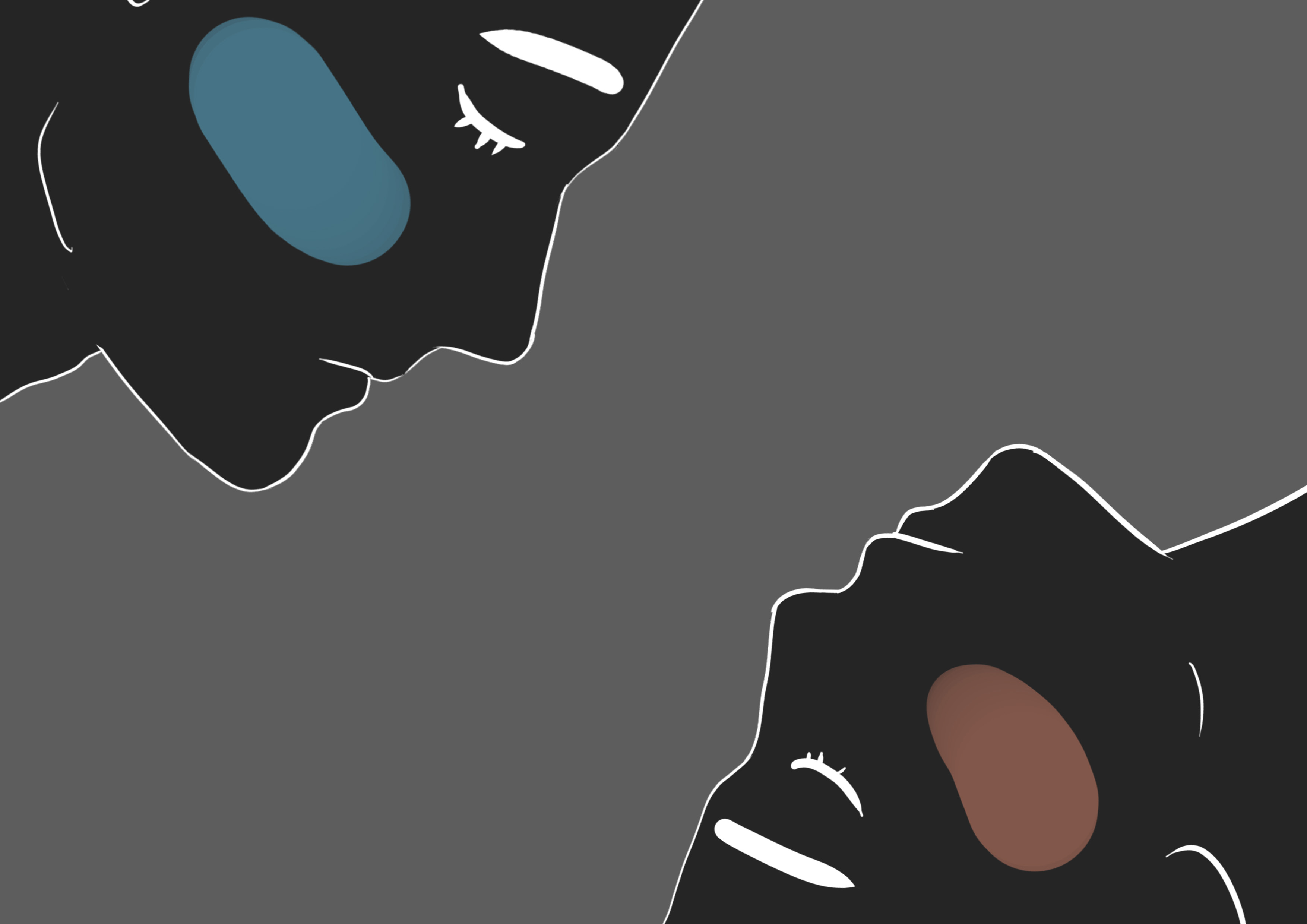
  Initially, the images were on their own without any background and I thought it looked quite messy. I referred back to Megan Nicole Dong’s comic strips and tried out color blocking each element and I thought it worked out nicely. It’s neater, segregates each element and it enforces some sort of grid system in the zine. Overall readability is improved.

^ Test printed spread for consultation
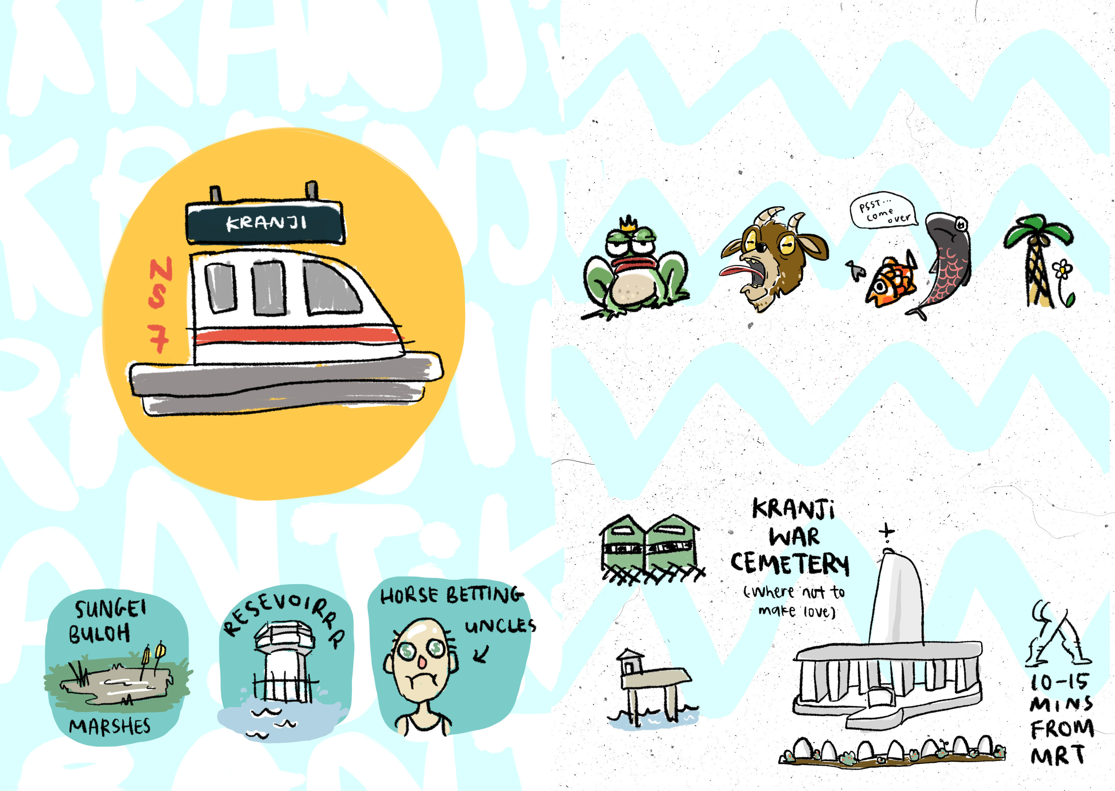
The focal point is clearly the Kranji MRT – emphasised by the circular shape and orangey color that stands out from the other design elements from the page. I have also experimented with different copywriting to go with the Kranji MRT page.
However, on the right spread, it was apparently confusing to the viewers because there were too many things going on and the text also didn’t seemed to have made much of a difference, so I simplified it much more in the next variations.
Eventually, I decided to remove the bus and walking time from this spread as it was getting too cluttered and the organisation of information is quite messy. I explored putting them in their respective spreads instead so this page gives a nice overview of the stuff that can be found in Kranji.
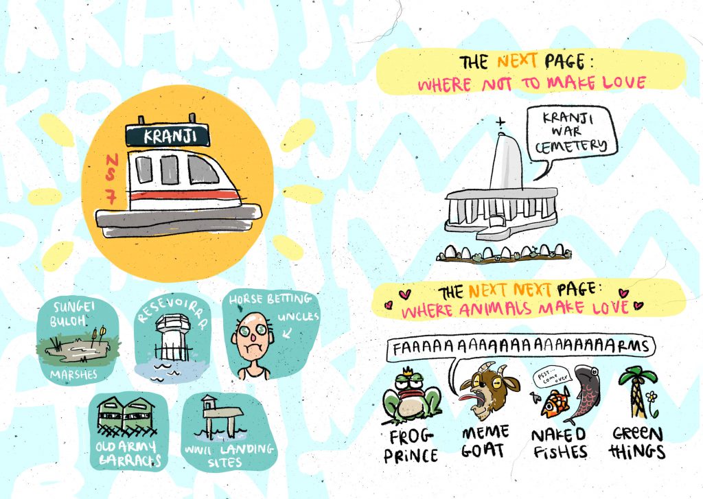
 ^Final Print
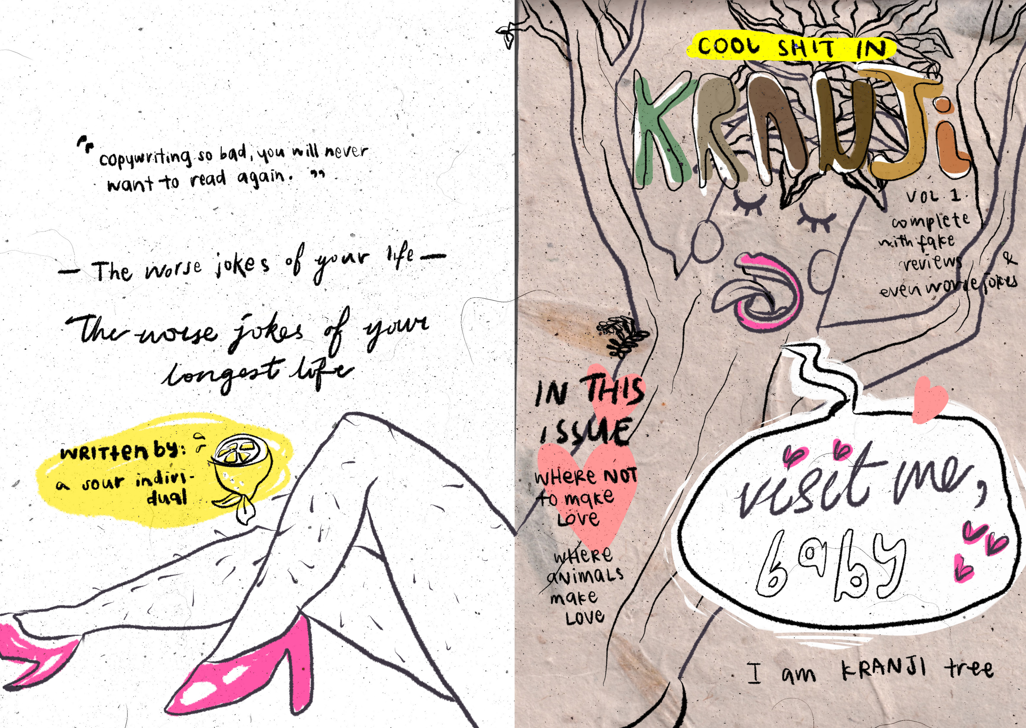
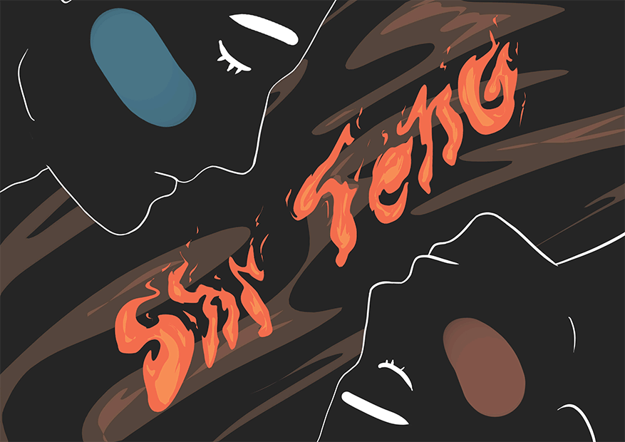
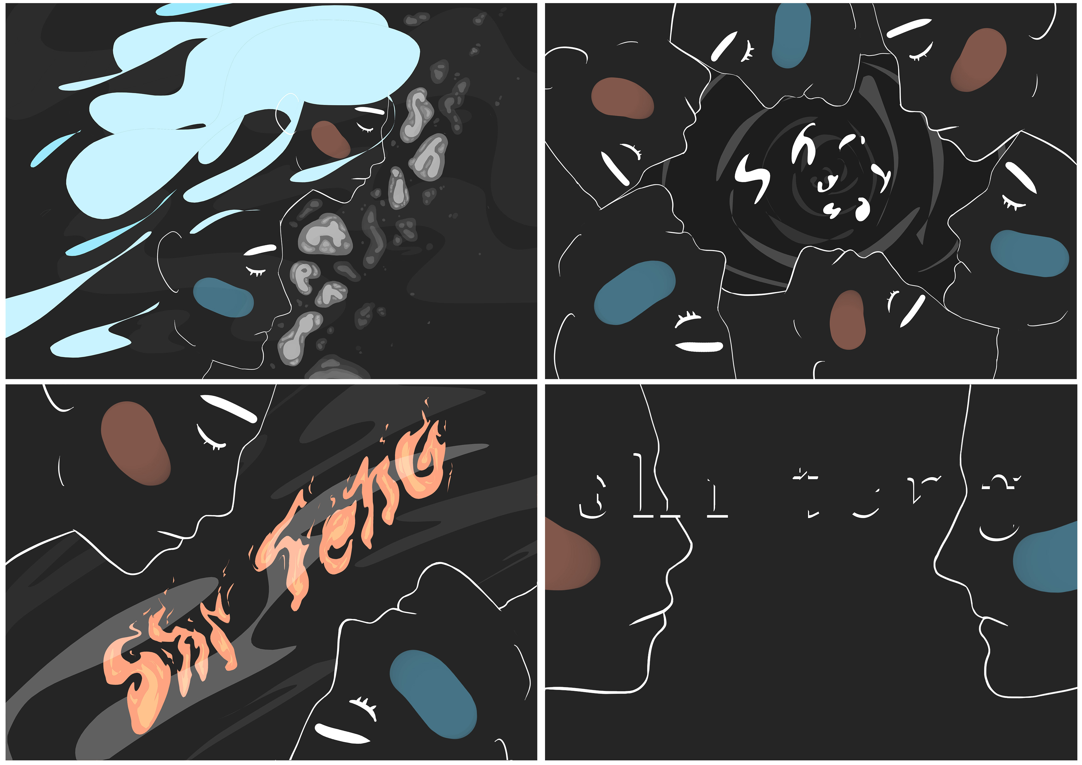
Had the title of this spread more related to the front cover’s “COOL SHIT IN” text – the same yellow highlight and words.
Added some lines around the Kranji MRT circle to fill up negative space and further emphasising it as the focal point and at the same time tying the colors with the rest of the page. Halfway through, I also changed the colors of the text from black to white as I felt white was less harsh and I liked how it goes with the turquoise. Having the text a different color from the line art perhaps also helped it stand out.
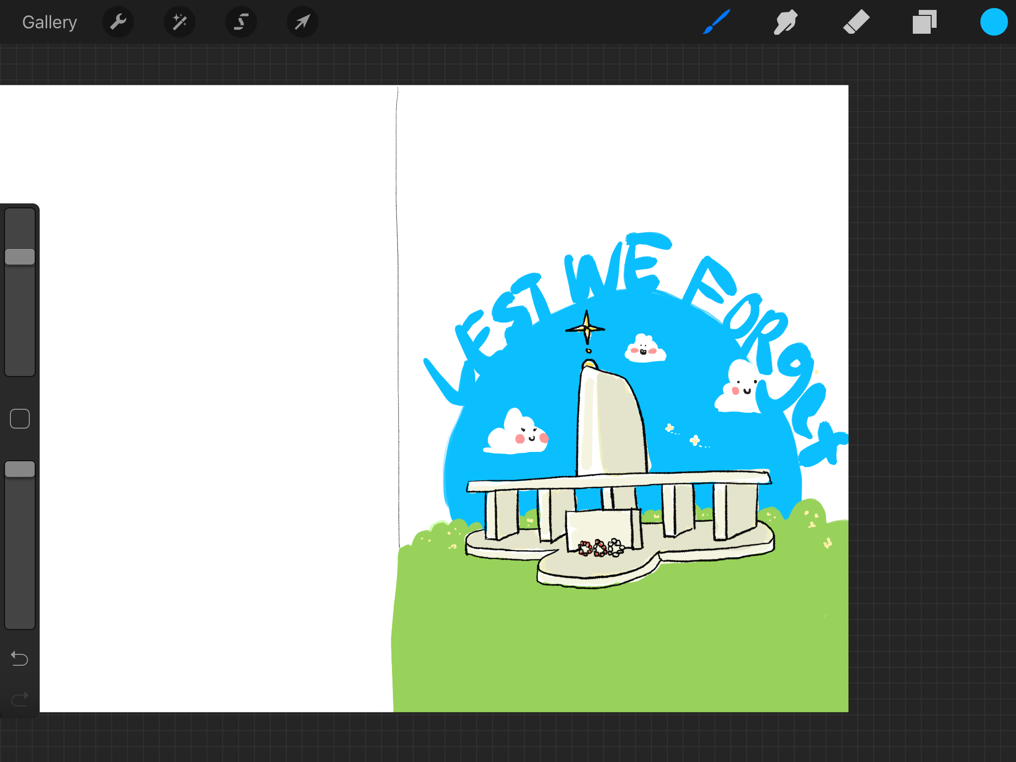
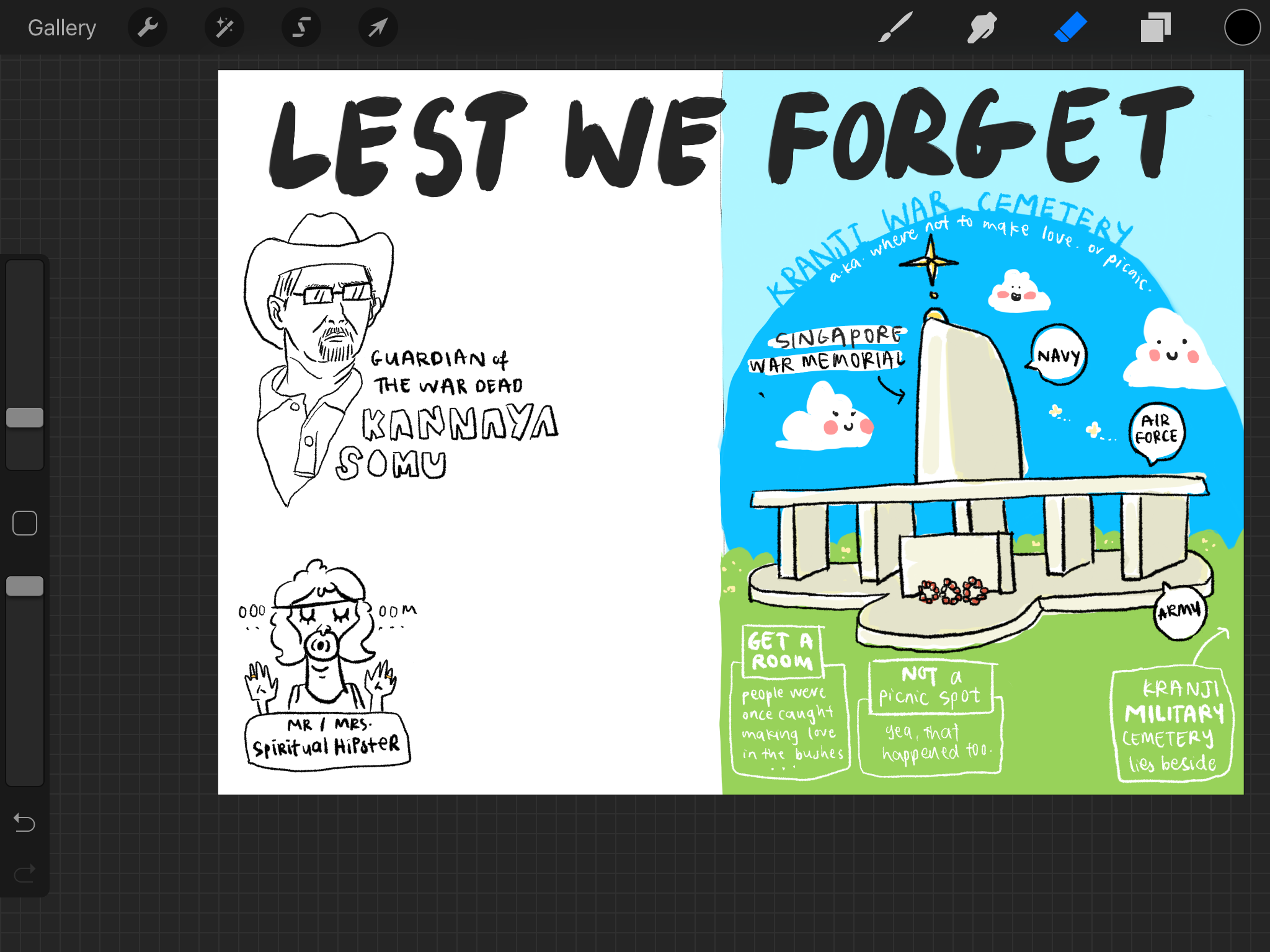
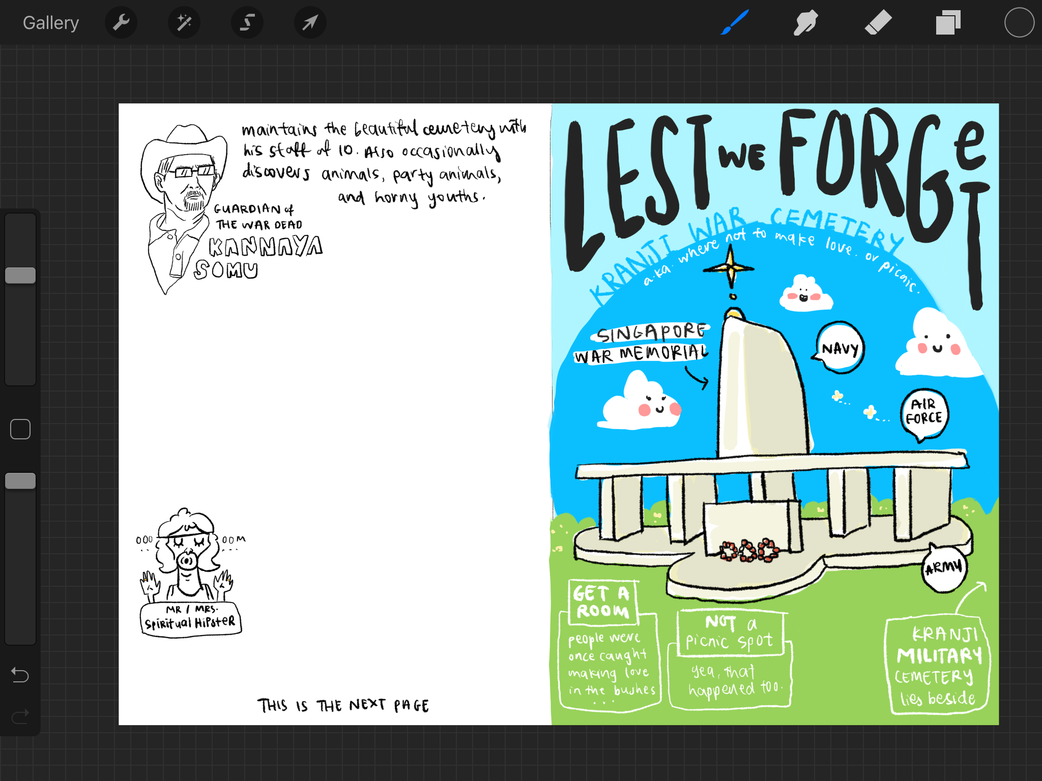
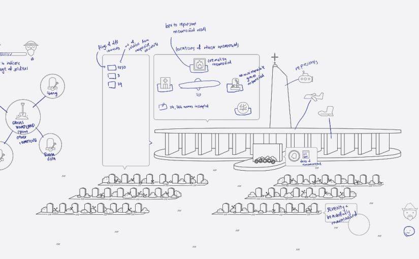
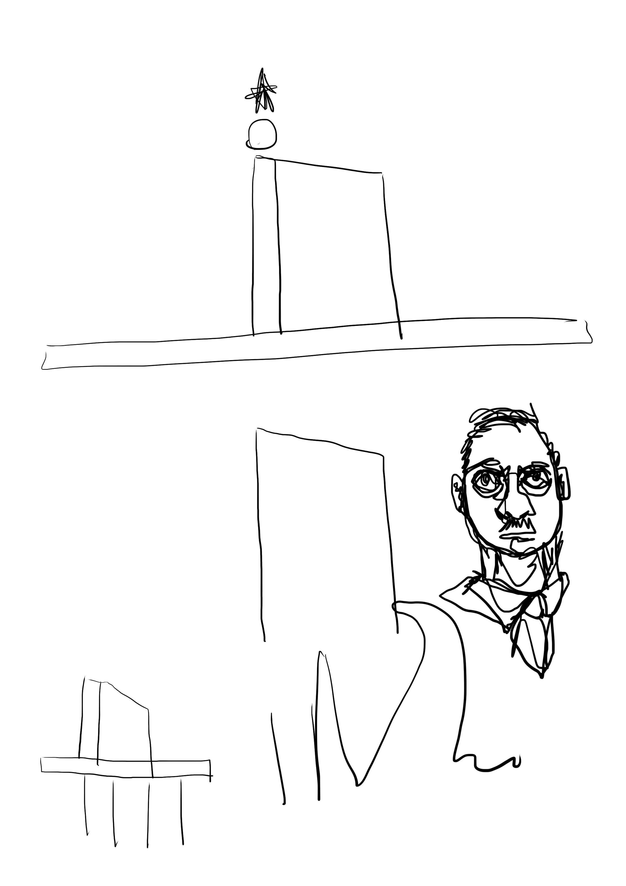
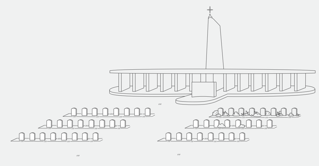
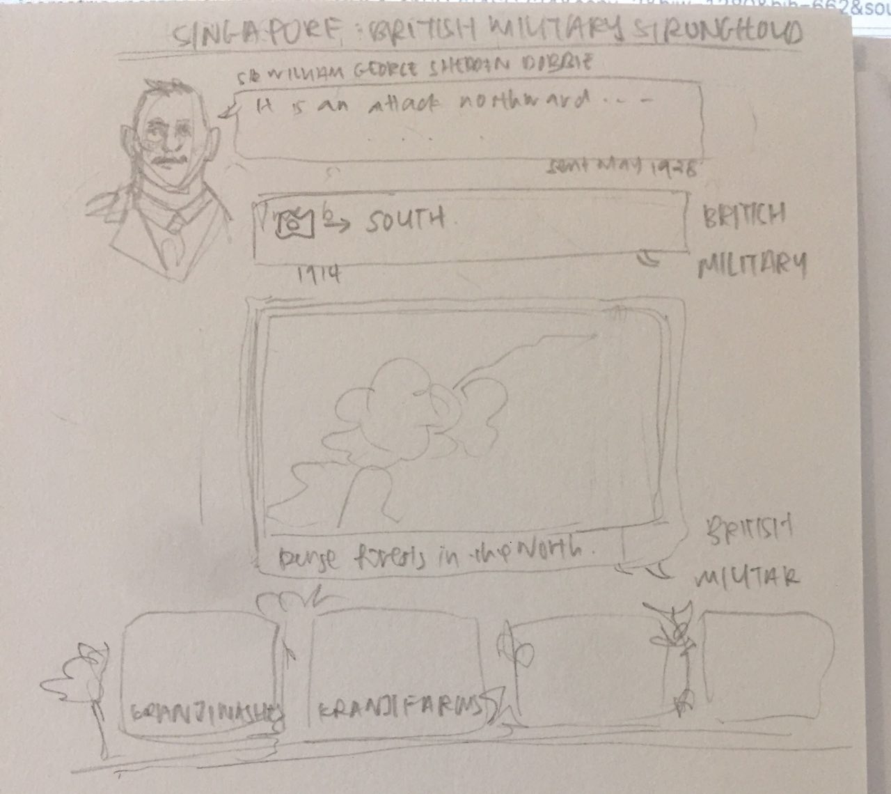
The very initial spread for the war memorial spread, but i figure this meant that i didn’t have space to include anything much at all so i changed it. There’s also too much going on in the page – too much big words that is in the reader’s face and confuses the reader on where to look / what is the title of this page.
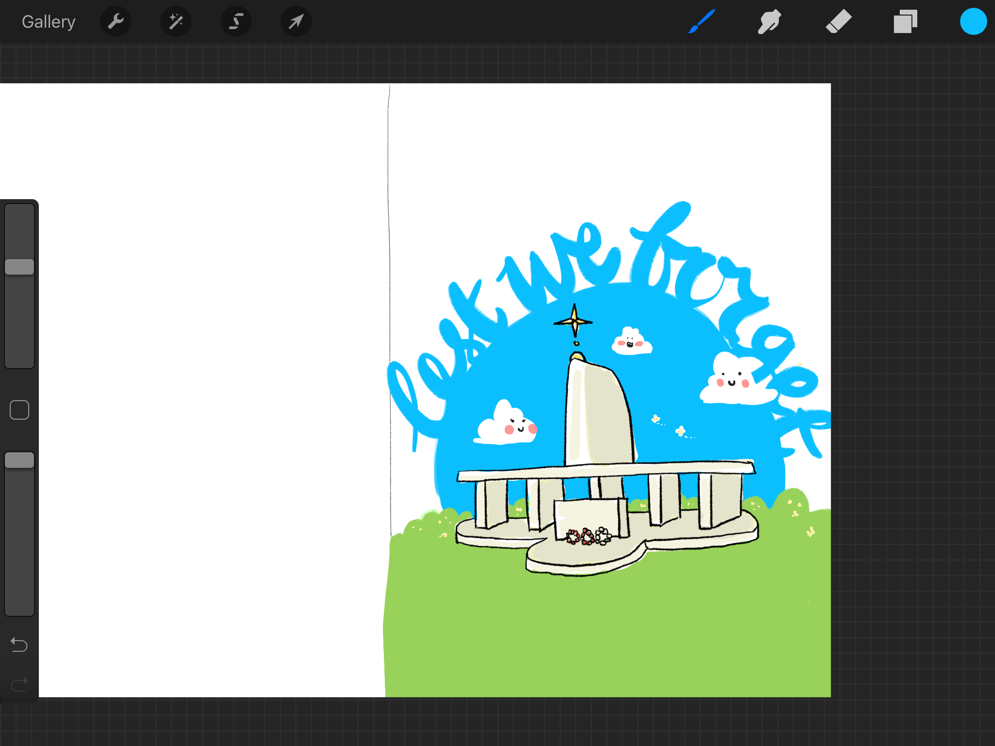
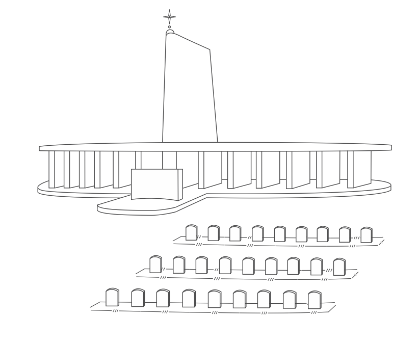
So I revised my method a bit and instead drew the war memorial (the focus of this spread) out first and trying different types and placement instead of diving into the rest of the page layout first. 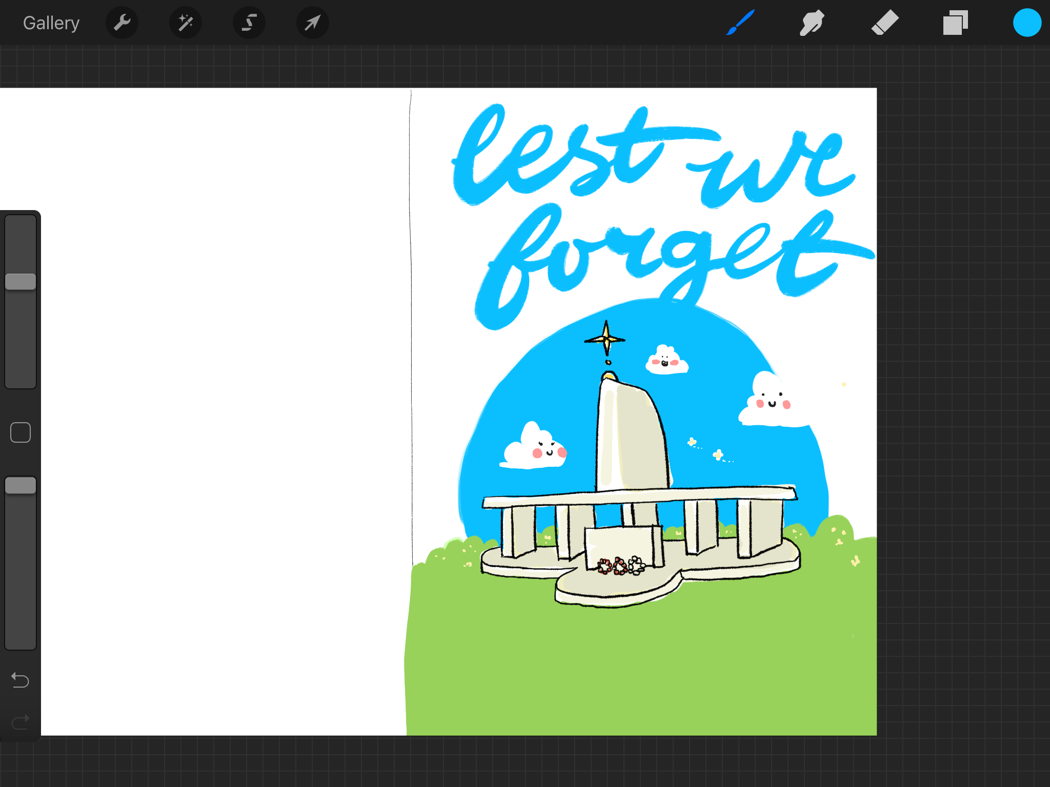

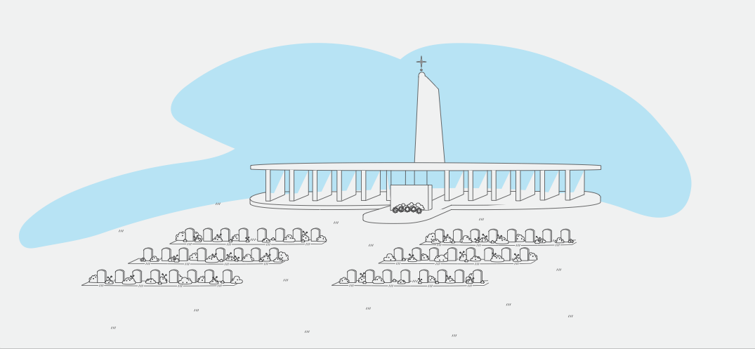
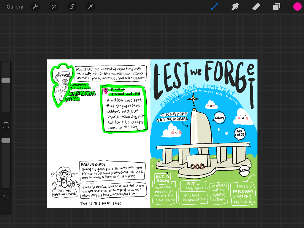 I removed the blue in the right side background so the entire spread will fit in better together.
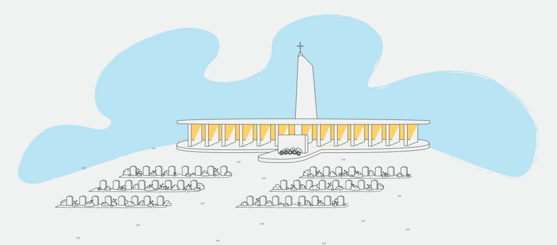
^Test Print
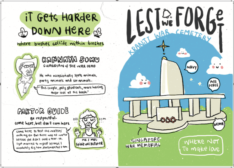
Eventually managed to fill up the whole page but after printing it, the text was just all too overwhelming and I removed some content, came up with better jokes and rearranged it. Also remove the “This is the next page” to reduce confusion.
Minimalising the entire page to the simplest elements that I know I want to have, then filling it up with title and body text: 
 ^Final Print
For the last page, it was quite set from the start. I knew I wanted a comic strip to help fill up one of the pages and also have it as one of the jokes instead of just having text content. I had another variation for the comic (in the sketchbook) but I came up with another that was more related to Kranji. More specifically the crocodile sightings in Kranji, which I found surprising and amusing. I used the same method of blocking out squares using colors – which maintains consistency and it works. Also shifted the bus information to fill the farm page.
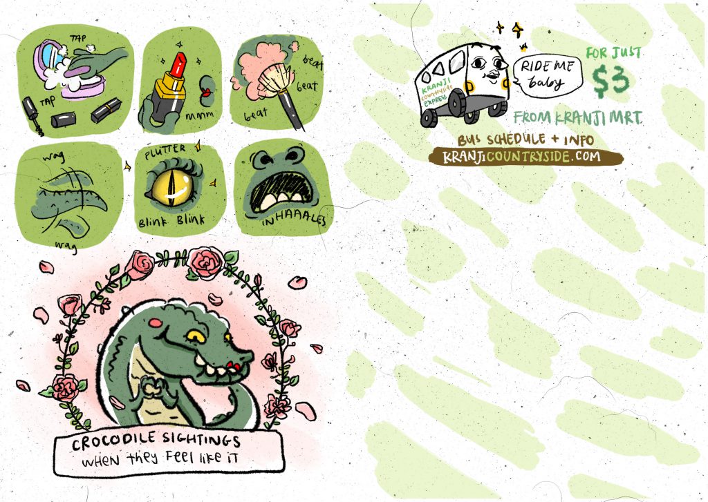 During consultation, it was suggested that i swapped the pages because in the previous layout, it was illustration heavy page after illustration heavy page. This layout also worked much better content wise as the farm was stated in the content page while the crocodile was just something more like a surprise fun fact inserted at the end.
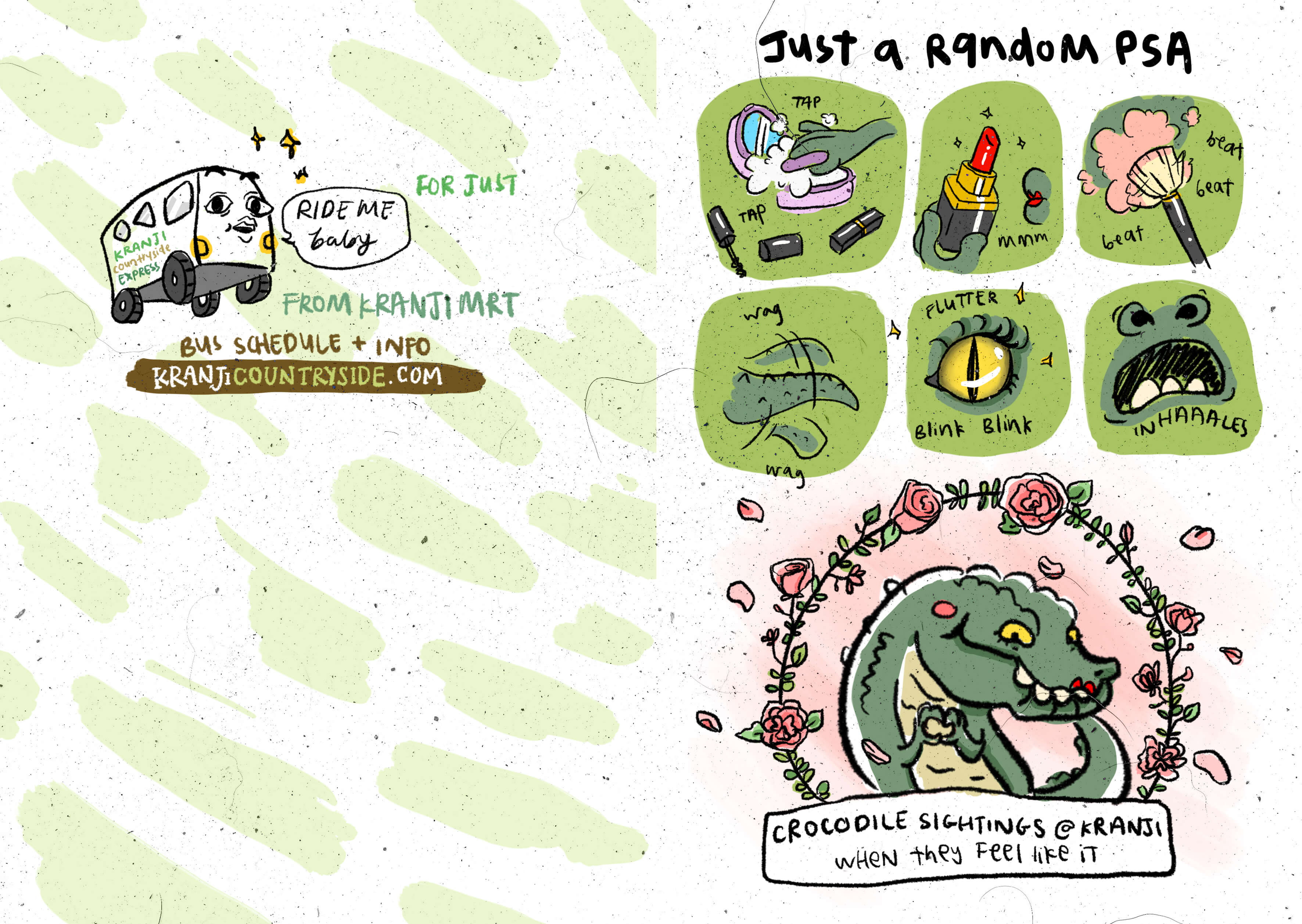
 ^Final Print
Same process, putting in the main elements, and then filling up with title and text. Also tried to make the title stand out a bit more and with a different type. Credit to the jokes for the first paragraph goes to http://www.jokes4us.com/peoplejokes/farmerjokes.html. I tried to include the experiences that was most interesting to me from the site visit into the rest of the text.
Last but not least, this zine was inspired by Clara’s quote of “Good but not sexy” as mentioned in one of my previous OSS posts. Also, a special mention of my friend Haoran who sort of contributed to the jokes. I went to him for his bad one liners, and ended up coming with better ones myself in the process.
Soooo that’s it for the digital process! Test prints, sketches and more weird jokes can be found in the visual journal.
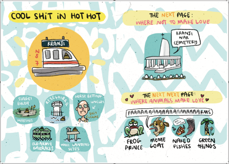
The color for the school printer at NorthSpine was quite bad. It made my yellow man turn greenish yellow and the background stood out too much. Though the ink and paper combi came out not glossy at all. The printer at Out de Box was much better, color wise. It took one additional go of test printing as I had to adjust some background colors to make them stand out a bit more. I would have actually preferred a more matte look for the whole zine to go along with the texture that i printed out, but unfortunately that isn’t open in the specifications of this project and the printer ink was quite glossy. But I am fine with that!
After printing, there was also feedback about the texture that I used – people kept trying to brush away the ‘hair’ that was part of the dust and scratches texture. Which.. I thought was quite an interesting unintended interaction that came with my zine. It was another layer of interaction on top of the reading and laughing. It also adds to the whole sleaziness – well, what hair could that be, may readers wonder.
Links to:
Final Zine Images
Zine Research
Links to Part 1 Infographic:
Final
Process
Area Research 1 / 2 / 3
Reflection
All in all, this was quite a fun project that I feel was really quite flexible and it was fully up to us to make the decisions on what we want to do, as long as there was concept, art direction and content. Which thankfully, I had most of it nailed from the start and knowing what direction I was going towards was really helpful. I knew I wanted a sketchy look, I had a main reference artist, I wanted it to be a quirky / parodical tone, and my content was about Kranji. In the other projects, I probably struggled more because they felt more abstract to me as they were a lot about transferring ideas and concept into visuals. Perhaps along the way I’ve grown to become better at that so dealing with the zine seemed to be easier. Overall, I believe that I grew in conceptualisation – thumb nailing more, coming up with more compositions, as well as exploration.
I think my biggest struggle for this zine is with the content. It was a little bit of a barrier because I wasn’t really sure what I wanted to include / what i can include in eight pages. I knew how it was going to look like, but I did not know exactly what was going to be in it. Plus, I intended for a quirky tone so I needed to have jokes. It was quite difficult to find a balance between jokes / offensive jokes (especially for the war memorial one. There was so many undocumented offensive jokes.) and jokes / information. There had to be a balance because I didn’t want to just come up with wisecracks and throw away the topic of Kranji totally. I wanted it to be somewhat informative but still interesting and weird, to read. I think i probably really needed to curate the content a bit more from the start, perhaps by coming up with a ranked list of points I wanted to include, then making the jokes from there instead of having super broad topics like war memorial / farm that I wanted to address.
For instance, it was helpful when it was suggested that i should base the war memorial information on the target audience and the whole idea of ‘horny youths’ I was mentioning a few times in the same spread initially. And eventually, i am quite happy with the subtle innuendos on that page. (Not that my mom sent me to school to make sexual innuendos.)
It was interesting to see everyone’s zine. I thought that everyone else’s zine is a little piece of themselves and it’s somewhat reflective of their personalities (not that i should be associated with sexual innuendos). It may not be the perfect work, but I am happy to have achieved what I started out to achieve, especially as the final project of foundation year. It was most wonderful when my friends specifically told me that they really liked my zine in terms of both content and look. It’s a good satisfaction to know that I’ve hit my target audiences and that people were interested to read on as they found the jokes funny and that I’ve made them smile. The most feedback I have received was probably regarding the entire messiness of the zine and text hierarchy. I agree that these things could be improved on and it was probably because of my persistence in consistency that I probably could have explored more if I knew what titles / subheaders I wanted to include – again, going back to the content. But only because of this imperfection, I was able to receive extra nice comments as people were backing me up by telling me that they thought the messiness went well with the art direction in spite of other feedback.
It’s been a joyful journey the past semester and I’m glad to have ended up in this class. I believe I found a bit more of myself through each project, especially with the help of my friends and teachers. Hopefully, all the inspiration I’ve gathered from the people around me were transferred well into the final project and that my own improvement is reflected. Looking back, my previous projects seemed to be really controlled, in contrast with the final project, and I feel that this ties in with my objective of this semester to ‘let it go’. It’s always nice to be able to come up with something that I’m happy with, and I am happiest with the final project as compared with the previous ones, which I always felt have something lacking.
So, we’re done. All is cool and all is well. It’s a good ending to foundation 2D. This letting go feels like a good start to animation life and I hope it’ll bring forth even better things. (:


