Project 3 Brochure for Arts and Health at Ng Teng Fong General Hospital (Task 1: Design Exploration)

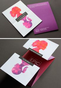
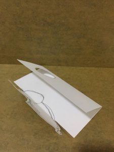
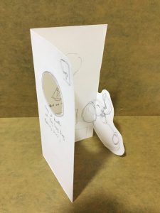
Shape of the brochure is triangle. It can be opened easily. Viewers can see the information easily. There is two figures in the brochure and look like connected when the brochure is closed. Colour of brochure is nice, it gives a sense of smoothly.

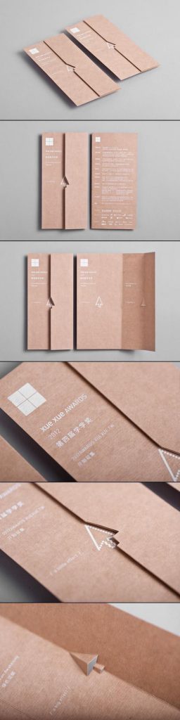
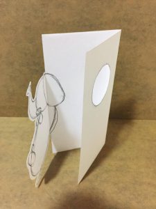
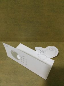
Minimal Design, fold easily. Viewers can understand and get the information easily. There is one die cut in this design. It is a interesting part.

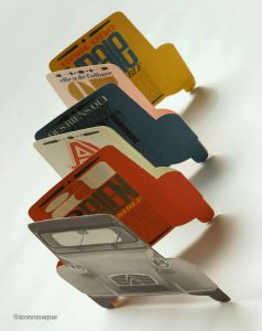
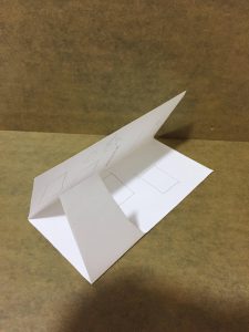
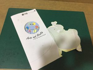
The design can be recognized easily. The overall design is a car. It was folded in a way. Therefore, viewers can open it in a natural way. All the information can be arranged in a sequence. Viewers can read the information easily. The choice of colour is nice, it attract viewers to read it.

Playing with Folds

There are 3 mock up.

Mock up 1

Mock Up 2

Mock Up 3

Visual Studies of the design 

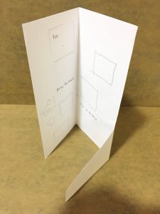
I printed it to see how can it be folded and how it looks like.

Inside of the Brochure


When You Fold it


When You Open It


Back View of the Brochure

Project 2: Arts and Health Promotional Poster (Task 1A: Visual Research)

Existing Event Promotion Posters

This poster convey a message which is there is a bigger and better H&M store at Orchard building.

Design of this poster expressed the excited and happy of shopping.

From this poster, the first things I see is two models. This poster is symmetrical. There is two models with happy faces at the center of the poster. Secondly, the red banner at the center attracts viewers. Also, there is white text in the red banner and delivery a clear message to the viewers. From the text, I know they are wearing legging which can be bought in H&M. The background of poster has attractive effect like shining strips. The overall of colour in this poster is grey, white, copper and gold which express excited and looks high class. It is an eye catching poster.

This poster delivery a message which is customers can get free Choya Umeshu when dining in because Sushi Tei is running an event.

The design of poster has a relaxing feel. Like people will feel relax when enjoying the meal and drink.

From this poster, I saw the two cup of Choya Umeshu first. Choya Umeshu spilled out gave a sense of energetic. Colour of Choya Umeshu is very eye catching.  Second thing I see is the text ” Grand Opening Special” and Logo “Sushi Tei”. After that, the below text and images. The overall colour is blending well. Yellow, gold and white are very eye catching in this poster. It gives a sense of fresh and the poster looks tasty, like quench thirst. This a symmetrical poster.

This poster convey a message which is there is a sushi promotion at new new outlet.

The design of this poster is simple but cute. The sushi model is eye catching. Therefore, viewers know that this is sushi poster. The text with red colour is big. From this poster, I saw the sushi model first. Following by the red text and white text. This is an asymmetrical poster.