some updates…in the mist of my messy schedule trying to balance school, FYP, job applications, exams and relationships :((((


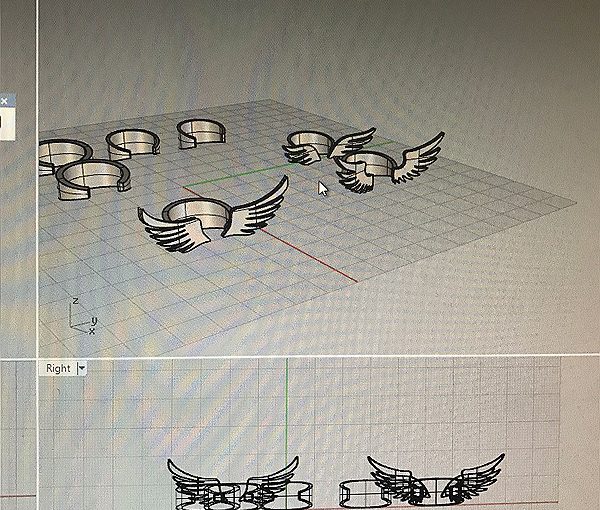
my next step is finish CAD all designs and make them 3D printable…
some updates…in the mist of my messy schedule trying to balance school, FYP, job applications, exams and relationships :((((
my next step is finish CAD all designs and make them 3D printable…
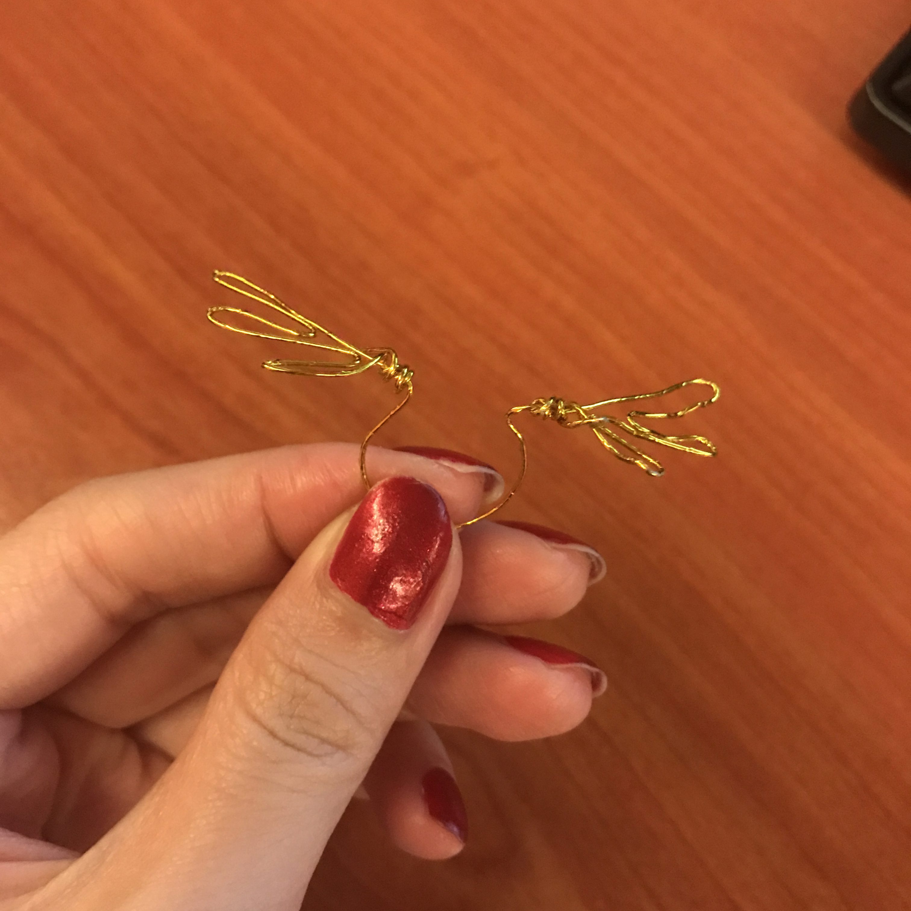
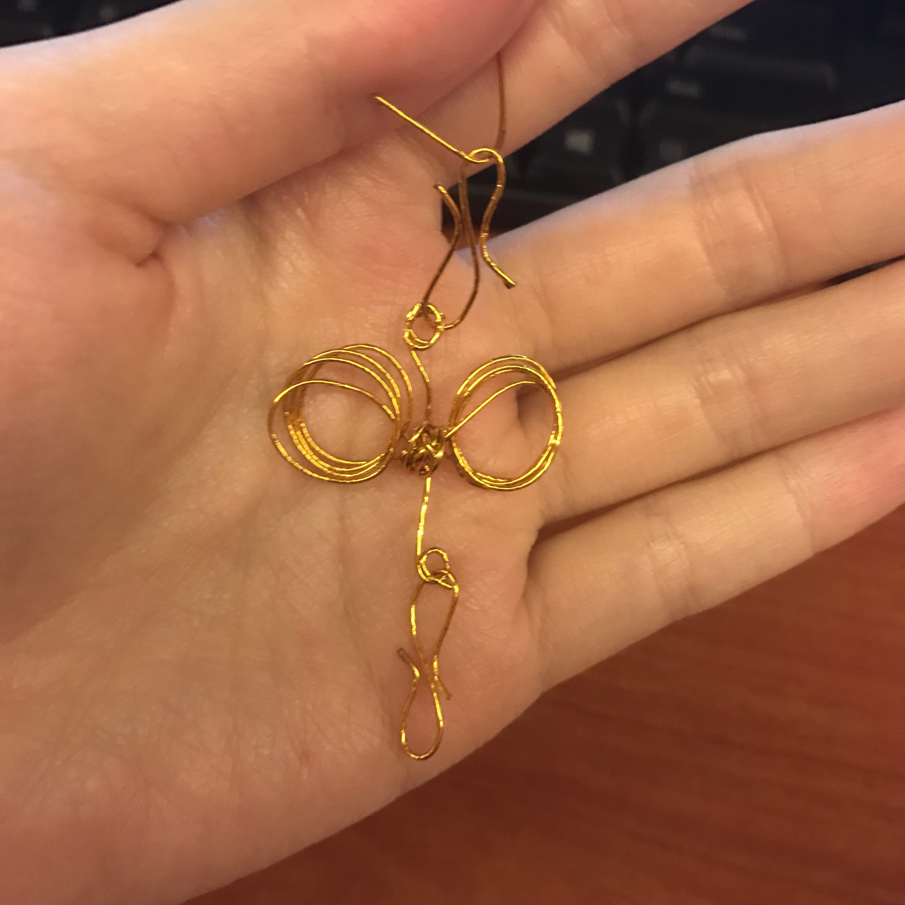
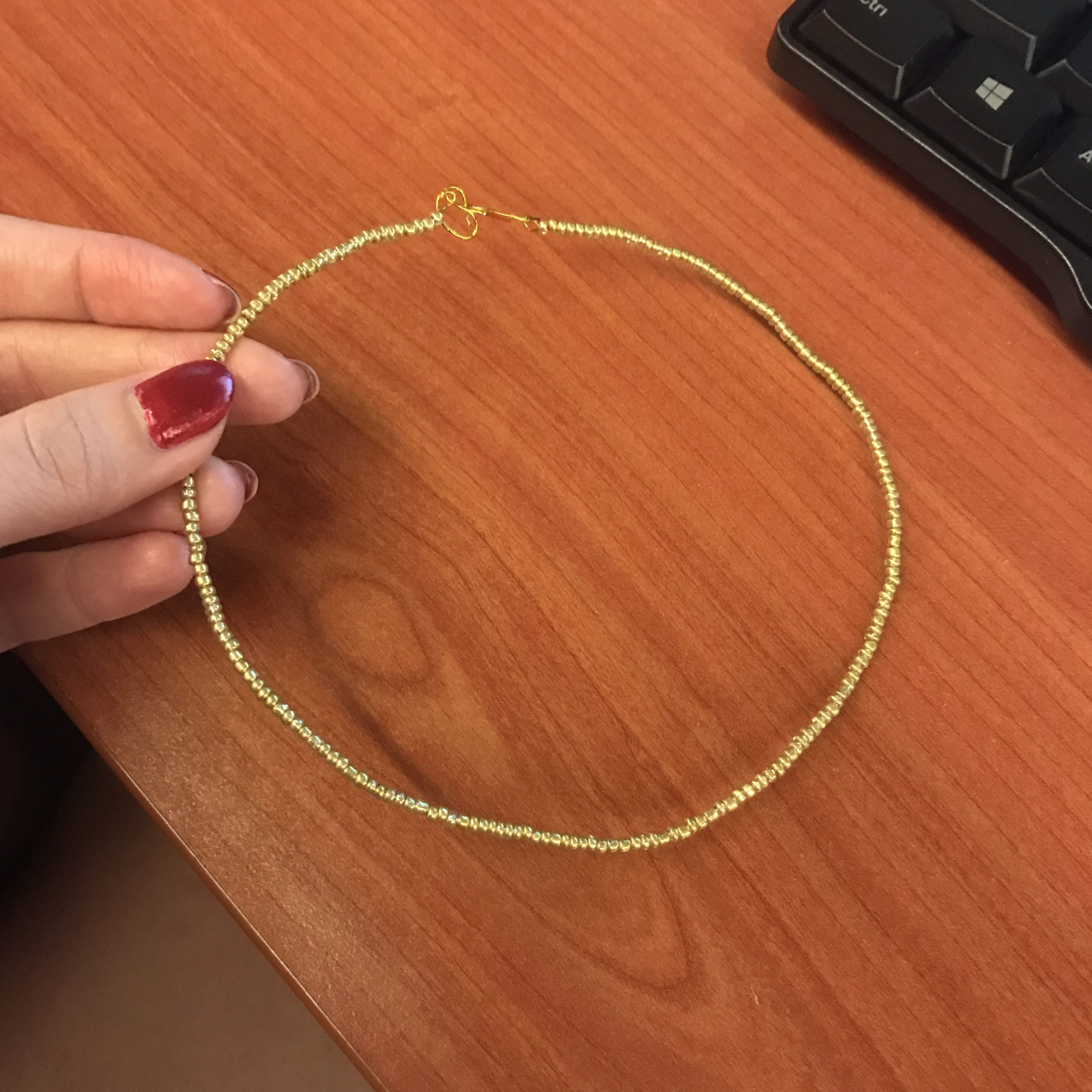
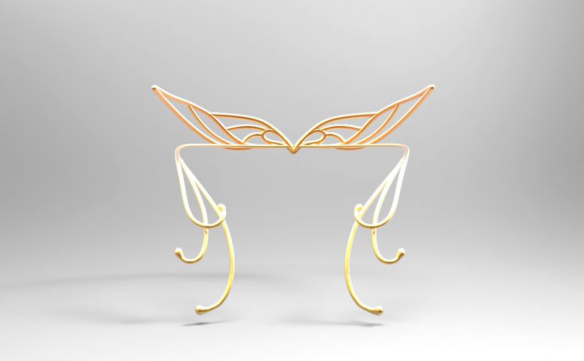
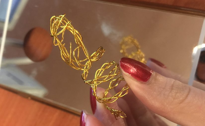
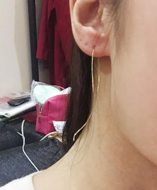
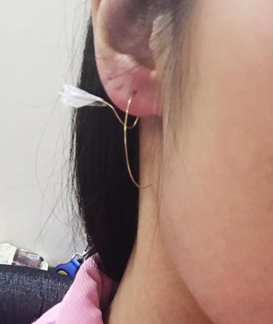
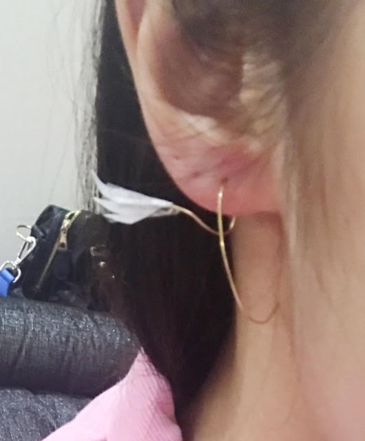
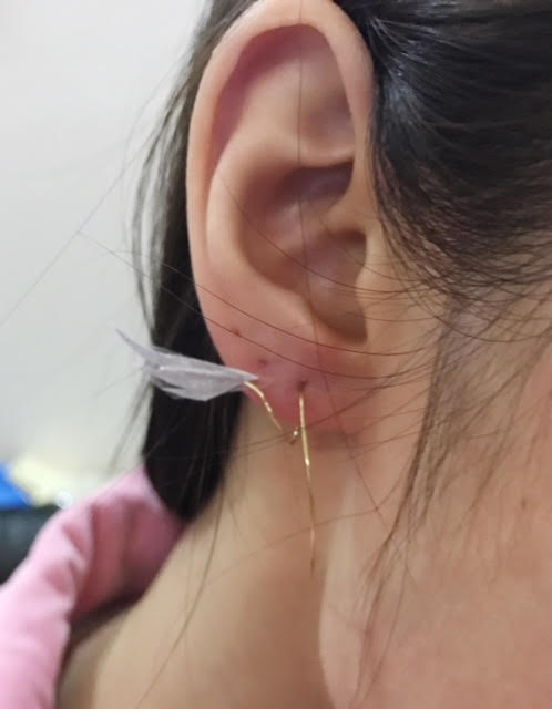
Previously, I had my choker mockup done from wire:
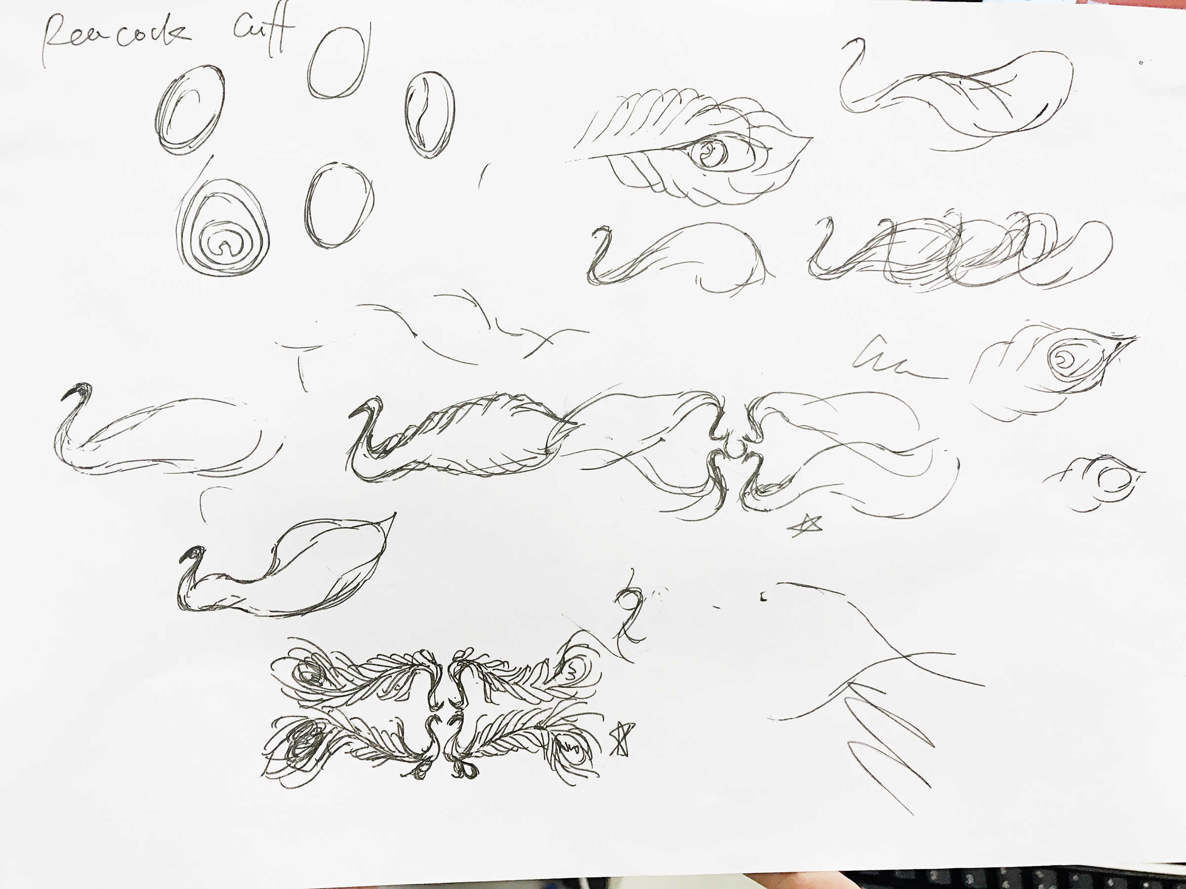
After which I proceed to drawing them out in computer, 2D. The form was further simplified.


I drew them in group-from top down, 3 in a group. The first of the three is the first layer, second is the second layer, third is the layering of 1st and 2nd layers, to explore the possibility of layering.
I also drew the variations of design, some has cut out, some have holes for tassels or dangling details. Some have wings more angled than the rest.
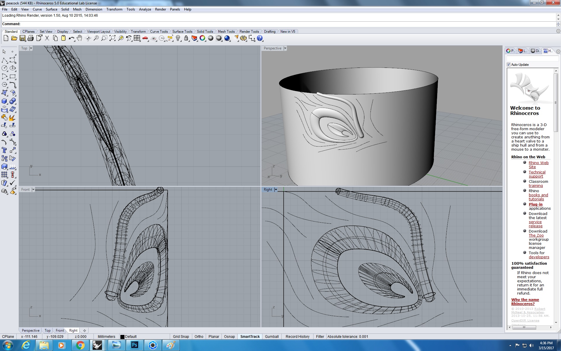
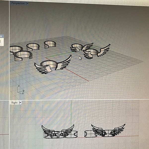
Following the 2D design, I drew the choker in 3D rhino.


As you can see from the image on the left, this choker is ergonomically not feasible. Our neck is not a standard cylinder but rather a cone shape. As this choker is pretty wide, it should be designed with a slight angle. If not, it can only be wore at a very high position on neck(right image) and would be really uncomfortable to wear. In addition, the pointed edges and spikes can be dangerous for people to wear on neck.
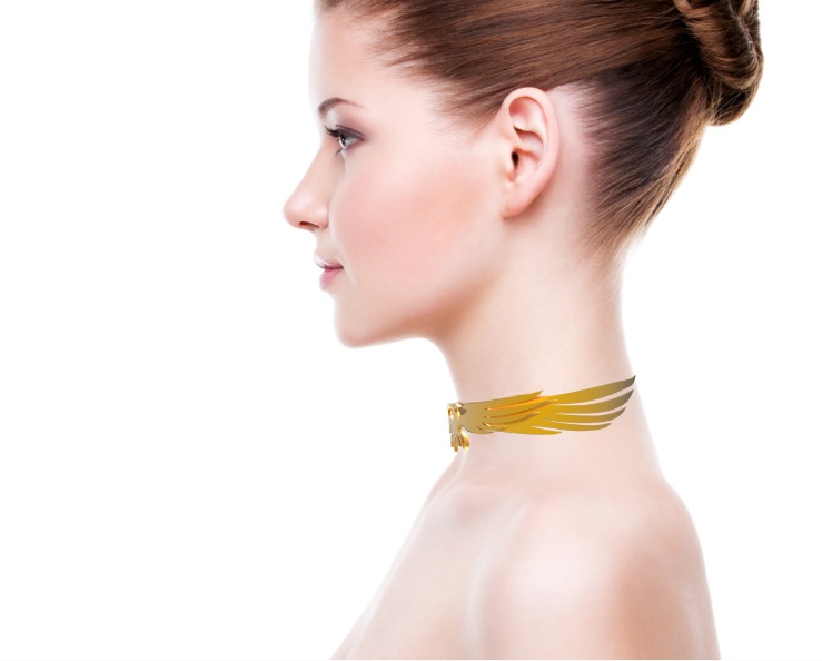
side profile of the product . In addition, the bulky design needs a lot of printing materials, at the same time, reducing the flexibility of the choker.

After slight adjustment of the angle of the wings, the choker sits better on the neck. Nevertheless, it still doesn’t solve the problem of safety. AND after all it doesn’t look so appealing aesthetically.
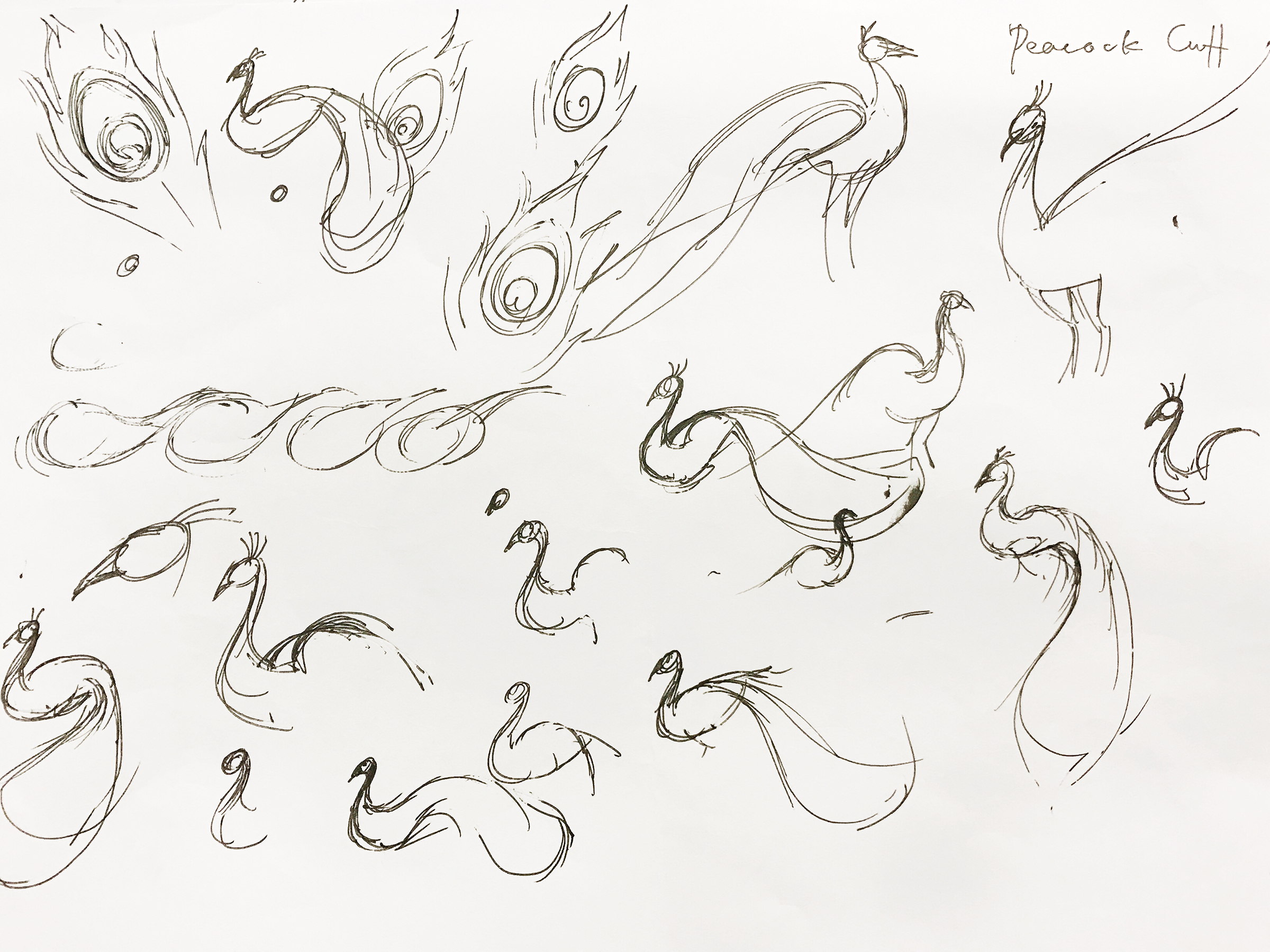
I started to review my design and think of other possibilities. As we have learnt in Studies in Forms module in year 3, depicting an animal does not necessarily depicting the entire feature. It can be just representation of certain traits. Take phoenix for example, to me, the most symbolic part pf phoenix is the flamboyant tails and the proud even arrogant gestures. Starting from there, I simplify my design into something more representative.


I personally like this idea a lot although I wouldn’t say it is perfect. It is physically and visually much lighter, more versatile and modern.
Based on similar design I drew out a wrist cuff.


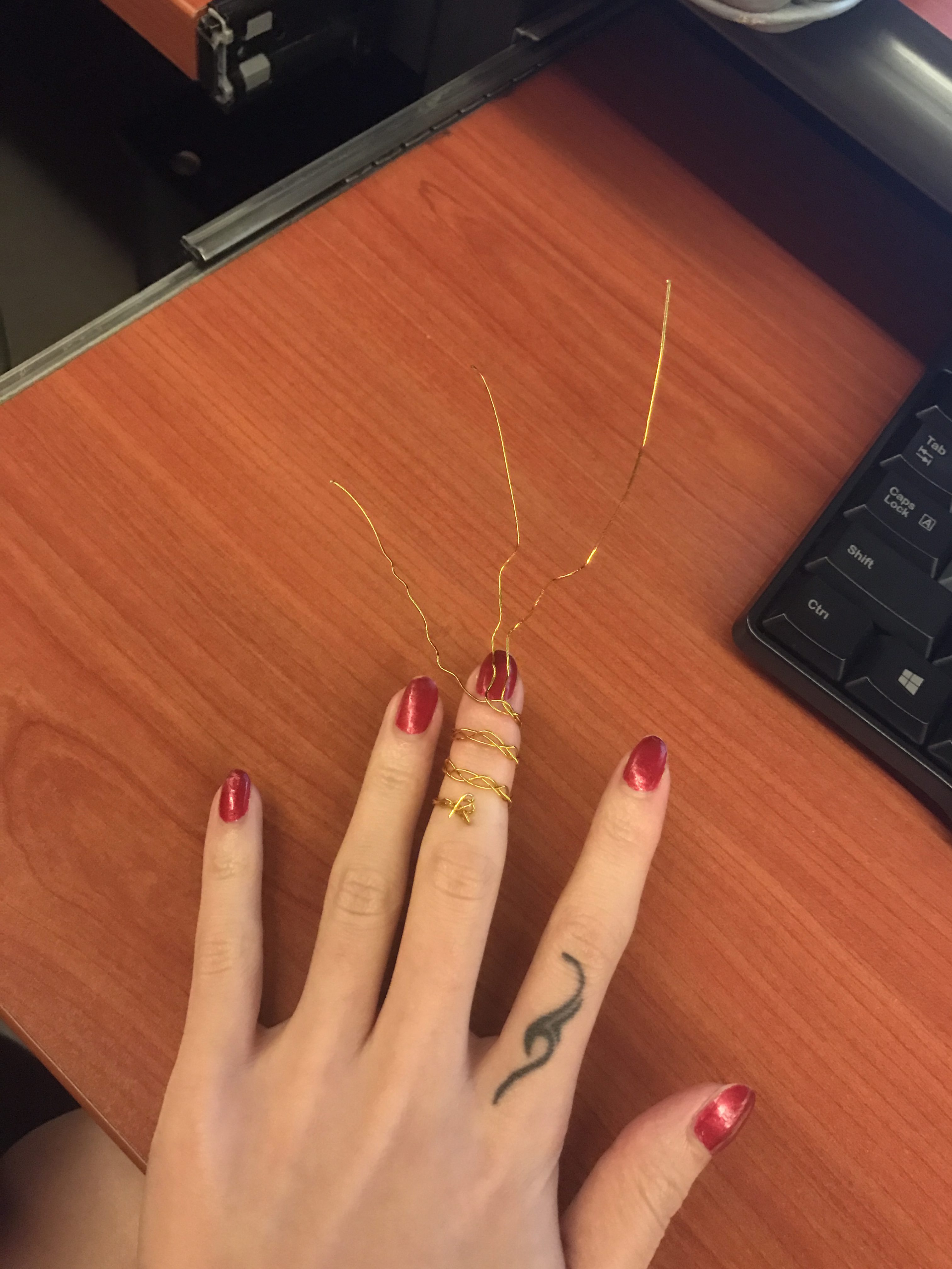
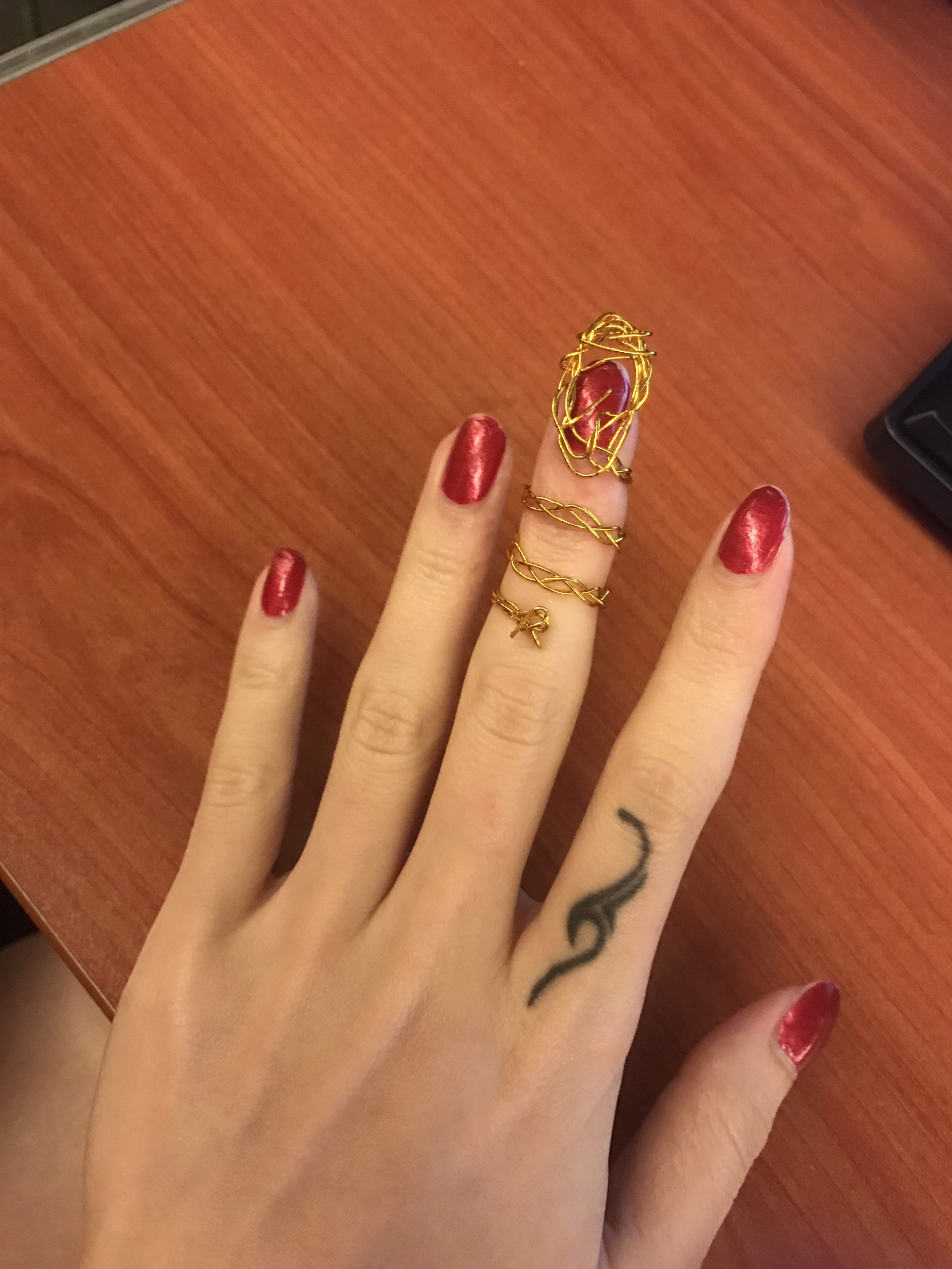
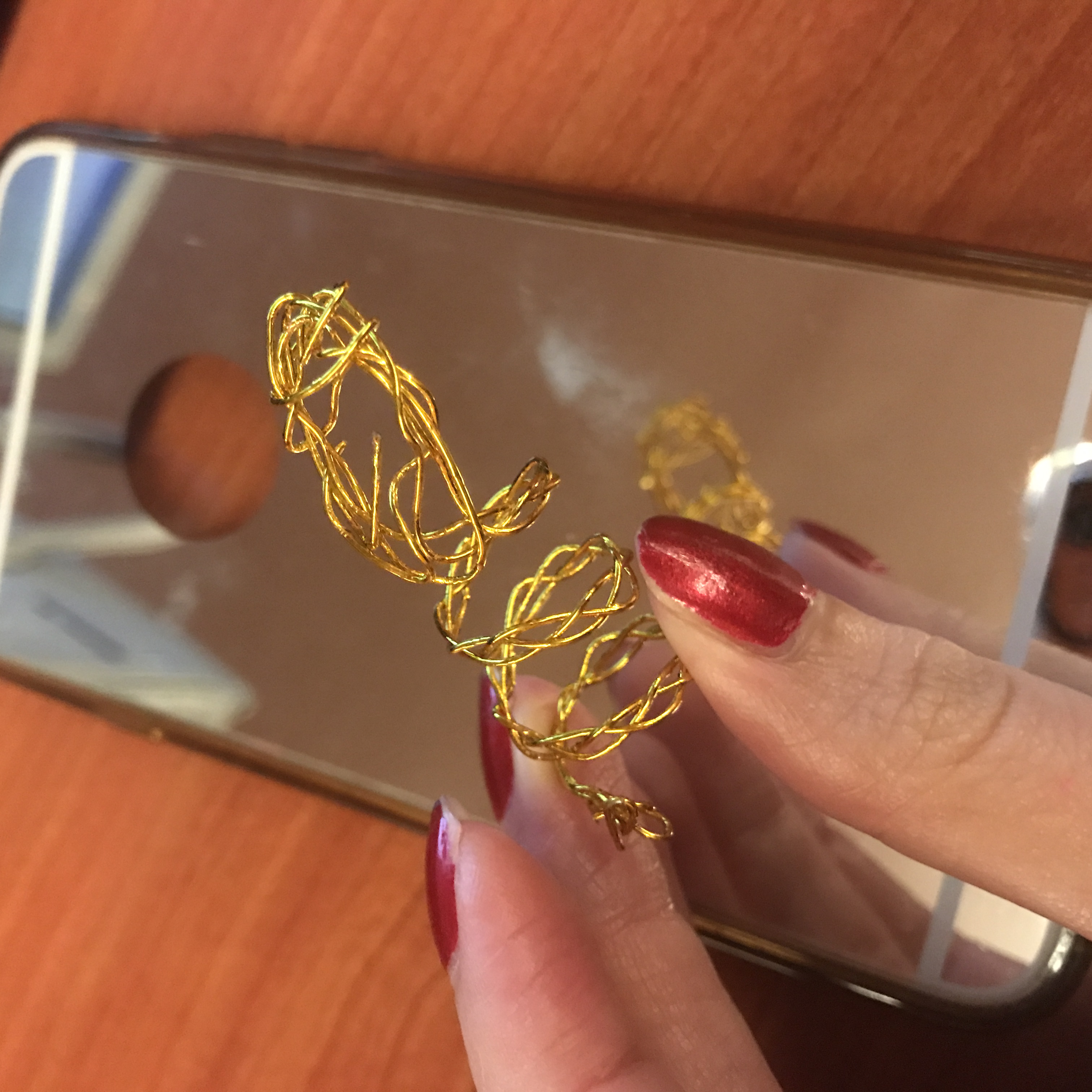
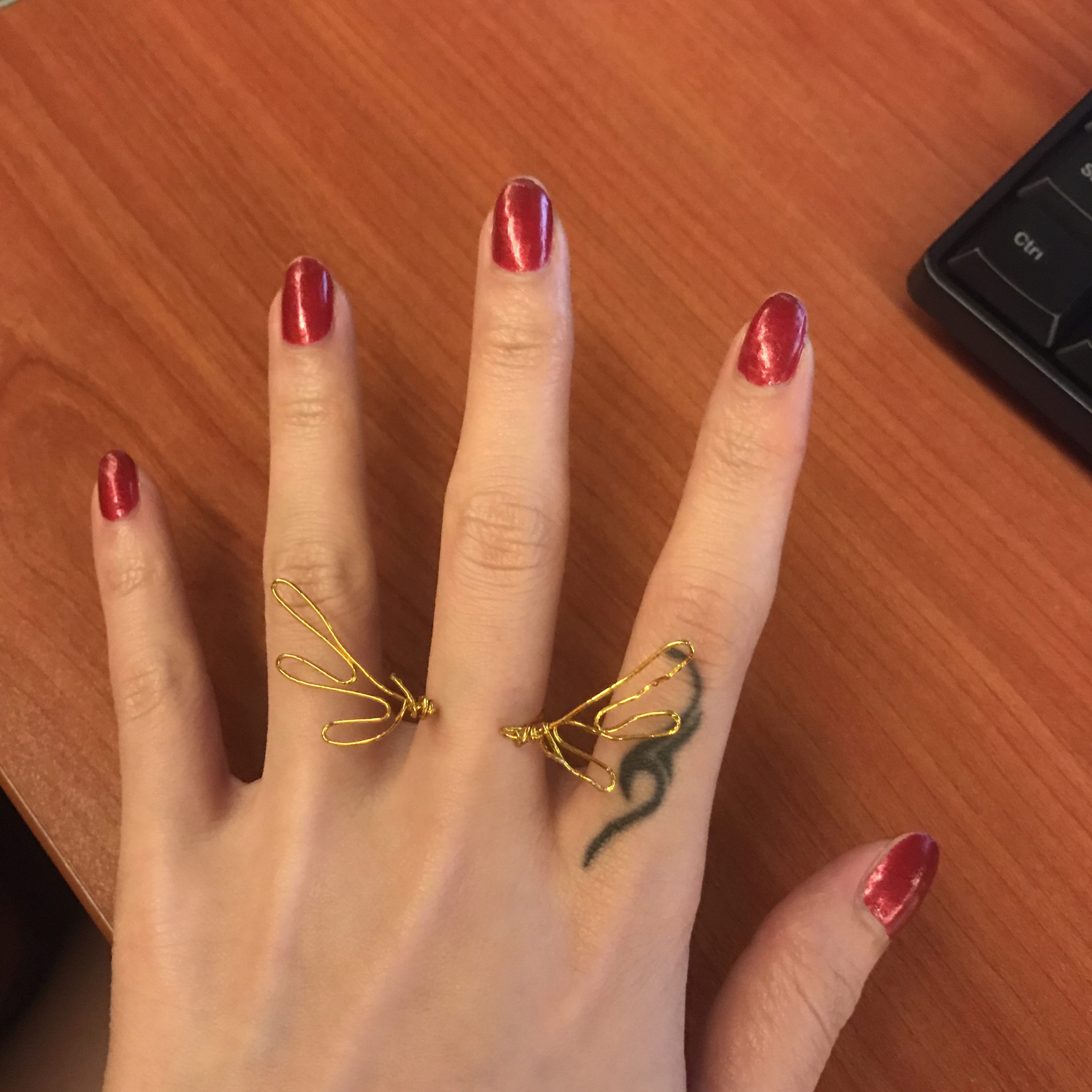
previously I have done my ring mock ups like these
After last presentation, I did CAD models and 3D printed them out.


The printing quality isn’t good. The ring sizes are reasonable and fits me well. As rings are very particular in sizes the products will come in S M L sizes which is US 6 7 8, the most common female ring size.
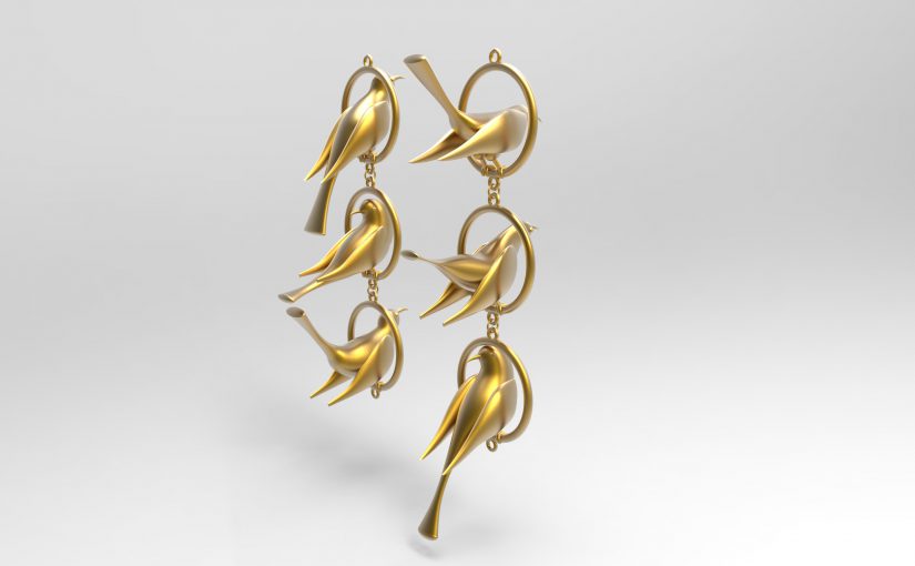
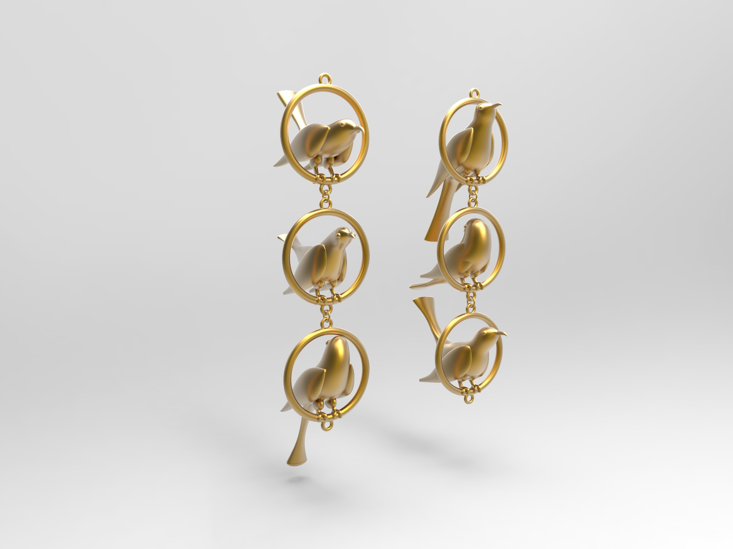
Then I CAD out the matching ring design with previous choker and cuff.


And alternative design with a lotus. A such the series will not seem boring with wings wings and wings.

Lotus is an element I consider to add into other pieces such as glass chain, earrings, necklace pendant.
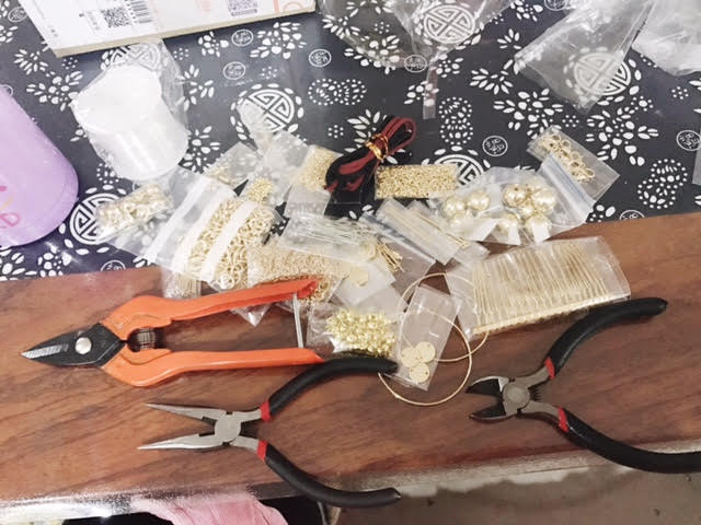
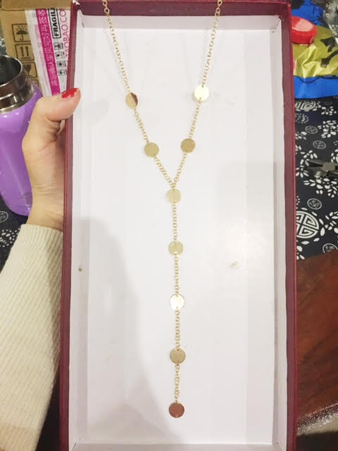
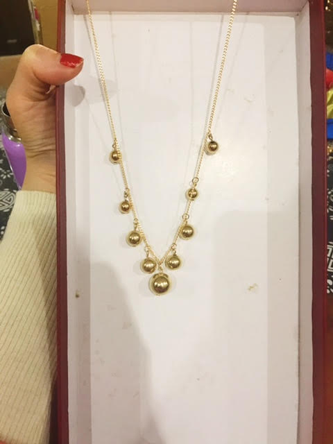
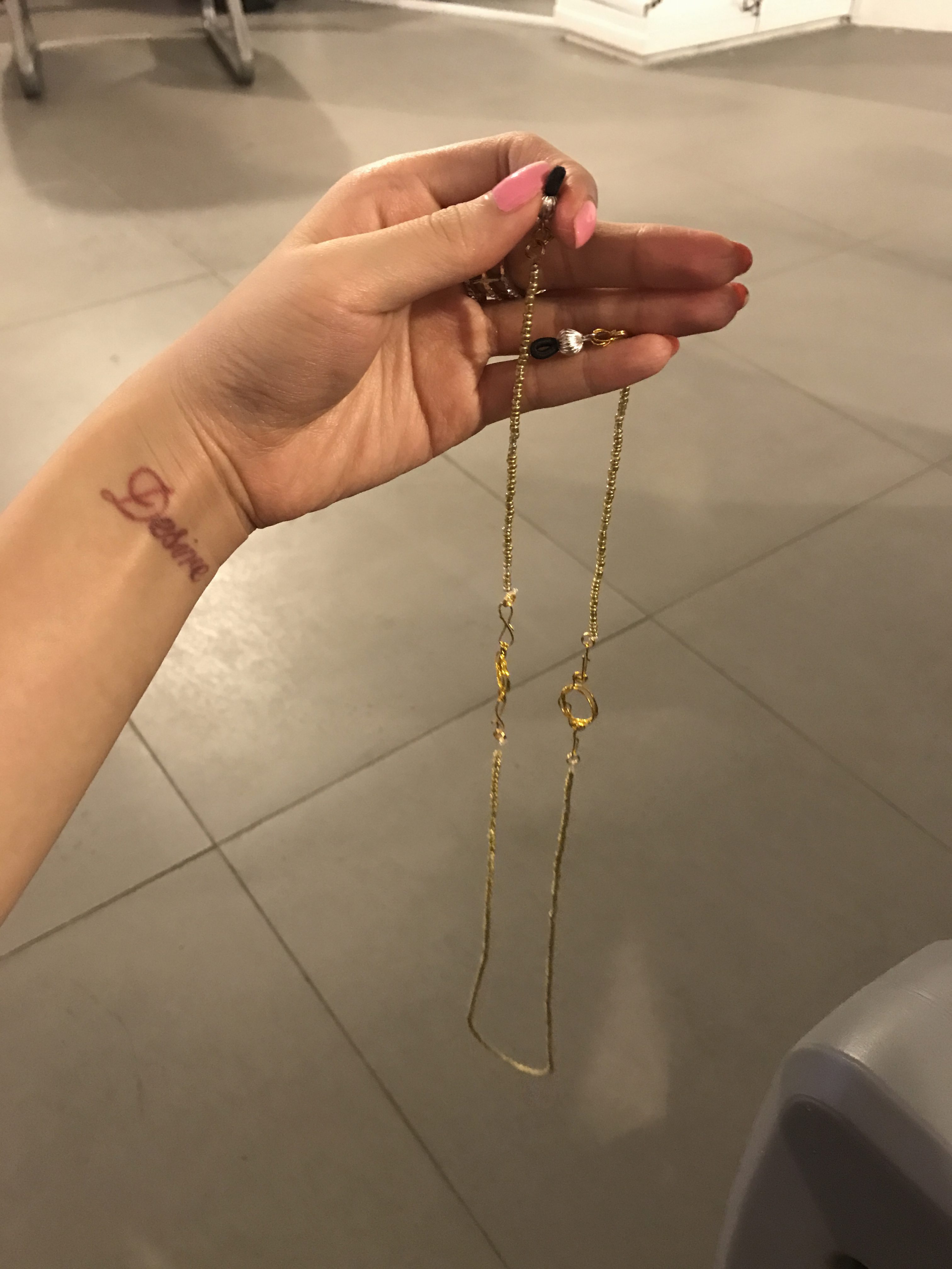
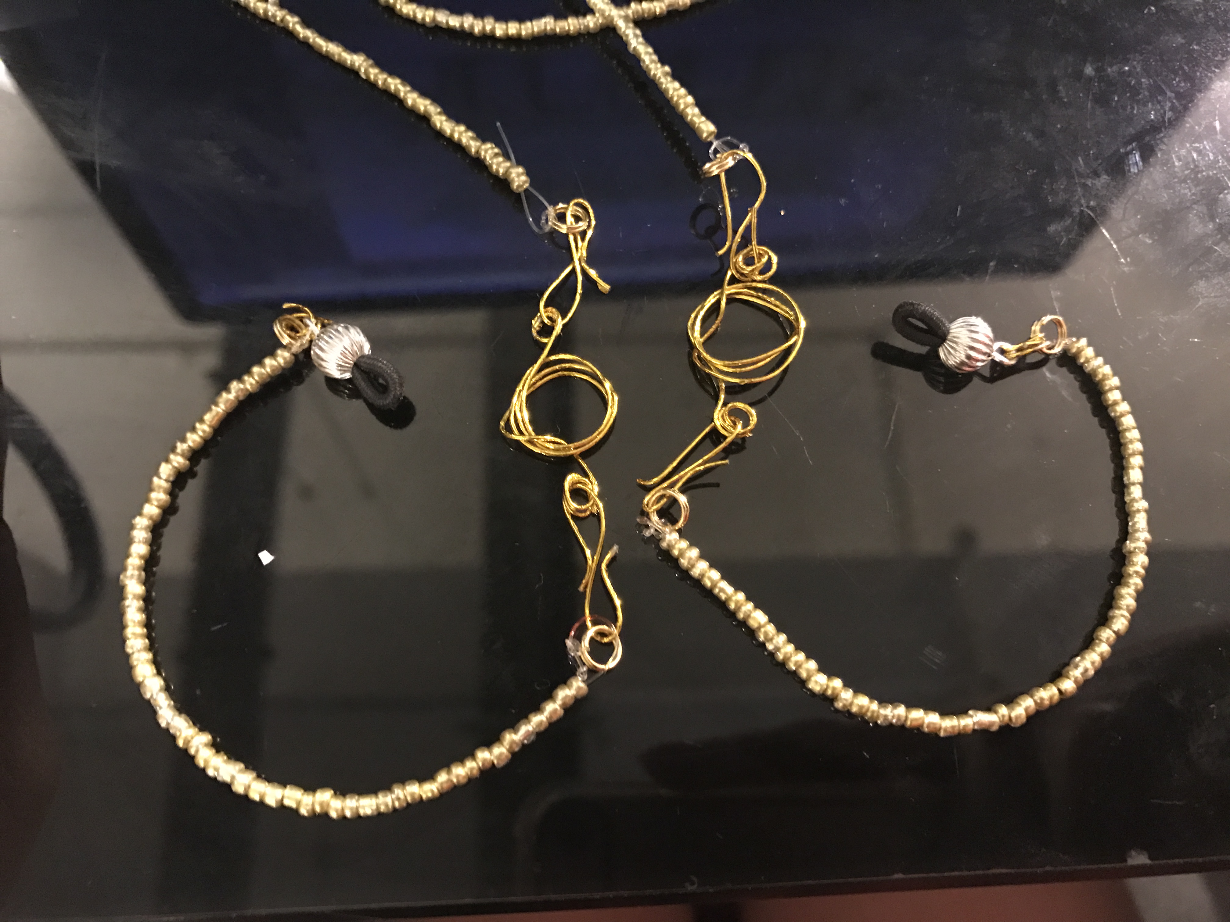
I bought some DIY jewelry parts and practice to assemble them into wearable pieces. The problems I found out during the process are
1, The details of the jewelry, i.e. links, thickness of the chain, size of the lobster claps, affect the overall look as well as the comfort of the user much more than I expected
2, The design is limited and boring as all the parts are readymades.
3, When I am considering the customizing parts of my design, be it replaceable/changeable beads, pendants, how they can be linked onto the jewelry piece without disrupting the overall look.
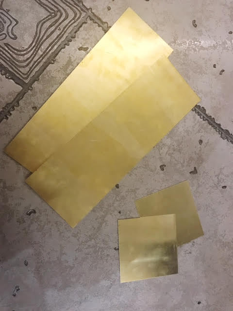
4, If I want to combine 3D printed parts with readymades, such as wire, how can they be combined together(glue?claps?) and the what colors should it be.
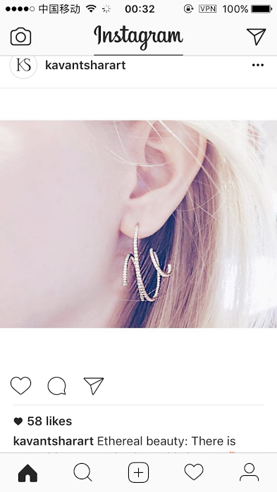
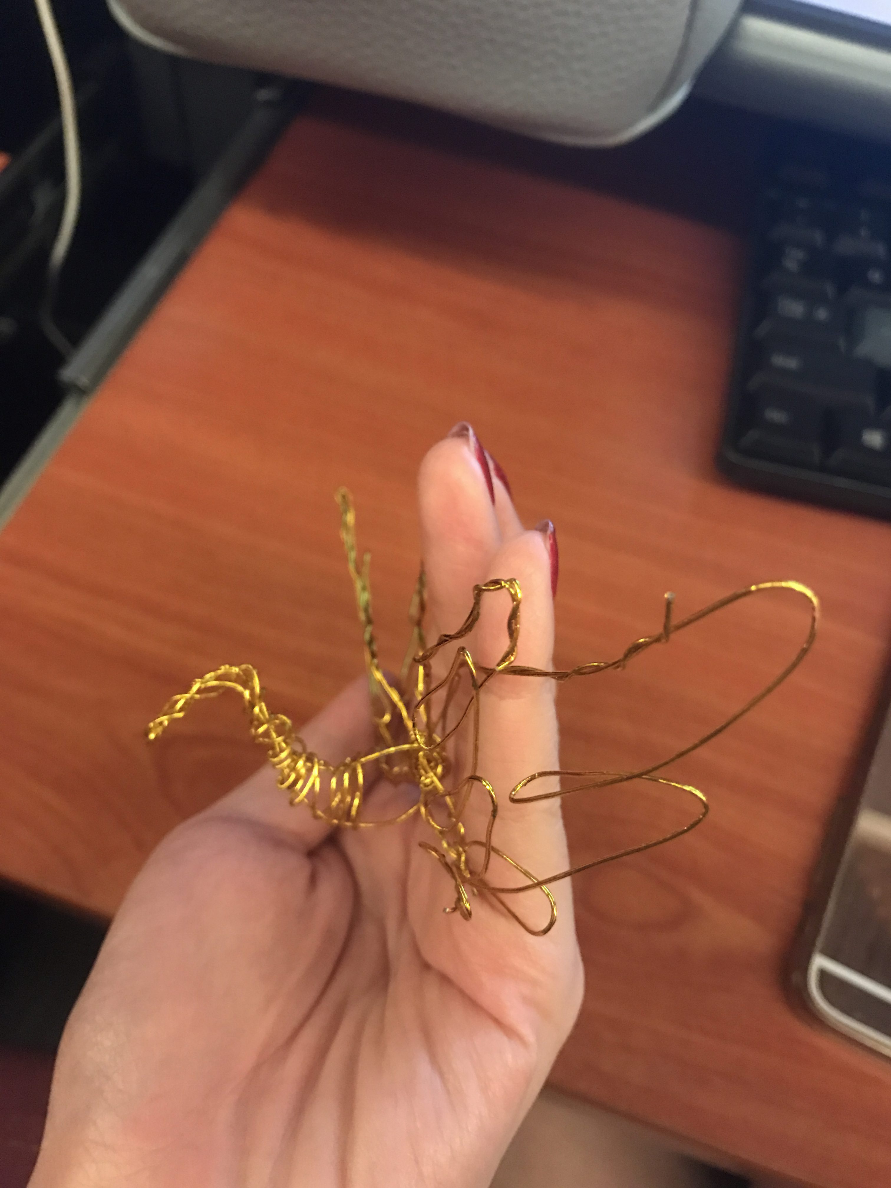
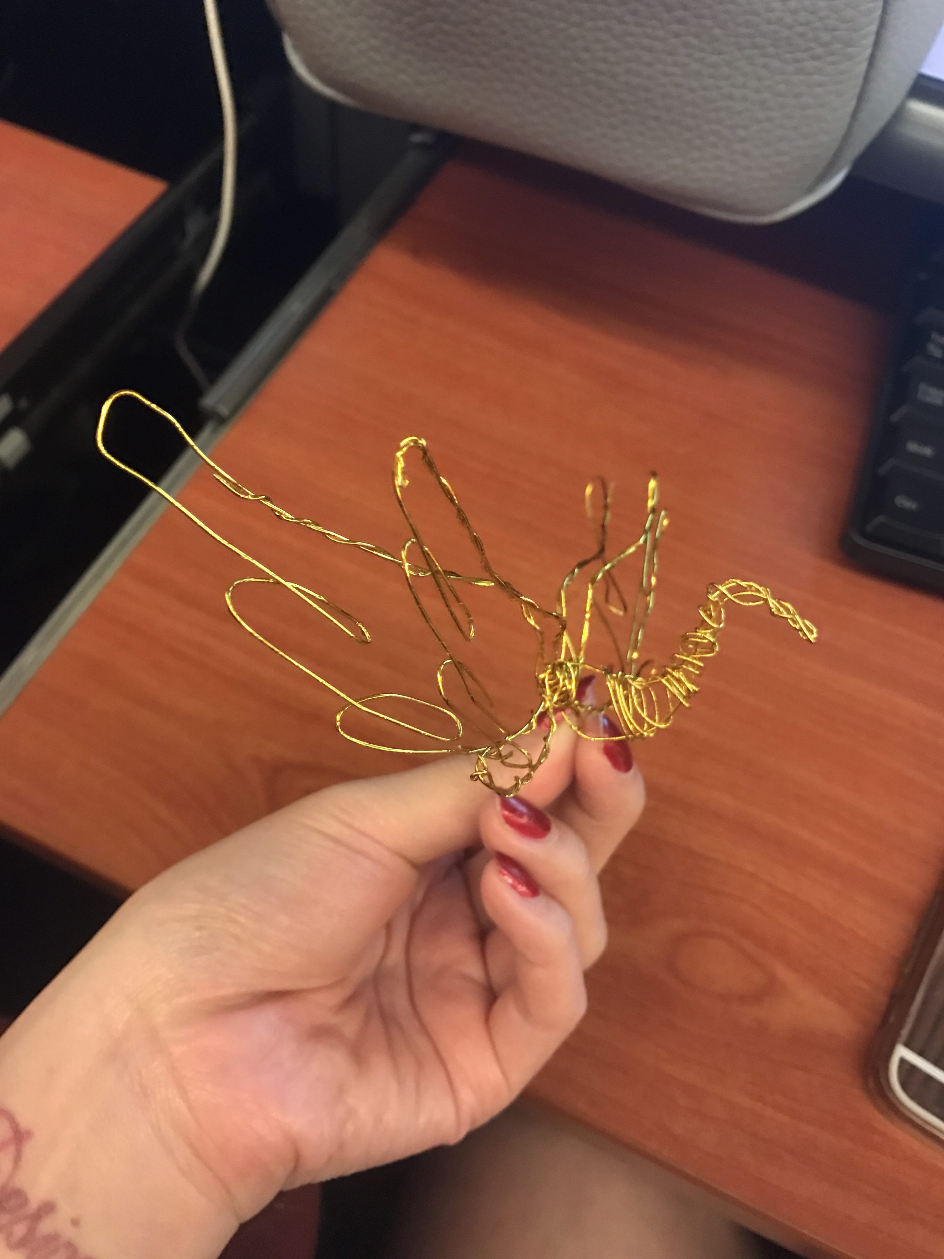
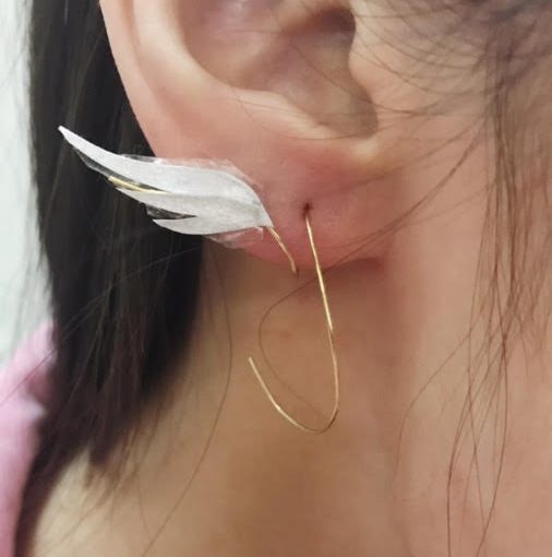
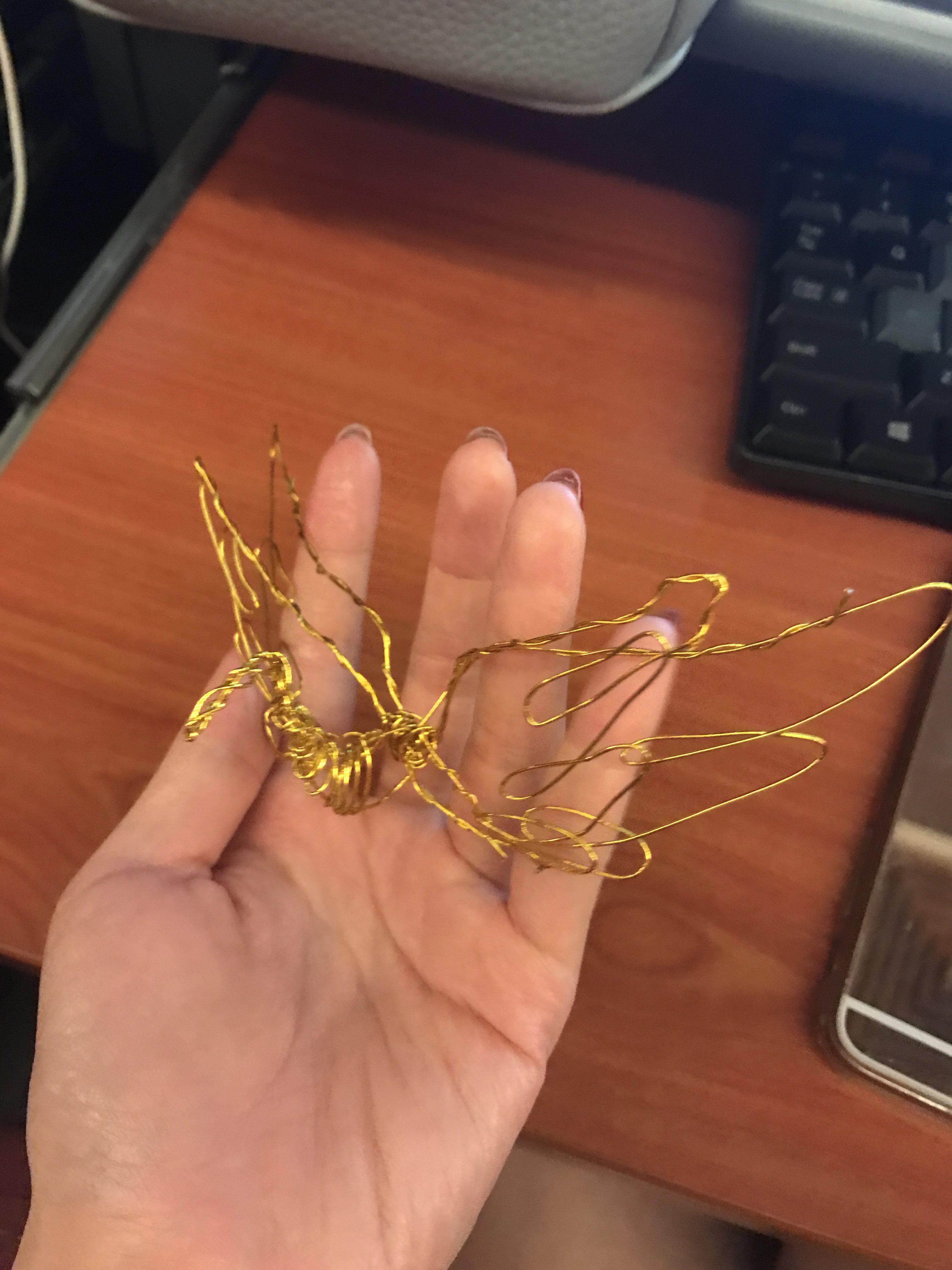
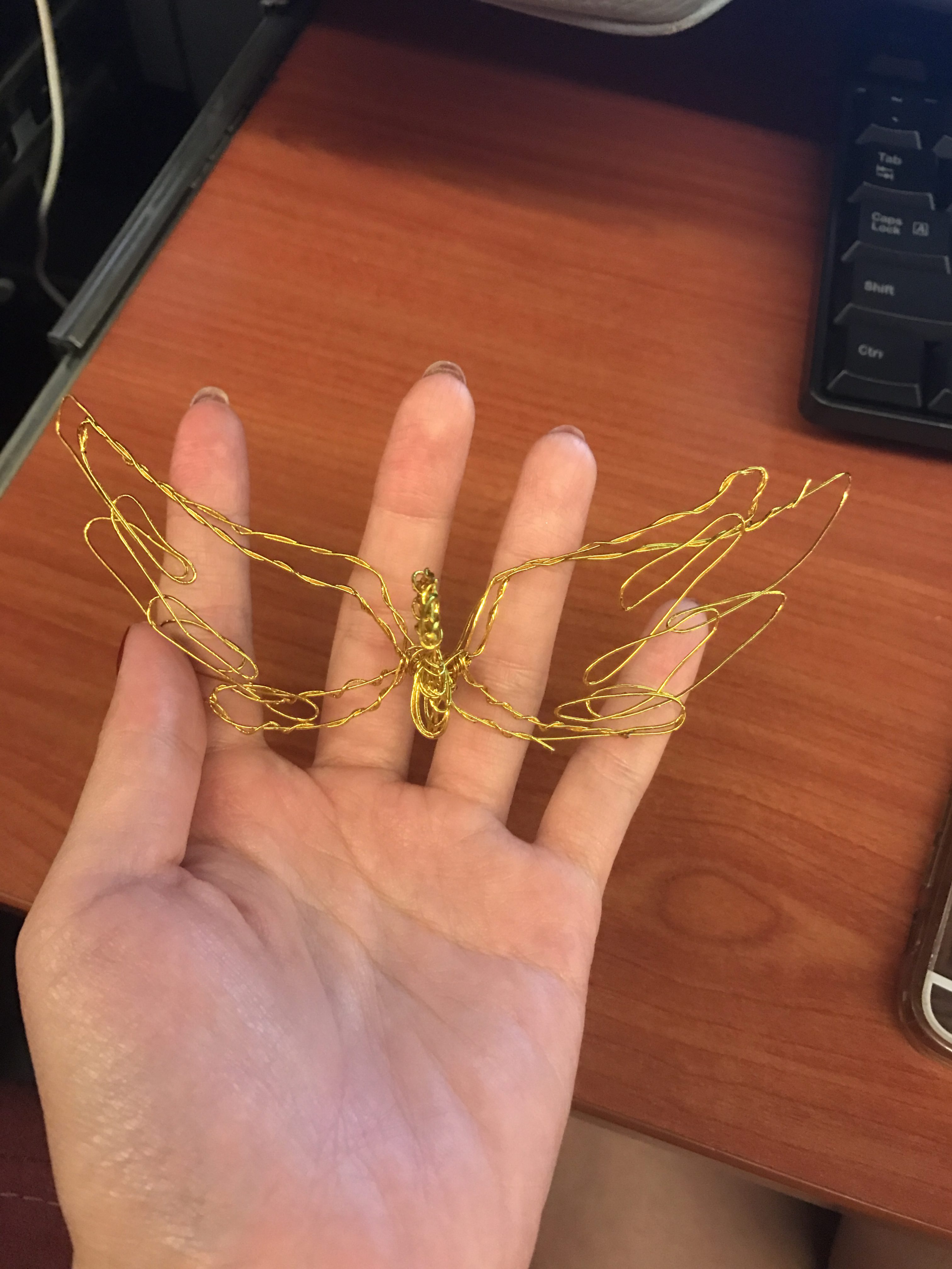
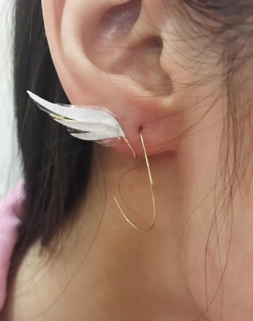
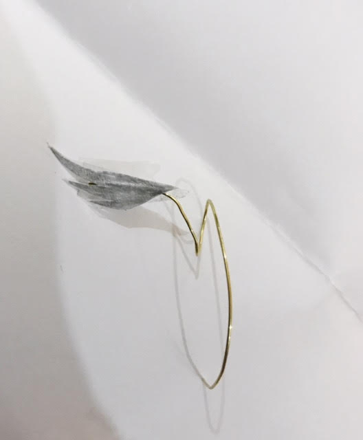
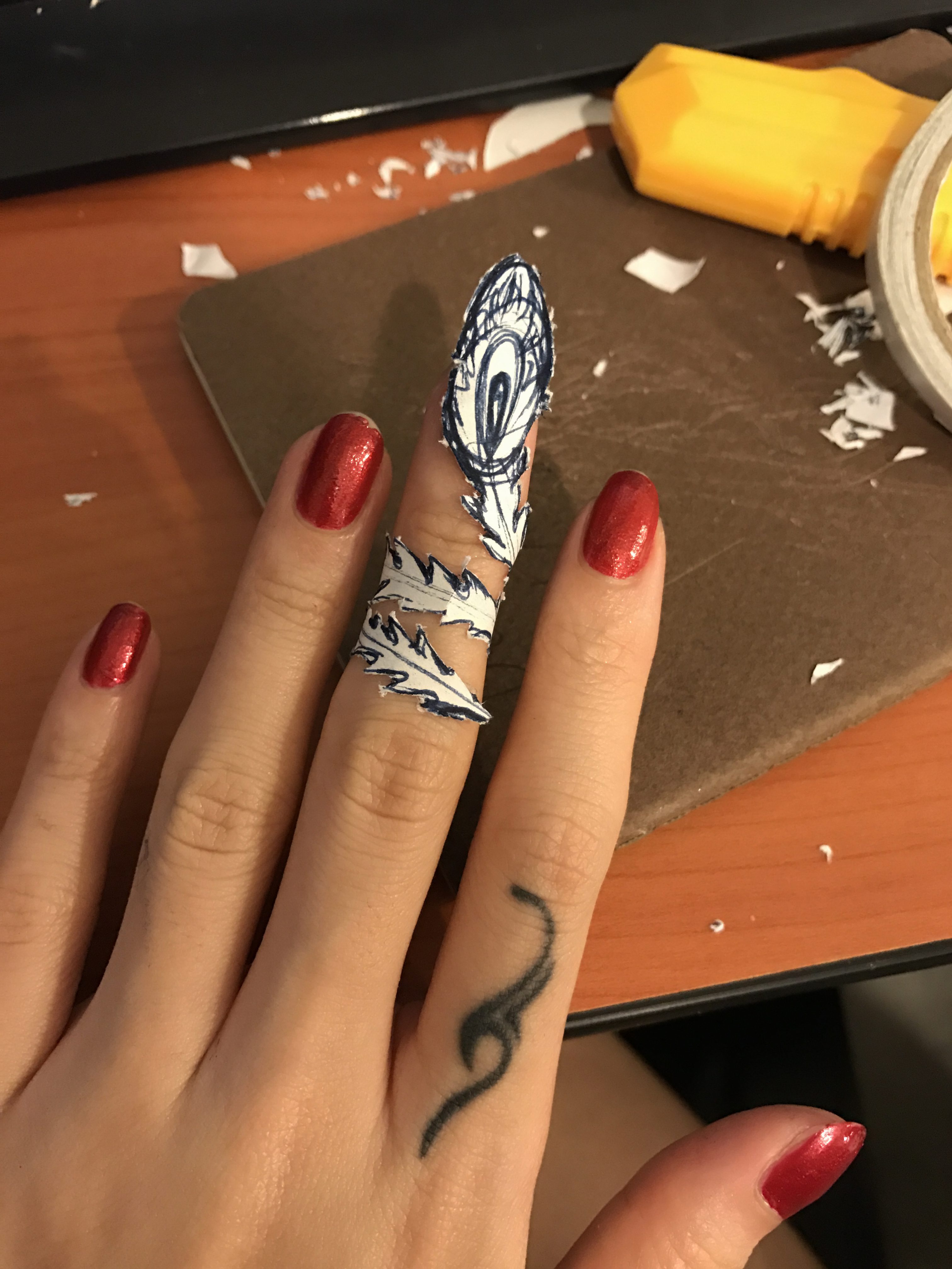
I came across this piece of jewelry on instagram and it reminds me of the lightness of feather, the movement of phoenix tails. So I did some wiring to try out the possible looks. However, there is a big issue regarding 3D printing the design, which I will elaborate in my next part 2 post.
More sketchings of my designs of earrings and chokers will be in next part 2 post as well.
Also, I took some photos of the CNY and Chritmas editions in shops.
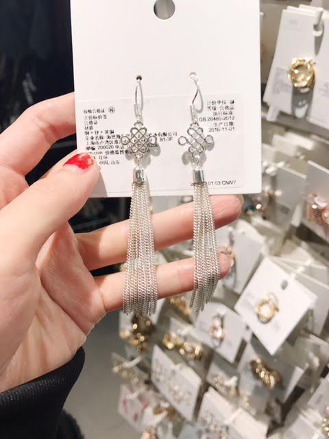
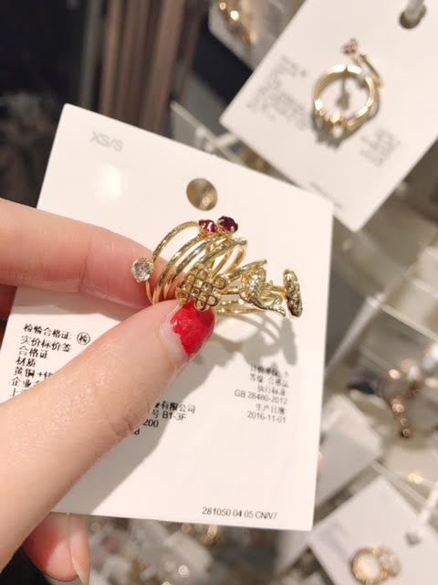
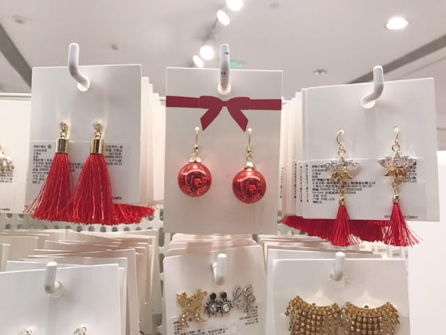
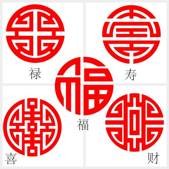
They look festive but cliche to me. They are very straightforward in representing “Chinese””Auspicious””China””Happiness”, and they look cute, but also boring to me because there is nothing new about them.
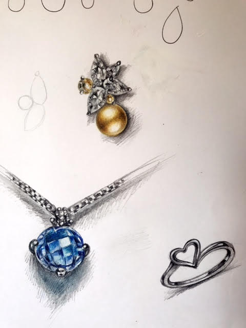
Here is a random practices I did to get a felling of how jewelry designers sketches dine jewelries.
In part 2 there will be some 3D printing experimentation failures, sketches of chokers and new ideas. Basically I feel that, like what we learnt from Product Design year 2, to represents a animal doesn’t need to draw the entire feature out. I refined my designs into a simpler direction. For example, my previous idea of the phoenix choker can be further simplified to the gesture of the phoenix wings or tails, It is not a MUST to add a bird head onto the piece to tell people this is a phoenix or this is a bird.
The choker can also be designed in a way that can be worn two-way, i.e. there isn’t strict front and back, each side has its own beauty.
to be continued hmm…
My main feedback of third presentation:
1, Need to find stronger connection between the culture, story and the jewelry. Making people easier to see the story from the jewelry.
2, More original design is needed. For example, the auspicious motifs are directly taken from existing designs, there is little I did to make it MY design.
3. More mock-ups and test models for next presentation
Although more presentations going on and I receive feedback from more people, I still believe that design is a very subjective thing. While I can learn from what others tell me, it is impossible to make every single person happy because we just have different way of seeing things and issues. I hope that I can make designs that I like and I can justify, even at the end of the course I will receive both approval and doubts from other people.
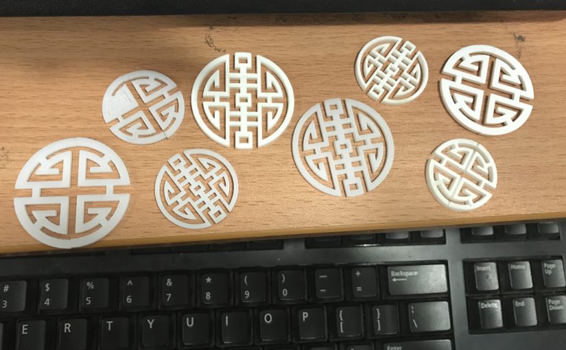
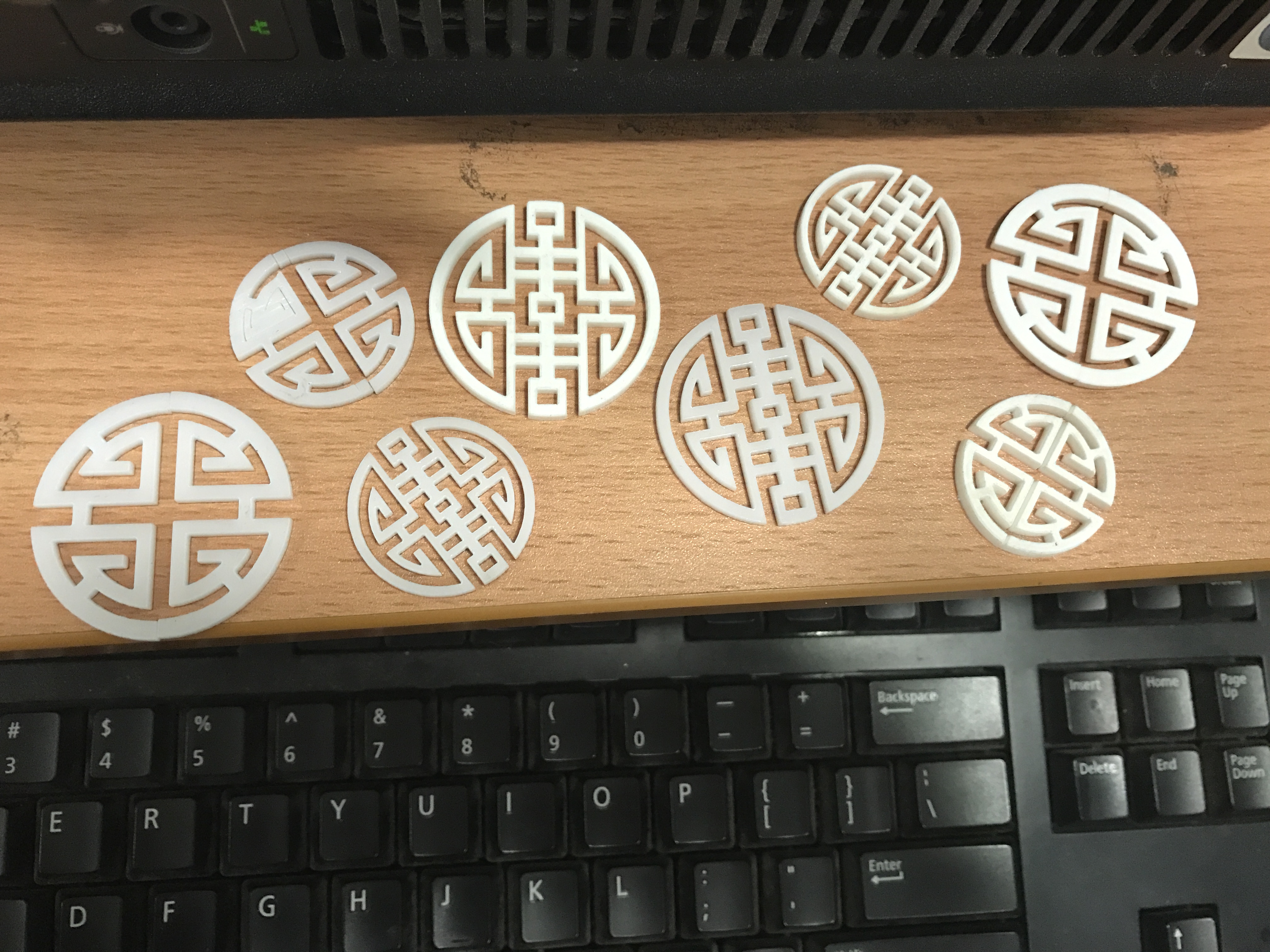
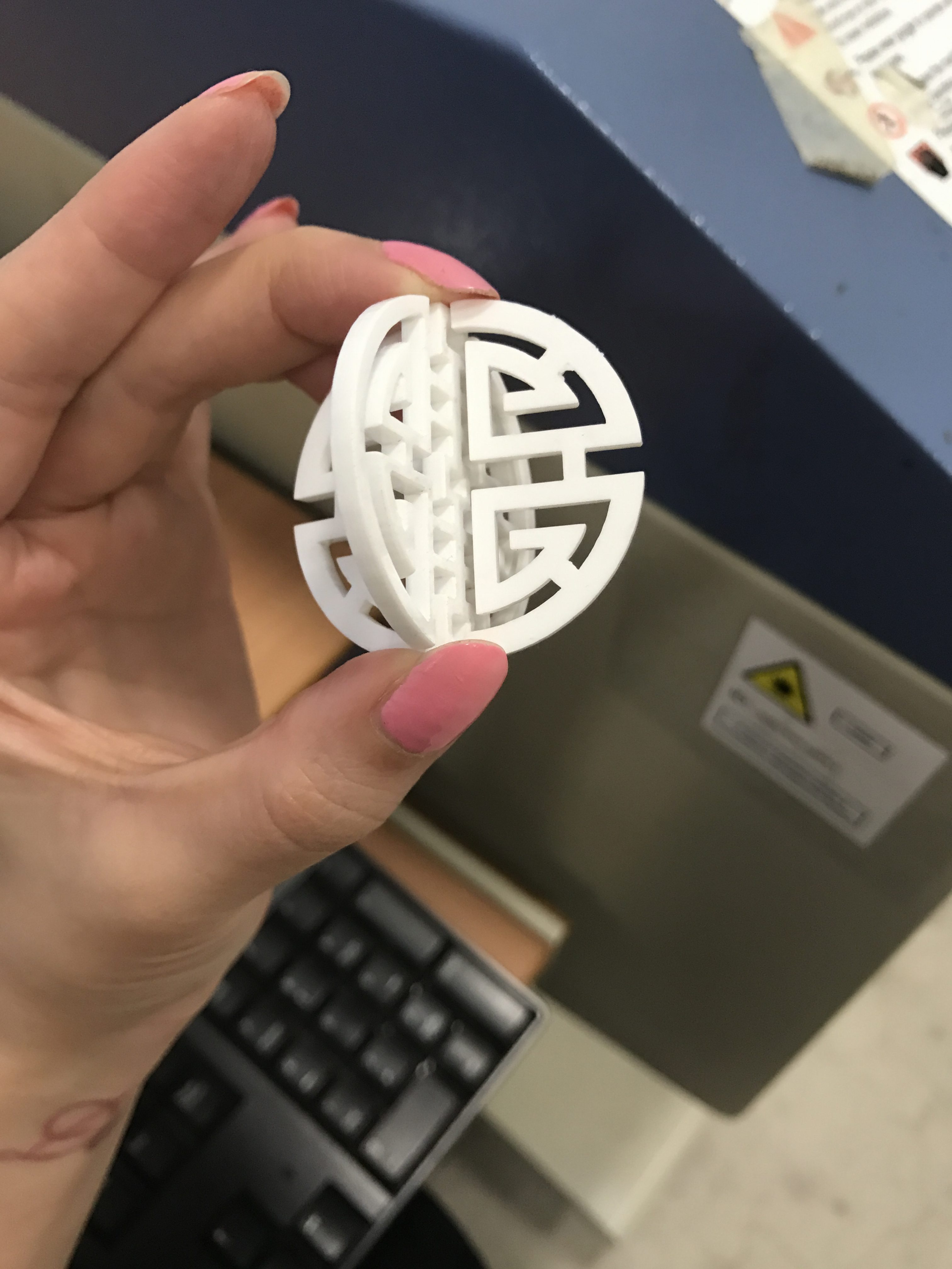
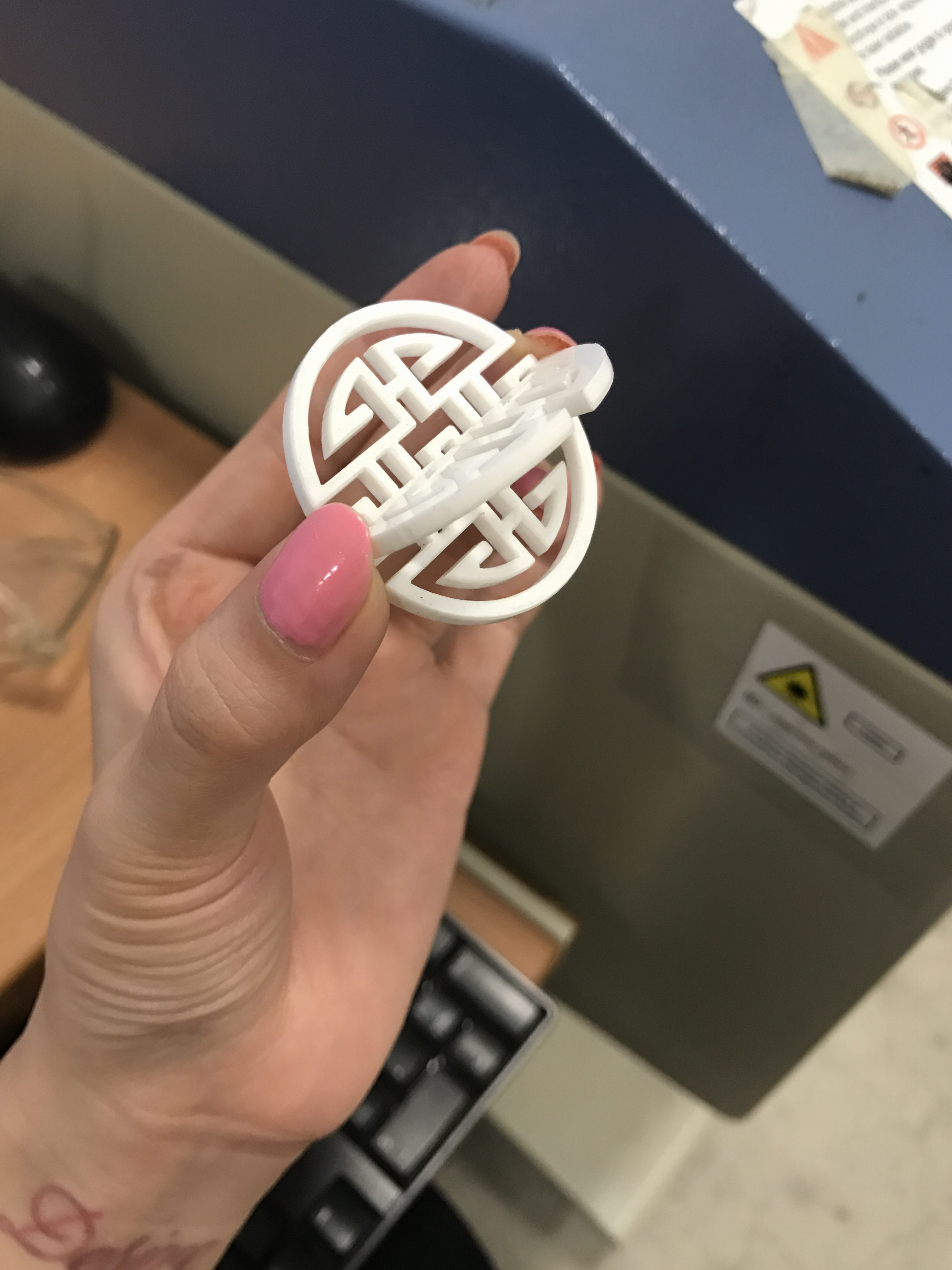
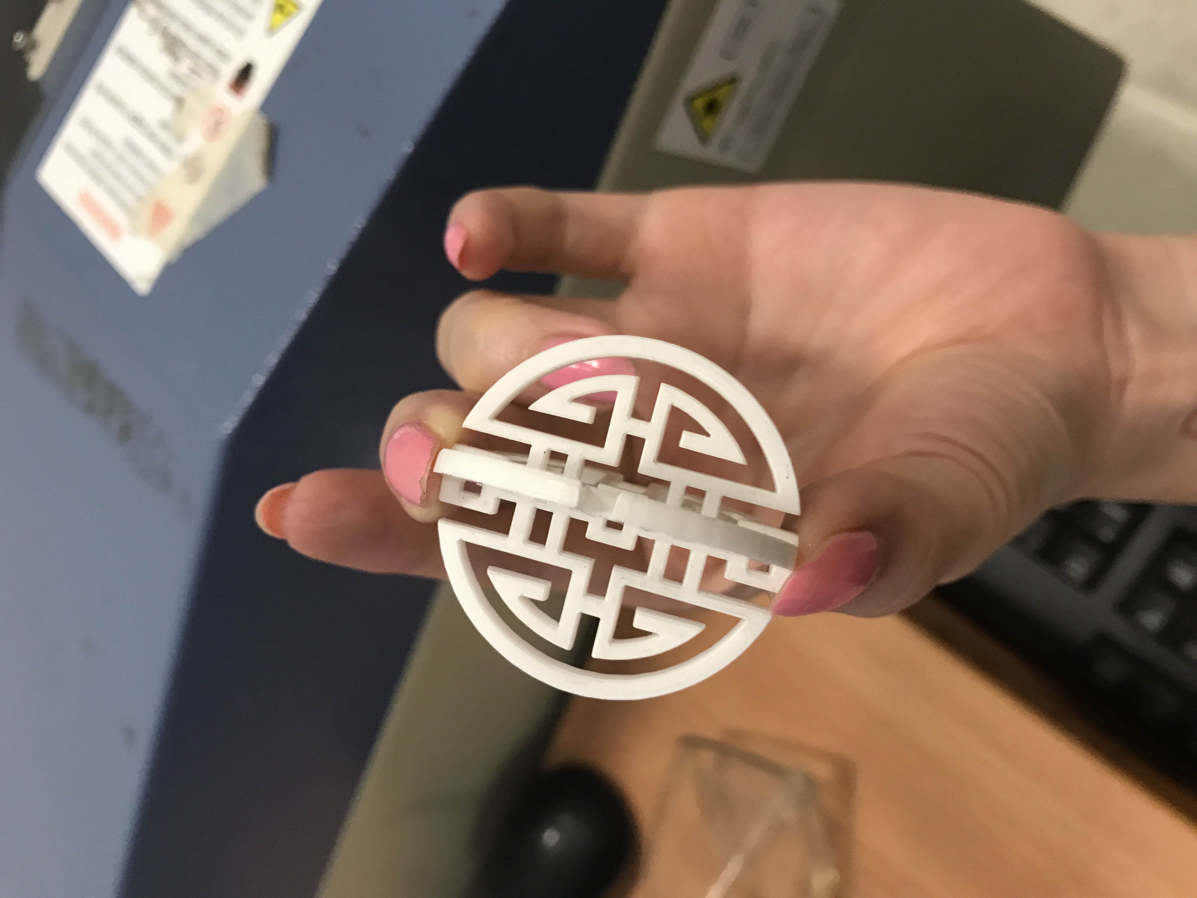
also, I had laser cut the auspicious characters. I made them in different sizes.
SO WHAT I AM GOING TO DO NEXT
-Print my stl files and draw more for 3D printing
-sketch sketch sketch. I start to watch Youtube tutorials on how to make jewelry sketchings as I found myself very inexperienced in such drawings. I would start from imitating and make some practices. Then maybe I will start my own sketching.
For this week, I start my modeling in rhino as well as some other 3D paper mock-ups.
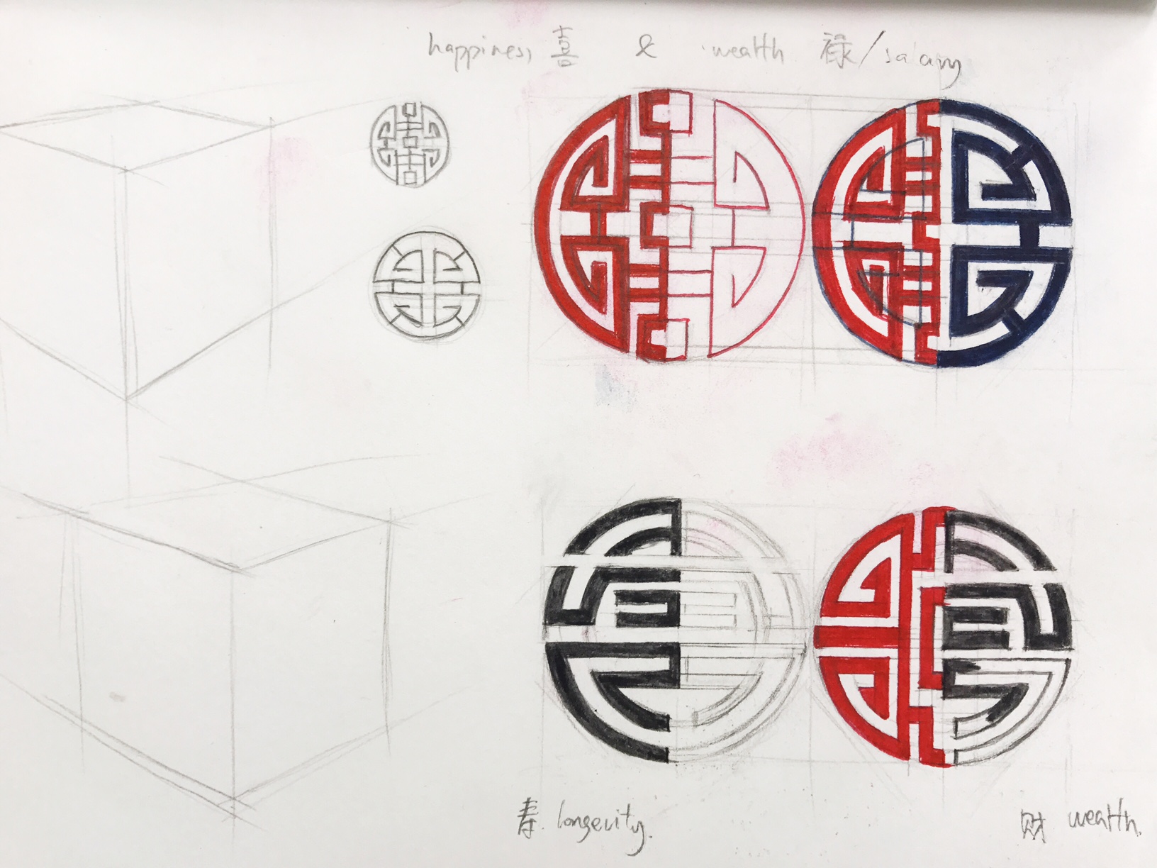
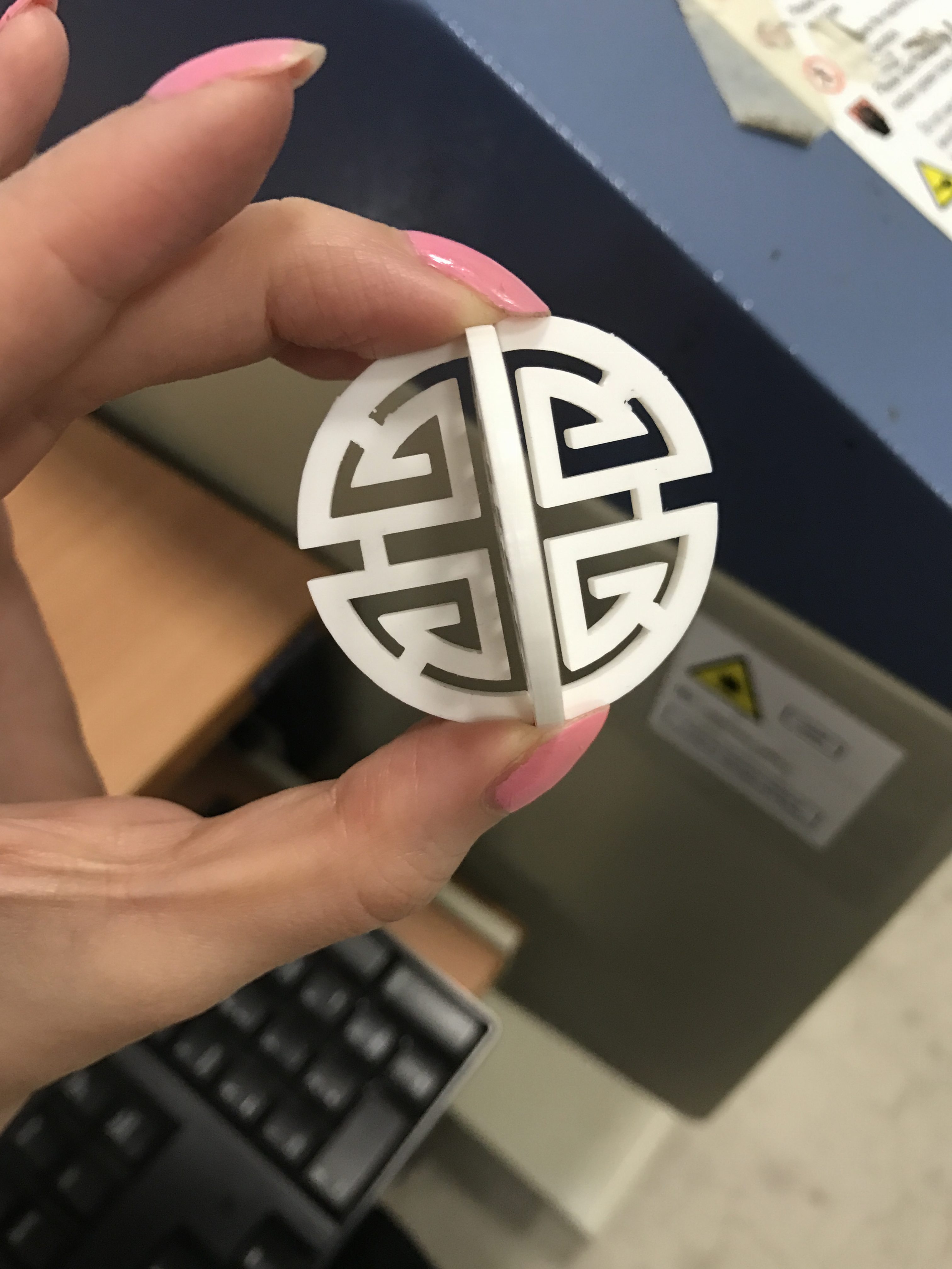
This is how it looks when I stick 4 pieces of them together to create a cross shape 3D pendant. it appear as “happiness” in one angle and “wealth” from another.
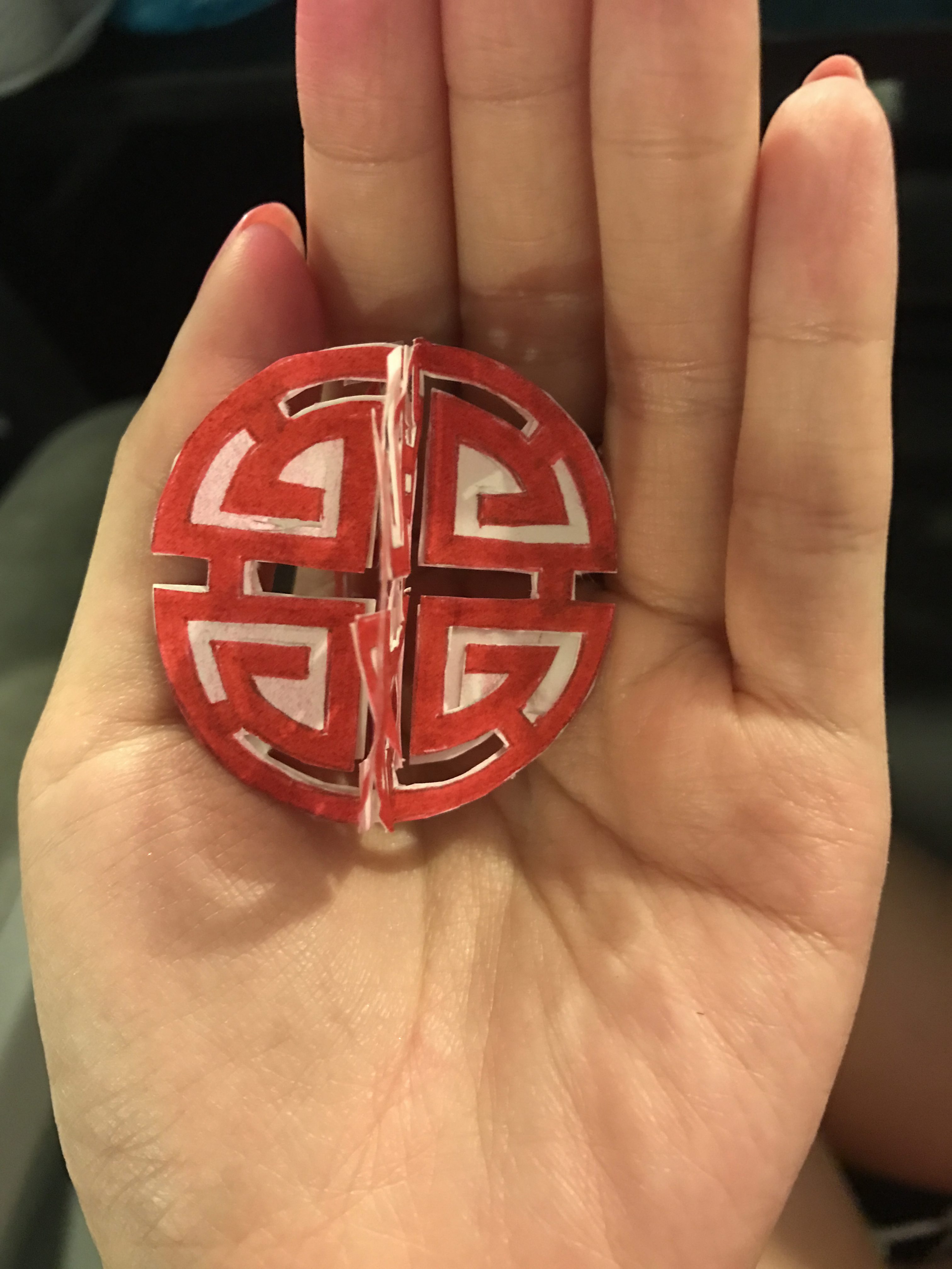
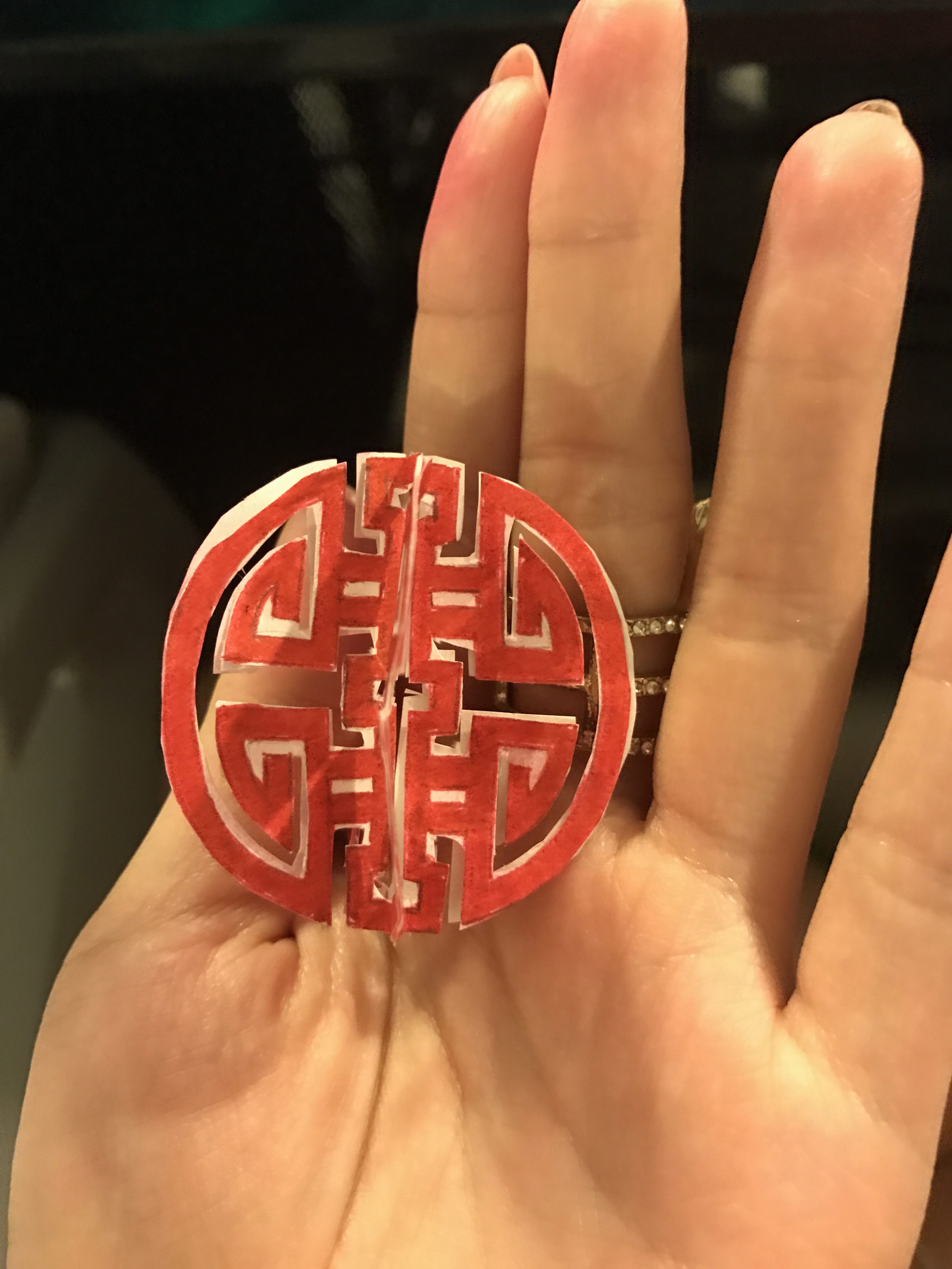
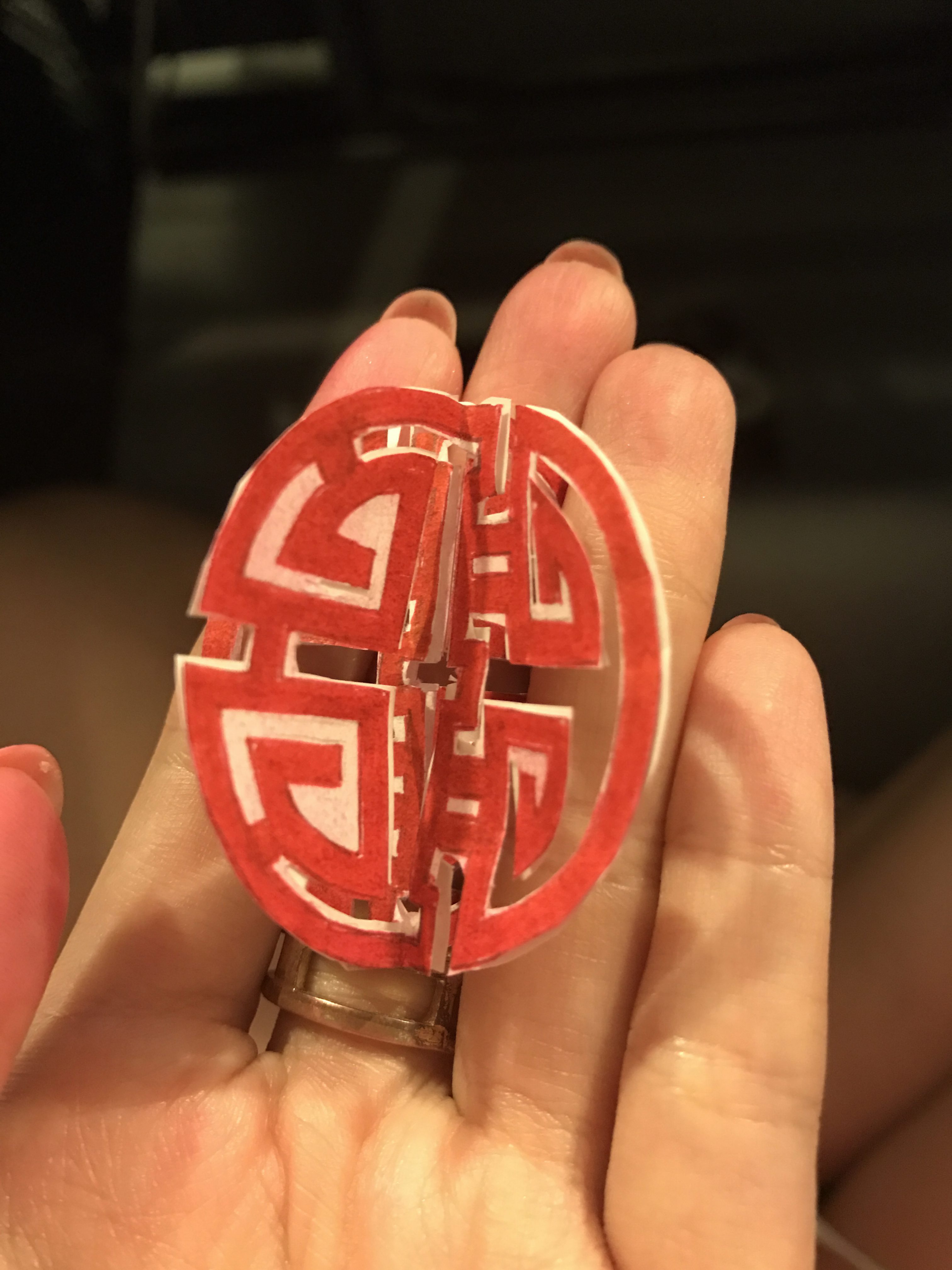
However, my paper cutting is not refined as my scissors is too big for the pattern. So I am going to laser cut the pattern with acrylic board and then stick them together.

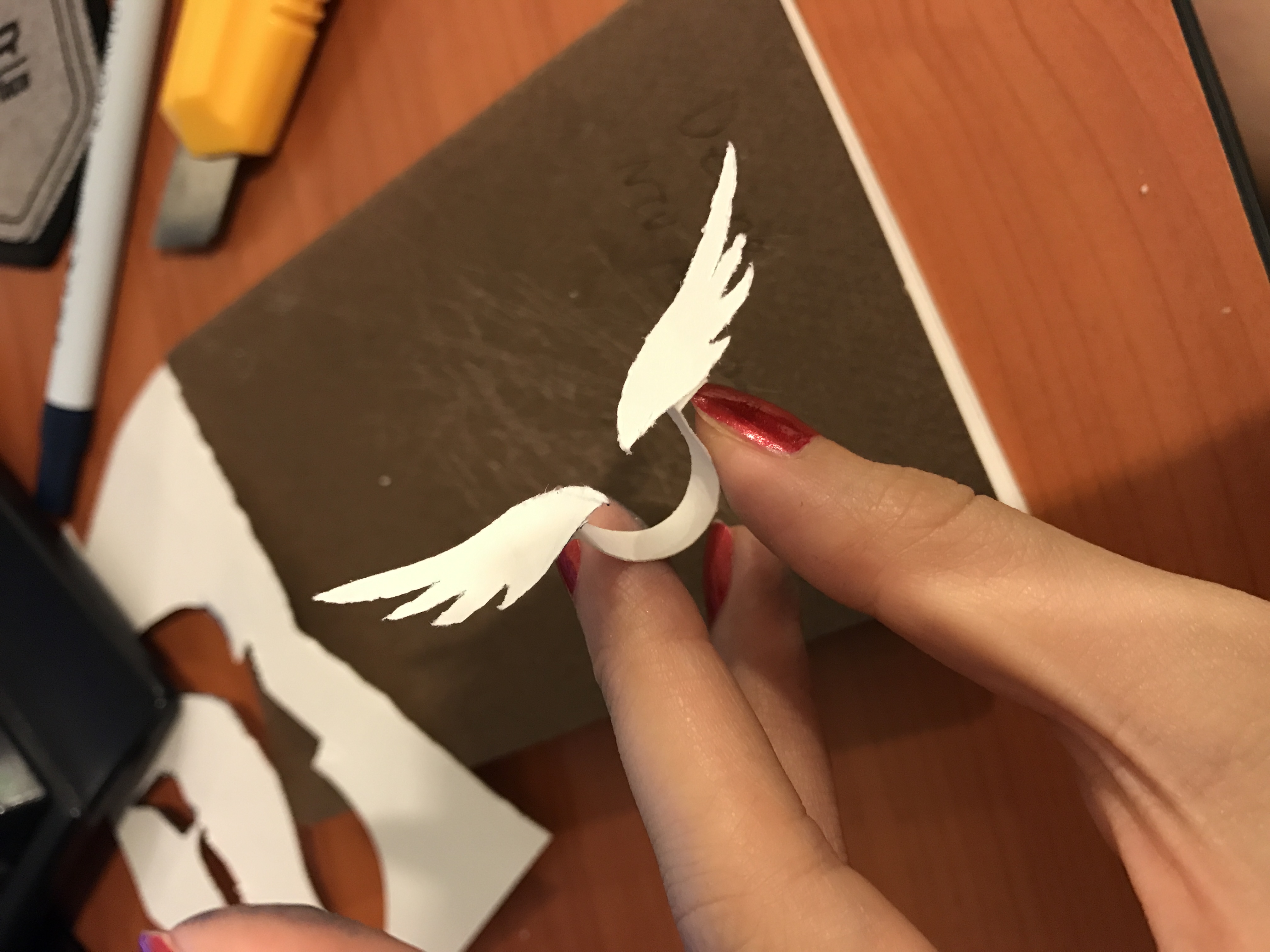
I made some rough models for the jewelry pieces to see how it would fit on body. First I did in paper
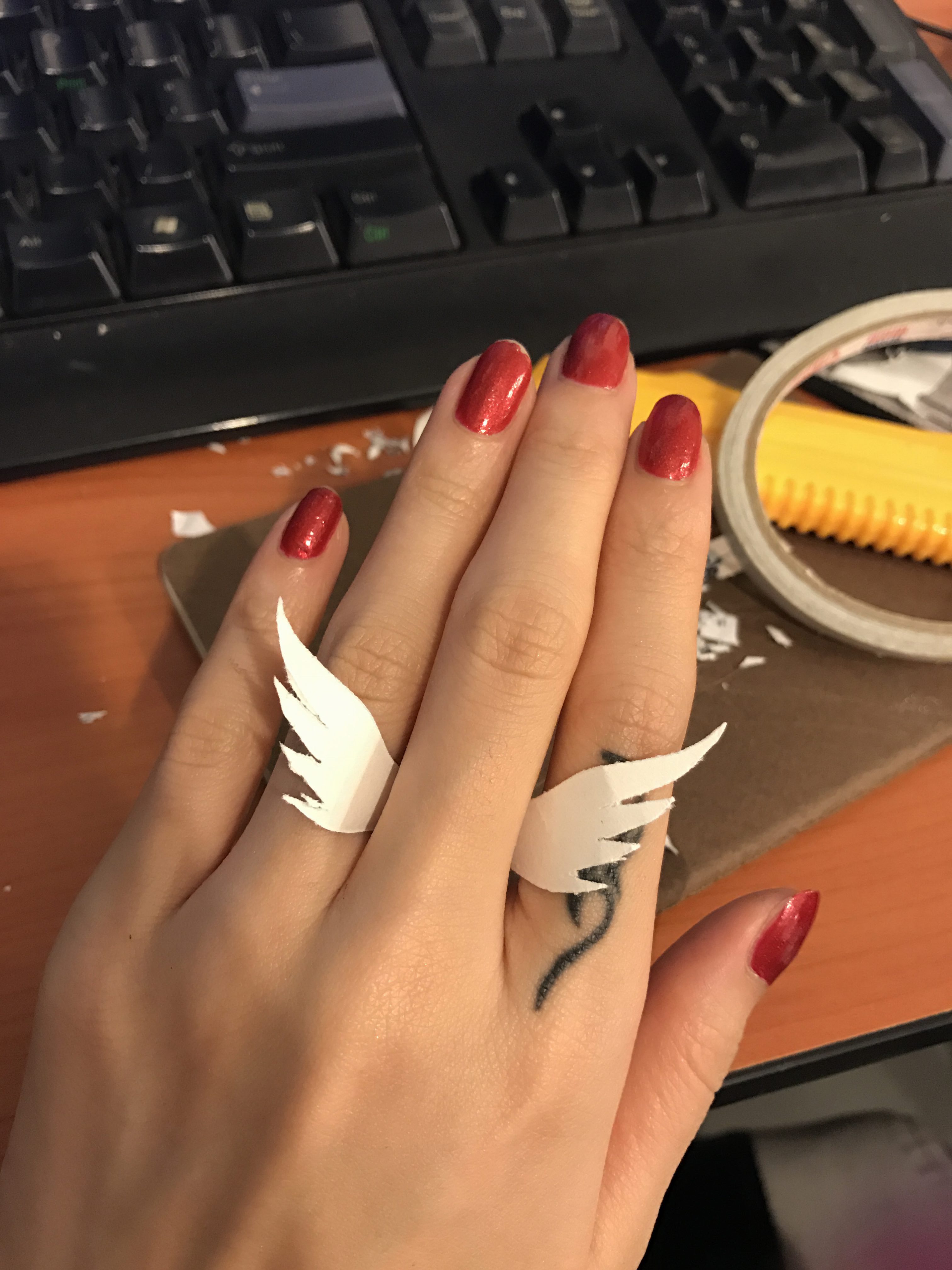
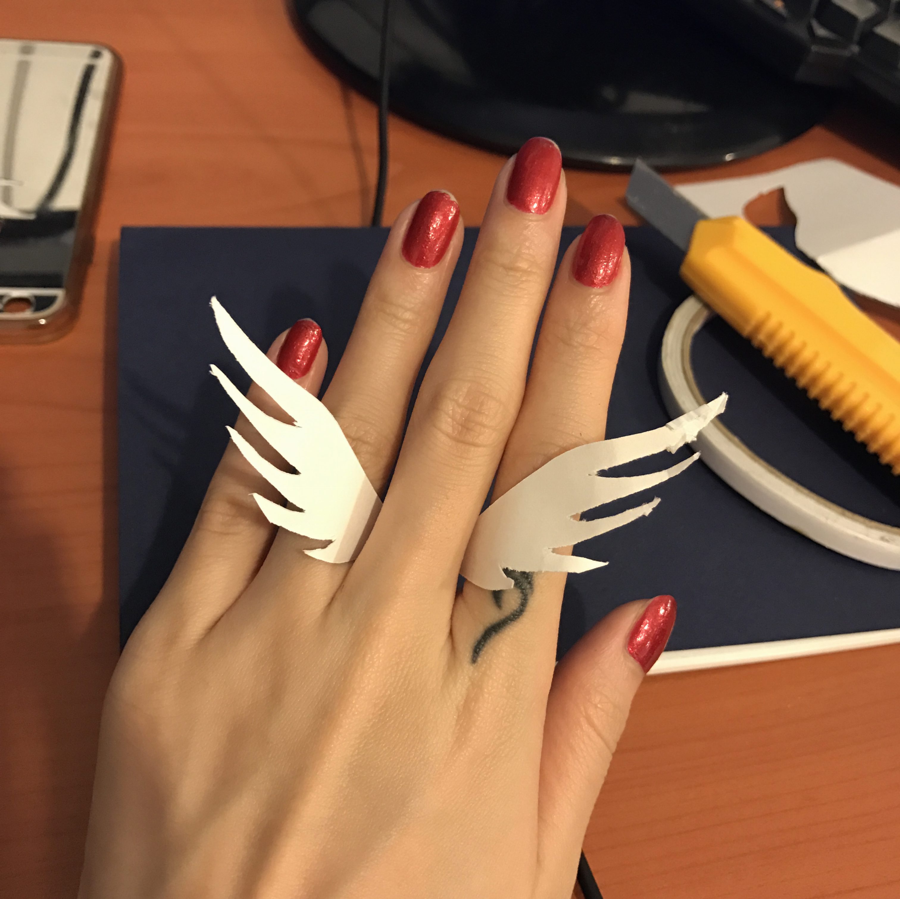
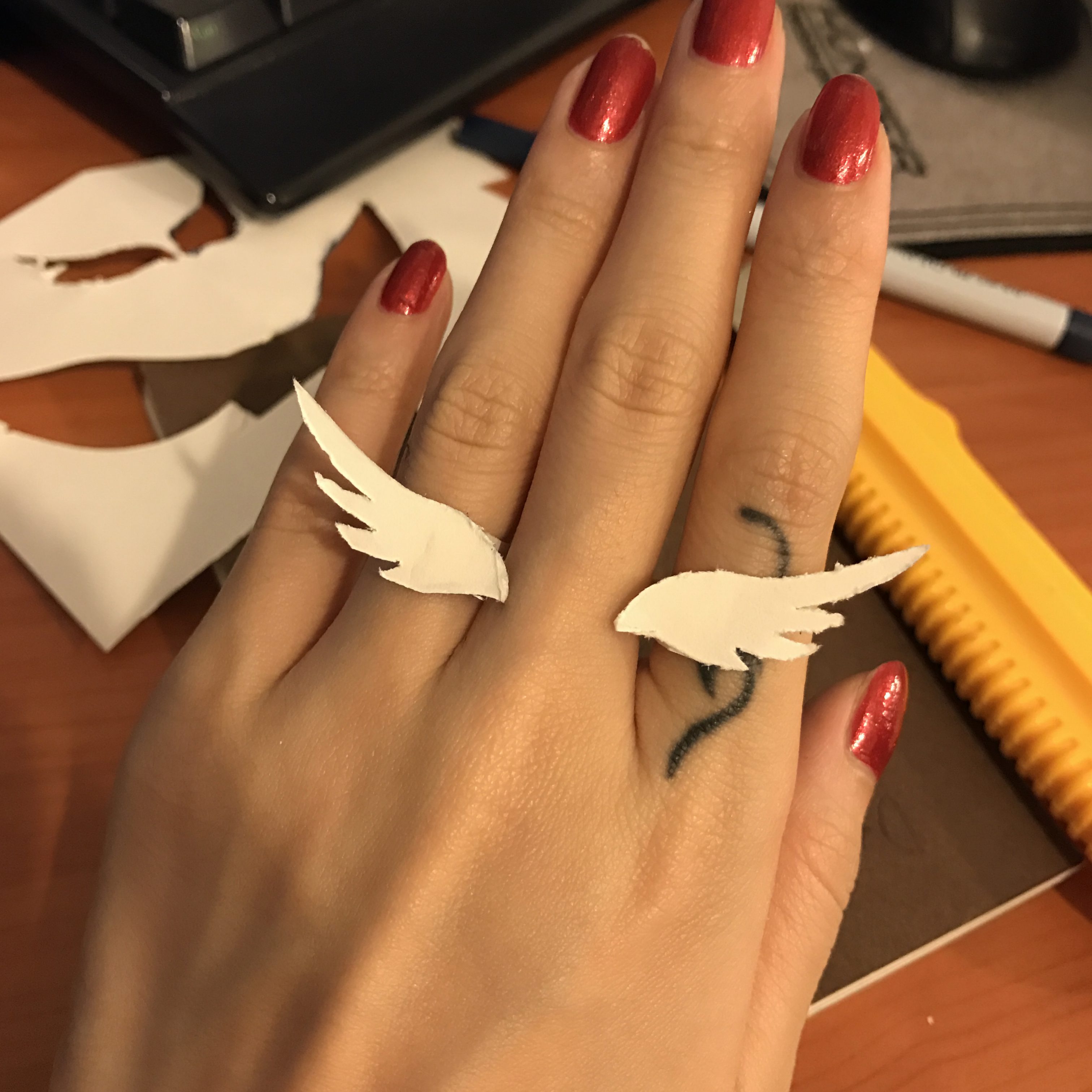
open ring with slightly differed design. This can grab the finger more firmly.
I also made a phoenix design choker with paper, however I forgot to take photo of it so I will upload the photo when I take one…