UX Week 6 – You Are What You Carry

Chipchase Chapter 4: 

Whilst reading the beginning of the chapter, it got me thinking about how everyone has their own unique system of handing their belongings, as well as my own. Then I decided to do a little analysing with my own, depicted through some doodles from yours truly.


cc

bb

Range of distribution – The distance that people are willing to let physical objects stray when they are out and about. Criteria: perceived risk of danger, actual risk of danger, perceived and actual need and convenience.

Of course, the criteria for consideration is subjective to the individual – whether one is habitually paranoid or relaxed, they will perceive risk of danger or need and convenience differently.

dd

I find the concepts of centers of gravity and point of reflection intriguing as I have never thought of it beyond just being extra mindful of one’s possessions. Also, to note that I did not intuitive pick up the habit of practicing point of reflection, and instead was taught by my mother to “look by at your seat when you leave”.

aa

With regards to the story of police officers in Afghanistan, the highlighting of the people’s mind-set of “if you can’t see it, you don’t own it” telling of the suspicious attitudes, behaviours and the kind of life they live. This contrast with the average citywalker, for at the touch and a swipe, we can recover our account balance through a phone app, and will readily accept the numbers we see as indicative of how much we still own (so long its not far off from what we expect).

I’ll end with a quote from the chapter that concludes everything.

“…we could try to either reduce the risk of losing things, reduce the cost of recovering or replacing those things, and/or make it easier to live without carrying those things around. One of the simplest ways to accomplish all three is to allow people to use more while owning less.”

UX Week 6 – Response to “Future World”

19th Feb 2017 – Art Science Museum

“ArtScience Museum collaborated with teamLab, an award-winning Tokyo-based art collective of “ultra-technologists” that includes artists, programmers, engineers, CG animators, mathematicians, architects and designers. The result is Future World – Singapore’s largest interactive digital playground.”

Looking back at the works, the first thing that came to mind was the extensive use of sensors throughout the different exhibitions, and then the coordination of information that was scattered, then collected, analyzed and then answered – all in the matter of a second.

As a Visual Communications major, the most I could do was tag along and listen to the third year Interactive Media seniors talk about the different software used, along with a handful of jargon thrown into the conversation, more or less lost through the technicality of it all. But one thing was clear, there was most definitely a complicated system behind the magical inflatable sound ball pit.

The one exhibition that stuck out was exactly that, but not for the exhibition and the great time I had running around with the kids in the ball pit. It was when we sat down to listen to team Lab-san that I truly understood how much I did not know. It was not just normal motion sensors that were in the balls, instead you had machines that detected gravity, movement, as well as to calculate speed, acceleration and position in the pit, all of which contributed to the sounds created. To think that all that technology was packed into one flat package, stuck to the surface of the inflated ball.

UX Week 5 – Smartnation.sg

“Advances in digital technology have opened up new possibilities to enhance the way we live, work, play, and interact.”

First, they mocked us for being small. So we pushed ourselves to work, and we worked hard. We got a bunch of smart people to do smart work in the economy, they made some smart decisions, and BOOM you got yourselves a fast growing business hub. Then they said, y’all are boring, there’s nothing to do here. Okay, we started building fun places like parks and themed parks with kinda fun rides, sprinkled resorts and malls here there, all for you to play with. Then its “you’ve got no culture, little history, and no heart for any of it either”. Fine. We channeled more money into the arts and we made Singapore Arts Museum, National Gallery and other places happen, we called it “Renaissance City Plan” – and the history part, we are working on it, but you literally have to give us time.

Rant over.

After 50 odd years, you have a relatively stable country, small in size but big in ambitions, however, constantly mocked by outsiders and our own people for our efforts at it. But this time, Singapore’s got a new fancy name for a new fancy project, and we’re gonna make it work.

Through the catchy slogan of “Connect, Collect and Comprehend”, for what I have understood, the plan aims to study the way people behave and go about reacting to certain situations, and then use this data to create public initiatives that blend seamless into everyday life to help improve it. With the help of technology and, of course, multiple trial and error kinds of situation. The focus are in five domains, namely: Transport, Home, Health, Business and the Public Sector.

In my opinion, it is time to look inwards and see what the people really want. Currently, there is definitely a focus on the ageing population, which makes a good start, and followed by perhaps developing a more green friendly nation. These do not have to immediately create new and never-seen-before initiatives, it could just be ones adapted from success stories around the world.

On a side note: something I’ve been noticing is how a lot of these plans kind of backfire and then get scared into hiding in shame at the corner of some government building. Our people get really critical and a bit shitty when it comes to new initiatives being rolled out. Yea it doesn’t work now but not all of us could get riding a bike the first time right? Geez.

“Singapore strives to become a Smart Nation to support better living, stronger communities, and create more opportunities, for all.”

My input to the Smart Nation initiative is by no means new to the world. Cities in China, France, US, and England have seen in works, improving its feasibility, and its time we had it too.

toronto-bixi-martin-reis

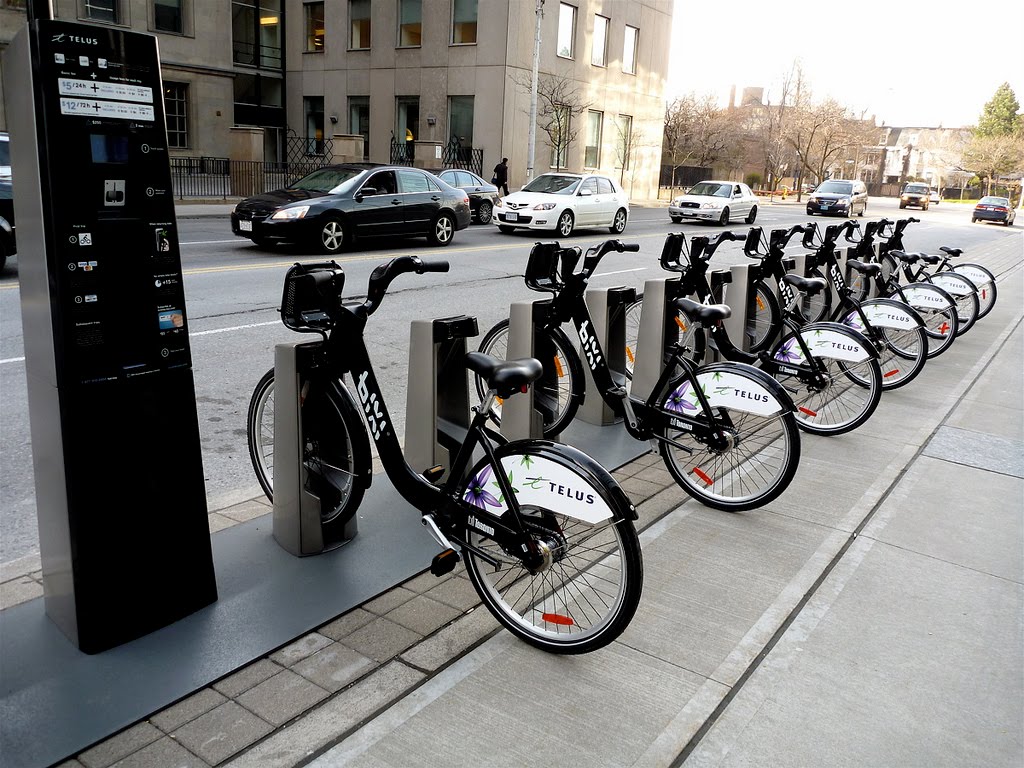
A bicycle sharing system

The bike-sharing systems works with smart-cards, allowing the bicycles to be returned to any station in the system, which facilitates one-way rides to work, education or shopping centres.

Why do we not have it??? I cannot figure out how this isn’t implemented yet. We have literally the cultural and behavioural habits that shows that it will almost guarantee that it will work.

  • We love bicycles.
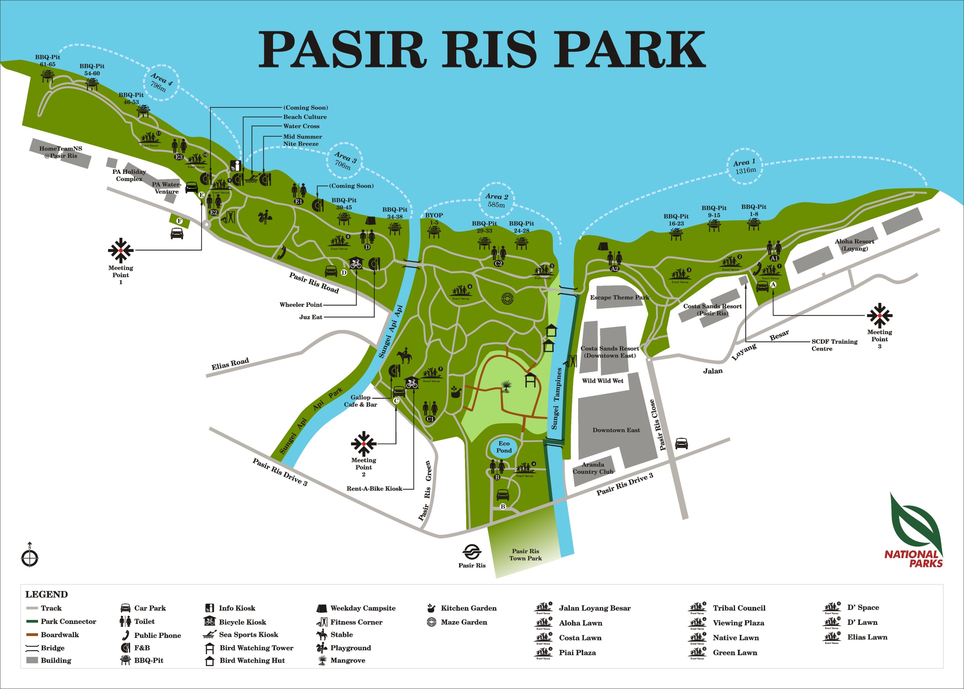
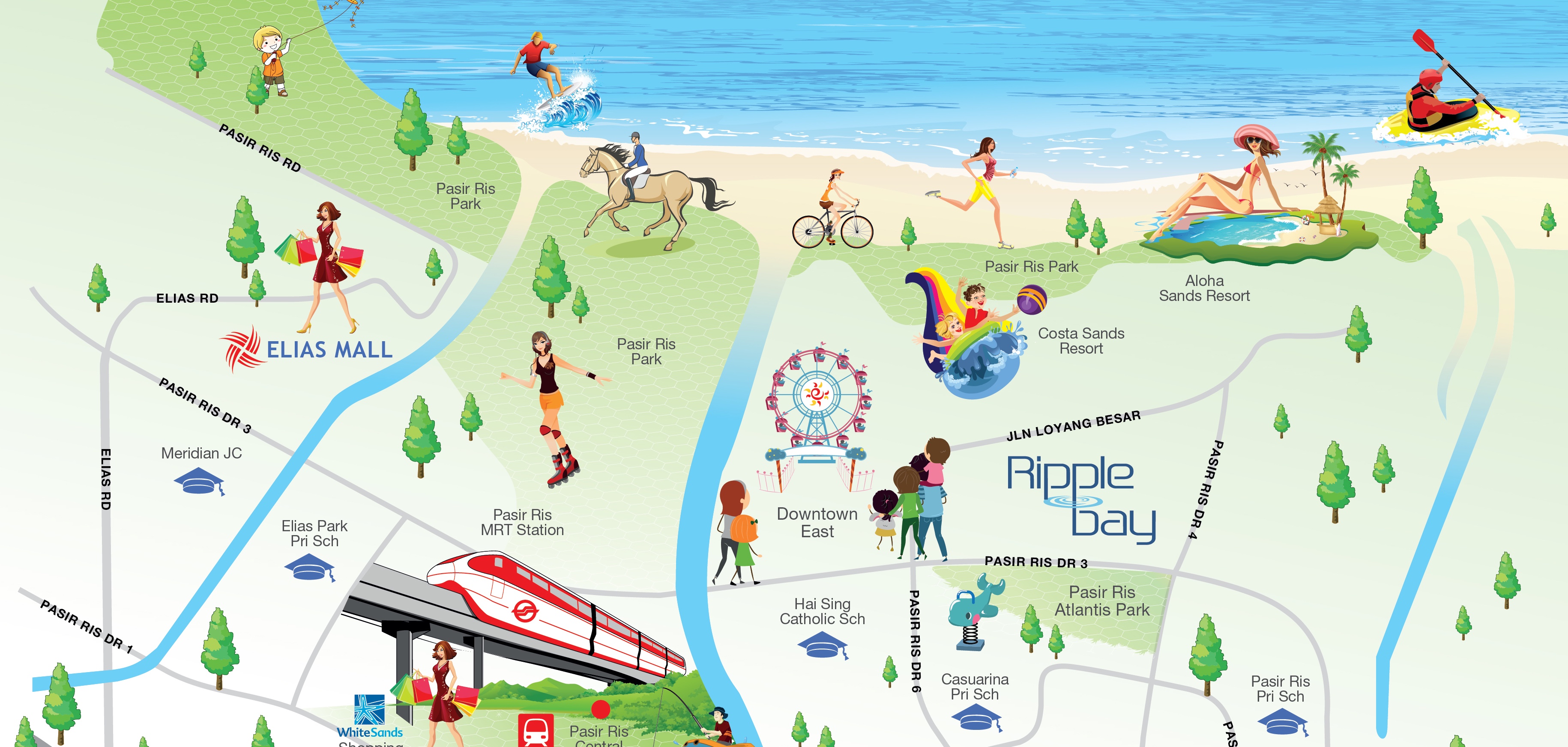
    We love them so much, we made it legal for bicycles and people to share lanes in some areas of our land, and in places where we can’t, we paved bicycle lanes just for them. Many of us have the habit to ride wherever we go, and more than often you have bicycles cramping up racks. Plus, look at East Coast Park on a weekend, wheels > feet. And the bike renting kiosks there charge a whooping $10/hr. WE STILL RENT THE CRAPPY BICYCLES. If we can had an alternative to taking the bus and a more convenient access to bicycles, no doubt we would make the jump as well.
  • We are small but also not that small
    We are around the same size as New York (SG: 719 km²  to NY: 789 km²) and they could manage the system and find space for the bicycles, I’m pretty sure we’d do a good job too.
  • We are so law abiding, it is a joke to others
    Yes, I get it. NO CHEWING GUM? HAHAHA. Anyway, if we can abide to that, I’m pretty sure we can rent and return a bike by ourselves. We’ll be angels on wheels.

Lets revamp the stations too. The design is inspired by the car lifts in some really swanky condominiums where rich people can have their expensive sports car tucked away safely in their homes.

(Image)

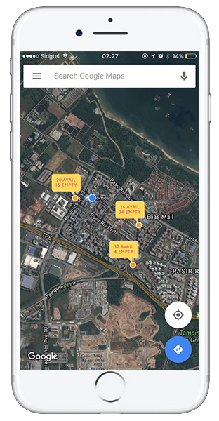
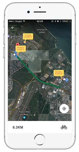
Furthermore, I propose pairing the system with an app (because everyone loves apps), except that this one is going to stay on your phone because it is going to be right next to your bus timing app.

The app will work similarly to bus apps, they will have

  • A map with all the available bicycle sharing stations
  • Available bicycle and available empty rack count at each of the stations
  • Distance to the next station + GPS guiding

Ideally, this can also be paired with Google Maps, or Apple Maps.

1 32


UX Week 4 – Hawker Centers

Where this at: Bedok Mall Hawker Centre

Hawker centers are the best, they really are. They sell inexpensive (well most of them) good food, and yes you can even find some healthier stuff like fish porridge or skinless/fatless chicken rice… if you can exercise enough self control to skip the mouth watering cha kway tiao (“fried noodles”) or the savoury, but spicy as hell, laska. But why would you?

img_7234Moving on.

Hawker centers might seem similar to coffee shops, but consider them the bigger and more varied cousin, with around 20 food stalls compared to the latter with around 4-7 stalls.

Thus, to account for the then larger number of crowds, you usually get a whole building dedicated to it, filled with rows of tables and chairs in front of the stalls. These stalls usually work on a “self-service” basis, with customers queuing up in front, and the really popular stalls have queues snaking into the sitting area.


img_7236

The cooking is done within the little cubicles, usually manned by one person, and the cash till by another. They share the same space when it comes to displaying food, serving it and paying, and sometimes even cooking, though that would be done in the back of the cubicle if space allows. The environment is relatively well controlled with vents installed to pump the oily and sticky fumes away from the stall, upwards to the top of the building and into the air. Note: For some reason, it never really smells that bad, or too strongly. Just, y’know, yummy food smells. I’m guessing that the vents might have filters as well.


img_7237

img_7233

Most hawker centres have cleaners who tidy up tables after diners, and push around carts that are sectioned of by “shelves” and “bucket” that hangs on one side. Unfinished contents of the dishes and discarded tissues go into “bucket” and the dishes, now empty, go onto the shelves. They go to the back of the building, which is where the cleaning stations are situated, or sometimes, back to the stalls themselves for cleaning. However, in recent years, hawker centers have been trying to get diners to return their plates themselves, indicating one shelves for food from halal stalls and the other for non halal. This ensures that the cutlery and dishes do not mix, and makes cleaning up more efficient halal food stalls. Another thing to take note: dishes are usually of different colour and design to differentiate from one another, however some stalls might use the same bowls or plates, they either share them or they mark it out on the ends of cutlery or with indelible ink on the sides of their bowls and plates.

img_7238

Finally, I would like to end off with a question: DOES ANYONE KNOW WHAT THIS IS? THE BLUE LIGHT THING BELOW THE FANS? I see it around at hawker centers, coffee shops and even some bakeries (the ones found below shophouses). I’ve asked the cleaners and hawkers about it, and even googled but no one knows for sure what it is. Some said it was for insects but like.. how?

UX Week 3 – The MRT Experience

General Observations from our group, consisting of: Christy, Feli and Yoosh (that’s meeee).
ux3-p1 ux3-p2 ux3-p3 ux3-p4

I guess we thought that there was suppose to be some problem solving going on here, so uh.. we did some problem-solving. ux3-p5 ux3-p6 ux3-p7 ux3-p8 ux3-p9 ux3-p10

UX Week 2 – Still Trying

Response – Chipchase, Hidden In Plain Sight: How To Create Extraordinary Products For Tomorrow’s Customers, Chapter 5

The reading provides an in-depth guide to how one may understand a foreign neighbourhood and its people, through its infrastructures and immersion. It is also through this understanding that we can invent or reinvent designs that work and suit the people. The guide covers general people viewing – to understand the local’s way of life and their routine, scrutinising small details in the community – noting nuances that might affect behavior, as well as to take note of things that are not there, all in the name of finding the gap in the market or to improve on a faulty cog in the machine.

Through the essay, I have found useful tips and directions in terms of understanding a target audience, and with these skills improved, I will be able to infer and conclude findings on groups that I might have no initial knowledge of as I can built it it through my own observation.

Take, for example, in Singapore, we have alot of campaigns and events that push for an improved art scene and culture. However upon the surface the celebrations and activities, as a avid consumer of the Arts and content creator myself, I have become a lethargic of the hundreds of blindly thrown darts at the board. Events after events, work after work from famous or up and coming artists from our Southeast Asian neighbours, forcing it into our eyes, when we have yet to develop a big enough scene of our own that our people want to see. While the efforts have been made on the part of our local creators, there is still much to be done in terms of well-developed and directed efforts to attract the attention of our local audience.

Question:

Another form of information collection would be surveys and interviews. Would formal interviews and surveys count towards this deeper understanding and how much would it have to be considered with bias, or if the interviewee will overthink? With that consideration, how do we avoid over-thinking when we ourselves make inferences out on the streets?

UX Week 1 – Yoosh Trying to Catch Up

Response – Donald Norman’s The Design of Everyday Things, Chapter 1

Norman broke down the aspects of design into simple categories: Affordance, Signifiers, Mapping and Feedback. In each category, there is a simple consideration to design and it allows designers to think of them independently and yet see how they flow and work dependently with one another. While it was doable to think about these aspects separately, it was also about how one affected the other. To design something that could check off all the boxes was the difficult part. 

“As I watched people struggle with technology, it became clear that the difficulties were caused by the technology, not the people.”

I was thinking about the ever shifting sort of common technology knowledge that everyone has (or at least those up to date). For example, knowing/realising a laptop is out of battery, and knowing how to charge it, something that any adult, teen or even primary school child could do, might not be as apparent to the grandfathers and grandmothers of today. It got me thinking about how we should take into account the different generations and their different levels of this common knowledge. However, as I read and I thought about it more, I realised that this had to do with interaction and experience with other technologies, and it was the good designs of the past that have develop this almost instinct reaction to know what to do. I saw that as technology improves, the design for it to be used practically and to be easily understood has to be improving as well. We should not be making excuses for ourselves and technologies.

Questions:

How large of a part does habit have/is able to play in the world of design?

Is relying on the idea of habit and contextual knowledge only sort of an “escapist” or “easy way out” mentality? Or is it also frequently, using design to affect habit? Will that be under “bad design forces the user to behave as the product wishes”? Do I also sound like a mad scientist trying to figure out how to control human behaviour? Maybe..

Map Assignment: Pasir Ris Park

Both maps presented have their own pros and cons, but clearly in terms of doing a better job, the first one is definitely a real map’s map. (lol jk) Its not amazing but it does a good job and accurately depicting the land mass, yet without being overly anal about the little details, which might have complicated it more. While the second map simplified itself as well, it was overdone and presents itself as too inaccurate. Furthermore, the first man has more information about Pasir Ris Park, while the second only highlights its main attractions, leaving out toilets, pavements and individual BBQ pits. Although the second map has a more interesting and eye catching aesthetic, it does sacrifice accuracy and details about the park. 

pasir-ris-park-map ripple-bay-brochure-locationmap

Redesign Everyday Objects

I’ll get on that soon, promise.