Recent Posts
Illustration For Designer: Editorial (Research - 1) Theme & User Persona
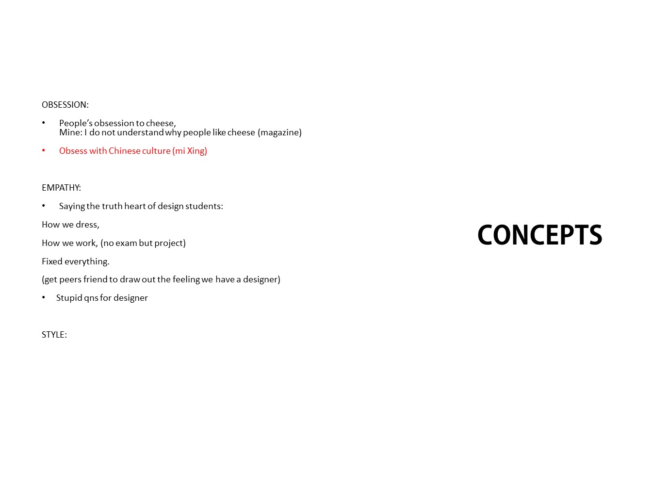
BRAINSTORMING CONCEPT:) I started this project by simply creating a blank page and write down the three topics: Obsessions, Empathy and Style. Following, I wrote down events, situations that happen around me that are inspired by these three words. E.g, What people are obsess about (traditions, cheese, neatness), Then I realized as i write, the is one common situation Read more →
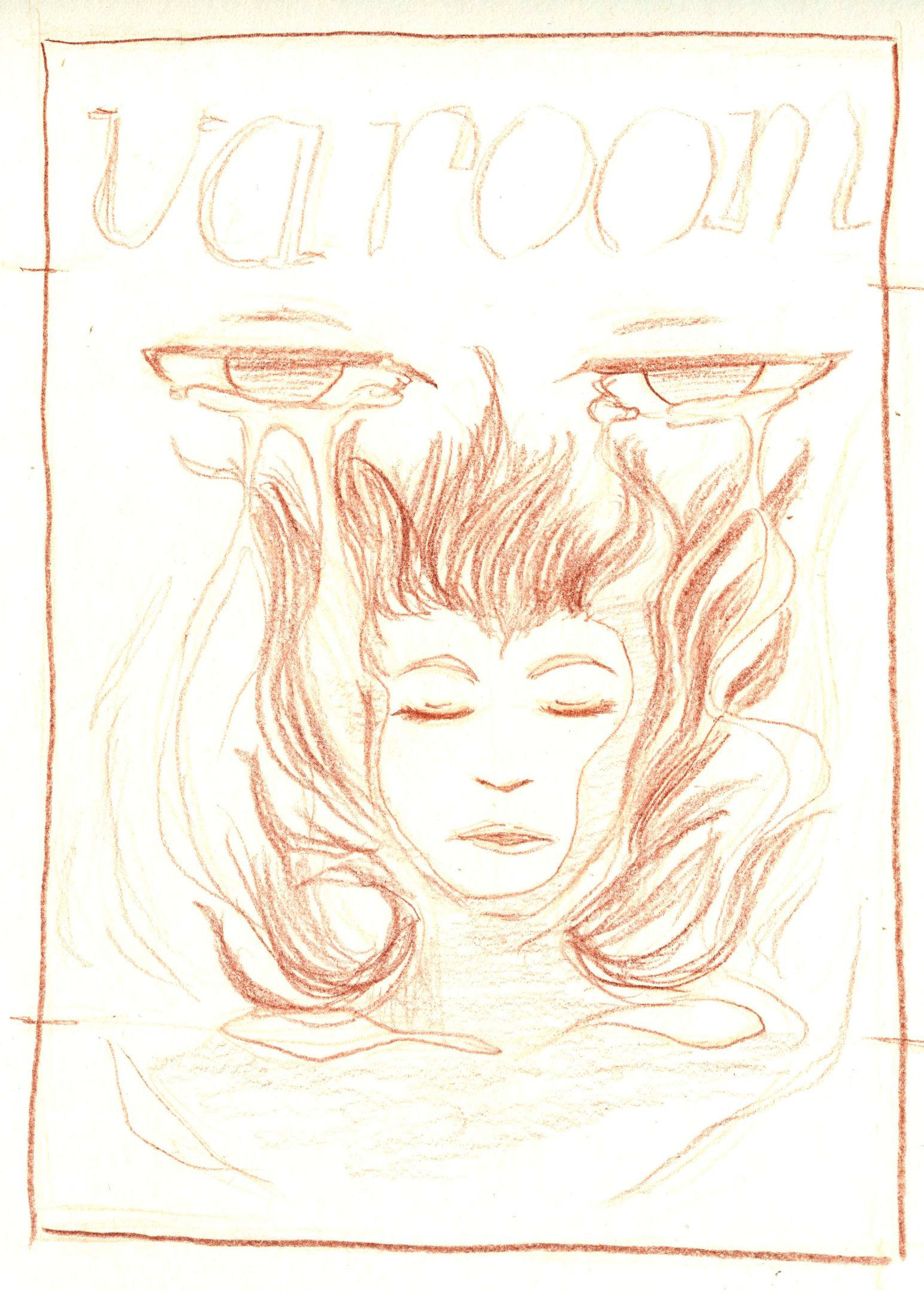
Assignment 2 - Varoom Editorial

Assignment 2 requires to create a front cover illustration for Varoom magazine.
«Varoom is the globally leading illustration magazine featuring a unique combination of industry insight and critical analysis of the field of illustration.
Published by the AOI and edited by John O’Reilly the magazine comes out twice a year» (https://theaoi.com)
Choice of topic was between Style, Empathy and Obsession.
I chose to Read more →
Editorial Illustration, Part IV (Thumbnails and Concept)
I had a few ideas at this point (See the concept for each on each as a caption when you hover over the thumbnail). Ultimately, as the concepts got too broad, Prof and I decided that we should narrow down to a more focused concept. Despite the diversity of ideas generated, Prof noticed that the robot is a constant fascination Read more →
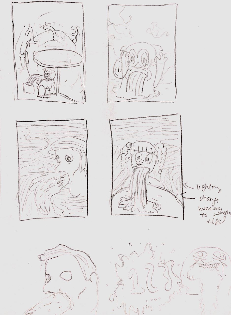
Editorial Illustration - Pencil Composition

After all those research, I came up with my initial compositions. I admit that they are pretty direct since I initially didn’t really take satire illustrations as a consideration. I was more into the style and story-telling, which did not represent the irony.
So after some class sessions, I found an idea. That is to portray a quote into the Read more →
Editorial Illustration - Ideas and Research

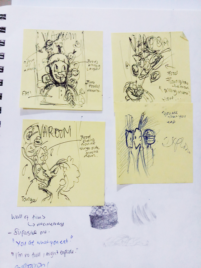
From the 3 themes for Varoom Magazine cover, I chose the ‘Obsession’ theme. And obesity is the type of obsession that I would like to represent in my illustration.
First of all I had several ideas and did some research. I want to go to a 50s Cartoon illustration, which is hyperbole, a bit disturbing, but cute at the same time. I Read more →
editorial illustration: pencil compositions

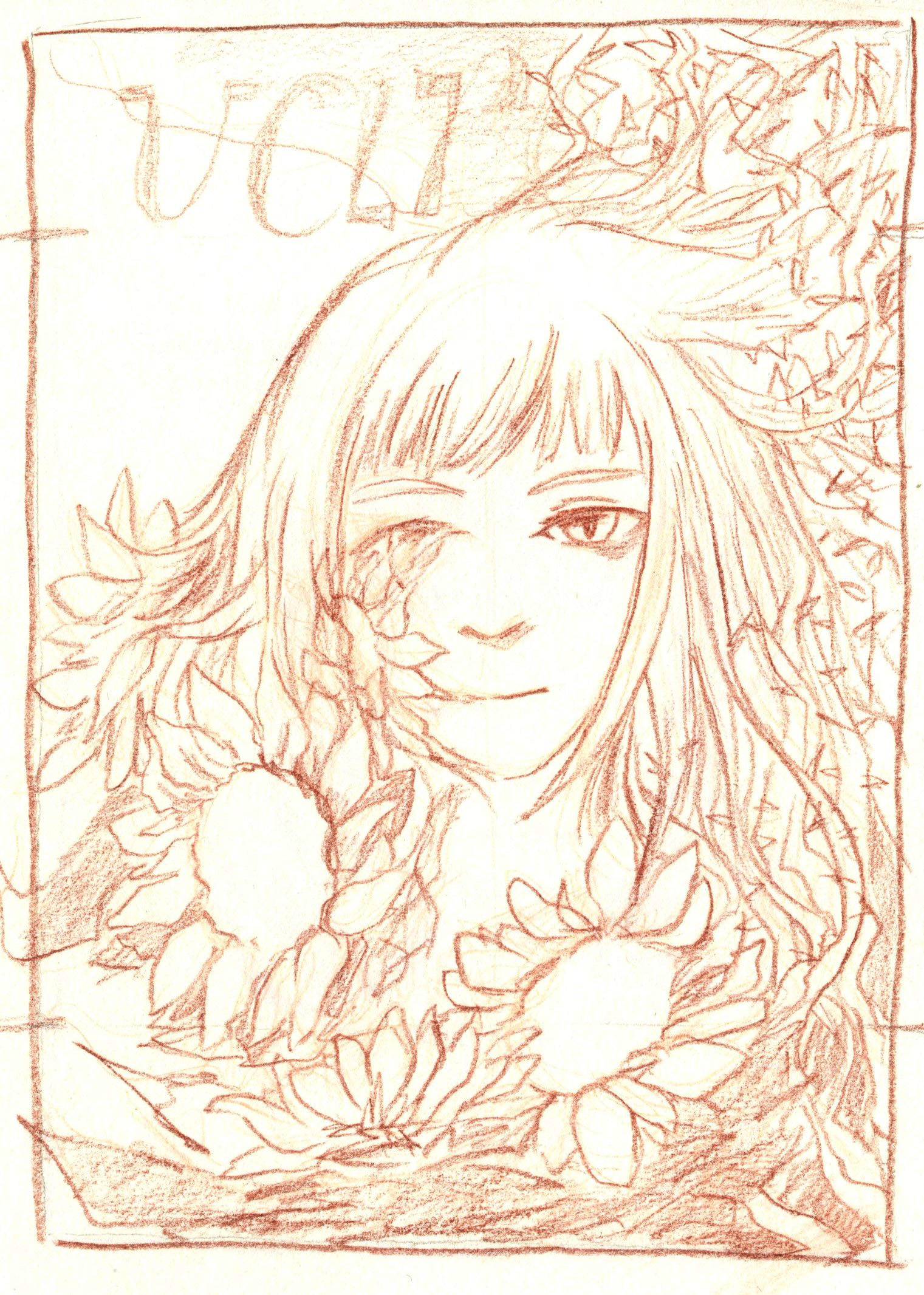
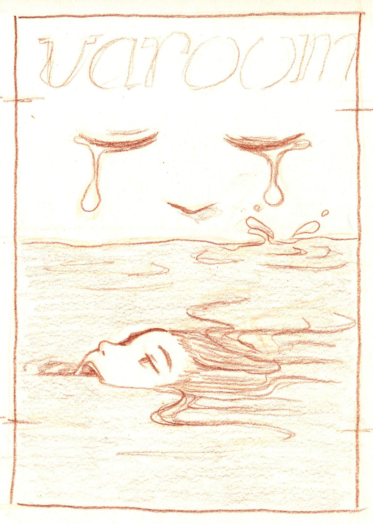
concept: negative impacts of empathy
1
idea 1 is revolved around the idea of putting up a sunshine front (hence sunflowers) when empathising; but too much empathy hurts yourself in the process, thus the thorns at the back
2 (two versions)
the theme for idea 2 is “drowning in another’s emotions” when empathising with them
also not shown in the sketch, but Read more →
editorial illustration: thumbnail sketches

concept: negative impacts of empathy
(disclaimer: a lot of these sketches are just me vomiting out what i have in my head so some are not as refined or well-thought, and i have no idea what they really mean lol)
1A midst of thorns and vines
1B going through thorns and vines
1C a refined version of 1B???
2A similar to 1B, more straightforward Read more →
Sketches and Ideation

My Focus
Here are some of the areas I want to focus on.
Controlling the LOVE OBJECTIn more extreme cases, the one with the disorder will want to control the love object’s movement and life. It’s as if he has become the love object.
2. From the Perspective of the Love Object.
Did an interview with someone who was the love object Read more →
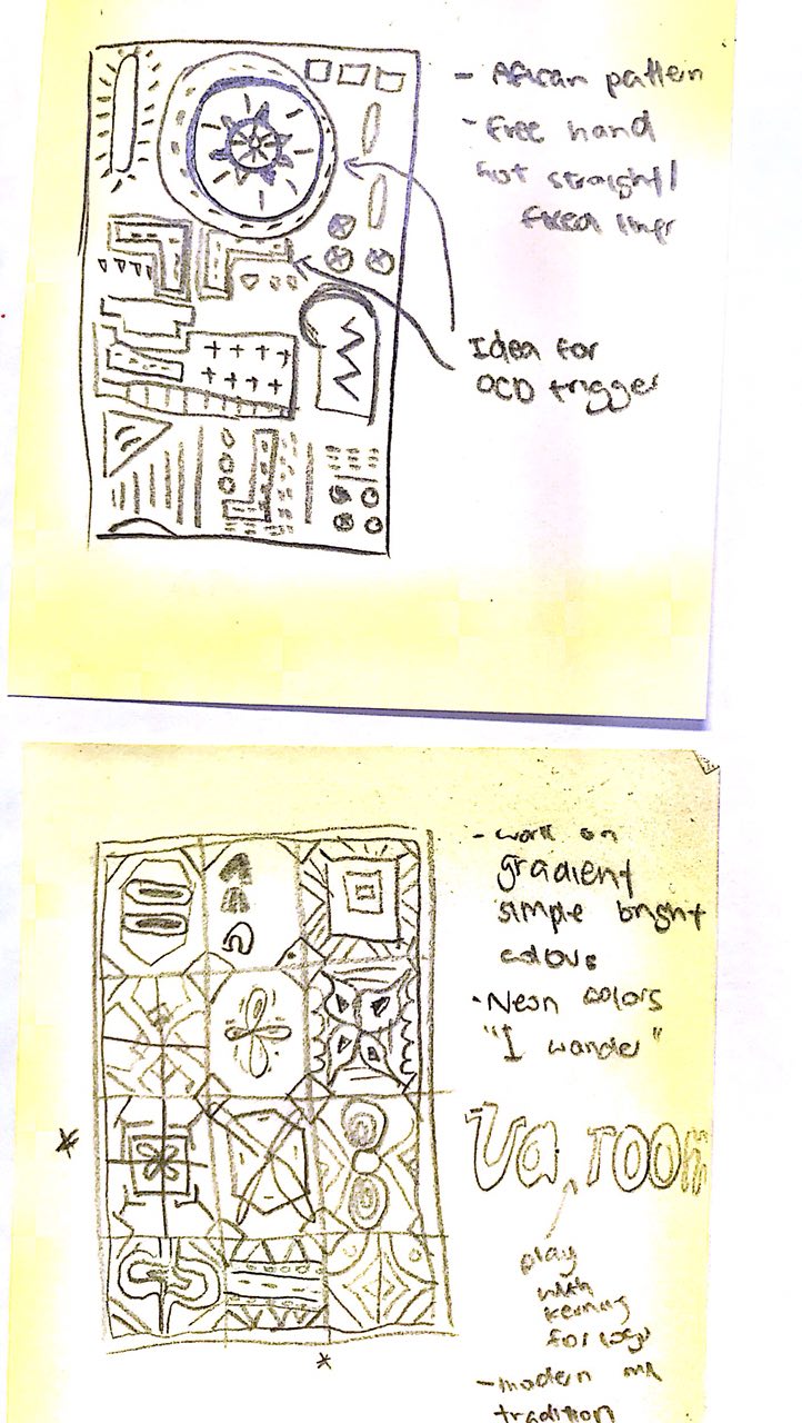
Illustration for design: Assignment 2 thumbnail sketches
Here are the thumbnail sketches for the two different concepts:
Concept 1: Practice makes perfect
Concept 2: “OCD”, obsession with perfection
Still thinking about different forms and compositions that I can explore for the two concepts, as I have yet to decide which to work on!
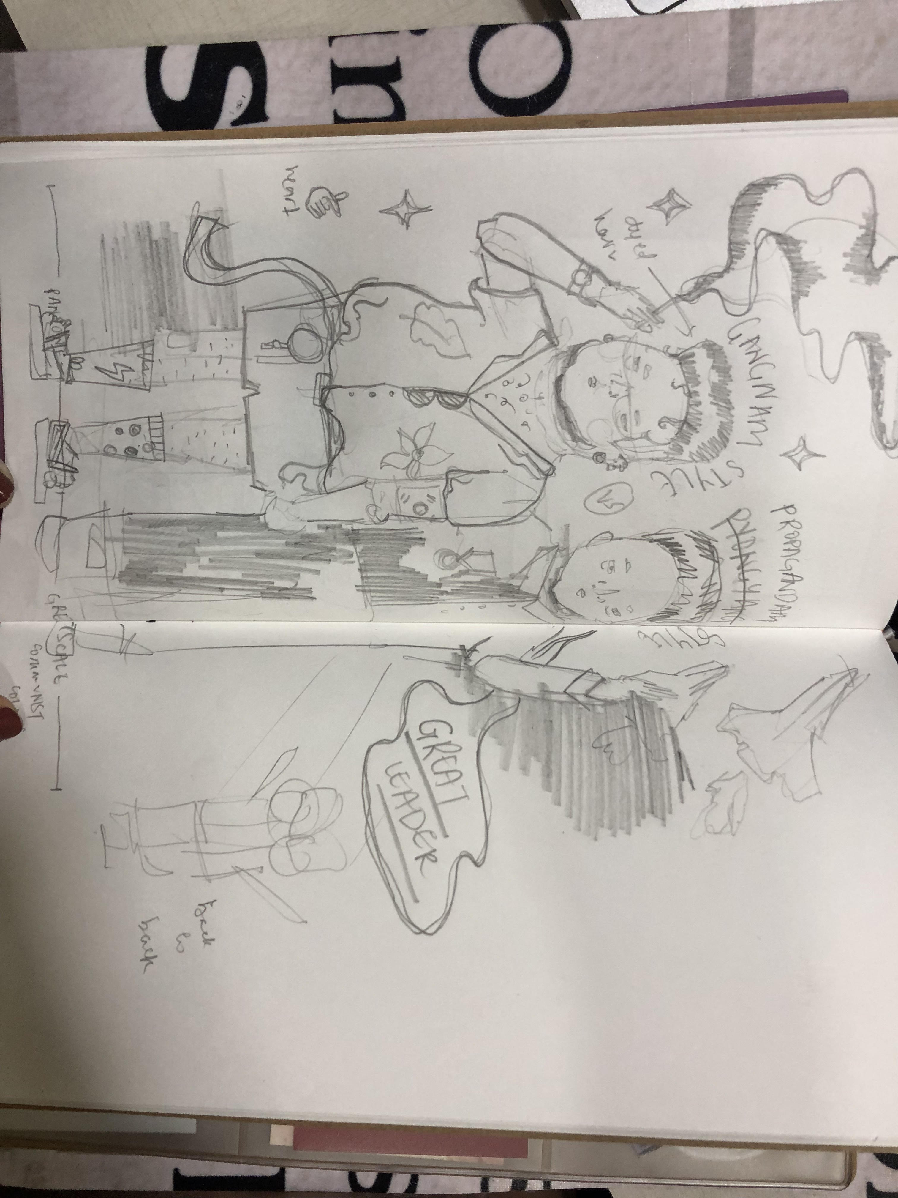
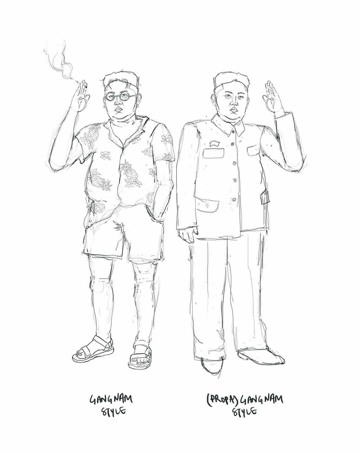
Editorial illustration #4: pencil compositions
These are some really rough pencil comps I did to flesh out the ideas from the previous post:
I digitized them to better see how they would look:
This idea wasn’t outlined in a previous post, but came to me in class. Here’s style epitomized by the division between the two Koreas. I think it’s really interesting how drastically differently Read more →