[Documentation] ADM-DIP Green Group – Light Patterns Development

ADM-DIP Green

As our installation focuses primarily on light pattern to give the visual impact to viewers, we have tried a few light patterns over the past 2 weeks.

*All the GIFs here are the TOP view of one cluster of our installation.
As all the stalks are laid in a circular cluster.

1. Circular-Outward Pattern

This was one of the first pattern that was proposed. However, as the cluster is top view, having the ripple to start from the center of the cluster will not show how the viewer “impacted” the installation. Hence, this was then modified to another pattern.

2. Linear-Bar Pattern

This pattern will start from the side that the sensor was triggered and the linear bar will move away from the viewers. The interaction part was what we wanted but the linear bar looks too rigid and does not reflect the dynamism of ripples.

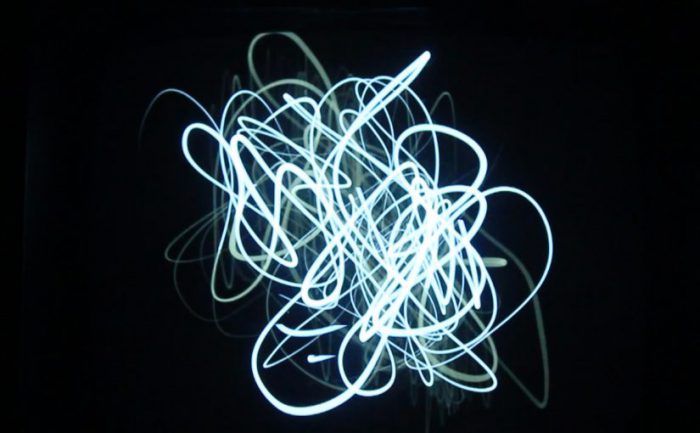
3. Ripple-Out (Finalised Light Pattern)

This is the pattern that we want to achieve. With the black dot symbolizing a viewer, and as the black dot gets nearer to the installation, the sensor is triggered and causes this ripple effect.

From here, we thought about what if there are more than 1 person at the installation, as Ilights events will definitely have times that there are more than 1 person at the installation.

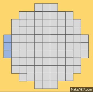
This is the light pattern for when more than 1 person is at the installation.
We didn’t want the ripples to just overlap each other and move away, hence we settled with 2 ripples coincides and resultant ripple will continue to move outward. Where the ripples meet will depend on which sensor is triggered first. (Triggered first means the ripple would’ve travelled further before meeting another ripple)

4. Default Pattern

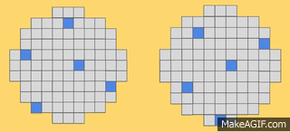
This default pattern is what will be seen when no sensor is triggered at the installation.
The rationale was not to let the installation look too dull and uninviting to viewers when no sensors are triggered. This random scattered lights will look like moving stars from far and we want that to attract viewers to come closer. With the viewers coming closer and at that point that they triggered the sensor and setting off the ripple, it will be like a surprise for the viewers. This was the kind of visual impact that we were going for too.


5. Light Show

During the case that our installation is crowded with people, the sensors will be constantly triggered as it is sensing radial proximity. To ensure that the ripples will not be too uninteresting after sometime when the viewers are walking through, we are looking into having a Light Show when a sensors is constantly triggered for more than 15 seconds. This will act like the 3rd layer of visual to our installation and also to captivate the viewers.

The Light Show are still in midst of development, we will continue to update when the Light Show animation is ready.

[Response] Designing for the Digital Age – Kim Goodwin

In this reading of “Designing for the Digital Age – Goal-oriented Product and service Design” by Kim Goodwin, it gives a clearer view on basically how to design.

Goodwin gave an accurate definition for the word – Design – is the craft of visualizing concrete solutions that serve human needs and goals within certain constraints.

Serving human needs and goals will confuse people on whether human factor and HCI are different from designers. Goodwin raise the criteria to differ both groups of people. Designers will give creative problem-solving solutions whereas people who are trained in human factor and HCI are people with evaluative techniques. I agree with her as the line between designing and making something suitable/comfortable for human can be very vague at times as all our target-audience are human beings. Being trained in human factor will be a bonus for designers as there will be some considerations given to human. Personally I feel that on top of designs are for usability, it is also tackling with emotions that users feel when they uses the product, which is something that thoughtful designs can achieve.

Goodwin also focused on Goal-Oriented Design and the method to it. I agree that a goal-oriented design can maximise the efficiency of the team and also ensuring clear communication with other teammates or client. However, I am not very receptive to the point that she made about pattern. In some way, I feel that having a pattern can seem like a template/stencil for design. Personally, I’ve always felt that a good design should be polished overtime, just like brewing a pot of soup, taking time for the taste and essence to reach the maximum. It will be definitely easier for designers with their “vocabulary”, where they can come out with solution faster and efficiently. However, if every design were to follow certain template then where and when will the breakthrough in design come?

Week 7: Diary of Behaviour

Day 1 – What did I do with my phone?
The first time that I will touch my phone during the day will be to off my alarm, followed by checking for messages. This is the routine for my day.
As I do not have school on Friday, I continued to browse through my social media for a while before I get out of my bed to start my day. I continued to liaise with my friend about the meet up in the afternoon through messaging applications on my phone.
I will also listen to music on my phone and read a book from application on my phone when I am on my way. I realized that most people on the train are looking down on their phones too, some typing on their phone, some playing games and some watching shows on their phones. Only people who are not looking at their phones are slightly older and those who are resting. Even a toddler was watching cartoon in his stroller.
The next time that I was using my phone was while waiting for my food. My friend and I just looked down on our own phone and browsing through, replying messages. We were also occasionally sharing about what we saw on our social media. I realised that not as many people were looking at their phones at the food court as I thought it would be. Most people were chit-chatting with their friends and some were dazing.
I was on my phone all the way at night, on messaging applications and jumping around social media platforms too.


Day 2 – A Day without my phone (as much as possible)
(I tried not to use as much of my phone today but it was really hard)
I had to use my phone to wake me up in the morning as I need to be somewhere in the early afternoon. I quickly checked through my phone for important messages and got up to prepare.
I got out of my house without my earpiece so that I won’t be tempted to plug it in my phone. On the way to my destination, I was just looking out of the window and occasionally observing the people around me. There was a mother with toddler who was sitting in a stroller on the train. I was just looking at the little girl and trying to make her smile with my “ghost faces”.
I used my phone a few times to make some calls to check on some stuffs but other than that I didn’t use my phone.
I couldn’t keep myself away from my phone 100% as I needed to run errands. That was when I realized that phone had become irreplaceable in my life. Phone has given me the kind of convenience that i really couldn’t leave without it. I can survive without using my phone as entertainment but definitely cannot do without it when I have to communicate things with people or like quickly search up something.

I tried the second day when I was meeting my friend, I set a meeting time and meeting place the night before and I just turn up at the place the next day. But my friend didn’t turn up until I called her as she didn’t know that I am awake as I didn’t message her. This is interesting how staying connected all the time is needed even when we’ve set the meeting time and place.
Something different when I stayed away from my phone was I have more free time to do my stuffs and I felt like travelling journey is not as boring as what I’ve imagined too. One thing that i feel is really different when i do not have phone will be to plan, like i have to plan in advance. For eg, like i needed address of a place that i am heading to, i will need to find out before i leave house and write it down somewhere first. Usually i will just Google it while i am walking to the nearest MRT station.

This exercise also allows me to truly look out of that screen and observe around me, it is quite interesting and thought-provoking too.

[Response] Interactive Environment and Experience Design

Timothy Nohe was invited to class to share about his experience and his project on “Light City”. His project was very interesting, how it can be adaptable to different input system (music box; tablet). He showed us how a different input system allows many different types of styles to be created and how the target audience can be different too.

It was nice of him to bring his project to our class to give a demonstration to us too. Initially, I felt that the whole set up was quite intimidating as they were objects that seems to be for professionals. Some of my classmate went up to try out the installation and it seems like they really enjoyed it. From the different music that they are making, we as audience are also enjoying the visual music which were the “Electron Drawing” on the little screen.

Timothy Nohe also shared very useful insights to us on doing installation, what we should look out for and what do we really need to be mindful about. Weather surrounding environment etc.

[Response] Thoughtful Interaction Design By Jonas Lowgren

Lowgren brought up about how digital technology is a material that has no qualities, designers are not restricted by anything. He also brought up a good point about how designs should be reflected on again and again to make it more thoughtful. And I would link that to why operating systems such as iOS and Android has multiple multiple updates within a year. It can be troublesome but definitely good.

One of the update in iOS for iPhone actually changed drastically the whole look and feel of the operating system, moving on from the previous blockish-blue-steel look to now, sleek look. Also re-arranging a lot of essential functions and making more convenient and intuitive for users. For eg, the notification chart comes in 2 pages, with one about the To-Do list etc. Also the Control center has the alarm, calculator, torch light all in there.

Talking about thoughtfully designed user experience, one of the top product that people will think of will be smart phones. The convenience of a smartphone can be largely attributed to the wide range of applications that they have. Some of these applications are really designed thoughtfully for their users.

One of the application that I would like to highlight will be Grab. Personally, I use Grab quite often for short trips. I like it when I open the application and they will straight away notify me on the promotions that I can enjoy and they will input the promotional code for me straightaway, without me having to remember the codes and type it in the box. Another feature of Grab is that they will automatically input your destination for you based on your routine for the past few weeks and it really saved my time and hassle of trying to pin a correct location for pick-up. It’s all these little details that made the process of Grab-ing more convenient and enjoyable.

Another product that I would say it’s a thoughtfully designed product will be the Swiss Knife. It has all the essential tools/cutters arranged and packed nicely into this pocket size product. Every cutter has a sleek indent intended for users to pull it out easily. It is amazing how the knife can be super useful when you are out camping/hiking or basically just not at home. The look of it might be confusing but it can be easily understood by the users.