Trip to Harvey Norman

Comparison of 2 similar products – kettles 

During my trip to Harvey Norman, I was very attracted by the different shapes and colours of different products. Especially the range of products that were in pastel colours, definitely an eye-catcher.

For this post, i will be comparing 2 kettles from 2 brands – Morphy Richards and Kitchen Aid
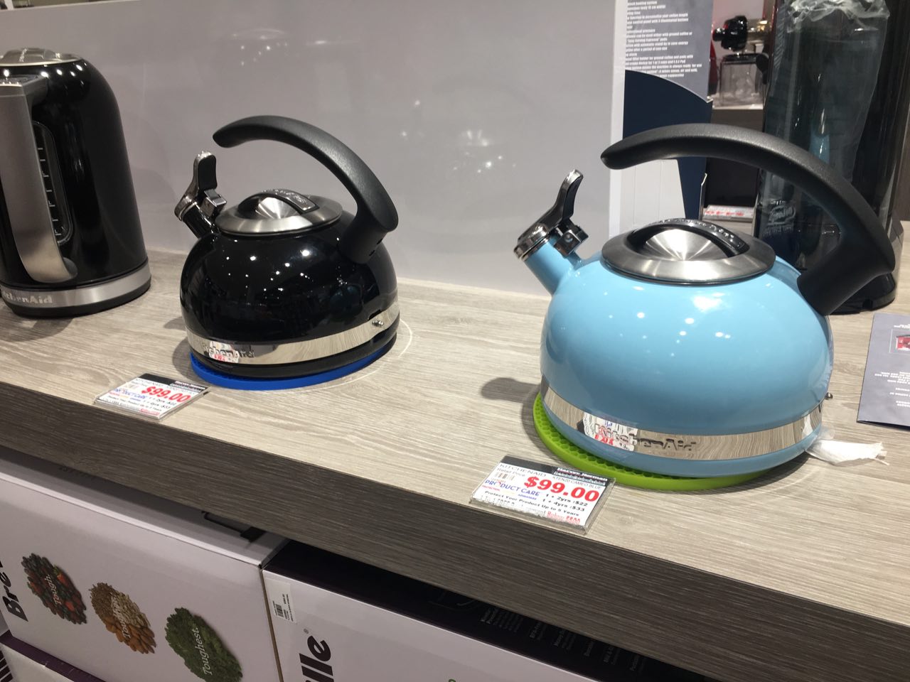
Kettle – KitchenAid

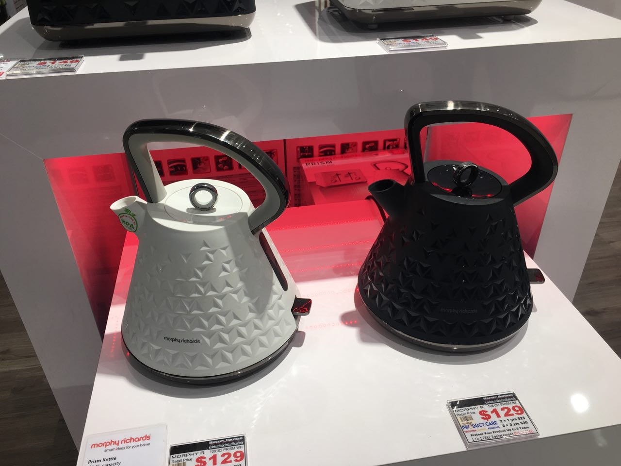
Kettle – Morphy Richards

Both kettles has the same function of boiling water.

However, the differences in forms and certain details gave both products a different personality.

  • Shape

Both products have a very different shape (form). The one from KitchenAid is more bulbous whereas the one from Morphy Richards adopted a more trapezoidal shape with triangular indentations on the body of the kettle.

Both forms are very inviting for people to touch it due to its shape or the indentations. The one from KitchenAid gives people a more casual and everyday life kind of kettle feel. But for the one from Morphy Richards, it gives people a sense of distance, feels like something more high end, more elaborated due to its height and indentations.

  • Colour 

Both brands carries more than 1 colour for respective kettles mentioned above.

As shown in the pictures, the one from KitchenAid carries black and sky blue colour whereas the one from Morphy Richards carries black and white. There are more colours that were not shown on display too. The available of different colours will be able to appeal to a wider group of consumers if they have different taste and preferences. One of the similarity for both products will be the choice of colours available. The colours available are all towards the more vibrant side, for instance, lime green or orange.

  • Details

Looking at both products, it will be easy to realise that one of the difference on detailing will be the thumb-press spout on the kettle from KitchenAid.

This additional detail promises a sense of security towards the consumers. This could also be the deciding factor of consumers.

Both products from both brands have simple functions and detailing. Making it easy for consumers to understand and use.


Conclusion

From this trip, i was exposed to a wide varieties of products that comes in various forms, colours and even functions. It can be noticeable that the trend now seems to be bringing consumers down the memory lane – the revival of pastel colours, leathery textures and also simplicity. On the other side, there are also a group of products that are taking on a more rustic feel, with the use of olive green with brown etc.

Lastly, I would like to share one of the product that interests me the most.
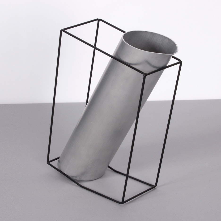
Fan – Cornell

This fan caught my attention from a distance, it just looked like a pin-point on the map. The whole shape of it looks really unique, it really stood out from the numerous fans around it. However, it’s a little top heavy so a little nudge will cause it to sway. And… I still don’t understand why the wind comes out from one side and not the front 😮 Overall, still an interesting design!

Aesthetics of Products

From the previous lecture, we were introduced to the 3 factors that influence the aesthetics(form) of a product. The factors are Function, Human Factors & Emotion.

I will be sharing 3 products that show dominance in each factor in this post.

FUNCTION DOMINANT

A functional based product will be straightforward about its function so users will be be able to use it intuitively.

This product is Happy Bowl from an online store named ezpz, designed by Brad, one of their team member. This product is made of silicone and specially created for toddlers (>6 months).

I chose this product to illustrate function-dominance aesthetic as it is simple in showing the function. The main intention of this design is to allow easy cleaning after the toddler is done with their meal. The suction of the silicone mat will not allow tippling of bowl and also captures any food that are dropped outside the bowl.


HUMAN FACTOR DOMINANT 

Human factor based products are designed with priorities on the interaction of human and the product itself, hence focusing on comfort of users during use. Usually this will also be known as ergonomics. One of the common product that is greatly influenced by this factor will be computer mouse.

Also, designs that are specially for human with specific requirements (such as infants, elderly or handicapped community) also falls under the influence of this factor.

This product is Leaven Jug, designed by a British Product Designer, Simon Kinneir. Leaven Jug is part of the series of kitchen products that are designed specifically for visually impaired users.

This product enable visually impaired users to know when the jug is full by touching the frame of the jug. The jug is slanted and as the jug is filled, the center of gravity will shift and causing the frame to tip forward, hence cueing the user that the jug is full.


EMOTION DOMINANT 

Emotion based product focuses on giving a specific personality to the product or show certain mood to users. This type of products will attract the users who prefers the specific spirit of the product.

This product is Juice Bruce, designed by Yaacov Kaufman. A wooden citrus juicer with an unique look.

The blockish juicer with a emotionless expression gives users a rather adorable feel and it will definitely attract users of different age groups too, especially children and ladies. Simply a product that will be too cute to handle and definitely bring smiles to users just by looking at it. On top of its function, it is good to be just a decoration in the house too.


Naoto Fukasawa

The designer that I most identify with is Naoto Fukasawa.

Tetra Candle Holding

Tetra Candle Holders

Fruit Juice Packaging

Fruit Juice Packaging

I like his simplistic style with appropriate details and colour. He uses one colour for his product to keep it simple but still impactful at the same time. His designs are straight-forward and able to communicate visually to users (on its functions etc).