Process slides for SEE Project: See project
Final Documentation for SEE Project:
Version 1
Final Version
Website
Link to website: https://3rpproject.wixsite.com/3rp-project
(Not available on mobile yet)
Features

Home page: Landing page + Brief Introduction + Blog

About page: What is 3RP? + Why should you recycle?

Recycling kit: Recycling guide + What’s in the recycling kit?

Recyclable or not?: User can key in the item to see if it’s recyclable or not (Key in “wood” or “plastic bottle” to see how it works)

Plastic alternatives: Link to environmentally friendly stores + List of brands/stores that can return the packaging back e.g. lush, Innisfree

Blog: Content about recycling properly
Briefly share your experience going through Dialogue with Time. What were some of the feelings, thoughts, challenges, and insights gained while role-playing an elderly person? (150 words)
Dialogue with Time was an insightful experience learning facts about aging from the various rooms and real-life experiences as shared by the senior guides. We were given some factual information about how we age, and what are the things we can do now as young people to prepare to age happily and to also help others if we can.
I was able to empathise more especially in the Yellow Room where we had the chance to experience some of the physical limitations that the elderly face in their daily lives.
The limitations that we had to experience in the yellow room were not foreign to us. We hear it from our grandparents, we see it from the aunties and uncles at the market, we see it from TV shows and movies. Seeing these challenges everywhere in our daily lives somehow made me feel that these problems seem normal. However, through role-playing, it helped me to experience the pain and challenges which I have never thought would be so difficult and frustrating. Furthermore, we only had to experience one limitation at the time. Some elderly have to experience most of it at the same time!
Drawing on your experience, can you think and list some of the benefits inherent in the design research technique of role-playing? (150 words)
Participants are able to put themselves in the person’s shoes through role-playing, which in my opinion, gets the message across clearer and more effective than just reading about it or watching a video. The interactive element of it helps the participant to experience it which can invoke emotions or thoughts that they will remember instead of watching a video and forgetting about it days later.
Can you think of some contexts where role-playing can be useful to help discover and define design challenges or contribute to the development of design solutions? (150 words)
I think role-playing can be useful in uncovering insights to improve the user’s understanding as well as to sieve out some problems which were not uncovered when going through it on theory. One example is during the development of new products or services during the prototyping stage.
Link to Essay: DD3016 History of Design – Reflective Essay
Works used in the essay:
Visual Identity
“A visual identity is the visual aspect of branding that businesses create in order to evoke certain feelings and experiences with the brand.”
A company’s visual identity includes anything visual that their brand produces such as logo design, fonts, photos, and any other visuals that were used to communicate with the brand. A company’s visual identity is part of the branding that communicates the overall message, values, and promise of the brand through anything that is visual.
Throughout the history of graphic design, graphic design was used as a way to communicate a message, or evoke a certain feeling, whether it is for political, or commercial purposes (e.g. advertisements). Building a visual identity for a company helps to differentiate itself from its competitors and easier for its customers to identify them.
Paul Rand was an eminent twentieth-century American graphic designer and art director. He was the pioneer of iconic corporate logo designs for major firms, including IBM, ABC, Morningstar, Inc., NeXT Computer, Yale University, and Enron.
Paul Rand believed in good design to be the way of life that he changed his name from Peretz Rosenbaum to Paul Rand. One reason is to do away with his prominent Jewish identity to sound more American, the other to simplify his first and last name to four letters each.
He was dedicated to treating design as a function of businesses. By the 1950s, International Business Machines Corporation (IBM) had established itself as one of the leading data processing companies in the world. Its president, Thomas Watson Jr, believed that Good Design is Good Business, and hired Paul Rand to do a complete overhaul of IBM’s graphic communications system. Over the next decade, Rand created what was perhaps the first design system for a corporate identity. From the company’s logo to letterheads, to product packaging, he made sure that every corporate asset had the company’s visual identity incorporated into it.
This then paved the way for businesses to see the importance of corporate visual identity as a function of their businesses, which continues even today.

Chermayeff & Geismar & Haviv, a graphic design firm specialising in the development of trademarks and identity programs. Following Paul Rand’s approach to corporate identity, they designed the visual identity of the companies that aligned to its values and products they are selling.
Reflection
I think corporate identity is often overlooked or taken for granted nowadays as it is so common. Even small businesses like neighbourhood bubble tea shops (e.g. Sweet Talk – logo, colour, etc.) have their own branding and visual identity. Nowadays, it just comes naturally to us that a business should have its own corporate identity. I think that by knowing its history and the reason why it was created helps designers to understand the importance of their jobs and that it is not easy to do the job that they do.
Course Reflection
I think it has been a fulfilling 4 weeks, and I have definitely learned a lot about the history of graphic design. I have also grown an appreciation for the design practices and not take our learnings for granted as what we learn today is a result of what the people of the past have explored for many years! I think it is also hard to condense so many years of graphic design history (since the cave paintings) into a 1-hour lecture every week so I would like to thank Desmond for that. I also appreciate the weekly reflections as I get to understand deeper on topics that I am more interested in.
One thing that I think can enhance the learning of students is to not conduct the quizzes of the same lecture content on the same day. I think it will be better and fairer if we have more time (instead of a few minutes) to study for something that is graded.
References
https://blog.jcimarketing.com/business-marketing/the-difference-between-visual-identity-and-branding
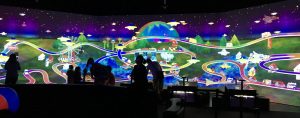
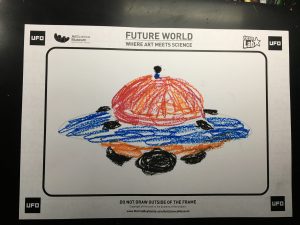
Future World: Where art meets science
Future World is a highly immersive and interactive digital installation (or playground) that is situated at ArtScience Museum permanently. It is a collaboration with teamLab, which consists of 4 key narratives – City in A Garden, Sanctuary, Park, and Space.
If I were to put myself in a child’s shoes, I think I would have enjoyed Sketch Aquarium and Sketch Town the most. I definitely enjoyed all of the installations but the one which appealed visually the most to me would be the last installation, Crystal Universe.
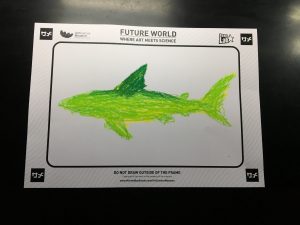
Sketch Aquarium – This installation features a digitally rendered, aquatic world of underwater animals. Participants of all ages use their imaginations to create fantastic and colourful sea creatures on paper. They are then digitally scanned and brought to life to swim freely in the aquarium where they live.
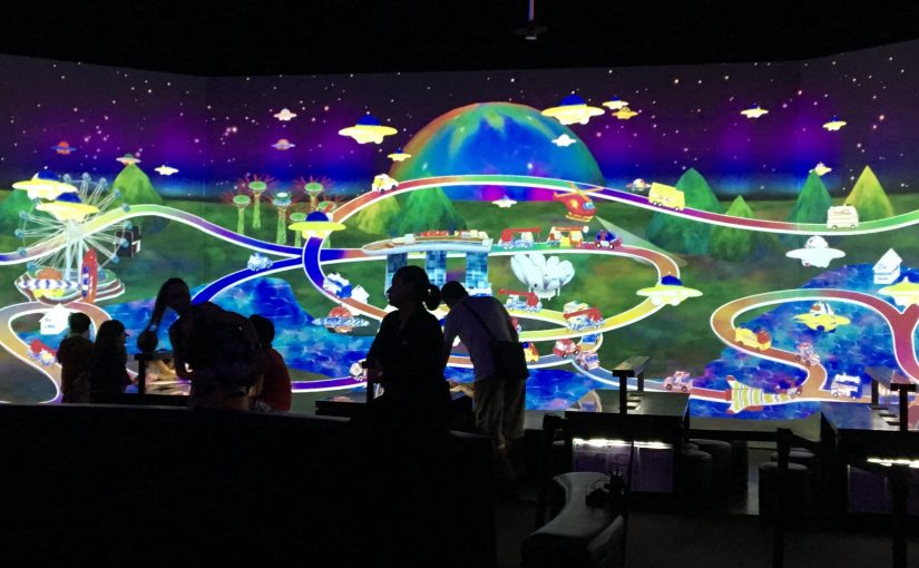
Sketch Town – This installation is a depiction of a fictitious town, based on Singapore that includes recognisable landmarks, such as, ArtScience Museum, the Merlion and the Singapore Flyer. Participants can use crayons and paper to draw a building, a car, or a plane for Sketch Town.
The flow of interaction:
1. The participant (P) views the Aquarium/Town when they first enter the space
2. P proceeds to the activity table to create their own sea creatures/vehicles by colouring within the outlines of different templates
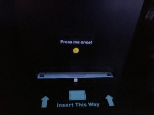
3. P proceeds to scan their creations to populate the town/aquarium
4. P views the projected Aquarium/Town on the wall with their creations!
5. P can interact with the objects of the Aquarium/Town, i.e. touch the car and it will go faster/change direction, and touch the fishes it will swim away. (In the aquarium if the P touches the food bag the fishes will swim towards it.
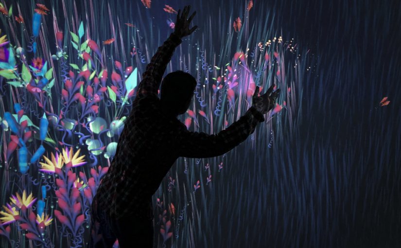
Crystal Universe – This stunning artwork is created with teamLab’s Interactive 4D Vision technology and over 170,000 LED lights, giving the illusion of stars moving in space. Participants can change the fabric of the universe by ‘swiping’ astrological phenomenon from smart devices within the installation/their phones and watch it become part of the dazzling environment around them. They can encounter astrophysical phenomena such as planets, galaxies, and even gravitational waves.
Thoughts
In most museum exhibits, viewers are not allowed to be in close proximity to the artwork, let alone touch it. In Future World, participants are instead encouraged and expected to touch and interact with the installations, completing the cycle of the artwork.
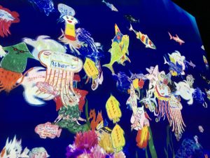
In Sketch Aquarium and Town, participants create and contribute to the installations. As an adult, I think it is fun as I get to see my creations on the big projection, contributing to the virtual aquarium. If I were a child, I would expect myself to be excited as I see my creations come to life. A child can imagine a rainbow shark and the most they can do to see it in real life is to draw it on a piece of paper and colour it. The Sketch Aquarium is an upgrade from their normal sketches as it makes the self-created sea creatures move in the virtual aquarium. By utilising art materials and augmented reality technology, it helps to develop the child’s creative thinking and encourages active participation of the child which enhances the learning experience.
The crystal universe is a really beautiful and immersive installation. To me, it is more than being an Instagram worthy photo or video to capture, it is a performance. By walking through the pathway, the participant can see the individual lights up close and see how each light changes colour. When they stand at a distance away, they are able to view the artwork in a bigger picture and appreciate the performance.
Even though the exhibition is more catered to kids, I still enjoyed myself as I interacted with the artworks and seeing a visual response almost immediately. I believe that the installations were a two-way artwork that engages the audience to participate/contribute to the artwork itself. This exhibition is a good example of utilising technology to show art in an interactive way that is worth visiting again.
References
https://www.marinabaysands.com/museum/future-world/park.html
https://www.marinabaysands.com/museum/future-world/city-in-a-garden.html
https://www.brighthorizons.com/family-resources/nurturing-creativity-and-imagination-for-child-development
About
Connected Worlds is an immersive, large scale installation of an ecosystem located at the New York Hall of Science by Design I/O. It is composed of six interactive walls of ecosystems that are connected together by a 3000 sqft interactive floor and a 14m high waterfall. Participants are involved in growing and sustaining the ecosystem through the actions they make. One way of sustaining the ecosystem is to direct the stream on the floor from the waterfall to the ecosystems by using logs to block and direct the water flow. They are also able to plant seeds to grow the ecosystems.

According to Theo Watson, the co-founder of Design I/O, the purpose of this installation is for the kids to interact not only in one environment but in a world where everything is connected. The idea where one local action can lead to another that may cause global implications is what they wanted to convey through this installation.
Reflection & Thoughts
If I were a child at Connected Worlds, I will be fully immersed in the installation! I would imagine my senses to be engaged with the installations, whether it is seeing how my seed will grow into a tree by using my hands, or just admiring how colourful the made-up animals and plants are. A child’s development is often paired or combined with play, where they are able to learn cognitive, linguistics, and social skills. They are also starting to make sense of the world around them by learning from the experiences that they have gone through while playing. I feel that this installation is a good example of a guided play, where the adult is able to target specific areas of development for the child. In this case, the child is learning to be conscious of their own decisions and actions that lead to different outcomes.
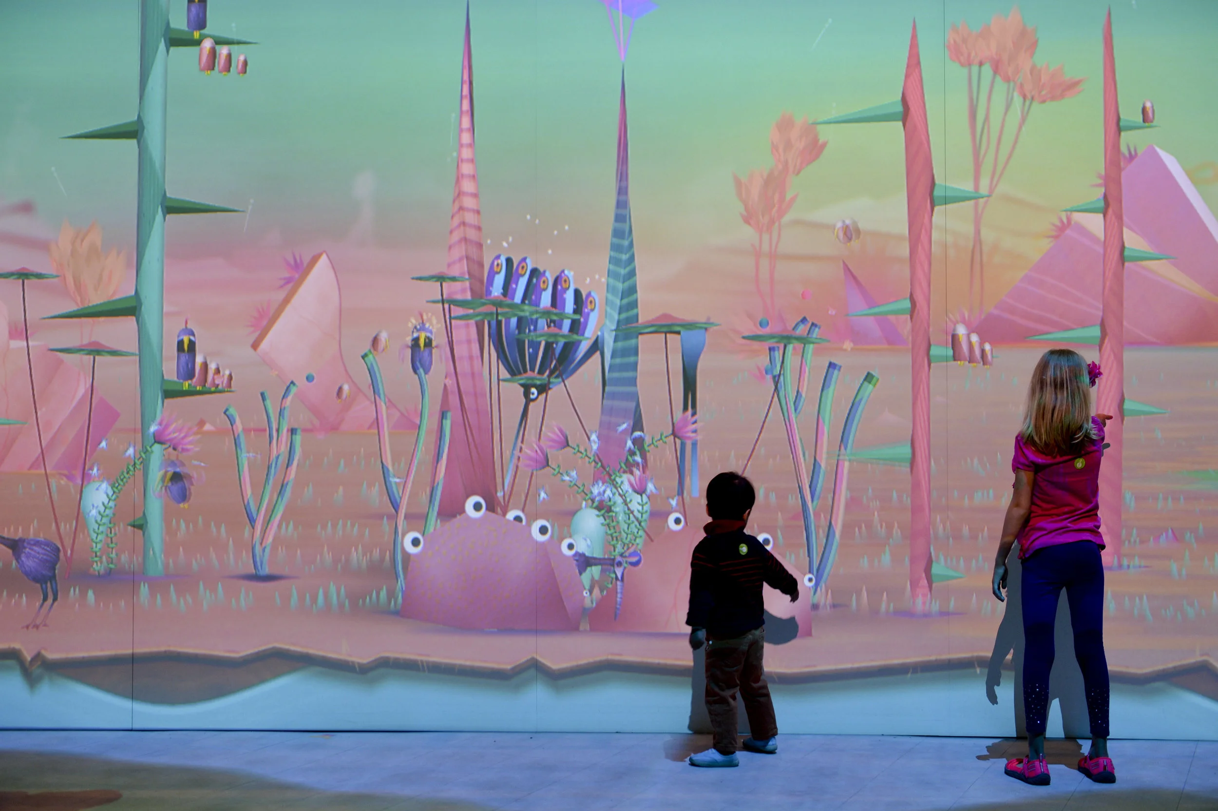
The installation is very engaging as the participant is able to see an almost immediate response to their actions. The tracking system that they have used is well thought of which shows in the seamless response that the participants get when interacting with the walls and the floor. In the real world, we are not able to see the implications of our choices immediately. (E.g. using plastic takeaway cups are convenient, but it contributes to the ever-increasing landfill that is harmful to the environment.) In contrast, this installation enables a child to understand the importance of thinking through their actions for the environment as they are able to see a response to their actions almost immediately.
While I feel that this installation helps a child to understand our world a little better, I do believe that having an outdoor excursion that exposes them to elements of nature in the learning process will also aid in the child’s development and understanding of sustainability better. Although this installation teaches a child to be conscious of their actions, I believe that the outdoor excursion will give them a real feel to how nature is like, that it’s not always clean and immediate like the exhibition that they experienced.
Lastly, I am very impressed with how seamless the whole process of tracking the input and showing the results is. Connected Worlds intrigued me on learning more about interactive devices, and to take note of every single aspect of a participant’s interaction to make the experience as smooth and engaging as possible.
References:
https://www.design-io.com/projects/connectedworlds
http://citeseerx.ist.psu.edu/viewdoc/download?doi=10.1.1.608.6539&rep=rep1&type=pdf
https://www.ukessays.com/essays/young-people/theories-surrounding-learning-through-play-young-people-essay.php
https://www.pentagonplay.co.uk/news-and-info/psychology-learning-through-play
https://nysci.org/wp-content/uploads/CW-FieldGuide12-12.pdf
We presented on Suprematism, Constructivism, and the De Stijl movement in the early 1900s.
PDF file for our slides: G3_Group 2_A New Language of Form
Thank you! :)
Welcome to Open Source Studio. This is your first post. Edit or delete it, then start blogging!