Zoom Performance: Sharing

Sketch

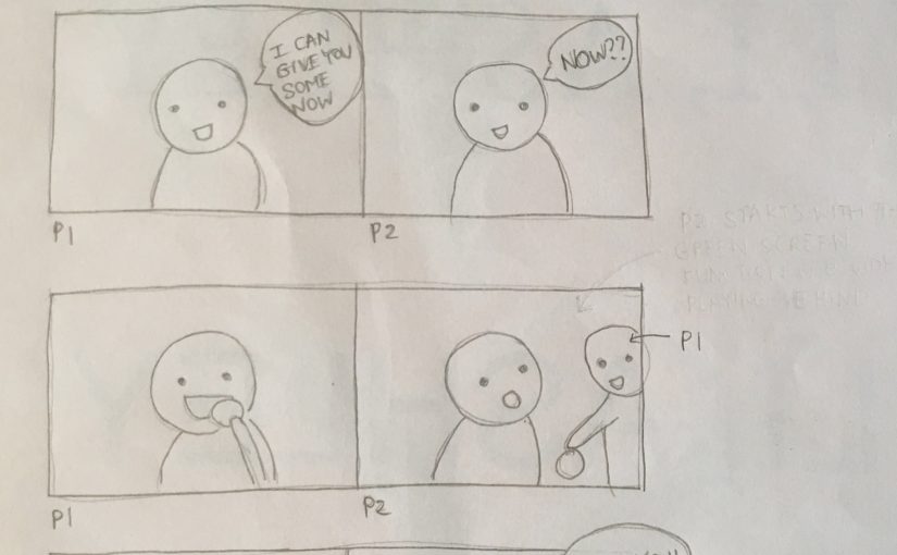
During the circuit breaker period, people were sending food to each other using food delivery apps like Grab to show appreciation/love/encouragement for each other. Since we can’t be physically there for each other and we were always video calling each other, I thought it would be fun to make use of the green screen function from Zoom to make it seem like we are physically together. 

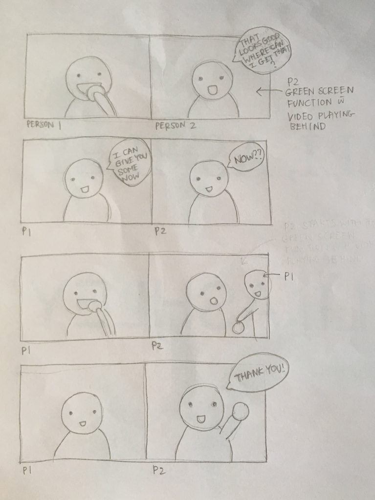
Person 2 will use the pre-recorded video as their green screen background, and Person 1 (the one eating) will appear in the middle of the video to share the food with Person 2. This looks as if Person 1 is physically present at Person 2’s location and as if Person 1 cloned and teleported herself. Person 2 has to act that Person 1 is actually there to respond to the pre-recorded video. 

Final Performance with Daryl & Gwendolyn

“Stop motion” performance with Yixue

Assignment 1B: Letter Croppings

Letter Croppings

Cropping letters to the point before they become illegible! I tried to show the unique characteristics of each letter, e.g. the tail/descender for the letter ‘p’, the arc for the letter ‘m’, and the vertex for letter ‘v’.

Typefaces used: Arial Black, Bodoni 72, Comic Sans MS, Courier New, Didot, Futura, Gill Sans, Helvetica, Myriad Pro, Times New Roman (randomly picked haha)

1st Version

1 (m), 2 (e), 3 (H), 4 (s), 5 (y), 6 (x), 7 (f),  8 (A)

1 (m), 3 (H), 7 (f): has too much white space at the bottom/side

Final Version

1 (m): Cropped m even further. Kept the serifs of the “m” visible to indicate that it is neither “w” nor “E”

3 (H): Scaled up “H” to reduce white space

7 (f): Scaled up “f” to reduce white space


References: 

Assignment 1A: Letter Drawings

Letter Drawings

Some observations I have made while drawing my name in both serif and sans serif styles:

Serif: Serifs, thick and thin stroke weight/width for different strokes

Sans Serif: No serifs, same stroke weight/width throughout

Both: Has the same cap height and baseline since it’s all capital letters, different kerning (space between letters?) between each letter and each word


Transitional typeface: extremely thick and thin stroke weight, the contrast of stroke weight is higher

References: