
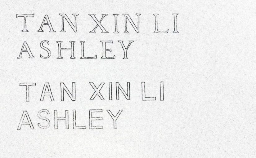
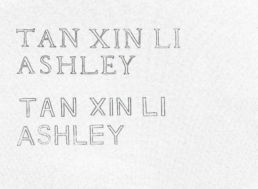
Letter Drawings
Some observations I have made while drawing my name in both serif and sans serif styles:
Serif: Serifs, thick and thin stroke weight/width for different strokes
Sans Serif: No serifs, same stroke weight/width throughout
Both: Has the same cap height and baseline since it’s all capital letters, different kerning (space between letters?) between each letter and each word
Transitional typeface: extremely thick and thin stroke weight, the contrast of stroke weight is higher
References:
