These are the final pieces for my Que Sera Sera project. Overall, this project was enjoyable for me to see what I could make out of symbols and textures and colour to communicate my initials, AG. What I found the hardest was visualising original ways to communicate the jobs I wanted to portray, which is why I went through so many thumbnails and ideas. I’ve never done typography before so it was a new challenge to tackle.
These are the final pieces for my Que Sera Sera project.
FISHERMAN
I used the symbols of the boats to help contextualise the fact this is in fact, a fishing environment at night, and the water ripples help separate the water from the air. I used basic symbols for the fish without going into too much detail – the pattern of the lines on the net would help fill in the detail for this piece. The hook also serves a dual function as the moon – just to add a little quirkiness to the night scene.
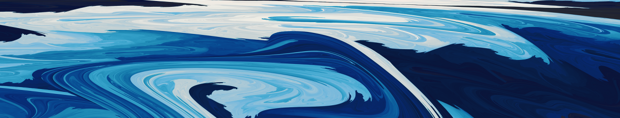
ASTRONAUT
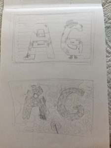
The G is the planet that rocket A is landing on – I followed the bright colours of some of my research photos to make the shapes stand out against the dark space background. Though not the same colour, they’re still under the category of warm colours and so I grouped them together that way. Texturing of the rocks showed the bumpy nature of asteroids and planetary shapes, while the rocket remained smooth and unmarked – manmade. I also made the texture of the background star-speckled, but blurry. I thought it would be nice to have motion in the background and give the impression of being ‘suspended’ in space in contrast with the moving planets and orbital nature of rocks, which I hear is often what space travel is like. I think the colours used and simple textures communicate a children’s book vibe, which is what I was going for.
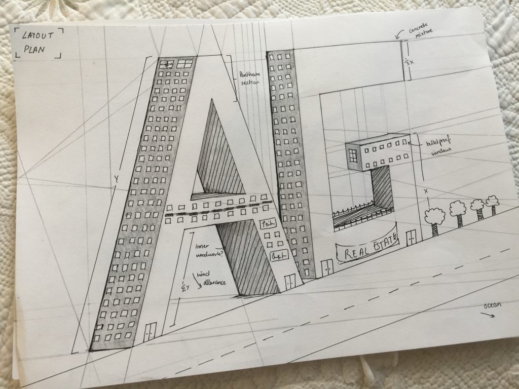
ARCHITECT
Blueprint texturing is often a faint grid in the background, so I started out with that first. Then making the perspective more intense than my initial pencil sketch, I included faint perspective lines to make it look more ‘sketchy’, like an architect had just spent his time working and drawing over the print. I also used lighter sections to make the A and the G stand out agains the blue, and tried to make it look chalky and written – hence the notes and the different scribbles that I imagine an architect would make (from what I’ve seen from my research). The perspective here took a long time to get right, because sometimes my sizing and my angle for the two different letters would look odd together. I think the blue and the white work well together to communicate a blueprint as well as to make it look professional.
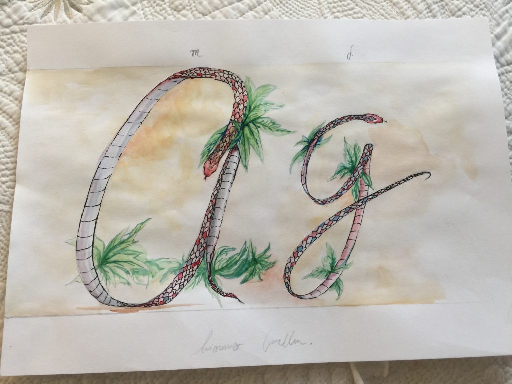
HERPETOLOGIST
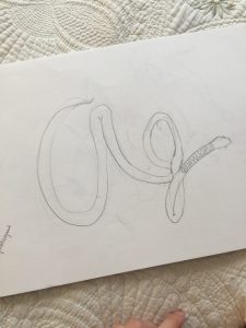
Out of all my pieces, I feel like this is the most artistic and vintage-style. I started the watercolour painting and then scanned it into the computer. Using watercolour as a medium helped set the paper-texture that I was going for; I painted first with browns and yellows and then enhanced this texture using photos of papers and overlaying them over the painting. The snakes stand out with the use of colours like red and green – warm and bright agains the pale yellow to contrast the two. I also included scribbles and writing to make it look like a diagram of an actual species of snake.
Overall, this project was enjoyable for me to see what I could make out of symbols and textures and colour to communicate my initials, AG. What I found the hardest was visualising original ways to communicate the jobs I wanted to portray, which is why I went through so many thumbnails and ideas. I’ve never done typography before so it was a new challenge to tackle.
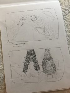
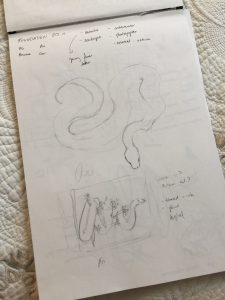
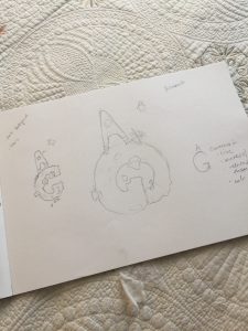
After all the initial research that went into my jobs, I started the visualisation of my final pieces. Like I said before, I went through many revisions of different jobs (e.g I thought about criminals but I ended up scratching that idea) but there are a lot of thumbnail sketches of possible compositions that I came up with.
Some of the different thumbnails I did are here below:
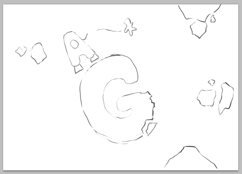
I focused a lot on the fisherman job, because it was the one I was most excited about, but I also did preliminary sketches of possible ways I wanted other jobs to look too. Especially for herpetology, I sketched out snakes in many different ways to make the A and the G look very prominent. I also worked on the composition for the astronaut; I wanted the G to be the planet and the A to be a rocket (since A is easier to manipulate into a rocket than G is). Consulting with Shirley reinforced my idea: she like the contrast of colour, shape, while all still under the umbrella of the same space-theme.
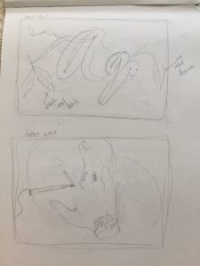
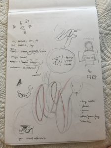
For two of the jobs, I started out doing traditional mediums of pencil and watercolour first (and some marker) to see what they would look like. I did this for the architect and for the herpetologist because I thought that both of these jobs were especially close to the use of traditional mediums.
Herpetology – because like my research showed, there’s a sepia/vintage like vibe to it. I imagine coffee stains and other debris as a herpetologist works on the diagrams of the animals he studies. So I tried to emulate that with my own watercolour painting.
I will later digitalise this so that it can make for a clean print.
Architect – you often imagine an architect drawing and sketching out buildings. Though I know that perspective is a very inaccurate tool in drawing and architects don’t use it, I decided to include perspective to give it more of an ‘artistic flair’. But I felt that the pencil drawing still remained a little plain and messy, so I eventually will change the medium to digital and use the colours of white and blue like blueprints.
As for the other two, I started out digitally and continued to just work on them digitally. A process screenshot for the astronaut can be seen below:
The prompt for this project was to portray our names (whether our full name, real name, nick name, initials, what have you) in relation to a future job ambition.
I wanted to use my initials ‘A.G.’ so I explored that, with the jobs that I had in mind. Initially, I wanted to be a zoologist, a criminal, a fisherman, and an astronomer, but eventually as I started sketching out and planning the way my deliverables would look, I ended up with these 4 jobs as the finals:
Fisherman
Astronaut
Herpetologist
Architect
For all of these jobs, I will use only AG and try and explore different ways that I can incorporate it into the job-type to see if it can be expanded to be used as an actual font.
RESEARCH
First of all, I started out researching the type of visual aids that are related to the jobs that I picked.
Fishermen are often associated with nets and fish (obviously!) and so I thought it would be best to look at photos of nets and see what kind of ideas I could come up with.
Bozo fisherman using a net on the River Niger, Mopti, Mali
Often with these photos of fishermen, there isn’t much in the background except the sky and the water. I thought this contrast in detail (the cluttered texturing of the net vs the clear and vast sky) could be an important part of my composition. Symbols of the boats would also help.
Astronauts are obviously associated with space, planets, asteroids, and rockets. Since planets and asteroids come in different shapes, I thought maybe I could use these to create the letters “A, G”. I came across cute clipart/cartoon pictures of astronauts on the internet and liked the way they looked.
For this one, I especially like the colours of yellow and red for the planet and the rocket. They work well together to stand out against the dark background.
Herpetologists are experts in the study of reptiles and snakes. I actually initially wanted to do something with snakes because I am a big fan of some artists on instagram that do insane art with snakes. (e.g @christinamrozikart).
I think snakes are a fun, organic way to make letters, and I was into the idea of making a cursive font in the midst of all the other blockish fonts I was visualising. Herpetologist’s diagrams are also often pictured on sepia-type backgrounds – a kind of vintage scientist vibe that I wanted to capture.
Architects work with blueprints. I like the look of a strictly white and blue colourscheme, with all the little lines and details in places that outline a building. I looked at a few blueprints (like the ones below) to give me some reference for my own piece.