


PROJECT 1 EMO


As I started going into the production phase of this project, that was when I began to more seriously consider the colours I was choosing.
For each of the 4 rows of 3, I wanted to have its own individuality. That is, according to colour. I will explain each row below and how the colours correspond to the scenes and the outcomes.
TRANSFORMATION
Transformation visually tells the story of me (as an alternate persona) – as a ninja. The individual frames look like this:

This frame is me as a ninja, killing and (basically doing what a ninja does in this period) but I’m killing with blood lust – hence the two aggressively contrasting colours of red and black. The silhouette is black to make it stand out but the hot red hues are there to suggest violence in the frame. As a result, the red is then associated with the figure. 
This scene is where I (the ninja) is kicked out of the community for my violence, outcasted and thrown away (I am pictured begging). The colours chosen are meant to suggest the feeling of sobriety and of being somber – the downfall of a character. Again, black is used to give the impression of a definite action – a solid, unmovable shape (there are no hues of black or different shades/tones). The blue is gradated to imitate the dusk/twilight of a day, which signals the ‘end’ to things. It gradually fades into deeper and more intense hues of blue from the top as the weight of the sky appears to ‘descend’ and bog down the silhouette, drawing attention to the figures and their actions. 
This is where I come back, full of revenge, and kill the people who ostracised and cast me out. The story is mainly one of simply violence and anger, and the pale use of negative space with cooler colours contrast with red to show the paradox of killing in cold blood. Calculative, relentless, yet not guilty nor shameful. I wanted to again, highlight violence and harm so I deliberately made the red the dominant hue in this composition to bring attention to the idea of blood and gore.
RMS TITANIC
This set of frames is to picture me travelling back in time (to 1912) to the RMS Titanic and its sinking. Yet, again as an alternate figure/character, and this time I am the captain of the Titanic itself. It follows my actions as I essentially ‘save’ the ship from its infamous sinking (an easily cliche, heroic daydream). These are the individual frames:

The first frame is me as the RMS Titanic’s captain – an extremely heavy responsibility to bear (considering I’m from the present and I know that the ship will eventually sink). I like to imagine that it’s my responsibility to keep the ship from sinking. And so, I chose sombre colours as well, but keeping it more pastel and paler – not so saturated, to have the notion of dread and fear; the ‘colour draining from one’s face’. It complements the expression on my face; everything is simply a cloud of dreariness and deep thought about the disaster that is to come. 
The RMS Titanic was painted in black and white to have the effect/feeling of being in the past. When I was searching up photos of what the Titanic looked like, she was only pictured in black and white images (understandably, as it was 1912) and I wanted to retain the same sentiment. So, I painted her in black and white, faded and somewhat cloudy to give off the impression of a memory (which is what she is, to us now). It’s nice to complement this effect with me travelling back in the past as the captain of the ship. 
Eventually, however, I end up steering the ship away from the iceberg that caused its demise – instead, sailing away to clearer, lighter waters (the blue is gradated to symbolise travelling away from darkness into something akin to hope, I suppose). The white complements the blue pleasantly and balances out saturation with negative space – and also altogether highlights the black outline of the ship sailing in the ocean.
ARIANNE THE GREAT
This story is one of me travelling back in time to Macedonia, BC, in the time of Alexander the Great. I’ve always liked the idea of being in power, of having authority and dominion over a nation, and I just wanted to paint out what would happen if I so decided to overthrow Alexander the Great. The idea for this row would be to use each frame as another section of gradation for the intense colour of red. As you go on, the red becomes deeper and more intense – climaxing at the point of my own victory. The individual frames are below:

I am first pictured in pale colours (to contrast and oppose the violent mutineer I become later). Pale browns, yellows, and pinkish reds are supposed to express this peaceful servant girl in the time, ‘harmless’ and not a threat to the oh-so-great leader. 
Alexander is pictured with his horse Bucephalus, mighty and strong. The reds and browns are intensified – contrast between colours is emphasised to show the scene of action and intent. There is a growing plume of red and orange and yellow to signify his power growing, and his flowing red cape helps to accompany this idea. His hair is painted golden to suggest wealth and power, the ‘golden boy’ of his age. 
However, the reds all intensify and come to the breaching point in this scene, becoming darker and more saturated compared to the pale blue cape that lies across the fallen Alexander. I am holding the bloody sword stabbed into him, and behind me the plume that was suggested with Alexander parts its way for my silhouette shape. The black and the red and the yellow has purple in the centre to also tell the intention of royalty and victory.
OVERCOME THE WORLD
This scene is more abstract than factual (such as the ones above). It is an imagery of me overcoming the cloudy, heavy burdens that result from growing up in the world. From relationships to family, to money and other stress, I am first fascinated by the complicated world to becoming weighed down and pained by the burden. However, by the end, I am at peace with myself, coexisting with my responsibilities and my pains and overcoming my world. The common thread of colour in these frames is how 1) the clouds remain dark and intense – unchanging and 2) how I gradually end up having colour in my skin (from no hope to hope and life). The individual frames are below:

This first frame is me, pale (yet with some colour) as I gaze in wonder at the complicated nature of the world – the cosmos is ever expanding and the universe is in front of me. However, I am pale and stand out in white because I am still pure and untouched, yet also without personality and almost ‘fragile’ in a sense. 
I am becoming tainted with the blue pains of my burden, dripping down my body as my body is shrouded in shadow and black, bearing the giant globe that is growing up. I am still pale, but this time it is to show how tainted and stained I can be, and also to show that I remain fragile and breakable, like porcelain without blood or life in my skin. 
The final frame shows how I have colour in my face, in my hands, and my lips – to show the life coming back into me as I realise that I can coexist with the dark, still stormy cloud of burdens. But this time, my relationship with my pain is peaceful – the negative space shows that I am not so cluttered and confused – my rest is clear as day and without distress or weakness.
This project allowed me to explore my inner comic book artist, and I really enjoyed it. The prompt was to create scenarios in a 1 + 1 = 2 sort of fashion.
As in, we would put ourselves (essentially, our egos) in a situation (which would be the 1 + 1) and we would have to come up with an outcome (being the 2). I was really excited to start thinking of ideas for this project so I jotted down ideas and notes for what situations and outcomes I wanted to put myself into.
I really liked the idea of going into the past and changing those historical outcomes, so I focused mostly on that. Rather than portraying myself as alter egos (as in, nicknames, animals, etc) I portrayed myself as myself, but in different times. Travelling back in time and altering time is an interesting concept and I wanted to stick with it.

These are my final compositions for this project. Each goes with a quote from Princess Mononoke (1997).
ONE
In this composition, I wanted to contrast the ideas of being ‘tame’ and being ‘wild’. Wolves in general are uncontrollable, wild beasts, but with this quote, it was about the wolf’s head and the power the wolf has, even in death. So the rest of the body of the wolf is within the confines of the circle (aesthetically ‘taming’ him), while his head sticks out, suggesting the notion of pushing the boundaries and refusing to stay within the constraints. I also included a deer because they are symbolic of prey animals – it adds the feeling of a threat to the deer on the wolf’s behalf. The lines pierce through the deer to emphasise this threat; I think the use of two subjects is interesting.
Movement was a prominent principle of design in this piece as I wanted to show the left to right movement of the wolf and carry the eye across the piece, to view the wolf and then the deer. And so, the balance of the piece also weighs more on the right side. There is also emphasis on the wolf and the deer as the most of the design comprises of thin linework, as opposed to block-y pattens that are on both the subjects.
TWO
I think crows are symbolic of a lot of bitterness and hatred. Combining them with storm-clouds and lightning encompasses the intensity that exists in an emotion like hatred. The quote says to see with eyes unclouded by hate. In the context of the film, this was said as though “seeing without hatred” was a goal of the protagonist. However, I thought it would be interesting to portray someone still seeing with eyes literally clouded (hence, the storm-clouds) by darkness and hate still. The constellation-type things are there to show the complicated nature of this quote; easier said than done.
Unity is quite prominent in this piece as most of the work is dark toned, so the piece harmonises in value. Repetition is created with the mass shapes of the crows that make this artwork seem active, to express the fact that hate is an active emotion that moves and breathes.
THREE
I think fate is as vast as mountains and as unexplored as the universe. And I think, like koi fish swimming downstream, we all tend to have no other choice but to go with the flow (which is downstream) and accept our fate. The notion of rising and meeting fate is a scary and dark space. Rising to meet fate is something that takes time, and I wanted to show that by angling the largest fish more to the side (to imply that it might perhaps stray from the movement of downstream swimming like the other two fish and go in another direction, like meeting its fate).
The principle of design that is most strongly used here is the feeling of emphasis, which is executed by using central composition as well as the values – contrasting between black and white. The koi fish all stand out, but are also balanced by downsizing the other two fish that make it more interesting, but not too repetitive and dull. There is also movement down to the bottom right corner of the artwork. The lines of movement contrast as the fish move down while the mountain moves up. The stark contrast and emphasis is complimented by the pattern of the stars, which delivers another element of balance and stability.
This is the design I used for my tote bag.
FOUR
I personally really love this composition. The quote is a side character talking to the protagonist, and I think it tells a lot about how each of us are in our own little worlds, obsessed with our own predicaments. We centralise ourselves, like the subject above – blind to anyone but their own thoughts. However, the world looms (also suggested by the fact that it extends out of the frame of the composition), it still exists even if we shut it out. The constellations in the background also imply a larger universe beyond, but the central figure (outlined in white) represents us, and how we make ourselves literally, the centre of the universe.
By having a centralised composition but with the placement of the earth at the side, there is a diagonal pull from the bottom left corner to the upper right, making one see the human figure first and then realising the world is there – which, in effect, is very visually explanatory of the quote itself. The rhythm of the stars in the background add visual interest and the emphasis (by using the white outline) is on the figure and on the earth as well.
I have thoroughly enjoyed Project 2 so far. From being able to have the freedom to take quotes from movies we want to designing our own interpretations of those quotes, this project has been really fun and interesting – I’ve learnt new things in the process as well.
The process of silkscreen printing is something that I haven’t done before and I thought it was really fascinating,
Last week we coated our silkscreens with emulsion and left them to dry, taking care not to let white light hit the emulsion (or it would become exposed).
Then we exposed the screen’s emulsion layer by putting our transparency on top of it and putting it in the machine below:

Afterwards, we cleaned off the area of the emulsion that was exposed using a water gun. Slowly but surely, our designs emerged as we continued barrelling water at the screens.


In the end, my screen looked like this, where all of the emulsion washed off in the areas that were exposed to the light. Then it was left to dry (it no longer needed to be protected from white light).

It was such an interesting experience. This week (the lesson after the one above), I finally tried silkscreen printing.
The screen went from brilliantly blue to stained with black, but that was all part of the process of printing out the ink onto a surface, which you can see below:


In addition to printing on a tote bag, I also brought my own shirt along to try on out other fabric and I think it turned out well!! This was an overall very educational and enjoyable assignment and it has piqued my interest in silkscreen printing.
My all-time favourite movie is Hayao Miyazaki’s Princess Mononoke. The animation is beautiful, the message is powerful, and I just can’t breathe when I watch the film. I wanted to use quotes from this movie because I think they’re particularly significant to the nature of man. And also because I love the way they sound.

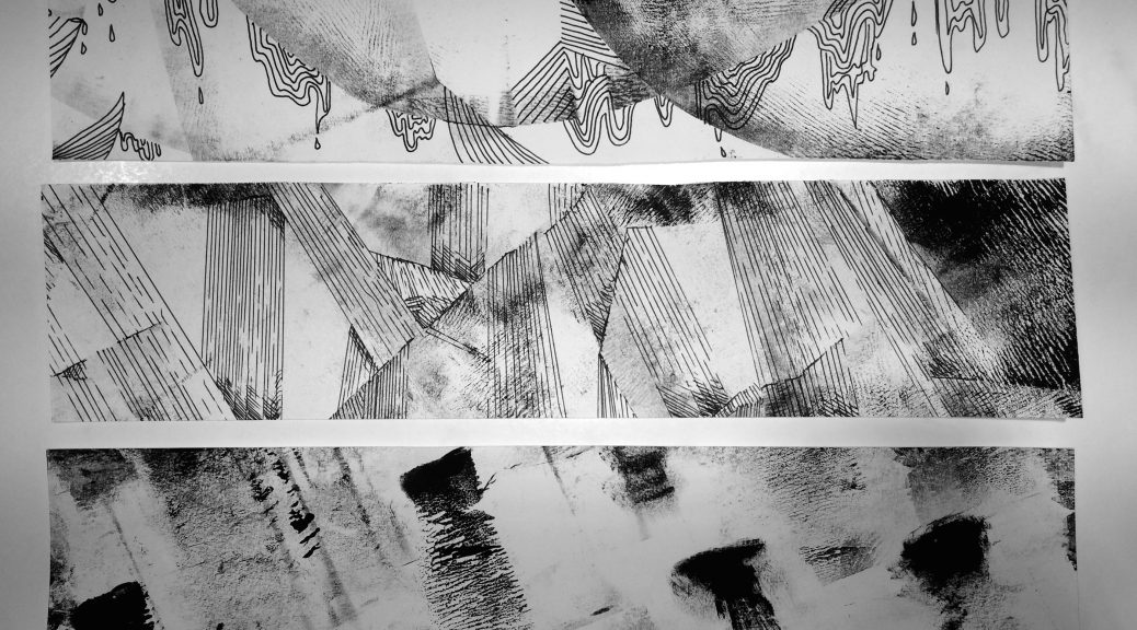
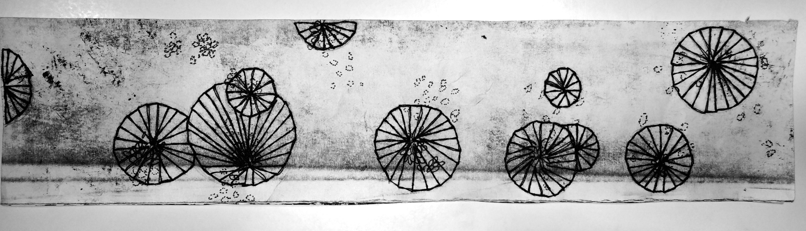
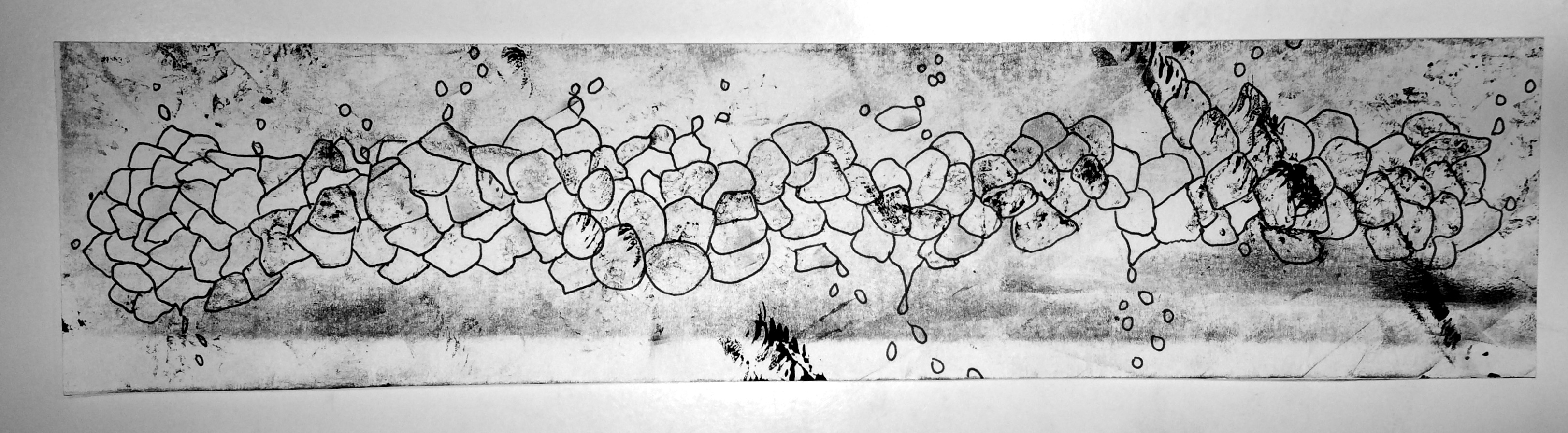
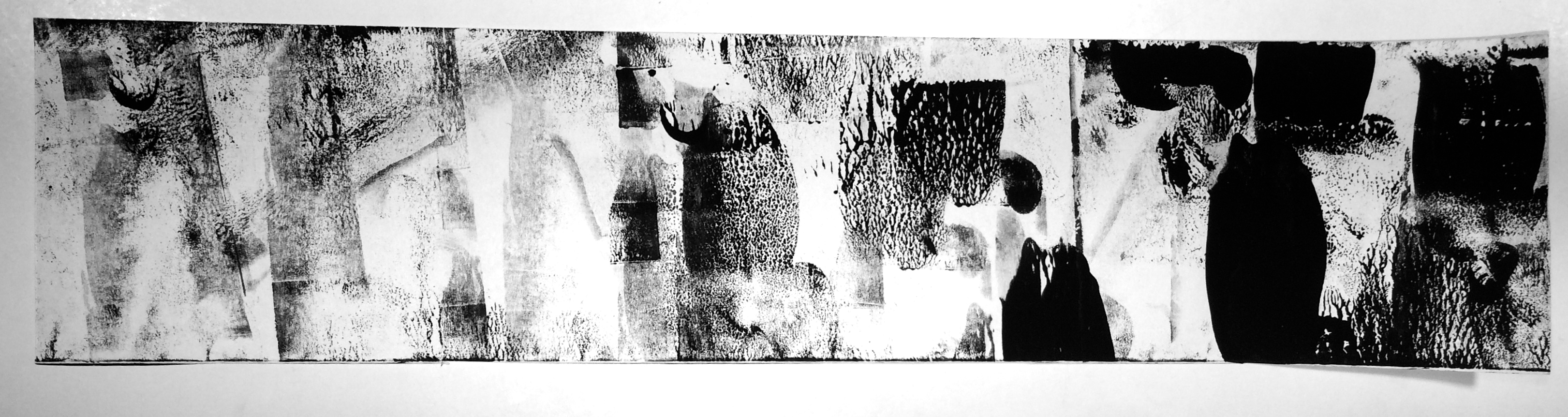
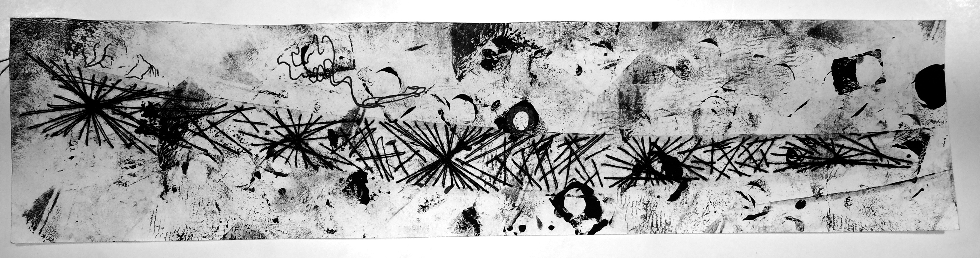
The final results of this project consist of my visual interpretations of 18 specific emotions. Experimenting with different methods of mark-making reveal many different outcomes that imply certain emotions. The project’s specifications about using only black and white (no colour) places a huge amount of emphasis on the mark-making itself, without the distractions of colour.
As a result, I have experimented with mono-printing, drawing, paper cutting, and stitching into the strips of paper for each emotion. Most have elements of mono-printing, but I believed that I could combine mono-printing with different elements and add layers onto my strips, as one will see below. These are the final works for each emotion. I chose the primary emotions of love, anger, and sadness.
➤ Primary Emotion of Love
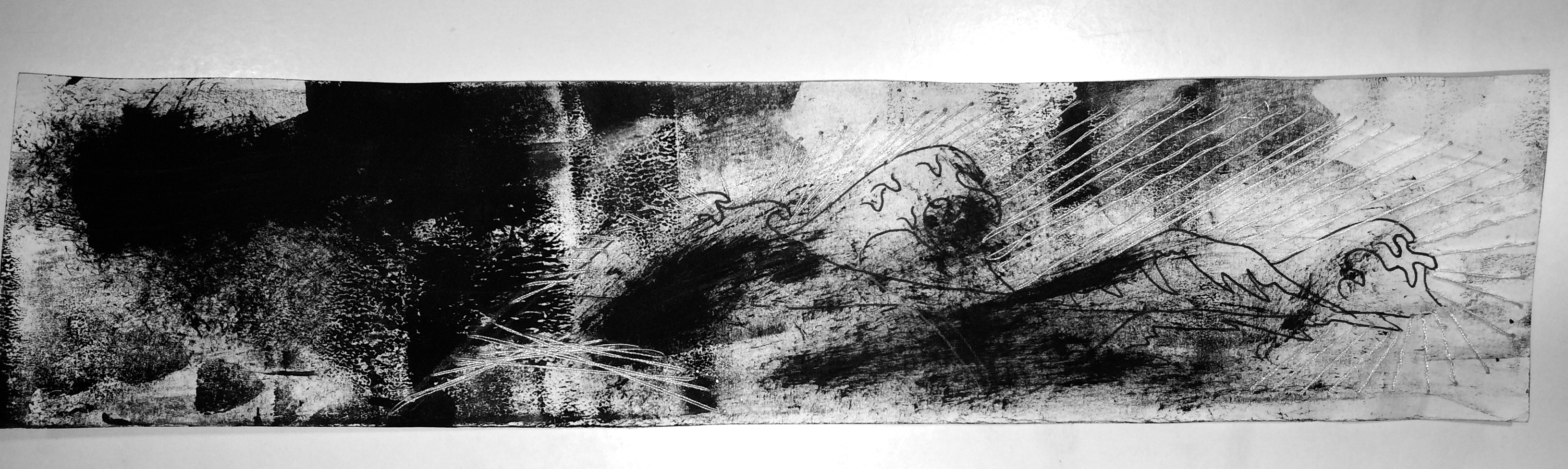
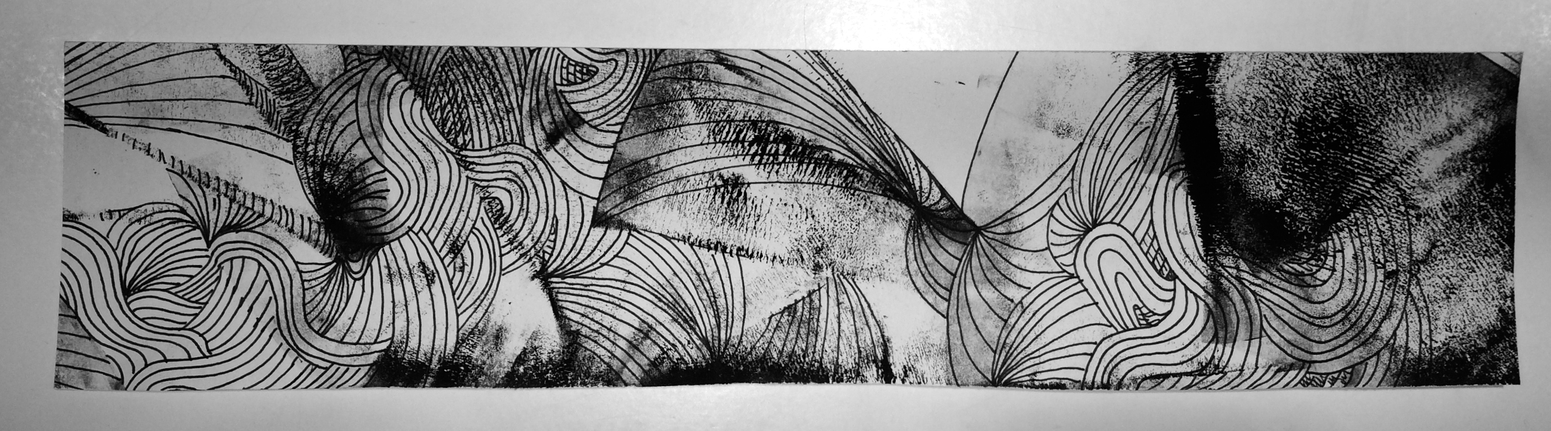
↳ LOVE: I believe that this emotion is full of ups and downs; very turbulent but also has a flow. That’s what I wanted to show with the combination of mono-printmaking, drawing, as well as stitching with white thread. The combination of mediums also translates to the combination of highs and lows in love; there are dark points and there are also light points. I wanted to show that there is a journey with this emotion and so the strip has a flow from left to right, and from dark to light – love can take you out of dark times.
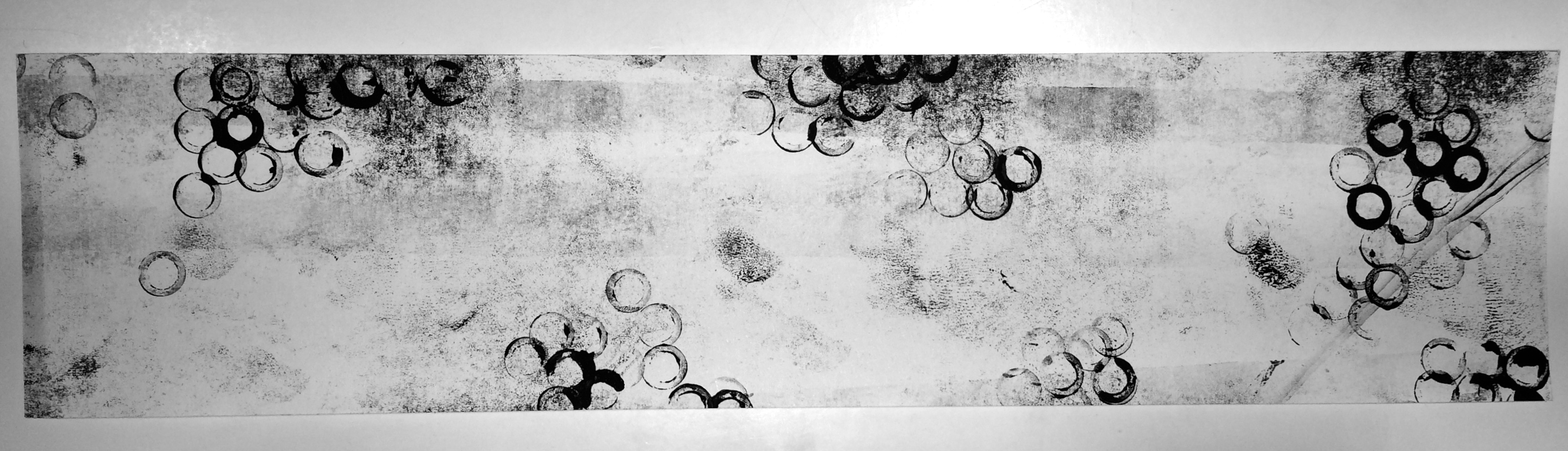
↳ AFFECTION: I think that this emotion is a much softer version of love, with a ‘bubble-like’ feeling that carries and makes you feel like you are floating and light-hearted. This piece is solely mono-printmaking. The background is lighter and more empty to give a more positive feeling. The darker patches convey more intense areas of the emotion of affection, like the feeling of wanting to bite a baby’s cheek or squish their face – that kind of affection.
↳ FONDNESS: This strip is a combination again of mostly stitching and drawing. The background is one streak of a roller without much paint to communicate the straight-forwardness of fondness. It isn’t as turbulent as love and is much more simple; it has one direction and that is to the person/thing it is directed at. I think it is a little more bittersweet, however, than affection because fondness can lead to unwarranted bias and can often cage you in your opinion of a person based on how fond you are. That’s why even though the circular shapes of the thread are happier and softer, the lines in the middle lead to harsher points that communicate this “trapping” in your fondness for someone.

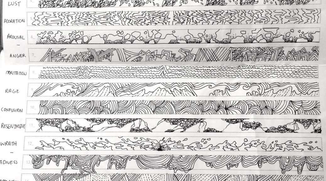
↳ LUST: Like love, lust is a turbulent emotion but I think it is much more intense and harsher than love; it is almost like a hazy feeling that clouds one’s vision. I used paper cutting over the whiter areas of the strip to communicate the feeling of being blocked by this emotion – you cannot see beyond the fierce wall of intense lust. The straighter lines in the background are also similar to fondness where lust is also very straightforward and raw as a human emotion, in my opinion. It leads to one thing; the flow of the strip goes to that destination by the flow of the black paper cut and the darker, intense marks.
↳ ADORATION: I think adoration is hard to hide. It is an emotion that is light-hearted and fun, but also has twinges of intensity (shown by the darker, random spots), and it can cut down the metaphoric wall one will put up to maintain their demeanour and shows through easily. I drew tiny “bubbles” and “pieces” coming off from the weakening, flimsy “wall” that runs along the middle to show this feeling of lowering your defences to the emotion that doesn’t hide itself from others.
↳ AROUSAL: I think arousal is similar to lust where it is very intense, but with this particular emotion I believe time plays an element. On this strip, from left to right, I wanted to portray a rhythmic increase in intensity and darker marks, to show the progress of arousal, which in my opinion, is the pre-cursor to lust. It’s a step-by-step increase in the strength of the feeling.
➤ Primary Emotion of Anger
↳ ANGER: I didn’t choose to make anger look very intense. I don’t think that the emotion itself brings a darkness to the person; I believe that like arousal to lust, anger is a pre-cursor to emotions like rage and wrath. It is an emotion that weakens and “breaks” the person, per-se, which is shown through the crooked ‘crack-like’ and fragile. Along some of the edges, I showed the imminent darkness creeping out; marks that threaten to overcome the person and take over with more intense, powerful emotion.
↳ IRRITATION: Irritation to me is an incessant feeling that is the same as white-noise but if white-noise was darker and had a shrilling sound. I communicated this by curved, topsy-turvy turns of tiny scribbles that can be described as simply “incessant.” It takes your mind and turns you around and constantly irritates and annoys you, so I wanted to show that by using drawing on a mono-print background.
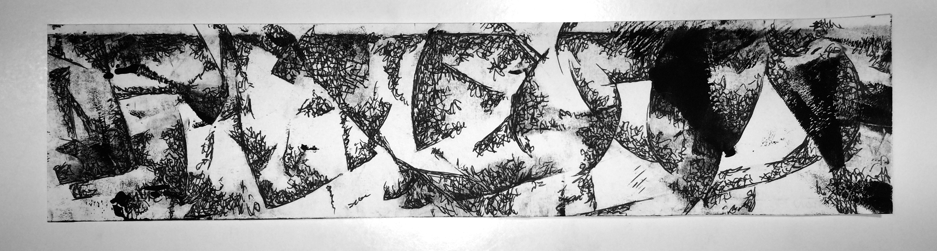
↳ RAGE: Rage is what comes after anger. It is a violent, tempestuous emotion that seems to turn one’s mind into a motion-blur movement, where the only thing one can focus on is the dark rage that spits and spews around like a relentless tornado/whirlwind. I think this emotion has a lot of movement, and so I translated that into movement on the strip for rage, using both mono-printmaking as well as applying paint using a roller. Rage is a very wild emotion.
↳ CONFUSION: Confusion is not necessarily a bad emotion. Though I categorised it under the primary emotion of anger, I think confusion can also be taken as the term: “ignorance is bliss.” My strip illustrating confusion is quite giddy in nature. There are darker points where the spirals appear to fade into the unknown (which is also an essential part of confusion as an emotion) but there are also areas where they blissfully go without direction or reason – this is what I believe is also a very important part of confusion. The main idea behind this strip is that confusion has no direction and can be either blissful or dark and unclear. I aimed to show both of those sides to this feeling.
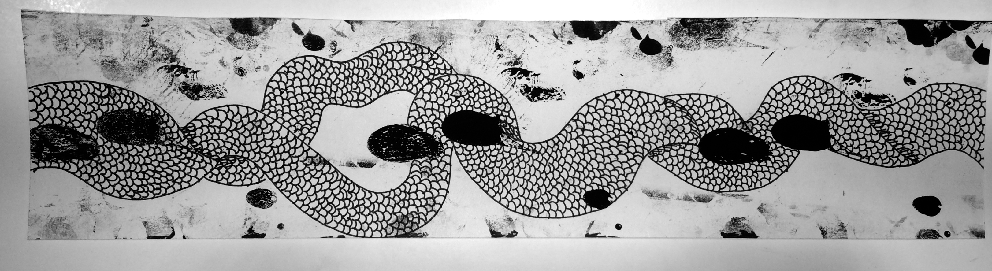
↳ RESENTMENT: To me, resentment is also a journey. I wanted to also include time into this strip, but go ‘backwards’ instead. Most people read from left to right, but I wanted to make the strip appear as though it were going from right to left, because resentment as an emotion brings you back into past grudges and things, where one cannot move on and is continuously travelling back to the resentment in their mind. I also wanted to include drawings on the mono-print because I felt it would be effective if I drew scales and twisting shapes around what appears to be footprints (a symbol for journeying) to give the impression as though the journey is trapped within the twisting resentment, and that even though there’s a gap (2/3rds from the right), as though it were struggling to break free, it goes back together and continues to move backwards.

↳ WRATH: I think wrath is a long-lasting emotion. Like rage, it is dark, powerful and very intense, but there isn’t as much movement across the strip as there is within the elements on the page. I wanted the misty, dusty dark patches to have some energy within themselves because I think wrath festers as an emotion and stays, vibrating and moving where it is because it lasts. The various shapes and hazy patches around the dark areas circulate around the two circular dark areas to communicate that everything will rotate and revolve around the fermenting grudges and intense anger.
➤ Primary Emotion of Sadness

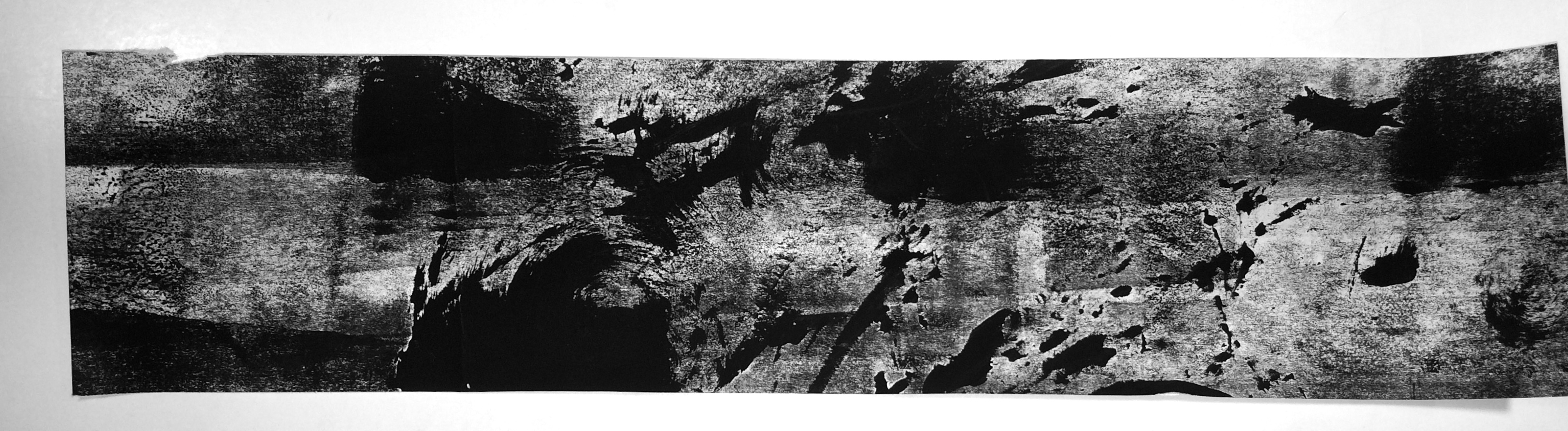
↳ SADNESS: Sadness is a downwards moving emotion, always dripping and sluicing down because it brings one to their knees. For me, it ‘drapes’ across my mind with darker (not intense, but hazy) scratches that weaken my mind and allow the sadness to leak down and bring me down lower. I wanted to show this movement with the drawings on top of the mono-printmaking, to extend further this feeling of downwards movement. There is also a lot of negative space around the draping scratched areas to express the notion of emptiness; the only thing you focus on are the drips.
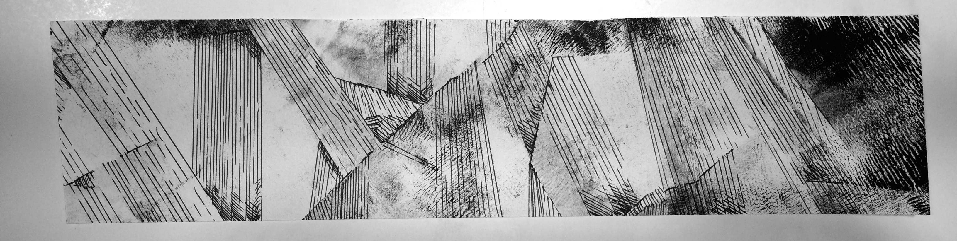
↳ DISAPPOINTMENT: Many of the secondary emotions to sadness have a downwards movement, and disappointment is no different. But I think rather than dripping, disappointment is a quick, straight fall down into the feeling of regret and sorrow. I wanted the strip to have the impression that the lines were moving from somewhere ‘high’, where one was not full of dismay but where one was happy, and that it was descending down into a darker, unknown area where one was let down somehow. It is a very straightforward emotion though, in my opinion, which is why I used straight lines. Some of the lines also become faint, because I wanted to symbolise the feeling of weakening trust in someone or something.
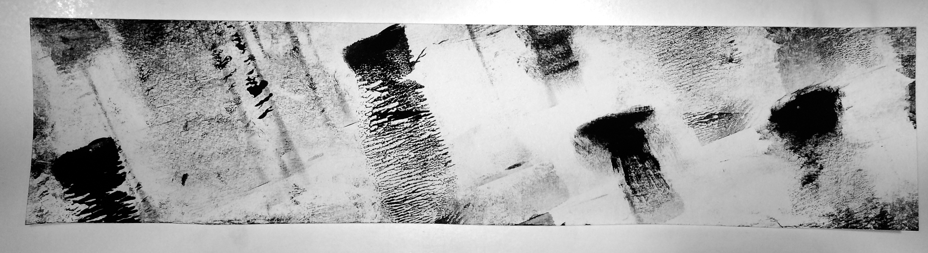
↳ GRIEF: Grief is an emotion that is not consistent. It peppers you with streaks of dark, intense sorrow that eventually fade but will come back from time to time. I wanted to show that by the mono-printmaking patches on the strip, where you can see that the darker points gradually become lighter and fade, but as you move across the paper more and more dark patches come back over time. The empty space behind them was also used to have a ‘ghostly’ feeling of the grief coming back to haunt, as well as the notion of emptiness again. The patches are also all angled downwards to communicate the descending feeling again that is notorious in the emotions under sadness.
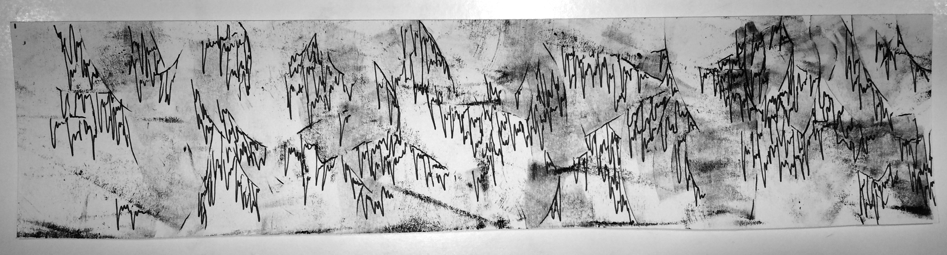
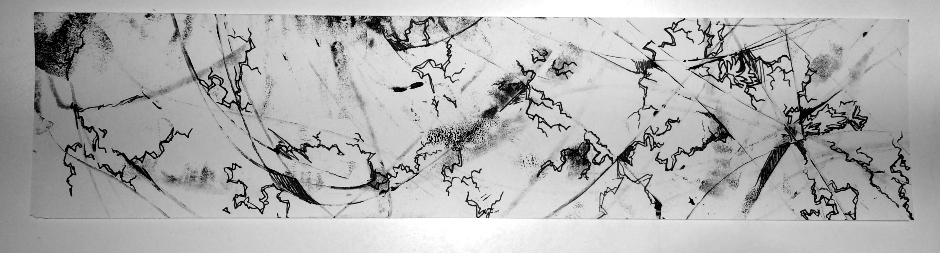
↳ GLOOM: Gloom is like cobwebs, threatening to cloud over your vision and mind with a sticky, stringy feeling that is always dripping down. It is also hazy; hence the faded, random mono-print background, but I think gloom is a ragged curtain that obstructs and contributes to the haziness of the mind. So, I also included pen drawing over the patches to display this idea. I also think gloom is an emotion that connotes age and wear, which is why I drew the tears hanging down as though it were old.
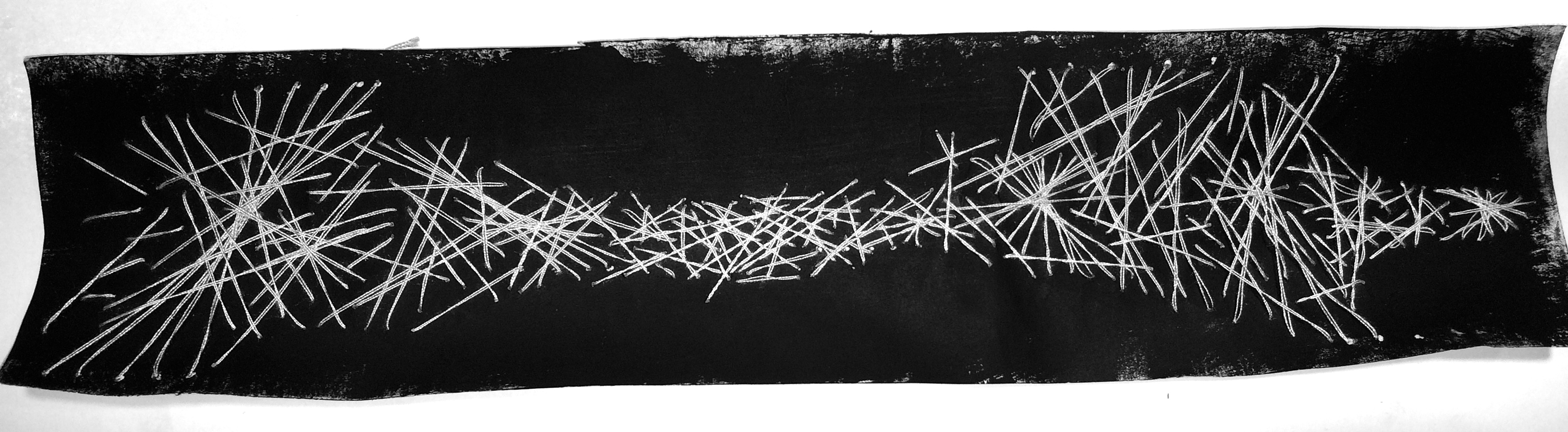
↳ HEARTACHE: I think heartache is a very relentless feeling. It is cruel and unkind to the person experiencing it. I specifically used white thread on a dark background and stitched the thread into the darkness to 1) communicate that heartache brings gloom and darkness and 2) that it is always being wrapped and twisted by the heart-wrenching feeling that – in my own experience – feels like strings tightening around your soul, tangled; there appears to be no way to disentangle yourself from the ache. One string over the other (I also thought thread was fitting because of the term: heartstrings) wrapped over each other, tightening and then becoming broader and looser, but then tightening into a painful cage once again. This is the rawness I wanted to demonstrate by threading into the paper.
↳ SHAME: Shame is a dark, but fluttery emotion. To me, it is the feeling of always wanting to get away from the humiliation that brought about the shame, like a frantic pitter patter of footsteps as you run away from the memory, but it is very messy and un-coordinated. I also think that because it is tangled and messy, I used the combination of thread and mono-printmaking again. The square and circular marks are meant to imply the feeling of discord and confusion of what to do to get away from the shame (which is the feeling of shame itself: to escape, to hide) and the thread shows how messy the emotion is.
For my project, I have chosen these 18 emotions to do mark-making on.