After filming, editing, and lots and lots of eating, here is my final film, entitled ‘disregard’.
I used iMovie to execute the editing and focused on keeping it simple, to let the meaning of my film filter through clearly (leaving a certain type of ‘clear’ ambiguity, I suppose).
My 50 word narrative is below, just like it was before:
‘disregard’ follows the behaviour of humans while they eat and relate it to the concept of desiring experiences. What do people think of when they eat? Do they get irritated when they’re bothered? Perhaps they insist on solely living in the moment, disregarding and blocking out any intrusions. Yet, they do not realise what happens to the food they enjoyed in the moment – forgetting what time brings to the indulgence. Food washes away, and so does experience.
Ironically, every time I wanted to stage a film time with the people in the film, they got irritated, saying things like “why do I have to do this now while I eat” as well as “now I feel self conscious.” I think that the process of making people star in my film while they eat and seeing their reactions for myself gives the entire process a much deeper understanding between me and my own work.
4D was a very rewarding course in terms of teaching me about personal storytelling. I was given the opportunity to explore different ideas and the process of developing a story myself, from thinking to executing and to documenting the journey.
As I started going into the production phase of this project, that was when I began to more seriously consider the colours I was choosing.
For each of the 4 rows of 3, I wanted to have its own individuality. That is, according to colour. I will explain each row below and how the colours correspond to the scenes and the outcomes.
transformation: all three
TRANSFORMATION
Transformation visually tells the story of me (as an alternate persona) – as a ninja. The individual frames look like this:
This frame is me as a ninja, killing and (basically doing what a ninja does in this period) but I’m killing with blood lust – hence the two aggressively contrasting colours of red and black. The silhouette is black to make it stand out but the hot red hues are there to suggest violence in the frame. As a result, the red is then associated with the figure.
This scene is where I (the ninja) is kicked out of the community for my violence, outcasted and thrown away (I am pictured begging). The colours chosen are meant to suggest the feeling of sobriety and of being somber – the downfall of a character. Again, black is used to give the impression of a definite action – a solid, unmovable shape (there are no hues of black or different shades/tones). The blue is gradated to imitate the dusk/twilight of a day, which signals the ‘end’ to things. It gradually fades into deeper and more intense hues of blue from the top as the weight of the sky appears to ‘descend’ and bog down the silhouette, drawing attention to the figures and their actions.
This is where I come back, full of revenge, and kill the people who ostracised and cast me out. The story is mainly one of simply violence and anger, and the pale use of negative space with cooler colours contrast with red to show the paradox of killing in cold blood. Calculative, relentless, yet not guilty nor shameful. I wanted to again, highlight violence and harm so I deliberately made the red the dominant hue in this composition to bring attention to the idea of blood and gore.
RMS TITANIC
This set of frames is to picture me travelling back in time (to 1912) to the RMS Titanic and its sinking. Yet, again as an alternate figure/character, and this time I am the captain of the Titanic itself. It follows my actions as I essentially ‘save’ the ship from its infamous sinking (an easily cliche, heroic daydream). These are the individual frames:
The first frame is me as the RMS Titanic’s captain – an extremely heavy responsibility to bear (considering I’m from the present and I know that the ship will eventually sink). I like to imagine that it’s my responsibility to keep the ship from sinking. And so, I chose sombre colours as well, but keeping it more pastel and paler – not so saturated, to have the notion of dread and fear; the ‘colour draining from one’s face’. It complements the expression on my face; everything is simply a cloud of dreariness and deep thought about the disaster that is to come.
The RMS Titanic was painted in black and white to have the effect/feeling of being in the past. When I was searching up photos of what the Titanic looked like, she was only pictured in black and white images (understandably, as it was 1912) and I wanted to retain the same sentiment. So, I painted her in black and white, faded and somewhat cloudy to give off the impression of a memory (which is what she is, to us now). It’s nice to complement this effect with me travelling back in the past as the captain of the ship.
Eventually, however, I end up steering the ship away from the iceberg that caused its demise – instead, sailing away to clearer, lighter waters (the blue is gradated to symbolise travelling away from darkness into something akin to hope, I suppose). The white complements the blue pleasantly and balances out saturation with negative space – and also altogether highlights the black outline of the ship sailing in the ocean.
ARIANNE THE GREAT
This story is one of me travelling back in time to Macedonia, BC, in the time of Alexander the Great. I’ve always liked the idea of being in power, of having authority and dominion over a nation, and I just wanted to paint out what would happen if I so decided to overthrow Alexander the Great. The idea for this row would be to use each frame as another section of gradation for the intense colour of red. As you go on, the red becomes deeper and more intense – climaxing at the point of my own victory. The individual frames are below:
I am first pictured in pale colours (to contrast and oppose the violent mutineer I become later). Pale browns, yellows, and pinkish reds are supposed to express this peaceful servant girl in the time, ‘harmless’ and not a threat to the oh-so-great leader.
Alexander is pictured with his horse Bucephalus, mighty and strong. The reds and browns are intensified – contrast between colours is emphasised to show the scene of action and intent. There is a growing plume of red and orange and yellow to signify his power growing, and his flowing red cape helps to accompany this idea. His hair is painted golden to suggest wealth and power, the ‘golden boy’ of his age.
However, the reds all intensify and come to the breaching point in this scene, becoming darker and more saturated compared to the pale blue cape that lies across the fallen Alexander. I am holding the bloody sword stabbed into him, and behind me the plume that was suggested with Alexander parts its way for my silhouette shape. The black and the red and the yellow has purple in the centre to also tell the intention of royalty and victory.
OVERCOME THE WORLD
This scene is more abstract than factual (such as the ones above). It is an imagery of me overcoming the cloudy, heavy burdens that result from growing up in the world. From relationships to family, to money and other stress, I am first fascinated by the complicated world to becoming weighed down and pained by the burden. However, by the end, I am at peace with myself, coexisting with my responsibilities and my pains and overcoming my world. The common thread of colour in these frames is how 1) the clouds remain dark and intense – unchanging and 2) how I gradually end up having colour in my skin (from no hope to hope and life). The individual frames are below:
This first frame is me, pale (yet with some colour) as I gaze in wonder at the complicated nature of the world – the cosmos is ever expanding and the universe is in front of me. However, I am pale and stand out in white because I am still pure and untouched, yet also without personality and almost ‘fragile’ in a sense.
I am becoming tainted with the blue pains of my burden, dripping down my body as my body is shrouded in shadow and black, bearing the giant globe that is growing up. I am still pale, but this time it is to show how tainted and stained I can be, and also to show that I remain fragile and breakable, like porcelain without blood or life in my skin.
The final frame shows how I have colour in my face, in my hands, and my lips – to show the life coming back into me as I realise that I can coexist with the dark, still stormy cloud of burdens. But this time, my relationship with my pain is peaceful – the negative space shows that I am not so cluttered and confused – my rest is clear as day and without distress or weakness.
This project allowed me to explore my inner comic book artist, and I really enjoyed it. The prompt was to create scenarios in a 1 + 1 = 2 sort of fashion.
As in, we would put ourselves (essentially, our egos) in a situation (which would be the 1 + 1) and we would have to come up with an outcome (being the 2). I was really excited to start thinking of ideas for this project so I jotted down ideas and notes for what situations and outcomes I wanted to put myself into.
I really liked the idea of going into the past and changing those historical outcomes, so I focused mostly on that. Rather than portraying myself as alter egos (as in, nicknames, animals, etc) I portrayed myself as myself, but in different times. Travelling back in time and altering time is an interesting concept and I wanted to stick with it.
an image of one of the pages in my notebook outlining my initial ideas.
I have updated an improved version of my film: Disregard.
As I continued editing my 4D project 3, my main concern was about how to sequence the clips between people eating (being extremely engrossed in their food) and clips of the after math, whether it was fish bones on a tissue, empty bowls, cutlery being washed, or food being thrown away. I think, for my idea, it made the most sense to sequence them interchangeably.
screenshot of my film sequencing in iMovie
I was debating between staging a scenario where a person would continuously get annoyed at me (the photographer/interviewer) as they ate, showing how people don’t really register much or care for what happens around them as they eat.
However, I quickly began to realise that a video consisting just of people getting irritated would be rather bland. While I was filming, I then thought of the idea of just making that irritation a small part (still significant), but also combined with the narrative of the viewer themselves experiencing the feeling of eating food (either eating at home, in a hawker, etc) but then thrown in with scenes that will quickly remind you that the food will disappear afterwards, just like our own memories and experiences.
This will follow the behaviour of humans while they eat and relate it to the concept of desiring experiences. What do people think of when they eat? Do they get irritated when they’re bothered? Perhaps they insist on solely, themselves, living in the moment, disregarding and blocking out the intrusions. Yet, they do not realise what happens to the food they enjoyed in the moment – forgetting what time brings to the indulgence.
I wanted to focus on people eating, so at first I filmed people at hawkers as I walked past, and just people eating in general.
But since I wanted to include what happened to food after the indulgence and after the consummation, I needed to grow mould. Or at least, show what happens to food in the events afterwards (ones that we don’t give much thought to).
I intended to use food moulding (like my Project 2) but to do that, I would need to use found videos as I do not possess the right cameras or resources to be able to do such a long timelapse – over a couple of days – for food to mould.
So, I had to think of an alternative to growing mould – I think the process of washing food off of dishes and throwing it into waste bins is similar.
To pursue the notion of rot and moulding in food (as symbols), I decided to make my own food grow mould and rot. At first, I wanted to try moulding fruit (more specifically, an apple) by cutting into it a design so that the mould would grow through the skin, like so:
However, I read online later on that apples, out of all the fruit that mould, would form mould the slowest – this would not give me enough time to take good photos before the project’s 30+ images were due. So, I decided to throw away the apple and then use another food item that would mould quickly: bread.
The conditions for growing mould on bread are:
Moisten the bread
Let it catch the spores from the air (that will start moulding eventually)
Put it inside a plastic bag so the spores do not cause illness (to me) and the mould can grow and be observed easily.
Put it inside a dark area, as most mould doesn’t grow in sunlight.
Disappointingly, even though I had read online that mould would take 2-3 days to grow, by the 4th day I had seen no signs of any growth and I was about ready to give up and use online images of mould. But then, on the 5th day, the first sign of growth was spotted on the bread and I just carried on from there.
The problem still though, was that I didn’t want to just have a sequence of pictures of a singular slice of bread moulding; I wanted it to have a connection to my idea of food as human nature, as a memory.
So, Robert gave me the idea of showing the beginning, that is, right before one is about to consume the food, where the excitement and the energy is highest and where the thought of what happens to the food afterwards is far, far away from one’s mind. And then, showing the end. Which would be the bread as it becomes mouldier and mouldier. I decided there and then that I would pair up the photos – pictures of a meal about to be eaten with scans of the mould on the bread.
The older the picture, the more mouldy the bread would be.
A teacher of mine (she taught literature) once told me that all literature is either about food, sex, or death. Thinking about it, I think it makes perfect sense about us as humans.
My first project focused on the nature of time and what it does to a moment as it transitions to a memory, questioning what is left behind after loss.
I want to explore further, and rather look into the nature of humans as we are, in relation to time. I kept thinking though, about how I wanted to show this in a series of photos, and then I remembered what my teacher had said above.
And as I was looking through possible images and ideas online, I came across this account called Two Red Bowls on flickr.
Despite being an account that obviously appreciates food photography in all its beauty, it was the images of the empty bowls and plates (after everything had been consumed) that got me thinking about human nature.
I think food and consumption is a very good representation of our hunger for things: for money, for a lover, or for anything in between. We eat and eat, chew continuously, some of us with less awareness of our limits than others. But in the end, we are left with some pieces. A grain of rice here, a smudge of sauce there. What we do with the leftovers (after we experience the moment) relates to what my first project was about. The leftovers are either washed away (forgotten and cleaned) or left to rot and mold. I think this accurately symbolises the notions of bitterness and grudges, of a memory turning foul because of the refusal to let it go. I want to express this with my project.
The moment I stepped into Amar Kanwar’s The Sovereign Forest, I was bewildered, to say the least. The darkness of the room threw my senses into disarray as I tried to put together what I was experiencing. The first thing I was greeted with was The Scene of Crime (2011), which is a series of installation views that show the landscape of Odisha, east India; the area which Kanwar’s exhibition focuses on. The installation showed sequences of beautiful scenes – aesthetically pleasing, but did not leave that much of a strong impression (of course, I didn’t know the purpose of the exhibition, yet).
However, as I walked around in the darkness, things became clearer to me – both physically and mentally, as my eyes adjusted to the darkness and my mind started to understand what Kanwar’s message was. What I began to realise was that The Sovereign Forest was a commentary on feuds between government and the people, presenting stories of struggle surrounding industrial interventions and the issue of land ownership for the sake of materials like aluminium and bauxite.
The political aspects served as the context for the mounted rows of newspaper clippings and documents, the installation views (both The Scene of Crime and Love Story), and the books Kanwar has presented. He makes use of moving images and sequences coupled with writing and text, putting together two different story-telling ‘mediums’ (if you will) to weave together the intricate – and violent – conflicts of the local communities, government, and corporations. Often, when I think about stories and art together, I believe that the more naturally intricate and complicated a story is, the higher chance it will have of staying in my memory. The more thinking and effort the viewer has to put in to understand the work, the more memorable it will be – in my own opinion. And as a result, Kanwar has ingrained the name “Odisha” into my mind.
The Sovereign Forest allowed me to consider what it meant to truly tell a story. Despite the weighted reality of a violent humanity and the mixed dilemmas of environmental problems and displacement of the locals, I wanted to really question what it was that made the story such an important one for the viewer. Why do I remember the content of the stories told?
Indeed, the entire time I was within the darkness of Kanwar’s works, I was immersed. There aren’t really any other words to describe it. Even amongst the other people roaming the room, my senses were automatically tuned into the lighted books and displays. The words of those passed still float in my head. I still think of Nidhan’s comparison of cutting to the conflicts of the land.
A good story is a gripping story – where your world disappears and you sink into the thoughts of the storyteller. My own Foundation 4D explorations centre a lot around the concept of memory and the metaphysical condition of the mind ‘losing’ something. Kanwar’s exhibition largely revolves around the notion of what was before, leaving the viewer open to think about the destruction that followed the industrial activities of Odisha. The Sovereign Forest is also very much about what was lost. From the lists of farmers who have committed suicide to the people who have died for the purpose of what they believed in; Kanwar’s works all echo the same element of human experiences – the effect of time. The layers of text, videos, photography, seeds, and other such elements suggest what was, what is, and what will come. In effect, the essence of a story.
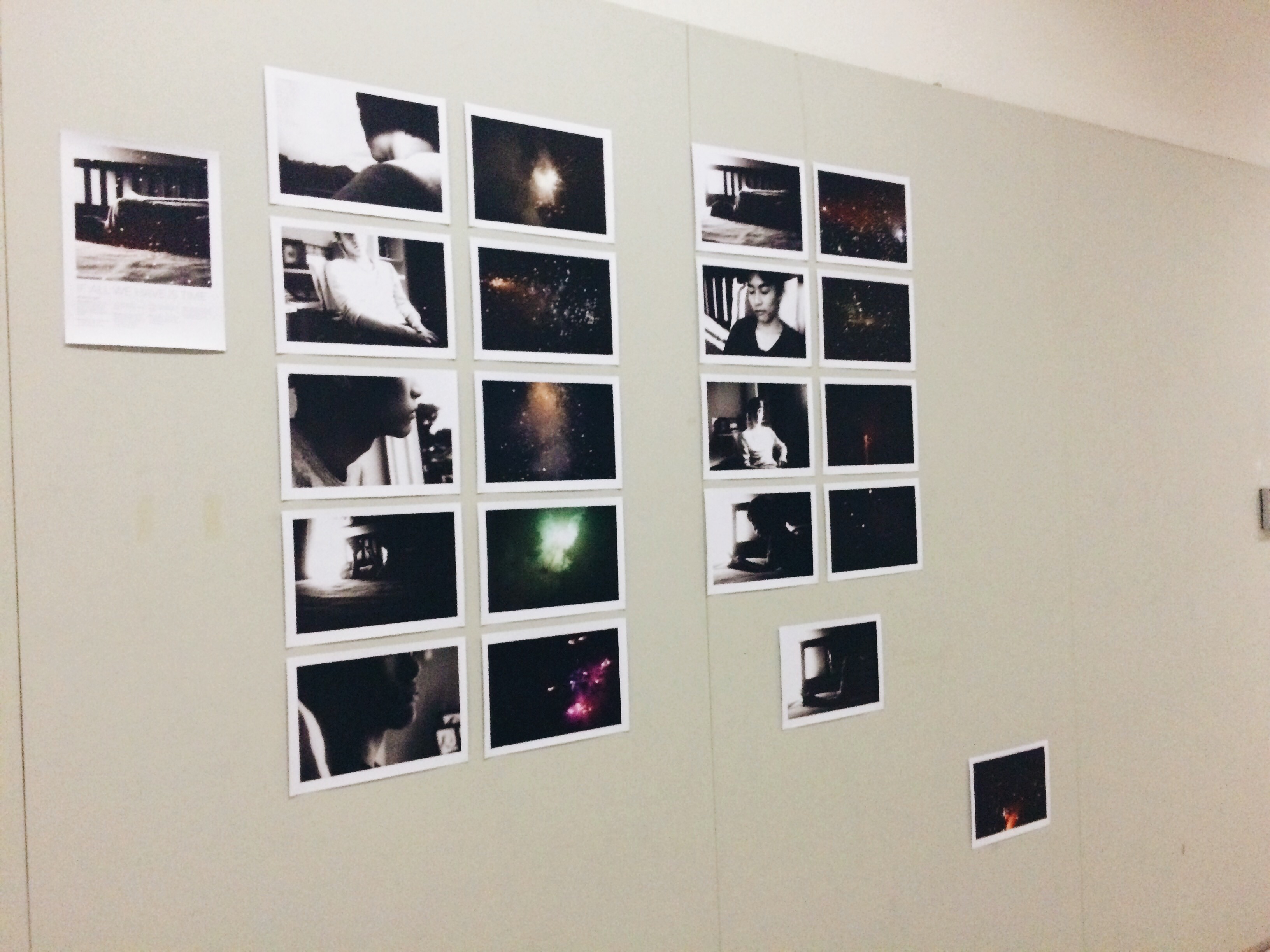
This was my final layout for the arrangement of my photographs for Project 1.
After much thought, I really wanted to show the separation of moment from memory (as aforementioned in previous posts). I think this layout really shows that idea. It goes from the raw, original photo of the moment with him to the figurative image of the firework, which is a symbol for my interpretation of the flashes of memories that are left after someone is gone.
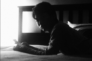
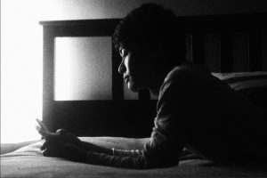
The far right shows two photos that drift noticeably out from the mass. The last sequence of momentary photos are these two:
I especially wanted to sequence the last two photos to show that the intensity of the experience/moment fades when the person looks away, or in other more metaphoric terms, “leaves”. The presence fades, but the sad part about this is that it’s inevitable for moments to fade; it’s part of time’s erosion. The last drifting photo is a firework and I think in the end, at least time gives us the presence of the memory, no matter how fleeting.