Tag Archives: layout

2D II ZINE – Process

2D II,  ZINE PROCESS

Assigned Location: Bukit Batok

After my initial research of the area of Bukit Batok, I narrowed it down to the neighbourhood’s nature parks. And within those nature parks, I picked the topic of lamp-posts to investigate and display in my final zine. 

The process has been a very educational one; I’ve learned so many things from using InDesign to developing an actual product and figuring out what would look best visually to convey my message. 


Learning InDesign – –

One of the biggest areas in my process documentation was learning InDesign itself as a software. I have had no prior knowledge or use of the application and it was a really useful experience to understand what terms like ‘bleed’ and ‘slug’ were. I was taught to format a product with the end result in mind, and having to think about the printing helped in the process of construction my zine.

Specifications for the A5 zine document.

Crafting the Zine – –

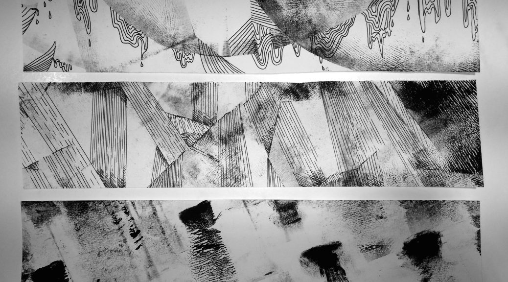
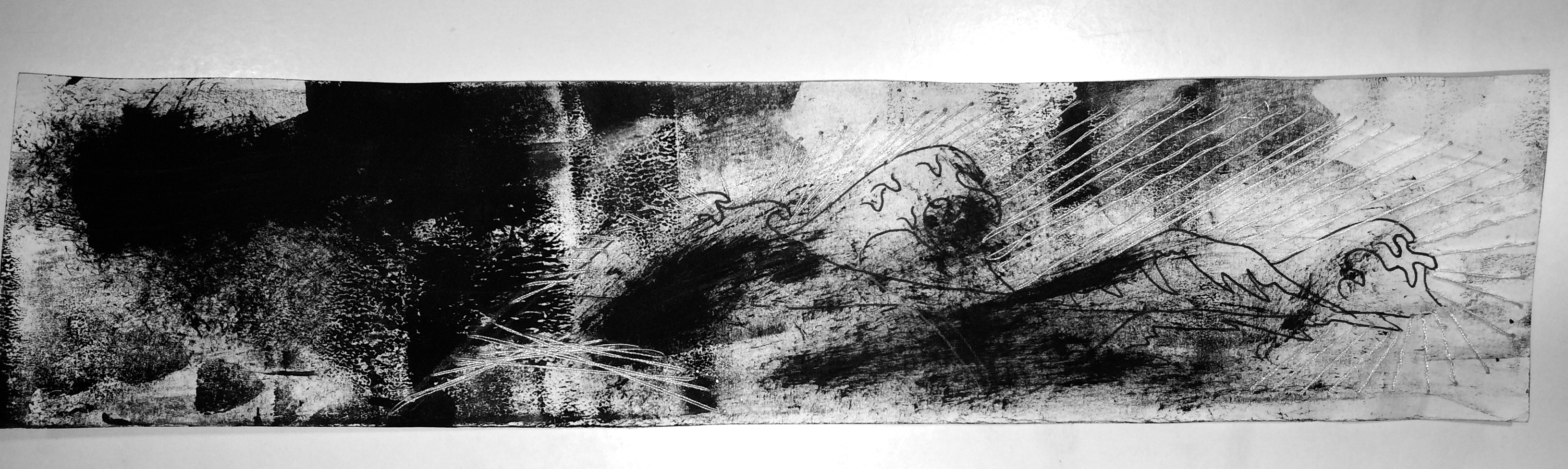
I started the process of creating a zine with the idea of ‘lamp posts of Bukit Batok’. I knew that I wanted to do illustration in my zine, rather than use photographs, so I just used my photos as reference and created illustrations based on them. At first, I found it extremely hard to figure out what colours to use. Admittedly, I hadn’t planned out the actual narrative/storyline to my zine, I only knew that I wanted to characterise and bring the lamp posts that I saw so often to life. However, the more I worked on the zine, the more I started to figure out what I wanted to do.

In the end, I would create a narrative with dawnnoon, and twilight and attribute these times in the day to different ‘guardians’ – that is, the lamp posts. I ended up with 15 total versions of my zine, from start to finish as I tried to figure out what I wanted to show visually. Below is the progression of my zine from start to finish in screenshots.

The first draft of the cover page of my zine.
The second draft of my cover.

I knew that the illustration above was one that I wanted to keep – it had good composition and it showed that I wanted to talk about lamp posts in Bukit Batok’s environment. However, I was frustrated with the colours as well as the font – consulting with Shirley showed me that the fonts you use are very important to the tone that you want to convey. And at this point, the font was too serious. I didn’t want a goofy, silly font that was child-like, but I still wanted to show that I was telling a story rather than an information pamphlet.

Changed the colours on the previous illustration.

The first thing I did to try and fix the problem was change the colours of the illustration so that they were more cohesive and aesthetically pleasing. I liked this illustration much better than the one before and this is the final one I would use for my zine’s cover page. Then I went on to experiment and play around with different fonts that would help convey my message better (and not be so serious!) Below is the final cover page, where I made the font more light-hearted and ‘story-like’ (if you will) and fit it into the page so that it would look cohesive as an entire layout. I am quite pleased with this cover and prefer it enormously over my two earlier versions.

Final zine cover layout.
The Rest of the Zine – –

After jumping over the tough hurdle of the zine cover, I moved onto the rest of the zine. Like I mentioned before, I want to convey a story that takes us from dawn to noon to twilight and associate different lamp posts with these timings (e.g. the dawn lamp post would be shy and quiet, like the dawn as an entity itself). Dawn was relatively easy to do; it was harder later on to craft the noon spread and the twilight spread.

The first spread.
The second spread.

Above is the final end look of the second spread in my zine. It was hard at first to figure out what I wanted to do with this page, because I wanted to use this illustration:

But the illustration itself would obviously not cover the entire spread. I needed to think about what I wanted to do with the spread, so then I tried to balance out one area with empty space and the other with more complicated designs and patterns. Heavy on one side, and light on the other. Below is my process of trying to figure out the composition for the spread. 

After I was satisfied with the composition, I tried to follow the rule of thirds with placement of the texts and kept them from being right in the centre or the middle of the spread. This was to provide more visual interest. I like the contrast between the empty right side and the heavier left side.

The final spread.

Above is the final spread – the ‘twilight’ guardian. So as I reached the end of the zine, I tried to progress it throughout the timings of a single day; dawn to dusk. For this spread, I had some troubles with choosing colour. Initially, I was going to use this image:

But obviously, the style of the above illustration doesn’t match the other two spreads or the cover page. So I went back to the reference photo used:

And created a new illustration that would keep the consistency across the zine. The final illustration for the twilight spread has a common colour scheme of warm browns and oranges and tries to communicate a sense of dusk/twilight. 

I had fixed up the odd green/blue/yellow colour scheme and replaced it with one that would match better with the rest of the zine. But I then had issues with adjusting the colours of the text. 


As you can see above, the word ‘twilight’ is different – one is yellow, the other is blue. I was struggling between which one would give more visual interest. In the end, I decided on blue because it would match the blue of the previous noon spread and also makes the word stand out.


Learning Points + Takeaways – –

This entire project has taught me many things, from softwares to composition and thinking about end products. One of the biggest things that I had to think about was both colour and composition. Using different elements of design like the rule of thirds and so on really helped me create a zine that would be more interesting to look at. For example, in the beginning I would split up the composition of the spreads down the middle because of the left and right pages, but then after consultations, I realised that I could bring images across the middle divide to create the rule of thirds and so on. Thinking about consistency across a product is also an interesting aspect of this project. Usually when I create artwork or paint, I only have to think about a single frame on a page. In a zine, not only do I have to think about individual spreads, but also about how they transition from each other and the consistency across the entire document. I enjoyed this project very much and it represents learning milestones in my design career.


2D II ZINE: Likeable Layouts

During my research, I was looking at different Zine layouts that caught my eye and compiled 5 of the best ones here, stating what I like best about them.


one

I like this Zine layout because of the strict colour scheme. Pink and mint green work uncannily well together and the layout is definitely not standard – a lot of overlapping of both text and photos makes it very interesting to look at. Even the photos have been edited to match the colour scheme. Though I appreciate this layout for its aesthetics, I’m not sure about how functional and effective it is for actually understanding the text. However, I admire its avant-garde style, it makes it quite original.


two

I like this layout because of the black and white. I usually tend to like darker backgrounds with lighter text. I really like how abstract the background is – it simply looks good, and it reminds you of the stars. I think it’s important to have the design remind you of what the zine’s contents are – if this zine is about stargazing, it does its job well. I also like the singular box in the centre; there is no need for visual hierarchy because there is only one thing you’re supposed to be looking at. The appreciation for simplicity is very obvious in this design.


three

This zine masters a concept that is hard to execute – variety. Zines are aesthetically pleasing when they follow similar layouts on each spread, with the same colour scheme – it looks well composed and very coherent. Variety is important too however, if you want to saturate your reader’s mind with everything you want to talk about (I think this is very valuable for travel zines). This zine pulls off everything from a two-page spread, combines both illustration AND photography, and uses multiple styles of layouts. Each page is a new color scheme, theme, and layout that makes you excited to turn to the next spread.


four

This zine makes good use of geometry. In addition to the colour scheme, you can see cohesion throughout because of the simple use of shapes and line. The colourful shapes against the black and white background also serve to highlight the important aspects of each page, so one doesn’t get lost in the middle of all the geometry The font is also very simplistic, so that all the elements don’t jumble and fall onto one another – complicated, but easy at the same time.


 five

For this zine, I like it a lot because of how beautiful the illustration is. The colours of text and the drawings are also kept simple to make sure the photographs are appreciated, but the illustration is gorgeous – and links the pages too! Birds are an obvious recurring motif throughout the zine and they add a special original touch. It makes me want to illustrate in my zine too.

2D Project 2 – Forrest Gump Compositions (final)

These are my final compositions for this project. Each goes with a quote from Princess Mononoke (1997).


ONE

screen-shot-2016-10-11-at-11-54-24-pm

In this composition, I wanted to contrast the ideas of being ‘tame’ and being ‘wild’. Wolves in general are uncontrollable, wild beasts, but with this quote, it was about the wolf’s head and the power the wolf has, even in death. So the rest of the body of the wolf is within the confines of the circle (aesthetically ‘taming’ him), while his head sticks out, suggesting the notion of pushing the boundaries and refusing to stay within the constraints. I also included a deer because they are symbolic of prey animals – it adds the feeling of a threat to the deer on the wolf’s behalf. The lines pierce through the deer to emphasise this threat; I think the use of two subjects is interesting.

Movement was a prominent principle of design in this piece as I wanted to show the left to right movement of the wolf and carry the eye across the piece, to view the wolf and then the deer. And so, the balance of the piece also weighs more on the right side. There is also emphasis on the wolf and the deer as the most of the design comprises of thin linework, as opposed to block-y pattens that are on both the subjects.


TWO

screen-shot-2016-10-11-at-11-54-33-pm

I think crows are symbolic of a lot of bitterness and hatred. Combining them with storm-clouds and lightning encompasses the intensity that exists in an emotion like hatred. The quote says to see with eyes unclouded by hate. In the context of the film, this was said as though “seeing without hatred” was a goal of the protagonist. However, I thought it would be interesting to portray someone still seeing with eyes literally clouded (hence, the storm-clouds) by darkness and hate still. The constellation-type things are there to show the complicated nature of this quote; easier said than done.

Unity is quite prominent in this piece as most of the work is dark toned, so the piece harmonises in value. Repetition is created with the mass shapes of the crows that make this artwork seem active, to express the fact that hate is an active emotion that moves and breathes.


THREE

screen-shot-2016-10-11-at-11-54-40-pm

I think fate is as vast as mountains and as unexplored as the universe. And I think, like koi fish swimming downstream, we all tend to have no other choice but to go with the flow (which is downstream) and accept our fate. The notion of rising and meeting fate is a scary and dark space. Rising to meet fate is something that takes time, and I wanted to show that by angling the largest fish more to the side (to imply that it might perhaps stray from the movement of downstream swimming like the other two fish and go in another direction, like meeting its fate).

The principle of design that is most strongly used here is the feeling of emphasis, which is executed by using central composition as well as the values – contrasting between black and white. The koi fish all stand out, but are also balanced by downsizing the other two fish that make it more interesting, but not too repetitive and dull. There is also movement down to the bottom right corner of the artwork. The lines of movement contrast as the fish move down while the mountain moves up. The stark contrast and emphasis is complimented by the pattern of the stars, which delivers another element of balance and stability.

This is the design I used for my tote bag.


FOUR

screen-shot-2016-10-11-at-11-54-16-pm

I personally really love this composition. The quote is a side character talking to the protagonist, and I think it tells a lot about how each of us are in our own little worlds, obsessed with our own predicaments. We centralise ourselves, like the subject above – blind to anyone but their own thoughts. However, the world looms (also suggested by the fact that it extends out of the frame of the composition), it still exists even if we shut it out. The constellations in the background also imply a larger universe beyond, but the central figure (outlined in white) represents us, and how we make ourselves literally, the centre of the universe.

By having a centralised composition but with the placement of the earth at the side, there is a diagonal pull from the bottom left corner to the upper right, making one see the human figure first and then realising the world is there – which, in effect, is very visually explanatory of the quote itself. The rhythm of the stars in the background add visual interest and the emphasis (by using the white outline) is on the figure and on the earth as well.

2D – “Forrest Gump” Project: Process Post

I have thoroughly enjoyed Project 2 so far. From being able to have the freedom to take quotes from movies we want to designing our own interpretations of those quotes, this project has been really fun and interesting – I’ve learnt new things in the process as well.

The process of silkscreen printing is something that I haven’t done before and I thought it was really fascinating,

Last week we coated our silkscreens with emulsion and left them to dry, taking care not to let white light hit the emulsion (or it would become exposed).

Then we exposed the screen’s emulsion layer by putting our transparency on top of it and putting it in the machine below:

img_3384

Afterwards, we cleaned off the area of the emulsion that was exposed using a water gun. Slowly but surely, our designs emerged as we continued barrelling water at the screens.

img_3388 img_3391

In the end, my screen looked like this, where all of the emulsion washed off in the areas that were exposed to the light. Then it was left to dry (it no longer needed to be protected from white light).

img_3392

It was such an interesting experience. This week (the lesson after the one above), I finally tried silkscreen printing.

The screen went from brilliantly blue to stained with black, but that was all part of the process of printing out the ink onto a surface, which you can see below:

img_3490 img_3491 img_3492 img_3493 img_3494

In addition to printing on a tote bag, I also brought my own shirt along to try on out other fabric and I think it turned out well!! This was an overall very educational and enjoyable assignment and it has piqued my interest in silkscreen printing.

Foundation 2D: “My Line is Emo” – Final Look

The final results of this project consist of my visual interpretations of 18 specific emotions. Experimenting with different methods of mark-making reveal many different outcomes that imply certain emotions. The project’s specifications about using only black and white (no colour) places a huge amount of emphasis on the mark-making itself, without the distractions of colour.

As a result, I have experimented with mono-printing, drawing, paper cutting, and stitching into the strips of paper for each emotion. Most have elements of mono-printing, but I believed that I could combine mono-printing with different elements and add layers onto my strips, as one will see below. These are the final works for each emotion. I chose the primary emotions of love, anger, and sadness.

➤ Primary Emotion of Love

img_3038

↳ LOVE: I believe that this emotion is full of ups and downs; very turbulent but also has a flow. That’s what I wanted to show with the combination of mono-printmaking, drawing, as well as stitching with white thread. The combination of mediums also translates to the combination of highs and lows in love; there are dark points and there are also light points. I wanted to show that there is a journey with this emotion and so the strip has a flow from left to right, and from dark to light – love can take you out of dark times.

img_3039

↳ AFFECTION: I think that this emotion is a much softer version of love, with a ‘bubble-like’ feeling that carries and makes you feel like you are floating and light-hearted. This piece is solely mono-printmaking. The background is lighter and more empty to give a more positive feeling. The darker patches convey more intense areas of the emotion of affection, like the feeling of wanting to bite a baby’s cheek or squish their face – that kind of affection.

img_3040

↳ FONDNESS: This strip is a combination again of mostly stitching and drawing. The background is one streak of a roller without much paint to communicate the straight-forwardness of fondness. It isn’t as turbulent as love and is much more simple; it has one direction and that is to the person/thing it is directed at. I think it is a little more bittersweet, however, than affection because fondness can lead to unwarranted bias and can often cage you in your opinion of a person based on how fond you are. That’s why even though the circular shapes of the thread are happier and softer, the lines in the middle lead to harsher points that communicate this “trapping” in your fondness for someone.

img_3041

↳ LUST: Like love, lust is a turbulent emotion but I think it is much more intense and harsher than love; it is almost like a hazy feeling that clouds one’s vision. I used paper cutting over the whiter areas of the strip to communicate the feeling of being blocked by this emotion – you cannot see beyond the fierce wall of intense lust. The straighter lines in the background are also similar to fondness where lust is also very straightforward and raw as a human emotion, in my opinion. It leads to one thing; the flow of the strip goes to that destination by the flow of the black paper cut and the darker, intense marks.

img_3042

↳ ADORATION: I think adoration is hard to hide. It is an emotion that is light-hearted and fun, but also has twinges of intensity (shown by the darker, random spots), and it can cut down the metaphoric wall one will put up to maintain their demeanour and shows through easily. I drew tiny “bubbles” and “pieces” coming off from the weakening, flimsy “wall” that runs along the middle to show this feeling of lowering your defences to the emotion that doesn’t hide itself from others.

img_3043

↳ AROUSAL: I think arousal is similar to lust where it is very intense, but with this particular emotion I believe time plays an element. On this strip, from left to right, I wanted to portray a rhythmic increase in intensity and darker marks, to show the progress of arousal, which in my opinion, is the pre-cursor to lust. It’s a step-by-step increase in the strength of the feeling.

➤ Primary Emotion of Anger

img_3045

↳ ANGER: I didn’t choose to make anger look very intense. I don’t think that the emotion itself brings a darkness to the person; I believe that like arousal to lust, anger is a pre-cursor to emotions like rage and wrath. It is an emotion that weakens and “breaks” the person, per-se, which is shown through the crooked ‘crack-like’ and fragile. Along some of the edges, I showed the imminent darkness creeping out; marks that threaten to overcome the person and take over with more intense, powerful emotion.

img_3046

↳ IRRITATION: Irritation to me is an incessant feeling that is the same as white-noise but if white-noise was darker and had a shrilling sound. I communicated this by curved, topsy-turvy turns of tiny scribbles that can be described as simply “incessant.” It takes your mind and turns you around and constantly irritates and annoys you, so I wanted to show that by using drawing on a mono-print background.

img_3047

↳ RAGE: Rage is what comes after anger. It is a violent, tempestuous emotion that seems to turn one’s mind into a motion-blur movement, where the only thing one can focus on is the dark rage that spits and spews around like a relentless tornado/whirlwind. I think this emotion has a lot of movement, and so I translated that into movement on the strip for rage, using both mono-printmaking as well as applying paint using a roller. Rage is a very wild emotion.

img_3049

↳ CONFUSION: Confusion is not necessarily a bad emotion. Though I categorised it under the primary emotion of anger, I think confusion can also be taken as the term: “ignorance is bliss.” My strip illustrating confusion is quite giddy in nature. There are darker points where the spirals appear to fade into the unknown (which is also an essential part of confusion as an emotion) but there are also areas where they blissfully go without direction or reason – this is what I believe is also a very important part of confusion. The main idea behind this strip is that confusion has no direction and can be either blissful or dark and unclear. I aimed to show both of those sides to this feeling.

img_3050

↳ RESENTMENT: To me, resentment is also a journey. I wanted to also include time into this strip, but go ‘backwards’ instead. Most people read from left to right, but I wanted to make the strip appear as though it were going from right to left, because resentment as an emotion brings you back into past grudges and things, where one cannot move on and is continuously travelling back to the resentment in their mind. I also wanted to include drawings on the mono-print because I felt it would be effective if I drew scales and twisting shapes around what appears to be footprints (a symbol for journeying) to give the impression as though the journey is trapped within the twisting resentment, and that even though there’s a gap (2/3rds from the right), as though it were struggling to break free, it goes back together and continues to move backwards.

img_3051

↳ WRATH: I think wrath is a long-lasting emotion. Like rage, it is dark, powerful and very intense, but there isn’t as much movement across the strip as there is within the elements on the page. I wanted the misty, dusty dark patches to have some energy within themselves because I think wrath festers as an emotion and stays, vibrating and moving where it is because it lasts. The various shapes and hazy patches around the dark areas circulate around the two circular dark areas to communicate that everything will rotate and revolve around the fermenting grudges and intense anger.

Primary Emotion of Sadness

img_3053

↳ SADNESS: Sadness is a downwards moving emotion, always dripping and sluicing down because it brings one to their knees. For me, it ‘drapes’ across my mind with darker (not intense, but hazy) scratches that weaken my mind and allow the sadness to leak down and bring me down lower. I wanted to show this movement with the drawings on top of the mono-printmaking, to extend further this feeling of downwards movement. There is also a lot of negative space around the draping scratched areas to express the notion of emptiness; the only thing you focus on are the drips.

img_3054

↳ DISAPPOINTMENT: Many of the secondary emotions to sadness have a downwards movement, and disappointment is no different. But I think rather than dripping, disappointment is a quick, straight fall down into the feeling of regret and sorrow. I wanted the strip to have the impression that the lines were moving from somewhere ‘high’, where one was not full of dismay but where one was happy, and that it was descending down into a darker, unknown area where one was let down somehow. It is a very straightforward emotion though, in my opinion, which is why I used straight lines. Some of the lines also become faint, because I wanted to symbolise the feeling of weakening trust in someone or something.

img_3055

↳ GRIEF: Grief is an emotion that is not consistent. It peppers you with streaks of dark, intense sorrow that eventually fade but will come back from time to time. I wanted to show that by the mono-printmaking patches on the strip, where you can see that the darker points gradually become lighter and fade, but as you move across the paper more and more dark patches come back over time. The empty space behind them was also used to have a ‘ghostly’ feeling of the grief coming back to haunt, as well as the notion of emptiness again. The patches are also all angled downwards to communicate the descending feeling again that is notorious in the emotions under sadness

img_3057

↳ GLOOM: Gloom is like cobwebs, threatening to cloud over your vision and mind with a sticky, stringy feeling that is always dripping down. It is also hazy; hence the faded, random mono-print background, but I think gloom is a ragged curtain that obstructs and contributes to the haziness of the mind. So, I also included pen drawing over the patches to display this idea. I also think gloom is an emotion that connotes age and wear, which is why I drew the tears hanging down as though it were old.

img_3058

↳ HEARTACHE: I think heartache is a very relentless feeling. It is cruel and unkind to the person experiencing it. I specifically used white thread on a dark background and stitched the thread into the darkness to 1) communicate that heartache brings gloom and darkness and 2) that it is always being wrapped and twisted by the heart-wrenching feeling that – in my own experience – feels like strings tightening around your soul, tangled; there appears to be no way to disentangle yourself from the ache. One string over the other (I also thought thread was fitting because of the term: heartstrings) wrapped over each other, tightening and then becoming broader and looser, but then tightening into a painful cage once again. This is the rawness I wanted to demonstrate by threading into the paper.

img_3059

↳ SHAME: Shame is a dark, but fluttery emotion. To me, it is the feeling of always wanting to get away from the humiliation that brought about the shame, like a frantic pitter patter of footsteps as you run away from the memory, but it is very messy and un-coordinated. I also think that because it is tangled and messy, I used the combination of thread and mono-printmaking again. The square and circular marks are meant to imply the feeling of discord and confusion of what to do to get away from the shame (which is the feeling of shame itself: to escape, to hide) and the thread shows how messy the emotion is.

Foundation 4D Project 1: Exhibition Display/Layout Rationale

Processed with VSCO with a6 preset

This was my final layout for the arrangement of my photographs for Project 1.

After much thought, I really wanted to show the separation of moment from memory (as aforementioned in previous posts). I think this layout really shows that idea. It goes from the raw, original photo of the moment with him to the figurative image of the firework, which is a symbol for my interpretation of the flashes of memories that are left after someone is gone.

The far right shows two photos that drift noticeably out from the mass. The last sequence of momentary photos are these two:

Screen Shot 2016-09-15 at 9.37.59 pmScreen Shot 2016-09-15 at 9.37.52 pm

I especially wanted to sequence the last two photos to show that the intensity of the experience/moment fades when the person looks away, or in other more metaphoric terms, “leaves”. The presence fades, but the sad part about this is that it’s inevitable for moments to fade; it’s part of time’s erosion. The last drifting photo is a firework and I think in the end, at least time gives us the presence of the memory, no matter how fleeting.