Category Archives: Project 2 Forrest Gump

FORREST GUMP – FINAL

test-print-04

test-print-02 test-print-03test-print-03

test-print-01


Reflection

Throughout this whole assignment, I thought that it would be something that I would enjoy considering how I am not actually that good in photoshop, Also, how much the fact that I do not like to edit photos considering the pain that I went through in poly. However, to my surprised I actually enjoyed it as much as I did for assignment one. The fact that we did silkscreen was like a whole new experience to me and really such a fun time. I have heard so much about it and attended museum talks and walk through of their silkscreen printing for the artist behind the scenes and all but I never got to try it. For the fact that we are allowed to even try out silkscreen with our own design is really something amazing.

About the photoshop experience, I never thought that I actually enjoyed it thoroughly. The different things that I actually learnt from all the self exploratory. All in all, I would say that I really am learning a lot from 2D lesson but not only that I am really enjoying myself. Being able to express myself to through imagery and all.

FORREST GUMP – WIP 4 (Design)

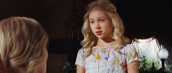
I had two design ideas for the quote “Have courage and be kind” from Cinderella, 2015. One of which is a deer and a lion head, the other is a lion with the dolphins in the background.

cinderella_edit02

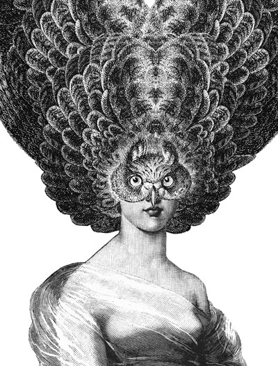
For this composition I thought that dolphins are considered kind and friendly creatures. So I had a lady with a head of the lion to show that she have courage as they are considered as one of the strongest animal. Hence, this composition is to show her exuding kindness despite her being courageous and fierce.

cinderella_edits01

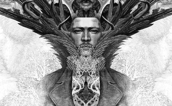
This is the design that I actually pick for the quote but somehow I feel that it is a little too clean cut and lacks the sort of vintage texture feeling to it. So I edited a another one with the texture using halftone and noises. This design has an opposite meaning to the first design. The kind lady actually has a courageous side that is lurking inside of her. Hence, explaining the birds which shows that the courage is actually surging through her.

cinderella_edits02

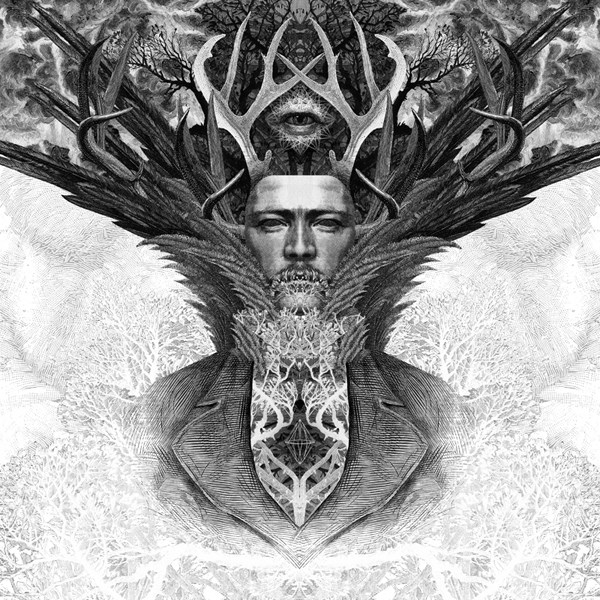
This is my final design for the first quote with the textures.

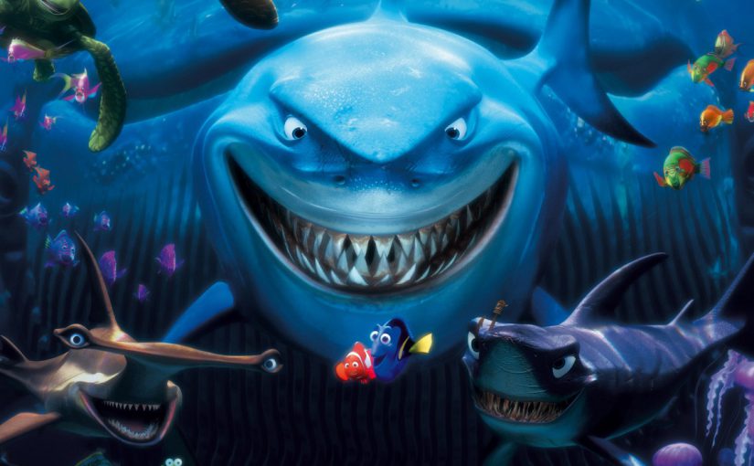
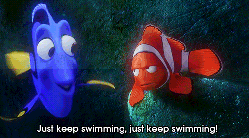
The second quote would from finding nemo, 2003 “Just keep swimming, just keep swimming.” For this I only had one design, but I tried editing it again since I was not happy with the idea design ever since I showed it for my transparency printing.

finding_nemo_test_01

At first I thought that the black thick lines passing through the shark looks really plain so I tried to use the same method as the shark, by putting little dots among the back space.

finding_nemo_test01_print

But then I felt that the black lines were really weird with the parts removed and all. It did not felt right to me, and somehow  I felt that it could not tell the quote that I was trying to portray. So I decided to change it again.

findingnemo_edit_02

This is my final design for the quote. I changed it to dory and marlin because throughout the movie, even though there is actually so many other fishes, they are the one that we would actually remember the most. So I used them to show them like swimming with the waves illustrations. The shark and the jellyfish being  one of the few reasons that “forced” them to keep swimming on.

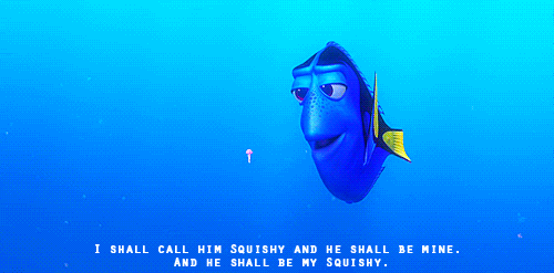
Another quote from the movie would be “I shall call you squishy and you shall be mine.” Even though it is one only one design, I was not really sure of what elements to use for it to be able to portray the quote strongly.

squishy_first-edit

At first I thought of just leaving it but I felt that it was too simple and the fact that dory sorts of blends into the bubble as the tonal value is quite similar. So I decided to try changing some of the values and try out different elements to it. Also, I added the collar to symbolize the jellyfish being Dory’s pet.

squishy_second-edit

I changed the background to black to make the girl more prominent and also added the white stripes to make it look like a jail cell. Since the quote is about Dory wanting to make the baby jellyfish her pet. However, I feel that the white stripes are not that obvious into showing that they represent jail cell.

squishy_4-edit

In the end, I changed it to jellyfishes watching dory as they are actually quite protective of their young ones when they are in danger. But I felt that the background somehow swallowed up the jellyfishes at the back.

squishy_third-edit

So I ended changing the background to white again making them more prominent.

The last quote is from Hunger games, 2012 “I volunteer as tribute.” I originally had two ideas for this quote.

hunger_games_design_test_02

In this design I wanted to show katniss and her “manager” ,for district 12, seem like they are the powerful and in control. Also to show how Katniss has the confidence to win and represent the hunger games in order to protect her sister.

This other one being the one that I pick to print on my tote bag.

print

In this design, I tried to make Katniss look strong and that she is confidence enough to face snow, the villain in this movie. He was the one who created the so-called hunger games. Hence why I wanted to make him look like a figure looming over the city as he takes control of them all.

FORREST GUMP – WIP 3 (Silkscreen & Tote bag)

We had to do our silkscreen in class which was a new and very fun experience for me, as well as going into the dark room and everything. Learning how to expose the silkscreen was a pretty challenging thing considering how we had to properly pour and make it even for it to be able to expose properly. While inside the darkroom with other classmates, the senior told us that it was okay to actually use a single transparency to expose the image. However, it seems like using two pieces is more safer considering how some of the design did not get transferred over as seen from my other classmates.

02

I would say that my printing actually went pretty smoothly, the image was able to come out clearly after the wash. I really enjoyed the wash, the spraying machine made me feel like i am inside some action scene or something. Though i guess the emulsion was kind of washed off at the top right corner, but I could just tape it down with tape to prevent the ink from sipping. Overall I am happy with my first printing of silkscreen. SUCCESS!

20161005_122515

20161005_122509


The next lesson we were then given our tote bag to print on. Everyone was really scared of screwing up the prints on their tote bag, it was really funny. I was just telling to myself “Lets get it over and done with, have trust in yourself and the silkscreen.” Since I was able to get a good result the previous week, I thought it i would be able to proceed straight away to the printing on the tote bag. But sadly when I tried to test print on the newsprint I did not manage to make it as nice as  my first few tries in the previous week.

01

They had this patches of grey in them. I was pretty upset, but then I just kept going over and over again. Washing the silkscreen about 2 – 3 times before the print managed to work. Yeah! Also I realised even though I have a lot of black areas, I only needed a little bit of paint for my prints.

I am finally doing it! The print on the tote bag, it was really a 50/50 since we only have two sides of the tote bag. So I went for it….

20161012_102007

Everything was so perfect! Then I realised the number 12 on Katniss could not be seen, which was one of the key area for my print. I tried it again the second time but it was just the same result. I guess its because of the fact that the tote bag and the newsprint are two very different material. Also the fact that the number 12 is such a small detail.

FORREST GUMP – WIP 02 (Transparency)

I tried out some designs for the transparency prints, not sure whether they are okay? It is actually pretty hard to try and save some of the details I realised. This are the few that I thought might be some probability to printing it for transparency but I am not really sure which quote to pick for the final, but I would most probably go with the Cinderella or Hunger games one as I find that they have more composition ideas to play with.

The first two designs are from the Cinderella movie ; “Have courage and be kind.” The following two is from the hunger games ; “I volunteer as tribute” and lastly Finding Nemo “Just keep swimming, just keep swimming“.

Hope to get your critique for printing of transparency, thank you.

FORREST GUMP – WIP 01

The first try-out of the designs for assignment one during last week consultation was pretty bad since I was not really clear of what I could do or should do. I actually thought that what we have for  the prints needs to be the same as the one for our tote bag. I actually only managed to produced 3 designs one for each of the different movie for the consultation last week.

The first quote is from the Cinderella remake of the animated movie series.

Have courage and be kind.

Synopsis of Cinderella (2015) :

Her father died, in turn leaving her to be with left with her step-mother and step-sisters as her kin. However, they treated her like their maid instead. Until one day an invitation to the palace ball came but her step-mother prevented her from going by destroying the dress that she has put together on her own. She was really depressed at that moment until the godmother heard Cinderella’s plead and help her to get to the ball and meet her prince charming in the end.

cinderella_design_test_01

The message given in the illustration I made is apparently very unclear as the branches since to be overpowering her. Also the fact that she is holding out to a butterfly might not get the message of kindness across even though the thought of courage could plausibly be seen as she is in a spooky forest and somehow she does not look timid. The fact that she is somewhat floating gives the imagery that she is not stable?

The next two quotes I did was from the movie Finding Nemo.

“Just keep swimming, just keep swimming.”

“I shall call him squishy and he shall be mine.”

Synopsis of Finding Nemo (2003) :

After having his other children taken away from him, his one and only son was also taken away by the humans. He together with a short-termed memory blue tang swam across the ocean in search of his son, Nemo.

finding_nemo_test_01

The message was able to be portrayed through this illustration however the jellyfishes somehow looks like mushroom instead. I should find images that are actually obvious enough. Also, I need to work on the waves and how I can push the design of it even more instead of it being too direct.

The third movie quote that I actually picked is from the movie Hunger games.

I volunteer as tribute.

Synopsis of Hunger games (2012) :

Every year a district will be force to randomly pick a girl and a  boy to participate in the annual hunger games for entertainment and also the glory. This is to be broadcast on the live television – a fight to death. That is when Katniss volunteer to take her sister’s place when the sister was being pick to participate in the game.

hunger_games_design_test_01

The imagery of the hand sign could not be seen as the details are lost when the image is darken this badly. Also, the silhouette of katniss is not obvious enough, she could just be any other girl. The whole message of the image just somehow is not being brought across correctly.

I will post of the edits with the following post. Regarding the thought process of this assignment I think I will record all of them down in the OSS since it it easier instead of having double copies in the Journal and OSS.

FORREST GUMP – Artist Inspiration

Through the consultation in class, I realised that the design for the art pieces can be much detailed than the design for the tote bag. Originally I had thought that the art pieces need to be all clean, so I had only have them in clear designs. After discussing with Mimi about my quotes and designs, my designs are on the right track but they are not clear or too direct.

Maybe it is because I did not really look up on my artist reference, my style and all are jumbled everywhere. There really a lot of ways to interpret and present my words. I could show them using visual metaphor,  visual vocabulary, contradictions in the imagery can also make it more obvious when trying to interpret the quotes.

One of the style that I can use for my designs would be through old engravings. Artist like Dan Hillier has a really nice way of putting images together using Victorian sensibilities with a fascination for animal attributes. We were looking through altered engravings in class with Mimi when we stumbled upon this artist.

I actually really like this artist considering how his arts look really pretty and detailed but it looks creepy at the same time. Considering how I really like creepy stuff I was really intrigued by it. The way he pick and put the animal parts together.

homepageimages-img1-87

ecomproducts-img1-89

ecomproducts-img1-90


Another artist that I actually found interesting is Peter Lewis. He puts together an illustration using digital collage which looks really amazing to me. It looks like his art pieces really tell a lot of story through the piece itself.

plewis1

plewis2

17d9816cd6626c712992611cfd11911c


One other artist would be Marcel Duchamp, I would say his art pieces are a combination of photo collage and photo montage which is really interesting considering how he actually did a series of the alphabet using that photo manipulation method. Its so surreal yet in a dream-like state.

marcel_duchamp_01 marcel_duchamp_02 marcel_duchamp_03 marcel_duchamp_04

I guess I really need to brush on my work for this assignment, this is really testing my photoshop skill considering how I have not use this kind of photo manipulation method before. But I feel like it will be really fun as well when it comes to graphic design perhaps I could use this to create fun ideas.

FORREST GUMP – Movie quotes & Ideas

For this assignment we are tasked to find 4 different movie quotes from either the movie or different movies. After finding the quote we are to depict it in an illustration using manipulation of photoshop to piece different images together and create an imagery that i feel from the quote.

I would first just type out the general idea of the sketches that i intend to., so this post would mainly just be words. Following up after the photoshop session I would post another post of sketches of the illustration that i plan on doing.


This assignment is giving me so much headache as i have watched and like so many movies. However, the first movie that actually came to me would be a quote from Cinderella – “Have courage and be kind“. This was one of the quote from the real-life movie of Cinderella. As much as I really enjoy the animated version, I feel like that quote really call out to me a lot. Since young, somehow I have always been in love with Cinderella’s story, I would say she is my favourite princess. The kind girl that sees the joys in things even if the only people that she can depend on treats her like a lowlife.

1cb903ed848f43cff88315a2c0ea7456

They mentioned it almost at the beginning of the movie where the mother told Cinderella to be kind and courage.

h3zu41

The second time was when she met the prince and she told him that.

I wanted to be like her and view the world in a more happy tone. Even among the darkest hour there would be a light at the end of the tunnel. So i thought about a few idea for this particular quote :

  • The first would be Cinderella gently holding a butterfly with dark spooky forest around her.
  • The second idea I had was having the silhouette of Cinderella and in the center of her is a bird cage with the step mother and sisters in it.
  • The third one would be a silhouette of the godmother with the shape of the glass shoes and within it is Cinderella.
  • The last one that I actually thought of is a lot of butterfly forming into the silhouette of Cinderella.

giphy

The next movie that I actually had in mind Finding Nemo. Just like Cinderella, I have re-watched the movie numerous of them. This movie just somehow seem to call out to me and i can relate from it. The quote i thought of from the movie is “Just keep swimming, swimming swimming“. This quote just stuck to me the moment I heard it, I thought it was wonderful. In a sense she is telling Marlin not to give up but to me it has so much other meaning too.

giphy-1

There is another quote that I actually really like from this movie, which is “I shall call him squishy and he shall be mine.” I really find this quote cute and how dory was like going crazy over the little jellyfish.

  • The first idea that i actually have is the silhouette of Marlin and Dory inside the mouth of a shark and within the silhouette of the shark i was actually thinking of adding jellyfish. However, if it is too constrained i would not add them in.
  • The second idea would be the silhouette of Nemo as the main subject but within Nemo I would try to put in the many fishes that he encountered and of course Dory and Marlin.
  • The third design that i was actually thinking is the turtles within the silhouette of Dory and Marlin. In a sense saying how they are moving forward as that is what the turtle are doing in the movie.
  • The last design that i was thinking of is actually having seagulls chasing Dory and Marlin. I was thinking of a flipped colour for the seagulls in the sky and the two fishes in the sea, I guess it is quite hard to explain, I would show it in my sketches in the next post. The seagull was really memorable in the movie because they were really funny.


volunteer-1

The third quote that i have is from the hunger games “I volunteer as tribute“. I actually find this quote quite funny, the scene in which she suddenly burst out with this line in the movie. To be honest I had high hopes for the movies but after the first part, the second and third part seem to just went downhill. I did not read the book of the series but even through the movie i thought that the story started to get a bit too draggy.

  • The first design that I wanted to do is many arrows being aimed at Katniss and behind her would be the handsign. Seems like a propaganda, this is so funny.
  • The second design that i actually thought of is combining the faces of katniss and the Effie ; The lady with the crazy up-do. I was thinking of this because it was Effie that “picked” Katniss’ sister from the lottery.
  • The third design would be a silhouette of mocking jay and inside it is Katniss standing among the high trees. This was the scene in which she was fed with bad thoughts from the mocking jay.
  • The last design is the silhouette of Katniss holding the bow with the background of district one towering over her and the president snow in which he looks like he is controlling the districts. I was thinking of the composition from attack on titan.