For the first assignment, we would be working on typography to express our possible future job. I think this would actually be a difficult thing for me after realising what happened during the class practice. I don’t really have much experience with typography considering how I came from an animation course and we just express a personality through the poses and stance of a character.
I feel like this assignment would kind of be like a challenge for myself. However, I also this is also a good exposure for me to get started on my own branding for adm’s showcase perhaps. I guess typography is like drawing but in a non visionary way where on can still tell the personality and character of something.
For the artist research, I thought that David Carson would be an interesting artist to find some inspiration from. I looked through the other artists too but David Carson’s work just intrigues me. He is a graphic designer and also an art director. His work style involves a lot of typography and interesting layouts.
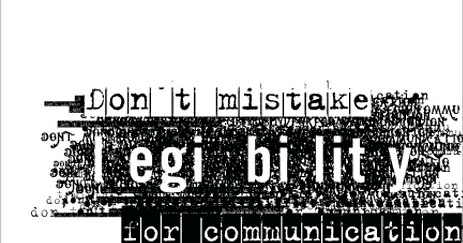
Some of his work looks like a jumbled mess of words but then i remembered what we were talking about in class. There were actually emphasis of some of the words among the whole chunk of words.

This image feels like it is something about a festival by many different type of artist all over the world. Even though it looks pretty messy and the letter seems to be chopped up, the message is still clear enough.
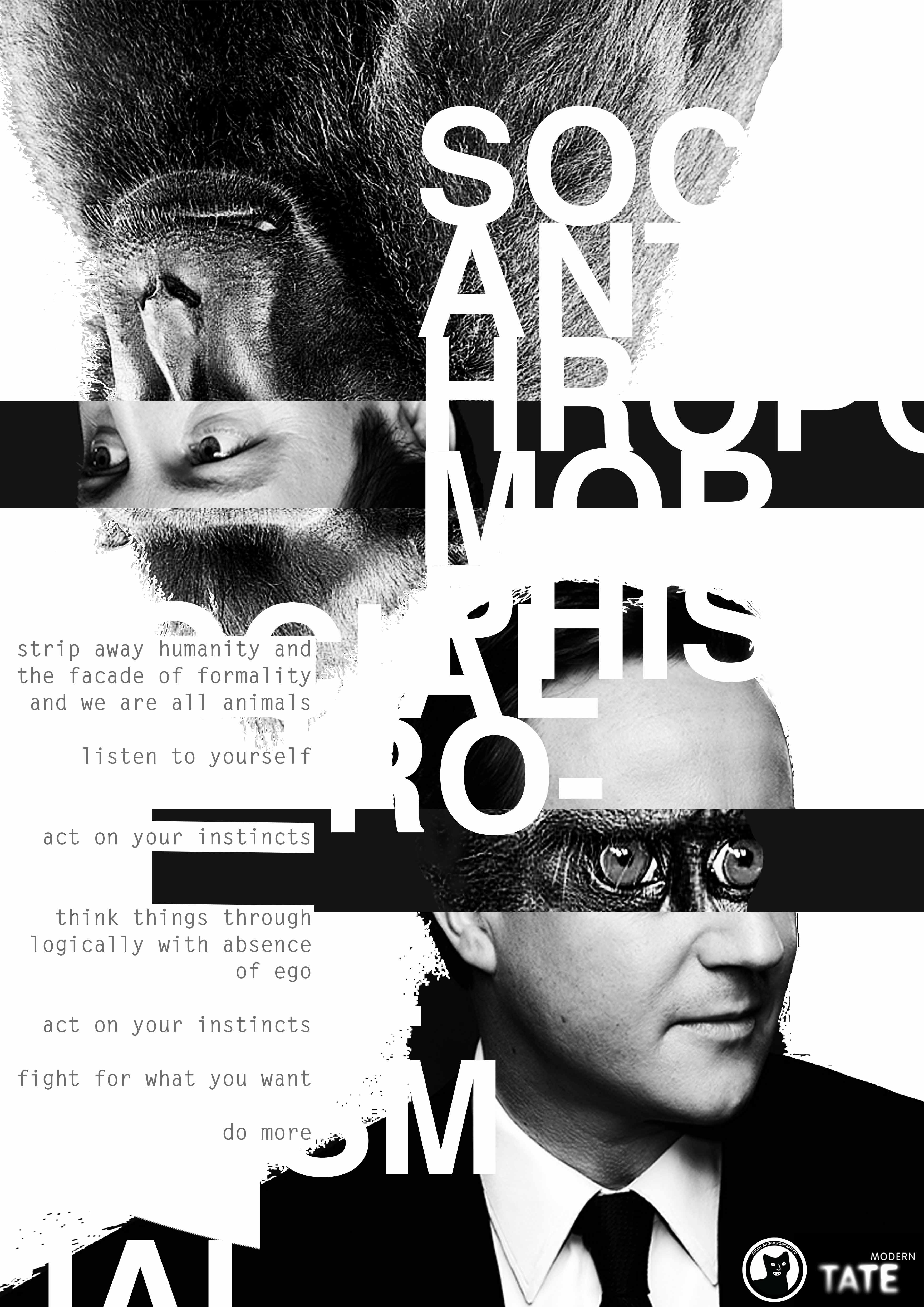
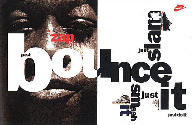
This image is about anthropomorphism where he actually use collage to play with the visual meaning and there is also the explanation of the words by the side. He also played with the negative space between the words and photos. Even though not all the letters could be seen with the white background, he position it in a way that we are still able to make out the outlines of the words.
His other works:
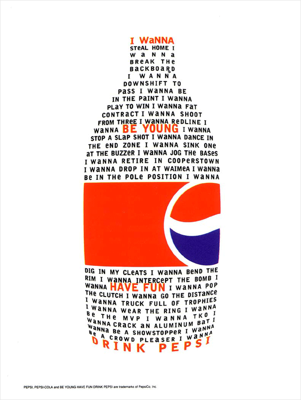
His works really makes sense in both the type fonts he uses and also the way he places them in space. It sort of brought everything together when you view them on a whole but even as one they each have their own meaning too. After seeing his works I actually felt quite worried and scared for this assignment but yet at the same time I am quite excited to see what kind of end product I could make.