Category Archives: Project 1 Que Sera Sera

Que sera, sera – Career : Patisser (WIP04)

I have a lot of problem with this career to be honest, I want to cry. But I already kind of gotten the stuff for it already so I might as well see it through right? I was debating on whether if I want to do this in real life or a photo montage of it. Then when I consulted Mimi, she told me that I could probably just try doing it out in real life. After all this assignment is about trying out different medium?

But then me being me got pretty lazy with having to gather up the materials or sweets that I am required to design my name. Then I tried to test photo manipulate my name. Truth to be told I was struggling so hard with the lighting. Like all the cakes and sweets just have different lighting on them. I also tried to use the utensils for baking and all. Of course it did not work out :’^)

patissier

Oh how terrible it looks… My eyes hurts. I told myself that I need to stop being a lazy bum and go out to hunt for the materials instead. Then I was looking at my design thinking about the possible cakes that I could get or how I could execute them. Then I told myself that I should probably have an open mind in case I really cannot find the specific cake that I want.

So…… i really could not find the cake I wanted. Rather I found it but it was too big of a pocket burn for me, I cry. So I ended up having to change a little of my design according to the cake that I got instead. Also for the piping bag, I actually found those already made ones inside a pack. I might photo edit the piping bag into the more high class looking one considering how the career is a more classier version of the original?

Got all this ingredients and ready to rumble.

16593537_10208425927114518_162446905_o16593716_10208425927034516_779932618_o

As usual the first try was horrible. Since the opening was pretty small the thickness was not enough so I had to go over it twice. Also the piping require equal strength throughout if not the cream would not flow evenly. If i press too hard they start oozing everywhere with in consistent thickness but if I do not apply enough force the line would break off.

16523950_10208425926914513_527846649_o

Okay so I tried the second time, I would say it looks better? But the overall image seem to look pretty flat since everything is on the same line. Also the letters looks pretty hard to read since I have no experience in calligraphy I am also kind of at a disadvantage,

16523378_10208425926954514_1310625656_o

Argh… After like so many tissue wiping and restarting of the of the icing, I would say that I kind of got the gist of it? Then I tried to lay out the sweets and fruits, played around with the whole composition of the fruits too to give it more pop. Then I realised something… My name somehow looks like it blends into the baking sheet making the sweets pop up instead. NOOOOOOOO!!—

16651517_10208425903993940_1539263993_o

16559047_10208425905233971_1987945378_n

So I went to photoshop hoping to be able to salvage what I have.

patissier02

IT IS BLURRRY NOOOO—-

Que sera, sera – Career : Comic artist (WIP05)

After showing my design for Concept artist for consultation, it is quite hard for people to tell that i am a concept artist.

concet-artist

Since concept artist is such a broad term it can go from abstract artist to surrealism and all. So I was thinking comic artist would probably be something I am more familiar with considering how next week is already the submission.

Something that really stands out as a comic artist is the panels, also a particular rendering style. They are generally more flat and “textured” with the etchings. I was thinking of showing the process of a comic through my name. From the sketches in blues all to the inking and maybe the colouring.

process

Since there is like different type of rendering style I need to pick something that screams comic instead of storyboard since they are pretty similar. There is the purely white & black and the coloured one.

art-by-comic-artist-roberto-zaghi-interview-creative-mapping-1024x660

2386011-comic_book_artist_v1999_019__2002__pagecover

For the style I was thinking of trying the pop art style. Its not something that I have done before so I think it will be pretty fun. I actually thought of using the style with just my name but I figured out that maybe it is not that obvious that I am a comic artist?

optimized-maxw950-girl-with-red-earring_dot


I realised after drafting out the panels, if I were to draw on tall the panels, everything would be too cluttered and you would not be able to see anything. So I tried it with just my name in a pop-art style.

comic-artist-test

To be honest, I am not really sure if anyone can tell this is a comic artist. So I tried doing the panels for the typography and added in some illustration. But somehow the blocky panels do not pop like the test.

comic_artist

Then I tried editing the letters again according to the font I got from online. But honestly speaking I am not really sure what to feel for the background.

comic_artist comic_artist_02


Que sera, sera – Career : Archaeologist + Reflection (WIP06)

Last week during when mimi sort of saw my idea for the career Archaeologist, she also mentioned that a classmate is doing a similar. Though it was more of someone who specialises in dinosaur bones. So she suggested that I should have some tools or something that would stand out as an archaeologist. Honestly I tried designing a few compositions or ideas inside the journal that is has nothing to do with bones. But when I ask my classmates about what comes to mind when they hear archaeologist and they told me bones.

Then I thought to myself but archaeologist does not only necessarily dig out only dinosaur bones, yeah? Since they like to uncover mummy’s bones and all, I thought that maybe I could stick closer to human bones? Probably it will not be be that close to the other career. Also I about my name initials, I used that instead of Alicia because I was thinking about how it seems pretty word that you would actually find a whole horde of skeleton together. Since my name has like six letters….

There was this photographer that I stumbled across while searching up for some bones. His name is Francois Robert. Yes, photographer not an artist. I was so blown away but how he showcased his messages through his photographs as a way to stop violence. I really like how I could actually feel the distress through this photos. Since we generally associates bones with death.

stop-violence-art-made-from-human-bones-3

azhhjuw8nppw3wlhxnkd_1082043568

For the bones, since I am placing them in sand, I had to look for bones that is already deteriorated. A clean bone just would not work since it would look out of place in the sand. Also an archaeologist is supposed to be finding things that are there in the ground for a lot of centuries, so honestly speaking the bones would not be clean at all.

archaeology-expands_02

I was thinking of adding the strings directly on the design inside of doing it digitally. Currently my design looks like this. I will upload another version with the strings.

archaeologist


Edit : I added more bones to my name, hopefully it is more prominent now

archeologists02


To be honest this project make me realised that I have zero skills when it comes to typography. Also, I really need to work on my idea generating skills considering that is like the greatest skill anyone in the art industry could have. After actually putting out all my ideas together I feel like all of them are almost the same? Just flat with an applied design? I am not really sure how to explain my designs… After actually seeing the works by some of my classmates, it really opened up my eyes. Their design really brings out the whole career feeling. Though this project has really taught me a lot on designs and typography. How even with just typography we are able to tell a story. Use proper camera when taking photos (Important lesson)

20170208_084718

Que sera, sera – Career : Hacker (WIP03)

Something that Mimi pointed out last week was that when we look at the design the typography/our name should be the main focus. Not the imagery that is accompanied by our name. Also when we did the peer reviewing with each other I realised that my designs need quite a bit of fixing, especially the designs I did for the career hacker.

Somehow the first thing that come to them would be computer science. Something that would actually differentiate a computer science person from a hacker is probably the little greenish glitches that comes with it. Also, i was told that I could probably add like repetition of tabs like they are jammed or when the screen hangs.

concept-artist

Apparently the texture for the fonts makes my name quite difficult to read. I was also kind of unsure what type of fonts could really represent a hacker. I honestly have no idea how to do glitches effect for fonts so I had to search up on a lot of things, it was all just trial and error.

hacker

Then I tried out the second one without the codes and try to switch up the fonts. Then I realised that the fonts are too thin, it makes the whole thing look very awkward. Also the plain background together with all the texture just makes its look like a spoiled film instead.

0010

For the third time, after going through all the different type of fonts, I thought that I would just go for something simple and add in the effects myself. Also for the codes at the back, I kind of blurred them since they clash with my name. Since I obviously could not tell what is better or worse I had to ask my friends again. What they told me was that my font was actually too clean, also my background was kind of flat and boring. SO HERE WE GO AGAIN

0011

My I-have-no-idea-how-many-tries at this point of time anymore. I was just going back and forth a lot of stuff before I figured this out, like finally! Now really at this point I am not sure of what to do anymore, perhaps I will come back to it when I do out my other careers.


Que sera, sera – General idea and style (WIP02)

-Long post ahead-

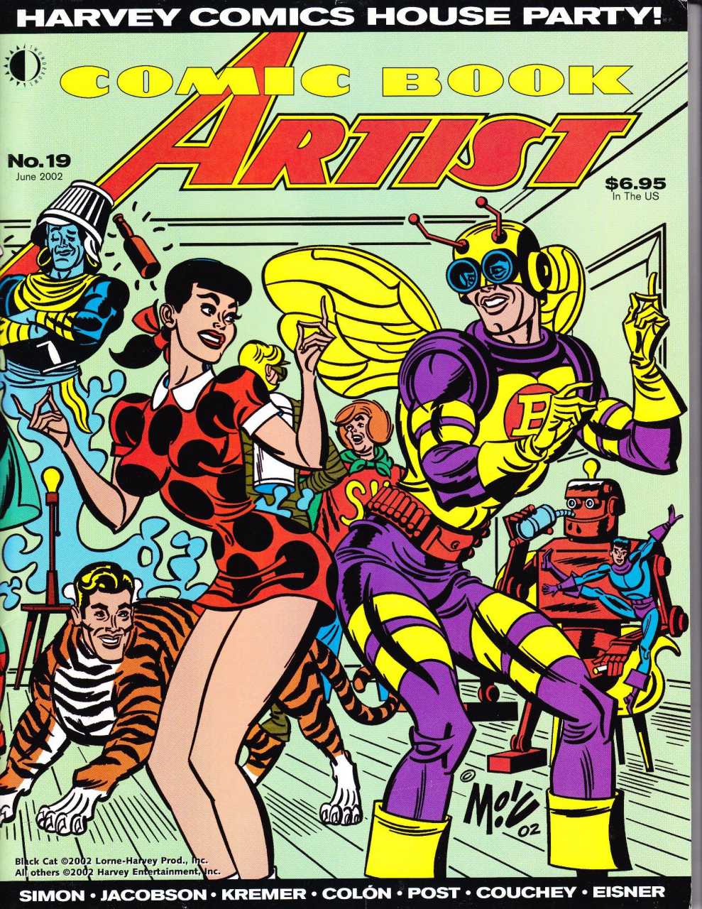
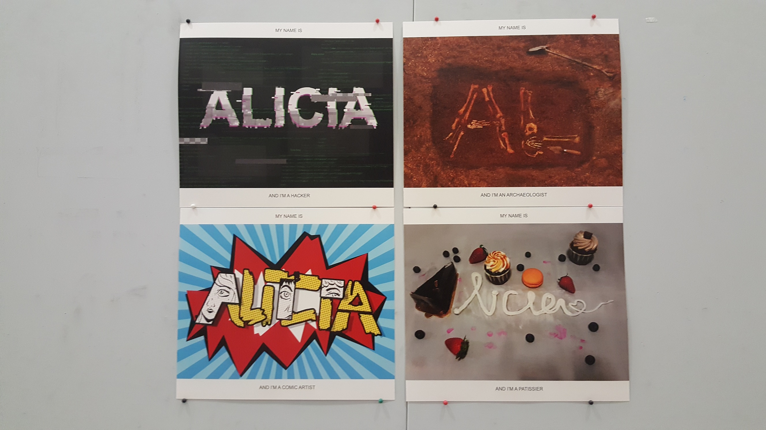
After actually searching up the different possible ways and style to showcase the 4 careers that I have picked on, here are a few of them. There are not really what I would do exactly but I guess they just gave me idea to get started. I actually printed them out in the Journal too, since I thought it would be easier for me to refer to them when brainstorming about the compositions.

0062c75bc8212e2e8870a54bf462389e

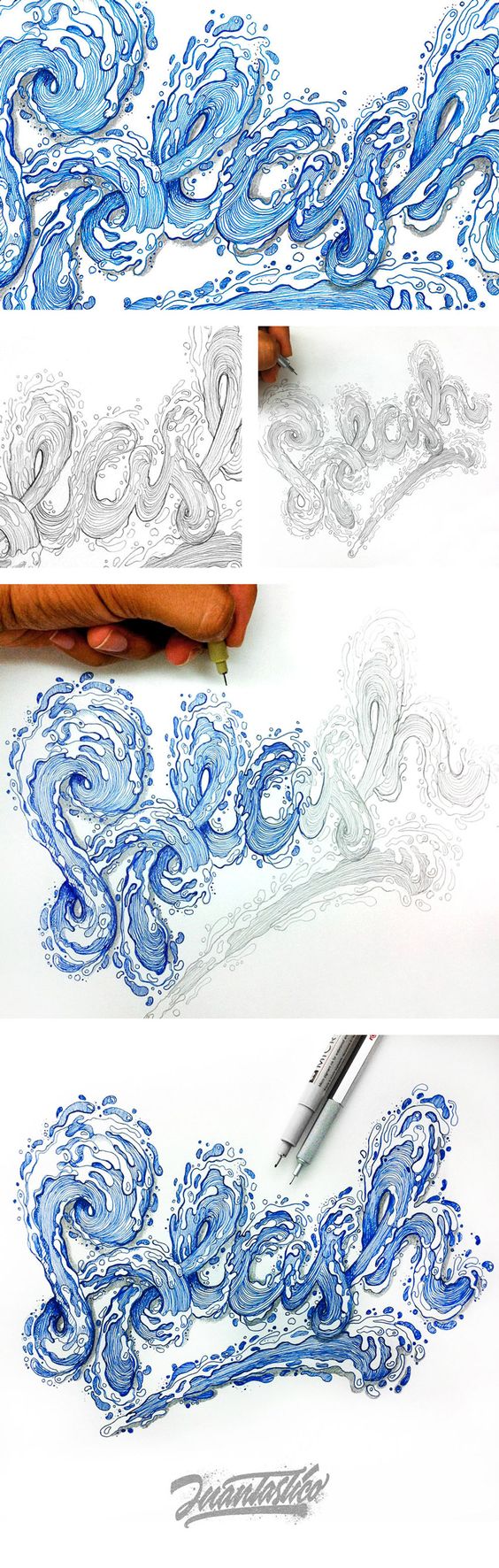
I am very curious how much time this person spent at doing this? Or did he/she customize a brush?

9990844eecc393b9055d29c8896dadce

e755067df08af14b61098f2704dac217

ea3cb2fcf42d83855cdcd849df871708

1f4e90372b800851e1156dfae689778a

6cfb420cb04538be4b14af1e35996dc8

08f4118ff5b95df2a1840c50576a80a8

9e20cea27fcf979ee1f8ef8bfcab97c4

The 4 careers that I have chosen is Concept artist, Archaeologists, Patissier and Ethical hacker. However, after last week’s consultation, apparently having to portray specifically ethically hacker is quite difficult so I am changing it to just hacker.

After deciding on the careers, i thought that I would look more into each of the design and style for each of them. Also maybe picking out objects, effects, symbols or colours that may represent that specific career. There was also the 30 idea boxes challenge which I thought was pretty interesting. So I thought why not trying out for all the 4 careers.


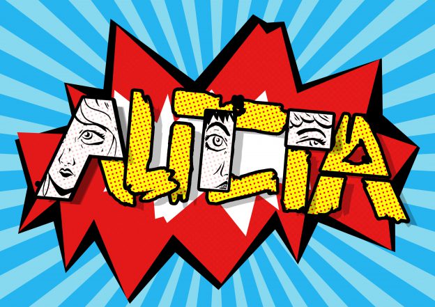
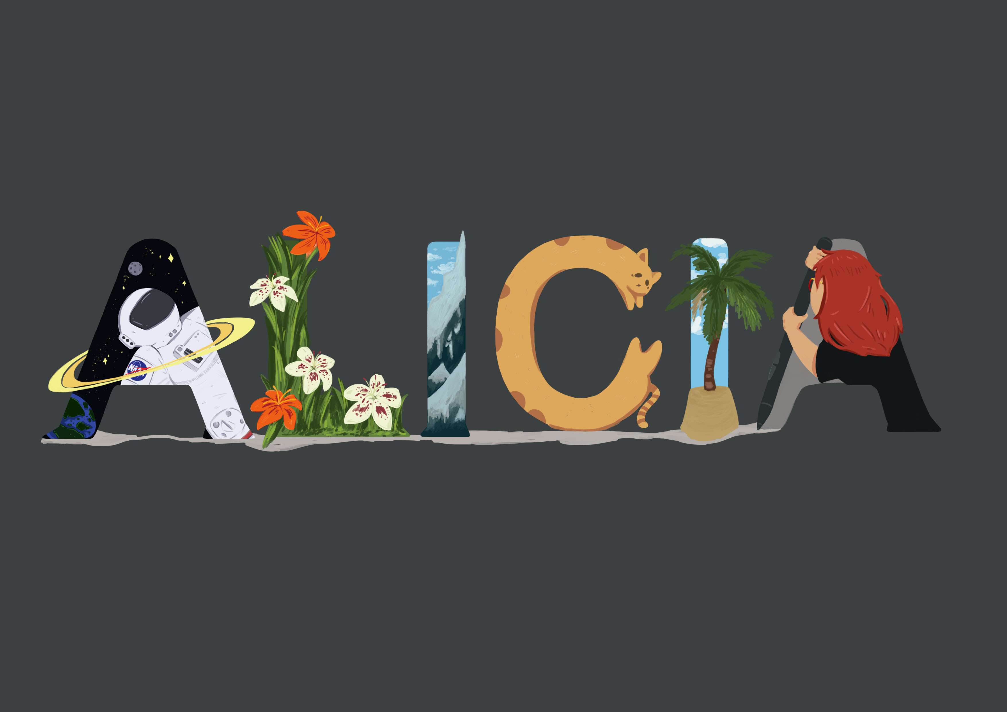
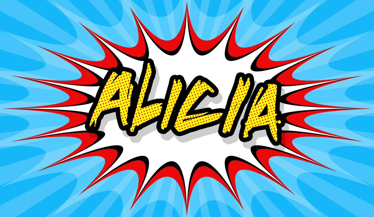
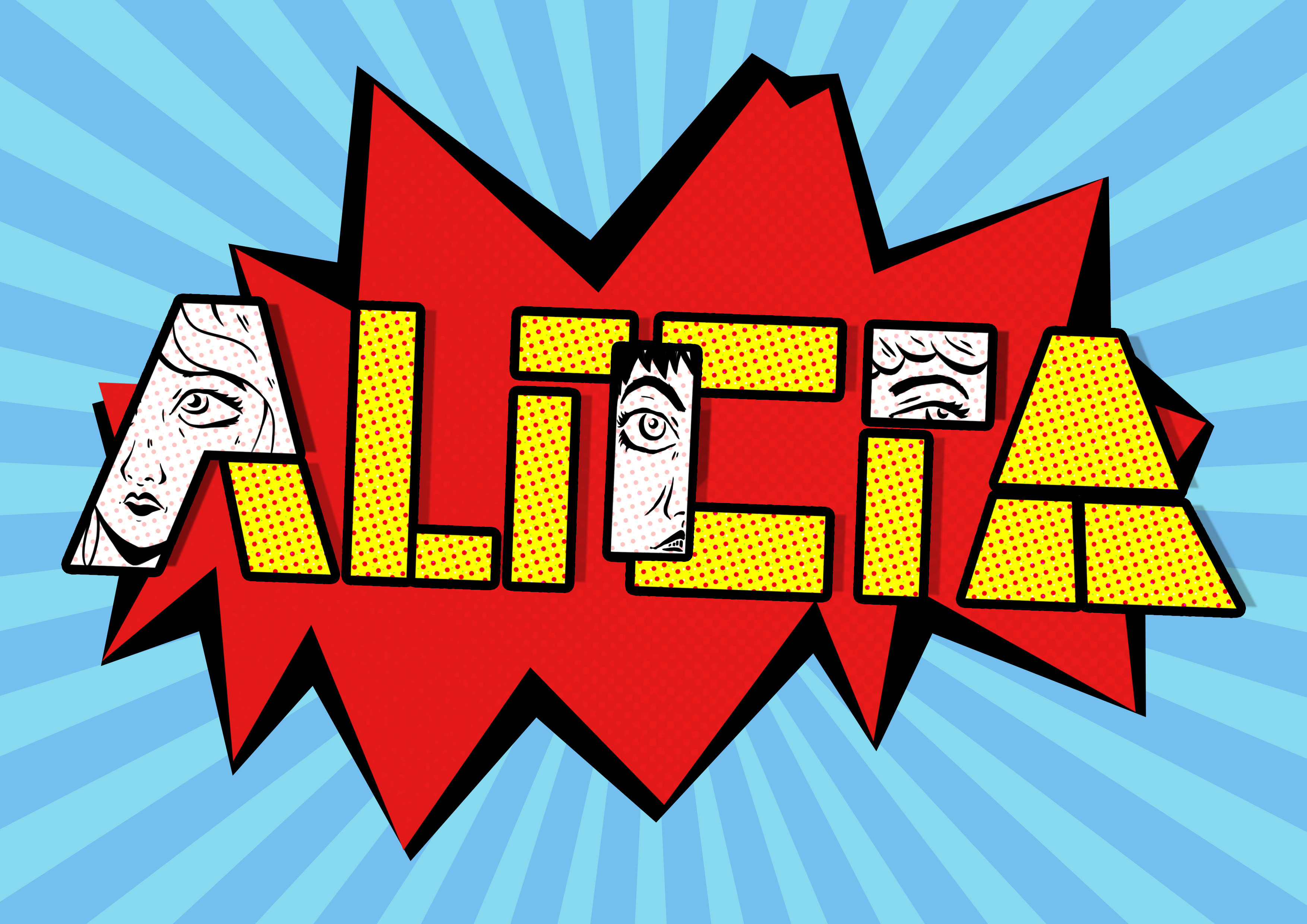
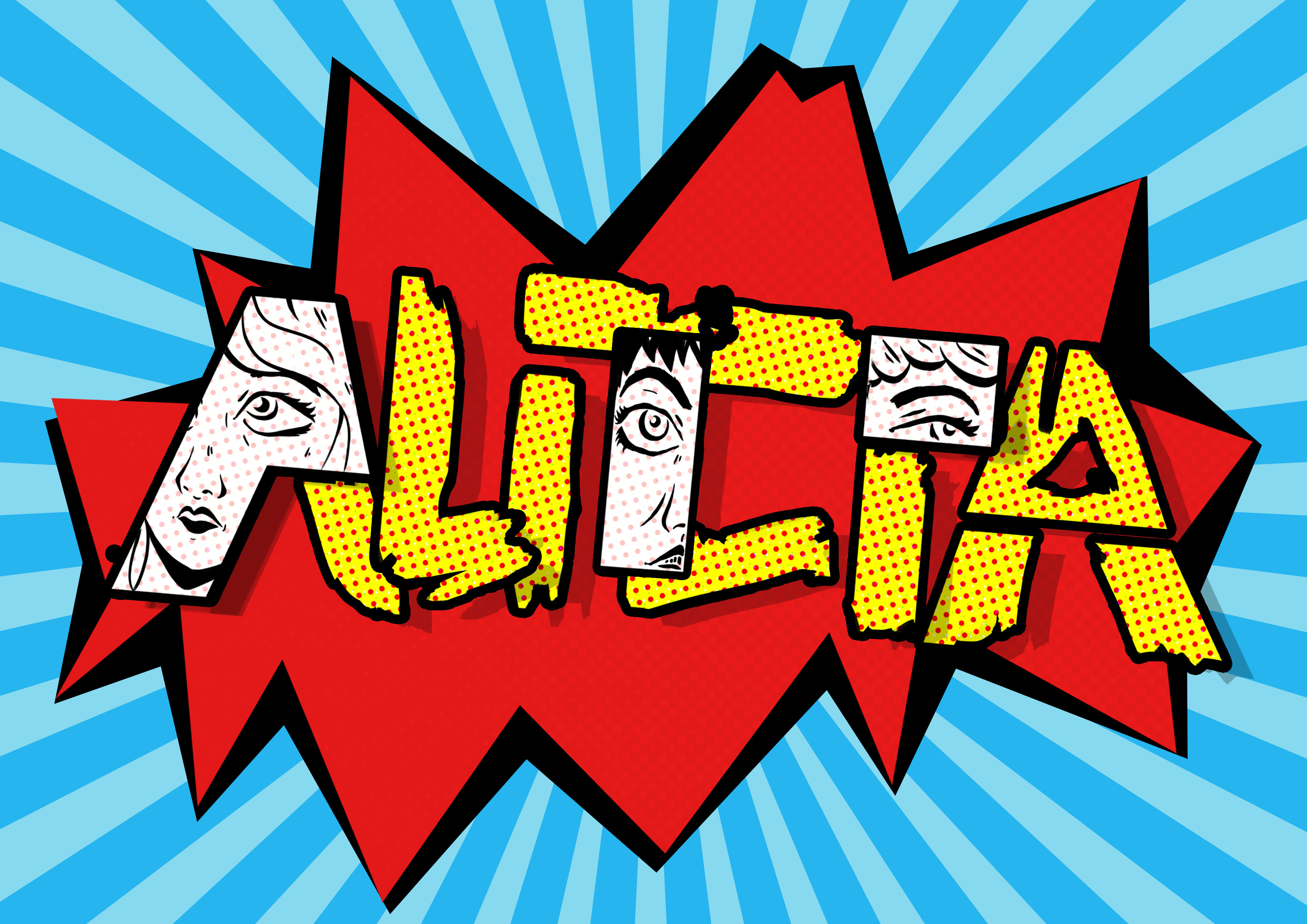
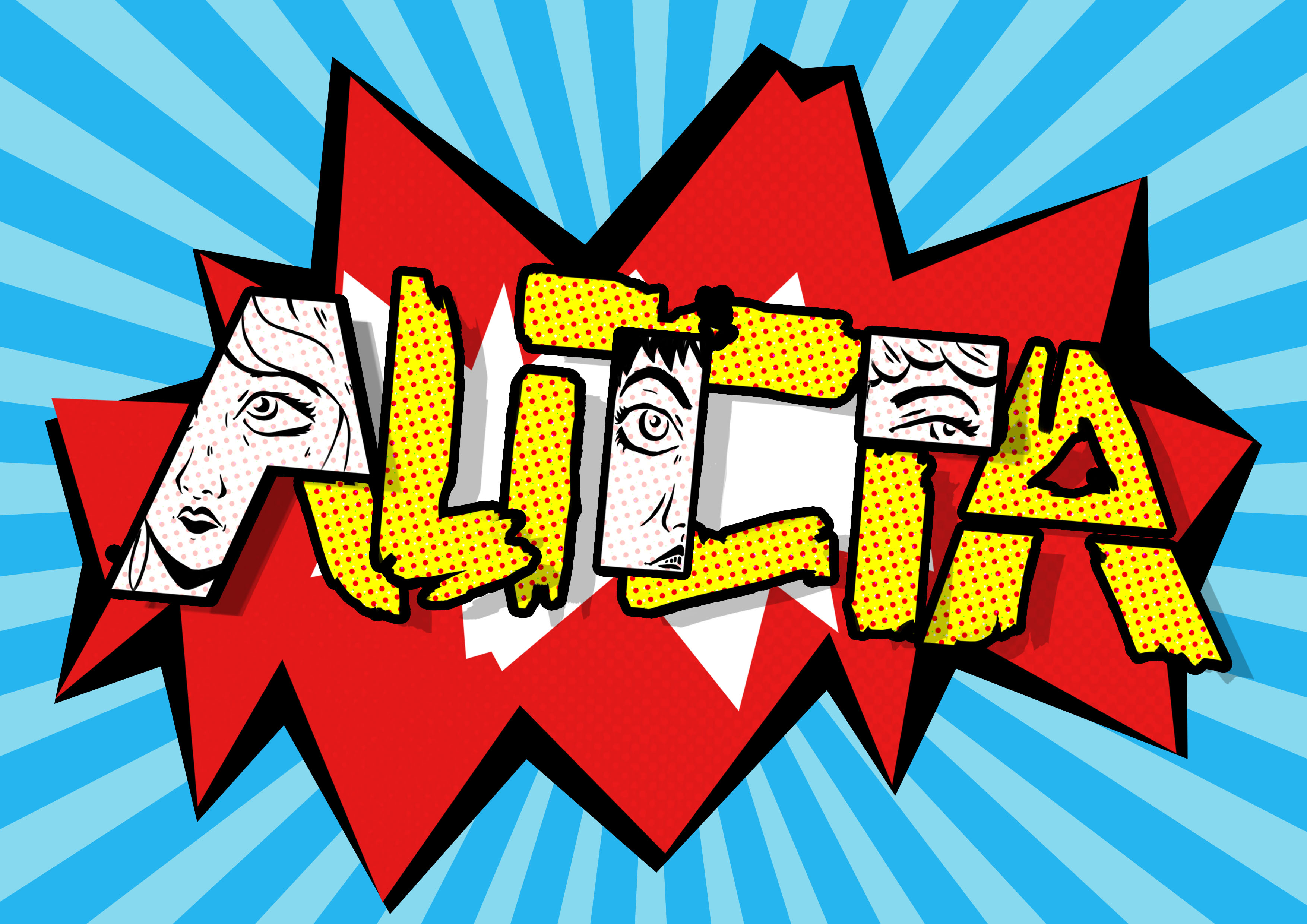
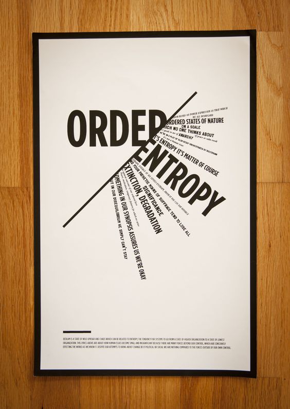
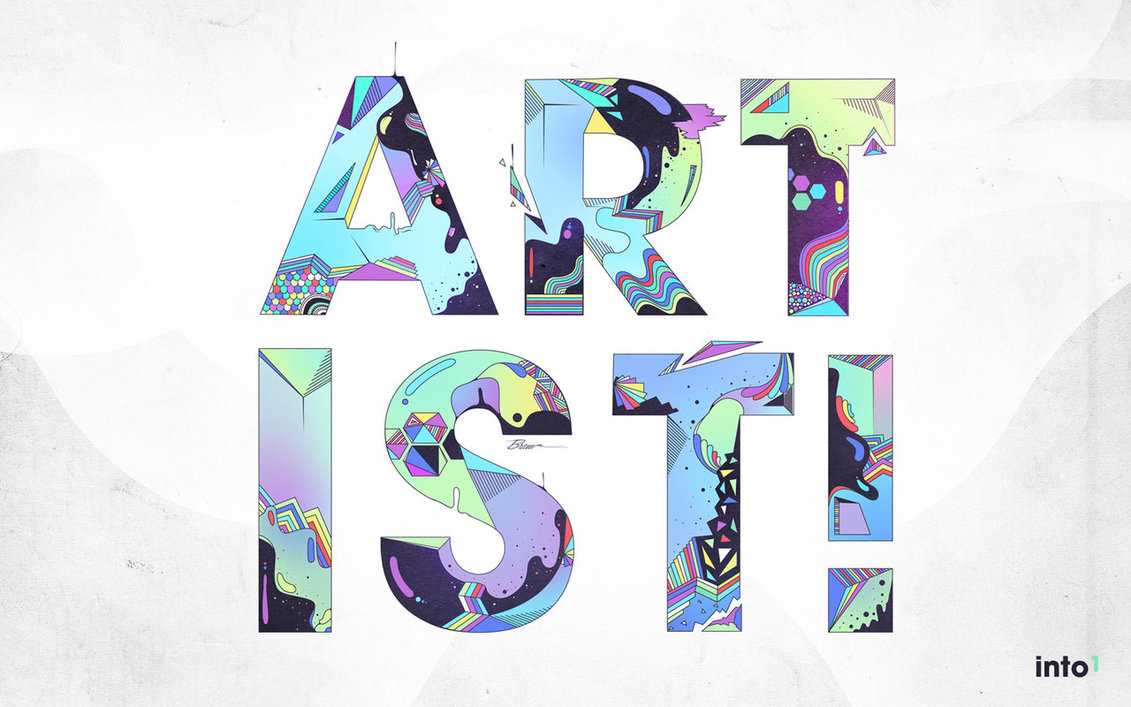
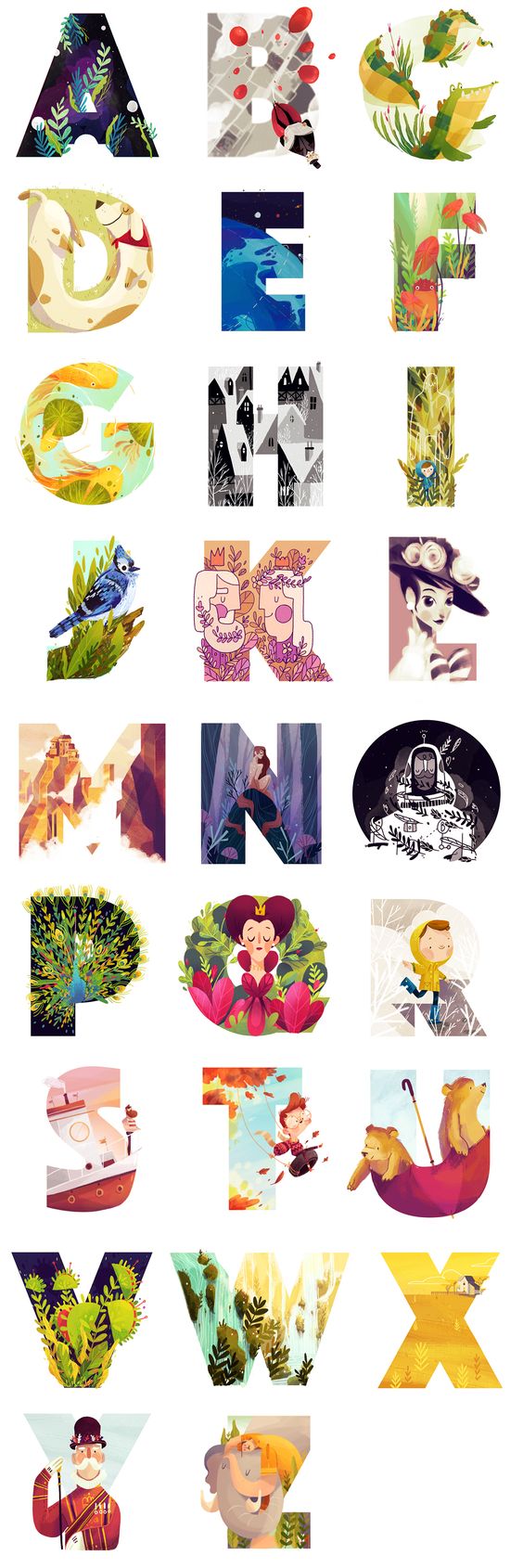
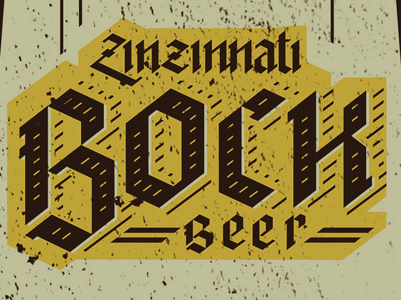
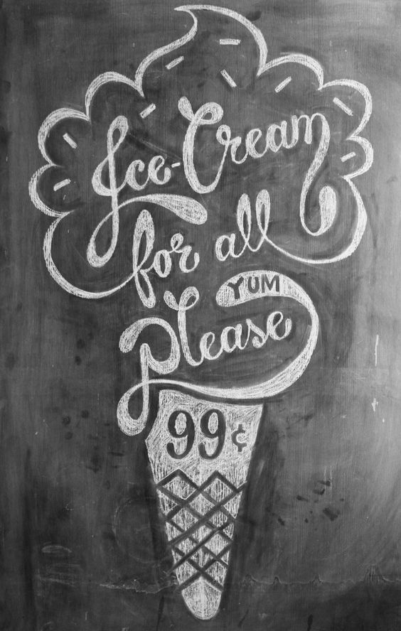
For the first career, I thought of something that I would actually want to do in the future. Hence leading me to picking a career as concept artist. I thought about how concept artist is actually a pretty fun job. For the font I was thinking of using San serif since it is more modern and a little less serious. I also thought of decorative fonts. This brings me to this artist that I found online while looking for inspirations.

Bram Vanhaeren, also known as Espador. He is a graphic designer that plays around with typography and illustration. One of his work that really captured my attention was Artist. It was just the word artist with a san serif bold font made up of detailed illustration within them.

The thing that I really like about this is the illustration is the consistency of each design for the letter as well as a whole. Even though a concept artist could be represented by a fun typography, it should also have consistency and look coherent. His typography look like it is more on the design side while I think I would probably do something more characterized since it sort of represent me who is doing more on characters.

artist_by_espador

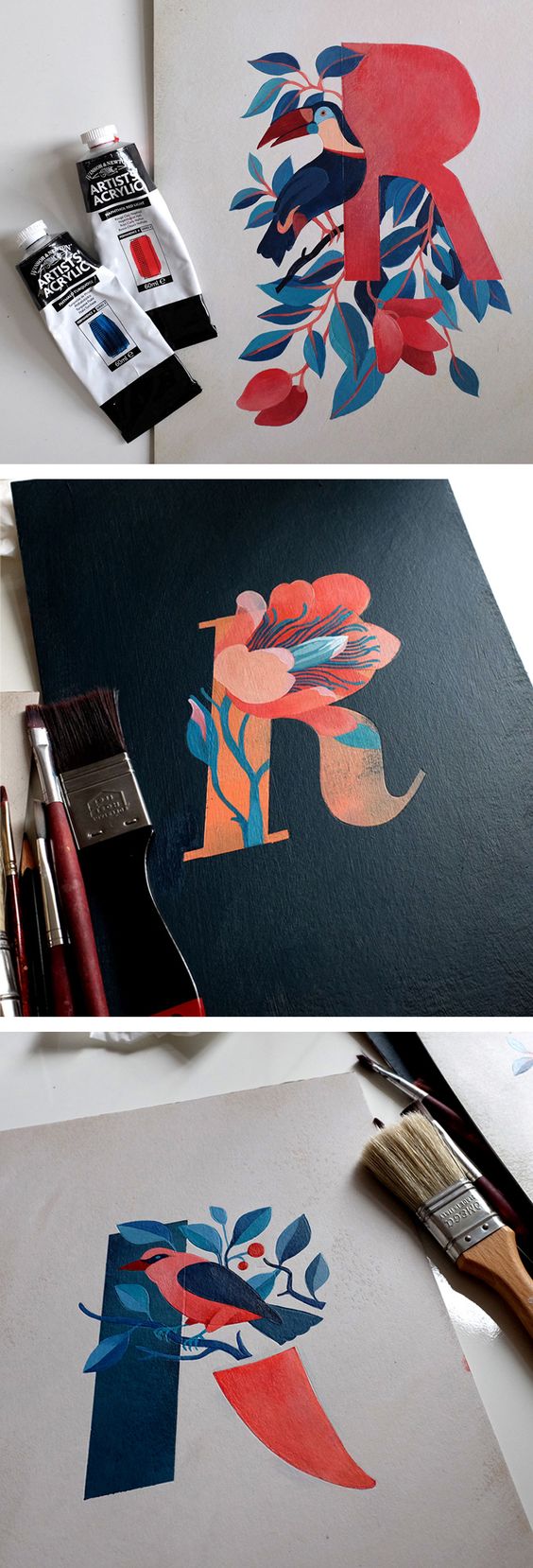
I also saw this other artist’s work on pinterest which was amazing as well. Eleonora Kolycheva did this typography using birds and plants. I really like how she uses minimal colour but it still brings out the focal point of the text. She played around with the different areas where one can emphasize  on the design instead of the whole thing like what Espador did. This could also be something that I could look out for when I design my font.
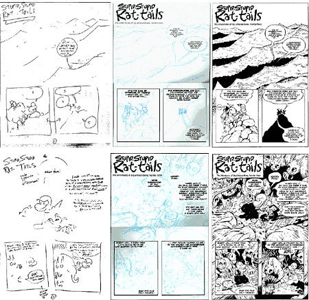
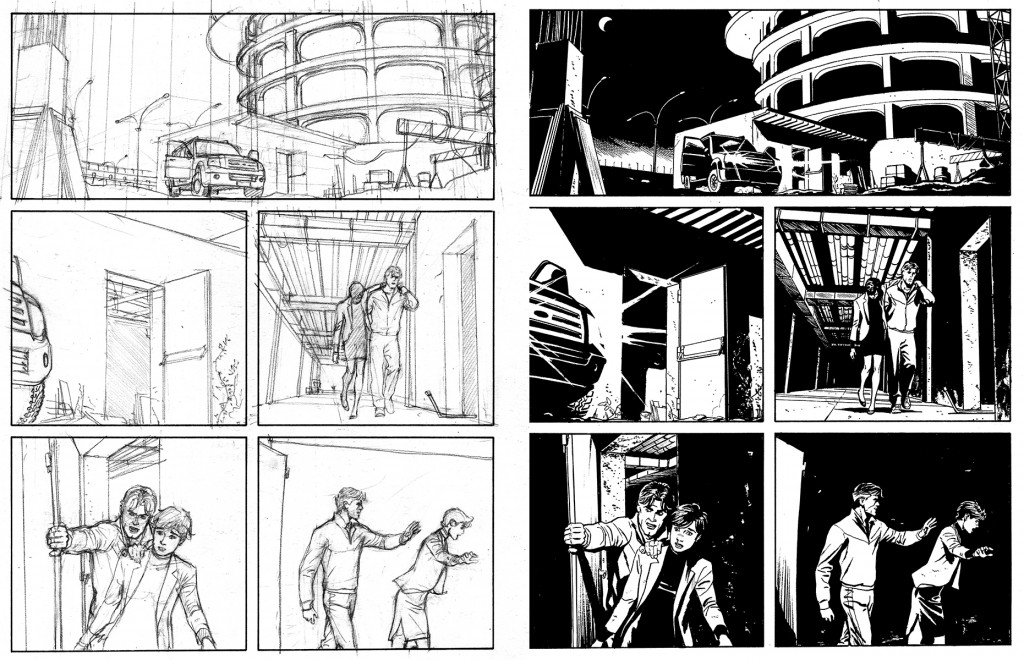
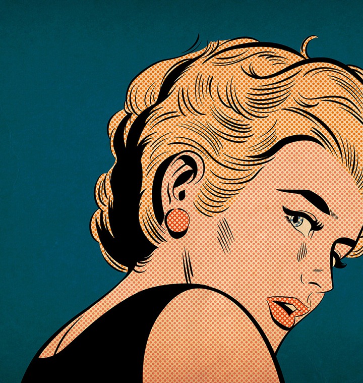
444046ddb702f83edc38c97755a9ecb9

Other examples

11ef7bd4b00d572025a9150e2d03dcdb

a630b9628d7de3a1765866dc77f5c4a7

This is so pretty!!!


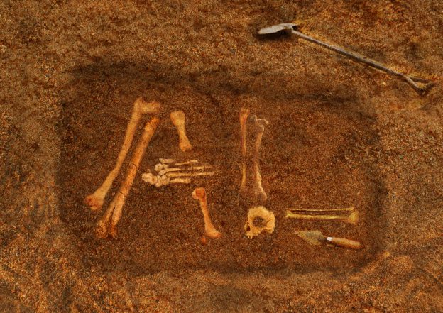
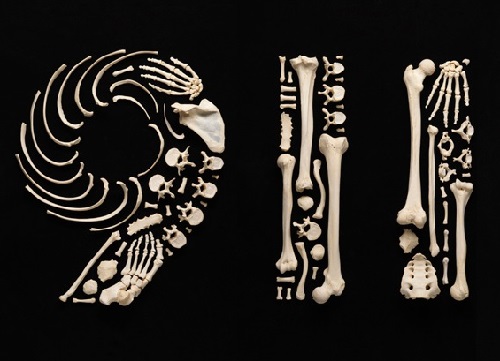
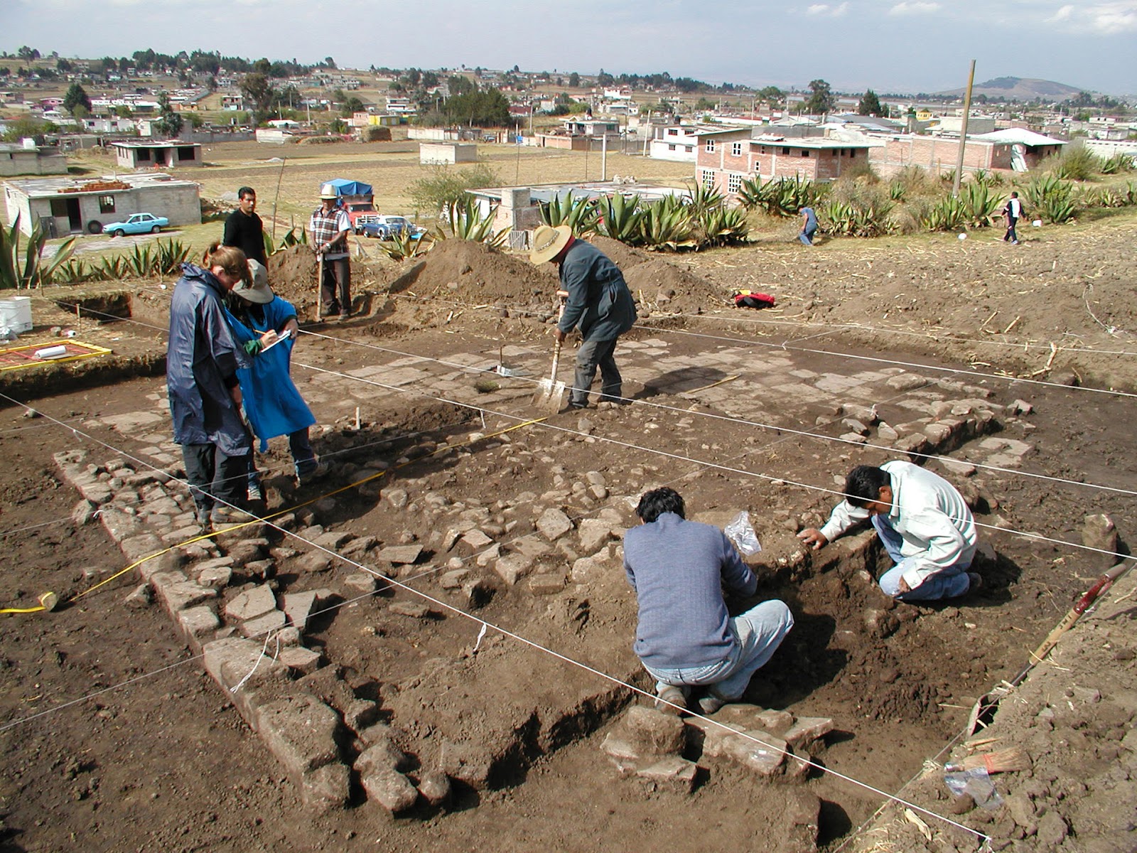
For the second career I choose Archaeologist because I like bones, so I thought that it would be something fun for me to work on. I guess when people hear the word archaeologist they would think of dinosaurs. But when I went online to search up on the things that they mainly do, I realized that they find more than just dinosaur bones.

However, after discussing with Mimi, if i actually use designs that are with potteries and sculptures instead of bones, the career prospect does not seem to come out as an archaeologist. It could possibly be a art historian.

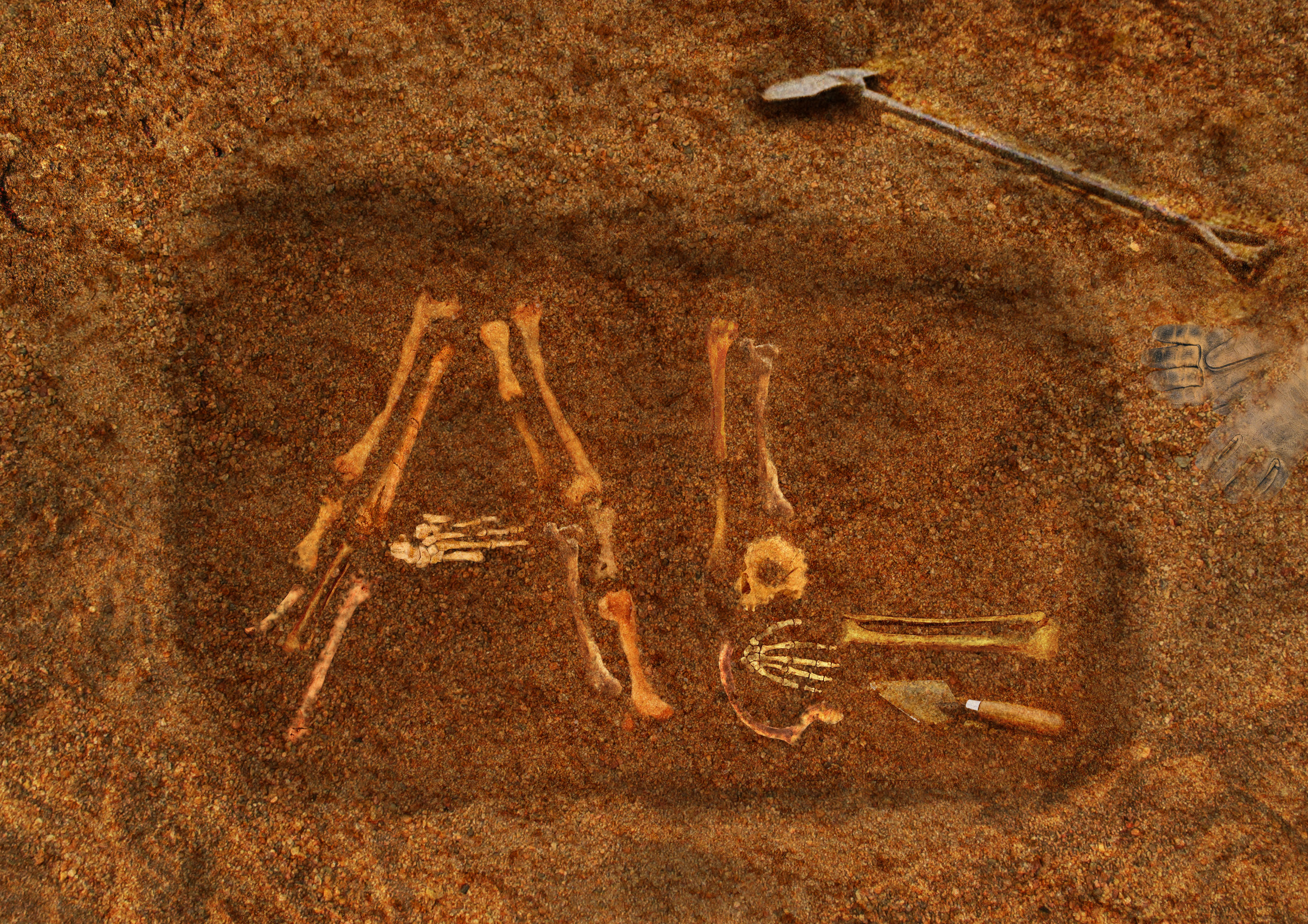
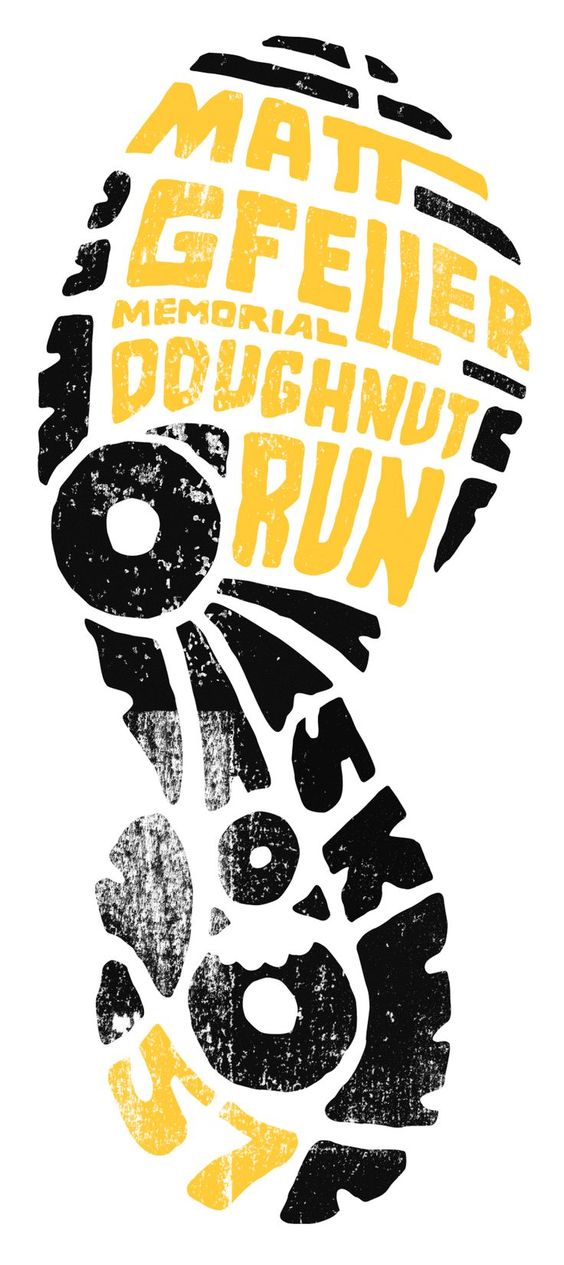
So I thought that I could use some edgy and bold words or even design out bones for my initial. I was thinking that my name kind of has too many letters? And generally when we find bones, they are not really packed together.

Though i am afraid of my set not being constant since I will be using Alicia for my other career and this only with my AL initial. I guess I will need to come out with my ideas to test out how I could possibly use Alicia instead.

For the fonts I was thinking of black letters. They are edgy and also bold which gives off a kind off a sense of lost scroll and buried treasures. I also have quite a few ideas in my journal from the 30 boxes exercises we did in class.

053883d37a7471a15d48c7e6f542877f

I really like how this is so simple but yet it gives off the antique feeling.

Other examples :

5d2a793f11be9f170f5f731ca4373693

743ce291b583ef56e7a9bba274faa373


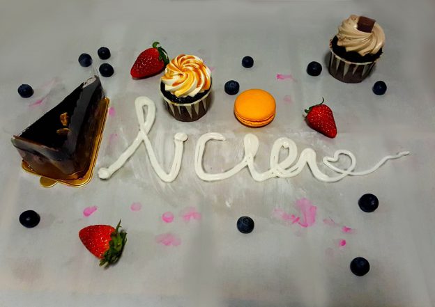
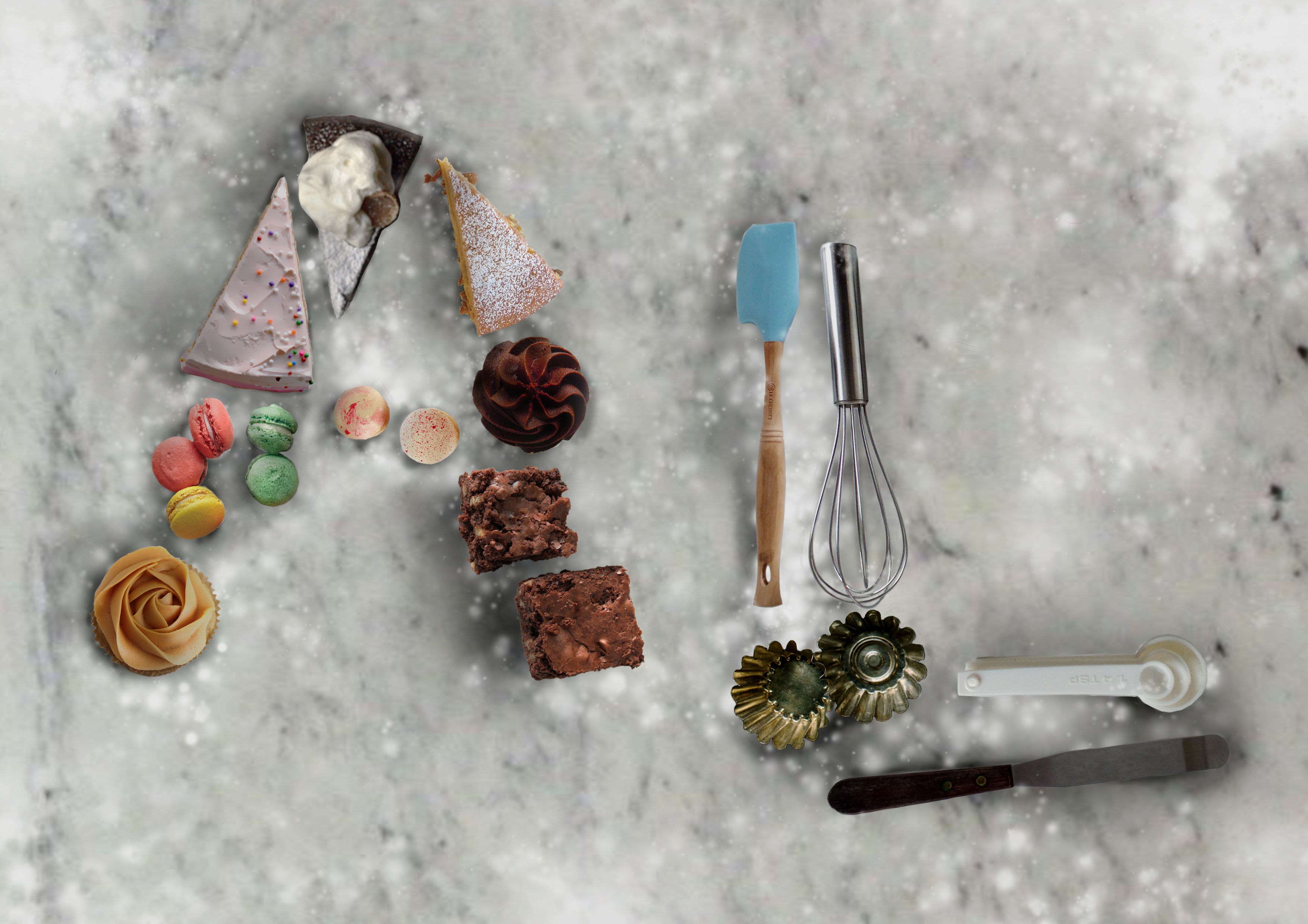
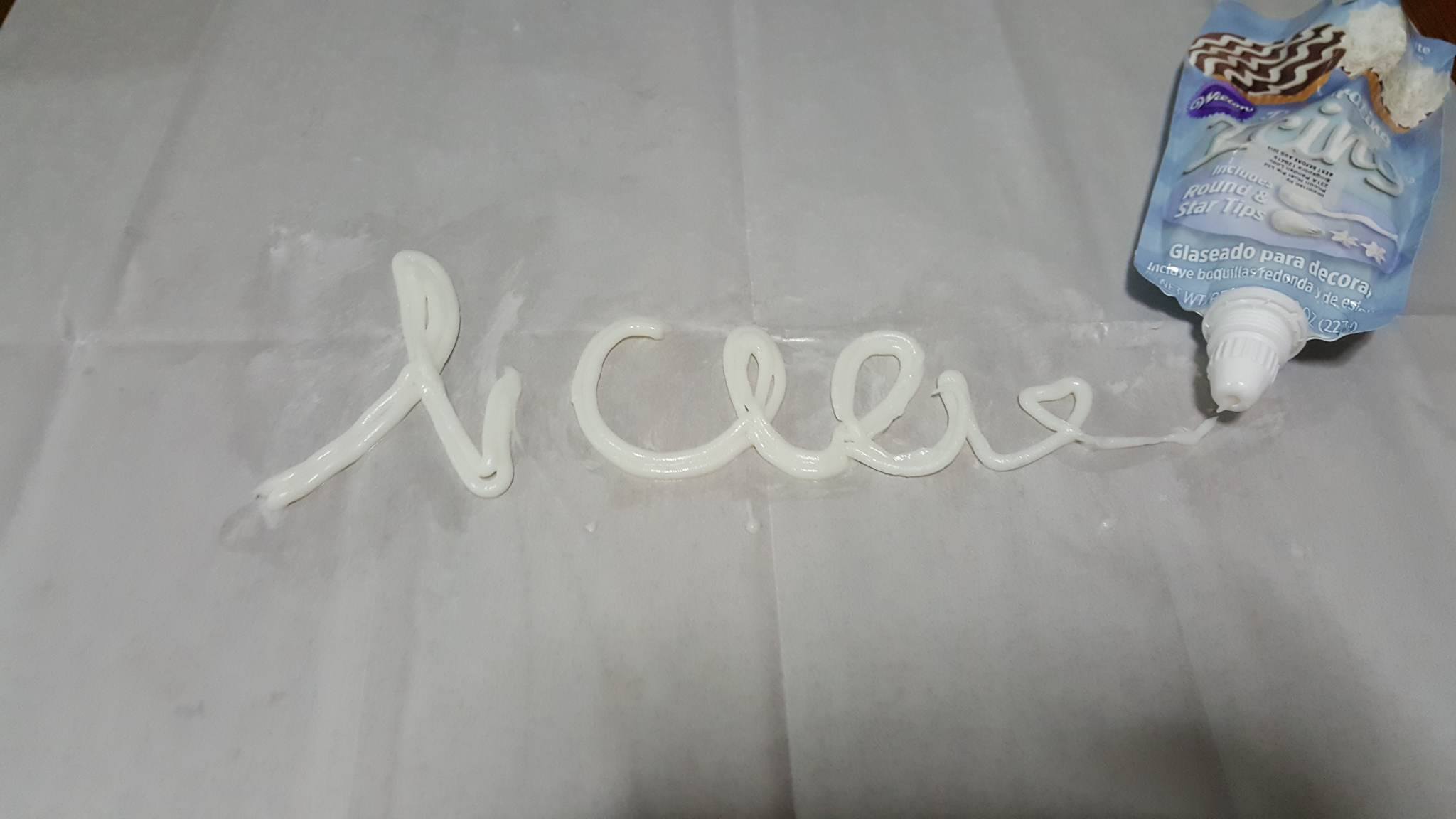
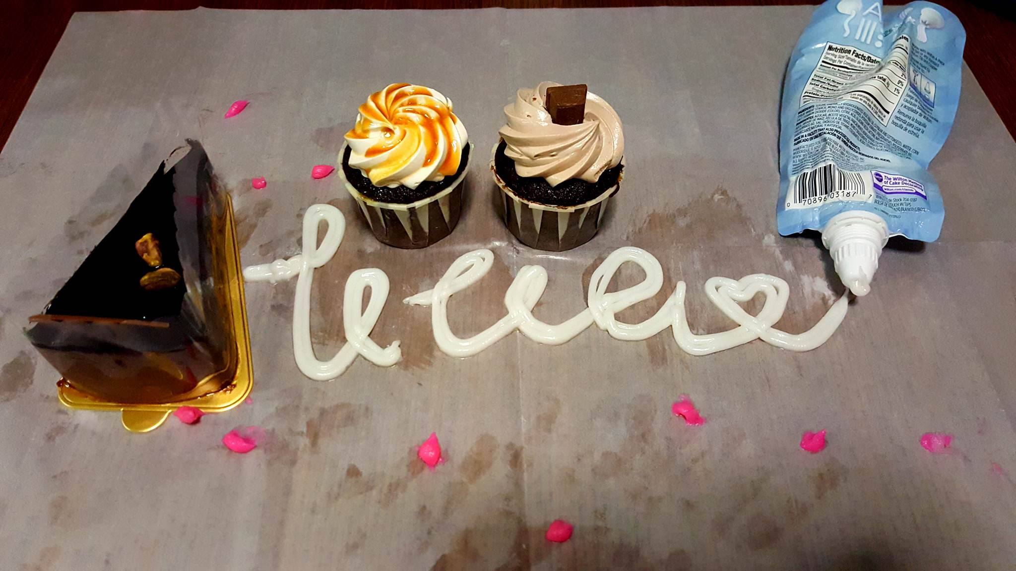
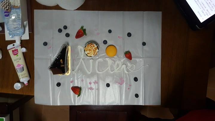
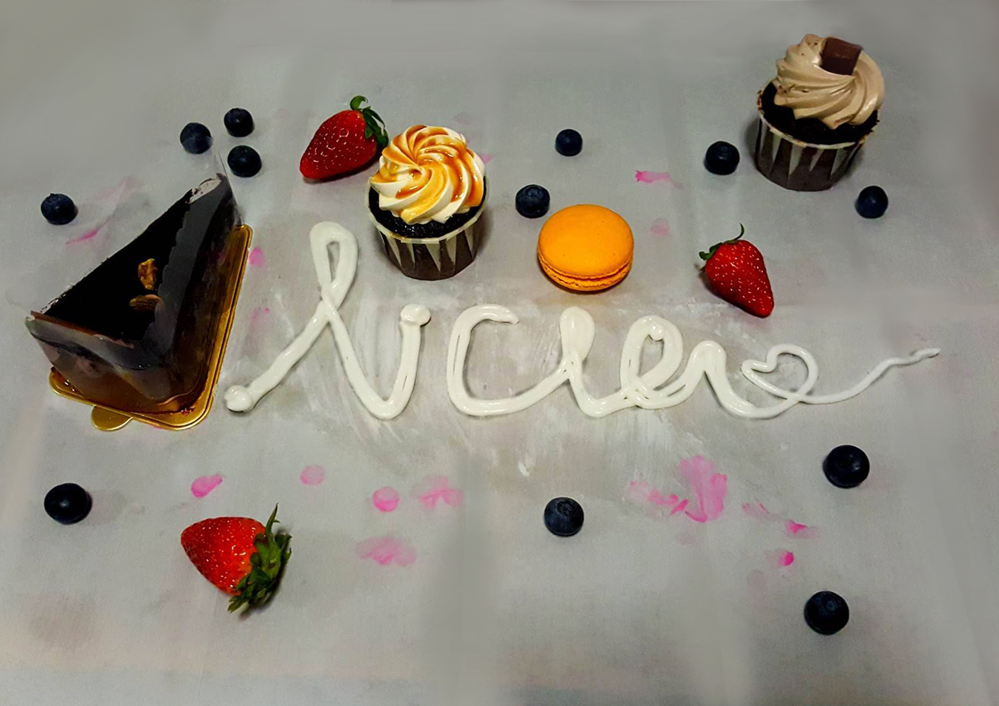
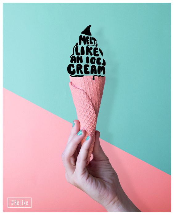
For the third career that I have picked is a patissier. I was actually thinking of a baker, but I guess that is like more breads than sweets? So I thought that perhaps a patissier is more towards the career I want with cakes and sweets. Generally when I think of sweets I think of pastel colours, like how the colours of macaroons are.

32f89066694aede842b7ee784282edc6

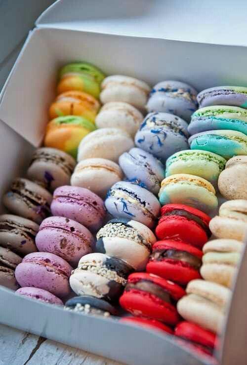
As for the fonts, i was thinking that perhaps it could go with the a more flowy style. For instance like calligraphy or even script fonts. It gives of a sense of a pretty elegant feeling but yet artistic and grand? Seeing the photo makes me feel hungry…

I actually wanted to try out for something more like this? But I honestly felt that it was more towards are cafe feeling than a patissier so I was not really sure how I could actually bring out a more “sweets” kind of design while in-cooperating calligraphy or script font.

7d7ba0536bcd53be397d652de2e528af

Then I came across this which was really close to the idea that I wanted to portray for the patissier. Screaming in joy internally! It was somewhat similar to the concept artist where the fonts are pretty decorated with designs. However, instead of bold fonts, I will use either calligraphy or script. For the designs, I was thinking of doing the sweets design inside of the letters or I could do it like the example below but using the sweets as the letters themselves.

e87164142edabed5c050af13e6238287

cc71480fae0746c87a12cf68e26c8fb6


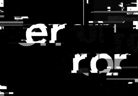
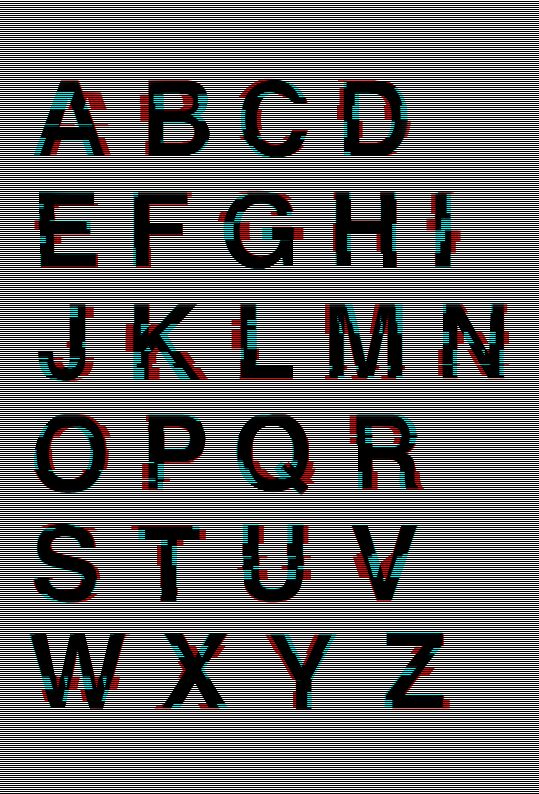
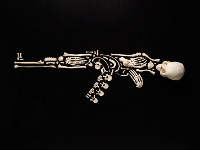
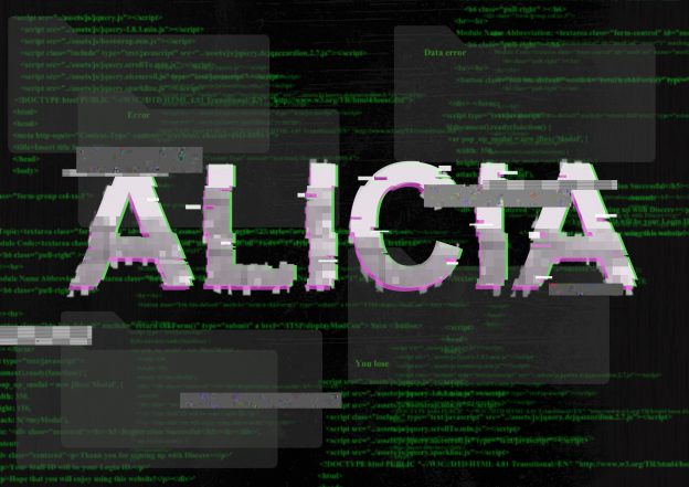
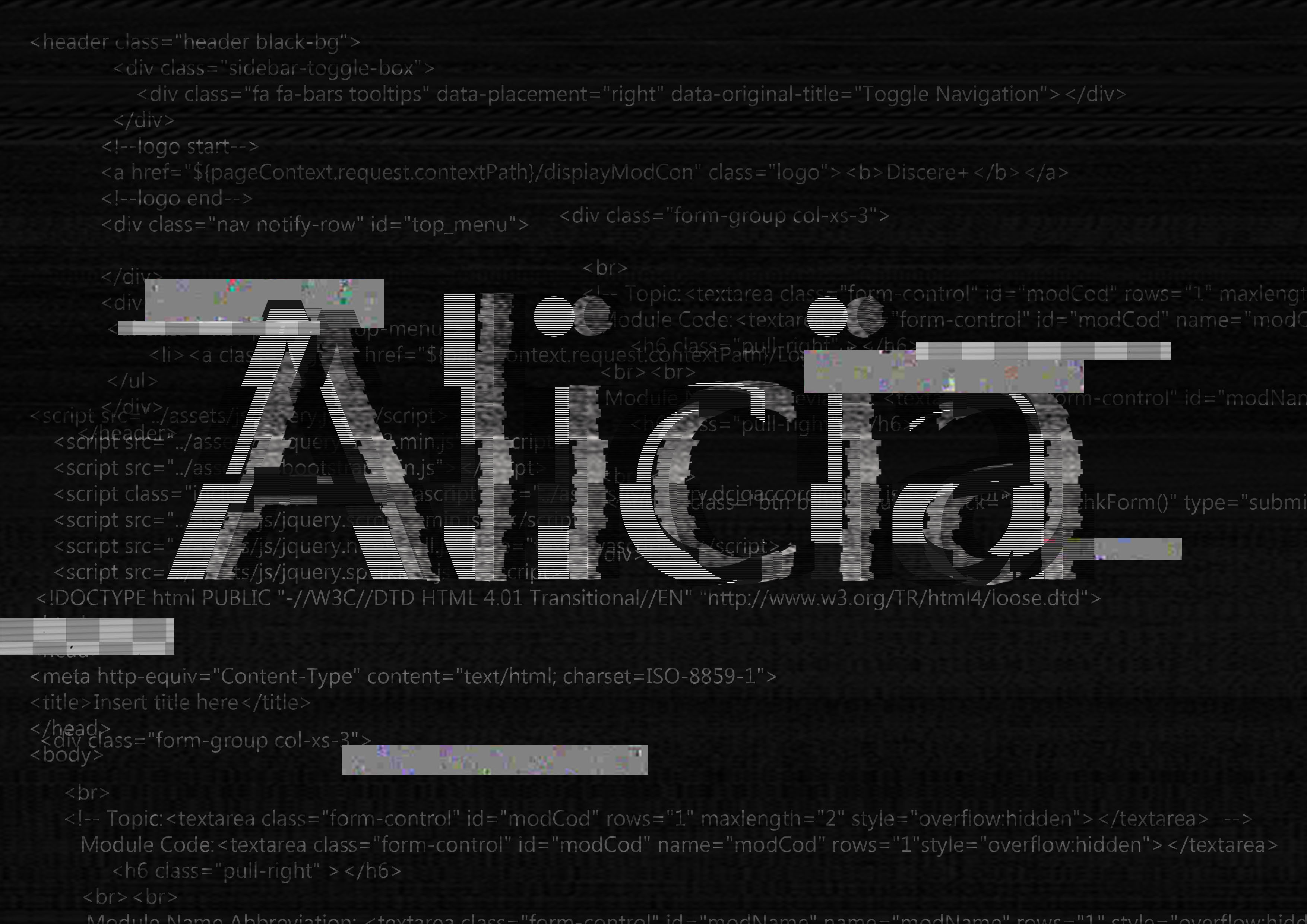
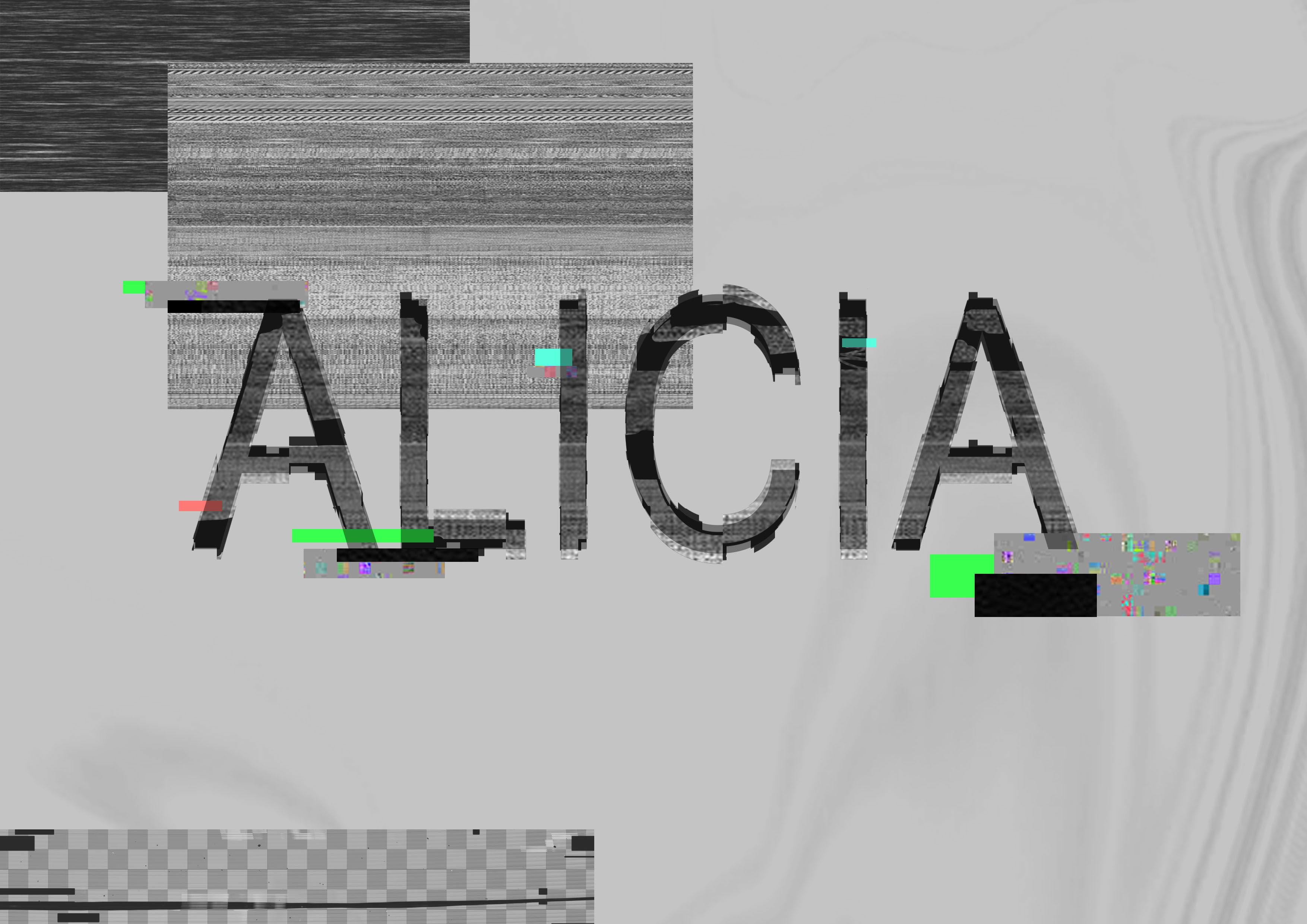
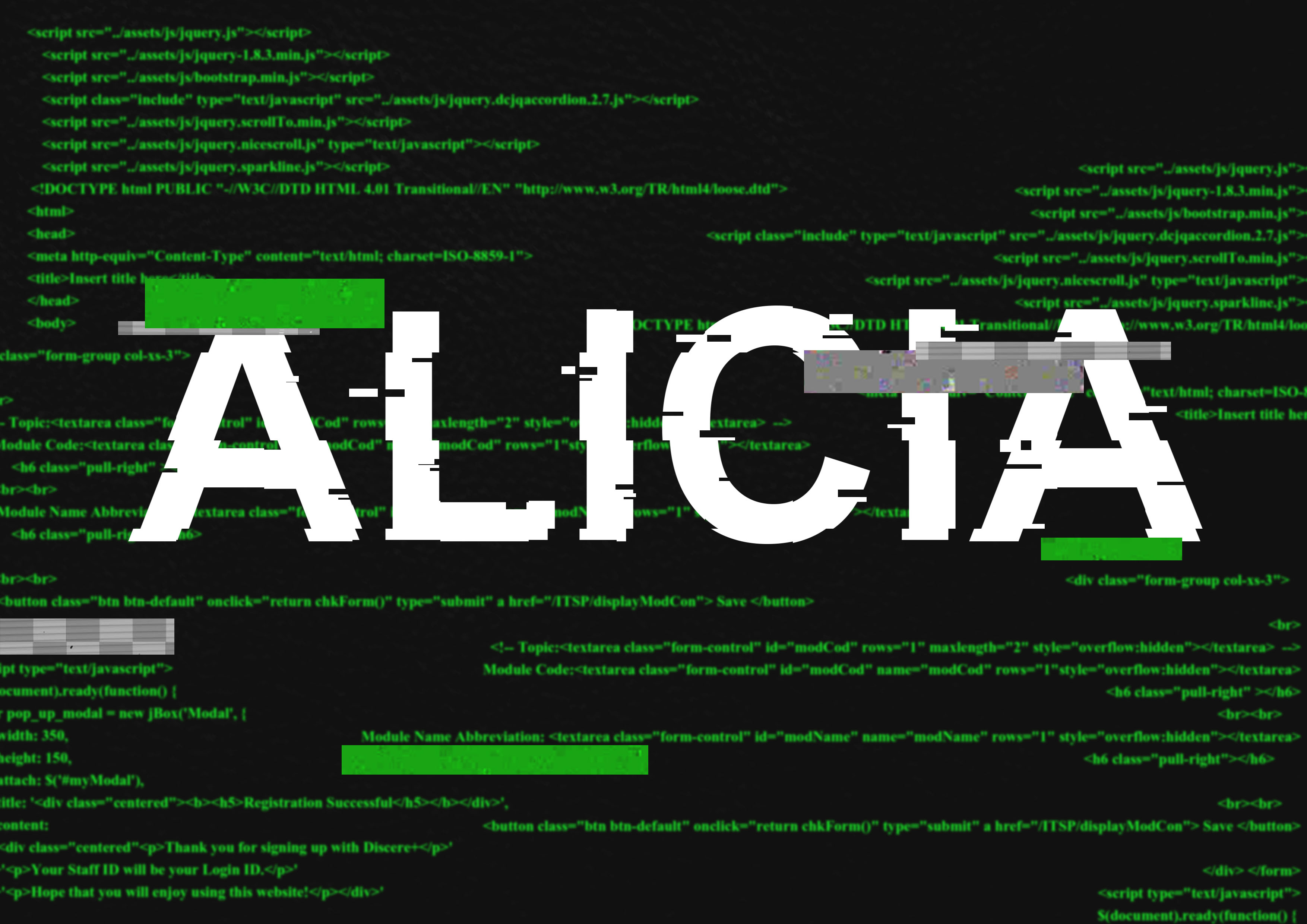
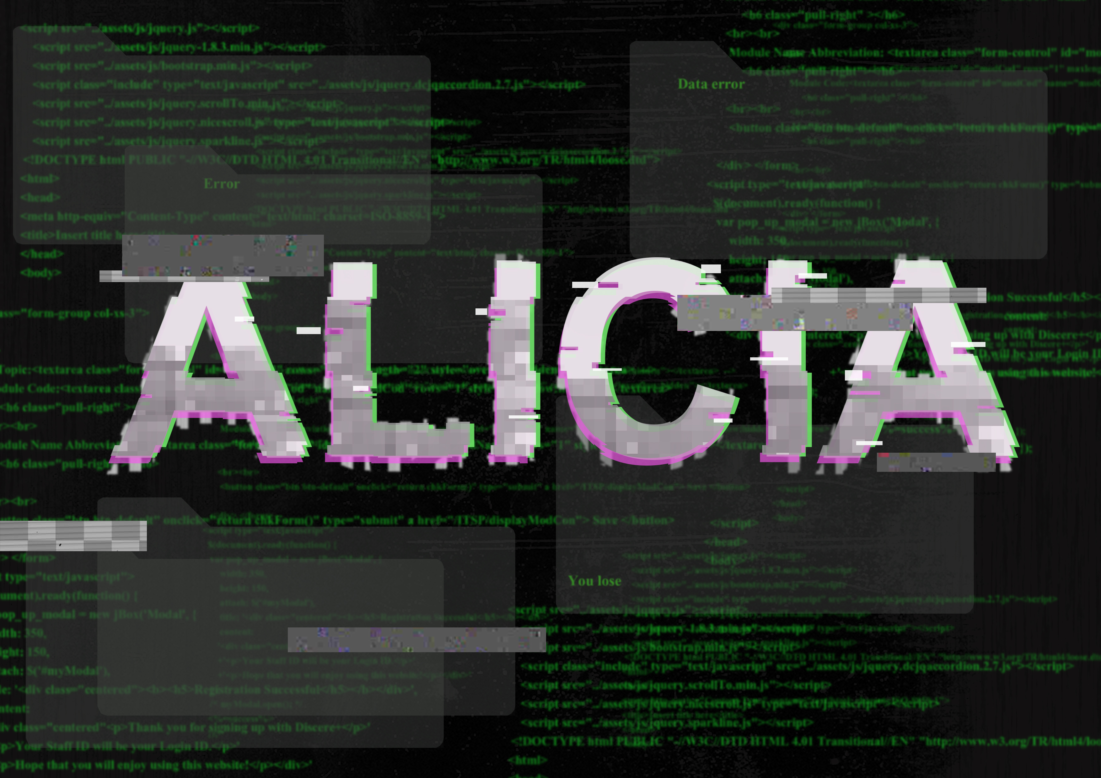
As for my final career, I picked ethical hacker. I really wanted to try out this career because of a game I saw. The whole game was about hacking and how they had set up their own base with their branding and all. They had this poster which really reached out to me.

6e1b766619c5fe76053457bc6650e3a1

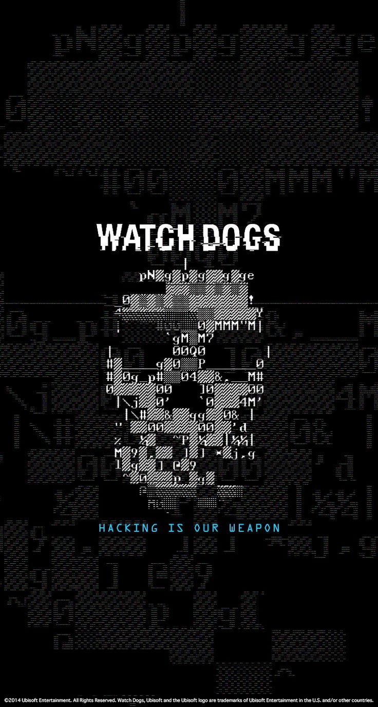
They used glitches and coding to form a skull which is their logo. I thought it would be interesting to try and make something using code to form my name.

I have also thought about doing pixel art? Since we are talking about coding and glitches, its all under things that represent computer. However, I realised that for this career, it is actually quite difficult to pen down the ideas since everything is just full of codes. So I think that probably for this career I might just upload all my ideas onto oss instead of having them down on journal.

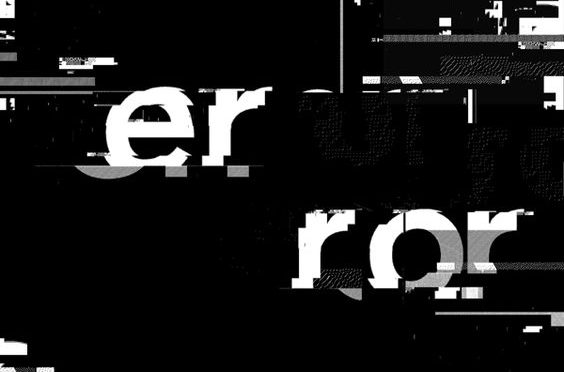
Examples of glitches :

22f05855a7edb1f1608c68cb8d963d65

cc8c567627f5a4d74babac22e2092d67

5eb75cdbb5556cf72d1018421d3e0998


Que sera, sera – David Carson (WIP01)

For the first assignment, we would be working on typography to express our possible future job. I think this would actually be a difficult thing for me after realising what happened during the class practice. I don’t really have  much experience with typography considering how I came from an animation course and we just express a personality through the poses and stance of a character.

I feel like this assignment would kind of be like a challenge for myself. However, I also this is also a good exposure for me to get started on my own branding for adm’s showcase perhaps. I guess typography is like drawing but in a non visionary way where on can still tell the personality and character of something.

For the artist research, I thought that David Carson would be an interesting artist to find some inspiration from. I looked through the other artists too but David Carson’s work just intrigues me. He is a graphic designer and also an art director. His work style involves a lot of typography and interesting layouts.

Some of his work looks like a jumbled mess of words but then i remembered what we were talking about in class. There were actually emphasis of some of the words among the whole chunk of words.

Festival

This image feels like it is something about a festival  by many different type of artist all over the world. Even though it looks pretty messy and the letter seems to be chopped up, the message is still clear enough.

0af72200d70665d63558ca76b3076629

This image is about anthropomorphism where he actually use collage to play with the visual meaning and there is also the explanation of the words by the side. He also played with the negative space between the words and photos. Even though not all the letters could be seen with the white background, he position it in a way that we are still able to make out the outlines of the words.

His other works:

56fbbff1528a298c66e85cdad0760dc1 essaycarson neville-brody-3

His works really makes sense in both the type fonts he uses and also the way he places them in space. It sort of brought everything together when you view them on a whole but even as one they each have their own meaning too. After seeing his works I actually felt quite worried and scared for this assignment but yet at the same time I am quite excited to see what kind of end product I could make.