-Long post ahead-
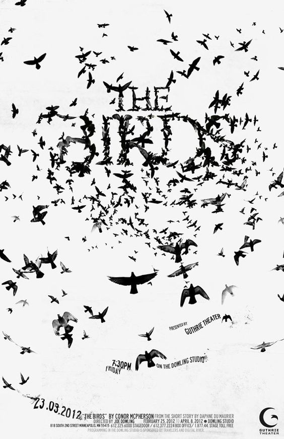
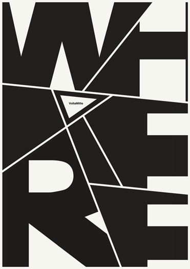
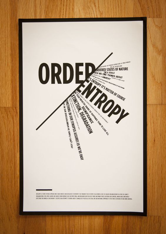
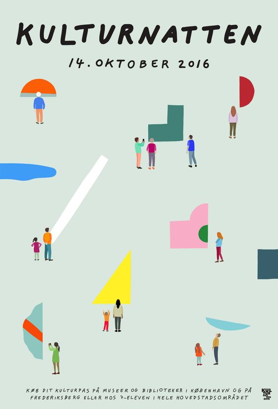
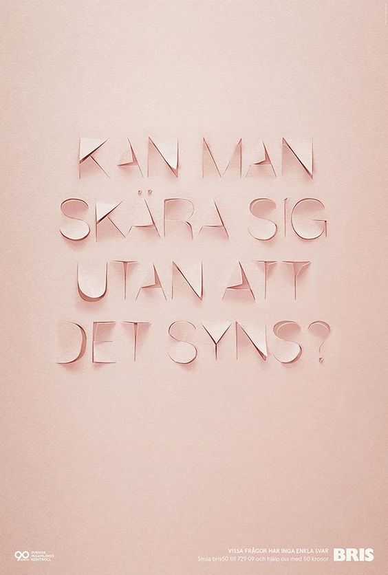
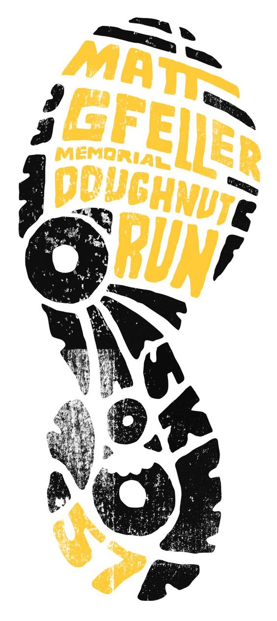
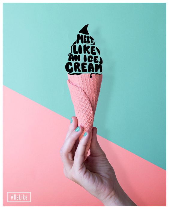
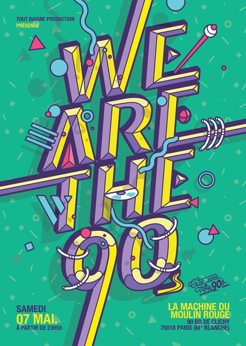
After actually searching up the different possible ways and style to showcase the 4 careers that I have picked on, here are a few of them. There are not really what I would do exactly but I guess they just gave me idea to get started. I actually printed them out in the Journal too, since I thought it would be easier for me to refer to them when brainstorming about the compositions.
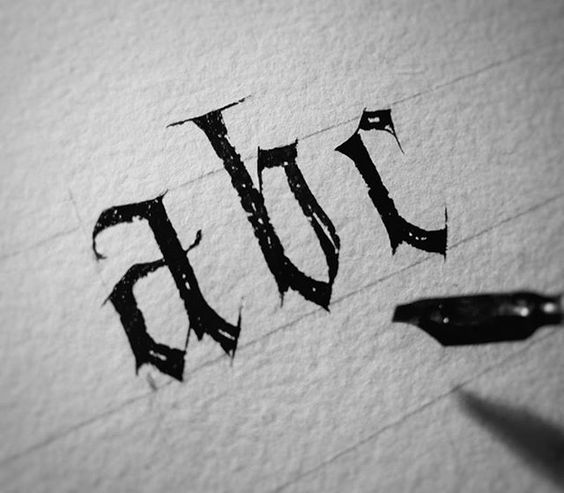
I am very curious how much time this person spent at doing this? Or did he/she customize a brush?
The 4 careers that I have chosen is Concept artist, Archaeologists, Patissier and Ethical hacker. However, after last week’s consultation, apparently having to portray specifically ethically hacker is quite difficult so I am changing it to just hacker.
After deciding on the careers, i thought that I would look more into each of the design and style for each of them. Also maybe picking out objects, effects, symbols or colours that may represent that specific career. There was also the 30 idea boxes challenge which I thought was pretty interesting. So I thought why not trying out for all the 4 careers.
For the first career, I thought of something that I would actually want to do in the future. Hence leading me to picking a career as concept artist. I thought about how concept artist is actually a pretty fun job. For the font I was thinking of using San serif since it is more modern and a little less serious. I also thought of decorative fonts. This brings me to this artist that I found online while looking for inspirations.
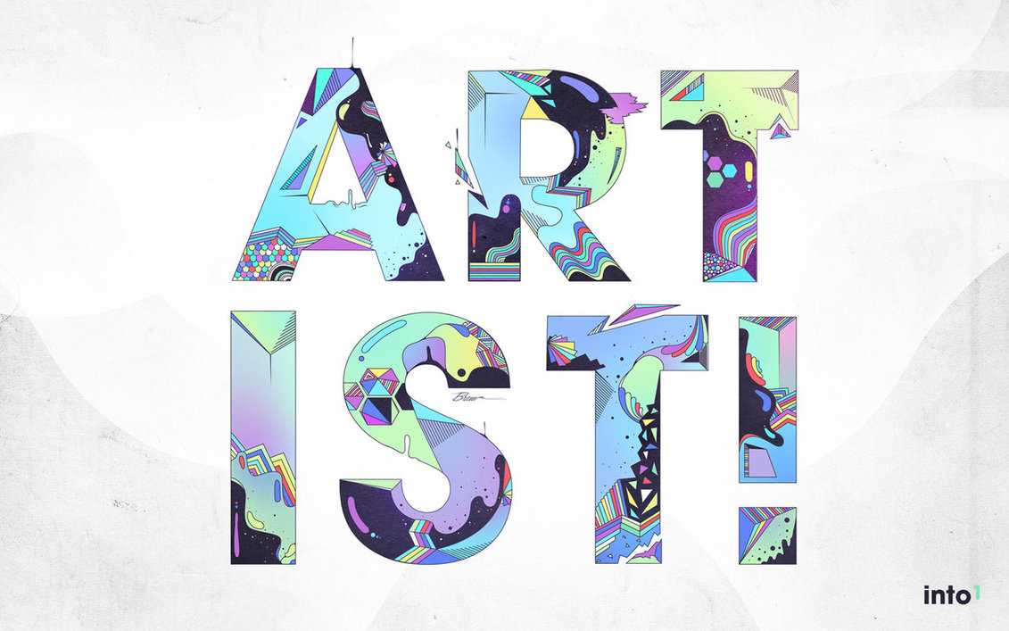
Bram Vanhaeren, also known as Espador. He is a graphic designer that plays around with typography and illustration. One of his work that really captured my attention was Artist. It was just the word artist with a san serif bold font made up of detailed illustration within them.
The thing that I really like about this is the illustration is the consistency of each design for the letter as well as a whole. Even though a concept artist could be represented by a fun typography, it should also have consistency and look coherent. His typography look like it is more on the design side while I think I would probably do something more characterized since it sort of represent me who is doing more on characters.
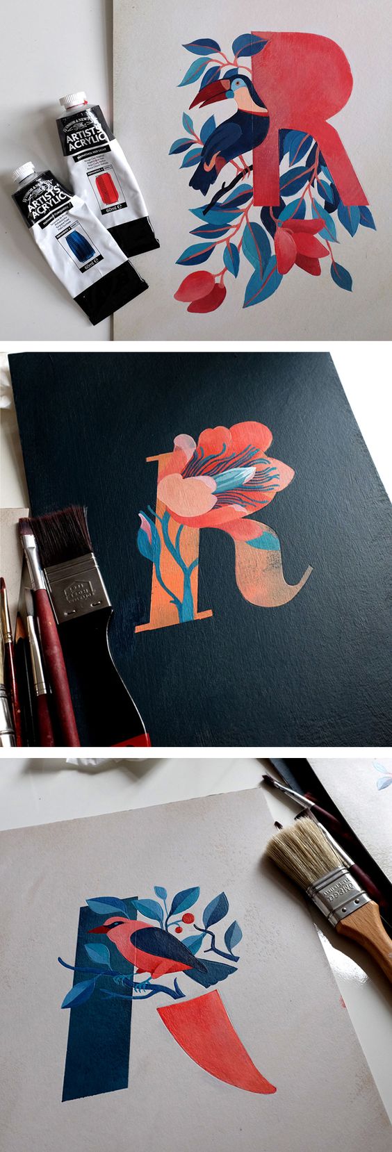
I also saw this other artist’s work on pinterest which was amazing as well. Eleonora Kolycheva did this typography using birds and plants. I really like how she uses minimal colour but it still brings out the focal point of the text. She played around with the different areas where one can emphasize on the design instead of the whole thing like what Espador did. This could also be something that I could look out for when I design my font.
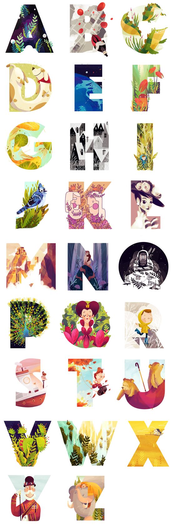
Other examples
This is so pretty!!!
For the second career I choose Archaeologist because I like bones, so I thought that it would be something fun for me to work on. I guess when people hear the word archaeologist they would think of dinosaurs. But when I went online to search up on the things that they mainly do, I realized that they find more than just dinosaur bones.
However, after discussing with Mimi, if i actually use designs that are with potteries and sculptures instead of bones, the career prospect does not seem to come out as an archaeologist. It could possibly be a art historian.
So I thought that I could use some edgy and bold words or even design out bones for my initial. I was thinking that my name kind of has too many letters? And generally when we find bones, they are not really packed together.
Though i am afraid of my set not being constant since I will be using Alicia for my other career and this only with my AL initial. I guess I will need to come out with my ideas to test out how I could possibly use Alicia instead.
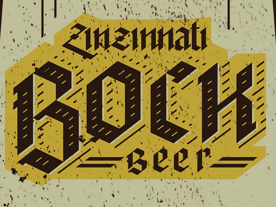
For the fonts I was thinking of black letters. They are edgy and also bold which gives off a kind off a sense of lost scroll and buried treasures. I also have quite a few ideas in my journal from the 30 boxes exercises we did in class.
I really like how this is so simple but yet it gives off the antique feeling.
Other examples :
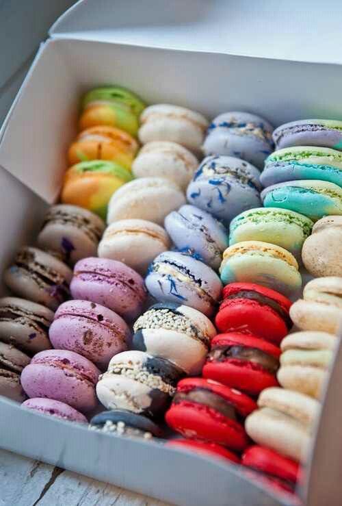
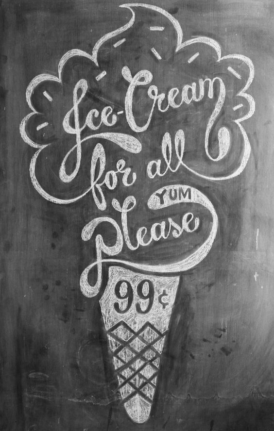
For the third career that I have picked is a patissier. I was actually thinking of a baker, but I guess that is like more breads than sweets? So I thought that perhaps a patissier is more towards the career I want with cakes and sweets. Generally when I think of sweets I think of pastel colours, like how the colours of macaroons are.
As for the fonts, i was thinking that perhaps it could go with the a more flowy style. For instance like calligraphy or even script fonts. It gives of a sense of a pretty elegant feeling but yet artistic and grand? Seeing the photo makes me feel hungry…
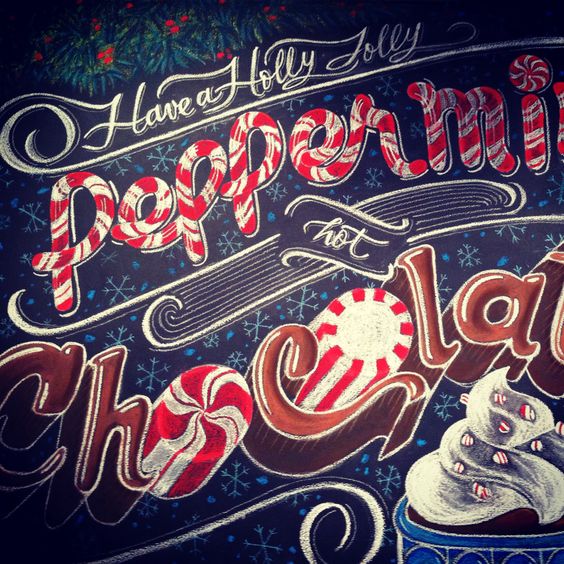
I actually wanted to try out for something more like this? But I honestly felt that it was more towards are cafe feeling than a patissier so I was not really sure how I could actually bring out a more “sweets” kind of design while in-cooperating calligraphy or script font.
Then I came across this which was really close to the idea that I wanted to portray for the patissier. Screaming in joy internally! It was somewhat similar to the concept artist where the fonts are pretty decorated with designs. However, instead of bold fonts, I will use either calligraphy or script. For the designs, I was thinking of doing the sweets design inside of the letters or I could do it like the example below but using the sweets as the letters themselves.
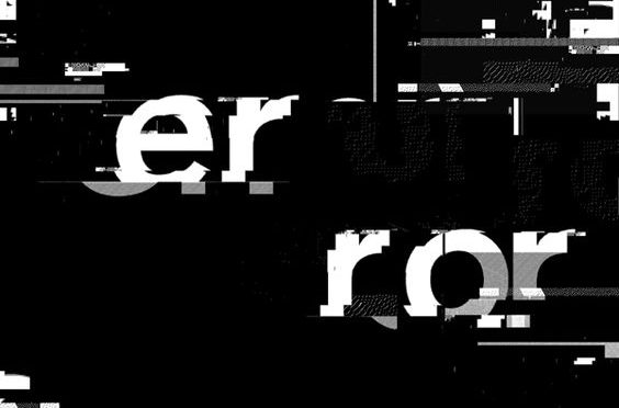
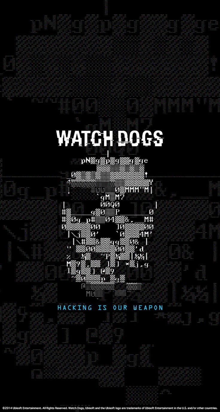
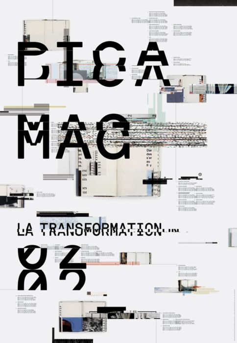
As for my final career, I picked ethical hacker. I really wanted to try out this career because of a game I saw. The whole game was about hacking and how they had set up their own base with their branding and all. They had this poster which really reached out to me.
They used glitches and coding to form a skull which is their logo. I thought it would be interesting to try and make something using code to form my name.
I have also thought about doing pixel art? Since we are talking about coding and glitches, its all under things that represent computer. However, I realised that for this career, it is actually quite difficult to pen down the ideas since everything is just full of codes. So I think that probably for this career I might just upload all my ideas onto oss instead of having them down on journal.
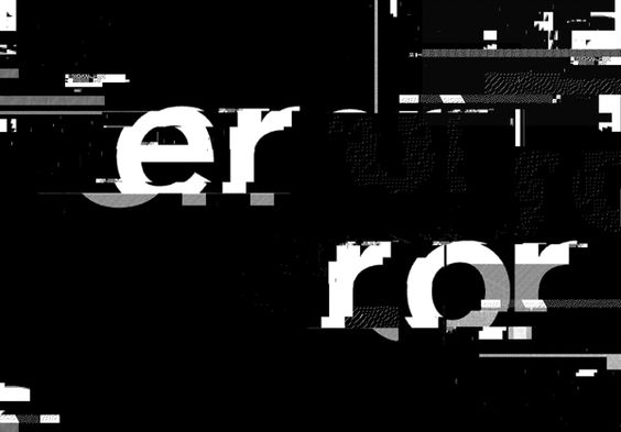
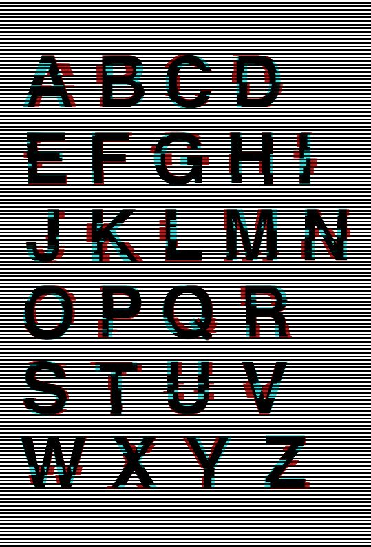
Examples of glitches :

