
Attached below is the pdf of my essay
Category: LE02 HISTORY OF DESIGN (2019)
History of Design Lecture 04 Reflection: The Beauty of International Typography

A B O U T
The ‘International Typographic Style’ also know as the ‘Swiss Style’ is a graphic design style developed in Switzerland, Europe in the 1950s that values and focuses on cleanliness, readability and objectivity.
Typical features of the style are asymmetric layouts, use of a sans-serif typeface and flush left, ragged right text. Many of the early International Typographic Style works featured ‘Typography’ as a primary design element, which means they focused more on typography because it’s the root of communication and then pictures and other design elements comes as a secondary design elements and this is the reason the title ‘International Typographic Style’ has the word ‘Typography’ with it.
International Typographic Design begins with a mathematical grid. These grids are considered to be the “most legible and harmonious means for structuring information.” Using a grid for design makes creating a hierarchy for the content much easier—think web design. Why are so many websites broken into grids? Grids are flexible, consistent and easy to follow. They are clear-cut and work well with ratios (Rule of Thirds, Golden Ratio, etc.). In addition to the grid, Swiss Style usually involves an asymmetrical layout, sans serif typefaces and the favoring of photography over illustrations.
The movement’s innovators combined elements of other artistic trends to create the beauty and simplicity of the Swiss Style that we know today. Elements from Bauhaus, De Stijl and The New Typography are sprinkled throughout the works of Ersnt Keller, Max Bill, Josef-Müller Brakmann and Armin Hofmann—i.e., the pioneers of Swiss Style.
By stripping away the embellishments, Swiss Style eliminates distractions for the viewer and allows the information-heavy design to be read and studied rather than merely seen and admired. Because of this, the typefaces chosen to represent Swiss Style are those that really hone in one the movement’s key principles:
A K Z I D E N Z - G R O T E S K
Akzidenz-Grotesk is a sans-serif typeface family originally released by the Berthold Type Foundry of Berlin. Akzidenz indicates its intended use as a typeface for commercial, or “occasional” or “jobbing”, print runs such as publicity, tickets and forms, as opposed to fine printing.
Originating during the late nineteenth century, Akzidenz-Grotesk belongs to a tradition of general-purpose, unadorned sans serif types known in Europe as “grotesques” (“sans-serif” in the US) that had become dominant in German printing during the nineteenth century. Relatively little-known for the first few decades after its introduction, it achieved iconic status in the post-war period as the preferred typeface of many Swiss graphic designers in what became called the ‘International’ or ‘Swiss’ design style of the 1950s and 1960s, and its simple, neutral design has influenced many later typefaces. It has sometimes been sold as Standard or Basic Commercial in English-speaking countries.

U N I V E R S
Adrian Frutiger, one of the most influential typeface designers of the 20th century, created Univers in 1954. Pulling elements from Akzidenz-Grotesk, Frutiger created one of the first typefaces that formed a font family, allowing documents to use one typeface (instead of several) in various sizes and weights, creating a beautifully simple uniform via text alone. Originally released by Danberry & Peignot in 1957, the family passed through the hands of the Haas Type Foundry before being purchased in 2007 (along with all of Linotype) by Monotype.

H E L V E T I C A
Helvetica is a neo-grotesque or realist design, one influenced by the famous 19th century typeface Akzidenz-Grotesk and other German and Swiss designs. Its use became a hallmark of the International Typographic Style that emerged from the work of Swiss designers in the 1950s and 60s, becoming one of the most popular typefaces of the 20th century. Over the years, a wide range of variants have been released in different weights, widths, and sizes, as well as matching designs for a range of non-Latin alphabets. Notable features of Helvetica as originally designed include a high x-height, the termination of strokes on horizontal or vertical lines and an unusually tight spacing between letters, which combine to give it a dense, solid appearance.
Miedinger and Hoffmann set out to create a neutral typeface that had great clarity, no intrinsic meaning in its form, and could be used on a wide variety of signage. Originally named Neue Haas Grotesk (New Haas Grotesque), it was rapidly licensed by Linotype and renamed Helvetica in 1960.

History of Design Lecture 3 Reflection – The art of Futurism

A B O U T
- An Italian art movement of the early twentieth century that aimed to capture in art the dynamism and energy of the modern world.
- Created by the Italian poet and author Filippo Tommaso Marinetti in 1909 through Futurist Manifesto.
- Fusion of the cubist painting and the futurist poetry
- Futurists were well versed and practiced in nearly every field of art, including painting, ceramics, sculpture, graphic design, interior design, theatre, film, literature, music and architecture.
F U T U R I S T M A N I F E S T O
-
- A poem written by Marinetti, and it first appeared as a preface to a volume of his poems (written in 1908)
- Marinetti and his fellow futurists were tired of Italy’s reliance on its classical heritage and disdainful of the present, and thus wanted to create a new aesthetic based on industry, war and the machine.
- They wanted to burn museums and libraries, as they contained traces of the old traditions of Italy.
- They also demanded purification by war – which influenced fascism and chauvinism
A R T S T Y L E S I N F U T U R I S M
Paintings

- Used elements of neo-impressionism (post-impressionist works) and cubism to create compositions that expressed the idea of the dynamism, the energy and the movement, of modern life.
- Used divisionism: breaking light and colour down into a series of dots or geometric forms.
- Also incorporates high contrast and intersecting lines to show movement
Typography

- Words in Freedom: destroyed syntax, used verbs in the infinitive, abolished adjectives and adverbs, suppressed punctuation, and employed mathematical and musical symbols.
- Marinetti exhorted writers to “destroy the ‘i’ in literature: that is, all psychology,” to give up on being understood by the reader, and to abandon aesthetic concerns by creating the “ugly” in literature.
- His prescription for Futurist writing was not only phonetic but also visual. He wanted to take advantage of the “typographical revolution” to use new fonts and arrangements of words.
- use of different sizes, weights, and styles of type allowed them to weld painting and poetry, because the intrinsic beauty of letterforms, manipulated creatively, transformed the printed page into a work of visual art.
- used intersecting lines within words as well to create directional lines that lead the eye from line to word
A D A P T A T I O N S I N F U T U R I S M


![]()

- The use of Futurism has adapted into book covers and posters
- Adapted the use of futurist mindsets of skyscrapers and neon interface
The Art and Technique of Photoengraving

The act of engraving text and image onto materials for commonfolk to read has dated back to 750CE. The first engraved printing units were wood engravings, such were seen in the Chinese Diamond Sutra that was created in the year 868.

After these wooden engravings gained popularity, people started to make printing units out of metal plates using different types of metal – specifically copper and pewter. These metal plates were made able to print by a process in which an image in wax or bitumen was drawn on, or transferred to, the surface of the plate and nonimage areas removed by action of appropriate acids.
Photoengraving was only invented in 1813 by researcher Joseph Nicephore Niepce. He coated a pewter or copper plate with a photosensitive asphaltum and exposed the surface to bright sunlight through an etching of a portrait, which served as a positive image. Sunlight passing through the background of the etching hardened the asphaltum, while the protected areas, under the inked portion of the etching, were developed in oil of lavender and white petroleum to create an image in exposed metal. This image was then etched into the plate, and from the intaglio image, prints were made on a copperplate press.
Example of photoengraving on wood
In 1851, wet-collodion process for photography was introduced, and it provided a means for producing a photographic negative as the basic element in the preparation of engravings. This photographic process also provided a method of stripping the photographic image from the glass plate, permitting assembly of a number of images for plate making, and also making possible the geometric reversal of the image needed in letterpress plate making to produce a right-reading print on paper.
Soon after, the halftone process allowed people to produce shades of grey, in which the image is broken up into dots, and variations of gray tones are obtained by varying the size of the dots, thus controlling the amount of ink laid down in a given area.
The discovery of the halftone screen was primarily responsible for the development and growth of photoengraving; further growth was related to other developments in the printing and allied industries. The introduction in 1935 of the first practical colour film for amateur and professional use probably did more to accelerate printing developments than any single invention. By making bulky studio-type colour cameras obsolete and permitting the use of readily portable camera equipment for the production of colour images, on-the-spot colour photography became possible, greatly increasing the use of coloured illustrations.
At approximately the same time, the commercial production of coated paper and heat-drying printing inks for letterpress printing began. Many colour developments for films, printing processes, and materials followed.
Now in our current society, photoengraving is used for specialty printing, such as foil stamping, embossing on paper, wood and cork branding for the wine industry and chocolate coin engraving and molding plates. It is also used by designers to simulate various products for photography shoots and right reading plaques for casting in bronze.
R E F E R E N C E S
http://www.bauerengraving.com/
https://www.britannica.com/technology/photoengraving/Modern-photoengraving-techniques
History of Design Reflection: Expanding research on the Garamond Typeface

A B O U T
The Garamond typeface was created by engraver Claude Garamond in the 16th century. Our current understanding of the Garamond font are interpretations of fonts that were inspired by drawings which were modelled after the punches of Claude Garamond.
C H A R A C T E R I S T I C S
Garamond was the first to craft letters to the medium. He was the first to deviate from a purely handwritten-style to make letters that would read better when printed. These letterforms were thinner and more delicate than those before it, which both allowed the ink to bleed on the page without overly distorting the words and used less ink. Other key characteristics include the way the top serifs of the lower-case letters curve back into the letter, the feeling of airiness from the generous openings in the letters, known as counters, and the tall ascenders. These letters were often used for printing of body text and books.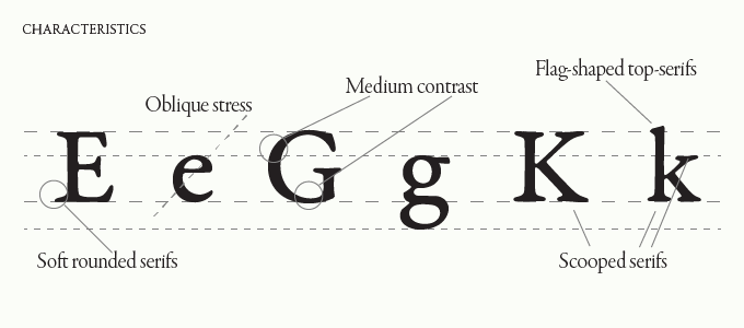
R E V I V A L
Garamond fell into decline in the 18th and 19th century, and people tried to revive the font, thus expanding Garamond into many different styles which have evolved into the modern Garamond fonts we have today.
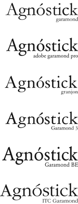
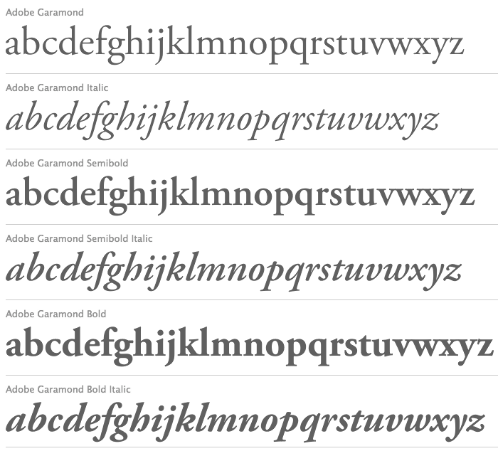
T H E D I F F E R E N T T Y P E S O F G A R A M O N D
Garamond has evolved in its own way and different types of Garamond font has been created depending on different inspirations.
R E F E R E N C E S
http://www.meaningfultype.com/garamond.html
https://medium.com/@thelittlereina/typeface-garamond-be1b8b01add8