How did we arrive to the topic of Identity?
The three of us decided to look back to our past projects and we all agreed that the alter ego one was the most meaningful one. So for Tisya’s case, she did the identity of Dory and the idea of getting lost in life and finding one’s self. As for Gerald, he did on the concept of duality in personalities and space relation to the human psyche and characteristics. As for myself Amelia, I did on Margo and the idea of being okay to get lost to discover oneself ultimately.
In conclusion, the similarity in all our projects dealt with the sense of an identity being lost. However that was still very widespread, so we decided to focus on on a smaller issue, and that being the local Singapore identity gradually being lost as modernisation comes into place.
Objective
Rojark revolves around the identity of Singapore – objects, people and places which are slowly vanishing or have vanished in our journey through development and modernization. It suggests this identity as something that is visibly tangible, but yet intangible, and is a representation of this part of our Singapore as something that future generations might not be able to identify with. This installation is a demonstration of a haphazard and futile attempt at the preservation of this identity, upon the realisation that it might be too late.
Purpose
_ hopes to evoke a sense of nostalgia and provoke a thought of our responsibility in the preservation of the Singapore identity through objects, people and places. We take for granted the uniquely Singapore factors that still exist around us now, which we might never get to see again as the country moves forward with the world. As our country develops, we have to make way for the future and abandon what no longer seems to fit in our context. A cultural heritage that is conserved and preserved is the country’s reflection on itself will guide the future generations in recognising our roots. This installation is much more than just preserving the physical aspect, but it also serves as an important reminder that we have to retain the inherent spirit and original ambience of these factors that make up our Singapore identity.
Concept

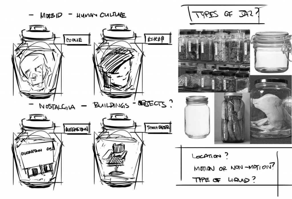
Jars will be used to emulate the preservation method similar to specimen collection or Traditional Chinese Medicine (TCM) style of preserving herbs or medicine. This gives both morbid and scientific enquiry sense of approach, on top of the emotive aspect, when viewing the installation.
INITIAL: We wanted to put actual objects into the preservation jars and experiment with liquid of different translucency and viscosity to give it a more faded facade. However we would face issues of finding the objects because of its rarity and size.
REVISED METHOD: Instead of actual objects, we will use a video projection against a frosted glass surface while trying to retain the liquid idea. It translates the idea of the object existing in an intangible form, like that of a memory, and reinforces the ominous foreshadowing of preservation of culture. It emphasizes on the idea of the object existing only as a memory once it disappears.


First Round Of Testing
So from our first round of testing, we borrowed a projector and tried playing around with trying to project a video on a jar since that was one aspect of our concept. We also experimented with whether trying to project it from the front or from the back would be better and eventually settled for the front.
Second Round Of Testing

So from our second round of testing, we experimented with many different various ways and mediums. On top of that, since the TCM style of preservation had liquid inside, we also tried to play around to include it in. After few testings it was decided that water would make the image less clear so we decided to do without it. As you can see from the video, when water is added, it makes the projection inside less visible.

We also experimented with various jars we collected. We decided to collate jars instead of buying them all in a single specific style as we figured it would fit to our haphazard concept better. We tried to keep the style of the jars as cohesive as possible and tried to project both still images and videos and they both seem to turn out fine. We found out that the best way was actually to sand the glass jars on the inside without water. We then settled on placing them in the cupboard in two rows, stacking on top one another.
We also tried rotoscoping (one new skill acquired!) So from the rotoscoping it became evident that sizing mattered so we tried to do various sizes to see which fits better.
Final Round Of Testing

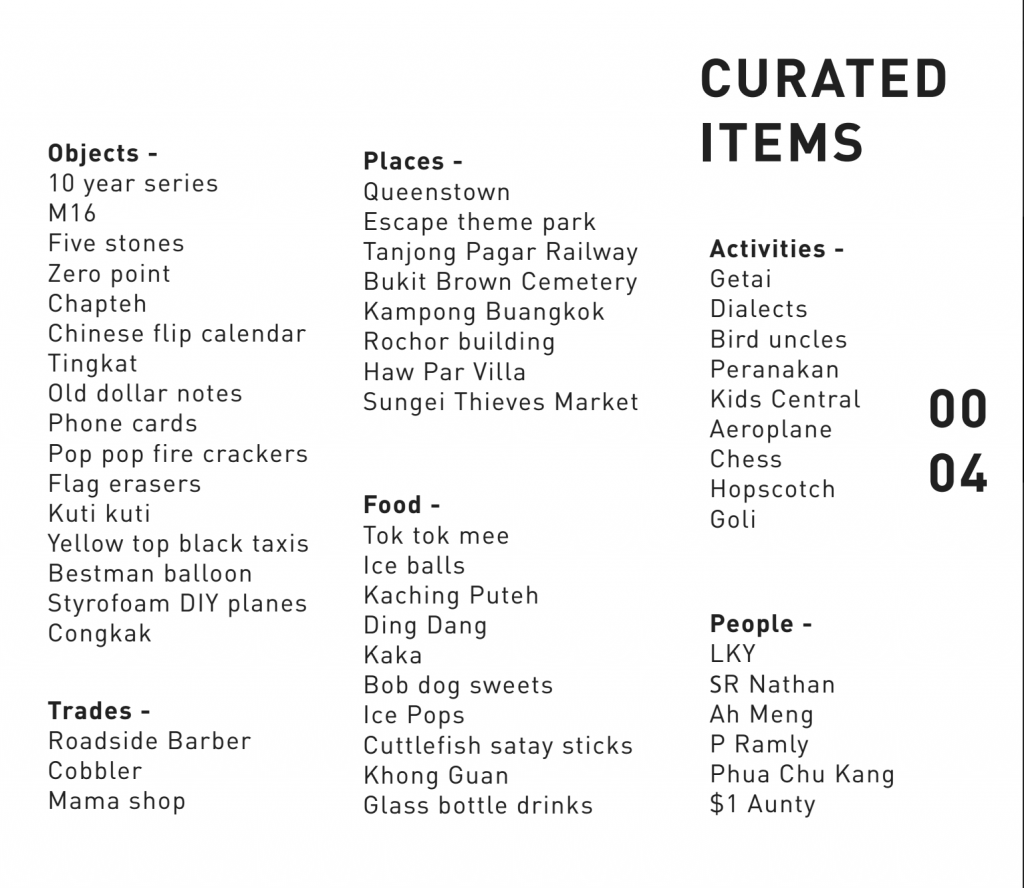
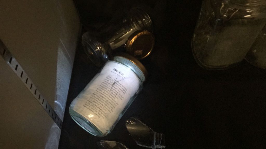
So for our final round of testing, we curated all our different objects, people and places and started piecing them together in after effects. We modified the number of projections in the end with it being 10 instead. How we did it was that one person was in charge of taking note of the projection mistakes and telling where and how much to shift the projection, while the other person was doing it on aftereffects. We also played around with the arrangement of the jars making sure it wasn’t visually heavy and was well balanced. Instead of placing all the jars in portrait format, we played around and decided to leave one or two tilted or landscape. We also placed broken shards of glass around the sides as a concept of some objects can no longer be contained and has vanished forever.
Soundscape
We also completely forgot about the soundscape but decided in the end it would be better if we added in sound of snippets of iconic speeches and songs that brings about the identity of Singapore better. We also curated it in a very haphazard and static kind of nostalgic feeling.
Final Projection


And here is one with reaction from our classmates!
Overall the audience felt very pitiful and sad upon watching our installation as they felt like it was such a waste that some of these items are no longer here in Singapore and that our generation was sort of lucky enough to embrace and experience all these objects, people and places.
Despite such feelings, there were those that felt that there was a sense of happiness in it too, after being reminded about the memories they have attached with these objects, people and places. There were a lot of happy reactions when snippets of their favourite tv show songs played. There was also a feedback how this entire experience felt like a community of people watching tv together on a small screen.
An interesting feedback was how these jars were very curated to a certain generation in Singapore. Given another generation if we were to say our parents or grandparents, it would in a sense be a whole new set of jars. Overall the new skills that we learnt such as rotoscoping, projection mapping and also even the conceptualising of our project were very benefitting and such a fun project to do!
Thank you for viewing!


