Neighbourhood Explorer Research | Geylang

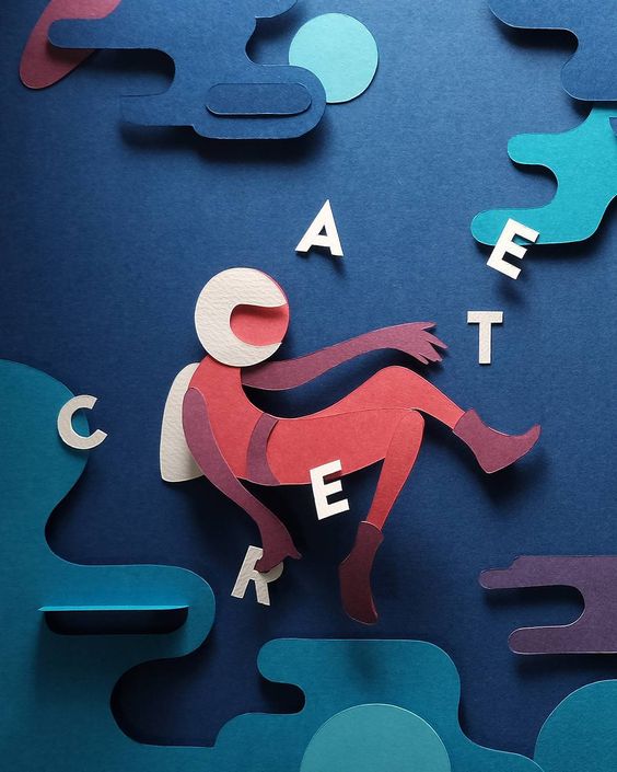
Hello! So the place that i have been assigned to is somewhere that i am very familiar of. Geylang! It is known to be one of the most iconic Malay places in Singapore bursting with everything Malay ranging from the architecture, food and more. Though I am very much familiar with the place, upon roaming around i found little bits and pieces of the neighbourhood that caught my attention that never did. Here are some of those bits!

img_1767 img_1769

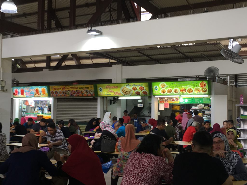
As you can see, so much good food! All these neons signs showing the various colourful kind of Malay food you can get here. (Some of the best, example their Kacang Pool). Looking at the different dishes an idea came that maybe i could do the publication in colour code, with each colour symbolising the iconic malay dishes here. So after my stop here, I decided to go across and walked further into Joo Chiat area.

img_1771 img_1772 img_1775 img_1776

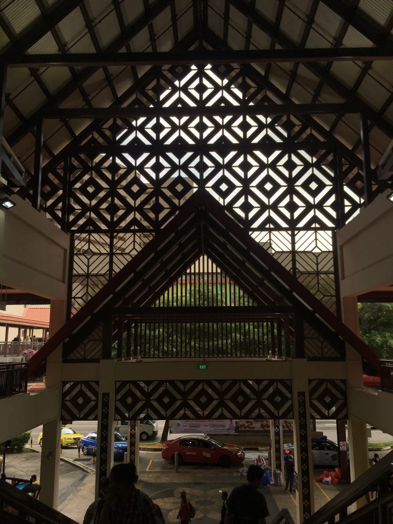
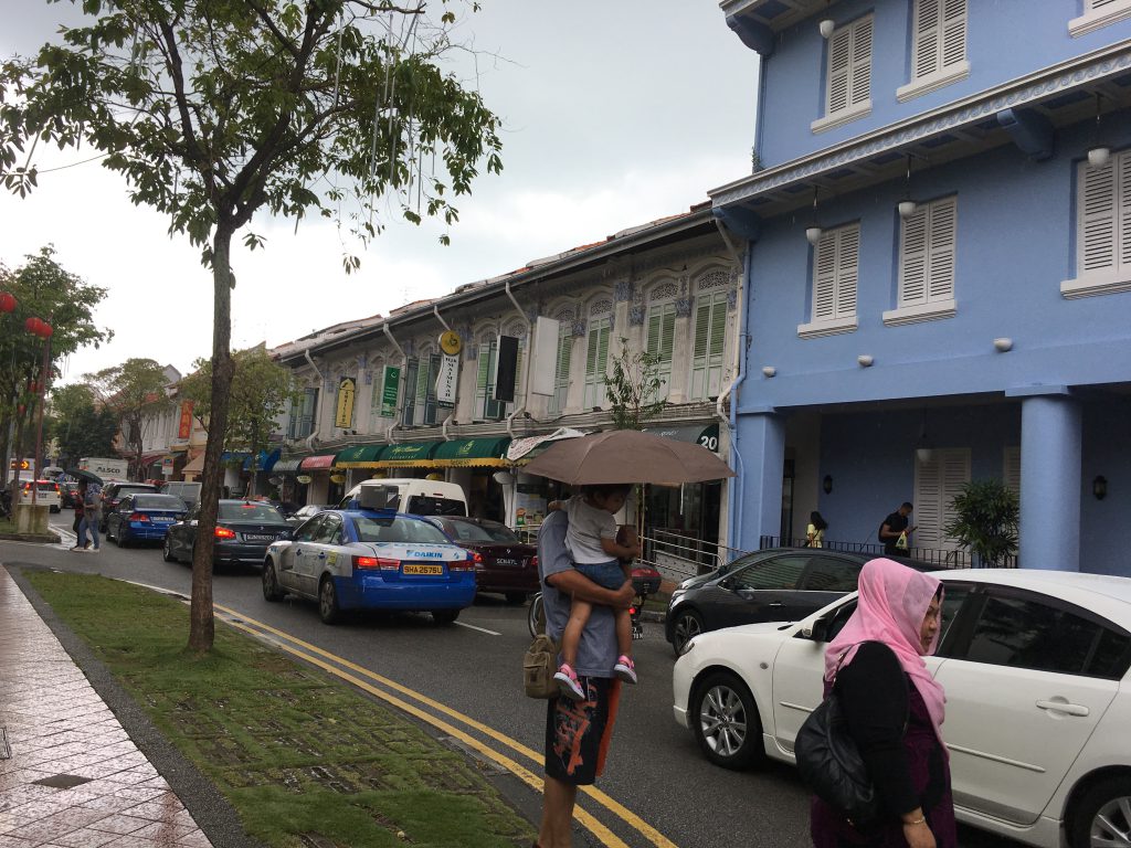
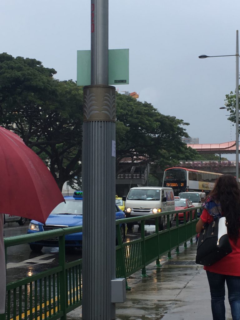
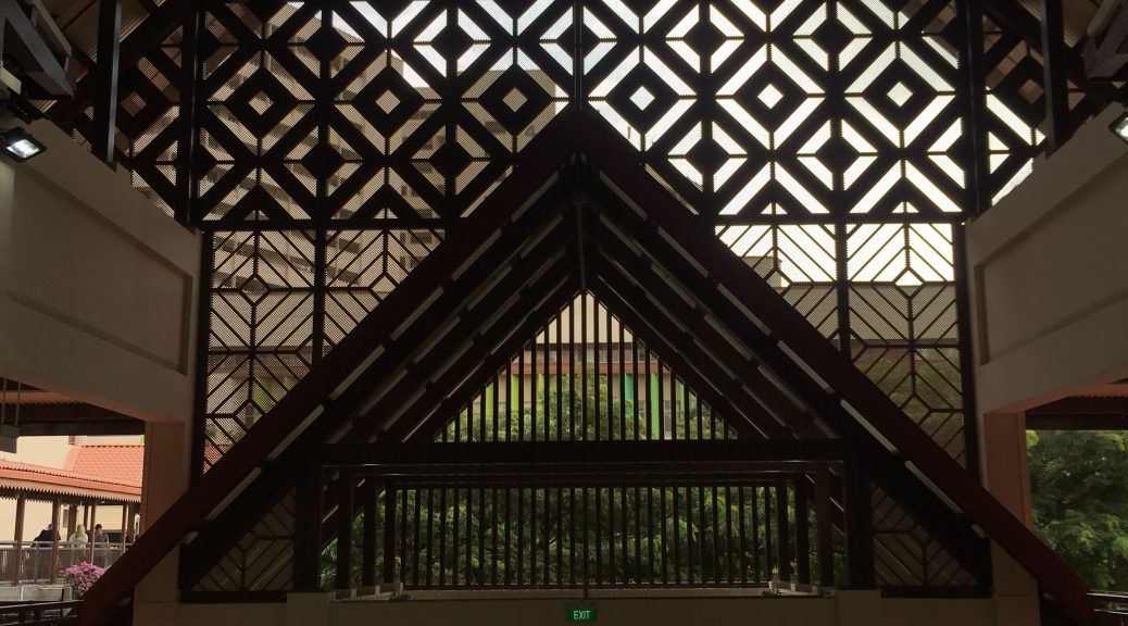
So the more i travelled around the area, the more i realised that how every piece of architecture symbolises something unjquely Malay about Geylang. Eventhough something as simple as the lampost and the overheadbridge is something that is overlooked, it distinctvely has the essence of the Malay. I also walked past several shophouses that has its own distinctive styles. So an idea i had was that i could do a publication on the little things that make the architecture here uniquely Malay. Or I could also do on the different shophouses. And so I continued walking!

img_1777 img_1780

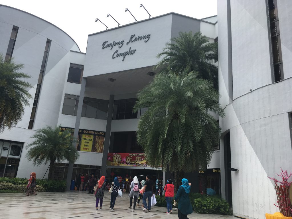
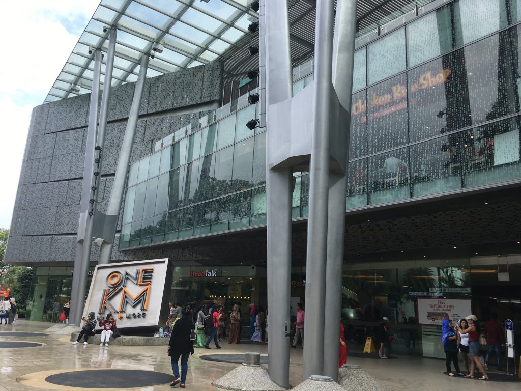
So another thing i noticed about the neighbourhood lastly was that how there was a traditional shopping mall as compared to a more modern one. The difference was oddlh strange showing how people would rather hang around and gather at the traditional mall rather than the modern ones. The difference was also the different shops there making the tradional one having a strange oldy tingy vibe than the modern. Another idea i could do is the publication on how the new blends with the old there.

Overall it was such a refreshing experience as it has been awhile since i’ve been there!

Sound Texturizer Progress 2

Here is an update on my progress!

img_1809 img_1810

So my initial idea was like a funnel spiral kinf of contraption. The seeds would be dropped from the height producing a first sound which is the rain dropping. After which, the second sound would be produced when the seeds are sliding producing the constant rain sound. Here is the actual try out of the sound texturizer.

img_1812

img_1814

img_1815

So part of my sound texturizer managed to be made like how i imagine to be however unfortunately the bottom part which i imagined it to be a continuous spiral where the seeds flow didn’t exactly work out how it should be! So i improvised and made it straight instead. However another point to take note was that instead of using the flimsy metal, the harder metal, produced a not so rain-ish sound like i expected it to be. So I might have to go back to that and work around it. Still sticking to the concept of using the same material but changing the distance and direction to change the sound produced. Will work on a better idea for the final!


Sound Texturizer Progress 1

Hi! Here is my update on my sound texturizer .

Idea One

img_1719
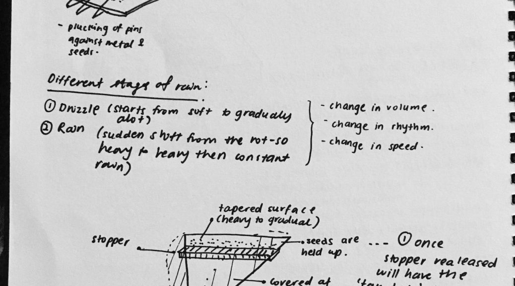
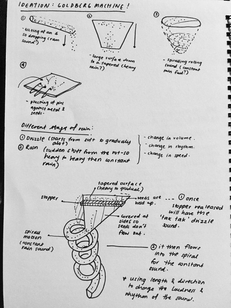
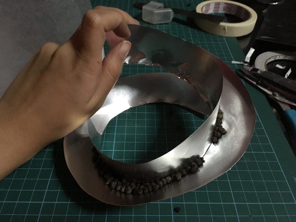
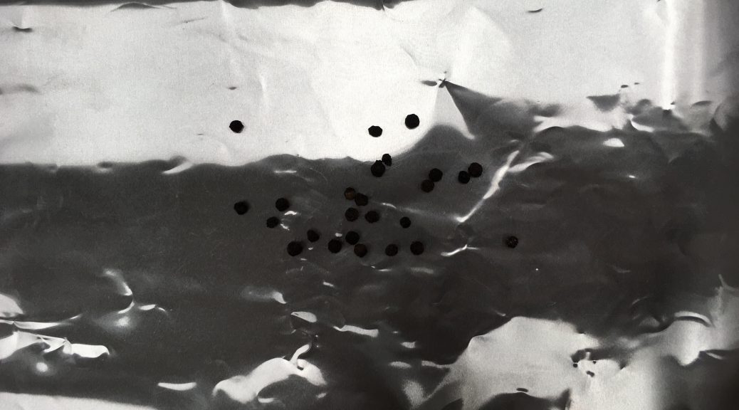
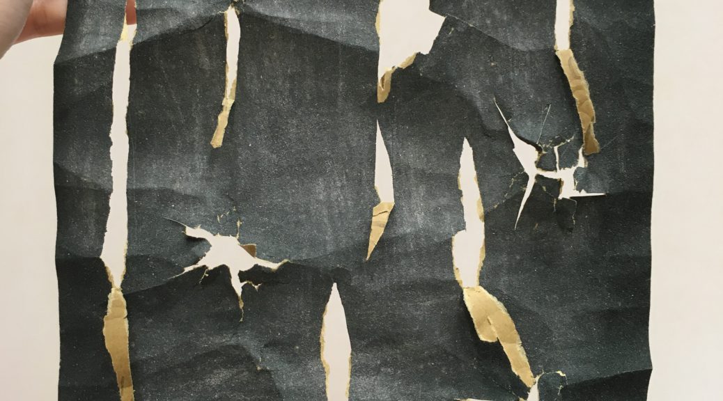
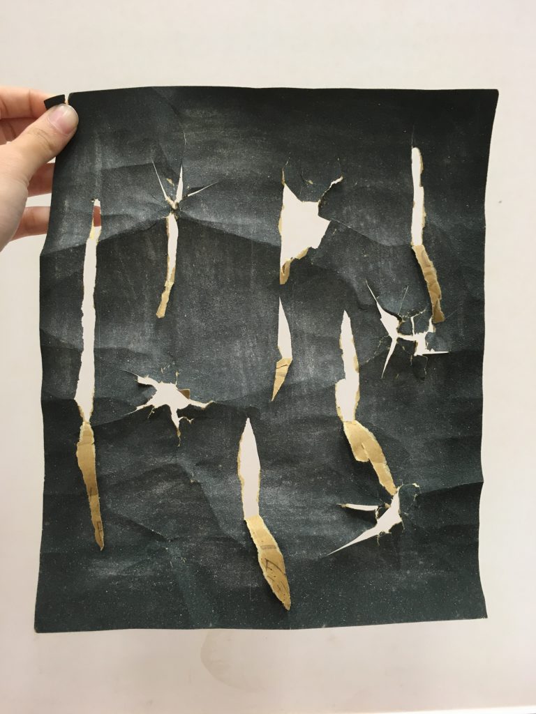
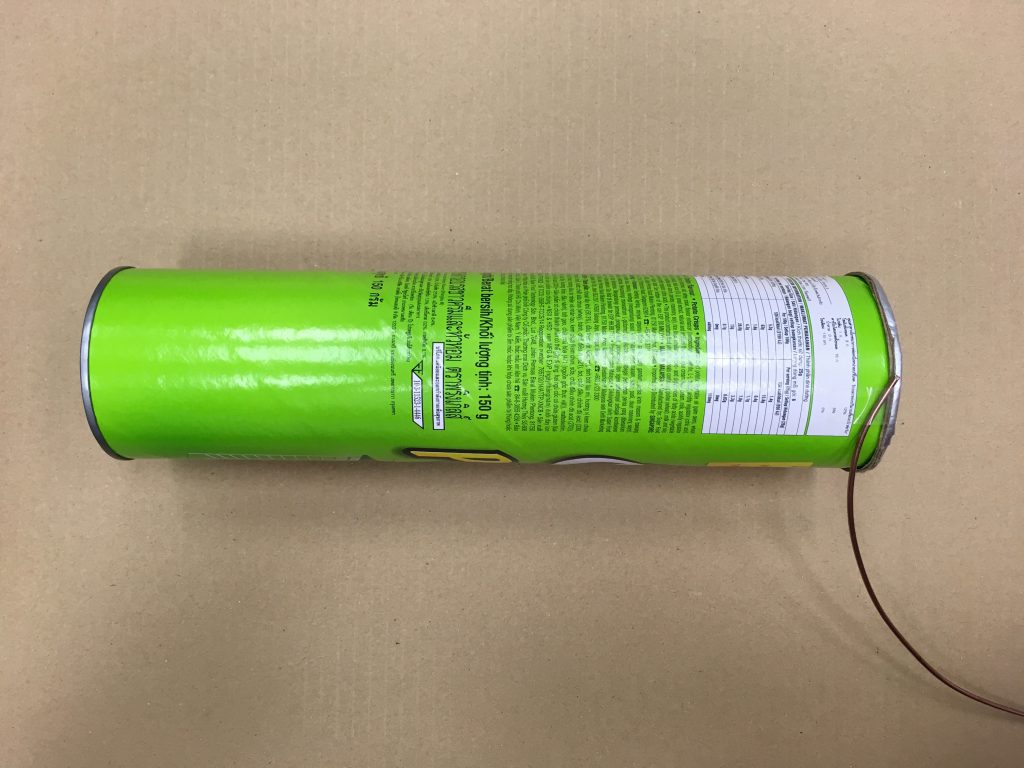
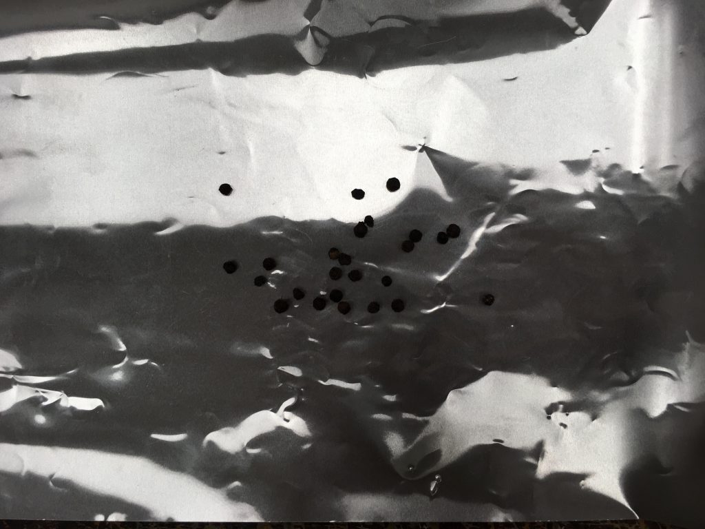
The materials I used were the aluminium sheets and peppercorn seeds. Upon dropping the seeds i found out it sounds like the rain drops and if I were to slide them from side to side, it sounds lile the rain falling. So i thout it would be interesting  if my sound texturizer mimics the various different stages of rain.

  • Stage 1: Dropping of rain
  • Stage 2: Constant rainfall
  • Stage 3: Fading of  rain

Idea Two

img_1718

For my second sound texturizer, originally it came from the ruler organ idea but I improvised amd used bobby pins. I bend each at a different angle so the sound produced is slightly different.

New Concept

My new concept is a combination of both the ideas whereby i was thinking of making the different stages of the rain sound using the concept of the flicking of the bobby pin. It inspired me to use the concept of the Goldberg machine.

I’ll upload my skecthes and ideation soon! Thank you for viewing!


4D II Project One – Alter Ego

Video Link! – https://vimeo.com/203124561

Story line:

stroyboard

The video revolves around the many different aspects of one being lost and trying to find one’s self. Often in this modern world we subconsciously are dictated by who we are by the number of likes on Instagram and who are really our ‘friends’ are on Facebook. Constant planning for our future creates the illusion that we got out lives together. But if we really get all that we plan for, will then will we be happy? I don’t think so. Thus we are so afraid to get lost in the unknown that we forget to embrace that it is part of the journey to find ourselves. We keep seeing flights deals and wishing to be away from ‘here’, but so often afraid to just drop everything that we got to pursue a better understanding of our self. The thought of being by oneself scares us in this big world, but we should see it as so many amazing big chances out there for us to make mistakes, get lost, learn from new people and gain an experience that school or even the highest paying job in the world could never teach us.

Concept, Research, Film/Artist Reference and Challenges:

I researched on some of Margo’s popular quotes from the Paper towns movie and one quote that got to me and defined what character she had that I could relate was when she said “you have to get lost before you find yourself”. Margo had the character where she was someone that everyone knew; a pretty and popular and sociable girl. Something that most of us are accustomed with, just going about as what everyone saw us as. But she then realizes that this was not her, and that these people or places were merely ‘paper’ or fake. So she decides she needs to go away to find herself. I also read up on a few thought catalog articles that is famous for articles with titles such as ”sometimes losing yourself is the only way to fin yourself.” Upon researching more about Paper town on pinterest I realized that there were many objects that associated with the movie. That sparked my concept of using purely objects to depict and tell the story line. I researched on youtube several flat lay videos and what was required for flat lay. One of the many difficulties and restrictions that I had to face was that there were no humans and everything has to be clean from the background to even the objects. It was difficult trying to portray something philosophical and tangible such as feeling lost in a mere number of split seconds and trying to get the message to the viewer just like that. I had to narrow down the number of individual ideas I had for snippets of the video to see which best fits and told my concept clearly.

Thought Catalog Articles:

8dcdd2b1c56b9b44846f370cf99f0315bc413579cb750311dd3a4c4e4d36f767 0950972e092d127728e52c55f0387091

Feedbacks:

● good approach to a typical kind of subject

● take note of voice recording, might be tok near the mouthpiece

What learnt:

● learning to shoot in flatlay for the very first time!

● a small but nifty thing where youcan import and drag a video without fhe audio into premier pro (yes im not aware)

● how a simple motion or action (like befriending someone on facebook) can be shown in different way but which way is the best to give more ompfh!

Soundscapes and In class Activity!

Here are my two soundscapes represented by the pleasant and unpleasant sounds, pleasant being the waterfall sound and the unpleasant being the feet dragging.

img_1618

Because my sound had a very grainy texture, I immediately thought of sandpaper. The bigger sharp holes represent the squeaky part of the shoes or the start of the shoes dragging where it is more dominant. The longer torn out part represents the echo of the dragging feet. I also sanded the entire of the sandpaper because there is a certain white noise.

img_1619

As for my pleasant sound,  I decided I would cut wavy slits on transparency paper as I felt that it was the most suitable material that represented the softness of the water. I also varied in the cutting making very thin ones with thicker on in between as at certain points, the sound of water is quite loud when dropping. I like how the material is when light acts on it and it sort of moves as it really gives the feeling of water flowing!


For the in class activity, we played around with more materials to get ideas for our sound texturizer. So here is my idea:

img_1620 img_1621

So what I made was like a contraption for surround sound? The top photo shows the right hand side of the headset that I made that if you listened to you would hear it as very near. Then the bottom is the side of the headset where if you listen to it would be far away. If you actually turn around it sounds quite interesting. Playing with space, near and far, atmospheric.

Also me and Candy experimented and found out about a diy ruler organ!

ruler-organ
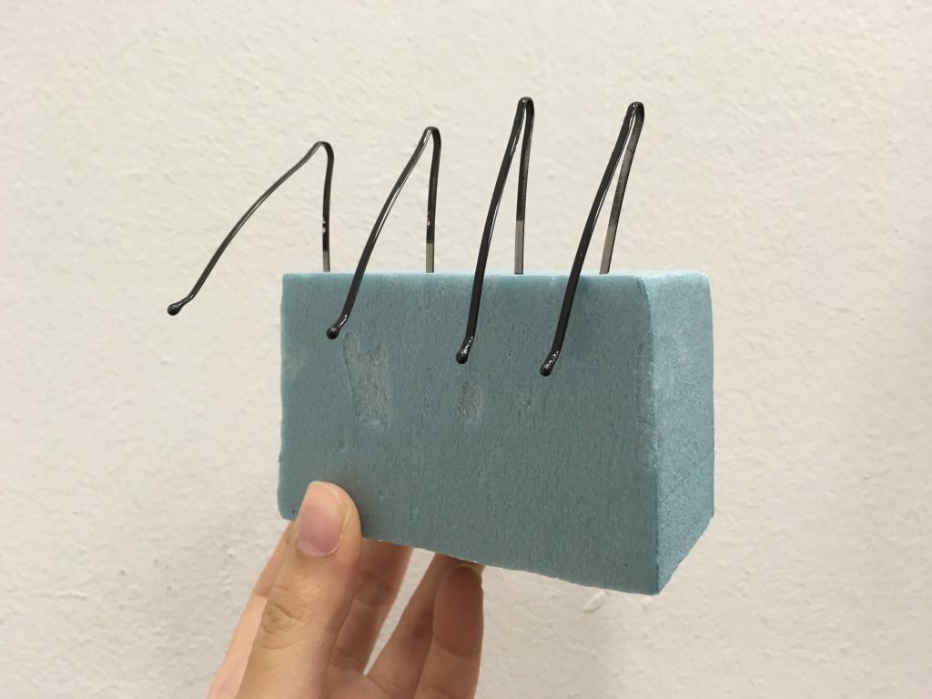
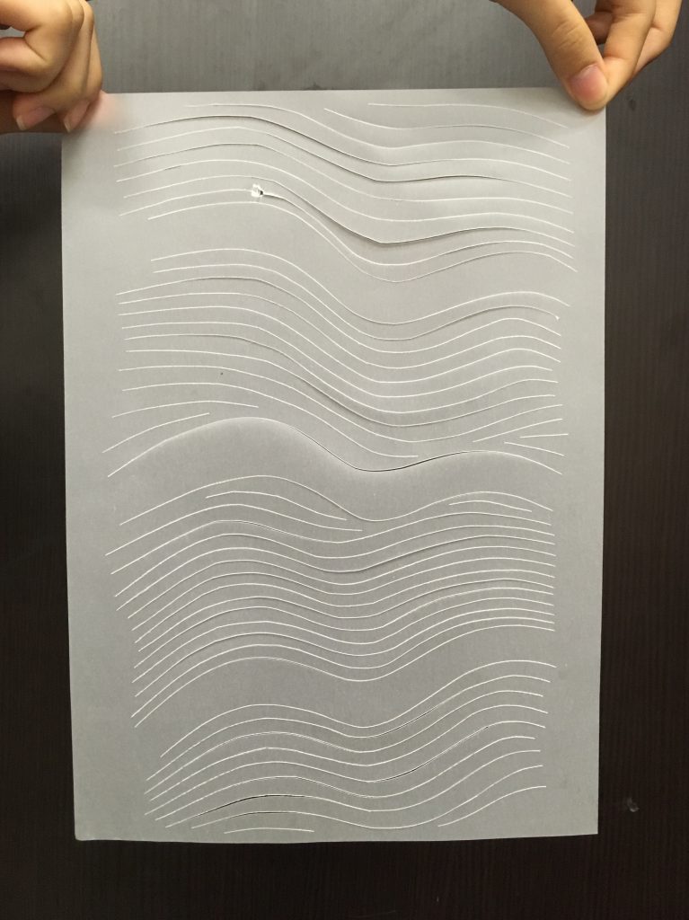
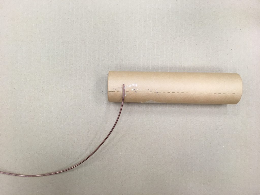
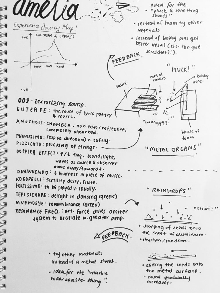
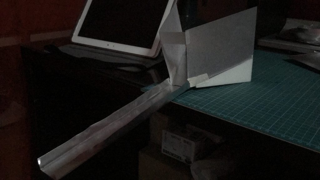
We played around and figured that the metal ruler actually works better. But i think the concept of playing with the same material but different distances or even the vibration the material makes.

Thats all!

Que Sera Sera: Progress

So here is my progress for the four occupations that I have in mind!

Ballerina

a3zekto6lvencll7bse8hp-650-80 signpainter-housescript_font_preview

For the ballerina occupation, I went to research some of the best cursive fonts out there on the web. So I decided I would try to experiment with one that was less fancy than the other. I also experimented with the thickness of the ribbon as well using one that was thinner than the other. Here are the results!

ballerina-1 ballerina-2

So the top one was using an existing font called Noelan Script and directly copying the font style, whereas the bottom one was using the Sign Painter font however I manipulated it a bit to give it a more flow composition.

Feedback: Take photo and play with the lighting to further enhance or show the mood of ballet perhaps?


Astronaut

24bafb5e08efc3153f994a8e68df2bd0

99285

As for my astronaut occupation, I stumbled upon this interesting paper cut out concept and liked how they used the context of space and made the words not flat but float. I also figured a more solid and rounded and bold font would work better for this occupation to represent the planets that are in space. So here are the results!

astronaut-2 astronaut-1

So the one at the top is actually and entire font I made myself and decided to replace the letter A with just a triangle because it sort of looks like a spaceship shape! I also tried to kept the pointy edges but I think I feel that it was a little too overdone especially with the letter E. So the bottom, I actually cut out a little at the bottom of the letter A so it looks more recognizable, and also this font was actually the Halis Rounded font however I manipulated it a bit and made it a little thicker. I also played with the background decided which was more suitable.

Feedback: The letters all look the same now, so may be change the individual letters to show near and far like in space? Also take out the unnecessary and just keep the stars and all.


Tattoo Artist

ee4b102259630574e3a5cc8cd8f16a95

So for the tattoo artist I was little lost but I researched and found out that Inked Script is one of the best and easily recognizable font that is used. I decided to try out with photo shop to see if it would work.

tattoo-artist

Boo! Haha the end result really doesn’t look as legit as an actual tattoo. I added in the redness to show the rawness and condition of the skin just getting inked. So I have decided I will draw on my hand directly and take a photo.

Feedback: Tattoo is such a broad area that ultimately, if you are a tattoo artist you would want to showcase your best work? So maybe can go more crazy and out there and develop own drawing or font instead.


Musician

volstead

For this occupation, I decided that this font, Volstead actually reminded me of like those rock star signature fonts? And I had to use a cursive font as well as my idea revolved around that.

musician

So this is currently my idea, it is manipulating the Volstead font slightly into the guitar amplifier cable. I feel like it is a simple concept but it is easily recognizable what occupation this is! May be i’ll add in more like a collage kind of feel like those rock posters.

Thats all!