Category Archives: My Work

The Beauty of Silence (Final Submission)

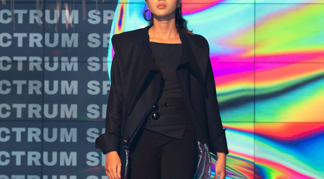
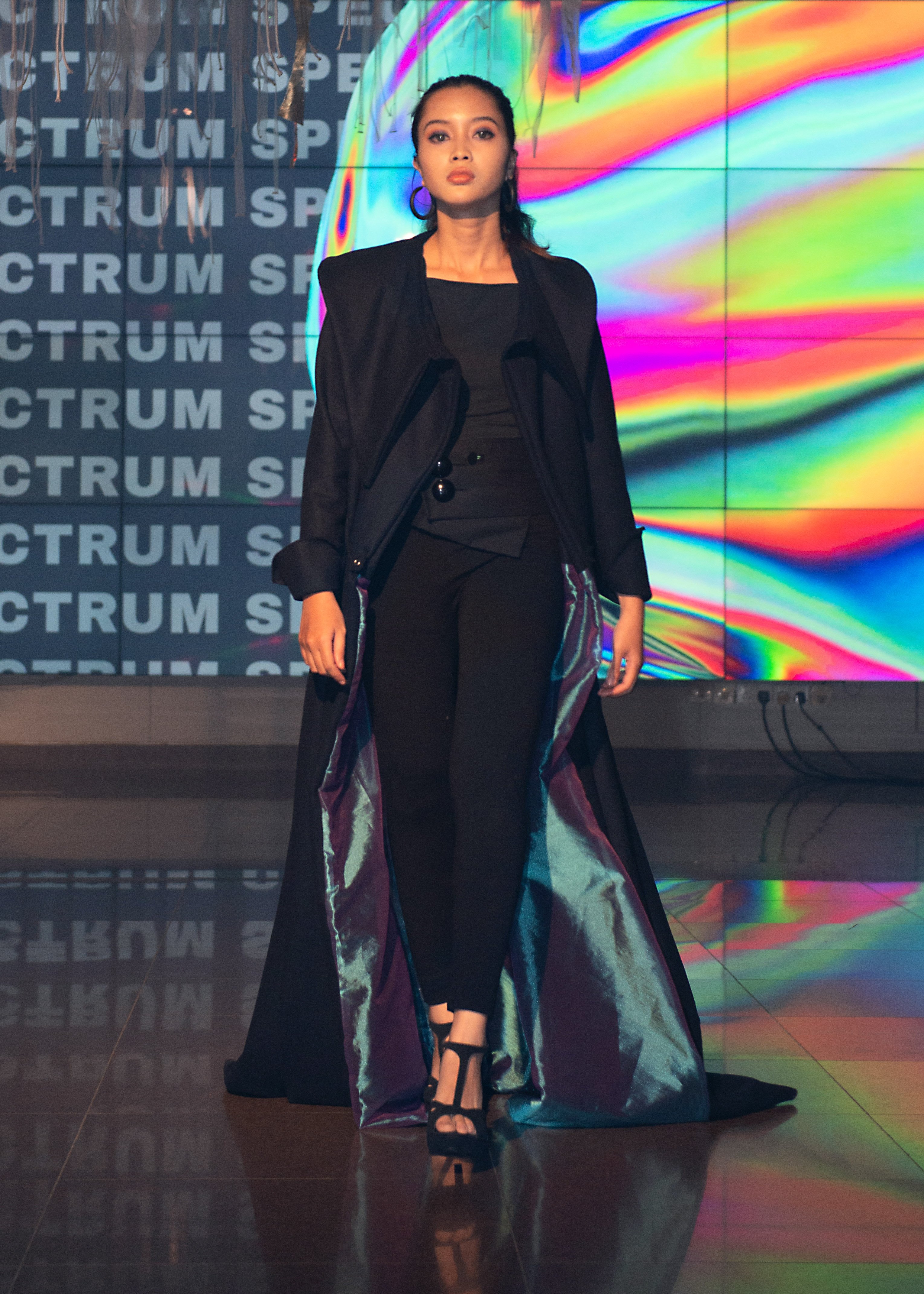
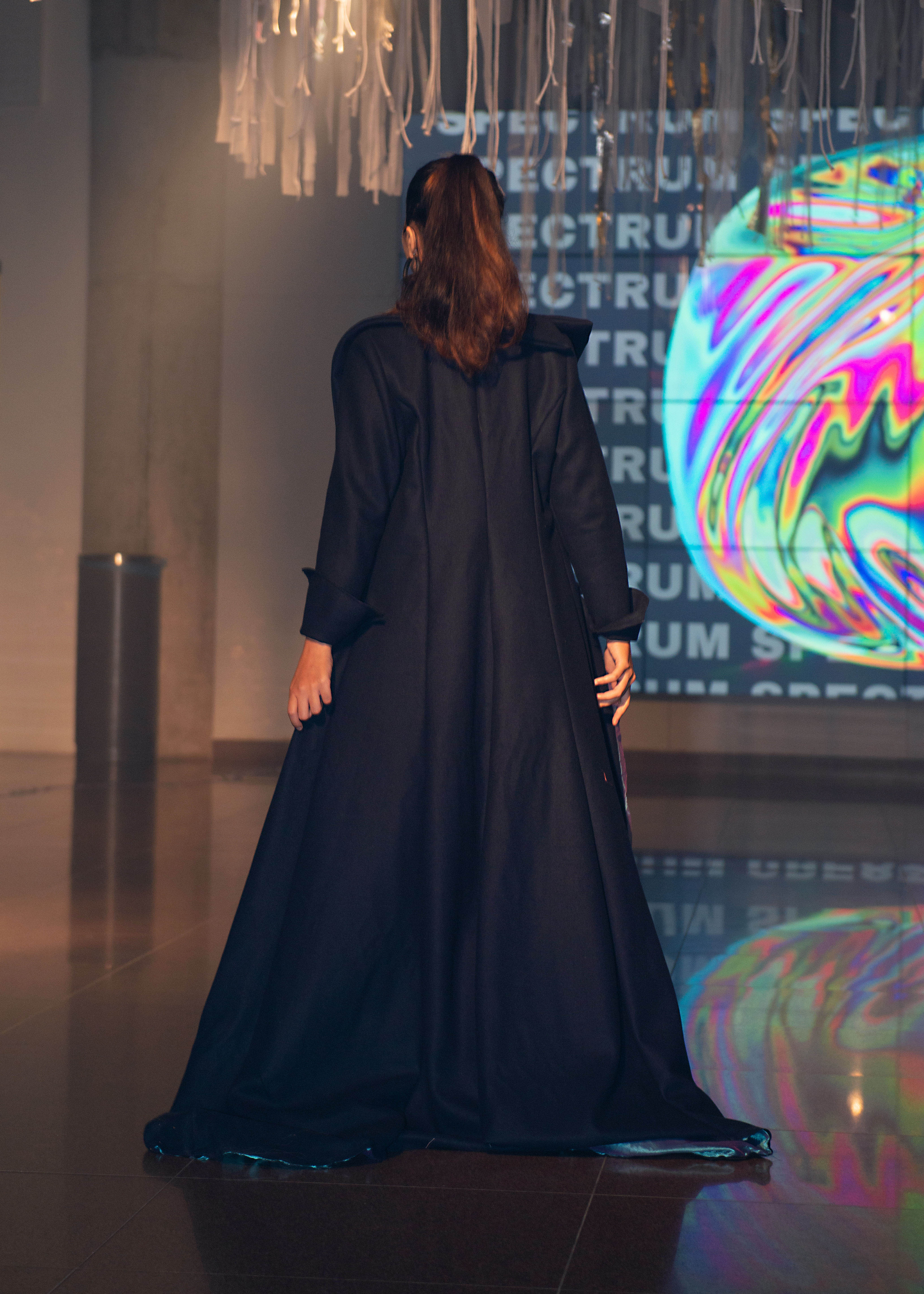
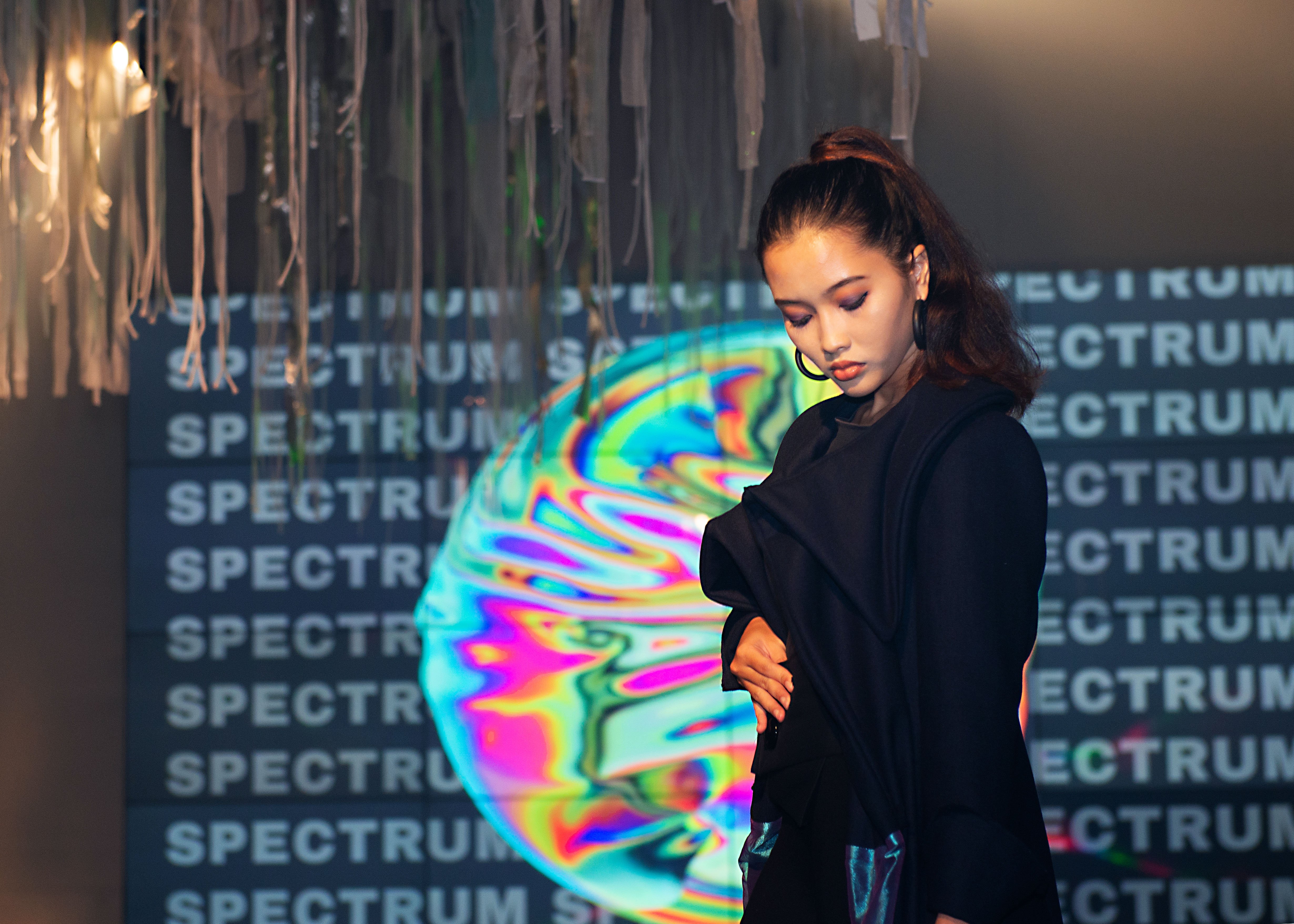
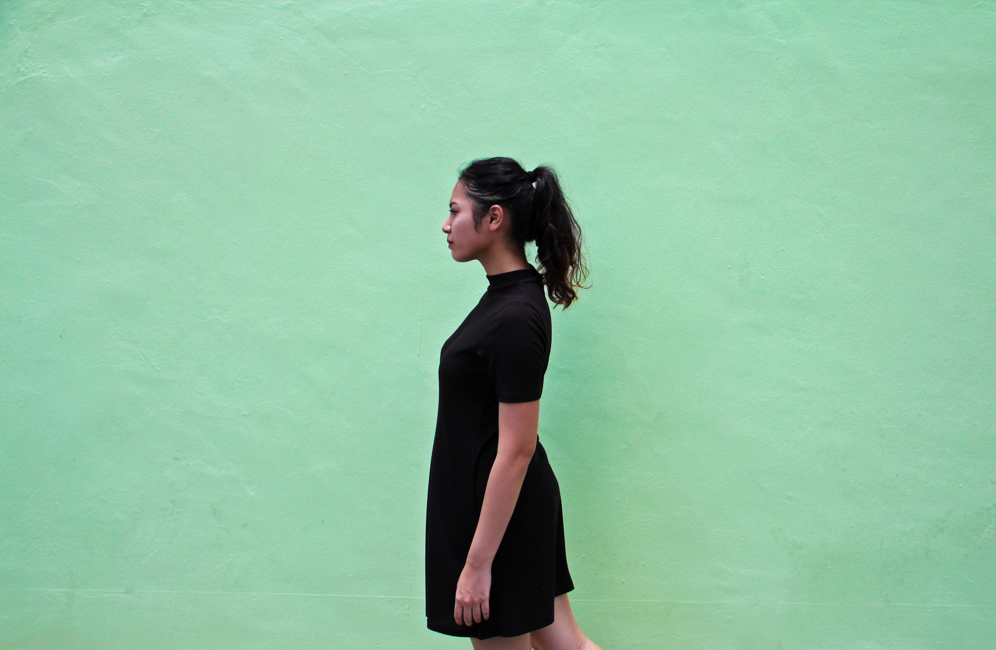
The beauty of silence is an ordinary coat which reveals itself upon the change in the noise level in the environment that it is in. Focusing on the idea of comfort and privacy, the idea of a coat fits very well as a garment we use when need to feel warm and safe.

Biomimicry is the best way of inspiration, and this garment has been inspired by the simple mimosa plant. It delicate being represents the quiet people and how upon touching it recedes back not wanting to be revealed is where the idea came from.

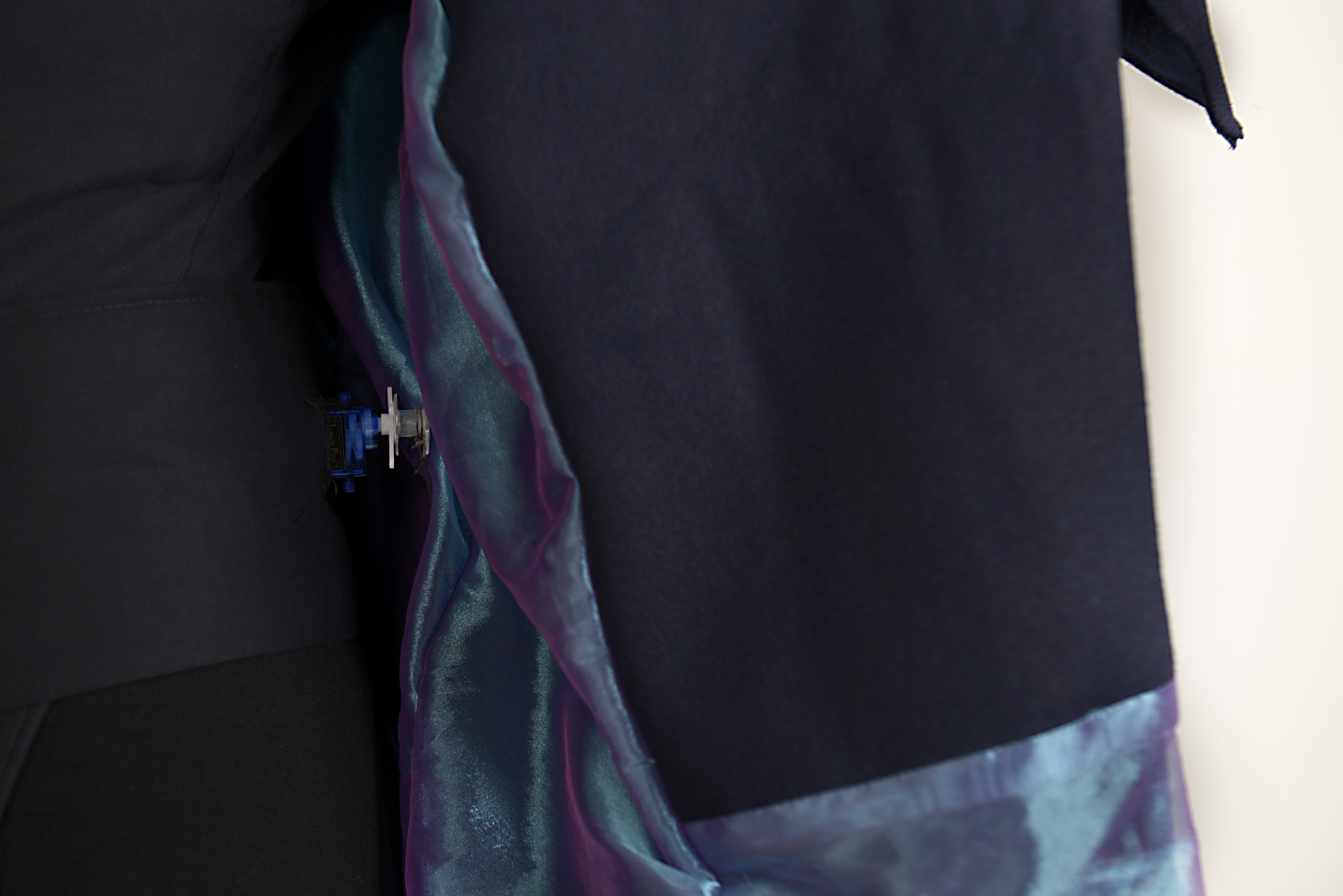
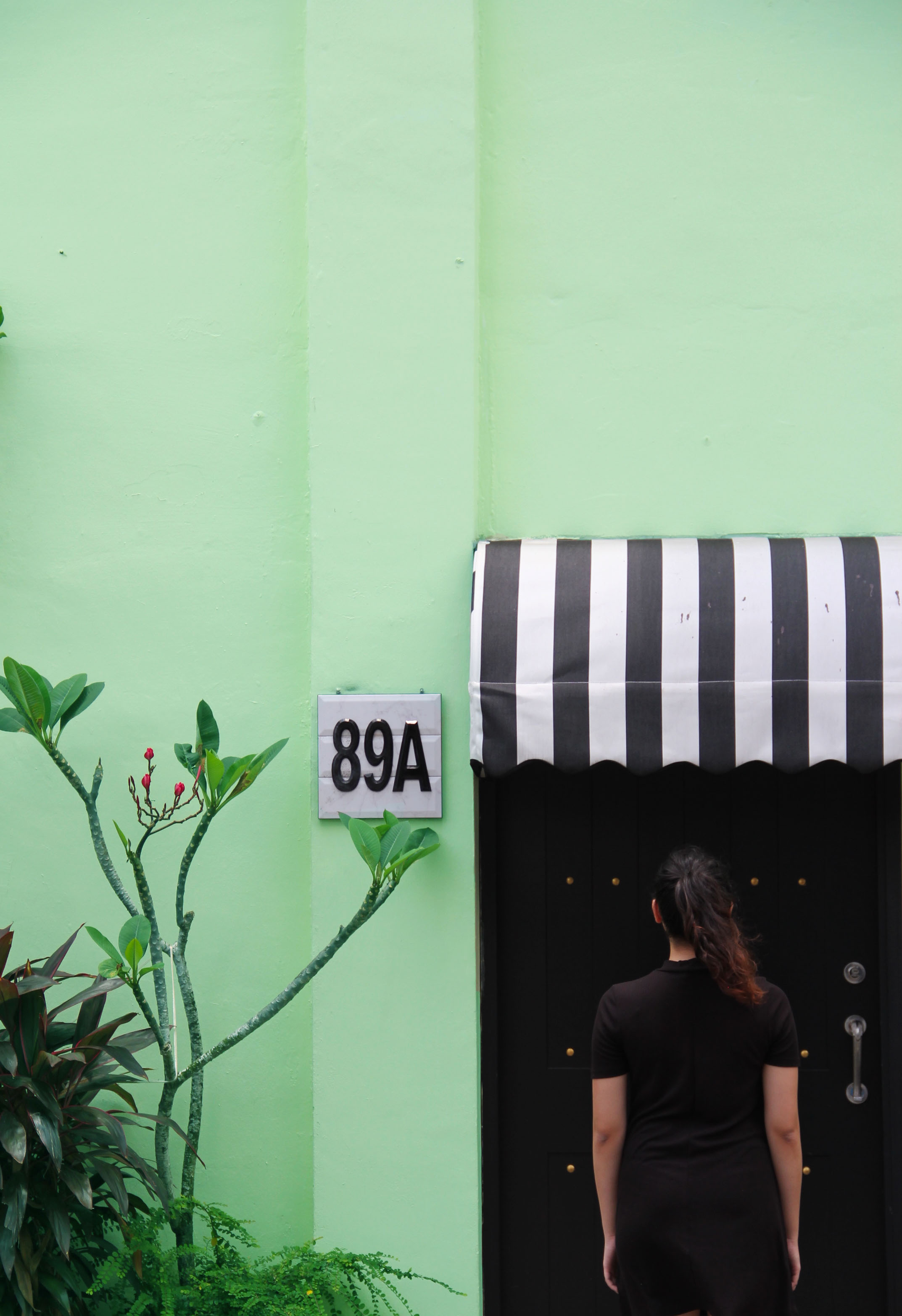
In the society that we are today, we are a culture that worships loud people but often forget that quiet people too have a strong voice. Silence is not the absence of sound, but rather the presence of focus. Fashion has always been a form of language for one to express oneself as someone who is loud wear bright vivid colors whereas those that wear plain colours which is why the coat is designed in such a way whereby when the environment is loud, it remains as a plain looking coat however, when it senses the sound around dampening, it starts to reveal the inner fabric which is iridescent, representing the beauty of silence.

Designing the coat as something more Avant Garde and dramatic, makes the concept more ironic as fashion can be used to attract attention because of the. “loudness” it speaks yet bringing awareness to this “quiet” issue.

The technology that accompanies the garment is powered by Arduino, a sound sensor and servo motors. Upon detecting a certain value range of the sound around which is hidden among the button in the front of the belt, it will trigger the two servo motors at the side and slowly pull the coat a part to reveal. In this manner, the person wearing the coat will get the attention subconsciously without having to be conscious of using the coat. The revealing is subtle, so it draws just enough attention to appreciate it, but not too drastic that the user feels intimidated.

In conclusion, this coat is designed for quiet people to wear and feel like they can stand out without making a sound but also for the society that is noise driven to understand and appreciate these people as the coat revels itself when the surroundings get quiet. This misunderstood issue is approached in a different and unique angle through wearable technology in hopes of opening the eyes of the public.

Neighbourhood Explorer: Geylang Sipaku Geylang!

CONCEPT

Moving towards the final of the zine project, I was using the different colours hidden deep behind the concrete front of Geylang as my main concept. The concept behind the zine was that how these small coloured areas are reminiscence of what left of the vibrant culture of Geylang that we knew.  I got more inspired when I saw more images like these.


CONTENT

I decided to add in poetry to accompany my photos as I felt that it would suit my zine better than just writing texts inside. I decided to base on the familiar song “Geylang Sipaku Geylang” and have my take on it. To me the song was somewhat like an invite to go back to Geylang together in a very lively and homely kind of way. So my poetry included a bit of Malay.


CURATING PHOTOS

My past photos only showed architecture so I figured if I added a character inside, it would add more narrative to the zine. So with the help of a friend, I asked her to help make my photos more curated and almost as if she was discovering through these coloured places. I decided that I would only show different parts of her body so the main focus would be only the colour and architecture. I also edited the photos to bring out the colours more in photoshop and to get rid of the unnecessary elements in the photos. 

I also decided that it would be fund to curate the colours of Geylang into a Pantone kind of way. I found inspiration from this local photographer, Jonathan Tan. So what he did was to classify the different places in Singapore into their iconic colours. So here is my attempt on my own!

Attached is my zine! Geylang Pantone

One thing I have learnt from this project is to learn how to really curate photos and due to the restriction of the zine, how to best fit the content into minimal number of pages. I am looking forward to inputing more on what I have learnt about layout, typography and images and how to benefit from them into my future major!

Thats all!

4D II Project 3: Research on art installation of the late 20th and 21st century

Moving on into our final project, we were told that we could make reference to either one of our previous projects that we felt we liked and to me, it was the alter ego. I realised that I’m more into towards the sense of discovery of one’s self and decided I would focus my research for the next project a bit more into that genre.


Everyware –

Cloud Pink is an interactive installation by Everyware. Everyware is a creative computing group by Hyunwoo Bang and Yunsil Heo. The duo mainly do works that appeal to the human action, user interface and speech. Their works always consist of something that appears merely normal on the surface such as a projection or sand, however invites the user to come into contact with it without providing any specific details. Upon interacting with the installation it gives them a sense of discovery of what is possible.

I feel like their installation always taps into your inner child like behaviour towards nostalgic and dreams, such as cloud pink. The feeling of stretching out as the child and wanting to reach into another world that is represented by the clouds. These of fabric as opposed to just a flat wall to interact with also puts into place everything nicely. Their installations may be simple with only a purpose but it always has that sense of play and discovery about one’s self.


Honey Leong & Prue Stent

Moulding is a performance art piece by the duo Honey Leong and Prue Stent. Throughout this series, they deal with how the fluidity of materials interact with one’s body in the landscape. Generated spontaneously the wrapped bodies play with the idea of classical human forms and statues, making them dynamic, transient and ambiguous. The use of shrouds generates a sense of playfulness and freedom that comes with anonymity and acts as an expansive and weightless extension of the body. However embedded within their otherworldly beauty is also a sense of suffocation, restriction and alienation.

Majority of their works play with the discovery of the human body against various landscapes and material and though it may be a bit too gritty for some users due to the rawness of the human body, as for me, I feel that using the body as a medium to explore the perverse curiosity to interact with the allure of materials and objects. Their results are often unexpected and playful. It makes me question in what other ways can the human body be discovered within a constricted space, time and body.


Peter Campus –

Three Transitions is a video art created by the famous Peter Campus. The video consists of three short exercises or “transitions” in which he employs different visual and spatial effects. Throughout the video, he himself displaces and superimposes takes of his own body, which he makes interact with each other using chromo-key techniques. He deals with a lot of self-transformation and the body identity in his works while using a lot of studio camera work and video technology.

I like the idea of how he uses his own body as a paradoxical space and as a medium of self discovery though different reflections or mediums. I think it would be interesting to see how one’s self can be displaced in various ways  in different spaces and the effect it will take on for the user interacting with it.


Animal Research: Sea Anemone!

So the creature my group was assigned to was the relationship between the sea anemone and other animals, mostly the hermit crab and the clownfish. They share a symbiosis relationship which means that, it is a mutually beneficial relationship from both parties in close physical association.

The structure of the sea anemone

To understand how the anemone bonds with the hermit crab and clownfish, it is first important to understand the structure of the anemone, how it moves, defends and other actions it may take.

  • surrounded by numerous tentacles,  studded with nematocysts and are actively used in food capture and defence.
  • the nematocyst, or stinging capsule, similar to that of a jellyfish.
  • they have single sack-like body cavity that performs digestive, nutrient absorption and, gas exchange functions.
  • this single opening  is the mouth, through which food, water, and gametes must pass.
  • several kinds of muscles can be found, and are used to contract and bend the column in various directions.
  • the pedal disk, used by burrowing anemones to anchor in soft substrate.

So we can conclude there are numerous movements which the anemone takes which is, the stinging action by the tentacles, the column that contracts for digestive functions or just bending into directions and finally the pedal disk which sort of anchors the anemone or while it moves around.

Symbiosis with clownfish

The clownfish is the only fish that doesn’t get affected by the sea anemone stinging tentacles as they have a special mucus that protects them. They get accustomed to the sting as they lightly brush their bodies against the tentacle.

Symbiosis with hermit crab

As for the hermit crab, it is intelligent enough to find sea anemones to hook onto its shell for extra protection against predator. This makes the sea anemone seem as though it has a moving house! It doesn’t need to stay in one position waiting for food as the hermit crab does all the work for it.

I also came across two very interesting documentaries on the sea anemone so do take a look. Thanks for reading!

Dialogue in the dark Experience!

So we went to Dialogue in Ngee Ann during one of the lessons. It was my first time being there so I didn’t know what to expect. I thought the journey would be kind of short but it took longer than expected. Here is my experience journey map of the entire journey through.

As you can see from my mapping, I have also drawn out how certain areas I felt were like in terms of their shape and the ”x” i drew represented me in the scale of each area. As for me the journey continued to grew more and more exciting for me as i grew more anticipated to experience what awaits. The most interesting and fun part for me was the cafe, because it was not like a staged performance, we really got to buy, eat, seat and do everything like a normal cafe would in the dark.

What could have been improved: I felt like one segment they could improve on was the walls? Because at the moment it is all flat and only varying in different materials. Maybe, there could be indents or more tactile stuff to make it more fun.

So after the entire experience, we were told to make interpret the space into a paper form, and this was how mine looked like!

I felt like the beginning was very narrow and winding, which then lead us to more natural surroundings that i felt were more safe and comfortable thus i made the paper more flow. I felt like the boat experience I was in a deep hole and I was quite small. As for the marketplace i felt like it was very linear and straight kind of orientation? The car park felt more open and the cafe at the end I felt like it was entering a big space that gradually.

Overall it was a great experience, that’s all!

Sound Texturizer Progress 2

Here is an update on my progress!

img_1809 img_1810

So my initial idea was like a funnel spiral kinf of contraption. The seeds would be dropped from the height producing a first sound which is the rain dropping. After which, the second sound would be produced when the seeds are sliding producing the constant rain sound. Here is the actual try out of the sound texturizer.

img_1812

img_1814

img_1815

So part of my sound texturizer managed to be made like how i imagine to be however unfortunately the bottom part which i imagined it to be a continuous spiral where the seeds flow didn’t exactly work out how it should be! So i improvised and made it straight instead. However another point to take note was that instead of using the flimsy metal, the harder metal, produced a not so rain-ish sound like i expected it to be. So I might have to go back to that and work around it. Still sticking to the concept of using the same material but changing the distance and direction to change the sound produced. Will work on a better idea for the final!


4D II Project One – Alter Ego

Video Link! – https://vimeo.com/203124561

Story line:

stroyboard

The video revolves around the many different aspects of one being lost and trying to find one’s self. Often in this modern world we subconsciously are dictated by who we are by the number of likes on Instagram and who are really our ‘friends’ are on Facebook. Constant planning for our future creates the illusion that we got out lives together. But if we really get all that we plan for, will then will we be happy? I don’t think so. Thus we are so afraid to get lost in the unknown that we forget to embrace that it is part of the journey to find ourselves. We keep seeing flights deals and wishing to be away from ‘here’, but so often afraid to just drop everything that we got to pursue a better understanding of our self. The thought of being by oneself scares us in this big world, but we should see it as so many amazing big chances out there for us to make mistakes, get lost, learn from new people and gain an experience that school or even the highest paying job in the world could never teach us.

Concept, Research, Film/Artist Reference and Challenges:

I researched on some of Margo’s popular quotes from the Paper towns movie and one quote that got to me and defined what character she had that I could relate was when she said “you have to get lost before you find yourself”. Margo had the character where she was someone that everyone knew; a pretty and popular and sociable girl. Something that most of us are accustomed with, just going about as what everyone saw us as. But she then realizes that this was not her, and that these people or places were merely ‘paper’ or fake. So she decides she needs to go away to find herself. I also read up on a few thought catalog articles that is famous for articles with titles such as ”sometimes losing yourself is the only way to fin yourself.” Upon researching more about Paper town on pinterest I realized that there were many objects that associated with the movie. That sparked my concept of using purely objects to depict and tell the story line. I researched on youtube several flat lay videos and what was required for flat lay. One of the many difficulties and restrictions that I had to face was that there were no humans and everything has to be clean from the background to even the objects. It was difficult trying to portray something philosophical and tangible such as feeling lost in a mere number of split seconds and trying to get the message to the viewer just like that. I had to narrow down the number of individual ideas I had for snippets of the video to see which best fits and told my concept clearly.

Thought Catalog Articles:

8dcdd2b1c56b9b44846f370cf99f0315bc413579cb750311dd3a4c4e4d36f767 0950972e092d127728e52c55f0387091

Feedbacks:

● good approach to a typical kind of subject

● take note of voice recording, might be tok near the mouthpiece

What learnt:

● learning to shoot in flatlay for the very first time!

● a small but nifty thing where youcan import and drag a video without fhe audio into premier pro (yes im not aware)

● how a simple motion or action (like befriending someone on facebook) can be shown in different way but which way is the best to give more ompfh!

Que sera, sera : Research

Typography! Well I thought before I jumped into my occupations I’d take a look at Pinterest because its such a great place to get inspired and get ideas rolling in. Instead of immediately thinking of an occupation, I decided to look at the different mediums already explored first.498c38db84f16c23f6675e0b467038ca a902bb34e5fbcd75d70b1cd2fb524f27 c72b94b31569e77c187bdc714abbf581


So my four occupations are musician, tattoo artist, astronaut and a ballerina!

Musician:

1aca84ec4860b35e23d3e06aef79c95c 01f13f639d706981a7320648efbe9b1a 5cf319e0d227aa9d71a4071e00ab532a 75009a907182eac753ba17045aa8834d

As for musician, its very easy to manipulate the typefaces into individual instruments, and since I put musician I can either go into a specific kind of play around with all at one go. I think this typography will look nicer in black and white and clean style.

Astronaut:

6e696d43b68eff5cece99b30e2548933 9d80bd51a784812e86ca0876fe67cf26 24bafb5e08efc3153f994a8e68df2bd0 35b9971f4158b7bec4369a870324e635

With the astronaut occupation there is a lot of things I can play around with such as dealing with gravity and making the letters float, or the texture and colours of the planets and such.

Tattoo Artist:

77cf639ff6a14d6fd53e83b6e9809e74 055010b163883133d82367cc55bcba1b

As for this occupation i feel like i have to play around with both the typography and photo manipulation in order to get the content out. Also, tattoo has a lot of typography itself so maybe it is better to focus on those that are more easily recognisable as a tattoo font.

Ballerina:

6de47cc7f783f239f7d8418167955ec0 96643358c4789ef753847299b4c65b15 aa5539d8fbb5624c598b83da52ed3d13 debcfc60d832a67e670024fca6fb4bd4

For the role of the ballerina, I feel like can play into the material and also they always seem to associate the brushstroke font to a ballerina. The movement of the ballerina can also be manipulated into the fonts.


Okay gonna start ideation now, bye!