Project 3: Ego in Different Settings


[ INTRODUCTION ]

I was a little worried going into this project, if I were to be perfectly honest. I never really thought of myself as a particularly interesting person so when I heard the topic was going to be on ego, or what makes me me, I drew up blank.

So I brainstormed about what makes me me. Nothing really particularly stood out. That was until my mom called to check in on me, as she does once in a while since I live in hall. I was hit with a bout of homesickness when I realised I haven’t actually seen my family and had a proper meal with them in nearly 2 weeks. Either I’m busy in school or my family has their own responsibilities to settle.

It made me realise how big a part my family had to play in who I am as a person and my own “ego”.

So I decided to dedicate each equation row to one of my family members, a situation I have experienced with them and how they changed me as a person. As I have a mom, a dad and a sister, I decided the leave the last one for myself.

The family. We love bright colours obviously. Great subjects of an assignment on colour theory of course.

[BRAINSTORMING]

Next problem came with deciding how I wanted to design my three rows. The OCD part of me wanted to make them all in the same style so that they looked more like a whole art piece together. I realised everyone in class seemed to be doing either vector drawing or traditional watercolour. I couldn’t watercolour to save my life and my pen tool skills are kind of…slow. So I decided I wanted to do something I have been gaining interest in after Project 2: Forrest Gump.


SUrReaLISm


I’m sorry. I meant Surrealism. But yes, I enjoyed photoshopping images together back in Project 2 as the compositions didn’t have to make sense but could still be understood because of imagination. I felt that it was a good medium to express what I was feeling considering how my emotions within each equation weren’t very extreme and mostly a combination of feelings.

[REFERENCES]

Eugenia Loli

My work is mostly inspired by Eugenia Loli’s collages, which I found online while scrolling Pinterest. I enjoyed how she combined images from  vintage advertisements and pieced them together to form a new image. She plays around a lot of motifs and object symbolism to bring across her message. Common motifs are things such as planets, flowers, nature landscapes, food and animals.

Here are some of her works:

“All fun and games” Source: http://www.thisiscolossal.com/wp-content/uploads/2014/10/loli-5.jpg Accessed on 21 November 2017

“Rising Mountain” by Eugenia Loli Source: https://johnangier.files.wordpress.com/2016/01/rising-mountain-eugenia-loli.jpg Accessed on 21 November 2017

“Nail Biting Edge” Source: http://payload123.cargocollective.com/1/8/271097/4762523/nail-biting-edge-web_670.jpg Accessed on: 21 November 2017


[ LET THE FUN BEGIN ]

1.

STRESSED ME + LATE NIGHTS STUDYING WITH MY SISTER = FUN
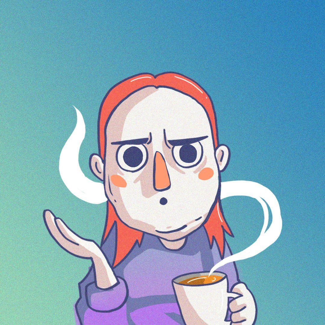
STRESSED ME 

Version 1

This was the first design that I presented to Joy one week after getting the brief. I wanted to expressed the stress I felt trying to accomplish my assignment at once.

To show that, I had hands reaching for paper planes (symbolic of assignments) stretching in different directions. To emphasise their effect on me, I had the hands to attached to me by red string connected to hooks embedded in the girl’s body.

The girl is representative of me, floating in a tumultuous sea of stress in a coffee cup full of bad feelings represented by the black sludge on the rim. To show how my focus is very dispersed I covered the girl’s eyes with static.

Joy enjoyed this design and liked how it incorporated the surrealism from project two. She also liked how the emphasis on the main subject was very clear by using the complementary colours with orange as the colours of the main subject.  She suggested I incorporate a subtle element to hint at what work the girl is doing to give it context.

Updated design

I added a paintbrush into the girl’s hair to hint at the artsy work that I am working on. I also added a canvas texture to the image so that the photoshopped elements within it will have a more cohesive look and look like one painting.

LATE NIGHTS STUDYING WITH MY SISTER 

This was one of the rare designs that I didn’t have to update much. In terms of symbolism, this one is chock full. As you may notice, the running motif of paper aeroplanes representing assignments is still present. My sister and I, represented by the two girls are in a sea of assignments, We are clinging onto our ideas (symbolised by the light bulbs) for dear life. To represent the “working through the night” aspect, I replaced the bulb of the light bulb with moons.

I also wanted to express the feeling of lethargy that we felt while doing our work through the night; the feeling of our eyes closing. To represent that, I replaced the eyes of the girls with stitches.

Additionally, as a link between the first and second image, I made the girl representing me have pink hair again. I made the brown haired girl bigger for two reasons. Firstly because she represents my older sister, who is older than me, secondly she is the subject of my second image. However, I still placed certain aspects to draw the viewer’s eye back to me, the main subject overall in the equation.

This can be seen by the use of pink hair and the redder moon as well as the spiralled clock leading the viewer’s eye to my head. Thus drawing the viewer’s eye from my sister then to me.

Originally I thought this would count as a complementary colour scheme as orange and blue are still the prevalent colours throughout the composition. However, during the presentation, joy pointed out that this composition due to its wider range of colours could be counted under using the quadratic colour theory. This however still works as two of the colours are more dominant throughout and the remaining are used for highlighting and emphasising, creating a more dynamic and vibrant image.


FUN

Version 1

For the final image of this equation, I placed both my sister and I in a sea of flowers. The two of us are blowing bubbles but I have replaced the bubbles with paper planes to show how assignments have instead become something fun when we do it together. Additionally, as you may have noticed, the two of us are children again to show how it’s become child’s play and also to emphasise the element of fun or childish delight and bonding.

In terms of design, after consulting joy, she felt that the flowers were a bit too striking and took away from the subjects that was the girls. So following the complementary colour theory,  I once again made the dominant colours of the image orange.

Version 2

Additionally, this worked out better as a row since now all three images makes use of complementary colours and get progressively more orange, representing how everything gets warmer and happier.

Final Design for Equation 1

2.

DEJECTED ME + HEART TO HEART TEAS WITH MOM = COMFORT


DEJECTED ME

Original design

This was the original design. I was trying to go or more analogous colours on the red orange end of the colour wheel. However, Joy commented that the main subjects of the image were kind of fading into the background. So I updated the design instead to use the complementary colour scheme of red and green to create a more dynamically coloured image.

Updated design

The starker contrast between the colours also make it clear to the viewer what to focus on in the image. That is the cat and the umbrella.

In terms of design, I chose to use a cat trying to reach for an umbrella in stormy weather to represent me trying to reach my goals. To emphasise the grabbing motion, I replaced the cat’s paws with human hands.

The ladders are to represent how all the options around for me to reach my goal are too far out of my reach.


HEART TO HEART TEAS WITH MY MOM 

Original colours

I had a bit of trouble thinking how to represent these tea breaks I have with my mother. I tried placing us in tea cups in fish bowls etc. Then I watched Beauty and the Beast with my sister over the weekend. Mrs Potts and Chip seemed like a mother and child relationship reminiscent to what I experienced as a kid with my mom. So I replaced this mother and child’s heads with a tea pot and a cup in varying shades of red. To represent the wealth of knowledge that my mom imparts to me over our tea talks, I used books that look like they are flying towards us about to land. To represent my own latent worries, I used crows (common sights in fields and sometimes bad omens) and replaced their heads with clocks to show how time felt like it was running out.

I also placed the pair under a mushroom shelter to represent a new hope as mushrooms are often representational of life that comes from death. So the new life or hope to my dead dreams.

In terms of colour theory, Joy felt the original image’s sky was a bit “undecided”. It was both green and blue at the same time. She suggested I pushed the colour a bit.

So instead I opened to make the sky blue so that it forms a triadic colour with the yellow and red. With red to emphasise the main subjects of the image.

Additionally I cropped the image a bit wider this time as I wanted the viewer to be observing the situation from a distance and thus making the talk seem more intimate.

I also placed the two kinds of birds (the books and the crows) in similar patterns on opposing ends to balance each one out and also to create leading lines to the pair in the middle.


COMFORT

Original design

With this design, I wanted to show how I have a new dream, represented by the floating balloon in the same position as the umbrella from the first image. I also wanted to show how the new hope from the second image have ground and bloomed larger than how far my dreams. The comfort comes in how I didn’t have to face chasing my dreams alone this time around and the options available to me are all hinged on my growing hope.

In terms colour theory, I chose a sub-complementary colour of blue and red. However, joy mentioned that the mushrooms were more a green brown than red. She suggested that I turn it more blue so that it will distract less within the image and the viewer will notice the woman and the child more.

Updated design

This is the only row within the four that does not have a running motif across the three images. In this case it’s the mushroom. However, since I’m using mushrooms as a representation of hope, I wanted to show the lack of hope within the first image.

Additionally, I wanted me in the images to get progressively more human to show my growth as a person after the talks with my mom. Someone with more logical thinking and less based off instincts.

3.

BORED ME + KARAOKE CAR RIDES WITH MY DAD = FREEDOM


BORED ME

With this image, I wanted to show days I hid out in my room listening to my music and being antisocial instead. The girl is basically me withdrawing from life in my hermit crab shell. I used the headphones on my head, firstly as a shoutout to the music theme coming up in the next few images. But because headphones are a very individualised object. When used, only one person can use it at a time. The goldfish are to represent my thought process, or lack thereof. My thoughts in my own shell don’t last very long and go in circles.

However, I wasn’t very satisfied with the colour. I wanted something a bit more dynamic.

Updated design

Now the colour of the girl’s dress, the shells and the fish seem more synonymous. I made use of complementary colours and the red blue-ish green colour scheme to make the image more dynamic.


KARAOKE CAR RIDES WITH MY DAD 

Original design

I tried to go for the same colour scheme with this design. I made the car out of different instruments. And I replaced the man’s head with a boombox to show how my dad is always singing and how he’s really LOUD.

The goldfishes are now flying upwards with the car to show a sense of flight and building exhilaration and also to show how my thoughts are taking an upward turn and have more direction.

Joy suggested I changed the colour of my dad’s shirt and the guitar on the car so that they would match more with the green sky to create a complementary colour scheme.

Updated design


FREEDOM

With this image, I wanted to show how my dad was transporting me out of my room and my shell and to see a whole new world in music as a way of expressing my emotions. As can be seen from the fishes (my thoughts) escaping the gramophone like lyrics of a song.

My dad and I both each have a guitar at home and we sometimes play together. I figured it’s be cool to replace both our heads with them. And finally the shells in the bottom, show how I am leaving my shells behind and achieving Freedom through music thanks to my dad.

In terms of composition, I placed the shells and the fishes to balance each other out within the image. The image uses the sub complementary colour scheme.

4.

BUSY ME + FAR AWAY FROM HOME = HOMESICK

BUSY ME

This is busy me, represented by me rushing through life on the MRT, and how everything is a blur to me because it’s going by so fast, represented by the blur sotong I replaced the person’s head with. I also tried to show me  trying to avoid the stinging sensations of homesickness, representing the feeling with jellyfish.

I used triadic colours of pink blur and yellow. I also wanted to draw the viewer’s eyes to the MRT and the person on it. So I made the MRT a vibrant yellow and the person’s vest a bright blue.

I also made the jellyfish go the opposite direction as the MRT to contrast the direction of the MRT and also to give a sense that they are rushing by the train.


FAR AWAY FROM HOME 

I wanted to emphasise the distance I felt from my family living in Hall on Pulau NTU so I placed a tent on the moon far far away from the city below. I also kept the general skycap shrouded with the same jellyfish to show how homesickness is always hanging around. I used a similar colour scheme as before. However instead of blue, I used split complementary colours of green, pink and orange with orange as the emphasis, drawing the viewers to the subject of the image that is the tent.

HOMESICK

The final and most important image in the whole 4 rows, and the reason behind the direction of this whole collective piece. An image to show my homesickness. This is also probably the simplest piece.

I wanted a punch in of the previous image. A closer look at myself on that moon. The “floor” of the moon that I used in this image is actually another image that I stitched together with the galaxy background because I liked how the landscape seemed to have natural seats and tables for my character.

I added an astronaut sitting on the moon. And the astronaut’s helmet is reflecting the earth on it’s glass, showing the direction of the astronaut’s gaze, towards earth. The jellyfish in the background is to show how the feeling of homesickness is sometimes understated but it is always hiding out in the background.

I didn’t mean for it at first but this image of the astronaut I used is holding a gun in hand. Which gave the image a whole other meaning. While I am not lonely to the point of suicide, I think it is something that some people may feel or relate to so I left the it there, for a small amount of people to notice and maybe feel.

[ CONCLUSION ]

If you may notice, each row has a specific theme. Starting in the seas (actual sea, sea of clouds and sea of flowers), to the field to the skies and then then space. I chose space for the last row specifically to show the loneliness and silence that is very present in space.

University is truly the first time I have spent such extensive time away from my family. I think I’m quite happy to have been able to create something to represent aspects of my family that I miss and love and to a certain extent show them my appreciation of how much they have shaped me as a person.

In terms of the design and art direction, I’m quite happy with how the surrealism pieces turned out. While it was really hard finding images that pieced well together and the printing was hell.

I think this project was a good conclusion to whatever I have learnt in foundation 2D. For example, using patterns, shapes and lines to create emphasis or to lead audience eyes to piecing images together and using semiotics to create meaning from abstract images that I learnt in project two and design composition to balance an image and the negative space.

IM DONEEEE! 

Thank you for all your lessons Joy, I learnt a lot and I really enjoyed them. 🙂

Project 2: Forrest Gump


[ Introduction ]

When I first heard this project was based on movie quotes, I was very excited since I loved watching movies and movie quotes were something that I always took note of. Sometimes the writers for these movies know the exact words to express exactly how you feel. And in that moment, that quote just speaks to you. I love it when that happens.

I knew that the designs could not be a literal representation of the movie but instead an abstract representation of what we felt about the quote itself. This gave the whole project a more personal feel and an added layer of challenge which was very exciting to me.

[ Let the fun begin ]

 1. “Quit blowing smoke up my ass, you’ll ruin the autopsy.”    

– Meet Joe Black (1998)


I love the biting sarcasm and cynicism in the quote. Meet Joe Black was a movie about a rich man, Bill, who was coerced into being Death’s tour guide in exchange for time to settle his affairs and the relationships in his family.

Bill, played by Anthony Hopkins and Joe, or Death, played by Brad Pitt. Source: http://ilarge.lisimg.com/image/1175770/852full-meet-joe-black-screenshot.jpg Accessed on 22 Oct 2017

I think this quote was by far the easiest to work with. I knew from the start what part of the quote I wanted to focus on. “Blowing smoke up my ass.”

I looked up into what that slang means. It means to complement someone insincerely or hiding certain parts of your true feelings..

This made me start thinking about lying and what it did to people.

Source: https://i.pinimg.com/736x/7f/bf/39/7fbf396b1234209ed0c887b8b932476f–godfather-art-the-godfather-movie.jpg Accessed on 22 Oct 2017

I was inspired by the movie posters for The Godfather. A man dressed in a black suit, with darkness that conceals a large part of him giving an element of mystery and danger to him.

Original design

For my initial design, I had a man in a black suit wearing a goat skull as they are often associated with the devil because of the shape of the horns. The devil is symbolic of deceiving, lying and manipulation which were the issues that I was trying to address with my piece. The man wearing the skull concealing his face could have two meanings. Either that the man’s thoughts have been influenced by the devil or that the man was the devil himself.

The man is literally blowing smoke. The initial smoke I was trying did not read well on threshold which was the effect I intended to use on the piece in photoshop. The smoke needed more line work. However I didn’t want the smoke to seem too cartoonish as well since it would clash with the realistic features of the man.

I chanced upon a picture of distorted faces. I decided to crop out a few faces to form the shape of smoke. It turned out pretty well. I felt this gave an additional meaning to the man’s smoking. How what he says about people is often distorted and untrue; most of the time ugly.

The man is also holding a scythe, firstly as a shoutout to the movie’s main character “Death” or “Joe Black” I also partially concealed it in the darkness to show the hidden danger of this individual.

During my first consult, Joy liked the design and the additional layer created by the smoke. Even though they weren’t noticeable off the bat, having something for the audience to notice after looking longer gave it more depth. Additionally she liked how the smoke and the scythe balanced each other on the image. However, she felt the scythe was too literal and suggested changing it into a mouth.

Updated design

This is the updated design. I changed the blade of the scythe to a toucan’s mouth to show how our words and what we say is what is the real danger to others. During the second consult, Joy was okay with majority of this but only felt that the scythe should align with the tie so that it creates a leading line.

This is the final design that I printed onto my tote bag.

Final Design


Quote #2

“What if I fall? Oh but my darling, what if you fly?”

– Peter Pan (1953)

Original design

I had a rough idea for this design by the second consult with Joy. The basic image of the hands controlling paper aeroplanes to reach the child’s mobile. However, Joy felt that this was still too literal a representation of the quote in terms of it being about chasing and flying up to my dreams. She asked me to find a deeper relation of the quote to myself.

Thinking on the concept of chasing my dreams more, I felt a bit cynical about it. I thought about how dream chasing wasn’t as easy as movies made it up to be. Dreams needed funding, and while all we see are the success stories, many dreams my not be what we expect and sometimes, quite often, they crash and burn.

So for my second consult, I updated my image and made the paper planes out of Singapore thousand dollar bills and made some of them crash into the planets hanging on the mobile.

Updated design

Joy felt that this was a more put together version of the design and it’s message was much clearer. However, she felt that the dollar bills weren’t as clear as we can only see a bit of Yusof Ishak’s face and a bit of the numbers. She also felt that in terms of design properties, I could try shifting some of the aeroplanes so that all their directions of flight were in line and created a subtle leading line up towards the planets. She also suggested putting some smoke that could balance the large hand on the bottom left of the image.

This is the final design that I presented.

Final design

I cropped and edited the shape of the dollar bill so more of it could be squeezed onto the shaper of the paper planes. I also shifted some of the flight directions of  some planes so that they all look like they are flying roughly in the same direction. Lastly I added a larger paper plane falling back towards the hand. It leaves behind a trail of smoke which overall balances the large hand at the bottom.

Quote #3

“It does not do to dwell on dreams and forget to live.”

– Harry Potter and the Philosopher’s Stone (2001)

On the flip side compared to the previous quote, my interpretation of this one is a lot more hopeful. I love this quote from the first Harry Potter movie and it was always an encouragement when it came to school and trying to motivate myself. I felt that often times, when the workload got tough, I tended to retreat into myself and procrastinate by daydreaming. It was a bad habit that lead to a lot of rushed assignments in the past. It always left me with a certain sense of regret. How was that very well developed daydream about making a zombie movie complete with character arc and design going to stop me from failing school and actually learning the skills needed to film movies in the first place?

Thus I related to this quote greatly. I wanted to portray the sense of reluctance and danger I felt when it actually came to chasing dreams and my desire to cut myself off my bad habit of hiding in my daydreams before it is too late.

Initial design

This is the initial design. To portray my daydreaming, I placed floating balloons to show a sense of weightlessness in the image. I had a lot of trouble with this because many images of balloons disappeared the moment I used threshold and half tone did not have the effect I desired in the image. To solve this issue, I made eyeballs using vectors on parts of the balloons where the shapes weren’t visible. This gave a sense that the whole mass of balloons were actually eyeballs. I also made sure that none of the eyeballs were looking down on the earth which I chose to represent reality. I also placed hands holding cotton candy out to represent the distractions and various daydreams that turn me away from looking at what’s happening in real life. Finally, I placed a falling girl that has just cut herself off from her daydreaming and taking the risk to fall to earth for her dreams.

Joy and the rest of my consult group mates liked the whimsical surreal vibe of this piece. However, Joy suggested that since the main subject of was the girl, I should darken her and make her more prominent if not the large dark mass of balloon eyes will steal the audience attention away from her.  Joy also suggested that I turn the cotton candy clouds to point subtly at the girl to lead the viewer’s eyes more to her.

Updated and final design

This is my final design. In order to lighten the darkness of the balloons, I added more eyes and eye whites. I darkened the girl and her hair so that the contrast between her and the background will draw the viewer’s attention more.

I tried to point the cotton candy clouds towards the girl but I felt that it the weird angles detracted from their original intention to create a sense of sky and height from the earth. So instead I altered the size and positioning of some clouds and used them to form the path from which the girl would fall so it would seem like she is falling through the clouds. As you can see from the design, the darkest elements within the picture are the balloons, the girl and the earth. The decreasing amount of balloons form a subtle arrow towards the girl and the gravity and direction of the girls descent will draw the viewer’s eyes towards the earth. This thus allows the viewer’s eyes to follow the girls journey down to reality with her as well.

Quote #4

“I never look back darling, it distracts from the now.”

– The  Incredibles (2004)

I love Edna Mode from The Incredibles. She is very decisive, efficient and did not take anything sitting down. Basically everything I wanted to be as a kid. But now that I’m older and I have the benefit of hindsight, I could see a certain flaw in her philosophy. I get that sometimes, being stuck on past failures could hinder your confidence in trying again.

However, I can see the wisdom in remembering failures and their purpose in improving. Even Edna Mode herself stopped using capes because some superheroes died because of their capes; a fatal design flaw. I felt that in order to succeed in the future, one always has to look back in the past for guidance.

Source: https://media.giphy.com/media/dePaPOPNSLDsk/giphy.gif Accessed on 22 Oct 2017


To show that wisdom, I used an owl which is  symbolic of wisdom. I also chose an owl because of their ability to turn their heads 360 degrees to look behind and all around them. The owl is wearing a pair of glasses (shoutout to Edna) with which one lens is replaced with a clock to show looking through the past.

The body of the owl is made up of hydrangeas which in the Victorian era was symbolic of pride, because it was a plant with many flamboyant  flowers but very little seed. I wanted to use this to portray the pride of the body still facing forward and turning it’s back on the past.

Lastly, I perched the owl on top of a weighing scale to represent choice.

With this piece I tried to play with asymmetry to show how the side that is looking through the past is weighed more heavily by the mistakes but is also the “heavier” and more suitable choice.

In terms of design elements, I made the owl head larger than normal as it is the main subject of the image. I also left one lens open, so that people will notice the owl first. It’s been psychologically proven that human beings seek out eyes on images first before everything else.

I did not have time to consult Joy for this design, however, during the critique, she suggested that while my subject is still very obvious, it’s importance in the image could be greatly multiplied if the size of the scale wasn’t as big. She also suggests that the weights of the scale could be nearer to the bar as well to form an overall triangular shape with the forms, thus making the elements of the piece seem more in harmony with each other.

[ Silk Screen Printing ]

Joy warned me that the blackness of my design might be hard to print. But I never thought it would be this hard. The whole process before of coating the screen with the emulsion and exposing the screens was alright, fun even.

Washing the exposed screen in the red room


Exposed screen after washing

But the nightmare came in terms of printing on the back. Due to the amount of ink needed, there was never enough to reach the bottom of the design.

Attempt #1: What even is this???

Running over the design a second time would get rid of all the small details, especially in the smoke.

Attempt #2: Tried going over it twice. It’s too dark. Now he looks like the Darlie man’s shady older brother.

The work-study that day, Clara, suggested I spread the ink on the screen first before placing it back on the bag and running it over once with the squeegee.

Attempt #3: Much better with Clara’s new method. Still a bit dark so some details are lost. One last bad left, one last try.

Attempt #4: Finally!

Thank God it worked. There were  still small patches of white near the bottom but this was my most detailed print yet and I filled the holes in with a paintbrush. (Bet you can’t tell eh?) So overall, a success. Shoutout to Clara for being my saviour.

[ Final critique from Joy ]

Good attempt in conveying my meanings behind the quotes. Good use of design elements to clearly draw the attention of the viewers to the main subject.

Critique from classmates:

Thanks everyone. 🙂

My Line is Emo : Growing Up


[ Introduction ]

Starting out on this project, I was really confused as to how a line or more specifically the marks that make up the line could be used to express emotions, especially when cropped to a small line.

My initial impression of abstract art was that it was an emotion put on paper. Usually large and with a certain choice of colours to evoke a certain emotion when viewing the piece. This project challenged that view entirely with it’s requirement for small monochrome lines cropped and curated from a big piece. This forced me to focus on the values, the texture and the basic elements of design and make use of them to convey my intended emotions.

I first started out researching on the suggested reference artists to observe the mediums and methods that they played with and how it reflected in their work.

[ Research on Artists ]

ED MOSES

Medium: Ed Moses often worked with industrial materials such as polyester resin and latex, which he mixed with paint to create textures and marks.He also painted resin on the back of the canvases so that the liquid could seep through. Other examples of materials that he tried on his work include masking tape and snapped chalk. An example of works where such materials were applied are:

Source: http://www.albertzbenda.com/artists/ed-moses/7 accessed on 10 September 2017

This untitled 3 set piece made in 1975-77 was made on Strathmore boards with acrylic and masking tape. (With the exception of the last piece which was made with charcoal and ink as well.)

Technique: He often layered his different mediums which created different values on paper to invoke a sense of depth on his art pieces. Another way he achieved this was by paper collage where the paintings seem to be hiding under another layer that has been torn open. E.g:

Ed Moses, “Avilda,” 1963. Graphite with paper engineering on board. 5 1/2 x 6 inches. Collection of A. Garrigues, Los Angeles, courtesy of Louis Stern Fine Arts. © 2015 Ed Moses, photo courtesy of Louis Stern Fine Arts. | Right: Ed Moses, “Color Rose,” 1967. Graphite on paper. 18 1/2 x 14 1/2 inches. Collection of Blake Byrne, Los Angeles. © 2015 Ed Moses, photo. © 2015 Museum Associates/ LACMA, by Brian Forrest.
accessed on 10 September 2017


SOL LEWITT 

Lewitt as an artist is intriguing in that he brought to question how much authority an artists needs in his art. He believes that the idea and concept of an artwork is an art on its own. Thus he gives instructions for his work to his assistants in “blueprints” that are deliberately vague so that the end result is not controlled by the artist that conceived the work.

Medium: Lewitt emphasized very often on the process or the lack thereof. Thus, he varies in terms of the simplicity of his materials. As compared to the other artists in this list, he does not use industrial materials to create his work, instead opting for more traditional materials such as wood, canvas and paint.

Techniques: Lewitt often used scribbles, doodles and geometric shapes to create a sense of chiaroscuro in his pieces which give them a 3D feeling on their 2D form.

https://www.moma.org/collection/works/175905 accessed on 10 September 2017

For example in Sol Lewitt’s Scribbles, the works are built up using basic shapes and simple marks  of layered graphite scribbles. The end result “renders for without space” and create a sense of depth and curvature despite being on a flat wall. The varying layers and density of the gray bands of graphite scribbles thus take on a temporal, undulating quality.


CAI GUO QIANG

https://www.artsy.net/show/fundacion-proa-cai-guo-qiang-impromptu accessed on 10 September 2017

Cai’s work can be considered by some as a performance pieces. Often due to the massive scale of the marks made, he makes them on location before installing them directly.

Medium: He works mainly with gunpowder and fire on specially made paper as he wanted to investigate both the destructive and the constructive nature of gunpowder, and to look at how destruction can create something as well.”

Technique: He arranges gunpowder fuses, loose explosive powders and some times cardboard and paper stencils on sheets to create silhouetted forms on the sheet. He also adds wooden boards to disperse the patterns formed on the paper from the smoke and adds rocks to intensify the explosion.

The resulting marks created by the explosions and resulting fire create a long flowing pattern across the sheet with tinges of yellow and varying shades of brown and black creating an interesting texture.

http://www.caiguoqiang.com/sites/default/files/styles/large/public/1993_GreatWall_pet10_0087_002ltr_cc-web.jpg?itok=cX_Vn5c1 accessed on 10 September 2017

One example how such looks were applied was in his large-scale explosion events, “Project to Extend the Great Wall of China by 10,000 Meters: Project for Extraterrestrials No. 10 (1993)”, for which Cai ignited a line of fire—evocative of a dragon gliding across the land—using 10,000 meters of fuse extending from the end of the Great Wall into the Gobi Desert. The drawing is mounted on 12 oversized panels, and the viewer must walk along the length of the work to fully experience it. The panels of the folding screen are displayed in a pattern that shifts the perspective of the drawing in and out, mimicking the peaks and valleys of the Great Wall while also suggesting, as does the wall itself, the undulating body of a dragon.


http://www.caiguoqiang.com/sites/default/files/styles/large/public/1993_GreatWall_pet10_0085_003h-web.jpg?itok=MtzXLs3n accessed on 10 September 2017

[ LET THE FUN BEGIN ]

During this session, I wanted to experiment on just to see how texture and the hardness of the medium affecting the emotions they generated in the viewer due to the marks as well as how the techniques the materials were used in would affect the final outcome.

I realised that most of the marks I made with soft materials or when I mixed ink with water generated more happy and gentler emotions.

Mixed bubble solution with ink, blew with straw and placed calligraphy paper on bubbles.

Bubble marks made interesting swirls on the calligraphy paper.

For example, I mixed bubble solution and ink and blew bubbles onto paper to form a fairly consistent and soft pattern.

However not all “soft” materials were a success. I tried imprinting the dried flowers from my graduation bouquet but they just fell apart in the ink.

The before and after.

I also experimented with a makeup sponge. As the one I brought was a triangular one, I was able to make geometric shapes on the paper. When layered it formed an interesting, spray paint like quality.

Sharp edges with high contrast and varying darkness of marks create a sense of depth and form to the paper. Marking the paper in a circular manner draws the eye to the centre of the image when negative space is left.


Experimenting with a straw..

On the other hand, sharp objects with hard edges often projected harsher emotions or emotions with more energy due to the tight distance between the marks and their high contrast. For example, I experimented with satay sticks, metal, brushes, straws and seashells. I particularly liked the variation in the thickness of the marks for the satay stick.

Made by dragging satay stick across the paper as well as hitting it after dipping in ink.

I also experimented using the hard objects in varying movements. Hitting the paper, dragging across the paper and rolling the material across the paper. The movement often  generated elongated and explosive  splatters which conveyed a sense of energy and guided the viewer’s eye across the canvas due to the decreasing size of the “dots” the further they were from the source of impact.

Made by hitting paintbrush on paper.

Consult Critique

My original idea of using mark making to express my emotions“Growing Up” was first born when using the medium of bubble blowing. Firstly the medium and messiness of it reminded me of my childhood.

From there, I started crafting my concept around the theme of childhood. I started using materials that related to childhood to see how they translated on paper.

Materials such as bubbles and the makeup sponge translated quite well on the paper. 

The memories I associated with the materials and emotion all seemed to revolve around my mother and thus Joy suggested that I narrow down my theme to my childhood memories with my mother. This led to the idea of doing a collaboration piece with my mom and make it a sort of dialogue between the two of us as we revisit portions of my growing up.

[ ROUND 2 ]

Bubbles

The bubbles turned out well in the original attempt but the emotion I was trying to convey was drawn from the memory of my annoying habit of blowing bubbles in my drink. (And doing it further to because I knew how much it annoyed my mother.) The emotion I concluded was akin to glee.

However mainly due to it’s consistent and equally dark pattern of the bubbles formed by bubble solution, I decided to experiment with other kinds of bubble making solutions to see if I could form a more chaotic pattern which would create more texture and a variation of dot sizes on the paper.

The original test runs with body soap and ink solution were a failure as I tried to figure out the right balance of ink and soap. The bubbles were either too dark or too light. But I soon got the hang of it. I created patterns by blowing into the mixture with a straw before scooping up the bubbles and spreading it on the paper.

The makeup sponge

The original imprint created shapes that made a spray paint like pattern across the work giving it an interesting texture and depth. However  when I chose to squeeze the makeup sponge instead, the whole look of the piece changed.

This created soft swirls which were darker on the center of the mark creating emphasis. This felt really interesting to me because it felt as if I were trying to pinch and mould the mark.

Cling Wrap

Left: A gradient can be created by varying the thickness of ink layered on cling wrap. Right: Negative space creates sharp contrast drawing the viewer’s eye to the darkest parts of the image.

I wanted to use cling wrap to show how frustration at my childhood messes not only came from myself for making a mess but also from my mother who often had to clean up after me. So my original intention was to make a mark using cling wrap and have my mother literally “clean it up”. Unfortunately it didn’t translate as well on paper and the smudges ended up destroying what original marks were left.

Wiped off ink on cling wrap. Does not translate well as marks are mostly gone.

Water

I wanted to convey saddness and remorse with water and so I tried wettting the whole calligraphy paper and dripped black ink at the top and let it seep down. However all it created was a gradient. I also needed a way to insert my mom into it to show her side of causing my remorse.

[ FINAL ROUND ]

Making art with my mom was probably the most fun both of us have had in awhile. Busy as we are, we never really found much time to do stuff together and my mother has always never really been all that supportive of art dreams. So this making art together thing was really a first.

For each of the pieces, we both created a portion of the art. How or where we did it varied in terms of the piece.

Bubbles – Glee

Observe the master bubble blower at work.

For the first piece with bubbles, I gave my mom a crash course on blowing bubbles into a “drink”.

My side of the paper

It was fun making my mom do something she abhorred so much in my childhood and making her the “child” for once. I would daresay what I felt was very much the “glee” i was trying to express.

She had trouble blowing bubbles. And when she finally got one, it burst before it even hit the paper.

She clearly hasn’t had much practice.

Although, in the end, her fear of ruining my “section” of the piece made her kind of stick to her own corner of the paper. Thus the distance between the two sections made me decide to just crop out a part of mine and a part of hers before piecing it together to the final piece.

Final piece before cropping

This difference in our bubbles (my tightly packed layered and darker bubbles vs her widely spaced lighter ones with dark accidental drops of ink) created an interesting contrast that met in the middle thus looking like how we clashed over this issue.

Final cropped line

I believe the viewer would have gotten the emotion of glee from this line firstly due to how obvious the medium used was. Bubbles are often associated with fun and happiness. Secondly, the contrast due to the varying the number of bubbles suggest that one person is having more fun than the other. Which I feel sums out glee about right because glee is defined as “great delight, especially from another’s misfortune.”

Cling Wrap – Frustration

From my second experiment, I had knew I had to find another way to show my mom’s side on the piece. Remembering how Ed Moses painted on the back of his canvas and let the paint seep through, I decided to do the same with cling wrap by having my mom place the cling wrap marking on the other side of the paper to give her mark a more faded quality to show where the “mess” I made on the front used to be. Also, the faded quality of her mark also gave a sense that her “frustration” was boiling below the surface and as a child I could not perceive it as well as my own.


Darkening my side of the paper again to increase the contrast between the marks.\

Uncropped version

Again, this piece uses contrast to show the two different perspectives in the mark. I believe frustration can also be conveyed through the marks due to the jagged and generally dark texture of the marks as well as how tightly spaced the marks are between each other creating a sense of tension and chaos.

Final cropped line


Friction Mat – Surprise

Here the restrictions of working with my mom finally made itself known. She was fine with using bubbles and cling wrap but she drew the line at our bike.She “wasn’t spending the weekend cleaning tracks up”. So I had to make do with friction mats that were placed under a lot of things on my desk. This is mainly because of how clumsy I was. I wanted to use the bike originally to convey the surprise I felt learning to ride a bike and getting it right on my first try and also the surprise that came when I crashed into someone within one minute of being let out into the proper cycling track.

I had to find something with a similar texture to wheel marks which I originally intended to use as the constant appearing and disappearing marks as well as the drag marks it would have made on paper.

Friction pads had a similar effect, but on a smaller scale. In fact they reminded me a bit of the black tire marks I’d get on my leg after every cycling trip because I kept bumping my legs into the tires.

I made the marks by letting my mom make the constant marks until when she decided to “let go” of the bike. I then added the drag marks where her prints stopped to show the surprise of suddenly having to do something on your own.

Final un-cropped  piece

I believe viewers can get the feeling of surprise from this line due to the sudden variation of texture. The constant flow of the friction mat’s almost dot like texture also leads the viewer’s eyes across the line before it suddenly smoothes. This variation in texture also creates a sudden contrast thus also invoking a sense of surprise.

Final cropped line


Makeup Sponge – Adoration

Growing up, I remember constantly being fascinated by makeup. I would sit and watch as my mother put it on her face and hope that she’d offer to do me too. Never happened until I grew older and I could buy makeup on my own. In a way, this sense and need to use makeup to make myself look prettier has thus always been ingrained since young.

To show this emotion, I let my mom apply the ink to the center of the canvas using the sponge however she liked. Layering it till it created a dark circular shape. I then surrounded her marks with mine. But as I was making my marks, I squeezed the sponge as I tried out in the test run. This created a dark dot surrounded by a soft swirl which I layered more nearer to my mother’s marks. I left more negative space the further I got from the center.

Uncropped version of the piece

This created an emphasis on the center of the piece and thus my mother’s marks, which was what I felt I was doing as a child. She was the main ideal and I was always moulding and shaping myself to be like her.

Final cropped line

I feel that adoration could be conveyed to the viewers through this line once they know the medium used. The more darker marks made by my mom as well as the use of circular swirls  on the sides also create a sense of movement that lead the eye to the center of the image. Makeup and it being the centre of attention would lead the viewer to infer that makeup was a means to achieve an ideal that was in the middle.


Pencil on Essay Papers – Anxiety

Test run on paper with pencil

The use of the pencil was originally inspired by the satay sticks. I liked the sharp meandering lines made by the sticks but I wanted to use a medium with more significance to make the mark. Thus I chose the pencil due to it’s similar shape and greater symbolism in terms of study.

The original essay which I photocopied to make it monochrome.

My mom is a chinese tuition teacher and thus the pressure to do well in chinese was very prominent growing up. This was an essay I got my mom to pick out for me from a stack. I did particularly badly for it scoring 17/30. Ironically, it was an essay on how I got lost in a shopping mall because  I didn’t listen to my mother.

I printed it out on two a4 papers to make it monochrome before using a pencil dipped in ink to make swirling patterns all over it. I tried to apply principals of automative drawing and tried not to think about where my pencil was moving. Interestingly, I appeared to be subconsciously trying to cover up my mistakes.

Final un-cropped version

The marks made by the pencil worked well in conveying anxiety due to it’s tapered tip. It ended up making uneven marks across the paper that conveyed a sense of uncertainty as it guides the viewer’s eyes across the piece and also my horrendous essay.

Final line

I think the viewers would be able to get the feeling of anxiety from this piece firstly due to the commonality of how much anxiety the learning mandarin brings, especially to the Singaporean audience. The meandering lines and it’s uneven texture also leads the audience in crossing leading lines across the essay showing how anxiety leads one in meanders across the mistakes and how in the end they form a cage on the whole thing.

Remorse – Paintbrush and water

Caning is definitely a lot more fun now than it was in the past.

I decided to let my mom use a paintbrush dipped in ink and make a caning motion on paper. I then sprayed water on the canvas and let the ink smudge. When the piece dried, the caked ink at the point of impact also cracked.

I felt that making this piece also did well in conveying my mother’s emotions on caning as well. She does not like caning us as she always said it felt like she was caning her own flesh. The cracked ink did well to show the heartbreak it brought her to cane me growing up as well.

Before “crying”

I then proceeded to spray the cane marks to symbolise my tears of remorse after getting caned.

The cane marks on the paper formed dynamic stroked across the paper which contrasted nicely with the soft lines that were formed by the water smudging the ink which gives the marks the impression that they are bleeding.

Final un-cropped piece after “crying”

I believe that viewers will be able to derive the feeling of remorse from the marks due to this contrast and would be able to understand it even more due to the method used to create the marks. Caning after all seems to be a pretty common part and parcel of growing up and making mistakes.

Final cropped line

[THE FINAL PRODUCT ]

Top down: Glee, Anxiety, Frustration, Remorse, Surprise, Adoration


Final Critique from Joy: 

Good use of theme to bring together the whole concept. However how the marks have been curated ( i.e why this section of the entire piece has been picked) can be further expanded on. The original piece was placed vertically and would work better when viewed horizontally so the audience can see the dialogue and contrast between mother and daughter more clearly.


Critique from classmates: 

Thanks everyone 🙂

Mark Making Tools

Today we learnt about mark making. What interested me most was how diverse and, if I may, ratchet, the tools to make a mark making painting has. From Conventional inks and paintbrush to bubbles and joss sticks. It opens much more innovative way of making art. In a way, this form of art challenges us to go back to the basics when art started and materials couldn’t be bought in the local Artfriend and people played around with crushed shells, berries, egg yolk etc to achieve what the wanted on the canvas.


Source: https://3.bp.blogspot.com/-x_GZIZIQ5gQ/WLMYr23fjrI/AAAAAAAAdfM/M3GFumU1rxceqIM8I3MEg5ILRBEYwbg0ACLcB/s400/textures-tools.jpg accessed on 17 August 2017