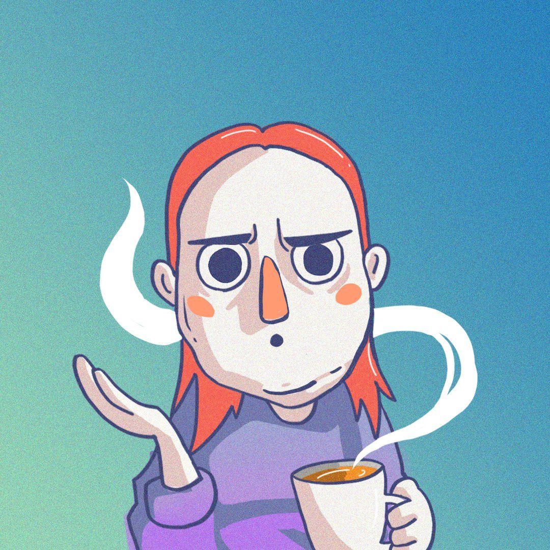
For this assignment, I decided to walk around looking for fonts around school and the supermarket. I think this was the first time I was actually aware of the amount of fonts all around. In fact, I think this was the first time I actually noticed that Food Court 2 at NTU actually uses Comic Sans on their stall signs and surprisingly, it didn’t actually look all that bad.
Here are some of the fonts that I found:
The Nanyang Chronicle uses a san serif font for their headers and subheaders of their paper. It’s an interesting choice considering traditionally most newspapers use serif-ed fonts like Times New Roman since it looks more serious and is easier to read. The choice of sans serif in this case was probably to come across as more friendly and modern looking which is appropriate for their target audience: the students of NTU.
Ah yes, comic sans, we meet again. I’m surprised that the use of the font in this context did not annoy me enough to notice throughout my entire first year of study. I think this is actually one of the cases comic sans is actually an appropriate choice. It looks friendly and welcoming, can be read clearly from a distance and it can be used uniformly throughout all the stalls without affecting impressions of what could be sold there. I vaguely remembered visiting a food court once where all the stall names were in extremely bolded, capitalised and serif-ed. It was a very intimidating eating experience since it almost felt like all the stores were screaming their wares at me.
While looking for some serif font examples, I headed to the supermarket and directly to the wine section. As expected most of their selection was labelled in serif fonts or script fonts. In this case it’s name is in Old Style serif and the wine’s production location is in Script.
I think wine brands often try to portray themselves as refined and expensive, thus the use of serif fonts. Wine labels tend to use traditional, busier typeface styles and design that link to history and authenticity.
It also gives the impression of seriousness and maturity that is often linked to wine.
On the other hand the use of similar font at this hairdressing store seems an opposite effect on me. I think it’s because my impression of haircuts often involve colour, creativity and freshness. Thus I think the application of the font in this case does the opposite.
I think I have always been aware of how I felt about each subject. Such as how I somehow knew that the hair salon was dubiously boring or that the food court was warm and welcoming. But after this little adventure, I now know why.
I wasn’t sure what to expect when I decided to take Typography considering I never had any formal lessons. I mean I knew the basics: try not to go more than 3 fonts, try to let the text breathe and NEVER use comic sans. Things like that. Stuff like kerning, leading and serif, I knew what they stood for but never why. So it was definitely interesting to finally learn over last few lessons.
I’m looking forward to learning new ways to manipulate type to create and sculpt an experience for viewers and how they perceive things in the lessons to come.
Group Allocation
My group has been dubbed SpaghettiItaly. Other than sounding like the generic pasta brand, we are a group of people with varying personalities and interests that have found a common ground in food.
Against our common sense, we have picked Comic Sans as our research topic. Purely for the irony of the situation and our slight inclination toward memes of course. If anything, it’ll definitely be an interesting ride. Wish us luck!
I think it’s a known fact that Singaporeans love to travel. It’s the bi-yearly mass exodus from boredom during the school holidays that happens every June and December. A solid proof that I wasn’t alone in my thinking. Living here for all my life, I always thought Singapore seemed…kinda lame and boring in comparison to other countries that had four weathers and a longer history, especially in art. Which I suppose was the first hurdle I had to cross when it came to this project.
Locale’s goal was for us to conduct research on a location in Singapore and find out what was unique and interesting about it before producing a Zine that encapsulates it’s essence.
Which of course came the problem of Where? I knew from the start that I didn’t really want to go anywhere very touristy. Somehow, I felt Singapore’s tourist spots often seem to be where least of it’s character shines through. They always seem to be presenting the image that Singapore wants to be seen as rather than what Singapore actually is like.
So during my first consult with Joy, here are some of the places I decided to explore:
The Japanese Cemetery
Beauty World
Playgrounds in Singapore
Wet Market stores
After the consult, Joy suggested I look into maybe Beauty World or the Japanese cemetery. Since they were more focused within one location rather than being joined by less tangible factors like the patterns or stores, thus making it easier to focus the direction of my research.
Originally, I thought the Japanese cemetery would be interesting through the eyes of the grave keeper. However, I eventually found out that the man had unfortunately passed away a few years ago.
Thus I turned my sights to Beauty World, a place where I haven’t set foot in, in 15 years. Also a place that 5 year old me regarded as old run down and boring.
Yes I thought it was old and run down THEN.
Imagine my surprise when I arrived in there to find the place looking exactly as I remembered. There were only three food stores picky eater me liked to eat at in the food centre and one toy shop that I visited while waiting for my mom as a child. Every single one was still there, exactly like I remembered. It was a bit unnerving at first. I suppose one thing that definitely changed was the crowds. Perhaps it was the height difference of 15 years but back then, Beauty World felt really really crowded. Being at adult butt level at that time was understandably another unpleasant experience for me to say the least. So what changed? Or what hadn’t that caused this stagnation to happen within this place.
RESEARCH
This is where I angled my research on the place and subsequently presented to the class in Part one of the project:
Beauty World started out as an amusement park in 1942 that catered both to the locals and the Japanese that lived in Singapore during the Japanese occupation. It was a way to lift the spirits of the people during the occupation and give people a place to have fun and relax in. The world Beauty World actually came from the various names of the sections within the amusement park e.g. Happy World.
Aside from the usual amusement park bells and whistles, the place also had wayang and getai performances, gambling and films, altogether a pretty fun place to be.
However when the war ended, the place lost it’s purpose and was losing popularity and soon, it was replaced by something more practical to suit the needs of the people living nearby: Beauty World Market (1947).
The place sold more provisional household items, toys, medicine and food, surprisingly similar to what Beauty World of now provides as well. However due to a slew of electricity, fire and drainage problems, the market was closed down and the tenants shifted across the road into the Beauty World Centre of today in 1984. The building itself was bought over by its 194 tenants and thus most of the stores within the place actually have full rights to their stores and don’t need to pay rent.
After spending an extended amount of time in beauty world interviewing people walking around the mall section of beauty world as well as the food centre here are some of my observations:
Most of the visitors are Chinese
Most people only come by around lunch and even then, it’s not completely full. For every ten seats at least one would be vacant.
The crowd peaks at 12pm-2pm but according to google statistics, it’s only considered “mildly busy” compared to other malls.
In a survey I sent out to over 80 people ages ranging from 13-70, 38% have visited beauty world once or twice with the least visiting a lot. Those results were from a group of friends I know from Ngee Ann Poly that visit quite often as it is nearby.
Recent news on Beauty World would be the 17.5 million dollar bid to buy over the food centre on the upper floor. The stores were asked to close by May 2017. However, due to lack of communication and updates between the buyers and the store holders, the bid was rejected. The food centre opened again in late April. However by then business had already been affected. For now, most of them are stuck in a limbo waiting for further news or buyers. This is especially urgent considering the building is almost halfway through it’s 99 year lease. The older it gets, the less attractive the place gets to potential buyers.
This could possibly be the reason why the place felt like it hadn’t changed much despite the amount of time since I last visited. With most of the stallholders in their late 60s and 70s, most of them are simply waiting to cash in their store and retire peacefully. Additionally, with most of them not needing to pay rent, there wasn’t much motivation to improve or change the stores to attract more customers. Instead most of them survive on a customer base built on friendships formed over the years. This was probably why the place felt almost like it was stuck in a limbo. Just waiting for something to happen so that life could go on. It almost felt as if the whole building and it’s tenants were waiting to retire; for something new or better to take their place.
This bittersweet tiredness and fond nostalgia that I gathered from the place while researching and walking around was also deeply reflected in the qualitative part of my research where I interview different tenants around the mall about their thoughts on the place and the future.
I also counterpointed my interview results with footage I got from the location. Things that I found nostalgic, things that I found reminded me of the place as a child and things I thought showed the vibe of the place fairly well:
The interviews really gave me a more intimate perspective of the place, especially since I had to get close and talk face to face with some of these tenants. It especially broke my heart when one of them started crying as well.
Heres the feedback I got from the presentation:
PART 2: ZINE
Now that the research was done, now came the hard part of trying to concise the place into it’s essence: How was I going to depict the a place in limbo while keeping the old school colourfulness and nostalgia that is still part of the places makeup?
I went on Pinterest to look for design inspirations. I knew going in I wanted the zine to contain old school elements I found in the place. Like the fonts and the object. I also considered looking into the signboards within the food centre to create a pattern out of it as well. Here are some examples I though about trying.
Source: https://i.pinimg.com/564x/0a/5a/26/0a5a263a3e01b6dd9164513c53766713.jpg Accessed on 26 April 2018
I also thought to do a flatly of all the items within a store like the example below to show the clutter and the items that make up the place:
Source: https://i.pinimg.com/564x/6a/4c/e1/6a4ce19744b91a7b7a43491a6afde09a.jpg Accessed on 26 April 2018
However, I had a lot of left over images that I took while I shot the footage for the research interviews so I was wondering if I could make use of those. A lot of them depicted the clutter and the dingyness of Beauty World very well so I researched on how to combine the two together.
Source: https://i.pinimg.com/564x/f6/87/54/f68754115c6428ea53f8f1f91c1317ef.jpg Accessed on 26 April 2018
I liked how this designer made use of the shape of the font and made it seem like part of the environment and was peaking out from it. I also liked the solid colour of the font that created negative space within the clutter of the image.
Source: https://i.pinimg.com/564x/44/a2/65/44a2656560baa2af93e27d70ff7d7b08.jpg Accessed on: 26 April 2018
I also liked this design because the lines look a bit like blueprints or plans for the future that would tie in well with beauty world’s evident future.
CONSULTATION #1
Combining all this I consulted Joy with my initial art direction:
The picture on the left is taken from one of the provision stores within beauty world. The font is from one of the signboards within the place. Using the word 世 from 美世界 or Beauty World, I played around with the shape to form a frame around the shopkeeper. The font itself because of it’s bright colours also serves to create negative space within the clutter of the space.
Meanwhile on the left page would be a flatly of the items within a shop as well as an excerpt from the interview with the shop owner.
Joy liked the colours and the repurposing of the font as a frame. She also liked that the subject within the image was not looking at the camera and was instead profile. Giving of a sense of loneliness and obscurity within the image.
However, she felt that the clutter of the flatlay one the opposing side of the spread was a bit distracting and suggested I try incorporating it into the environment itself, just like my previous artist reference. Like a blueprint. I could also try repurposing the objects to bring new meaning to the place and also try to make them more like part of the environment.
By the end of the consult, I had a clearer idea as to what art direction I wanted with my zine. I decided to use each of beauty world’s chinese characters within each of the spread. And each spread would focus on one of the three main stores within the place: The Food Centre, The Toy Shop and The Provision Store. I thought this would tie in nicely with the stores of Beauty World Market from old as well as the three main kinds of stores found within the place. I wanted to structure it in a wat that it felt like the viewer was walking through beauty world itself and taking a peek into each of the places.
FRONT COVER:
First Attempt
This was the first attempt for the front cover. I used the original font found on the signboard of beauty world. Combining them together, I tried to form a pattern in the background, overlaid over the image.
However, after consultation with Joy, I took it out as we both found it a bit distracting at the end. Not to mention it altered from the colour of the image as well.
Originally, I also wanted to try getting rid of whoever was left on the escalators with content aware, like how I did with the cover image of this post. While it created and interesting glitchy result, the tech glitch feel didn’t really match with the overall old school vibe of the place.
Final Front cover
I picked the escalators of Beauty world as I felt that a shopping mall’s popularity can often be seen from it’s escalators. In a crowded mall, the escalators are often either full or or everyone on it was either rushing up and down to get to where they want to go. When I was at beauty world, I realised that no one really moved much. Whoever was on it, little as they were just stood on it, waiting, on limbo, to get somewhere. Thus I felt it would be appropriate as a front cover. Additionally, I wanted the viewer to be moving between the stores which were on different levels in the building and so the escalators kinda added to it.
As for the English font, I used a basic font I found on some of the directional signs within the place. I repeated it with each one more faded than the next, to illustrate how the place is still around but over time, it will eventually fade. But not yet.
Finally, the colours of the spread come from the old school colourful signs of beauty world as well as it’s old school retro amusement park aesthetic. I also made the image dual toned to imitate the effect of newspaper cuttings. This effect will be seen reflected throughout the zine. The font’s colours will thus also be chosen to contrast to the colours of it’s background.
SPREAD #1
Food Centre Attempt #1
This is the first attempt at spread number one. Looking back I feel it was too blue.
Attempt #2
As can be seen, I made use of the illustrations of things I associated with the place and incorporated them into the environment. To emphasise the cramped feeling within the space, I stuffed the 美 word into the background, having it peek from behind the stores, thus making use of with the symmetrical nature of the word so that viewers can still tell it’s the 美 word even though it is half obscured. Additionally, the font of the word is taken from the sign on the far right.
Within the image, you can see small illustrations. Two spoons conversing like stallholders and customer, a woman’s hair has become like the noodles she’s eating because you are what you eat. The woman in the next table is also eating a bowl of noodles (I’m assuming the noodles here are really good since so many people are eating noodles.) This time, I used the English font from the noodle store to form a humanoid figure sitting across from the lady. In a way showing how sometimes your meals are your only companion at lunch.
In the table over, a man and his wife are having a meal. She keeps moving the fishball in her bowl. So I made an actual ball with the word fishball from the font of stall they bought from and placed it within the bowl.
The man sitting across her is falling asleep. His drink seems to be the only thing keeping him awake in that moment. So I made a coffee his seat instead.
After consulting Joy, she said she enjoyed how the illustrations and letterforms came to play within the piece. However, she found the ceiling and floor of the outdoor food centre a bit distracting as they looked a bit like borders within the spread instead. The difference in colour also took attention away from the main image. She also found the natural tilt of the floor in the place a bit distracting. So she suggested I either emphasise it or cover it up.
She suggested since it was raining when I took the image, maybe I could play with the water on the floor outside the food centre.
I decided to use it to show a reflection of the food centre in the past when it was very busy and crowded, like I remembered as a child.
Final Spread 1
I tried looking for images of the food centre in the past but none of it would reflect properly in the water. Thus instead I took the original image and I flipped it onto the floor to create a reflection effect. However, I flipped it and doubled it over as well, thus making it seem like double the amount of people are within the food centre. This also let me hide the distracting tilt on the floor. I also changed the colour of one of the layers so that the reflections will appear slightly more colourful than the dulled out past.
I also cropped out most of the roof area thus showing that the food centre is on the rooftop (it’s unique aspect) while getting rid of the “borders” the image accidentally creates.
SPREAD #2
Attempt #1
I think the main problem I had with this image was trying to find a balance within the background image’s colours. As the toy shop was significant more well lit than the rest of the stores, I couldn’t pick too bright a colour or it would affect the visibility of the illustrations However too dark made it seem too dim and took away a bit of the details within the image.
Spread #2 Final
As you can recognise, I tried to recreate the same effect with the letterform from my original play with the art direction. I liked the use of the font as a framing as well and thus wanted to recreate it over here. I actually went back to beauty world for this shot as I didn’t have a horizontal image of this store that could spread over the two pages. It was quite sad for me to realise that the uncle was actually closing his store, in the middle of a clearance sale. That’s why most of the toys were gone. What is in the image is all that is left of this little “Happy World”(The name of the store).
Thus with the illustrations of the old school toys I found there, I tried to create a world using the stacks of toy boxes. There was this overlying sense of waiting and ending that I got from the place that I wanted to convey with this spread.
I always hated the toy crocodile games where you had to press the teeth of the crocodile expecting it to clamp it’s jaws. Thus I placed them in the middle of the boxes like a pit of danger. The rubber duckies at the top sitting on the hoop and in the cage are to create a sense of anticipation and waiting for them to fall down to the waiting jaws. After I illustrated out the water guns, I though they looked quite futuristic and so I changed them to look like skyscrapers in the background, like a futuristic skyscraper blueprint in comparison to the lower “buildings” created by the old boxes.
To add to the futuristic factor, I also illustrated the toy cars and had the baby dolls sitting off the side ride away in them. Kind of like how the children are all moving away from such toys now. Finally, for the uncle in the image (you heard him in the interview), he is sitting behind the window, formed by the letterform, away from the toy world. He was doing paperwork for the closing of the store. He too was preparing to move on and progress ahead. To symbolise that, I gave him a futuristic toy helmet as well.
SPREAD #3:
Attempt #1
The final spread was the on the provision shop. I felt that the colours of the first attempt of this spread were a bit too similar to the first so I updated it again.
Attempt #2
I think one difference with this spread from the rest would be it’s lack of human subjects. Not for the lack of trying of course but there was just no one in the store at all. Thus I decided to play around with the letterform instead. Especially considering the font looks a bit like a human with their arms spread anyway.
While I was alright with the usual incorporation of the objects into the environment, aI wasn’t completely satisfied with their placement and use. Yes they are things I noticed hidden away in the cluttered store and I placed them as such within the image but something felt missing.
Additionally, after consultation with Joy, she felt that the objects felt like they were going in different directions and thus could be a bit confusing to the viewer as to what is the main point amid all the clutter.
Thus after consulting a few other classmates, a common trend I realise was pointed out was that the objects looked like they were almost falling off the shelves. I thought that was a nice point and would emphasise the clutter and cramped nature of the Beauty World provision shops nicely.
Spread #3 Final
As you can see there are some major changes. I darkened one of the tones within the image so that the yellow would contrast better within the image.
The chicken bowl I placed it within a fish bowl (yes its on purpose. I found it amusing how the whole section on bowls for food had fish bowl included as well). However I stacked it in a way that it appears that the bowls are almost toppling on the world itself.
There are also a few other pairs within the image like the pans and boxes to emphasise how there are a lot of the same things stacked side by side together. Unlike modern stores where the stocks are kept in the back and one display item is out front, old school provision shops have EVERYTHING on display. What you see is what you get. A porridge cooker is quite out of place with the pot cleaners just like certain misplaced items within the store.
The cane and teapot hand off the shelves also add the how things seem to be almost falling off or hung up out of convenience. As for the pineapple lantern on the ceiling, there was one outside the store and I figured it added to the old school aesthetic.
Now everything in the image is either pointing towards the 界 or falling on it. Kinda like how when a person enters the store, everything seems to either be unmoving and watching you in the dingy quietness of the store or falling on you in a surprise attack.
Back Cover:
The back cover corresponds to the front except this time you’re taking the escalator to leave the mall. It says” Thank you for shopping!” at the back thus rounding up your whole trip through the zine as one shopping trip in beauty world.
CONCLUSION
Here are all the spreads together: Overall I’m quite satisfied with my zine. I didn’t take the very direct approach in trying to point out the nostalgia and bittersweetness of the place in a more obvious manner because I felt that the vibes one could get from the images and the people within it would be enough to bring the message. The use of fonts was mainly to create negative space within the clutter and to draw people’s eyes to the illustrations of the same colour as well. The coloured illustrations are of the things that make each location within the mall special, little things that stood out to me when I was there that triggered memories. I feel that is the common experience with many that visits beauty world and that is what I wanted to achieve with this zine.
When someone thinks old school, they think faded and dull. Now after this project, I think old school is cluttered and oh too colourful with just a touch of whimsical longing.
I think it’s safe to say Singapore isn’t very lame to me anymore after this project. Not Beauty World at least.
Ah yes, the age-old question that has plagued me since adolescence. I always wondered why adults enjoyed asking kids this question.
As I grow older, I suspect it’s the innocence and naivety behind their answers that we find amusing. An answer untarnished by the harsh realities of the world and hard logic that has been hammered into the rest of us years after.
As a child, I had many dreams. Many weren’t very realistic though. In fact many were derived from the various movies and TV shows I watched. In fact, I recall a vast part of my childhood was spent creating an alternate reality version of myself where I lived in whatever universe that I was currently obsessed over.
In fact, I’m positive that sketches of these alternate realities filled more of the borders of my old math books than the actual math itself. The desire for escapism was just that strong.
A fool’s errand of course, given how all these realities will never exist and I’m flunking P5 Math in the real one.
Yet, when thinking of jobs, this memory comes to the forefront. Of course at this point i have a bit more of a direction I’d like to head in in life. But the thought of chasing seemingly impossible dreams often leaves me wanting for the blissful comforts of my bedsheets. The same feeling of escapism resurfaces.
And that’s what I wanted to express with this project: 3 dream jobs from these “alternate realities” and one “reality”.
RESEARCH
Here’s the hard part, how should I show these alternate realities? I mean they are just figments of my imagination. Most of the time my mind just fills in the gaps in my internal storyline with random things. There wasn’t any pressure for my piece to make sense. It reminded me a bit of the surrealistic style my projects took last sem. But I wasn’t very keen on doing exactly the same thing twice. So I researched into several other artists as well as artists that incorporated typography into their work.
MIKHAIL SISKOFF
Mikhail a visual artist and photographer living in Anchorage Alaska who makes surreal collage images from vintage publications and free use archive images as well as my own original analog photography.
Here are some examples of his works:
To the Sea by Mikhail Siskoff Source: https://www.saatchiart.com/account/artworks/894614 Accessed on: 26 April 2018
Bird sanctuary by Mikhail Siskoff Source: https://www.saatchiart.com/account/artworks/894614 Accessed on 26 April 2018
I enjoyed how he played with the size and general shape of the subjects to insert them seamlessly into the environment to create a whole new world.
VLADISLAV ERKO
Vladislav Erko is a famous artist-illustrator from Kiev, Ukraine. “Fairy Tales of Foggy Albion”– illustrated by him are published in 20 countries. His illustration of “Harry Potter” was recognized as one of the fifth best in the world by the studio Warner Brothers.
Erko is definitely more known for his complex illustrative works on published books. However, while I’m not completely sure if this set of works are belong to him as the only place I could locate them were on Pinterest. But most of them on that site are attributed to him.
Art by Vladislav Erko Accessed on 26 April 2018, Source: https://www.pinterest.com/pin/421790321323321749/?lp=true
I enjoyed the subtle collage-y style in which he combined the pieces to form a typography. A fact which I could consider incorporating into my work.
I also liked how each piece within the collage also added to the world or the message he was trying to bring across.
CONCLUSION FROM RESEARCH
After looking at all these artist, it became clear that what I wanted to create were 3 “portals” that were obviously out of this world and weird looking. As I mentioned earlier, imagination to me meant filling the gaps in the internal reality with things that were familiar to me. So I also knew I wanted to create realities made up of things that are relatable and recognizable to Singaporeans.
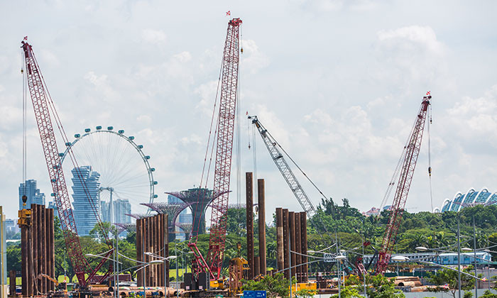
Source:http://images.humanresourcesonline.net.s3.amazonaws.com/wp-content/uploads/2017/06/Aditi-June-2017-workplace-safety-health-construction-sector-istock-700×420.jpg Accessed on 27 March 2018
As a kid, I used to imagine construction cranes as dragons or dinosaurs eating things off the ground and buildings as giant robots and the red lights on top as eyes. So i wanted to do the same with my collages.
I also came up with a few alternate realitiy jobs inspired my storyworlds that I found interesting and would sometimes think about. For example: Dragon Wrangler, Zombie.
CONSULTATION #1
After consulting with Joy, she mentioned that she liked the part where I wanted to incorporate Singaporean-y things into the work. She also recommended a more collage-y cut and paste style compared to the less obvious photo collage style last sem.
She also suggested looking into scanography and experimenting with it to see how I could apply it to my works.
Which of course threw me for a loop because I had never heard that term before. Thankfully Joy provided a few websites I could look at before I gave scanography.
Here are a few scanography artists whose works I enjoyed:
Lucy Peltier Scanography Art Source: https://i.pinimg.com/564x/f0/ba/17/f0ba175fa7f0039ad943114348870829.jpg Accessed on 27 March 2018
Unknown Artist on Pinterest. Source: https://i.pinimg.com/564x/43/82/62/4382621e8bde9658ffa7826aa64f0703.jpg Accessed on 27 March 2018
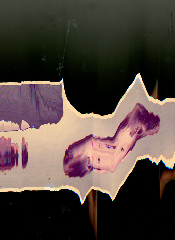
Hayley Chatfield, taken with Epson scanner with cling film on scanner bed. Source: https://www.flickr.com/photos/87207371@N07/8024496956 Accessed on: 27 March 2018
I really enjoyed how glitchy everything looked. The portraits taken with scenography, why mostly not very flattering due to the smushed faces, does cause a discomfort that is slightly alluring. Like how the portrait seems a lot more real and raw. Since the face is so close, you can really see every strand of hair and every pore on the face. Nothing photoshop can hide.
I also enjoyed how the length of things and the shape of things could be experimented with and altered by moving the object along with the scanner.
EXPERIMENTING WITH SCANOGRAPHY
So basically all one needs with scanography is a passable printer with a high res scanning function. Thankfully I had one at home. I cannot imagine how MORE awkward it would have been if I had done my experiments in a printing shop or anywhere else.
Additionally scanography needs to be done in a dark room so that the image captured would be what is directly above the scanner. Which naturally meant I had to do it at night.
Naturally, this is how my mother found me at 2AM in the dark:
Actual ratchet scanogrphy setup
It took some explaining after on my part. But here are some of the result s from my efforts:
Very flattering I know. Overall it was an interesting experience and it did change how I perceived photography quite a bit. I liked how the lighting ended up with a bit of a studio spotlight kind of effect due to the shallow depth and black background.
I also enjoyed the irony that came with me making the glitches together with the machine. It feels as if I’ve bridged some sort of gap between human and machine and we’ve created art together in some odd poetic way.
I did attempt to make some letterform shapes with the scans, but it didn’t read as well. As can be seen with the baby’s breath and burnt paper.
Also, while it the photos turned out really interesting, I also had no idea how I wanted to incorporate it into my work.
LET THE FUN BEGIN
And so begins my journey with the collages. I started with the dragon playground playground since it was the one that visually I had in mind the most.
DRAGON WRANGLER
I started by compiling all the objects I associated somewhat with dragons. Turns out this cut and paste look wasn’t as easy as I thought.
My attempt at a Merlion dragon…
Second attempt turned out better.
I wanted to incorporate the organic curves of the C and L in my name into the general shape of the dragon. The bend of the neck and the disconnect from the main body forming the C and the reaining neck and body of the construction digger forming the L. After that I decided to place all the dragons into an environment made out of dragonfruit.
Now came the hard part of incorporating the scans.
Looking at previous examples of scanography art, I noticed that most of them tended to use layering and had a glitchy effect. So as a test, I tried scanning a paper with my name written on it and burnt it (because…well, dragons.)Just to see if the effect of burnt paper in the scan. I layered it over the a scan of my face and hand. It ended up looking like i was smushing my face against the glass of an aquarium and I liked the look it brought when I placed it in the background of the piece. It had this glitchy otherworldly effect that I decided to replicate throughout the rest of the works.
After consulting with Joy, she suggested that I tried to make use of the movement of the construction diggers as well since they sort of “write” out the letter C in their digging movements as well. To emphasize that point, I added dragonfruits with gouges in them that form the letter C, to emphasize the movement and the shape of the letter C.
I also added more “dragons” so it looked like there were more of them in my little aquarium.
I think all in all it turned out pretty well. I enjoyed how dystopian it sort of looked. Like I was controlling the dragons in some weird dragonfruit harvesting sweatshop like a dictator rather than the innocent childhood dream of having a dragon as an adored pet. In a way, I think my childhood dream turned out a lot darker and more glitchy because of this process.
ZOMBIE
I know I know, why would I even want to be a zombie? It probably stems from me wanting a job that requires me to just eat all the time for once. Also I figured if a zombie apocalypse were to happen, I’d more likely be Extra #3 that gets bit in the first five minutes of a zombie flick than a badass survivor.
Anyway, I always felt it would be ironic if everyone in Singapore became zombies considering we ARE a The Lion City. So to allude to that, I represented Singaporeans with Lions and made them queue around a wet market table full of meat. Also to show how we forgot our humanity and our “past”, I layered a scan of my baby picture and a hand that dragged across the screen, like a zombie clawed down it.
I also added static around the eyes of the Merlions to emphasise the fact that there is nothing going on in the brains of zombies.
Attempt #1
To incorporate the C and L letterforms, I decided to play with the “water” that normally spews out of the merlion’s mouth, which naturally forms a C like curve already. However, I wasn’t too sure how to go about it. Also, the static wasn’t really working out and I felt it took away a bit of the blank stare effect that I thought the merlions naturally held.
However, I decided to add another layer to the image. I wanted to talk about how Singaporeans are sometimes viewed as technical zombies, always lifelessly glued to our phones and walking without awareness. So I gave the merlions hands holding onto iphones and made them spew glitches out of their mouths instead. The glitches are a popup window that says “Human Error, you are obsolete.” Instead I warped glitch to have a similar effect as it would have if I ran it through the scanner. It read as the organic curve of the letterform better than when I ran it through the scanner. To add to the impression of the glitch escaping from the mouth of the merlion, I tapered down the tip of the glitch at the tip to give the impression of suction.
Attempt #2
After consulting with Joy, she felt the merlions in the back were a bit distracting and not merging properly with the environment.
So for my final, I shifted them to the back, to make it seem like they were queueing for something in the wet market of merely blindly walking past.
Final Attempt
Overall, I liked how this one turned out in terms of the colours. It was a lot more glitchy than the first, which could be something I could play with as I went along; making things get glitchier and glitchier.
ICE CREAM AUNTIE IN HELL
With all the conspiracy theories out there about the world ending, one can’t help but think, “what then” sometimes. Many movies touch on this topic, on the end of the world or the life after. I couldn’t help wondering the question “ What kinda job would actually be the best if we all went to hell?” Which led to the thinking “Hell’s pretty hot. I’d bet people would kill for ice cream. I’d probably earn a lot hell notes.”
Thus this new job was borne. This job was the most fun for me to visualize considering the less serious thinking behind it and the lack of limitation on my imagination as to how to express it made it a lot of fun to brainstorm about.
My impression of ice cream aunties was always with the red truck with the huge umbrellas that were constantly surrounded by pigeons waiting for a scrap of food. So instead of the humans queueing for ice cream, I swapped them for pigeons. There are also stacks of hell notes beside the ice cream cart. To emphasize the amount of money coming in, I photoshopped hell notes with a similar effect to glitch popup window in the “Zombie” piece. This time the hell notes are flowing and tapering into the ice cream cart. The shape and flow of the hellnotes flying thus form the shape of the C. The shadow casted by the hellnotes thus make an L shape on the floor. This also highlights the similarity between the shape of C and L.
Finally, to make the place look more like hell, I overlayed the ice cream cart and pigeons on a desert landscape. I feel that hell would be very dark but very warm. And to show that effect, I changed the hue of the sand turning it purple. To represent the fire, I overlayed the backdrop with the scan of my hair, changing it’s hues so that they will become red.
REALITY – THE COUCH MANAGER
I wanted the final image to represent myself in reality after having spent so much time daydreaming. Obviously, the daydreaming has not helped me achieve my dreams and I was jobless. But in my delusion, I had given myself a job: ‘The Couch Manager’. Which was simply a fancy way of describing myself as a couch potato. This was also to imitate the way some companies liked to give very convoluted names to certain jobs just to give the illusion of it sounding important. I once had to work as a “Administrative Production Coordinator” which was simply a fancy way of describing my desk job during internship, sorting through paperwork.
In the piece, you can see a sloth, wearing an “idiot hat” mid descent down the image. The bottom of the image being darker than the top. This is to physically illustrate my descent from my daydream to reality. I also added a TV at the top of the image to represent where all the ideas for these daydreams originate from. To emphasize on the descent, I added the scan I did of a baby’s breath plant dragged down the scanner that gets progressively more glitched out as it reaches the bottom of the image. As baby’s breath symbolizes innocence, I wanted to represent that innocence being stripped away when falling into reality.
The more obvious incorporations of the letterforms would be in the doughnut on the sofa with a bite taken out of it to show the similarities in the shape between C and O. The L letterform can be seen in the sloth’s body, contrasting with the R letterform formed by the spilling coke. So far, most of my pieces only incorporated the C and L letterforms, but this time I chose to incorporate R as well from my first name. This is to show the similarities between the L and R letterforms apart from their orientation.
CRITIQUE
Joy felt that the overall concept of the pieces for the jobs from alternate universes and the one with reality was interesting. She liked how there were relatable Singaporean elements within it to showcase how my perception of how imagination works. She also liked how the scanography was incorporated. However, she felt the letterforms could have been more emphasized within the pieces and take up more of the construct of the image.


