Project 1: Image Making

“What do you want to be when you grow up?”

Ah yes, the age-old question that has plagued me since adolescence. I always wondered why adults enjoyed asking kids this question.

As I grow older, I suspect it’s the innocence and naivety behind their answers that we find amusing. An answer untarnished by the harsh realities of the world and hard logic that has been hammered into the rest of us years after.

As a child, I had many dreams. Many weren’t very realistic though. In fact many were derived from the various movies and TV shows I watched. In fact, I recall a vast part of my childhood was spent creating an alternate reality version of myself where I lived in whatever universe that I was currently obsessed over.

In fact,  I’m positive that sketches of these alternate realities filled more of the borders of my old math books than the actual math itself. The desire for escapism was just that strong.

A fool’s errand of course, given how all these realities will never exist and I’m flunking P5 Math in the real one.

Yet, when thinking of jobs, this memory comes to the forefront. Of course at this point i have a bit more of a direction I’d like to head in in life. But the thought of chasing seemingly impossible dreams often leaves me wanting for the blissful comforts of my bedsheets. The same feeling of escapism resurfaces.

And that’s what I wanted to express with this project: 3 dream jobs from these “alternate realities” and one “reality”.

RESEARCH

Here’s the hard part, how should I show these alternate realities? I mean they are just figments of my imagination. Most of the time my mind just fills in the gaps in my internal storyline with random things. There wasn’t any pressure for my piece to make sense. It reminded me a bit of the surrealistic style my projects took last sem. But I wasn’t very keen on doing exactly the same thing twice. So I researched into several other artists as well as artists that incorporated typography into their work.


MIKHAIL SISKOFF

Mikhail a visual artist and photographer living in Anchorage Alaska who makes surreal collage images from vintage publications and free use archive images as well as my own original analog photography.

Here are some examples of his works: 

To the Sea by Mikhail Siskoff Source: https://www.saatchiart.com/account/artworks/894614 Accessed on: 26 April 2018

Bird sanctuary by Mikhail Siskoff Source: https://www.saatchiart.com/account/artworks/894614 Accessed on 26 April 2018

I enjoyed how he played with the size and general shape of the subjects to insert them seamlessly into the environment to create a whole new world. 

VLADISLAV ERKO

Vladislav Erko is a famous artist-illustrator from Kiev, Ukraine. “Fairy Tales of Foggy Albion”– illustrated by him are published in 20 countries. His illustration of “Harry Potter” was recognized as one of the fifth best in the world by the studio Warner Brothers.


Erko is definitely more known for his complex illustrative works on published books. However, while I’m not completely sure if this set of works are belong to him as the only place I could locate them were on Pinterest. But most of them on that site are attributed to him. 

Art by Vladislav Erko Accessed on 26 April 2018, Source: https://www.pinterest.com/pin/421790321323321749/?lp=true

I enjoyed the subtle collage-y style in which he combined the pieces to form a typography. A fact which I could consider incorporating into my work. 

I also liked how each piece within the collage also added to the world or the message he was trying to bring across. 


CONCLUSION FROM RESEARCH

After looking at all these artist, it became clear that what I wanted to create were 3 “portals” that were obviously out of this world and weird looking. As I mentioned earlier, imagination to me meant filling the gaps in the internal reality with things that were familiar to me. So I also knew I wanted to create realities made up of things that are relatable and recognizable to Singaporeans.

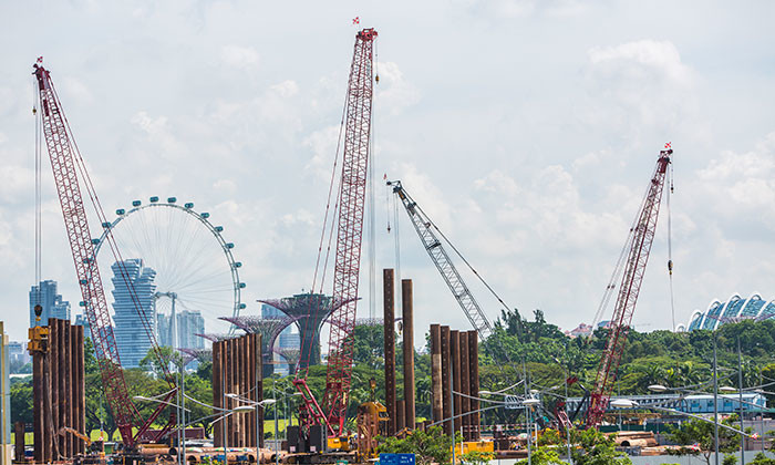
Source:http://images.humanresourcesonline.net.s3.amazonaws.com/wp-content/uploads/2017/06/Aditi-June-2017-workplace-safety-health-construction-sector-istock-700×420.jpg Accessed on 27 March 2018

As a kid, I used to imagine construction cranes as dragons or dinosaurs eating things off the ground and buildings as giant robots and the red lights on top as eyes. So i wanted to do the same with my collages.

I also came up with a few alternate realitiy jobs inspired my storyworlds that I found interesting and would sometimes think about. For example: Dragon Wrangler, Zombie.

CONSULTATION #1

After consulting with Joy, she mentioned that she liked the part where I wanted to incorporate Singaporean-y things into the work. She also recommended a more collage-y cut and paste style compared to the less obvious photo collage style last sem.

She also suggested looking into scanography and experimenting with it to see how I could apply it to my works.

Which of course threw me for a loop because I had never heard that term before. Thankfully Joy provided a few websites I could look at before I gave scanography.

Here are a few scanography artists whose works I enjoyed:

Lucy Peltier Scanography Art Source: https://i.pinimg.com/564x/f0/ba/17/f0ba175fa7f0039ad943114348870829.jpg Accessed on 27 March 2018

Unknown Artist on Pinterest. Source: https://i.pinimg.com/564x/43/82/62/4382621e8bde9658ffa7826aa64f0703.jpg Accessed on 27 March 2018

Hayley Chatfield, taken with Epson scanner with cling film on scanner bed. Source: https://www.flickr.com/photos/87207371@N07/8024496956 Accessed on: 27 March 2018

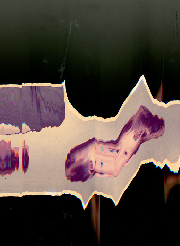
I really enjoyed how glitchy everything looked. The portraits taken with scenography, why mostly not very flattering due to the smushed faces, does cause a discomfort that is slightly alluring. Like how the portrait seems a lot more real and raw. Since the face is so close, you can really see every strand of hair and every pore on the face. Nothing photoshop can hide.

I also enjoyed how the length of things and the shape of things could be experimented with and altered by moving the object along with the scanner.


EXPERIMENTING WITH SCANOGRAPHY


So basically all one needs with scanography is a passable printer with a high res scanning function. Thankfully I had one at home. I cannot imagine how MORE awkward it would have been if I had done my experiments in a printing shop or anywhere else.

Additionally scanography needs to be done in a dark room so that the image captured would be what is directly above the scanner. Which naturally meant I had to do it at night.


Naturally, this is how my mother found me at 2AM in the dark:

Actual ratchet scanogrphy setup

It took some explaining after on my part. But here are some of the result s from my efforts:

Very flattering I know. Overall it was an interesting experience and it did change how I perceived photography quite a bit. I liked how the lighting ended up with a bit of a studio spotlight kind of effect due to the shallow depth and black background.

I also enjoyed the irony that came with me making the glitches together with the machine. It feels as if I’ve bridged some sort of gap between human and machine and we’ve created art together in some odd poetic way.

I did attempt to make some letterform shapes with the scans, but it didn’t read as well. As can be seen with the baby’s breath and burnt paper. 

Also, while it the photos turned out really interesting, I also had no idea how I wanted to incorporate it into my work.

LET THE FUN BEGIN

And so begins my journey with the collages. I started with the dragon playground playground since it was the one that visually I had in mind the most.

DRAGON WRANGLER

I started by compiling all the objects I associated somewhat with dragons. Turns out this cut and paste look wasn’t as easy as I thought.

My attempt at a Merlion dragon…


Second attempt turned out better.

I wanted to incorporate the organic curves of the C and L in my name into the general shape of the dragon. The bend of the neck and the disconnect from the main body forming the C and the reaining neck and body of the construction digger forming the L. After that I decided to place all the dragons into an environment made out of dragonfruit.

Now came the hard part of incorporating the scans.

scan

Looking at previous examples of scanography art, I noticed that most of them tended to use layering and had a glitchy effect. So as a test, I tried scanning a paper with my name written on it and burnt it (because…well, dragons.)Just to see if the effect of burnt paper in the scan. I layered it over the a scan of my face and hand. It ended up looking like i was smushing my face against the glass of an aquarium and I liked the look it brought when I placed it in the background of the piece. It had this glitchy otherworldly effect that I decided to replicate throughout the rest of the works.

After consulting with Joy, she suggested that I tried to make use of the movement of the construction diggers as well since they sort of “write” out the letter C in their digging movements as well. To emphasize that point, I added dragonfruits with gouges in them that form the letter C, to emphasize the movement and the shape of the letter C.

I also added more “dragons” so it looked like there were more of them in my little aquarium.

I think all in all it turned out pretty well. I enjoyed how dystopian it sort of looked. Like I was controlling the dragons in some weird dragonfruit harvesting sweatshop like a dictator rather than the innocent childhood dream of having a dragon as an adored pet. In a way, I think my childhood dream turned out a lot darker and more glitchy because of this process. 

ZOMBIE

I know I know, why would I even want to be a zombie? It probably stems from me wanting a job that requires me to just eat all the time for once. Also I figured if a zombie apocalypse were to happen, I’d more likely be Extra #3 that gets bit in the first five minutes of a zombie flick than a badass survivor.

Anyway, I always felt it would be ironic if everyone in Singapore became zombies considering we ARE a The Lion City. So to allude to that, I represented Singaporeans with Lions and made them queue around a wet market table full of meat. Also to show how we forgot our humanity and our “past”, I layered a scan of my baby picture and a hand that dragged across the screen, like a zombie clawed down it.

I also added static around the eyes of the Merlions to emphasise the fact that there is nothing going on in the brains of zombies. 

Attempt #1

To incorporate the C and L letterforms, I decided to play with the “water” that normally spews out of the merlion’s mouth, which naturally forms a C like curve already. However, I wasn’t too sure how to go about it. Also, the static wasn’t really working out and I felt it took away a bit of the blank stare effect that I thought the merlions naturally held. 

However, I decided to add another layer to the image. I wanted to talk about how Singaporeans are sometimes viewed as technical zombies, always lifelessly glued to our phones and walking without awareness. So I gave the merlions hands holding onto iphones and made them spew glitches out of their mouths instead. The glitches are a popup window that says “Human Error, you are obsolete.” Instead I warped glitch to have a similar effect as it would have if I ran it through the scanner. It read as the organic curve of the letterform better than when I ran it through the scanner. To add to the impression of the glitch escaping from the mouth of the merlion, I tapered down the tip of the glitch at the tip to give the impression of suction.

Attempt #2

After consulting with Joy, she felt the merlions in the  back were a bit distracting and not merging properly with the environment.

So for my final, I shifted them to the back, to make it seem like they were queueing for something in the wet market of merely blindly walking past.

Final Attempt

Overall, I liked how this one turned out in terms of the colours. It was a lot more glitchy than the first, which could be something I could play with as I went along; making things get glitchier and glitchier.

ICE CREAM AUNTIE IN HELL

With all the conspiracy theories out there about the world ending, one can’t help but think, “what then” sometimes. Many movies touch on this topic, on the end of the world or the life after. I couldn’t help wondering the question “ What kinda job would actually be the best if we all went to hell?” Which led to the thinking “Hell’s pretty hot. I’d bet people would kill for ice cream. I’d probably earn a lot hell notes.”

Thus this new job was borne. This job was the most fun for me to visualize considering the less serious thinking behind it and the lack of limitation on my imagination as to how to express it made it a lot of fun to brainstorm about.

My impression of ice cream aunties was always with the red truck with the huge umbrellas that were constantly surrounded by pigeons waiting for a scrap of food. So instead of the humans queueing for ice cream, I swapped them for pigeons. There are also stacks of hell notes beside the ice cream cart. To emphasize the amount of money coming in, I photoshopped hell notes with a similar effect to glitch popup window in the “Zombie” piece. This time the hell notes are flowing and tapering into the ice cream cart. The shape and flow of the hellnotes flying thus form the shape of the C. The shadow casted by the hellnotes thus make an L shape on the floor. This also highlights the similarity between the shape of C and L.

Finally, to make the place look more like hell, I overlayed the ice cream cart and pigeons on a desert landscape. I feel that hell would be very dark but very warm. And to show that effect, I changed the hue of the sand turning it purple. To represent the fire, I overlayed the backdrop with the scan of my hair, changing it’s hues so that they will become red.

REALITY – THE COUCH MANAGER

I wanted the final image to represent myself in reality after having spent so much time daydreaming. Obviously, the daydreaming has not helped me achieve my dreams and I was jobless. But in my delusion, I had given myself a job: ‘The Couch Manager’. Which was simply a fancy way of describing myself as a couch potato. This was also to imitate the way some companies liked to give very convoluted names to certain jobs just to give the illusion of it sounding important. I once had to work as a “Administrative Production Coordinator” which was simply a fancy way of describing my desk job during internship, sorting through paperwork.

In the piece, you can see a sloth, wearing an “idiot hat” mid descent down the image. The bottom of the image being darker than the top. This is to physically illustrate my descent from my daydream to reality. I also added a TV at the top of the image to represent where all the ideas for these daydreams originate from. To emphasize on the descent, I added the scan I did of a baby’s breath plant dragged down the scanner that gets progressively more glitched out as it reaches the bottom of the image. As baby’s breath symbolizes innocence, I wanted to represent that innocence being stripped away when falling into reality.

The more obvious incorporations of the letterforms would be in the doughnut on the sofa with a bite taken out of it to show the similarities in the shape between C and O. The L letterform can be seen in the sloth’s body, contrasting with the R letterform formed by the spilling coke. So far, most of my pieces only incorporated the C and L letterforms, but this time I chose to incorporate R as well from my first name. This is to show the similarities between the L and R letterforms apart from their orientation.

CRITIQUE

Joy felt that the overall concept of the pieces for the jobs from alternate universes and the one with reality was interesting. She liked how there were relatable Singaporean elements within it to showcase how my perception of how imagination works. She also liked how the scanography was incorporated. However, she felt the letterforms could have been more emphasized within the pieces and take up more of the construct of the image.

Feedback from Friends

Project 3: Ego in Different Settings


[ INTRODUCTION ]

I was a little worried going into this project, if I were to be perfectly honest. I never really thought of myself as a particularly interesting person so when I heard the topic was going to be on ego, or what makes me me, I drew up blank.

So I brainstormed about what makes me me. Nothing really particularly stood out. That was until my mom called to check in on me, as she does once in a while since I live in hall. I was hit with a bout of homesickness when I realised I haven’t actually seen my family and had a proper meal with them in nearly 2 weeks. Either I’m busy in school or my family has their own responsibilities to settle.

It made me realise how big a part my family had to play in who I am as a person and my own “ego”.

So I decided to dedicate each equation row to one of my family members, a situation I have experienced with them and how they changed me as a person. As I have a mom, a dad and a sister, I decided the leave the last one for myself.

The family. We love bright colours obviously. Great subjects of an assignment on colour theory of course.

[BRAINSTORMING]

Next problem came with deciding how I wanted to design my three rows. The OCD part of me wanted to make them all in the same style so that they looked more like a whole art piece together. I realised everyone in class seemed to be doing either vector drawing or traditional watercolour. I couldn’t watercolour to save my life and my pen tool skills are kind of…slow. So I decided I wanted to do something I have been gaining interest in after Project 2: Forrest Gump.


SUrReaLISm


I’m sorry. I meant Surrealism. But yes, I enjoyed photoshopping images together back in Project 2 as the compositions didn’t have to make sense but could still be understood because of imagination. I felt that it was a good medium to express what I was feeling considering how my emotions within each equation weren’t very extreme and mostly a combination of feelings.

[REFERENCES]

Eugenia Loli

My work is mostly inspired by Eugenia Loli’s collages, which I found online while scrolling Pinterest. I enjoyed how she combined images from  vintage advertisements and pieced them together to form a new image. She plays around a lot of motifs and object symbolism to bring across her message. Common motifs are things such as planets, flowers, nature landscapes, food and animals.

Here are some of her works:

“All fun and games” Source: http://www.thisiscolossal.com/wp-content/uploads/2014/10/loli-5.jpg Accessed on 21 November 2017

“Rising Mountain” by Eugenia Loli Source: https://johnangier.files.wordpress.com/2016/01/rising-mountain-eugenia-loli.jpg Accessed on 21 November 2017

“Nail Biting Edge” Source: http://payload123.cargocollective.com/1/8/271097/4762523/nail-biting-edge-web_670.jpg Accessed on: 21 November 2017


[ LET THE FUN BEGIN ]

1.

STRESSED ME + LATE NIGHTS STUDYING WITH MY SISTER = FUN

STRESSED ME 

Version 1

This was the first design that I presented to Joy one week after getting the brief. I wanted to expressed the stress I felt trying to accomplish my assignment at once.

To show that, I had hands reaching for paper planes (symbolic of assignments) stretching in different directions. To emphasise their effect on me, I had the hands to attached to me by red string connected to hooks embedded in the girl’s body.

The girl is representative of me, floating in a tumultuous sea of stress in a coffee cup full of bad feelings represented by the black sludge on the rim. To show how my focus is very dispersed I covered the girl’s eyes with static.

Joy enjoyed this design and liked how it incorporated the surrealism from project two. She also liked how the emphasis on the main subject was very clear by using the complementary colours with orange as the colours of the main subject.  She suggested I incorporate a subtle element to hint at what work the girl is doing to give it context.

Updated design

I added a paintbrush into the girl’s hair to hint at the artsy work that I am working on. I also added a canvas texture to the image so that the photoshopped elements within it will have a more cohesive look and look like one painting.

LATE NIGHTS STUDYING WITH MY SISTER 

This was one of the rare designs that I didn’t have to update much. In terms of symbolism, this one is chock full. As you may notice, the running motif of paper aeroplanes representing assignments is still present. My sister and I, represented by the two girls are in a sea of assignments, We are clinging onto our ideas (symbolised by the light bulbs) for dear life. To represent the “working through the night” aspect, I replaced the bulb of the light bulb with moons.

I also wanted to express the feeling of lethargy that we felt while doing our work through the night; the feeling of our eyes closing. To represent that, I replaced the eyes of the girls with stitches.

Additionally, as a link between the first and second image, I made the girl representing me have pink hair again. I made the brown haired girl bigger for two reasons. Firstly because she represents my older sister, who is older than me, secondly she is the subject of my second image. However, I still placed certain aspects to draw the viewer’s eye back to me, the main subject overall in the equation.

This can be seen by the use of pink hair and the redder moon as well as the spiralled clock leading the viewer’s eye to my head. Thus drawing the viewer’s eye from my sister then to me.

Originally I thought this would count as a complementary colour scheme as orange and blue are still the prevalent colours throughout the composition. However, during the presentation, joy pointed out that this composition due to its wider range of colours could be counted under using the quadratic colour theory. This however still works as two of the colours are more dominant throughout and the remaining are used for highlighting and emphasising, creating a more dynamic and vibrant image.


FUN

Version 1

For the final image of this equation, I placed both my sister and I in a sea of flowers. The two of us are blowing bubbles but I have replaced the bubbles with paper planes to show how assignments have instead become something fun when we do it together. Additionally, as you may have noticed, the two of us are children again to show how it’s become child’s play and also to emphasise the element of fun or childish delight and bonding.

In terms of design, after consulting joy, she felt that the flowers were a bit too striking and took away from the subjects that was the girls. So following the complementary colour theory,  I once again made the dominant colours of the image orange.

Version 2

Additionally, this worked out better as a row since now all three images makes use of complementary colours and get progressively more orange, representing how everything gets warmer and happier.

Final Design for Equation 1

2.

DEJECTED ME + HEART TO HEART TEAS WITH MOM = COMFORT


DEJECTED ME

Original design

This was the original design. I was trying to go or more analogous colours on the red orange end of the colour wheel. However, Joy commented that the main subjects of the image were kind of fading into the background. So I updated the design instead to use the complementary colour scheme of red and green to create a more dynamically coloured image.

Updated design

The starker contrast between the colours also make it clear to the viewer what to focus on in the image. That is the cat and the umbrella.

In terms of design, I chose to use a cat trying to reach for an umbrella in stormy weather to represent me trying to reach my goals. To emphasise the grabbing motion, I replaced the cat’s paws with human hands.

The ladders are to represent how all the options around for me to reach my goal are too far out of my reach.


HEART TO HEART TEAS WITH MY MOM 

Original colours

I had a bit of trouble thinking how to represent these tea breaks I have with my mother. I tried placing us in tea cups in fish bowls etc. Then I watched Beauty and the Beast with my sister over the weekend. Mrs Potts and Chip seemed like a mother and child relationship reminiscent to what I experienced as a kid with my mom. So I replaced this mother and child’s heads with a tea pot and a cup in varying shades of red. To represent the wealth of knowledge that my mom imparts to me over our tea talks, I used books that look like they are flying towards us about to land. To represent my own latent worries, I used crows (common sights in fields and sometimes bad omens) and replaced their heads with clocks to show how time felt like it was running out.

I also placed the pair under a mushroom shelter to represent a new hope as mushrooms are often representational of life that comes from death. So the new life or hope to my dead dreams.

In terms of colour theory, Joy felt the original image’s sky was a bit “undecided”. It was both green and blue at the same time. She suggested I pushed the colour a bit.

So instead I opened to make the sky blue so that it forms a triadic colour with the yellow and red. With red to emphasise the main subjects of the image.

Additionally I cropped the image a bit wider this time as I wanted the viewer to be observing the situation from a distance and thus making the talk seem more intimate.

I also placed the two kinds of birds (the books and the crows) in similar patterns on opposing ends to balance each one out and also to create leading lines to the pair in the middle.


COMFORT

Original design

With this design, I wanted to show how I have a new dream, represented by the floating balloon in the same position as the umbrella from the first image. I also wanted to show how the new hope from the second image have ground and bloomed larger than how far my dreams. The comfort comes in how I didn’t have to face chasing my dreams alone this time around and the options available to me are all hinged on my growing hope.

In terms colour theory, I chose a sub-complementary colour of blue and red. However, joy mentioned that the mushrooms were more a green brown than red. She suggested that I turn it more blue so that it will distract less within the image and the viewer will notice the woman and the child more.

Updated design

This is the only row within the four that does not have a running motif across the three images. In this case it’s the mushroom. However, since I’m using mushrooms as a representation of hope, I wanted to show the lack of hope within the first image.

Additionally, I wanted me in the images to get progressively more human to show my growth as a person after the talks with my mom. Someone with more logical thinking and less based off instincts.

3.

BORED ME + KARAOKE CAR RIDES WITH MY DAD = FREEDOM


BORED ME

With this image, I wanted to show days I hid out in my room listening to my music and being antisocial instead. The girl is basically me withdrawing from life in my hermit crab shell. I used the headphones on my head, firstly as a shoutout to the music theme coming up in the next few images. But because headphones are a very individualised object. When used, only one person can use it at a time. The goldfish are to represent my thought process, or lack thereof. My thoughts in my own shell don’t last very long and go in circles.

However, I wasn’t very satisfied with the colour. I wanted something a bit more dynamic.

Updated design

Now the colour of the girl’s dress, the shells and the fish seem more synonymous. I made use of complementary colours and the red blue-ish green colour scheme to make the image more dynamic.


KARAOKE CAR RIDES WITH MY DAD 

Original design

I tried to go for the same colour scheme with this design. I made the car out of different instruments. And I replaced the man’s head with a boombox to show how my dad is always singing and how he’s really LOUD.

The goldfishes are now flying upwards with the car to show a sense of flight and building exhilaration and also to show how my thoughts are taking an upward turn and have more direction.

Joy suggested I changed the colour of my dad’s shirt and the guitar on the car so that they would match more with the green sky to create a complementary colour scheme.

Updated design


FREEDOM

With this image, I wanted to show how my dad was transporting me out of my room and my shell and to see a whole new world in music as a way of expressing my emotions. As can be seen from the fishes (my thoughts) escaping the gramophone like lyrics of a song.

My dad and I both each have a guitar at home and we sometimes play together. I figured it’s be cool to replace both our heads with them. And finally the shells in the bottom, show how I am leaving my shells behind and achieving Freedom through music thanks to my dad.

In terms of composition, I placed the shells and the fishes to balance each other out within the image. The image uses the sub complementary colour scheme.

4.

BUSY ME + FAR AWAY FROM HOME = HOMESICK

BUSY ME

This is busy me, represented by me rushing through life on the MRT, and how everything is a blur to me because it’s going by so fast, represented by the blur sotong I replaced the person’s head with. I also tried to show me  trying to avoid the stinging sensations of homesickness, representing the feeling with jellyfish.

I used triadic colours of pink blur and yellow. I also wanted to draw the viewer’s eyes to the MRT and the person on it. So I made the MRT a vibrant yellow and the person’s vest a bright blue.

I also made the jellyfish go the opposite direction as the MRT to contrast the direction of the MRT and also to give a sense that they are rushing by the train.


FAR AWAY FROM HOME 

I wanted to emphasise the distance I felt from my family living in Hall on Pulau NTU so I placed a tent on the moon far far away from the city below. I also kept the general skycap shrouded with the same jellyfish to show how homesickness is always hanging around. I used a similar colour scheme as before. However instead of blue, I used split complementary colours of green, pink and orange with orange as the emphasis, drawing the viewers to the subject of the image that is the tent.

HOMESICK

The final and most important image in the whole 4 rows, and the reason behind the direction of this whole collective piece. An image to show my homesickness. This is also probably the simplest piece.

I wanted a punch in of the previous image. A closer look at myself on that moon. The “floor” of the moon that I used in this image is actually another image that I stitched together with the galaxy background because I liked how the landscape seemed to have natural seats and tables for my character.

I added an astronaut sitting on the moon. And the astronaut’s helmet is reflecting the earth on it’s glass, showing the direction of the astronaut’s gaze, towards earth. The jellyfish in the background is to show how the feeling of homesickness is sometimes understated but it is always hiding out in the background.

I didn’t mean for it at first but this image of the astronaut I used is holding a gun in hand. Which gave the image a whole other meaning. While I am not lonely to the point of suicide, I think it is something that some people may feel or relate to so I left the it there, for a small amount of people to notice and maybe feel.

[ CONCLUSION ]

If you may notice, each row has a specific theme. Starting in the seas (actual sea, sea of clouds and sea of flowers), to the field to the skies and then then space. I chose space for the last row specifically to show the loneliness and silence that is very present in space.

University is truly the first time I have spent such extensive time away from my family. I think I’m quite happy to have been able to create something to represent aspects of my family that I miss and love and to a certain extent show them my appreciation of how much they have shaped me as a person.

In terms of the design and art direction, I’m quite happy with how the surrealism pieces turned out. While it was really hard finding images that pieced well together and the printing was hell.

I think this project was a good conclusion to whatever I have learnt in foundation 2D. For example, using patterns, shapes and lines to create emphasis or to lead audience eyes to piecing images together and using semiotics to create meaning from abstract images that I learnt in project two and design composition to balance an image and the negative space.

IM DONEEEE! 

Thank you for all your lessons Joy, I learnt a lot and I really enjoyed them. 🙂

Project 2: Forrest Gump


[ Introduction ]

When I first heard this project was based on movie quotes, I was very excited since I loved watching movies and movie quotes were something that I always took note of. Sometimes the writers for these movies know the exact words to express exactly how you feel. And in that moment, that quote just speaks to you. I love it when that happens.

I knew that the designs could not be a literal representation of the movie but instead an abstract representation of what we felt about the quote itself. This gave the whole project a more personal feel and an added layer of challenge which was very exciting to me.

[ Let the fun begin ]

 1. “Quit blowing smoke up my ass, you’ll ruin the autopsy.”    

– Meet Joe Black (1998)


I love the biting sarcasm and cynicism in the quote. Meet Joe Black was a movie about a rich man, Bill, who was coerced into being Death’s tour guide in exchange for time to settle his affairs and the relationships in his family.

Bill, played by Anthony Hopkins and Joe, or Death, played by Brad Pitt. Source: http://ilarge.lisimg.com/image/1175770/852full-meet-joe-black-screenshot.jpg Accessed on 22 Oct 2017

I think this quote was by far the easiest to work with. I knew from the start what part of the quote I wanted to focus on. “Blowing smoke up my ass.”

I looked up into what that slang means. It means to complement someone insincerely or hiding certain parts of your true feelings..

This made me start thinking about lying and what it did to people.

Source: https://i.pinimg.com/736x/7f/bf/39/7fbf396b1234209ed0c887b8b932476f–godfather-art-the-godfather-movie.jpg Accessed on 22 Oct 2017

I was inspired by the movie posters for The Godfather. A man dressed in a black suit, with darkness that conceals a large part of him giving an element of mystery and danger to him.

Original design

For my initial design, I had a man in a black suit wearing a goat skull as they are often associated with the devil because of the shape of the horns. The devil is symbolic of deceiving, lying and manipulation which were the issues that I was trying to address with my piece. The man wearing the skull concealing his face could have two meanings. Either that the man’s thoughts have been influenced by the devil or that the man was the devil himself.

The man is literally blowing smoke. The initial smoke I was trying did not read well on threshold which was the effect I intended to use on the piece in photoshop. The smoke needed more line work. However I didn’t want the smoke to seem too cartoonish as well since it would clash with the realistic features of the man.

I chanced upon a picture of distorted faces. I decided to crop out a few faces to form the shape of smoke. It turned out pretty well. I felt this gave an additional meaning to the man’s smoking. How what he says about people is often distorted and untrue; most of the time ugly.

The man is also holding a scythe, firstly as a shoutout to the movie’s main character “Death” or “Joe Black” I also partially concealed it in the darkness to show the hidden danger of this individual.

During my first consult, Joy liked the design and the additional layer created by the smoke. Even though they weren’t noticeable off the bat, having something for the audience to notice after looking longer gave it more depth. Additionally she liked how the smoke and the scythe balanced each other on the image. However, she felt the scythe was too literal and suggested changing it into a mouth.

Updated design

This is the updated design. I changed the blade of the scythe to a toucan’s mouth to show how our words and what we say is what is the real danger to others. During the second consult, Joy was okay with majority of this but only felt that the scythe should align with the tie so that it creates a leading line.

This is the final design that I printed onto my tote bag.

Final Design


Quote #2

“What if I fall? Oh but my darling, what if you fly?”

– Peter Pan (1953)

Original design

I had a rough idea for this design by the second consult with Joy. The basic image of the hands controlling paper aeroplanes to reach the child’s mobile. However, Joy felt that this was still too literal a representation of the quote in terms of it being about chasing and flying up to my dreams. She asked me to find a deeper relation of the quote to myself.

Thinking on the concept of chasing my dreams more, I felt a bit cynical about it. I thought about how dream chasing wasn’t as easy as movies made it up to be. Dreams needed funding, and while all we see are the success stories, many dreams my not be what we expect and sometimes, quite often, they crash and burn.

So for my second consult, I updated my image and made the paper planes out of Singapore thousand dollar bills and made some of them crash into the planets hanging on the mobile.

Updated design

Joy felt that this was a more put together version of the design and it’s message was much clearer. However, she felt that the dollar bills weren’t as clear as we can only see a bit of Yusof Ishak’s face and a bit of the numbers. She also felt that in terms of design properties, I could try shifting some of the aeroplanes so that all their directions of flight were in line and created a subtle leading line up towards the planets. She also suggested putting some smoke that could balance the large hand on the bottom left of the image.

This is the final design that I presented.

Final design

I cropped and edited the shape of the dollar bill so more of it could be squeezed onto the shaper of the paper planes. I also shifted some of the flight directions of  some planes so that they all look like they are flying roughly in the same direction. Lastly I added a larger paper plane falling back towards the hand. It leaves behind a trail of smoke which overall balances the large hand at the bottom.

Quote #3

“It does not do to dwell on dreams and forget to live.”

– Harry Potter and the Philosopher’s Stone (2001)

On the flip side compared to the previous quote, my interpretation of this one is a lot more hopeful. I love this quote from the first Harry Potter movie and it was always an encouragement when it came to school and trying to motivate myself. I felt that often times, when the workload got tough, I tended to retreat into myself and procrastinate by daydreaming. It was a bad habit that lead to a lot of rushed assignments in the past. It always left me with a certain sense of regret. How was that very well developed daydream about making a zombie movie complete with character arc and design going to stop me from failing school and actually learning the skills needed to film movies in the first place?

Thus I related to this quote greatly. I wanted to portray the sense of reluctance and danger I felt when it actually came to chasing dreams and my desire to cut myself off my bad habit of hiding in my daydreams before it is too late.

Initial design

This is the initial design. To portray my daydreaming, I placed floating balloons to show a sense of weightlessness in the image. I had a lot of trouble with this because many images of balloons disappeared the moment I used threshold and half tone did not have the effect I desired in the image. To solve this issue, I made eyeballs using vectors on parts of the balloons where the shapes weren’t visible. This gave a sense that the whole mass of balloons were actually eyeballs. I also made sure that none of the eyeballs were looking down on the earth which I chose to represent reality. I also placed hands holding cotton candy out to represent the distractions and various daydreams that turn me away from looking at what’s happening in real life. Finally, I placed a falling girl that has just cut herself off from her daydreaming and taking the risk to fall to earth for her dreams.

Joy and the rest of my consult group mates liked the whimsical surreal vibe of this piece. However, Joy suggested that since the main subject of was the girl, I should darken her and make her more prominent if not the large dark mass of balloon eyes will steal the audience attention away from her.  Joy also suggested that I turn the cotton candy clouds to point subtly at the girl to lead the viewer’s eyes more to her.

Updated and final design

This is my final design. In order to lighten the darkness of the balloons, I added more eyes and eye whites. I darkened the girl and her hair so that the contrast between her and the background will draw the viewer’s attention more.

I tried to point the cotton candy clouds towards the girl but I felt that it the weird angles detracted from their original intention to create a sense of sky and height from the earth. So instead I altered the size and positioning of some clouds and used them to form the path from which the girl would fall so it would seem like she is falling through the clouds. As you can see from the design, the darkest elements within the picture are the balloons, the girl and the earth. The decreasing amount of balloons form a subtle arrow towards the girl and the gravity and direction of the girls descent will draw the viewer’s eyes towards the earth. This thus allows the viewer’s eyes to follow the girls journey down to reality with her as well.

Quote #4

“I never look back darling, it distracts from the now.”

– The  Incredibles (2004)

I love Edna Mode from The Incredibles. She is very decisive, efficient and did not take anything sitting down. Basically everything I wanted to be as a kid. But now that I’m older and I have the benefit of hindsight, I could see a certain flaw in her philosophy. I get that sometimes, being stuck on past failures could hinder your confidence in trying again.

However, I can see the wisdom in remembering failures and their purpose in improving. Even Edna Mode herself stopped using capes because some superheroes died because of their capes; a fatal design flaw. I felt that in order to succeed in the future, one always has to look back in the past for guidance.

Source: https://media.giphy.com/media/dePaPOPNSLDsk/giphy.gif Accessed on 22 Oct 2017


To show that wisdom, I used an owl which is  symbolic of wisdom. I also chose an owl because of their ability to turn their heads 360 degrees to look behind and all around them. The owl is wearing a pair of glasses (shoutout to Edna) with which one lens is replaced with a clock to show looking through the past.

The body of the owl is made up of hydrangeas which in the Victorian era was symbolic of pride, because it was a plant with many flamboyant  flowers but very little seed. I wanted to use this to portray the pride of the body still facing forward and turning it’s back on the past.

Lastly, I perched the owl on top of a weighing scale to represent choice.

With this piece I tried to play with asymmetry to show how the side that is looking through the past is weighed more heavily by the mistakes but is also the “heavier” and more suitable choice.

In terms of design elements, I made the owl head larger than normal as it is the main subject of the image. I also left one lens open, so that people will notice the owl first. It’s been psychologically proven that human beings seek out eyes on images first before everything else.

I did not have time to consult Joy for this design, however, during the critique, she suggested that while my subject is still very obvious, it’s importance in the image could be greatly multiplied if the size of the scale wasn’t as big. She also suggests that the weights of the scale could be nearer to the bar as well to form an overall triangular shape with the forms, thus making the elements of the piece seem more in harmony with each other.

[ Silk Screen Printing ]

Joy warned me that the blackness of my design might be hard to print. But I never thought it would be this hard. The whole process before of coating the screen with the emulsion and exposing the screens was alright, fun even.

Washing the exposed screen in the red room


Exposed screen after washing

But the nightmare came in terms of printing on the back. Due to the amount of ink needed, there was never enough to reach the bottom of the design.

Attempt #1: What even is this???

Running over the design a second time would get rid of all the small details, especially in the smoke.

Attempt #2: Tried going over it twice. It’s too dark. Now he looks like the Darlie man’s shady older brother.

The work-study that day, Clara, suggested I spread the ink on the screen first before placing it back on the bag and running it over once with the squeegee.

Attempt #3: Much better with Clara’s new method. Still a bit dark so some details are lost. One last bad left, one last try.

Attempt #4: Finally!

Thank God it worked. There were  still small patches of white near the bottom but this was my most detailed print yet and I filled the holes in with a paintbrush. (Bet you can’t tell eh?) So overall, a success. Shoutout to Clara for being my saviour.

[ Final critique from Joy ]

Good attempt in conveying my meanings behind the quotes. Good use of design elements to clearly draw the attention of the viewers to the main subject.

Critique from classmates:

Thanks everyone. 🙂