Hello! 🙂
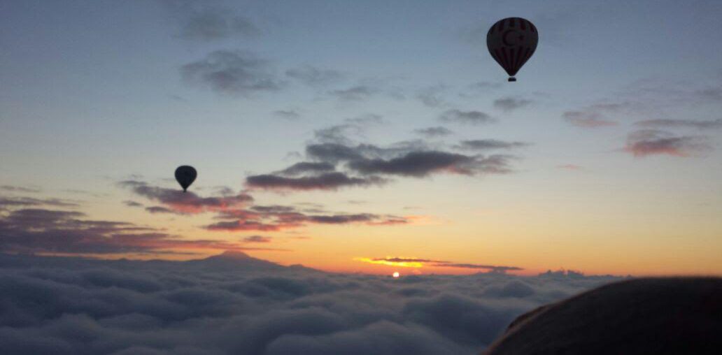
My zine is based on objects and textures that I’ve found interesting in Pasir Ris. From these textures and objects, I would experiment the different kinds of patterns that I can create from there.
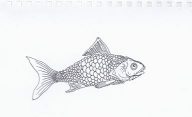
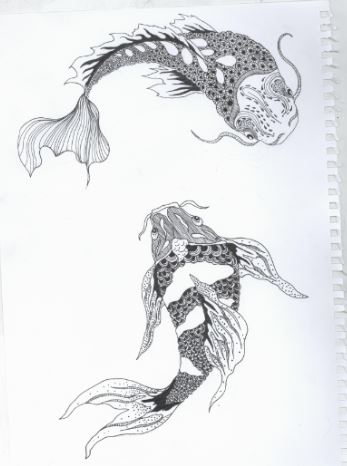
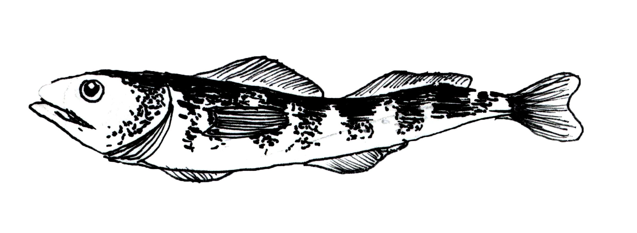
To start off, I’ve done drawings of the things I saw in Pasir Ris, after which I’ll scan them in.
Initial Idea
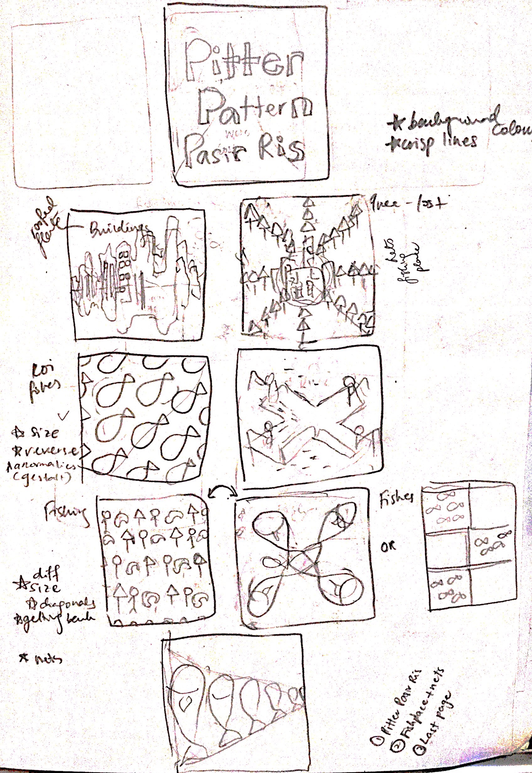
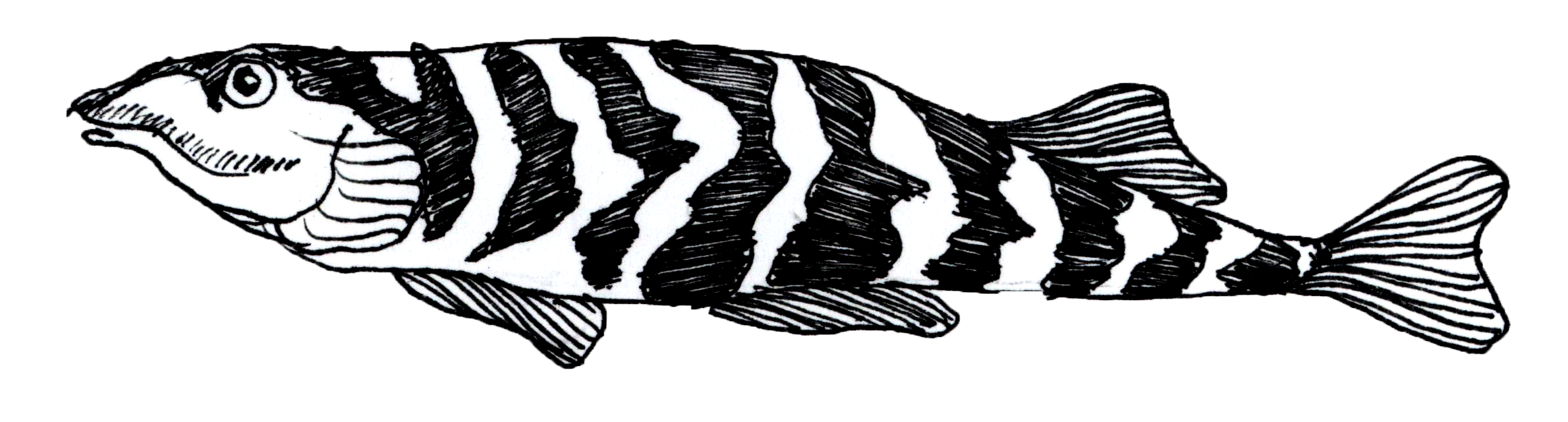
My first plan was to create various tessellation patterns based on the things/objects I’ve seen in Pasir Ris. Below were a few of my try-outs!
These were done in watercolour and pen! I tried doing tessellation using the trees/fishes there.

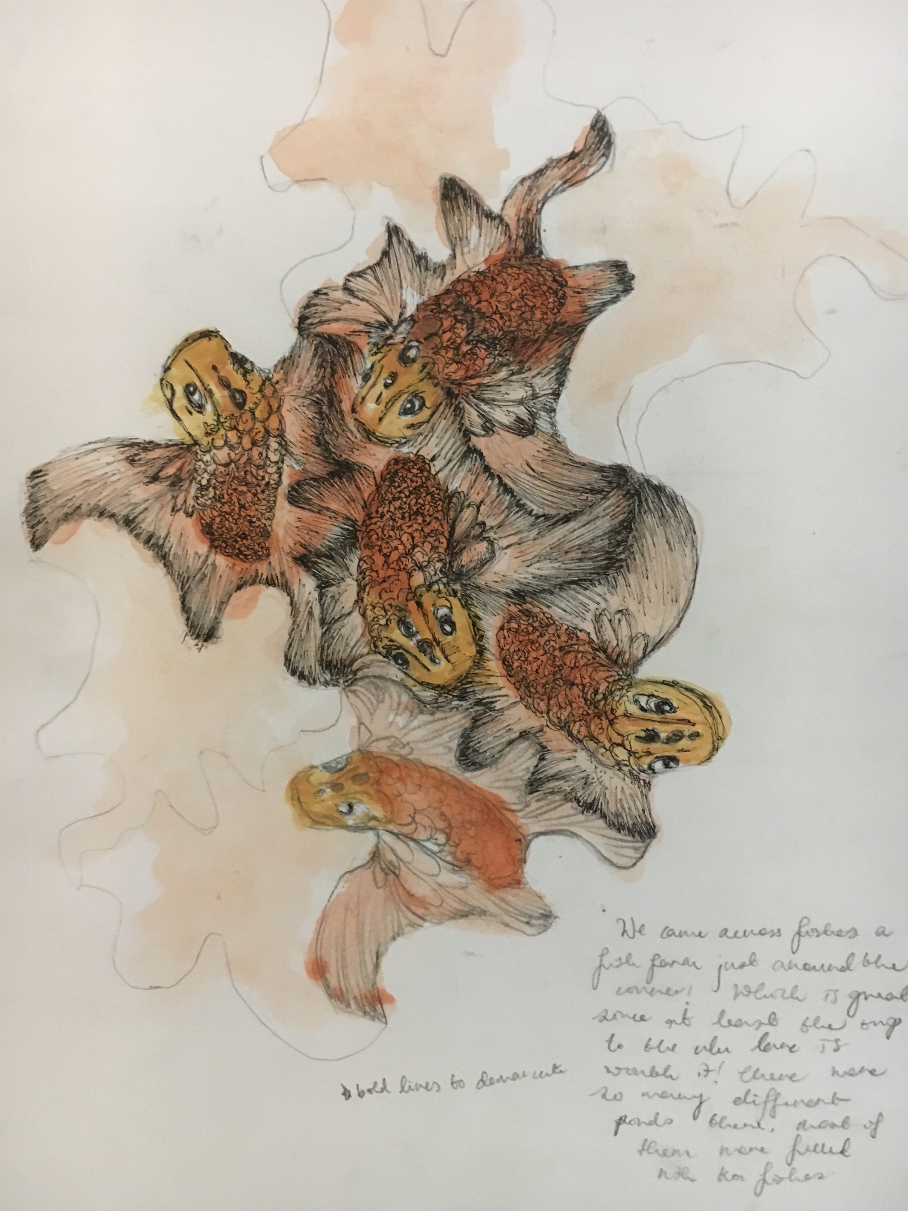
Besides tessellation, I also did symmetrical patterns of the fish nets there.

I was really happy that I tried out doing the tessellation first, because it was really challenging! For instance, you can’t control the shape of the tessellation, it kind of depends on your luck? So you start cutting out random parts of a paper, and then finally you’ll unfold the paper and reveal what kind of pattern you end up with. Hence, you can’t dictate what kind of shape you want the tessellation to take.
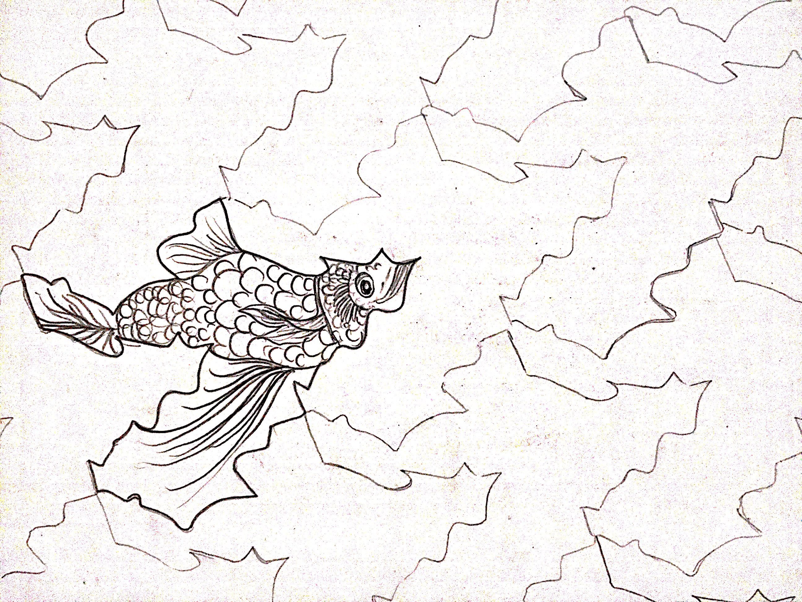
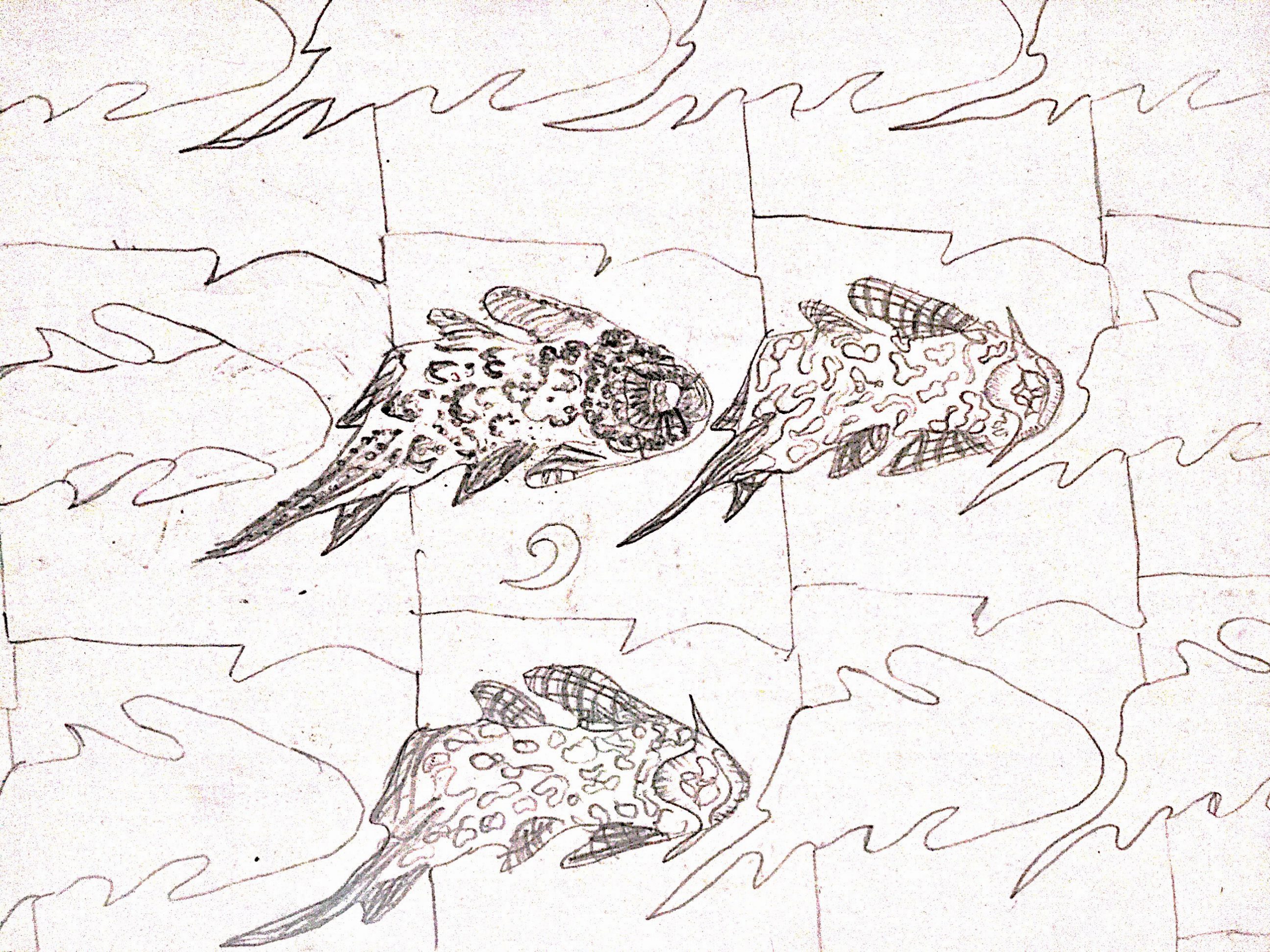
My other failed tessellation attempts!
The one below was too angular and weirdly shaped to pass of as a fish.
Tessellation of the sucker fish, but didnt look like one at all! Plus it had weird background.
So my idea of creating tessellations was scraped, because I was bad at making them. However, the idea of making other patterns still holds. I decided that I should try mirror imaged patterns, patterns that are arranged in a starburst pattern or rows and rows of the fishes/prawns.
Final Idea
Since I’m not doing anymore tessellation, I decided to try out other patterns.
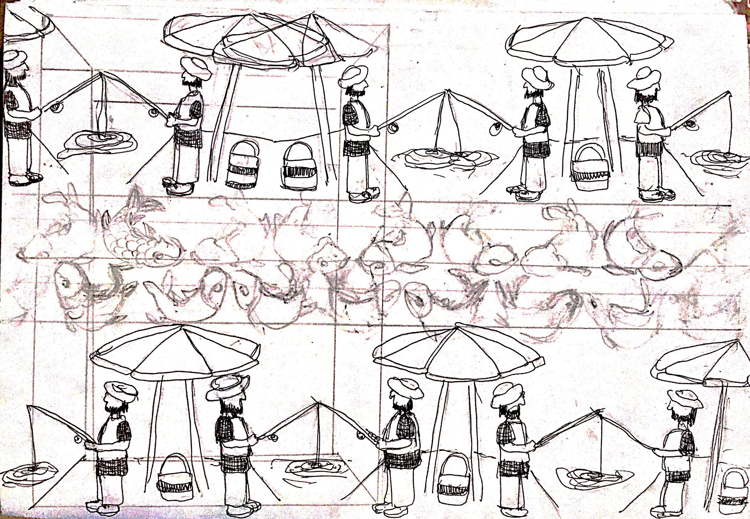
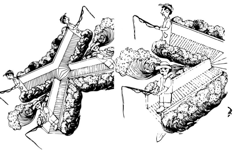
A try-out of a symmetrical pattern; consisting of fishing men and fishes!
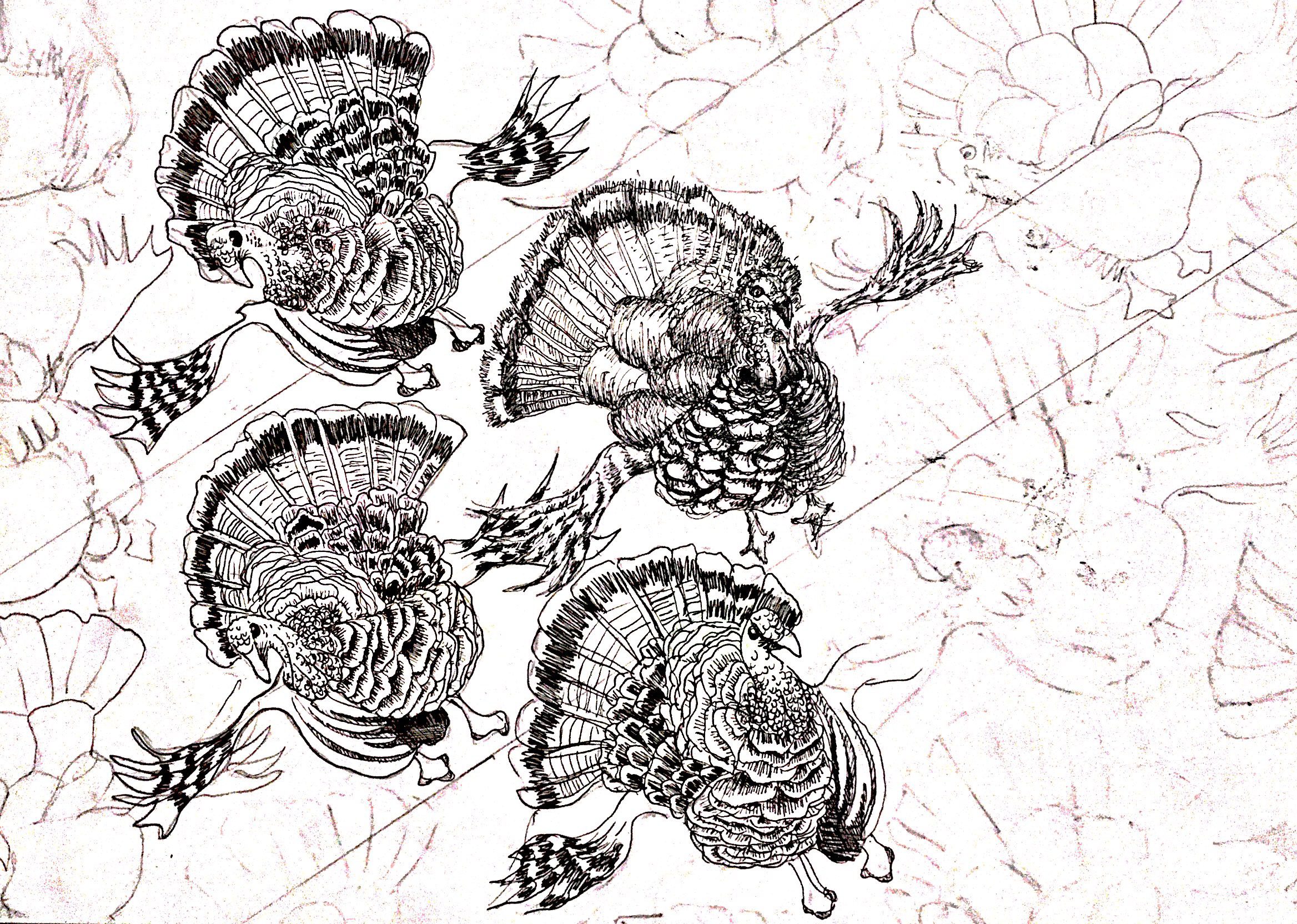
Rows of the turkey I saw at the fish farm! Also, after consulting Ms Mimi on my idea, I decided that sticking to the black and white concept really works so that the emphasis on the lines/textures are clearer without the distraction of colours. At the same time, I decided to keep the lines of my illustrations clear and crisp, such that it does not have a sketched/hatching effect.
Thumbnails of the finalised spreads!
Process
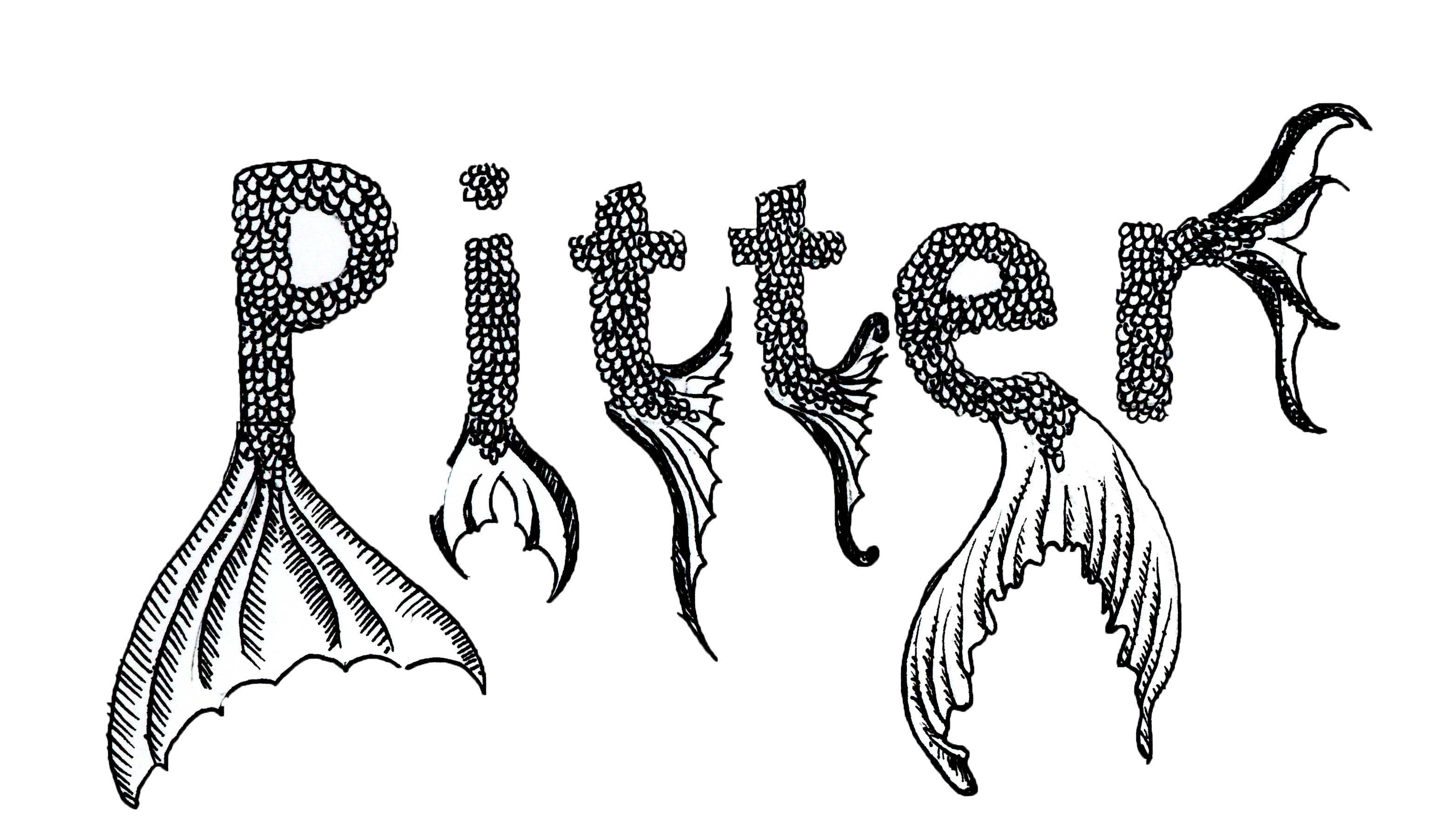
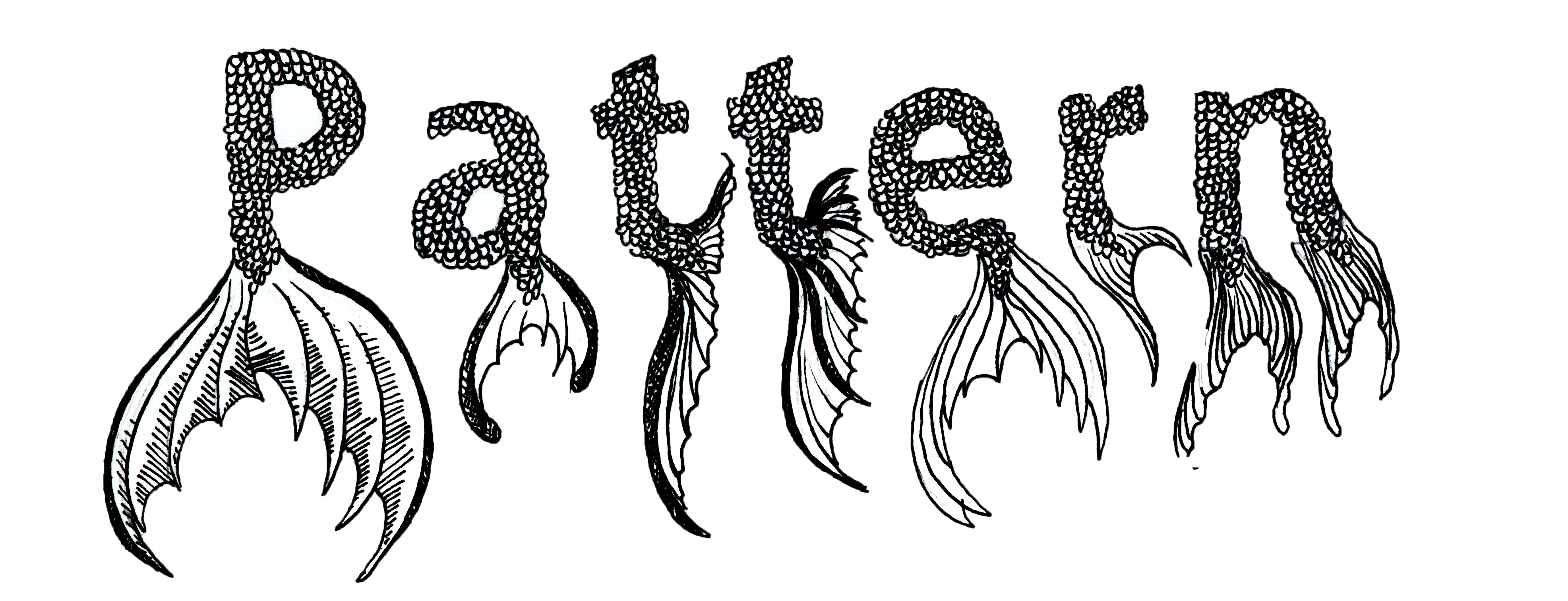
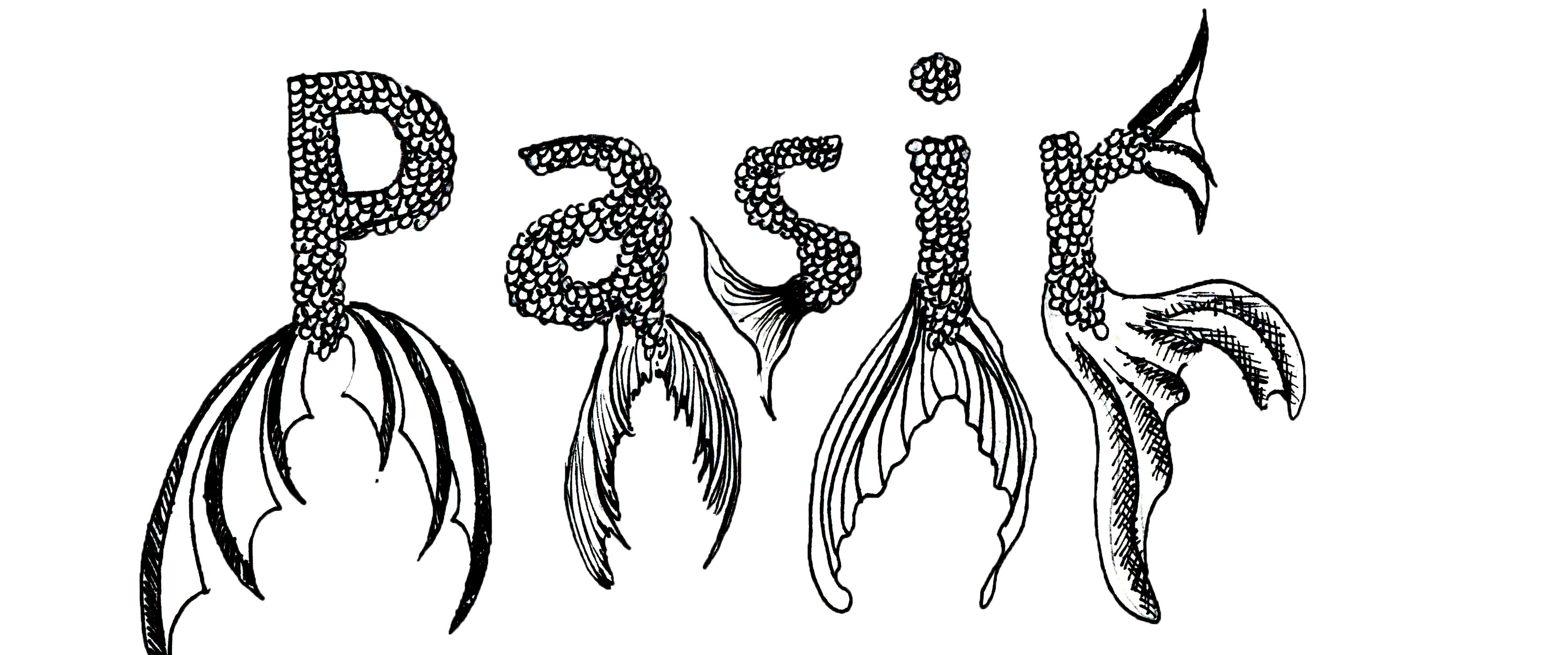
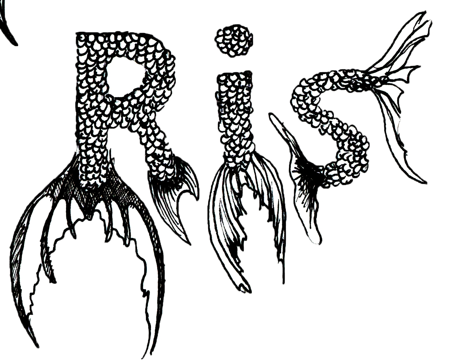
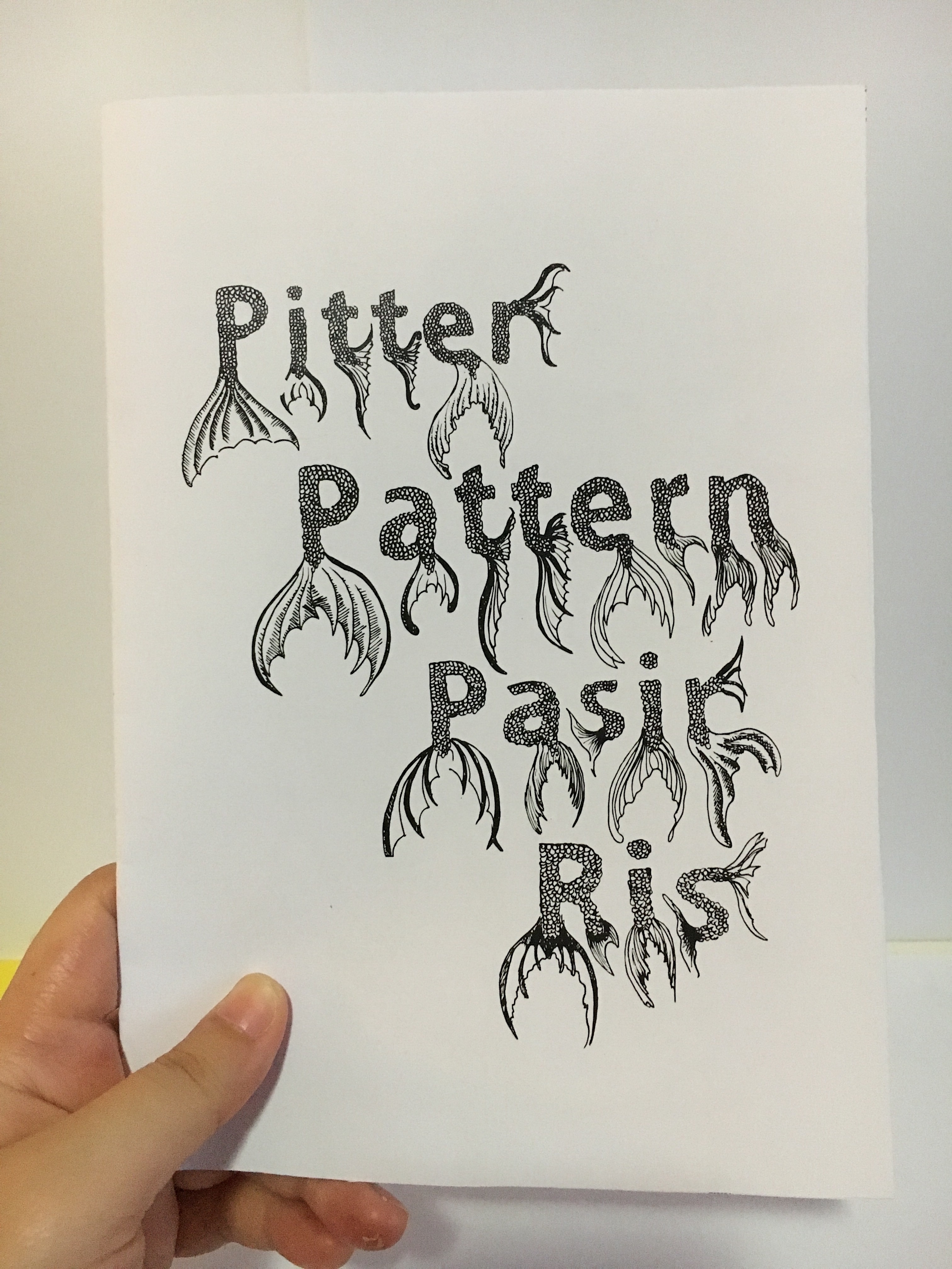
- The title was done with a template in “Adobe Gothic”. I chose that as the template as it has a thick enough space in the middle for me to fill up with fish scales. At the edge of the alphabets, I’ve also added in fish tails to create another set of textures into the title. I also felt that the fish tails are essential to give the readers a hint of what they’ll be seeing in the zine.
How it looks like after being scanned and photoshopped! I used the quick selection tool to remove the background. In addition, I also made use of the colour picker under Curves, to pump up the black and white contrast.

How they look like after being arranged in InDesign!

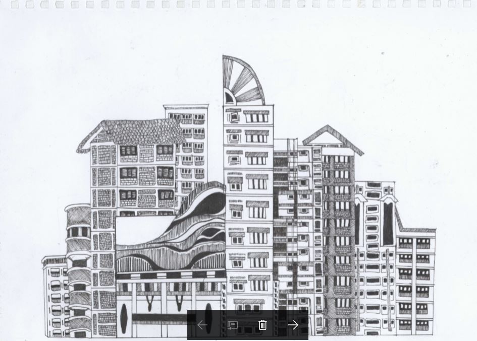
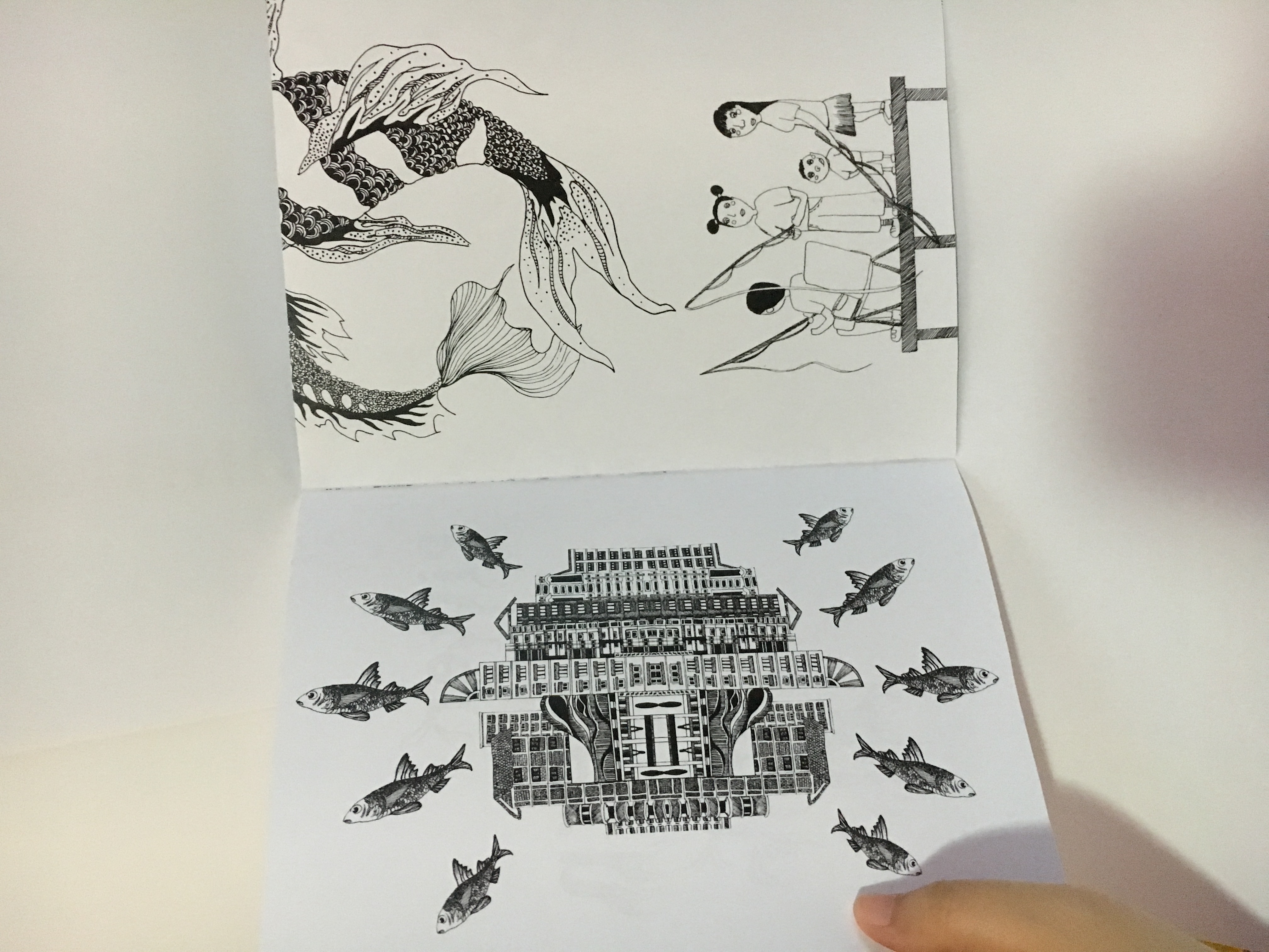
2. Next, I did a drawing of the flats that I’ve spotted in Pasir Ris. I also noticed that Pasir Ris flats had triangular roofed tops and I decided to include that inside, as I felt that these flats were uniquely Pasir Ris.

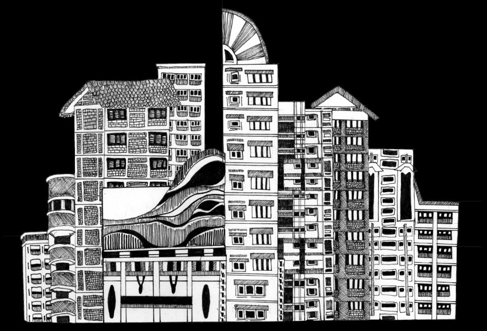
To complement the buildings on top, I’ve decided to arrange tiny fishes around the flats. Besides adding another interesting element into this page, I also wanted to show that amidst these flats in Pasir Ris, there lies a precious gem; the fish farms!
How they look like after being arranged in InDesign!
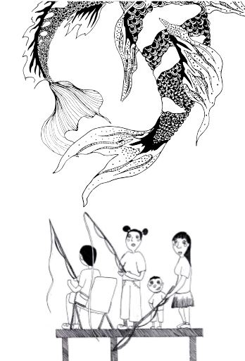
3. For the third page, I planned to make a transition to people fishing, to show a more zoomed in scope of my zine. Therefore, I decided to draw a family fishing together, a scene that is commonly seen during my recce there.
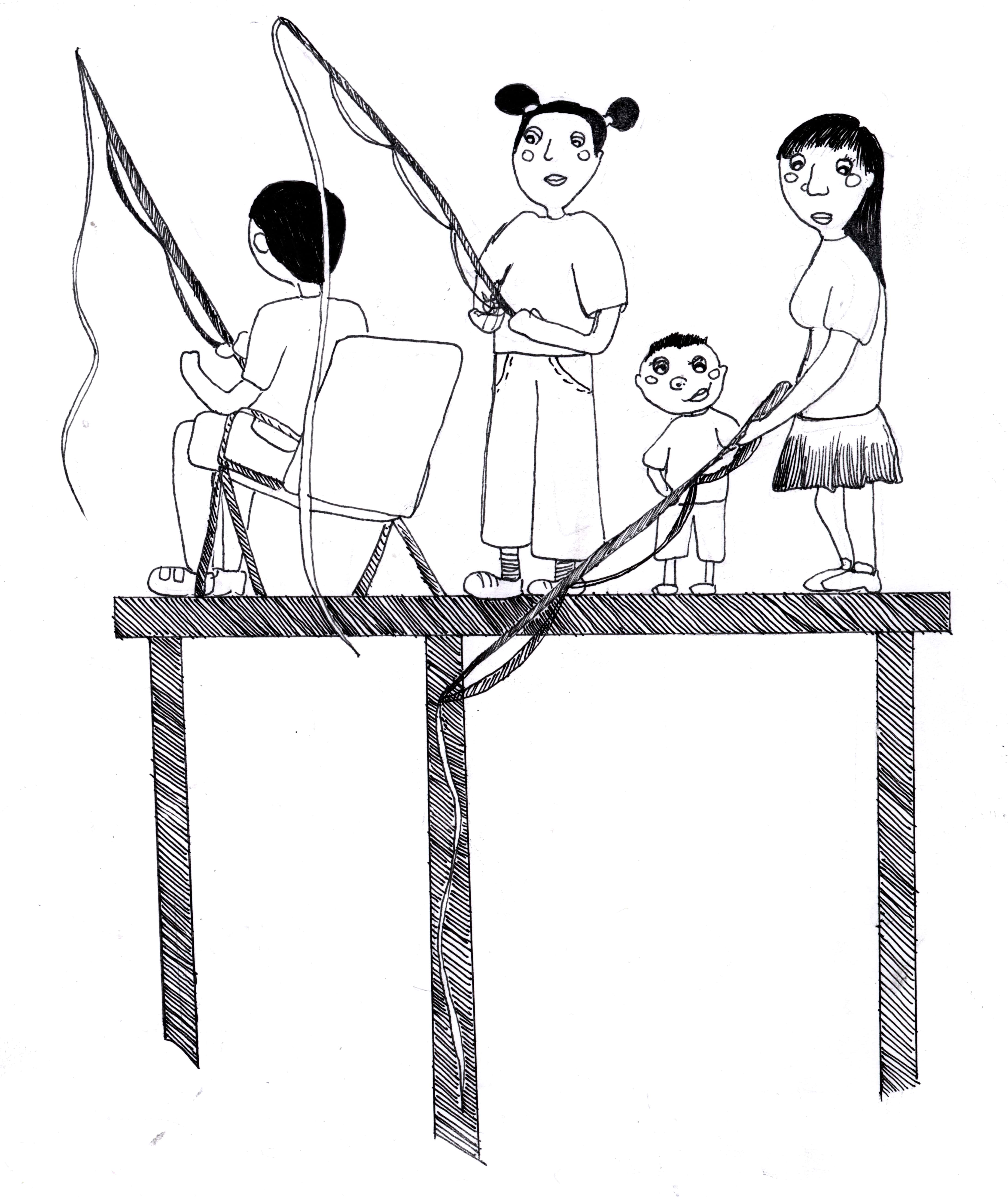
I’ve also decided to add koi fishes swimming above these family, to balance out the composition on page 3.
How the page 3 looks like after combining everything!
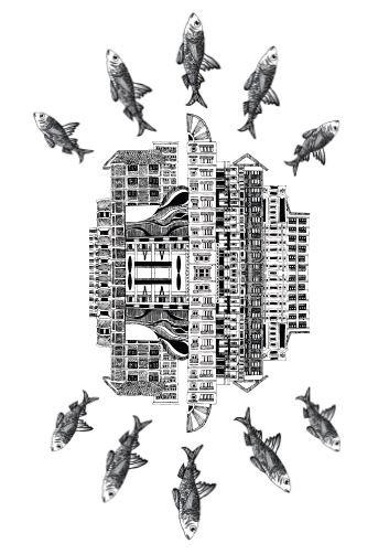
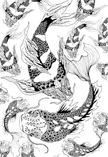
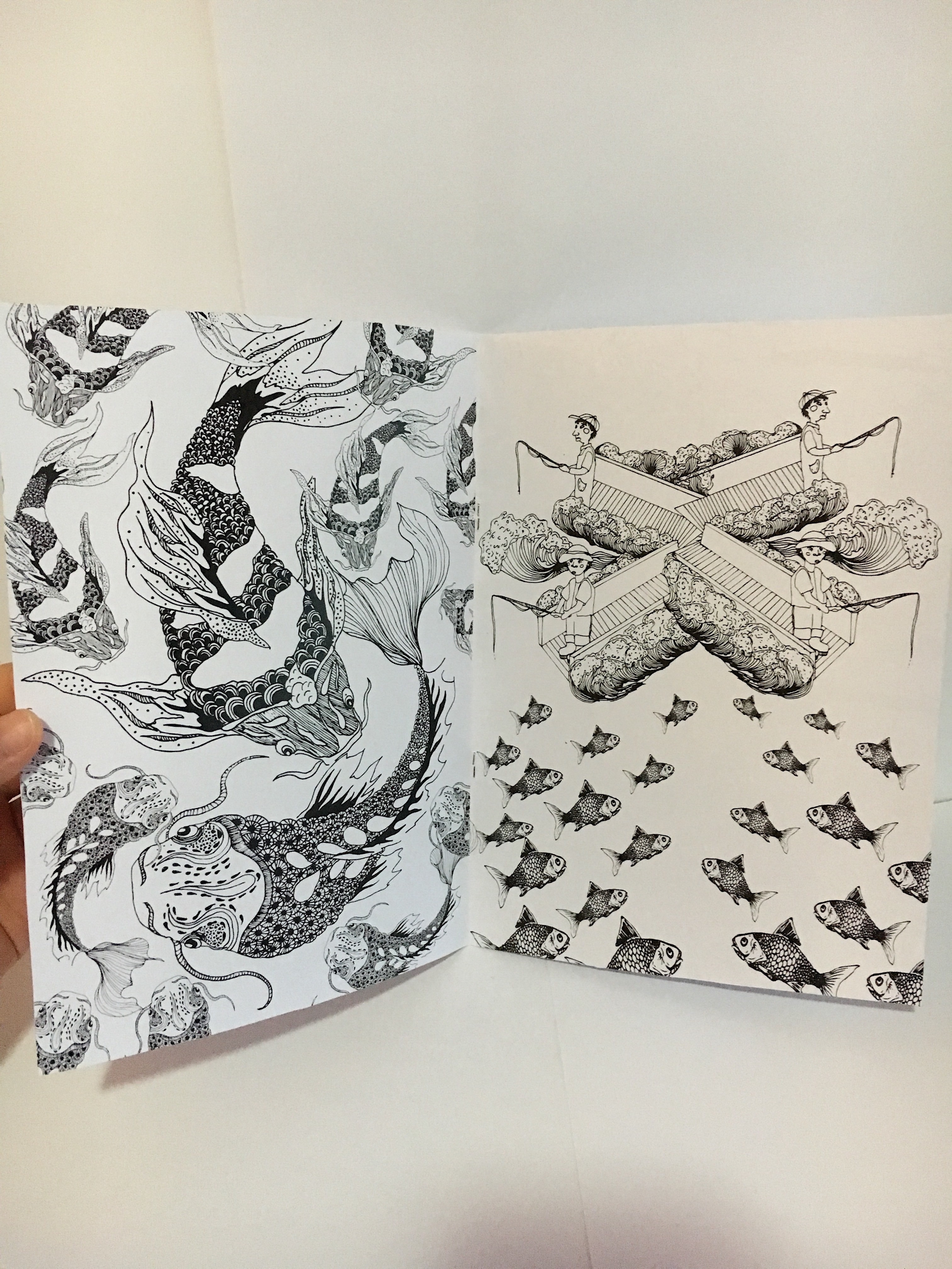
4. I decided to dedicate a page just filled with koi fishes. Since the previous page didn’t fully show the koi illustration, I decided to show the full figures of the kois on this page. This is how page 4 looks like after rearranging and playing around with different sizes so as to create a more varied look.
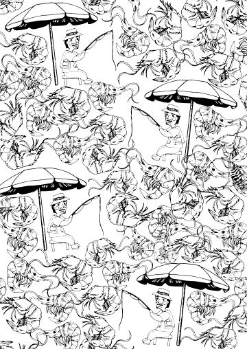
5. After a full page dedicated to fishes, I decided to go back to drawing people fishing. For this illustration, I planned to mirror image the drawing such that it has a starburst effect.

At the same time, I also drew in new fishes to add them in on the bottom of the page.
How page 5 looks like after combining everything!

6. I decided to move away from the fishes and include something else that I’ve observed there. There was prawning as well! So I drew separate images that I would then manipulate into rows of patterns.

How they look like after being arranged!
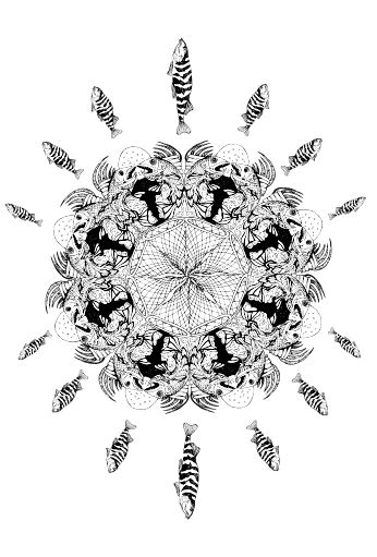
7. For the 7th page, I decided to create something that does not fill up the entire page, as the previous one is already packed with objects. Hence, I decided to create a mandala out of the textures I’ve seen there, such as the fish nets, the fishes. I added in a circle in the middle as I felt that it gives the whole mandala a finishing touch.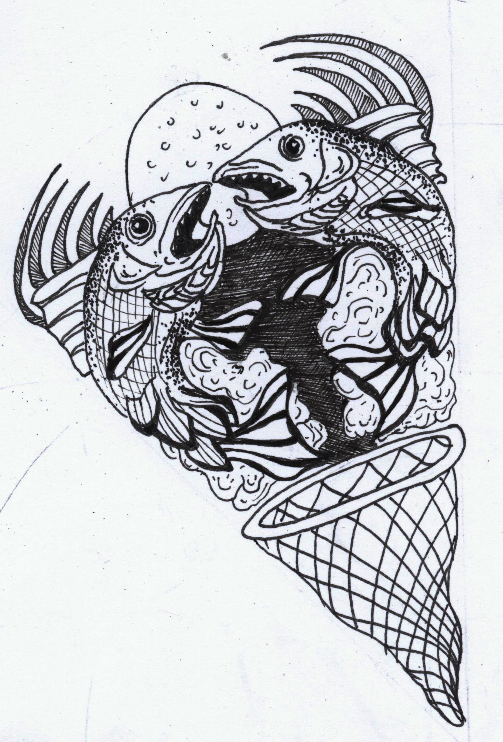
I was really close to putting the page below, but I realised that it would be too overwhelming when paired with the prawning page so I scraped this one.

How the 7th page looks like after I created the full circle mandala! I also added in a few fish illustrations around it.
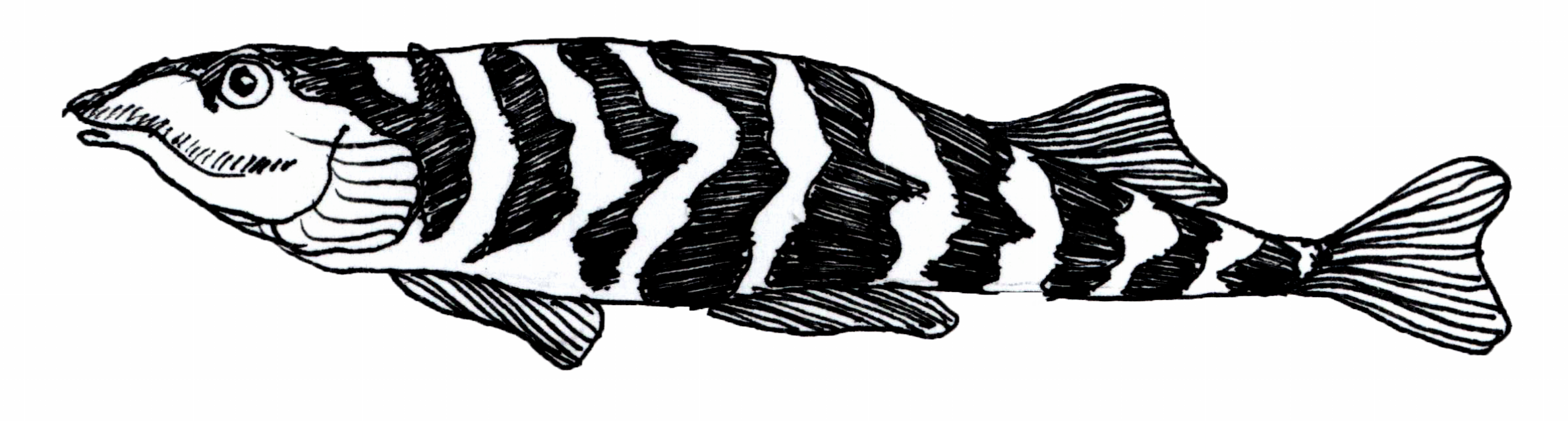
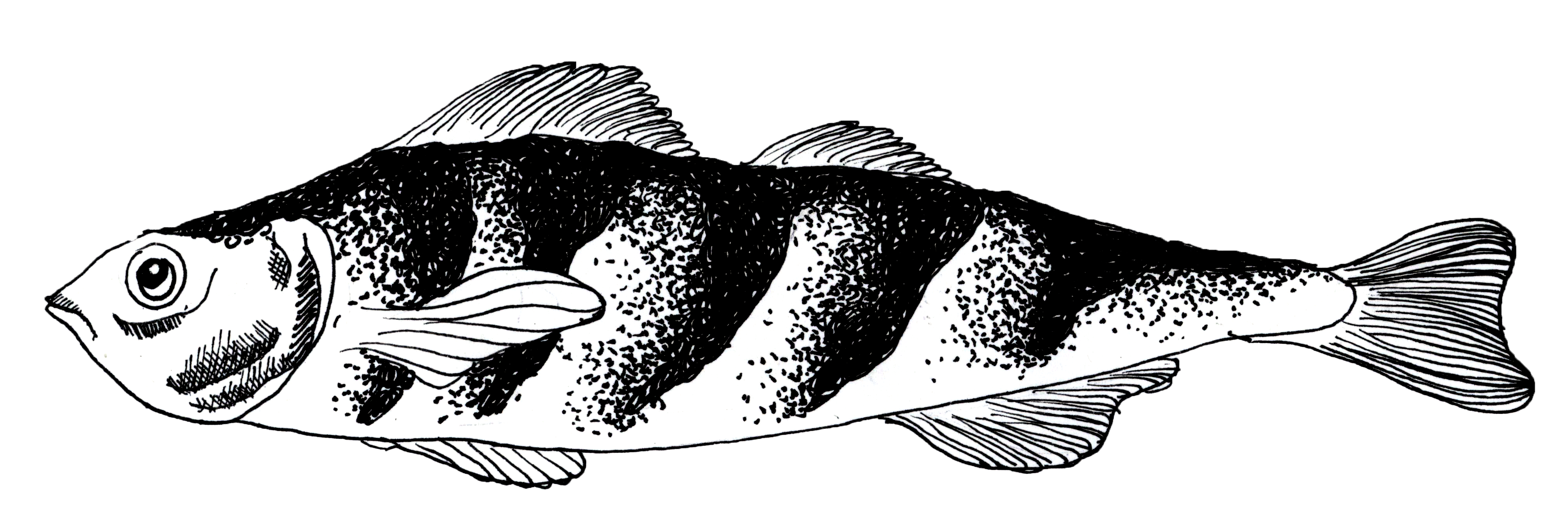
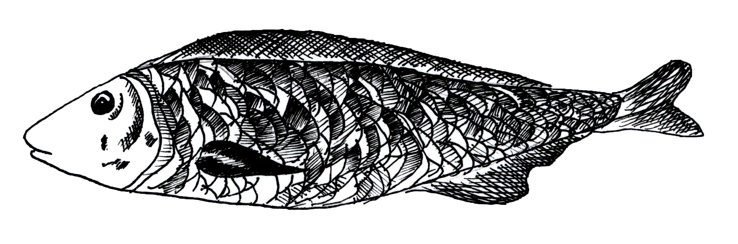
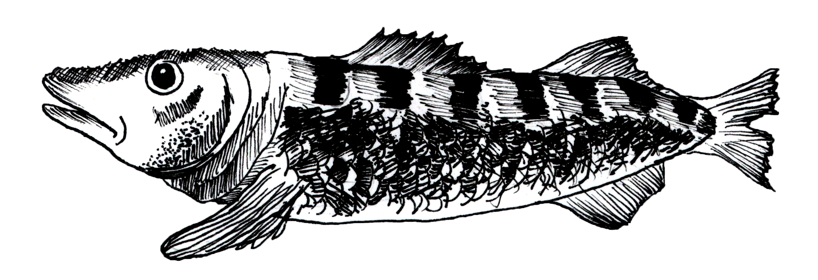
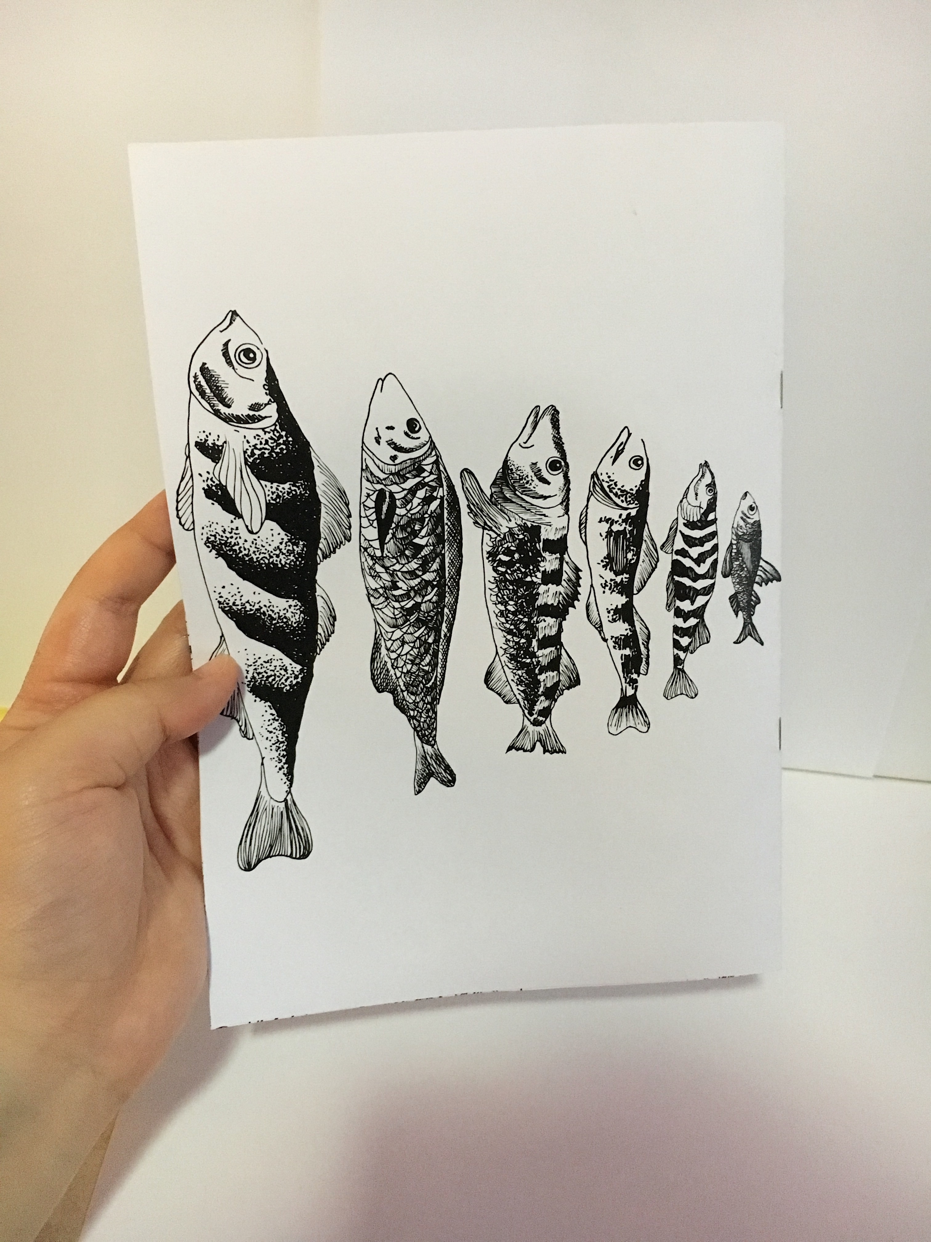
8. For the concluding page, I wanted to keep it simple. Therefore, I decided to arrange fishes of various sizes in a straight line, in descending order.
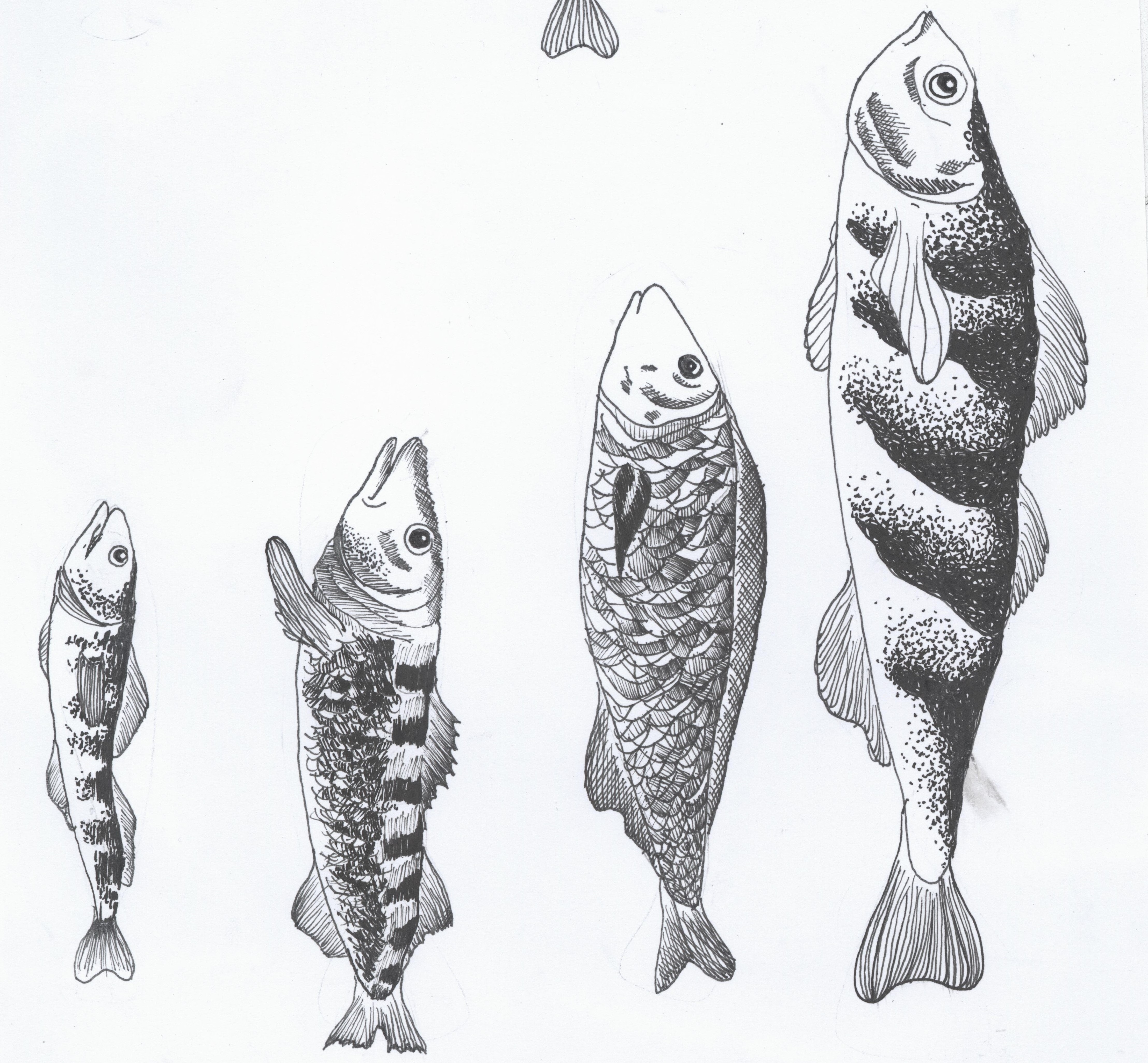
How they look like after being scanned, edited and vectorized!
How the page looks like after being arranged!

Reflection
This assignment is definitely one of the toughest assignements for me. I’ve never really scanned my work before so there were problems where the picture was too blurry when dragged into InDesign, even after being edited in Photoshop. There were so many of them which were blurry such as the one below.
Therefore, with the help of my friend, we found a method to vectorize it. I couldn’t screencapture the process as the whole computer was lagging, but I did take a picture of the screen.
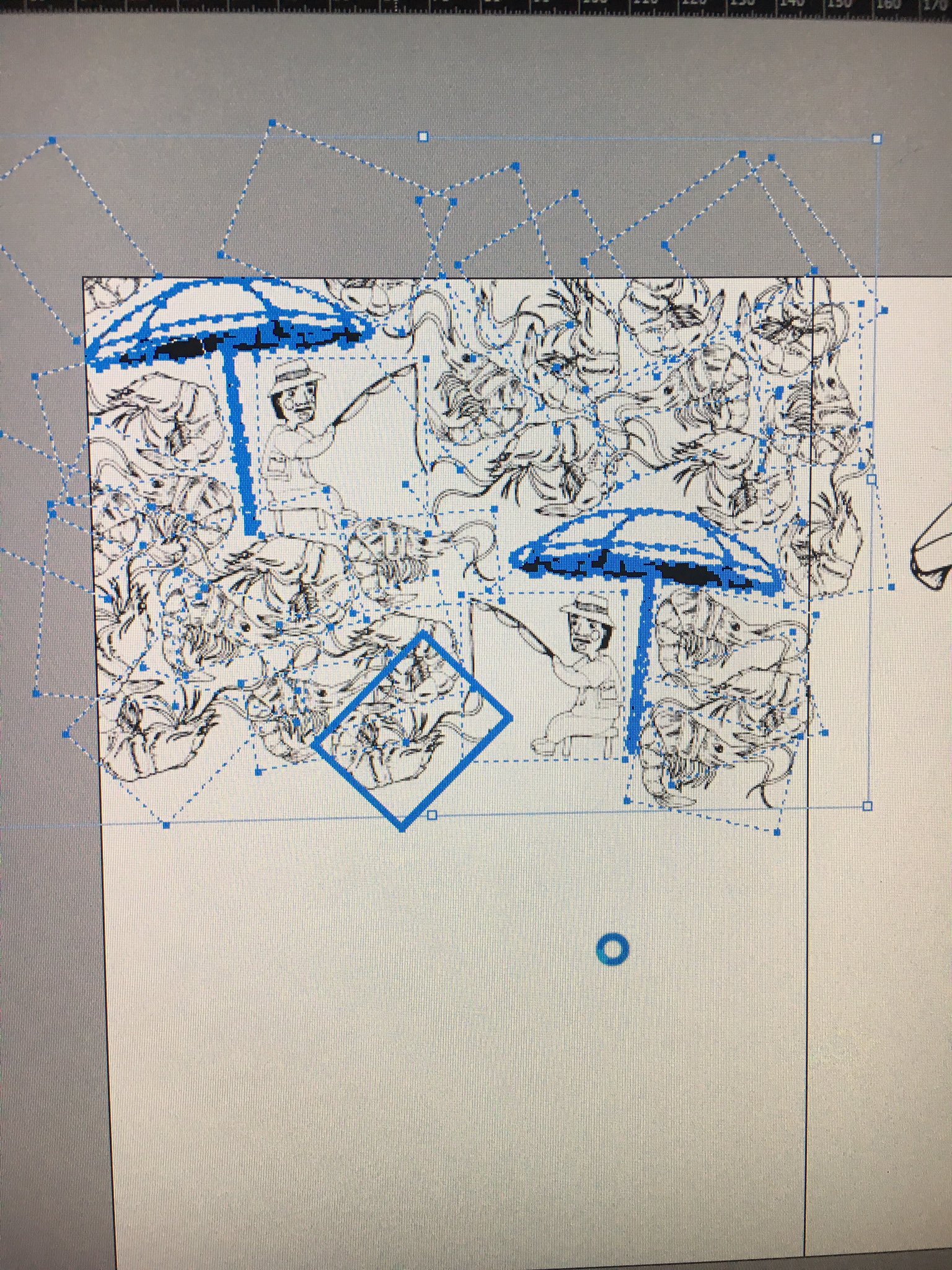 After it is vectorized (through image trace), finally most of the pictures were clear when dragged into InDesign. Therefore the whole process of drawing –> scanning –> editing and removing background on Photoshop –> vectorizing on Illustrator –> exporting as PDF just to check if it looks okay (since the pictures looked too blurry on InDesign for me to see clearly) was definitely a whole new process for me.
I don’t deny for a single fact that there are still improvements that could be made especially for my Page 3, since it was the only image that could not be vectorized for some unknown reasons. 🙁 But other than my page 3, I am really proud of my work. Not just the final outcome, but also proud of myself for learning new things and overcoming my blurry picture problem.
In short, I really learnt a lot from this assignment; vectorizing, importance of being clean in your work, importance of having a coherent concept/theme that holds throughout your assignment.
Final Printed Zine
An exploration of patterns found in Pasir Ris’ famous fish farms.

Thank you for reading! 🙂
And thank you Ms Mimi, for your guidance and having faith in me! It really went a long way, so thank you so much! 🙂
2 comments for “Project 2: Zine”