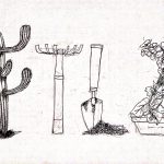
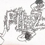
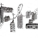
Hello! 🙂 My zine is based on objects and textures that I’ve found interesting in Pasir Ris. From these textures and objects, I would experiment the different kinds of patterns that I can create from there. To start off, I’ve done drawings of the things I saw in Pasir Ris, after which I’ll scan them in. Initial Idea… Read more →
Category: Research
Project 2: Zine (getting lost in fishy Pasir Ris!)
Unlike my first recce, this time I went to Pasir Ris without any plans in mind. The idea this time is to just get myself lost in Pasir Ris and hopefully, chance upon something interesting. So naturally, we walked down this weird “ulu” lane somewhere in Pasir Ris. That led us to this. And this. I took… Read more →
Project 2: Zine (First trip to Pasir Ris!)
Before heading out to Pasir Ris, I decided to read up on news that happened in that area. The first news that appeared was otter sightings at Pasir Ris Park! Of course, I knew I wouldn’t be so lucky to see them. But I was still interested to visit Pasir Ris Park anyway, because I wanted to know what might… Read more →
Project 1: Que Sera Sera (Process + Research for Henna Designer)
For my Henna Designer, I wanted to incorporate mandala designs into the font and the alphabets would be inside and be part of the mandala, as seen in the two drafts below. To imitate the colours of the Henna, I tried using different shades of the brown colour pencils. However, the tip… Read more →
Project 1: Que Sera Sera (Process + Research for Florist)
Florist are always associated with flowers. Therefore, my first few drafts are all fonts surrounded by flowers. I was also interested in Artist Sabeena Karnik‘s typography where alphabets are being created by flowers surrounding it. However, after looking at these two drafts, I feel that I would prefer having the flowers making up the font and not the font made… Read more →
Project 1: Que Sera Sera (Process + Research for Writer)
For writer, I thought of using crumpled papers to show the rejected ideas that writers have crumpled up and discarded. Thus, explaining my first draft. After the first draft, I thought it looked quite boring if all of the alphabets were made up of crumpled paper. Therefore, I tried to make the different alphabets be made… Read more →
Project 1: Que Sera Sera (Process + Research for Architect)
For Architect, I had a clear picture from the start that I wanted buildings to make up the font. Therefore, I sketched a small draft below. After this draft, I was really confident that for Architect, I wanted a thick, blocky font that is made up of buildings. I went on to sketch another draft but now including twirling… Read more →