
–The Principles of Design–
Balance
In art, balance refers to the state of visual equilibrium in its design. This equilibrium can be found symmetrically, asymmetrically or radially.
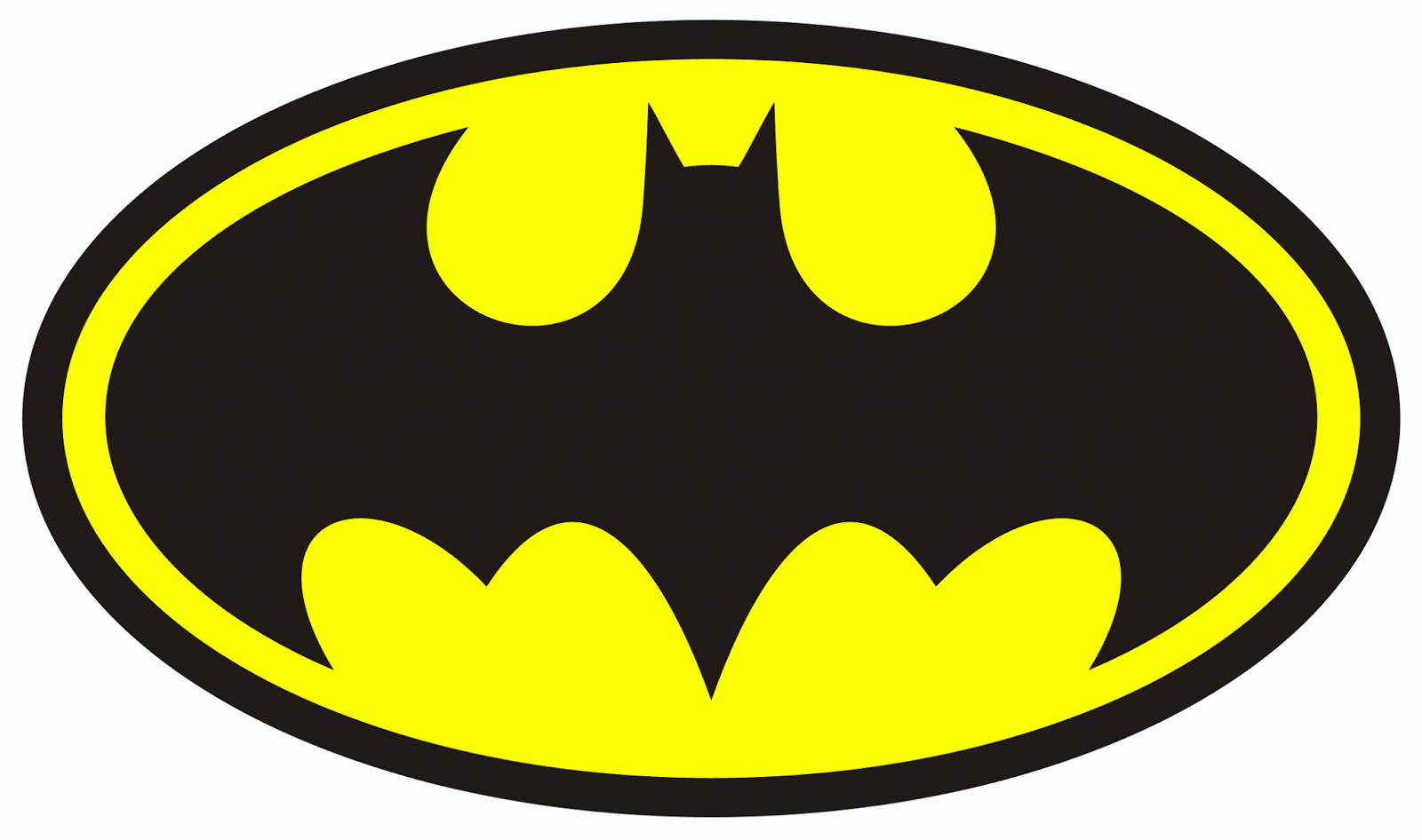
Try running an imaginary line vertically through the centre of the image below and you’ll find that the Batman logo makes for an impressive example of symmetrical balance.
On the other hand, the following images do not have that imaginary line
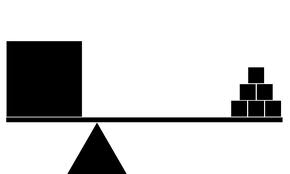
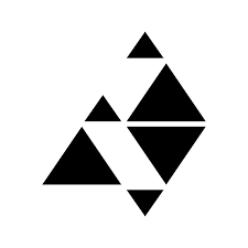
And yet, they still seem to be rather ‘stable’ in the visual sense. Why is that so?
First, let us analyse the size of the objects in the image. Taking the first example, one large square balances off many much smaller squares. The large square is also closer to the pivot than the smaller squares. This conforms very nicely to the rules in physics and thus, just as we tend to associate larger objects with a larger mass and therefore greater weight, so does a larger object carry greater visual weight, allowing it to ‘balance’ the much smaller weights in the image.
The second image is much more interesting, I feel. The triangle looks like it is just about to tip to one side, but is still somehow upright. Following the above principle, you’ll realise upon dividing the image into halves, the left has one big triangle and one small triangle (placed slightly further from pivoting point); the right has two big triangles stacked on top of one other (placed very close to the pivoting point). Thus the composition works, because the visual weight of the dissimilar triangles are balanced.
There are more way to play with asymmetrical balance by varying the following:
Value. Darker values carry more weight than lighter values.
Colour. Brighter and more intense colours carry more weight than muted colours.
Texture. More complex textures carry more weight than simple textures.
Shape. More complex shapes carry more weight than simple shapes.
Moving on, radial balance is achieved when all the elements radiate out from the centre into the surrounding, distributing visual weight evenly throughout the circle it forms. These elements guide the eye to the epicentre from whence they came, making the centre the focus. As such:
Hierarchy
The importance of the elements in relation to one another. Typically, in good design, the viewer is led by order of significance of the elements: from the element of most importance to least importance
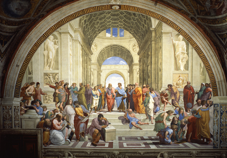
1509-1511
The School of Athens
Fresco Apostolic Palace, Vatican City
Using a famous artwork, Raphael’s School of Athens, a hierarchy is very distinct even though most of the figures are of the same size. This is achieved by the deliberate framing using the arches overhead, and the brightest part of the painting being above the heads of the two men in the centre. This makes the two figures (who are already in the centre if that was a big enough clue) stand out amongst their counterparts.
Hierarchy can also be presented through clever use of proportion. Generally, the larger object will capture most attention at first glance, and also present itself as the most important figure in the whole piece. This can be seen in Romanesque Art (example below), where Christ, the most important figure in Christianity, is the largest in size, compared to the angels and saints that surround him. Hence, in doing so, the artist establishes that Jesus Christ is above, and more important than the angels.
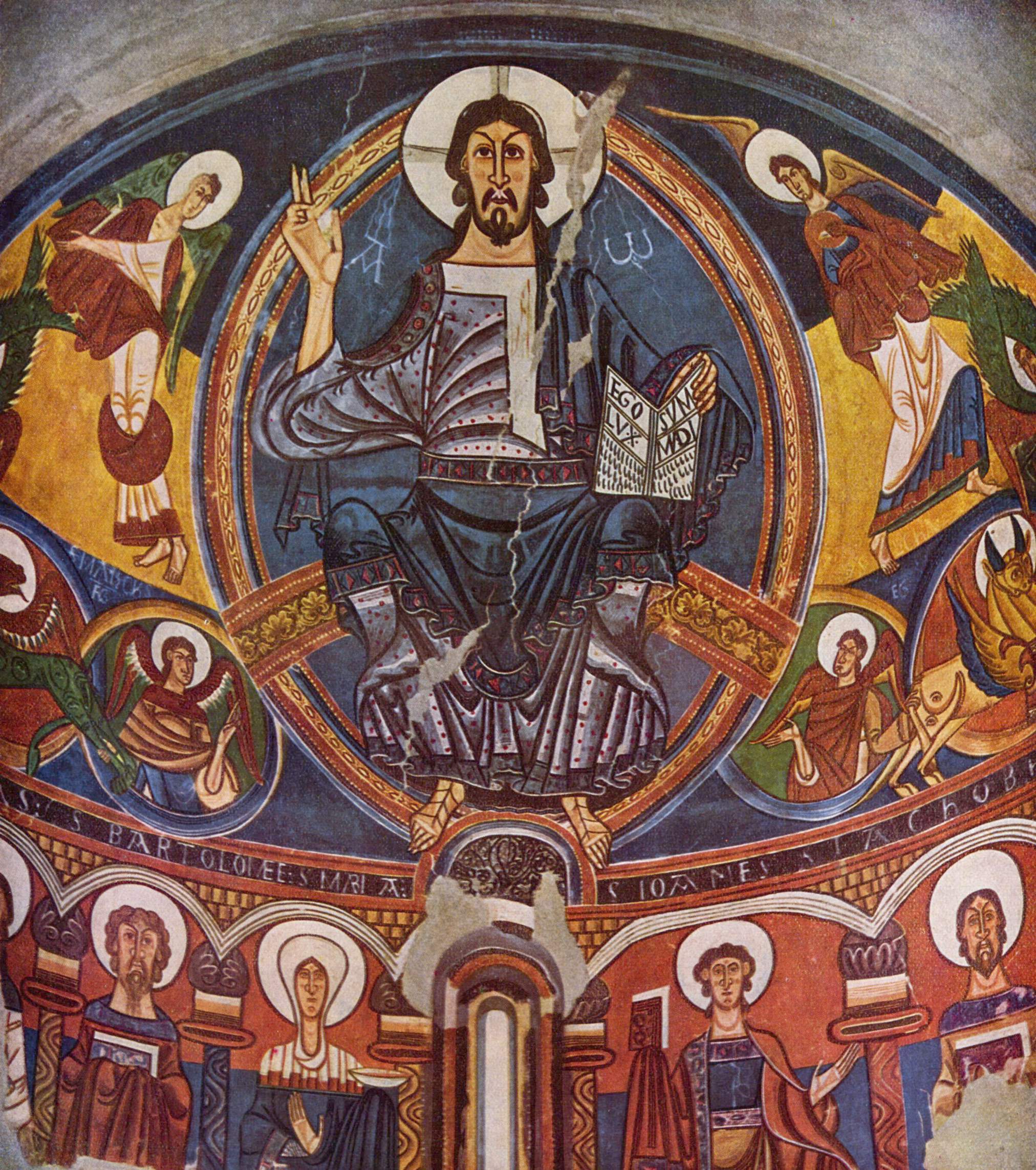
Apse of Sant Climent de Taüll
Catalan fresco
Museu Nacional d’Art de Catalunya
Similarity and Contrast
Similarity is vital for uniformity. However, when elements are too similar, the focal object may blend into the background, which is generally not desirable (unless the artist chooses to do so intentionally to prove a point). Hence, some contrast is necessary to emphasise or point to the focal object. Such as:
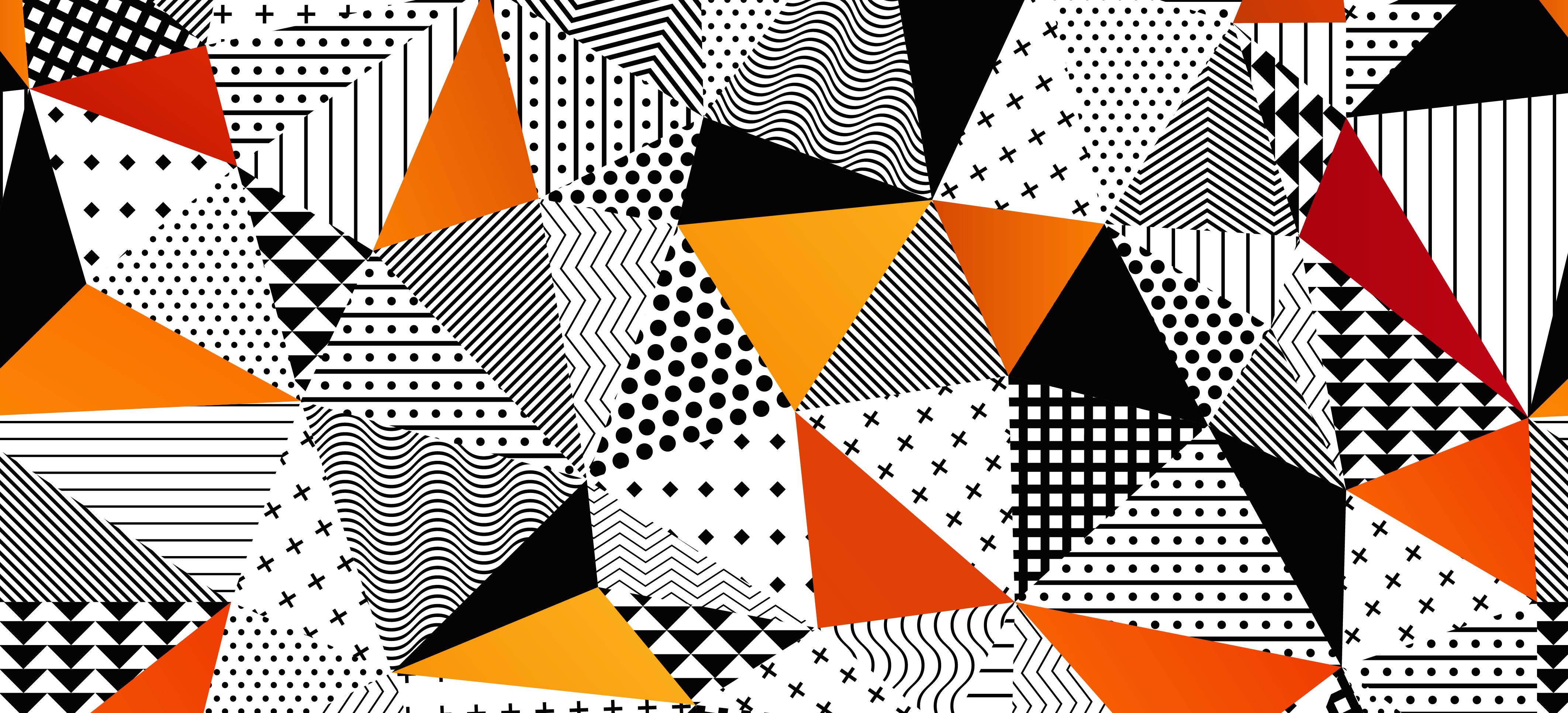
What catches the eye first? Was it the orange/red triangles?
Above is an example of contrast in colour and texture. The vibrantly coloured triangles really stand out against its monochrome background. And its flat colour, free of elaborate texture, makes it pop out even more. Contrast is very useful in adding variety and interest!
Unity
The synthesis of all the elements in the design: their ‘together-ness’, which supports the whole design to make it what it is.
Built upon: similarity, repetition, continuation, rhythm, perspective
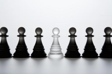
The chess pieces above form a cohesive image due to the repetition of chess pieces of the same size throughout the piece. The focal point is the clear chess piece, where it breaks the pattern of an all-black assembly.
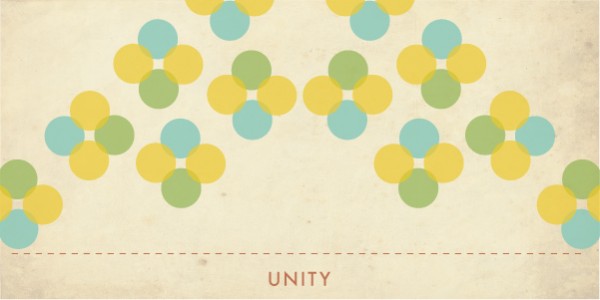
Here, we see again a repetition of elements. The basic block of four dots is pasted similarly throughout the piece. The eye can follow the ‘movement’ of the block of dots, which forms something similar to a ‘M’, an example of how continuity can create a sense of unity.
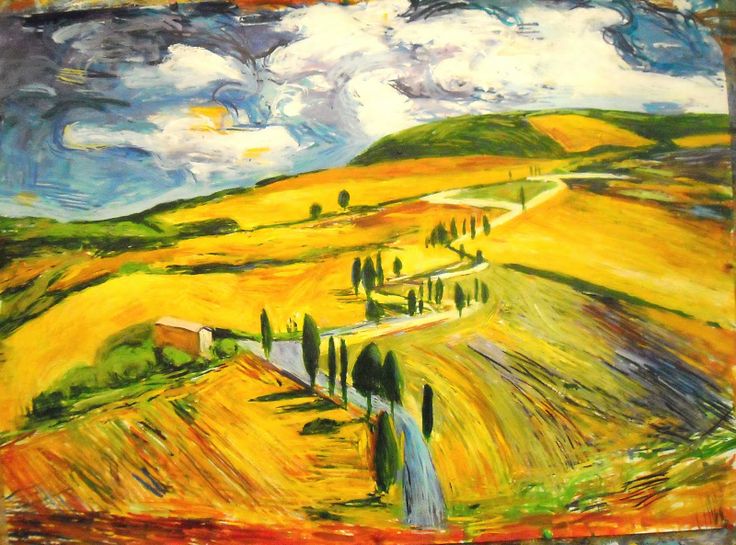
Finally, perspective. This whole piece is basically sewn together by the thread of road that snakes from the foreground all the way to the back, guiding the eye through the most important parts of the image. In doing so, the piece is seen as a whole, not separate objects by name of ‘land mass’ and ‘sky’, but a landscape. A whole.
Phew. That’s about it for today, I think. There’s still a lot out there to learn though, so…all the best! :>