
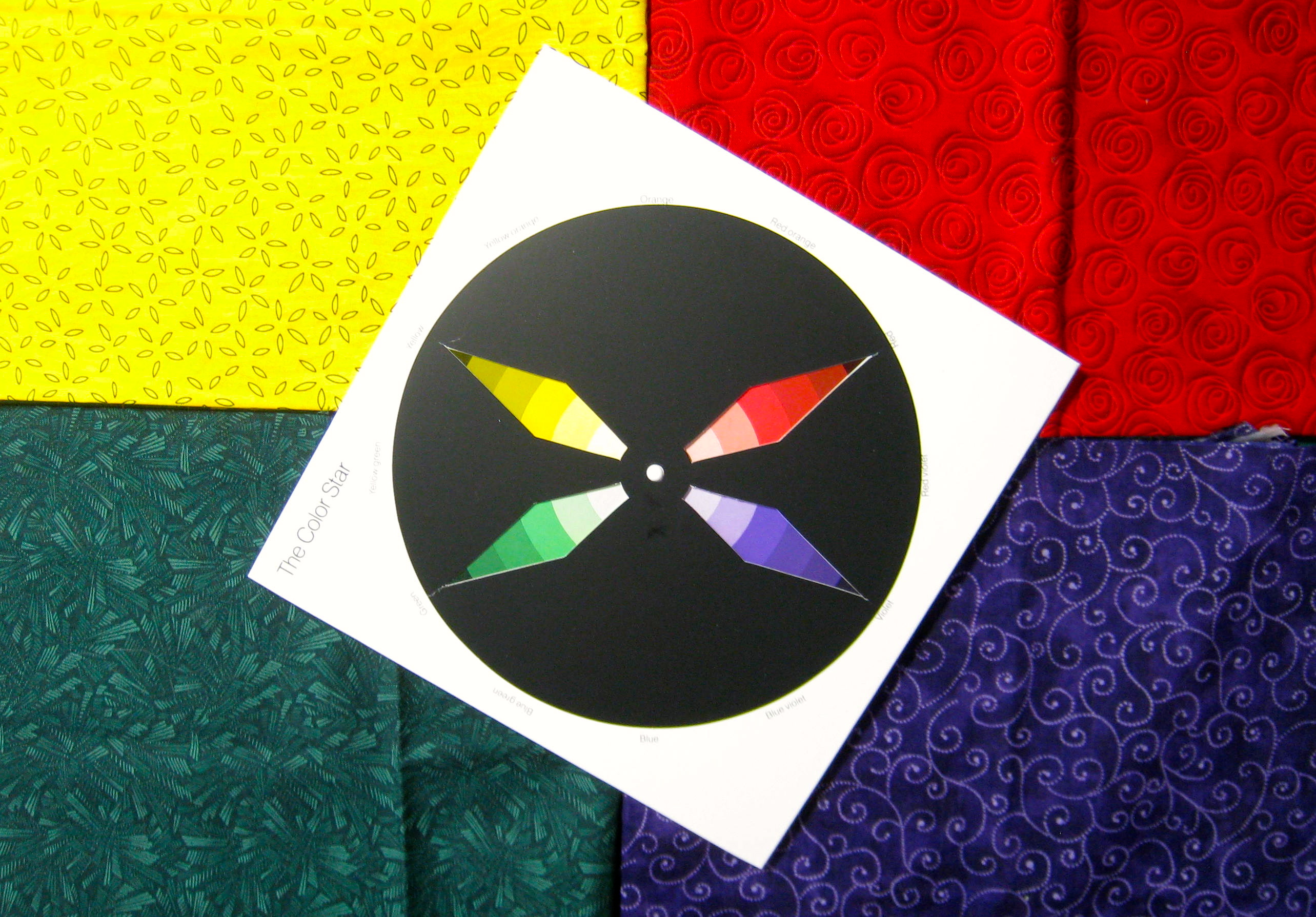
Colours can be put together in different ways.
The result of various colour combinations can add to the emotion, or strengthen the statement that the artist wishes to convey.
This post will discuss monochrome, complementary, analogous, triadic, split-complementary and tetradic harmonies. With a bonus at the end;)
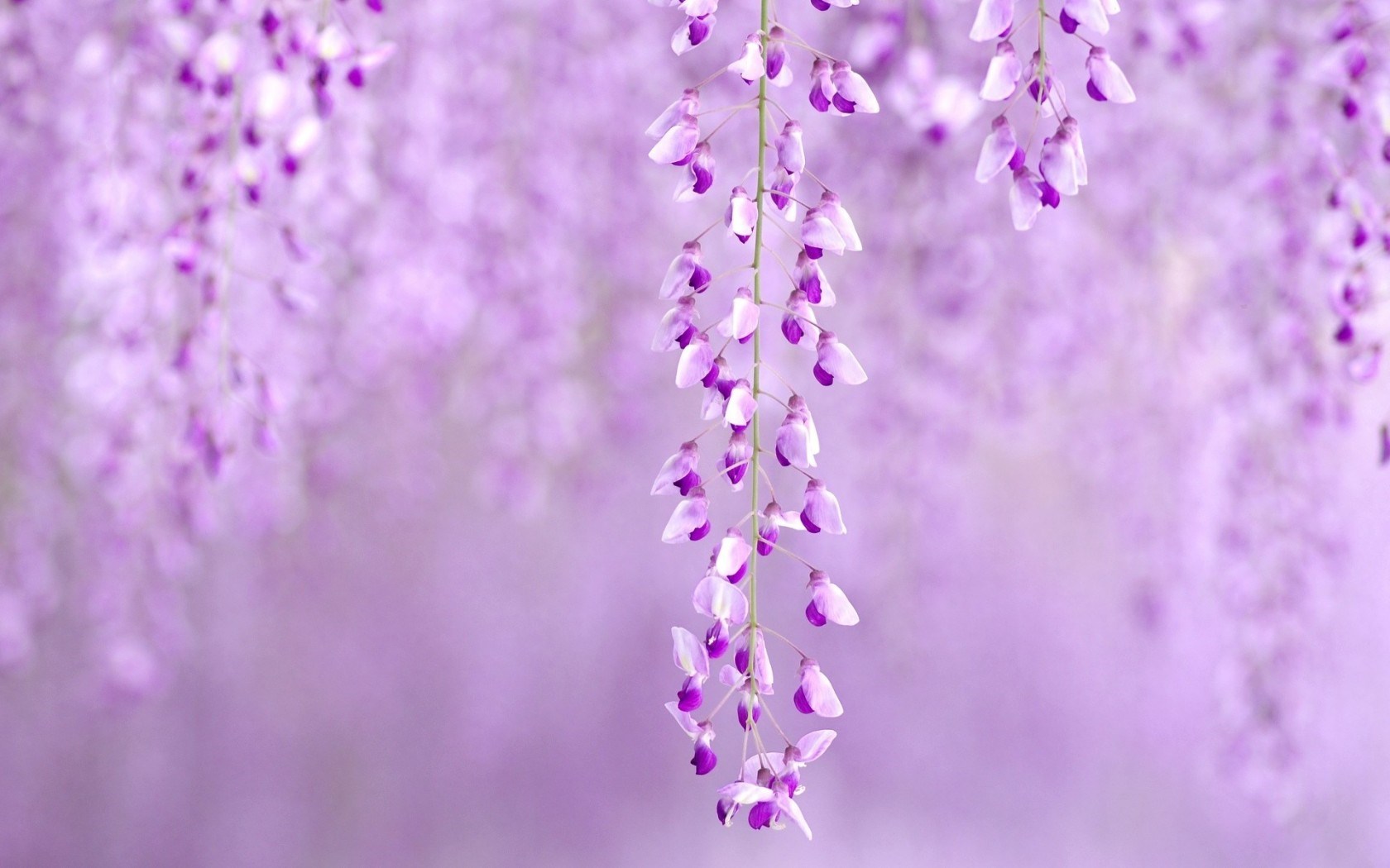
1. Monochrome Harmony
Using a single hue, with a variety of values
Gives the whole image a unified look due to the similar hue throughout the piece
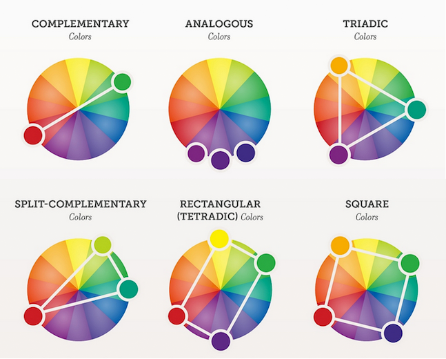
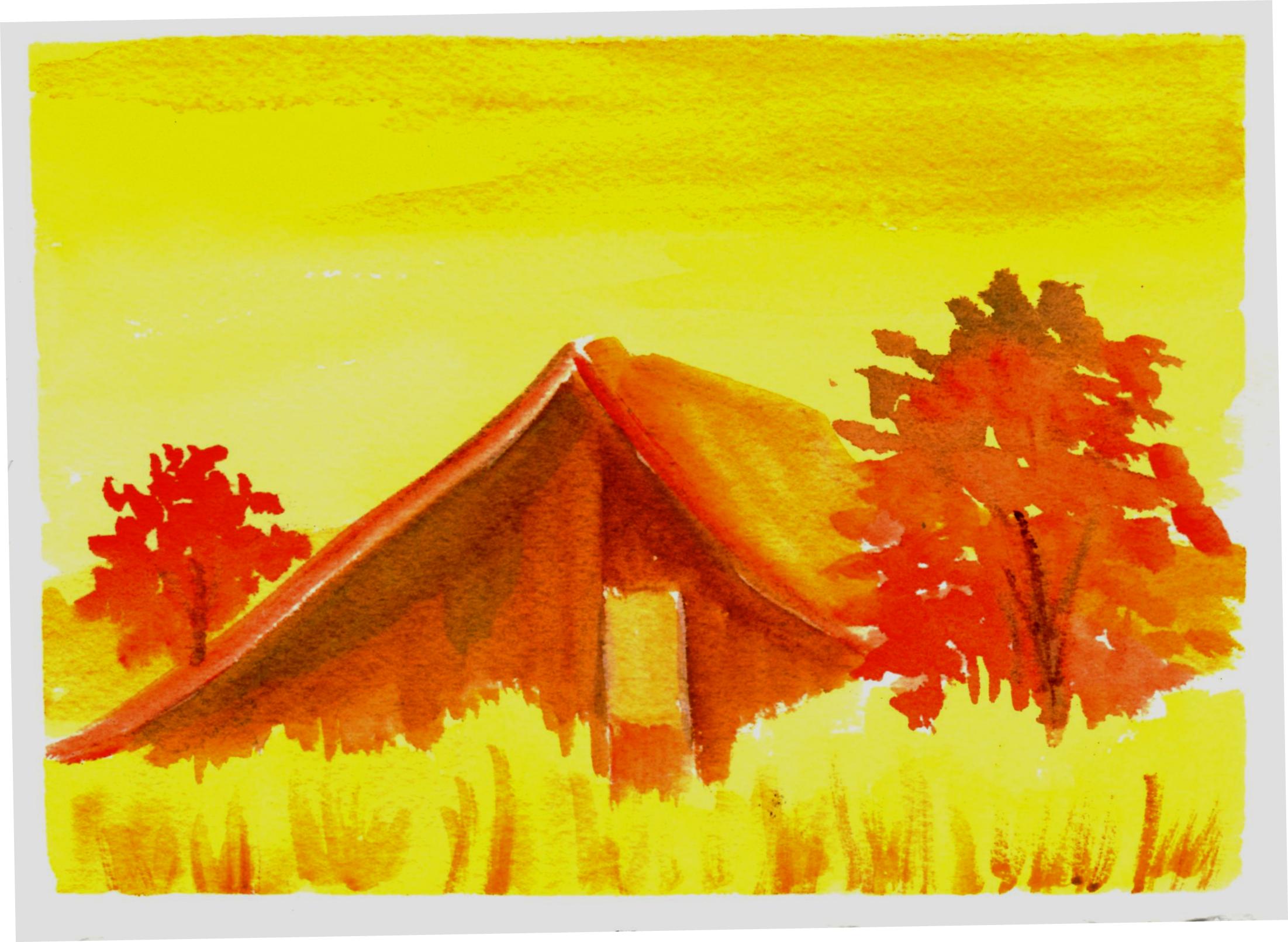
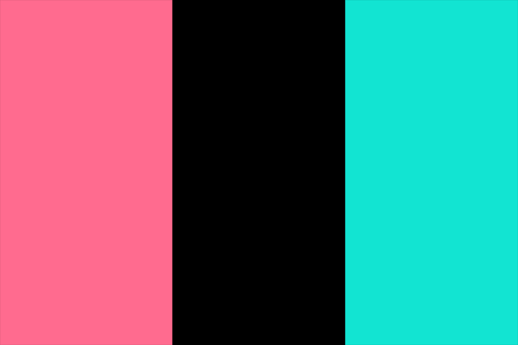
2. Complementary Hues
Using two hues that are directly opposite one another on the colour wheel
E.g. purple and yellow
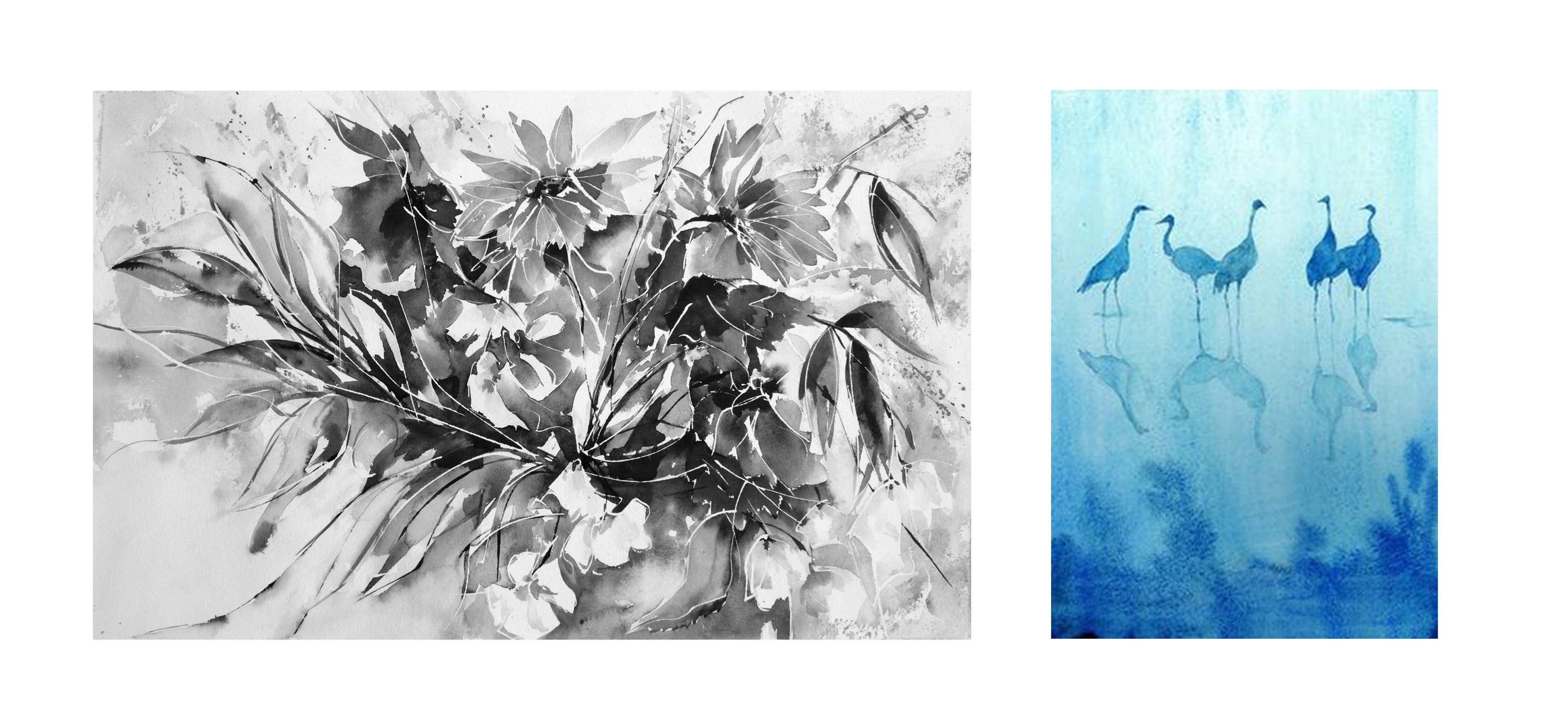
3. Analogous Harmony
Colours that are directly adjacent to the key hue
Creates atmosphere and mood through Dominance of Hue that creates analogous harmony by having the light pass through a filter, which lights a scene through a filter of a certain colour.
4. Triadic Harmony
Three colours that are evenly spaced around the colour wheel
e.g. orange, purple and green
Triadic harmonies are more colourful, though less contrasting than the complementary colour schemes. It can work to soften the overall visual load of the artwork, making it somewhat more ‘approachable’ and ‘friendly’ to the viewer.
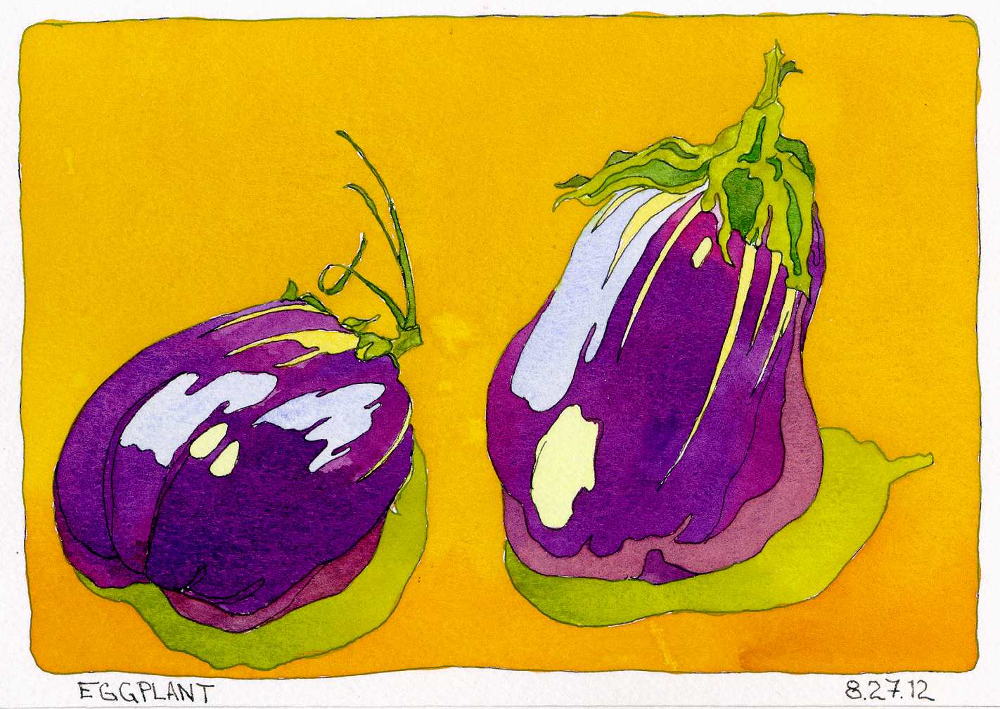
5. Split Complementary
A variation of the complementary colour scheme. Usually consists of one key hue, and a two adjacent hues of its complementary.
e.g. blue, orange and yellow
Offers visual contrast, but with greater variation as the artist can play around with more colours. Generally, split complementaries are less contrasting than solely complementary colour schemes. It retains strong visual contrast, yet due to the intermediary colours, there is less tension between the colours.
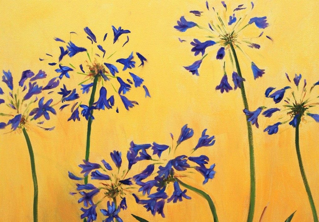
6. Tetradic Harmony
Four colours consisting of two complementary pairs
The above image speaks for itself 🙂
Lastly, just as a square is a subset of a rectangle, a square colour scheme is a specific subset of tetradic harmony.
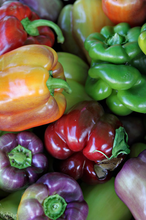
The colours above fall nicely into a square: orange; purple; red; green
The saturated colours of the capsicums are farther brightened by their (and just nicely contrasted) friends of different skin colours.
7. After-image phenomenon
Ever seen that ghostly apparition of colour after staring too hard at something?
The after-image phenomenon is probably what you experienced. Simply put, is the result of overloading your eyes, eventually tricking your brain into thinking that the image is still there — even though you have already looked away!
There are more interesting things relating to colour out there — various optical illusions that play with colour and such. But this post is long overdue, and, frankly, long enough for now. Hope you learnt as much as I did while reading and consolidating the information for this post!
’till next time!